Transcripts
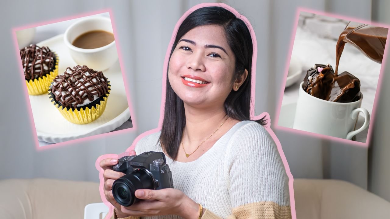
1. Class Introduction: Hi there, my name is Rose. I am a food and product
photographer from the Philippines and a
Skillshare top teacher. I have been photographing different subjects for
almost a decade down. Most are paid work, but some are personal projects and I'm humbled to say that
I am completely self-taught. I didn't know about composition when I was just starting out. I will just take
photos the way I want. But over time and as I get more clients and made
upgrades on my gear, I felt like I needed to
level up my skills too. And that is when I
studied composition, it took me years to really
figure out what it all means and make it simple and applicable in my photography. Because when you search
for composition, you will be bombarded
with photography jargons like Gestalt, Fibonacci
Spiral, Dynamic Symmetry and many, many more. And that is why I
created this class. This is something that I wished I had access to back then. This class is perfect for
anyone who wants to dig deep into composition
in product photography. This is also for
beginner photographers who are still learning the ropes and wants to get a
solid grasp of composition. This class is made
for people like me in the past who get
overwhelmed about where to put props and products in a scene. The
techniques that you will learn from this
class can be useful in photographing products
for your small business, for your clients, your blog, or your social media. We will kick off with
visual perception and why composition is important
in product photography. Then we will move on to longstanding composition
rules and guides. Then we will dig deep into
how to use colors, lines, shapes, and patterns to create product photos with impact. Then we will move on to
intentional cropping, framing, shooting
angles and orientation. I will end the class
with a demo of how I use composition in my
product photography. My goal in this class
is to make composition less intimidating
but accessible, doable, and fun! No
prior skills needed and it does not matter what
type of camera you are using. You are very much welcome to join this class. With that said, I hope you'll join me and
I'll see you in class.
2. Class Project: Do you know what makes
Skillshare classes more fun and exciting? projects! I believe that this is how
you can really get the most out of Skillshare classes. By participating
in class projects. You can practice,
cultivate your skills, get feedback, and
it's a great way to connect with your fellow
students and teachers. For our class project, you just need to collect two to three props for
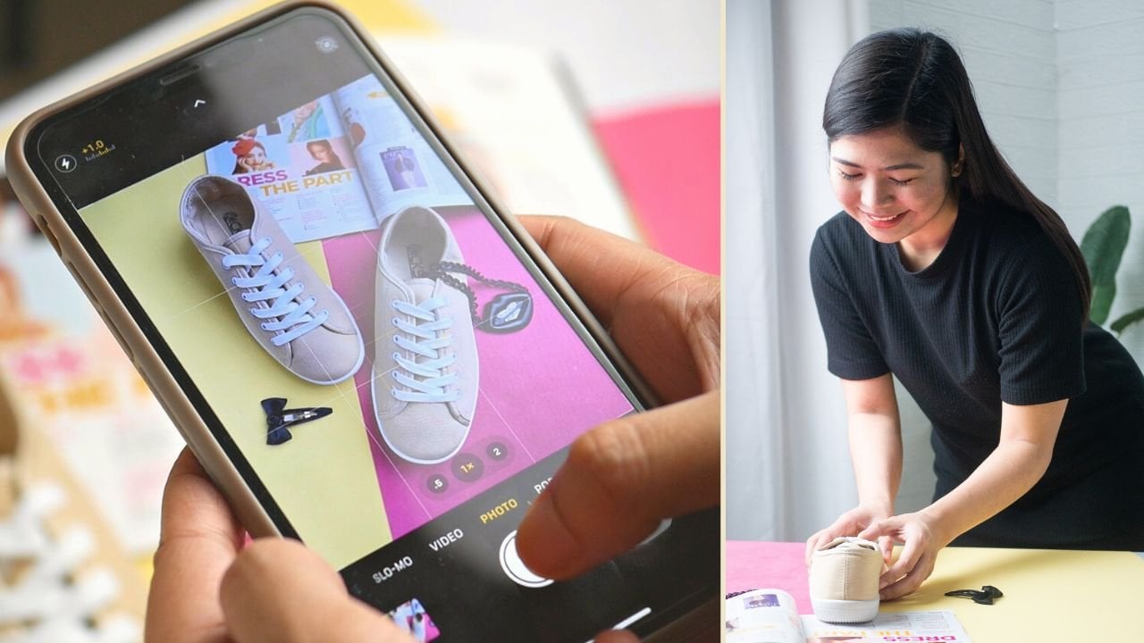
your product photo shoot, then you will be needing
your product or a product to photograph then a camera to
photograph your product. It could be a DSLR
point and shoot mirrorless or your smartphone then a background or backdrop. It could be as simple as
poster papers and fabrics. And finally, a flat surface where you can
set up your backdrop. After you collect
these materials, you just need to apply
whatever you learned from this class and photograph your products using
composition rules and guides to best
showcase the product. This could be as simple as
photographing your products in a plain background with no distractions and
intentionally cropping or you could go as
grand as arranging a flatly with a combination of different colors
and compositions. Once you're done, you
can make edits or not. Then upload your work in
the class project gallery. Feel free to tell us
more about your work and your photo session experience
in the project description, I am super excited to see your work and give it some love. In the next lesson, we will officially
start with why composition is important
in product photography. See you there.
3. Why Is Composition Important?: So why is composition important? Because we want to create photos that appeal to our
target audience. When we do product photography, we have a purpose We have a message that we want to tell through
our photos, right? Composition can help
us better achieve that.. I love what Richard Garvey Williams
said in his book, "Mastering composition", that
effective use of composition can often help you
create something special from even the ordinary. For example, I was
asked by a client to photograph this organic scrub together with the ingredients. And it was really challenging because some of the
ingredients are yellow, which is a loud color. Plus I had to arrange so many elements and make
sure that the subject, which is the organic
scrub, is not overpowered. But with the help
of composition, which is the process of
selecting, arranging, and emphasizing the
important elements of an image to support
the intended message. I was able to create this photo using the leaves as
leading lines and positioning the
avocados like that are all part of my composition
for this image. Now, even products that
are photographed in plain backgrounds require
a bit of composition. For example, these brownies photo graphed vertically
emphasize height and depth, while horizontally it
feels more spacious. Composition is also the
reason why this photo of these mango drinks is
better than this one. Basically, following
composition rules and guides can help us create pleasing images that show good visual
design and balance. To dig deeper into
why composition is important in our
product photography, we will explore visual
perception in the next lesson. See you there.
4. Visual Perception: Visual perception refers to our brain's ability to make
sense of what the eyes see. For example, when
we see this photo, we assume that this
product is made of the fruits and vegetables
surrounding it. When we look at photos, we unconsciously
connect the dots. We try to find the meaning, we look for clues,
we want closure. We naturally find images
that are in order, symmetric and harmonious,
pleasing and easier to look at. Without composition, we
just place elements in a photograph wherever we want and hope that
it will work out. For example, this is one
of the photos I took for a client way before I
knew more about composition. Looking at this photo makes me cringe a little because it is confusing and you can't really tell what is my
main subject here. What is the message or the
intention of this photograph plus I have no idea why I
position the knife that way. This is another example
where you can't really tell what may main subject and
the intent of the photo is. But now when I plan for photo sessions I dedicate a lot of time interviewing my clients, asking for the purpose
of the photos and the message we want to tell our viewers or their
target customers. When it's time for
me to select props, backdrops, and color palettes. I have direction, I
know what to prioritize whenever I am composing and arranging the elements
in my photographs. So the next time you do a photo session for
your product or your client's product put yourself in your viewer's shoes. What do you want them to see? What do you want them to feel and what you want them to do. Do you want them to know that
your product is organic? Do you want them to
smell the ingredients? Do you want them to
salivate? Do you want them to see how crunchy, how rich or how amazing
your product is? Asking these questions,
practicing and applying composition rules and guides can help you create product
photos with impact. And that is what we're going to talk about in the next lesson, composition rules and
guides and how to apply them in your
product photography.
5. Composition Rules and Guides: In this video, I will share
with you composition rules and guides that I maximized in my very own product photography. The first one is
the rule of thirds. John Thomas Smith, a painter
engraver and antiquarian, first wrote this long-standing
rule back in 1797. To follow this rule, you place your subject on the left side or right
third of the frame, creating a pleasing composition. Each intersection point is a potential point of interest You just align your main subject along with other
elements of the frame along these points to create a balanced and visually
interesting image. For example, looking at these photos of the
chocolate truffles, the one when I used the rule
of thirds to position the subject and the blurry logo looks more pleasing
and balanced than this one where the
subject is off center. For me, the rule of thirds is the easiest and simplest rule to follow and utilize in
my product photography and to be honest, I use it a lot
before I was able to explore other
composition techniques, which leads me to my
second favorite way to compose images, The
Diagonal Composition. This is when the elements
in the image are organized based on
a diagonal line. Diagonal lines help
to create depth, a sense of tension and
dynamism in a photograph, Dynamism simply means
the illusion of motion. Diagonal lines have
more energy and impact than horizontal
and vertical lines. For example, these brownies looked okay with
this composition, but just changing the
composition a bit and photographing it diagonally
made it more appealing. We see the same
effect on the Juanito's bread and
the chicken steak. But it does not end
there, The direction of your diagonal
line has an effect too. If the diagonal runs from
top-left to bottom-right, it is closer to how the eye is accustomed to scanning the page, so it will be easier to follow and can suggest tranquility. But the downside is that it
has less of a dynamic impact. On the other hand, if the diagonal line runs from the bottom-left
to top-right, it is more challenging and
dynamic and it gives power, forcefulness, and
movement to the picture. To show a few examples. Here's another photo I took for Juanito's
bread. I wanted a peaceful
afternoon snack feel so I followed the
diagonal composition from top left to bottom right. On the contrary, and as the
name of this product suggests, I wanted to add more movement and dynamic to this composition so I followed the bottom-left to top-right diagonal
line on this image. I also applied the same
composition guide to make this chicken
crunch more fun, same thing with this bento meals and the chocolate truffles. So you can definitely
use this guide in your very own
product photography if you want to suggest
order and tranquility, you can use the diagonal
top-left to bottom-right. And when you want to make it more fun and add
power to your photos, you can maximize the diagonal bottom-left to
top-right composition. The next guide is the
triangle composition. There are many ways
you can utilize this First is if you have three
elements in your scene, you can place them at
points of a triangle within the picture
plane, like this. And this, and this. Another way is to form an
implied triangle like this. Next, and related to the
triangle composition is the rule of odds, which states that an odd
number of subjects in an image is more pleasing
than an even number I find this rule very
useful to follow when deciding how many stacks
of products to photograph, as well as in choosing
the number of props and the number of
products to photograph. This is why learning
and practicing composition is such a
game changer for me. Following and
familiarizing myself with composition rules not only
improved my photography, but it made my job
so much easier. Whenever I have an
overwhelming number of props in front of me, I start with odd numbers, then I try to follow
the triangle composition. And if it's not working, I try to follow
the rule of thirds or the diagonal composition. And if nothing works, I just go back to following
the very basic "Visual Weight" This refers to the visual impact of elements in your composition. The stronger the element's
visual weight, the more it draws in the eye..
photos that are bottom heavy appear more natural to us because this is
how we see the world. A lot of details and contrast at the bottom and clear
blue sky at the top. When we look at photos, we also see gravity In effect. Photos that are heavy at the top can look awkward and imbalance. Colors have an effect
on visual weight too, but we will dig deep
into that later. Basically, you can use your very own visual
perception based on visual weight to analyze if your image is balanced
and pleasing. That is what I did in photographing this
organic beauty product set, it was challenging to photograph all of the
products at once and I could not follow any
composition guide that works. So I just used visual weight
as guide to position the products and here's
the final result. The techniques that I shared
with you are just a few of the many other rules
and guides that you can maximize in product photography. But it's an easy and
doable way to start. Once you master these
composition guides, you can explore other rules like the golden ratio with
the golden spiral, dynamic symmetry and
many, many more. I myself am
constantly learning and exploring composition
techniques in my photography because
repeated use of techniques can lead to
predictability in our work. Just to encourage you there that we're all learning
and exploring. No matter where
you are right now, if you don't stop
studying and practicing, it is remarkable what
photos you can create. Don't compare yourself with photographers who have been
taking pictures for decades. You can only compare
yourself to your old you. I hope you will really apply the techniques that I shared
and we'll be sharing in this class to create your project and level up
your product photography. In the next lesson, I will show you how
you can use lines, shapes, and patterns in your product photography
composition. See you there.
6. Lines, Shapes and Patterns: Remember visual perception? When we look at photos, we look for connections
and clues, right? We connect to photos
that are familiar to us. Using lines, shapes, and
patterns can help us with that. It can help guide
our viewer's eye It can help our
photos look homey, and it can also help
grab attention. So let's start with using lines. Lines have the power to direct the viewer's eyes
throughout the photograph. Look at how you can use any
lines present in your scene. Leading lines are a
great way of drawing the viewer's attention to
something in the picture space. For example, this is a photo I took for
another local business, the pouring caramel sauce formed a line leading to
the main subject. On this next photograph. My hands and props formed
an invisible line to guide the viewer's eyes
to this homemade product. Just a tip that
the line does not have to be an actual
or a continuous line. A row of objects can act as
a line and lead the eye. Moving on to shapes. Different shapes have associations with
different qualities These associations
came from where and why they appear in
the world around us. Bold shapes will serve
to create bold images. Angular shapes are
also more dynamic and grab our attention more
than rounded smooth shapes. Rectangles in general represent structure solidity
and precision, whereas triangle
represents strength, endurance, unity, and trust. Triangles also look
like pyramids. That's why they have
associations with stability and I use them most
of the time when photographing
products in groups and when I want to convey a message of trust
and stability. On the contrary, an
upside down triangle will convey less stability
and look imbalanced. Circles represent wholeness,
purity and potential. They also have an enclosing and encompassing effect on
elements within them, which can be a good use when
it comes to composition. Next, repeated use of shapes and lines can help us
create patterns. The repetition of
shapes or colors in the picture is
generally pleasing. Just as rhythm is in music. The forms don't have
to be identical. Similarity or repetition
in an image can suggest harmony,
rhythm, and movement. A technique for
showing patterns is to completely fill the
frame, the minds eye will assume that the pattern continues way beyond the
edges, even if it doesn't. Another technique is
to break the pattern. This can add interests, make your viewer curious
and allow the viewer's eye to rest as it
studies the pattern and so breaks the monotony. From here you can see that
there's a lot of tools we can use to achieve the message we want to convey
through our photos. We can maximize lines, shapes, and patterns in our composition, to deliver different messages. This is why It is also important to
start with why and what. Having a clear message
and purpose for your product photos can help in your photo session
planning and composition. In the next lesson, we will move on to using colors for high
impact photos See you there.
7. Colors: So how can we use color in our composition to create
high-impact photos? First, we need to
understand that different colors have
different effects, meaning and visual weight. So let's start with
the weight of colors. Light colors are obviously lighter and darker
colors are heavier. For better compositions,
aim to position darker and heavier colors
at the bottom of the frame. Our understanding of gravity means that images
feel top-heavy when darker colors are on top as
if the image will fall over. This is the reason
why I positioned this red poster
paper at the bottom as background for
this photo shoot instead of yellow at the bottom. Another example is this
image where I gave equal space to the
coconut and strawberries. Since red is heavier color. I can feel that the image
is heavy on the right. So to solve this, I tried to add more white negative space on the right side and
photographed it diagonally to make
it more balanced. To further illustrate the idea of visual weight in colors. This is a block
of colors created by Brian Peterson from his book, understanding color
in photography. In the first image, black is on top, and in the second image
black is at the bottom, most of the time, black and other dark colors
and tones such as deep red, burnt orange, and dark purple work best
near the bottom of the frame. Our knowledge of gravity affects our perception that something is wrong in the first image. In the second image, we feel safer because the
composition has a strong foundation of heavy
black to support the others. There's clearly much to consider when we are composing
with colors in relation to how we match different colors
with one another and balance their proportions
within the image space. A tool that can
greatly help with this is the color wheel. Pairs of colors
lying opposite each other on the wheel are
considered complementary. These pairs are red and green, orange, blue and yellow, purple. When put together, they have an unusual optical
effect and appear to vibrate more intensely due to the quirks of the
physiological process. Complimentary colors are also a combination of cool
and warm colors. I find this very
useful when selecting props to complement the
product I am photographing. For example, in this photo
of the cocoberry soap, I complimented the pink
soap with the green leaves. For this photo, I complemented the cheesy purple yam
bread with yellow flowers I notice that photos with complementary colors seem
to have something extra. It could be because
the contrast of cool and warm colors in a scene seems to create the balance. Next is the analogous colors, which are colors next to each
other on the color wheel, composed of one dominant color, usually a primary
or secondary color, then a supporting color, a secondary or tertiary color and a third color that
is either a mix of the 2 first colors or an
accent color that pops. Their harmony comes
from their similarity. When put together, these have less bold effect than
complementary colors, but can be appealing and
easier to tolerate for longer. Aside from visual weight
and the color wheel, we also have what we call
advancing and cool colors. Advancing colors appear
to come towards you. while cool colors appear
to go away from you. yellow, red, and orange
are advancing colors. Yellow is cheerful,
vibrant, and bright. Yellow is the most visible
color in the spectrum. It is the first wavelength
of light seen by all of us. Red is also bold and
energetic and conveys energy, vitality, power, love, lust, desire, passion
and excitement. Just like yellow, it catches our attention and can
dominate an image. This is why red needs to be used with caution in a
sensitive composition. Lastly, orange is
the other warm color conveying a sense of
vitality and energy. The cooler colors are
blue, green, and purple. Blue is a less active color and has associations with
the sky and water. It conveys wetness, airiness, coolness, mood, depression,
desolation and loneliness. It can also symbolize peace, tranquility, harmony
and calmness. Green says nature, health, life, renewal, growth, hope
and youthfulness. And finally, purple may suggest
mystery and spirituality and as with the other cool colors, it tends to recede relative to warm colors that
demand more attention. I know that is a lot to digest and I have more things
to say about color, but I hope that this
is a good start. Our choice of color is our unique compositional
responsibility. the one creative tool
that is constantly under our control.
To help with this, I have a color wheel app on
both my phone and computer. This helps me a lot in the planning stage of
my photo sessions. When you plan and
compose your photos, you can start with
complementary colors and use it as a tool to add
elements to your scene. You can also use color
to balance your image. Practice looking at photos and have an imaginary
weighing scale. It can be overwhelming at first, but try practicing one principal at the time and go from there. In the next lesson, we will talk about
crop and framing, so it's less intense and chill. I'll see you there.
8. Crop and Framing: Welcome back Let's talk about crop and framing and how it can
affect our composition. Just like the other
tools and guides, our main purpose
here is to create a pleasing and
balanced image that can easily connect with
our target viewers. We want to create
impactful photos, but easy on the eye. This includes eliminating
distractions and framing our photos
the best way we can. Our goal is for the elements to float freely
within the frame we want the frame to
be less apparent, like we are seeing
through it on a window without being aware
of its existence. If we put elements
near the frame, it can cause tension. Placing objects very close to the edge can lead
to distraction. Avoid leading the
viewer's eye to the corners because it will
probably leave the frame, which is the opposite
to our goal when creating great product photos, it is better to deliberately
crop a portion of that element in the
photograph rather than accidentally
nicking the edge of it. You can also use
foreground elements in your scene to create a
compositional frame. It is also worth noting where the photos will be
uploaded or printed. I have experiences where I carefully framed
and crop my image, but it ended up being
awkwardly crop in print or by the online
platform I uploaded it to. So keep this in mind when you
are shooting and cropping. If your photos will
go to Instagram, plan and prepare for
a one-by-one crop. If you will use the photos on your Facebook or
Instagram Stories, plan and prepare for a nine by 16 crop and the list goes on. Don't worry, I will be attaching a guide in the project and resources tab to help with image size and dimensions
for different platforms. The next lesson is
somewhat related to crop and framing, angles
and orientation. See you there.
9. Orientation and Angles: Just like visual weight, lines, shapes, colors, crop and framing. Orientation and angles
have an impact on the overall look of
our product photos. Let's start with orientation. Landscape orientation
shows more space portrait shows more
depth and height. Landscape is best for group photos, portrait is best
for photos that will be posted on platforms like
Instagram and Facebook, as well as stories. When planning and choosing
which orientation to use, you can use these
questionnaires as a guide. Number one, Does the
shape of product and props naturally suit
a particular orientation. Number two, which
orientation will avoid including
unnecessary clutter? Number three, are there
foreground elements that you wish to include that will
help support the message? And finally, number four, do you want to convey a
sense of space or depth? For example, these are photos I took for a local beauty product. I have the landscape
and portrait version. When photographed
in landscape orientation, it looks spacious
and airy.. For me, It's okay. But looking
at the photo as is, I feel like there's too
much negative space. This is photographed in
portrait orientation. And for me it looks better. The space at the top is okay, just in case my
client will add text. I love the foreground and
the depth this orientation created leading the eye
to our main subject, which is the beauty product. On the contrary, this set of products look better
photographed using the landscape
orientation versus the portrait. The landscape version looks
balanced, spacious, and airy. For me, the space is
just right to give importance to the
elements in the photo, the portrait version look cramped and products were
too close to the edge. So whenever you decide
which orientation to use, consider how it will
affect the composition Avoid putting objects
too close to the frame because it is distracting and
not visually appealing. You either rotate
your camera for a spacious landscape orientation
or just deliberately crop a part of the object
to give an illusion that there is more happening
outside of that frame. Now, moving on to angles, the three shooting angles
I maximized when shooting product photos are
flat lay or the top view, the three-quarter
shot and straight on. A question that helps me decide
on which angle to use is, what part or angle
of the product shows more visual interest For example, if the best characteristics
of the product can be showcased from a top view angle then doing a flat lay
is the way to go for example, in photographing
this giant chicken crunch, the best way to show
its scale, shape, and size is to photograph it
using the top view angle. where in the camera is above the subject. A tip when using this shooting
angle is to carefully plan for the composition
and lighting. Products shot in
flat lay can look flat So to compensate, strategically
light your scene and do a graphic arrangement of your props to create
a compelling photo. This is your opportunity to show off dynamic compositions The next angle is the
three-quarter shot. So moving the camera a little lower than the top view angle. It's like the middle of the top view and the
straight on angle The top, side and front of the subject are all
visible from this angle. It is also best
for most products. For example, this is how
the cocoberry soap looked like when photographed
using the top view angle. It's okay but you can't really see the characteristics of the soap. This is how it looked like photographed using the
three-quarter shot. You can see the top, sides
and front of the product. So you have a feel
of the texture. You have an idea of
how thick the soap is. Just looking at this
photo as a buyer, you have a clue of what are the physical attributes
of the product. A tip when using this
angle is to ensure that the horizontal line in
your scene is straight, even if it's not
captured in the frame. As if the horizon where visible. That means that the
bases of the products should be flat and level. Not doing so will feel
like we're stepping into an unbalanced and potentially
unnerving environment. To achieve harmony and
a true to life vision, don't forget to keep your horizon level even if
it's not visible in the frame. The last shooting angle is
straight on where we shoot directly at our subject to get the ultimate view of the
side of the product, this angle will often result in the top of the product
not being visible. This is best when photographing taller and bottled products. For example, These beauty products
showed more texture when photographed straight
on versus the flat lay, it is the same set of products, but by changing the angle it was photographed gave a
totally different feel. The flat lay looked flat
while the straight on angle showed more
height and texture. A tip when using the straight on angle is for it
to look straight. Be careful on how you frame and position
your products because even tiny mistakes can
break the balance and result in distraction and
tension in the image. In the next lesson, we will put everything
we've learned into practice. See you there.
10. Composition Demo: Perfume: It's finally time to put
everything we've learned into practice. For
this photo shoot here's my setup, so I have
my GODOX SL60W This is a continuous
artificial light that I also use for videos So I'll be using the same light set up to light my
subject and our scene I have this T stand to
hold my background, which is a white poster paper that I got from a bookstore Then another white poster
paper for my background. I positioned it this way to give me a seamless effect. Now for our product, I will be photographing
this perfume and these cute curtain holders. For our props, I have these geometric foam
blocks because we studied shapes and the effect it can contribute to
our composition Then I have these fake
ice and for the camera, I will be using my
Panasonic Lumix G7 This is a mirrorless
crop sensor camera, and I have a 60 millimeter equivalent
macro lens attached to it. Basically that is it. So let's start with the perfume. For this demo, I will be maximizing the three
shooting angles that we've talked about. I will show you effects of landscape and
portrait orientation. And as you will notice, my props are colored white, my backdrop is color white And these fake ice
are transparent, but they give the effect of
the color white as well. Because I wanted to really emphasize the color
of our perfume here. I really wanted to show
that off to really give that dreamy and watery
and airy and fresh look. Because you know the
meaning of blue right? So I really wanted to bring
that out into the photograph. So that's why I
selected all whites for the props and the background
to help me achieve that. So let's start with
our first set up, which is the flat lay So for the flat lay, I'll be
using this geometric foam I love it as you can see, it's showing us that effect. So the perfume is creating a frame for the name of
the brand, which is Bench So let me just show
you how it looks like in photo. Hang on. I'll just get my reflector. Reflector is used to lessen the shadow in your scene
to help bounce light But that is a topic
for a different class, but just showing you how I
photoshoot my products. This is the effect
of the perfume creating that frame
around Bench, which is the name of the brand. It's a retail brand here
in the Philippines. So they also have
clothing and swim wears Okay, Let's see what the top
view angle will give us It's fine, But I can see
the text behind bench, the name of the brand. So that's the reason why I maximized the three-quarter shot. And as you will see, I'm really moving
close into our product here to really get a
nice close-up shot. But let's see if I will
backup a little bit. Let's see the effect. I love it. Actually. Let me just
get another diffuser. I just wanted to really try that like a double diffusion effect. This is my 5in1
reflector/ diffuser I'm going to have to ask my
husband to hold this for me on that side
please and here's the effect So this is with
diffusion and without. This is also how I add
props into my scene. So as you can see,
I started with the geometric foam block. Now I will be adding
our fake ice. So again, our flat lay
or a top view angle. So my lens here have
an aperture of 2.8, so that's my aperture. My shutter speed is at
200 because I'm shooting handheld and my ISO is 800. But again, that's a topic
for a different class, just really telling
you everything, my setup, my settings. So you have an idea. I removed the reflector so I'm seeing that nice
effect on the left side. So let's see if it will give us a good image. I'm going to ask my husband
again for the double, the double diffusion effect. So we're done with our flat lay
and three-quarters shot. Now for our straight on, I will be just changing
our setup a bit. So that's our composition. So since we will be
photographing straight on and I will be maximizing
the portrait orientation. So we need to create height, because that's what we can emphasize with a
portrait orientation. Now, let me just choose the side with less
imperfection because my son is using this
as his toy as well so it has a lot of bumps and dents And then I will be just putting our product on
top to really create that height and to give us that pyramid and implied
triangle composition. I'm not photographing it like
this straight on, I mean, the product towards
this direction because you can see the
text at the back So later on I will show
you what I mean with that But let me just compose
this the way I want. I'll be just moving it closer
to our light source for more light. I'll
be putting our fake ice So I'm using this fake ice to give me that effect of magic, extraordinary, to kind of support
the name of this perfume. So I'm hoping I
can achieve that. So I'm done with my setup here. So let's take some photos. Again, the straight on angle. So I'm using the
rule of thirds to position the name of the
brand, which is bench. Okay, So this is
how it looks like. Again, as you can see, bench
on the rule of thirds. And we are creating this
nice pyramid composition. Let me just show
you what happens if I photographed it this way. So you can see that
the text at the back, its kind of confusing
as you can see. There's this blurry
text at the back, if you will see at the photo. So let me take a
closer photo so you'll see that's the effect if
I photographed it this way So that's why I'm moving the product sideways to
give us this effect So as you can see,
Bench is clear and the text at the back is not
dustracting our subject So let me just take
another photo of our palpable dreams
effect and set up here I love the name of this
perfume "Impalpable Dreams". Word for the day. Okay, Now I wanted to try
the double diffusion. So again, I'm asking
my husband to hold our reflector here or diffusion and then reflector Better.. less
highlights, more dreamy. I love it. Okay. Take a closer shot. Okay. So as you can see, the portrait orientation
really emphasized the depth and the height
of our setup here. So that's what happened
when you maximize orientation and your composition based on the product
you are photographing. I'm taking additional
three-quarters shot with this setup
because I can see the effect of the light going
through our bottle here creating this effect
on this left side. I love it. So I just wanted to capture
it the best way I can. Okay, It's really not flattering with a landscape orientation
with this setup. Take more three quarter shots. That is it for the perfume. Let us now move on to
our curtain holders.
11. Composition Demo: Curtain Holders: For our next product, I will be photographing
these cute curtain holders. My original plan
is to photograph it on a green backdrop to show you the
analogous effect and a complementary color effect. But before I do that, I just wanted to
see the effect when photographing it on
a white backdrop and just to show you everything, so you'll have ideas and
hopefully it will help to get your
creative juices flowing So this is how it looks
like on landscape. By the way, I
photographed it like this because this is
how it looks like. It's best for landscape. But if I positioned it this way, then we can use the
portrait orientation, but it looks blurry at the back because I'm using
a low aperture so I think it's best
to be photographed for it to be
photographed this way. That's how it looks like
with a white backdrop. Now, let's put it on this table napkins
to give that effect or to give the viewer's ideas
how it will look like Green on green for that
analogous color effect Okay, I'll be utilizing the flat lay and the
portrait orientation I feel like this table
napkin, although it's green, it's a darker shade so I'll be putting it here
near the bottom of the frame. If you remember that topic, with darker colors being close to the bottom
of the frame. I'm not satisfied with how it looks against the
white background so I'll be getting my
green poster paper. So again, another poster paper that
I got from a bookstore. First I wanted to
photograph just this one. Just show you that this is how, this is how I can use the analogous color scheme
or the color wheel. So this is the effect. And as you can see, I'm using the diagonal composition
because this is how it looks like
if it's vertical. So you can see the difference, so vertical and diagonal. So next, let's photograph
it with the pink one. Let's see the effect
against the green backdrop. Hey, that looks more fun. So from there you can
see the effect of color in your photograph
and in your composition. I'm actually very happy with the photographs that we
were able to create, especially this is a demo, It's hard to do it
on the spot while explaining every
decision I make. I hope I was able
to help you and give you ideas and contribute to your
photography journey. In the next lesson, I'll be sharing a
cheesy final message to officially wrap up this class.
12. Final Thoughts: Congratulations on
finishing this class. Don't forget to celebrate
this big win with a friend or a family
or your pet or pets. To summarize, composition is important in
product photography because it will greatly help us to deliver our message
through our photos. Composition can also make our photography
easier by following longstanding rules and
guides to ensure we create balance and
pleasing photos We also learned that we
can maximize lines, shapes, and patterns to
connect to our audience. That we can use color and color combinations for
high-impact photos that crop, framing, angles
and orientation is as important as the other elements in putting all our
visions to life. One of our main goals in product photography is to
grab attention and make sure that it's not wasted by
delivering a clear message. Careful planning and composition can help with all of that. I hope you are more
inspired and motivated not just to do the
class project, but to photograph your products or your client's product using different composition
styles and techniques. I hope that the examples
I showed you sparked new ideas and got your
creative juices flowing Again, these are
just easy guides to help you get started. Once you master the techniques
I shared in this class, you can explore other
complex compositions and that's why I am
passionate about photography. There is so much room
to grow and explore. It is like a never
ending journey. There are so many things you
will discover along the way, not just in photography, but in yourself and in your art. Photography gave way for me to see the beauty in the world from huge landscapes to
food to handmade products I photograph for clients I feel that it is my
mission to bring out the extraordinary
out of the ordinary. I feel challenged and excited
when clients trust me to photograph the product they worked so hard for. Creating something out of nothing
for me is just magical and I hope I was able
to share that magic and joy with you in this class. If you are into product, food
and iPhone photography, you can follow me here
so you will be notified when I publish new classes
about these topics. If you haven't already, I really encourage you to do the class project and share it here so we can
give it some love. I hope you found this class
valuable, but either way, please leave a review
so you can help me and your fellow students in deciding if this is
the class for them. Thank you so much for choosing
me and this class to learn more about composition
in product photography, I am rooting for you. I wish you all the best and
I hope to see you soon. Bye!
 Rose Nene, Photographer & Videographer