Transcripts
1. Introduction: Hi and welcome to this class. My name is Nadia and I am a professional artist living
and working in Berlin. Now, if you've taken any
of my other classes, you will know that I have a
big love for portraiture. True to form, today's class is also about making a portrait, but where I usually work more in analog techniques such as
watercolor and linocut. Today I want to dive into the very exciting world of
digital artwork with you. Using procreate and incorporating
some analog elements with watercolor
and paper textures to make some really
stunning artworks. We will also be using several images and
layers in a kind of collage fashion to give our artwork depth and
really bring it to life. I will run you through the
materials we will need, both analog and digital. And then I will walk
you through where and how to find an image
for your portrait. Then we will go on to making the analog elements
of the clouds. We will then see how to
digitize them using Photoshop. But if you don't have access to a photo editing
software, don't worry. You will find some digitized analog elements
that you can use. In the resources section, we will set up our
canvas and then create a color palette
and procreate. And then we're going
to start the drawing. Now I do recommend
the class more for intermediate
or advanced levels because I won't be
covering any of the basics of procreate
or drawing in this class. So it would be good if
you had a basic knowledge of procreate and also some
basic drawing skills. However, we will be using the reference image as a guide in the background to
start the drawing, to get everything
on the canvas and put all the facial
features in place. And then if you
feel comfortable, you can use the reference on the side when we add
the shadow and details. Next we will look at how to add color to the work using a
couple of different methods. And then we will
start to introduce the analog elements and other images we have
collected for texture. We will be working and
experimenting with different features
of procreate to create a wide range of effects. And once we're happy
with the result, I will walk you
through exporting a canvas for printing
or digital use. I discovered the magic of
using and experimenting with layering with digital
and analog elements, making a type of collage and
procreate in my project, if these walls
could talk where I bring together music
and visual art. And it has really opened up a
whole new creative world to experiment with and create
visually complex artworks. So if you would like to
create stunning portraits, mixing digital and
analog techniques, join me in this class
and dive right in. I can't wait to see all
your awesome projects.
2. Project & Materials: In this lesson, let me tell you a little bit about the
project for this class, and then let's take a look at
the materials we will need. The aim is to make at least one digital portrait with procreate, using multiple layers to make a digital collage
and incorporating some analog elements
which we will also be making and
then digitizing. We will delve into the
endless possibilities combining digital and analog
elements, images and layers, and end up with a stunning, multi layered and
visually complex portray, which you can use in
the physical form of prints or in digital form. If you're inspired,
I invite you to make various versions
of your portrait using different analog elements, images and textures to
experiment with how different your work can be by simply interchanging
these elements. Let's have a look at the
materials we are going to need. On the analog side, we will need some watercolors. I'm working with these watercolor
pans and I'm doing that because precisely they leave a really nice texture obviously. We'll also need a paint brush. I'm using quite a large
one here, it's a size 16. We will also need a couple
of different papers. We will need watercolor paper
to make our color stains. And then we'll also
need a couple of different papers
to choose from for our textures that we can use as analog elements
to incorporate. On the digital side, we will need an ipad and some kind of pencil to
draw with on our ipad. So I have an Apple
pencil for example. We'll also need the program procreate the watercolor paper. Doesn't have to be
super good quality, it just has to absorb the water. So I'm using 300 GSM. You don't have to tape
it down this time because it doesn't really matter if it buckles in the end, we're going to be scanning in these watercolor stains
or photographing them. That's all going
to be digitized, so it doesn't really
matter what your paper actually looks like in the
end with the watercolors, it really doesn't matter
what kind you use. You can use pans,
you can use tubes, you can use watercolor pencils, you can use things,
you can use coffee. It really doesn't matter. So
anything that comes to mind, the important thing is
that we're creating some analog elements
that we can use later to incorporate into
our procreate work for digitizing the
analog elements. You will also need access to a photo editing software such as Adobe Photoshop and a
scanner or a camera. The photo editing
software should enable you to turn
your color stain into a P and G with a
transparent background so that you can incorporate
it into your procreate work. If you don't have access
to these, don't worry. I'll be uploading some
digitized material that you can use and it will be in
the resources section. I will also be
uploading a list of these materials to the resources
section of this class. Okay, so once you have
your materials together, I hope you join me in
the next lesson where we will look at how
to find our image.
3. Finding Your Image: Okay, so in this lesson, let's have a look at
how to find the image. For a portrait, there
are a couple of free to use image sites
that I like to use. My favorites are
unsplash and pixels, but you could also take a look
at free pick or maybe you also know another free to use image site that
you like to use. Of course, if you've got your own images from
your own archives, you can use those as well. So to start with, we'll be
looking for portraits and I suggest just having a
really good look around and downloading a few images
so that you can choose. Maybe one inspires you more than another once you
found your portrait. We'll also look
for some images to make our background
and our textures. So I would go with a
landscape, or a sky, or images of the universe, floral patterns, birds,
whatever inspires you. We'll get to that in a moment. So let's go and start
with the portrait. I'm going to type in
photographic portrait or portrait photography
here in unsplash. That usually renders the
best portraits I find. Okay, so here we've got quite
a few options already and what I'd really like
to find is in image, or images that are
really expressive, that have a really intense look. I'm just downloading this
in the original size. That's usually the best
size and the largest size, so we have the
highest resolution. What's really important
as well is that we can actually see the
features of the face. Because remember we're
going to be drawing this in procreate and I'm going to go and look for a
few images now. And then I'm going to
save them in a folder, especially for this project. And then I will see
you back here to talk about finding images for the
background in the textures. As you can see,
I've gone ahead and downloaded a few images
and I'm going to make my selection of the portrait
once I've also downloaded a few images of skies and things for our background
in the textures. And while I really
like my selection, I can already see that some of the images are not
going to work for me. What I'm really looking for is a good balance between
figure and background. So the figure shouldn't be too large and it should also
not be too far away. Ideally, I'll choose a
photograph where I have a head and a shoulder,
maybe part of the arm. Also, I want to be able to see the features of the
face really clearly. So I don't want to be going for anything that's too
much in the shadow. In any case, before I
choose my portrait, I'm going to go and look for some photographs for my
background and textures. I'm just going to be
downloading some images that are inspiring to me and I'm going to make a folder for myself and I suggest
you do the same. Just collect images that are
inspiring to you and perhaps you'll use them for
this project or maybe they'll come
in handy next time. I'm going to download
some images of Sky. I'm going to start with
that and then I'm going to move on and download a few
images of the universe. Yeah, so I'm just downloading anything that
inspires me really. And we'll see how
that works later. I find it's really
helpful to have an ample library of reference photos and
images that inspire you, because once you're in
the creative process, you don't want to
keep stopping and looking for things and
then going back and forth. So it's really great to have an extensive image library or archive that you can just
scroll through and choose from. Okay, So you can see I have gone and made myself a separate folder for the background or the possible backgrounds
that I may or may not use. Form portrait. So once you've got a nice
selection of images together, let's meet in the
next lesson and create the analog
part of our project.
4. Creating the Analog Elements: In this lesson, let's make the analog part of our portrait. I have a few different
papers here. I particularly like
this brown one. I'm just going to
grab a piece of this. I'm going to see if I can make a couple of pieces
that I can digitize. Maybe I can incorporate something like this
in my later work. I'm just going to rip a few
pieces off of this because I really like these
rough edged looks. Maybe I can work it into the background, make it
a part of the piece. I don't really know yet, but I'm just collecting
material at this point, looking for interesting things. I also really like the
texture of this paper. It's got a few lines, maybe I'll also just
scan in an entire piece. Maybe I can use that as
a background perhaps. I think I'm going
to just leave it there and I'll scan
those in later. We can also always adjust the color and the
grain of the paper. If we're scanning it in later, it doesn't necessarily have
to be this brown color. What you can also do with paper, I've got another couple
of pieces here you can scan in the paper because you
can see it's like a nice, it's got a little
bit of a grain, a little bit of a
different texture. This one as well, if you use it as a background
to your digital piece, it gives it a bit of
a haptic feeling, like a bit of an analog feeling. So you don't have just this very smooth, cold digital background. If you wanted to do that,
that would be one option. I'm going to start now with some brush strings
so that I'm just going to fairly large
paint brush and I'm going to start working
with some red tones. I'm just going to
bring those over. I'm just going to start doing
a little experiments here. Just add a bit of
pigment to the center. I usually prefer having the pigment concentrate
in the center. That just means that the
edges can be smoother, they blend and be it later
in the digital version, you can just add the
pigment in there, then you can smooth
out the edges. Okay, so we're just going to be making quite a few of these. They don't always
have to be round. Okay, just smoothing
that out a little bit, adding some tegment
here in the center. Let's try a different color. I'm just going to add a little
bit of the red to that. Don't be afraid of the paper. Just have fun experiment. Make as many as you can. Try not to mix them. You can see I'm
mixing mine here. I'm just going to separate
those while they're wet. You can always
still modify them. So I'm just going
to add a little bit more pigment in here. Hopefully you can appreciate this lovely texture that
these watercolor pans make. Again, just going to smooth
those out a little bit. Now you can see my paper
standing back a little bit, so the drips of color
are going to one side. But that doesn't really
bother me so much, but yeah, that bothers you. Then you need to take down your paper before
you start painting. It doesn't really
matter how large these brush strokes are, because obviously, you can
adjust the size later. Make them as large
or small as you want once we've digitized them. You can also alter the color
once you've digitized them. So it's not a huge
deal If you're not that happy with the
colors you've chosen. I'm just going to be sticking to warm tones because when I do
use these analog elements, I do usually tend to use them in the face
or on the hands. And I find that warm tones
just work better there for me. Maybe just introduce a
little bit of yellow. You can always go
back and smooth out some edges if
it's still wet. I really do like to use
these analog parts in digital painting because I do
feel like on the one hand, there still is a large
difference between how an analog watercolor stain looks as opposed to a digital
watercolor stain. Also, painting with a
watercolor brush on paper does behave differently than when you're painting
on your ipad. So I'm just going to keep
playing around with these and you can go ahead and experiment with as many
colors as you want. Of course, feel free
to play around also, mixing colors, making
different shapes. Anything that you think
will be interesting. I'll also upload
some of these to the resources part of the
class if you want to use them. Also experiment with eggs or coffee or anything
that comes to mind. And you feel like it might be interesting to use
in your piece. And another note on the paper, it doesn't have to be
a certain quality, but I would recommend you use watercolor paper so that it
absorbs the paint properly. I'm using 300 GSM, fine grain watercolor paper. Okay, let's keep experimenting. Now, if you flick your brush, you will get little
grips of colors. It could be quite
interesting too. While these are still wet, you can edit them
with a wet brush. You can also lift
up pigment if you wanted to with
your tissue paper. You can keep smoothing out
the edges a little bit. Okay, so just keep painting. I suggest at least one
page of color stains. And once you have those, let's meet in the next lesson to see how we can digitize them.
5. Digitizing Color Stains and Papers: Okay, so in this lesson, let's have a look
at how to digitize our stains and the paper
that we've selected. And we're going to be
doing that in Photoshop. Now, if you don't have Adobe
Photoshop, don't worry. I'm going to be uploading
some of the color stains and my textures from the brown paper that I've
selected into the resources. So you can just use those if
you don't have the program. Our aim really is to make those transparent
so that we can do layers and overlay them over the drawing that we're
going to make or the painting that we're
going to make in procreate. For that, let's just
open a new file. Let's say a four
because that's also the format that I
scanned my stains. So I'm just going to
open the first one. Let's just have a
look at that. Okay. So you can see that
the stains are, they're not very strong colors. So the first thing we want to do is just heighten
the contrast there. I usually like to
work with the curves. For that you just go down here, did this little half full, half empty circle, and you can make a new
adjustment layer. I go with curves, then I just adjust the shadows
and also the midtones, you can play around with that. This is the curve that
we're working with. I'm not going to adjust the whites because the white of the paper already
is really white. And then I'm just
going to adjust this so that I've
got a nice contrast. Not too much. Yeah,
I'm happy with that. One really important
thing to keep in mind when you're scanning
in anything or photographing anything
like these stains or the paper for the texture or
even your original works. Make sure you use the
highest available quality to you so that the images
will have a high resolution. And if you want to
print them later, you can print them
at a larger size without them being pixelated. So just keep that in mind. Always use the highest
possible quality that you have available to you. I scanned in my stains
with my printer and also the papers
in 600 DPI quality. So that was the maximum
that my scanner permitted. Okay. Before we
do anything else, let's just merge these
two layers together. And you can do this by clicking Command and clicking
on them both. Then right click and
select Merge Layers. Next let's go over to Channels. And here we want to
select the first one, the RGB command. Click on that, and that should select these
pixels for you. Then we want to go back over to the layers
window and invert the selection by heading over to select up the top here
and selecting inverse. Or you can also give the
command of shift command. Now that we have the
inverted pixel selected, we can just go control or command X so that we
cut those pixels out. Then we create a new project. I will just go a
four again because that's the dimensions
that I had beforehand. And I will go create, I will control or command
paste them in there. And there you go, you
can is the pixels that are selected
and that should be a transparent background. And I'm just going to
make that smaller so that it fits in the window. Now you can see that the
colors are very faint. We're just going to go ahead
and multiply that layer. Just drag it over to this
little plus sign down here. And then I'm just going
to put those layers together until you're
satisfied with the contrast. Just keep duplicating that
layer and merging it. Okay, then I'm just
going to leave it there. You can see now the background
is indeed transparent. Now what we want to do is
save the individually, I'm going to use the lasso tool and outline this object here, making sure that I have
the right layer selected and also careful to really outline the
entire color stain. Then again command X to cut
out the selected color stain. Then I'm going to
create a new document. This time I'm going to select
the clipboard and that will be exactly the size of
the object I've just cut out. I just go command V
and paste it in there. I'm going to do that for
all of the elements there. I'm selecting the shape
of the lasso tool. Then I cut it out with command, I create a new document, the clipboard, and I
just paste it in there. Okay, so one important thing to remember is that
we're going to save the color blots and with
a transparent background. So make sure you deactivate this white background
color before you save it. So you just go to
file Save As I would recommend you name each different stain
with a different number, and then you can just
save it as a PNG. Give it a name, color
stain ten for example. When you open it, you can see
that it's just the stain, there's no white background. Yeah, the more
stains you have or the more color blotches or textures that you've collected, the more variety you can bring into your illustration later. Then I also wanted to show you that you can change the
colors if you wanted to, or you could say the
same color stain in different kinds of colors. You can go to image adjustments
and then color balance. You can just have a
play around with this. See what you like best. These are the mid tones and
you can play around with the shadows if you want to
have a play around with that, to get some different shades, some different colors in there. Feel free then you just save it again
under a different name. For the paper textures, we're going to go
and do the same. I'm just going to drag my brown paper scan
into Photoshop here. This time I'm going
to work with levels. I just select levels. I just want to bring the
shadows up a little bit, but I don't want it
to be this dark. I'm going to bring the mid
tones closer to the shadows. But what I really want is
this nice texture here. I don't want to lose that. I quite like that.
So I'm just going to leave it like this then. Same thing as before
in the channels. I select the RGD layer and I go back over to
the layers tab. I've forgotten to merge
all these layers, but it's not a problem. I'm going to do that right now. And then I command X and bring them over into
a new four document, which I've already
created over here. By pasting it in again, it's very light and I'm going to do the same
as I did before, duplicate the layers, then merge them until I'm happy
with the intensity. I think I'm happy with that.
And then the same as before, just with the lasso, I'm going to select outline
these shapes again, making sure you have the
correct layer selected. And then I will create a new document in the form of a clipboard and just
paste it in there. Then take away this background. You can see, again, it's a
nice transparent background. If you want, you can turn twist it around, but you
really don't need to, because later in procreate, it's really easy just to
turn around all the images. I'm just going to
go ahead and save that again as a copy, P and G, and then continue until I have separately saved all these
lovely snippets of paper, and then I am ready to start
working on the next lesson.
6. Setting up the Canvas and Colour Palette: In this lesson, let's
have a look at how to set up our document and set
up our color palette. I've just opened procreate, and I am going to
create a new document. And my version of procreate and my ipad permit me to have fewer layers than a three.
I think it's seven. And it's not going to be enough
for this project because I'm counting on probably
creating quite a few layers. I'm going to make
my document four, but I suggest you have
a look at how many layers your version of procreate and your ipad allow you to have. And you can do that by going to Settings and looking
at canvas information. And then you go on layers. And there you can see my maximum layers
with a four is 19. And that should be
quite sufficient. Now ideally you
would want to create your canvas in the size that you're actually
going to print it. But for the purpose
of this class, so that I don't have to keep
merging layers together, I'm going to make mine four. But if you're
thinking of printing your finished work and three, then go ahead and make
yourself an three canvas. I think we'll probably
be using 11-15 layers. If you have a version of procreate and an
ipad that lets you have 11-15 layers using
a larger document, then by all means go ahead
and make your canvas larger. Okay, so let's import
the image and you go back to Actions
and go click on Add, Insert a Photo, and then you can see how you want to
place it on your canvas. I'm just going to
play around with it a little bit and see
where I like it best. Remember that we're going
to be drawing this, so the photo is actually just
going to be a reference. Okay, and then let's name
our layer a reference. It's always good to name the layers so that you
always know which is which. Then I'm going to open
up my color palette and I'm going to go down the
bottom there you see palettes. And I'm going to create a new
palette with a little plus. Sign up the top and
I'm going to name it, Procreate Skill, Share Portrait. Then I can select colors from the photograph that
I want to use by having my finger on the screen and just not lifting
it up so you can see that it's sampling all the different colors on
the face that I'm going over. What I'm wanting to do
is get one shadow tone, two mid tones, and
one highlight tone. I'm going to go into
the darkest area there. Then I tap on the palette, and then it registers my color. Then I do the same thing again. I hover with my finger on the screen over the
colors on the face. And when I'm happy,
I just click on the little squares and it
inserts my color in there. I've got two mid tones, one shadow and one high light. I'm going to do the
same for the hair. Yep, I've got the shadow. Me find a high light tone. Then I'm also going to want to get some color from the lips. Again, I'm going to go
for one shadow tone, one or two mid tones. And then a high light tone. Move that over there,
because I feel like that's the lighter
part of my mid range. Get a darker part of the
mid range. There you go. Then a high light, maybe. I also want to
select a couple of color samples from the eyes, from the iris specifically. They're, they have green tones, and so far we haven't
really got any green tones. I'm just selecting a few colors from there and putting
them in my palette. Then I'm also going to select some color samples
from the shirt. Just again, looking
for a darker tone, a mid tone, and a
high light tone. For example, if you have an
illustration that you really like and you like the color
palette of that illustration, you can also go and sample
colors from that illustration. You don't have to necessarily do this with your
reference image. You can collect your
colors from anywhere. You can also put it together
from your imagination. Another handy thing, of course, is the color disk. So if you're working
with one color, you can look for colors
that are adjacent to it, that are similar to it. So if you're working
with one red tone, you can also use the color disk to find your high light tones and your shadow tones by just
hoovering over that too. And you can see how it compares the new tone to the tone that
you've selected beforehand. I find that setting the
color palette to start with is always a good way
to be really organized. So even if you don't
end up using it, it's a good starting point. And you can always see how you go by using the color disc, which is possibly what
I will end up doing. But as I say, I always
like to be a little bit organized and
know that I have a color palette to fall
back on if I'm not that inspired with my color
choices as I go. So I do recommend that you
do this step so that you also get a feel
for how to select your colors and how to work
with your color palette. And once you have that set up, let's meet in the next lesson to start the drawing process.
7. Starting on the Drawing: Okay, so before
we start to draw, let's just desaturate
this image. I want to make the
image gray scale so that I don't get confused
by all the colors. Because I'm going to start by making a black and
white drawing. And firstly just getting the
overall drawing into place. The face, the eyes, the mouth, the nose,
the rest of the body. And once I've got the
general drawing in place, I'm going to remove the reference image from the
background and just have it as a reference on the
screen for the drawing part. Let's just go into the adjustments and take
down the saturation. And I'm just going to
take that right down. Then I also want to go into curves and I'm just going to heighten the
contrast a little bit. The highlights and
also the shadows, so that it's really dramatic. It's too dramatic. You can
have a We play around with this. Yep, I like that. Okay. Then I'm going to go over to my layers and
I'm going to select this little n here and I'm
going to put the opacity down so that it
doesn't disturb me. While I'm drawing
probably between somewhere 50-60%
It's pretty good. Now, I'm going to lock this layer by sliding it
over with two fingers and just pressing lock so
that when I'm drawing I can't draw on top of this layer, I don't
want to do that. And also that I don't accidentally erase it
or move it or whatever. And then I'm going to
begin drawing with the six pencil and I'm
going to choose my color. I think I'm actually going
to a color that's pretty dark and my pencil
size is probably about five pixels and the
opacity is all the way up. And then just making sure
rename this layer to draw, I recommend you have a really good overview over your layers. One part of that is
getting into a habit of naming them because
you really can save yourself a lot
of headaches If you have a good
overview so that you don't start drawing into layers where you actually
don't want to be drawing. Because otherwise
you can't really separate it later and you can't really erase it later
because there's things underneath
in that same layer. That's why we like to work
with different layers. Okay, now let's go and start. Okay, I'm just
going to zoom into the first part of
the face that I'm going to work on,
which is the eyes. And I don't want to go too
much into detail here, but I will be working
precisely from the beginning. So outlining areas for myself that I'm going to work
on with more detail later. And I'm just going
to say it again. Do make sure that
you're working on the correct layer
so that you're not working directly on
your reference image, but on a layer that
you've created for the beginning
stages of the drawing. And if you make a
mistake, don't worry. You can always tap with two fingers on your
screen to undo. Also, if you feel like your drawing is too intense,
don't worry about it. We're working digitally,
so we can always add highlights or erase
areas that are too intense. Later on, I'm trying to get the general ist of
the drawing onto the canvas. Also, I like to shade in a little bit the darker parts already because otherwise
it gets a little confusing. I'm marking in some
highlights and some shadows for myself for later when I go
into the details. For example, here on the nose, on the nose, under the nose. And make sure to check
in on your drawing now. And again, you just deactivate the reference image
layer by clicking that little box and then you can see how you're going
with your drawing. This is a really good example of why I like to lock my layers. Because if I'd selected
the reference photo layer, now I might still be
drawing on that layer, which would be really annoying. Because then I
wouldn't be able to change anything
or erase anything as part of the drawing would get lost once I get rid of
my reference photo. Okay, focusing now on the
jaw line a little bit. Going into the shadows
of the cheekbone, starting to define a
little bit of the hair. You can be super liberal here. You don't have to follow your
reference photo to a T. You can just be free
with your drawing. There's no rules except the ones that you
make for yourself. So I'm just going to loosely
outline the clothing. I don't think I want to
define it too much and I don't think I want to put
too much emphasis on it. So I think that's just going to be quite loose in the end, making sure you're
checking in on your drawing from time to time. And then let's
start on the hair. So again, I'm just outlining these darker areas here and
the highlights for myself. And first I'm going to outline
them and then I'm going to fill in some of
the darker areas so I don't get confused later. But just roughly at this point, I'm going to go into the
details a little bit later, checking in on my drawing again. And then I am going to
start with the shoulder, the highlights, and the shadows, and the back area. Okay, actually I think that's a really good initial sketch, so I'm going to take away the reference photo from underneath. Now, in the next lesson, let's have a look
at how we continue drawing with the reference
photo on the side.
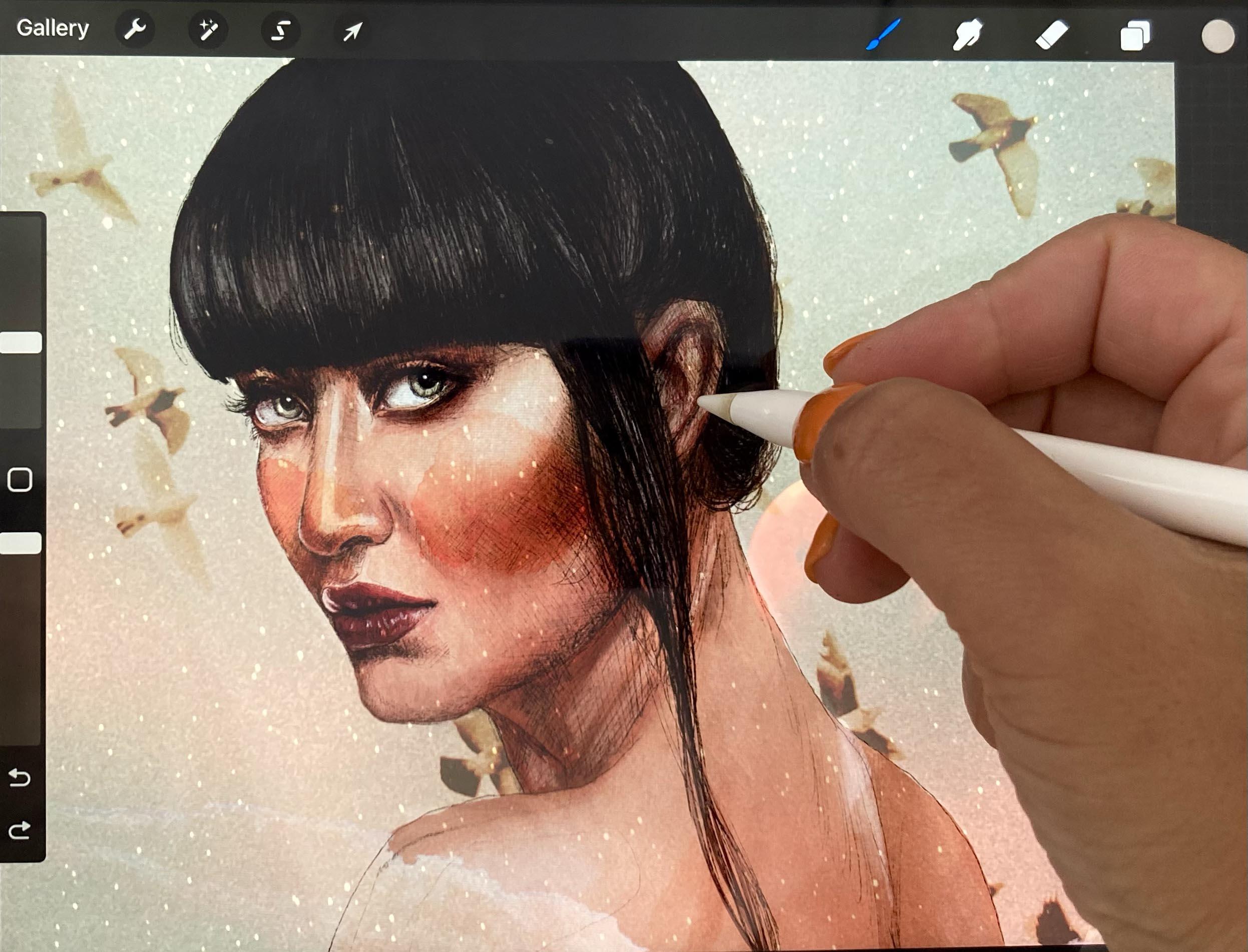
8. Drawing, Shadows & Details: Okay, To activate your
reference photo as a reference, you just go over to Actions and Canvas and toggle on
the reference part. And then you look for
your reference image in your image library. Select that. And as you can see, then you have it in a
separate little window. You can move that around
wherever you like. I'd like to have it
on the left hand side so that I can draw on
the right hand side. It depends on your left
handed or right handed. You can always zoom in and zoom out of your
reference photo as well. Once you've got that in
place, you can start to draw. I'm just going to start by filling in some of the
dark areas of the hair. For that, I'll just
zoom into my drawing, making sure I'm working
on the right layer. And I just start to draw
still using my six pencil. I always like to zoom right
in when I'm doing details, I'm working really
close up in some areas, I just want a little
bit of a shadow, so I just have to be
really careful not to press too hard size to
not make it too dark. It's not really a big issue because you can always
correct it later. But if you're already seeing a trend to going a
little bit too dark, you can just regulate that
by applying less pressure. When I'm working
in these details, as I said, I like
to zoom right in. But every now and then, it's
just good to zoom out again just to see how your drawing is going and how your
pressure is going. If you've got enough contrast or too much contrast, just
keep that in mind. When you're working on details, zoom out every now and again, a good way to start working on your drawing is to go from the
general to the particular. I'm going into the details of the eyes here because
I feel like that's the most important
part of the face and I want to have them
expressive from the get go. But really what we want
to be doing is working on all areas of the face
more or less evenly. So that we have an overview of what we still
have to emphasize. I will mark in some of
these more intense shadows. Now though, I always like
to follow the directions of the face with the brush stroke or pencil strokes that I'm
making when I'm drawing. Because in the end,
it'll just give a more organic feel
to the whole drawing. As I said, I'm just working on the entire face
little by little. I choose one area and then
I move on to the next. When I have that
basically covered so that once I finish the
first layer of drawing, it'll be an even layer of drawing and then
I can go from there. As you can see, I'm just trying to figure out here where
the highlights and the shadows are moving
on to the cheekbones. Now, I'm just trying to build up this drawing
little by little. The outline that I
made for myself in the initial outlining of the
drawing was annoying me now, so I just went ahead
and I erased that. I'm going to start on the
jaw line a little bit, now. I'm going to make my pencil
a little bit larger. Now I'm going to increase the pencil pixel size
to around about ten. I'm just going to
give a little more emphasis to this hair there. That's really the darkest part. See how I'm following the
lines of the hair as well, the direction of the hair. This also helps to distinguish
different layers of hair, maybe even up the pixel
size to about 20. As you can see, the hair doesn't go in the same
direction all over. And if you differentiate between the different
directions, that already adds a lot of
movement to your drawing. Again, filling in some
of these shadows of the hair so that we can start to see some
highlights as well. Now, don't forget that you
can add the highlights in later so you don't have to focus on that too
much right now. If you need to adjust your
pencil size, go ahead. You can just work with
what feels good and what you feel like flows
on your canvas. I'm just going to move on
to the neck and back area. Now, I'm not going to go
too detailed into that. I just want to
insinuate that there's some shadows and
highlights there. I really want the focus
to be mainly on the face. And don't forget, we'll
be introducing color and we'll also be introducing our
analog elements later on. Now I'm going more into the details and
heightening the contrast, but I'm still working on
the same layer of drawing. If you notice details that
you don't like so much, you can always just
go and correct them. And that's really the
great thing about digital artwork I
find is that it's so easy just to go and correct details at any
stage of your work. And I'm going to
soften up that shadow. Again, I feel like that's
a little bit too intense here and I'm just
using the eraser for that and just continue adding shadows and
building up on our drawing, Just heightening the contrast. Adding details, going back to the cheek bone and the
jaw line and the neck area. Don't forget about the ear focusing again on the
hair a little bit. Just need to build
up that darkness that contrast little by little. That still has a lot more to go. I'm just going over the
drawing again and again, seeing where there's areas
that need more attention. Also go over the lips again, they're quite a lot in shadow. Let's have a look again
over this part of the hair. Just some details
in the hair there. Just trying to really make
the highlights stand out. And for that, the shadows
need to be very dark. Okay, so at this
point I am going to leave my drawing here. I'm
really happy with that. Don't forget, you can always change things about
your drawing or add things to your
drawing or add highlights in the next stages. Once we introduce the color
and also the analog elements, it's going to change
completely again, so it doesn't have to be
perfect at this point. So I suggest we move on to
the next lesson when you're ready to go and start to add
some color to the drawing.
9. Adding Colour & Highlights: In this lesson, let's see how we add color to our artwork. The drawing layer is always
going to sit on the top, and I am going to select a background color in
a different layer. Let's try a couple of
different things then. I am going to start
with the skin. I'm going to create a new layer
and rename that two skin. There are a couple of ways you can start to add the
color to the work. So let's start by using
the selection tool. So I'm going to
select the area of the face and shoulders
by going up to the squiggly line up here and outlining the face with a
free hand selection tool. Now don't worry if you
go over the lines of the face into the hair
or the clothes because we'll be adding them in another layer which will sit
on top of the skin layer. Also don't worry too much, If you go over the lines
into the background, we can tidy that up too. This was originally
my color palette, but I feel like it's
going to be too dark. So I'm going to select a base color in the
more orange direction, but lighter than what
I had previously selected as my base mid tone. Let's try that by just selecting the color and dropping
it into my selection. Okay, let's just
keep that for now. We can always change it later if we don't like it right now. We're just putting
down one midtone, moving onto the hair again, new layer naming it. And then I will use the darker mid tone from
my original color palette. Let's try adding the
color this time by using a paint brush and
just filling in the hair. By painting it, I'm going
to use a round brush, making sure I'm working
on the correct layer, and also making sure I no longer have the face
and shoulders selected. Now, don't worry if you go
over the highlights that you previously outlined
in your drawing, because we'll go back
to those right now. We want to make
flat color surfaces of the entire hair area. Feel free to adjust your brush
to the size that you need. You may need to change
while painting, depending on the type of
hair you're painting around. The fringe area, I want it
to look a little less tidy. I'm going to go over
the area with my brush. I'm also going to add some hairs here in the strand of hair
that's coming down the face. I remember that when
we're working on details, it's always good just to zoom back out to have a
lookouts going overall. Then I'm going to move on to the clothes opening a new layer. I quite like the tones I have in my prepared color palette. I'm going to use
this mid tone to begin with for the clothes. I am going to use the
selection tool again. Then get my selected color from the top right corner and
drag it into my selection. Next, I'm going to start
with the high lights. I think I'm going to use
the watercolor brush. I don't think I will use the color palette I
had prepared earlier. Rather, I'm going to use
the color disc and select a lighter shade of the colors I have used in my base tones. Now I'm going to
take a sample of the base tone of the skin by keeping my
finger on the screen. Do select the color and then I look for a lighter shade
on the color disc. Making sure, again, I'm
working on the right layer. I'm just going to make my
brush a little bit larger. And then I'm going to start adding these highlights
here on the shoulder, smoothing out the high light on the shoulder a little bit. With the smudge tool, I'm trying to get the
transition between shoulder and arm and
back quite smooth. Then I'm going to move on to the highlights around
the spine area. Go onto the ear, move on from there
to the cheekbones. I'm really just trying
to find highlights all over my work and then
work in an even manner, so it kind of grows
organically as a whole. And then I'm going
to work a little bit around the mouth area.
Around the chin. I'm going to smooth this part of the jaw out a little bit
by adding some highlights. Okay, I'm going to start working on the
nose a little bit. For that, I'm going to make
my brush a little smaller and then get started on
these highlights here. Okay, I'm going to smooth out this high light on the cheek
bone a little bit, and then A little more
emphasis on the nose and this highlight here, near the eye and around
the mouth and chin area. Then let's also put a little bit of a highlight over this side, even though it's quite
a lot in shadow. Then let's start to put some
highlights on the hair. For that, remember
we want a new layer, Let's name that right away. I'm going to select
the highlight I have in my prepared
color palette. But I'm actually going
to go even a little bit lighter by selecting a lighter
shade on the color disc. Now I'm just going to start applying these
highlights to the hair, in the direction of the
hair and the highlights. Okay, I'm going to
switch brushes now to the six pencil to work on the hair at the back
of the neck so that it looks a little bit
looser and more organic. And for that I'm going to select the base hair color again. Right. I want to make the eyes a
little bit more realistic. So I'm going to select both of them with the selection tool. After one selected, make
sure you select add in the tool options down the bottom and then
select the second lie. I then go back to my skin
layer and go to adjustments. And I want to desaturate the selected area,
which are the eyes. You have the option
down the bottom here by sliding the saturation bar over. And I have mine at about 25% and that looks
pretty good to me. I'm going to start on the
second layer of highlights. Now I sample the last
color I have used for the highlights on my work by keeping my finger on
the screen again. Then on the color disc, I'm going to select the shade that's a little
bit lighter still. I'm opening a new layer, and I'm placing that on top of the first highlights layer because we want
it to sit on top, otherwise you can't see it. And then I'm renaming
it to Highlights two. I'm swapping back to
my watercolor brush, making sure I'm on
the right layer, and making my brush a
little bit smaller. Then I'm just going to
go over some parts of the first highlights to emphasize the lightest
parts of the work. That way I'm just working
my way around the face. I'm also trying not
to go over the top. Sometimes I will go and smooth out some highlights already
with my smudge tool. Other times I will adjust my brush, you
just see how you go. Then It's also good to remember
to zoom out every now and then to see that I'm working
organically and as a whole, on the whole work, so I'm just smoothing out
these cheekbones here. Next, I'm going to do
the same for the hair, making a new layer
for highlights two, then selecting the color I used in the first
highlights layer. And then I'm using the
color disc to select a shade that's slightly lighter
than my first highlight. I'm going to switch back to my six B pencil and I'm going to go over these
highlights in the hair. Great. Now that we have
the highlights sorted, let's go to the next
lesson to start putting in the shadows
and work on some details.
10. Continuing with Colour, Shadows & Details: Okay, this is where we left
it in the last lesson. Now let's start putting in some shadows and then
work on some details. Now let's start by creating a new layer over the skin layer. But under the highlights layers, I have already selected
my base skin tone. And I'm now going to use the color disc to
select a darker shade. I have chosen a shade
that's quite a lot darker, but we can also alter
that afterwards. I'm going to use my
watercolor brush, and I'm starting with the
jaw line and neck area to put in the first shadows, Let's move on to the right area where the eye is in shadow, and then let's go
to the left side. Just continuing now, you may notice that you can see very little
of your shadows. And therefore you
may need to go and erase some parts of your
highlights, layers. Don't worry if you color
outside the lines, you can always tidy
that up afterwards. Moving onto the shoulders and back area now and looking
for shadows there. You may notice that
the drawing already makes for a lot of the
shaded areas in your work. But we can intensify this with the colors
that we're adding. Now you can keep painting
and then smudging if you feel like it's too intense and you want to have it
a little bit smoother, you don't have to go too
intense on this layer. We'll add another layer
of shadow later on. Okay, let's put some color
on those lips for that. Once again, I open new layer
and name it right away. I am choosing my base
color from the color disk. And then I'm going to fill in the lips with a round brush. Don't worry about the
highlights just now. We will add them in later in
the same layer as the lips. I'm also going to go to the eyes and give the whites of the eyes a little
bit of a base. Now going back to my
watercolor brush, choosing a grayish
color from the disc, then I'm just going to put a little bit of that in the eye. Also going to go into
the iris a little bit with the color I prepared
on my color palette. I also have to go into
the ear with some shadow, which I forgot earlier. For that, I'm going back to
my shadow layer and then starting to apply some strokes and just put in
some details here, switching between brushes and
brush sizes when necessary. Next, I'm going to put some
highlights on the lips. And again, I'm creating
a layer for this. I select a high light
color from the color disc. And then I'm going to work with my six pencil to put
some highlights. I am looking at my reference image here on the left to search
for the highlights. I like to work with the
six pencil for details. I really like the texture and the accuracy on the same
layer as the lips highlights. I'm going to put some
highlights in the eyes. I'm sampling the base
color I put in the eye earlier and then selecting a lighter shade in
the color disc. Again, adjusting
my reference image and zooming right into the eye. And then just switching between the water color brush
and the six pencil. Depending on the area
of the eye right side, I find the watercolor brush better because I have a
large area to work on, but on the left
side, it's smaller. The six pencil is handier. Now, for the highlight
in the iris, I'm going to use the color I selected from my color palette. Okay, now I am going to add
another layer of shadow. For that, I'm going
to try to get a slightly more
red time in there. I select my color from the
disc, make a new layer. This one sits on top of
the other shadow layer. I'm going to go back to the watercolor brush
to try that out. I am starting on
the shadow area in the eye and then working
my way across the face. I don't want to go too
over the top so that I can still see the first
layer of shadow underneath. I don't want to cover
that up completely. Remember that if you
color outside the lines, you can always
correct that later. I'm going to smooth out on the highlights layer
just a little bit now. And maybe even erase a
little because it's too dense and I can hardly see any of the shadow
coming through. Now I'm going to go back to
my first shadow layer and I'm going to add a little
bit here in the cheek area. Back to my highlights
layer to smooth at the area of the chin
with the smudge tool. Now looking at the work, I feel like some of the
lines of the drawing are too intense and I want to
tone them down a little bit. I'm going to use the eraser and just erase a little
bit on the drawing layer. Then I'm going to add a little bit more shading to this
part of the drawing. Remember that you can always
go back to your drawing and adjust it again, always making sure you're
working in the correct layer. At the moment, I am just correcting my drawing
on the drawing layer, adding an erasing until
I think it's good. Just a little shading
here in the crease of the arm under the hair, in the area of the eyes. And some details
around the nose, working on the corner
of the mouth here. Now, going back to
the shadow layer and just intensifying
some shadows again. Now I'm going to add a new layer for the highlights
of the clothes. And as I said, I don't want to go too much into detail here. Again, I select my base color of the clothes and then look for a slightly lighter one
using the color disc. And then using the
water color brush. I'm going to start
applying some highlights here trying to keep
it fairly loose. Okay, great. So this is
where I'm going to leave it for now in terms of
drawing and adding color. Next, let's introduce
some analog elements and also maybe some background images that we
collected earlier. It's going to change
the entire image again once you're
happy with your image. At this point, let's go
on to the next lesson, where we will be experimenting a little with the new elements.
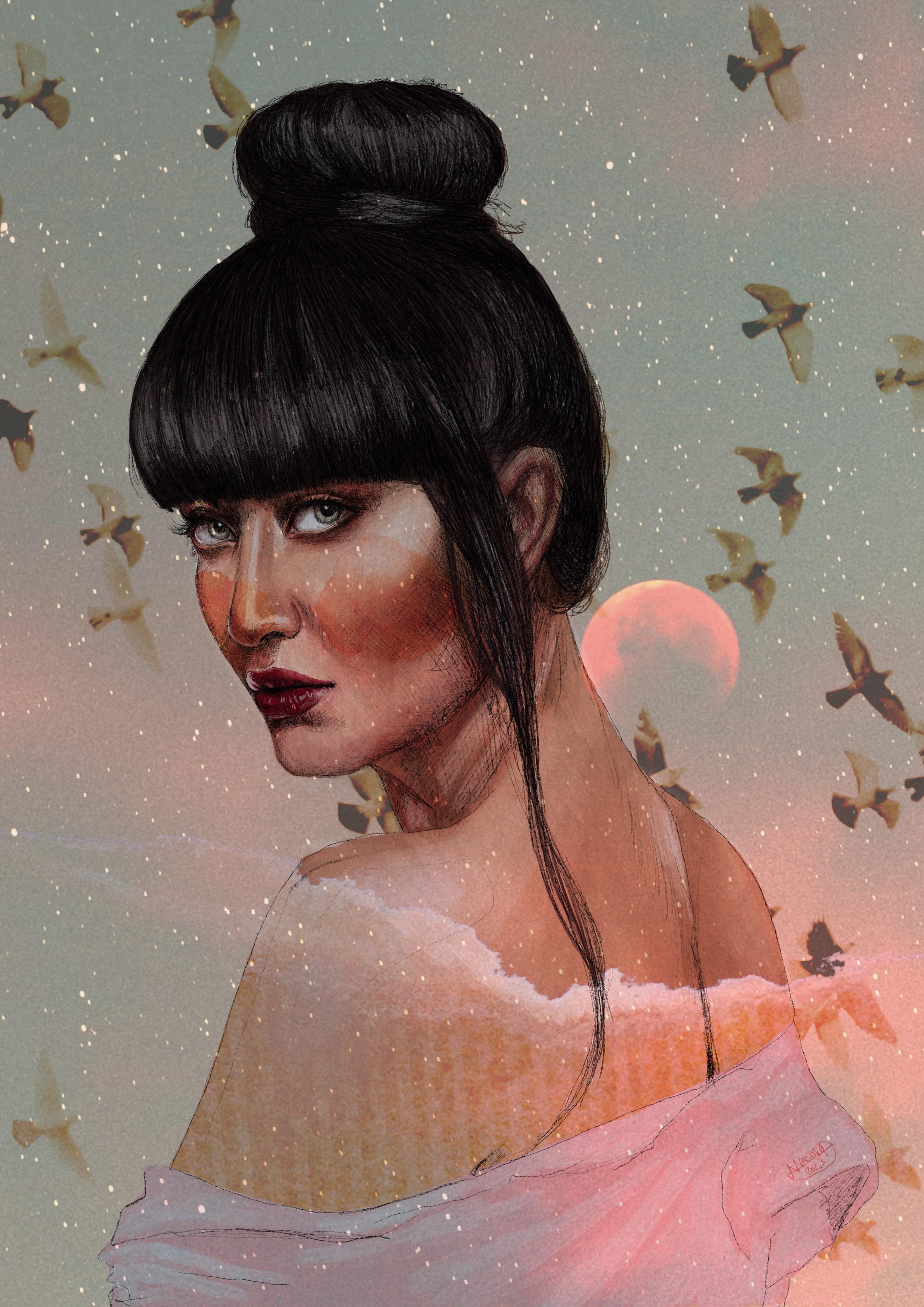
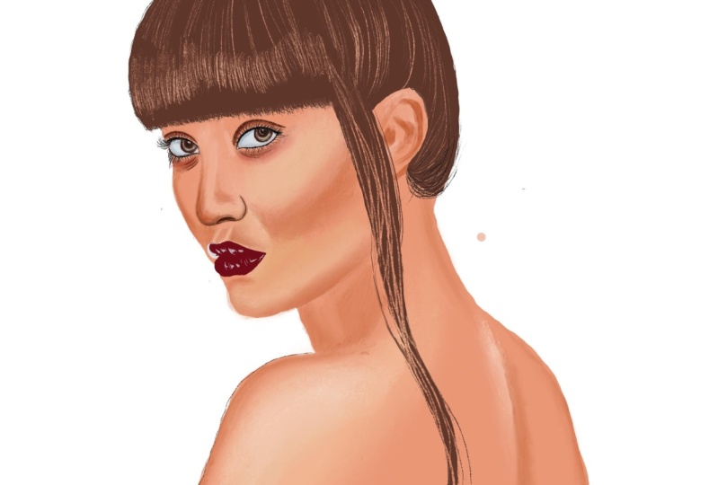
11. Introducing Analog Elements, Images & Textures: In this lesson, I'm going to start introducing some
of these elements. For that again, let's
open a new layer. And then go to Actions Add, Insert a photo, and then select one of the color stains
that we digitized earlier. I've chosen this one
now I'm going to adjust it so I can turn it
around and make it smaller or larger so that
it goes with my image. And next we're
going to experiment a little bit with
the blend modes. So as you go to your layer, you can see that
currently you'll probably have an end there, which is the normal blend mode. And if you go, for example, on multiply, you can
see that it changes. The same goes for the
other blend modes. You can also adjust the opacity and I recommend that you have a, we play around with these and run through them one by one, and then select one
that you like best. There are so many
different possibilities, but as you can see, some of them aren't really
appropriate at all. At least for my
purpose right now. But keep these in mind because they might just be perfect
for a future project. For my purposes, I would
say multiply would work. Also the color burn
or the linear burn. And I think I'm going to go
with linear burn for now and just take down the
intensity a little bit. Then I'm going to introduce another color stain
for the other side. And the same, again making
a new layer actions. Add, insert a photo and then select one
of the color stains. Move it around and
adjust the size. I'm going to try color burn
on this side and then I am going to erase part of
the stain that I don't want. The part, for example, that's overlapping the cheek
onto the background. Then I'm also going to
take down the opacity of the eraser and erase a little
bit next to the nose here. Then I'm going to take
down the intensity here. Okay, maybe I actually
like linear burn better. Again, I'm a bit
short on layers. I'm going to change the
background color of the canvas to the
background color I had on a separate layer. Then erase that separate layer. Also, I think I can
erase my reference now, because I'm done with
the drawing part. I'm also going to put together the two color stains
for the cheeks. Now to combine two layers, you just pinch
them together with your thumb and index finger. Next, I would like to introduce an image of the
landscape or space, maybe for the body
or the background. Same steps as before. Actions add, insert a photo and then
select an image to import. I'm going to play around with
this image a little bit, run it through all the blend
modes to see what works. I'm loving the hard
light blend mode. I'm just going to take
down the opacity, make the image larger so
that the moon is behind her. You can see the awesome things
that you can do with this. I'm going to lower the
intensity a little more still, maybe to around about 65%
Now I'm going to experiment a little with where
I am going to place this layer that also
makes a difference, okay? I'm going to place
it right at the top, just under the drawing, and then play around with the intensity. Now if you feel like
the landscape is too intense over the
face and the body, you can play around with adding another layer in which you select face and body as before
with the selection tool. And then you fill it with
different colors to which the blend mode of the landscape layer will react differently. I'm going to experiment just
a little bit with that. First, I'm trying it with blue. Okay? What about white? So you can always see what
the work looks like with and without the layer
that you're working on By deselecting
the layer here. I actually prefer it without it. So I'm going to delete
this layer now. Next, I'm going to
introduce one of the digitized paper strips
to see what that looks like. And I could imagine that
it would be quite cool. Okay, so once I've imported it, I'm just going to
adjust the size and the placement
and I'm really, really loving that part
where you can see that it's ripped at the
top. It's really cool. And then I'm just
going to place it, make it a little larger,
place it down here. And then play around with
the blend modes again. And I feel like a lot of
these are going to work. Let's see which one's the best. And that would be overlay. What about if I adjust
the capacity a bit? Let's see if I can
find a better one. You know what I think, actually, most of these are pretty cool. But I think my favorite so far is lighten, so I'm
going to go with that. I've got the opacity
down to about 47% 50% And I really like the placement of the
layers at this stage. Drawing then the background
and then the paper strip. And I'm going to adjust the opacity of the
background image as well. Okay, so far I am
actually really loving this at the moment.
I think that's really cool. But let's have a
look, If we can maybe insert an image of some
birds or something as well. I really like these birds. Let's have a play
around with that. I'm trying different
placements for the layer and then
I'm going to also, again, with the blend modes. The layer with the
birds is just under the skin and I'm running
through the blend modes. Let's try and multiply
and taking down the opacity, I'm not sure. Let's play around the game with a little more blend
modes and opacity. Maybe we can place it
somewhere else as well. The possibilities
are really endless. I'm just going to see what
works best for me here. Again, this all depends on where your layer
is placed and what the blend modes are of
the layer itself and on the layer on
top of this layer that you're working
on at the moment, obviously where you place
your layer, for example. Now the birds layer determines
whether the birds will be visible on top of all the facial features or
only in the background. I've got it on top of all the
facial features right now. So you can see it on
the face and the body. And then if I move it
to underneath the skin, you can only see the
birds in the background. I actually really love
that. What I would say though is that I'd love a little more
luminosity on the face. I'm going to create a new
layer and with a paint brush, I am just going to fill in the face and shoulder
area with white paint. If I go over the edges,
it doesn't matter. I can just tidy that
up with my eraser. And then I will also start working with some blend
modes on this layer. Because I don't want it
to be that luminous. I just want it to be a
little more luminous so that the face doesn't look like it's
so much in shadow. So I'm going to stick
with overlay and I feel like 100%
capacity is perfect. I am loving that
that is finished. Now, the last thing I want
to do is just sign it. So I'm going to change to an ink bleed paint brush
and I'm going to look for a space where you can see it but it doesn't interfere
with the painting. And then I am just going
to put my signature there. I really can't wait to see
all your awesome projects uploaded to the project
section of this class. Now, in the next lesson, let's have a look at how
to export your work and also what you need to think about if you want
to print your work.
12. Exporting Your Canvas and Final Thoughts: In this lesson, let's
have a look at how to export and share
our finished work. When you go up to Actions again, you need to select Share. And then you see the options
that procreate gives you to export your work
into different formats. If you want to print your work, I suggest you export it into a Tiff format because this won't compress your work
into a smaller file. That being said, it
will most likely be quite a large file
if you need to have it in a smaller format but
still want to print it. A PDF also works if you
want to upload it to your website or
Instagram or send it to someone via e mail or
in another digital way, I would recommend
exporting in Jpeg format. That's what I'm going
to do right now. But you can always come back to procreate and export it in different formats if you want to work with
different variations. You can also duplicate your work and try some
different things. That way you will
always still have this version that you've
been working on up till now. For that, you click
Select Your Work and then click Duplicate. You can also group your
different versions together by selecting them
and then clicking on Stack. And that groups them
into a folder or stack. What you can also
do, and this is also quite fun and
handy for social media, is export the time lapse video that procreate makes of
your drawing process. And to do that you need
to go to Actions Video, Export time lapse Video. And then you can choose
whether you want to export the whole length or
just 30 seconds of it. Now that you've created your stunning digital
artwork with analog touches, I would really love
to see your project. So head on over to the
project section of this class and upload
your project right away. You can upload a cover image, but don't forget to also upload an image
into the project. If you got really inspired
and have made multiple works, feel free to share them all. Now sharing your project is super important
because that gives us a chance to get in touch
and also share some feedback. I'm also happy to
answer any questions. You can post them
in the discussion section of this class. If you've enjoyed this class, please also go on over to the review section and
leave me a review. I read every single review and they always motivate
me to keep making these classes to share
the things that I've learned on my creative
journey with you all. And they are also really
helpful for other students. If you like this class, make sure you check out
my other classes as well. You can find them
here on my profile by clicking on my name. If you want to keep in touch, you can also follow
me on Instagram under Nadia Underscore,
Underscore Vi Leska. If these walls underscore
underscore could talk. Or night project where I share some different angles of my
creative work with the world. Of course, you can also follow
me here on skill share. That way you're always
in the loop that new classes and other things
I've got going on here. And with that, thank you so
much for joining me today. I hope you've enjoyed
this class and I can't wait to see all
your awesome projects. I hope to see you again in
one of my other classes.
 Nadia Valeska, Berlin based professional artist