Transcripts
1. Intro to Half Drop Repeats in Procreate: Hi guys and welcome. My name is Dolores
nascar engine. I'm coming to you from
sunny, Manitoba, Canada. Sunny and warm. What a beautiful day
out there today. I'm bringing you this class
well ahead of Mother's Day. Because I think this is
something you could easily use for a Mother's Day Project. What we're gonna be doing
is learning to create a half drop repeat in Procreate. And that's something that I
really haven't seen anywhere. It definitely took me a little
bit of time to figure out all the ins and outs of making
this work in Procreate. There's definitely
some challenges. And one of the biggest
ones is not being able to really fully preview
your pattern as you go. But I think I've
got a workaround that'll help us to
protect the pattern. I really think the final
result is more than worth it. I've kept this
pattern quite simple. I haven't got anything
overlapping on the edges. I plan to do a follow-up
class to this in a few weeks. I hope that you will attend
that class as well to make sure that you find out about it when it's going to be posted. Make sure you hit that
following button up there. I also encourage you to go to my website and Azure named
my mailing list there. You'll get a freebie right away. And that way also
you'll be informed of any of the classes that I'm
gonna start posting there. Are you ready to get into it? Alright, let's get started.
2. Setting Up Initial Document: Less than one here
we're gonna be taking a look at setting
up that document. Let's get right to it. Alright, so I felt my
document open here, and it looks completely
different than I ever do for setting
up a pattern. Usually I have a ten
by ten document, but this document is ten by 20. I'll show you how
to set that up. You go into your gallery here, hit that plus sign, photo, a new canvas size. You wanted to switch
this to inches. It's easier than working with
pixel dimensions I find. So here I'm gonna put
20 for the width, and I'm going to put
ten for the height. And that's all there is to it. Now you can see here, take note that the DPI is 300 and It's going to allow us
a maximum of 33 layers. And that's important. You'll notice that that is an issue as we work our
way through this project. I've tried to keep it
as simple as possible, but when we get to the
point where it is an issue, I will definitely explain
how to deal with it. So here's our document. Ready to go. First thing I want to do is
go into the Canvas here, turn on the Drawing Guide, and then go into edit it. And what we want to do is
bring this to its full size. That will divide it into four if it doesn't
look like this, chances are it's
because you don't have your options set here to quadrant, which
is what you want. You can make your guidelines
a little bit thicker. You might want to
make the moral panic. I have it on black right now. You can put it on whatever
color you like working with. Hit the done button
and then here you go, You're ready to get started. I'm going to go into
the document that I've already got
kinda set up here so you can kind of see what it is that
we're working with. So this was a test that
I had done and I've got it here just to help me rearrange some
of the elements. Basically, we're doing such a super simple pattern
because there's enough to take in as it is with
doing this half-drop repeat. I've also made sure that
I have nothing actually over the edges for
this In class. I will be doing a more
advanced class in the future, where we'll do a regular
pattern repeat that will have items over the edges. But I wanted to keep
this one super simple just so that we could easily get through it and learn just the basics of how a
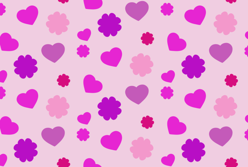
half drop repeat works. Now as far as
drawing the motifs, you can draw
whatever you'd like. I did some really
quick and easy ones. Basically, I use one heart that I created and then
filled it differently. I might have done too hard. It's this one looks a
little bit different, and then just a single quick
flower to create those, I changed my drawing
guide temporarily. So let's go back to the
document that is blank. We'll go into the next lesson to draw the rest of the motifs.
3. Simple Motifs Using Draw Assist: Hi guys, welcome to lesson two. Lesson two here
we're gonna be using Draw Assist to help us create some really
simple motifs to use in our pattern. Let's get to it. I'm going to go into the drawing guide
here and I'm going to temporarily change it to
vertical and hit done. Now what we can do is
draw those simple motifs. Let's, I'm gonna
stick with the heart. You could do, like I said,
wherever you'd like. But with this symmetry, I can just draw on 1.5 and it's going to repeat
it on the other half. I'm gonna be also showing
you how to create a flower and we're going
to use a radial symmetry for that particular one. But I've got just a
regular Posca marker here. So that is a mono line brush. You can use whatever you'd like. As far as brushes, you
don't have to make them solid if you wanted to
just save some time. I would also suggest that you go into the settings on that brush, makes sure your streamline
is set quite high. And that's going to give you
a really nice smooth line. So you want to start right? Somehow lost my color there
and I want to start right on that center line and draw
my heart and then fill it. So that's the basics
for the first motif. So we can slide that over. I'm going to
temporarily turn off my snapping and magnetics. Let's put that one out
of the way for a second. I'm going to just hide it and
then I'll make a new layer. And on that layer, I'm gonna do something
a little bit different with the symmetry. So I'm gonna go back into
edit the Drawing Guide. And instead of just vertical, I'm gonna do radial symmetry. This is going to make
it easier for us to draw a little flower. So what I'm going to hit
Done and here, same marker. I'm just going to make
sure first of all, that your layer has the
Drawing Assist turned on. You'll know it's
turned on because it has the word assisted there. And here we can make our petals. Now make sure you're actually
touching that line when you start and that's more
than acceptable. I mean, you can be really
picky here if you want and just really perfect your flour. And there you've got
your two motifs. So now let's go back
to the guide before we forget and go back to
our vertical symmetry. And then remember
what we're doing is only working on this 1.5. So I'm going to
reduce the size of my initial flower here and
reduce the size of my heart. So before I do any
of the repeating, I'm going to do my coloring and shading on each
of these two motifs. So we're on the heart right now. I've been using
this palette here, and I'm gonna
suggest you just use a soft airbrush so that's
in your regular procreate. There are brushes for
the soft air brush here, and you can set it fairly large. And I'm gonna go with one of the lighter versions
of the color. And I'm also going to put
the alpha lock on here. So I'm going to go
nice and large. And what I'm doing here is
I'm just lightly airbrushing. Let's kind of a little
flaw there on my heart. I'm not sure when that happened. Just bear with me
as I fixed that up. It doesn't have to be perfect because for me this
is just a test, but like I said, you can go through
and you don't add some highlighting the I don't know what's wrong
with that hurts. So it appears I had a ghosted
image of a heart here. So I'm going to erase again against a curve
like this can be tricky, but because this is a
brush that I'm using, I can still do that trick
of holding when I get to the end of the line to get a nice smooth curve
with my eraser. And I'm gonna make it
a little bit smaller. And I'm going to grab now
the sort of mid tone, I guess, of that
color and then kind of brushing on a little
bit of that as well. And I'm working from
light in this corner, too dark at the bottom here. So now we can go
to a much darker. And I'm basically not even
painting on the heart itself. I'm kind of on the
outside edge here to get that sort of a dark edge, not gonna go into
almost pure white. And I'm gonna do the
same thing on this side. That gives us a really nice three-dimensional
looking heart. We can do the same thing
with the flower here. Make sure you've got it
protected with an Alpha Lock. And let's start with the dark on this side
versus this time. And then we're going to kind of a medium
tone in the middle. And I'm putting almost
no pressure on my brush. I'm just letting it kind of
the weight of my stylist. The cover is enough to give
me that amount of difference. I'm gonna go to a
medium tone here. Now I'm really just
working in this area. And then let's go really light. I mean, you could go
to pure white because you're not really
putting any pressure on. But I think that just makes your motifs a little
bit more interesting. Perhaps that one's
a little bit light. So I'm going to go back
in with a little bit. Make sure you're on the right
layer when you do that. Okay, so we've got
our two motifs. Let's make some
duplicates of this. So we'll put them
both in a group. Swipe to the right, hit Group, and then let's swipe to the
left this time hit Duplicate. Now we have a few
and one-by-one, we can resize them and
slightly recolor them. So right now I'm on free form. I want to switch to uniform
and I'm gonna go to hue and saturation and then just
maybe brighten this one, slightly change the saturation. And same with this one here. Going to resize it first. What I'm trying to do is
have a variety here of different shapes and sizes to help me fill out my pattern. Here, I'm going to also
slightly change it, brighten it ever
so slightly change the hue and change
the saturation. So we've got that set. Now we can work with
this one, same deal. So we've got three different
sizes of the heart. And we can do the same
thing with the flower hats, make a small one. We're probably going to
duplicate a few of these. And what I want to do now is just put these all
in the same group. So I'm going to
slide those two in, slide those two
in, and then I can delete that group and
delete this group. All right, Now we've got
all of our motifs drawn, and it's time to start doing
some simple arrange it. In the next lesson. I'll see you there.
4. Setting Up the First Half: Guys, welcome to lesson three. Less than three here
we're gonna be setting up the first half
of our pattern. Let's get to it. All right, now we've got
all of our motifs drawn, and it's time to start doing
some simple arranging, maybe duplicating some of these elements in order
to fill out the space. So just like any
other pattern design, we're all about, arranging
this in a pleasing way. So I'm trying to think
of ways to do that. I'm going to do some
flowers or some of the heart's kind of tilted
in order to help out. Let's duplicate this one. I think that's a
good size to repeat. Oops, repeat elsewhere. So let's alternate the
way they are rotated. A little bit. Too many
hearts in a row here, I'm sure, but it'll
all come together. I'm sure in the end, I'm always trying to vary the sizes now because I
have reduced that down. I don't want to
size it up again, but it's perfectly fine
to reduce it some more. This one I'll duplicate as well. Maybe I'll try that one up here. This might be a
good opportunity or time for naming things like
that might make it easier. But for now I'm just
turning them off and on in order to figure out which
one they are to move. And I know I
definitely don't want those two big hearts together, so I'm going to move one. I think probably
the bigger pieces are more important at first to arrange because everything else can kinda work
to fill up the space. And remember, because
this is going to be a drop, half-drop repeat, this part will not be
directly across from itself on the next
half of the swatch that we're producing here, it's going to end up
being dropped down. I have, so it'll
end up being here. So I definitely don't want that one to be straight across. So I'm going to
actually put that one there and that's going to help overall in meat
arranging this pattern. And I find that the
most frustrating thing about Procreate
half-drop repeats is that really for any of the repeats in general
and procreate, is that you're not seeing a preview of the overall
pattern as you're working. That's why I generally, when I'm at this stage, I will be generally for
my actual practice, be working with Photoshop
or Illustrator. It would've helped to have had these different colors in a
way so I could label them as blue heart or red flower. Keep that in mind if
having it monochromatic like this is an issue
for that reason for you, then of course, feel free to colorize this
completely differently. You probably will anyways, I'm thinking that you're
not going to want to do it exactly the same
colors as I'm doing. The other thing that I'm
trying to avoid doing is having anything lined
up in a straight line. So I'm trying to vary
the sizes as well so that I don't feel like I've bought all these flowers in a row and they're all identical. So this one, I'm going
to pull in a little bit. Maybe working with two elements is a little bit difficult. So that's something
that you might want to do differently
than I'm doing here. You might want to
introduce a third element. And I'm purposely leaving
a lot of whitespace here because I think for myself
and this particular pattern, I think that's what's
going to look the best. I think possibly another
thing I could do here is to change the color. So I'm gonna saturate and
brighten that one so it doesn't look like I've got too much of a straight line happening here. And I want to alter
this a little bit. I'm also going to move this
large heart as close as I can to the edge and
this one here as well. So I think I'm going to
work with that for now. And I think in the next
lesson what we'll do is work on creating that repeat. Now in order for
that repeat to work, we're also going to need a square that will help
us do the positioning. I'm going to choose an
almost white color here, and I'm going to add a layer. I'm going to put that
one at the bottom actually and fill it. I'm going to turn on my magnetics and snapping and I'm going to
reduce that to be, I'm going to put on
free form and reduced that to be exactly half size. Now I know it is
because it just hit that yellow center line. That is our guide. And I think I'm going to just
lighten it up just a touch. So I've gone on going
into brightness here. But having that is going to help us with the positioning of our motifs are our R-squares
to be in the drop. Night. Realize here I just cut off the bottom of my heart somehow. So I'm going to delete
it, duplicate this one, and bring it down of my magnetics and snapping
and position it. So I am not keeping
the same angle as it was and I don't want it to be the same
angle as that one. So this one ends up being pretty much straight up and down. The other thing I can
think of here is that this heart could be space a
little bit differently here. And we're ready to start
working on the drop. I want to show you
how to do that. And so we'll do that
in the next lesson.
5. Repeating to Create Half Drop: Hi guys, welcome to lesson four. This is the lesson where
we're going to really be setting up that half drop. Let's get to it. All right, this is where the
fun truly begins. This is where we start to
see our half-drop repeat. So we need to go back
to the Canvas here. You didn't do so already. You might have
already done this, but you need to go back
to the drawing guide and set this up to
be quadrant again, that gives us that center line, which is what's really important
for our half-drop here. The other thing we
need is three copies, and this is our first copy here, so I'm going to duplicate it. This is where you see,
that's pretty easy. For the Yap. I already hit the
magical 33 number there, but that's okay. I think I'm going to
flatten this group. I don't want to flatten
that initial group because I definitely
want to have that to fall back on if I want to make changes
to the arrangement. Here, I'm going to
also duplicate it. And then these two
are what are going to become our drop repeat. So we want to put on snapping here because
that's going to help us to position those two additional
repeats of our pattern. And let's just grab the first one and we're
going to slide it over. And it's absolutely imperative that you get this
lined up Perfect. So what I do is once
I get it close, is I will enlarge so that I can see my center lines
a little bit better. And then I'm going to pull, and I'm already on
this line here, so I'm pulling
straight down and I saw a flash of that
yellow line there. So you've got to make sure that that's kind of that yellow, orange line that you see that flashes up when you have
it perfectly aligned. Now before you touch
anything here, click off so that
you can go back. You can do the quick
pinch to get it back to the size that will make it
easier for us to deal with. And let's grab the other one there and we're going to
do the same thing there. So I get it somewhat
into position. Usually this one is a
little bit easier to position in because it's
got this to line up to. The biggest issue
is usually some of the stuff in here
that is sort of conflicting a little
bit or are causing this to want to align to it. So that's why I go really big. And again, I can see my
vertical yellow line now I'm just going to
push up very slightly to get the other lines
so you can see both of these are yellow there. You can let go, make sure you get out of the selection
mode and believe it or not, we have set up our repeat here. So this is a drop. You can tell because this and this are not directly
across from each other. If they were a grid, repeat, this would be right here, but it has dropped down. I can always see pretty much
immediately what I consider errors as far as the placement
of my motifs and so on. And that's what is the
most frustrating thing about working in Procreate, is that you can't
work with that or see this as you're
creating your swatch here, your full half drop. But let's follow through
here and do a little bit of a test because that's going to help us to do some of
those corrections. So I'm gonna go into
the gallery here. I'm gonna select that artwork
and I'm going to duplicate it because I think I don't want to affect that one at all. I want to go in this
one here and we're gonna do some adjustments that are going to help us
to see the big picture. The first thing I
want to do here is flattened this
whole document. Remember I have that duplicates, so I know I still have those really important
layers in that group, and I know I have that
on the other document, so I know that here I can just select everything and group it, and then I can flatten my group. So now it's all in one. There's nothing that can
be moved at this point, but like I said, the backup document
is there to help us. What I want to do here though, to really test this fully
is to repeat this square in all four corners because
that's gonna give us a huge repeat of our pattern
the way it is right now. So I'm going to put the snapping
on yet it's already on, was still on and I'm
going to bring it into the one corner and I it
just saw my yellow lines, so I know that that's all good. And I can go through
now and repeat. So I've got two
beside each other and now I can merge those two, duplicate it, and
then bring that to the bottom half so that I've got a really good view
of my pattern. Now, I think we
need this sort of a bird's-eye view in order to fully understand how
our pattern has laid out, I'm going to turn off
the drawing guides temporarily and let's just
take a really good look. The bottom line is it worked. It's there. It is a drop repeat. So we've got the half-drop. You can see here because
this part here drops down by half every time
you see the full repeat. If I was an art director here and I had this turned into me, I would be saying, well, these are some of the
things you have to change. There's a gutter of whitespace kind of
going in through here. Not sure if I really want this to be striping in
the way that it is. So there's things like that that you could go in and change. That's what this
document helps us do. So I'm going to save this out, hit Share, save it as a JPEG. I'm going to go into my
Class Assets folder here, and I'm going to save it. I'm going to call this test just so that it's
easy for me to find. I'm not sure how you
do your organization, but you need to have a name on it that you're
gonna recognize and you just need to
put it in a place that you're gonna be able
to find in a minute. So we've got that document
that we could use now to refer to when we go in
to do our corrections. Let's open up that other
document and get ready. We're gonna go back
into the gallery. That's our original document. We know we can toss
away these two because we know that we're
gonna make adjustments here. And what I want to
do is the test here, save it as an image. Now it's gone into my
photo library so that when I'm in Procreate
and we want to bring in that example so that we can further
look at this and decide what we want to do to fix up the problems
that I noted. So I'm gonna go here
to the canvas again. I'm going to hit reference right now is just showing
this cannabis. And what we want to
do is get that image. And I want to import it. It comes up here on the list. So there's our whole pattern. It's going to make an excellent
reference for us as we start to make the adjustments
that we want to do. So like I said, I want to kind of fix up
that gutter of whitespace. And that's because I love too much space on
both sides here. And I also want to figure out
maybe a better arrangement for this big heart so that
it doesn't appear to Stripe. I mean, it's not
the worst thing. But I know I have a vision for what I want
this pattern to look like. You're gonna feel the
same way and you're going to want to go
in and make changes. So I think we can do all of our alterations in
the next lesson. I'll see you there.
6. Testing and Exporting the Swatch: Hi guys, welcome to lesson five, less than five here, and we're gonna be
perfecting our pattern. I'm gonna show you some
ways to make it as easy as possible. Let's get to it. Alright, so let's
address some of those issues that we
found in the first place. You may find that this
is a little bit too big. You can make it
smaller by grabbing the lower corner there. And I am going to make this a little bit bigger as I start
dealing with the issues. So first things first, I want to deal with this
positioning of this heart here. So I'm running out
of screen space. I should've labeled these. I'm going to call it
large part lower. And I probably won't ever need that again, but now I have it. Let's also turn off
snapping and magnetics. So I was mistaken when I thought that I shouldn't
position at right here. I think now I'm changing
my mind and I am going to position it there after all. And then we're gonna
work with some of these other shapes and
motifs and move them around. These two together weren't
super big of an issue, but I might as well.
7. Adjustments to Perfect the Pattern: Guys, welcome to lesson six. Less than six here
we're gonna be making the final adjustment. I'm also going to explain how to export as a full pattern swatch. Let's get to it. Okay, so most sites that
you're gonna find need to have a square swatch that's also useful for you
in other programs. And when you're making your
mock-ups, for example, what I wanted to do here
is change this to be a full square that we'll
do in the Canvas section. So we're gonna go
to Crop and Resize. And here what we want to
do is change the size. So you can do it a couple
of different ways. So you can just use it is
to pull it down to your, what you need is a 6 thousand
by 6 thousand square here. So I am slowly
approaching 6 thousand. And the hardest
part about this is getting it to the
exact measurement. I just did it. It doesn't always happen. Sometimes it's just too hard, but there it did work. The other way you
could do it is to go in and in other settings here. And you can change the size physically put in the
measurements here. So that's an
alternative if you are having a hard time
getting that to be perfectly 20 inches, a lot of times what I do
is I'll hold my finger on my stylus as I'm approaching
the number that I want. And it helps me to move a
little bit slower to get it to the actual size
that I'm looking for. So here now I'm going
to duplicate this and I'm going to bring it down. And now we can see
our full pattern. One of the things you want
to do is make sure that you see that yellow line again. So you might want to enlarge, but make sure you're
doing it on the part that's actually already placed there and then watch
to be sure that you get your yellow lines. Sometimes I lift after I've done the first one and then
the next one is a little bit easier to
get in position because I'm not moving from
side to side as well. There I had perfectly I can see the lines perfectly in
both direction in yellow. What I'll do now is I'll
export it as a swatch. So I'm gonna go into, into my Actions menu here, hit Share and save
it out as a JPEG. And that's what I'm gonna
be using in Photoshop. I'm gonna save it to the
same file that I have. This one I'll call final swatch. And now I'm ready to go into Photoshop to make my mock-ups. Before I import the swatch
that we've been working on, I thought I'd show you a
quick why I prefer to work in Photoshop when I'm doing
a raster based pattern, the main reason is this. When you move
something around here, you can see as it
works its way around, you can see it on all of the repeats of your pattern
when you bring in the swatch, it doesn't have all of this
showing on the outside. I'm gonna show you
how to do that, but this is what I love
about it is that you can do alterations and see how
they look in real time. So instead of saving out
those little copies of our document and then opening
them up in reference. And then trying to guess at
how that's going to look. I can actually just see it
as it's happening here. But if you don't have Photoshop, of course you can't do that. Of course, if you're doing
a vector-based pattern, it's very easy to
do in Illustrator. So back to working
with Procreate. Let's open up that swatch. So I'm gonna go to
where I've saved it. And that's on my iCloud Drive in my class assets to the half-drop folder
and then to the swatch. Now this is one of the
test patterns that I did. This one and this one are
the ones that we were working on now this one is
the one that I did on camera. Then I went and did a few little
alterations and this is now my finished pattern.
It doesn't matter. I can open either one.
I'm going to open it up. You can see here that we
can't do we can't move any of these around
because they're on flattened onto the
background layer. If I had imported a
Photoshop version or PSD file of my swatch them
when it was still in layers, I could be making
the changes there. So I'll demonstrate
that in a little bit. But really all we have
to do now that we have this swatch here is go into our preview and add
it because we know it is a perfectly seamless
swatch that we created. I'm gonna hit okay here, gets added down here. And now I can go into
one of my mockups. And this is one of my favorites. Actually, this is one I got from a class I did with
cat koko flat. She had these as free downloads, so that class was really
worth it to take. Anyways, we go into the smart object that
has the pattern, and then I'm going to go into
the adjustment layers here. I'm going to add pattern. I can choose the
one that I want, latest one that I created. And here I can set the scale so I'm going
to reduce it down, let's say 33% I'm gonna hit. Okay, this is fun
because you can definitely experiment
with the scale of the pattern once you hit Save and it goes through
the process of saving, and we go back to our document, you're gonna see
that pop in there. And there we have it
finished patterns. So that's a good way to test. Now you can take a look at, see what kind of things
would you change. Definitely, I would probably swap out this heart for this. So that instead of
having two hearts in a row here and two
flowers in a row, I would have that switched up. But it is frustrating working
on it in procreate for that reason that you're not
seeing that as you go along. Here, I've imported
that half-drop repeat that we created in Procreate. And I just want to show you why. It's just so much
more pleasant and easier to do in Photoshop here. So Photoshop now has what
they call a pattern preview. If we find that right here
under View pattern preview, and you'll see that as soon
as I say okay to this, I see my entire
pattern in the repeat. So the cool thing about
that is that I can now grab and move any of the motifs. And I see how that relates
to the whole design. So I mean, I know that there
are financial restraints, reasons why people don't buy and use something like Photoshop. But if you are thinking of going into this kind of
work professionally, I would strongly suggest
that you check this out. If you don't want
to spend the money on a Creative Cloud
subscription, then I would suggest that you check out Affinity Designer. Now with Affinity Designer, it's not quite as
simple as going in here and opening up the
pattern preview it. It is really nice
because you can still get this effect by using
something called symbols. That's something
that I'll teach you in an upcoming class. But I just wanted to just really quickly at the end
here, show you why. I tend to go and work in Photoshop when I'm at this stage of the design process, sorry. Yeah, I guess that's
it for this lesson and I will meet you
in the wrap-up. See you there.
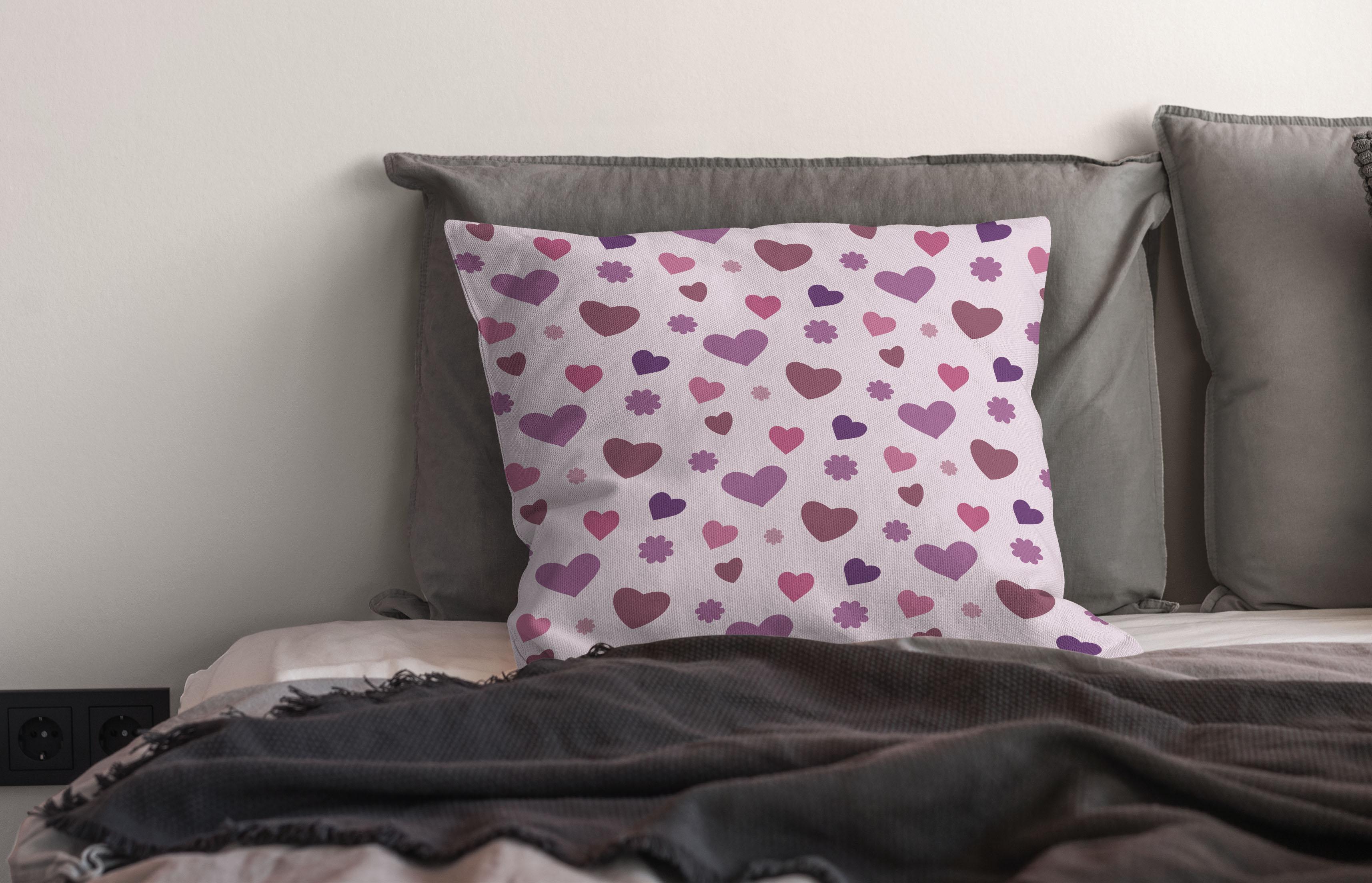
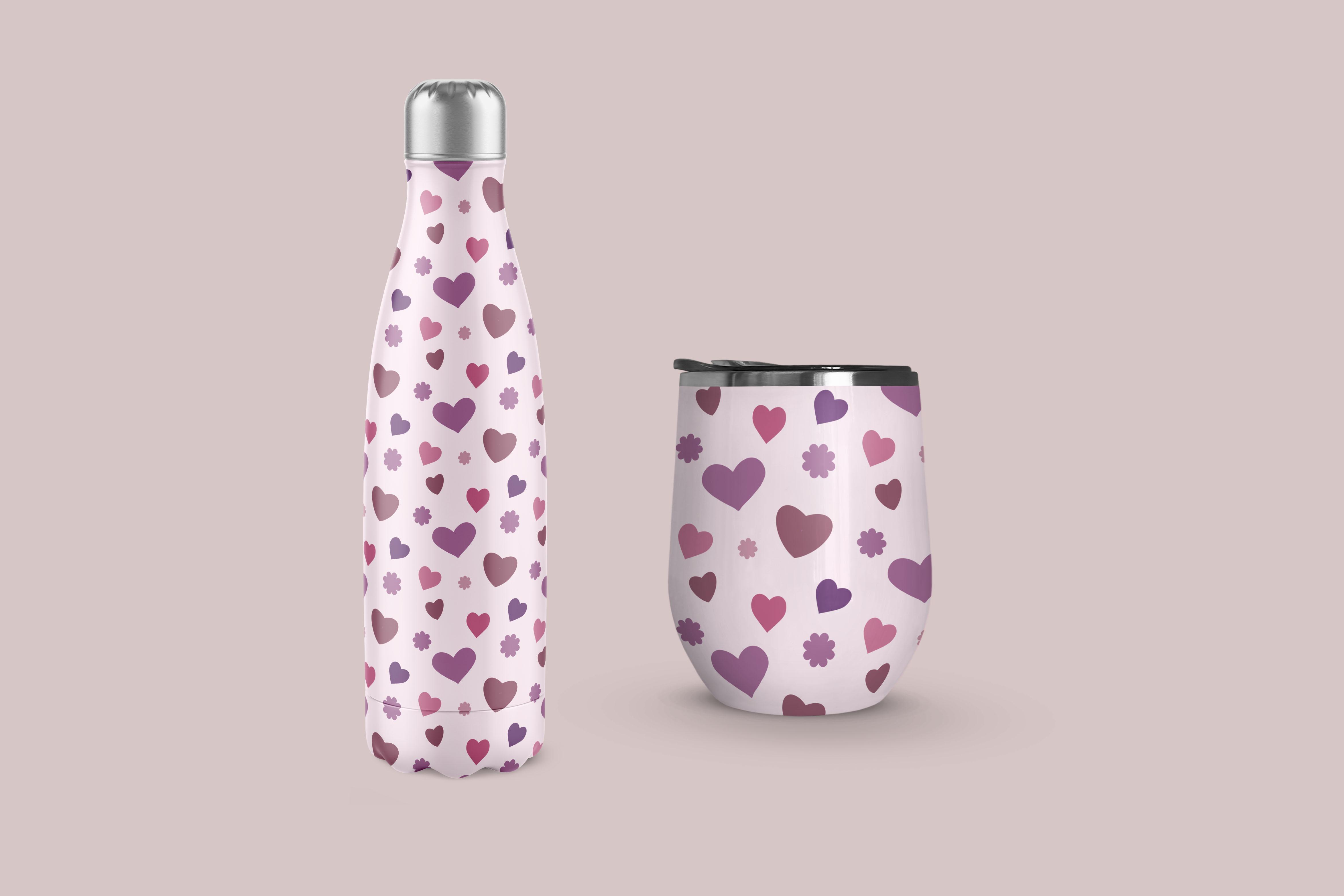
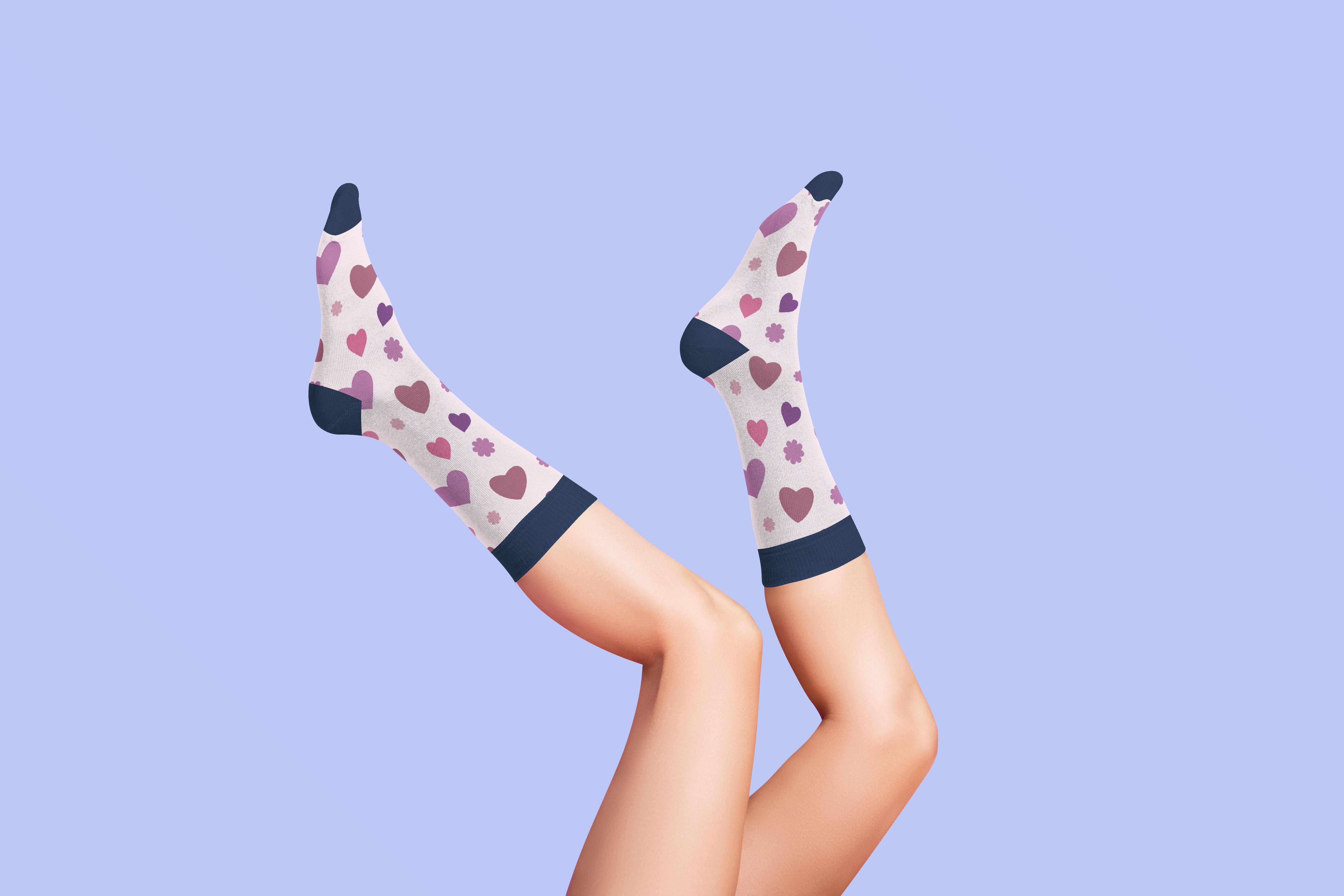
8. Wrap Up with Mock Ups: Guys, welcome to the Ralph up. It's always so
satisfying to have a finished pattern at the
end of an hour or two. This could be the beginning of a pattern collection
or it could be used as a stand-alone to upload to sites like Spoonflower
or society six, personally, I always like
testing on a mock-up or tube. And when I'm doing that,
I always try to show it on products that are
really contrasting. For example, I'll do it on something like
vetting or wallpaper. And then I'm gonna do it on an actual product like
perhaps a key chain. Even test them out on things
like pillows and Walmart. I really find that having
a bit of variety with these mockups is what
makes you really judge whether or not
the pattern works. Now remember I mentioned
that I'm gonna be doing a follow-up class to this. Follow-up will be with a much more complex
pattern where we'll be going over some of
the edges and so on. I want to show you how
to work with that. It is a lot more time-consuming, so it'll be a longer class and that's going to
be coming up soon. Make sure you hit the Follow
button up there to be informed when that
class is released. And of course, if
you have a minute, leave me a review. And if you could even leave a little bit
of an anecdote about what you liked about the class that certainly helps
other people to choose. I know I read the reviews
before I watch in class. I'd also like to encourage you to head on over to my website at the Lawrence aren't dot ca to put your name on the
mailing list there. I'm going to be doing some very different things there
and I definitely want you to get the information
as soon as I release it. You can also check out my shops. I have one at Sawzall.com and
I'm on society six center, my own name and also under the umbrella of out of the blue. I also sell on a lot of POD
sites like megadiverse, studio L, ICAD, this
and more checkout. My work there. I'd love to see you in all
of my classes, checkout. I've got tons of
them on my profile is the best spot
to check for them. I think I have over
a 100 here now. I'd love to have you
attend all of them. I think that's it for now. So I'm gonna say bye-bye, and I will see you next time.
 Delores Naskrent, Creative Explorer