Transcripts
1. About the Class: Seeing your illustration
come to life as an actual product is a
mind blowing experience. The joy that you feel while
holding a product with your original design
on it is just magical. Hi, I'm a Kumereson. I am a lot of things. An artist, an
illustrator, an educator, a surface pattern designer, a cat mom, but most importantly, a creative human being. Today's class is about creating a gorgeous botanical
illustration using procreate and turning it
into a sellable product. I love illustrating
with procreate. For most of my projects, I have used those designs on various products
such as stickers, calendars, notebooks, sketchbooks, throws
rugs, and so on. In this class, not only will you learn how I use
procreate to illustrate, but also how to monetize
your art and make a living. Learning to work with procreate
had to be hands down. One of the best
decisions of my life, because now I can create illustrations on the go
anywhere and anytime I like. It also means that
you have ready to go digital files to upload
on social media, on print, on demand websites, or even share them with
a client in a jiffy. Literally, anyone
can click upload and share their digital art
and there's power to that. In this class, I'm going to be walking you
through everything, starting with setting
up your canvas, catching the idea,
creating color palettes, using default procreate
brushes to color the artwork. Getting your file
ready for print, and creating product mockups. This class is not about
procreate basics, So it would be better if you had a prior understanding about the software before
you took this class. With that said,
let's get started.
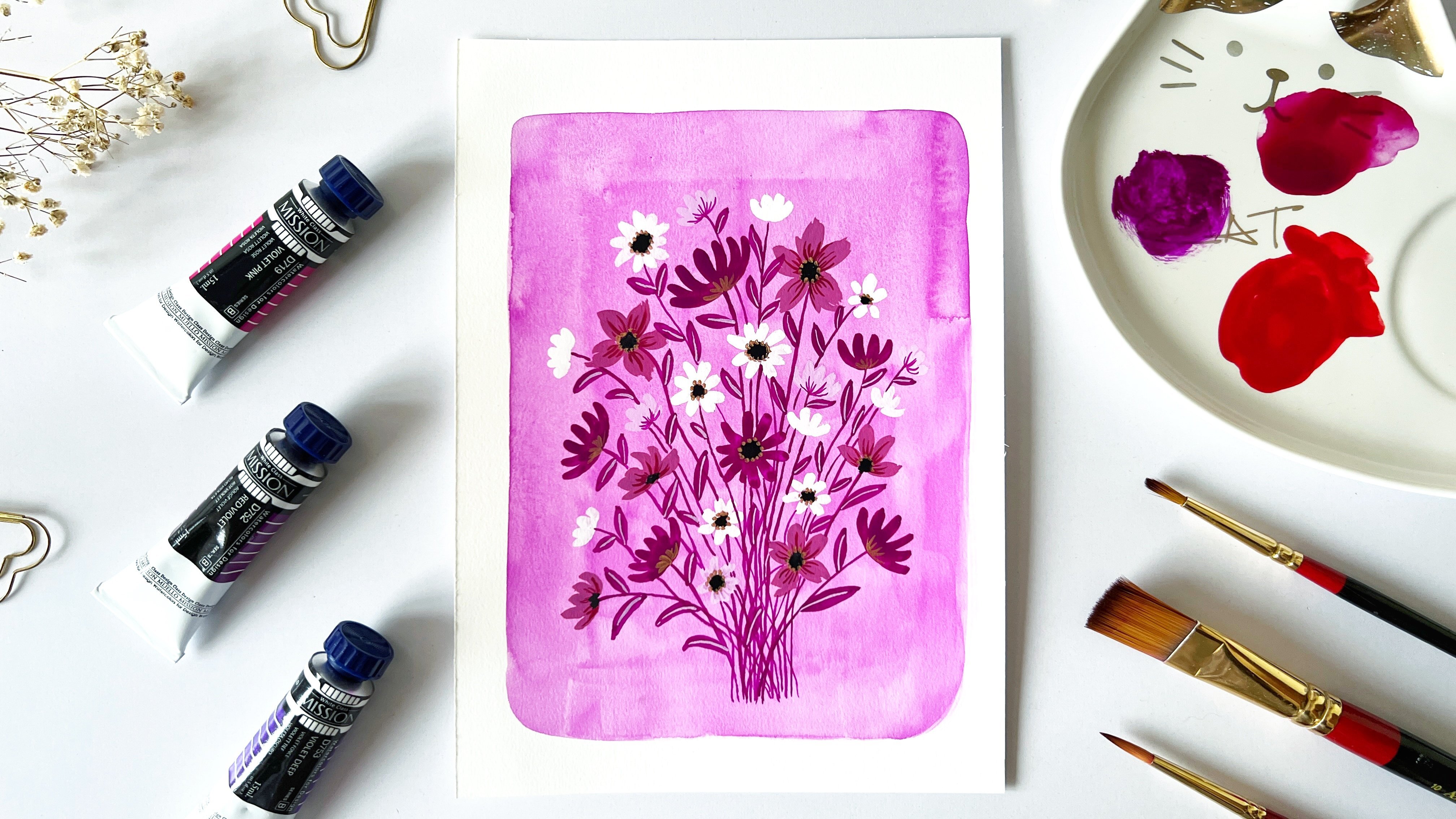
2. Class Project: For the class project, you will be illustrating a gorgeous botanical
illustration along with a favorite
code on ipad. Using Procreate,
all the resources that you will need
for this class has been added to the Projects and Resources
section on Skillshare. To access the resources, all you have to do is click on your Skillshare class and then click on Projects and Resources. And once you are inside
Projects and Resources, just click on the file
that you want to download. Make sure you have downloaded all the resources before
you take this class. I'll see you in the next lesson.
3. Supplies: Now let's talk about the supplies that you
would need for this class. The supply list is very simple. For this class, all
you need is an ipad. I'll be using an ipad
Pro Second generation. For this class along
with your ipad, you will also need
an Apple pencil. The Apple pencil that I am
using is of first generation. Next, you will need your
procreate app on your ipad. Just to check the version
of your procreate, click the procreate app. And once you are inside the app, all you have to do
is click the logo. You can easily find
out the version. The version that I'm
currently using is version 5.3 0.6 That's all you
will need for this class. I will see you in
the next lesson.
4. Canvas Setup: Next we are going to set our canvas up for
the illustration. Inside the procreate app, you can see this plus symbol. Once you click it,
you see there is a set of predefined canvas
information for you. I'm not going to be
using any of these, rather I'm going to again click
this little plus box over here and create my own canvas. Once you click that, it asks you all these information as to the width height of your canvas. Also the DPI and the
maximum layer it will allow for the canvas
size that you have set. For the width, I'm
going to enter 2048 pixels for the height. I'm also going to retain
the same 2048 pixel. Basically, the canvas
is going to be of a square shape
under the DPI tab. I'm going to leave it as it is 300 because whenever you are creating a canvas for
an illustration that is going to be used
for printing purposes, it's always better
to set the DPI to 300 or more than 300, but never less than 300. For that reason, I'm just
going to leave it as such. Next, moving on to
the maximum layers. This is something that
you cannot change. Rather procreate sets
this limit for you. This limit is based on the canvas size that
you have selected. Since I have selected 2048
pixel and 2048 pixel, which is a square canvas, the maximum layer
it will allow for this illustration is going
to be just 124 layers, which is more than enough for the particular illustration. Once I'm happy with this. Next I'm going to move
on to the color profile. This is where you're going
to set your color profile. Usually by default it
is on display P three, which is what we will be
using for this class. But you also have the
option of choosing CM YK. Now I'm not going
to go ahead with CMYK because I feel the colors are a little dull compared
to that of display three. For that very reason, I'm going to stick with display P three. This is something that
works for print as well. Many a times you've
heard that it is mandatory that you have to set
the color profile to CMYK, but that's not needed over here. Display three works completely fine even once you printed. Since I have already used display three for
printing purposes, I'm quite sure the color is
going to come pretty well. Let's go ahead with
display three, and once you're happy with
it, just click Create. There you go. You
have your canvas now. Anytime if you're not sure
about the canvas information, what you can do is you can go to this Wrench tool
over here. Click it. Here, you can see Canvas.
Just click on it. Once you are on it, you can see the
canvas information at the very bottom of the list. Just click it and you can
just click Dimensions. And you can see
whatever information that you have fed earlier
will be displayed here. I'm just going to click Done
There we have our canvas. I'll see you in the next lesson.
5. All About your brushes: Now let's talk about the brushes that we'll
be using for this class. In this class, we
are going to be using the default
procreate brushes that you can find under the
brush library on your app. You can find this
little brush icon. All you have to do is click it. Underneath, you can
find all the brushes, that is your default
procreate brushes listed under it,
inside this library. The brushes that I'll
be using are going to be for the purpose
of sketching. I'll be using this very brush
called Narrate the pencil. I'll just show you
how it looks in case, if you want to increase the size or decrease
the size of your brush, all you have to do is play
with this very tab over here. I'm just going to increase it. I'm just going to draw with it. If I zoom in, you can
see this pencil that is this particular
brush that's suing the pencil has a very
nice texture to it. One of the main
reasons why I like this particular brush is because while I'm
working with it, it gives a very
similar output to an ordinary pencil sketching on an ipad with this
particular brush feels like you're actually sketching
with an original pencil. That's one of the reasons why I love this particular brush. Apart from this brush, you can also try six pencil, which also gives you a very
similar feel when it comes to the texture as you can see here. But I usually don't use six
B pencil for sketching, rather I use it for filling
color inside my illustration. As you can see here, it really has a nice texture
and feel to it. The next brush that I
will be using falls under the category calligraphy and
goes by the name Mono line. This is a very nice brush if
you want to create outlines with it and later fill in color inside the filled outline. This particular brush has
a very smooth field to it. As you can see, once you're done drawing any particular element using this brush and
you have closed it, all you can do is just
take your color and drop it inside that
particular element, and it'll easily fill
color inside it. As you zoom in, you
can see that it has filled the
color really well, and you don't see any patches
or any sort of texture, it's just another
solid color inside it. Monoline brushes
are really great. If you want to draw
outline for you finished, that is your sketched
artworks, that is. If you want to give
a really nice, a dark outline to your sketches, then yes, this is the brush
that you should be going for. Next brush that I
will be using in today's session is going to be under the tab in is known
by the name Dry Ink. Now this is a good B if you are actually thinking
of doing a lot of line work in your illustrations, you can see that this
particular brush also has a very
nice texture to it. Now if I increase the
brush size and color here, can see it has these nice
white specks inside it, which can be of a great advantage when
you are thinking or planning of adding textures to your illustration later on. But in our class, we are not going to be using this brush for adding texture. Rather we are going to be adding it for the line work that is adding fine details to
our final illustration. The next brush that I'll
be using falls under the material stab and is
known as Noise brush. And as I draw, you can see it looks like this. Which is very similar to the
tiny specks that you see on your photograph when it is clicked under a very bad
lighting or low lighting. Now, this noise brush is of great help when you
are thinking of adding any texture
to your elements, or if you want to add any depth to your
final illustration. In today's class, we will be
using this noise brush to add texture to our floral
elements especially. And to add that depth between each petals so that they
don't look very flat. Rather they look like each petal is overlapping
on the other petal. So these are the brushes that I will be using in today's class. Just to summarize things, I'll be using the narinder
brush from the sketching tab, and I'll be using the monoline brush from
the calligraphy tab, and I'll be using the dry ink
brush from the inking tab. And finally, I'll be using the noise brush from
the material stab. I'll see you in the next list.
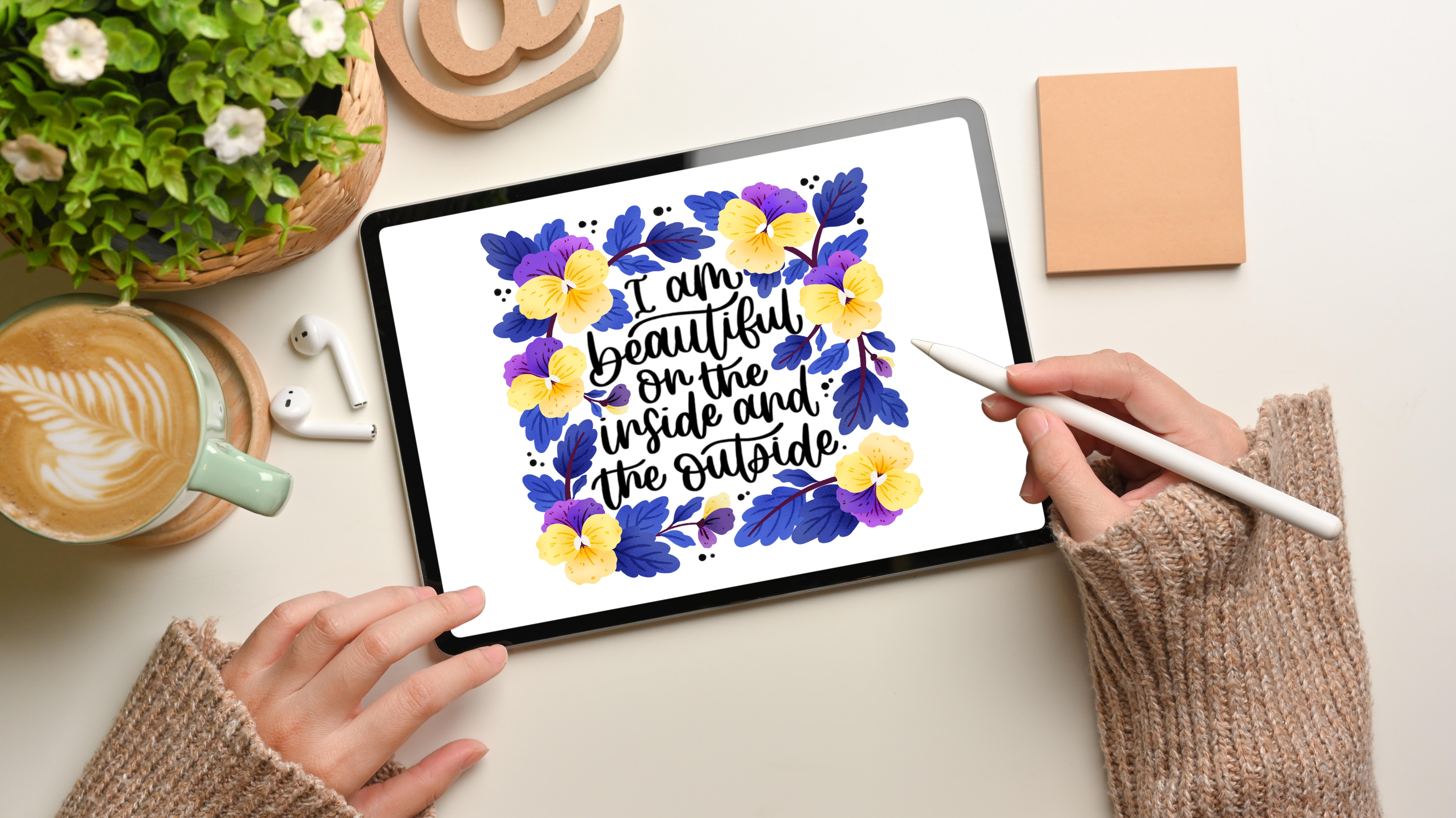
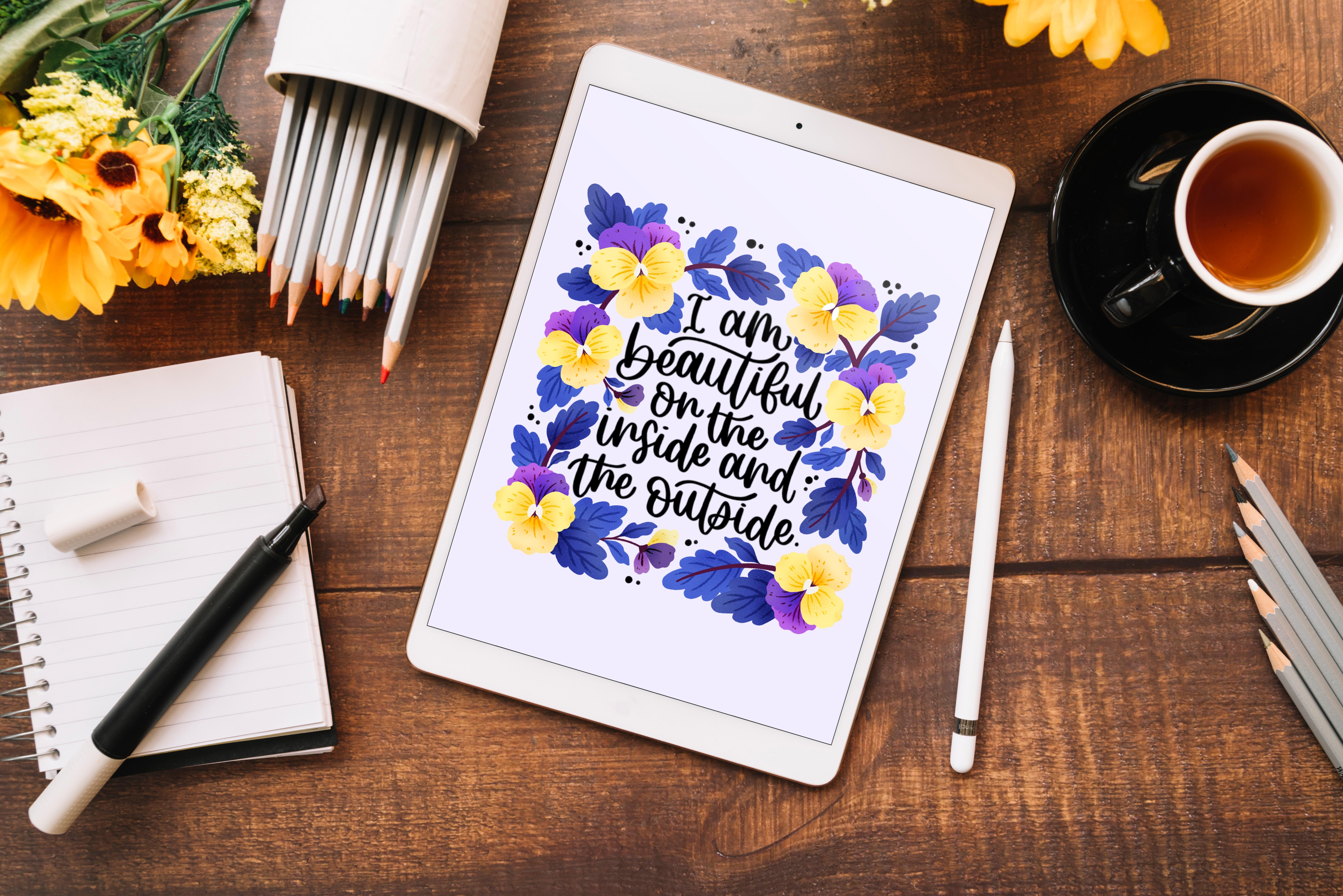
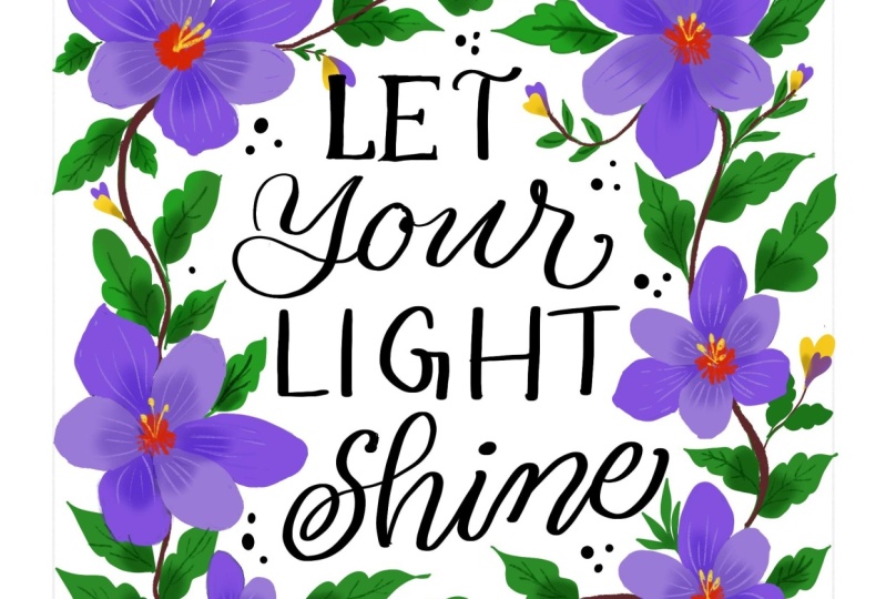
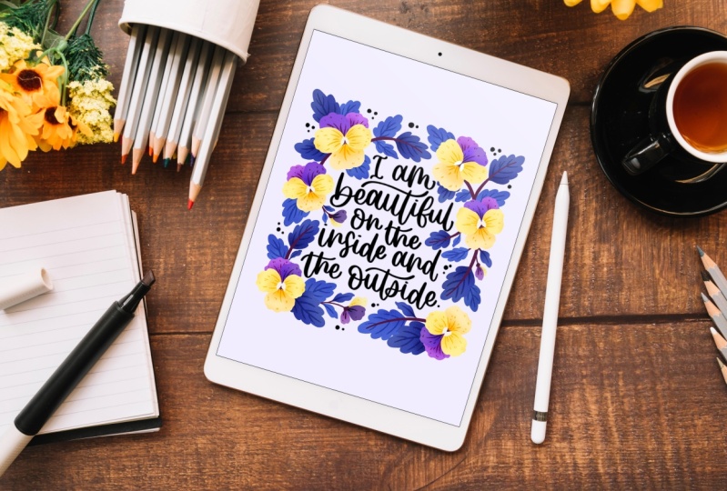
6. Adding the Quote / Text: The next step is to decide on a code that we'll be using
for our illustration. This code can either be a motivational coat or it
can be also a general code. For the sake of this class, I'll be going with an affirmation statement
that goes as such, I am beautiful on the
inside and the outside. The reason why I'm going for
this statement is because the theme for my
upcoming year calendar is going to be affirmations, hence I'm just
sticking to this code. But if you have any
other code on your mind, just feel free to use that
on your app to add any text. The first thing that
you're going to do is go to this Wrench tool. Underneath that you
can see that there is this ad text tab. You're going to click
that. Once you do that, your text column
appears on your canvas. Now to edit your text, you can click on it. And once you do that, you see
that your keyboard appears. We're just going to double tap
and delete that text word. And you're going
to type your code. In this case it's going to be, I'm going to type it in caps, so I'm just going to double tap this arrow mark and type it. I am beautiful on the inside and the outside. Once you're done with that, you can see that you
have this capital A small icon over here. So I'm going to go
ahead and click that. Once I'm inside that, it gives me a lot of different font options
to choose from. If you don't like the font
that you're currently on, you can change your
font by clicking on that particular capital
A and small A icon. In this case, since the font
is not completely selected, I have to go back. So I'm just going
to click, I'm going to click the box
now and click it. If I click on the fonts,
it changes accordingly. This way you can
play around with different fonts and choose
one that you like in case if you feel that
you didn't like any of the default fonts that
are mentioned here. You can also import your font into your procreate app by
using this very option. Say you have a font
downloaded onto your ipad. You can bring that
particular font into your procreate app by
using import font. I'm just going to go ahead with probably this font
that I chose earlier, look for something that is
regular or semi bold in style. Don't go for anything that
is very light or thin because it will not look great when it comes in combination with your botanical elements. I'm just going ahead with something that is
regular in size, but I also want to check
the bold option over here. I think it also looks
great if you want to make any other changes
to your text in terms of the spacing
between each alphabets. You can also play around
with the kerning over here. I'm just going to
leave it as such. You can also play
around with the size of the font over here. I think I'm happy with the size. I'm just going to
click Done over here. Now the next step is to align this very text box to the
very center of the canvas. To do that, just click the
pointer tool over here. Once you do that,
you see that it gives you a lot
of other options. All you're going to do is
just click on the snapping. Here you can see my magnetics and snapping are
already turned on. If this is turned off, just turn the snapping on. Once the snapping is turned on, just go back to the
pointer tool and you can just bring your text
box and you see it. Whenever I bring it to
the middle of the canvas, you see this very
yellow line appears. It means it's actually aligning my text box to the
center of the canvas. If I bring it further down, it also aligns it
perfectly to the center. It is both vertically
and horizontally, and exactly at the very
center point of the canvas. To make sure that
it is able to snap, you have to also
check if the snapping is turned on, just turn this on. And you should be able to snap any element to your canvas. Now it's snapped to the
very center of the canvas. I think I would also
want to play with the hierarchy of the
words over here. I'm just going to click it
again and double click. Click. And then maybe move the play around with the words a little
to see how it looks. Once I'm happy with something, I'm just going to make sure that it's again snapped to the
center of the canvas. Now I'm happy with
the way it is. I'm just going to stop there. For the sake of this class, I'm not going to be
using this text, rather I will be using a handleted version
of the same code. I'm not going to be showing you the process of how I
hand letter the code. I'm just going to add
that particular file to the resources section and you can download
it from there. Now, I'll show you
how you can import that downloaded file
into your procreate. I'm just going to go back into my layers over here and
I'm going to hide this. Now you have to go back to the Wrench tool
and click this ad. And then again click
Insert A Photo. Now the file that I downloaded usually gets
saved in my gallery. But in your case, you have to look
it into the folder where your downloads
usually gets saved. Just look into that
particular folder and you should be able to
find your file. Now just click on
that particular file and you see it gets imported
into your procreate. Now you can just drag along those lines to increase
the size of your text. Again, make sure that
the snapping is turned on and snap text, that is your imported text, right to the middle of
the canvas. That's it. You're done. I'll see
you in the next lesson.
7. Sketching Part - 1: Now that we have decided
the for our illustration, the next step is to decide the botanical element that we'll be adding to our
final illustration. For this class, I'll be using pansy flower along with other elements like
leaves and stems. But you can feel free to use any floral element
that you like. Before we get started
with our sketching, the best thing to do is to
look for reference image. I find that Unsplash
is a great website, look for beautiful stock
photos and images. The best part is that you
can download for free. Since most of these are
royalty free images, you can use them
on any platform. Once you are on the
Unsplash.com you can go to the search tab and type the floral element or the flower that you
are looking for. Since in my case it
is a pansy flower, I'm going to type pansy here. You can see you get a lot of different options
to choose from. Usually, when you are looking
for a reference image, look for an image which is of decent quality or even high
quality is much better. And one where you can see the details in the
flower clearly. As I said, you should look for an image where the
details are really clear. I think this particular image is a good example
where you can see almost all the details on this particular pansy
flower really well. I think this is also a good image as you can see
the details pretty well. I'm just going to go
ahead and click Download. If you click this
particular tab, you can download it in
like different options, but I think a small size
should be more than enough. I don't think you need anything big because
we're just going to import this particular pick into a procreate and
trace on top of it. I think a decent quality, I say medium, should
be more than enough. Once you click that, it
asks you this permission. So just click download and your image gets
onto your ipad. Now if you want, you
can go ahead and keep looking until you find something
that you are happy with. I'm also going to go ahead and
download this one as well. If you're someone who doesn't
want to use unsplash, but you would love to
use any other platform, then I think Pinterest is another great platform to
look for reference images. Now let's get back to
our procreate and go into this wrench tool
again and insert photo. Now I think my photo is
not saved as a photo. I'm just going to go cancel. I'm going to go into my folders, into my downloads, maybe recent. I have it over there, so I'm just going to
click that and I'm going to save it to my gallery. And I'm going to do the same
with this flower as well. I'm going to save
it to my gallery. Now. I'm going to go
back into my procreate. Now again, I'm going to
click the Range tool, and this time insert a photo, and it should be there
on your gallery. I'm going to take this photo, bring it into my canvas. This stem going to just
turn off the snapping and magnetic tool going
to resize it. You can resize by dragging this blue dots that you
see on the outer edges. If you want to
rotate your image, you can use this green dot. And just to drag it and rotate it in any
direction that you like. Now I'm just going
to bring this image. Click and drag it. And leave it. And you can see that image
has gone below this layer. I'm going to turn off
this text layer for now. Just going to resize
this a little bit. Zoom in and I'm going to
lock that particular layer. To lock a layer
you're just going to drag towards your right, towards your left click lock. Now you see there is a lock
right next to that layer, which means this layer
has been locked. Now on top of this layer, I'm going to create
another layer. To create a new layer, you're going to be clicking this plus it creates a new layer. Now I'm going to go into
my brush settings over here and I'm going to
go with sketching. And I'm going to use
N in the pencil. Just going to check it. Yes, that's the pencil I'm going to draw on top of this flower. So I'm just going to draw the basic outline of
the pansy flower. You don't have to follow
it very perfectly. Just a rough sketch should
be more than enough. This is why I said that you
need a good quality photo so that you are able to see all
the details really well. We are not going to take into consideration all the details or all the parts of this flower, but you should be able to see the very basic structure of this flower and be able to trace it out without any issues. If your photo that you had downloaded had been
of a bad quality, then probably then
you try to zoom in. You would actually
lose a lot of details. Your image will not be
showing you the details on the flowers really well or even when you try to zoom in, it'll sort of picture. It's better to avoid
bad quality photo and usually on splash
or even on pint. Look for photos which
are of decent quality, download them and check them. If you sort zoom them in, are you able to see the details clearly or is it something that plating and you're having difficulty to
figure things out, then avoid such images. Now, I think I'm done
with the sketching. Like I said, I'm not going
to sketch all the details, I'm just going to leave these details and I'm just going to sketch the outline
and I'm done with it. We are going to go ahead and turn off this particular
reference image. Now I'm just going to zoom out. At the same time, I'm also
going to turn on this code. Now the next thing to
do is actually to draw a frame that you can limit your illustration
within that frame. Anytime when you are sending
your artwork for printing. Usually your other
softwares will allow you to have a bleed option where you have
extra space around the corners so that when they
are cutting the artwork, the illustration doesn't
get chopped off. Similarly to, just to be
on the safe side here, I am going to draw
a frame manually. And I'm going to contain all my elements
within that frame. And I'm going to make sure that nothing is drawn outside
of that frame so that once when you are sending your artwork
for print or anything, that is the illustration doesn't get
accidentally chopped. I'm just going to turn off this pancy layer over here and I'm going
to draw a new layer. I'm just on the same pencil. In the pencil brush. Now I'm going to go into
this ranch tool over here, and I'm going to
go into the canvas and I'm going to turn
on the drawing guide. This gives me those grid lines so that I can draw
straight line. Like I told you, I am
going to create a frame, like a square frame around. This area. I'm also going to go into this
edit drawing guide. If you want to change the
color, you can do it. Or if you want to
change the opacity of the grid line,
you can do that. If I increase it, you can see the lines
are becoming darker. If you feel that the lines
are not clearly visible, then just increase the opacity. I'm just going to turn the assisted drawing on and also make sure that
it's on two D grid. Okay, that's what we need
and once you're done, you can just click done. Now, make sure that you are on a new layer and you can
just draw a straight line. Now what this will do is it will allow me to draw a line like a straight line without
any difficulty. I have to just draw
a straight line. But again, it doesn't
necessarily have to be straight. The grid option will do that for me since we have turned
on the assisted drawing. It's just going to
help me draw lines, that straight line
really easily. And it's going to
make this process really simple and quick. Now I have my square,
it's not perfect. So what we are
going to do is now you see it says assisted. We actually went into this edit drawing guide lines and we
turned on assisted drawing. Right, That's why it was
helping us to draw this line. It was sort of just
following those grid lines. Now, I'm just going to go
ahead and click over here and I get these options
and you see it turned on. I'm just going to turn that off. What happens is now if I just
go and try drawing line, it will not allow me to
draw those perfect lines. Okay? Anyways, we are
done drawing our line, so I'm just going
to turn it off. Click this pointer tool, make sure snapping is turned on. And now just align
it to the center. If you want to
increase the size, you can do that. Yeah, I think that looks good. And there's also enough space
on all the sides so that, you know, our illustration still has enough breathing
space in those area. And it doesn't get
accidentally cut or chopped off when we are sending
it for our final print. Now I'm going to push
this layer all the way down because we're not
going to be using it anymore. Its sole purpose is to just guide us as to where
that particular frame is. If you want, you can just
also reduce the opacity so that it's not very dark, right? If you want to lock it
also, you can lock it. Anything that I'm going to draw, henceforth, is going to
be inside that frame. Nothing is going to go outside, it's going to be within
that frame line. Now, I also feel
that I can slightly reduce the size of this
text that I have here. Again, make sure once you
have reduced the size, it's still aligned
to the center. I'll see you in the next lesson.
8. Sketching Part - 2: Now I'm going to draw my botanical elements
around the text. Okay, Now I think
it's a good time to turn on your pansy
illustration over here. Select that layer and I'm going to turn off the
snapping and magnetics. Now you have the freedom to
move your layer as you like. That is the element on
the layer as you like. And it's not going
to snap to the grid because we have turned
off the snapping. Now you can position it anywhere you like
within this frame. Also, remember we
are going to add few other elements
like leaves and stem. I'm just going to position
the pansy accordingly. Just going to rotate
this, increase the size. Remember this is just a sketch, this is not your final artwork. I'm also going to go
ahead and duplicate this. If you want to
duplicate an element, all you have to do is swipe, and you see you have
this option duplicate, and it creates another copy of the same element on
a separate layer. Now if I use the pointer
tool and if I move I have another copy
of the element. I'm just going to
position this at random, maybe duplicate a couple of times and see what
works and what doesn't. It's just basically
trying to fill in this square area with your
elements as much as possible. If you want to
rotate your element, just hold on a drag to that green dot and you should be able to rotate it in any direction
that you like. But if you want to do
the same at random, you don't want to be using
this very green line, then you can just use rotate 45 degrees over here to
rotate your element. At the same time, if you
want to flip your element, you can use flip vertical
or you can also use flip horizontal to help you
with the transformation. Again, I'm going to duplicate, increase the size accordingly. Maybe another duplicate and if you want to name your
layer, can also do that. Since anytime you
duplicate any layer, it's just going to get
duplicated the same name. If you want to rename
it, you can do that. Okay? You can just click and it goes into rename and
you can rename it. You can rename it as
flower one, flower two. You can keep renaming
your layers like that. I'm just going to go ahead and keep playing around with the flowers to see what
composition works for me. Here there is nothing
like a rule or a key that you have to follow for the composition basically, I'm just making sure
that, like I said, the area within that
frame is being filled. You can fill it
with just flowers. If you want a flower is not something that you
want to fill it with, then you can fill it
with maybe just leaves and filler elements like
small berries or something. It depends on the theme
that you're going for or the floral element
that you have selected. You can just keep duplicating the flowers as many
times as you want and place it and see how
it is working for you. So I'm just going to go
again and you see maybe increase the size
a little bit or decrease the size of the
flower a little bit. Maybe rotate, rotate it in a different direction or sort of flip it and see
what works for me. And that's what I'm going
to do at this point. Okay. So now I think I'm happy with the placement
of the flowers, so I'm just going to go ahead and group them all together. If you want to group
your layers together, just click at one layer and then keep
swiping at the rest. Then you see you get
this option group. Just click on that and they're
all under a single group. Now you can again rename this
group by clicking on it. I'll just name it as flowers. Next, I'm going to
go ahead and start drawing my other
botanical element. That's the leaves and branches. So while you're doing this, make sure that your
floral elements are not overlapping on the text area because then that is going to, it's not going to look
visually appealing and going to create a
visual clutter over there. It's better if you avoid
drawing over the text. You do have a lot of area around the text to play
around with and to draw, just leave the text
area and don't draw anything that could
overlap on top of it. So for the leaf shape, I'm just going with
something as simple as this. You can also draw a
very simple leaf shape that is the usual one, like these as well. There's nothing wrong with it. I just wanted to sort of give a little bit more
character to those leaves rather than just drawing
them as a very plain leaf. So if that's not your style, then that's totally okay. Just go ahead with
something that you feel that you're
comfortable drawing. So I'm just going to drag this layer below
this flowers layer. You can see you have a gap here. Similarly, you also had a
gap here and I'll try to bring it with the element. Also, you can extend that
gap so that it doesn't look like there's
a negative space or an empty space in that area. You can maybe extend a leaf or any other element into
that particular area. If you're using this kind
of into your illustration, I think don't spend too much
of time on drawing a sketch because it's okay with you can always go back and
make changes to it, but The name itself says
it's a rough sketch, so keep it as much as possible. Don't try to, you know, have clean lines or anything
because you anyway is going to color on top of it and any
changes that you want to make, you can still make
at that point. Don't waste too much
of time in trying to make your rough
sketch really neat. Yeah, we are almost done
with our sketching, but you can see there are
certain negative areas in between our illustration. You can just go ahead and make sure that those
areas are also filled with so that they
don't look a little awkward. Because having a
negative space in an illustration is
just like, let's say, area where the audience or anyone who's looking
at your illustration, the eyesight is just going to be directed towards
that negative space. Because there's one big
empty area and that's where the eye is going to look at the very first time that they're looking
at your illustration. It's where the
attention is going to get drawn. You want
to avoid that. It's always better to make
sure that you don't have any negative spaces in
your illustration here. Even when you're looking
through the camera, you can see that your eye
might be drawn towards this very area
because you feel like there is a lot of
negative space there, even in this area, because there's
something missing. It feels like there's something
missing in that area. And it would be
better like you can add a leaf or any other
element over there. That's what I'm going
to do. I'm just going to go ahead and
fill this area with, go ahead and add another
layer in those areas. I'm just going to
use these dots just to make sure that there's not
too many negative spaces. It's not also possible
to always fill those negative spaces with
just leaves or anything, and it always doesn't look good. So you can add in few other filler elements
like these simple dots. Once you're done, just
coat your layers, panel and detector
of that squire frame that you have created
and see how it looks. If you feel like everything
looks almost balanced, then I'm also going
to go ahead and turn off that drawing guide. Now you can just
have a better view and just check if there's
any negative spaces. Like for example here I see
there's a negative gap. I'm just going to go ahead and maybe fill that area
with some beef. That's yeah, I think
it looks good. I'm just going to stop
here with a sketching. I just also wanted to let you know that sketching is
not your cup of tea. Then don't worry, I have
got it sorted for you. I have uploaded the sketch
file to the resources stab and you can download it and later import it into
your procreate. To import any file
into your procreate, all you have to do is click the wrench to and then
go to Insert a Photo. And from there go to the folder where you have
downloaded the file. And just click on that file. And it will get easily
imported into your procreate. I'll see you in the next lesson.
9. Colour Palette: The next step is to create a color palette for
our illustration. You can do this in two ways. The first way is to go
back to your layers panel. Just click on this image that we had already
uploaded into Procreate. You can just in and
click on it and hold, and you see Procreate app allows you to pick colors
from your image. If you like any
color in this image, then you can just choose that and it gets
selected over here. Now just click on this
particular color wheel. Once you do click that, it would open into
this color wheel menu. All you have to do is go
to your palette over here. Once you are into that palette, just click on this les
and click New Palette. Once you do that, you see a new untitled palette
is just created. Now you can just go
ahead and add the color that you picked from the
image into your palette. You can also rename your
palette by just clicking on it. You can just click Done. This is one way of creating
your own color palette. The other method
is to just, again, go back into the plus over here, and you can just go ahead
and click on Photos. This again opens
your gallery menu, and you can choose
the photo that you have selected. Click that. It imports all the colors from that particular image
that you have chosen. These are the two
ways in which you can create your
own color palette. But for the sake of this class, I have already uploaded a color palette to your
resources section, which you can again import
into your procreate. To do that, again, just go
into the plus symbol over here and go to New from file. Just open the folder where
you have your palettes. Watches downloaded. It's named Pansies Palette. Over here, Dowatches. Just click on that again. It will import that palette
into your procreate. Once you have imported your color palette
into your procreate, the next step is to start
coloring illustration. I'll see you in the next lesson.
10. Adding Color: Now that we have imported our color palette
into a procreate app, let's start coloring
our illustration. So the first thing
that I'm going to do is go to my layers
panel over here. And then on the sketch layer, I'm just going to click this and I'm going to
reduce the opacity. 30, maybe 35. That should work. At this point, you can hide
the text if you want to because we're not going to be doing anything to that
particular layer. If you want to hide
it, you can hide it. And to make sure that you're
not making any changes to it or you're not
accidentally on that layer, just swipe and lock that layer. Now that layer is locked, I'm also going to
take that layer way down below my sketch
illustration. Now we'll work on this
particular layer. We have reduced the opacity. I'm not going to color
on my sketch layer, so I'm just going to create
another new layer just below that to make sure you can rename that coloring layer or
maybe say base color. Now I'm going to go
to my color palette, just going to clear
the previous history, and now we have the
pansies palette selected. The first thing that I'm
going to do is I'm going to choose this color over
here, this pastal yellow. I'm going to go to my
brush tool over here. I'm going to go under calligraphy and
select the mono line. If you want to make any
changes to your brush, you can go and over here, but I'm not going
to do anything. Just click done since it
was already selected. And I clicked on top of it, it went into the settings. Yeah, you're going to use monoline brush for
this base coloring. Make sure that you are
on that base layer now on all the flowers, this lower part that
you see is what I'm going to be coloring
with this particular color. Just draw on top of it. If you feel that still the
outline is a little dark, go back to the outline layer, go to and also decrease the
opacity a little bit more. I don't know why I locked this, but it's unlocked again. Just lock it. Go back to your base color and
just start coloring. Just follow the outline. Or if you don't want to and you want to
make a few changes, you can also make that anytime you want to undo anything,
just double tap. Take your two fingers
and just double tap. Hold your two fingers
and tap on the screen. And it'll undo it to redo, hold your three
fingers and tap again. And it'll redo that two fingers. Undo three fingers, stap. Redo. I'm just
going to undo that. Make sure that you come
and fill this gap. And there is no
gap anywhere else. Because if there is any gap, the moment you try
to fill the color, the entire surface
will get filled. If there is any gap
in your line work, make sure that there is no gap and it's completely closed. If it is a closed outline, then it'll easily fill the
color within that outline. I'm going to just repeat the
same for all the flowers. I'm done with that
particular color. Next I'm going to again, go into my layers panel
and select a new layer. Now if you want to
rename it, you can. I'm just going to
leave it as such. I'm going to select
this light shade over here with my line selected. Again, make sure that you
are on a different layer. And I'm just going to color these two petals of the flower. Just going to turn off the
sketch and see how it looks. But for some reason, I feel that if this color would be better here and this color
would be better here, I can quickly make that change. What I'm going to
do is I'm going to go back into my layers panel. I am quickly going back into the colors and I'm
going to choose that yellow that we used before. Go back to your layers panel and just click and
you see it says. Alpha lock over here, just click on that
and then come back again and make sure you
are on that yellow color. And just click fill layer, and it'll automatically
fill that color. Okay, now I'm going to come back and remove
that alpha lock. And then again, just go
back to the base color. Click on it, click Alpha
Lock, go to your colors. Click this light shaped, come back to your layers. Click here, just
click Fill Layer. And you see it
automatically fills that color on all your petals. Now going back and just
unchecking this alpha lock, going back into the layer that we created for
these two petals. Now just go back to that yellow
and start coloring again. This is a very quick
way of changing the colors to your elements in any time because you
just don't have to each and every time color drop into that
particular petal. If you just want to change the
color of all the petals at just a jiffy or at a few fraction of
seconds or something, you can do it by just
using the alpha lock. Now another thing
that you can do is instead of every time dragging
the color and dropping, you can just create
the outline first. Don't fill it with color, just draw the outline. Just the tap and
it'll redo that. Don't fill any color, just draw the outline. Once you have drawn the
outlines now just go and drag, drop the color and then
click on Continue Filling. And then in all those
areas where you want this color to be filled and to fill the
color over there, you don't have to drag and
drop your color every time. Sometimes you can use this continuous filling of color option and you
can fill the colors. Also, you can do this
in both the ways. You can choose whichever
is comfortable for you. I usually love dragging
and dropping the color, but if that's not something that you feel like works for
you, then just try this. Continue filling, where you just have to draw
the outlines first. And then you can just use the continuous filling option and fill the colors later on. Now I'm done with that layer, moving on to the next. Now if you notice,
these two petals are actually on the foreground. The petals that these two
petals are on the background. If I had to draw or
color these, obviously, I would have my layer below this particular
yellow color petal layer. I'm just going to draw again. I'm not going to draw,
I'm just going to create a new layer over here. You see it's below
these two layers. Now, go back to
your color palette. And this am, I'm going to
choose this purple color. Now, repeat the process again. Again, make sure you
are on the new layer. The reason why I am creating a separate layer for each color is because
when you do that, you have the freedom to
add details or even, you know, play around
with your layers. Because if you have all your elements on one single layer, it becomes really hard
to edit your elements. And anytime you feel like
you want to make any change, you have to completely
edit the entire element. Like you'll not have
that freedom to add texture or to add any line work if you
want to in your artwork. So if you feel like you are going to add
texture later on into your illustrations
or you're going to add in a lot of
details later on, then it is sensible
only to, you know, have your elements, most
of your elements as a separate layer because you
already have enough layers. So when we started the class and when we
created the canvas, you must have noticed
that it did say that you have like 124 layers
to work with, which is more than enough
for our illustration. You do have the freedom
to use a lot of layers. In this particular illustration, there is 124 layers. I think you can create
each of these elements on separate layers so that you
can easily add clipping mask, you can easily edit them later. Right? Make sure that you are creating most
of your elements, that is each of your individual elements on separate layer, moving on, choosing
the new color. And I'm just going
to add that to this now if you can't see. What is behind that. You can just hide this particular
layer and you can work. And then you can turn that
on. Again, I'll do that. I'm done with that layer. Now go back into your
layers panel and you can turn on this particular layer and you can see how it looks. If you also want to
turn off the sketch, just turn off and see
how it's looking. At this point, think
it's coming out great. We'll move on to the next color on the sketch layer again. And then this time I'm
again going to create a new layer underneath that purple color layer
and choose your color. So this time I'm going to go for this color that's first
in the color palette. Again, if you want to
turn off the layers, you can do it or you
can just work as such. I'm going to go
ahead and turn off these two layers this time
you're drawing this one? Yeah. Now, if I go back
and turn on the layers, you can see that it
is the last layer. Like it's the, if the floral petals are arranged
in a sort of hierarchy, then this petal is
something that comes way below all the other petals. Okay. The reason why
this happened is because the outline
that I created, I didn't close it properly. So just doing the
two finger tap, that's undo, I'm going
to go into my layers. If I just hide these, you see that there
is a gap here. And that's why when I
tried filling the color, it filled the entire canvas. What I have to do is I just
have to close this outline. And now if I go and
fill the color, we'll just fill in
that particular area. Just go back to your
layers panel and you can turn on all
the other layers. Just turn off the sketch
looking good so far. Coming back, turn on
the sketch layer. Now we're going to
go ahead and color the leaves and the branches
that you see over here, again, create a new layer. And you see all these leaves and branches are again
below these layers, because it comes
underneath the flower, you're going to create
the layer again below the last layer
that you created. Now go back to your
color palette. And you can choose any of these color because
I'm going to paint it or color it in a way where alternative leaves are
like in different colors. Say for example, I'm
choosing this blue and I'm going to start coloring
the next leaf. I'll not be choosing this one, rather I'll be
choosing this one. You see, I'm not sticking to the outline that
we drew earlier. I'm also making
slight changes then. And there, don't worry
if you feel like your sketch is
something that you don't want to follow and you just want to
make few changes. This is the right time to do
it because you still have the complete freedom and you are using a
digital software, which means you can
do as many as changes as you like at any point of
time in your illustration. So now I'm going to go ahead and again create a new layer. This time I'm going to create
a layer above this one. Again, go to your
color palette and you can choose this
dark blue color. Come back to your
layers, select your, and you can start coloring
the other leaf element. Okay, for this particular leaf, it's going to go to the layers
and create just one below. And then I'm going to draw it, because drawing on top
would not make sense, just creating a separate
layer for that. All right, we're done
with the leaves. Next we have the stems and
these flowers as well. We'll go back to
the layers panel and again create a layer. But this time I'm going
to create a layer above these leaves layer
that we have here. Then go to your color
palette and you're going to select this particular color, which is a dark purple. Come back and you can start
drawing the stem pushing. Sometimes when you are
drawing a very narrow line, you might end up
with these spaces where the color
hasn't filled in yet. Just go in and manually color
those narrow areas here. Again, I have a slight problem because the stem layer is
actually above the leaf layer. I'm just going to
undo it and I'm going to come back
to that later. Again, that layer is
also something where the leaf layer is above it. Again, go back to
your layers panel, this time just create a
layer below the leaf layer. Now you can just draw, you'll get tucked
behind that leaf. If you want to make
these branches thick, you can increase the size of your brush and maybe
a little bit more. If you draw, you see
you get thick line. If that's what you want,
you can do that as well. I'm just going to keep it thin, but in case if you
want thick line, just increase the
size of your brush. And that should do finally
for the flowers over here. Again, I'm going to create
a layer below the stem. Come back to your color palette, and you can choose any
of these four colors, because it's the petal color, the main petal color. I'm going to go ahead
with this purple, create another layer, and you can choose the
rest of the color. I'm going to go ahead
with this yellow. Lastly, we have, again, this portion of the
floral buds for that. I'm just going to go with this particular layer
that we have here, which has the stem. You remember? I'm
going to choose that layer and
choose that color. I'm just going to draw that. Okay, I think I made
a mistake here, because this floral
petal layer is above it. Undo. Instead of
choosing that layer, now I have to create a layer at the top of
these two petal layer. And now I can just color it in. Now I'm just going to hide the sketch layer and
see how it looks. If you want to turn on the
text layer also, you can, and you can see
that the base color is done and it is
almost looking good. Next step is to go ahead and add details to the flowers and the leaves and
other elements. I'll see you in the next lesson.
11. Adding Detail: Now that we have completed
the base coloring, let's move on to adding
details to our elements. Now go into your layers panel. And let's start with this very top layer
that we have here, which is this very
yellow color petal. What I'm going to do is
I'm going to just select this layer where we have
these yellow petals. And I'm just going to create
a new layer on top of it. And the next thing is I'm just going to click on that
new layer over here. And I'm going to
create clipping mask. What this clipping
mask does is it actually only allows me to draw anything within
this colored region that is only these
yellow petals. For example, if I just go ahead, maybe just to show you. What I mean is on the
clipping mask layer, when I try to draw
anything on the outside, you see it is not allowing me. But if I just try to draw
it inside again, if I draw, drag it all the way even
down in these areas, you see it's not visible. What is happening here is if I just go back to the
clipping mask area, just again, remove
that clipping mask, you see the scribbling or whatever I was trying
to draw is still there. But when I just use
the clipping mask, just masks it to the
layer that is below it. Say for example, I'm
going to go back again and uncheck
this clipping mask. Take this layer a
little below onto the base color layer
that is this color. And now if I click
clipping mask, it clips to that
particular area. Right, Clipping mask
applies just to the layer that is immediately below it in the layers panel. I'm going to go ahead
and delete it again. Go back to this layer that's on the top that is this
yellow color petal layer. Create a new layer and then go ahead and just create
a clipping mask. Now to add details, I'm just going to switch my
brush from mono line to just go into this inking and just
click this dry ink brush. I'm just going to reduce
the size to maybe six. Let's see how it looks. Maybe a little bit,
maybe seven or six. I think that should be good enough now that I'm inside
my clipping mask player. Next is to just add
details to the petal. We're just going to
create line work into these petals to just make it
look like the actual flower. Because when we go to this particular layer
where we have the flower, you see a lot of line work. We're not going to go ahead
and draw all these lines, but just to show that there
are these beautiful lines, we're going to draw a few
line works for each petal. I'm just going to unhide that go to your layers
panel and unhide that come back into my
illustration, go to your layer. Click on the
clipping mask layer. Now we're going to choose the same color that we
have already filled in. In this layer, you can either
just click and hold and you see it selects that color
and it changes over here. Can go to the palette and
also click and change. It can do it either way. Now that particular
color is selected. Now go back to your layers
panel and click on that layer. It's still on the
clipping mask layer. Click on that and
see it's on normal. This is where all your blending mode options are listed out. And instead of normal, I'm going to go ahead
and choose multiply. Now what this does is it
is using the same color, but when I try to
draw on top of it, you see that it is giving me
a different color option. It's just creating an overlay of the same color on
top of the base color. But in a slightly dark version. This can be really helpful if you don't want to be choosing separate colors or you're quite intimidated when it comes
to choosing colors. You don't have to be
because you can just use the existing color
that is already there, that is, in our case,
the base colors. And you can use the blending
mode to your advantage. And you can just create
a new different color which is also in sync with the color
palette that we have. It's not a color that is odd, it sort of looks like
it's a color that will easily blend in
with that background. Right, so I'm just going
to undo, remember, go into your clipping mask layer and make sure that it's on multiply mode and then just come back and this time I'm
using the dry ink brush. You're just going to slightly
decreasing the size to six. All you're going to do
is just draw lines. When you apply less pressure, it gives you a thin line. And when you apply
more pressure, it gives you a thick line. This line variation depends upon the pressure that you are
applying to your pencil. The more pressure, the more thicker the line is going to be. I'm just going to draw
a few lines at random. The same on this side as well. Make sure that you're drawing the lines of different height. Don't draw all the
lines of same height. It will not look good
on slightly big. I'm also using the
eraser tool because I'm not liking that
very pointy edge. Just using the eraser and making sure that it's
not very sharp, right? I'm just going to repeat the same for the
rest of the petals. So just apply pressure
and just pull the line. You can do this towards the center or
towards the outside, like even this way or this way. Sure is comfortable for you. I'm going to go ahead and go to this particular yellow petal
layer as well over here. And again, I'm going to
create a clipping mask. It's not mandatory
that you have to create a clipping
mask, even for this. As you see, the line is
not going to go outside. But I'm just adding
the clipping mask to be on the safer side. Because sometimes when you're
adding a line on the edge, it might end up coming
on the outside. Say for example,
let's go back to our previous clipping mask
layer over here and say, I'm just trying to draw
something on the very edge. Now you can see having the
clipping mask turned on, it means that even the
line has gone outside. It looks like it's cropped here and it still looks
like it's a part of this particular petal. And the particular line
that we have drawn has not gone outside
of that petal, it still is inside. That's the reason why I kept
the clipping mask turned on. But if you are someone who's going to keep your
lines within the petal, then well, you don't
need the clipping mask. But if you feel like you
might accidentally add your line outside the petal or there is a chance
that this might happen, then for, just to be safe, you can turn on
the clipping mask. Going back to this and again, make sure that the clipping
mask is turned on. And also it's on multiply mode
since it's the same color. We're just going to go ahead and decrease the
size of the brush a little bit and just
repeat the same. Now I'm done with those
areas of the petal. Now we'll move on to the
next color, this color. Again, choose that layer, create a new layer above it. Sell a clipping mask
if you want to. Again, make sure it's
on multiply mode. This time again I'm going to
color pick the same color. And I'm just going
to repeat the same, increasing the brush
size a little bit to six and I'm going to
do the same process. So I'm going to go ahead
into my layers panel and I just also want to
check how it looks if I add. Linear burn or color burn. Linear burn looks
much better compared to multiply for this layer. I'm just going to go ahead with linear blending mode
instead of multiply, but if you like multiply better then just
stick to multiply. That's also okay, but
I'm just going to go ahead with linear burn also. Let me check how linear
burn, it looks very dark. I'm just going to
settle with multiplier just for this particular layer. I'm going to change
it to linear burn. Right next, we'll move
on to these petals. Go back into your layers. Panel. Select the layer again. Create a new layer. Create a clipping mask. Now again, change it to multiply mode and then just choose the same color and
you can draw the lines. I think for this
particular petal, I feel this purple
is too bright. So what I'm going to do
is I'm going to undo, instead of choosing this color, I'm going to go into
my layers panel and select this color. Just going to try it out. I like this much better
than the original color. I'm going to stick with
the same, the stem color. If you remember, same thing, multiply on and
clipping mask on. Just for this layer alone, I'm choosing the color
from the color palette and not the original
petal color. Again, repeat the same process
with your inking brush. If you feel it's too dark, go back to your layers panel, click on that and just
reduce the opacity slightly. Maybe to 65. Maybe 70. Yeah, I think 70 looks good, so I'm just going to reduce
the opacity to 70 percentage. And I'm going to keep drawing. Okay, so this color and this
color are very similar. So we're just going to go back into that petal
color that's here. Click that, create a new
layer multiply mode. Turn on the clipping mask. Just draw a line. I'm sorry, I ended up creating
it in the wrong layer. It's over here.
Click add a layer. Clipping mask Blending
mode to multiply, maybe reduce the
size of your brush. Yeah, now we'll move
on to the next petal, which is this dark purple. Create a new layer above it, clipping mask and now multiple. This time I'm going to choose
the same dark purple color. And I'm going to draw, I'm just going to turn on my sketch just to see
if I missed anything. And I did notice that I have missed this very
part of the flower. I'm going to go back
into my layers panel. And since this is on the
very top of the elements, just go to the top
layer and just click a new layer now and go to white. Now you have to go back
to your monoline brush. Select your monoline brush from calligraphy and get
back to that layer. And just draw that
white color feature of the flower that I
actually missed earlier. And go back just turning off
and seeing how it looks. Yeah, so now I'm going to turn off the sketch
layer and come back to this, and I think it
looks good for now. Next we'll move on
to the leaf part. The dark blue leaf
is what I have. Click New Layer again, Clipping mask and multiply mode. Again, choose the
color coat your brush, change it to dry ink. Now I'm just going to draw
the in part of the leaves. To just keep it very simple, don't add too many details. Just adding only the veins
and I'm adding the veins. Even when I am adding the veins, I am not adding too much
of details into it. Yeah, we're done with that leaf, that particular leaf color. We'll move on to the next one, which is the one below it. Again, click, add a new
layer clipping mask. Add, multiply, and
choose your base color. Just click and hold. And
now repeat the same. I just have this
one leaf pending, so I'm going to go
back to that layer, create a layer above it. Just add, multiply,
choose the base color. And just make sure that you have added detail
over there as well. So I'm just going to go ahead and see if I
missed anything. I don't think so. Now you can see that
the illustration looks like it's slowly getting there and it looks like it has a little
bit of depth to it. But just to add
more depth to it, the next step is
that we're going to add texture into these elements. If you're done with this part, the next thing is to keep
your texture brush ready. That is your noise brush. Let's see you in the next class.
12. Adding Texture: The next step is to add
texture to our illustration. The main reason why we are adding texture is
so that there is a sense of depth in our
illustration over here. You can see that though we have added details to
our illustration, this area, especially
the petal region, it still looks flat in order to make it look like
there is some kind of depth when it comes to layering
of the petals to make it quite evident that this is the petal that's
on the top layer. And then you have this very petal which is of this
like orange color, or you can say flesh tint color. And then you have
these purple petals. So to give you an idea
or to make the viewer see it or visualize it in a way that whenever they see
at your illustration, it sort of looks like there is a lot of depth into
that illustration. So it sort of doesn't look
very simple, plain or bland. Rather it looks
really interesting or it's something that your
illustration is known for. Right? So in this lesson, we are going to learn
how we are going to turn this very flat illustration into something that has steps. So to do that, what
we are going to do is so back to your layers again, we are going to repeat
the same process. That is, we are going to again, add clipping mask
above our layers. And then we are going to again
work with blending modes. But this time instead
of using dry ink brush, we are going to be
using a noise brush. So I'm going to go ahead
with this particular layer. And the noise, or the texture layer that
we're going to add is going to fall below this clipping mask layer
that we added earlier. So it's not going to be above, rather it's going to be below. Again, just click Add Layer. And now you see the
clipping mask gets automatically added because
the layer above it, which means anything that
you add to these layers, it will apply to the
layer below it right now. Again, I'm going to go ahead and change it to multiply mode. Now, go to your brush tool, go into materials, and you
can select the noise brush. There's only one noise brush. The reason why I have
two is because I have duplicated it in your panel. You'll only see one noise brush. Just select that now. Again, repeat the same
process we are currently on, below the yellow layer. Just going to choose that. Yeah. Make sure that it's on the noise press and now
you can check the size. Maybe 25 should do. Just go ahead and add texture. Now the opacity is
slightly decreased. I'm just going to increase that. You might not be able to see
this on the screen clearly, but when you are adding
it to your illustration, you should be able
to see that you see these little specks that are getting added
onto your layer. Now just go back
to your layer and maybe just play around with
different blending modes. I feel linear burn actually
looks much better than multiply because we already
have used multiply over here. Again, let's go to linear burn. Maybe we can use that again. If you feel it's too much, just reduce the opacity
slightly. Maybe 290. Yeah, repeat the same. Just going to add few
over here as well. I'm not going and adding the
texture all over the petal. I'm just adding it to this very center part
that's more than enough. Don't go and add
all over the petal. We don't need that. Now,
if I just duplicate that, it becomes even more darker and I think now you
can see where it is. So what I'm going to do is
I'm just going to go ahead and reduce the opacity of this particular
layer over here. Right? I think we
shall delete this now. I'm just going to delet
it and I'm going to work with the rest of my
petals over here. And then I'm going to go
ahead and duplicate it, because that makes more sense. Go back and just
keep adding texture. Just within this area
is more than enough. Now, I'll just go into my
layers panel and duplicate it. This time I'm just going to
reduce the opacity slightly. I think that looks good. I'm going to repeat the same
for these petals as well, such as go back into
your layers panel and Click this and create
a new layer above it. We go to linear burn and
just add in your texture. Right next I want to
repeat the same process for all the other petals and
leaves in this composition to create a new layer just
above the original layer. And go to linear burn, Select the original
color and make sure that your brush is on Noise brush and then just start
adding the texture. I'm just going to
duplicate this. I think it looks much better. Just delete it for now. Keep working with the
rest of the petals and then we'll come back
and duplicate it again. Now go to your layers panel. Duplicate that layer and reduce the opacity be
somewhere to 50 or 45. I think 50 is fine, right? So once I've added the texture, you can see that
the detail that is the drying press detail
that we had added, it sort of now looks
a little dull. So I am going to my
layers panel and into that particular
area and again, I'm going to duplicate that one. I think it looks good, but I don't want it
to be this dark. So again, I'm going to reduce the opacity slightly
to maybe 50. 50, yeah. And I think it looks much
better than it looked before. Yeah. And you can
also see the texture. At the same time, the line
is also clearly visible. Again, we are going
to repeat the same for these petals as well. Select the original color, just add texture this time. Instead of selecting this color, I am going with the original
color itself. I'm using that now you can see the
illustration is not as flat as how it was looking
previously and it's slowly getting that
nice three D feel. You can see that there
is a depth there. Again, it's the same color. I'm going to go into
this particular layer, add a layer above it. Burn. Just add your texture. Now this is a very small size, Just reduce the
size of your brush. I'm going to move on
to the next petal. Choose the base color. I'm not quite happy
with this color. I'm just going to quickly undo. I'm going to stick with this original color
that we have here, and I'm going to
slightly use that. At the same time I
feel it's quite dark. Let's go back and try multiply. And I think that looks subtle
and also going to reduce the opacity slightly 290. So make sure that the texture is close to the
overlapping areas. And make sure to add texture. That area where you see two
petals are overlapping, reducing it to 85. Okay, I think the
flowers look great. Next we'll move on to adding
texture to our leaves. Linear burn. I think this
is the darker color one. So just select the base color and repeat the same process, right? So next I'm going to go ahead and add texture to
these leaves over here. Choose the base color. And just start drawing it. Just making sure that I
have covered all the leaves. So I've left this one over here. So going back to that layer shows
the original color and just add the texture. I forgot to add clipping masks, so sets spreading outside. So just go ahead
and C clipping mask and that should be sorted. Now you can see
the difference in your illustration to how it looked before and
how it earlier. It looked very flat. Now it looks like
there's a lot of depth and it looks more
three than two dish, just the stem part is remaining. I'm going to go into that layer, I'm going to add a
layer clipping mask. This time I'm going
to go ahead and add, multiply and then
add the same color, That's the original color. And just on either
end, on either end, just where the stem
portion is like seen from the flower or the leaf area. That's it. There you go. You have your final
completed illustration. And now you see we haven't
added those dots yet, which was a part of our sketch. So I'm going to slightly
increase the opacity. You have to unlock
it. And then just increase the opacity so that
you can see those dots. I'm going to lock it again. I'm going to create
a layer, new layer. Select black, to select black. Just double tap at the
black area and it'll automatically select
the black color. Now go back to your calligraphy
and monoline brush and make sure you are
on the new layer. Draw the circle and it'll
create a perfect circle. And just the color, there's an accidental
spill here. Just select the eraser
tool and clean it off. Draw a circle.
Just hold and then tap on your screen and color. Just going to turn off the sketch layer and
see how it looks. I feel like this,
since we have added a monoline brush and now it
looks a little big and dark, I want to just
decrease the size. What I'm going to do
is choose that layer. Go into the selection tool over here and just make a
selection around it. Click the pointer tool, and then you can just
decrease the site. Same here as well. Selection tool, draw a
selection around it. Click the pointer tool and maybe I want to move
it a little bit. Decrease the size.
Scale it down. Just click the
pointer tool again. That's it. I think I
just missed a spot here. Going back into that layer, choose the original color, go back into your materials
and Noise this happens. So just make sure that you
haven't left out any element. Yeah, I think it's done. We have our final illustration. So the next step is to learn how to save and
export your file. And then we'll be putting it on different product mark ups. And we'll see what works
and what doesn't work. And based on that decision, we'll be sending it to the
manufacturer accordingly. So I'll see you in
the next lesson.
13. What's Next?: Now that we're done with
our final illustration, the next step is to save it. To save your file,
all you have to do is go into your ipad and again click on this
Rene tool over here. You see this shared icon.
Just click on that. Now you can save your file as a procreate
file or a PSD file. You can also import
your procreate file into Photoshop and you can
edit over your Photoshop. So you can do that by just
exporting it as a PSD file. Next you have PDF, and then you have Jpeg, and you have PNG and Tiff. I usually prefer
saving my document as a PDF or I would go for Jpeg if I am sharing
it as a picture. So in this case, since
we are also planning to actually put our illustration
on different mock ups, I'm going to save
it in PNG format, which means that
there's not going to be any background and it's just going to be a
transparent background. If you are thinking of sending this file
to a manufacturer, say this person is someone
who manufacturers stationery. So it's a print
based manufacturer, then PDF is a good format to send to your manufacturer
over Jpeg because that's also something that they
are comfortable using over their system and it's easy for them to import it
into their system. If you're thinking of sending
a file to a manufacturer, then go for PDF over Jpeg. But if you are thinking of putting your illustrations
on different images, like mock up images just to see how they're
going to look. In that case, you can
save it in a PNG format. So I'm going to go ahead and before I save it
into a PNG file, I have to go back to my layers. I have to turn off
the background so that I don't have any background when I am saving
it as a PNG file. Many a times the
mistake that you would do is you would have your
background turned on. And then if you go and
save it as a PNG file, then you would end up having your background even
if it is a PNG file. If you don't want a background, just go and remove
that background. That's turn off the background and then go to your Wrench tool. And then just click PNG
and it should get saved. Now we haven't named
our document yet. I'm going to close
this. I'm going to go back into my gallery. Here's our artwork.
Just click on that and rename your artwork. I'm going to rename
it as Pansies. Just click done. Now, again, go into your file and then
just try saving it as PNG. You can save image if you want to send it to your mail ID, you can do that from here, or you want to upload it to the drive, You
can also do that. I'm just going to go ahead
and click Save Image, and it says pot successful, which means the save
was successful. Now go back and turn your
background color right. The next step is to do. What I'm going to do
is I'm just going to go into my web
browser over here. I usually love to use this
particular website called Free Pick.com where you can
download free resources. I'm just going to go into the Search tab and I'm
going to click say, T shirt and add the word
mock up and click Search. Now I'm also going to go into this filter and click
photos you see. You get a lot of options here. Choose the one that you like. In this case, I think I'll
go ahead with this image. Just click on it,
click download, and click free download
again. Click download. You see it's getting
downloaded over here. Just click that. Over here you can see
it says Save us again. I'm going to save
this as an image so that it appears in the
photo gallery section. And I don't have to go and
search for it in the folders. Now go back to your procreate
inside the gallery, you have this option called
photo. Just click that. You'll have your file up
here. Just click that again. Now the photo is inside
your procreate interface. Now again, go into
the Wrench tool, click Add, and then again
click Insert a photo. This stem, just bring in your PNG file that
you have saved. Now you can use the
transformation tool to place it to the center. I think mostly in this area is where you'll see the
design on the T shirt. I'm just going to place
it somewhere over there. If I just leave
it, it looks good, but it still looks like it's
not a part of the T shirt to make it look like it's blended and it's
a part of the T shirt. Go into your layers
panel on your file, that is your design file. Just go down again, go to multiply mode
once you do this, and now you zoom in, can see that it looks like
it's a part of the T shirt. Actually, it looks like it's actually printed on the T shirt. Right. Again, if you
want to move the design, just go to the pointer and you have your
transformation over here. So you can rotate in case
the design requires. But here, I don't think
you have to rotate the design just if you want
to move it or scale it up, or scale it down,
you can do that. This is one way in
which you can actually preview your products without having to invest in
an actual product. And you don't even also
have to buy a sample. So this is one easy
and you know, freeway. You don't have to spend
anything to just preview your product and preview your design on
different products. I also wanted to show you how this particular design
will look on a Tod Back. The Tod back file has already been uploaded to
the resources tab. You can access it from there. Now on your ipad, just
go back to the photo. If you have
downloaded your file, then you'll see it over here. Just click that and it's going
to open this to back file. Now again, go to this
wrench tool over here and click Insert a Photo and
bring your PNG file. You can just scale it down to fit it to the
center of the tote bag. Again, just go into your Layers
panel and click Multiply. Here you see you have a preview of how this particular design will look if you want to
print it on a tote bag. Right? This is how
you can download your mock ups from
Free Pick and you can bring it into your procreate and preview your products before
you get them printed. Now that's, I'll see
you in the next lesson.
14. Final Thoughts: Congrats on completing
this course. I hope you had fun
following along and creating this gorgeous
illustration on your ipad. If you enjoy this class, please leave a review. And don't forget to share your
work to the class project. If you have any doubts, feel free to drop it under the discussion
section or you can reach out to me on my Instagram
handle the wishing ink. Thank you for
taking this course. I will see you again
in another class.
 Vidya Kumaresan, Illustrator