Transcripts
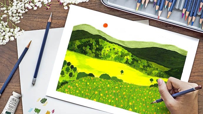
1. Introduction: Are you wondering what is Gouache and how
to paint with it? Then look no further. This class is just for you. Hi, my name is Vidya Kumaresan. I'm an illustrator, hand lettering artist and surface pattern designer
based in India. In the past, I've collaborated with
some amazing brands and created patterns for lifestyle products, stationery, clothing and packaging.
In this class, you will be learning everything
about Gouache as a medium and also how to
get the right paint consistency. We will also be practicing different brush stroke
to create Floral. And finally, we will be creating a beautiful floral
Bouquet painting. So let's get started.
2. Materials: For this class, you will
need gouache paints. The gouache paints
that I will be using is from a brand called
a mijello mission. But feel free to use any brand of gouache that
you are comfortable with. For this class, I'll
be using three colors, along with one
metallic Gouache color. The colors are Crimson Lake, which is also very similar
to magenta or rose madder. Red violet, which is also very similar to violet or lilac. Then white color.
And a metallic Gouache in the color bronze or gold, which we will be adding one
at the end of the painting. Next, we will need brushes
in different sizes. Here, I'll be using round
brushes of size 4, size 2, size 3/0 to add details. Along with these round brushes, I'll also be using a
flat brush of size 10 or even 12 depending
on the size of the paper. To paint the background. Then we need a watercolor
paper to paint a painting on. I will be using a hot pressed paper from a
brand called Brustro. Which has a very smooth surface. It doesn't have
any texture on it. But feel free to use any cold press paper as well
which has texture on it. The reason that I don't use a cold pressed paper and I prefer using a hot
pressed paper is because I paint on hot pressed paper and later
I scan it, digitize it. So when there is no
texture involved, it makes the digitizing
process much easier compared to working on a paper which has
a lot of texture. But if you're not going to
digitize your artwork in future than cold pressed paper
is also a best choice. Finally, you will need a
palette to mix your paints. I personally prefer
using ceramic palette over a plastic palette as it
doesn't crack my paint. But again, it's your
personal choice.
3. Gouache & Consistency: What is Gouache? Gouache is actually a loved child between watercolor
and acrylic paint. The reason I call it as a love
child is because it mimics the property of both watercolor
as well as acrylics. With gouache, if you
add water to it, it can become a watercolor. You don't add any water to it, It almost stays opaque. Now let's try Gouache by
adding little water to it. As I paint, you can clearly see that it covers the
white of the paper really well and
retains its opaqueness. So once the gouache dries, it's not just going
to be opaque, but it also has a slight
matte finish to it. To the same mixture puddle, I'm
going to add more water. It's still opaque. Let's add more water to it. Now you can see
it's slowly getting transparent and I can see the white of the paper
through my painting. We're going to add more water. And now it has turned
almost watercolor-ish. So here you can see that
when I started painting, my painting is almost
opaque and as it dries, it also has a slight
matte finish to it. But as I keep adding water to
my paint palette over here, it slowly translates from being opaque to completely
transparent. That is from being a gouache to being
completely watercolor. So this is one amazing
property of gouache, where when you add less water, to your gouache paints, they retain their opacity and also
have a nice matte finish. But as you keep adding more
water to your gouache paint, they actually turn into a
transparent watercolor medium. Gouache is a two-in-one medium. And this is one of the
main reasons why it is preferred mostly by the
artists around the globe. Right? So now that we have
understood what gouache is, let's talk about
the consistency. By Consistency you might think
or you might not have an idea as to how many
drops of water or what is the exact
water : paint ratio that you need to be adding to your paint so that you retain the opaqueness
of your gouache. Getting the right consistency
depends upon the amount of water that you will be adding to your paint. So let's say e.g. I'm going to squeeze
a little bit of paint on my
palette over here. Now, based on the amount of paint that I have
added to my palette, I also have to add Water accordingly, since the paint amount on
my palette is quite less, I don't have to add more than two or three drops of water to get the
right consistency. Now, this consistency
also depends upon the tool that you're going to be using
to add your water. If you're using a paintbrush, smaller paint brushes will
add few drops of water, whereas fluffier or
bigger paint brushes, like your watercolor brushes, might end up adding more
water to your paint. For this reason, instead
of using paint brushes, you can also use
ink dropper tool, which makes it more
convenient for you to add a few drops of water to your
paint paddle as required. Anyways, for this class, I'll be using my paint
brush to add water. Since the amount of paint on my palette is considerably less, I'm just going to add two
to three drops of water. Let's start with a drop of water and maybe
another drop of water. Now let's start mixing this. And as I mix, you can see the paint is getting
thick, but also creamier. So when your paint mix
starts getting creamier, it is an indication
that the amount of water that you have added
is exactly correct. But in case if you end up
with a very watery puddle, then it means you have
added a lot of water. In that case, try adding
more paint to your puddle. Here you can see that even
if I tilt my palette, the paint is not dripping. It stays intact. This consistency is fine. Now let's try this on
the paper as well. I'm just roughly drawing
a flower outline and trying to fill it
with my gouache paint. And as I paint, you can
see that I'm not having any issue with layering the paint because the
consistency is almost perfect. So it's allowing me to
layer the paint evenly on the paper without any struggle. Right? And you can also notice that the paint is covering up the white
of the paper completely, which means it is opaque. So let's wait for this to dry. And once dried, you
can see that it will dry with a matte finish. So things to remember
when you are trying to achieve the
right consistency is always remember that the amount
of water that you add to your paint depends on the amount of paint that
you have on your palette. If you have less paint
on your palette, just add few drops of water. If you have more then
add water accordingly. But if you're not confident with adding water using
your paint brushes, then remember, you can
always use ink dropper tool. And that way you can add
just a few drops of water to your paint puddle and have it
in the gouache consistency. And if you end up
adding a lot of water, which means your consistency
is not going to be opaque, rather, it's going to be
transparent in nature. In that case, just try adding more gouache
paint to your paint mix.
4. Practising brush strokes: Now that we have understood what Gouache is and how to achieve
the right consistency, let's focus on using brush
strokes to our advantage, and painting florals using them. So here I'm going to choose
my brush of size 4. And I'm going to take
my gouache paints. You can choose any color
that you like because this is just going to be like a warm-up session where you practice strokes
using your brush. Again remember to add
just a few drops of water. Once you feel that your
paint is creamier enough, you can start painting with it. I'm just going to take my
round brush of size 4 And I'm going to make brush strokes in
different directions which mimic a flower. So I want to start
with a U-shaped flower by just making strokes
with my paintbrush. It doesn't have to be perfect. I'm just going to repeat
the same few more times. I'm going to try doing that
in different directions. So just press your brush and just pull it in the direction you
want your flower to be. And then just join
them in a U-shape. Using my size four brush, again. I'm going to draw a flower, but this time it's going to be a little different from
what we did previously. Again, using brush strokes, I'm going to draw a flower. So this time I'm going to
press the brush, pull it out, and again press the brush
and make a shape like this, which looks very
similar to a leaf. I'm going to repeat the same
in different directions. This doesn't have to be perfect. The number of petals is again, a choice that you can
feel free to make. I'm going with a five
petaled flower here. So something like that. So I'm going to repeat the same. You can also try
doing the same in a U-shaped fashion. Something like that. Finally, I'm going to
switch my brush from size 4 to a smaller size, which is a size 2. Again, I'm going to use
my brush and just apply pressure similar to what
we did in the first method. But this time, instead
of a U-shaped, I'm going to go all around like in a sort
of 360 degree fashion. Again, none of these flowers, or the brush strokes that you
make, have to be perfect. So keep playing around with your brushes and keep
applying pressure. Like each time you
apply pressure, you get a different outcome. If you apply too much
of pressure than your line is going
to be like thicker. And if you apply less pressure then the line or the brush stroke that appears is going to be
thinner or thicker, right? Based on the pressure that
you're going to apply, you can just easily
play around with that so this is a very simple floral bouquet that we are going
to be painting. So these are the
kind of flowers that I am going to incorporate
in my final painting. So my advice to you would be to practice this really well before you move on to
your final painting. Once you're happy with
the way you are painting with your brush and
creating the strokes, and you're confident
enough with it, then you can move
on to painting the original painting.
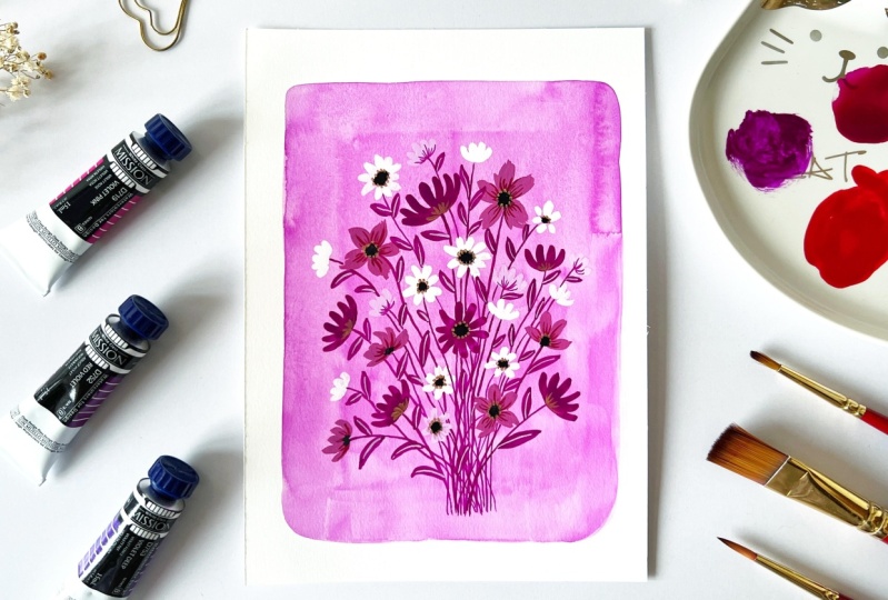
5. Painting the background: Let's start by painting
the background. For the background, I'm
going to use my gouache in watercolor consistency.
For the background, I'm going to be choosing
the color violet. so I'm going to squeeze little bit of the
red-violet on my palette. And to this, I'm also going
to add a little bit of white. Now let us take a
very little amount of white using my flat brush. Just a bit of that. And add it to my
violet over here. Again, taking a little bit
of white and adding it. And you can see the color
is slowly changing. I want the violet to be more
on the Pastel side. So I keep adding white
as much as I can. But I don't want it to
be a very light as well. So I think I'm happy
with this color. Maybe I want to
add a little more white and see while I'm at it, I would also love to
swatch it on a paper. Okay. So I feel it can be
a little bit more light. So again, going to
take white and add it, swatching it again. I'm quite happy with that color. To this mix. I'm
going to add water. If you remember, I
told that I want the consistency to be of
a watercolor consistency, which means I don't have to be worrying about how much
water I need to add here. I need the paint to be transparent and also as
much as light as possible. So again, adding
water, my flat brush. I'm also going to swatch this so that I can exactly calculate
the amount of water that I actually
need before I go directly painting on
the final paper. Adding water again. And I'm going to take this mix and use it to start
painting my background. I'm going to start from here. I'm not going to start
from the very corner further away like a margin. sort of trying to make a rectangle. Don't worry too much about
the layering of the paint. Even if you find a brush strokes to be happening,
It's totally okay. Because I do love
the texture that happens when you're using
a gouache as a watercolor. And also the brush textures, add in a lot of depth. So now I have to let this dry. And once it's dry completely, we can start painting on this
background using gouache.
6. Painting florals: Now that our background
has completely dried, we can layer the flowers
on top of our background. For this, I'll be using
a round brush size 2. I'm going to
use the same color, red-violet as before. I'm going to add just a few
drops of water to this. Once I'm happy with
the consistency, I'm going to start layering
the paint on the background. The very first flower that
we are going to paint, it's going to be of this type. I'm going to start with that. Now there's no right or
wrong way of doing this. I'm just going to
place my flowers like at random on different
places on this background. Even as I paint,
you can see that the stroke is not completely
opaque, but that's okay. You can always go again on top of it and try to cover it. Makes sure that
your florals are in different directions and not just in a straight 90-degree. I'm also going to try one
more flower in a circle. 360 fashion, which looks
very similar to a Daisy. For the next flower, I'm going to choose the
color, Crimson Lake. For this, I'll be choosing
the brush of size 4 and to this paint over here, I'm going to add white. I do feel like it needs white. You can see that I'm
only adding white to my crimson lake in parts. I'm not scooping the white
completely and adding it. The reason I'm doing
this is because sometimes when I end up adding like a scoop of
white into my paint, I regret doing that
because then it becomes very light and then I have
to go again with the dark, like the original color
and make it dark. But when I just add white in parts, it makes me more comfortable
and easy to understand, to understand the kind of color that I am actually trying to achieve
here with the mix. And for this, I'm
going to go with the style 2 that we
tried to paint. Again, I'm going to
paint the flowers in different directions and
also place them at random. The whole point is
to cover this area. You don't have to worry
about the center part. We'll be covering that
with black later. The next color that we are
going to be using is white. Since my white is already polluted I am
just going to use a new one. And again for this, I'm going to use round
brush of size 2. I'm just making
strokes with my brush. Now you can mix and match
the Florals as you want. I'm going to do a mix of this one and this
one using my white. next, I'm going to add white to the red violet
that I have here. Maybe just take the red violet
and add it to the white. Now I use that and
add few more flowers. I have a feeling that
it's not visible much. So maybe more white. So I think I'm happy with
the way the flowers are placed. Next, I'm going to go ahead and add stems and
leaves to the same. Let's start painting
the stem and leaves. For the stem. I'm going to use the same color, red violet. And this time I'm using a very fine brush of
size 3/0, which has very few
bristles and is really good for adding
really thin lines. I'm just going to add a stem and bring it
down all the way. Over here. Repeat the same
for all the other flowers. I'm done with the stems. Next, I'm going to add the
leaves. And for the leaves. I'm also going to use
the same color, violet. This time, I'm going to
switch my brush from size three by zero to size 2. And using the
pressure technique, I'm just going to add leaves. Wherever I feel like there is a lot of negative
space going on. So I'm done with the leaves. I've covered most of
the negative spaces. And next, I'm going to add details to the
flowers and the leaves.
7. Adding details: Next, we're going to paint the center part of the
flowers using black. I have already
00:00:14.205 --> 00:00:17.500
Squeezed black on my palette. For this, it doesn't matter the size of brush that you're
going to use. Just going to paint the
very center of the flower. Next, I'm going to use
the color Crimson Lake. I'm going to switch to a
brush of size three by zero. I'm going to add details to
the petal part of the flower. I'm just pressing
and pulling my brush out so that I get these fine Strokes. Next, I'm going to
mix a little bit of violet into my white. to get that nice pastel violet color. I'm going to use
this for the leaves. I'm just going to draw a line to represent the
vein of the leaves. We're almost done
with the painting, but we do have final gold details to
add to this painting. So let's do that. I'm using the color bronze from
the brand Arteza. It's a metallic Gouache. But you can also use any other metallic color that
you have with you. A very little amount
is more than enough. I'm using the brush of size 2 I am adding water to the mix here. And I think this
should be more than enough and around the center
area of the flower, I'm just going to add dots. I went ahead and added gold details to these
flowers as well. And you can see how much depth it adds to the overall painting. Now adding gold is
completely optional. If you feel like you
don't want to add it, just leave the
painting as it is, as how it was before. But I really feel like adding a hint of gold adds a lot of beauty to your painting.
8. Final thoughts: I hope you enjoyed this class as much as I enjoyed
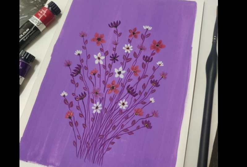
teaching it to you. Before I end this class, I wanted to show you a couple of other color options
that you can try out. Here are some examples. Do upload your projects
to the project section. And in case if you
have any queries, please feel free to drop your query in the
discussion section as well. I would love to look into it
and answer all your queries. Thank you so much and see you again in another class. Bye.
 Vidya Kumaresan, Illustrator