Transcripts
1. Introduction: Hi, my name is Vidya Kumaresan. I am an illustrator, hand
lettering artist and surface pattern
designer based in India In the past, I have collaborated with some amazing brands and created patterns for
lifestyle product, stationery, clothing and packaging design. Florals are easily
my favorite subject to paint irrespective
of the medium. And in today's class, I will be teaching
you how to paint a beautiful Floral lettering
illustration using Gouache. I will be teaching the
entire process, starting from choosing a font, sketching the elements,
tracing the elements, and finally painting the entire composition.
So, Let's get started.
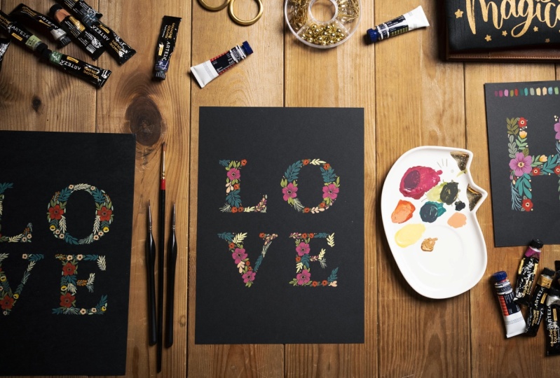
2. Tools & Materials: The supplies that
you'll need for this class is going
to be an A4 sheet. I will be using a
card stock paper, which is black in color. You can feel free to use any
color that works for you. like a watercolor
paper or a toned paper, or even a kraft paper. I will be using a 300
GSM thick paper because it is
really suitable for painting and also easy to frame. Next, you will
need an A4 sheet, like a couple of A4 sheets because we will not be directly sketching on our black card
stock paper. Rather, we will be sketching
on the A4 sheet first, and then we will
be tracing it to our final
card stock paper. Then you would need a pencil
like a regular pencil. a glass marking pencil like this, which is white in color. You can also use a chalk instead
of a white color pencil. You would need a couple of
brushes in different sizes. The size that I will be using is going to be a round
brush of size 0 & 1, 1 for painting the base layer and 0 for adding details. Apart from that, I will be using a very thin brush in case I need to add very
intricate details. You would also need a palette It can be any palette like a ceramic palette or
a plastic palette. I prefer using a ceramic
palette because Gouache can be reactivated or reused even once they are dry. So ceramic palette keeps the paint intact and
doesn't let it crack. You'd also need an
eraser to correct your mistakes. And finally, you will
need gouache paints. For this session, I'll be using a brand called Mijello
mission Gouache paints. But feel free to use any
gouache paints that you have.
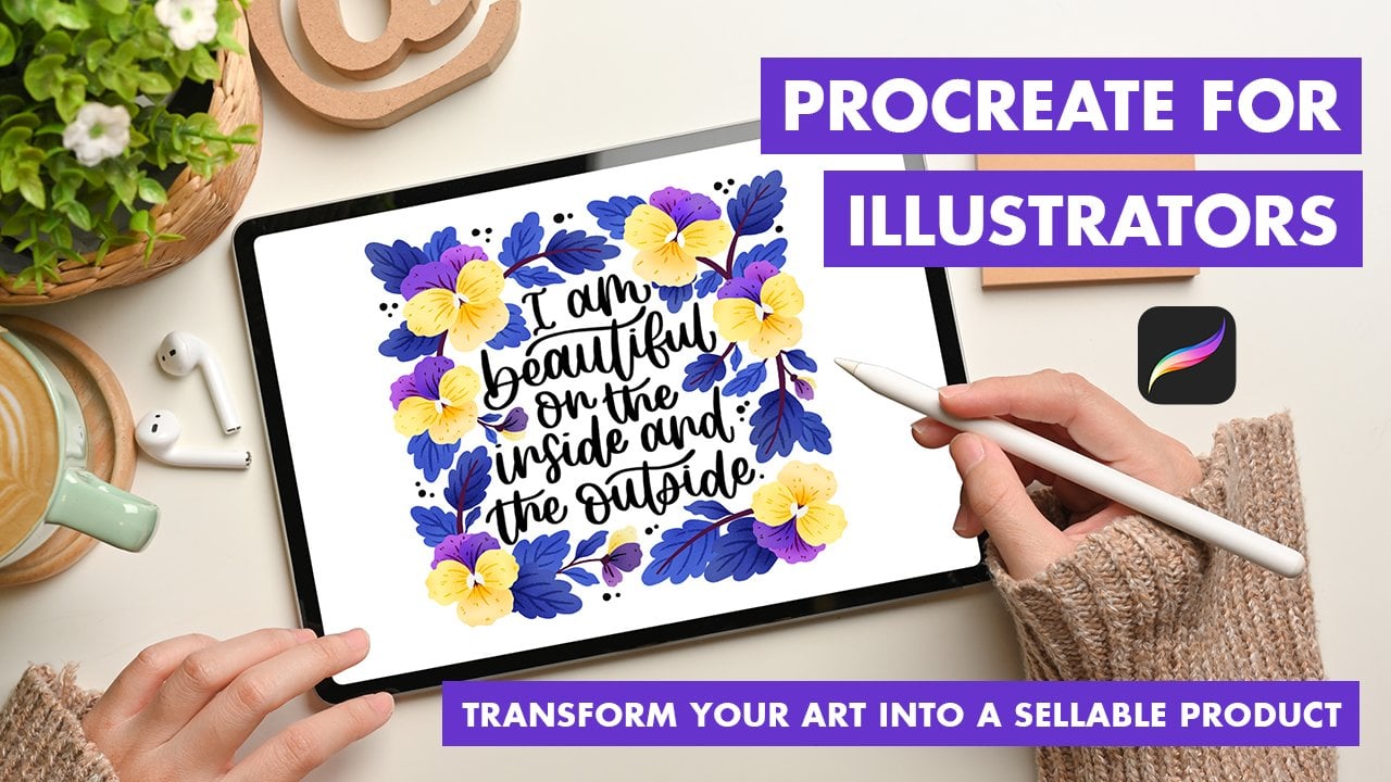
3. Choosing a font: Next you would need
an editing software like Procreate or Photoshop, something that you
can use to edit your fonts and make
them print ready. I'm using Procreate
and inside Procreate. I will be choosing
an A4 size canvas Once I'm
inside the Procreate, I have my canvas ready. Now, I am going to
choose my text. I'm going to be
choosing the word love. Make sure that you've typed everything in capital letters, scale it to the size
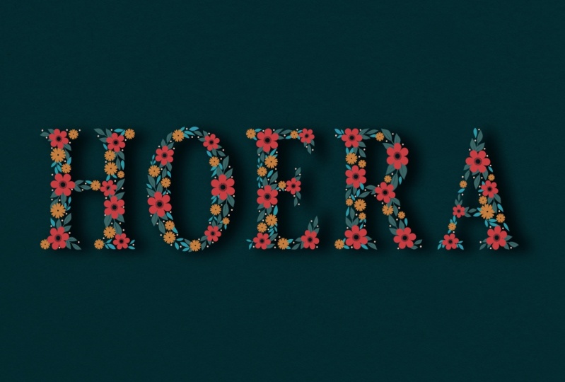
of your Canvas. Feel free to use any word that you feel that you
would resonate with. I'm choosing the word love, but you can choose words like Hope, peace, joy anything that you feel that you
would resonate with. Since I'm using the word love
and it has four alphabets, which is like an even number. I am using this vertical format, so it's easy for me to break
it down into two alphabets. But in case if you are using a word which is more
like an odd number one, it will not be easy
or possible to actually break it down
into something like this. In that case, for example, If you are using a word like joy. You cannot break it down
into something like this. It would not visually look good. What you can do is you
can flip your canvas, make it horizontal alignment, scale it accordingly. and have it in this kind of a horizontal format
over vertical format, you can just scale it according to the
size of your canvas. Center align it. You would be using it
in a horizontal format. But if you are using
like a word which has four or more like an even number
alphabet in it, you can use it in a vertical format. so I'll Get back to my Word, which is Love and align it. Now, you can just go
ahead with the font that you have default on
your system or You can just go into
your font library, make sure you select everything. Go back and forth with whatever font options
that you have. Make sure that your
font is bold enough. Don't go for anything as light
version or even regular. Go for something bold so that you have enough area to fill
within the alphabets. So I'm going with a
font named Baskerville, and I'm going for
the style bold. Now you can see that
everything is very closely spaced and
I am not liking it. So for that, I'm just increasing
the kerning space here. The size a little bit. Once I'm completely happy
with the way it looks, I'm just going to go
ahead and rasterize it. Again, scale it to
the size I want. Finally Make sure to reduce the opacity. Because when you
are printing it, you don't want it
to be super black. You want it to be kind of
in a greyish tone so that you can draw on top of it and you can see the elements that you're
drawing on top of it. So make sure to reduce the
opacity as much as you can, but not too much. Once you're done with it
and once you are happy with your word and
the way it looks, you can send it
off for printing.
4. Sketching simple floral elements: Once you have taken
the printout, you should have
something like this and your alphabets
should be really light. Now we can start
sketching our elements. So before we go onto
sketching on this paper, I just wanted to show you a few of the elements and
how I sketch them. For this composition, I am
planning a very simple flower. So if you're someone who
has never sketched before and you really struggle
with sketching a flower One simple technique
is to just draw a circle, and this doesn't
have to be perfect Then you draw another circle right in the middle Next you decide the
segments of the petal, like how many you want, how many number of
petals you want? I'm going for like maybe a five. Make sure that your petals. That is the tip of the petal falls within the
outer circle line. Feel free to use any
shape for the petal. I'm using a very wide
space petal over here. You can also use
the same technique. Go for even a narrow petal. Just makes sure that the petals stay
within the circle. Once you're done
with your sketch, you can just erase
the pencil lines. Next, I'll be showing
you how to draw leaves. You start with a nice
arc in any direction. Then from the tip, you just start
drawing your leaves. Now you can do this in
two different ways. One is by changing
the alignment. So I'm going to go ahead and change the alignment
and go alternative. The other way is to
go in a opposite alignment. So same technique. You start with the
leaf at the tip. You draw your second leaf. But this time we're going
to go right opposite. You're going to draw
a stem right opposite to the previous stem. By just changing the alignment
and also the leaf shape. You can create different
varieties of leap stem. Here again, I'm
drawing another arc. And this time instead of
the usual leaf shape, I'm going for a flat shape. Going for an alternative alignment
5. Sketching the composition: Now that you know how
to draw your elements, Let's start drawing them
inside the alphabets. Whenever you're drawing
inside these alphabets, one thing to remember is that
you have to make sure that your elements do not
fall out of the outline. Anything you draw should be only within this alphabet and not come outside of the
outline of the alphabet. You can feel free to
draw any elements in any direction as long
as you're filling the space inside the alphabet. I'm going to start from the
corner of the alphabet "L" and keep filling spaces as I keep coming in the
downward direction. My goal here is to
basically fill all the tiny, tiny gap that I see
between the elements. There is no right or
wrong way of doing this. Just keep sketching. Since this is just
a rough sketch, you also have the freedom to erase and keep making
changes whenever you want. Even if you find any negative
spaces in your sketch, you can always fill them
in with elements like the circle or even
any other elements like just a tiny leaf Whatever you like. These things we will be doing at
the end for now, just focus on sketching part. so whenever you are drawing close to the outline Make sure that your
elements are touching the outline. You just don't have to
follow the elements that I am creating. Feel free to draw anything that you like I'm almost done with
my alphabet "L" but you can see that
in certain areas I do feel like there's a lot
of negative spaces. So I'm just going to fill in those negative spaces
with tiny dots. I'm happy with the way
my alphabet "L" has turned And I'm going to be repeating the same floral
element or botanical elements. for the rest of the
alphabet as well.
6. Tracing the composition: Once you're done with sketching the elements within
the alphabet, the next step is
to trace them. To trace these falphabets you will need a white pencil or a glass marking
pencil or even a chalk Remember you have to use this only if you're using
a black color card, stock paper, if you're using a white color paper then you
can use a regular pencil. You have to turn your paper and wherever you feel that the alphabet
is actually placed you're just going to draw with your white pencil
over there. More like a scribble. Make sure that you cover
00:01:23.240 --> 00:01:25.745
all the areas with
your white pencil. Before you start tracing. Once you have scribbled
with a white pencil at the back of your paper,
you just turn it over. And place it on top of black
A4 card stock paper. If you're comfortable sketching, having the paper
straight then go for it. I usually prefer
it to be slanted. I'm just going to
position it in that way. And you can either use
a cello tape or a masking tape just make sure that
you're sticking and your card stock paper together to the table. Just adding one more to this side Not adding any on the side because in case if
I want to make sure that the elements that I am
drawing is getting traced or not I'll be just lifting up the paper to check
once in a while. Once you have taped your paper, just use your regular pencil or any pen or anything and just go on top of your elements like you would be redrawing
everything again. But this time just
make sure that you apply pressure so that whatever you're drawing on top gets the impression
at the back of the paper, start from the corner
of the alphabet and make sure that you apply. you are basically just
redrawing everything by just applying extra
pressure this time. Now before I proceed with
the rest of the elements, I just want to make
sure that whatever I'm drawing is getting traced
on the black paper. So I'm just going to lift this and as you can see the white color
pencils impression is falling on the black paper. Just want to come
back and carefully tape this and just keep continuing with the
rest of the alphabet.
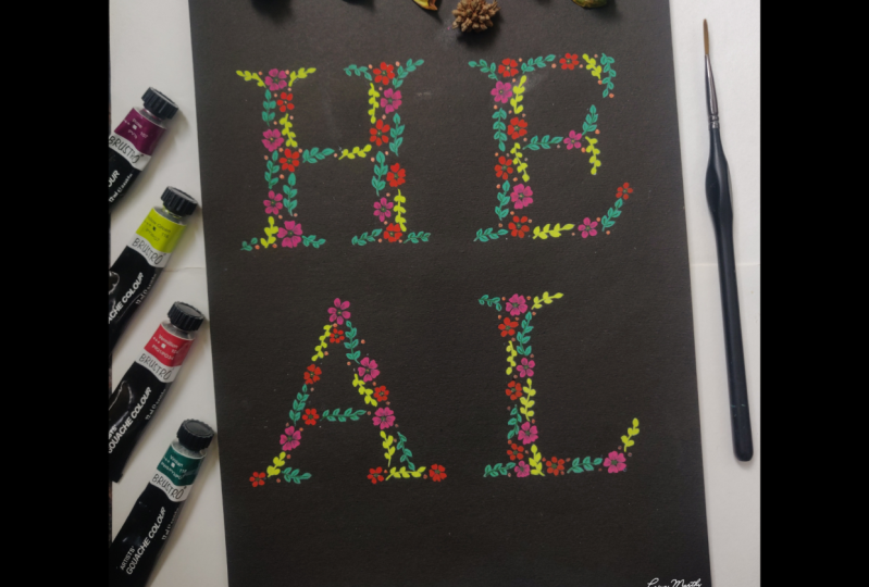
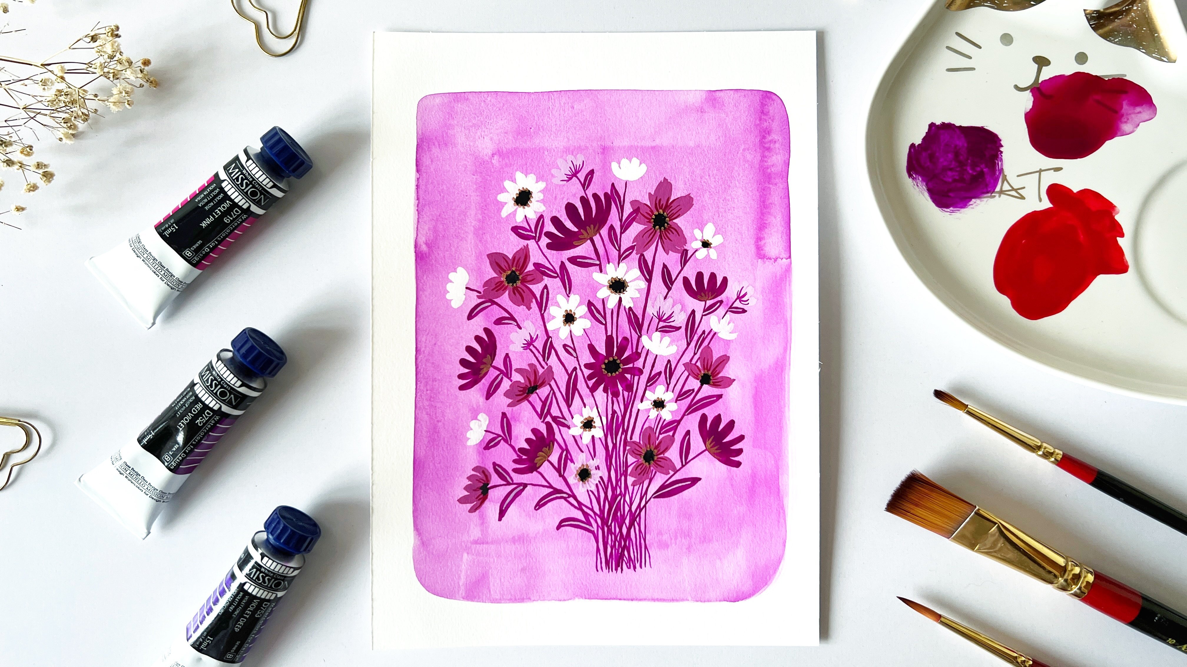
7. Painting the composition Part 1: So once you are done witg
tracing your elements to your card stock paper. Next, Let's start painting. for the very first element. I'm going to be choosing
the color rose. Vermillion red and grey I'll be mixing
these three colors. I be creating a color which is
sort of a muted rose color. with gouache you have to
make sure that you add only a few drops of water. Don't go overboard with water. In that case, you
would end up getting a very transparent
consistency. Adding more rose
into this mix. The key is to make sure that your mix is thick and creamy
and not really watery I will be adding a little bit of white You have to make sure
that your consistency is creamy and thick and not too watery. If you feel like it's too thick, then make sure to add
a little bit of water and make it creamy enough. so I'll be using this color to paint the biggest flower in
the composition? If your paint
consistency is creamy, then you should be able to layer these paints without any
hassle on the black paper. But when you do if you feel
that you still see the black of the paper
through your painting, then wait before the first
layer dries and then go on top of it with a second layer
or second coat of paint. This usually happens with a
black paper because it's a darker color and layering light color on top
of a darker color With gouache is easy, but sometimes you need
to go more than just one layer. Once you're done with
the base painting, and if you're happy
with the output, then you can move on to
painting the next flower. But if you feel that there are certain
areas in the painting, where you still see the
black of the paper. Then wait for the
first layer to dry. And then once it's
completely dried, you can again go on top of this base layer with a
second layer of paint. This way you will
be able to cover most of the black of the paper. Next, I'll be using
this Vermillion red You can also use
bright red or any kind of red which stands out or pops
up against this black color. Make sure that you're only
adding a few drops of water. Once you feel the consistency
is nice and creamy. Start painting. So I'll be painting the tiny
flowers with this color Next, I'll be using this shade Viridian and adding white to it? to get a nice pastel shade I am adding very little bit of white. using this shade for the leaves here For these illustrations, I'm
using a size one brush. I feel comfortable
working with this brush Mainly because my
illustration in this particular part is like really small and these brushes are
more than enough. But if you are making
huge illustration, like A3 size or
more than that, feel free to use a
bigger size brush.
8. Painting the composition Part 2: The next color that
I'm using is mid - yellow You can also use permanent yellow light
or deep or other similar shades. And I'll also be using white extra white in there pulling in little bit of that white Using it for the small leaves Not comfortable,
using even a size one brush for this because
the leaves are very small, you can switch to
a smaller size round brush 0 or even triple 0 or 00 You can paint at ease and not
feel like you are losing a lot of details with the paint. Notice that if your
consistency that's your paint consistency is actually good you don't have much
problems layering the paints. They also cover the Black
of the paper quite well. You don't have to go like a couple
of layers again and again. It also depends on consistency. Of the paint, if it's good, then you don't have to keep
on layering again and again. But if your consistency
is quite watery, then there is a chance
that you have to keep painting again and again. Then I'm using the
shade Apricot. It's very similar to light apricot
or like a Flash tint shade. I'm using a size 0 brush. If you're not comfortable adding drops of water with
your paintbrush. an alternative would
be to use an ink dropper. So that way you
won't end up adding too much water if you're
using a large size brush. Next to the same shade
that is apricot I'm adding a little bit of red. that I already have on my palette
and darken that shade. I am adding color to the alternative buds and I am leaving the buds in between and add another color I'll be using the same shade
that we mixed earlier for the bigger flower like the muted rose. I'm using the same shade Adding the branches little amount of black to the olive green Just very little amount
because if you add too much, it's going turn completely muddy black is going to dominate. so very little amount of black and if you feel like
it needs more then you can add but don't go overboard. I'm adding white to this olive green Make sure that they're
lines are fine lines Incase if you have drawn an element like this. You can also use a rigger brush I am using a rigger brush and it gives
me nice fine lines. Just make sure if you're
using a small size brush and making fine lines with it.
9. Adding details: Now you can see we're
already done with the base painting and only the
detailed part is left. So we'll go ahead and start
adding details for this one. I'll be choosing a darker rose color So I'm just going to use the same mix that we already
have here in the palette. Probably add a
little bit of black to it. I usually darken my colors
using black of burnt sienna. This way I didn't get
a nice dark shade of the base color that
I already painted. Just going to go ahead
and add few strokes. to my petals here. Using a
small size brush which is a size one, you can also use a size 0, so you get like a thin stroke. You don't have to be
perfect about this. Just go with the flow strokes you do need a little practice beforehand, but if it's your first time, they just don't feel too
pressured to get the strokes. It eventually comes
with practice using this same shade and adding
little bit of shading, using the same dark green. We are almost done with Painting the elements and I feel like
it's almost looking good. but Just to give a final touch I am adding this metallic gouache
in the color Bronze. make sure to clean your brushes once you're done
with dipping them in the water and use a tissue paper and wipe them off, especially when you are using dark colors like black because they
tend to get mixed. with the rest of the colors. I'm using this bronze color Adding tiny dots around the black Same bronze, those dots negative gaps and spaces. quickly looking at my pencil Sketch.
10. Conclusion & Final thoughts: I hope you enjoyed this painting as much as I enjoyed
teaching it. If you did complete
this project do post it under the
project section. In case if you have any doubts, feel free to reach
out to me through my Instagram handle that is The wishing ink. And you can also post
your queries under the discussion section
here on Skillshare. I hope to see you again
soon in another session. Until then, bye bye.
 Vidya Kumaresan, Illustrator