Transcripts
1. Introduction: Hi, my name is Vidya Kumaresan.
00:00:02.430 --> 00:00:05.400
I'm an illustrator,
surface pattern designer, and art educator based in
Tamilnadu. On social media I go under the name The wishing ink and I welcome you all
to my third skillshare class. In this class, you
will be learning all about the
silhouette and how you can use them to your advantage and create beautiful
illustrative pieces. For the class project, we will be sketching
and painting floral elements inside a
popsicle silhouette. Florals are easily my favorite
subject to paint. It is because they're
always on trend. It is also fun to paint them florals go well on any product when it comes to merchandising. And finally, they are one of the easiest sources of inspiration that are
available out there. In this class, you will learn
all the tips and tricks, starting with the
supplies that I use. how to choose your silhouette and get them print ready, how to sketch elements
inside your silhouette, how to trace them, and finally, how to paint
them using gouache. for this class, I will be
using gouache as a medium, but it is not a
compulsion. You can use any medium that you
are comfortable with. This class is completely
beginner friendly and also suitable for anyone who's
interested in expanding their artistic skills.
2. Supplies: Let's talk about the supplies that you would need
for this class. First, let's talk
about the paints. For this class, I will
be using Winsor and Newton designer
gouache paints along with another brand called Arteza. You can feel free to use any brand that
you are comfortable using for this class. For the Brushes, I will be using round
brushes of size 4 and 3/0 Both these brushes are synthetic hair brushes and
work really well with gouache. I'll be using size 4 for
most of my painting But in case if I have to add any fine line or any
detail to my painting then I'll be using the
size 3/0 We will also need a
pencil for sketching the florals and eraser to
correct your mistakes. for the paper, you
can use either a sketch book Or you can also use
a watercolor paper. For this class,
I will be using a watercolor paper from a
brand called brustro, which is a hot pressed paper. Feel free to use any
watercolor paper that you have I'm using a hot press paper which doesn't have
any texture on it. But having a texture or not having it is totally up to you. So feel free to use any
watercolor paper that can hold enough water and
allows you to paint freely. Finally, you will need a ceramic palette
or a plastic palette to mix your paints and a jar of water to
clean your brushes.
3. Choosing a Silhouette: What is a silhouette? A silhouette is a
cast or a show as a dark shape or an outline
against a brighter background. Most of the objects will
definitely have a silhouette. And this silhouette
can be used to a greater advantage
when it comes to art. Most of us usually struggle
with sketching the outline. This is where the silhouette
plays a major role. You can look into the
internet and find various silhouettes
of different objects, shapes, or even animals. For the sake of this class, I am going to download
a popsicle silhouette. I'll also be adding the downloaded file to your project and
resources section. You can download the
print file from there.
4. Printing the Silhouette: Once you have chosen
your silhouette, we are going to print
it on an A4 paper. But before we do it, we are going to edit our silhouette on an
editing software. I will be using Procreate on
iPad to edit my silhouette, but you can use any
editing software that you are comfortable with. You can also use your
phone to edit your silhouette. You can also use
software like Canva or Photoshop or any
other editing software. For this purpose,
I'm going to go ahead and choose a
canvas of size A4. And then I'm going to just bring in my selected silhouette. Now I'm just going to adjust it accordingly to
the canvas size. I'm also going to
align it so that it is perfectly aligned to
the center of the paper. While I'm not liking these
lines that I see here, I'm just quickly
going to remove that. Once I'm done with it, I'm just reducing the opacity of the entire silhouette
that we have here. You're going to reduce
it to an extent where you are able to see it. But it's not very dark. You have to lighten it. Then whatever you are
drawing on top of the silhouette can be
clearly seen by you. So I'm going to
reduce it further. I feel I want to
increase the size as well. Now I'm going to send this file for print. Once you're done
taking your printout, it should look
something like this, Your Silhouette should not
look very black. Rather, it should
look like this. It should be a very
light gray in color. So whatever you draw on top of the silhouette should be clearly seen to your
your own eyes.
5. Sketching the floral elements: Next we are going to
go ahead and fill this entire silhouette
with floral elements. For this class,
I'm going to keep the floral elements very simple. The flowers are going to
have just five petals and the leaves are also
going to be very basic. You can also take reference
images if you like them, or you can just follow along
with whatever I am doing. If you are very hesitant
to follow along, then just observe
whatever I am doing. And then you can start sketching at your own pace
when you're comfortable. I'm going to start
sketching from the very center of my
popsicle over here. And then I'm going to proceed
in different directions. Make sure that the size of
your flower is not very small. At the same time, make sure
that it's also not very big. The whole idea is to make
sure that you've filled the entire silhouette
with floral elements so you can leave
gaps in-between, but don't leave too
much so that it makes it look like there is
a lot of negative space. Don't be very hesitant
to make mistakes. We're just working
on a rough sketch, which is on an A4 sheet. This is not our final
watercolor paper. So in case if you feel like
you've made any mistake, just go ahead and correct it. It doesn't matter how many
times you end up correcting or making mistakes or just
reworking on your sketch. This is just a rough sketch. just give yourself that
space and don't get stressed. As you come close
to the outline, make sure that your
floral elements, whatever it is that
you're drawing. It might be a flower
or it might be a leaf. It is touching
this very outline. Don't go anywhere
outside of this outline, then you'll not be able to make out the shape
of the popsicle. So stay within the line
within this very outline. If you end up with
gaps like these, which we usually call as negative spaces,
it's totally okay. We will be filling
these at the end. Maybe with some loose leaves, are just few dots
here and there so you don't have to worry
too much about the negative spaces as of now. We will be filling
them at the very end. As you can see, I'm
done with the sketching and I'm going to leave
this part as it is. I'm not going to draw
any florals over there. Rather we're just going
to keep it as a line art, which I'll be doing
at the very end. So leave this space
as it is as of now. And here you can see that there are a few gaps in between, which looks more like
a negative space. So I'm just going to
go ahead and fill those negative spaces with circles. We can call it as dots. You can make it bigger, smaller, whichever
size you like. Just make sure that you
have those dots spread out throughout your artwork so
that it looks balanced. So I think it looks
good. So far, so good. Next we're going to go ahead and trace these elements that
we have sketched, to our watercolor paper.
6. Tracing the floral elements: Next we're going to trace this onto our final watercolor
paper over here. Before we do that, to
trace our entire sketch, we are going to
scribble at the back of our A4 sheets on which we
have our sketch with pencil. So what I'm going to do
is I'm just going to show this paper against light. Then you can see where
my artwork is starting. I'm just going to make
an outline around it. As such, this is to make sure that I'm not leaving out
any area at the same time. I'm not going out of
this outline as well because I don't have to
scribble over the entire paper, just the area where
we have our sketch. Let's just scribble
within this outlines. So make sure that
you have covered almost every part of
the pleural element. Because if you haven't, then it won't get traced. So just make sure of that. And in case if you haven't, then just go back and scribble on top of the
areas where you feel like the pencil hasn't covered the floral
elements properties. Once you're done
with the scribbling at the back of the paper. Now we are just
going to place it on top of watercolor paper. Make sure it's aligned properly. Then you might need a masking
tape or painter's tape. And you're going to stick the paper and the watercolor
paper to your desk. I'm also going to
tape the other side, this side to the table. This is to ensure that
the paper doesn't move while you're trying
to sketch on top of it. You can also tape this side, but I will not be
doing that because I am just going to leave it so that I can flip over and check if the elements are
getting traced. For that reason, I'm not
taping this side and the side. But if you feel very uncomfortable not taping
the site and you feel like, you know, you might end up
moving the paper tapered. Now, I'm just going to go
again and repeat the drawing. I'm just going to draw on top of these floral
elements once again, since we have scribbled at
the bottom of our paper, this is going to act exactly
like a carbon copy paper. So whatever you draw on top will get traced on your
watercolor paper. Make sure you apply
pressure to your pencil while you're drawing so that the elements are getting trees. I'm just going to flip
the paper to check. You can see that it
is getting traced. I'm just going to continue sketching the rest of
the floral elements. So once you're done
tracing your elements, you can remove the paper. Here you can see that you have a very subtle outline of
your floral elements. This is more than enough
for our painting. Just make sure
that the lines are very soft and not too dark. If the pencil lines
are too dark, then just take your
eraser, enlighten them. The reason we're doing
this is because having dark pencil lines can make your painting seem a little bad. Because sometimes though
gouache is an opaque medium, colors like yellow or orange
are quite transparent. So if your pencil
lines are too dark, even though you're painting
on top of these pencil lines, you might end up seeing the lines through
your final painting. Or you might have to
layer your paint a lot of times to just cover
those dark pencil lines. So don't worry too much if your pencil lines
are not very dark.
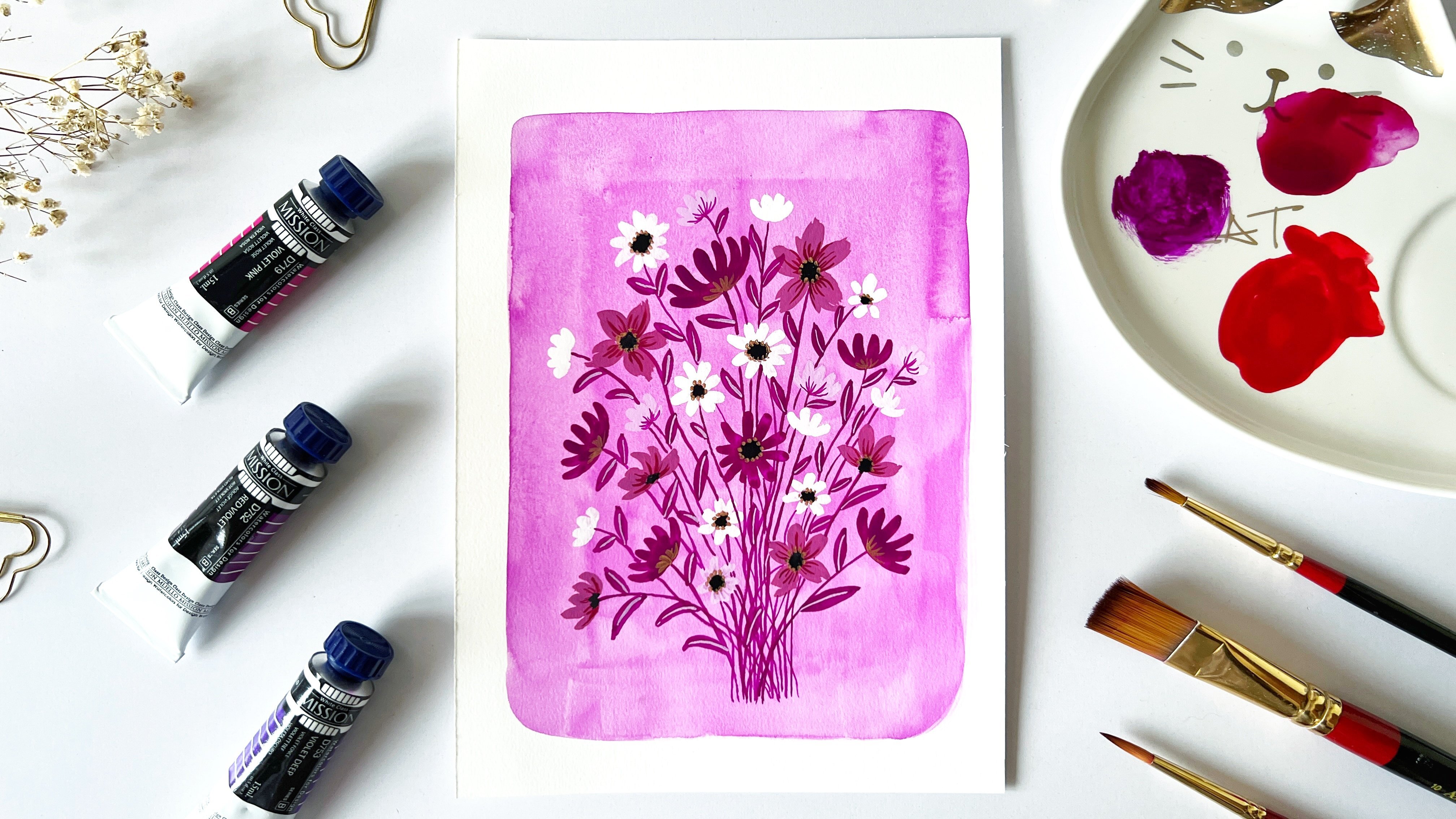
7. Choosing the colors: Now let's talk about
the colors that we will be using for this
particular painting. Since this is a floral popsicle, I am thinking
something in the lines of bright pastry shade. I've already done
a painting before, and I really liked how it looks with these
bright pop of colors, but also that light paste
or sheets going around, which balances this
art work perfectly. For this class, we
are going to go ahead with a similar
color palette. The colors that
you would need for this class are going
to be a permanent yellow, deep black apricots. If you don't have this color, it's totally okay because I will also teach you how to mix this color in case if you don't
have this particular two, you would need orange. You'll also need burnt sienna. Definitely need a white color. You will need a primary blue
as well as ultramarine blue. And finally, you will
also need a primary ray. These are the
colors that we will be using in this painting. And you will also need a
pigment liner as such, or even any black pen for
drawing this particular area.
8. Painting the floral elements: I'm going to start painting
these bigger blooms first. We have four of
these balloons here. So I'm going to
choose two colors, that is yellow and orange. I want to start painting
with yellow first, the color that I have here
is a permanent yellow deep, which is very similar
to a warm yellow. Doesn't necessarily mean you
have to own the same color. Any warm yellow is
more than enough. It's better to understand that. When you look at the
back of your paint tube, let's see this tiny square which indicates if your paint is completely opaque or if
it is semi-transparent. So here you can see
the box is half filled with black
and half white, which means this particular
color is semi-transparent. So this might require for you to lay your paint
more than once. And in case if your pencil
lines are super dark, then the lines are going to be seeing through your painting. So use your wash in the gouache consistency or
let's say to have that nice, opaque and matte finish. The amount of water that
we are going to add to our paints is going
to be very less. So I'm just going to start
with few drops of water. Maybe 1.2. I'm
just going to mix. You can see that the paint
is already creamy enough. So I don't need
too much of water. If I end up adding
too much water, then I would end up with
a watercolor consistency. I don't want that. So make sure that you don't end up
adding too much water. Just a few drops of water
is more than enough. My paint here is
nice and creamy. So I'm just going to go ahead
and start painting with it. But in case if you feel
that you have added more water and it has come
to a watercolor consistency. Then try adding a little
bit of paint to your mix. I'm using a size
four round brush. We're not doing any sort of
blending technique here. We're just going to keep
the colors very solid. If your consistency is perfect, you can see that it covers the white of
the paper really well. You don't see any transparency. When case, if it's still watercolor brush and you have
already started painting, don't worry, just keep painting. Once you're done with
the entire flower, wait for the base layer to dry. And then on top you can again
go with the same color. I'm not adding any
water to my mix here. It's screaming Enough already and there's no need for
me to add any water. But if you keep adding water, then it's definitely going to turn off watercolor consistency. I'm going to use
the same color for this flower over here as well. I'll wait for the
students this to try and this is almost dried. I feel like I can see a little bit of transparency
here and there. So I'm just going
to go again on top of it with the same paint color. You can see, even though my
pencil lines are very subtle, but still it's seen
through the yellow. The next color that
I'm adding is orange. Behind in just a
few drops on water. As you can see, this orange
is quite transparent. I'm just going to
go ahead with it. And once my first layer dries, I will be painting again on top. So sometimes you're also end
up with these brush strokes. As you can see here,
that's totally fine. It also highly depends upon
the paint that I'm using, but it's something
that can easily cover with your second
or third layer. So don't worry too
much about the lines or the pain
being transparent. Like I said, colors like yellow, orange tend to be transparent even if
it's a gouache paint. So wait for this layer to
dry and while it is drying, let's move on to this flower. My first layer has dried, painting again on top. So next, I'll be using
the color primary blue, but then leaves
around these flowers. This color is very
similar to a civilian blue or even a cobalt blue. Do some starting
with this flower. If you're not
comfortable using a size four brush or whatever
size you're using, then go for a
smaller size brush. So I'm using the same color for all the leaves around
those flowers. The ones that are
attached to the flowers. Here you can see that this
blue against yellow or orange, it's creating a
very high contrast because these two colors
are complimentary colors. And if all exactly opposite to each other
in a color wheel. I'm done with a blue color. For the next element, I'm going to be choosing
the color primary red. To my primary red,
I'll be adding white. I'm going to take
this binary, right? So the scholar is very
close to magenta or rows. This is not red, red color. This is more like a rose red. I need more white to this very pink mix. I'm going to add very
little amount of my wall yellow pianos,
but don't watch. So again, a little bit
of my primary red. I think I'm happy
with the color. And I'm going to use this
color for those tiny flowers. Leave the center as such. Or you can paint on top as well. Because once it dries, you can paint on top of it with a darker color so
that wouldn't be an issue. Next, I am using this
color, ultramarine blue. And I'll be mixing
white into this blue. I need a very basic shapes. Instead of mixing
white into blue, I'm going to mix the
blue and white like a very little amount of
just mix it with white. I'm using this color
for these leaves. Next, I'm going to be mixing primary red with
ultramarine blue. And I'm going to create
the color violet. Some extent in the equal ratio. I have a nice mix
of violet here. I'm going to switch
my brush 4-3 by zero. If you have a pain to you
of color while and you can totally skip this
mixing process. So I'm using this fine line
brush and I want to paint these really thin stem lines. Next, I'm usually
the same, bind it. And I'm painting the leaves
of these tiny flowers. Switching back to
the size full brush. And I'm going to add white into the violet mix and create a
very paste or violet color. I'm taking the violet and I'm
mixing it into this, right? I'm happy with this mix. I'm already used to scale up. We're almost done with
the base painting. Next, we will move on to adding details to keep your veins
on the planet as it is, because we will be using
the same mixes to be adding the details to
our floral elements. So I'm going to add burnt
sienna on my palette here. So burnt sienna is a great color to darken
your base colors. You can also use black, but I feel that black
mix your colors muddy, various burnt sienna
has more like a vintage feel and it doesn't suck the vibrancy
out of your base color. I'm going to add a little bit of burnt sienna to
this warm yellow. So here you can see it has made the yellow slightly darker, but it's not very muddy as how it would be when you
add black color to it. I'm going to use this color. I'm going to add slight
strokes inside these petals. Darker version of
the previous color to add an extra burnt
sienna into it. I'm also adding
the same color to the very base of the strokes that we
actually made earlier. I'm going to repeat the same to the other yellow color block using a darker tone
of the same color. I want to repeat
the same process for the orange cauliflower. So we have the orange mix here. To this, I'm going
to add burnt sienna. And why did it beat
the same process? Next, I'm going to
use violet as it is. Mix that we mixed using
our primary colors. So I'm using that violet, I'm going to add the main part. What does it suggest a single
straight line like this? And then I'm going to use this
ultramarine blue as it is. And I'm going to add a line
in the span of the leaf. This time I'm not adding this
line throughout the leaf. I'm just starting in Macbeth. This mix of my primary blue, I'm going to add
white and lighten it. I'm going to take this blue
and add it into this white. Then I'm going to
add this color to the blue leaves over here. I'm going to use the spine it really off the
darkness, right? And when I add it to
the very center of these tiny flowers, next, allergic black. Let me use my size four brush. And I'm going to add it to the very center of
these bloggers. I just messed this up a little. I'm just gonna go ahead
and conduct I'm just using a clean brush and the paint. I want to use this tissue
paper and just lift off. So luckily, I have that
color left on my palette. Once it dries and
add the middle part. So we're almost done with adding details to offer element. Next, I'm just going to sketch
this part of our Popsicle.
9. Adding final details: Next I'm gonna use
my fine liner. I'm going to draw it out. Stick portion of the
popsicles. Draw the outline. Now inside, I'm want to draw straight lines just to mimic
the wood texture that you see on the street. I'm also going to mark my negative spaces
are using RapidMiner. So that it is, We are almost
done with our painting. And I really loved
the way it looks. If you are someone who enjoys adding more detail
into your paintings, then this is the
right time to mature. I'm going to leave it as such. But if you feel like
you weren't add more details to your
painting, then go ahead.
10. Final thoughts: I hope you enjoyed this class and come to
learn something out of it. Kindly post your project
under the project section. I would love to see
them and review them. It would also be great
if you could leave your valuable feedback
as it could help other students understand
the class better in case if you have any
other doubts or queries, kindly post them under
the discussion section, or you can always
reach out to me on my Instagram handle
the wishing IC. Thank you for joining and I'll see you again in another class.
 Vidya Kumaresan, Illustrator