Transcripts
1. Introduction: Unlock your inner artist simple illustration techniques to
unlock your creativity. Hi, my name is Jonathan Niaki
designer and illustrator, and I'm passionate
about helping people like you reconnect
with their creativity. Whether you're a total beginner, someone who hasn't picked
up a pencil since school or an experienced artist looking
for fresh inspiration, this class is for you. Together, we'll explore
easy and fun techniques that make illustrating
approachable and rewarding, no matter your skill level. In this class, we'll break down the creative process
into simple steps, starting with foundational
moodboarding, sketching, and moving into
techniques for adding character and color and
emotion to your work. Along the way, I'll share tips
and exercises to help you overcome creative blocks and
discover your unique snyle. Don't worry about having the perfect tools or
expensive materials. What matters is showing up and letting your
creativity flow. I'll guide you through
each step so you can focus on having fun and
enjoying the process. By the end of this
class, you'll create your very own illustrated
piece to be proud of, whether it's a
playful character, illustration, a vibrant pattern or a story told
through your art. My goal is to show you that anyone can draw
and that creating art is one of the best ways to relax, stress, and have fun. So you ready to pick up your
pencil and start creating?
2. Research & Mood Board: Hello, and welcome to
beginning of this course. Congrats on starting this. Today, we're going to start
with doing some research on different designs and different design companies
styles and layouts, colors. So let's go ahead
and get started. Today, I have Lincoln
Design Co up, and this is a really
great resource for different designs, logos, illustrations
and lockups. And I find that they
have just a ton of work to reference and
find inspiration. So that's what I'm going
to be using today. If you have a favorite designer or design company or
anyone like that, go ahead and take a look at their work and find
some inspiration. Think about time period, think about colors, layout, design style, all
things that you can think about and
consider for your design. We're just going to
get inspiration here, and in the next section, we'll create a mood board. So what we use here we'll
use in the mood board. Um, so go ahead, find some images that you
really like and designs that you think really
work well with your, with your logo or your illustration that
we create together. So here, we're going to go
ahead and create a moodboard, and you can use whatever program you have if you want
to use Illustrator. You can use Illustrator.
You can use Figma. You can use any kind of program that allows you to
just copy and paste photos. So I just took some
screenshots from Instagram that I
thought were really cool and kind of
the look or vibe. And time period and style that I wanted to
capture in my illustration. So you can see here the different color palettes and different
typographic styles. And, of course, I do have
my sketches in there, but we're going to
go ahead and do that in the next section. So once you've got all
your images put together, we're going to go ahead and move on and start our sketches.
3. Sketching: Awesome. So, let's get
started sketching. We've done our research. We've got some inspiration. We've created a mood board. And now let's go ahead and use that moodboard and
our inspiration to actually start
sketching out some ideas. So here, you know, I just found a lot of different lockups for
typography and just kind of exploring how we could use the typography and
illustration together. In this example, just
kind of working on the sketching out of
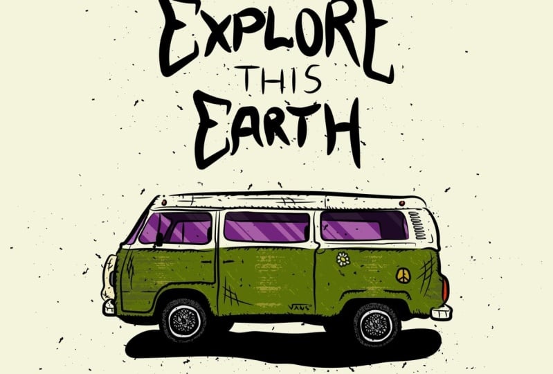
the Volkswagen van. And I really like
the Volkswagen. I think it's a cool idea. I think it would make a
cool little illustration. So in this one, I'm really getting a
little bit tighter with the design and the illustration and thinking about, you know, geometric shapes and keeping
things nice and loose and how that could translate into a nice
little illustration. So you can think about whatever it is that you're illustrating. You can think about
different views and perspectives of that if it's straight on or a profile
view like this van here. And also think about, you know, how you'd like that to be laid
out in your illustration. In this particular instance, we're going to
include typography, so you can think
about how the type is locked up within
the illustration. And as you can see, there's a lot of
vintage style logos and lockups that we could use
and explore in this example. But yeah, take your time, enjoy getting out pen and paper
and sketch up some ideas, and believe it or not, don't skip this step. It is a fun part of the process. So in this part, I just didn't show the other
sketches that I've done, but great four, five, six different sketches that you really like and just kind of brainstorm some different ideas and think about how you might be able to lay
out your illustration. Also, I want to mention, for your illustration
or your logo, find an object that
you really find fascinating or interesting or
whether it's a skateboard, a vehicle vans, you know, could be anything a plant. It could be a motorcycle, any object that you really like. As you can see, I
created this one with some palm trees and
some wilderness and mountains and some
different style of typography that has
some dimension to it. So, get creative. Explore, enjoy the process of getting out of pen and
paper. You won't regret it. And don't stop at
the first idea of your sketch because
more often than not, it's the later sketches that really the good
ideas come later. So don't go with
your first idea, get out a pen and
paper or better you a pencil and just have
some fun sketch, stay loose, and don't try to put too much detail
This just an idea, ideating part of
the design process. So enjoy this. Have fun, and I'll see you
in the next one.
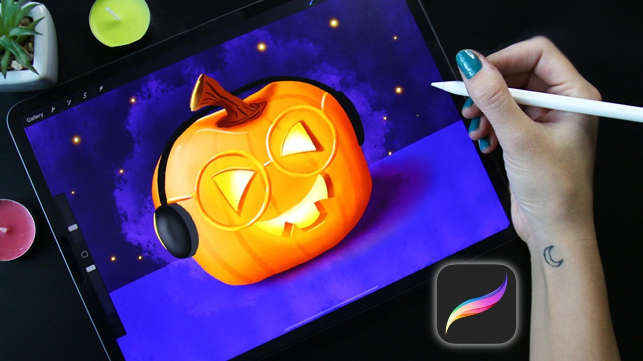
4. Procreate: Line, Color, & Value: Hi, everyone. So I
went ahead and found a nice reference image for
our illustration here. I can link the image and course here if you'd
like to use the same image. So the first thing,
well, first of all, we're using Procreate, and if you have a different program,
you're welcome to use that. And I'm also going
to go over how to do the same thing in
Adobe Illustrator. So if you're not
using Procreate, go ahead and skip this and
move on to the next section, and I'll show you how to
use Adobe Illustrator. So what we're doing
here is we're just creating we're
using a nice brush, and you can increase the
stability of the brush in the brush settings and procreate depending on the look and
style that you're going for. And so this one's a little
bit more the style of this illustration is a
little bit more hand made. So it's a little bit more, let's say, not perfect. And so you can actually update the pressure and stabilization
of the brush here. I'm going to go ahead and start color blocking our van here and cleaning up some of the lines as well
throughout the process. So I'm going to go ahead and add in the color
of our windows, and I'm even going to clean up a little bit
more of the lines throughout and add in some
highlights to the windows. The next step, we want to
create a range of value. And so what we'll do
is you just sample the current colors and create a darker shade on
the color wheel. And that will give
you the appearance of shadow and highlight. And let's go ahead and get
started on the background. And the background,
I know we sketched a palm tree in our
sketches here. And so I'm actually
just going to draw one palm tree leaf and
then copy and paste it, and then you can flip that vertically or
horizontally and then adjust the angle of those to give the uniform appearance
of the palm tree. So another thing you want to do is just go online and
look at references of palm trees and kind of get
an idea for the shape and the form of, of what
you're drawing. In this case, it is a palm tree. I think it's pretty obvious, but another thing you want
to do is actually layer your color blocking
underneath your line work. I think that's pretty colear. But again, I just thought
I'd mentioned that. Another thing you'll notice
in this sketch is that I am creating a source of light, and on the darker side, I will create a darker
value of that color. And then wherever
the light is shining on in this particular
instance, it's a leaf. I will create a
highlight on those. So again, just similar technique as the van is creating
a dark and light value.
5. Custom brushes in Adobe Illustrator: Hi, everyone on
Adobe Illustrator. If you're using
Adobe Illustrator, I'm just going to show you how to create our
linework and create the similar effect
that we're going for with our line art and
color blocking and values. So we're in Adobe Illustrator. You want to copy and paste
your reference image in there and go ahead and create another layer
for our line art. The next thing you want to do is actually reduce the opacity of the artwork so
we can actually see a little bit
less of the artwork. Now, Illustrator doesn't have a great brush that I
really like by default. So I go ahead and create just a very simple
tapered brush, and I do that by taking
the Ellipse tool. You have that ellipse
tool there and creating a solid color black fill
on the Ellipse tool. Once you have your ellipse, then you're just going to drag that into
the brushes panel, and it's pretty simple how
to create a new brush. Just go ahead and drag and drop the ellipse into the brushes
panel and click Art Brush. From there, you don't really need to adjust any
of these settings, but you certainly can
if you'd like to. Go ahead and name your new brush and go ahead and click Okay. And then from there, you'll
click B is a shortcut, and now you have a really nice, flowy tapered natural brush. And that's really
my favorite kind of style and brush that I like to use for
these illustrations. Take a look at our references and go ahead and start
laying in our linework. And once you've got
your linework in, you can start to block
out some of the black, dark silhouette areas and
add in your details and, um, just keep filling out areas
and you can decide on how much detail you
want to keep or how much you want to simplify
the illustration. Another thing, too,
is if you did skip the first section because you'd like to do the
illustration Illustrator, I highly recommend
you go back and watch that section on Procreate because the principles
still apply. We still block out color
underneath the black line art. We clean up the lines
and in the process, you want to create at least
two or three levels of value. And by doing that, you can just sample
the color that you created by creating
a darker value, and you can put that
darker value in areas where there's a little
bit more shadow and less light is hitting. And then the lighter areas, you would just sample that
same in this instance, green and create a light value
for the highlighted areas.
6. Hand Lettering: Awesome. Well, we are
back in Illustrator. I just went ahead and
exported the images from Procreate into Illustrator, so we can go ahead and play
around with our typography. In this instance,
we are going to do a handwritten typography, and I've done this and other
illustrations as well. And it just gives it a
really interesting style. And I'll actually show you. So this is another illustration that I've done with
the hand letter type, and you can see it kind of
follows some different shapes. And so it's good to explore
different shapes and allow your handwriting
to follow those shapes. But yeah, here's
another illustration and a different style, but pretty close to the same style that we're doing today. So let's go ahead and use
our brush that we made. You can also create a brush that's a
little bit thinner for those details by creating
a thinner ellipse. But, yeah, we're just going
to do a rectangular style. It's not following
any kind of shape, is what I mean by
that and creating our own handwritten
lettering here. So you're welcome to do the
handwritten typography, or you can explore
different fonts, and giving that a try, it's totally up to you. It is your project? Feel free to get creative. I've just enjoyed
creating my own font. In this process. So I think it goes along with the
illustration style and just kind of looks
like a skateboard graphic or something off of
a graphic T. Um, have fun with it and explore it, explore different
typographies and ways of warping the type or
following different shapes. And, of course, you can move the letters around as you wish. Adding in just some small
details, like I said, I created a smaller
brush for the details, and I just kind of mark
it up a little bit, give it a little bit
of that gritty look. And if you're following the
design that I'm creating, I'm just kind of
following the shape of the type to kind of just give it a little bit more texture and just make it a little
bit more exciting. It has some movement to
the typography here. Another thing that you can do is add a little bit
of your own texture. Sure, you can overlay
textures found online, but we're going to
make our own texture, and we're just
going to do that by taking our brush that we made and making some
dots into a area. Actually spread out
the dots a little bit more than I have here
because that will give it a less uniform look
and make it appear a little bit more
real in the way that these brushes work is it kind of works almost like a
stamp, if you will. And what you want to do is go ahead and group those
objects and go up to object, then expand appearance,
and then you will have what you need to drag and drop into
the brushes panel. So go ahead and drag that
into the brushes panel, scatter brush, and then just
leave these settings, okay. And now, make sure
you have that brush selected in the brushes panel. And there you have it. A really nice textured
splatter, if you will. And you can make your own
custom scatter brushes. And that is it. Thank you for taking
this mini course on Illustration and how to make a cool little illustration
with custom typography.
 Jonathan Nawrocki, Designer+Illustrator