Transcripts
1. Introduction: This very specific moment
in the creation process where you have all these
visuals, impressions, feelings, memories after an intense
experience, for example, a concert or a trip
or a big life event, and you want to
capture its essence. That's not easy. So you have these. You're
excited to create. You have hundreds of ideas
floating around in your head. And yet, you do
absolutely nothing. And I get it. Knowing the exact steps
and what to do after that initial spark
will help you to turn those ideas into
actual artworks. In this class, I will give you a simple framework to guide you from that first spark all the way to a
finished illustration. Hi, I'm Alexandra
AKAD Artmother, and I have been teaching
digital art and illustration online for years. I'm also a Skillshare
top teacher, and my classes inspired over
100 K students worldwide. And counting. And just to be clear,
in this class, I'm not showing you
Procreate tool hacks. We are not going to learn five secret buttons
or shortcuts. What I'm going to show you
are illustration hacks, creative ways of using
Procreate to make the process of coming up with and creating
illustrations easier, faster and more playful. We'll start by collecting
free simple ingredients, an object, a landscape,
and a texture. Then we will try our best to
create without sketching. Then played compositional
hierarchies. Use the Selection tool to
build shadows and light, and I call this part
Selection Tool Maxxing. And finally turn a
real life texture into your own custom
Procreate brush. For my project, I
will be working with the impressions from
my latest trip. But you absolutely don't
have to travel anywhere. Your inspiration can
come from a walk in your neighborhood,
your favorite cafe, your garden, or anywhere else you find something
that makes you say, Oh, I like that. This class is for
beginner to intermediate Procreate artists
who already know the basics and how
the app works, but want to become more
confident with illustration. And especially with
coming up with ideas, getting inspiration from your environment
and experiences, and actually turning
them into illustrations. We are going to use an
iPad and Procreate, and I will guide you through
all the technical steps. By the end of this
class, you will have your own finished
illustration and hopefully a new way of looking
at the world around you. So don't wait for
the perfect idea. L et's go outside,
collect some impressions, open, procreate, and let's make something
fun out of them. Okay, so if you are
ready, let's dive in.
2. About The Class: All right. I'm so glad
that you are here. In this video, I'm going to talk to you about
the class structure, the class project, and
the class resources. But first, I want to
clarify again that we are not learning
technical procreate hacks. We are going to learn about
illustration workflow hacks. Okay. Why? Because there is this
very specific moment in the creative process where
you have all the ideas, visuals, feelings, impressions, memories after a very
intense experience. Let it be a concert or a trip or something
happening in your life, you know, a big life event. And you want to capture the
sense of this experience. And that's actually not easy. I came up with this class after
my trip to Fuerteventura. Because I would so much love
to be a travel sketcher. I always bring my tools with me, my iPad with me, and I always have that illusion that when I will
have some boring moments, I will not just, you know, sit and stare out of my
hat and disassociate, but I'm going to actually draw my experiences right there, and I always disappoint myself. And on this trip, I actually did it once. I painted some cacti, but it felt forced. So I realized that I do this
best after that experience. So when I come home and I let these visuals,
feelings, everything, impressions marinate inside of me for a few days
and they clear up, you know, what remains
is the important stuff, because you forget so many
things in the process. Then I sat down and just did this random sketch
full of ideas, you know, words, my
thoughts, symbols. And then I grabbed some of those ideas and turned
them into illustration. This is how I came up with the framework that I'm
going to teach you because it felt so liberating because
with this framework, so much pressure
and performance and perfectionism was lifted from the creative process, you know. Sometimes we just want to be these very perfect artists
who are going on trips and, you know, creating
these beautiful things and and we create
for an audience. I really wanted to get
rid of this pressure. This helped me really to
loosen up and again have joy in the process of creation in my own way and maybe
this is your way too. If this resonates, this
class really is for you. Okay? So this framework
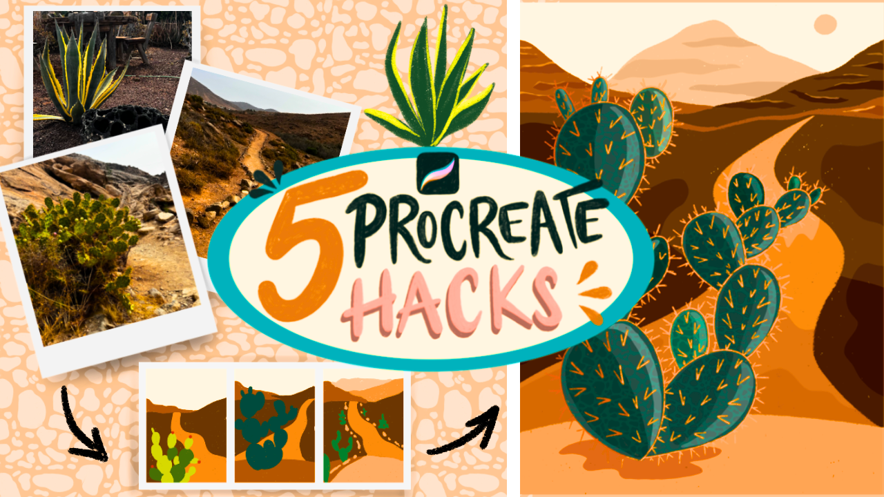
has five steps. At first, we are creating an Impression Board where
we collect these visuals, these photos that we
take in our trips or if you don't have
a trip in mind, you can just go on a walk and we choose free things
that speak to us, an object, landscape,
and a texture. If you are about to
go out for a walk, take your phone and at first just look for an
object that looks interesting. It can be a lamp, it can be
an architectural detail. It can be a flower, it
can be your coffee mug. It can be a plant, an animal, a person, whatever speaks to you. It can be a weird shape as well. And then a landscape, if
you live in a big city, it totally can be a street view, or if you have a nice view
somewhere in your town, go out and take a
picture and texture, you just need to
look more closely. A texture can be grass or the concrete you are walking on or a carpet that you
have in your house. So there are so many things
that you can collect, but I need you to focus on these three
things and collect one, at least one from all
these three topics. In the second hack,
we are not sketching. You know, I tend to
be a perfectionist. I have my workflow that I'm used to in my professional
illustration work. And I found out lately that it limits me so
much because I spend so much energy on perfecting a linework and the shape that, it limits me in the second part of the creation process where I'm painting, like, I'm closed up to those shapes, you
know, that I've drawn. So I really wanted to
loosen up and tried painting these artworks
without any sketch. And it was so much fun that
I wanted to show it to you. So if you also have this, you know, muscle memory
of sketching out. Everything we are
going to do a very little of sketching
in the first hack. But in the second, we are
going to just use one brush, plain colors and just
paint with those. That is going to be
the second hack. This is the part
where we are going to also do a little bit of thumbnails and play with compositional hierarchies
in a natural way. So this will be really fun. I'm sure that you will
have heuric moments here. In the third hack,
we are going to mix it up and basically refine our chosen variation of hierarchy or
thumbnail or colors, everything that we liked
in the previous hack, we will put them together to
have a base illustration. The fourth hack is probably
my favorite new discovery. This is the Selection
Tool Maxxing. This is a trendy word lately and I just want it to be trendy. And we are going to not
use a shade or branch. That was my obsession in
the last decade to use, you know, grainy texture
for shading and, you know, render everything. But we are going to
use the selection tool and we are going to use that to build up shadows and highlights and some
details in the artwork. It will be really fun. I'm
sure that you will enjoy it because it has this element of play in it and randomness, and it will again help you
to, you know, loosen up, uh a little bit and try out something new in a
controlled environment. So this will be really fun. Finally, I love creating
procreate brushes. This obsession of mine
didn't disappear. So we are going to use that
texture that we collected, and we are going to create a custom procreate brush from it. I will show you basically how to create
this one texture brush, so we are not going to learn the whole brush creation process and the brush studio but the exact way how to create a texture
brush with a seamless pattern and we are going to apply
that into our twegFinally, we are going to add some details and whatever feels like
it's missing from there. And this is the part where
sometimes, you know, uh, our fixed ideas come
back in our comfort zone and we just put everything into a little bit more
comfortable visual way, but that's totally okay. This whole process is going to be really fun and liberating. And yeah, that's how the class
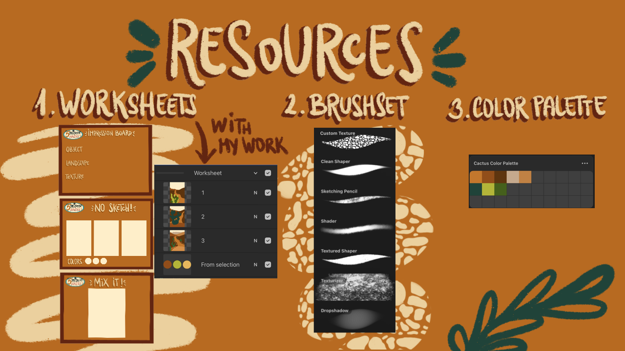
will look like, basically. Okay, I also prepared some resources to help
you in the process. So I have created, again, interactive worksheets
with prepared workspaces. In the layers, you can find my own work that you
can use for reference, maybe or when you are a very beginner and you want to follow me step by step, you know, you will have
references to work with. You will get my usual brush set and the brush that I'm
creating in this class, and my color palette. So you can use these resources to help
you in the process, but I really recommend you
to grab this opportunity to explore your impressions,
your environment. Find your own colors and own
topics that interest you. Your project absolutely don't
need to look like mine. I would prefer if it wouldn't? So grab your own references, work your own way
through this project. We spend so much time behind the screens that this is, again, a great opportunity
to go outside and absorb your environment and focus your attention
on what's around you and to see how
beautiful it is. Please don't feel like
you only have to upload the final artwork
into a class project. I would really love to
see your process photos, your Impression
Board or the other photos that you have and the whole process that
you are going through. If your illustration
has a story behind it, I would be really
honored to read them. I'm really interested
in the memories, feelings and experiences that end up in your illustrations. So, of course, just share with us whatever
feels comfortable, but it will be really fun to have such meaningful
class projects. Alright, I think that's it. I'm so much looking forward
to see what you create. So let's loose them up, go collect some impressions, and let's turn them into
something beautiful. Okay, S in the next video.
3. Impression Board: Alright, so welcome
to the first heck. It is called Impression Board, and I didn't name it
as inspiration Board and mindmap on purpose
because those are more, again, technical expressions, and they take away from
the personal experience. So what an Impression Board is. It is basically
collecting things that left a mark in
you in some way, okay? What is good is
when you, you know, have life experiences that
you can turn into art. It can be travel. It can be, you know, a movie. It can be a book
that you've read, a story that you heard, things that you've
seen on the way to, you know, picking up your kids or going
to work, et cetera, there are so many
things around us, and I cannot repeat this enough. Nature is the most creative
force on this planet. So a human being
in itself cannot be more creative than
the creation itself. So it is really words to look around in your environment and, you know, find the shapes, find the objects, find the
textures, find the landscapes. These are beautiful
things that surround us. So what your mission is in this hack is to
look for an object, a landscape, and a texture. Now, it is totally on you where you will get
these references, but try to look at it more
as impressions, you know, um, and what is an impression, you see it and it starts
something within you. It starts a thought process. It starts an emotion. It starts curiosity. Okay? Maybe you have a ok to your work and you see a
bush that has a weird shape, and you can just
take a photo of it, or you just go, you know, through a street and you see a wall with some
interesting textures. You take a photo
of it. Landscape. Okay, even if you
live in a big city, you know, it can
be a street view. It can be something that
you see from your window. Landscape. It can be a
scene in your home that leaves you with an impression maybe a nice corner
of your home. So basically, you can take
landscape as a scene, okay? Or if you have been on a trip, and not just recently, you can just go back on your camera and just
look for the photos, okay, through the trip or what
interested you back then. That would be another
place to start. So what I'm going to do now
is to go through my phone. Send the images into my iPad and place them here.
That's the first step. Okay. All right. So I have the photos imported, and what we are going
to do is to grab the things that
left a mark in us or left an impression
individually. So here it is this cacti. I really love these
little shapes that are randomly connecting into
each other. It is so funny. It's so funky. In
this landscape, I love this road. It is very dreamy and this landscape is so
plain and simple. That's what left
me with a feeling. And as a texture, this might surprise you. This is this lava rock. I love these little
bubbles in it. And let me give you a little spoiler what we are going to do
with this texture. We are going to create
a texture brush in Procreate so that we can
apply it into some parts. Of the illustration, we
will see where it fits, but I really want to create
a brush from it and I will show you different ways you can do so from a photo,
from a drawing. Let's put that aside for now. And as we are not going
to do too much sketching, we are now going to just do a little impression sketching. So really just grabbing the focal points
out from the image. Maybe your images are
more complex and busy. So this is your time to really grab those things out from the photos
with a little sketch. So what I'm going to do is to create another
layer, choose black. Choose a sketching
pencil, make it big, so you really don't
need to go into detail. This is truly for
getting the shapes out basically and kind of
summarize your impressions. So let's just start
with the object. I love that these are the
shapes of this cacti. I'm going to kind of
invent a new shape, so they are
connecting like this. Here are these bubbles, if you can see
them on the cacti. So I'm just add the bubble here. It is really just an impression. So these little things
that stand out. Of it. But basically,
these cacti, like, they connect so weirdly.
I cannot get over it. So I'm just looking at
some shapes and trying to put them together
in a bush, basically. I need to add that I have
several photos in my mind. Yeah, I really, you know, researched or observed
these shapes. So they are pretty chaotic. And they have so many
different little shapes or, you know, they have
these basic shapes, but they are so
distorted sometimes. It is really fun. So this is going to be my cacti. Kind of, I can work on it later. This is really just for, you know, getting the idea out. Now for the landscape, I can see these mountains. Here is this hill and this
little road with these rocks. And now let's do the texture. So these little blobs
are that interest me. So really just very roughly
just grab out the point of your impression or interest
and lay those down here. So these are the elements
that I'm going to work with, and we are going to put this together into a
final illustration. But to do so, we need to actually paint and experiment with the colors
and the placement, et cetera, see you
in the next video where we are going
to not sketch.
4. No Sketch: All right, so welcome
to the second hack. What I discovered lately
because I was very stuck on, you know, creating
a perfect sketch, preparing a color palette
in advance, you know, before I even painted and having a clean
linework and then trusting that sketch that it will look like
something or look good. Afterwards, I've gone
through the process. And my illustration
style got pretty stiff. So lately, I really love to
experiment with no sketching, and this is what I want
to show you that it can really loosen it up and gives you more space for play and for experimentation
because you can, you know, experiment
with color separately. You can experiment with composition separately
in a sketch. But what if we just go
straight in and play? Also with colors. So we are
going to play with colors. And what I love is to use
a limited color palette. So in this worksheet, we have all these shapes. These are separately placed so that we can paint
on them separately. And here are the little circles that we are going
to fill with color. And as you can see, I'm
already in this desert mood. So I definitely think about an ochre color it
will not be sin, so I will choose a
darker one, probably. Yep. And then I need color
green color for the cacti. So now you can think about the
object, what color it has, but it can have a
different color, so it can be a blue cati, and we are going to
play with that as well. But let me choose
green for my kati. And I love this color. Not this one. Let's
go like this. Mnh mnh. We're saturated.
This is too green. Okay. This food's better. And, um, I want more of an orange maybe this
color or a bech color. Let's go with beach. Maybe a slightly
more yellowish one. So I will try to use these free color so that
my designs are consistent. And I will choose the
first little canvas and choose the texture
shaper from the brush set. This brush is really textured and it is perfect for creating loose paintings, okay? So what I will experiment first with is and I'm not going to look at
the reference photos. I'm not going to
look at my sketches. I will try to remember from those lose sketches
what it felt like, okay? What was the interest? It will stay within you. So also think about
the composition, kind of, but we are going
to play with that as well. So there were some hills here. And I will choose a bit
darker color to add this hill like this, and I will actually
fill this in. The whole. And I will choose these color again
and maybe even lighter. So you can say you can
play with the intensity of the color and add this road. Oops. Like this. Okay. Kind of. Okay. Now I will click this
little green of mine. And as you can see, I
didn't use any layers. This is going to
be pretty simple. I will place my
little cacti here, but I can see that
it's too dark. So I will go a bit lighter. Okay. And add my cacti here. Kind of these shapes. I will choose a darker one. Forms in the back. And they had these
little Thanks, here. They are a bit reddish, maybe. So I can add those
little Thanks. Okay. I think this doesn't
look good, okay? So These two are competing
with each other. So either the road
is in the focus, so this is just like, you know, a decorational element, or I need to make
this a bit bigger. But what I realized is that I don't really
like these greens, so I will just change
my color palette, my base color palette. So let's try now
on the second one. That I will make the
cacti a bit bigger. Okay? So if your first
exploratory thumbnail is also with this hierarchy of importance, just change them. So think about that. I will choose this
more bluish color and the texture shaper, I will now start with adding
and I will just create another layer over this one and make it a clipping mask so
that I can work behind it. It will make it easier. I make this cacti. That's big. Mm. Like this. Like this. And is that just these
random shapes, okay? So, like this. I'm not going to even play
with the color variation now, because I really really want
to focus on the composition. Acts. I create a layer below to automatically
become a clipping mask. And I'll choose
this darker color and add this as the base, you know, this rocky ground. And in the background, I will add this brown. I will add a little rod. You can see, I just changed the direction of the
road and why not? I can totally do that if
that fits my artwork. And this might seem a bit weird, but maybe that's
just a road behind this rocky hill and I can add these mountains again in the background and make
it a bit like this. Okay. I think I love it better. I think this composition
works very well. And let's try something
in the third one. How to improve it or do something completely
different. Let's see. I just exchange the
hierarchy and make the road the main focus. So I will choose
this color again and let's go back to
the original thing. I can keep this again. I can add now the road. Oops. Okay. Like this. So I switched sides again. Okay. I can play with more mountains. The background. So this scenery becomes
more important. So this road, and I will bring this road in an even
lighter color to this hill. So maybe the road road goes, you know, down the valley, up the hill this way. And what if I make this
blue a bit more green? And I just Oops,
make it smaller, maybe make it a bit lighter, and add this cacti
all over the place. And I'm just throwing it. And there can be one here. And maybe one here in a very close way like this and I can add
some rocks on the way. This looks interesting, as well. I love it, actually. But I think I will
go with this one. I think this turned
out pretty well. So let's just do a
little recap on what happened here because
maybe I was just, you know, too much in the flow. So in the previous lesson, we took photos of our
camera roll Internet, a walk to our home with an object,
landscape and a texture. We did some very simple sketches to grasp out the main things. The impressions themselves,
then without sketch, we try to combine the
object with the landscape. Okay? It is always
about hierarchy. So without thinking, and this is why I didn't
explain this to you in advance. Without thinking
how things exist in your internal world are going to be expressed onto the
canvas right away. So if you are not speculating, it might be beautiful
to discover how things are in you, okay? So I didn't have the decision
what I want to make, you know, the main
focus of my artwork. So I immediately throw an equal hierarchy
onto the canvas, so the landscape and cacti. And this is where the creator, inventor persona in you comes into the light because this is where
you are the creator. And when you start to make
decisions in your artworks. You start to own it more, and this is the first or second basically because the
first was the impressions. This is the second
point when you make your art personal because
you know the decisions. You didn't just copy something. You didn't just make travel art. You were working with
your impressions and then experimented with
a conscious creation. This is kind of the
thought process artists then have and then, you know, what makes their
art so personal to them. So if you decide to go
with the equal hierarchy, it's totally okay if that's what appeals to
you the most, okay? And then we played
with the composition. Composition is about composing the elements together to
create this hierarchy. So at first, I decided
to put the cactus as a center of attention and the road and the background as, you know, a scenery as a side
character in the artwork. And then I switched it and made the road and the
scenery the main character. Now, what we are going to do in the next part is we
are going to mix it. Okay? So we are going to choose the thumbnail or the artwork
that we just started. Maybe you like colors
more on different ones. For example, I really love this combination for the hills. And even if in the
first artwork, there were just two hills. I'm going to do three hills. I love this composition and that the sky is just irrelevant. Okay? So I'm going to take
these colors with me. I will just create color
palette, basically, and I will just grab
these colors for myself so that I
can work with them. Like this. I have
the desert colors. This is the exact same
one, so I will clear that. I will bring this light
gray, brownish gray. This is also a different
color, if I'm right? Yes. Let's go with
the cacti color. I don't like this green. I will probably grab
this one and this one, but I will I think work on
that in the finished artwork. So what do you
think? No sketching. How great it was, right? We already have a composition. We already have some colors
without defining anything. The shapes, for example, can you see how different
those shapes are? If I have prepared
sketch, you know, the ones that I
need to stick to, you know, it limits me. I would not, you know, experiment and adjust
that impression of that object into the
view that I'm creating. This is the magic of this
hack, the no sketch heck. All right, so see you in
the next video where we are going to mix
it all together.
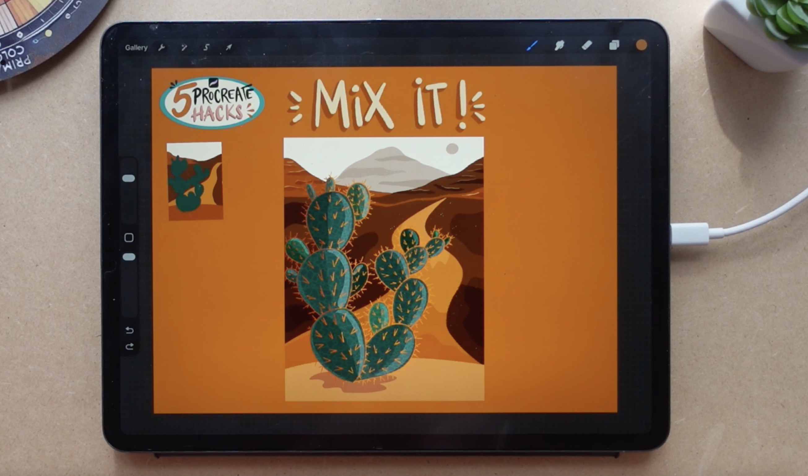
5. Mix It!: All right, so let's just mix it. This is the canvas that
we are going to work on. You are totally free to create a new canvas and only
work on that canvas. I'm going to work on this one, and I want my little thumbnail here so that I have
a little reference. I have my color palette, right? So I went back to the
no sketch worksheet. I will select this canvas
and just merge it. Hold down the layer. And let's go back
here and drop it. I will just put
it into the side. What I'm going to do
is basically work on the illustration in more
depth in more detail. The first thing I'm
going to do is that I'm going to create
a new layer about this main little canvas layer and make it a clipping mask so that everything is
within this shape. I will hold down,
pick the color. I can work with my
color palette as well. I will work with the
texture shaper again, but, you know, work a
bit in more detail. So my approximate for
this part is here. So I will basically
just fill it in. I will hold down to
pick the other color, create another layer, again, a clipping mask, and
add this other hill. Make it even smaller and
you can make your eraser, this texture shaper as well so that if something
didn't turn out well, you can just erase from
it and adjust the shape. I will go back here
and adjust this part. Oh, okay. Like this. And I love that I
made this thing here. It adds a bit more to it. As if a little hill here. And I will create another
layer behind it all. It already is a clipping mask. I will choose my
little grayish color and add a hill here. I can leave this beach
color in the background. I think it looks pretty nice. Okay. So this is going to
be my background scene. I can add the sun here maybe
like this as a notion of it. You don't need to go, you know, um, traditional with colors. Okay. And I will create
another layer on top. Maybe start the road here where this hill ends and Okay. It needs to go out here and
kind of follow this path, and it gets, you know,
tighter at this part. Okay, let's like this. Okay. Nice. I will add
this hail into the front. Still a clipping
mask and like this. I'm not going full in detail. I really want to
keep this light, and I will go back
to this hill and actually continue this line. Maybe add a little
hill here as well, so that it is completed. I love that with these simple
shapes, what we've created, I will adjust this little
road here as well. Kind of like this. Okay. I love it. And let's
create another layer. Again, make it a clipping mask. I will choose the color
of my little cactus. And let's work on those shapes. And as you guys see, I've started to work
in a bit small manner, so I will make it a bit bigger. Okay. I can see that this road
is a bit weird now, so maybe I can make it bigger. And I will click on free form
and kind of squish it a bit and make it come from this side. Like this. This is why it is
good to work on different layers because
you can reorganize them. And as you can see, it is
so different to work on a bigger scale artwork than on a little thumbnail
because you might get lost in the composition, the proportions that
you originally wanted. All right. So we have the
base for our illustration, and in the next video, we are going to go for the
Selection Tool Maxxing. This means that we are
going to shade and add light with the
Selection tool and not as we are used to with shader
branch or stuff like that. So let's see in the next video what we can
do with the Selection tool.
6. Selection Tool Maxxing: Alright, so let's just see what we can do with the
selection tool. Now, we have our cacti. On a separate layer, and I want it to
be alpha locked. Now go to the Selection
tool and go free hand. This is a technique that is
used by a lot of artists, and it can be really fun. So let me just demonstrate. I will just cut off this little piece and
I can recolor, okay? I can just drop in
a different color and have it a different color. Or I can go to the hue
saturation brightness and Oops. I the selected, so make
sure you don't do that. Go to hue saturation brightness and make this a bit brighter. You can push the color
to a different color. You can add saturation
and desaturate. I will create a little bit of color variation
within this cactus. But I can see that this section
doesn't look very good. I want to try to follow
this curve hoops. Of the main cactus. Hue saturation
brightness, I will push the color to a bit green
and make it a bit lighter, and I will grab a I need to remind myself
to select these things. I will go for this one
and make it a bit more greenish and maybe a
bit darker, light. Let's see. Let just
make it a bit lighter. Yes. This one as well. Hue saturation brightness,
saturation brightness, and also This one hue saturation
brightness, saturation. Brightness, I will
make it a bit darker. I will I'm doing this
with every little shape. I'm selecting this. Again, hue saturation
brightness. I will add saturation and
maybe a bit darker color. Again, so like this, I will add hue,
saturation brightness. I will make this a
bit darker like this, and it already has such
a nice color variation. We will play with the main
shapes as well in a second. I just want to grab these
little little blobs and play around with those. This is really exciting. It is a new technique I
just discovered, and it is really fun. It takes away again from
the pressure that I usually have with colors
and I don't know. Um, you know, to make everything very nicely
rendered and things like that. So it is push it a
bit more to green. And it is just so easier, so much easier than
just, you know, in advance, think about
all the colors and stuff. This is what brought
play back to me because I pretty
much lost a lot of this playfulness in my artwork because
of some pressures, you know, to perform
and Things like that. Satura brightness,
I will make it, push it to green, make
it a bit lighter. Oh, it's so funny. Great. Now, let's play
with the shadows. So let's just decide where
the shadows will be. So probably as the sun is here, it will lighten it up. So I will just grab shapes
and just make them darker. And you don't need to
be precise with it. Can push the darkness a bit. And he ropes hears well. Bit darker. And I will add this shape
to all of them. Oh, these little spikes or I'm not even sure how
to call these darkness. Not the usual way of my shading. But it really is fun. Okay. Is almost black. Oops. Okay. And now on the other side, I will just add lighter blobs. This is just so relaxing. You can just add some
nice music hoops and just enjoy the no pressure
artwork of yours. Okay. So we pushed the hue
saturation brightness and the lightness and darkness
to create some shadows. And let's do something with
the background as well. So I will go to the front hill and select an area around this
cacti and push it darker. No need for, you know, shader brush or texture brush or drop shadow brush that
I already have there. Then I will go for the road. And I will again select a little shape
here and push it darker. Darker. But still, you know, to have this gradual
thing here. Yeah. And I will play with
this background as well. So I will just select random
blobs and push them darker. This looks so fun. I love it. And let's go back to the road, and I will make a lighter blob. Here. What if I make it lighter. Okay, The blob shape
doesn't look good, so what if I just do
something like this? Okay, no. So fun. And let's play with the
little heels here, as well. So I will just choose some
shapes and make them darker. And by this, you
know, you don't need to vary the colors that much. You are just really working
with the shapes and the tuckle so effortless. And I will add some here. Push it a bit down. Well, let's go for this one. And I will Make it even darker. I was always wondering how to
paint, you know, mountains. There's so much detail in
them that in the first sight, I don't think I could, you know, play that much. With a mountain, but this technique is just
it's just so fun. Oops. What's happening? Okay. Okay. And I will go to this back mountain and just
a few don't overdo it. Oops. Oh, see. Darkness. Oops. This. And maybe I can add some
highlights as well with this technique to
these mountains, too. So let's continue. So
about these little shapes. I will just Oops. Okay. I will just select little random shapes
and make them brighter. Look, it looks
gorgeous. I love it. It's so much. This technique
is just brilliant. I hope you agree. So effortless to
create these shapes. And, uh just add more here. Like this. And I will go back to this hill. Like this. I'm sure there is a
shortcut to this one. It can be set. I didn't study. Maybe if I figure it out, I can share it in
a discussion board or if you figure it out, you can share it in the class
discussion board so that others can learn a
little bit of trick. It is not necessary. I personally enjoy
clicking that much. Um like that. Okay. I think this
looks perfect. Maybe I need to make the
overall cactus a bit lighter. So I will just click it, go to the hue saturation
brightness and maybe make it a little bit
lighter so it pops out more. And now, before we add any details and
linework and stuff, let's just stop this process, take a little break to
make the texture brush and then add some textures
to make it even more fun. So see you in the next video.
7. The Texture Brush: Okay, so this is a kind of bonus hack to alchemize your
impressions into a tool. Okay? So absorbing the
environment and things that inspire you is pretty important in order to create
art that is personal. So even in digital, okay, you don't have the
possibility of creating your own brushes in
the traditional media. Like, you can use different
objects to create, you know, textures
and stuff like that. But in procreate, this is huge that we
can create brushes. And let me show you how to. So for a brush and I'm
not going to go into explaining all the
possibilities you have within the brush
studio in Procreate. That's a whole other class. I have tons of classes on that. We are creating
specific brushes, developing personal brush set, texture brushes, pencil
brushes, et cetera. Now, I'm just going to show you how to create
a texture brush. Okay? So for the base, you need a square sized canvas. Okay? Let me walk you through in a minute how a brush works. Okay? If you go to
the brush library and hit the plus button and
you create a new brush, you have the brush studio. The brush works on
the idea that you are carrying pixels
around a path. Okay? This is your path, and there is a shape that you are
carrying around. This shape fits into a square, and that shape is defined
within that shape. If you think of a black square that's completely transparent, what defines the shape is that there is some kind
of color within a pixel. I'm saying some kind of
because as you can see, at this stroke here, it is falling off. It gets transparency. Imagine a little
square as a pixel. And gets filled with paint. Okay? Let's imagine a paint. It is a little bit transparent. If you are thinking
about nail polish, this is a good metaphor. So the first layer is
a little bit opaque, mainly in a white color. I mean, a little
bit transparent. And then as you layer over it, it becomes completely
opaque. Within one pixel. So within the square canvas that is the base of your brush, you have lots of pixels, right? And with lots of pixels, you can create different shapes. So here you have
different menus. If you go to shape, you can see that
within this brush, your base is a circle. The circle is
within that square. So in a circular form, are these pixels with
the full opacity placed. If I create a shape, Uh, let me just go into this
brush, for example. Okay, this is a texture. Let's see. Oh, this is as
well. Let's see the tick. Let's see the shaded brush. Okay, the shaded brush
has this scattered shape. So there are some
pixels that are, you know, not that opaque, have a little transparency. They're placed around, et
cetera, from an image. This is actually, I
think, created from salt. As I put it onto a surface, photoed it, and made a
black and white version, um increase contrast to have more smaller scale of white and black and that's
the base for this brush, and you can create several incredible
things within the brush. But the second thing that
a brush contains is grain. Grain is a texture
behind that shape. As you are, carrying that
shape around that path, you are revealing
something from behind. Okay? That's the texture. That's how texture brushes work. So if I go back to
this texturizer brush, let's say, this is the shape. This is a really
scattered shape. This is, I think,
from a pencil mark. And if I go to grain, this is the grain that
that shape reveals. And we have two possibilities here a moving and a
texturized texture. If I go to moving, that
texture that is revealed with that shape above is going to move with that
shape on that path. If not, if it's texturized, the texture is stable
behind that shape, and you are revealing
that texture by moving that object above
that fixed texture. Okay, I hope that makes sense. Let's just see how to
put it into reality. I will just insert my
reference photo here. Okay. There is a possibility to
create a texture from a photo. So if I want it, this is not a very
high quality photo. If I wanted to create a
texture from this rock, why does it have
like that, okay? I would, you know, make it bigger, focus
on the texture itself. It is very dark, and as we said, black is the transparent
one, so you wouldn't see it, so I need to invert the image, so I will invert the image. Can you see this
texture that showed up? I can go to curves and make the blacks more black
with this tuggle. Here is the black, here is
the white, so like that. This is not the best texture because it cannot be
repeated infinitely into the other sides
because texture is good when it is seamless pattern and you can do a
brush like that. Let's just try it out with this texture grasp from a photo. I will click this
layer and copy. Now I can go to this
brush that I created, go to grain, and hit add it
up here in pot and paste. Now I have this
texture right here. Let's see how it looks like. I hit done, create a new
layer, let's see black. Actually, it is not
that bad as you can see.This texture is okay. Okay. Let's see if I edit
it and hit Auto repeat. It repeats me this texture a bit more so that it
is a similar pattern. Basically, you can play
with the grain scale. You can play with
the border overlap, you can see the squares here. So if they overlap a bit, it is smoothened.
You can rotate. Oh, this looks good.
You can mask hardness. I just put it on, hit done
it's creating me a texture. I he done. And let's see. I don't see very much
of a difference, but what if I go into
grain and, yeah, moving looks better because
in the texturize, you know, it is not a high
resolution photo, so it is pixelated. It doesn't really look good, so moving is better. Is like moved with that shape. I can leave this brush here. You can add add it to
the brush so it works, you know, better
within the taper. So for example, if I want
to add taper so that, you know, pressure
sensitive brush, that if I push it,
it becomes bigger, you need to go to Apple Pencil, and you can hit size here. And as you can see
it immediately, oh, you can do that, as well. It immediately, like, tightened
the edges of the brush. So now we have a
texture like this, and it is pressure sensitive. So if you push harder, it becomes bigger, et cetera. This is very simple Thanks, so I will keep this
brush, actually. Alright. Now I want to
illustrate those blobs. Basically, the blobs from that rock is what
I want to grasp, you know, from the image. So I will insert
the photo again. I will just place it into
the side for myself. I will create another layer. Choose my textured shaper, and I will just spend time with observing and
copying those shapes. I can also make it bigger and
just copy them as they are. So I can just put it into
the middle and lower the opacity so that I
can see those shapes. Let's just do it like that
because it will be quicker. I will make my brush bigger. I'm on a new layer.
I just do it. Now I'm going freestyle, and we just turn off the
background and continue filling in the hole with bigger
blobs and smaller blobs. Okay. Now that we have this texture, we want to invert
it because again, these are going to be
the shapes that will be drawn or revealed by the
shape that we carry. I will choose my
background to be black and this layer hit and invert
and hit and copy at first. Now, I will create a
new brush, go to grain. Actually, you can
use it as a shape, but as a texture, it will look better, add it. I boot and paste. Hit done, let's see. Yeah. Can you see that? Okay. Let me reveal it to you. If I draw like this, you can see the squares,
and we don't want that. So go to edit and see
how it auto repeats it, and I don't like
the border overlap. So what we need to
do is to cancel. Let's make a seamless
pattern from this outwork. I will go back to the original, so the black dots
with the background. And I will go to the Selection
tool and hit rectangle and choose the approximately from the middle hoops and
swipe and cut and paste. This side will be on a new layer and I will
select it and place it completely to the side I will hit snapping and magnetics so that it
is in the middle. I will have some guides so
that this middle dot is in the middle like this and choose the other selection and place it as
well to the side. And so that this dot is
as well in the middle. Can you see that color is for the middle I will just
go to the close up here, it is right at the edge. I will choose the
textured shaper and add some shapes
to the middle and make some bigger
to fill in this line here so that border
will not be seen. Now I will merge these two layers and do
the same vertically. I will select this below, free finger swipe,
cut and paste, put it into the middle
up there and put this one again here and
just fill in the blanks. And now I will merge these. Again, choose a black
background, invert, copy, create a new brush,
grain, edit, import, paste, to repeat, and
delete the border overlap. And here we have a
seamless pattern. We turn off the pyre and
blending as well, and it done. And now we find painting, you cannot see those squares, but you have a seamless pattern. I think it looks pretty good. The base texture could be, you know, adjusted
a little bit more. So there is a little bit
of overlap when painted. There are some parts that are
pretty close to each other, but I don't want to overdo this. I will go back to the apopancil
thing, increase the size, and now we have a
nice texture brush. Maybe I can go back
to shape or grain and add texturized yeah. And I will scale it less soda. It is more dense. Yeah. This removed my problem
with that overlapping. I understand it now. So when you are carrying that
texture with your shape, it can create those overlaps, but they are not
present right now. So keep it at texturized. I can still see a
little bit these squares because these shapes are a bit organized in that way. But you can spend a
little bit more time on refining the base for you, but let me just show
you what we have done. Okay. And I will
create a new layer. And Wow, we have a nice texture, and let's just go to the next video and apply
it to our illustration.
8. Applying The Texture: Okay, so we are back
at our illustration. Let's just add a little
bit of this texture. I have my object selected.
It is alpha logged. I will create another layer
and make it a clipping mask. Choose a maybe darker
version of the color. The cactus is clipped
onto the background, so I will unclip that one. I have a layer about I will make it a clipping mask
over the cactus. I will add the
texture a little bit, and let's play with the
blending modes of that layer. Wow. I love this hard light thing. It looks cool. Should we
add that to the whole? Let's add that. Let's try. Wow. This looks so cool. I think this is overdone, but let's just see
how it turns out. Okay. I have this thing here. I need to erase it. I don't know how
it appeared there. And let's go to
that texture layer. You can lower its
opacity and maybe go to the hue saturation brightness
and play a bit Ooh. This little bit violet part
looks good. Can you see that? I put it into a little
bit of a violet and it adds a bit of
a variety over it. It looks pretty nice. Okay. Okay. So I have it implemented. I have my landscape. I have my little cacti and see you in the next
video where we are going to add some details and linework and see how that
goes with our illustration.
9. Final Refinements: Now, I will create another
layer over everything, and what I've thought of was adding a bit of an orange with a sketching pencil and add
lime work around my cactus. Let's see how that works. Okay, I love how it looks like, but maybe I need
different colors, so I will again, play
with the alpines. Oh, this blue looks good. But also there's more
ochre orange color. Okay. I will grab that
and I forgot this one. And what I want to
see are some spikes. So let's just try. What if I add some spikes around in some little clusters, smaller and bigger one. This is not overdoing it, and I can add some
simple shapes. Into the inside of the cacti. Looks good. Okay. I love it. Basically, there are Vs. So smaller, some equal. A really simple way. Oh. Okay. I know what
I'm doing wrong. So I will just erase
these inside spikes in these bigger
ones because those are the most
important ones, okay? I need to change the direction
of those is a bit more. So there's going to be a
like that and like that. So kind of following the direction of the,
you know, dimension. So I don't need to do
that much or that many. A few will look good as well. This is just my
perfectionism, you know. I'm sure that you
have it as well. That if you are not doing it, overdoing it, you are
not doing anything. This is a spiky little cactus. I think it looks so good. Maybe I need to work a little
bit on the background, so it is a bit darker though, because if I create
a value check layer, this is another hack from my
different class and I go and fill a layer with gray
and go add color, I can see my Oswek
in black and white, and I can see that it
blends a little bit. I can turn on and
off this layer. What I will try to do is to do a little darkening
at this part as well. I will select the road. Again, go to the hue
saturation brightness and make it a bit darker. Okay. Maybe at this
brown part as well. Hue saturation
brightness, darker. There is even more variation. I will go to this front hill and with the hue
saturation brightness, I think I will make
it even lighter. How does that look like? I think it looks okay. Or even darker? No. The slighter
one looked better. Let me see the values, I think it's kind of okay. Maybe if I go to the spikes and hit the
selection tool and select this part and go to hue
saturation brightness and make it darker so it blends more
into that shadowy part. That's okay. Select parts of those spikes and linework
and make them darker a bit. Okay, so I don't
want to overdo it. I call it a day. I think it looks
pretty amazing and I don't even want to add more details to it
rocks or something. Maybe I will just adjust this
shape for the job shadow. So I make it. I said to read it. Let me see. Unnecessary. Okay. You can do it forever. As you can see, I cannot
really stop adding things, but it looks really great. If you compare it
where we started, we had some images, took some impressions from it. Did some random, very
low effort sketches, and then we ended up
with this illustration, which is not very much rendered, which is not, you
know, very perfect. But it was fun. And that was the point of
this class to have fun and make personal art with
our performative pressure. Okay, that was the point, mainly in this class. And you have a very cool brush. Okay, I do hope that you
enjoyed this process. And that these five procreate
hacks like the four hacks plus the bonus brush
creation was useful for you. Let's just finalize it
all in the next video, and I think it was a
pleasure to have you here. See you in the last video.
10. Final Thoughts: Congratulations. You
made all the way from a few visual impressions to
a finished illustration. And I hope that you
are really proud of yourself because I am very,
very much proud of you. What I really want you to take away from this
class is that you really don't need to wait for the perfect idea before
you start to create. You can go outside and
experience your life. And just collect those
little impressions, moments, visual things that interest you and speak to you. Then with some little decisions, you can put them together and let the illustration
unfold naturally. In this class, we build
that process together. We collected impressions, created ideas without sketching, mixed different elements
into a composition, use the selection tool
to build light and shadow and turn real life
texture into a custom brush. But more importantly, now you have a framework
that you can apply again again and again with
completely different subjects, places, colors, and ideas. So the next time you open
Procreate and think, I have no idea what to draw. I want you to remember
what we did in this class. Now, I would absolutely want
to see what you've created. If you haven't built your class project up
during the process, this is the time to upload at least your
final artwork there. Tell us where you find your inspiration if you
have any stories behind it. What you borrowed from
your surroundings, and I would really want to hear which of the hacks
was your favorite. And, of course, don't forget to leave a review if
you enjoy the class. Your feedback helps me to understand what
you want to learn. And it also helps other students to decide if this class
is a great fit for them. You decide to share your
artwork on Instagram, make sure to tag
me as a Dartmoor. I really love to show off the work of my students
in my stories. Also, follow me on
social media and here on Skillshare
to stay updated, and it was really a
pleasure to have you here. See you next time.
Happy creating.
 The Artmother, Professional Art Teacher and Artist