Transcripts
1. Introduction: What's up, guys? I'm Phoebe. I am an illustrator
animator, mural artist. I like to use photography and
moving image to layer with my characters and
drawings to bring their personalities
into the real world. Combined with using contrasting
colors, bright textures, and some really cool outfits, these help bring my
illustrations to life. I've worked on loads
of cool projects from Illustrated murals, packaging design,
character animation. But mixed media is where
I love to spend my time. This class will teach you
my process of how I use simple animation tools and procreate dreams to bring
my characters to life. We'll look into what I look for when taking
a good photo to draw on and then we'll take some photos of our own
stout the project. Each lesson is broken down into different tools and techniques
that I find most useful. By the end of the class, you'll live with a newfound
understanding of procreate dreams and
the foundational skills to seamlessly integrate
photography and animation. Next up, I'll be giving you more of an insight
into what we'll be working on throughout the class and what tools you
need to get started.
2. Class Introduction: The class is designed for beginners and those new
to procreate dreams, ensuring that each step of the process can be
followed along with me. Practice makes progress here, so it will be useful
for you to complete each class and have a few goes before you move
on to the next. Come outside with me as
we're talking through the process of picking imagery to pair with illustrations. We'll discuss the use of
perspective, color, composition. When we've chosen
our favorite shots, we'll experiment with
different character scenes and how these can work with the perspective and
surrounding elements. For example, is your character
walking around the city? Is your character
sitting on a building? All you need for this class is an iPad with Procreate
dreams installed, an Apple pencil, and some form of camera to
capture your photography. For some parts of the process, it might be easy to have a
sketchbook and a pencil handy. You can sketch straight
into Procreate Dreams, which is what I'll be doing,
whatever works for you. For this class, you'll
be photographing and creating your own content. However, I have
dropped in a couple of my own photographs taken
throughout the project, which you can use, as well as a Procreate Dreams file which contains the assets
and the photography. This way, you can still
follow along with me if you want to skip the
exploring outside part. So get your tools
ready. We're gonna go outside and find
the perfect shot.
3. Photography: So to kick things off, we're going to need
some photography to use as a base to draw on
throughout the project. To do this, you'll
need a camera or a phone to take some photos on. A lot of the time,
I use my iPhone. However, sometimes I use my camera depending on the
quality that I'm after. I'm going to focus on
a few crucial elements when taking my photography. Which are composition,
color, and perspective. When you're adding
illustrations to a photo, thinking about composition
really matters. It helps everything feel
like it belongs together, so the drawing doesn't just
look like it's stuck on, but actually kind of
flows with the photo. A good composition
guides the viewer's eye and makes the whole image feel
balanced and interesting. Plus, when the illustration
fits naturally with the photos lines
and focal points, it creates a cool, unified
look that's way more engaging. Similar to composition, getting the perspective right
makes a big difference. Matching the angles and
the depth of the photo helps the illustration feel like it's really
part of the scene. Paying attention to things
like the Horizon line and the vanishing points can make your drawings look way more
natural and believable. It brings everything together, so your illustration and the photo feel like they really
belong in the same world. Finally, when you're
illustrating on a photo, paying attention to color
is really important. Matching or complementing
the colors in the photo helps the illustration feel like a natural
part of the scene. Whether it's using similar
tones, adjusting brightness, or adding shadows, considering color can make everything
blend together beautifully. Now that you've
learned about what I look for when
picking photography, I want you to get out
there and take your own. Be sure to grab a few shots for options and maybe even try
a few different locations, and I'll see you in
the next lesson.
4. Drafting & Drawing: So in this lesson, we'll be choosing our favorite
photo to draft, sketch, illustrate,
and animate on top of. Once we have our final imagery, plus any tweaks we might
want to make to the photo, we'll begin to create
perspective guys and sketch our character on top, starting with a
rough stick figure and building up the layers until we're happy
with the result. First of all, we need to
open Procreate dreams. And when you do this,
it will take you to your main gallery screen, which will have all your
projects displayed in one place. In the top right corner,
there's a plus button, and when you click on, it will give you the option to
create a new project. There's a range of
different presets and default settings
that you can use. So say if you're creating something as
a square for socials, or if you want a
landscape animation to fit landscape photography, there's the option
that you can use that. However, in this case, I'm
going to be creating a real, so I'll be using the
portrait social setting. You can customize this by clicking the three dots
in the top right corner. Which will open the
customizing settings, so you have the
frames per second, the duration of how long
you want the video to be. I'm going to keep mine quite short because I want
my real to loop. And you've also got
the frames per second. Now, I keep mine to usually around 15 because I quite
like a choppier look. I don't think it
needs to be super smooth and super perfect, but a higher frames
per second like 24 or 30 creates smooth motion, which is more ideal for
fluid, life like animations, while a lower frames per second, like 12 or 15, results in more of a choppier
stylized effect. So think carefully
about what you want to make and how you want
the animation to look. Once we're happy
with our settings, we're going to click draw, so it will open our file with the drawing track already in and we can get started
on dropping the imagery in. To do this, I'm going to click the cross on the right
hand side of the screen, go to Photo and pick the
image that I want to drop in. So my photo is in my project, but the photo is actually larger than the artboard
that I'm working too. So I need to scale this down
to fit the project space. To do this, I'll
highlight the track that my photo is in, which
should be easy. We don't have any of the tracks in the
board at the moment, so we know which one
we need to scale down. When I'm panning
across the track, there's a little red
button that moves with me. This is the Transform tool, which lets you resize, rotate, and distort your image. If you click on move and scale, you can grab the corners of the bounding box
around your image. And drag to resize and reposition on the
canvas if needed. So onto sketching our character, what we don't want to do is
draw directly onto the image. So we need to
create a new track, which we can use
as a draft layer, which can be turned on and off for when we need it
and when we don't. To do this, click on the
cross on the right hand side, which we used before
to add in a photo. But this time, we want
to add in a track, which will then appear in
the track at the bottom. Before I start drawing, I
like to pick a bright color, which stands out
against the image. To do this, you can go in the
top right corner where you have your color options and
pick a color that suits. To keep things off with drawing, what I like to do is get
some perspective guides in, which I use as a reference when illustrating my character. This will help and make it feel more like a natural
part of the scene. To do this, I follow the
lines of the photograph, keeping in mind the
vanishing points, the horizon lines, and the general perspective
of the image. After this, what I like to
do is drop the opacity, so it's a little less
visible to draw on top of. So if you click the
Transform tool, but this time we want
to go to filter. We can then lower the opacity
so it's not as obvious. Finally, the last
thing we need to do to get our guides in place is make sure this fills the whole duration of our
animation so we can pan across, and we won't lose our
draft at any point. When we initially started
drawing on our track, it created it as just one frame, so we want to make sure it
fills the whole duration. And to do this, if you
click and hold the track, you'll have the
fill layer option, which will then pan across
the whole animation. Now that we have our canvas
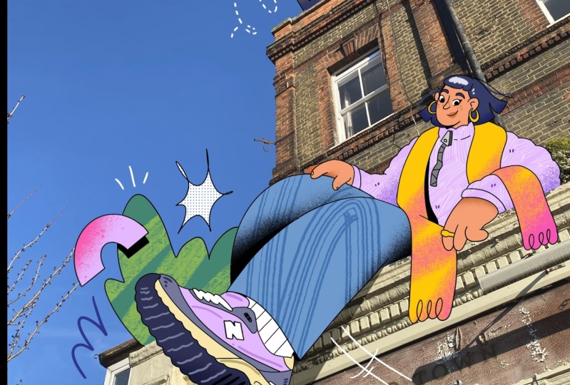
and our guides prep, we can crack on with drawing. So I've decided I
want my character to be sitting on top
of this building. So what I'm going to
do is use the guys to loosely draw a character, keeping in mind
weather direction, keeping in mind where I
want my character to face, how I want them to interact
with the building, how they'll sit within
the perspective lines to look like a natural
part of the scene. So think carefully about how your character is going
to sit in the photograph. Are they looking at
something in the background? Are they perhaps
casting a shadow? Are they interacting
with something, making sure your character
aligns with the perspective. I want to create some more
space to work with on here. So I'm going to use the flipbook option instead of drawing with the tracks visible at the bottom
of the screen. To do this, you
can grab this bar at the top of the track
section and drag it down, and the flipbook
option will appear, which will give you
more space to draw. I'm pretty happy with how my character is
looking at this stage. So I'm going to add
some more assets just dotted around some
plants and flowers. Anything that you can animate
later on its your life. So I'm just going to
exit flipbook mode by dragging this bar at the top of the flip book
to the bottom of the screen so my track
panel reappears. I'm really happy with
how my draft is looking, so I'm going to start to develop this a
little bit further. Before I start going in with
the more detailed lines, I'm going to drop the opacity of my photo layer just to make sure I can see everything properly
before I'm drawing it up. Now that the draft
is more visible, I'm going to create
another track on top, which I'll start to build
up my line drawings on. You can create as many
draft layers as you want, and each time you can build up the detail until you're
happy with the result. However, I'm pretty happy with how my draft is
looking at the moment, so I'm just going to dive
straight into the illustration. At this stage, it's
really important to separate out each element of the animation that you
want onto separate tracks. So every time you draw something new that you want
to have movement, add in another track and
then draw it on there. This will keep all
your assets individual so you can animate them
each how you want them. To make things a little
bit easier for myself, what I'm gonna do is start off illustrating the areas that
aren't going to be animated. So anything that I
want to keep still, I'm going to keep on one track. Anxious king b get
my Ming, grain. Anxious king be
get my ing, grain. Anxious king, be get
my mining, grain. Look at this again. Look at this again. Das, get my morning pit. Dems King get my morning bright. The scheming yep great. De ping, great. I'm just going to
exit the flip book. I'm now going to
start on the outlines for the rest of the animation. Everything else I've got here is going to be on
a separate track. So I want the sun to move. I probably want the clouds to kind of go backwards
and forwards. The leaves flowing
in the wind and some happy little flowers at the bottom,
something like that. I'm gonna create
another track for my leaf. Let's try
one down here. I want it to look
like it's growing out from behind the buildings. And then again, because
this illustration is going to be present
for the whole animation, what I'm going to
do is just hold it down for the duration
to prevent confusion. I'm actually going
to name this layer. So if you name this
one character. If we hold this down,
we've got leave for one. I'm gonna create another track a little bit, maybe
a bigger one. I'm just going to
create an example of an animation
that's got two parts. I want to create a moving sun. However, I don't want
the face to move around. I'm just going to do
a new track for this. Sometimes it's easy to
go back to the guides, and I want to kind of create
a proper circle here. I have spikes all round just following the circle
that I've got underneath. And then on top, I'm going to create a new track, and I'm going to draw the face, which is
going to stay still. So now, the sun rotates, the face will stay
in the same place. So once you have
the general outline down, when it comes to coloring, rather than coloring in
on different tracks, it makes more sense to
just use the layering. Forgot my sun, for example, we've got the layering
in the top right corner. And then we've got
the sun. So at the top, I've got my outline. So if I were to rename this, I can rename it sun
we go Sun outline. I'm going to add a new layer, and then I'm going to actually drop that below because I want the color to sit under
the outlines of my sun. You fill this in. And then what I love to do
I use a lot of textures. I love using spray paint
textures, crayon, pencil crayon. I go to the plus in the layers, hold it down and clipping masket it'll create a clipping
mask with the layer low. The thing I do on this layer will be bound to
what's underneath. So I like to add
some kind of red, and then we're going
to go to spray paint. Now that your design
is prep, next, we're gonna dive into
making the elements move, but in the meantime, make
sure all your illustrations finished with every part you want animated on
separate layers. This will make the
process a lot easier. See you soon. I get.
5. Moving & Rotating: Now that the illustrations finished and the layers
are separated out, we're going to
start to introduce some movement to our elements. So I finished my illustration. I've separated all
my bits and pieces. There are quite a lot of
layers at the moment, but I've separated them all
out onto different layers. And I've got duplicates of
flowers and things like that. So each layer names
just for ease, you'll see I've got
overlapping elements. If I just turn one of these off, let's turn off flower too. You'll see the leaf underneath
is completely finished. So when it moves, there's no
element, that's half done. Whilst I was going through and finishing off the elements, I kind of started to pick up on a color theme
that I really liked. And I actually
created a palette. I like to keep my colors pretty consistent when it
comes to illustrations, so it kind of ties it
together a little bit. I've also turned off my guides, so I can see what the illustrations
currently looking like. And then I've increased the opacity of my
background again, so I know what the end results going to look
a bit more like. When it comes to animating
and key framing, I'm going to start with my sun. What we want to do is make sure that the anchor point
is in the right place. So the anchor point is
at the point in which all the animation is
manipulated from. For example, if I
click on our action, we're going to go
to move, and you'll see this box with the pier. Click these three dots
in the corner and edit the anchor point to
the center of the sun. That way, any sort of movement
I put or any rotation, it's all going to happen
from this center point. So, for example, If I just click on this corner of the bounding box and
hold down the edge, my son will move around. Whereas if I had the anchor
point somewhere over here, and then I tried to remove it. Oops. It's going to rotate
around the anchor point. So make sure it's
back in the middle. So when it comes to animations and especially
ones I'm making for reels, I like for my animation
to be looped, so you can just
keep watching it, and there won't be a point
where the animation stops. I'm just going to go to
the start of my animation. I'm going to keyframe
in and move action, and then I'm going to scroll down to the end of my animation. I'm actually thinking 10 seconds might be
too long for this. Let's change the length. I'm just going to click
into the settings, and then I'm going
to go to properties. It's 7 seconds. I feel like that's a
nice amount of time. So although our
tracks keep moving, the actual animation
will stop at 7 seconds. Go to click at the
end of my sun, and I'm going to move action
and key frame in here. So now, throughout
the whole animation, the sun will stay
in the same place. But what we want to do is we
want to add some rotation, so it kind of rotates
a little bit around, maybe about halfway through. Click the little corner
of the bounding box. Hold this down. Kind of rotate it maybe
back to here. There we go. And it should add a
bit of ease as well, so it shouldn't be really rigid, and then it's going to go
back. There's a perfect loop. Looking at this now,
when my sun rotates, the face is a bit off center. Similar to when we rescaled our photograph at the
start of the project, we're going to go to
the start of the track, go to the transform button, and instead of rescaling, I'm going to move the face just slightly down so it
fits within the sun. And I want to kind of give some really subtle movement
to these clouds as well. So I've got cloud in the front, which is here, what I'm going to do is key frame it at the start. And then I'm going to
go and key frame it at the end. I go go right here. See, I feel like that cars moving a lot quicker
than it should be, so I'm actually going to
delete that keyframe. Your keyframes may not always be perfect the
first time around, so have a go at tweaking them. You can drag the keyframes
along timeline to make any edits or stagger
certain assets if you don't want them to
move at the same time. It's always worth watching
your animation through every so often to make sure you're happy with
how it's looking. This saves making
all the tweaks at the end instead of
doing it as you go. Now that you know how to move
and rotate your animations, we need to apply
this to the rest, bearing in mind where the
anchor point needs to go for the animation
to rotate correctly. For example, for me to
rotate this flower, I want it to rotate from the bottom rather
than in the middle, so it looks like it's
swaying in the wind. No Hab a go at experimenting key framing and rotating and
moving your shapes. Key framing is a fundamental
concept in animation. When you feel like
you've got this nailed, in the next lesson, we'll be using this feature
to rescale and play around with opacity to bring
our animations to life. See you soon. H.
6. Scaling & Opacity: So after we've played around with rotating and you've got
the hang of key framing, I add another element
of animation, which are re scaling
and opacity. I like the thought
of these sparkles kind of coming in and out. So I've got my sparkles.
I've separated them out. So we've got let me go one, two. I want to play around
with making them glimmer. So I'm going to keyframe
in where they are for now. I am going to go to the end and keyframe in just to make
sure it definitely looks. What I want to do
is just increase the scale slightly
and then back again. It looks as though
it's flickering. Not too much because I don't
want to be too distracting. You'll notice when you've
got your keyframes in, you actually get this bar
that appears underneath. You can actually just click
this bar along your timeline. Before I increase the size, I'm just going to make sure my anchor points in
the right place. At the moment, it's in the
middle of the bounding box, which would mean that
it's going to increase it from the anchor point,
which we don't want. So I'm just going
to edit the anchor and then increase
the size of that. That just came, they'd
get my morning pipe. That just came, they'd
get my morning pie. That just came they'd
get my morning pipe. That just came, they'd
get my morning pie. So I've got these stars that
I'm going to apply this to. I probably will stagger them a little bit so they don't all
glimmer at the same time. What I also want
to do with these? I just want to see what
it looks like with a faded opacity use it'd be nice if when it goes smaller,
it kind of fades out. And when it comes back,
it's like flickering in. So to do that, I'm going to go back to the
start of the timeline. This time, instead of
moving, I'm going to go to filter opacity
keyframe and opacity. At the moment, it's
going to be 100. And then I'm going to go back
to the end of the timeline, and I'm going to do the se Mi will put
this at 50% actually. We've got a keyframe
here and it goes bigger. So when it goes bigger,
I want it to be at 100%. When it goes smaller,
I want it to be 50%. How it go? Bigger,
100, smaller. 50. So you'll see underneath it, I've got my scale timeline and I've got my
opacity timeline. So it should start to get easier in terms of learning
where our keyframes go. Then we go and then go smaller called So you can see it fades out as it
goes, which I like. Gives it a bit of depth. So I'm gonna apply these to
all four of my sparkles. I'm going to probably
stagger them a little bit, so they don't all
do the same thing. Maybe some go bigger, maybe
some fade out a bit more. Finally, in the last section of breaking down the
animation elements, we've got the basics down and we've keyframed in
our smooth motion. Next up, I'll give you an
outline of how I use frame by frame animation to create embellishments and
complimentary bits and pieces. We also cover any
final touches to round off the project
and any tips and tricks that make the process a
little bit easier. Uh,
7. Frame by Frame & Extras: When I've got the
base of my animation finished and all of my
key frames in place, ensuring that the animation is a perfect loop
if I want it to be, I like to have a think
about what parts of animation I kind of want to
stand out a little bit more. I also like to round off
the project by adding in any highlights and shadows
right at the very end. I also like to create masks
on the layers to prevent the animation from overlapping any part of my image
that I don't want it to. Firstly, shadows. Just
looking at my image. I've got this green bush here, which is sat behind the house. I'll probably add
some shadows to that. Also underneath my character, so it looks like she's
on the building. We've already got the
clipping mask for this one, so I'll probably just
use that for ease. So if I go to my layers, actually, I'll create
another clipping mask. That way, if I need to make
any edits to the shadow, it won't make it to the
textures that I've got as well. I'll probably drop
this one opacity. The shadow it's going
to be gray paint. And if I just move the
texture underneath, so the shadow is applied
to the texture as well. So I've got my shadow here. Run that along the bottom as if it's kind of coming out
from behind the house. And then when it comes
to my character, what I'll probably do is seeing as it needs to sit
underneath my character, what I'm going to
do is add a track, and then so it'll be as if her shoes kind of
coming away from the building, there'd be some
shadow down here. I'm just going to
go into my layer, drop the opacity
just a tiny bit. Going to fill the duration. Next, what I'm going
to do is a little different to the animation
style that we've been using, but I like to add frame
by frame elements, and I've actually
left off two of the little sparkles
that I created before because I think they
might look better in a frame by frame style. Create a new track.
But this time, we're going to be drawing
each frame individually, so we won't need to fill the
duration of the animation. We can just dive straight
into the flip book. Here we've got our flipbook I'm going to add some
stars in this area. To do this, I want
them to start small, get bigger, and then kind of pop. They're
kind of glimmering. Start off by just drawing a really small more
star. Here we go. And as you can probably see, when you come back
to your timeline, you've only got the one
frame, which is what we want. So we're going to go
back to the flipbook. We're going to move
on a frame, and you can see the onion
skin underneath. If at any point you
want to change this, you can go to the
bottom left corner. You can edit it, you can
change the color of it. You can change the
opacity and how many frames that you want to
be able to see it for beyond the actual image itself. I'm going to go one on,
and I'm going to make this I'm going to make
this slightly bigger. And I kind of want
it to look as though it's like bulging
when it comes out. I'm actually going to go for
my last frown on this one. Gonna go a bit smaller. I then want to hold this frame because I don't want it to
disappear straight away. If you click the far
right end of the frame, you can drag it along for
as long as you need it. Now what we're looking
at is there we go. Then we're going to go
back into our flip book, and I'm going to jump
onto the next frame. Now I want it to start to pop. Carry each corner of the star off going to move it
out just a little bit. And there maybe some little
leftover bits like that. Nothing too fancy, but I don't feel like it needs to be
anything more than this. I like my animation to
be quite choppy anyway. The contrast of the
frame by frame with the really smooth movements
of everything else, I think that works
really nicely. Just fill this in each one. I tend to just group
them all together and duplicate it just so I don't have to recreate
it to do that, you can use this
timeline edit button, highlight all of them together. Then if you hold down, you
can group these together. Now this acts as one
track in itself. It's really useful in terms
of being able to bulk, animate, or duplicate
separate frames. So what I'm going to
do duplicate this. Let's dropped onto the
end of this track. Just going to go
back into dramas. We're going to create another
track above this one and then drag this where we want it. You can see it's staggered
here because one starts later. What I want to do
is move it around. So if I go to the
start of the track, again, go to our action. We're going to move it here. You can see the next to
each other. Duplicate it as many times as you want
and drop it all around. The last thing that I do is make sure that nothing is overlapping where
it shouldn't be. This leaf here. So through editing it, it
started to overlap. So what I'm going to
do is add a mask. So to do that,
you'll add a track above the layer. Go
back to my drawer. Just for now, I'm gonna
pick a really bright color. Gonna just draw along the
length of the building. We want this present
the whole time, so I'm going to
fill the duration. A go to mask layer mask. And you can see now the
part of the shape when it moves is actually inside what
I created on that track. However, we want it inverted, so it's the other way around. So we're going to
hold it down again. Mask get it invert. When the leaf moves over the building where
that shape is, it's going to prevent
it from overlapping. So it looks like it's
going behind it. So as for any final
bits and pieces, what I'll probably do is, and I tend to just
do this all on one layer because
they don't overlap. I like maybe add some movement
lines to these flowers. So I'm going to go to
a track at the top. I've got one already, but you might need to add a new track. So where this flower, this pink flower moves here, where it starts to speed up. Why stop it around.
There we go here. I'm just going to kind of
start a line like this, so it's going to almost
chase the flower. Kind of sway sway
movement lines. And then it can
kind of trail off. Again, it's not perfect,
but I don't mind that. I actually think it'll
be better if the flowers faster. See what works for you. It depends what animation
you're working with, what kind of movement
you want to add, if you want to add some
speckles or super fast lines. One thing I might do is
I've got my character here. Play around with what you
think works your illustration. It could be that
you've got different shapes that you can work with, different kinds of rotation,
different characters. You might want to make more things move
on your character. So once you've got that
down, your illustration finished and your
animation perfected, we're going to export it next.
8. Exporting: We're almost there. Once you're happy with your animation,
we can finally export it. There are a few ways
you can do that. For starters, if you
go into your settings, go to share, there are a
few ways you can share. So you can save out as video. If you want your frames as separate images,
you can do that, or if you want just
one single frame and then you can also share the appropriate
James file itself, alternatively, which I found the easiest way to
export for social media. If you click on custom settings, you'll get three options
appear at the top. For social media, I use h 0.264. Having used my default settings
when I created my canvas. Usually, the document size
works well when I'm exporting. However, I do like to pick
the 1080 option just in case. Sometimes I find
myself exporting at four K if I need a
high resolution. And finally, I need to
export as an MP four. When you're happy
with your settings, you can click Export in
the top right corner, and the options will
come up for you to save, share or send your file. Or if you go back
into your files, which is this little kind
of collage thing here. You can long hold. And where it's a share,
you've got video again, frames as images or
procreate Dreams. And if you click on
Procreate Dreams again, it highlights a
reduced file size, or you can do the full history. So if you want to show
someone your process, this will display
the whole history.
9. Wrap Up: Hey, guys, you made it through. Hopefully, at this
point, you've got what you need to bring your
characters to life in the real world with
a filmer grasp on combining characters
and photography, key framing and the animation features in Procreate Dreams. I would love to
see your projects, whether you've
used the resources or if you've created
something from scratch. You can upload your
character projects or ask any questions you might have in the discussion forum
or alternatively, just mess with your Instagram. I will make sure I follow up. Alright, folks, it's been a blast sharing my
process with you. If you've enjoy the class
and found it useful, please leave me a review. Remember to follow
me on skill share so you can get any updates
on my next classes. I can't wait to see
what you come up with. And hopefully, I'll see
you in my next class.
 Phoebe Robinson, Illustrator, Animator, Mural Artist