Transcripts
1. Intro: Hi there, and welcome
into this class. My name is Shivani, and I'm a gouache artist,
creative entrepreneur, and surface pattern
designer based in the Sunny city of Chennai,
in the south of India. Ever since the first
year of my art business, I have been converting
my artwork into prints, and I've done this
in various ways. Art prints are great because not only do they give you an
additional income stream, but they also expand the potential of each and
every artwork that you create. If you're a
traditional artist of any kind who creates hand
painted illustrations, and you're interested in converting those into art
prints that you can sell, then you're in the right place. The skills that you learn
in this class are not applicable just for creating
fine art prints like this. It gives you a
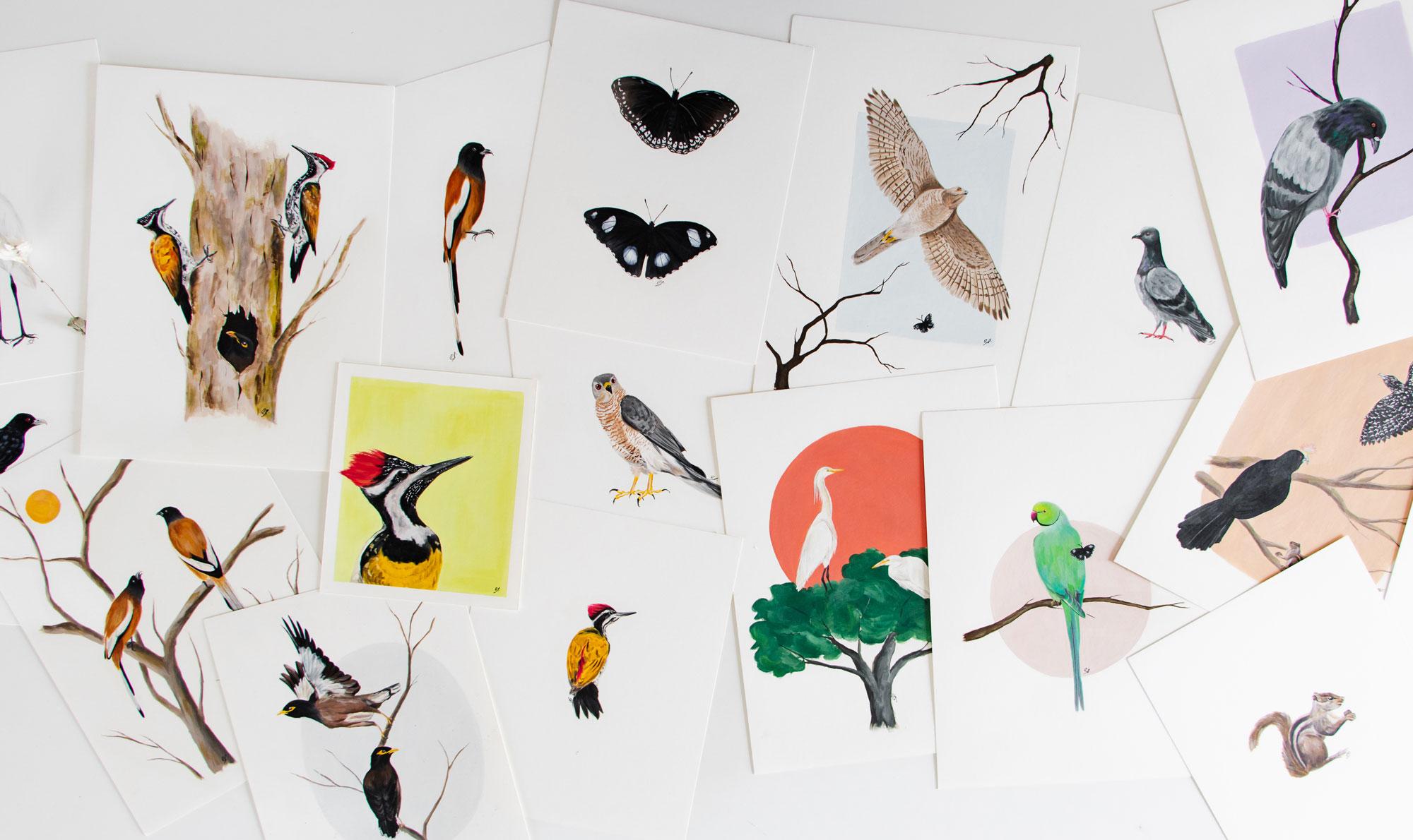
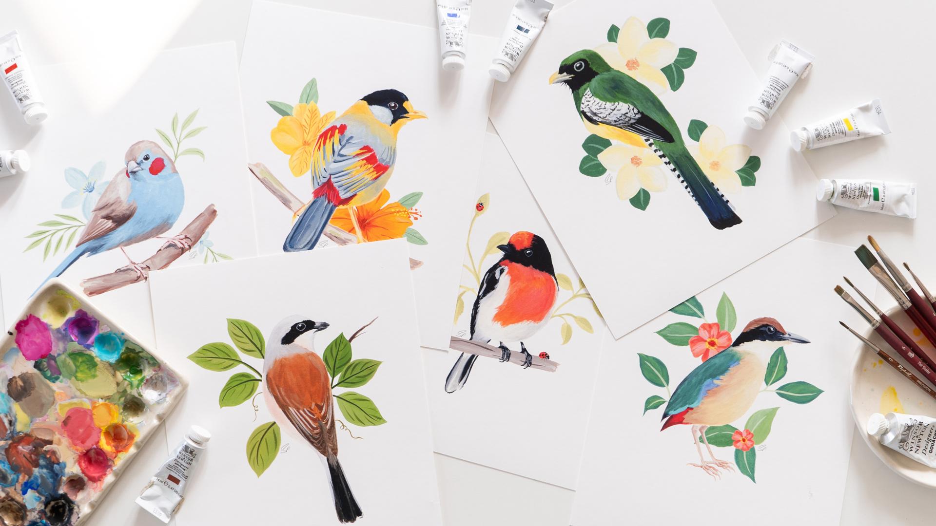
foundation which you can apply to multiple other kinds of products that you can sell. For example, I have collaborated with brands to put my artwork onto products like these mugs and also these greeting cards. All of this was possible for
me because I knew how to digitize the hand painted
illustrations that I create, clean it up, and then
put it onto products. I was also able to create desk calendars using my artwork because of this same skill. So in this class, I'm going to take you through all of that. We're going to learn how to take traditional hand painted
artwork and digitize it. You're going to learn
everything that you need to convert your hand painted
artwork into prints, right from your scanner settings to all the adjustments
that we'll make in Adobe Photoshop to then actually preparing
your files to print. We'll also talk about how to
troubleshoot at every stage, how to make sure that you
select the right papers, and what to do when your prints don't turn out as expected. And if you're an artist who works digitally and
not traditionally, then you could skip past the portions where we scan
the artwork and clean it up and go straight to the
portions about how to actually prepare your files for print and how to create the prints. In the end, we also have a
bonus section where I'll teach you a little bit about how to market and sell your prints. So let's jump into
the next lesson where we'll talk more
about the class project.
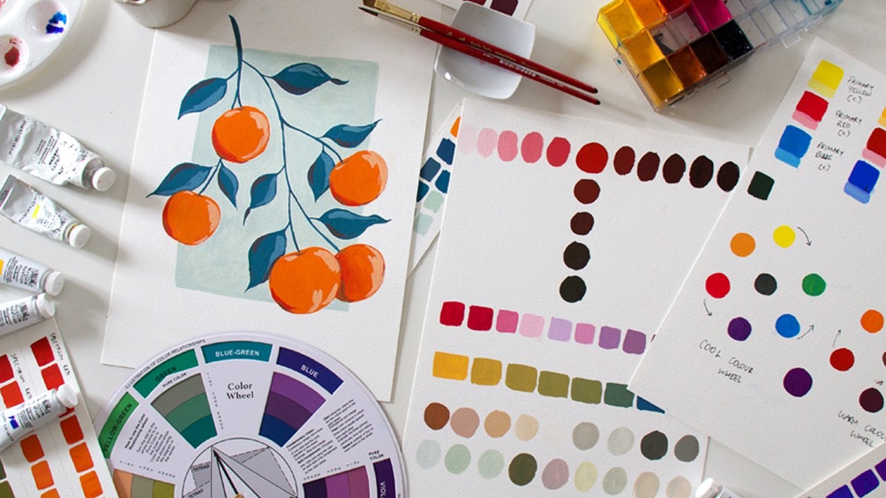
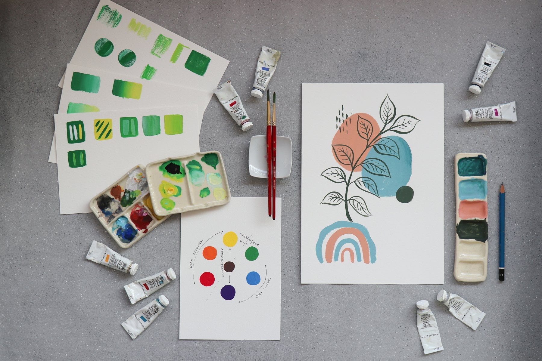
2. Project Intro: The project for this class is to create a perfect
print ready image. To do this, you'll be applying all the lessons that we'll
cover in this class. The first thing you need to do is select the artwork
that you'd like to use for going through this class and for
converting into a print. There are two possible ways
that you could be working, and I have done both
of these things. One is you could be painting
in the form of motifs, something like what
you see here behind me. Where you can then digitally combine them into a
completed artwork like this, or you could be creating
full illustrations. So you could be creating a
complete fine art painting, and then it will be scanned
and digitized as it is, which is something like what I did in my rain tree
collection here. Both of these ways of
working are perfectly fine, and I'll show you how to clean the image up in both
of these cases. So whichever way you want
to work is perfectly fine. Once you've selected
which artwork you're going to be
using for this class, head to the link
in the description below to download
Adobe Photoshop. If you don't already
have a subscription, you could get a seven
day free trial, so that will be perfect as you go through the
lessons in this class. Over the next few lessons, I'll teach you how
to scan your work, how to do the color corrections
in Adobe Photoshop, and how to actually save your file and get
it ready to print. As you go along the lessons, keep uploading your project
to the project gallery, and you can access that through
the projects tab below. You can also use the Discussions
tab to post questions anytime you feel stuck I'm always there to
answer your questions. In the next lesson, we'll
talk a little bit more about the potential of art prints.
So I'll see you there.
3. The Benefits of Art Prints: There are so many
benefits to adding art prints as one of the things that you do
in your art business. One is, of course, that it provides you a new
source of income. Assuming you are already
creating artwork, which, of course, if you are an artist, you
are doing that. The most obvious choice is always to sell
your original art. But if you scan your
work before you sell the original and get it
ready as an art print, you automatically increase
the potential earning of that particular piece of art. And if you set things
up in the right way, art prints can also be a great
source of passive income. You need not necessarily be selling the physical art prints. You could also sell them as digital downloadable prints
through a platform like Etsy, or you could even
sell through a print on demand platform
like Society 6. In terms of your art collectors, I have often found
that art prints are a great entry level
offer for collectors. There may be people
who come across your work through Instagram
or through Pinterest, and maybe they fall in
love with your work. But unless they've
built trust with you by following you for a
prolonged period of time, it's unlikely that
they're going to invest in an expensive piece
of original art. However, if you
offer art prints, that could be a great
way for them to dip their toes and buy
something from you and support you as an artist while not yet committing
to buying an original. Not just that, I feel art prints also have
their own customer base. There are a lot of people
who like to change their art up in their
homes quite regularly. So maybe they don't want to buy too many original paintings. Again, offering art
prints opens up the door for these types of collectors and increases your
collector base. Art prints can, of course, give you much higher
sales volume as well. You can only sell one of
each original piece of art, but with art prints,
it's limitless. You could keep selling them as long as there is
demand for them. It can also open up wholesale
opportunities for you. There could be local
boutiques or brands who might be interested in
stocking your art prints. As an income stream, I find it to be
relatively low effort, and more than everything else, it's just a lot of fun. It's so lovely to see your artwork being reproduced
in the form of prints. And with originals, they can exist only in one
particular size, but with art prints, you can have them right
from a really tiny size up to a really large size. So get your artwork ready and
download Adobe Photoshop, and I'll see you in the
next lesson where we'll talk about how to
actually scan your work.
4. Scanning Your Artwork: The first question when
it comes to scanners is usually whether or not
you need a fancy scanner. What I will say is that a higher quality scanner does make a huge difference
to your end product. And the more expensive
scanners allow you to scan at higher resolutions
or higher DPI, which is something we'll
discuss in just a minute. But at the same time, I would say, start
with what you have. Don't feel like you
need to invest in any special equipment
to get started. Even if you don't have
a scanner at home, we'll discuss in the next lesson how you could potentially
use a camera, but you could even go down to your local print store and
get the scans done there. For my own needs, I use
the Epson V 39 scanner, which is what I've got
on my desk over here. I really like this
scanner because it's very lightweight and
it's very portable. It's very easy to even
travel around with it, and it has this little
stand at the back, which I can just open up. And I can make it stand up on my desk like this
if I'd like to. And then this just opens up here and that's my scanner bed. If you're looking
for a high quality beginner level scanner
to get started with, this is a great option, and it scans, I think, up to 4,800 DPI. The other option, which
is more expensive is the Epson V 600 scanner, which is absolutely great. But if it's out of your budget, it's completely fine to get started with
something simpler. When I started, I just used the scanner that came attached
with my home printer, and typically those
scanners scan up to 300 or maximum 600 dpi. When you scan your
artwork at 300 DPI, what that means for
you is that there are 300 pixels per inch in
the final scanned image. And if you zoom too much, you're going to see
a lot of pixelation. 300 DPI is usually fine
if you're going to print at the same size in
which you painted the artwork. However, if you want to
scale the artwork up, then you typically need to
scan at a higher resolution. It's a simple formula, so it
goes in multiples of 300. So if you scan at 600 DPI, that means that is 300 X 2. So you can scale your artwork up to twice the original size. So 2X the original size. If you scan at 1,200 DPI, it means you can scale it up to 4X the
original size and so on. I'll leave a little PDF guide to that in the
resources section, so be sure to check that out. So if you only have
a 300 DPI scanner, make sure that you paint
your image much larger or paint it to the maximum size that
you would want to print. Or even larger than that so
that you can scale it down. Since my scanner goes
up to 4,800 DPI, it allows me the chance to
paint my motifs pretty small, and then I can really scale
them up when I digitize them. I usually scan at
about 1,600 DPI, so that means that
if I wanted to, I can scale my artwork up to five times of
the original size. Okay, so now hopefully you
have your artwork ready. So let's work on
actually scanning it, and I'll show you all
these scanner settings. I've got my scanner ready. I've got the artwork that I want to scan
ready right here. And on my laptop, I have opened up the
scanner software. So this screen might vary depending on what brand
of scanner you're using. But we're going to look
at the basic settings that should be applicable
across any scanner. What you see on the
screen right here is my last scanned sheet. Right now, I'm going to be
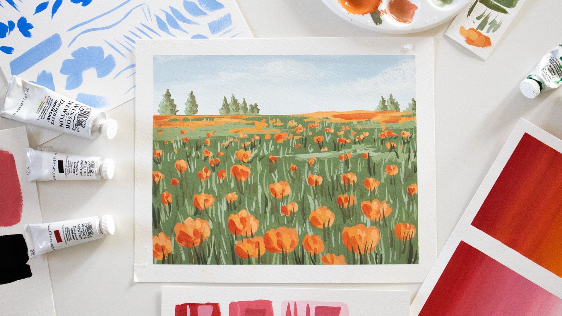
working with this page. I think I'll scan this artwork here for the demonstration. The reason I've chosen
something like this is that this works as a
complete piece of art. It's pretty small in size, so I'll show you how I scan at a higher resolution and
I'm able to scale that up. It also has a lot of white
spaces within the image. So that gives me more
opportunity to show you how to clean up all of
these white spaces. When you have a full artwork that goes from end
to end of your page, that actually becomes
a lot easier to scan. So if you're able
to scan something with a lot of white spaces
and clean all this up, then scanning something like a full page illustration
becomes a lot easier. So let's scan this
image right here. I'm going to just open
up my scanner first. And the first thing I always do is to clean my scanner bed. I keep a really
soft bristled brush so that it doesn't scratch
the surface at all, and I make sure to
thoroughly clean out any dust that has gathered. Once that's done, I will then insert my artwork
into the scanner bed. And then before I
actually scan it, what I'm going to do is
hit preview right here. So now we can see we've actually got an image preview over here, and we'll look at
the main settings. The first thing you're
going to want to choose is your DPI, as we already discussed. If the maximum your scanner goes up to is 300,
then choose that. If the maximum is 600,
then choose that. But for me, it
goes a lot higher. So I'm going to
go with 1,200 for this particular illustration,
which, like I said, means that I can blow this up to four times
the original size, and I prefer to scan just the
area that I actually want. So I'm going to adjust this
bounding box right here. Because especially when
you're scanning so large, every extra pixel that
you have around what you actually need is just
extra information, and it increases the file size. And when you're scanning
at such a high resolution, each and every file is
going to be pretty large, so it makes sense
to just keep it to the area that
you actually want. So now I'll look at
the advanced settings, and at this point, it makes sense to make any adjustments to the
color that you may need. Usually, I choose a bit of
dust removal from mine. I live in a very dusty area. So sometimes even after
I clean my scanner, it does pick up some dust. So I prefer to do this. But mainly these brightness
and contrast settings, you can take a judgment call based on what you're seeing on screen and what your
original artwork looks like. Sometimes I find that the colors that come
in here are pretty desaturated compared to what
I actually have painted. In this case, I
actually feel that it's more saturated
than what I want. So what I can do is I can take
the saturation down a bit. Keep in mind that all
of these adjustments can also be done in Photoshop. So A, if you don't have this in your particular scanner software to make the adjustments while
you're making the scan, then just skip this
step altogether. But secondly, you can also just scan it as it is and
adjust it later. But I just try to get it
as close to what I want as possible in this step itself so that I have
less work to do later on. I think I'm also going to take the brightness up
just a slight bit. And I think I'm quite
happy with how this looks, so I'll go ahead and hit Scan. Depending on how high
your DPI is set, your scanning is going to
take less time or more time. 300 DPI would take less time, and the larger the DPI is, it's going to take a
lot more time to scan. So let's just let that
continue scanning for now, and I'll see you in the next
lesson where we'll talk about some alternatives
to scanning your work.
5. Unable to scan?: There could be two instances in which you can't
scan your work. One is if you don't
have a scanner and you urgently need to get
it onto your system. And the second is if your work is just too
large to be scanned. Some fine artists paint
really large in scale, so that cannot fit
into a scanner. It can, of course, be pieced
apart and scanned in bits, but that's not something
that's recommended. So in either of these cases, you could photograph your work. If you're painting really
large fine art pieces, then I would recommend getting it professionally
photographed. The reason for that
is you need it to be of the perfect
aspect ratio. You need your colors to be perfect, and you need the camera to be of a very, very
high resolution. You need to get a very
high quality image and you need the mega
pixels to be really high. So it's usually better to get
that professionally done. If, however, you've
painted pretty small like my illustrations and you're
in a hurry to scan it, you need it for a project
and you don't have the time to go to your local print
store and get it done. Then you could photograph it. If you're photographing it, make sure that you use
either a high quality camera or your phone camera at the
highest possible resolution. Make sure your lighting
is bright and even. You don't want one
side of the image looking darker than
the other side, that's just going to
make it harder for you when it comes to
color correction. And finally, make sure
that your phone is perfectly straight and flat while you're taking the image. You don't want your
phone to be tilted to one side because
that's going to give you a slightly skewed image. So if you're not
working with a scanner, photograph your work, and then we can continue
with the next step. In the next lesson,
we're going to talk all about
digitizing the work. We're going to import
it into Photoshop and make all of the
necessary adjustments.
6. Digitising Your Art: Now that my artwork is
all scanned and ready, the first thing I'm
going to do is open it up with Adobe Photoshop. So I've got it open here, and once it's in here, I will usually like to
zoom in and make sure that it is not pixelated anywhere or
it's not blurry anywhere. Sometimes with scanners
that can happen, you can have the
edges of the image sometimes looking a little bit blurry and we
don't want that. So it's best to just have
a quick look and zoom in to make sure that everything
is nice and clean and crisp. And once I'm good with that, I can move on to the next step. For this particular artwork, my original size is
about 4x6, and like I said, I can scale
that up to four times. So I could go up to 16
by 20 if I wanted to. When I'm creating a
file for an art print, I like to create it at the
maximum possible resolution. That way, I can
always scale it down if required without
losing any quality. But if I do it at
a smaller size, so if I do my adjustments
at the original size, which is 4x6, then
if I try to scale it later, I could see some pixelation happening, and I
don't want that. So it's always best to create your master print file at the maximum possible size that you're going to
want to print it at. So I'll open a new
file by hitting Command N or Control N
if you're using a PC, and I will go to 16 by 20 because that's the maximum
I can scale this to, and we'll keep
this resolution as 300 pixels per inch because that's more than
enough for your print file. When it comes to the color mode, a lot of printers might ask for CMYK mode for your prints, but RGB mode gives you better and brighter
colors on the screen. When you work with archival
or fine art Giclee printers, they're usually okay with
working with RGB color mode. So this is something you
might want to check with your printers before you
actually set it here. You can always change
it later in your file, but then you may need to make color adjustments
all over again. So that's just something
to keep in mind. I typically like to stick with RGB color and go
ahead with this. And now we have a 16 by
20 canvas to work with. So now I'll open
this image tab and I'll just drag it
into this file. And like you can see,
it's bigger than the file size that I've created because I scanned
it at 1,200 DPI. So I'll just make it roughly
to the size that I want it. And the first thing
we're going to do is correct the white
balance of this image. So to do that, we will hit adjustments icon down here
and we'll choose levels. And then we'll pick this
eyedropper at the bottom, which has the white
ink filled in it. And we'll try to select the
whitest part of our image. When we click down, you'll see that the entire image brightens based on
where you're clicking. So if you click a
darker section, it might get darker, but if you click a
brighter section, it will get brighter. Since I had already adjusted my brightness when
I was scanning, there's not much of a
difference going on over here, but you can see if I click
on an area like this, the entire image does brighten. So figure out what
you're happy with, and this will help to even out the whiteness of your paper. I'm also going to duplicate
my original layer so that we have one layer that's
untouched as the original file, and we'll keep that one hidden by clicking on this eye icon here. And when it comes to
the duplicated layer, that's the one where we'll
apply this layer adjustment. So we'll select both of the layers and we'll
say merge layers. So that applies that
layer adjustment onto this layer and flattens it. In addition to this, there are a few other adjustments
you could make. For example, you could adjust your brightness
or contrast or you could adjust your saturation
if you feel that it needs to be more
or less saturated. It completely depends on your artwork and each scan needs to be
just treated differently. And it's usually a
good idea to keep your original illustration
next to you on your desk so that you can
kind of compare how they're looking and make any
adjustments that you need to. Another thing you could do
is the color adjustment, which is selective color. And here you would
individually be able to adjust the different hues or the hue
families within your image. So sometimes you might
want to specifically adjust the yellow and
make it more yellowish. I think I'm going to try
to make my reds a bit more yellow because I do want my carrots to look
a bit more orange. So I'm just adjusting the yellowness of
my reds to do that. And I quite like
how that's looking, so I'm going to
leave it at that. And again, I'm going
to select both of these layers and I
will merge them. Now it's time for us to start actually deleting the
white of the background, and we'll get into that
in the next lesson.
7. Digitising Your Art - Part 2: So we're now ready to start removing the white
of the background. There are many different
ways to do this. So in this class,
I'm just going to show you my favorite
way to do it, especially when I'm
working with this kind of artwork where there is a lot
of white space around it. I'll probably do a future
class where I show you all the different methods
for background removal. That way you can choose
what works best for you. But for now, I'll just show you a couple of the best options. So one is the magic wand tool. The magic wand tool
has a few limitations, so you can use it to
just click on the white, and it will select most of
the white of the paper. However, if your background
white is not very smooth, if there are variations
in the white, then you might run
into a lot of issues. Also, it doesn't pick up these areas where there might be little splotches of paint. All of those get left
behind in the selection, and that can be a little
tricky to deal with. If you have a full page artwork, then the magic wand
tool is a great option. If you just have white around the edges that you need to
clean out, then it's great. And many times, when you
have a full page artwork, you may not even need
any white removal. But right now, I'm going to show you what you can do in case of these kind of illustrations and also if you have
individual motifs. So what I prefer over the Magic Wand tool is this
Object Selection tool. So I'll undo that selection
that I initially did. And the Object Selection
tool just makes it really easy to isolate the
different objects that are in your artwork. All you need to do is come here, and usually it will give
you an outline like this. I'll show you what
to do if it doesn't, but usually it gives you
a pink outline like this, and you can just
simply click and it selects everything that
belongs to that object group. You can see over
here, of course, that it's left out this section
and also this leaf here. I can just simply
hover over that, and it again, brings
up this pink outline. And because there's a plus icon, and I have here the 'add to
selection' icon selected. So when I click, it just
adds that onto my selection. Now, in case you have a part
of the artwork which is not automatically showing up
with this pink around it, then you can just click and
drag around that object, and it should pick it up. In most cases, it
does pick it up. See, even though I didn't drag
around the entire object, it's even picked up
these little bits of the root that
was sticking out. So now I'll go ahead and add everything else
into the selection. I'm just hovering and clicking
on everything that I see. And here you can see
that, like I said, it's not showing me
these pink outlines, but I need these
stems to be selected. So I'm just going
to click and drag around them and let's
see what happens. As you can see, it's selected those and added them
to my main selection. Again, I'll do that
for this area, and we've picked
that up as well. And here we have the same issue. Try to be more tight with these outlines so that it picks
up exactly what you need. Here you can see it's picked up some of the
white area as well, but we'll deal with that later. Okay, so we've got
all of those stems, and I'm just staying zoomed in so that I can see if there's anything else
I need to select. There's this area of this peach color that's
been missed out. And it's not selecting
that right now. So again, we'll deal
with that later. I'm checking all of
these stems here, and it seems to have done a reasonably good job of selecting everything
that I need. But it's selected a lot
of the white over here, so we'll have to delete that. So just zoom into your
image and make sure that everything that you want
selected has been included. If there are any extra areas that have been selected
that you don't want, then that's the next thing
that we're going to deal with. Okay, so I'm happy
with that selection, and everything that you see with the marching ants going around
it is our main selection. Now we're going
to start deleting the areas that we don't
want out of this selection. To do that, I'm going to use
the magnetic Lasso tool. This is what I used
to use before. I used to manually, go around outlining each and
every leaf and detail until the object selection tool became a lot more powerful in
the last couple of years. So now you have the
magnetic lasso tool, and when you're using this
to remove certain areas, make sure that you
select the subtract from selection so that you're removing the things
that you don't want. You can also use the add to selection if you want to
add specific areas in. But right now, I just
need to use it to remove certain areas like this
entire white area here. The marching ands
are going around all of this white
which I don't want. So I'll select an area
around this corrot here, and I'll just drag
my mouse around. And it's basically magnetically
sticking to the artwork. It's able to distinguish this area of white
because of high contrast. So you can just use that to go around the main elements
that you want to keep. And if at any point, it selects something
that you don't want, just hit Delete. And you can also click down if you want to guide it to
select in a specific area. If it's going outside of what you actually wanted to select, then you can just
click and continue. So I'm removing all
of these areas from the selection, and I'm
only keeping what I want. So you can see, once
I closed that out, this entire white area
here has been removed. So I'm just going
to continue doing that for the areas
that I don't want. And here I can see
that this area, for some reason, it's
removing from my selection. So in that case, I'm just going to use the
rectangular marque tool. I'm going to say add to selection and just
go around that. So that's added back in. And now I'll go back to
my magnetic lasso tool, continue with my subtract from selection and remove all the
areas that I don't want. In areas like these, I will use the add
to selection and just go around it and add it
back into my main selection. Let's continue doing this. And before you
proceed any further, please don't be like me.
Please save your work. I often forget to save my work, and then I regret it. So make sure you're saving
your work as you move along. Start zooming in really tight to make sure you're getting
everything that you need to. Once you're happy with that, go ahead and move on
to the next step. And don't worry, even
if you've not got everything just yet or
you're a little unsure, there'll still be room to make
changes in the next step. So in the next step, what we're going to do is we are just going to create
a layer mask. Now that we've already selected
everything that we want, what we're going to do
is hit the layer mask, and what that does is it masks out all of the area
that was not selected. So if you notice right now, all of the background
has been removed, but it's not
technically removed. It's just been masked out. So if you see this
little icon right here, everything that's in black
has been masked out. And I'm really happy
with how that looks. And one thing that
I like to do at this stage is I just
create a new layer, and I move that layer under, and I generally like to make
it black so that I have enough contrast to see whether all of my white
has been cleared out. So to do that, you can just use this adjustment layer and
you can say solid color, and we're just going
to choose black there. And this is usually
the best way, especially when you
have lighter colors in your illustration
to just make sure that there's no
white being visible. I can see some white here, and I do want to clean that up. So what I'm going to
do next is I'm going to come to my layer mask. So that's our main
working layer. And instead of clicking
on the artwork icon here, I'm going to click
on the mask icon. And now I can choose
the paintbrush tool, and all you need to
understand here, if you're a complete beginner, I understand this can
be a little confusing, but all you need
to understand is that if you paint
over this with black, it will add to your masked out section which
you see in black over here. You paint over it in white, it's going to become visible. Right now, we have
white selected, so you can see if I
just paint over this, it's bringing back
everything from that background color
which we masked out. So I'll just undo that. Instead of that, I'm going to paint because I want
to hide something, so I'm going to paint in black, and I'm using the box bracket as a shortcut to make my
brush a lot smaller. I'll then switch over the
colors from white to black, and I'm zooming in really tight so that I can see
exactly what I'm doing. And I'm just going to
paint this in black. And by doing that, I'm not actually losing
any part of this image. I'm just adding it into that layer mask and hiding
it from what we see. Okay, perfect. So
I'm happy with that. That is my illustration
actually ready to be made into a
print ready file. I don't have any other
adjustments to make. At this stage, now I'm
going to do two things. The first is I will hide
this color fill layer, which I was just
using to test it out. And the next thing I will do is I will duplicate
this layer again. And I will hide the
original layer mask layer. The reason I'm
doing this, again, is so that I still have
this editable layer. If I ever need to make
changes, I can come back, make this visible, and I
can make my changes here. But in the final layer, I'm going to flatten it so that it's no longer
a separate mask. I'm applying the mask
onto my artwork. So I'll just right click on the layer mask and
I'll say apply layer mask so that flattens it into a layer which if you
look at the icon here, you can see that there are these checks
in the background, which means that the
background is now transparent. So we have an artwork with a transparent
background layer. So whatever color you
apply to the back of that is going to show through because it's
all transparent. And this is our final
print ready image. And you can also adjust the positioning on the
page if you'd like to. And then we'll move on
to the next lesson.
8. Preparing Files for Print: So now that we've edited our artwork to a point where we're
actually happy with it, it's time to prepare
the file for print. To do this, the first
thing I usually do is add my signature
to the artwork. But before that, I'm just going to look at
the placement of the print once again and see if I want to adjust
it in any way. For mine, I think I'd like
to rotate it a bit so that this area at the bottom is a bit more centered and it
just looks overall, a little bit more balanced. And maybe I don't want it
going so much to the edges. I'd like to have a
little more white space around it, so I'll do that. And I think I like
how this looks. I have a signature file
over here, as you can see. To create the signature file, all I did was actually put
my signature down on paper, and I followed the same process of clearing out the background. So what I ended up with was a file with just my
signature on it, and I keep this
saved in a folder so that anytime I need it,
it's easily accessible. So I'll just copy that by
hitting Command C or Control C, and I'll use Command V to
paste it into this file, and then I can move it to
exactly where I want it. And I can also resize
it if I'd like to. So I'm going to put it somewhere here and leave it at this size. I really like how that looks. So now, all we need to do is save this file to be able to
hand it over to a printer. And to do that, I'll
use Command Shift S, which is save as. And I usually just go with JPEG, and I save it at the
maximum file size possible. So this is going to remain in the same dimensions
that I originally set and at the same
pixels per inch as well. So I've saved that
into my folder here, and this is a JPEG file that's ready to be handed
over to a printer. Sometimes people prefer to use PNG or TIFF file formats
for their art prints. TIFF is definitely a
much higher quality, but the file size is
also a lot larger. For my own needs, I've not found it
to be required, but you can take a call based on what you think
would be best for you. Now, let's talk about
what would happen in case you have a full
page print image. So for example, I
have one right here. In this case, the artwork actually goes all the way
to the edges of the paper. In such a case, it would be best to talk to your printer and understand how much of a margin or bleed
they would require. Bleed is basically what goes
outside of the boundaries of the final print size that you need so that when
they trim it down, you don't get any white spaces. There's a bit of margin for
them to be able to trim it, and you won't get any white
lines along the edges. If you provide them
the file exactly in the size that you're
going to need for your final trimmed print, then there's a
possibility that if the trimming goes a
few millimeters off, you're going to see white
lines on the edges. So to prevent that, speak to your printer and understand
it would usually be about 5 mm of a
margin or a bleed that they might require you
to add to your print size. So in that case, you're
going to hit Command N, and let's say we
are working with the same 16 by 20
ratio at 300 PPI. If we convert that
to millimeters, that's about 406 by
508 millimeters. So over here, what
you could do is you could add 10 millimeters
to each of these, make that 416 and
518 and create that. So this is actually
your 16 by 20 with a five MM extra
margin on each side, and then we can insert
the same print image, resize it to fit the canvas. And now when you provide
this to your printer, you have to be aware that about 5 millimeters on each edge is going
to get trimmed off, but this way, you make sure that there's
no room for error. Okay, so now, regardless of what kind of artwork
you have used, we have a print ready file that can be sent off
to your printers. In the next lesson, let's talk a little bit more about
choosing your printer, choosing your paper, and
creating test prints.
9. Creating Test Prints: Now we're at the point where
you're ready to actually start creating your art
prints to start selling them. Over here, there are a few different choices that
you need to make. The first one is whether
you're going to print them yourself in house in your studio or you're
going to outsource them. I outsource my prints to
a local vendor near me, but you could choose to invest in a printer for
your own studio, and you could choose to
create the prints in house. A lot of that depends on
what volume of sale is expected for you and whether you think it's going to
be worth that investment. Also, if you're going to
provide very large print sizes, then you need to think about whether that's feasible for you. A printer that can
print very large sizes is definitely going to be
quite expensive to invest in, and it's also going to
occupy a lot of space. So these are decisions
that you need to think about based on your
individual situation. But if you're an
absolute beginner, I would always
recommend starting with outsourcing before you actually
start doing it in house. Even though with outsourcing, your profit margins per
print are going to be a little lower than if you
were to do it in house, it's still worth giving yourself
that time to experiment, that time to build an
audience for your work and actually start getting
regular print sales. The next choice
you'll have to make, especially if you do
choose outsourcing is whether you want to work
with a drop shipping partner, or you would prefer to
self fulfill your orders. So the difference in this
case is that if you're working with a print on demand
or drop shipping partner, you're going to just hand
over your orders to them, and they are going
to take care of the printing and the
shipping to your customers. However, if you prefer to handle that part of the process, if you prefer to
package the prints yourself and send them to
the customers yourself, then you will want
to do that in house. In that case, you might need to order a few prints
in advance and stock them with you so that you have prints ready to go
when customers order them. If you are somebody
who absolutely does not have space in
your studio to stock inventory with you and you don't want to invest in too
much inventory upfront, then drop shipping could
be a great option for you. But if you prefer to have
a little bit more control on the process and a
bit more control on the experience that
your collectors receive when they order something from then I'd recommend
doing it yourself. Once you decide on all of
these different factors, start doing some
research on who are the printing partners that
you could possibly work with. Once you select a few
potential partners, it's a good idea to get
some test prints made and to check the different
paper options that they offer. The third choice you're
going to have to make is whether you want to do regular poster prints or you want to do archival
fine art prints. Archival prints are
museum grade prints of the highest possible quality, and they provide your collectors with an amazing experience. The color reproduction is so unbelievable that it looks
almost like an original. Archival printing can
be done on a variety of fine art paper surfaces
or even on canvas. And that's what I
choose to do for my art prints just because
I love the quality of it. Keep in mind that
archival printing is going to be slightly
more expensive, which would lead to slightly
higher price points. However, you can get good
quality poster prints as well, and you could charge
your collectors a lot lesser for those. This choice is completely dependent on who your
target audience is. You'll need to do some
market research to understand where you
are trying to play within the larger
scheme of the market and who are the collectors
that you want to attract. If you want to
attract collectors who are looking for something a bit more permanent and are willing to pay a price for that, then it's really
worth investing in archival prints because
they last a lifetime. But if your collectors are possibly people who
are younger and maybe aren't looking for that
fine art museum quality right now in their lives, then you could choose to
go with poster prints. So once you've made
all of these choices, figure out some local
partners that you could collaborate with and get
some test prints made. Test prints help you
check whether the vendor is able to provide the
quality that you are after. But additionally, it also
helps you check whether all the color adjustments
that you've done on Photoshop have translated
well into print. When you're checking
your test prints, there are a few different
things to check for. Firstly, you want to see if you're happy with
the paper quality that you've chosen and whether that paper suits your artwork. Then you need to look
at the trimming size. Like we discussed in the
part about bleed and margin, you want to make sure that that's been followed correctly, and it's being trimmed to the
exact size that you need. When I made test
prints with my vendor, I found a bunch of issues
that needed to be corrected. In this case, I found
this black line coming on top because the paper had not been
trimmed correctly. Another issue that you
could see is banding, and that is when these
lines appear on the print, and I saw this happen with
a few of my prints as well. You get these horizontal or vertical lines across the print, which is not something
that you want. Sometimes there could even be ink splatters across the paper, and that is something
we want to avoid. And finally, it's possible
that something went wrong in the edit stage and the colors didn't
translate well into print. It's very possible
for that to happen. Sometimes the colors
we see on screen look very different from
how they appear on print. If that happens,
you want to make sure you go back to Photoshop, make the necessary adjustments to the colors and
the saturation, and then try another
test print until you get it looking exactly
how you want it to look. So now you're actually ready to start marketing and
selling your prints. In the next two bonus lessons, let's talk a little
bit more about that.
10. BONUS: Building Your Print Sales Foundation: When you're getting
ready to sell your prints, there are three things
you need to think about. The first thing is your
product photography. The second is your
pricing strategy, and finally, your
sales platforms. When it comes to
the photography, make sure that you click beautiful and
professional looking images of your artwork. Sure you show the artwork in
different settings and show some close up shots to show the level of quality
that you're providing. You might also want
to click photographs of the packaging that
you put the artwork into give collectors a feel of what the experience
might be like. If doing a professional
photo shoot is not something that's going
to be possible for you, another great idea is
to buy mock up packs. On sites like Etsy
and Creative Market, you can easily get
mock up packs, and you could mock up your artwork in
different room settings. Again, this gives
customers a good idea of what the artwork might
look like in their space. I've spoken a lot
more about actually photographing
artwork in my class about fine art collections. In case you haven't
checked that out, I'll leave a link in the description so that
you can have a look. Then you need to think
about your pricing strategy for your different
sales platforms. Think about your actual cost
of creating the prints, whether that is
through drop shipping, whether you're outsourcing it or you're printing it in house. You need to get a good estimate of what it actually costs you. Think about the
time that went into it and think about your
packaging costs as well. Factor all of that in
and try to come up with a number that gives you a
good profit margin, as well. Another thing I always
recommend doing is looking at a few other artists in your niche just to understand
what the market is. Looking at artists who have
similar offerings will give you an idea of what people might be willing
to pay for them. Another thing that's
very important to think about is
your shipping cost. Whether it is domestic shipping or international shipping. Think about what the costs are for you and whether you want to absorb that into the price or you want to charge
separately for shipping. And finally, think about
discounts or offers. You could even bundle some prints together
as a print pack, and that way offer them
at a special price, or you could have a
special discount code when you newly open your shop. You could even offer a
special discount code specifically for people who
sign up to your mailing list. We'll talk about that
in the next lesson, but that's a great
way to bring people onto your list so that you could promote your
products to them. And then think about
your sales platforms. Like I discussed with you in
the beginning of the class, once you learn how to digitize and create prints
using your artwork, the possibilities with
that artwork is endless. You have that digital
file and you can use it for a whole bunch
of different things. So you could sell the art
itself on your website, and you could build
out a website if you don't already have one using a platform like
Squarespace or Shopify. Or you could even
sell on an Etsy store. You could collaborate with the Print on Demand
partner, like we discussed, and you could tie
up your print on demand with your Etsy
store so that once you get orders on Etsy it's directly being fulfilled by
your Print on Demand partner. Another mode of print on
demand is that you could list your art on a print on demand
website like Society six. In this case, if
there's any sale, Society six will directly
take care of it. However, I would also like to
mention that platforms like Society six are quite
oversaturated at the moment. So if that's the
route you go down, don't expect to see too
many immediate sales. I'm not saying it's
impossible to see sales, but it is going to take you some time to build that up. You could even sell your art prints at local
galleries or art fairs. And finally, you could look
at wholesale opportunities. So now let's talk about how
you can market your work.
11. BONUS: Marketing Strategies: So in this lesson,
we're going to quickly discuss how you could potentially
market your art prints. As with any other income
stream or business, it's important for you to
build up your audience. You need loyal followers who really care about the
work that you're doing. Email marketing has always
been a great way to do this. Like I mentioned in the
previous lesson, you could potentially
offer a discount for people who sign up
to your email list. You could call it a collectors
club or anything else that sounds exclusive and make it really exciting for
people to sign up. Once they sign up,
you can create a welcome sequence to
nurture that audience. You can tell them a lot more about who you are as an artist, what kind of art you create, what your inspirations
are, and all of that. As your list builds up, you can start sending
out regular mailers. Could use this as a
way to inform people about new launches
of your art prints, take them behind the
scenes in your studio, and maybe give them some
exclusive previews and sneak peeks and basically really build a relationship with them. Then there's social
media, of course. Instagram has become a
really competitive space, and it is difficult
to stand out, but I still recommend posting on a semi regular
schedule, at least. This way, it gives people
the chance to discover you, and if people are interested in the kind of art
that you create, then they can follow along. You can also treat it more as a gentle portfolio space
instead of treating it as a platform that needs
to enable direct sales. I think that takes a lot of the pressure off of Instagram, and it allows you to
just post there without any expectation and without caring too much about
the end result. You can use it as a way to
promote your email list and try to get more people
enrolled there instead. And then Pinterest can also
be a great way to post your art and get people clicking and coming
through to your website. I'll leave links to some of
my own YouTube videos where I explore each of these
marketing platforms in depth to give you a
better understanding of it. You can check out those links in the description below.
12. Conclusion: Congratulations. You made it
to the end of this class. So just to recap everything that we
covered in this class, we learned how to take your artwork and convert
it into an art print. To do that, we understood the
different scanner settings, and we understood exactly how to calculate the
DPI that you need. We then took it into Photoshop. We did some basic
color corrections, and we cleaned up the background to make it ready for print. We then understood how to create the print ready file and
send it off to be printed. We spoke about the importance
of test prints and the different kinds
of issues you could run into when you
do your test prints. So make sure you make
all the corrections until you're completely happy
with your final prints. We then spoke a little
bit about preparing your artwork to be sold to your collectors and how
to market your work. As a next step, I would
highly recommend checking out my class on fine
art collections, where I take you
through exactly how to create art in the
form of collections, which could be great even if you're selling them as prints. And we also speak about how to sell and market the
collection like a pro. You could also check out
some of my classes on business fundamentals where we go over different
income streams, and I have another one on how
to create a business plan. Don't forget to follow
me on Instagram so you can see what
I'm up to and check out my YouTube channel
where I put out a lot of free content for
creative entrepreneurs. So congratulations once again, and I will see you in
the next one. Bye.
 Shivani Patel, Gouache Artist | Creative Entrepreneur