Transcripts
1. Introduction Presentation Design: Are you still making
presentations in PowerPoint or Keynote. Have you ever thought of
using Adobe XD instead. I'm Martin, I have over 20 years of experience as a
graphic designer, illustrator, and Adobe
certified instructor. I have worked with companies
like BBC, Disney, Google, Ikea, and I cannot wait to share my best
practices with you. This is a streamlined
hands on course focusing on a real
life design project. I will be walking you through
everything step by step, and you will get all
the exercise files so you can follow along. In case you prefer
not to copy me. You can also follow my workflow using alternative
assets provided and create something
completely unique that you can showcase in
your creative portfolio. I am pretty sure
this course will inspire you to create
something amazing. I'm going to walk you
through my process of building an interactive
presentation in ADB XD. We will start the project by creating the main navigation, some interactive components and assign keyboard shortcut
triggers to them. We will also add the sticky menu using component
state and anchoring. Besides all the technical stuff, we will also cover
some important graphic design theory that you will be able to apply in any of your future
creative projects. You can join this course
without any prior knowledge in graphic design illustration
or DOB applications. But to complete the project, you will need access
to DOB Creative Cloud and the desktop or
Laptop computer. But now, it's time
to start creating, so I will see you
in the next lesson.
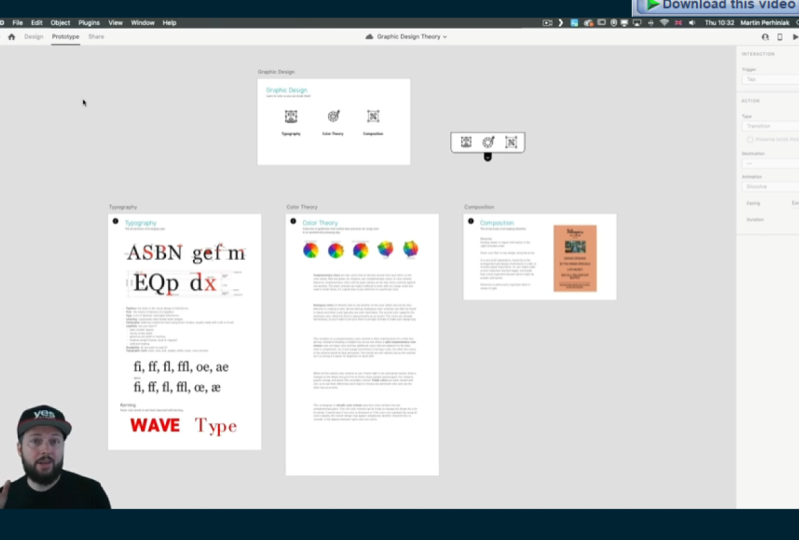
2. Main Interactions : Here we are in a DBXdam. And as you can see, I already have a couple of
slides prepared. We have our main starting
slide here on the top, and then we have these three
additional slides below. But first, let's just build
the main interactions. So from this first
component typography, I would like to move
onto this next artboard. So I'm just using
the little plus sign and drag the line out. By the way, I am
in prototype mode. So this is when you can
set up these interactions. And I'm going to just simply
use the trigger to be tap. And the transition, I can change to something
else later on, but for now, I'm happy with the way it's set up by default. Now, I'm going to
do the same weight. Color theory, I will
drag that here, and then composition
should go there. Now notice that composition is slightly smaller
than these other ones. And that is because I haven't set this up exactly
the same way yet. So let me show you first of all, how this looks when we
are testing it out. So to play the animation
or to see it working, the prototype in action, I'm going to press command,
the control enter. So that opens up this
presentation view. And here, I can show you
that these two elements are already built as components
with hover effects. And as you can see, there's an auto animation
already applied. Don't worry because I'm
going to show you exactly how to do this on
this third button. But now, because we
edit the interactions, I can also just simply
click on it already, and as you can see, we
moved onto that next slide. And by the way, this
slide is longer, so it automatically has the scroll function built into
it as well, which I love. Now, we don't have
the back buttons connected yet to the
original main slide. So let's just do that
before we forget. I'm going to move here, select that little arrow, and just drag it back here. And the good thing
is that because I have this arrow set
up as a component, and I use the same component
on these other pages. When I select them,
notice that they already have that
interaction added. So I didn't have to
repeat these steps. So let's test this out again. I go back in here, go to typography, scroll a bit, and then let's move back. Then go into color theory. We can also move around, and it works perfectly.
3. Create Hover Effect: Now it's time to build that hover effect on
this third button here. So first of all, I
will switch back to design mode and zoom
closer to this page. Commando Control
three is the way you can zoom onto a
specific artboard. And I will show
you that these two here are created as components, including the text
at the bottom. I also added two
guides at the bottom, which will help me to
create the animation because notice when I
switch to the Hover state, not only the icon changes in color and slightly in size
and even orientation, but also the text
comes up a bit. So before and after, so that's the normal
state and Hover state, and the best thing about XD, to be honest, is that everything is
automatically animated. So you just have to set up
the two states and the in between animation will be generated with the
auto animate feature. By the way, it took me some time to realize where the guides are in D when I first used them
because there's no rulers, like an illustrator
photoshoporin design. Instead, all you have to
do is to come to the edge of your artboard and then drag
the guide out from there. The same thing you can
do from the left side. You won't find these features on the bottom or
on the right side, so it's only on the
left and the top. And then when you don't
need a guide anymore, just drag it out of the
artboard to remove it. Let's take a look at this icon here on the right,
decomposition icon. This is already a component. The way I can tell is because
it has a green outline. Normal objects would
have blue outline. Anything green will mean that it's already set
up as a component. And by the way, here on the
left side at the bottom, you have the assets panel where you can keep track of
all of your components, so it will give you
a list of them. And of course, you
can also name them. I haven't bothered naming them, so they are just
the default names that came in with the icons. By the way, these icons
are from noun project. The link is in the
description below. Check it out. It's a
free resource site with loads of really
quality icons. And I really love to work with them in XD because I can add these simple animations that you've already seen on
the other two icons. But let's see what
we can do here. So first of all, this component doesn't have a hover state yet. So it just has the
default state. So first, what we need to do
is to add the hover state. But maybe even before that, I am going to combine the
text into this component. All I have to do is to cut it. So Commando control x, then select the component,
double click on it, which means that we
enter the source of this component and then
press commando Control V to paste in the text. We'll remember where it was. So the position one change. But if I click away
and click back again, now you can see that the text and the icon is in
a single component. Components work like
groups in illustrator, and when you double click, it's almost like
using isolation mode. So now, let's add
the Hover state. So we just click on this little plus sign here
and choose Hover state. You can even rename it
if you want the state itself because you can create
as many states as you wish. But I'm going to keep it as is. And instead, I'm going
to double click inside this component and drag
the text up to this guide. And then I will also
change its color. And use the eye dropper tool and pick this color
here from the text. Now, I should have saved
this already as a swatch, but I can always
reference it from there. And if we now select
this and go back to default state and then press
commando control enter, we can already see
that effect working. And you can see already how cool this auto
animate feature is. So we just had to set
up the two end points, and it creates that effect. And it even uses easing
between the two states. So now it's time to add a bit more interest
and animate the icon, like I've done on these
other ones as well. So let's just go back here, select the component,
go to Hover State, and then double click, to be able to select the icon
itself, so there we are. And I am going to resize it. So holding down old and shift key together. I can resize it. But you can see that it changes the proportion of
the items inside it. Now, that is happening
because by default, there is a feature in X
deced responsive resize. So if you want just
a simple resize, what you need to do is to go
back to the default state, and that's where you can
turn this feature off. So I'm just going to do that. Then go back to
Hovortate double click. Again, select all
of these elements, and then holding
down all ten shift, I'm going to resize the icon
to something like that. Maybe that's a
little bit too big. And also, maybe we can
move it down slightly. And then once again,
the color I'm going to just pick from here. All right. So now, if we go back
to the default state, We can check before, after. That looks good, but we can
also test it out like this. Very nice simple
animation there. But I would like to also have a little bit more
interest on this. So once again in
the Hover state, I just come inside it. But this time, I'm only going to select these details
here in the middle, and I will just simply rotate them around maybe
to somewhere there. And maybe we can also
move it slightly up. All right. Now, once again, let's not forget to go back to the default state, and
then check this out. We go into preview mode, and there you have the beautiful animation
of the rotation, resizing, color change, and
the text moving up and down. Believe me, if you do
presentations like this, everyone will be amazed, and it really feels much more professional that just simple
slides 1 after another.
4. Custom keyboard shortcuts: So since we now
have the animation, let's go back into
prototype mode and select this component, zoom out a bit,
and then drag out the interaction to go to
this composition slide. By the way, I wanted
to mention that these other little
lines here are actually representing
those hover effects that we just built. So with the little
lightning bolt, that means there is a hover
effect on this component, but that's not going to take
it away from this slide. It has to be an actual tap that's going to move
onto the next slide. And since we are building
the interactions, let me show you how you can use even custom keyboard shortcuts to move between the slides. So let's just say we
are on the main slide, and we would like to go to
the type slide very quickly. If I use this little arrow, I can drag it here onto the
type or typography slide. And then instead
of tap this time, I'm going to say
keys and game pad, and then we can just use a key, in this case, maybe T that
will move onto that slide. Then let's do the
same thing again. Once again, another interaction for which we will
use another key, in this case, C for color. And then once again, another one for composition. Well, maybe L this
time for layout since they are both the same first letter.
So let's test this out. I'm going to go
into preview mode, and if I press T, It goes there. Let's go back to the main slide. C, goes to color theory. And when I press L, it goes to composition,
brilliant. Now, if you want to be
even more advanced, you can even use voice commands for moving
between the slides. And once again, this can make your presentation
so fun and cool. So if I again add
another interaction, let's just say go there. Instead of the keys and gamepad. Now I'm going to choose voice, and I can just enter the
voice command and say color. When I press Enter, now,
this is also added. And notice that here on
the top it tells me that there's two interactions
assigned between this slide, the main slide and color theory. One is that keyboard
shortcut that we assign and now
this voice command. So let's test this
out. I'm going to go into preview mode again. And there is a little note at the bottom saying
that you have to hold down the space bar if you want to activate voice commands. So let's try this out. Color. Cool. Understood what I meant. All right, that's brilliant. So that's all I wanted to show
you about the navigation, so you can use
keyboard shortcuts. You can use your voice commands. And of course, you can also use tap interactions as
we've seen before. Now, if this is not cool enough and you want to be
even more advanced, you can actually
create a sticky menu. You can see this here
on the right side. So I'm going to set this up. This is just a default
graphic at this point, but I am going to align it somewhere here
on the right side. Yeah, I think that's
going to work. And it's probably better if we stay in design mode for now. So there we have all of the elements that
we need for this. And I will turn this
into a component. So there's a shortcut for
that Commando Control K, and notice how the green
outlines appear now. So now we can add a
hover state for this. Let's just add that there, and then simply move it down. But when I go into the component area here and I switch between
the two states, notice that nothing
is happening. Now, this is because by simply moving the component
around in the two states, it's not actually
recording its position. So what you need to do is to set up your default state
position first. So let's just go up here where
we wanted it originally, then select the hover state. And in this state, Double
click onto the component, select everything that's
command or Control A, that will only select
stuff inside it. Once again, remember it's like isolation
moding Illustrator, and then holding
down the shift key, I'm going to drag it down a
bit somewhere around there. Now, when I click away, come back to it, it will now
remember these two states. So default is when it's outside, and then when I hover
over the little arrow, it's going to come down. Now, there's another
brilliant feature that I'm going to use
for this sticky menu, and that's the fixed
position when scrolling. If I turn this on and I press commando control
enter to test this out, we will be able to see that it actually stays there on the top. So no matter where I am within
this slide in this case, it's always going to stay there. But what we have
to make sure is we also come back here and set
it back to default state. This is something
you have to always remember when you set
up components with animation or several states is that if you want
it to work properly, you have to make sure
you set it back to default state before you
test your prototype. So let's test it again. Now you can see it's just a simple arrow there on the top, and when I hover over it, the menu comes down.
5. Connecting the Slides: And now we just have to
set up the interactions. So let's switch to
prototype mode, select this, and we are already in hover state,
which is perfect. So I'm going to double
click inside it. There's the little icon, and we just have to drag that
out onto this other slide. Now, make sure that it's
set to tap and not voice. And we'll always remember
your last used interaction. So I will keep it on tap and all the additional
settings are fine. Then let's just do the same
thing with this other icon. This needs to go here. So because we are
already on color theory, maybe this can be
graded out a bit. For that, I'm going to go
back to design and maybe just reduce the intensity
of this to 50%. Maybe even less 25 p. Okay? So now we can test this out. If I go back into
the fourth state, and go back to preview. When I hover over, it comes up, and these two are working. Let's just go on to
typography. That's great. Once again, I'm just going
to go back to color theory, test out the other icon that
works perfectly as well. So now, what we need to do
is to copy this whole thing. So I select the sticky
menu that we built, Commando Control C, and then Commando Control
V on this side. And I will do the same
with this slide as well. There you go, and it will
remember all the settings. So what we need to do now is
to go into prototype mode, switch to Hover state. And here we just have to
make sure that it has the connection to the color
theory slide as well. So I'm just going
to double click and assign an interaction
to that slide. But also going back
to design mode, I would like this to be set, to 100% opacity. And instead, I'm going to change this
one on the right and reduce it down to
25% like before. Now we can set this back to default state and
test things out. So when I hover over it, it comes up and we can go to color theory where
when it comes up, it remembers the specific
settings for this slide. So we can now switch between these two,
which works great. And then we still have to set up the version for typography. So let's just go to that slide. I'm going to just
repeat the same steps. So I select this component, and I will go into Hover state. And in this state, I am going to make sure that this icon here, so double clicking on it will be reduced in opacity to 25%. And then this other one
should be set back to 100%. And then I just have to
do the prototype now. So for color, we
need to go there. And the composition
is already there thanks to the fact that
it was a component. So it looks a little bit
complicated, but believe me, once you start doing this, it will be second nature, and you can set things up
very quickly and easily. So once again, let's
just test things out. If I come back to
the main slide, we can come to
whichever we want. Let's go to typography. And Oh, yes, I forgot to set
this back to default state. So that's important. We go back, go to default state, and that's the way it is. So now if we just start
here, I can hover over Yeah, looks good.
We can go to color. We can go to composition, and we can go back to type,
and so on and so forth. So now we built several
different ways of navigation. We have obviously
the back arrows. We have our sticky menu. We also have voice commands
and even keyboard shortcuts.
6. Components : But if this is still not enough, if you have two screens available when you
are presenting, you can also use the actual design in the
background for navigation. So I'm just going to make this window a
little bit smaller, and I'll show you that
if I click here in the background on
specific slides. Let's say I click
on the main slide, notice how quickly my
presentation switches to that. So this can also be used to very quickly
move between slides. And of course, in
the background, I can still zoom in and out, and find the relevant
slide I want to jump to. So that's almost like
your table of contents. And this really only works well if you have
two separate screens. So if you can use
the projector as a second screen and it's not
mirrored to your laptop, then I would recommend also maybe to use this functionality. And since we've seen how
to work with components, I actually have a cool
example here on this slide, if I just scroll further
down that I built. So with components, you
can do much more than just simply having simple animations for buttons and stuff like that. You can actually create interactive games or even
quizzes if you want. So for Kerning,
for example, here, I created a hover effect
which can show before and after saw text without kerning
and then with kerning. The same thing here on
the right side as well. So all this is another
component with four separate characters
put together into a group, and then simply we again
have for this component, a default state and
the hover state. And the color also changes
between the two states. Similarly to this, on
the composition slide, if I just show you this quickly, we have another hover
effect which can show how hierarchy can
improve a design. So that's before. And then when we hover over,
that's after. So this is again, another
great way of presenting stuff. So instead of switching
between slides, you can just use your
cursor, hover over, or even use stuff like
voice command, show before, show after, and that way you can interact with
your components. As I said, using these methods, you can actually build really cool interactive
quizzes and games. And if you would like me to
record another video on that, let me know in the
command section below, and I will make sure I will cover it in an upcoming video.
7. Anchor Links: But before we finish, let me show you one
additional thing. It's another brilliant feature
called anchor links in XD, with which you can build
the following thing. So here in color theory, we have a quite long slide. And what I've done
here is that we have these little icons
on the top or images. And if I click on complementary, it's scrolls to that
part within the slide. If I click on analog, we go to that and
so and so forth. This is again a very simple
thing that you can build. So let's just say if we want to use this as an anchor link, what we have to do is
to go to prototype, and then simply click
on the Little arrow. No click and drag in this case, just click and then keep
the trigger on tap, but change the type
to scroll two. There's loads of
different types, but this is the one
we need in this case, and you just have to
set the destination, which in this case,
will be the triad, which I think is this one
while not the easiest color. Yes, that's the triadic colors. And we can check this
out how this works. So if I go into preview
mode and click on triad, it scrolls straight there. Now, the only problem is that there is no space on the top, so it completely goes right
onto the first line of this. So it doesn't give
any space above it. So to avoid that problem, I will just go back
to design mode, select this paragraph
and notice that I'm using the frame format or area text format
and not point text. I prefer to work with
area text always. And with this, I can simply add some empty spaces
before these lines, position it where I want it. And now, when we test it
again and go to try it, you can see that
empty space above it. It's almost like
a top margin that you build into your anchor link. And that is all I wanted to show you in this video,
but believe me, we are literally just scratching
the surface of what you can do with XD when it
comes to presentations. And I've never been a
big fan of PowerPoint. However, it's also a good tool. I feel like XD is so much closer to my heart
because I can work exactly the same way
I would work for mobile prototypes and use
the same tools and settings, but for presenting
things in a much more engaging and
interactive way.
8. Conclusion: Well done for
finishing this course. I hope you had just as much fun going through it as
I had recording it. And of course, don't forget
about the class project. Because remember,
practice makes perfect. I can't wait to see your work, so make sure to submit it. And in case you
like this course, and you would like to
learn more from me, then there's plenty of other courses that
you can find here. Go and check them out now. I can't wait to meet
you in the next one.
 Martin Perhiniak, Graphic Designer, Illustrator & Educator