Transcripts
1. Introduction Dreamscape: Welcome to the most hands on photoshop course
you've ever seen. This isn't your
typical feature tour. We are diving straight into
exciting creative projects, and you are encouraged to create completely
unique designs. This project is about creating an imaginary landscape or the way I like to
call it a dreamscape. Now this time, we
will heavily rely on degenerative AI features in photoshop, especially
generative fill. Here are just a few
examples of what's possible to creating
photoshop with this workflow. Again, starting with a completely blank canvas
and filling it up, mainly relying on the
generative fiel feature. The type of dreamscape
that you will create is only limited by
your own imagination. Whether you are an
aspiring graphic designer, photographer, marketer, or simply an individual with a passion for visual
storytelling, Mastering photoshop provides you with the tools to bring
your visions to life. This course is perfect for you if you are new to Photoshop, or if you are staff
told and you need to get more confident and
effective using it. I am Martin Parkin, a certified adobe
expert and instructor with a design background
spanning over two decades. Throughout my career,
I collaborated with renowned clients
such as Disney, Mattel, Cartoon Network,
Nilodeon, and BBC. Learn to use photoshops
latest features together with the
fundamental building blocks, like layers,
adjustments, selections, transformations, masking, smart objects brushes,
and so much more. Can also future proof
your skills by mastering Photoshop's amazing
generative AI features. I am not just
teaching photoshops. I am empowering you
to express yourself, tell your story,
and create designs that resonate with
your unique style. This is your chance to
create work that is truly personal and worthy of your professional
creative portfolio. You can follow along
with each project and replicate my designs, or you can use the workflows
and techniques I show you and create something completely
different and unique. So are you ready to revolutionize the way
you learn photoshop? Your creative adventure
with Photoshop starts right here. O.
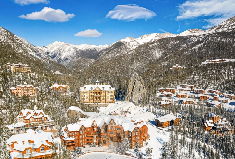
2. Establishing the scene: For this project, we will
start a blank new document, and I will be using the
desktop version of Photoshop. So once we choose new file, the size I will start with is
going to be 2000 by 1,500, and resolution set
272 RGB color mode. And once you create this, you will get a blank document. Now, let's select everything, command or Control A, and then using the
contextual Taz bar, we will click on
generative fill. In case you can
find this Taz bar, it's in the window menu all
the way here at the bottom. Now, what I would like as
my prompt is mountains, but to be more specific, I want it to look like
the Dolomites Mountains, which is a mountain range
in the north east of Italy. These mountains
are just gorgeous. I've been there several times, both in the summer
and the winter, and it's always
very photographic, scenic, one of those
beautiful places that will look great
in a composition. Now, this looks epic. I really like this one. And to be honest, all three looks like they could
be in the dolomite. I actually like
this one as well. This looks really good, too. And it's actually something that probably we would be able
to work better with. But let's just generate again. Just to get a few additional
options to start with. And whenever it comes
to these dreamscapes, which I like to call them, it's important what
you start with. So the first image is crucial because everything
will be built around that. So it's worth creating a few options before you
settle for something. So again, I like this one, and this looks really promising. I also like this one. I think I'm still preferring
this one the most. So let's just generate
one more time. Give it another shot. It's almost like gambling. You can keep creating and generating more and more
until you are happy with it, and it's hard to stop,
like in gambling. So let's just see, this
is a little bit off. I don't like the
colors in this one. And this is not bad, not bad. And that's quite nice, but not specifically
what I'm looking for. So I'm actually going
to settle for this one. And what I'm going
to continue to do is to use the crop tool. Make sure it's cleared, so there is no ratio set for it. The crop tool, by the way, is C on the keyboard shortcut or just select it from the
tool bar here on the left. And most importantly, you
want to make sure that the fill is set to
generative expand. With that, you will be able
to extend your canvas. And I want to extend it in both directions. Let's
see what happens. If I press enter, it's going to
automatically generate details based on whatever is
currently in the document. So if you don't type
in any prompts, that means it's just going to
generate something random, but we'll try to
continue whatever is already existing
in your composition. And that looks really good. I really like the way we have this curve here in
the composition. That is going to give a
nice framing to everything. So, yeah, I think that
is going to work nicely. I am going to further
extend the canvas. Now I'm going to extend
it up a bit like that. Let's see. This is probably
going to be a fairly easy one because we just have to add
some sky or clouds in there. I think that will be fairly easy for photoshop to do. Yeah. Of course, again, we have
options to choose from, but there's not much
difference here, so I'm going to go
with this first one. Now I'm going to drag
the canvas down. I want to have a little
bit more details here at the bottom as well. This should add some more
forest details for us. And then I am going to actually extend it again both to
the left and the right, just to change the
aspect ratio a bit, make it more of a
landscape shot. Let's generate one more time. Okay? That looks quite nice. Now, what I would like is to have a lake in the foreground. For this, I am going to
actually make a selection now. So I will use the less tool. And with this, I
am just going to draw a selection here
in the foreground. Something like that. And
holding down Shifke, if you missed any parts, you can just draw over it again, and let's type in Lake
in the mountains. And we got one result. Here is another one,
and here's another one. Now the main problem is that there are lots
of people here, and I don't actually want
anyone to be in the image. So I'm going to write Lake in the mountains
without any people. This one is looking
better or ready. But let's just move on. Maybe check this one. This is looking quite nice. Although there are still
some details here, but we can easily tidy
them up by creating a new layer and just using the remove tool.
So I select that. It's a brush, so we can increase the brush size with
the square brackets on the keyboard and just paint over any details
we wish to remove. There's one there. All of this here, I would
like to remove. The edge is not
nicely aligned here, so I'm going to paint
over this one more. That's better. Paint over this and that some
more details here. Just very quickly tidy this up. Yeah. That is looking
already much better. So that's our
composition so far. I like where we got from
the original image. So we extended it quite a lot. If you use the alter option key, when you click on
the icon over layer, you can turn off
everything else, and then using the
same shortcut again, you can bring them all
back one more time. Now, if you want to
add more mountains, we could use the less tool
one more time and just over here and maybe down there. Let's see what happens
if I type in mountains. And again, we have a couple
of options to choose from. I feel like I want to have a little bit more
mountains, and also, I want them to be in the suns
of mountains lit by sun. Let's see if we can generate some more
interesting details here. Okay. So we have 123. That's quite a nice detail
here. I like this one. Then I'm going to use the
rectangular market tool and make a selection of
all of this part here, maybe even higher,
something like that. Come all the way down here, and then just type in
mountain peaks in the sun. I would prefer to have a little bit more sun in the image. I like the details
here on the left side. And I also like this
detail here on the right. But I guess it's good
to have some contrast. So some details are in shade, some details are in the sun, since we have an
overcast day clearly. There are some clouds here. Okay, so this is quite
interesting. This is quite nice. There's even one
where the sun is behind the mountains that
doesn't really make sense because the sun is actually more towards us the way
it's lit currently. So yeah, this is better. So what we can do is now
build on top of this and just make more mountains
here, rocky mountains. Let's see what happens.
That is quite nice. We have some more
sun detail here, and we can just add a little bit more mountains
on this side here as well. Just type in dolomites, maybe, again, it's good
to vary your prompts. You will get different results, of course, depending
on what you type in. So it's always worth
experimenting a bit. And yet, that looks really good. Let's see what else we have. Okay, I quite like this one. So we already have three
distinct shapes here. Again, if we go back
to the original image, it had something similar, but now we have more
sunlit details. So it's really a good variation
between shade and light. I think we are ready now
with the main details. So what we can do is to refine it with the
top of the mountains. I'm going to create a new layer, and I will use again, the removal tool and just
paint over the top here. With this, we can
refine the edges. So if there are some details
that don't look good, we can refine it. And again, that did
a really good job refining those edges. Again, here, I
feel like there is an edge which we can
remove in the clouds, and that looks
already much better.
3. Building a castle: So now it's time to add
some exciting details. First of all, I
would like to have a castle here in the middle, so I will make a selection using the rectangular
market tool. If I hold down the space bar, I can reposition this selection. I think maybe somewhere
around here is going to be a nice
place to start and then hit generative
fill and type in castle, maybe
medieval castle. L et's see what happens. Sometimes, the wording
could be different, maybe fortress would work better for the style
that you need. But it's really hard to
tell at the beginning, so you have to explore
different options. I actually quite like these two. This is close to what
I wanted. Let's see. The first one is clearly
not what we need. Yeah, I feel like this one
could work quite nicely. So let's just keep
adding to this. So if I keep this here and I make another
selection next to it, I will again just
type in castle. Since we already have
some detail there, it's going to try to resemble
that most of the time. So it's always easier. Once you establish one
detail that you like, you can extend that. And yeah, we can see that it did a really good
job extending that. I like this detail. I like the ruin wall. But I will still stick
to this one first. Let's move on and make a
selection further out. But always make
sure that you keep some details of the existing
castle selected as well. That way, it's more likely that photoshop is going to
continue those parts. Now, we'll actually extend
this selection all the way out here and then type
in again castle. We got the first one,
second and third. This looks really
interesting. I like this one. So let's see before and after it change the structure of the mountain a bit,
but I like it. There is some
interaction between these hills in the foreground and the mountains
in the background. Yeah, it feels like a
very big fortress now. So we can add some more
interesting details here. Maybe just type in again
towers or fortress. Fortress with Towers. Let's see what happens. That's the only ique part of the composition at the
moment, in my opinion. So let's see if we can improve that and make
it more interesting. So that's one, two, and three. Okay. Yeah, I feel like that
looks the most realistic. Yeah, I like this. It's a very strong
line of wall here. And we can just
add the new layer, use the removed
tool and paint over this flag that it created. We don't need that one there. Instead, I would like to add some interesting details
like a tower somewhere here. So I am going to
make a selection, maybe something like that, and then type in medieval tower. So we got this. I
quite like this one. That one is a little bit
messy. This one is good. However, it interrupted
our structure quite a lot. So in cases like this, what you can do is
instead of using the whole layer
that was generated, you can just use parts of it. So select the layer mask, this thumbnail here, and
then choose the brush tool. And I'm going to use 100%
opacity soft edge brush, so the hardness of the brush, I leave on 0%, and start painting over with black as my
four ground color. So that way we are
hiding details. And that means we
are bringing back the original wall. Like so. Now here we can maybe change
the hardness up to 100% and paint over the wall again
until we get it like that. And then press x
on the keyboard. We can switch back and forth between the white
and black colors. We can actually create
a perfect transition between the wall and
the tower we added. So, yeah, that looks quite good. So you don't always
have to sacrifice all the selected area that you initially had when you're
using generative fill. You can just use it partially. And this looks so good that
I'm even tempted to increase the height of this tower by having another detail
edit on top of it. So let's just do another
generative fill and say tower. And let's see the three
options that we got. It's not bad, but not
the best results, so I'm going to just
generate one more time, and we got again a
bit weaker results. So I actually prefer it without. I'm going to press back
space to delete this detail, go back to the way it was, and maybe just try another
tower somewhere around here. I'm going to again make a bigger selection and
type in medieval tower. And I think the second
one looks quite good. Yeah. The second
one I really like. Although it blends a bit too
much into the background. Not sure if that's going to
work for us, so not again, maybe we can select the mask
and using the brush tool, we can paint over this with black until we get
back down here. So I'd just make
this tower a bit shorter and just
draw over it to add some interesting detail until it feels more aligned to what
we wanted to create here. Like here, we can just
cut into it a bit. And also here, maybe
we can cut into it, make it more like a ruin. Okay? That looks quite nice. So let's see before and after. That certainly adds some
character to the castle. And last but not least, I would like also to have a point of interest
here on the top right. So I will make a
big selection here. And I'm going to type in
ruined medieval tower. Now even though this is
a bit further away from the existing castle details, it should still pick
up the style of the castle and should be able
to resemble that somehow. So that first one is quite cool. Let's see the next
one. That's much smaller than what I expected. This is not really
in proportions, quite like this one, but
let's give this another go. This thin column
is quite cool too. So let's just generate. Whenever you see
something that is close to what you
wanted, but not perfect, it's always worth
generating another time, at least one additional round. Okay. Yeah. I think I mean, that's quite nice detail. I'm not sure about
the colors on it. I feel like this is probably
still the best or this one. It's more subtle, but that
fits the composition better. This feels almost
like a drawing. Let's just do another generate. Maybe we will be more
lucky next time. Okay. So we got again a
few additional results. Okay, this is good. I like this one, so I
can just use the mask, and I'm going to
paint over the flag. Definitely, that's
something I don't want. Going to use a soft edge so
we get a better blend between the sky details and what we
have in the composition. And let's just take a look. Okay. I think I would like
to keep this as well. So I will use the white
brush with a hard edge, and I'm going to paint
over this part here and trying to make it feel like it's in the
right perspective. If you have a tablet, it can help to add
more details faster. But I am going to try to
just use the mouse this time and create some
interesting details here. Just simply by masking over it. And I feel like that
works quite well, let's see without this
layer and with this layer. Yeah, that certainly added
some interest there.
4. Adding more interest and depth: And I feel like now it's time to move on to
the foreground. So I actually want to
have an island here. But for this, we might need to extend the
composition a bit more. So let's see what happens if I add a bit more space
here with the crop tool. So I just press C
on the keyboard, dragged the bottom
of the canvas down, and there should be more
water detail added, but that will just
give us more space to add some lake in here. Yeah, so we have more water. And I'm going to create a
fairly large selection. Like that. And let's see what happens if we type in island. This actually added a castle, even though we
didn't ask for that. These ruins are interesting, so I might actually
keep those in there. To have space for our island, I'm actually going to use a new empty layer and
use the Clone tool. Which is more of a
manual retouching tool, but this will help us to direct the generative fill
in the direction we want. So I'm going to paint
over all of this section here and get rid of all of this darker
detail in the water. Alt or Option click to sample, and then simply just
paint over the water. So we have that detail there. Now I'm going to old
click again to sample, maybe from here, paint over
a bit more these details. And I feel like that
already looks better. Maybe a little bit of that wall or structure we can have here
on the left side as well. Now, it's important to mention whenever you use the
Clone Stem tool, you should set the sampling to all layers that way you can use it non destructively on a separate layer like
I did in this case. And if you feel like
the details that you created don't blend perfectly, you can switch back
to the remove tool. And with that, just paint over any details
that you don't like, and it should help you to blend them or align
them to each other. I feel like this wall can
be adjusted a little bit, so I'm going to paint over it just so it doesn't
look repetitive. Maybe even completely remove it, and maybe just go over
this side as well. Again, just trying to
avoid any repetition. And I feel like that
looks already quite good. Now, maybe we can add some rocks in the lake instead
of an island. So I'm going to make
a selection here. Actually, the whole part of
the water can be selected, and just type in rocks in lake. This is just to break up
that big surface of water, just to add some interest to it. This one actually
looks quite good, although I don't really
like the right side of it, so I'm going to use the mask and just paint over this
with a soft edge brush. So let's get rid
of these details. I only need the
ones on the left. Really like those, and maybe we can try to paint on top of this. So if I make another selection, and just maybe also include
a bit more at the bottom. I will just type in island. Let's just give it a shot again. Maybe it's going to
help now that we have some rocks there to turn
this into a small island. And yes, it starts to
look better already, so this is without,
and this is with. There's some soil
here and some plants. So we can just extend on that, maybe at some bushes. Yeah. That's looking
more interesting. Okay, I quite like
the way this looks. But on the previous layer here, I feel like the backdrop
changed quite dramatically, so I'm going to use the mask and just remove
a little bit of that. I actually preferred the shore originally the way it looked. So let's just see a few
of my layers before. And these more
recent layers after. Yeah, that definitely edit some visual interest
here in the foreground. And I can see a
visible edge here. So let's just check
which layer was that? I think the most recent one. So I will just paint over
that again in the mask with a soft edge brush until
it's blended in perfectly. Now, what I feel like
is still lacking interest is this left
side of the composition. So I'm just going to make a
big marquee selection here, and I will just type in
cliffs. This is what we got. It is quite good. There's
even a cave inside there, and that's also interesting. This is actually quite nice. This last one, a
bit more subtle. First one is a little
bit too dominant, maybe. Let's see without it and wid, and then the third option
again without and wid. I'm actually going to keep this once again
before and after. I like the way this looks. Now, just to add some
more visual interest. I will see if I can add a dead tree here
in the foreground. So something that
is growing out of this piece of land,
a couple of rocks. So I will just type in dead
tree, white dead tree. That would give us good
contrast from the background. So let's see if it
can be generated. Yeah. That looks perfect. It's exactly what I had in mind. Uh, yeah, I like this
first one the most. And then to make it
even more interesting, we will add the bird here
on one of these branches. So maybe right here is a perfect
spot for a bird of prey. It could be an eagle, a hawk, or maybe an owl. Might be even more interesting. Let's try that. Although owls would go out hunting at night, as we know, it might be an interesting bird
to see on this tree. And I really like this one. This looks perfect. It has a good contrast from
the background as well. And in terms of proportions,
it feels right. It might feel a
little bit too big, but I think it will work
for what we have here. And by the way, as you can see, I positioned this
point of interest, which turned into
a focal point in the composition to the
third of the composition. So if we use the crop tool, we can turn on the rule
of thirds overlay, by just simply start dragging
the edges around a bit. And we can see that if
it was placed here, it would be even closer
to that third point. But I'm still happy with this. So as long as it's not all
the way in the center, it helps to create a more
dynamic composition. So now we have a lot of exciting things both
in the foreground, midground, and the background. And maybe one thing
that we could try is to have something
even further in the back. Maybe have a selection
here on the left. And then just type
in snowy peaks. Let's see what happens. Maybe we can add some
additional layer in the composition that would
help to get some more depth. And again, just more interest on the left
side of the image. And this first one and the second one actually
connected more into the mountain that we have there doesn't really
look realistic. While this one is perfect. So this feels like it's connected and it's continuing
that mountain range. And because it's getting higher, there's actually some
snowy peaks there. This is beautiful. This is
exactly what we need it here. I feel like to balance
everything out. Once again, without it, and with it, I really like that. Although I also like this
detail what we had here. I feel like it's worth
sacrificing for this. And maybe since we have
this new area here, we can also add some
ruins here on the top, maybe just add it here, so there's enough contrast. I I just type in ruins. Let's see what happens. Might be a little bit too
small to have those details, but I feel like
photo show should be able to generate
something there for us. And I feel like the second one is perfect. It's in the sun. It has some details that we can notice even
from a distance. And yeah, now I feel like we have a really cool composition. It's really came together. It's a good time to stop adding more details because it
can get overwhelming. And again, I would
be able to spend hours refining every
little detail. But I feel like it's a good
composition or good enough.
5. Final touches with a Smart Filter: I wanted to make sure we
add one final thing here, and that is to apply a smart
filter to the whole image. And the best way to do this
is to sect all your layers. So click on the top and then
shift click on the bottom, and then right
click somewhere in the layers panel and choose
Convert to Smart Object. This is going to generate a single smart object
from all your layers. Don't forget that you can
always double click on this thumbnail to access
the layers themselves. But while you work with the
smart object like this, you can apply any filter as a smart filter that will
keep it non destructive. And it will apply on
the whole composition. And my favorite filter to use
is the camera row filter. So I'm going to select this. The first thing I'm
going to do is to go to the light section and increase the shadows because I felt like the trees in the mid ground
were a little bit too dark. So I want a bit more
visibility there, then maybe we can increase
the intensity of the blacks. That just adds a
bit more contrast. So if I temporarily
turn this on and off, we can see it's a subtle
change but already made the mid ground of the
composition more interesting. And what we can do is to go into detail and maybe increase
the sharpening a bit. We can also go into effects and increase
the texture a bit. It's going to make it feel like there's more details
in the composition. It's quite subtle, so it will show better
when I zoom closer, and there is the detail
again with that sharpening. It's very subtle, but helps to again make
the image better. And then going back
to the light section, maybe we can also increase
contrast just a little bit more once again before
and after, yeah, I feel like that helped Overall, maybe exposure can also be increased just ever so slightly, and the highlights can be reduced also slightly
together with the whites. So let's see now
before and after. Yeah, I think that helped to make the composition
work even better. Now let's click Okay,
and here we can see again without and
with the filter. So I hope you had fun with this dreamscape, and of course, your result will be very
different from mine, because every time you are
using generative fiel, it's going to randomly
create details. So don't feel disheartened
if you feel like my composition
turned out better. It's all about experimenting. And as the LOB Firefly engine, which the generative
field feature relies on is going
to get better, the results that you
will get with this type of workflow will also improve. So like always, keep exploring, keep experimenting, and have fun with everything that we
covered in this project.
6. Skillshare general conclusion 2024: Well done for
finishing this course. I hope you had just as much fun going through it as
I had recording it. And of course, don't forget
about the class project. Because remember,
practice makes perfect. I can't wait to see your work, so make sure to submit it. And in case you
like this course, and you would like to
learn more from me, then there's plenty of other courses that
you can find here. Go ahead check them out now. I can't wait to meet
you in the next one.
 Martin Perhiniak, Graphic Designer, Illustrator & Educator