Transcripts
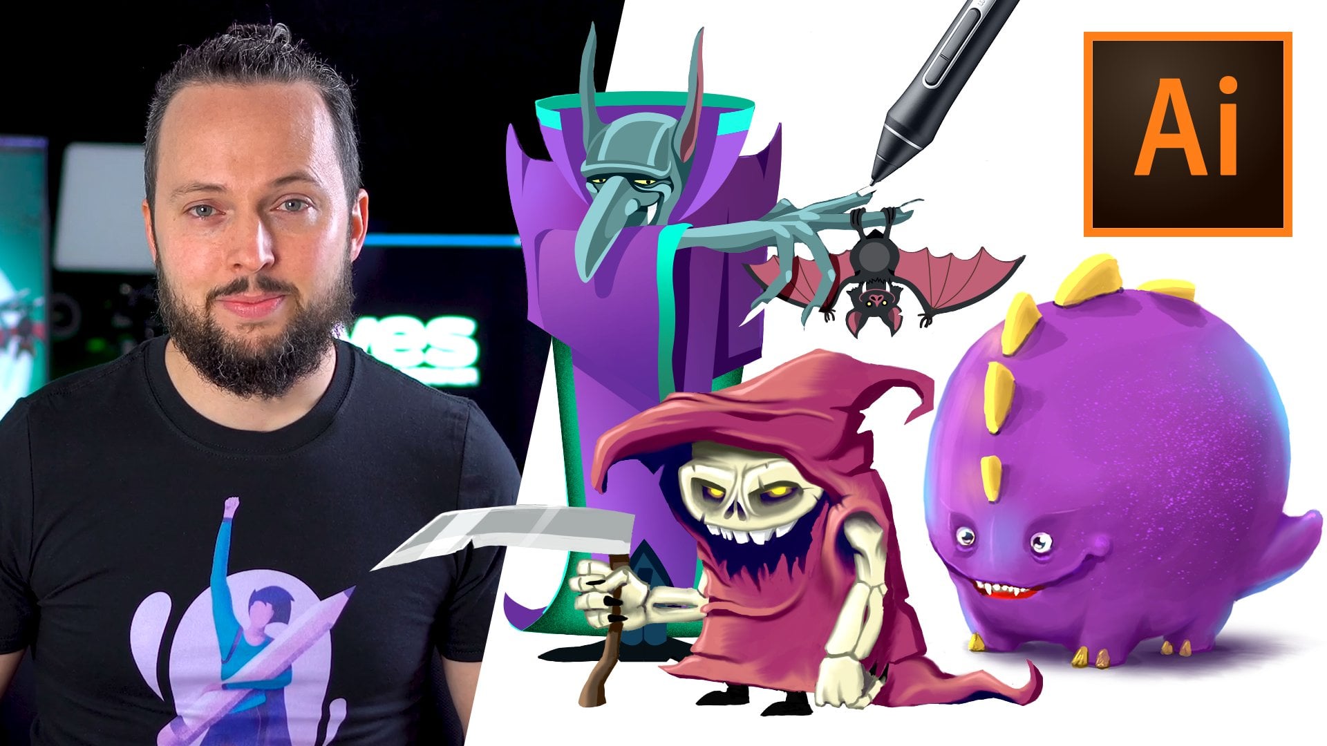
1. Introduction Portrait: You want to learn how to create expressive and unique
portrait illustrations. Well, look no further because this course is exactly
what you mean. I'm Martin, I have over 20 years of experience
as a graphic designer, illustrator and Adobe
certified instructor. I have worked with
companies like BBC, these knee, Google, ikea, and I cannot wait to share my best
practices with you. This is a streamline
hands-on course focusing on a real life design. I will be walking you through everything step-by-step
and you will get all the exercise files
so you can follow along in case you
prefer not to copy me. You can also follow my workflow using alternative
assets provided and create something
completely unique that you can showcase in
your creative portfolio. I am pretty sure
this course will inspire you to create
something amazing. First, we will learn
how to draw faces. What are the common
mistakes people make, and how to avoid them? We won't go too deep
into artistic anatomy. Instead, we will be focusing on the fundamentals
you need to create stylized portraits who will use Adobe Illustrator for one of
our portrait illustrations. Floods show for the other one. We will be working with the
Pen tool extensively for both compositions and
other useful features like a smart filters, layer styles, and keeping lot. Besides all the technical stuff, we will also cover some important graphic
design theory that you will be able to apply in any of your future
creative projects. You can join this course without any prior knowledge
in graphic design, illustration or
Adobe applications. But to complete the project, you will need access to Adobe Creative Cloud and a
desktop or laptop computer, but now it's time
to start creating. So I will see you
in the next lesson.
2. Drawing faces - Why is it so difficult?: This time, I would
like to concentrate on why is it so difficult
to draw faces? First, I would like to show you a really cool resource where you can find inspiration and
also things to draw. It is Pinterest. Now, you might be familiar
that on Pinterest, whenever there is an image, you can actually do
something they call a try. Which means that if it's, let's say a person, whether it's a photograph
or an illustration, you can attempt to recreate it. So draw it yourself, whether it's on
paper or digitally, you can upload it as a try. Now this is one of the
examples that I've found. This is art by an
artist called a leaf. I think that's how
it's pronounced and you can find this
artist on Facebook. But the main reason why
I'm showing this is that we can see the original
drawing on the left, and then we can see a few
of the tries on Pinterest. Now, I intentionally chose few good ones and some
not as good ones, but generally the reason
I put them together. And so you can see it both the
original and redraws is to explain that there is actually no bad drawings because
every drawing is unique. And if your aim is to recreate exactly the
original drawing, that's not really a good
goal because then you could just simply trace it over or just scan it in
and print it out. Whenever you draw something, the most important thing
is to do your own take. So you have to create
something slightly unique, at least in that aspect. I would say this one here is just as good as any
of these other ones. But of course, if
the aim is to get it closer or as close as possible to the origin
or the reference, then I would say this
obviously is going to win. Now it's also very
important to remember that everyone starts somewhere. So no one will be able to
draw like this straight away. Whenever you see an
artist that you admire, they probably went through hours and hours of practice and copying references before they got to that skill level that
you are familiar with it. So is it a good idea to copy? Well, of course it is because drawing is all
about observation. So the better you
get at observing details and trying to recreate
them in your drawing, the better you will be
enjoying in general, and whether your references
a photograph or drawing, it doesn't really matter because you will be able to
pick up things from either of them when you look
at an actual photograph and then tried to find
something quite similar to this drawing here, you will be able to
see more details. And if you are aiming for
photo realistic drawings, then obviously this is
a better reference. But you might find
it more difficult, especially if you're just
starting out because you will have to decipher
the photograph. There's so much subtle details that you might not even notice. So when I zoom closer, you won't really see
much structure of the face because it's all very soft and blend it together. So you have to interpret photographs while
drawings obviously add a bit clearer
because they are just, most of them are line drawings. So you might find
it easier to copy and practice with existing
drawings that you like. But also don't forget to use photo references
once in a while. So I would say a mixture
of both is good. And another important
thing I wanted to mention, and this is something
I discussed in more detail in
the previous video. And if you haven't seen it, The link is in the
description below, is that whenever you
are doing drawings, it is just like what I said at the beginning
of this tutorial, you're not trying to
recreate something exactly. And that's when it comes
to stylized drawings or cartoon like caricatures. Even so there will be
exaggerations like the size of the eyes in this case is obviously not like
realistic eyes.
3. Drawing faces - How to use references?: But we can look at another
set of images as well. And this is from another artist
called Camera mark again, and you can find the
artists on Instagram. Again, I included as similar shot and a similar
characteristic phase. And also then we can see the tries next to it
here on the right. And again on this example, you can see that
there is exaggeration on the size of the eye clearly. And even the position of
the nose is quite low. And the bridge of the nose
is really nice and round. So it has that nice S curve, which you can see
on some people. Again, this is slightly
exaggerated or stylized. So again, you can ask
whether it is better to practice coping
stylized drawings or whether to re-create the actual realistic
proportions of the face. Well, again, both of
these are good practice. Again, it's all
about observations. So by doing stylized
drawings, you will improve. And by doing realistic drawings, you will also improve. Its similar to sports. When you do one kind of spore, it won't really harm your
performance in the other one, it's actually going to most
of the time improve it. Or like with instruments, when you learn
multiple instruments, you will get better in both, because generally
your understanding of playing music improves. Looking at the trials
in this case, again, I put probably the closest
one to the original up here, and then we have less
successful ones. But again, these are not
bad drawings, as I said, they can be more abstract
or they can be just simply someone's really
young who hasn't developed the
observation skills yet, but you have to start somewhere. So if you draw something
like this or worse, in a way, it's
still fine because that's going to take
you to the next level. So each drawing you do
is just one step towards getting really good at
drawing like these artists. And even though I've been
drawing for more than 20 years, I still sit down and practice
and copy other artists. And again, not tracing over it because that doesn't
really develop the scale. It doesn't make your brain work. It might be relaxing, but you don't actually
achieve much with it. But you can see here, I created this quick time-lapse. I can show you how I've
done this drawing. So I was using the reference on the left
because I'm right-handed. I just put it on
the left and then I was drawing on the right of it. And you can see that I start usually with the shapes
that makes up the face. I will talk a little bit
more about that soon. Then I would just basically
copy what I see on the left. And I tried to
observe my reference, and I tried to recreate
it as close as possible, but at the same time, I don't mind changing
some details. So the end result
doesn't have to be exactly as the original. You can see how it turned out. It is very similar to the
original but still different. And I don't mind that. So again, remember,
whenever you use a reference that is
just for reference, you don't have to
exactly recreate it. Tried to take as much out of practicing by
drawing it again. But don't be too harsh on yourself because that's going to prevent you from improving. So instead of struggling
on one drawing for hours, maybe do several of them
not the same drawing, try a couple of different ones, and it's going to be
more enjoyable as well. But believe me, you will
develop your skills faster.
4. Drawing faces - Do you need to know anatomy?: And to come back to the
first question I asked, Why is it drawing
faces so difficult? I have a few things here that
I'm going to go through, which shows just how many
things you need to understand before you can actually start
drawing faces confidently. It is actually a very
complicated structure. The human face or human hat. You have to understand
things like the skull, which is the underlying
structure of the head, then how the muscles
work in the face. And then you also
have to understand things like perspective
foreshortening, which means that when I
turn my face is going to be completely different
from every angle. Again, you have to be able to
think In three-dimensions. You have to know the proportions
where things need to go. And if anything is
a little bit off, viewers will be able to
tell because we are very experienced in knowing
that human faces anatomy, even when you're not
studying it is something that you just see constantly. So when you are new born, when you're a baby first
opening your eyes, you get used to seeing
your parents first. So it's the first thing that you observe as a human being. And it is something
that we have to be good at because we need to be able to understand people which simply
by just looking at them and understanding and
reading their expressions. But coming back to the
examples I wanted to show you, you can see that there are measurements that you can learn. And I usually see these are
very useful guidelines. But you shouldn't, again, focus too much on them. Instead, try to observe things. Once you observe them practice. Then looking at things
like these will help you to understand why certain things are
already working in your drawing and why some
things are still off. So don't start practicing with these references
because they are too complicated to begin with. But I'm still going
to go through these because it will be a good visual reference
even if you just vaguely remember them next time when
you start drawing faces. So the first thing to remember is the skull is
probably easiest to represent with a sphere and
then shapes added onto that. So when we look at
it from the side, you can see that you can
start with a circle and then this rectangular shape added for the jaw and the
lower part of the face. So usually that's
the construction of the face and that is something you can also do from the front. The only thing is
that from the front, it's good to imagine
chopping off two slices of that sphere. So it's not like a perfect ball. You would have to
chop the sides of. That's like a plane here on both sides that you
need to remember. And that's just the
basic structure. There's lots of other
construction lines you can learn. And of course it gets more complicated when you look
at it from the side. So again, we can see that
chopped off slice on the side. And then here we can
actually see how these lines are
coming to the center. So the chin is actually much narrower than where the jaw
connects into the skull. And these points that we
can see under the skin, we normally call landmarks. And that applies to
the body as well. When you're drawing
the full body anatomy, landmarks are visible
bonds like the collarbone, for example, that you can
use as a reference to find the proportions and
the posterior of the body. Then moving on, we can
see another image of the proportions of the
features on the face. And these are obviously
very standardized numbers. So it's not going to apply
to everyone's faces, but in general they work. And one of the simple
ones to remember is that if you look at someone's
face from the front, the eyes would
take two-thirds of the face width and
then you would have another eyes width in-between. And then you can also
find lines like from the eyes to the top of
the forehead is 1 third. The same 1 third
is from the top of the eyes to the
bottom of the nose, and then from the
bottom of the nose to the bottom of the chain. But as I said, these are
really just guidelines, so you shouldn't always
strictly follow them. But generally, once you
remember this structure, it's going to help you to
see these shapes on faces. And here's a good
example where we can see that sphere chopped
off on the sides. And then we can see in whatever angle we
have to draw faces, we can always find that sphere. And that can be a
good way of trying to understand the
three-dimensional form. So even here, we have these
construction lines and the basic measurements or
division lines for the third.
5. Drawing faces - Don't just copy!: Again, we can see the same phase from all
kinds of different angles. But you can see that
generally the same shape can be found in all of them. And then another thing that I really found useful
when I was learning to draw people is to think of geometric shapes
or almost like a simplified polygon
on the phase where we can see everything is made
up of smaller elements, like the nose is
also constructed of planes and these
geometric shapes. And you just have to draw those
first two then be able to refine it into that
smooth structure that we see because of the skin. Because the skin is
really just covering up all that very sharp structure
that we have underneath, like the tip of the nose is
actually from the skull. And we can see that
really well here. It's a bit scary example, but very useful that all of
this is not really born. So the bone ends there. And some people like myself, I have a very sharp tip
here so I can touch that. And there is a very
good landmark point again that you can remember. And even when someone
has a very soft nose is still good to know
that the bone ends. It's going to help your
drawing to improve. So even though you are drawing
those soft skin details, as long as you understand what's underneath both the
bones and the muscles, you will be able to create the structure
that's necessary to create more realistic and
more believable faces. And lastly, I wanted to show
you a full time lapse again, I'm just going to run
this while I'm talking. So you can see I
used a reference of Lupita has photo or from
the cover of this magazine. And this is something I
actually started doing while I was on a train
journey. I was just bored. So again, I put this on the side and use it as a
reference and I was drawing now, it took me a couple of
hours to do this painting. But generally, I wasn't too focused on re-creating
the exact look. I was using it as a reference, and then I've simply
started playing around. And the final result
you might not even be able to tell it is her. But as I said, that wasn't
really my aim with it. It's all about practicing. And I was focusing
really more on the expression and those
landmarks that you can see, I'm going to do
with the shading, bringing them out
like on her face. We can really see well the
bones underneath here. So these are very useful things to practice and try
to recreate them. Well, I'm just going to fast
forward a bit and you will see I worked on the coloring and then I was just
messing around here, further refining all the details until I got to the end result. So all I wanted to show with this example again is that you should always feel free
to work from references, but then put your
personal touch on it and don't ever worry about
concentrating too hard, recreating exactly the original
photograph or drawing.
6. Drawing faces - Keep flipping!: I put these examples
together next to each other to compare them and not to make fun of the drawings that were attempted
based on the original. The original is always
on the left side. And immediately you can
see that even small things like the headline here
can confuse people. And when the drawing is created, the proportions of the eye and even the placement of it
can shift and distort. So if we were thinking
about the symmetry here, it's clearly visible
than the right side, is much larger and distorted. It's almost like being stretched towards the top right corner. So that's mainly,
I'm guessing is because of this hairline here. And then the example on the right side is
slightly different here mainly what happened
is that the I on the right shifted upwards. So if I connect the line
here at the bottom, you can probably see it better. And this, once again, most likely happened
because of the headline. But then even things
like the Jew is completely different
on the left side and on the right side. Now faces are not
perfectly symmetrical, even if you are drawing
them from the front. But there should be
only minor differences between the left
and the right side, not huge distortions when we're comparing
them to each other. If you are drawing on paper, these are the things that's
hard to spot, but even that, you can always use a mirror in one hand and just
place it next to your drawing so you can see the reflection and the
drawing at the same time. With digital drawing,
this is obviously much easier and that's what I'm
going to show you later. But before we go there, I wanted to also just show
you a few more examples. So when the drawing is not symmetric or like there is a
strong expression like here. Sometimes it can get even more difficult to get the
proportions right again, with the original drawing
here on the left side, even the strong expression, you can still see the symmetry
while these other ones, if I were to try to draw that, you will already see
stuff like the chin, how much smaller it is on the right side
compared to the left. And the jaw line as well is completely different
from the left side. Even the ears are shifted. So here on the right
side it's further down. Bile on the original drawing is almost perfectly straight. And even though the
general proportions of the face here are
almost symmetrical, we still have a much larger gap on the left side between
the center of the face. And I compare it to the
one on the right side. And there's a last example. Once again, we have the original drawing on the left side, and hopefully by
now you can see on the copies on the right
side where things moved and shifted compared to where they should
be originally. So when you are
drawing in Photoshop, you can use the
symmetry feature. And this is something you can find here in the Options bar. You just have to select
vertical and you can simply just align the center
point where you need it. So in case of a portrait, we can just place it here, press enter, and then whichever layer we want
to work on, we can start. And you can see
immediately it starts to add the lines on both sides. So we can have the
mouth, the eyes. And it really helps to
keep things in symmetry. And if you want
to draw something that is not symmetrical, you can just turn it off
and draw, in this case, maybe the front line
for the eyebrows. But then I can always come back and choose last use symmetry. So now if I draw the moustache, let's say it will appear on
both sides at the same time. Now what you can also do is to place a drawing on one side of your Canvas and then duplicate it and place
it on the right side. There. You can flip it
horizontally by going to the Edit menu and choose
Transform, Flip horizontal. And then when you go back to the brush tool and
have the symmetry on, now when you're drawing, you will see the results that you're making on both sides
at the same time. So this can really
help you to check that the details you are
adding are going to work. And whenever I draw like this, I would actually jump between the two sides of the drawing. So I would add a little
bit of detail on one side and then jump
on the other side. So that can help me to always have a fresh
island while I'm working and make sure that I get all of
the details right. Now if you don't want
to see two versions of the artwork that you're
working on at the same time. You can also flip your Canvas periodically
while you're working. You can do this in Photoshop
or if you are in Procreate, you can also go to the canvas options and choose
Flip Canvas Horizontally. So even though I
like this drawing and immediately can spot in this flipped version
that the eyes are not completely symmetrical and
it looks a little bit funny. So once again,
let's just go back. I was used to seeing
my drawing like this, but once I do the flip, I can detect immediately
the errors if you prefer to set things up the way I showed you in Photoshop, all you have to do here in Procreate is to
extend your canvas. So going to crop and resize
and just drag the edge out. And then you will have to
duplicate your artwork. You do from the layers panel. Simply drag to the left side, duplicate, and then the copy. You just have to move with the selection tool
on the right side. And then at the bottom you
can choose flip horizontal. And finally, just have to turn on the Drawing Guide option. Choose Edit, Drawing Guide. And at the bottom, make sure you have this symmetry option selected and that the symmetry is set up in the right place. You can always move this
slightly further left, in this case, select it. And then now if I zoom closer, whenever I'm going to
make changes is going to show on both sides
at the same time. So let's just draw
maybe another heel here in the background, maybe another cloud in the sky. And once again, I can draw
on either side because the changes will always appear
on both of the incenses. If you choose to work this way, make sure you keep jumping between the left and
the right version. So keep drawing a
little bit on one side, then jump to the left
one and back and forth. And the same thing if you
are just working with one version and you flip
the whole canvas around, don't forget to do it often
while you're drawing. The more often you
do it, the better, because it's just going
to allow you to work constantly with a fresh eye and avoid ending up having
those hidden mistakes that we've seen in the
beginning of this video.
7. Portrait styles - Exaggeration: Portrait painting is
a fascinating topic. And in this video, I would like to give you a brief history or
where it comes from, and especially focusing on current contemporary portraits, especially digital portraits
or digital paintings. And to see whether
it is better to go towards a more
realistic impression of a character or a person, or a bit more stylized. And to be able to define which
one is a better approach. And the best way
to find an answer to that question, in my opinion, is to look at some
amazing artists work and try to compare
them to each other. All the examples
that I collected for this tutorial will have the
names of the artists above, and you will also see
some of them have their Instagram
accounts edit here. If you don't see
the account name, that means that they are not on Instagram or I
couldn't find them. So in that case, you can just search for their names
and you will most likely find that work on Behance
or other portfolio sites. The first two artists
on my screen, Sarah tap ash and Louis, fund balance or lowish, as most people would know her, have quite similar style and I really love that portraits. This is already a
good example of showing that although
they are based on the original proportions and facial features of people, but they are still
quite stylized and some details
are exaggerated. The probably the best
example would be to look at the eyes and the
size of the eyes. So we can see these two
images here, for example, have the eyes bigger than what you would see
normally on a face. But it's also quite
cool that lowish also changes and exaggerates
the position of the eyes. Sometimes. Here, for example, you have a huge gap between the two eyes. Normally, it would be the same distance between the two eyes as one of the eyes. So if you have the AI plays
the in-between two of them, that's roughly the distance. And because the eyes
are really big, it's sort of works, but I feel like the gap is even lighter than
that in this case, but it's still works
as a stylized portray. Now historically, of course, portraits were more
made for creating a perfect realistic
representation of a person. It was to achieve likeness and to make sure it's recognizable. But also artists
were trying to show the inner essence or
characteristics of the person. And most of the
time they wanted to create a flattering
representation, something that shows the
person in a positive light. Throughout art history,
you can see the tendency that the artists improve their skills and
they got closer and closer to photorealistic
representations. But then came impressionism,
which changed everything. And since then, I would say it's completely free
for you to choose whether you want to go towards more photorealistic
portraits or more stylized. And especially with
digital painting, which is a very forgiving medium where you can
experiment and create even multiple versions or save multiple instances
of the same work while you're working through it, it opens up so many avenues and ways of creating
these paintings. Now one thing is very
important to mention that having something
more stylized and less realistic doesn't
mean the artist is not good at anatomy or not as good as another more
realistic artist. With Serra's work and
Louis she's work, we can clearly see
that they have a very strong understanding of the human head and
the facial features. And by exaggerating them, they are creating a
more unique approach which really defines their style and makes it recognizable. That's already something
I would like you to remember from this video that by stylizing and exaggerating
some details in portraits or in any type of painting will help to
define your style. And this is something you
should experiment with, whether it's the colors like
we're lowish sometimes uses very strange and unique colors for portraits and how paintings, or whether it's the
actual proportions of the details that
you are using, or even the technique or the tools or medium
that you're using, it can define the style that you will be
recognizable for.
8. Portrait styles - Realism: Let me show you another artist, Julia Razumovsky, who again
has a very interesting style. She is much more photorealistic, especially this one
here in the middle. You can see that. But
most artists like these ones that I'm showing here would have a range of artwork. So if you look into their
portfolio or their work, you will see some of them, for example, for Julia, a very photorealistic, while
others are more stylized. So they themselves
also experiment with that range between the more realistic and
stylized approach. But what I love about her work is that some
of the paintings and portraits she does would have
a very realistic detail. But then that would
be these almost cartoon like details
added on top of it. Like here we can see the tears and that these are
really cool combination. Once again, that
defines her style. And it is really hard
to be unique and you shouldn't be worried about being unique and like forcing something that makes your
art different from others. It should be a
natural evolution. So as you are experimenting
and trying different things, you will eventually
get to something that other people will
recognize that it is your work. Now, no matter
whether you are doing photo realistic or
stylized portraits, one thing apart from anatomy
that is very important is the understanding
of light and using the light in a good way
that defines the form. Because you are working
in two dimensions, but you need to represent
something that is three-dimensional and
f is very important. Like in this case, we can clearly see the
highlights and the shadows and mid tones used to define the
form and shape of the face. Without these tonal values, it would look really flat and it would look
like a cartoon. But by having the
shading in place, it already looks more realistic, even though it's a
stylized portray, the lighting and
shading is much more subtle when we look at an
example like this one here. But still here, we can see clearly strong highlights which makes the lips really glossy. And also these soft shadows under the neck and
also around the ears. That again, helps to define
the three-dimensional form. For a photorealistic approach, it's good to introduce
lines like this one, which is obviously much more
complex and unique lighting. But again, a good
understanding of how light would affect the
phase is very important. Now, in this case, the
artists might have used a photo reference and
base everything on that. But of course, some
artists would just combine a couple of
references together. And if they have a
good understanding of how to light portraits, they would be able
to do that even without an actual reference. Of course, when you
are just starting out, it's a great thing
to study portraits. So you can go on
Pinterest and I'll find so many amazing
photos of people. And you can practice basically
trying to recreate them. Instead of tracing over them, it's best to have
them side-by-side and don't worry too much about creating a perfect resemblance. Like even in this case, maybe the artists
use the reference but then alter the
couple of things. So the point is not really to create a
perfect representation, especially if it's just a
photo that you found online. If it's, let's say a celebrity, then you might want to make sure that people will recognize
the person in the painting. But nowadays that's not really the only reason why you
would paint the portrait. So coming back to lighting, let me just show you a
very different style.
9. Portrait styles - Stylization: We have Alexander's work
here and this artists obviously has a more
abstract approach. So it's definitely not as realistic as the
ones we've seen before. It's more geometric and simplified and uses a
limited color palette. But still, I think the people are recognizable and that's
a hard thing to achieve. So the more abstract you
make your paintings, I would say the harder it is to achieve a likeness
of the person. And of course, using
geometric forms is just one of the
many ways that you can achieve abstract
representation of a person. You can also go to more painterly effects or paint
with watercolor and inks. And you can see
sometimes leaving whole parts of the portrait
empty or just like have hints of details is also a cool approach like
this artist UE is using only a few details
on the face that still makes it resembling the original photo in this case. So that was the original
reference for this painting. But apart from those few
details on the face, everything else is really
rough and exaggerated. And we haven't talked about
caricature and I don't even have examples of
that in this video. But you should
treat caricature as a completely separate style
where the exaggeration is used excessively and it's
usually about taking a more fun and comical
approach to a portrait. Of course, to be able to
exaggerate details, first, you need to learn the
real proportions, just like with anything else. The more you practice
and the more you observe people and try to recreate
them in paintings, the better you will get at that. But don't forget
along the way to remember that a photorealistic
representation, although it's
interesting, It's not really the most artistic
work that you can do. So if you can inject some
style and exit duration or unique details into your
portraits that will help to make it more interesting and
engaging for your audience, like Louis work here we can
see is also very unique. It's a pencil drawings, I think color pencil drawings, but they have amazing
detail on them. And it's a mixture of the geometric style
that we've seen before, but also has an amazing
detail on the shading and really cool rainbow colors used on all of these portraits. Then we also have
another artist's with the pencil
drawing, where again, we see everything in
gray scale apart from a few details
emphasized in color. That's also quite nice
touch and unique makes it recognizable for the artist. But then we have these two
other artists that I love. And we can see probably
next to each other in Dennis's work is
probably easier to appreciate if I make one
of these images bigger. So it's again, a very
complex painting and a lot of details are added. But although it is
very recognizable, so we can see
immediately who it is. It's still has some
abstract elements in it. So it is almost like
People are made of glass and there's
like shards on them. So if we look at
another painting, Let's just say I'm going
to make this one bigger. Again, you can see
the same polygons are triangles and that
glossy texture on them, which makes it really
cool and unique. And also these very bright
and saturated colors in the background and
around it that adds that painterly
effect as well. So I love Dennis's work.
10. Portrait styles - Define Your style!: And then we have also
Afghani porphyrin of work, who again has an
amazing balance between the abstract forms and realistic resemblance
of the person. Here we can see that again, polygonal shapes are used and it's almost like
a vector drawing. I'm not sure whether it was created in Illustrator
or Photoshop. It doesn't really matter, but the final result
feels like it's very geometric and still
lifelike at the same time. So again, this is
really hard to find that right balance and to work with so many
different colors and still managed to achieve the shading and lighting
to work altogether, this artist's work reminds me
almost like stained glass. So TPNs portrait, for example, could be in a church window. And that's again, just makes it so unique and recognizable. And last but not least, let me show you another
artist's, our store, where we can see that the original reference was
actually from a game Beecher. I'm just going to make
this a little bit bigger. So this is from the game itself
character called the NFL. And then the artist
recreated that or use that as a reference and recreated the same character, but in a much more
painterly version. But still this almost looks like a life-like representation,
so very realistic. And that's mainly because of the lighting that the
artist was using. So having that nice backlight and then the soft light here in the front and all the
little details of the head just makes it
a really realistic. But again, although
these artists can create these very
realistic portraits, He's still experiments with
lots of different styles. And within that range between
abstract and realistic, we can see he can create these mixtures or blend
between the two sides. So we can have a realistic style combined with a much
more abstract direction. So even within the
same painting, as you can see, you can
combine different approaches. So similarly to what we've seen before with the
painterly effects, just a part of the face detail, and then the rest is
just more expressive, just like with this
artwork here is also a cool and unique direction. And with my own portraits you
can see also I constantly experiment between realistic
and stylized approach. But generally I tried to, again, go for a mixture where some details are really
detailed and closer to realism, while the rest of
the details can be a bit more painterly
and abstract, if you are interested to
see how I created some of these paintings and you want to learn more about the process. You can find the links in the description
below to the videos. So to summarize what
we've talked about today, I created a diagram and I play some of the artwork
we seen on it. So from the complex, too simple on the vertical axis, we have also realistic to abstract on the horizontal axis. You can see that
whichever position you choose for your art, you will be able to
achieve the goal of portraiture to create a
likeness of a person. So even when you go down to the abstract and
simplified root, or whether you go to the more
complex and realistic one. It's completely up to you where you want to
position yourself. And you can also shift
and move around within this range freely and experiment
with different styles. But to be able to define
a recognizable style, it is good to find the right
balance that works for you.
11. Adobe Illustrator - Minimalist Portrait - Getting started: Like always, every
illustration should start with a good
sketch that you prepare before you jump into Illustrator and do
the vector artwork. In this video, we will
be concentrating on the Illustrator part
of the workflow. And amongst many useful
drawing techniques, you will also see how
I prefer to set up my sketch tracing
layer and how I use a global clipping mask
that doesn't get in the way. So in case you
download the file, you will be seeing the swatches already prepared and
also the layers. And this is the layer that I'm going to work on called portray. Now notice that there is
already a mosque edit here. I'm going to show you
later how it works, but for now, we don't
have to worry about it. Let's start with
a simple detail. I'm going to use the
pen tool and I will just click and drag to
create the first curve. Then click on this point once again to be able to
draw a straight line, come up here and then click and drag to create this other curve. Now notice that out
of all the details, we are really just concentrating
on this bottom section here because the rest of the shape will be
in the background. But it's always good to close your shapes so don't
leave them open. That's just generally
a good practice for vector illustrations. Now notice that even
though it feels like we're drawing over the sketch, it is not completely
disappearing. And that is because I
set it up as a layer on top of the
illustration layer. So we have it right
here and it's locked. But if I unlock it temporarily, I can show you that the
image itself is embedded. But most importantly, it's
blend mode is set to multiply. And also I reduce
the opacity to 50%, just so we can see through
it a little bit even more. But thanks to the fact that I'm using Multiply blend mode, even if I set it
to a 100 per cent, you can see it is not
getting in the way at all. But let me just set this back to 50 per cent and lock this layer. Let's not forget to
select that shape that we've been working
with because that way we will make sure that the next shape will also
be created on this layer.
12. Adobe Illustrator - Minimalist Portrait - Main shapes: I usually don't worry too much about the colors at this stage, so I'm just going to keep it on roughly around the colors
that we will need. And I will switch back to the pen tool and
continue drawing. Now we can zoom a little bit closer as just concentrate here. I'm going to start at
this point down here, and I will click and drag
to create the next segment. And by the way, if
you have ever trouble seeing your control points, you can double-click on your layer and change
the color there. So for instance, if I
set this to orange, now we will be able
to see them better. So I can just come
up here and then probably click
somewhere around here. Drag this detail out a bit. And the good thing is that
we can always hold down command or control key to adjust these handles and
make it as close as possible to the
original illustration. However, of course, you can always make it slightly
different to the sketch. It doesn't have to
be exactly the same. So if I just come down here, I can also adjust this
handle a bit further down, make that angle a bit sharper. And then just like before, I'm not concerned about
this part here because I know I'm going to create
another shape on top of it. I'm just going to
click and drag, click and drag, trying
to follow these angles. Again. Here, you can drag and then click and drag one
more time at the bottom. So that's our second shape. Ready? Now the only thing
here is at the bottom. This is a little bit too narrow, so we just have to
adjust it a bit. Something like that, I
think is going to work maybe just a little bit
by there at the bottom. So it's not too sharp. And by the way, if
you ever end up creating an anchor point where you only have a handle on
one side, but not the other. Way you can do is to
use the pen tool, hold down the Alt or Option key, and click and drag out to recreate that original handle that you had on the left side. But then in this case we have
to split these two handles. So we have to hold
down the Alt or Option key and drag
this other handle in the place where it's going to look better,
something like that. But now that having both of
these handles is going to be easier to make
refinements and adjustments. I just want to make
sure that there is no gaps between
these two shapes. Overlapping them is
the best thing to do. Something like that. I'm happy with the way
this looks so far, so we can always
adjust it later. And remember I said that the least amount of
anchor points you create, the easier it is going to be
to make changes later on. So it's much faster to move
these points around and adjust things instead of
having so many anchor points. And that's something
that would happen if you end up using other tools
like the pencil tool. However, the pencil tool is also a useful tool in case you
prefer to work with that. So I'm going to
draw the outline or the contour of the
face with this tool. So I have the pencil
to already selected. I'm going to select
a different color just so we can see
what's happening. And I'm going to start
drawing along the edge here and coming down, trying to trace it as
close as possible. And then wherever it's
going to be hidden. I'm not really worried about, but the problem is
that by default, the pencil tool is going to simplify what you are drawing. As you can see, we
lost quite a lot of detail that I had
here on this side. So if you double-click
on the Pencil Tool, instead of making the
results to smooth, you can always make
it more accurate. Now of course, this is going
to add more anchor points, but I'm happy with that. And the good news is
that you don't have to actually redraw
the whole shape. You can just draw over the areas that you would like to add
a little bit more detail, like around the eyes here. And then the cheek. I want to bring it out a bit. And then the rest
of the details I think looks quite good actually. So you can see that for this area we needed a little
bit more anchor points. However, we can always
try to simplify this. If you go to the Object menu, you will find under the path section this
simplify option. I actually even added a custom keyboard
shortcut for this, so I can use it
faster because it's something I actually
use quite frequently. So you can see with this feature immediately we get slightly
less anchor points. It was 12 points are originally, we can probably go
down to ten points. I think that's still good. We have still enough details and then we don't even
have to accept this. It's already been applied. Now we just have to add the color to this so we
can see how it looks. And if we want to refine it, we can just come here and
select these anchor points individually and move them around with the direct
selection tool. I'm just going to
adjust it slightly. And once again, I'm not worried about the rest of the details. As long as these
points are in place, I'm happy with the way it looks. So I am going to move
on to the next shape, and it's completely
up to you whether you prefer the pencil
or the pen tool. You get very similar
results in the end, I'm just going to continue
with the pen tool though. So I am going to draw
this shape first. Let's just draw this one. Going to drag up this way. Then click on this to
create a corner point, another corner point, and then
click and drag down here. This can be a different color just so we can
separate it for now, and then we can draw
this other shapes. So let's just start
maybe up here. If you click and drag already with your
first anchor point, you won't have that issue
that we had last time. So we want to have to
recreate the curve. And I'm going to
come down this way. Then, all the way down here
we can click and drag, click on that anchor point to turn it into a corner point. Let's create another
curve there. Click and drag here
on the top, like so. And then we can hold down
the Command or Control key, drag this handle back. Because on this side we need a much smaller curve like that. And then we can just
finish off with this other curve segment. You can actually even get rid
of this anchor point here. I don't think we need
that detail on the hair. I think it's going to
work without that. And now at this
point we can already start moving things around
in the layers panel. So either coming here in the Layers panel and
drag things up and down, we'll use the Command or
Control left and right square brackets to adjust where the layers are
compared to each other. So I want it to
have the skin tone behind the half details. And I think that works already. Now we will need another
shape here in the background. And I'm just going to use
our rectangle tool for this. This again is going
to be covered up. So this is for that
little detail there. And let me make this
a different color. Again, using the Command or
Control square brackets, I can move this down where
it's supposed to be. And then we can draw this
large shape here for the body. Just going to draw these curves. And as you can see, I just click and drag, click and drag here on the top, we have to make sure that
this is a bit further down, comes out that way. So I'm trying to follow
that curve again, maybe change the color of this shape so we can
separate it from the rest. Okay? Don't forget to use the
command key whenever you need to adjust things around
while you are still drawing. And there we go. We have our shape right there. Now here at the bottom, the mask is already affecting
what we are drawing. So it's actually hiding
those details there, but we don't have to worry
about that just yet. But this shape should
be further down. So I'm going to use
again the shortcut until it falls in
the right place. It actually needs to go on
the face as well like that. Okay, So the good
news is that we have all the large shapes in place. And at this point we
can already assign the actual colors that
we want it to work with. So the skin is supposed
to be this color, while this detail here
behind it is, I think, already set to the right color, it's actually this
darker shade than this detail here on the left
should be a darker purple. And then all the details
for the hair are using the same color,
this brighter purple. And then at the end
we will just add a few more shading details. But for now, I'm happy
with the way things look.
13. Adobe Illustrator - Minimalist Portrait - Drawing the face: Now we can focus on the
details on the face. So let me zoom a
little bit closer and I'm going to start
again with the pen tool. But since we are
drawing over the face, I'm going to adjust
once again the color of the layer so we can see
the anchor points better. Now what I wanted to do here is to already start with a curve. Click and drag here
at this point. Then click and drag on the top, and then click and drag
again on the right side. Now we can come back and adjust these curves with the
handles. Just a bit. Thing that looks quite good. And in this case I'm
actually going to use a stroke instead of a fill. So that's Shift X
on the keyboard. Quickly swap the two colors. And I will increase
the thickness of the stroke to maybe around
five points in this case. And I will use this dark
purple color for it. So that's the eyeline. Let's just move it up a bit, maybe somewhere around that. And we can also just
refine it slightly. I like to adjust the curve
of the eye. That looks good. Now we can draw a similar shape to this here on the left side, I'm going to click and drag. Then click and drag. It's like an S curve. That looks good as well. And then we can draw
this other shape which we will use for
the white of the eye, which I can again create from a very few amount
of anchor points. That's fine, or
something like that. Then press Shift X again to swap the fill and stroke colors. And this is actually
going to be white, but this should go underneath the eyeline,
something like that. Now before we refine
these details, I'm also going to add the iris. I'm actually using the
ellipse tool and holding down the Shift key to make
sure it's perfect circle. And this should also have
this same dark color. So it's not even an
issue if they overlap, there won't be
visible in the end. So to refine these details, I can zoom closer and adjust
these curves either to match the sketch or you
can even temporarily turn off the sketch and see
how it looks without it. I'm happy with this. Now let's not forget to move
this behind the headlines, so just adjusting where it
falls in the layer structure. And then let's bring
back the sketch. And this is where I'm going
to really simplify things. So you can see already that we are ignoring quite a lot of details because we are creating this more minimalist
illustration. While for the nose,
I'm literally just going to use two lines. I will come closer
here and just draw this first line by
clicking and dragging, click and dragging again. So that's the first one. The thickness here can be less. I'm going to set this to
maybe three or two points even and change the
color to this shade, make sure it falls
in the right place. So that's a very
good simplification. I'm going to duplicate this by holding down
Alt and Option key, drag it on the other side. And then by pressing
the keyboard shortcut, I can flip it around,
something like that. So that's the reflected. And then let's just adjust
these around as well until we get roughly the
original curve that we had here. Something like that. Let's see, without the sketch, we zoom back out. That's close enough. For now. You can always refine
these points a bit later. And I feel like it's a
little bit too thin. So what I will also
do is to change the thickness to three points. Now it looks a little bit
strange at this point, but just bear with me, it's going to work. In the end. I'm going to
draw another shape here. The bridge of the nose should already use the same color
then same thickness. And I think that's good. Now we can draw the mouth. This again. I'm just going
to draw very quickly trying to minimize the amount of anchor points and
simplify the shape. Not worried about the
details here at the bottom because that will be
defined by the other shape. And this should also
be this darker color. So that's done. Then we can again
use the Pen tool, click and drag and
draw these outlines. Then here I'm going
to pay attention to the shape and change the color
to this brighter detail. Zoom out. So that's coming together. Now for the eyebrows again, I'm going to do a very
simplified detail. I will just use the Pen tool, click and drag, literally
create just an arc. Then I will use the stroke color that I have here is going to be
like an accent color, which only appears
on the eyebrows. And I will make
them quite thick, something like that,
maybe ten points. And notice how it also moved it higher up
compared to the sketch. I want to exaggerate the
expression works quite well. And then using the
pen tool again, we just draw this other
shape right there. Now, this one I can move
further down in the structure, should go underneath the hair. But this one on the right, I actually going to keep
on top of the hairline. So that's just
going to make it a little bit more interesting. The details for the I
can even group together, That's Command or Control G, and I can move it down
altogether underneath the hair. I think that looks good. Now. We just need to add
the ring in the nose. So for this, I'm
going to use again the ellipse tool and
draw that detail. We'll use white color for this, which is the thickness down
to maybe three points. It'd be adjusted a
little bit down, something like that in size. And now we can select the other two lines
that we created that. And then using the shape
builder tool that's Shift M, You can delete the details. You don't need this
part here on the top, simply holding down
Alt or Option key, you can remove it. And then I'm just going to
deselect this and make sure that the white details go
underneath the other two lines.
14. Adobe Illustrator - Minimalist Portrait - Background details: And as I said in the beginning, I wanted to add some additional
shading for the hair. I'm just going to
do that right now. I am going to use
an ellipse tool, simply drawing an
ellipse up here, set this to a darker
shade, maybe this one, and then make sure it goes behind this detail
here in the front. So then we can just adjust
it a little bit and make sure it creates that separation
between these two shapes. Now, even though I
started with an ellipse, I can always move
these anchor points individually as well, just to get it in the
right shape that I need. I feel like that creates
that separation there. I'm going to do the
exact same thing here. I would draw an
ellipse and we'll use the same color that
we use that on the top. And I just have to make
sure it goes further down. And this shape needs
to be on top of it. And at this point I can just select that the lips adjusted. And I only want to see these details here
on the right side. So we can come down here and create the
angles that we need. Something like that. I feel like he's going to work. And then now I can just select this shape and the shape behind it using the shape builder tool holding down Alt or Option key, I can just chop off the
part that I don't need. Now there is not enough contrast here at the bottom
at the moment, but I'm going to
change that soon. First we need to work
on the background. So first of all, I want to have a big rectangle here
in the background. And this is going to
actually be using this color that we currently
used on the clothes. But then I'm going to
switch back to the dress. And I'm going to change
this to only be an outline. Let's increase the
thickness of it, maybe around ten
points, That's good. Now we can just make sure that this other shape here
doesn't get in the way. We can either move
these anchor points up or use the shape
builder tool, which ever is easier. Now, I'm going to use the pencil tool and draw a
couple of random shapes. So we will have a shape
here on the left side. Let's just make sure
that it's closed. And then I'm going to
use this yellow color, fill it in, then set it up in the right place,
somewhere in there. And I'm using the
simplified command on this. So that's the Path
Simplify option, reducing the anchor points, keeping this shape nicer. And I can even move this
anchor point out a little bit. Just like that. I think that's a good shape. Then let's draw
another one again with the pencil tool here
on the right side. Once again, I'm just
drawing another blob, filling it with that color, then use simplify option, reducing the anchor points. And then we can set this again
all the way in the back. We need one more
here on the top. This time I'm going to use the
pen tool because I want to have a corner point and it's
easier to do it with this. I'm just going to create
a corner point there. Then click and drag. And we have our next shape. Again, put it in
the right place, maybe moving it down a bit. I'm going to add the couple of additional little details here. I'm going to have a line and that's just
running that way. And I will have it set to white, increase the thickness of
it to something like that. I'm going to use the
same appearance, but I will use the pencil tool this time to draw another shape. Use the simplified option
to refine it a bit. This shape can come down a bit further and let's just add a
couple of floating elements. I'm going to draw a simple line, can use the same
design as before. Copy, paste this, rotate it
around, select these two, and then change the
stroke setting to round cap and maybe increase the thickness at bit,
something like that. We can group these
together and zoom back. And then we can just
rotate it a little bit just to add a little
bit more randomness. And then I'm just going to
use this a couple of times. There. Another one here. I'm actually using the
same size on all of these. And then maybe we
can have one at the bottom which can
be a different color. We can use this
darker stroke color. And in case I don't want this
to be affected by the mask, I can move this shape onto
the out-of-bounds layer. So that can go outside. I'm going to draw
a circle as well, have it filled with brighter shade that
we used on the hair. Maybe we can put that down here. And there's actually
one line that I'm missing here
from the sketch. I'm just going to
turn that back. It's actually quite
important line. So that's for the arm. I'm going to draw that, use the same style that we
have on this other shape. So it works together with that. And in case you want to keep these details aligned
to the background, you can just select the mask which is supposed to be here. And then we can just drag it up. You can see we can very
easily hide details or show them again all
the way to the bottom.
15. Adobe Illustrator - Minimalist Portrait - How to use masking creatively?: Now, at this point, I just want to explain
how this mask works. So how it was set up. Because as you can see, we have that rectangle
in the background, but the mask is a
completely separate shape. And in the template or the
file that we started with, I already had that
mask prepared and it's actually a good
thing to set it up before you start drawing. But let me show you what
happens if I delete it. So I'm selecting the
mask and I deleted obviously all the
details that we were hiding and now again revealed. And in case you create a rectangle after you
created all these details and you draw over everything that you want
to turn into that mask. You can select everything from that layer and as long
as that shape is on top, if you press Command
or Control seven, that will create
the clipping group. Now the problem with
a clipping group is that it's always difficult to draw inside it unless you
are in an isolation mode. So when you double-click on it, you can continue
drawing with it. But what I prefer to do is to avoid creating this
clip group and instead create a mask on its own without having
anything else selected. Now you might be
wondering how to do this, and I'm going to show you, so I'm going to have
that rectangle there. Let's select everything else
in this layer, group it, and maybe drop it on
this other layer here, so we will be able
to move it back. But now on this portray layer, having that rectangle
selected on its own, we can go to the layer
panel menu, this drop-down. And here notice you can choose Make Clipping Mask.
So that's great. Even though there was
nothing else in this layer, it already turned into a mask. And I actually
prefer to rename it mask so I can find it easily. And the great thing is now if we drop back our illustration here, even if we select
it and ungroup it, our mask will still work. We can select that
and move it around. You can see how it's
affecting the illustration. So the main advantage
of this is that you don't need to have
an additional group. You can just have your mask
pleased inside a layer. And then any other elements
that you draw inside that layer will automatically
be affected by the mask. Also, don't forget that you
can select the mask and even make changes to it
later by using the Pen Tool. For instance, if I want to keep this shape
coming down here, but these other two hidden, I can just add anchor points, maybe another anchor
point up here as well. And then using the
direct selection tool, I can just drag
this point up here, and we'll drag that one down. And now you can see we
have this custom shape for our clipping mask where
it hides those two lines. But it's still allows
this line to come out. And that's pretty much all I wanted to show you
in this tutorial. I hope you found it
useful and inspiring. And of course, you
can always use this style on any
other portraits, even photo references if you
are not good at sketching, the most important
thing is to have fun.
16. Adobe Photoshop - Neon Portrait - Getting started: The first thing you
will need to do is to find a good photo of a person that you can
use as your reference, but you can trace solar. So once you have that ready, you can start tracing
with the pen tool. So you have to press P on
the keyboard to select the tool and then make
sure you set it to shape. Modes are not path
mode. Select Shape. Then the following
settings I recommend set the fill color to none, the stroke to white
or whatever color is going to look
good on the image. So while you are tracing, you have to make sure
you can see these lines. I'm going to use
white in this case. And then the thickness
you can decide on whatever works with the size. It really depends on the
resolution and the image size. But I'm going to use
this size by the way, if you want to
increase it quickly, you can click and drag
on the word stroke, and that makes it increasing
and decreasing quickly. Also, additionally, options that you might want to change is the alignment for the stroke that I normally set
the center line, which is the second
icon from here. The caps you can
already set up to be round and also the corners
you can set to round. So that's pretty much
all you have to do. And if you want, you can also save
this as a preset. So if you're planning to do
more of these portraits, you can just go to the
pen tool and then select the plus icon here and
just type in tracing. You can also include the color. That way you can easily
come back to it next time. So if you have
different settings, clicking on this preset will bring back all the
options for you. So you don't even have to create a separate layer because
the Pen tool will automatically create
a shape layers each time you are
drawing with it, I'm just going to
zoom a little bit closer and show you what I mean. So all you have to do is to click to start drawing a line. And then if you just simply click that draws straight lines, or if you click and drag, you can create curved lines. So once again, I click and drag, create a curved line. And if you are drawing
something and you feel like it goes too far from the
position that you wanted. You don't have to undo, just
hold down the spacebar, reposition the point that
you are currently creating. When you let go the space, you can still adjust the
handles so you can create the curve the way you
need it if you hold down command or control while
drawing with the pen tool, you can also go back and
adjust previous anchor points, which is very handy. So as you can see, I can adjust both the
handles and anchors. And then when I click
on the last point, I can continue drawing the line. And other useful
shortcut is holding down the Alt or Option key
with which you can turn a corner points so a sharp point into a smooth point
which has handles. And again, if you hold
down the Alt or Option key and click on an already
existing smooth point, you can convert it back
into a sharp corner. If I do that on these, you can see they turn
into corner points. So it removes the handles effectively to start a new line. Or you have to do is to hold
down Command or Control key, click somewhere outside and
then start drawing again. So that creates an
additional shape layer here on the right
side you can see that now I have to shape layers and you will need to
combine these together. It's better to keep
them separate. And because that makes it
easier to make amends to them. If you want to make changes
to multiple shape layers, just use the black arrow,
the selection tool. A is the shortcut for it, with which you can very
quickly select multiple parts, as long as the select option
is set to all layers. That way you can very
quickly increase, decrease the size of all
of them at the same time. Now there's one additional
feature for the pen tool that might be useful if you
are new to using it. And that is the rubber band. You can find this here
under the settings. If you turn on rubber band, you can then start drawing
in a slightly different way. So if I click and
move my cursor, Notice how it's already
showing the next segment. So now I can click and drag
to create this curve here. Then, once again, when I move my cursor without clicking
or doing anything, It's already showing
me the next segment. So that might help to identify whether you placed
your previous anchor in the right place or not. It's also worth
mentioning that if the lines are not that
visible on the background, you can change the color
here again in the settings. So if I switch, I don't know, maybe two yellow, it might
show better on the image. So it really depends on what background you
are working on. But I'm just going to go back
to the default settings. Also, if you want, you can increase the
thickness of these lines. Once again, that might help you to see better what you're doing.
17. Adobe Photoshop - Neon Portrait - Effects: Now I'm going to fast-forward this process because it's not that exciting to watch me doing the same thing all over again. Whenever you use a
photo reference, tried to simplify it as much as you cancel the least amount of lines and details you can
use the better Normally, what I'm going to also pay
attention to is to keep some of the lines thicker
than the other ones. So there will be some supporting detail lines that are not as important as the main
silhouette and details. But now it's time to
hide the photo and put a color fill layer at the bottom so we can concentrate better
on the illustration itself. So I normally would go to the solid color adjustment like that and then pick
whatever color works. But this will work for us. I'm going to click Okay, and I don't even have
to hide the photo because this is
already covering it. What's more important
is that we need to group all of
our shape layers. So I am going to
select all of them, I think all the
way up to the top. Yeah. So up to here, I'm going to select all and then Command or Control
G to group it. So this is the group that has all the layers
necessary for the face. And then the remaining layers I'm going to group separately, which is going to be the shades. I'm going to rename these
groups shades and face. And I can also give them colors just to make it
easier to find them. Later on, I'm going to mark the face blue and then
the shades violet. So let's check this again. Shades and face. Now that we have
all of these ready, it's time to add the neon effect and that's by using
layer styles. It's a fairly simple
method because all you have to do is to add
these on the groups. Let's start with the face. I'm going to double-click
on the layer group. And then Layer Style panel
comes up within which I'm going to first add the
Outer Glow option. Now you can see that I already
have these settings saved. I prefer to use the settings
that you can see here. But of course, you can always
adjust the color easily. And for the face, I'm going to use
something like this. So bright cyan or blue color. And of course we can always
increase the opacity, but I prefer to use a bit
less, something like that. And you can just copy
the settings I use here. But of course you can experiment with other settings as well, but this is not
enough on its own. I like to also add to
drop shadow effects. One of them to create
a very soft shadow and the other one is a little
bit sharper, crisper shadow. So I'm going to turn
on one of them. And then the other one. I'm going to show you
the settings I use here. But to be able to
see them better, I'm going to change the
background color to meet create value,
something like that. So if I turn off
the drop shadows, you can see exactly that. One of them is a softer shadow, while the other
one is a bit more sharper and closer
to the lights. So the two together,
it looks like this. Again, this is a
personal preference. You can experiment with
different settings, but if you want to use
the same exact settings, here is one of the drop shadow, and then here is the other one. Both of them are set to
Multiply blend mode, like the default
drop shadow option. And there's a couple of
things that are very mainly the spread and the size. If you want to see
the settings better, I have screenshots of them in the blog post version for which the link is in the
description below. Now the good news is
that we can reuse these settings on the shades. So all we have to
do is to hold down the Alt or Option key and drag the effects onto
the shades group. And you can see
it came up there. The only thing we have to
change there is the color. So going into Outer Glow, we can select a different color, say something like that. So what I like to do
is to first of all create a duplicate for both of these groups and then take off
the drop shadow from them. So just turn off the
drop shadow from this duplicate groups and then merge them by using
Command or Control E. So this is a raster
layer right now. But just to keep at least the
filter and non-destructive, I'm going to turn it
into a smart objects. So Convert to Smart Object
and then go to Filter Blur, Gaussian Blur, and probably
use around this much blur. This looks quite nice. Let's just turn it on and off. That gives more presence to
the light or more atmosphere. Once again, before and after
quite a big difference. Next, I'm going to add another additional glow
by using a shape layer. And I normally use
the Ellipse tool, but you can use a
custom shape as well. I'm going to draw a circle somewhere here in
the center where most of the neon lights are and which part is the focal point
of the whole composition? And I'm going to change it so it doesn't have any stroke value. It just simply has
the same color as that blue light we used
on the main neon lights. So that's the field color
and it's a shape layer, once again, completely non-destructive
vector shape layer. The most important thing
that I'm going to do now is to go into the
Properties panel, switch to the mask properties and increase the feather value. With this, we can blur out this shape completely instead of blurring it with a filter. This is just much easier
and again, non-destructive. And if it's too big, we can always make it smaller. Let's just say
something like that. We don't want the whole
canvas to be lit by this. Somewhere around there it works. And then also we can reduce
the opacity to a lower value, maybe around 60 per cent. So let's just see
if I turn this off. Turn it on. It again, adds a little bit
more atmosphere. Now let's forget about the different color neon
lights on the shades. I'm going to use the
brush tool already set this layer to
overlay blend mode. We can of course change
that later and then use a soft brush, bigger brush. By the way, I'm using
Control Option click and drag to change both size and
hardness at the same time. I believe that's the
same on Windows, but you might need to
use the right-click on the mouse to be able to access it with the same
keyboard shortcuts. So with this, I can
already start painting, but instead of using
a darker color, I would like to use
something similar to that bright color
we had up there. And it might be a little bit overkill if you are using
it with 100% opacity. So maybe just press
two or three on the keyboard to reduce the opacity down
to around 20, 30%. And then you can build
up the effect yourself. So you can paint over
the shades a couple of times until you are
happy with the result. And let's just see
the doubt and width. So that's just again, adds that extra interest and
glue to the composition.
18. Adobe Photoshop - Neon Portrait - Patterns: Another very important
little detail is that normally these neon
light compositions, they look good on
darker backgrounds. But instead of changing the color field that we
have here at the bottom, I prefer to add a
vignette layer. This is again going to
be a technique with the brush tool very similar
to what we've just done. I will name the layer vignette and then zoom out to be it. Use an even bigger brush size. Probably the same
opacity will work. But this time I'm going
to use the same color as the background color and set the blend mode to
multiply for the layer. Now, I can start building up this shading
around the edges. So simply paint over the edges, make sure that you go over
the corner points the most. So the coordinate
should be the darkest. And then keep the brush from the center part of the composition as
much as you can. Now this is really hard to judge how much you need to add. So what I recommend to do always is to keep
turning the layer on and off just to see how
much shading you added. Vignetting is a
term also used in photography and paintings
and art in general. And it's a useful technique
to keep the interesting the center of your composition and with a neon light
composition like this, it also helps to establish
that dark setting where the light really close and creates this
cool atmosphere. Now, although we are pretty much done with the composition, there's still a few cool
things that we can do. For example, we can add some pattern for the
hair and facial hair. For this, I'm going to create
first of all, new shape. I'm using the line tool
and I'm going to draw a straight vertical line,
something like that. Probably the stroke
size can be reduced. And also I'm going to reduce
the thickness of my lines, the path indicators just so
I can see what I'm doing. And once again, the color
doesn't really matter. Then I'm going to
duplicate this. So Alt click and drag a
duplicate once, twice. And once again. Now
merge these layers, Command or Control
E and then again, duplicate, duplicate,
and so on and so forth. If you're not familiar
with this technique, I've recently done
another tutorial with an effect and
animation on time. So you can watch that
and I'll go a little bit more in detail on how
I create these lines. But it's really simple
as you can see, I'm just duplicating and
emerging the lines together. So then I can use the
free transform tool, Command or Control T on all
of them together and then squash them in a little
bit, something like that. And also I will make sure that having all of these
parts selected, I will distribute
them evenly with the distributor horizontal
centers option. So now that we have that ready, we can use the free transform
tool and maybe turn them into 45-degree angle
or 30 degrees. Press enter and then
position them somewhere where they will fill up
the hair and the beard. So all the facial hair as well. I think that works
in this position. Now we will add a
mask on this layer. So click on the little Japanese
flag here at the bottom. And by the way, if
you hold down the Alt or Option key, clicking on this, it will automatically create
a completely hidden layer. So it creates a black
mask on which you can use the Brush tool we divide
to reveal those details. So I'm just going to zoom
in a little bit closer and you can see exactly
what's happening here. So I can paint over and
reveal these details. Now, at this point, it doesn't really look that
good because first of all, the layer is on top of all of the other details
in the composition. And that shouldn't be the case. It should actually be under the vignette and under
everything else. But we should also
change the color from white to something
less intrusive. And since it's a
vector shape layer, what we can do is to change our path selection
tool to active layers. That way we can select only
the parts within this layer. And once they are all selected, we can go into the
stroke settings and select a different color, maybe something like this. Let's just click away
so we can see it. And yeah, that looks
already much better. Now we can jump
back into our mask, select the Mask icon here, and using the brush tool
with a white color, I can paint over the details to reveal them
where they are necessary. Now, once again, because we are working
non-destructively, the cool thing about all
of this is that we can always go back and make
a man's on any detail. So I'm just going
to paint or where the beard very quickly. And I'm not going to bother refining these details too much. I'm going to add a bit of
detail on the eyebrows. Don't think much will
be visible there, but I'm going to add the bid. Don't forget them stash. We won't see much
because there's a lot of glue going on here. But there you go. That looks quite good already. Now, as I said, if I wanted to make amends, I can always go back, select all of these lines. And for example, I can
increase the thickness of them by increasing
the stroke size, just going to pump it up a bit so you can see the difference. There you go. Once again, completely
different look or if I don't like the angle, I can go back with the
Free Transform tool and adjust the angle and
so on and so forth. And there's still a lot of little details that we can add, like little holes for each of the endings
of the neon lights. I already created this so I
can just turn it on for you. These are simply vector shapes added on each of the endpoints. So it feels like
the neon lights are connected somehow to the wall. And then also, I just added
as decoration elements, some scribbles using the
brush tool around the poetry.
19. Conclusion: Well done for
finishing this course. I hope you had just as much fun going through it as
I had recording it. And of course, don't forget
about the class project. Because remember,
practice makes perfect. I can't wait to see your work, so make sure to submit it. And in case you
like this course, and you would like to
learn more from me, then there's plenty of other courses that
you can find here. Go ahead check them out now. I can't wait to meet
you in the next one.
 Martin Perhiniak, Graphic Designer, Illustrator & Educator