Transcripts
1. Introduction Dinosaur : Do you want to get
good at creating awesome vector illustrations
using Adobe Illustrator? Well, you came to
the right place. For this project, I
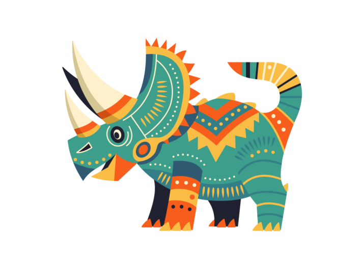
decided to draw a dinosaur made up of aboriginal
patterns and decorations. I wanted the creature
to be highly stylized, featuring geometric shapes and perhaps even the
forms of a DG two. Just to further emphasize
the Australian theme. I decided not to introduce any texture to
this illustration, and I also kept shading
to a minimal level as I wanted the patterns to describe the forms
and shapes instead. I imagine this illustration
to be part of a kid's book. And if you like this style, maybe you can create
a whole series of dinosaurs based
on my artwork. Whether you are an
aspiring illustrator, digital artist, graphic designer,
photographer, marketer, or simply someone with a passion
for visual storytelling, Mastering Illustrator
provides you with the tools to turn your ideas
into stunning vector art. I will be guiding you
through every step of the process from the initial
sketch to the final touches, giving you a comprehensive
understanding of dV Illustrator's incredible
tools and features. This course is perfect for you if you are new
to illustrator, or if you are self
taught and aiming to get more confident and
effective using it. I am Martin Para, a certified LOB professional and instructor with a
design background spanning over two decades. Throughout my career,
I've collaborated with renowned clients
such as Disney, Mattel, Cartoon Network,
Nilodeon, and BBC. Leveraging this
extensive experience, I have carefully crafted
this course to help you navigate OB Illustrator like
a seasoned professional. I am not just
teaching Illustrator. I am empowering you
to express yourself, tell your story and create illustrations that resonate
with your unique style. This is your chance to
create work that is truly personal and worthy of your professional
creative portfolio. You can follow along and
replicate my illustrations, or you can use the work
flows and techniques I show you and create something completely different
than unique. There are at least two
additional compositions you can choose besides the one I
am using in my examples. And roll now and
let the fun begin. Your creative adventure with
Illustrator starts here.
2. Hind leg outline: To establish the main shapes
for this illustration. I am going to start
working with the lip tool. First, let's do one
of these shapes, maybe the leg here in the back. Now, notice that I am using already one
of the colors that I establish for this
illustration, this orange color. But whenever I'm drawing, I like to draw with an outline
instead of a field shape. So I'm going to press shift X, and I'm going to set up
this shape with no fiel. And the stroke thickness, I'm going to set
to three points, just so you can see it better. Maybe even four points, just to make it really visible. Now that I have this
first shape ready, I'm going to align it to
the shape of the lack here. I will also zoom a little bit closer so we can see it
better on the sketch. So I can stretch
this shape around and move it around until I'm happy with the
placement of it. And then I'm going
to draw S square. So I press M on the keyboard and draw the square for
this part of the lag. Then I use the direct
selection tool and just create this angle here on the right side that is
looking already quite good. Now I'm going to use
the lips tool again. I press L on the keyboard and
draw this other shape here. I'm holding down the space bar while I'm repositioning
the shape. And when I let go the space bar, I can continue
adjusting the shape, and I quite like
this angle here. So that is looking quite good. I think we can probably use
the direct selection tool and just drag this
point up a little bit, just so we get that angle a bit more stretched out
towards the tail. So now we have a fairly
good starting point here, just simply creating
these three shapes. I select all three of them, and then I use the
shape builder tool, which is shift M, then
hold down the old key or option key to remove
everything that we don't need. So I just drew over
those parts there. And then I drew over
the remaining shapes without holding down
any keep or shortcuts, and this is going to combine
them into a single shape. So that is looking
already quite good. And at this point, I can
decide whether I want to keep this as a sharp corner or
want to smooth it out, like in my original sketch. I'm not 100% sure which
one would work better. So at this point, I can use the direct selection
tool, move this down, maybe here and adjust the anchor slightly
to have a look at it. And I actually quite like that. So instead of smoothing it out, I'm going to keep it like this. And I don't always want to stay completely
true to the sketch. It's more like a guideline, so you should also
feel free to adjust things and just be free whenever you are
creating your curve. So, like I said, it's more like a guide than something that
you need to strictly follow. So I think this shape is
already looking quite good. We can move this point
further in maybe around here, and then we can just
adjust this a little bit even further down that way. Okay. So we have a really good starting
point with this shape. We can move on maybe
onto the tail. So for the tail, I'm actually
going to use a triangle. I will draw this
with the pen tool. So I will create the tip here. Now hold down the shift
key and click there, and then we come down here. And then we can actually join
it into this point here, since we already
have this shape. So let's just create
that right there. And then we could turn it
into a triangle like this, but I'm actually going to go here overlapping
this other shape, and then we can close it off. Maybe up here. So
instead of a triangle, it's more like a polygon
that we created here, like a trapezoid shape, and we actually don't need most of it here
on the left side. But to be able to do that, we can do a couple
of different things. We can use, for instance,
the curvature tool. So that's the tool right here. I actually use Shift P as a
keyboard shortcut for it, which you can set in
the keyboard shortcuts. So just go in the edit menu, keyboard shortcuts, and then you will find the
curvature tool there. So if you don't have
a keyboard shortcut assigned already, you can do it. This one, I am going to click and start dragging
these points around. So I drag a point here. I drag a point there, then I drag a point down here. And you can see already we created exactly the
shape that we needed. Was that simple? We can drag this around a
little bit. Here. Maybe that one can come a
bit further down that way. And then we can drag this
further up here as well. So the good thing about
the curvature tool is that when you use it without
any keyboard shortcuts, it will always try to create perfectly smooth curve segments. So this one here, this one, this one, and this one, these
four segments will perfectly transition
into each other. So you won't have any
interruptions in there. So if I select this with
the direct selection tool, we can see the handles are really nicely
leading into each other. So there is no interruption
here, like I said before. Yeah, that is
looking really good. I actually noticed
that the color of my layer highlight is very similar to the
color I'm using to draw. And to be able to differentiate between the handles and
the path outline itself, I just double clicked
on the layer's name, and I'm going to
change this color. So now, let's just
change it maybe to can, just to check it out. This way, we can see it better. Maybe it's a little
bit too bright color on a white background. So I would change it to green. I think that's
going to be better, or if we want to
maybe make it darker, we can use this medium blue. And yeah, I think that
stands out better already. So now if I select
these anchor points, I can see how they look. Now, there is actually a
setting to be able to see all the handles and anchor
points at the same time. So if I select multiple points, you can see that the
handles are disappearing. If you go into the settings, that's in illustrator settings, I believe it's under
selection and anchor display. The same options, I
believe you can find on PC under the edit menu settings, or just press commando Control K on the keyboard to get to it. And the feature I was
telling you about is under selection and anchor
display category. And here it is, show handles when multiple
anchors are selected. So when you enable this, you can see even when multiple anchor
points are selected, we can still see the handles. So the direction handles, essentially, you don't want
these to be tangled up. That way, you can
see that they are forming perfect smooth curves. So this is a great example. For instance, if I select
this anchor point here, and I start dragging
this handle, and the handle is
crossing over the curve, That's when there will be not consistent transition
between the two. While if I go back,
now you can see that the handles are not tangled.
That's what I mean. This is the same
thing that applies when I select
multiple points here. So the handles are not
crossing over the curve. And this looks really good. Now, for the other section
here on the right, we could do two
different things. We could create an ellipse, and we could align it to this, so we could create
the ellipse like that and then join
the shapes together. Or we could just
do the following. We can say, we have this
shape already here, and I know where
I want it to end. So I'm using the Panol when
I see the little plus sign, that means that I'm going to add an anchor point
directly on this path, so I'm going to
define a stop here, and then I want another stop maybe down here. To be honest, it could already start
all the way down there. We will probably have to merge
these two shapes anyway. So I'm just going to create that stop here just so I can
demonstrate this to you. So now we have these
two points here, and of course, we still have
the original point up here. But that one can be deleted. So let's see what happens. If I use the direct selection
tool, the wide arrow, and I press delete
on the keyboard, that's just going to completely
delete that segment. That's not good because
it breaks up this shape. So instead, what you can
do is to use the pen tool, and just the way we
created new anchor points, we can also remove
anchor points. So when I hover over this, if I remove it, it's going to keep this shape
still being closed. But now, because there
is no point there, it's going to define the shortest distance between the two remaining
neighboring anchor points. So it created this
closed shape here. Now, there is a very
useful shortcut to access the reshaped tool when
you are using the pen tool. If you hold down the old key, you can hover over
this existing path, and we can just drag and move
it into place right there. Now, look at what
I'm doing here, with the handles, I am trying to achieve a nice flow, again, a transition from the
neighboring anchor or neighboring path segment, leading into the distance there. And then I'm going to hold
down the old key again to adjust this side
independently. Now, if I wanted this
to lead up here, of course, in this case,
that's not going to work. So here I have to move in slightly following the
shape of this curve. Now, this is obviously an
issue because here we have, if I select all of the
points in this shape, here we have an interruption. So that's something that
we will have to fix. And I can actually do this already while I'm combining
these two shapes together. So what we can do
here is select the two and then use the
shape builder tool and just quickly get rid of
things that we don't need and then join these
remaining shapes together. So that is looking
already really nice, and it's joined up the
way I wanted it to be. Now, the only point here, like I said, is this
one that I need to fix. So what can we do here? Let me zoom out a bit, and let's just analyze
what we can do. So I don't want to disturb
this part of the path. And ideally, I also don't want
to disturb this part here. So the fix needs to be
done around here only. Now, for this to
work, we could use the pen tool again and
hold down the old key and reshape this segment here to then have a better flow
in between these shapes. But that's still not
doing a perfect job. What we could do instead is
to use the curvature tool. My custom shortcut for is Shift P. And then notice that
these circles here. So when I have the
curvature tool selected, these points have
sharp corners in them. Whenever a circle is
just completely empty, that means they are perfectly
smooth on both directions. While wherever you see
the little dot inside, that means there is an
interruption in the curve. So, for instance, here, if I double click on this, I can fix that by doing
that double click. So there was a little bit
of interruption there, which I could smooth out. The same thing
goes here as well. I can remove that, or I can
just select it and delete it. And in case of the
curvature tool when you press delete
on the keyboard, it doesn't actually
break up the shape, it just removes that
smooth point from there. And by removing
this, we only very slightly adjusted
this path here, as you can see, but
we can just try to move this point very
slightly to the right. What happens with curvature tool is that if you start
moving things around, notice how neighboring
shapes are also affected, so it's the same thing
in all of these points. So you have to be very
careful moving things around and adjusting them. But in case of these two
points here on the right, where we identified the problem that we have an
interruption in the path, we can try double clicking on it and double
clicking on it again. And now we have a
perfectly smooth result. So if I select this path once again and I select the
curvature tool, now, these two points are white, so they have no
point inside them, meaning that there is a perfect seamless
transition there. And we can double
check this as well. If I have these points selected and zoom a
little bit closer, can see that these handles are not crossing over the path. So they are not tangled up, which means that we have a
very nice, smooth result here. I'm not 100% sure
about this part here. This doesn't look that good. So we have these handles overlapping a bit that's
causing the problem here. So I can see that this point probably is the
one that we should remove. Let me try removing
this with the pano. That's already improving
the path a bit. So let's just see again,
what we have here, maybe this handle, we
can drag out a bit, just to smooth this
out a bit more. Like, so Yeah. Feel like that's already better without interrupting
the other side. So yeah, you have to be careful
using the curvature tool. It can mess up details that you created before if you are
not careful enough. But in certain places, like in this case
here on the right, it created a perfect
transition from the curve that we created on the top and the curve that we
established earlier on. So now we have this
really nice shape, and if I select it
and press Shift X, we can see how it looks
once it's filled in. And I am very happy with it. And to be honest, not
all of these shapes will be visible in the
final result anyway, because I am actually
planning to only show this shape up to probably
around this point here, like it shows in my
original sketch. So if I turn this off, you can see that there actually won't be any visible
line up there. I still like to have this as a solid shape that
I can work with. So we'll be able to use this as a clipping mask and do
additional shapes inside it, which we'll show
up here later on. But that's going to happen
in the detailing part.
3. Other legs and body outlines: But now it's time to move on
to create more shapes here. So since we started
with the legs, let's just continue
with the legs. They are actually
quite simple to do. I'm going to do the next one, which is pretty
much a rectangle. So I'm going to draw
this right here. And then I'm going to hold down the command key and maybe
select the bottom two points. So Commando Control key can select those individual
anchor points. And using the direct
selection tool, we can drag these to the left. Maybe we can select
the top two as well and drag it to the right,
something like that. Now, I intentionally want to keep this as a geometric shape. I'm not going to add
any curves on it. I think it's going to work
quite nicely the way it is. Maybe, if anything, we can use the reshape tool here
on the left side. So using the pen tool, I'm holding down the old key and dragging this part
in a little bit, and maybe dragging
this point just with the direct selection
tool to the left, and just having a
very mild curve that created on the left side. So, yeah, I think
that looks good. In this case, I didn't even need this to be outlined first. I already drew it
in a field color. Now, I'm going to use a different color for the
legs in the background, and I will press shift
X to swap the color. So I drew with a stroke
instead of a field color. And you can see I adjusted the stroke thickness to
three points as well. Now, for this here in the back, I am going to draw, I think just a very
simple shape here. I'm going to draw
one point here, another point, then hold down the shift key to keep the
bottom two points straight, then come up here and
then finish it off, and then hold down
the old or option key and add a curve on
this side here. Now I can just move this with the direct selection
tool further out a bit, and I'm already happy
with the way this looks. So it was very simple. We can do the same
thing on the left side. Going to press
with the pen tool, create the first point, come up here and then come down and just join these
two points together. Now, if you want
to make sure that these points are exactly aligned
with these other points. What you can do is to select all of these anchor
points at the bottom, since we have all of the points defining the
bottom of all the feet. And then we can just
use the align option, which is up here on top, so align all of them to the
furest detail to the bottom. And I think that's going
to work quite well. Maybe we can just press
up on the keyboard a couple of times if we want to move it a
little bit higher. Okay. That's a bit
closer to the sketch. And now I can come back to this shape here that we created. I press the P on the keyboard to have the pen tool selected
and then hold down alter option key and
curve this detail up. And then using the
direct selection tool. We can drag this
further out a bit and just adjust that a little
bit more down there. Okay, I'm happy
with that detail. Now we can select
these two shapes, shift key to select
multiple shapes, and then shift X to switch
the colors on them. If you want them to be set
behind the other shapes, you can select them and
use commando control left square bracket until they go all the way to the back. So this way we have already established foreground
and background. Well, of course, we
will have a lot of additional shapes coming here. First of all, the body itself. And like before, I like to
start with geometric shape, so I'm going to try to define the closest possible
ellipse that we can use, and I'm using the space bar, moving this around, adjusting
the bottom and the top, And the main curve that I'm interested in here to
capture is this one, and also this curve
here on the top. And I feel like that is
a good shape for it. Now we can switch to maybe
using this other color. I'm going to remove
the fill color. And for the stroke,
I'm going to use this other orange color.
Something like that. Let's just increase the
thickness a little bit more. Yeah, I think that looks good. Now what we can do is to use the direct selection tool and
just bring this detail in. So it's kept inside. And then we can also start dragging this around a bit here. So even though I start
with a circle or ellipse, in this case, I am obviously
morphing and shaping it. You can think of
this as sculpting. When you work with
clay or pla Do, you're sculpting the
shape that you need. But it's still always
good to start from that simple geometric
form to begin with. So instead of drawing
the whole silhouette manually with the penol
or the pencil tool, this will give you
a more organic, believable shape, and something that is
just more relatable to. That's why I like to work
with geometric shapes. So I think this is looking
really good all around. I think what we need to do, maybe move this point out
a little bit further. Like, so, I think that's
going to work well here. And let me just double check if I need any
additional angles there. I feel like this
is going to work. Maybe if we just drag it out a little bit more,
something like that. And now here on the top, I'm going to use the
pen tool and just add an additional point here on the curve and then
hold down the old key, and then add another
point here in the middle. And then if I start moving this point around with
the commando control key, you can see that I create a dip in here without affecting the
other details in the shape. So if you use the
curvature tool for this, it would mess up the
other curves all around. But this way, I
managed to create a nice continuous flow without messing up any
other details around. But I can still smoothen this out more by using the
command or control key, and drag these
points around a bit. Maybe this handle here as well
can be adjusted slightly. And now I'm starting to affect that other
side there as well. If I switch to the
curvature tool now, we can try to move
these around just very slightly without messing up too much the other
curves around. I feel like this is looking
good. I'm happy with this. So we can zoom out a bit, select this press
shift X to fill it in, and then we can use command left square bracket until it
moves behind the shape. So it's in the middle in front of the legs
further away from us, but behind the other two
legs that are closer to us. So we have that potato
shape ready for the body, and I feel like it looks good. Maybe this segment here can be adjusted a
little bit further. So if I use the curvature tool, let's just see what we can do, drag this out a bit
maybe this way and then this one up or maybe
even delete this one. Let's see if we
can simplify this. Yeah, I think that
curve looks good. Here, we don't want to
extend beyond the leg. So I will have to just
drag this in a little bit. Myb we can go higher. That. Let's just drag this
one in as well. And I feel like
the rest is good. Yeah. That looks nice. Now, what you can also
do is to turn off the sketch layer
whenever you want to just really judge the
shapes that you created. And, of course, at this point, it doesn't say much, but still it's a good way to
understand what you created. So, for instance, here, I'm still not happy with this little detail that
will need to be fixed, so there needs to be a
nice transition there. I wanted that to be curve
instead of having, like a dip. So that will need to be fixed. That's actually something that I will have to think about. Probably, I will have
to use another shape, combine it with
this potato shape to create that transition, because I would like
to keep this leg as a separate element
or separate object. Especially once I start adding the decoration
will be important, and I want the body to
also be its own shape. So to create that
transition there, we can already do
this to be honest. What we can do is either create a new shape
and the merge them together, or we can just add a couple
of additional points here. So instead of
creating a new shape, I am going to just
add to this shape. So I will create that point or define the point which
I don't want to adjust. So this segment of the
curve looks good already. Instead, I want to add
another point here and use commando control key
to drag this up. I want it to come up here, and then still holding
down the command key. I can start dragging this
in the direction I needed. And then I just align it
to this point up there. And then, essentially,
I want my handles, so these direction
handles to almost look like they are forming
this transition to this other curve. So the handles
shouldn't overlap that. Instead, they should
be tangent to it. Something like this and
that one as well there. So, yeah, this is
looking really good. I can just keep the
rest like this. It doesn't really
matter how this shape looks because it's covered up
anyway by this other shape. So yeah, we won't really
see this anywhere. But yeah, what I wanted to make sure is that we have that
nice transition there. We can also press commando
control hy at this stage, just to see how the transition looks
like in outline view. And I'm quite happy with that. I think it's going to
work quite nicely. So let's just go back. Press Commando Control by again. And then now we can move on to the last larger shape,
which is the head.
4. Head and horns outlines: Now, for this, I am going to start drawing with the pen tool. And let me start drawing here, so I will define this point
another 0.1 more point. And then I press
shift x just to swap the stroke and the field colors. I don't want to
see a field color. And you can see I
intentionally create just sharp angled corners. So I'm not click and
dragging to create curved segments
because I feel like the head should be this
more angular shape. And then later I can introduce the subtle curves
that I wanted to add. So I'm going to define
this as one single shape. I would just come up here
maybe up to this point that. And then here I actually
want to have a curve. So I'm going to define that. Yeah, something like this. It's not really
visible in my sketch, but I know what I
wanted to achieve here, and I even move this
a bit out that way. Okay, that looks quite good. Now, for this shape, we could use an ellipse, but I can also just come up
here and click and drag and define this or at least attempt to define this with
a single path. So then we just use
the command key and drag this out a
little bit this way. And then we can come
back on that side. I'm just using the command key, trying to move that anchor. Okay. So it is tricky
to fit this path with just two points
perfectly to the sketch, but I feel like we are quite
close or close enough. I think that's close enough. Yeah. The only thing that
we'll have to adjust this here at the bottom that
will need to be updated. We can actually put
a stop to it here, so an additional anchor point, and I can move that
in maybe down there. Let's just drag this out a bit
more back to where it was. Yeah, is looking good. Okay. And then this point
here can be fixed as well. Something like that looks
quite good. Mm hmm. Now we will use maybe a thicker structure so we
can see what we are doing. And then going back here, I will continue this by
drawing with the pen tool, and I can actually
just join this up to that point there and the hold down alter
option key to create a one single curve that's connects the top to
this tip of the head, which is like the nose area. And I think that
is looking good. However, this path, I just realized needs to be
a little bit higher, so we have to drag it up here. Not so sure. Maybe
just this point here, or we can just define this
point here to be closed. So I add a point there, and I holding down
alter option key, we can adjust this part without affecting that
section too much. I can adjust that and adjust
this a little bit further. That one needs to
come out a little bit higher like that. Okay. That's looking quite good. Now we can introduce
additional angles, just very subtle ones
using the panal steel. We can add maybe a little bit of angle here. Smooth that out. And I like to use this
reshape technique where the corner points
will stay intact, so they stay in place, and I'm only introducing
curves in between them. I like sometimes with
shapes to alternate between corner points which are sharp to then move into a
nice smooth curve, just like here between
this point and this point, they are very sharp and solid, but then we have a nice,
subtle curve there. The same thing here,
we can drag this up, and maybe even drag
this one down. So almost forming an S curve
here, very subtle one. And then we can also add
a little bit of curve. Here, and I feel
like that is enough. So we have a very good shape
for the head here already. We can press shift x to
switch these around. And I'm going to use it
with the same color that I use for these details
that are close to us. So I believe it works
well for the head. And now, really, the last main details that are still quite big and
important are the horns. So we have to do the three
horns for the triceratops. For this, I will actually
attempt to use just ellipses. So let's do the first horn. I'm going to use a
different color. Maybe we can use one
of these colors. I'm just going to remove
the field color for now. So I set that to none, and I will keep the stroke
color but make it thicker. So we have this shape here and
we can move it into place, drag it down a bit, turn this into a nice
elliptical shape that will fit to what we need here. So yeah, that's a
good fit there. Then I hold down
altar option key and duplicate this ellipse, and I'm going to rotate it, try to align it here
on the other side. I also noticed this in illustrations that if
I use the same shape, same exact ellipse twice and try to create
something out of it, it usually creates a more
interesting end result or more organic
end result again. So instead of two completely
independent shapes, there is some kind of
harmony in this object. So the two ellipses that define this shape work well together. And we could even attempt to do this bottom shape here again
with the same ellipse. Although I don't think
that is necessary, but we can do it like that. And then I select these
three ellipses together, and then press shift for
the shape builder tool, hold down the old key and quickly remove the details
that we don't need. And then we end up
with the final shape, which we can turn into a field
shape by pressing Shift X. And it is looking really good. And now maybe if I use the direct selection tool and
just click on this shape, we can maybe add the very
subtle curving on the corners. Just maybe that much. Let's just try this again. There it is. It looks good. Let's just see this in
outline view as well. I like what I see.
This is looking good. Now, we can try to duplicate
this and then reuse it. So let's see what happens. If I duplicate this
and just scale it up. I can try to fit this on
this other detail up here. Maybe just do some very
minor tweaks on it. Using the pen tool, maybe I can just reshape
this segment here. Because I already used
the corner points, the direct selection points, it's not perfectly
continuous here. So it already has a little bit
of messed up detail there. So I actually prefer to again, just be really precise. And to be honest, most of the time, if possible, I avoid duplicating details, especially quite big
details like these. So let's just do
the same technique again that I've done
using the ellipses. So I drew my first
ellipse trying to fit and align here
on the left side, and that is looking good. And I'm just going to
switch the fill and the stroke with the shift x shortcut and then duplicate
that shape again, using old or option key
dragging that shape up. So there's our duplicate, and then rotate it around until
it fits the illustration. And that looks really nice. Now we can just fit this
to the bottom as well. Yeah, something like that. And again, there is
a beauty in creating these shapes simply by
using just the ellipses. I find this quite fascinating. The end result looks always
just a little bit better than compared to using like
the pen tool to draw it. So now we can use the
direct selection tool add a little bit of
the corners on it, very subtle, like that. And then I feel like that's
already looking quite good. Maybe the bottom needs to
be curved a bit more so before I introduce the
corner here on the top, I will use the pen tool, hold down the old or option key and create a bit more
definition here. I will also remove
that anchor point. I was an extra anchor point. And I feel like there's
an extra shape as well. I'll just deleted that quickly. So let's just select this again. Using the pen tool, holding down old or option key. We can add a more
dominant curve here, just like that. Yeah. That looks much better already. And then selecting
this top point here, we can add our
little curve there. Now, if this doesn't
want to curve more, that is because of the
angle of this curve. So it was created in a way that we can't curve
it further down. In these cases, what you can do is to manually
reposition this. So you can have that
point moved down. Or in this case, I can see
what the problem is here. There is an additional point here which needs to be removed. Now, if you just remove that, simply by clicking on
it with the pen tool, that is going to obviously
affect the curve. Let me just change this color just so you can see
what I'm doing. So you can see
there's two anchor points there next to each other. This one needs to be removed. And this is a very
useful shortcut. If you switch to the minus tool or delete anchor point tool, and hold down the shift key while you are
removing this point, is going to attempt to retain the original curvature
of this part segment. So let me do this
from a distance. If I do it without
the shift key, it's going to mess
up that detail. But if I hold down the
shift key with this tool, it's going to look
exactly the same. So that's a magical result. So now we have a
perfect detail up here, and it will allow
us to curve this as much as we want with
the smooth widget. So we can smooth it out all the way down here
if we wanted to, and I think that's quite
nice result there. Yeah, removing anchor
points with the pen tool. So whenever you have a shape selected and using the
pen tool to remove a point is always going
to affect the shape, so it's going to mess up the
shape that you had there. So instead of this,
I recommend using the delete anchor point
tool in these cases. And again, don't just
click on it like that, hold down the shift
key and click on it. And see, again, we managed
to remove a point, which was just in the way. It wasn't necessary
for this path. And it already is just so
much easier to work with it. So there's literally
three points. So if I were to draw
this with the pen tool, I would have originally only created these three
anchor points. But I still like the
fact that I created this from ellipses and not
only random ellipses, but duplicates of
the same ellipse. So the whole thing was defined
by those three ellipses. And I'm just going to use
the same field color and then set this up the same
way as the other horn. And then let's just
duplicate this. I think this can be duplicated for that
other horn behind it. Since we are not going to
see a lot of that shape, I can just set it up like
this and maybe just use a darker color for it just
so we can differentiate it, and then with the command
left square bracket, I can move it further
back in the distance. Let's just turn it around
a little bit more and use the arrow keys on the
keyboard to align it. And then this point here, we can just move down
ever so slightly. So it's hidden away
behind that other shape. Looks good. All right. So the good news is that
we actually managed to create all the most
important elements. So we have to head,
the horns, the legs, and the tail all defined
in these curves. We can see it in
outline view as well. We can also see it
without the sketch. And, yeah, so very simple, the least amount
of anchor points that was necessary
to create this, a good transition
between curved details and sharp angles to have
interest in the composition. And already, obviously,
I'm thinking of making things as easy
as possible for me. To then later add all
of these details and refinements that we will introduce in the
following lessons. So I hope you enjoyed
this workflow so far, and don't worry
if you don't have the exact same result
that you see here. I will have this
file ready for you to continue working with if you want to or if you choose to, but don't worry if your
result is slightly different. The most important thing is
to have fun with the process.
5. Refinements and details for legs: Before we start
adding some details, I would like to make
one minor change to these main shapes
that we created so far. So remember how we created the
tail connected to the leg. That point it made sense, but the more I think about the decoration and details that I would like to add later, the more I feel
like it would make more sense to have the tail
connected to the body. So the potato shape that we
have here in the middle. So to be able to do this, there is a very
quick and easy fix. We have to divide or split this shape in
the front into two. First, I'm going to
use the pen tool and define a point here where
I would like to cut it. So let's create
that point there. And then choose
the scissor stool. The shortcut for this is C. And then click on that
anchor point right there, and then maybe use this
other anchor point here. To create the cut. And now we have two objects. What we can do is to have this one on the top
selected and then shift click on the body and use the shape
builder tool as Shift M, and then just paint over these details to join them
together into one shape. I'm just going to
change the color back to yellow just so we
can see it better. So we can now see clearly
that there is one shape, the tail and the body, and this leg is separated. One thing you have to be careful
about when you are using the Scissors tool is that
it can create open pods. So in this case,
these two points are not a quick fix
for this is to use the direct selection
tool and select one of these anchor points on the part where we
have it opened up, and then shift click on
the other anchor point. And then from the control bar, you just click on
this option here. That way you can join
these two details. And now it's connected
with that path, and now this is a
nice closed shape. So it's worth taking a look at all the anchor
points that we have here. If I zoom closer, I can actually see that there is an unnecessary anchor
point right there. I'm going to use the pano
for this to remove it. We'll just use Pentool and click on it,
and that's removed. And doesn't really matter what we have here
behind the lag, but if you really want
to create smooth points, you can just adjust
this as well a bit. But this way, we have these
two perfect shapes now, the body and the
leg in front of it. At this point, I really like to focus on one element first. Completely add all the details on it before I move
on to another one. And just to keep things easier, I'm going to start with probably the smallest or simplest
shape in this case, and that's going to be this
leg here in the front. What I will do first is to
draw the clothes or nails. For this, I'm going
to use the Pen tool. Let's just draw the first one. I will hold down the shift key, so I keep the bottom detail straight and go up there
and then go down here and click and drag to create
a nice curve on this side. Looks good. Now I'm going to use the direct selection tool to get the corner igits and just add a little bit of corner on all of these corners and then drag
this down somewhere here. Let's see this
without the sketch. I think that is looking good. We have to duplicate
this one time, and I also stretch it a bit
and then another time. Okay. Yeah. Something like that. So let's see compared
to the sketch. Yeah, that is looking good. I think it's a good
detail to begin with. Now, I would like to use this actual shape that we
created as a clipping mask. And I am actually considering to have a curve here created
similar to the sketch. So what we had here. To be able to do that,
I might use an ellipse. So let's draw the ellipse
and draw this detail here. So instead of just a
solid shape on the top, I'm going to actually
follow that shape there. Select these two together and then use the shape builder tool. Let's shift M. An
old or option draw over the details that we don't need and just merge
the other two without holding down any keys to
create this unified shape. But whenever you use
the shape builder tool, remember that you have these unnecessary anchor
points that remain there, and to be able to remove these without
affecting the curves, remember we use
the minus tool or delete anchor point tool with
the shift key held down. So that's what I'm
going to do here. I fixed it quickly, and maybe we can also
use the same method. By the way, minus on the keyboard shortcut will
get you to this tool quickly. And again, holding
down shift key, I could fix it very
quickly there. So, yeah, instead of having
seven anchor points, now we just have four, and it's exactly the
shape that I wanted. And this is going to be used
as a clipping mask because I would like to have a couple of additional shapes
placed inside this. So, what I'm going to do
is to draw another shape. In this case, I'm just going
to draw another ellipse. Let me just draw this
ellipse down here. Just like that, let me try to follow the curve
as close as I can. Yeah, I think
that's good enough. And I'm going to use
these two shapes now. But what I need to make
sure, and for now, I'm just going to
change the color of this shape just so we can see it better is that if this is going to be
my clipping mask, so the container
or holding device, then this needs to be placed on top of everything else for this. You can right click
and choose a range bring to front or
use the shortcut, commando Control Shift
close square bracket. So if I do that,
comes to the front, now shift click on
the other shape to have these two selected, and then go to Object, Clipping mask make, or Comando Control seven is the shortcut that you
can use for this. So now, as you can see, we have that invisible boundary created by the original shape
that we had for the leg. And inside it, we
have this circle. So to be able to see what's happening in the layers panel, we can see there is the
clipping group created. There is the ellipse,
which I can still move freely around inside
this other shape. But I'm going to
keep it down there. But what's best is I can start
duplicating these shapes, and I can even add an actual
color for the leg itself. So even though it's
a clipping mask, it can still have
its own field color. So I'm going to use this
dark blue as the base color. Then I select that ellipse
inside the clipping mask, and I'm going to duplicate it, so I just click
and drag up there, and then I'm going
to change the color, and I will move it
below the other shape. Like this. And then we
can duplicate this again. Once again, we change the color, this time, the
same orange color. But then again, I move it
below the other shape. So I'm basically building it up. Now we have one
ellipse at the bottom, another one on top, another one on top, and that's the base color of the shape. So now we created these colors, and we can have this group
moved below the other shapes, which are the little
nails we created here. To keep things organized, I will already start putting things
together into a group. So in this case, I'm going to select all of this together, and I'm going to group it. So once it's selected, I press commando Control G, and I'm going to call
it front left leg. That's it. And then we can start adding these additional small
details, the circles. And if you want to make
sure these circles end up within the group
that you just created, for this, it's best to
use isolation mode, which is a simple double click. So double click takes
you inside that group, so you can see now we are
working inside this group. So we still have
our clipping mask, which is that main shape, and then we have the little
nails that we created. The only issue
whenever you are using isolation mode is that you might not see your
original sketch. So in this case, I have
to turn off temporarily the clipping mask that already
has those field details. So then I can use
the ellipse tool and start drawing these
additional small details. So I'm going to use
this with this color. And then I'm going to use
another ellipse here. I will use this
bright color on it. And I'm going to
just duplicate it once and one more time. And then let me just
duplicate this circle, but this time I will use
the dark color on it. And again, I'm going to
place them down there. Now we can turn back
the clipping mask, and we can adjust
these a little bit just to have them align
the way I imagined it. And that is looking
good, by the way. The inspiration for these
little dots is coming from the aboriginal illustrations and paintings on things
like Dig dos. Feel like that is what I had in mind when I drew this sketch. So I'm trying to
stay true to that. And if I double click outside, I can exit the isolation mode, and now we can see how it
looks without the sketch. And I think it
looks really good. So that's the level of detail
and the type of detail that I would like
to see on all of the rest of the illustration. But since we started
working on the legs, let's move on and apply the
details on the other legs. I'm going to move on these legs that are further away from us, so the right legs. And this will be
fairly easy to do. I'm just going to have this detail selected using
the direct selection tool. You can pick something even though it's inside
the group already. Copy it, and then press
commando Control F to paste it in front. And the good thing
about this is that it automatically places it
outside of the original group. So we can now move
this here to the side, move it slightly higher than
the other leg and I actually will select these legs and just move them up
with the arrow key. Just to add a little
bit more depth. So having them not
perfectly aligned, is going to create a little bit more depth in the illustration, so it won't feel so flat. I think that's going to help us. Now, this color, I want
it to be dark like that. And the nails, I'm going to
set for this darker orange, just to have some nice contrast, and I will actually
make this nail slightly smaller,
something like that. And I'll just have space
for one more here. Okay. And that is looking
quite good already. I'm going to use the same color
here as on the other lag, and I'm going to duplicate
these shapes here. I'm actually going to
use three in this case. I start with duplicating
this holding down old key. There's one here. Another one there.
And then this one, we can even use the
send backwards command shift squared bracket or arrange send to back option and then have it placed
completely behind. Maybe something like that, and then these can
come ale bit closer. Again, I'm changing the way it was in the original sketch, but I'm making these
decisions along the way, and that's completely fine. You don't have to
stick to your sketch. It just makes more sense to
me the way this looks now, and even this one, I can just move a little
bit higher somewhere there. All right. Now I'm going
to have all of these selected together and shift, select these other details
and actually group them all of these together
into a single group. Again, I just feel like
it makes sense like that, and I'm going to call
these right legs. So that's both the
front and the back. There won't be much
detail on these. So that's why it doesn't really
require a separate group
6. Details for hind leg: Now, this lag in the back is going to be a little
bit more detailed. For this once
again, I'm going to copy one of these nails
with the same method, direct selion tool to select it, and then command
or Control C and command or Control F
to paste in front. So we have this path
in a separate space, not inside a group. And then here, we have, again, the nails set up like that. We have three of
them. And then we can actually have one
more duplicate this, and maybe reflect this around, press all on the keyboard, which is the reflect tool, you can find here
in the toolbar, and then just click and
drag will reflect it, and you can also
rotate it around. Reflect tool is like
a special type of special version of
the rotate tool. So it can rotate and
reflect at the same time. I can place it up here. Now, whether this should
be in front or behind the other shape, I'm 100% sure. And I just noticed that
we lost one of the nails. Going to recreate that
quickly, like that. I feel like this probably would make sense to be behind the leg. I'm just going to
place it behind it. Yeah. I think that
looks better already. And the base color of this lag will be defined inside
the clipping mask again. So at the moment, it doesn't
really matter what color it has because it's going
to lose that color. But what I'm going to do is
to draw another ellipse here. So I will turn on my sketch. Like before, I'm
going to draw one of these cores or ellipses that I will be using
here like that. And I'm actually going to
use a stroke for this, and I will use this
darker green color with a thicker stroke. Something like that. Now I want this to be only visible inside this shape here. So for this, once again, what we need to do is to
create that clipping mask, which will set this
holding device or boundary within
which we can work. For this, remember
that you always have to have the shape, which you use as your silhouette on top of everything else. So you need to
place this on top. I use the keyboard shortcut, but you can also just use the layer spanel if
you want and drag it all the way to the top to make sure that these two
shapes are selected. Or the leg detail and or silhouette and this little
circle that we created. And then the shortcut
for clipping mask again is Comando
Control seven. Now, once you have your
clipping group created, within that, the
actual silhouette itself can now have
a field color. So I select the field color. And I'm going to use
this green color, which is going to be the base
color for our triceratops, that's going to be the
original color or skin color. And all the rest of the details
will be different colors. So those will be
the decorations. But, yeah, this is going
to be the base color. Now, if I turn off my sketch, you can already see
that little detail there is something that we
can easily move around. If I selected from the layer
spanel just like before. We only see that circle
inside the clipping mask. So that's the way this works. And the good news is that we can easily reuse that detail. So I'm just going to
turn back the sketch. And I can see that
ellipse right there. I can just duplicate it, change it a little bit
around the angle of it, and then apply for
the stroke yellow. Color this time. And
then I would like to have some additional
details added here. So for this, I'm going
to start drawing outside of this clipping mask and
just draw this shape quickly. Like so. But then I can just drag and drop this
into the clipping group. And that way, it will
be added inside it. So that's also a
useful technique. You can easily draw outside. You don't have to always
enter isolation mode, because you can
just drag and drop things in and out
of a clipping mass. And for this shape, I would like to use this color, but as a field color. So I press shift X. So I swap that around. Then I would like to have this section here at the bottom set in
different colors again. Now, here is another
thing that you can do. You can actually have clipping masks inside clipping masks. So what if I want
to then further break up this shape
into other details? Well, one thing that I can do is to draw these two shapes. So, in this case, I'm
going to draw a rectangle. Maybe like that, and
then use the pen tool just add another point there and then another point below, and then use the Cisors tool to break this up into two shapes. So now we have one on the right, which can be this darker blue, and then we can have
this one maybe yellow. But if I want these two
shapes to be only visible within that the shape
that we created earlier. All we have to do
is to make sure that they are turned
into a clipping mask. So I'm just going to
drag that shape out from the original place
where I want it to be. And as you can see, I
have them all together. Now if I select them all
and I press command seven, I just have to go back and reapply the color on
the clipping mask. So I'm just going to
use that orange color. So now, just so you can
see what we have here. We have this shape within which we have those two
additional rectangles. But don't forget that
we wanted this to be inside that other shape,
which is the leg. So if I just drag and drop this inside the
other clipping group, then we have exactly what
we wanted to achieve. So now that we have
this shape ready, we can just drag it
underneath the nails, select them all together, and also don't forget
about that shape there, and then group them together. So now we have this shape ready, so the whole foot,
can drag that around, and then we can
put it back here. And one thing to notice is that sometimes if you
have a clipping mask, clicking inside
the clipping mask might not make a selection. You might not be able to
move the object around. So it's good to
always try to click and drag it from the path or outline of it or another detail that is not
inside a clipping mask. That's just one of
those things in Illustrator you have
to pay attention to. But this lag is
starting to look good. There's only a few more
details that we need. Those are these dots here. So for this again, I can reuse one of
these other dots I created earlier just
so it's the same size. I use the copy and pasting front technique
that I've done before, and then I'm just
going to place it here, then duplicate it. Actually before we duplicate it, let's just also draw this
other shape that we have here. To create this shape, I'm actually going
to draw this on the side here just so
you can see better. There's again, several
ways of doing this, but I like to do it
with the Ellipse tool. So I will just draw a
long ellipse like this, which will have
four anchor points. And then using the pen tool, we can hold down the
altar option key and convert one of the points
into a sharp corner. And there you go. That's
how quick and easy it was. And then we can just use
the direct selection tool. And move these two
points higher. So we can't actually
see it properly, what's happening until I let go. And I think it doesn't need
to go any higher than that. In case you want to
move it any closer, you will have to drag
these handles down a bit. So holding down the shift key, I drag them down to make sure that they are still straight. That. Now if I move them higher, we can create that
tear drop shape that I had originally
mined for this. And I think that looks good, so now we can just reduce the
size and drag it in here, and then align it. Like so. Now if we want to
duplicate these quickly, we can just select these two
together and group them, commando Control G. And
then using the rotate tool, which is R on the keyboard, you can just define the center
point for the rotation. And start dragging them, but also hold down
the older option key. So there's the first,
and then again, do the same one more time, and then do one more time there. So this way we
know that they are perfectly aligned to each other, and maybe they don't have the
same distance between them, but that's not that relevant for this illustration anyway. So I feel like this is
looking quite good. Of course, we can always
further refine this later on. But one thing that
I forgot to change is the color for
these shapes here, so I use the direct
selection tool. Select them, and
I'm going to use this darker blue color on them. I'm just thinking which
one would work better. Yeah, I think we can use
this darker blue color. Okay. And I feel like
that is looking good. Let's just see the sketch again. I actually had in mind now, I remember that
these points were supposed to follow the
original line of the foot. So that's something that I
can try to replicate here. So I can move these a
little bit further out. And have that original curve in mind as I place them down. Yeah. So this is something that we can further refine later. But for now, I am happy with
how this is coming together. And let's not forget combining
these into a single group. So I'm going to select these
together with the shift key, have that foot detail as well. Group all of these together
with command or Control G, and then let's call
it hind left leg. Okay, so we have
the front hind leg, and then we have the right legs, which are in the background. Okay, so we're done
with the legs. Now we will be able to move
on to the body and the tail.
7. Details for the tail and back: Make our life easier. I'm going to turn
off these details in the foreground and maybe
even turn off the head, which I'm going to quickly
just group together for now, so group all of this together. Hide that as well, so we can see the
potato shape better. And I'm going to turn
back the sketch because that shows us some of the
details that we will need here. First of all, we will want to turn the body into
a clipping mask. It's going to be a
big clipping mask with lots of elements inside it. But a shape on its own doesn't really work
as a clipping mask, so you need something
that will go inside it. And in this case, just
to make things easier, I'm going to just draw a square here on the top or rectangle, I set it to a color. And then I'm going
to make sure that this body shape is above it. So I just move the rectangle underneath from
the layer spanel. And then select
these two together. I make sure the sketch
layer is locked, so it doesn't accidentally
get selected. So I have these two
selected and then press commando Control seven to
create the clipping mask. Now, the base color of the body, as I explained in the
previous lessons, is going to be this green color and brighter green or teal. And I think that is going
to work quite well. Now we have our
clipping mask ready. We can continue to
work inside this. And there is another
technique that you can use whenever you want to draw
inside a clipping group. So there is this feature
called draw inside, and it even has a shortcut Shift D. But as you
can see at the moment, that is not accessible. And the reason for that is that you actually have to highlight the clipping mask
or the shape that was created inside
the clipping group, and then you will be
able to enable this. So when you use draw inside, you will notice these
little dash lines appearing around the object. And now, even though we
are not in isolation mode, we will still be able
to draw new shapes, and they will
automatically end up appearing inside
the clipping group. So let's just test this out with a shape that I wanted
to create up here, and we're going
to use the pantle and draw around this part. Up here, and then I'm going to set this color to
yellow. There you go. You can see even
though we didn't have a specific
selection of anything, we still ended up creating
this shape automatically inside of the clipping
group that we established. Now, the good thing about
draw inside is that you can use this even before
creating a clipping mask. So just to show you this again, if I go back a couple of steps, we get back to this point where we had our original shape, which is just this simple
path that we have here. I choose draw inside
why this is selected. It's automatically
going to turn into a clipping group the first
time I add something. So if I now use
the rectangle tool and draw something
like this detail. Notice how immediately
that is added, and the original body outline is turned into the
clipping mask. And of course, I can still select that and change
the color of it, and then I can continue drawing. Again, I can draw
this detail here, like I've done before, and then just assign
the color on it, and so on and so forth. So yeah, draw inside is probably a more convenient way of
creating clipping masks, but I still wanted to teach
you how to do it without it. So the commando Control seven shortcut when you
have two objects, one that is used as
your container or mask and the other shape that is going to
be used inside it. Placed on top of each other. Turned into a clipping
mask is the original, or we can say standard way
of creating clipping group. But this draw inside technique is something that I
really like to use. So that's why I wanted to
highlight and show it here. So I'm just going to draw
a couple of lines now. I'm going to draw a line here, and I will use
this bright color, and I am actually going to
remove the stroke or the feel. For the stroke, I would like
to use that bright color and increase the thickness,
something like that. And I actually going to turn off my sketch just to see that. Yeah, that looks good. Maybe I can make this even thicker. So let's just increase
the thickness on this up to nine points,
that looks good. And I'm going to duplicate this. Let's click and drag duplicate. I'll turn it around a bit. One more time duplicate.
That looks good. And then maybe one
more time duplicate. Just have to make sure I
select the right thing. There it is. And then rotate. This time I'm going to use
this dark color on it. Now, let's just use this dark
stroke and move it up here, can rotate it around,
keep it straight. I can have one here, maybe. I will have another one maybe
a bit thicker, this one. If you hold down the
shift key when you're in or decreasing the
thickness of your path, it can go faster or slower, and I feel like that one, the thicker one can go a
bit further to the left. I just noticed that
we lost one of the lines that I
established here earlier, so I'm just going to
duplicate it again, place it down there. Okay. So that is starting to look closer
to what I had in mind. I'm going to continue
adding some more of these, one more, going to add here. This can be a little bit higher. Just around the edge
of that other shape. And by the way, I just noticed
that these two shapes, the one that I
just created here, and that other shape there can easily be replaced by using a stroke directly on that
other shape that I created. So I'm just going to
simplify things and add the stroke around that because those are the only
visible edges of the shape, and why not use it for that? It just makes more sense. Now, I am going to draw
another shape here, so using the pen tool, I'm going to click
and drag and try to define this outline, and then come up here, maybe click on that point. Come up here and then
click and drag again, using the space bar, I
can reposition this. Click and close. So we have another
cool shape here. I'm just going to change
the colors on this. So the feel color should
be this darker orange. And the stroke can be the
brighter orange color. And let me just turn off the sketch so I can
see what we are doing. Yeah. This is
looking interesting. And then what I'm
going to do is to just have two more of
these lines added. So let's just rotate
this around. One here. This one is going to
be this darker blue. And then one more once
again. Rotate it around. Just maybe adjust
this a little bit more rotate it and move it
down, or something like that. Now I'm going to add a
few circles as well here. I'm going to add a circle here with a white or
bright fill color. So let's just choose fill. There it is. And then I'm
going to just duplicate this, so I come closer. We put one more here. Another one there. For now, these three will be enough. And then maybe just
for good measure, we can put one more here
just for some interest. Okay. Now let's turn
back the sketch. Let's see where we are. So the tail is close
to what I had in mind. Obviously, we have the legs. Don't forget. We already
edit those details. But I want to concentrate
on the back here now. So we need this decoration. For this, I'm going
to start with the larger shape that's
going to go at the bottom. And don't forget we're still
using the draw inside. So whatever I'm going to draw
is going to appear there. So first of all, I'm going
to draw from up here. I'm actually just using
the pentel for this, and I'm following my
sketch very closely. It doesn't have to be perfect. I want this to feel
quite organic and loose. So yeah, I'm just
following it like that. And then I think
I would just come up here straight, like that. Maybe a bit higher. And
then close it up there. Now, this can be
this orange color. Then we will have other shapes overlapping this on the left. But first, I'm going to
draw these other shapes. So we have this one. Let's click and drag. Then click again with the pen tool to turn that
into a corner point. Then click and drag here, holding down the space bar. I can reposition
this anchor point. And then I just have to
close this up again outside. Like so, this one is going
to be this orange color. And then we can just duplicate
this if we wanted to. So select that
shape the last one that we just created
and duplicate it. Now I moved it off, but we
can't really see what this is doing until I actually
changed the color on it. So that looks close enough. Maybe we can adjust it
slightly, like that. Yeah, that looks good.
Then once again, we can duplicate this shape. I'm going to use the
dark orange again. Let's align it and then just
adjust the shape a bit. And then one last one. I'm going to drag this up, change it to the
original base color and line it up there. Okay, so that's close
to what I wanted. Now, we, of course, re need some of these little
circles here as well. I'm going to use this
yellow color on it. And let's just try to
create a few more of these. So I will duplicate few of them. I'm not following
exactly the drawing. Slightly different
places compared to that. And let's take a look at
this without the sketch, and also maybe have all the additional
details add it back. Yeah, that's looking good. Now, one thing that
I notice is here, the lag is overlapping
that detail. So what we actually need to do here is to reduce the
outline of the leg, but we just get out of the
draw inside mode temporarily. So I will go back
to draw normal. You can also press Shift D on the keyboard to deactivate it. So we can come back here, use the direct selection
tool and just drag this down until it doesn't interfere with those
details up there. So now that I drag it down, I can click away, and it is looking
already better. And at this point, I can
always come back and just adjust these anchor
points a bit. Once again. You don't have to stick to using the same exact details that
you had in your sketch. If you feel like they
need to be updated, you can always go back and
make those refinements. Even here, I can
come back just these parts a bit until I'm happy
with the way it looks. It just feels a bit
more balanced now. I feel like this needs
to come down a bit as well. Like that.
8. Details for the belly: Now we actually
have a few details, if you recall in the sketch. These pikes on the back
that should be added. So for this, I'm just
going to use the pen tool, click and drag to
draw this first one, and click and drag
and finish the shape. And I'm just going to
add a corner on this. Actually, I only need the corner on this
particular point up here, not the other two.
Yeah, like this. I just then copy this, try to align it to that. Larger shape that we
have on the sketch. I can, of course,
adjust these points, so it doesn't have to be just relying on the
transformed feature. I can make this one a
little bit smaller. Adjust it a bit more. And just that handle as well. Okay. So yeah, these look good. Now, this just needs
to be placed in a group command G and make sure that it's
underneath the body. Now we don't want to
put it in the group of the body because that's a
clipping group that we created. These should be
behind it because it extends beyond the original
outline of the body. And that is looking good. Now, we need some additional
details further down, so we will need to add some
details here at the bottom. Go back to the body, which we worked with before. I go back into draw inside, and then using the pen
tool and my sketch, I can just trace along
these details here. I'm just going to draw a curve that comes down and
follows the body here, and then just goes
around like that. And then I am going to fill this one with the
darker orange color. So that's detail for the belly. And then we can maybe duplicate this detail and use
the other color, this brighter orange further
down somewhere like that. Let's see, without the sketch. Yeah. It might get a
little bit confusing, so I'm not sure
about this detail. We'll probably have it
something like that. But now I'm also conscious
about one detail. If I use the same orange color
on the leg and the belly, it might clash and make it hard to read what
is happening here. So maybe this color that we used here could be changed
to this darker blue. Think that makes it better. So it reads better. There's a better separation
between the details, and it actually makes
more sense to have a darker color
there on the belly. So I think that
works quite nicely. And then still within
the same shape. What I can still do is
maybe use this same shape, duplicate it one more time and just have the instead of a feel, I'm going to have a stroke with this brighter color
assigned to it, and then maybe just
align it to here. Let me just drag this
out a bit. Yeah. Have maybe a line running through there at the
bottom, which again, creates a nice continuity
between the front and the back, and we could potentially even
apply this to this shape. So if I use the same color, use the same thickness as well. Might be a little bit overkill. I actually preferred
it just with a single version
of it like that. And instead, maybe let's just
use a few of these dots. So I'm going to use direct selection tool,
copy, and paste. And I'm going to actually paste this already inside
this clipping group, and then just place it here, maybe make it a little
bit smaller as well. Something like that. Okay.
And then let's zoom in. By the way, if the corner
points are getting in the way, whenever you work with
small objects like this, you can go to the view menu
and choose hide bounding box. That way, you can still
work with the object, but you don't have to
worry about all of those tiny little details
affecting your selections. So I can just click and drag, Old click and drag and
continue doing this. But here's another technique
that's worth mentioning. If you have lots of these little circles that
you would like to place down on
a specific path, instead of creating the circles
individually like this, what you can do is to draw
a path with the pen tool. So I'm just going to
draw a path here. It's a simple curve. Like that. And instead of using
the circles individually, what we will do is to
have a stroke setup, so increasing the
thickness of it, and then go into
the stroke settings from the appearance
panel and turn on dashed line then make sure that the cap
is set to round cap, and the actual dashes, you want to set to zero point. But then you want to
increase the gap, and depending on the size
or weight of the points, this will need to be different depending on
what you want to achieve, but you can see we
can adjust the gaps, maybe have 20 points
in this case, and that looks
already quite nice. So yeah, that makes it much
easier to work with the dots. So all I have to do now, let's not forget to
turn the bounding box back so we can see the
path when I select it. But yeah, so if I
select this path, can just move these anchor
points around and notice how the circles are created
as I'm moving it around. So that just makes it so
much easier to work with. I'm just going to set it up. Here. And we could
even continue this, so it could even go
all the way here. I could even add additional
anchor points on it. So we can add a nice
little curve in there. And I quite like
the fact that it is even hiding behind the leg. So some of those points feel like they are actually
placed behind the leg. But if you want to make sure the points are fully visible, then of course, you can also do that just two separate lines. So I draw another line here. So that way, I have a perfect control over where they start
and where they end. And yet, this way, we could create a nice
line there as well. And at this point,
I'm not even entirely sure whether we need
this line here, so I can even just delete that. If I wanted to, and
we can come back and add more details later
if we feel like it. Maybe let's just add
one more little detail with the same style. Just going to add one more here. Again, following the foot. Adjust these points a
little bit like that. So let's see how this
looks from a distance. Yeah, I think that
looks quite nice. We can move this a little
bit higher, maybe. Yeah, I think that created a bit more interest
here in this region. Now, remember that we had
these dots added one by one. If you want to have
more control and you want them to feel
more equally spaced out, you can also recreate these. So just going back
to those dots, I can have these selected
and delete them. I will just delete those. These direct selection tool, delete that one as well, and then just use the
same technique as before. We can even just duplicate this, place it up here,
and drag it down, adjust it a bit. Like that. And by the way, if you want to make it easier
to reuse certain styles, you can even save
graphic styles. So this one could be
called small white spots. And I just used the pen tool to continue adding
another segment to it. So now we have two. We can adjust These points a bit
drag it up like that. But now what I'm
going to do is to go into the stroke settings. I will increase the weight because we wanted
these to be bigger, but we also are going to
increase the gap size. So yeah, maybe
something like that. And then we will also change
the color of the stroke. In this case, I believe we
were using this orange color, so we can now save this also
as a new style and call it large orange spots. The cool thing is once
you save graphic styles, you can easily switch
between the two like that. So you can easily update them. By the way, if you don't see
the graphic styles panel, it's from the window
menu graphic styles, that's where it is. Anything that you create and
you quickly want to reuse, and it has a little bit
more advanced settings than just a fill and a stroke. Then graphic styles is always going to make it
easier to reapply it. Now I just noticed that there is one detail here that
we need to fix. I believe that's one of these
shapes that's overlapping. So I'm just going to move
that point down there. That way, it doesn't
overlap the tail. And yes, the good news is
that we pretty much are done with most of the
little details that I wanted to add on the
body and the tail. So now we can move on to add the refinements and
details on the head.
9. Details for the head: Time to work on the head
and add details here. So first of all, there's a small little shape here that we will have
in the background, which is for the mouth. I'm just using the panel
very quickly to define this. I'm going to use the darkest
color for this detail, and I'll make sure
it's behind the head. Or we can already put
it in this group, which we started
creating earlier. So that's just going
to help to define the depth for this detail. And then we can start adding additional details like the eye. So let's just create that
quickly one ellipse here, then another ellipse on top, which is going to be
this bright color. And then we can have one more. I'm just duplicating the
other shape and using that darker color I
like so the eye is, of course, very important, so we can refine this later. For now, I'm going to
just keep it like that. I think that looks quite nice. And then we can have maybe this additional
shape around it. I'm going to use the ptol and I will use only a
stroke color for this, increase the thickness of the
stroke and set it to white. Now, if you don't
want the stroke to run around, all the way. You can use the scissors
and cut it off, let's say here and there. That's one way to do it. And maybe we can even reuse this shape and just place
it here on the right. You can maybe make
it slightly bigger. And, maybe angle it a little
bit differently like that. Or we can just use
the pen tool and draw another curve
here might be easier. But whenever you crop
or cut into a path, it's also worth adjusting
the styling on it. So in this case, what I will do is to sure in the
stroke settings, we have round cap, which is going to
turn the caps from this sharp angle that we have here to round details like this. I think that's quite
important in this case. So let's take a look at
this without the sketch, and that is looking good. So around the eyes, we have
some good details already. Let's draw the nostril, this hole here at the front. I'm using the pano for this. Just draw around it, create the curve,
and then feel color, we will make this dark. And then we will also add
some roundness to this, so the round joints. The stroke, just as
important as the round caps. So round joins instead of
having these sharp corners. Now we have them
nicely rounded down. So you don't have to use
the corner vigi for this. If you just want the stroke
to be nicely rounded, then you can use the attribute from the appearance
panel on the stroke. And that is looking
much better already. Now, I am going to
select the main shape. So that's the head detail that we have here,
this silhouette. And what I'm going
to do is to press or use the draw inside feature. I can start working
inside this once again. This is creating
a clipping mask. So what I will do is change
the color first of all, the field color of this shape. So that's our head shape. I'll change it to
the base color, this teal, and then I can start adding the
details that I wanted. So first, let's just
draw here something. I'm going to draw
from this point. Yeah, we can start drawing from that point and maybe align
it to this point here, create a curve and then
start coming down. And we can actually go all the
way around here the mouth. And then I will choose the
field color to be yellow. Then, let's draw another shape. Once again, from the same point up there, let's come down, and go around, and then this one will be
the darker orange. So that is looking really good. And the cool thing about
this technique is that if I ever change my mind
about the outline, of, let's say, the mouth. I can always come back
to the starting point, which is the outline shape, the main shape that we
have here for the head, which I can still find
here and select it. And for instance, if I
wanted this point to be curved down, I can
just adjust that, and you can see already
the details are updating, or if I do something
more drastic change, you can see I can move
this point around as well. And the details I dit for those additional colors
will continue updating. Thanks to the fact that
everything is connected. So yeah, this is a really
nice little technique, the draw inside mode. And yeah, it's coming
together nicely. What I wanted for the head. Now, let me go back and make sure that we can see
the outline here. So I'm going to
just make sure that the draw inside mode
is still highlighted. All right, so next
up, let me just draw another shape here as well, maybe coming down to there. And then again, I don't want to be going into the bottom
part of the mouth, something like that,
that looks really nice. Then we can move on to draw
additional details up here. So I'm going to use the pen tool and start
drawing this curve here, one shape, and then
let's draw the next one. Just like that.
Then draw up here. And then we just go outside to finish it off and
then come back here and maybe start coming in from that angle and
then close it off. Like that. Okay. So let's see
this shape we just created. I think I will use
yellow for this, just to really nicely separate it from the
rest of the body. And the most important
thing I wanted to make sure that this has a nice
flow here at the bottom. So it needs to be
adjusted a little bit. I want this to have a really nice flow from
one shape to the next. Of course, in this case, the outline of that detail might need to be
updated as well. I'm just checking
where it leads. It actually comes down here. I might make sense to have
this all connected like this. This is actually quite
nice way of doing it. So I'm going to use
that point that I defined here just to
see where it leads. So the original outline, the way I did it is
actually quite nice. I like the way this looks. Okay. Slightly different
to my sketch. I like it. And I'm going to just draw another ellipse here like that. Using the darker color. I can turn off the sketch now just so we can see
how this looks, and then maybe have
another shape here. This one even can be
slightly adjusted. T more into an ellipse. Yeah. And then draw one more shape or
even duplicate this. Use the darker orange on it. Yeah. I like the way that looks. And then if I just turn off
this head shape for a second, I can see that a few details are already not
grouped together. That's something that
we have to think about, make sure that they end
up in the same group. But what I also want to
make sure is that we are going to have a good separation between the head and the body. So what I will do
temporarily is to go back to the body and select the
main clipping mask, which is the silhouette, and then choose the
draw inside on that. Then use the shape tool. And this time I'm using this darker blue and just
add that separation here. So I will just row
that shape in there, and then I will even just
duplicate this ellipse, bring it up, and then
set up another shape. It's almost like a drop shadow that I'm creating
here like that. And maybe I can even have
these two combined together. So now that I have them roughly
where I want them to be, I can combine the
two shapes together. So let's move this down. There. For some reason, it doesn't want to stay there. Let me just use the shift
arrows and put it in place. So now I can select these
two shapes together. And there is actually
a useful panel, the pathfinder,
where you can just quickly join or unite
shapes together. So window menu pathfinder is
where you will find this. And then the first
option, unite. It's like the shape builder, but sometimes it's just
faster to use this feature. Now that I have them together, I can just use this point using the direct selection tool. I just make sure that's
the only one selected, and then I can round that
detail down like so. So this is a nice little detail that I wanted to
make sure is added, and it helps to separate
the head from the body. So just again, without
it, and with it. It's almost like a drop shadow. We can obviously make this even softer by having this color. It might actually work better. I'm not 100% sure yet. For now I'm going to
keep it on this one, but I might change
this later on. For now, I quite like
the way this looks.
10. Creating a Pattern Brush: I will actually draw a few
details behind the head now. And this is also a mode
that you can actually use. It's called draw behind. Same shortcut, shifty, or
selecting it from the toolbar. This is going to help
you to be able to draw everything behind
a specific object. So in this case,
when I am drawing, let's just say triangle, one of these pikes here,
I can just draw it. And you can see automatically it goes
behind the other one. So there's one created there. I can draw the next one. And I could draw
these one by one, but I would actually prefer these all to be a single shape. So what I'm going to do
here, as you will see, is that I am going to
just set the color to what I want and just continue
creating this zigzag. So let me go down, down. I can even have a
bit of curve on them like I have in
the original sketch. They don't all feel
so rigid like that. This is where it's starting
to go behind everything else, so it's not ending up
in the right place. So I'm just going to fix
this quickly. Of course. But yes, so that
is looking good. I can just come up quickly around here and then
draw the last one, go up there. Curving it a bit. Curving it a bit there as well, and then close it up. Because we like closed shapes. Now, let's take a look at
where this ended up being. It ended up being all
the way at the bottom, but we actually want this
to be under the head. So the head group
that we created, and it actually can
go inside that. So if I drop it in there, just not inside the clip group, but we have this other
group for the head. And let's see it
without the sketch. That's a really
nice little detail. It was very important, looking already much
more interesting. And I can just move
this point in a bit. That was a little bit too long. I felt like, and, yes, it's looking
already much better. Now, coming back to this detail here I created for
that separation. I will probably bring it
out a bit just so we have a better separation between the decorations that we
have here and the head. I don't want those
details to overlap. So yeah, that creates a
nice separation there. Then now we can
move on to adding some additional details
here in the front. So for this, we will
be using one of our styles that we already created earlier for
these little dots. We will add one of them here. Feel like it would
be a good one. So I will click and drag. And click and drag
one more time. Trying to follow
that shape nicely. And let's just add
the little dots. Make sure that this is
above the head for now, but then later we will join
it together into a group. So let's see how this looks. We can obviously refine
the curve itself. And I love this when
it's updating live. I can see exactly where those
little dots are leading. I can make sure that
this is angled a bit. Like that. No 100% sure whether this should be the same style as on
the rest of the body, but for now, I am just
going to use it like that. Now, I would like to also have
a few thicker lines here. So I am going to draw one of the lines starting
maybe from here, and I will have it go
all the way up there. So that's one line, and this is just going to
be above the head again. But we need to make sure
that this is not dash line. So I will remove the dash
line option from it, and I want to make sure that is visible
on top of the head. It's going behind because I'm still in the
draw behind mode, so just don't forget
to get out of that. I just went back to the
draw normal option. So we have now a straight
line running up on here. It can reduce the
thickness a bit. Thing like that.
That's looking better. This can actually be part
of this clipping group. So if I place it in here, it's going to work better. I feel like that's a
good place for it. And then we can have the silhouette of the head selected and choose draw inside. Just for all the additional
lines that we will draw, will end up inside there. I actually want to have
different shape add it in here. We'll use the lips tool, draw an additional shape. And I will set this to be
the darker feel color. We don't need a stroke. And then this needs to be behind those other
details like that. And I'm going to select this shape that I
created earlier and use the pen tool and just draw another line running
from here to there. I want this to be in the
same spot as the other one. And then I will use the
pen tool and once again, draw another shape,
starting from here, running up to there. I probably need to do
two anchor points here, so first one. And one more. Again, just adjusting this
nicely. In this case. I want to make sure that
this extends into it, so there's no gap
between the two. Same thing on the other
edge, which is looking good. Yes, that looks nice. Now, I would like to have maybe a few little details
inside here. And for this, we can use these shapes that we
established earlier. I'm just going to copy
and paste that in front, paste it and move it over here. I'm going to turn
this around. Like so. And I'm going to use
this yellow color on it. So these are the
tear drop shapes that again, we used earlier. Now, in this case, I'm
actually thinking I might round this corner down instead of
having it so sharp, and I probably will do the
same on the other shapes. And now I can align these and create some
additional shapes for it. But this can take
long, and again, similar to what we've done
before with the little dots. There is a technique to
simplify this process. Unfortunately, there's
no quick and easy way to do this with graphic style. Instead, we will have to
create a pattern brush. So let me show you
how this works. I'm going to move this object up here and then set
it up like that. And then from the window menu, we have to open the brush spanel and simply drag and
drop this in there. Now, when the option comes up, make sure you choose
pattern brush, and then we can call
this tier drop. And all you have to do is to
increase the spacing here. So you will see a preview, and you can decide how
much space you want. For now, I'm going
to use 100% space, which means it's the exact
space in between each of these tiles or elements as their original
width or thickness. And I'm going to click for now. The next thing you
need to do is to use the pan tool or any
other tools with which you can create the shape or the path that you wish
to apply this on. And there it is. I'm
just going to set it to a stroke just so
we can see it better. And then simply click
on the tear drop brush. And, we have the tear drop nicely following
the curve as well. And if we need to
adjust the shape, we can easily do it with
the direct selection tool, you can see how easily
we can do that. It's working really nicely. Can align it up here, drag it down a bit. And of course, if we double click on the brush option here, so the one that we just created, As long as the
preview is turned on, you can also adjust
the size of this, so you can just simply
drag this down. If you want to
make them smaller. Don't forget, you can also
adjust the spacing easily. I wish there was
a slider here for spacing instead of percentages. But yeah, we can just use the shift up and
down arrows when we click on spacing to
adjust this fairly quickly. We can even flip
these shapes around. So if you use this, you can have them facing
the other way. I actually prefer it like this, so I will probably
keep it like that. Then I'll click Okay, and
I'll choose apply to strokes. And then we can close
the brush panel. So yeah, that's a really
nice little detail. And of course, this is
again something that we can reuse in the rest
of the illustration. I might add some more
of this on the legs, maybe even on the belly. Since we have that quite
empty at the moment, let's just reuse this there. I just duplicate it, bring it down there. I could even just turn
this into a single line. Like that and adjust it until it follows
the shape perfectly. Yeah. I don't mind it being slightly overlapping
this leg, but of course, once it goes into
the right place, so this is the front leg that we are working with
just has to go behind that. It should be in the body. So I just drop it
in the body group, and it already
looks much better. If you don't want
to end up having these tiny little details like this one hanging out here and
that one hanging out there, you can just use
the scissors tool and chop off the path
in these two sections. And then using the outline view, I can just highlight that
section and delete it. So we can go back
and now we have the two outlines of the one that we created here and
the other one there. So there's no overlap issues. And yeah, that is
looking really nice. I really like this brush, and it's worth keeping
this brush visible. If you need to ever come
back and make changes to it. I'm just going to drop it here together with
the appearance panel, so we can easily access
it whenever we need it. I think we are pretty
much done with the head. So in the next segment, we can move on to
detailing the horns.
11. Details for the horns: Pared to the other details, the horns shouldn't
take too long, especially now that we practice
all of these techniques. So I'm going to start straight with using the
drawing side feature, and I'm going to change
the base color of the shape that we currently have here to this bright color. So I'm just going to
remove the stroke. Yeah, we have that
bright detail there. And I'm going to use the pan tool zoom a little bit closer and
just draw a shape. And this is going to
be more like shading. So I will close up
this shape here, and I will make sure the field color is set
to this darker detail. So, yeah, that's already
looking quite nice. Now we can draw over
this with the eps tool. Or actually, I'm going
to use the pen tool. I will just draw a shape here and just go
around it like that. I'm going to use the
orange shape. Like that. And if I go inside this shape that we
are working on right now, so this should be in the head group and
inside it, there it is. So there's that detail
that we use for shading. If I keep this on top of
everything else like that, I can actually change
the blend mode of this to multiply And that way, it's going to also add the shading on every other
detail that I create here. So, as you can see, this was before, there was no effect on the orange detail. But now because it's
set to multiply, it's blending itself with
all the other details. And if I then select that
shape that I created earlier, and I duplicate it and maybe use this orange color or
the other yellow color, can just adjust it a
bit, the position of it. But yeah, you can
see already there's that nice blending and
transition created. I think that's already good, the way this horn is set up. And of course, I can always come back and adjust that shape. If I want the shading to be
a bit more subtle like this. Let's do the same thing
with this other horn. Again, the base color
should be this. And then we have the drawing side mode turned off and then
turned on again. So this way it changes from the previous horn
to this new one. And just like before, I'm going to draw the detail that I want to use for shading, like that, nicely wrapping
around this other object. Show it's closed, and then
set it to the darker color, set the blend mode from the transparency
panel to multiply. And then now we can just
add the additional details. So I'm going to
use the pen tool, draw this shape at the bottom. Like that, and set this to the darker orange and just make sure that it goes
in the right place. So it needs to go
under the shading. The shading detail has to be on top for the
blending to work. And then I have this selected. I can just duplicate it, change the color once again, just move it around until I'm
happy with the curvature. And yes, that is
looking really nice. I feel like that works well. Maybe these details need
to be adjusted a bit. So the detail around the eye, I can probably move this
a bit further down. Like, so I felt like it was
just a little bit too close, and then this one can
also curve down a bit. This way away from the horn. Yeah, it feels a little
bit more natural now, the way it follows it. And I feel like that's all I
wanted to do with the horns. So let's just turn off
the draw inside mode. Maybe this horn in
the background, so this one could be the darker color just to match
the details on the legs, to make it look like
it's further back. I think that is probably
going to work better. And I actually changed my
mind about this detail here. I feel like it should
be not this dark color. So if I just come back to the
front lag, and within that, it's that silhouette
that we have here, probably we can use
this darker blue because there's nothing else around it that uses that color. So it actually works quite
nicely and still stands out. So, yeah, we can use that there.
12. Final refinements and fixes: I am not sure about
this detail here. I am not fond of
how it turned out because it doesn't really
follow the shape of the leg. So I'm actually going to
remove this shape here. And I come back to this
silhouette that we used here, and I will use the
draw inside mode and try to add a few of
these details here. So we just duplicate
these circles or lines. Let's see what happens. So I feel like if I set them up following
the shape of the lag, it's going to create
an interesting and more unique look for us. So I'm just adjusting the
size of the ellipse as well. Maybe one more. Going up all the way here. And then what we
could do is to have an alternating pattern
between these. So have different
colors alternating. So one blue, one yellow, and then blue again, then blue again up here. And then of course, the only detail
that doesn't work now is that this overlaps
the other detail. But actually, again,
I don't really like these black details
that I edit here. So I'm going to delete them. And I'm going to update this with the design that
we created earlier. So I am going to stay
inside this area. So I still have this
hind leg selected. I'm going to double click on it, so we work in the
isolation technique, and then use the pen tool click and drag to follow
the shape of the leg, and then go into brushes
and select that detail. So that's already
more interesting. We can have that while
moving up a bit this way. And maybe curved a
little bit even more. So even though we don't have a continuous line showing the curvature or the
curve of this foot, it still represents it. And then we can just
move these points away, they don't have to
come out this much. Can even move the whole
shape up a bit like that, so it doesn't take
up that much space. This point can go up as well, and then let's see
how this feels. Now, in case you want to change the color as well of
these little dashes. So instead of keeping them
the same as on the head, And on the belly,
let's say here, we want them to use one
of these other colors. Unfortunately, there is
no quick and easy way to update the brush. So once again, I'm
just going to show you that the duplicate is the one that we use
for the smaller ones, is the bottom one from
the brushes panel. And if I double click on this, there is a colorization option. And we can experiment
with these settings, the, tints and shades, and hue shift, but they
don't really do much, or it's not as accurate
as what you would expect. So if you want the
specific color to be used, unfortunately, the quickest and
easiest way to do is to update the definition
of the brush. And the quick and easy
technique is to drag the brush thumbnail
onto your Canvas. And since we only
use this shape here, you don't have to
worry about the rest. Select that and update it to
the color you want to use, let's say this darker
blue color like that. And then just simply use the direct selection tool and
holding down the old key, drag it back onto
this section here. So alter option key, drag it back, and then say, Okay, and apply to strokes. And, it's updated. So there it is. Now it's
using these blue colors. And obviously, if you want
to have different colors, it actually makes sense to
duplicate the brush again, and that way you will be able to easily switch between them. So if I select this one, I can just duplicate
the brush again. And then for this path
that we have here, once again, let me select that. Now if I select
the third option, I can once again, drag this out here
on the artboard, use the direct selection
tool to select that detail. Maybe I will use
this white color now and then drag it back holding down the old key or option key targeting
this section. Say, and apply to strokes. And now, as you can see, we have three options
or variations. We can switch between
this, this or this. And because there are three different brush
templates or settings, you can have variation even in the orientation of
these tear drop shapes. So if I go back in the settings, I can flip them
around like that, which is also quite nice, or I can again switch back
to the other direction. Is a quite cool
little technique. And it's worth having multiple settings just so it
doesn't feel so repetitive, the designs that you create. And I actually feel like
it would make sense to have more variation
in some of these areas. So we could have maybe a few more details
at it here as well. Just to fill in these details, I'm just going to draw
one more line here. Again, following the
shape of the lag, and these dots already
work quite nicely. Maybe we can just turn them
around a bit more. Like that. I think that looks quite nice. Maybe we can have some
more of these here at the front as well,
the same dots. Just to have a bit more
consistency or connection between the different
parts of the design. Let's just drag this down here. Could even go a bit
further like that. Could even overlap
that detail there. So yeah, you can continue to experiment with these elements, the ones that we created
and see what works best. I think in this case, it's probably better not
to overlap that area. So I'm just going
to drag this up here and create that
angle around there. Yeah, I feel like
that works better. And let's not forget
to organize our layers because it's now I feel like ending up a little
bit of a mess. So let's just take a look at it. Essentially, we
only want to have a few groups inside here. So, for instance, these details that we just added should
fall in the right place. So this should go
in the hind leg. This should go in the head. And then, let's see, this one, I believe should be
also on the head. Yeah. So let's just
drop that in there. Then we have another
detail here, which should be
also in the head. Then we have a few details
which we use on the eye. Let's just group these together. Maybe even those two
additional details, which should be for the eye. I can even just call this y and drop it in the head group. And then that's the
nose or nostril. And also drop this
in the head section. Now, if I turn off the head, it takes off the whole
detail there, front leg, hind leg, body, and the spikes could actually
be inside the body group. But we have to make sure that they go all the
way at the bottom. And by the way, here we have to group this
differently because the whole body group is
a big clipping mask with that main clipping path
sitting inside it. So what we need to do
is to actually have the body selected together
with the spikes like this. So shift click on the
little circles in layer spanel and then press
Command G or Control G, and then rename this one again, body with spikes, maybe, just so it makes sense. Now inside it, we still have access to the body and
the spikes separately, but now we also have them
grouped together like that. And then we have also the right legs, which
are in the back. So now it's much more organized, much easier to make
changes to everything. And of course, the
whole thing can be also put into a large group, and just call it tricera tops. So this way, of course, it's easier to move it around. If we were to move this
into another illustration, it just keeps
everything together, but will also allow us to easily separate and
move elements around. If this was created
for animation, I already have things set
up for the animation, so you can see it would be so easy to move the head around, I could also move the leg, like the front leg around
for making some walk cycles. The only thing that is not easy to move around at this point is the tail because I connected
the tail to the body, but that could be
separated as well. Of course, whenever
you want to create an illustration for animation, that's important to
decide at the beginning, so that way you can set
things up accordingly. And you have to talk
to the animator, make sure that you know exactly what they are
planning to animate. So yeah, in this case, a lot of things been set up correctly already
for animation, even though I wasn't planning to use this character for that.
13. Conclusion: Well done for
finishing this course. I hope you had just as much fun going through it as
I had recording it. And of course, don't forget
about the class project. Because remember,
practice makes perfect. I can't wait to see your work, so make sure to submit it. And in case you
like this course, and you would like to
learn more from me, then there's plenty of other courses that
you can find here. Go ahead check them out now. I can't wait to meet
you in the next one.
 Martin Perhiniak, Graphic Designer, Illustrator & Educator