Transcripts
1. Introduction Abstract portrait : Do you want to get
good at creating awesome vector illustrations
using Adobe Illustrator? Well, you came to
the right place. This time, we will be
creating colorful, slightly abstract
portraits, using a variety of simple geometric
and organic floral shapes. This time can be applied to
all kinds of illustrations, and it allows us to experiment with unusual funky color themes. I want these illustrations to be dynamic, vibrant, and playful. I also want to add some interesting textures to contrast the clean and
sharp vector outlines. Whether you are an
aspiring illustrator, digital artist, graphic designer,
photographer, marketer, or simply someone with a passion for visual
or storytelling, Mastering Illustrator
provides you with the tools to turn your ideas into
stunning vector art. I will be guiding you
through every step of the process from the initial
sketch to the final touches, giving you a comprehensive
understanding of Adobe Illustrator's incredible
tools and features. This course is perfect for you if you are new
to illustrator, or if you are self
taught and aiming to get more confident and
effective using it. I am Martin Perine, a certified OB professional and instructor with a
design background spanning over two decades. Throughout my career,
I've collaborated with renowned clients
such as Disney, Mattel, Cartoon Network,
Nickelodeon, and BBC. Leveraging this
extensive experience, I have carefully crafted
this course to help you navigate OB illustrator like
a seasoned professional. I am not just
teaching Illustrator. I am empowering you
to express yourself, tell your story and create illustrations that resonate
with your unique style. This is your chance to
create work that is truly personal and worthy of your professional
creative portfolio. You can follow along and
replicate my illustrations, or you can use the
workflows and techniques I show you and create something completely different and unique. There are at least two
additional compositions you can choose besides the one I
am using in my examples. And roll now and
let the fun begin. Your creative adventure with
Illustrator starts here.
2. Portrait of a man - Illustrator on the iPad - Basics: Case you have an iPad, and you want to practice using AOB Illustrator on the iPad. This is the perfect
project for it. You can start laying out
all the shapes using the iPad and then move on to refine them
later on the desktop. Now, most of the workflow I'm going to still do
on the desktop, because I know most users
would prefer to work there. However, for those who
prefer to use the iPad, I'm going to show you a couple of useful techniques
in this video. If you're not planing
to use the iPad, you can just skip
this completely and move on to the next lesson. Now, first thing, what you
need to do is still start on the desktop version because you will have to save
a Cloud document. That's the easiest way to then being able to open
it on your iPad. So what you need to
do is once you have the file open on your desktop, which, in this case, should
be called guy Start AI file. Just go to the Fine
menu and choose Save S. And then here at the bottom, you should have the Save
Cloud document option. Once you click on that, you
just have to give it a name. I'm going to call it Guy Start, and then let's save it. And the way you
can tell that this is now saved as a Cloud document is that it shows a
little Cloud icon here in the document tab. But also, the file format
is now instead of AI, it's AI C. So Illustrator Cloud. I switched over to the iPad now. I have an Apple
pencil in my hand. And first of all,
I'm going to tap on your files here
on the left side. And immediately, the most recently saved cloud document should
show up there. So there's the guy start. I'm just going to select this, and it will download it
first onto the iPad. So it might take a
little bit longer than usually to open it. There we go, we have our layers the same way set up
as on the desktop. So we have the sketch layer, which is set to multiply. That way we can see
what we are doing even while we are drawing underneath it on the illustration layer. I make sure that
is selected here. One of the most
important thing to remember when you
work on the iPad compared to the desktop is that you have limited
options here. So it's a more
streamlined workflow to quickly create shapes. And usually I would
prefer to use the iPad for these type of more
organic illustrations, where I want to be
a bit more artistic and less rigid or
restricted with my lines. So this is a perfect
style and project to experiment with the iPad if you haven't tried
illustrator on it yet. Now, the drawing
tools that we have available here are the Pen tool. Then we have these
additional drawing tools. If you tap and hold on them, you can choose the pencil, the blob brush, and
the paint brush. Then we also have the eraser. And that's pretty much it. So the most common
tools we still have here that we wouldn't
normally use on the desktop, maybe apart from
the curvature tool. But I'm going to show you what I find the most effective way of working with the iPad and what I feel to be
the most intuitive. So this is actually
the blob brush tool. I'm going to select that. And I normally work with
the basic round preset, which I selected here. Here at the bottom
of the toolbar, we have additional options. So if you tap on the
last icon at the bottom, you can adjust the angle, the roundness, and even options like whether you want to have
the edges tapered or not. So by default, I'm just
going to show you quickly, it's going to draw
shapes like this. And of course, the thickness
can be adjusted here, so I'm just going
to drag that up, so I can draw thicker
lines like these. But as you can see the beginning and end points are always tapered or they are
shrinking in size. So that's something
you can turn off here. If you uncheck that, now it's going to have
the same thickness. But don't get confused, you can still use pen pressure when this
feature is disabled. So I can draw in different pressure and vary
the thickness of the brush. Of course, that's
again something you can turn off if you
don't want to use it. That's the pressure dynamics. Once you turn that off, it's going to be disabled. But whenever these
features are turned on, there's even more
options for them. So there's little arrows. If you tap on that, you can even adjust how the tapering
you want to work, how long you want
them to be and you can also adjust the
pressure dynamics. So that's also a
setting for it there. So you can really
customize this tool, the way you prefer
to work with it. And let's not forget also
a very important setting, the smoothing, which
is the icon here, just below the size. This is essentially how the pencil tool accuracy
works on the desktop, so you can make it
much more smoother, which means it will create
less anchor points, but it won't be as accurate, or if you keep it lower, then it's going to look very similar to the way
you are drawing. I like to keep this around ten. But I can show you
if it's set to one, which is the lowest value. I can draw and it's going to create much more anchor points. So if I select this, we
can see how this looks. And compare to this, if I
go back to the block brush, and I increase the
smoothing all the way up. When I draw, one
thing that you will notice that it's going
to be a bit slower, so it's going to
take time to render. That's because there's
a smoothing going on. But you can compare the two. Generally, there's
less anchor points. But to be honest, I like to
keep the smoothing quite low. Mainly because I don't want
my lines to be delayed. So I am going to just
delete all of these shapes. Select them all, and there's this little floating task bar or tool bar here at the bottom. Here we can just choose delete. And going back to the tool, once again, I'm going
to reduce this down. Let's just say, maybe even
go down to four or five. Yeah, I want it to be fast. For me, that's more important. Now, I'm going to reduce
the size. Let me see. Yeah, something like
that looks good. And I am also going to change the color
that I'm drawing with. Now the good news is that
because I already had the switches set up on the
desktop version of this file, they also been transferred here to the Cloud
version of the document. So we already have these colors. And for instance,
this is the color that I wanted to
use for the hair, beard, and mustache,
and eyebrows. So I already have
that one selected. And let's just see how it looks. Yeah. Works well. Now, let's start
with the moustache. I'm just going to zoom a
little bit closer here. And I'm going to start
drawing over this. Let's try to close it off here. And the good thing
is that if you keep drawing over with the same tool, in this case, it
is the blob brush, it's automatically going
to join them together. So this is going to end
up being a single object. And that is because we
are using this setting, so let me just jump back here. Again, from the brush settings, the merge brush strokes is an
option that's owned by D f, and you should
definitely keep that on.
3. Portrait of a man - Illustrator on the iPad - Additional techniques: Reason I like to use this tool, and the reason why
I said it's quite effective is that you only need to draw the outline of your shape and then use
the direct selection tool, which is the second
tool in the toolbar, select one of the anchor
points in the center part, press the delete option, and then delete again, we'll delete that
whole inside path. So it's not a compound
path anymore, it's just an individual
path on the outside. So we created a field
shape very quickly. And then one additional
thing you need to do is to simplify this path. But for this, make sure that you make a selection
of the hose shape, or one easy technique
to make sure that all the anchor
points are selected is to switch to the
path selection tool, click on the object. And then switch to the
direct selection tool. So as you can see now, all of the anchor
points are selected. So with this, I can tap
on this option here, which is the simplify path. If I just tap on that, it will reduce the amount of anchor points, and if you want, you can tap it a couple of
times until it's going to get to a point that it can't
further simplify it anymore. This point, of course,
you can still go in and manually refine any
of these details. But on the iPad, this is not something
that I prefer to do. It's just a little
bit too fiddly. I prefer to do that
on the desktop. So at this point, I would just
move on to the next shape, and let's just draw quickly
this part of the moustache. Again, I'm just trying to feel what works best here,
something like that. Select the whole shape, then use the direct
selection tool, select one of those inside
parts, delete twice. And again, simplify
and simplify, and that looks quite good. Now, let's just do
one more shape. I'm going to draw the beer. And you can see why
I like this tool because I feel like I can
work in a very organic way. I can then go back quickly
and simplify things. One other the thing
that I sometimes use is the eraser tool. If I just select
the eraser tool, I can very quickly refine some
edges that I didn't like. So that detail there, I can just like that. And let's just take a
look at this, click away. So we very quickly
created these shapes. And maybe one more
important thing that I wanted to show you is how to create clipping masks on the iPad because it's
slightly different. So we don't have the
draw inside mode that makes it quite convenient to create them on the desktop. Here, what you need to do is to have two shapes to begin with. So I'm just going to draw
another shape quickly, maybe with a different color. So let's just say I
want to have something like this inside the beard. So I will just
close this off and then do the same technique
as before, delete. This is a shape I would
like to have showing inside that beard outline
or object that I created. First, I have to make sure
that the beard is selected. And then using this icon here, which is called stacking order. With this, I can
very quickly drag it up or below the existing shapes, especially when you
have a lot of objects. This is going to make
things much easier, so you can quickly access
the stacking order, which, of course, by the way, you can also access from
the layer spanel, so you can still drag things up and down
here if you want to. But now that we have
these two shapes, I can just select both
of them together. And while they are selected, we have to tap on this
option here on the right. And choose make clipping mask. And of course, the object on top is going to be turned
into the mask. And unfortunately, you
will have to reapply the color on it because
by default, it's removed. So we have to go and
select that shape, and then we can apply
our field color on it. And now we have our clipping
group created for us. So what that means is that if we continue to draw
inside this group, everything that we
draw is going to end up being masked
out automatically. So let's just test this out
with the different color. I'm just going to
deselect these. Change my color to this and then use the blob brush
tool again and let's draw another shape like that and then delete
the inner parts. I have to do is
to drop it inside this clipping group here
in the layer spanel. I have to start dragging
this and drop it in there. It doesn't matter where it goes. The clipping path will
be activated anyway. But of course, if I want to
have these two overlapping, and let's just say I want this teal or turquoise color
to be below the pink one, I can just drag it all
the way underneath there, and I can still move it around and find the
best place for it. So Alo working on the iPad can be faster and
more effective. In some cases, like when it comes to working
with clipping masks, I find it easier to
work on the desktop. Thanks to the draw inside mode. Finally, there is one
more important thing to remember when you work on
the iPad that you don't necessarily have to save
your work because it happens automatically as long as you are connected
to the Internet. So you can just tap here on
the document name on the top, and it should tell you when
it was saved last time. So if it's not saved already, you can just tap on save now, but it seems like it's
automatically saved. And I can also see a little green tick on the bottom right
corner of the thumbnail, which means that
it's up to date, and it's stored in the cloud. And that means if
I switch back to the desk of where I
am at the moment, I can see it showing
up right here with the shapes that we
created on the iPad. And I can check that
we have definitely that clipping group that we created and we can
zoom closer as well. Yeah, just like I said, everything is there, so I can
just continue working here. And what I like to
do whenever I want to involve the iPad
in project is that I prefer to start drawing there quickly the shapes
that I need and then do all the refinements and texturing and all the rest of the workflow on the desktop. I very rarely go back and forth. But that's an advantage
of Cloud documents that. There is the option to
do that if you want to. So now that you've seen this,
it's completely up to you, whether you want
to continue using the iPad for most
of the project, or whether you prefer
to follow along with me using the
desktop version.
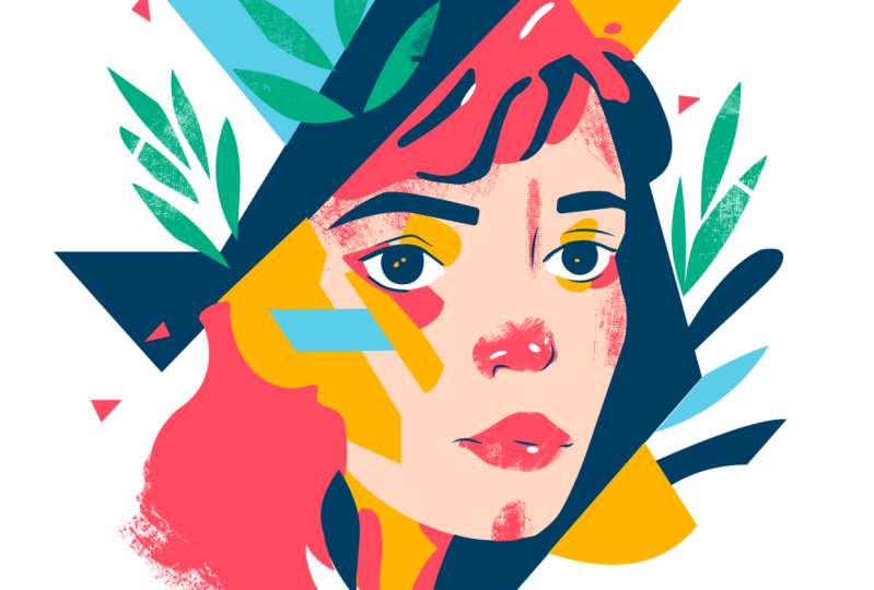
4. Portrait of a man - Main shapes for the head: For this abstract
portray illustration, I would like to keep things as loose and as artistic
as possible. So just to try to break out of the usual clean vector look that we would normally
get in a OB illustrator. So I have my sketch ready here, and I'm going to start
using the pencil tool, and I'm using a
styles, a pen tablet. But if you want,
of course, you can follow along with mouse as well. These are the settings I'm
using for the pencil tool. So I keep it more
accurate this time, and I keep these options on. So I can edit my paths
as I'm drawing them. And you can see that in this
file, when you're starting, there's already a couple of
custom brushes that I added, which we will be using
for this project. If you are interested on how
to create custom brushes, you can watch those videos in the getting started chapter. Now, let me start with one
of the main shapes that we will be using here and
that is going to be the head. But maybe let's
start with the neck. So I can just draw
the neck quickly. That can be shape on its own. Something like that. Here
at the bottom, if I want, I can stay closer to the edge just by
redrawing that section. Again, I can redraw
it one more time, and that is looking
good already. I'm going to start already applying the field colors
that I had in mind, and this is going to be the main skin tone that
I would like to use. Now let's draw the
next larger shape. This time, I'm just going to go somewhere here in the middle. Maybe we can go over
this way like that. And I know that I'm
going to have the beard, so I'm not going to
worry about those edges, but here, I want to
follow along this fairly closely and then
come up and then close it. Again, I'm using the
same field color. Then let's just draw
quickly the beard. For this, I'm going
to draw it like that. I will probably have
some sharp corners just to make the abstract
look a bit more prominent. And then come up
here, close it off. This one is going to
be this darker color, and then let's draw the
eyebrows and the mustache. Let's just start maybe
with the moustache. It can be two shapes just to have a bit of
gap in the middle. Like that. On side. Let's seem a little bit closer. Let's draw the other side. There it is. Okay. And
let's draw the eyebrows. It's a very fun and
simple technique. So you should be
able to follow along easily and also just have
fun in general with this. I just forgot to color that. Okay. Now, let's draw the hair. So the hair can be
probably one big shape. Just going to start
drawing out here. Still using the pencil go up around and down
and then up again. Now here, just going to move my canvas up a bit and
maybe redraw this section, draw it down a bit further out, something like that,
and then come up. And then draw these details. And down and then close it. Let's add the color. Yeah, that is looking good. Now let's add the ear. I'm just going to
draw this shape out like this starting here, go and then go out this
way and then go up here. And again, we will
use this color. And then maybe we can
just move the beard down. By having it selected, I'm going to use the eraser
tool that's shift E, and then just erase
back from it a bit, bringing it down a
bit more like that. I'm already going to add some detail here on the ear
just so we can see it better. I'm using again the pencil tool, and then let's just
add this color. Now we can draw some
details for the nose. I will actually draw the
highlights for the face. For this, I am going to
draw up a shape like this. Maybe we can come down here
and then near the nose. We want to define the
nose with the highlight. And then we can
actually just draw a single line here or
even down this way. Going behind the lips. And then and then around the nose again and
then close it off this way. Maybe I just redraw this
section here a bit. Okay. And this is going to be white, which we want to keep
behind everything, just simply on top of the face. I mean, the skin tones. So all the additional
details that we edit so far can
be on top of it. So that is going to
be our highlight. Now just to make
things easier to see. I am going to draw
the sunglasses. So for this, I am going
to use another color. Let's just use again,
the pencil tool. Draw this out this way. Over it, and then I'm going to assign this red color to it. Now we can try to use
a stroke this time. So if I increase the stroke thickness and also keep the
stroke inside this shape, I think it's going
to work quite well. Yeah, I can actually
use that here, and then I'm going to draw
another shape like this. Trying to follow
my sketch closely. And maybe we can just redraw this section here at the
bottom, drag it up a bit. I actually can go
down a bit further. Yeah, something like that. And the top section can
be evened out a bit more from here to there. Yes. Now, this detail
actually will need to go behind the white
outline of the nose. So I will probably just draw another shape on top of this
just to make things easier. So I will try to
draw that outline. Come down connecting
to this other shape. And go up, and I can just
use the same feel color, the cream color
that we have here. And let's add some other details connecting the sunglasses. Like that one and
another one here. And just for more
visual interest, I think I'm going to change
the color on these two. So this and this can be using
a different stroke color, maybe this bright cyan color, and these ones actually can
go behind the other ones, so I'm just going
to put them behind. This one can go behind there. Yeah, that is starting to
look more interesting. Now, I also want these
glasses to have a feel color. I'm going to use the dark purple that we used on the hair. That's our darkest color
in the composition. And the thickness
of these lines, I will probably reduce a bit, so I will go back, reduce
them down to 30 points. I think that's a
little bit better. They were just a little
bit too thick before. Now, for the nostrils, I am going to draw
again the shapes with the pencil tool as one here, and there's other one. That. I'm not sure what colors I'm
going to use in the end, but for now this works, and I'm going to
also draw the lips. I'm just going to draw it
from one single shape. Again, keeping things
more abstract, like that and just fill it in. At this point, I will
also start adding some additional shapes just to make things a little
bit more abstract again, like this one, and maybe
we can select the face, the outline of the face, and draw inside that. So using the draw inside mode, I'm going to draw another shape. Here. Let's just start up there. And we can start
introducing another color, which I want to use
prominently, this yellow fiel. And I just realize
that this white color, the main shape could
actually be placed into the same clipping mask
that I just created. So I'm going to
put it in there in the same clipping group just to make things a little
bit more tidy. And it actually can go
underneath the yellow one. Like that. Now continuing to
draw inside here. I'm going to use the
pencil tool again. Let's just draw another
shape coming up maybe this way and down and
then close it up. This can be red.
It's essentially like shading, what
I'm doing here. I will also do
some shading here. I actually want to use the
red on this side of the face. I feel like it would
look really nice. But for that, I am
going to change temporarily the nostrils to the darkest color that we have. So We don't want any stroke, just feel like that, and maybe redraw
this a little bit. Yeah, something like that.
5. Portrait of a man - Smaller details for the head: I'm going to draw a
shape here for shading the nose and also
behind the nose. I want to have a shading
going down this way and then go up around here
and then down again, or maybe here, at the end, we can just close
it off like that. Let's try to draw
this line a bit closer. Yeah,
something like this. So let's see how this
looks in red feel. Mm hmm. I'm just going to
erase back a little bit from this nose detail here. That's the one outside
of the clipping mask. I just want to fix that. And then this shape here is
inside the clipping mask. Yeah, it's starting
to look better. But now we have to separate
somehow the sun glasses. So what I'm going
to do here is to copy this shape that
we already created, Commando Control C, and then Commando Control
F to paste it in. And then I'm going to
use the scissors tool. And I will cut it
off here and there. And then this top section, we don't need only
this bottom one. And what I'm going
to do is to select this shape that we
created earlier. And I would like to be able to separate colors on this stroke. And we could use a
gradient on the stroke, but that would be more
of a soft transition. Instead, what I would like to do is to have maybe a yellow color running along the edge here and also different
colors running on the top. So essentially, I would like
to be able to draw things inside that stroke and use
it as a clipping mask. The way you can do
this is by going to the object menu and
expanding disappearance. That's going to turn the
strokes into shapes as well. So if we look at this
in the layer spanel, we will have a compound path for the stroke that was
originally the stroke. And then behind it, we have the field shape as well
as a separate path. So what I'm going to do here, first is to ungroup these
commando Control Shift G, That way, I can select
them individually. And once I have the
outline selected, which is now field shape, I'm going to go
into draw inside. And then here, I can just use the pencil tool and
paint over the section, which I want to change in color. So this part, I would like
to have it in yellow. And that's how simple it is to introduce
different colors. I will probably
have another shape, maybe draw over this
section here as well. Just trying to create
contrast and interest. There it is another
interesting detail. I can turn off the
draw inside mode and maybe just draw over the actual glasses
themselves as well, just to create something more
like a reflection type of effect using the same red color, and maybe some
more on this side. Red, and that may be another
red detail here, like that. Let's take a look at
this from a distance. This one, maybe we can
make a little bit wider, even stretch it away from
here, something like that. And this one can also maybe
go a little bit higher. Like that. I'm just going
to redraw this quickly, make it a bit
thicker, like this. And even this one here, I can make it maybe
following this outline here or at least
staying close to that. And even this one, I think I can make it slightly thicker. Redrawing it or just redrawing it completely
from scratch. This. Okay. So that's
getting more interesting. Now, let me do the same
thing here on the left side. I will again select that
shape, expand the appearance, and then we can ungroup it, commando Control Shift G, select the compound path, set the draw inside mode on. And then I'm going to use the pencil tool and
draw a shape quickly. Fill this in with yellow. We can also maybe add a
bit of yellow up here, just a tiny bit, and then
deselect the draw inside mode. And maybe just draw another
yellow shape around here. And this one, maybe
we can set back a bit to go just in front of the
darker details like that. Let's just add some
more yellow detail, maybe down here at the bottom. I can go maybe around here. So that's like the chin detail. Set it to yellow, send
it back to there. I'm going to select
the beard and just redraw a little bit
of detail here. I wanted this to be a bit
more sharp, this section. Then I'm going to draw
another shape here. We can also introduce
a new color, a color that I wanted to use. Can just have a bit
of detail of that. This steel color. I'm just using the arrange
keyboard shortcuts that these bring to front, send to back and bring
forward, send backward. So these are the keyboard
shortcuts I'm using. Of course, you can also do
this from the leer spanle, and drag objects up
and down if you want. I just like to work this way. It's a bit faster. So I'm going to draw
another shape here. That's part of the beard. Maybe we can also add
some more detail in this clipping mask that
we created earlier. So I just have to make sure
I click on the edge of it and then go down in
the layer spell and will select the clipping
mask itself and choose draw inside to be able to continue
drawing in there. So I will have another
red detail added here. Just like that. That looks good. While we have this detail
selected, so this is the face. I can also draw another shape, maybe a yellow one on this side. So let's just go down
the sharp angle. That's like the
cheek bone detail. I'm trying to emphasize here, and this I was meant
to place in here, so I'm just going to drop it in the right group,
that clipping group, can draw another teal
detail on this side. Just introduce more
of that color. Maybe you can add a little
bit of yellow around here, the side of the nose. I will also add an
earring detail. That can be maybe white. And then maybe
another line here. Still using the pencil tool, that can be this dark detail. And maybe we can still go
back to that clipping mask, select it and draw inside again, using the pencil tool. Maybe I can add a bit of the darkest detail
here, just a shading. A little bit of that there. And now let's just add also
some details on the hair. So for this, I'm going to
use this as my outline, set the draw inside mode on. And I'm just going to draw
some random shapes here, and we'll fill it
in with yellow. Something like that.
And that's yellow. Looks quite cool. I will turn off the draw
inside more now. I will also add some
details on the neck. So I will going to select
that and choose draw inside. Using the pencil tool again, I will just draw maybe a
bit of shading here with the darkest detail,
which is purple. Maybe we can add
a bit more here. And then we can also draw some of the red details
just coming up here. This is essentially
also shading. So I'm using these as shading. I will probably set
it behind the others, and then draw another shape. Considering this also
a shading detail. Set it behind the other one, can have maybe a bit of
the yellow as well here. You can see I'm very
loose with these shapes. So I'm not worried too
much about that outline. I want to keep things
very organic and simple. So this can go also behind
these other details. And then one more shape in
the same clipping mask. I'm just going to
draw it up here. And like that. Also, I
want this to be red. And then we can turn off
this draw inside mode and select the other main shape that we created,
also clipping mask. So select that and draw inside. And I'm just going to
add a little bit more of that red detail
running up this way. Again, it's the cheek bone that I would like to emphasize. Let's just try it again, maybe running down here, and then a sharp
angle down that way. Let's see how this looks. Yeah, I like this. One thing that I wanted
to change is for the year to be higher than the
detail that runs behind it. That just makes more
sense like that. Now let's just take
a quick look what we achieved so far
without the sketch, and also a turn off the draw
inside mode temporarily. So, yeah, it's looking good. You can still
recognize the face, but I want to keep
things very loose, and I think it's
working quite nicely, especially once we start
adding all the textures. But for now, I just want to get all the large
shapes in place. So we got this far having most of the details I
wanted to on the face. And now we can move
on to adding more of the background details
or the environment.
6. Portrait of a man - Background and floral details: So moving on, I will
probably select everything that we created so far and group them together. So this is going to
be called the head. And it's just going to make it easier to move things around. I will actually
lock this as well, and I will bring the sketch back just so
we can see what we need. And first of all,
I'm going to add the big square here
in the background. I will probably come all the way down somewhere around here. And this I actually
want it to be yellow. I am going to work on a
background layer now, so I just create a new
layer, call it background. And I might merge these
together later, but for now, just makes it easier
to have things created automatically behind
the other detail, the head that we
already created. Continuing to working
on this layer. I am going to also draw another shape using
the pencil tool. I would like to have
some white details still showing up here or this
cream color that we use. And that's just going to give a little bit more contrast
in certain areas. So something like that. And then it's time to draw
some of these floral details, which is more like a decoration, but it's going to
work quite nicely. We have that teal color
that we can use for this and then running
up here as well. Create another
detail, fill it in. And then we can draw maybe another just shape running around here to keep
the abstraction going. I'm going to use pink for this. We'll just move this
slightly over like that. And let's just add some more teal details here
on the left side. I will draw maybe one large
shape that runs down here, goes behind the ears, and then can come up here. Come up and close it off. Yeah, that looks quite nice. Let's just draw another
shape here just to break up this square that we
created in the background. Again, just another
abstract shape for this, I use this pink. Maybe I can use the eraser
tool just erase from the top. That's a good way of creating
sharp corners quickly. I like to have sharp
straight edges varied with the
organic curve details. So that just again, add some
more contrast and interest. Now, let's just draw maybe one more larger shape down here. Just going to keep
this very simple, just like a big blob
again using teal. And then let's just add some final floral elements
down here as well. I'm going to build this up from single shapes filled
with the dark color. I keep this very
abstract as well. Let's draw this here. And a good advice is not to get stuck on small details
at this stage. So until you see
things coming together nicely and the colors
working well together, there's no point of refining
any of the shapes too much. Of course, you can get
them closer to what you imagined by redrawing them
with the pencil tool. But I wouldn't recommend wasting too much time finessing
small details at this stage. For that, we will
have time later to come back and adjust things. But something like this here, I can see already that we have a little bit strange
ending on this shape. And also, I can just move this out a bit
separated from the other shapes. And maybe this one can come
higher slightly. Like that. This one can come closer and maybe use the
pencil tool a bit here. Refine it. Yeah, that
is looking quite nice. And I intentionally going beyond the edges of that square that we created in
the background. And I will even just
distort it a bit, so use the direct
selection tool. I don't want it
to be so perfect. So I select
individual points and just skew it a bit by moving
it in different directions. So again, that adds a bit more randomness
and wonkiness to it. Now we need another detail that should go in the other layers. I'm going to lock the
background layer, and we can just check
how this looks. So this is what we added there. It's coming together nicely. I will have the layer
with the head selected. And then I'm going to use
the pencil tool again, have the sketch turned on. And I'm going to
draw a big shape for the clothes like a jacket
that he's wearing. And I can draw this in front
of the existing shape. Come up here, go down and
then draw a line there. Now one thing you
can do is if you want to keep things
straight again, instead of relying
on the pencil tool, you can just use
the eraser tool. So here I wanted to
have a little bit of separation like that. But then at the bottom, I can
switch to the as shift E, and I hold down alt option key and cut off the bottom
edge like that. This base color, I'm
actually going to use the same yellow as
we used before, and I will redraw this
section here slightly. I want it to be closer to the
original sketch, like that. But while this
shape is selected, I'm going to use the
draw inside mode, and I will start adding
some shapes here. First, let me draw a large
shape running down here. And go around this whole area. This is going to be set to pink. Then maybe we can have a darker detail like that
shading that we already created running down here,
something like that. That's the darkest color. And then we can maybe also
have some red on top of this. Maybe even some red
here at the bottom. And then I'm going
to add some of the cream colors as well
for further interest, just go down here, go up L et's set this to cream. And I can see a little bit
of detail there showing up, so I'm just going
to adjust this. So that detail disappears. The same thing I can see here. So the outline of this path, I would drag up a bit that just refines the
edges a bit for us. Now, whenever you select shapes outside of
a clipping group, you have to always go back,
select the outline and then choose draw inside again to be able to continue
drawing there. So here, what I imagined
is to have a few more of these cream color
details running around. Something like that. I just
drew a big shape here. Similarly to the hair, I try to keep this abstract. Something like that. Okay, Let's see how this looks. And then on top of
this, I will just have a few more additional
details like this dark shadow detail. And maybe also have a bit of that teal color that
we used before, the brighter one, more like
the cyan or turquoise. And that looks colorful enough. Let's just turn off the drawing side more to be
able to better judge this. And also the sketch
I will turn off, and I call this one
jacket, this group. So we can just check
better what we've done. That's the jacket, and
that's the background. And of course, that's the head that we created,
which is right there. And the good news
is that we have all the main shapes in place. Now it's about adding the finesse and refinement
to make this look even more organic and make
it look more like traditional media or
at least mixed media.
7. Portrait of a man - Adding texture with Brush strokes: One of the first things that I like to do before I move any further is to simplify
shapes a bit. So I'm going to
select everything. I have all the details unlocked, and I'm going to use the
path simplify option. So we can check what happens. If we click on this option here, we can even see a
little bit more of the settings and more
of the information. Like, originally, we
have 1061 anchor points. By default with
the auto simplify, it reduces it down to 774. We want to go even lower. We can go maybe down almost
to half the amount, 590. And a cool thing
that you can do is to show the original path. So if I turn this on and off, we can compare how much
change is actually happening, and not much noticeable
change happens. But what we can
also do is click, click away, and to be able to actually see
what's changing. You want to also hide the edges, so go to the view menu. And choose hide edges. So when you do that, you
can zoom closer and go back and forth time
just using dodo do do, and we can see what happens. I definitely like
the updated version. Not much has changed for
this particular style. Accuracy is not that important, so can definitely save some space and make the illustrator file
faster at this stage, because what we are
going to introduce now is going to make it slower. So we will introduce a
lot of small details. And the main parts that we work with should be as
simple as possible. Now, one other thing that
I like to do at this stage is to zoom closer and really try to identify any
shapes that just doesn't work or has small
little errors in them. And one thing that I can spot here straightaway is this shape. Just remember to go back to
the view menu and choose show edges to be able to
see what you're selecting. So in this case, I have
that object selected, and I can just use maybe the
Blob Brush tool as Shift B, and just very quickly paint
over that part in the middle. And then maybe have this outline selected with the
direct selection tool. And I have a keyboard shortcut
for the simplify option. It's F five for me. I can maybe even go down
a bit more on this. And there's also
the smooth option. I can just smooth
out the edges a bit. That's also a keyboard shortcut. I'm using F four for that, but it's in the object,
my new path smooth. I use this almost on
all of my projects. So that looks much
better already. And now quickly,
let's just select this outline as well. The ear. I'm going to just paint over it quickly with
the blob brush, fill in that detail. And then we can just select this part here and simplify it, and then smooth it out
as well a little bit. That. Looks already much better. Same thing I'm going to do here. I'm going to use the
block brush tool and just refine the
top edge of it a bit, then simplify this and then
smooth it out as well. Like that. So it's still kept
as organic as the original, but just much more simplified. So here with this shape, what we can do
again is maybe even use the pencil to just
to draw over that edge. The other edge I actually
like the way it looks, and then just this
shape one more time, I'm going to run simplify on it. So yeah, that can make
it much more simpler. Okay. And then there's one
more little detail here. Just going to use
the eraser tool, chop that off, like that. And let's click away. And then maybe one more
little detail here that stands out to me the
outline of this shape. We have a little bit of
crooked detail here. We can just redraw this
with the pencil tool. And something like that
looks already much better. Okay, so now that we refined everything and we
simplified these details, it's now time to start
using the brushes. Now, if you don't have
the brushes panel open, just go to the window
menu and choose brushes. And I have a couple of
different brushes here. But first of all, I would
like to introduce maybe some textural detail
on the background. So what I will do is to use the brush tornel that's
B on the keyboard. And then let's try maybe
using this brush first. And I'm going to
set the color for this brighter teal or turquoise. And I'm just going to
draw a line down here. Let's just draw maybe
even a longer one. Now, whenever you use
these art brushes, you can increase their thickness by increasing the stroke size, something like that, and I'm just going to
change the color. That looks good. But I wanted this to be behind the jacket. So right there. And now I can use the
direct selection tool and just drag it out a bit more if I wanted to
come over this area here. This actually can go in the background now that
I'm thinking about it, so I can just drag it down
into the background layer. So that way it goes
behind the head as well. Then maybe we can also introduce one more of the same down here. Just drag it down. That
looks good as well. We can also draw something
up here, another detail. And this can actually go all
the way in the background. Maybe just in between
those shapes. So the white detail
is not covered by it. But this one I'm going to
set to a different color. Maybe we can use this pink
or this one or even the red. Let's just see which
one works better. I quite like that red.
We can of course still move these points around
so drag that down a bit. And maybe we can also reduce the thickness
if we wanted to. So if I go down to one point, it's going to be a bit thinner, and we can control it, maybe a bit better.
Something like that. Just drag it down here. Maybe curve it a bit more. I really like working with
textured brushes like these. They really add
some more interest in the illustration
very quickly. And we can actually use it
on smaller areas as well. Like even on the glasses. If you recall, we used a
clipping mask for them, so I can go back into that clipping mask.
And draw inside. And then we can just use
maybe a yellow brush. And this time I'm going to use one of these other brushes, and I just draw over it. Let's just select
that brush again, maybe this one, and
then use yellow on it. And then we can maybe reduce
the thickness on this to 0.5 points,
something like that. And then we can drag it out. We make sure it
goes all the way. So details like that
can look interesting. We can also turn off
the drawing mode now and maybe draw one
additional detail. Here, let's again,
assign another brush to this and set this in front
of the other shapes. And I'm going to use this, but with a smaller thickness,
something like that. Let's drag it out a bit more. Really looks like
a brush stroke. Maybe we can use this
pink color on it. Okay, and zoom out. And sometimes if you created a brush detail that you like, you can just use the
brush tool and draw a few more of that while
you have that selected. So this just saves you time. So for instance, here, I can quickly add a bit more detail. Maybe we can have some more of this detail running up here, just to add more
interest to the hair. And then I can switch my brush, maybe increase the width and just draw another larger detail here with red And
if we want this, it can even be added
inside like this. I think that looks good. It could even go beyond the edge slightly just to make
it more interesting. And I just noticed
that this detail, I think would work
better if it came down a bit more here, maybe even more. Don't want that pin
to show up here. So redrawing the
edge up to there and then come down. That's it.
8. Portrait of a man - Adding texture to the edges: Then just to maybe make the background also
more interesting. I'm just going to have
another shape at it, maybe down here with this detail or maybe even this other one and just set
it to white like that, and we can make this thicker and not that thick,
maybe five points. Might be still a little
bit too much, three. Yeah, it looks better, and we just want this to be going all the
way in the back, so we can just align it here, make it seem like that circle
that is created on the top, is continuing further down and creating this shape where
it's a bit more textured. Okay. Something like that. And now I just noticed that
this little detail here feels like almost a continuation of that line in the background, and I don't want this to
be confused with the head, so I'm going to just drag this
one down and separate it. So that would have been a
tangent that I created there, which I wanted to fix. Then finally, another thing that you can do to
make things more interesting is to introduce brushes on the edges of objects. For instance, here
in the background, we have this big yellow square, and this is the brush
which I set up as a pattern brush that we
can use for this purpose. So if I click on this, it's going to be assigned
to the edge of the shape, but I'm going to use the same
color as the field color, so it's yellow on yellow. And I can just show you
from the appearance panel, there's the pattern
brush applied. I can turn it off,
turn it back on. And the way it's set
up is that depending on the weight that you
use on the stroke, it's going to extend further outside of the original shape, or if you reduce the weight, it's going to stay
closer, of course. Now, whenever you use
pattern brushes on strokes, one thing that you can do
is to change the alignment, so it will always
be set to center. That's just a limitation
you have to keep in mind. I actually prefer
the texture quality of this when it's
set to one point. I think that's when
it looks best. So even from a distance,
we can see it. But sometimes if you draw a shape that you want
it in a specific place, like if we look at our sketch, we wanted that shape to
be a little bit smaller. In these cases, what you
can do is to just go to the object menu and
choose path, offset path. And then you can say maybe
minus ten or minus five. And that way you can
make the shape smaller. But whenever you
use offset path, you have to remember
that there is always a duplicate created when
you use this feature, so you have to delete the
larger shape to be able to actually see what you
done with that effect. So there's our new shape, which is smaller in size. But together with the stroke
and the pattern brush on it, it's actually
filling up the shape that we wanted originally. I can turn off the sketch now just so it doesn't
get in the way. I will apply the same technique
on a few other shapes. Like this outline, I definitely think would benefit
from this effect. I just quickly select
the same stroke color, and then from the
drop down here, we can just apply the brush, and that is looking good. However, there's a little
bit of break here. Just see all around the other
details are looking fine. Here. I'm not 100% sure
why this is happening. Maybe if we add a little bit of roundness that's
going to fix it. Yeah, using the corner git. Sometimes if you have
strange outlines, it might not work as well. And we can actually
introduce this on these floral details as well. Since they are the same color, we could even group these together and even
that shape there, even using compound path. So command or Control eight. That becomes a single shape. The only thing you have
to pay attention to is if the objects
are overlapping, there will be an issue there. So maybe instead
of compound path, I'm just going to
group these together. That's command or Control G. And then while the
group is selected, I'm going to assign the
same color on the stroke. As what we have here already. And if you see these
strange shapes appearing around the corners, that is because you most likely need to simplify the parts or maybe just use the corner widgets on them and just round them down a bit. So this can happen when there's very sharp details created. Most of them disappeared, but there's still some issues. So I'm just going to use the simplify option
from the path menu Um, or maybe smooth. Let's try smoothing them down, going to increase this
value, and there you go. It's fixed it already. So we can just click
away and it's done. Now, let's just add
the same effect maybe on the beard and the hair. Those are two larger
details as well. So I'm just going to select
the outline of the hair. And the beard, maybe
also the moustache. And then we can add the same stroke color as
the field color and then apply the brush on them and
just reduce the size to 0.5, or maybe even to 025, so it stays closer. And we can see that
it's been applied well on the moustache and the beard. Maybe there is a little of
artifact going on here, just going to smooth
out this shape a bit. Hey beats the other one. Yeah. That's better. I want to have a bit of
separation between the two, so I just move them
apart. Like this. And for the hair, it seemed like it
didn't apply it. So let me try this again. And I can see why
it is not showing up because it is actually
a clipping path. So if you want to use this
effect on a clipping path, what you actually need to do is to duplicate the path itself. So in this case, I'm going
to use the clipping path. Alter option, click
and drag it out, and then immediately
starting to show up, it's best to put it
underneath the other object. And then we can decide on
the thickness of the effect. But this time, I actually
like the way it looks, and it even creates a
little bit of gap there. Now, once again, if this is something that
you want to avoid, you can, of course,
use offset path. So we can go into
path, offset path, and we can decide
how far we want to go in, maybe minus four. We'll be enough this
time. Let's click Okay. And then we just
delete the duplicate. And this is actually turned
out to be too small, so we can increase the
thickness of the stroke. And now we have that nice
effect around the edges. So that is looking quite nice. I like the way it turned out. And it's completely up to you whether you want
to apply this to all of the shapes or just keep some shapes
the way they are, having more of the
crisp clean edge. And then there is a
good contrast between the clean shapes and
the more organic shape. I'm going to do maybe
as a final step is to just draw a few more
shapes inside the lips. So I'm going to
set a draw inside on that and using
the brush tool, I will maybe use this
shape or this brush here and maybe use
yellow on it like that, or maybe we can
use pink as well. Just draw over it again and almost like building up
a little bit of a fact here. Going to use maybe
the steel as well. That's also quite a
cool little technique. You can combine
multiple colors with the same brush or even different
brushes, if you want to. And that way you can build up a bit more detail and the
fact on a certain area. Okay, so I hope you
like this technique. If you want to see
another composition created in this style, I have another portrait, which you can follow along. And in that one, since I already showed you the
whole process here, I'm working a little bit faster but using the same techniques.
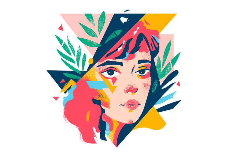
9. Portrait of a woman - Main shapes: First of all, I'm going to draw the outline or the
silhouette of the face. For this, I'm using
the pencil tool and with the settings to
have it editable, so it keeps it a single line. If you don't have
the setup already, just double click on the
pencil tool in the toolbar and choose keep selected and
edit selected parts options. And as you can see, I'm just
drawing over the details. I will just rotate
my view a bit, and then drawing this way
because I'm using a stylus. It's just easier to do
it in certain angles. And here, it doesn't
really matter how I finish off the path because that section
won't be visible. And I'm happy with
the way this looks, so I'm going to continue drawing a new path now for the eyebrows. I just draw the silhouette
again with the pencil tool, and I try to keep things
nice and organic. Here is the other eyebrow. Ream a bit closer, draw over it. And I just go beyond the
edges because of course, we can cut these off with
the shape builder tool. So if I select all the
parts so far I created, I can hold down the old key
and subtract those shapes. Now I can just select
the two eyebrows and press shift X to switch the
stroke and feel colors. And then I'm using a bit of the simplify option to have less anchor points on
the shapes that I created. There's a few lines I'm going to add around the
lips and the nose. I'm not going to draw
all the lines that I created in my sketch,
certain parts of it. And then I will
use shading later to define these forms more. So I don't want everything
to have outlines around it. I'm drawing a few more
lines around the eyes. Again, trying to create
completely filled shapes. Just trying to emphasize the most important
details with my lines. Like this one can
be a bit thicker. I drew an outline for it, and I'm going to
adjust it later on. Let's just draw another
shape here for the eyelid, the upper eyelid, and I feel like that is looking
quite good already. Now it's time to draw the neck. Once more, I just extend
beyond the lines that I need, and then I will be able to
cut off what's not necessary. But we can come
back to that later. Now, here I'm using
the pencol to draw these lines for
the shape outside. Then switching back
to the pencil, again, I'm using additional lines
for the hair a bit better. And then just adding a few more lines for the
shapes in the background. There's another shape there, which I am going to turn
into a field shape later on. But for now, I'm just trying to get these larger
shapes in first. And I'm doing pretty much everything with the
pencil tool here. I like to work with
the pencil tool when I want to keep
things more organic. And then, as you can see,
sometimes I switch to the pen tool to draw
some additional details, like these sharp straight lines. It's definitely easier
to do with the pen tool. There is another bigger
shape there on the top, which I want to lay down, and now that's also in place. We can probably also add
this other line here, another diagonal
line that runs down, which will be important, so we can actually
connect this into this other shape
that we have. Okay. So I feel like that's already starting
to give us the structure. Maybe here on the right side, we need this other
shape as well, which we can actually combine with this more organic detail. And I'm switching back and forth between the pencil
and the pen tool, depending on which one
is easier to work with. And I can also refine
some of these details, just to match my
sketch a bit better. And I don't want to have too
much messy anchor points. So sometimes I like to
have them tied it up. I just use the eraser
tool there and connected the two anchor points. So that's also connected. This time, I'm going to use the blob brush tool because I need to create a field shape, and I feel like this
works better this way. So I'm just going to paint in
these details for the hair. This is more like
a shading detail, but I feel like it's good
to establish this in the beginning and draw
over this section here. Now select these two
and simplify them with the path object path
simplify option. Then with the eraser tool, I just delete some parts of it. Like that, make some parts of it more sharp because
that's one thing about the blob brush tool that you end up
having everything very soft and rounded
if you use it. And then it's always good
to add some angles on it, just to have a bit more
contrast for the shape. And now we're just going to
do the same thing here again. Another detail. I'm again,
the blob brush tool. Then I will smooth
it and simplify it. And then using the eraser tool, I can add some
angles back on it. That looks better. Now
we can draw the details. We have the iris, and then
we have the other detail. Again, I'm using
the eraser tool to cut off the parts
that I don't need. I don't need to be very
accurate here because we can always adjust these
at a later point. And then I'm just
going to select these lines that I
created earlier, and I want to adjust
their settings a bit. So I'm going to set them
to this non uniform shape, also increase the
stroke size on them, so they are more noticeable. So I'm using the shape builder to cut off any lines
that we won't need. And I'm also merging some
of these shapes together, which will make it easier
later to colorize them. Like this one here, I want
to have as a single shape. That's why I use the
shape builder to connect them to each other. Moving on. We will also use the
shape builder tool to remove some of these
details that we don't need, like these lines right
here at the bottom. I'm just going to use
older option key, quickly subtract the
ones that I don't need. These overshoot details, I
can just remove one by one. And now it's time to merge some of these details together. I just paint over the shapes. I'm just painting
over this part here. I'm connecting these two shapes, and then filling
in that section. And this is going to
be a single shape, so it can always be refined later with the eraser
tool on the top, and I feel like it
looks quite good already and then join it together with the
other big shape. Using the shape builder tool. We can use also a bit of
simplify or smooth on it, and now it's time to move on and work a little
bit on the face. So I apply the skin
color and then also start adding some of the colors for
these other shapes. So I'm introducing
the additional colors I prepared in my swatches panel. Another bigger shape,
which I'm going to fill in with the color
I wanted to use. Now, for this other shape, I'm going to use the blue color that we have in our switches. We can decide this later, but for now, I'm just
going to keep it blue. And then we have a shape here that we don't actually
need. I can remove that. We will have to add
a few more lines to define details like the eyes. So for this, I'm going
to use white color, which we don't have actually in the switches panel,
so I just created it. And I'm going to use
the pen tool to draw over the area where I want the eye to be,
the white of the eye. I'm going to use the
white fill for it. Here's the penol.
I'm drawing over it, and going down,
following the shape. And then again, fill
it in with white and make sure it ends
up in the right place. So underneath those
darker details, we can check without the sketch, and we are getting there slowly. So let's keep moving. I am going to add the
reflection on the eyes. So there's a bit
of a yellow here, and a bit of a yellow
on the other side. We will refine these later.
10. Portrait of a woman - Smaller shapes: And then I also want to have some yellow details
just below the eyes. Consider this
similar to shading. Just try to keep it
a bit more abstract. It's not necessarily makeup. It's more like just
decorative details. But the way I'm drawing these
shapes is that I'm trying to define the form or
structure of the face. So I'm adding it in the areas where I
know that there would be darker shaded details. But instead of using
the skin tone, I like to use these
additional colors that we introduced in
our color palette. Now let's draw the lips as well. It's time to have
the lips in place. I'm using the blob
brush again for this and I filled it in. And I'm just using
the eraser tool to refine the edges a bit more. Now, moving on, we can start drawing the additional
shapes that we need. In this case, I'm going to
use again the pencil tool, draw the leaf that we
have here on the top, and make sure it's connected
and then fill it in. I'm going to erase from
it a bit and maybe use simplify or smooth to
make it more organic. And then we can also
use the pen tool. Sometimes it might be faster to use that for these
type of shapes, so we can have nice
straight corner points while still having these
nicely curved details. And again, I can just
move this behind the other shape or even
delete it, if I want to. With the shape builder tool. And now we can just add
another shape in here, maybe just to follow the sketch. Some shapes in front, some shapes behind always helps to add some
depth and interest. Yeah, we have these organic
details on the right side. Now I'm using the pen tool to define the hair line
here on the top. This is actually going
to be a larger shape, so I'm going to draw over
all of these details here and then follow along this outline that
we have in the sketch. Like this. And then let's
just fill this in with a color and place it underneath the other details that we already had there. And then moving on,
I switch back to the blob brush tool
and just paint over a bit of this area here. I want to use the
same color that I will be using for
the hair color. So this is the base
color of the hair. And just using the eraser tool again and the smooth feature, I create the shape that I need. And just cpting really with the combination
of these tools, the shape that I
want to end up with. I keep judging what shape
works pass as I move along. So I don't always strictly
follow the sketch. And then now we just need
to use the pen tool again. Draw over the hair details. And then after filling them in with the colors I wanted to use, I just extend one of these shapes with
the blob brush tool. I just want to make it
a bit more filled in. Again, some shapes
here for the neck. I'm using the blow
brush tool once again, and then with the shape builder, I cut off any excess
details that I don't need. The shape definitely
needs some tidying up. I'm using the smooth
feature on it first, then the shape builder to delete the parts
that I don't need. And now we can just refine a bit the bottom of the hair as
well with the eraser tool. I just cut back a bit from it. And then we can just add a little bit more details
with the block brush tool. Just going to make
sure that this needs to stay behind
the other detail. And once we're done with it, I make sure it's
set to the back. And I'm just using the ser tool here on the bottom as well. And yeah, the hair detail
is coming together nicely. Now let's draw another shape here and I'm going to fill this in and
place in the background. I felt like this would help
to keep things together. Felt like it helps a little bit the balance
of the illustration. And I actually created a
new color swatch for this, and I will use it also
on the left side. Now moving on. I'm going to
use the blob brush tool and just fill in some
details around the nose. And this is going to be later refined with the shading
technique using a special brush. I'm just preparing
the shape for it. So I really just concentrating on the outline
of this shape for now. After I use the block brush, I always like to smooth out the shape and
simplify it as well. Now here's a couple
of additional shapes we will need around the eyes. I want to define the eyelids
a bit better as well. For this, I'm using the pantol, and I'm just trying to
fit this shape under the eyebrow and also go a
little bit below the eyeball. So it's the upper eyelid
and the lower eyelid. That I would like to
define with this shape. Make sure it is set in the right location underneath the additional details
we already have. And I'm doing the same thing
here on the right side, but with the blob
brush tool this time, I simplify this shape a bit, and then with the eraser, I just cut off the section
that I don't need. Something like
that. It's starting to look closer to
what I had in mind. Just extend that shape a
bit more to the right. And I feel like This shape
can go underneath the yellow, so the yellow can be on top or move the yellow
also behind the bit, covering up less details. And then just adjusting
these shapes a bit more with the pencil tool, just refining the outline. Also, this shape should
be coming a bit lower. So again, moving it down
with the pencil tool, adjusting that path, and starting to come
together around the eyes. There's still more details
that we need to introduce. I'm just going to emphasize
this line a bit more, add a bit more red detail on it. Extend it like this. And we can also introduce some floating details
around the composition. I will add more of
these later on. Now it's time to do the ear. I'm just using the pen tool and trying to define the
line that I will need for the ear and just using the width tool as well to increase the
thickness on one side. Then let's just add a few more geometric shapes
here on the face, just for additional interest and abstraction or stylization. I will again use
this yellow color that we had before
Here's another shape. I'm going to add, here,
I'm going to introduce the blue that we have
already in the background. These are just more
high light colors. Here's another shape. I'm going to add. This one
will be a little bit bigger. I will again go over
the cheekbone area. So this defines the
cheekbone quite well, but instead again of using color that's
similar to the skin tone, I'm utilizing these
vibrant colors, highlight colors that we already started using
in the composition. This helps to stylize
the composition, make it more intriguing. I'm just adding a few triangles, floating triangles
in the background. Since we have these
triangular sharp shapes already in the composition, I feel like again, it's good to repeat
these in a subtle way, have some of them floating
around in the background. And this is looking closer
to what I had in mind. Maybe I'm going to add
another shape here. Again, have another
blue color just to have a bit more interesting detail there and feel like that
looks good already. Now it's time to create
a shape for the neck. Just going to make sure
it's a closed shape, and then we can fill
it in with yellow, and then we can just
keep this there for. I'm going to add some
shading on this later. Maybe we can already
start doing this. I'm just going to use the draw inside and add a bit
more red colors here. I'm trying to keep these
inside, the original shape, simplify it a bit, y, that looks already
more interesting.
11. Portrait of a woman - Details and textures: Now, that's add
another shape up here. Again, it's just one of those
small floating details. Maybe this can be white. I might refine this
later with more details. And then I will add
some highlights on the nose as well
with the white color. Maybe on the lips as well. These are more like reflections, but in a very abstract
and simplified way, a few more on the hair as well. Just like this. I
can simplify it, and then we can move
on and just work a bit more on some additional small details around the nose. This is like a shadow
under the nose again, instead of using the skin tone, I'm going to use
the yellow color, maybe add another shape here
below the lips as well. Just very subtle hints of
shading in an abstract way. Let's not forget
these leaves that we wanted to add here on the left side according
to the sketch. I'm going to draw a few of these shapes quickly
with the pen tool. We have a few of these
plays down here. And then Just keep
drawing them one by one, and then we can decide
in terms of arrangement, whether we want them
above everything, or we want them to be
blended in a bit more. Like with the shape builder, we can cut some sections off. So some details comes in
front, some goes behind. I'm trying to create this interesting interaction
between these elements, which establishes
depth and connects all the elements
together visually. So here again, another detail. And let's just draw
these as well quickly. One of the leaf again
with the pen tool, and then we have another one. Don't have to follow
the sketch perfectly. I can always be a bit of
creative freedom here. Can draw over it. Roughly following
the original shapes. Just a few more,
here's another one. And then we just need one more in between these
other two leaves. Repositioning this a bit. And then one last one here. This is actually
the only shape now that was missing from the
sketch, the original sketch. Now everything
should be in place. So we can check it
without the sketch, and this is coming
together really nicely. These leaves on the left
side were really needed. I'm just going to cut
into some of them to make them a bit more interesting
using the razor tool. I select them and then
cut a few details in. But yeah, you can see how
those green leaves on the left side really helped
to bring everything together. It fills in that emptiness
that we had on the left side. It establishes more
balance as well. And now it's time to add
some shading details. I'm going to use
the art brushes, these custom brushes that I used already in other projects. These are already ready in
the document if you start out or you can bring them in from the brushes template
that we have. And I define the shape within which I want
to see the texture. And I can also move these around until I'm
happy with the result. I was using the draw
inside technique, which is the shift the shortcut, if you press that twice,
you can access it. Here, I already have the lips, but I'm going to
remove the fill color, and instead, I
again use the draw inside technique
using these brushes. I just paint over it. And I want to keep it
loose on one edge, while the other side, the top part of the lips
is a bit more defined. Now I'm going to select
the face, and again, use a draw inside technique and use the same brush to create another shading detail around the cheek bone on
the right side. And then once you have
brush stroke that you like, you can of course, use
the selection tool, move it around and refine it. I'm going to just add a
few more here on the top, shading on the forehead. It's almost like the hair is bleeding into the skin details. Now we can move on and do the same thing on
the neck, as well. I would like to have some white
details bleeding in here. So it's almost as if the
illustration is fading out. So the background white color is bleeding into these shapes. Now I'm using the magic one
to select all the leaves. So by clicking on them, it selects all the objects
with the same color. It's a very quick
and easy technique. I would like these to also
bleed into the background. So I have them all selected, and I'm going to group them together with Command
or Control G. And once they are a group
within the opacity options, I add a opacity mask. And by turning off
the clip option and selecting the opacity mask, we will be able to paint inside the transparency
of this group. So if I now use the same brush that we used
before these art brushes, but with a black color, which I'm just adding to
the switches, with this, I will be able to hide
details from this group. So I can just start painting, and you can see it's
almost as if I'm erasing from the leaves. This is a very, very
useful technique. I use it often when I try
to integrate some elements, and again, add some more
interest into composition. Make it feel a bit more organic, have some texture in it, and don't forget to get out of the opacity mask
when you are ready. And now moving on, I'm going to do the same thing
here on the nose, what we've done with the lips. I'm just going to
extend this shape a bit dragging up
the anchor points. And then I'm going to
hide the feel colors, use the draw inside technique, and use the same
brush that we had before to define this
with this texture. Shading, but again, the bottom edge of the nose
is filling completely, and the top it's just
fading into the skin tones. Now, the highlights on the nose, I'm going to quickly recreate with more of an artistic brush, instead of using the original very solid shape
that I had there. This again, just adds a little
bit more textural detail. And like I was planning before, I also refine the
highlights on the eyes. Using the eraser tool, I just cut into those shapes. And then I'm just using
the same brush and add some additional refinements and details along the edges
of some of these shapes. So I keep the shapes there, but just drawing around them, just to make them a little
bit more interesting. And I'm going to also add
some additional details, more of this texture
brush around the edge of the hair
in a couple of places. So I'm going to change
the color of this to the same color as the hair and
align it around the edges. I can use the anchor points
to refine the angle of it. And this looks quite good. Let's just use this again
in another position. And align it. Again, that creates
a nice edge detail. We can also use some brush
details on this darker detail. So the shaded part of the hair. Again, we can align
it around the edges. And just one more shape that I'm going to add
here around the eye, just to extend that red
detail using the pen tool. I just set it up,
make sure it goes in the right place behind the dark details and in
front of the yellow part. And then there's only a few additional refinements
I added after this, so we can see before and
after before and after, that just brought things
together even more.
12. Conclusion: Well done for
finishing this course. I hope you had just as much fun going through it as
I had recording it. And of course, don't forget
about the class project. Because remember,
practice makes perfect. I can't wait to see your work, so make sure to submit it. And in case you
like this course, and you would like to
learn more from me, then there's plenty of other courses that
you can find here. Go ahead check them out now. I can't wait to meet
you in the next one.
 Martin Perhiniak, Graphic Designer, Illustrator & Educator