Transcripts
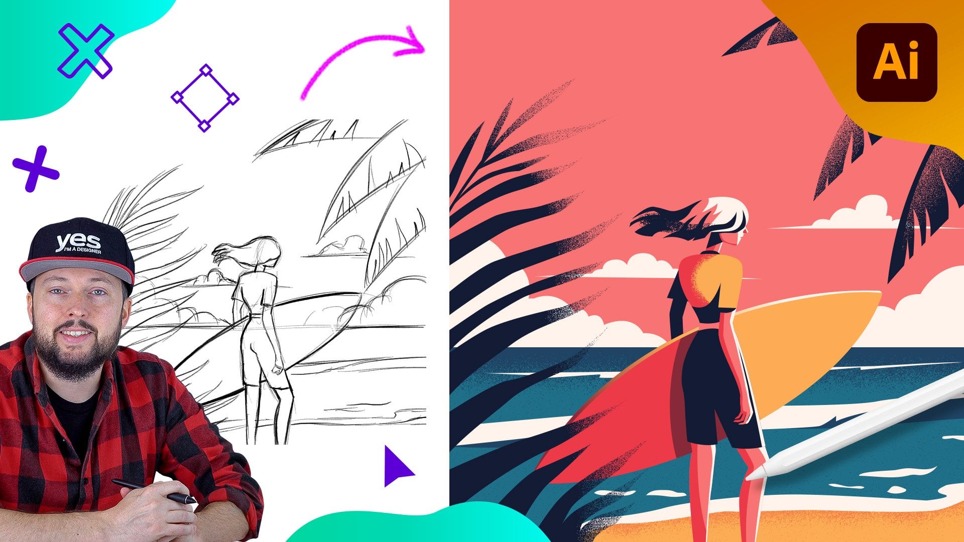
1. Introduction Skater Girl: Do you want to get
good at creating awesome vector illustrations
using Adobe Illustrator? Well, you came to
the right place. For this project, I wanted to
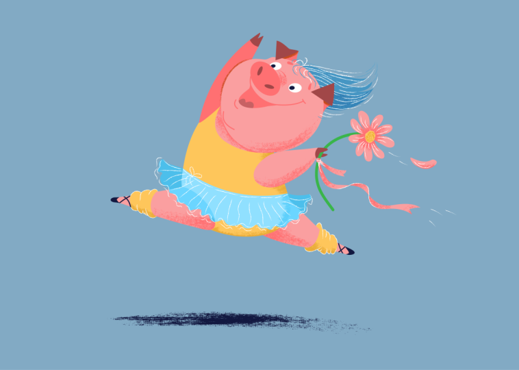
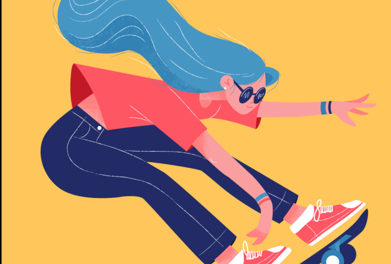
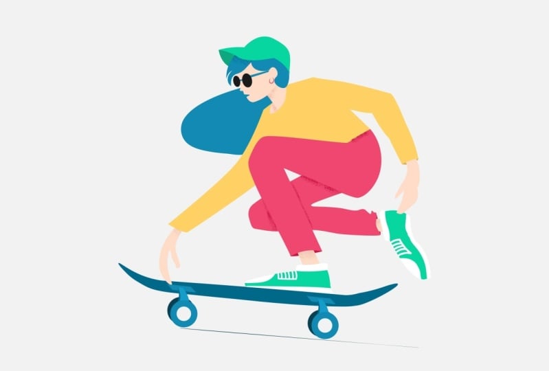
create an illustration that focuses on an exaggerated and dynamic pose of a character. I decided to go for a skateboarding scene and
feature a girl with long hair, which always helps
to describe motion, speed of movement, and gravity. We will use a minimal
shading at the end of this workflow using
a texture brush. Whether you are an
aspiring illustrator, digital artist, graphic designer,
photographer, marketer, or simply someone with a passion
for visual storytelling, Mastering Illustrator
provides you with the tools to turn your ideas into
stunning vector art. I will be guiding you
through every step of the process from the initial
sketch to the final touches, giving you a comprehensive
understanding of Adobe Illustrator's incredible
tools and features. This course is perfect for you if you are new
to illustrator, or if you are self
taught and aiming to get more confident and
effective using it. I am Martin Parma, a certified LOB professional and instructor with a
design background spanning over two decades. Throughout my career,
I've collaborated with renowned clients
such as Disney, Mattel, Cartoon Network,
Nickelodeon, and BBC. Leveraging this
extensive experience, I have carefully crafted
this course to help you navigate AOB Imustrator like
a seasoned professional. I am not just
teaching Imustrator. I am empowering you
to express yourself. Tell your story and create illustrations that resonate
with your unique style. This is your chance to
create work that is truly personal and worthy of your professional
creative portfolio. You can follow along and
replicate my illustrations, or you can use the work
flows and techniques I show you and create something completely
different and unique. There are at least two
additional compositions you can choose besides the one I
am using in my examples. Roll now and let the fun begin. Your creative adventure with
Illustrator starts here.
2. Outline for the hair and T-shirt: I like to concentrate
on the larger shapes in the beginning when I start
adding my vector shapes. So in this case, I'm going
to start with the hair. And there's many different ways of drawing shapes
in Illustrator. But this time I'm going
to show you a technique that in some cases,
I like to use. So instead of using the
pen tool or the pencil, this time I'm going to
use the blob brush tool. I'm just going to start
drawing around the edge, trying to follow this
shape, and most likely, I won't be able to
do it in one go because I actually like to
draw from left to right, especially when I'm
using a stylus. So that's just more comfortable
for someone right handed. So I'm going to draw
the other line here. I'm trying to follow it
as closely as I can. And if I make a mistake
like there at the bottom, I can correct it later. Now since I'm using
the blob brush, I'm not going to worry about drawing over this
small section here, I can always add that later. The main advantage of using the blob brush is that even though I did two separate lines, they are automatically connected because I didn't
change the color, so it's just blended them
together into one single shape. And here is a useful technique. If you want this to turn
into a field shape, so just fill the
center part of this. Use the direct selection tool, select one of the
inner anchor points, and then press back space once
and twice or delete twice. That way, you remove
the line in the center, and then it just turns
it into a field shape. So that's quite useful. Now, to fix the issues
that we have here, there's a couple of
things we can do. First of all, we can find
the anchor points we want to move around and
start editing things. But before we do that,
first thing I like to always do is to
simplify the shape. So that is from the object menu, you go to path and simplify. I have a keyboard
shortcut for this. I will be using that
throughout this project. I am just going to check
what was before and after. Yeah, I can see that the
path didn't change too much. I'm just using undo redo. And it actually looks fine. Of course, I could
go even further if I wanted to adjusting this, I could go even
less anchor points. But I'm going to stick with
the automatic settings here. So that looks good. Now what I would like to do
is to move this detail a little bit closer to the original outline that
I had in the sketch. And when I check this with
my direct selection tool, there's actually no
anchor point here. If I use the pen tool and
I added a new point here, I could then use the
direct selection tool and just drag it up like that. That's probably the easiest fix. And that actually
looks quite good. However, there is a point
here where I can see it's not a smooth transition from this curve
segment to the other. So there is a break here. And the way to fix this is to have that
anchor point selected, and click on this
icon here on the top. So to convert this
into a smooth point. So that's already better. But if I wanted to, I could always adjust these
handles a little bit further. And I'm happy with the way this looks at least for now,
it's going to work. I can select this
other point here as well at the bottom and also
do the same technique. So turn that into
a smooth point. Already looks neater. And then we can just
check the other ones. I think the rest looks good. Again, maybe turn that
into a smooth point. And if you'd want
to do this faster, what you can also do is to
have the whole shape selected again and use the
smooth feature as well. So that's again from the
object menu path smooth. And then once again, we can increase this a bit. And without changing
the path itself, I think we got a better result. So let's see before and after, it introduced a couple
of additional points. But normally what happens is that it just moves the anchor points around to place
them in a better position. So now if I select
these anchor points, most of them will
be smooth points. So yeah, we don't have to go around fixing them one by one. So yeah, smooth and simplify are two extremely
useful features. And I just noticed that this point here came
down a bit again. So I'm just going to
fix that one more time, and the shape is looking
really good all around. Apart from this section
here, of course, on the top. To fix this. Again, there's lots of different
ways of doing it. We can just select this
last anchor point, and I'm going to do the opposite
of the smooth technique. Now we are going to convert the selected anchor
point to a corner. So if I click on that, we get now a corner, and I can drag this all the
way up where I need it. And then I can just adjust
these smooth points around it. I might even need to
move this a little bit higher just to get
a better corner. Here, where I can
align it, like so. And then again here, we can do the same thing. We have a nice curve, and then just use the pen tool. I'm going to add another
anchor point here, and I can drag that out. Now, this is automatically
a smooth point, so I can again adjust
it, drag it up. And then I feel like we are
getting the right shape now. We just need one more
handle on this side. And the easiest way to do
it is to use the panel, hold down alter option key, and click and drag
the handle out. So we can create this handle, and we can also drag
this one up a bit.'s it. And then to get rid
of this other handle, we can just drag it down and align it in the direction
that we need it. So here we split the handles and just adjust
this a little bit further. And now we get a
very nice result. I think this one is the only point here that we
need to fix a little bit. This is actually
not a smooth point, so I'm just going
to make sure it is. I clicked on the smooth feature. And it looks much better. Now, one other thing that you
can do is instead of using the smooth feature on an individual anchor point
or on the whole object, you can just select a section. In this case, I selected
these few anchor points here, and then go through the menus
again and choose smooth. And as I increase that, I can see if I am getting
a better result or not. And this is actually doing a really good job
refining my curve. So if I click away, now, I can see before and
after before and after, it's much more balanced,
and of course, these anchor points
will be smooth points. So they look great, and let's just zoom back
to see the whole shape. Yeah, I am happy with
the way this looks. Maybe this section here needs to be dragged in a little
bit, just like that. And I feel like we got a very
good alignment all around. We can also check this
without the sketch being on. And yeah, I like how this looks. Maybe here, we can just tweak it a little bit more
around this side here. Feel like that could be fixed, just ever so slightly
round there on that side. Of course, you don't
always have to stick to exactly how you
drew the sketch. You can make changes
to it if you feel like the flow of the
shape looks better with those small alignments
that you're doing. But yeah, so this is
looking great already. Now it's time to move on
and draw the other shapes. Now, when it comes to
more angular shapes that are less curvy, for these, I still prefer
to use the pentol. With the pano, you
can be very precise, and that's what I'm
going to do here. So I'm going to draw
the T shirt now. And for the T shirt, I'm going to start
here on the top. And I will draw over it. And I'm overlapping the shape, and I'm actually going to go all the way to this point here. And then I am going
to come down, click and drag to create that
little curve segment there. And while I'm drawing, I'm
going to change the color. This will be this pink color. So I'm just changing
the field color for that. And then because I
created a curve here, I'm going to just
click on this last anchor point to remove that. And then I am going
to continue drawing. In this case, I will just draw maybe I think I'm going to make this
a straight line here, or if we wanted to, we can click and drag to
have another curve, and then another
straight line is coming. I am going to draw this straight line all
the way down here. Trying to make this shape
as simple as possible. I want to contrast also
the shape on the top, which is very curvy with
this more angular shape. And then I'm going to
click and drag and create this next
curve right there. Okay. So that is looking good. And I feel like we have just one additional
shape for this to work. And that's, of course
this part here. So I'm just going to
draw that quickly. And even though I don't have to, it's still a good practice
to close every object, so I'm going to close
this shape as well.
3. Additional details for the upper body: Now, we will have to
draw the details that we see in the inside
of this T shirt. So here as well, I think I probably would
prefer to make this into a slightly curved detail. So for this, I'm
using the pantol, just click somewhere here in the middle and start
dragging it up. And then we can turn this
into a smooth point. Just click on the
icon on the top, and then let's drag it up. Now, Another technique
for doing this would be, if I go back and just remove
this point that I added to use the curvature tool
instead of the pen tool, because the curvature
tool by default, is going to create
a smooth point. So now that I add that, if I start moving this around, as you can see, it automatically
is a smooth point. So you don't have to
worry about the handles. Just going to set it up
somewhere around there. I would like to have the same
detail as I see it here, even though I didn't
have that on my sketch, I feel like that's going to help to make it a bit
more interesting. I feel like this shape could
be adjusted a bit later, but for now, I'm happy with it. So I'm going to draw
another shape here. Again, I'm going
to actually align this shape with the original
detail that I have, so I'm going to click on that anchor point
with the pantol. Create a new shape, and I'm going to click
and drag to align it. And this original point will
have to also be curved. So I will get back to
that once we reach it. First, I'm just going
to change the color just so we can see it's
a different detail. And I'm going to click
and click and drag. Actually, on this side,
doesn't really matter. But we definitely need another handle that's going
to define this curve here. So I'm using the pen
tool and I hold down older option key and
drag this handle out. And adjust it until I get just the right angle
on the left side. I feel like that
is looking good. Yeah. Now, this
shape, of course, can go behind the other detail, so I can use the command left square bracket
key on the keyboard, which will move it down
in the layer spanel. So I'm just showing
you this technique. The command key or
control key with the square bracket
keys on the keyboard. You can just move them up
and down very quickly, and there it is below it. So that looks fine. I will change the color of
this to something different. But for now, we
can just use this. And of course, I'm going to
draw additional details here, so I'm going to fix that later, but I don't worry about this because I'm going
to overlap them. So let's just draw also the
details for the sleeves. So for this, you can either use an ellipse and
try to align it, or again, use the way
that we've done before, using the pen tool
and then click. And then in this case, I will click and drag here
in the middle and then click at the end point and then just close
it up like that. It doesn't really matter what
you do, the in the in side, because once again, we will move this behind
the other shape. So that was the command,
the control key, and then square brackets
to push it in the back. The same thing we can do
here on the other side. I'm just using the pen
tool, click and drag. Click and then draw this shape and then command control square
brackets to move it back. All right. That is looking good. Now, we will need to draw, obviously all the additional
details around here. So now we can concentrate on the shapes that will
make up the skin, like the head, neck, arms, and the vast. Let's start with the vast,
that's the easiest one. We just need to draw a
shape here with the penol. This can be a bit curved, the back and then come down and then close
it up right there. Now, this skin tone is the color I already
prepared as a swatch, and again, move it
back a bit like that. So that's ready.
And then moving on, let's do her head. Now for the head, I am probably going to use
the curvature tool, and I will actually use the outline of the ear
together with the face. And because this is going
to be in front of the hair. At least the ear
has to be in front. I'm going to define
the shape that way, so I will click up here. Click click and click
and click again. And then here I need
a corner point, so I'm going to double
click on this point. So that is going to allow me to start a new angle. I will click. A couple of times.
I'm just looking at the curve of the face. I think here we can
just go all the way up already and then
align it up there. I think maybe if I
step back one step, I can go all the way up here or we can just align it down here at the
bottom like that. Again, double click because
we are changing direction, and then click and
click. All right. So that is looking good. Now, the only detail that I
need to fix is right here. I'm using the direct
selection tool now, dragging that detail a little
bit in. That looks good. And then I'm just
selecting the hair, and I'm going to drag this
point down a bit further. Just to make sure that we get that overlap there
that we needed. And I'm just going to check
the rest of the detail. And I actually
noticed that the hair needs to be on top
of the T shirt, so that comes in front
of the T shirt here. So I'm going to select both
the head and the hair and use command or control
shift square bracket to drag it all the
way to the top. So that's also
something, by the way, you can use from the right
click range bring to front if you are not
familiar with the shortcuts. And that is looking
good already. That's exactly the
shape I want it here. Maybe the hair can be
adjusted a little bit more. I'm probably going to add an additional anchor point there and then using the
direct selection tool. I can even use the arrow
keys on the keyboard. To drag this in
place and then align it a bit further around
there and there. Okay, looks good. The head looks great. Now we can draw the neck. For the neck, we can just do a very simple shape,
starting from here. I'm just going to
draw pretty much a rectangle. Like that. I will set this to again, the skin color, and then, of course, we need to go
back there below the hair. But then we will have to
align this to this line here. So one thing you can do is to very quickly take off what you don't need is use
the eraser tool, and then with the eraser, you can just drag down, and then you get the
shape that you need. For this, of course, make
sure you have that shape selected first before
you erase from it. If you still need to refine
it a little bit more, you can just drag points
around if you want it to. I'm going to keep
it the way it was. Lastly, this little detail here is supposed to
be skin tone two. For this, I'm actually
going to draw an ellipse. I'm just drawing the ellipse
and then holding down the space bar, I can align it. And something like that, and then use a rotate
feature that's R on the keyboard to
align it up there. And then this can
go under the hair, just simply arrange the
layers accordingly, and we got those
details in place. So that is looking good. Now, before I forget, we have a little detail
for the hair here. For this, again, I can
use the Ellipse tool, since we already had
that one selected. I'm just going to
draw it like that, align it, distort it a bit. And also just drag
this detail out. Now I'm using the
eye dropper tool that's on the keyboard to get the tool quickly and then
click on that shape above. Now, sometimes it
doesn't work because you have the sketch
layer turned on. So if you turn that off, you will be able to
sample with the tool. Just going to bring
back that layer. And then of course, this he detail needs to go
behind the head. Again, I just did
the alignment there.
4. Remaining shapes for the entire body and skateboard: Okay, so now we can move
on to the arms and hands. Let's start with this one here. I'm going to use
again, the pen tool, and I'm going to start
drawing from here because this shape is going to go in between these two
existing shapes. So I want to make sure
that it goes beyond it. And then I'll just
click and drag here. I actually create a nice
curved shape. Click and drag. We can switch to the skin tones, and I just continue all the
way to the tip of the finger. Then click on this last point, create a little curve here, and then come down here. Click and drag. Click.
Click and drag, click. And then click and drag. Click and drag. And the
last click and drag. Okay. So since this was a very nice
smooth and curved shape, but with also two corner points, I found that using the panel was easier in this case compared
to the Smooth tool. I had a little bit more control over how things are going. But of course, it's up to you
which technique you prefer. I'm trying to show you
various techniques for each of the shapes, I'm switching
things up slightly, just so you can see
how much variation you can do in ado illustrator. So I'm going to move
this shape back using again command key and
the left square bracket. Also, I noticed that I
didn't close this shape, so let's just go back with
the panhol and close it up. Now it's a close shape. Let's keep moving it down, and there it is in between the pink shape and the
detail on the sleeve. Now we can draw the
additional fingers. These again, probably is easiest
to do with the pan tool. I'm going to start behind
the existing shape. I add that nice curve
there, sharp corner, and then click and drag to
create that detail there. Yeah, that looks nice. Let's just close this up. I'm going to use the same
skin tone for this for now. I'm going to change it later, make it a little bit darker. And if I wanted to save time, I could just duplicate
this shape and rotate it down since this is pretty much the same
detail as the other one. I can maybe just
distort it a bit, drag this down and then
adjust it in place. Okay. That looks good. So we
have that hand ready. We can check without the sketch. It is looking nice
and clean so far. We have all the
details that we need. So like I said, I always
like to concentrate on the larger shapes first and then move on to smaller
details like the glasses, nose and mouth, and of course, the lines that we
will be adding later. But for now, let's just
move on to the other arm. Again, I'm using the pen tool. I will do this a
little bit faster now. I try to have the elbow
a bit visible here. So I'm just drawing
that point there. Then I come up to here
and then go down. This can be a little
bit more angular. Like that. And then this is the other finger which I
will draw a bit closer. I just a bit closer
here and draw that according to the sketch, Again, I'm trying to
align my anchor point to the hand as much as possible. I can probably go up to here. It doesn't have
to meet perfectly that part of the T shirt, and then I close it up. So let's not forget
closing the path, and then send it back with
our shortcut to arrange it, and we have the second hand. So that was easy. Now most of the skin tones are in place. Since we are drawing
the skin tones, I could just quickly
draw these shapes here, which we will need later. There is one and the other one. This is literally just with
the pent very quickly. This bit here can be angled
a bit and then close it up. So now we have all the
skin tones in place. We can move onto the genes, which is going to be made
up of two major shapes. I probably wouldn't
do it in one shape. However, since we are
going to add lines, it actually could be
done with one shape. So we could just do the
silhouette of this. And then we will just add
the line there later. I think that will save us time. Before I do this, I'm actually going to
change this color here, and we will come
back to these later, but I don't want
to use this color for these shapes because this is going to be
used for our jeans. So I'm actually going
to select these and change them for now. And we will add
the shading later. But yeah, let's start here
where the skin tone is. This is a good point to start. And then I actually will use
the pen tool again here. So I will click and drag and
start defining this shape. It is quite curvy detail. So if you prefer to use the curvature tool,
feel free to do so. I'm just more confident with the pen tool for
these type of shapes, and especially
because I like to go back into straight
lines like here, we have a straight line,
and I am going to create a little bit of curve
here show if I need it. I think I'm actually going
to keep this straight. Just have a subtle curve there. That, and then keep
this part straight, but then we will start adding a curve up to this point
here. Click and drag. Remember, we decided that we are going to do only the
outline of this, and I'm actually changing
it to this color. Maybe just change it to another color for now just so we can see the sketch better. I'll click and drag, go the other way
for the other foot. Go down there. Click and drag. Click one more time.
Keep this one straight. And then here we are going
behind the other shape. So it doesn't really matter
where I put this point, so it can just go all the way
up there and then close it. Now we just have
to move this down. Command Control shift
left square bracket, or right click and
choose a range sent to P. And once it's all
the way in the back, we can just double check that this shape actually
needs to go behind it. And yes, that's looking good. These shapes can go at
the bottom as well. So I just selected them too and use the same shortcut
to send them to the back. So let's take a look at
the full illustration. It's coming nicely together. So we have the main
shape for the trouser. And now we just need
the shoes, or trainers. For this one, again, I think I'm going to stick
with the Pen tool, and I'm going to draw everything
first, just the outline. So I will start here. Click and drag. Click
again to make it straight. Come maybe up to here and then click and drag to
create a curve. Then click again,
click and drag. Click and drag and go
up to this point here, and then come down, click and drag and click and
drag finally there. And I'm going to
change the shoes for now to maybe this color? We might change it later, but
this is looking quite good. Now, you could just
duplicate this and use it there by using
the selection tool, old click and drag
and adjusting it. But just to help you get
used to these tools, I'm going to actually use the curvature tool now
instead of the Pen tool. So what happens if we are using this? What's the difference? I can start drawing
again, click, and then click click click. Here, I double click. I want to keep it again straight all the way
up to this point. Double click to make sure
it's going to stay straight. Then click up
somewhere around here. I want to create a little
curve just like that. Then double click click click. Click and click there and then double click
and click in the middle, and that creates a nice
little curve up there. Now, if I wanted that
curve to go the other way, I would have to double click
on that point as well. So it's a little
bit hard to see, but instead of this curve, if I double click on this one, it's going to make it
into a sharp corner, and then I can just drag
this point around if I wanted to and get
the right angle. So, yeah, I mean, it's roughly
the same amount of time to draw with either the curvature
tool or the pen tool. But yeah, the end result
looks quite good. And now we just need
the skateboard. So for this one, I am going
to use the pen tool again, and I will click and drag. Draw the straight line up there. And then click and drag. Click, click and drag, or change the color just so we have something different,
maybe yellow, click. Keep it straight all
the way up to here. Then click and drag. And then just click to finish it off. So that looks good. Now we
can draw with the lips tool. Let's just draw the wheel. First one, right there. Again, I'm going to use a different color just so we
can separate these shapes. We can decide what color
we want to use in the end. For this one, I am
just going to draw another shape up here with
the lip tool. Like that. And then for the
wheels in the back, I'm going to use a
different color again, just so we can separate them. I will make them look
darker, send it to the back, and then I can actually
duplicate this and put it here on
the other wheel, which is automatically
behind the other one. There's going to be a few additional details
for the skateboard, but that's generally all
the larger shapes ready. Maybe one final little thing
here that I forgot to add is this inner part of the genes would be
still nice to see. So I'm going to
use the pen tool, click on that corner,
click and drag, click, and then click and drag, and I make sure that this is sent all the way to the back. So it's just a very subtle
little detail there. Same thing on this other side. Again, align it to the
existing shapes click. Click around and then send it
to the back and done. Okay. Looking good. Now it's time to start adding the
smaller details.
5. Sunglasses and facial features: It's time to add the
smaller details. I'm going to start with
the glasses or sunglasses, and this time I'm going
to use the lip tool. It just makes sense using
the rotate feature, which is R on the keyboard. We can have it aligned. And for this one, I'm going
to use this darker color. Let's just try to align it as close as possible
to what we need. And then I can use the direct
selection tool if I feel like I need to drag it
out a bit this way. That looks good. Now let's duplicate this and
drag it up here. Maybe make it a little bit smaller since that's
further away from us. I can also slightly angle it differently, and
that looks good. Now, let's use the pen tool. Remember that this needs
to go behind the ear, so we need to make it look like it's coming
out from there. I'm going to draw this
first shape, come out, and then this detail here
goes behind the ear, and then we just
have to angle it down a bit as if it's following
the angle of the ear. Something like that. Now,
when you zoom closer, and I'm going to
turn off the sketch here just so you can see it, that if this ever happens that you have these imperfections
in your drawing, it looks quite amateur. So this is something you
definitely need to fix. The thing here is that if I wanted this shape to go
behind the ear, first, I have to separate the ear from the face because the glasses obviously have to be
in front of the ear, but then the ear should be
in front of this detail. And that's a very
simple thing to do. So instead of struggling
with this shape here, I'm just going to divide
the shape of the ear. So I'm going to actually cut the ear off and have it
as a separate shape. So the best way to do this is actually by using
the knife tool. And with the knife tool, you can just go over it and
cut it wherever you want. In this case, I cut it here. Now, it created an
extra anchor point. I noticed at the bottom
because it didn't cut perfectly along the edge. So if I take this off, you can see it created
that extra anchor point. So instead of the knife tool, another technique you can do
is to use the scissors tool. The scissors tools,
you can click exactly on an existing
anchor point and then click either on
the other side of the path or again on an
existing anchor point. I'm just going to cut it here. So once again, now if we look
at this in outline view, we can see that this is
actually an open path. Outline view, by the way, if you are not
familiar with it yet, it's command or Control
y on the keyboard or go to the view menu and
choose the feature there. So I'm just going to switch
back to normal view, and this is when you
can see it up here. It's a togo, you can
go back and forth. And it's a great way to check whether a path is open or not. So as you can see, if I move this path away, it's
currently open, and that other path as well, the original other section of the face is
also an open path. So these should be fixed. And a quick way to
do this is to have the contextual task bar open
and just choose join path. So that's from the window menu, contextual tas bar, if
you don't see it already. And then if you
click on Join path, then you can see
now this is closed. And the same thing we can do by selecting that other shape, which is the face. I'm just going to click
back here so we can see it. That's the one selected. And for this, again, we
have contextual task bar, say join path, and
now is joined. So we have these
two shapes ready. And the good thing about this is that we can decide
which one goes where. So I'm going to actually
delete this shape for now. This should be on
top of everything. So I'm going to right click, choose arrange, bring to front. So seemingly nothing happened, but if I now draw the detail
for the glasses here. Just going to maybe start from here and come down
and then go back up. There. As soon as we
send this back one step, we can see how it's now
aligned behind the ear. And all I have to do
just to make sure that we don't get in the way of this little detail
here is to move this up a bit maybe up around here. So it doesn't follow exactly
our sketch this time, but it's not a problem. I can just align it
a bit more this way. If I was a bit more careful
where I cut into the ear, maybe I should have
cut into it there. It would have worked better. But now I feel like it actually looks even better than
the original sketch. So let's just see
without the outlines, and yeah, I'm happy with
the way this looks. So just a little bit more precise in the way that
this detail meets here. Just by dividing this path, we managed to achieve that. And the next shape
is going to be very simple. We
just have to draw This detail right here, and then sample the color or
just choose it from here. And that's the glasses done. So we have one detail down. Now we need to draw
these little details for the ear, the
nose, and the mouth. These are very simple. Just click and drag. And
click and drag again. So there we have the ear. Now for this, I'm going to
use stroke instead of fill, so I will press Shift X. And then let's just zoom a
little bit closer on this. I want these to be much softer, so I don't want them to be
so sharp around the edges. This is actually something
that you can access if you have the whole shape
selected or this path. So here on the top, you
should see these values. If you don't see
them, just click away and then click back again, and then they should show up. And what you want is
the stroke panel. And from the stroke panel, click on the round cap option. There's round caps, and
also I want round corners. So that fix that
bottom detail there. I will increase the
thickness of these lines, and I'm actually going to
use this darker red color. Just make sure that the
stroke is selected, and then choose that color. So let's see without
the sketch on top. Yeah, it's a very subtle
little detail from a distance. It's still going to be visible. But like I said,
it's quite subtle. And the good thing about
drawing this is that next time now that we are drawing the rest of the details, we don't have to re enter
all of these values. It's just going to copy
whatever was used last time. So I'm going to turn
back the sketch, and then I will have the pencil selected and click and
click for the mouth. One shape, control or
command click away, so you deselect
the previous path, and then you click,
click and click, and you have the nose. So let's see again without
the sketch. That looks good. Maybe this can be a
little bit more in. Keep it smaller, and
then let's zoom out. Yeah. We can change the
colors later but for now. I think that's going
to work. Now we have to also have an
additional shape here. I'm actually going to copy
the existing ellipse. Command C command F or
Control C Control F to duplicate in place, align it. And then we will just
change the color of this to the
slightly darker color, but make sure it's applied
to the fill like so. Yeah, that looks good, but it needs to go
behind the hair details, and this has to go all
the way back as well. Just like that. Let's
see without the sketch. Yes, that looks good. I actually need to have this shape selected
a bit and adjusted. I'm going to drag this in until We have a better
alignment there. And I just noticed that there's actually two anchor points here. One of this needs to be removed. And a good technique
for this is to have one of them selected that you
don't want to use anymore. Use the delete anchor point, and then shift click on the
point you want to remove, which will try to retain the original shape as
close as possible. So this is once again, the delete anchor
point tool with which, if I just simply click
on that anchor point, it changes the shape too much, but by shift clicking on it, it retains the original
shape as close as possible. And then this shape right here, if you ever have this problem
of having one side curved, but the other one doesn't
have a handle point, you can just use the
convert anchor point tool, which you can again select
from here in the options bar, or while using the pen tool, you can hold down
the alter option key and then click and drag it out. However, again, as you can see, this messes up the
original shape. So here's another work around. If you want to fix this without distorting the
original shape too much, Then just switch to
the curvature tool, double click on that point, and then double click again. And see it's already fixed it, and it actually jumped back
to the way it was before. So now it looks great. This shape here
looks good as well. I'm happy with the results. This one can come up a bit more. Maybe somewhere around there.
6. Adding smaller details: If we check our sketch, the next bit of detail, what we need is to
add some bracelets, and for this, I'm going
to use the shape that we created and switch
to draw inside. Let's shift D twice, or just click on this icon
here. Draw inside mode. And this is when you
see that that shape is now highlighted with
these dashed lines, creating a rectangle around it that indicates that we are going to draw inside this shape. And for this, I'm
actually going to just use the blob brush tool. And with that, I'm
going to use maybe the blue color with
the square brackets. You can increase, decrease
the size of your brush. And I'm just going to draw
over from here down there. That looks good. And then let's just use a slightly
different color. Maybe this darker one, make the size of the brush a bit smaller and
just draw it down. I didn't change the color
because with the blob brush, you actually need to
change the stroke color. So let me just go back
and do this again. Looks good. Now, if I want to do the same thing on
this other arm, first, I have to press Shaft D to get out of that
previous selection, and then select this shape and
press Shift D again twice. Now we get the bounding
books around this shape, and then using the
blob brush again. And then here I'm actually
going to use this color first. Like so. Then I'm going
to use the bright blue and increase the brush size and then draw over
the arm like that. Then press Shift D to get
out of drawing inside mode. Now it's time to draw the
details for the trainers. I'm using again draw
inside mode for this, and I will use white
and use the blob brush, increase the size, and I'm just going to draw over
it here at the bottom. Like that. We also need to
draw in some detail here. Like that some
detail around here. And that's the great
thing about having the outline that we can just very quickly
draw these shapes. We don't have to worry
about the edges anymore. But to be able to see
better what we are doing, I'm actually going to add
also background color. So the background color, I think I'm going
to use this yellow. For now, I'm just
going to change the skateboard to
have that color. And then I will actually
create a new layer. I always like to keep my background a completely
separate layer. Put this under the
illustration layer, and then using the
rectangle tool, I can draw around the artboard and then change it to the color
we wanted to use. That looks nice. I'm going to make sure that it's
aligned to the artboard, drag it up and then lock this layer
from the layer s panel. That way we want
accidentally selected. So we can go back to
the illustration layer and continue working there. So I I zoom closer
to the trainers, we can check it without
the sketched layer. I can see that these shapes will definitely need
to be simplified. So I'm going to use
the simplify feature, maybe first a smooth feature
a bit, and then simplify. And yeah, it seems
to be fine already. Okay. Yeah, that looks good. Maybe this one can
be also simplified. And now we can draw the
same details for this side. So let's shift the twice. Let's bring our
sketch layer back. We use the block brush tool, and we just want to
paint with white. So let me switch to
white on the stroke, and then that section
there. Try again. Yeah. And then we can
draw this detail up here. And that detail at the bottom. Yes, this is looking good. I will also add a circle here
just with the block brush. This is quite fast and easy. And then if you turn
off our sketch, we can just select these shapes, the ones that we just created, and I'm going to do
a smooth on them a bit and also
simplify a little bit, just to refine them. And I can actually move
this around a bit. Like so. Okay, let's not
forget to get out of the draw inside mode and zoom out a bit just to
check how they look. Now, we will need
some additional details here on the trainers, the shoe laces, which I
had in my original sketch. And for that, I'm
just going to use the pencil tool or the brush tool with
a white straw color. We can start drawing
these details. I'm just going to use the
default calligraphic brush and maybe reduce the size of the brush with
the square brackets. And then I will draw a few
details just very quickly. The like that. Then I will draw these lines. I think that looks good. Maybe we can go down a bit more, and then we can do
the same thing here. Okay. That looks good. If you want to add a
bit more interest, you can also add some
depth on the shoe, even though we had
a nice outline. We can always come out of that
a bit with these details. Just add a little
bit more interest. Just paint over it with the brush tool even
here in the front. We can have the sole of the shoe come out a
little bit further. Same thing here. A very
small little detail there. I feel like this is
looking already better. If we zoom out all the way, we have quite a nice
little detail down there. And before I forget, I also wanted to give
her a little earring, which I would just do with
this tool, the brush tool. I'm just going to
drop earring there. And now it's time
to fix the colors. So this shape, for instance, needs to be slightly
darker than this. So I'm just pressed shift
key on the field color, and I have the HSB
value selected. And with that, what I'm
going to do is to reduce the brightness to
make it darker. But I also like to increase
the saturation for anything that's darker than
in the original color. And sometimes you can
also play around with the hue just ever so slightly. Just going to keep
it around here. I think that looks quite nice. Since this is the
color that we will be using for the shaded
details on the T shirt, I am going to save
this as a new swatch. So this is going to be
added here in the library. Let's have that
selected, add it, and then put it next
to the other color. So we know that these are
the ones we use together. And then I'm going to select those other two smaller
details, this one, and this one, shift
click on them, and then assign the
color we wanted to use. Now, the jeans I actually
wanted to be this darker color. If I want these details
here to look different, we can again have even
both of these selected, then shift click on that color, and just make them even darker. Since I'm only using this here, I might not save it as a swatch, but let's just add
it there still. So we have the darker
version and then click back. Let's take a look. So, yeah, I feel like the colors are working quite nicely
together now. Maybe here at the bottom. I'm just going to add
another shape over there. So I have to be
perfectly aligned. And maybe this can
be filled with blue, just so we reintroduce that
color there at the bottom. And the wheels can
probably also be blue, either this or the darker blue. I think the darker
blue works quite well. And just to add some
more details here, I am going to draw
another ellipse. In the center roughly like so, and this can be maybe white. I think white would
work quite nicely. Let's put that on the
other side as well. And then I'm just going to
add a small detail here at the bottom of the skateboard where the wheels are attached. Something like that, which I believe I had on
my sketch as well. And then this one
can be maybe, again, a dark blue detail, or we can have it. Actually, that probably
is a good one. I don't want it to
stand out too much. And then let's just draw a very small detail for this to be making it
look like it's added here, connecting the
wheels, and this can be the dark color just
set it behind the wheel, which actually probably
is easiest if we select these two shapes and bring
them all the way to the front. So this shape actually probably
needs to be also blue, the brighter blue detail. And then we can just
duplicate these two together and bring them up here. And again, we just bring the
wheels above this like so, and this can be
moved up a slightly. That one as well. Yeah,
something like this. So if we look at this
from a distance, this helps to connect
the skateboard. If you want to move
the skateboard around, it probably would make sense have it selected and
put into a group. So I'm going to
use the Lasso tool and just make a quick
selection around all of these shapes and shift click on this because I didn't want to include that, and just group this together. So now in the layers, it's going to be a single group, and I'm going to
call it skateboard. This way, it will be much easier to move it around in the future. For now, I'm just going
to keep it there. And now it's time
to move on adding the lines and the
shading details.
7. Adding lines on the legs: For this part of the workflow, I am going to use these three custom brushes that I prepared. I'm going to select them, copy them into the document
that we've been working on. Once you place these lines in, they will automatically show
up in the brushes panel. So if you can't see this panel, just go to window brushes. And the great thing in
Illustrator is that if you just copy an object that was using
a particular safe brush, as soon as you copy that
into another document, it will not only show
up in the panel, but also will have
all the settings automatically applied. Like, in this case,
I'm using the tints method for colorization for
all of these three brushes. Now we can actually
delete these from here, so we don't actually need them to be visible
in the document, but it's still going to be staying here in
the brushes panel. The first one I'm going to use is this one, the thin line. If I use my brush tool and
I start drawing with this, you can see that it tries
to emulate a pencil. This is slightly different to the default brushes that you can find in Illustrator under
the artistic category. I tweaked one of those
default brushes, and I wanted to make
it a little bit thinner and more expressive. I'm going to use this preset. But I'm going to change
the stroke color to white because we are going
to draw over details here, and probably starting first
with the trousers or jeans. So let's just see what happens if I start drawing
with the brush tool. Now, the brush tool is great. For drawing single lines. But then each time you draw, is going to start a new line. And this way, if I
Zoom a little bit even closer, you will
see this better. This way, each time
you are drawing, you are pretty much just
replicating the same line. However, instead of drawing
individual lines like this, if you want to continue an existing line instead
of starting a new path, what you can also
do is to change the preferences
for the brush tool by double clicking on it, you will get this option to edit selected parts and
also keep selected. If you turn both of
these options on, you will be able
to start drawing a line and continue drawing it. And you can see how the line is getting
stretched further out. Now, I can still start
a new line as long as I'm far enough from
the original one. So if I draw here, it's
going to be another line. If I draw here, again, it's
going to be a new one, and your cursor is actually helping you to see what
you are going to do. So if it shows a little
star next to the brush, that means it's going
to start a new line. When the star disappears, that means it's
going to continue drawing one of your
existing lines. Now if you want to jump
back to a previous line, just hold down commando control and click on it to select it, and then use the
Brush tool again. You can continue either left
or the right side of it. For this illustration,
I am going to try to keep these
lines fairly long. And as you can see,
I'm just drawing over the parts that
I'm not happy with. And probably that's
roughly around a good length that I
wouldn't want to exceed. And to make sure that
I'm not going to extend or continue
drawing this line, I just have to click
somewhere outside. So essentially deselected. Now, let me show
you what happens. If I start a new line now, you can see it's overlapping
the previous one. I can start drawing
it from here, and then just keep
drawing again, this one is going to continue, and I can even refine
sections of it. So I can just go down again. Keep drawing, keep
drawing over it, if I'm not happy
with this placement. And then if I want to end
this line, maybe here, I just command click
outside to deselect it, and then I can start a new line. So let's go down again
a little bit closer. And keep drawing. Now, don't
forget that you can use the rotate view tool adjust
the angle of the view. This is something you can
find here in the toolbar. So that's the rotate view tool. And with that, it makes it much easier to continue drawing
in a specific angle, especially when
you're using stylus. So I am going to draw this
all the way out there. If I want to adjust existing
lines, I can just select it. And again, using the brush tool, I can refine it. Like so. If you want to revert back
to the original orientation, just press escape
on the keyboard, and then we can zoom out a
bit to see how this looks. Now, if I wanted to, I could
select any of these and use either the smooth or the simplify options to
refine it a bit more. But I feel like most
of it looks good, maybe on this one as well, I would use a little
bit of more smooth. And if I don't want this
overlap to be visible here, I could just use the
direct selection tool and drag that point
up a little bit. You don't always have to be di precise with your brushstrokes. What you mainly are looking to do is to avoid repetitions, so make it look organic
and unique each time. One other tape that I always recommend to do is
for your lines, it's actually good to have
a separate layer set up. So as you can see right now, they are in the same layer
as all the other shapes, but I'm going to select them
and create a new layer. I will call this one lines and shading and drag these
objects in here. So now we can see that we have these three
parts at it there, and we could even lock our
illustration layer for now. So we won't accidentally move anything around
in the background. One other advantage
of doing this is that I can very quickly
select all of them. And if I wanted to make
them a bit thicker, I could just increase
the point size. And again, it was much
faster to do it this way. So now, if I use the brush tool, I can zoom back, and let's just continue
drawing these lines. Again, I'm just trying to draw
this with one single line, so I will go one
single line like that. If I want to set
this to two points, I can do that very quickly. I think two points works quite
well in this illustration. When I zoom out, that's the
good amount of thickness. But not every line has to
be the same thickness. Like this one, I
feel like even with one point is strong enough. Yeah Zoom a bit closer. And now let's draw
this line right here. W to start from there and go
down. Let's try it again. Maybe I start from here.
Let's draw it again. Yeah. That looks good, and then I'm going to just
increase this to two points. Now, to get this curve right, I'm actually going
to select this path, simplify it a bit,
Ma it smoother, also simplify it, and
then let's just select the anchor point and drag
this handle down like that. Maybe the anchor point can
come back a bit right there. All right. Now let's move on. We need to also draw a
few more lines here. So we have one more
going this way. We can continue this
all the way there. Then we will need another
line running down here. Another line there. Then we just need a few
more lines up here, one running down there,
another one here. And one more for the pocket, which is right there. Now I don't want
this to overlap, so I'm just going to
drag it up a little bit. So let's take a look
from a distance. This is looking quite good. I'm just going to add a
button here with the ip tool. Holding down the shift key, I make it a perfect circle and then press shift x to
switch the colors around. So we set it up like that. Now let's take a look without the sketch on top of
it, and it looks good. I'm just going to
bring back the sketch so I can see my additional line.
8. Adding lines on the upper body and hair: I'm going to use the same brush for the T shirt, the sleeve. I'm going to just draw
over this part here, and then another line running
down on the other side. And these two lines I can
make also thicker, like that. Again, let's see
without the sketch. Can I adjust this one a bit. Follow that shape better. It's looking good. Again, let's take a look at the sketch. Okay. So I'm going to use the
brush tool, come back here. We need one more line there
and another line here. That looks quite
good. Now let me just draw a little detail
for the elbow. We can have just a
little detail there. And then we can
use the same brush over the trainers as well. So let's just use the brush. And I'm actually going to
draw a few lines here. Maybe go this way. So this works quite nicely for the stitching
details as well. Maybe we can have another
line running down there. Again, one more line here. Another line running down there. And I feel like
that's already good. Maybe we can also have one
more line running across. Let's see. And here. Maybe a bit further
down like that. All right. And now it's time to add the
details on the hair, again, which I had in
my original sketch. So I'm going to zoom
closer in this part here, and I'm going to use
the same settings, and I'll start adding
some brush strokes. So let's start with
this one here. We'll turn it around a bit. So there we go first line. We add another one here. Then let's do another
one right here. We can then do another one here. And one thing that
I normally do is I also like to vary
the brushes a bit, so I'm not drawing them
in the same direction. I start drawing another one from left to right
instead of right to left, again, I'm going to flip
my camera back or view. So I can draw it in different
direction once more. I'm going to draw and
extend this line a bit more here, coming down. And then let's just keep drawing
some more lines up here. One line And then another one. One more in here. We can also have some lines outside of
the hair running like there. Maybe some running this, could also have one more here. Could also have one more here just to break up a
little bit the shape. So let's take a look at
this without our sketch. And I feel like that
looks quite nice. Maybe we can also have
some smaller lines here, and maybe one more up here. Like that. And I'm going to also use
the same brush to add some reflection details
on the glasses. So I'm actually going to
draw around it first here. Another line there,
maybe just on the top. And then just draw
a zig zag like this and maybe reduce
the stroke size on this. It thinner. Now the zigzag. And let's take a look at
this from a distance. I feel like that edit some
nice little detail there. And I actually want to also have some additional lines drawn with the same color as the hair. So just to make it
look like there's some additional hair detail. And now, there is
a useful setting. If you don't want to
see your anchor points when you're drawing
these very thin lines, you can actually go in
the view menu and you can choose the
hide edges option. So when you do that, you can draw without seeing
the anchor points. So let me just undo this step. Draw another hair detail. So as you can see,
now I can draw without having any anchor
points showing up. I will use the thicker
line for this. So there is one had line. Maybe we can have a
few headlines coming down here as well
around the ear. So there's one, come on, click outside to deselect. There's another
one. We can maybe have a few more coming
down here as well. One and two. And let's do the same
thing here, one and two. And I will maybe add a
few more up here as well. So I am just using
this very sparingly. I'm not trying to do too
much detail with it. But it's a good way to make
it a bit more dynamic, more interesting,
have a bit more fun with some of these details. So taking a look at
this from a distance, I feel like it's coming
nicely together. Maybe there's one last detail that I need here at the bottom. I wanted to have a line here running across at the bottom. But for this, I'm
actually going to use the line tool because I want this to be
completely straight, and I even hold down the shift
key to keep it horizontal. And once the line is there, I will just choose
the same brush, this custom brush that we've
been using for our lines. This time, I'm going to increase the thickness up to
three points and also change it from uniform
to this option right here. So this is going to
add the taper and keep it thicker on one end and
thinner on the other side. So that works quite well. I will probably set this
to this darker color, align it here,
something like that. That looks good.
Let's go back a bit. That's just a very subtle
little detail there, but I think that works. So seeing without the lines, and with the lines, this
is what we achieved. As you can see, it
adds quite a lot of interest and makes the
illustration more fun. And now it's time to
add some shading.
9. Adding shading with texture brushes: Similarly to the lines together, shading can really help
to bring everything together and add a lot of additional interest
in the illustration. So this is actually something
that you can either do on a separate layer or you can do it directly in the
illustration layer. I like to keep it
on a separate layer mainly because I
like to see before and after to judge whether I improve the
illustration or not. So what I'm going
to do here is to unlock my illustration layer because I will be
working with that. And just to keep
things even tighter, instead of having the lines and the shading in
the same layer, I will just keep the
lines on their own. So that's the one that
we've done before, and I will actually create
one additional layer, and I'll call that one shading. So the reason that we need
the illustration layer is because we will be working with the shapes that we
established there. The lines layer can be locked, so I'm going to keep
that one locked. And I'm going to
start with the hair. So there I would like to
have some shading here just to define the form
of the shape for this, we will be using this
darker blue color that we already have
in our swatches. And the way I'm going to do
this is that I'm going to copy this shape from
the illustration layer. Then I select the shading layer, and I'm going to
paste it there with commando Control F.
Commando Control C to copy and then commando
Control F to paste. And because we have the lines underneath the shading
at the moment, we can see how this
duplicate object was added, but we will actually
want to keep the shading layer
underneath the lines. So that's where it should go. But also, this object actually doesn't need any field colors. So I'm going to select the field color and
set it to none. So now, even though that
we have this shape here, it doesn't actually
show anything. But what we are going to
do is to draw inside this. So we only use this
shape as a mask. I'm going to click on the draw inside option when you
can press shift D twice. And then here I will be using these textured brushes that I also brought in from
the brushes document. So if you don't have them yet, make sure you bring them in. And mainly I will be using this one right here.
So I'll select that. I select the darker blue color. But you have to make sure that the color is
actually assigned to the stroke color because this is what we will be using
with the brush tool. And then once that's selected,
with the brush tool, if I start drawing,
you can already start seeing these
details appear here. Go to zoom back a bit, and let's just draw a bit
more of this detail here. And what I'm trying to
create at the moment is just to have a flow for the
texture that I'm using. So I'm following the shape
of the hair, as you can see. And for this,
actually, I'm going to turn off the keep
selected and edit selected parts options because I want to keep building
up this effect. So I keep drawing
over it a couple of times until I'm happy
with the way it looks, and I can fill in a bit more
detail up here on the top. Like that. And since
the draw inside mode turned our original hair
shape into a clipping mask, we will be able to make
changes to this so we can refine where we want
this shadow to show up. I'm going to press shift to escape from the
draw inside mode, and then open up
this clip group, select the mask itself, which will show up here. And then using the
direct selection tool, we can adjust these anchor
points and move them down to align to the detail where we want this
shading to appear. Now, I'm not going to be
extremely precise with this. But as you can
see, very quickly, it can be adjusted. And go all the way down there. And then this point as
well can come down here. And already we have a good result and maybe
just this part here, as well can come down a bit
and curve it down that way. So let's click outside. Zoom out a bit, and it looks
much more interesting. We can of course align this path a bit better
if we wanted to, so we can just move
this point further to the left and that handle
can be adjusted as well. So I like sometimes to create the texture first and
then refine the mask. That's exactly what
I'm doing here. So again, we can select this point and just move it
to the left a bit like so, and that looks quite
nice right there. Now, it's up to you how
you want to refine this, but I'm actually going to go even further
following this shape. So I feel like this should
go all the way down there, and this one also needs
to come this way. Just to completely follow along that other shape
that we created. So you can keep tweaking this until you're
happy with the result. I can select multiple
anchor points as well by shift
clicking on them and using the ero keys on the keyboard,
adjust them around. Yeah, I think that is
looking even better now. Now, I want to do the same thing here for the neck detail. So this shape I'm
again going to copy and paste into the
shading layer. Just make sure that you select the shading layer with the
little circle next to it, and then press
commando Control F when pasting the shape in. Don't forget to remove the
field color of that shape. And in this case, I actually will also need this other shape, so I will copy that and also bring it here in the
shading layer, paste it in. And I will even move
these points out a bit, so I'm just going to extend
it a little bit like that. I select these two shapes, and using the shape
builder tool, which is Shift M from
the keyboard shortcut. I actually only want to use
that bottom detail there. So I will hold down
the old key and remove every section
that I don't need. So now we are left with that. I'm just going to show
with a different color. So that's the shape
that we are left with. I'm going to remove
the color from it, so set the field to none, then use the draw inside mode. And then with the brush tool, I'm actually going to use this darker red color and the same brush
that we had before, and I'm just going
to draw a line. And that's a little bit
too thick or too big. So after drawing the line, we can actually resize it. Let's just open the path, select it and reduce the stroke
size down to maybe 0.25. There's a nice texture now. So let's just move
this around a bit. I will use the arrow
keys on the keyboard, move it in a place where it looks good,
something like that. Now, for the color of this, we actually want to use the skin tone and make
that a bit darker. So I will shift click here
and make this darker, and maybe increase the
saturation as well. So that looks like
a good option. And I'm just going to
duplicate this path and drag it along a bit just to
add a bit more depth. And then I'll duplicate Again, I want to increase
the density here at the bottom, like so, and then one more time, maybe fill up a little
bit more detail here on the top as
well. Like that. All right. So let's
see now if we zoom back and turn off
the draw inside mode. My main problem is that it
got a little bit too dark, so it looks almost the
same as the other color. There's not enough
contrast between the T shirt and the shading. So it should either be
darker or a bit brighter. And in this case, I feel like
a bit brighter will help. So I will increase the
brightness of the color up. Let's see if we click away, this looks much better. So let's see also
from a distance. Yeah, I like how this looks.
10. More shading and final touches: I would like to have some of this detail coming
up here as well, under the chin, and maybe also have some on the
arm and on the vast. For sure, we will need this. So let's start with the vast. I'm going to copy that shape
and also the T shirt shape. So both of these together, put them on the shading layer. And then using the
shape builder tool, I'm going to hold
down the old key and remove the details
that I don't need. So we end up with this
little triangle here. Again, we can remove
the field color from this and then
choose draw inside. Then use the brush tool, and to make sure that we use the same color that
we established here. I'm just going to save that
into the switches panel. There it is. I'll put it
next to the other color just so we can see
these were the two that we use for
the skin tones. And then coming back
to this shape here, if I use the brush tool, I can start adding the details. Going to zoom out a bit. And this time, I'm
actually going to use this thicker brush. So we were just going
to draw down like that. And I feel like that's
already looking quite good. Maybe it can be from this angle, or let's try it from the
other angle like that. Yeah, I feel like something subtle will work, y,
something like that. So I don't want it to blend
into the T shirt too much, but we can see without the
shading and with the shading. So we already have
quite a good amount of detail added once again
before and after. But let's just keep going. I'm going to do the same
thing here with the arm. Now, you might recall that
the arm was actually already turned into a clipping mask when we were adding
the bracelet. So for this to work, we will have to find this first. And sometimes when you
work with clipping masks, the easiest way to
select an object is to actually use the
direct selection tool, click on the edge. And then you can use this little magnifying
glass icon here in the layers panel to jump
down to the object. So there's our clipping path. So we are going to use this, and I just clicked
on the circle to make sure the whole
path is selected, and then shift click on this other shape as well,
which we will need. Copy these two, and then come back up to
our shading layer, select that, and
commando Control F to paste these two parts in. And just so we can
see these together, I'm going to change their
field color as well. So there's the two shapes. And then I'm going to use the
shape builder tool Shift M, a keyboard shortcut
to quickly access it. And the holding
down door option, we can remove these bits here because we only need the arm. So now that's selected, we can set the color to none
to remove the field color. And now using the
draw inside option. We can paint over this
again with the brush tool. Just zoom out a bit. Let's
try to draw with the brush. I'm going to use
this other brush. And I feel like it's too thick, I'm going to reduce the
thickness. Let's try again. That looks better,
and we just need to use the same color for this. So let's just select that
shape that we created, and we want the stroke
color to be set to this darker
shade of skin tone. Okay. Let's just draw
one more line here. Maybe one more
running down there. And yeah, that looks quite nice. So let's click away and press shift D to get out
of this draw inside mode. So once again, before
shading, after shading. And while I'm doing this, I just remember that
these two fingers can also be set to the darker color. And of course, they should
be behind the other shapes. So let's just move them all
the way back. Like that. Now it's time to add the
shading under the chin, so for the neck area right here. For this, we will actually
need a couple of shapes. First of all, remember, we have the ear on
a separate layer. We have the head, the
neck, and the hair. So we select all of these
shapes by holding down the shift key and then copy them all onto the shading layer. So that we have
everything placed in, and I'm just going to add the different color on them just so we can see them better. Then using the
shape builder tool, we can start subtracting
everything that we don't need, and that's holding
down the old key and painting over all
of these details. So now we got the shape that
we wanted to work with, and we can just remove
the field color from it. Having this shape selected, I can go into the
draw inside mode. And then to save time, I'm
going to use the layer spanel and select one of the
previously used brush strokes, then switch to the
brush tool and just start painting
from the right side. So this way, I will use exactly the same settings
that we had here. Very quick and easy way to go back to a setting that
you prefer to work with. And you can see
what I'm doing here is trying to build
up the shading from the chin and
the head because these are the two objects
that cast the shadow. So I want it to be more
intense around here. That's like the strongest
section of the shading. And maybe just one more
there around the neck. Okay, so let's see
this from a distance. Again, we can see without the shading and
with the shading. It looks quite nice
and it defines the shape of the
head much better. But now I also feel
like I want to adjust the shape of the
nose and the mouth bits. I'm going to lock
the shading layer, and I unlock the lines layer. So I actually want
the nose to be slightly in front
of the glasses. Like that. And also the mouth, I think can come a
little bit this way, can make it a
slightly bit smaller. And let's just do it back. Yeah, I feel like that's a
bit of an improvement there, very subtle, but it
feels more natural. And also, I feel like the
chin can be refined a bit. I'm just going to use the direct selection tool
and drag this out a bit. I want a little bit
more of an angle here compared to
how it was before, so it was there before
it looked too round. Now, I feel like the structure of the head reads
better this way, and maybe even this point
can come inside a bit. So if I drag that
down a little bit, it will read a bit better. Yeah. I feel like that
looks a bit better. Just subtle little improvements. I keep noticing these
things as I go along. And like I said before, don't be afraid of adjusting
your sketch at any point. And now I'm just going to
continue doing the same thing, adding a few more
shading details. So I will need here on the hand, and some around the ankles. So let's do this quickly. I'm going to select
this shape right here. We will also need this shape. Let's just use that shape
as well at the same time. Let's copy all of this
onto the shading layer. I will just make
sure it's unlocked, paste them in, and then let's just set them to a different color
that we'll stand out. Use the shape builder tool and delete the bits
that we don't need. Now, remove the fill color, select a previously used
shape from the layer panel. And then selecting these two
shapes from the layer panel, with shift clicking
on the circle. We will need to combine
these into a compound path. That's object menu compound path make or commando Control
eight, is the shortcut. So this creates a
single shape from them. This is just to
allow using the draw inside mode while both of
these objects are selected. Since they are not
connected to each other, we had to use the
compound path option. Now I can choose draw inside. And then I'm just going
to quickly select one of the previously
used shading details. So my brush tool is
loaded with the setting. And then I'm just
going to draw here from top down, just
filling this in. I don't want to go
over the trainers, so I'm careful not to do that. I will draw to the
side a bit, like this, maybe switch to the
other brush as well to fill in a bit more thicker
detail here like that. And then the same thing here. That looks actually
really good already. So I will turn off the shading. And now we just
need to do the arm. So some shading
here at the bottom. And since this is already
in the shading layer, we set this up before when we created the shading up here. We just have to select the
clipping path that was generated and then go back
into the draw inside mode. Now select one of the shading
details from up there. Use the brush tool, and then let's paint
over here at the bottom. On line, another one. And then one more maybe
with this other brush. Like that. Okay. So that was just a very subtle
little detail there. We can zoom out and
see how this looks. I'm quite happy with how the
shading details stand out, so we can take a look again without the shading and with it. It at it depth, but
in a very subtle way. So I don't like to overdo shading because it can distract from the
illustration itself. Again, let's see
without the lines and the shading and put
them back together. So it really helps to make
the illustration pop. And this should be visible
even from a distance. I also like to do this, just zoom out and remove and add those
details back again. And that's why it's
worth spending some time setting up the shading on a separate layer
and also the lines, so you can really judge it at a later point whether they improve the illustration or not. Of course, it's always easier
to work in a single layer. It's faster, but it won't allow you the flexibility to go
back and make changes. Like, for instance,
here, if I wanted to, I could still select
all the lines together, and I could set them up
much thicker than before. And yeah, that's just something you won't be able to do as easily if you had everything on the same
layer to begin with.
11. Conclusion: Well done for
finishing this course. I hope you had just as much fun going through it as
I had recording it. And of course, don't forget
about the class project. Because remember,
practice makes perfect. I can't wait to see your work, so make sure to submit it. And in case you
like this course, and you would like to
learn more from me, then there's plenty of other courses that
you can find here. Go ahead check them out now. I can't wait to meet
you in the next one.
 Martin Perhiniak, Graphic Designer, Illustrator & Educator