Transcripts
1. Introduction: Illustrator has been the
gold standard for creating everything from gorgeous web and mobile graphics to logos, icons, book illustrations, product packaging,
and billboards. For decades until recently, you had to have a desktop or
laptop computer to use it. But now you can also create
stunning illustrations and graphics on the goal by using
Illustrator on the iPad, this course is perfect for you if you are just
starting out or if you are self-taught and
aiming to learn to do things more effectively
and professionally. I am Martin brainiac, certify that there'll be
expert and instructor. Besides using Illustrator
for over a decade as a professional graphic
designer and illustrator, I have taught thousands
of people in classrooms, webinars, online tutorials,
courses, and live streams. Thanks to being truly
passionate about both using and
teaching Illustrator, I am proud to say that I
was officially voted as one of the top ten Adobe
instructors in the world. Taking this course can be
the perfect introduction to creating vector
illustrations for anyone who owns an iPad. The refined modern interface and support for Apple pencil
makes this robust, creative tool easier to
master than ever before. Throughout this course, I
have carefully selected each example to
make sure you get clear explanations
without wasting time. Even why we explore
complex techniques. Having worked for
clients like Disney, Martel, Cartoon Network,
Nickelodeon, and BBC, I have ensured this course will help you start using
Illustrator on the iPad, just like a creative
professional. Thanks to the Cloud documents, there is a seamless
handover between devices and most of the
techniques you will learn from this course will also apply on the desktop
version of Illustrator. Adobe is frequently updating
their creative tools. You can also expect to
see new features release, often for Illustrator
on the iPad. These will be covered as new
lessons edit to the course. Each time there is a new
product updates released. By purchasing this course, you will get all the examples as downloadable exercise
files so you can follow along and practice
everything at your own pace. Take the next step in
your creative career, enrolled for this course now, and let's master Illustrator
on the iPad together.
2. Download Exercise Files: I wanted to make sure that
you can easily get hold of all the examples that we will be using throughout this course. So there's actually a couple of different ways you
can get hold of them. First of all, you can use a
desktop computer and download the Illustrator files from
the exercise files lesson. So these are the AI files. Once you download them and open them on the desktop
version of Illustrator, then you will be able to go
to the File menu and choose Save As to save them
as a Cloud document. Here, you might be greeted with this dialog box where you can choose Save Adobe
Cloud document, or this dialog box where you just simply have to hit save. And now let's jump to the iPad. And you can see immediately
the file is now appearing here in the your work Cloud documents section
within the home screen. And there is a little cloud
icon next to the thumbnail, which means that it's
not downloaded yet. So it's available to download. We just have to tap on it. And once the download is ready, you will be able to get started right on the iPad to make things easier and to avoid transferring fire several times
throughout the course, I put several examples
and exercises into a single file and only used separate files wherever
it was necessary. So in this collective
exercise document, you will be able to see a
couple of sketches which I prepared for you to
be able to trace over. And if you go into
the Layers panel, you will see that the sketches
layer is actually locked. So when I turn that on and off, you can see that's the
one in the background. And I already have a layer
setup called work here, within which you will be
able to start drawing. There's already a couple
of elements on that layer, which is for a specific
exercise later in the course, when we will be talking
about the repeat features, I recommend to draw
these yourself, but in case you
want to jump ahead, these are already there for
you to get started with. Don't worry about messing up anything while you
are practicing. If you want to get started
with a fresh new document, you just have to follow the steps that I
showed you before. Start with the desktop version, save it as a new Cloud
document and then you get a clean start with
everything the way I originally
set it up for you. Another way to get hold of
all the exercises is to use the public CC
library that I created. The link for. This is again included
in the lesson where all the files can
be downloaded from. And once you click on the link, you will see a list of all the assets in
categories that I sat up. And when this page opens, you just have to
make sure you sign in with your Creative
Cloud account. And after that, you
will be able to choose the copy to your work option. This essentially
will make a copy of the whole CC library and
edit to your account. Once you are done with that on the iPad within Illustrator, you can create an
empty new document. Just go into the Import
Options and choose libraries. Here, the library
should already show up and you will
be able to simply tap on any of these assets to add them into your document, then you will be
able to resize them and start working with them. So I'm going to show
you this again, going into import libraries
and then selecting another asset and resizing it before I get started
working with it. So hopefully by having these
two different methods, it will be easy to get
hold of all the exercises, but please make sure that
you only use these assets to practice and don't distribute or share them
anywhere, publicly. And last but not least, I just wanted to mention
that if you are planning to practice while not
connected to the Internet, you can actually achieve that by going into the files that you've downloaded and choose the additional option
make available offline. This can be useful in case
you have a Cloud document, but you still want to access it while not connected
to the Internet. So I hope you will find
it easy to get hold of these assets and
that you will have fun working with them.
3. Creating a New Document: First of all, we need to learn how to create a new document. This is extremely simple. Here on the home screen, we
already have a couple of preset sizes that
we can start with, like a four letter and
the full HD VAB size. But if we need more
sizes than that, we can choose Create
New on the bottom left. Now, we have categories
to choose from. Print sizes, screen sizes,
and illustration sizes. Each of these presets
can be set to portray because by default
they're set to landscape. So if we select that, even the icon is going to update and in case we
need a custom size, we can set that up here
on the right side. Well, first of
all, we can decide on the unit that we
wanted to work with. So we can choose points, pixels, inches,
centimeters, millimeters. Let's just stay with pixels. And once we have that, we can specify the size. I am just going to type in
something different here, 2500 by maybe 1500. It recognizes that this
is a landscape format, but if I change my mind and I want to switch the
two dimensions, I can just tap on the
portrait orientation. You can also look
the aspect ratio. And in that case, if I
change one of these values, the other one will
automatically update. We can choose between
two color modes. At the moment we
have RGB and CMYK. Rgb is better for
screen while CMYK, if you're planning to print your illustration
and if you plan to use the same
dimensions in the future, you can also save this as a new preset all
the way at the top, we have the option to
name our file already. And last but not least, we can also choose how
many artboards we wish to start with in this
blank new document. And we will come back
to art boards later on. But for now, just
so we can see it, I'm going to choose three art boards and
then tap on Create file. So here is our new document. We can move these
artboards around. They are all the
same size that we specified in the beginning
in the dialog box. Now, whenever I want to go
back to the home screen, all I have to do is to tap on the little arrow on
the top left corner. And then the most
recently created document will show up in the recent tab. So we can very
quickly come back to it by just tapping
on the thumbnail. Or if we want to
manage the document, we can also use this little menu here where we can
rename the file, duplicated, deleted, or even
make it available offline. And this is important
because by default, every document you
create in Illustrator on the iPad is going to
become a Cloud document. The file format for that is AIC. Ai being the native file format originally used for desktop, and then additional
C stands for Cloud. One of the biggest
advantages of working with Cloud documents is that we can easily transition from the iPad onto the desktop and vice versa. Plus also we have an automatic backup of
each state that we save, which is called Version History. And we will cover
this later once we created a couple of
documents in this course. But remember, you can find
this option in this drop-down. So now that we've seen how
to create a new document, in the next video, we will learn how to
open up a file that was created on the desktop
version of Illustrator.
4. Working with Cloud Documents: Here we are on the desktop
version of Illustrator and I have an art work or pen
which has two layers. We have the illustration
in the background and the text on a
separate layer. It's a fairly complex artwork, so we have lots of objects
in each of the layers. And currently this is
not a Cloud document. I can tell that by
the five format, it's simply just an AI
file saved on my computer. Now let's see what I need to
do to be able to continue working with the same
file on my iPad. First, I need to go to File Save As and choose
Save Adobe Cloud document. When this message
first comes up, it just explains what's
the difference between using a file offline
or in the Cloud? You can decide not
to see this again each time you are
doing this conversion. And then just simply click
on Save to Cloud documents. You can choose a file
name for it as well. I'm just going to keep it
the same and then save it. Now as you can see, the file format
updated to AIC and now switching onto my iPad
under your work category, it should automatically
appear once the synchronization is complete. If a Cloud document hasn't
been used on the iPad yet, it will show a little
icon on the bottom right. That little cloud icon
there means that you will have to first download
it once I click on it, that's when the download starts. And it usually
doesn't take long, especially if you have a
good internet connection. And now we can see the font
being open on the iPad. So I can zoom closer and
select any details from here and even use the same layering that we had on the desktop. So all of the objects that
we prepared on the desktop is still completely
editable on the iPad. And the best thing
about Cloud documents is that you don't
even have to worry about moving the files back and forth between the
iPad and the desktop. Because now all the
changes I do here on the iPad will be
reflected on the desktop. So let's just see
how that works. I'm just going to change
the background color. So once that's selected, I will use the color picker and maybe make this a little bit more purple or a light
blue, something like that. And now, for example, if I go back to the home screen, the document will be
saved and synchronized. Notice the little icon here, that little blue arrow icon
under the thumbnail is telling me that it's being
synchronized at the moment. And once we switch
back on the desktop, we can see straight away that the thumbnail
updated as well. So we can just select
that and we can immediately see that it is
the same background color. Now if I want to go back
to the previous version, I can do that from here on
the desktop or from the iPad. Just simply go to the File menu and choose version history, which opens up a separate panel that keeps track of the changes. I can even see when
these changes were made. And then I select the
previous version. I will get a preview
here in this thumbnail. And if I want to go
back to this version, I can just choose
revert to this version. And the document is going to
update here on the desktop, but also switching
back on the iPad, we see the changes immediately
reflected here as well. So when I open the document, we can see once again, the original background color is now restored throughout
this course. A couple of times
we will be moving back between the
iPad on the desktop, but we will mainly concentrate
on the workflows you can do just purely using the
iPad version of Illustrator. In the next video, we'll
take a look at a couple of useful settings
and preferences.
5. Useful Settings: There's two different ways
of finding the preferences. If we're on the home screen, we can just tap on our account profile icon and that will open
up the app settings. Or if we are in a document, we can use the cog icon
here on the top right. Besides the app settings, we also can change the file name and the units that are
used for the measurements. We also see a little bit of information about this
current document. But most importantly,
for this video, we can go into settings
within the general settings. First, we can decide
whether we want the toolbar on the
left or on the right. And notice whenever I do
this in the background, the two sides are
swapping places. So by default we
have the tools on the left side and we have our
panels on the right side. But depending on which one you prefer or maybe if
you are left-handed, it might be more convenient to have the tools
on the right side. The next option is for the color theme of
the user interface. I prefer to set this to dark because it's just
easier on the eye, but you can switch it to light
or make it even brighter. Or you can use System Settings, which is going to reflect
the iPad OS settings. Right below this we have an important option called
Scale Strokes and Effects, which we can turn on or keep it turned off as it is by default. And we will come
back to this setting once we start making transformations on the objects that we create on the input, we have another very
important option, palm rejection, which I
recommend to keep on. This essentially helps
you to be able to rest your hand on the
iPad screen without messing up your
artwork and purely rely on the Apple
pencil for input, there is a useful shortcut
that you can customize, which is the double-tap
on the Apple pencil. I prefer to use this for these selecting
objects or parts. But as you can see,
there's a couple of additional options here you can choose from if you prefer, you can even disable it by
setting it to no action. And that way you
can keep tapping on the pencil without
affecting anything. At the bottom we have an option, Show taps as a blue dot, which essentially
highlights wherever you are tapping or pressing
the Apple Pencil. This can really get in the way if you are just using
your iPad normally. But if you want to
record it like myself, it's actually quite useful just to indicate what you are doing. In the next category, we can change the units for the stroke size
and the type size. So instead of the
default points, we can choose any of these
other options under Account, you will be able to check which Creative Cloud account
you are signed in width. And if you wish to change
to another one here, you can just choose
Sign Out or so you will be able to see how
much free cloud storage you have available and also how much local storage
you have on your iPad. When you choose a bout, you will be able to check the version of
Illustrator on the iPad and you can expect
regular updates with improvements
and new features. So it's always worth
updating or having an automatic updates
setup on the iPad. And last but not
least, within Help, you can find lots of
useful information, including things like gestures, touch shortcuts,
keyboard shortcuts. We will go through these in
the next couple of videos. But before moving on, there's actually one
additional thing that we can change outside
of the app settings, and that is the position
of the touch shortcut. So this is the little
helper here on the screen. If we tap and hold and
start dragging it, we can reposition it somewhere
more convenient to access. This is a sticky settings, so the touch shortcut will
remember its position wherever you left it last
time throughout the course, we will be covering all
the touch shortcuts for each of the tools. But for now, just
remember that if you tap the center part of this circle, that's the primary state
of the touch shortcut. And if you drag a
bit further out, that is the secondary state. If you want to see
a list of all of these touch shortcuts
in one place, you can just tap on the
question mark icon here. Choose View, touch shortcuts. And as you can see, there's the two states,
primary and secondary. And if you scroll down, you can see it being
applied to all of the tools that we will
be covering in this course. As I said, you don't
have to memorize these right now
because there will be plenty of time practicing and using these
throughout the course.
6. Gestures and Shortcuts: In this video, we will cover all the useful gestures that
you can use on the iPad. If you want to get a list
similar to touch shortcuts, you can once again find this in the question mark
drop-down view gestures, which is going to
give you this list. But I'm going to show
you how to use them, although they are
very intuitive. So simply by pinching, you can zoom in and out. If you do a quick pinch gesture, you can quickly fit the
artboard through your screen. And once you start making
changes, as just say, I move this object
here, rotate it around. I also select another
object and stretch it out. Now if I want to
undo this last step, I can use a two-finger
tap on the screen. If I do it, again, I keep going backwards. So I undo the previous steps. And if I want to
redo these steps, I can use three fingers
tap on the screen, which again can go all the
way back to my last step. By default, you can't
really use your fingers to interact with much on
your actual artwork. So you can't even select
things or move them around unless you are
using the quick menu, which we will be covering
later on in this course. However, you can use your
fingers to tap on any of the interface elements like panels or tools
on the left side. And if you tap and hold on a tool with a little
arrow next to it, like the pencil will open up this additional setting
to access the blob brush. In this case, the same applies for the shape tools
and the type tool. But most of the work that you
will be doing on the iPad is actually going to rely
on the Apple pencil, which makes sense
for an app that is designed for illustration. We won't be using keyboard
shortcuts in this course. But if you have a
Bluetooth keyboard that is connected to your
iPad, once again, you can find all the
available shortcuts under here, few
keyboard shortcuts. And they are
actually exactly the same what you're used to if you are using
Illustrator on the desktop. So in case you have a
Bluetooth keyboard, I highly recommend to start learning some of these
shortcuts as well because it can really increase your efficiency using
Illustrator on the iPad. Now that we covered
though the preferences and useful settings, in the next video, we
will take a look at how to work with art boards.
7. Artboards: Having multiple
art boards within an Illustrator document is
a great way to organize your work and set up multiple different
illustrations in the same file. In case of a branding
project, for example, you can have all the
collaterals in one place. So we have the logo, the business cards
front and back, even the app icon and a brochure or prepared
within the same document. The good thing about
Illustrator art boards is that they are not
restricted in size. So within the same
file you can have various sizes or prepared for that specific
purpose that they are designed for by using
the selection tool, which is the first tool on
the top of the toolbar, you can select any of the art boards and
move them around. You can also increase, decrease their size by grabbing the control
points around it. You can also rename
art boards by double tapping on this text here
on the top left corner. You can also duplicate
art-boards by tapping on the quick menu item
here just below it. And if we just move to the side, we can see it's
automatically named exploration copy in this case. So it not only copies the size
of the previous artboard, but also all the
artwork inside it. And if you decide to
delete this new art board, we can tap on the
trash can icon, but it's going to keep
the artwork intact. So it just simply removes the art board from
underneath it. With the art board tool
here on the toolbar, you can choose presets sized art boards to
add to your document. So for example, if I choose
the first one letter, it's going to add that our board underneath the selected artwork. Or if I don't have
anything selected, and again I choose
the art board tool may be now a different size, is going to edit just next to the previously
created art board. Once again, I can just select
this and move it around, align it, and place it anywhere
within the document area. And it's worth
mentioning that you can even overlap art boards. So if I use this art board as a large size that
covers everything, I will be able to export all the assets in
a single file or export them individually using those smaller
artboards inside it, we will cover all of the
export options that we have in Illustrator on the iPad in a later chapter in this course. But now in the next video, we will cover all the
different ways you can import artwork and photos into
Illustrator on the iPad.
8. Import Options: There are a couple
of different ways of importing assets into
Illustrator on the iPad. The first one is from the
home screen all the way at the bottom left we
find import and open. This will allow you to
browse on your iPad. So if you have things set
up like Google Drive, dropbox, Creative Cloud, or
any other storage solutions. You can use it
directly from here. And whenever you
choose an asset, Illustrator on the
iPad is going to generate a document for that. And even though this is a
useful way to get started, I actually prefer
to import things into an already
created a document. So if we just open up a blank document that we created earlier on
in this course, we can find the import
options here on the toolbar. And there's actually
quite a lot of options. We can either use the camera on the iPad or bring
in existing photos, files, or even import
Cloud documents are assets from CC libraries. But let's just
start with photos. Once I select that, it's
going to allow me to browse through all of
the albums on the iPad. And as you can see,
I already prepared an album with a
couple of sketches. I'm just going to pick
this image and it immediately appears within
the selected art board. So even though Illustrator on the iPad is for vector drawing, you can easily work with
pixel images and use them as part of your
illustration or just as a reference
to trace over. We will be doing this
a lot in this course. So you will get to
play around with these drawings in the
next couple of chapters. Moving on, we have
Cloud documents. As for all types of
Cloud documents, not just illustrator,
and we have a couple of different
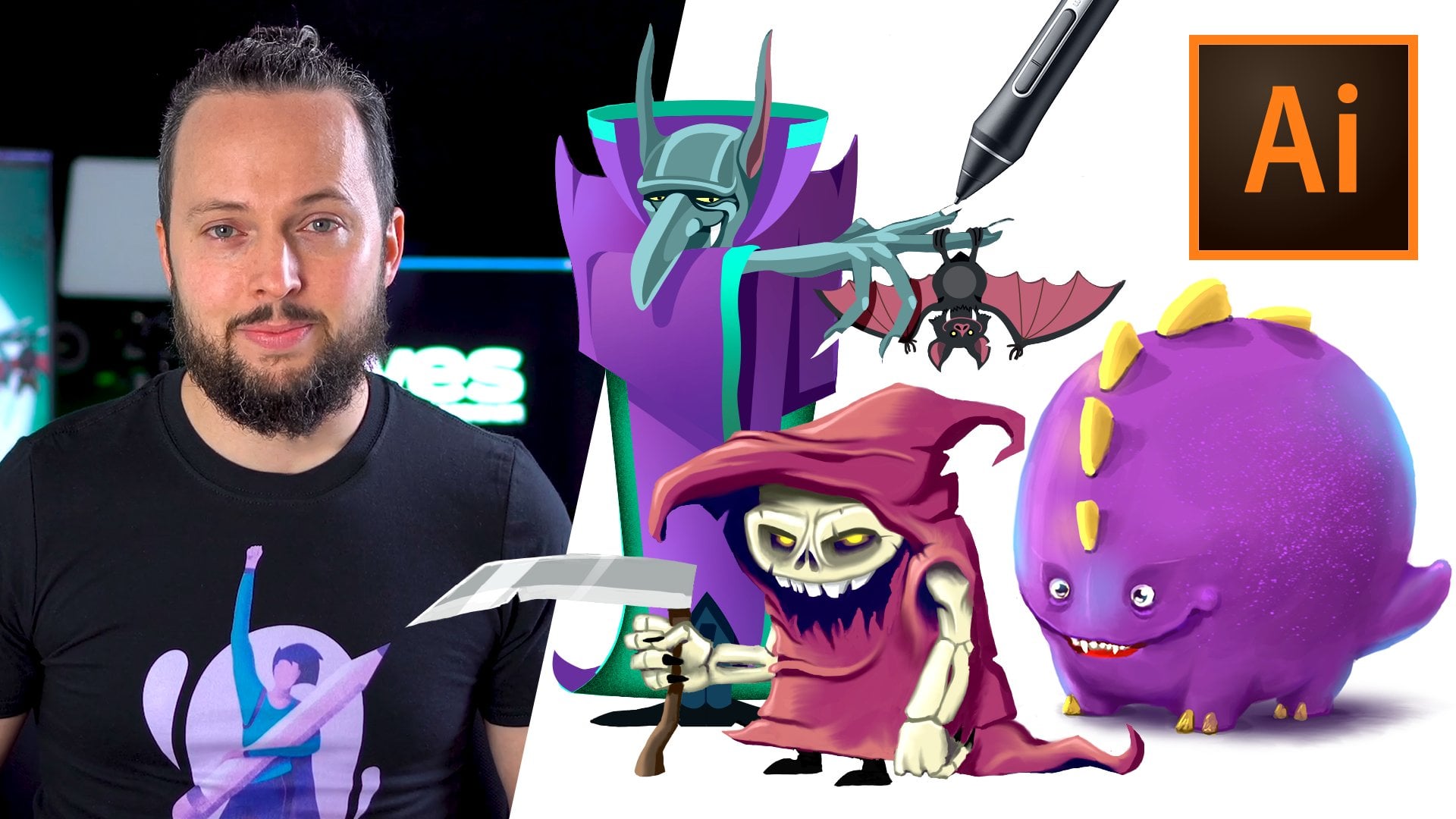
things here like this. One is a Photoshop
Cloud document. If I select that
and choose place, it will give me a
couple of ways of importing this into my
Illustrator document. So I can convert all its layers to
objects, which is great. Again, because it was a
layered Photoshop file, I will be able to access all
of its contents separately. Or if I just want
to simplify things, I can even flatten all the
layers into a single image. And besides that, I can also decide to Import
hidden layers or not. Now this really just
matters if you are going to use all the layers
are separate objects. So by choosing this and
then clicking Okay, we get the artwork placed into
the Illustrator document. And from the layers panel, I will be able to access
all of its contents, which in this case is just
that cloud that I can separately move from the
rest of the illustration. But by going back to the
same cloud documents option, There's also fresco
Cloud documents here, like this illustration
of the vampire. If I select that
and choose place, it will give me exactly
the same options. Now in this case again, I will use Convert
layers to objects. And once again, it
generated a separate group where I can find
all these layers and start interacting with them. And last but not least, if we go back to import options, we can also choose libraries, which is giving us access to
all the CC libraries that were generated with our
Creative Cloud account. These can be used on
all the Adobe tools, both on desktop and mobile. And they are extremely
useful to keep things consistent,
easily accessible. So for example, from this folder called
Adventure designs, I have a couple of nice
vector illustrations. And if I just pick any of these, it will be pleased into
our Illustrator document. And this is actually a fully
editable vector object, which is resolution
independence. So we can zoom in and
there is no rasterization. But also once again, we have access to all of
its contents and details once we start opening up the groups within
the layers panel, since we started talking about
pixel and vector artwork, if you're not familiar with
the differences between them. In the next video, I'm going to explain this a little
bit in more detail.
9. Pixel vs Vector artwork: On my screen you can see the same illustration created
in two different ways. On the right side, the pixel roster version, which was created by
using Adobe Fresco. And then on the left
side, the vector version, which was created on the
desktop version of Illustrator. In a nutshell, the main
difference or advantage of vector graphics is that they
are resolution independent, meaning you can zoom in as
much as you want and you will never see loss of
quality or pixelation. And that essentially means
that you can print it out in whatever size you need
without losing quality. While, if we look at
the pixel version, this is not going to have those
nice, crisp, sharp edges. And also the closer resume, the more we start to
notice the pixels or the small building blocks
of a raster image. Photoshop is a tool
that relies mainly on using and utilizing
pixel graphics. While Illustrator is designed to work with vector graphics, and fresco is almost like a
hybrid in-between the two, which supports both vector
and raster workflows. And other main advantage of
working with vector graphics, besides the fact that they
are resolution independent, is that they are made up
of individual objects. And it makes it very
easy to go back and make changes to any details
like here, for example, if I wanted to
select any details, I could go and dive deep into selecting either the
nostril of this bad. And it doesn't require me
to set up separate layers. It's just simply the way
vector graphics work. Every single detail is
going to automatically become a separate,
individually selectable item. And that makes working with vector graphics so
much more convenient because you can make changes to any details at any
point of your workflow. Now that we've covered everything that you
need to know to get started in
Illustrator on the iPad. In the next chapter, we
can focus on drawing.
10. Pencil Tool: The most intuitive tool for drawing has to be
the pencil tool. This is the one that
we will start reading this chapter and I will show you all the shortcuts and
techniques you need to learn to be able to work
with it more efficiently. So the first thing that
we need to set up is the colors that we will
be using for the drawing. And these you can set
here in the toolbar. There's a fill color
and stroke color. For now I am going to use
only the stroke color. I'll set that to black, but I would be able
to choose any of these colors by using
the color wheel, setting the hue
on the outer ring and the saturation and
brightness in the middle, you can quickly reset a color
back to white or black, or also just simply
remove it with this icon. As you can see at the moment, we have no stroke. But if I tap on the fill again, there we can change the colors. And there is a very
handy shortcut. You can swap the fill and stroke colors by just
simply dragging over them. So I can transition the stroke
to fill and vice versa. So I am going to draw with
black fill and I'll just show you very quickly this
is how it looks by default. But if I zoom a
little bit closer, I can show you that this is
actually a very thin line. It's using one-point
stroke size by default, which might be a little bit too thin to see what we're doing. So I am going to open the
Preferences on the right side, and via this path
is still selected, I can just drag over the point size so you don't
have to type in anything. You just scrub to the right
and left to change the size. I'm going to set it to maybe around six points
or seven points. The good thing is that we don't even need the
properties anymore. We can just hide it because every new path that
we will create, Going to remember the
last few settings, the pencil tool
automatically create anchor points and these
can be adjusted later on. But for now, I would
like you to just remember that some points will be indicated with a square by others will be
indicated with circles. The squares we call
corner points, and the circles we
call it smooth points. There is a very important
setting for the pencil tool, which is called smoothing. And this is something
we can find here at the bottom
of the toolbar. By default, it's
set around five, but you can go all the way up to ten or you can
reduce it down to 0, which is basically
disabling the feature. Now let's see what this means. If it's set to 0 and I try drawing a similar curve to
what I have next to it. You will see that
we have a lot of additional points created
because it's trying to follow the movement of my hand extremely closely and
generate every little detail. So all of those imperfections
will be much more visible. That's probably not an ideal way of working because first of all, it doesn't look great. And secondly, it is
more difficult to make changes to a path if it has
a lot of anchor points. So going back to smoothing, Let's see what happens if we
go all the way up to ten. Now if I draw the same thing, notice how while I'm drawing, illustrator is trying to simplify this path
as much as possible. And now we only have a couple
of anchor points created. The higher the smoothing,
the more continuous and nicely flowing your
paths and we'll be, but the less details it
will be able to capture. So in general, I would
recommend to use somewhere around five for smoothing
value, which once again, can generate lines more closely
to what you are drawing, but still refine them and create a nice continuous flow
without the imperfections. There is a very useful technique with the pencil
tool and that is to simply pose via drawing
to create a corner point. So let's just see if I start
drawing and then hold, then go down, hold again, and go up or down again, and so on and so forth. You can see, I can
create nice curves, but then I can turn and go in a completely
different angle thanks to the fact
that I posed once and that created a
coordinate point. Now remember when I
mentioned the squares and circles on these
pads that we create, you can tell that
wherever I post, it actually shows a square. And in-between those squares, it shows smooth points. The little circles. Each circle would have also handles which
describe the curve. And we can see these once we start using the direct
selection tool, which is the second
one from the toolbar. By clicking on any
of these circles, we can find those handles. If I move this down a bit
and adjust the handles, it's a little bit
easier to see it. We will learn a lot
more about these in the next chapter when we
start editing our parts. Now moving back to
the pencil tool, if I start drawing freely, and then I decide I need a straight segment
within this path. I just need to tap to the point which I
need to connect to. So simply tap here, There's my straight line. I can tap anywhere. And as you can see, that will automatically
create a straight segments. And then if I want,
I can continue drawing freely once again. Now if I ever want
to close the path, all I have to do is to continue drawing and hold close
to the end point or starting point of that
particular path to be able to continue a previously created
path like the one above. I will first use
the selection tool, that's the first
tool in the toolbar. Select the path, then switch
back to the pencil tool. And now you can see I can either continue drawing
from the left side, I can also continue
from the right side. There is also another quicker
way to close and open path. I'm just going to go back one step and having
this path selected, I'll just switch to the
Direct Selection Tool. And once the quick menu
comes up below it, I can just tap on
this icon here. Join path, which is
going to close up the empty part with
a straight line. Now that we've
covered the basics of working with the pencil tool, in the next video, we
will learn more about how to utilize the
touch shortcuts. Why working with this tool.
11. Pencil Shortcuts: You might recall that
in the first chapter, I moved my touch shortcut
up here on the top-left. But remember you can
reposition this anywhere. I prefer to keep it
here because it's just easier to access it
close to the toolbar. And we will be using this now in combination with
the pencil tool. So we already know that
with the pencil tool, we can draw freely or if
you just tap anywhere, we can create straight lines. However, we can
also switch between the two Drawing Modes by
utilizing the touch shortcut. So I am using the
pencil to draw and holding down with my other hand the center part of
the touch shortcut, that's the primary state of it, which I will be
able to continue. Vdd constrained straight lines. These are either vertical,
horizontal, or diagonal. If I hold down the outer edge of the touch
shortcut, with this, I can draw straight lines without any restrictions
in direction. Once again, holding down the outer edge or secondary
state of the touch shortcut, I can draw lines without any
restriction and of course, at the same time, and
I can also connect to previously created
paths like this.
12. Pencil Exercise: Now that we learn how
to use the pencil tool, it's time to put
it into practice. And in this document I have a few exercises that
we can go through. So first of all, here we have this
sketch of a fox simply created with a single line
using the pencil tool. This would be a great exercise, just simply setting
up the color to be black and trying
it out here first, I can see that the stroke
size is too small, so just like before, increase it to something a
little bit thicker like that. And now we can remove
this line by switching to the selection tool and tapping on the Delete icon
here on the right. Now, we can switch back
to the pencil tool and we can decide where
we want to get started. I will probably start
here on the right and draw this first section because it is a straight line. I can even just tap once
and then tap again. So there's the straight line. Then continue drawing from
here, creating a curve. I can let go the pencil
and draw the next line. Or if I want, I
can also just keep holding until it creates a
corner point like before. Again, holding it down here, create a corner point, holding it down there. Or if I need to move around
to make it easier to draw, I can just use the panning gesture with two
fingers on the art board. Maybe go a little
bit further out and then draw this next segment. Now if I'm not happy
with that curve, I can remove it and try
it again. That's not bad. Let's draw the next one. And then let's draw
this long section here. And then finally, another
curve at the end. Any mistakes I made, I will be able to
refine later on. We will learn more
about these in the upcoming videos
and chapters. But now let's do
another quick exercise. Here's another single line
illustration of this Rhino. So I'm just going to start
here on the left side. And I will try to
continuously draw this now. And I'm not that worried
about the details. So I don't try to make
it exactly the same. It was I'm posing a couple of times just
to create corner points. And there we have
our illustration. Let's draw one more thing. Here we have this beautiful
illustration of a rose. Again, I'm going to use
the pencil tool and now we will create
multiple lines. First, starting with the spam, then drawing these other parts. Then let's draw the leaves. Then draw the flower. And then when it
comes to drawing these smaller details here, it might be worth reducing the smoothing just so we can get closer without joining up these
path that we're creating. And maybe just finish
off that line, dad, My be better if
you draw over here. Now, you are probably
wondering how we can tidy things up like here. This line doesn't connect
into the other line, or again, it's not
aligned perfectly here. Another coronary here
we might need to amend. But these are all things
we will learn once we get to the next chapter
where we are editing parts. For now, all we have to do
is to get familiar using the pencil tool to draw
straight and curved lines. Feel free to do these
exercises a couple of times or even draw freely before
moving onto the next video, where we will be learning about the other most useful
and essential tool called the Pen tool.
13. Pen Tool Basics: We already seen that the pencil
tool is great for drawing freely because it creates all
the anchor points for us. However, if you want to be
a little bit more precise, you should use the
pen tool with this. It's more like constructing
paths than drawing them, because each and every anchor point you will have
to define yourself. So if you just tap anywhere, it will create straight lines. But if you tap and drag, that's when you start
creating curves, that dragging motion is
going to define the handles. They always come by default
as pairs to allow for a nice continuous flow
between the curves segments. So for example here, if I tap and drag again, you can see that there is a perfect continuation
between the last two curves. However, if I want to continue with a
straight segment now, I can just tap on this
last anchor point, which will remove
that empty handle. And now I can just draw
a straight line again. You will need to do the
same thing if you want to change direction
between two curves. So if I tap and drag, then tap once on that
last point again, and then tap and drag again. You can see I can have
two curves following each other without having a smooth
continuation between them. The great thing about
the Pen tool is that it automatically
allows us to go back and make changes to
any of the anchor points or handles so
I can tap on them, move them around, and also do the same thing
with the handles. I can adjust this curve completely while still having
the Pen tool selected. The good thing about that
is once I made my changes, I can just come back
and continue drawing either curves or straight lines. You can easily remove
any point still with the same tool just by simply
tapping and holding on them. And you can add
additional points by tapping anywhere on the path. Once that point is created, you can move it around freely, just like all the
previous points. Make sure you spend
some time practicing using the pen tool before you
move on to the next video, where we will learn about a couple of additional shortcuts which can make working with the pen tool even
more efficient.
14. Pen Tool Shortcuts: You might recall that in the first chapter
there was a preference for setting up the double-tap
on the Apple pencil, and I chose to set it
up to create new parts. This means that whenever
you draw something with the pen tool or even
the pencil tool, and you decide to create as an additional path without continuing the
currently selected one. Or you have to do
is to just simply double-tap on the Apple pencil. And you can see now I'm
free to draw a new path. So just as a reminder, the settings you can find here from the cogwheel settings. And this option is
actually the double tap which I chose to set to
the select object or path. Now I'm going to switch
to the selection tool, select all of these parts, and delete down quickly just
to clear this art board. And I will show you what
you can achieve by using the touch shortcut in
combination with the pen tool. So first of all, you might
remember that we can create curves by dragging
with the pen tool. And then I'm just going
to draw another one here. This creates these
handles for us. And by holding
down the center of the touch shortcut or
the primary state of it. With this, we will be able
to split the handles. So the default behavior would be for the handles to move
together as a pair, which I can show you if I
just undo this last step. So without holding down
the touch shortcut, I can move them together. Once again, with the
touch shortcut held down, I can split these two points. If at any point I would like to combine them back together. For that, I can use the outer
edge of the touch shortcut, which is the secondary state. And if I just tap
anywhere on the handles, immediately they will snap back together and become a pair. Once again, it is also possible to move
points along a path. Once again, by using
the secondary state of the touch shortcut and
start dragging a point. You can see that it will adjust the point and
move it along the path. Now, depending on how many
points you have on a path, you might be able to retain the original shape or might not. So for example here, if I add an additional point, maybe move it down here, and then we add another
additional point in-between when I'm using the secondary state now and moving
that point around, there's not much
change going to happen because of the other
two neighboring points restricting the path. This is a feature that
you might not use often, but it's still very
useful because instead of adding
and removing points, if you just need to
nudge a point around but still retain the original
shape of your path. You can just move points
around like here. I can have a much nicer curve moving that point further to the right compared to having it too close to the other
one on the left. Once again, the secondary
state of the touch shortcut. And I'll just drag that
point to the right. Remember you can also
use the pen tool to edit any of the
points on a path. So simply just selecting
something and moving it around. However, if you hold down
the primary state of the touch shortcut while
moving a point or a handle, you will be able to constrain
the movement to horizontal, vertical, or
diagonal directions. And that's all you need to
remember about the Pen tool. But just like before,
in the next video, we will also practice
a little bit using this tool on an
actual illustration.
15. Pen Exercise: I will be using the
same exact drawing for this exercise just to be able to compare and see
the advantages of using the pen tool
over the pencil. You can follow along and
do the same exercise, but also you can feel free
to use any other examples, whichever you feel is best
to get used to the tool. So all we have to do to get started is similarly to before, define the first,
then the next one. I'm going to keep this straight, so I just simply tap there. But then I'm going
to tap and drag. And notice that I
can move the handles around easily to
adjust the curvature. And sometimes you
might need to drag the handles out quite
a long distance from the center of the
anchor point itself to create the right curve
that you are looking for. And then at this point, I knew that I will have to split the handle to be able to create
that next curve segment. So if you recall, we can use for this the center touch shortcut
and drag that handle. I feel like it will need
to be somewhere around here for that next
curve segment to work. And then I can just tap
and drag out to the right. And now I can just
adjust this handle here, and maybe that one
as well a bit. Now we have another
coordinate point to the ovid. Here. We can simply just tap on that anchor point
once more to remove the free handle and then tap and drag to create
the next segment. But at the same time, even before letting this go, I will already use
the touch shortcut to break the tangent or handle, set it up in the
direction I need it. And then I can move
on to this next point here and drag it out. We can adjust once
again the handle and then continue again with
a straight line here. Here comes another curve and another longer
curve further down. I just zoom out to make
sure I have enough space. That looks good. Then to continue, let's
break this handle up again. So holding down the touch
shortcut, I'll set it up. I think it will need to
be something like this, then we can continue
drawing and drag it out. Yes, that will work. Once again. We can break this handle here and set it up
for the next segment. Click and drag, and then just
adjust this handle further. And that. Then we can break that
next handle again and set it up to maybe
somewhere around this way. And then click and drag, create this nice curve here. Then I can see that this
handle will be too long. So I will just move it in. And notice that
although the handles on the two sides are
still connected, but I can have one side longer
than the other by default. And here, now we
can just tap and maybe just adjust this
handle a bit further. And then finally, we
create our last curve. So just like before, if I feel like I need further refinements to
create a nicer curve, I can move points
around and maybe at this point we can use
that other shortcut, the outer edge of
the touch shortcut to move this point
along the path, maybe there it
would work better. And then further
adjust the handle, makes a nicer transition. And the same thing
here on the tail. If I want it to come back, I can adjust these handles easily until I'm happy
with the curvature. And then to make sure I
don't mess up anything, I'm just going to double-tap
on the Apple pencil, which deselects the path. And we can take a
closer look at this. If I use the direct selection
tool and tap on this path, we can see we haven't had
to use many anchor points, definitely much
less than what the pencil to create it by default. We could be much more precise setting up all the curves and straight lines exactly in the direction and shape
that we needed them. So that is really the
main advantage of working with the Pen tool
compared to the pencil, even though it's not
that intuitive and free. And it might take a little
bit longer to get used to, but it's still a
very important tool for vector illustration. So I highly recommend
to continue practicing with the
exercises that are included in this course and any other examples
that you find yourself that will motivate you to practice and get better
at using this tool. In the next video,
we will be covering two additional tools
which are also extremely useful for drawing the blob brush and the eraser.
16. Blob Brush and Eraser: Both the pen tool and the
pencil tool can help you to create parts and the
outlines of objects. However, there's a
different way of approaching drawing within
Illustrator on the iPad, and that is by using
the blob brush tool. This is going to create fill
instead of stroke details, and it will automatically define the outline by using a
specific brush size. Once again, it sounds more
complicated than what it is. So let me show you how it works. You just have to tap and
hold on the pencil tool and switch to the brush
or Blob Brush tool, which will give you a couple of settings in the beginning, I prefer normally to start
with the basic round brush, but this is something
you can come back to and make changes to later on. Now, we need to
make sure we choose a color that will be visible
on the white backdrop. So I will probably use
a green color since I'm planning to draw over this cactus here on this sketch. And once I start
drawing with this tool, notice that it has a
thickness which can be adjusted with the number just underneath the color swatches. I'm just going to
increase this a bit. And let's see. Now it covers much better that
area that we need. And if I just continue drawing
down this way and adding these additional shapes here on the left and on the right. The good thing about
this is that everything is now combined into
a single object. So when I use the
direct selection tool, we can see that even though we were drawing
in the middle, it actually defined a path or a silhouette
around this shape. So all these brush
strokes that we added are automatically merged
into a single object. When we switch back
to the brush tool, you actually can find additional settings
at the bottom of the toolbar where you can adjust the roundness and
angle of the brush. With this, you will
be able to create more calligraphic brushes so I can show you how this looks. But if you want to
quickly reset the brush, just go back to the settings and tap on this icon
here at the bottom, you can disable the function called merge brush
strokes if you want to keep each brushstroke
as a separate object. And you can also choose to use the pressure dynamics of
the Apple pencil or not. When it's turned on, you
will be able to change the thickness of a brush
stroke while you are drawing. By pressing harder
on the screen, you will be able to increase
the thickness of the brush. And if you want to adjust the sensitivity
of this dynamics, you can tap on this little
arrow and increase or decrease this percentage once
it's set to a 100 per cent. That is the most sensitive
way of using it. Because now if I press lightly, it will be very thin wire. If I press harder, I can go to a much
thicker brush size. And if I come back and reduce
the size maybe to 20%, then I will have much
less freedom in changing the thickness by applying
pressure on the screen. Similarly to this tool, we have the eraser
with which you will be able to cut out
details from objects. All you have to do
is to make sure you select the detail you wish to make changes to
before you use the eraser, then you can select
the tool itself. And this tool once again has a couple of
settings at the bottom, including the size of
the brush, smoothing, similar to the pencil tool, and then also similar
to the blob brush, we have roundness, angle,
and pressure dynamics. Now if I start drawing
with this tool, I can cut off the bottom part
of this cactus or I can cut any details out of
it and notice how it quickly adjusted the path
and all the points on it. I'm just going to
draw another shape here with the blob brush. Because I would like to
show you that if you have multiple objects on the canvas and you have nothing selected, then with the eraser tool, you will be able to
cut into any objects currently unlocked and
available on the Canvas. While if you select
one of these objects beforehand and then
use the Eraser tool, it's going to only delete
from the selected item. This can be a useful way
of protecting details. You don't wish to
make changes to when you are using
the eraser tool. Once again, feel
free to practice these tools before moving
onto the next video, where we will be covering how to work with the shape tools.
17. Shape Tools: In this video, we
will be covering the shape tools which
you can find here. In this category. We have the rectangle, ellipse, triangle, and star options. Let's start with the rectangle
with which we can draw rectangles or perfect squares by holding down the
touch shortcut. Once you create a shape, you will still be able
to make changes to it easily by using the
corner widgets, you can adjust the corner radius on all the corner points. Or if you use the direct selection tool
and select a specific point, you will be able to
adjust it individually. You can also select the
shape and rotate it around. And if you use the touch
shortcut via rotating an object, you can constrain it
to a 45-degree angle. The Ellipse tool works
very similarly to this. We can start drawing
ellipses freely, or again, holding down the touch shortcut, we can constrain it
into a perfect circle. Or if we use the outer edge
of the touch shortcut, we can also draw ellipses or circles from their center point. So let's try this again. Now, you can see I'm drawing them from
their center point. When you are using the
triangle tool or polygon tool, you will be able to add just a couple of
additional things, including the number of corners. This is something you can do by using this little slider here. With that, you can
increase it further up to as many
points as you need, or all the way down
to three points, which is the minimum. You can still use
the coronary widgets to adjust the radius
on the corners. And you can also
access these features from the properties panel
where you will find the point size for
the corners and the number of corners
here just below it. And last but not least, we also have the Star tool
with which we can draw a star. And currently there is no way of adjusting the number
of corners on stars. However, I'm sure
it's going to be added as a feature later on. This is really all
you need to know about working with shapes. There's one last thing
that might be obvious, but whenever you create shapes, you can obviously fill
them in with colors, either by using the
properties panel and selecting a color there, or by using the toolbar on the left and tapping
on the fill color. You can also choose to add that there also remember
you can easily swap the stroke and fill colors simply by just
swiping over them. And that is all you need to
know about creating shapes. However, in the next chapter we will learn how we can also combine them together to create details like the clouds
in this illustration, very quickly and easily.
18. Precision Mode: In the previous video, we've seen how to
work with shapes, and now we will learn
how to work more precisely using
guides and grids. In this document, I already
have a rectangle created, but I'm going to
draw another one. And you will see that I
can create this freely. However, while I'm drawing, notice that there is a magenta diagonal line
appearing a couple of times that actually shows whenever I create
a perfect square. So I can go further out as well. Now I know it's a
perfect square. And also, if I want to
align to another object, that magenta line
will again helped me to align their bottom edge. Or again, if I drew another
shape from the bottom, I can align that
edge is like that. And of course, I can align two edges even if
I want them to be overlapping each other in case you want to
work more precisely, you can go into this
section called precision, where you can turn on the grid which might not be visible well
in this recording, I'm going to change
its color to black. And I will zoom a little bit closer and then
start drawing again. Notice that it doesn't
actually make any difference until I also turn on
Snap to Grid option. Once that's enabled, now my shapes will align to the
grid in the background. And even if I start
moving shapes around, they will snap to the
grid in the background. There's lots of options you
can change for the grid line, spacing and subdivisions,
which can help you to add just a grid to make sure
it suits your workflow. Sometimes you might want
to use an object just as a guide instead of being
part of the illustration. In these cases, make
sure you select that object and then go to these additional
settings here on the right and choose
Convert to guide. This will remove any
appearance and visibility from that object and simply
keep it set up as a guide. So now even if I
turn off the snap to grid option and also
the grid itself, I can select another
shape and align it to that guy that
we just created. Again, it can be
aligned, of course, to any edge or even
coordinate point, and that guide can still be
moved around if necessary. However, if you want to make
sure a guide stays in place, you just have to click on the little lock icon in the
quick actions underneath it. This will still
allow you to move objects around and
aligned to that guide, but you won't accidentally
move the guide itself around. And that is all we
needed to cover about drawing in Illustrator
on the iPad. In the next chapter, we will be focusing on
editing our drawings.
19. Layers: Layers are extremely useful
to organize your work, especially when you start to create more complex
illustrations. In this artwork, everything
is on a single layer. However, within this layer
we have a couple of groups. So that already makes it easier to access individual details, increase their size
or move them around. Liters on the iPad work very
similarly to the desktop. Or you have to do to
create a new one, is to tap on the plus
sign here on the top. And of course, you
can rename layers. So let's just rename this one by dragging to the left and
then tapping on this icon, I will call this Mountains. And if I want to move
a couple of details like the mountains
onto these new layer, I can just hold onto
them until I can start dragging and then just simply drop it into
this new layer. Now, because we created
this new layer on the top, it changes the stacking order. And if we want to keep the
mountains in the background, we just have to make sure it's placed underneath
the other layer. Now, it will be
very easy to hide the mountains separately or the details on the other layer. And since we have a couple of different things on
this layer on the top, it probably would make
sense to separate them. So let's just create
another new layer. And I will call this cacti. Now, just like before, I am going to open
this layer on the top, select one of the items and holding down the
primary touch shortcut, I can add the other cactus
as well to the selection. Now that they are both selected, I can hold onto
them and then drag them into this new
layer that we created. Now that we have them
on a separate layer, it's very easy to hide them
and show them individually. And if I want, I can also move these additional plants
into the same layer, just like we've done it before, selecting all three with
the touch shortcut and then dropping them into
that other layer that we already used before. So once again, these are the items now on
this third layer. Besides organizing things,
layers are also useful to individually look parts
of the illustration. So for instance, if I only
want to work with the llama, I can easily look
the cacti layer and the mountains as well by using the little pad locks
in the layers panel. And now if I make a
selection on this area, you can see only the Lamar
details will be selected. So I won't accidentally include any of these details
in my selection, which is a great
way to selectively modify parts of
your illustration. And there's one last thing that I would like to mention that you can use the
layers panel also to delete objects
or even layers by dragging them to the left and then choosing the
trash can icon. In the next video, we
will continue to use this artwork and the
layers that we created, but we will explore all
the different things that we can do with the
main selection tool.
20. Selection Tool: The main selection tool
that we have on the top of the toolbar is for selecting
objects and modifying them. So let's just start by selecting this cactus here
on the left side, we can see it also highlighted
in the Layers panel. And if I open this group, we can also see that
it's made up of a couple of separate objects. And by using the layers panel, I can get to these
easily, individually. Or if I select the main group, I can also double-click on it to select the individual
items inside it. I'm going to select
the whole group again. And here, just below
our selection, we can see an icon with which we can ungroup this selection. So by tapping on this icon, now, they are all independent objects and they won't be automatically
selected together. However, if I want to turn
it again into a group, I can hold down the primary touch shortcut and click on these
additional details, which we'll add them
to the selection. And now we can once again use the group function here at
the bottom if you want. Of course, you can
also name your groups similarly to what we've
done in the previous video, we can just drag to the left on the group in the
layers panel and then tap on this icon and
I can just type in cactus. It is very easy to resize
and rotate objects, or we have to do is to
grab a corner point. If you want to make
sure that you are not changing the proportions, just hold down the
primary touch shortcut, which will constrain
the proportions. You can also use this point
here on the top for rotation. Again, with the primary
touch shortcut, you can constrain the
rotation to 45-degree angles. And since we are working with vector objects and which means that they are
resolution independent, you will never lose quality by resizing any of the objects
within your illustration. In the first chapter, I mentioned an
important feature. It's a preference
that you can turn on, which by default is disabled. This is for resizing
objects that are using stroke attributes
instead of fill colors. So this other cactus that we have here on the right
side is also grouped. So it's made up
of three details, but they are grouped together. But notice that when
I'm changing its size, it is resizing in
a different way. This is once again, because this object
is using stroke instead of fill and to
assure that it resizes, keeping its visual
appearance exactly the same, we would have to use
the preferences. And within the general options, we have to make sure the scale, strokes and effects
is turned on. So now that we enabled that
when I start resizing, you can see that
the stroke size or stroke weight is also increasing while I'm
changing this object. And just like before, if I hold down the primary touch shortcut, we can also constrain
the proportions while having an object selected
with stroke attribute. You can also access the stroke width option from
this quick menu here below. And this is the second
icon you can just drag up or down to adjust the values. The same feature you can access also from the Properties panel, you can drag left and
right on the number within the stroke category to the left of this icon in the
Quick access area, we have an opacity control, which we can again drag up
or down to increase and decrease the selected
items visibility. I wouldn't recommend
using this to hide or show details for that, it is better to use the little icons within
the layers panel. This is more to create transparency or making
certain details see-through most
creative tools you would expect to also have blend modes. And that's actually something
you can find within the Properties tab here above, opacity, which is
the same feature we just use from the
Quick access menu. We also find a drop-down
for Blend Modes. And multiply, for example, would make the selected
object always darker. Via screen would always
make things more brighter. And then we have also overlay, which is a little bit of
a mixture of the two. Of course, there's plenty
of other blend modes here. They are all exactly the same
as on the desktop version. It's hard to define which one
is best for what purpose. But in general, you
most likely would use these first four
normal Multiply Screen and overlay within the
Quick Access area, we also have an icon for
quickly moving items around. This is the fourth icon. Sometimes when you
have a complex object or maybe the outlines
are very thin, it might be difficult
to move them around. That's why we have that icon. And for this, you can actually
also use your fingers and just simply move the object wherever
you need it to be. When you have multiple objects
within the same layer, there will be a stacking
order between them. And we can see this in
the Layers panel as well. So that cactus is behind of that little plant
detail at the bottom because that's the
way they're set up here in the layers panel. But if I quickly want to
move the cactus in front, I can use this third icon, which is for changing the
arrangement and just simply drag it up to move it in front or drag it down
to move it behind. So once again, if I
drag it in front, it will be able to go all
the way to the top of the current layer
that is placed into, but it won't be able to move
between layers for that, you have to result to
the technique that we learned earlier on in
the previous video. So let me just move this back
again behind that detail. And then moving on within
the quick access icons. The next one is for locking
the selected object. This is exactly the same feature that you can find from
the layers panel again. But it's also good to
know that you can use the top-left corner of the selection for
quickly unlocking it. The next icon we
have already seen is for grouping and
ungrouping items. So for example, if I want these two details to
be grouped together, I can just select them
and create a group. Now of course, you can
have groups within groups, like in this case, the original two details
were already groups, but now they ended up
being in another group, which just like before, it makes it easier
to select all of these details together
and move them around either by tap and dragging
on the items themselves or using the Move icon in
the Quick access area. When you went to
duplicate something, you just have to tap on this icon within the
Quick Access area. And now we can move these
duplicate to the side. So by default, when you
create a duplicate, you want immediately see it. It will only show up
in the layers panel because they are overlaid
on top of each other. You just have to
move it to the site to be able to notice it. Another faster way to
duplicate would be to use the secondary state of the touch shortcut while
dragging an object. This again creates the
duplicate and it's very similar to holding down the Alt or Option
key on the desktop. And last but not least, don't forget that when
selecting a group, you can always double-click to access an item inside the group. But then if you already got to an individual object and
you double-click again, you will switch to
direct selection mode. And notice that even
the tool in the toolbar changed to the second
selection tool, which is called
Direct Selection. And this is the tool
that we will be covering in the next video.
21. Direct Selection Tool: We already seen in the
previous chapter how we can use the pen tool
not only to draw, but also to amend and
edit existing paths. However, the best tool for this is actually the direct
selection tool. We can find it here
in the toolbar. And whichever object we select, it's going to show us all the anchor points
it's made up of. There's a couple of useful
techniques to learn here. First of all, that you can
convert a smooth point into a coordinate point and vice versa by double-clicking
on the point. So if I select this
one, for example, I can just double-tap to
turn it into a corner point, or double-tap again to turn
it back into a smooth point. Notice that the
quick access icons below our selection is also different compared to
the ones that we've seen for the selection
tool in this video, we will go through
most of these icons. So the double-click
that we've just seen can be also
accessed from this menu. It's called Convert to corner. So if I tap on that, again, we get the corner point or
tapping on the one next to it, we can go back into
a smooth point. Of course, this smooth
point can be further adjusted by dragging
the handles around. And naturally we can move any of these anchor points
around as well, or even move them along the original outline by using the secondary state
of the touch shortcut, which again is something that we already seen in the
previous chapter. So to summarize between
two selection tools, the main difference is that the direct selection tool allows you to change individual
anchor points. While the main
selection tool is for amending or editing the
whole object itself. Remember, whenever you use the selection tool,
you can quickly, temporarily access the
Direct Selection Tool by double tapping on the object. And when you are
done making changes, you can just hit Done
here on the top, which will take you back
to the selection tool. In next video, we will
look at a couple of techniques how you can
simplify your parts.
22. Simplification: It is always advice to keep
the anchor points as low as possible because
this is going to help you to make
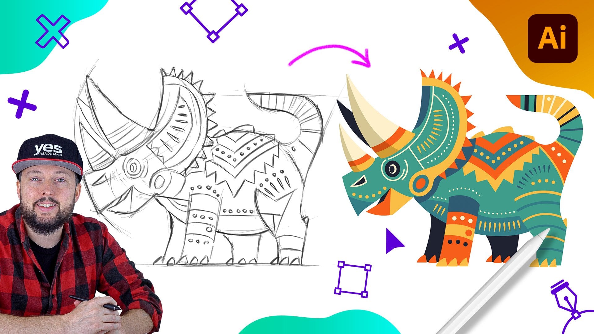
changes much faster. Here we have the example of the rhino created
with a single line, which we've done in
the previous chapter. And you can see that
there's actually quite a lot of
anchor points here. Good news is Illustrator on the iPad has a brilliant way of simplifying parts by simply
clicking on this icon here, you can get a much neater result without affecting the appearance
of your illustration. So let's see this again. I will just undo this last step and then
tap on simplification. The change on the appearance of the path is hardly noticeable, but we have a lot
less anchor points. So once again, this is
before and this is after. If you don't want to use simplification on
the whole path, you just want to tidy
up certain parts of it. You can also use the
Smart Delete feature. I will zoom a little bit closer and select this
anchor point here. I will now use the Smart Delete icon from
the Quick Access area. And you will see that hardly
anything changed once again, because Illustrator manage to replace these neighboring
anchor points with handles that can define the exact same
curvature for which we had an unnecessary anchor
point in-between them. So once again, I undo this step. That's the point that
we had originally. I can even move this up a bit just so we can
see it better. What's going to happen? So there's the point
where it's handles and one side tap
on Smart Delete, it will disappear without any noticeable
difference on the path. Now of course, you
won't be able to remove every anchor point without
affecting the path itself. So for instance, if I
select this one here, if I now tap on Smart Delete, there will be a much
more drastic change since it was impossible to use the neighboring
anchor points to describe that complex
path segment. I am going to just undo
this step and also show you what happens if instead
of using smart delete, we use the normal Delete
Anchor Point option, which is the trash can in
the creek access area. The same point is selected. Now I tap on the trash can, this actually going to
delete that anchor point, but also it will break up the path and it will open
it up leaving a gap. If this ever happens, there is also a quick option to close the path by
first selecting the two points that needs
to be connected and then tapping on this icon here
in the Quick access area, we can join those two details with a simple straight line. It is also possible to slice, so cut parts into
multiple parts. So for instance, if
I select this point here and use the scissors icon from the Quick Access area. Now, we have two separate paths. The one that we just trimmed off and the additional part
that we have here, once again, using the
direct selection tool, if I select another anchor
point like this one here, and maybe also holding down
the primary touch shortcut, selecting another anchor point. Now, using the scissors tool, we can again split the path
into multiple segments. And now we got a section here, another section here, and the
third section on the top. Now that we've covered ways of simplifying pods,
in the next video, we will look at the
similar technique, but this is more for converting
a path into an outline.
23. Stroke Options: We already learned how to change the thickness of a stroke. We can either use the
Quick Access area and drag up and down
the second icon. Or we can use the properties
panel where we can drag the number again to
the left or the right. It is important to mention
that for open ponds, you won't be able to adjust
the alignment of the stroke. It will always have
to be centered. However, if we
close this path by selecting the last
point and continuing it with the pen tool
and then closing it up in any way like
this, for instance. Now notice that these
options here in the stroke area within the properties panel
became available. And we can change it to
have the stroke aligned to the center or to the outer
edge of the original path. Now, this is easier
to see when we have a simple object
like the ellipse with which if we
just draw something like that and increase
the thickness, we can simply change
from center aligned to inside or outside of
the original path. That is also an
important feature called Create Stroke outline, which is a way of converting stroke appearance
into a filled object. So just to make this
again easier to follow, I'm going to create a ring by
using a very thick stroke. And then if I go into
the object options, here I can choose
Create Stroke, outline. I doing this, the stroke
became a fill and now I won't be able to make
changes to the thickness, for example, or the
alignment of the stroke. But I can start using tools like the eraser and just
cut into this shape, creating some gaps on it
very quickly and easily. You can, of course, still use a stroke attributes
on these new objects or even swap the field
into the Stroke option. But this is going to create a completely different look to the original ring that we had. Because now instead of a
single path in the center, we have three separate shapes
with individual outlines. In the next video, continuing to work with
stroke attributes, we will be looking at how
to create dashed lines.
24. Stroke Appearance: To be able to access
the dash line options, you will need to
make sure you have the Properties tab
open and that you have an object selected which has a stroke attribute
assigned to it. Once you have this setup
here in the stroke area, you will be able to
switch to dashed line. First is going to give you a
default dash and gap size. But you will be able to increase or decrease
these once again, simply by dragging the values to the right or to the left. We can also increase
the gap just like that. And we see the update live
on our selected path. If I zoom a little bit closer, I can show you another
important option. This is once you have
an open path or you have a dashed line
applied to it, here, we can change the end
points of the gaps and we will be able
to see this better if I increase the
gap size a bit. So this is the
default cap feature, which is just a straight line. And this is the
round cap option. If you are using round caps
and you set the size to 0, you can actually create
a dotted line as well. And just like before, we can easily increase, decrease the gap size to change the intensity
of the dots. And of course, we can also
use the stroke size to increase or decrease the size
of the dots at any point, of course, you can
also change the color of the stroke from
this icon here, we can just pick a
different color. And now we have that
quickly applied, these changes at all
non-destructive, and they can also be copied
from one object to another. So in this case, let's just say we
would like to reuse the same settings
on another path. All we have to do is to go to the edit options here on the right and choose
copy appearance. Once we selected that, we just need to find another path on which we
would like to apply this. And then go back to the edit options and
choose Paste appearance, which will ask us
whether we would like to use both the fill and
stroke colors settings. And in case of texts, we also have character style
and paragraph style options, which would replicate the
formatting of texts as well. But for now, we just say
Paste and we can see the same visual appearance
now applied on this path. In the next video, we
will take a look at another useful panel called
align and distribute.
25. Align and Distribute: This is the panel for Align
and Distribute options. These can be used to
align and distribute objects or anchor
points to each other. So let's see how this works. First of all, on these
couple of rectangles here, once I come back
to these settings, I can first choose
a line to top edge, which is going to just
simply align them like that. If I undo this step, I can do the same thing, aligning them to
that bottom edge. And now I can use the
horizontal distribution, which will evenly spread
them out without moving the objects on the far
left and far right. There is also another important
option in the same menu. I'm just going to select
this illustration now. And if we come back here, we can also flip this
horizontally or vertically. And as I mentioned, the Align and Distribute options also work not only
on separate objects, but also on anchor points. So for instance, if I select these points here
at the bottom and come back to the
align options and choose align bottom edges. I will now have them exactly in the same
vertical position. And I can even move them down
or up all at the same time. So I'm just going to go
back a couple of steps to see them again in
different positions and maybe even move them a
bit further away from each other just to make it more
obvious what we're doing. So something like that. Now I am going to hold down the touch shortcut and select these four points like before. Then going to the
Align feature and then again align them maybe
now to that top edge, which of course, in this case it looks a little bit weird. So we can just
refine it further by moving all the four points
together at the same time. Now let's not forget
that we can also create guides and align
objects to them. So if I use the pen tool and
create a straight line by tapping once and then holding down the secondary
touch shortcut, click again, then go into the object menu and
choose Convert to guide. Now, I can just use the
direct selection tool and move these points onto the
guide that we created. So with this, we can align
them easily to each other. In this case, this took longer. However, in some cases, this might be a better way to get to the results
you're looking for. In the next couple of videos, we will be taking a look
at the repeat features, starting with the mirror option, which is brilliant for
creating symmetrical drawings.
26. Mirror Repeat - Draw in Symmetry: Creating symmetrical drawings
has never been easier thanks to the repeat features
in Illustrator on the iPad, all you have to do
to get started with it is to use one of
the drawing tools, like the pencil and start
drawing your first-line. Once it's created, switch
to the selection tool, and then from the sidebar, select mirror repeat, which will immediately give you the
center of symmetry line, which can be done adjusted to the position you need it in. And then continue drawing. I am going to focus on the central part of
this illustration and draw some additional details
which we need for the eyes. As you can see, when I get close to
the center point, I can even overlap the
two lines automatically. And the part that went through the symmetry line will
be automatically hidden. This is a huge
time-saver and makes working in symmetry
so much easier. Now switching to the pen tool, I can continue drawing, still, keeping
everything in symmetry. And just like before, we can start adding curves by dragging than adding
corner points by tapping once more on the anchor point and creating the
next curve segment. So as you can see, both working with the pencil and pen tool in symmetry makes illustrations like
this come to life so much faster and it's so
much more fun as well. In the next video, we
will take a look at another repeat
feature called grid.
27. Grid Repeat: Repeat Grid can be extremely useful when you want
to create patterns. So for instance here, this cross hatch that
I want to have on the ear of this
fox would require me to draw lines
very closely to each other and following
the same curvature. Now we can do this much easier by using the
Repeat Grid option. Let me just draw one
line and then using the selection tool and
the Repeat Grid option, we can now set up how
this should work. First of all, I will zoom
out and show you that we can easily increase or decrease
the size of our repeat grid. We can also control
how many columns and rows we need of the pattern. So in this case, I just want
a single column like this. But I would like to keep the
lines closer to each other. So I am going to
zoom closer and drag these two points until I get the pattern to the
density that I need. I can get even closer
if I wanted to. And of course, I can still control the thickness
of my lines from the properties panel by
adjusting the stroke value. At the bottom of the
properties panel, we can see the
options for the grid. Repeat the second
value here we can control the vertical
distance between the tiles. And in case you have
multiple columns, you can also control the
horizontal distance between the repeats and you can even overlap them on top of
each other if required. And there's so much more
useful options here. But just to finish
off this design, I am going to reduce the size of this area because we only
needed around the ear. And then zoom in closer. I can now choose to expand this design by going
into the object menu. And once we select it, expand, we can just choose
the eraser tool and start deleting the
details that we don't need. So I'm just going to quickly
get rid of all of this. And then on the other side, delete all the details
that is not necessary. And the amazing thing
about the repeat features is that you can even
combine them together. So now that we used
repeat the grid, why not use the
repeat mirror option that we've seen in
the previous video. So having this group selected, I can just choose
mirror and move the center of symmetry
where it needs to be. Now switching back
to the pencil tool, we can finish off the drawing by drawing
these lines here. Posing for the corner points
like we've done before. And then closing up this shape. So this once again appeared
on both side thanks to the mirror repeat that we set up after using the grid repeat. In the next video, we
will take a look at the additional features
of repeat grids.
28. Creating a Seamless Pattern: To better utilize the additional features
of repeat grids, I'm going to draw a
couple of elements. And from these, we will
create a repeated pattern. I am thinking of creating an autumn pattern with a couple of leaves
and maybe acorns. So for this, I'm
going to start with the blob brush and make sure
we have a nice autumn color. So probably some orange color like this would work
well for the leaf. And I'm going to increase
the size of the brush. I am going to draw a very simplified
version of an oak leaf. So I will just
draw this side and then go next section and
then maybe one more up here. I will also rotate this
slightly to the left. And then just like before, I will turn this into
a symmetrical object by using mirror repeat and drag them closer to each other. Now, moving on, I am going to draw another line
with the pencil tool. Just set up the
color to be black and simply use a
stroke with which I can draw here in the center and increase the thickness
by using the quick menu. And then maybe draw a couple of additional lines
coming out from here. Maybe one here, another
one on the other side, and then one more
on the right side. So there's our first leaf. We can even group
these together. But maybe I'm just
going to select these three lines
that I created. Adjust the cap to be round on all sides and also
maybe increase the thickness just a
little bit further. Now, we can select all of
these together and group it. So it's just easier
to move it around. And I'm going to duplicate this whole design by tapping
on the quick action, drag it to the side, double-click on this,
select the shape in the background and change the
fill color to maybe read. I will also transform this leaf just to change the
shape slightly, making it a little
bit more unique. And then flip it around horizontally from the
Align and Distribute Panel on the right and maybe add a little bit of
rotation on it as well. Now we just need
to draw an acorn for which I'm going to use the Ellipse tool and draw the first shape here by
double-clicking on this, we can switch to the
direct selection tool and select these two points. Move them up a bit just to
create a more similar shape to an acorn and then draw
another ellipse on top of this. And to be able to use the color here from the previous leaf, I am going to select
that shape on the left, tap on the Fill Color and
click on the plus sign. So now it is added to
the swatches panel. Now we can easily assign
the same color on this detail and
double-click again on it and adjust these two
points to create this detail. And maybe also just use the transform feature to align it closer to the
shape that we need. Now, all we need is to use a similar shape to what we
already used on these leaves. So I can even copy it by
going into the Edit Feature, choose Copy, then tap
somewhere outside and paste. Now we can move this up here, rotate it, and align
it to the top. And finally, we might
just need to group these together to make it
easier to move around. So that's one group. We have another group here
and another group there. Now it's time to turn all of
these together into a grid. So I will select the
three groups and from the repeat options,
let's choose grid. And immediately we
have our pattern, which we can increase
in either direction. But more importantly,
we can come to the grid repeat settings here
in the Properties panel. And we can change the grid
type to brick by row, which is going to
alternate the elements. So instead of repeating it
exactly in the same way, now we can see that the acorns are not lined up vertically, but there is a shift
between the rows. And we can do the same
thing vertically. So this is Brick by Row in a vertical shift
where again we can see things are not
lined up horizontally, but there is that jump up and down between the
acorns, for example. For more variety, we can also choose to flip the rows around, which means that
every second row is going to be in a
different orientation. This is, again, easy to see
on the acorns, for example, one vertical row is
pointing to the left, the next one is
pointing to the right. And for even more variety, we can add vertical flip to it, where once again,
every second column will be upside down. The best thing about
Repeat Grid is that we can still come back to our
original elements, double-click on it, and then start moving them around and see the update live happening
on all the other tiles. So let me just zoom out a bit. Start moving this leaf around. And you can see
everything moving around. And thanks to all those
sophisticated settings for tiling, including the brick by column and the two types of flipping. It really feels magical
when we're doing this. All of the Repeat Grid options in Illustrator on the iPad. Non-destructive, which
means that you can always come back to them
and make adjustments, even spacing them out or adjusting their values
from the properties panel. Don't forget that if
you ever wish to make individual changes to
each of the tiles, you can also expand the whole pattern by
using object expand. The only disadvantage of
doing this is that you will be losing all the
repeat functionalities. And we still have
one last type of repeat option to cover
in the next video. The most interesting one in my opinion, the radial repeat.
29. Radial Repeat: In this lesson, I'm going to
use the same elements that we created in the
previous video and show you another very useful
function to be able to copy and paste items from
one document to another. So first of all, I'm going to double-click here just
to be able to get inside this grid and select the original elements by holding
down the touch shortcut. Now that all three of
them are selected, I can go to the edit
options and choose Copy. This is going to copy
them onto the Clipboard, which allows me to go into
another empty document. And then once again
from the edit settings, I can now choose paste. If I check my layers panel, it will tell me that these are not in a repeat grid anymore. But I can also see that this acorn needs to
be grouped together. The grouping was just
something I lost on the way. So now that we have these
three elements ready, I can just set them up in
the direction I need them. And now, similarly to before
having all of them selected, I am going to choose another repeat
feature, in this case, the radial repeat, with which
we get a circular pattern. And here we have a couple
of useful control options. First of all, we can
increase or decrease the amount of instances
within our pattern. We can also increase the size
of the whole illustration. But probably the most
interesting adjustment is this circle here
with which you can control the scatter of these patterns so you can move them further away
from each other, create a little
bit more spacing. And then now we
can maybe increase the amount of
elements a bit more. If you want it to keep a
part of your repeat empty, you can just use
these arrows here and open up either this
side or the other side. This could work really well
for adding some type here at the bottom in case
this is part of a logo or a radial design. And just like with the
repeat grid, you can steal, double-tap to go back and make changes to
individual items. You can move these around, even change their colors
or orientation or size, since everything is
completely non-destructive, working with patterns,
as you can see, has never been so
intuitive and fun.
30. Selecting Colors: In this chapter, we will take a closer look at how
to work with colors. First of all, now whenever
you select an object, you can either assign a field
color or a stroke color. Both of these options will give you pretty much
the same options. Apart from gradients which are not allowed for
stroke attributes, they can only be
assigned as Phil. And we will discuss gradients
in a lot more detail. But first, let's take a
look at the color wheel. By using this, we can choose
a hue on the wheel itself, and we can choose the
brightness and saturation of the selected color in this
square in the middle, we can also quickly revert
back to black or white, or also remove the fill
color by tapping on this icon here to use an
existing color from the artwork, you can use the eyedropper tool. Once the little color
picker comes up, you just have to drag it over the color that
you wish to use. And once you let go, it will be applied to the
selected attribute, like we've seen it before. You can also swap the fill and stroke attributes very
quickly and easily, just simply by swiping
over them if you prefer to select the color a little bit more specifically, instead of using
the color wheel, you can also use the
sliders or the hex code. The hex code is for web colors and you would need to know the exact
code for a color. So for example, for black, you can just use zeros
or for using white, you can use six f's. But this is not really the most convenient
way of picking colors. So instead of this
from the drop-down, we can switch to
either CMYK sliders, which is a great
way to selecting colors for print illustrations. And by the way, remember whenever you create
a new document, you always have the choice
to decide the color mode. And this is actually
currently not something you can
change later on. So in the settings
I can see that the color mode for this particular
document is set to RGB. However, whenever I
create a new document, I can start off
with CMYK if I know that the illustration
I'm working on is created for print. Now coming back to the sliders, we also have the RGB
sliders, of course. And besides that we have HSB, which is hue
saturation brightness. These are extremely
useful as well. So just like before, we can set the saturation
and the brightness. But then we also have
the hue here on the top. And last but not least, you can also choose to work
with the gray scale slider, which will give you a range
between white and black. Now to get back to a more suitable color for this pumpkin, I'm just going to select the hue and the saturation
and brightness. Now that we know how
to select colors, in the next video, we will learn how to work with swatches.
31. Swatches: Using the color picker
in the toolbar. Besides selecting colors, we can also save them as swatches. You can choose to use
the default grid view or you can switch to List
View where you will be able to see the names
of the colors and every document is going to start with a couple of default colors, depending on whether you are
using RGB or CMYK documents. And in case, let's
say I wanted to add this orange from the pumpkin. All I have to do is to
just tap on, Add swatch. If I wanted to rename it, I just have to tap and
hold and choose Edit. Here I can actually specify whether I
want this color to be registered or saved
as RGB or CMYK. And I can change the name by just tapping here on the top. So I will just type in pumpkin. And that also two options
for the color type. The default one is
processed scholar, but there's also a spot color. Now if you have a spot
color in the document, that means that whenever
is going to be printed, it should have that colored
besides the usual CMYK inks, this can make sure that you get a perfect match in print to
the color that you specified. But whenever we're
working with spot colors, it is best to actually choose
them from color books, which I'm going to show
you in the next video. Besides these, there's also
an option to choose whether you want this color
to be global or not. If I keep global
option on what that means is whatever this
color will be applied, will automatically apply by changing the color definition. Let me show you how this works. So once it's saved, notice that there is a little triangle next
to the swatch thumbnail, which means that it
is a global color. So now if I draw another shape using the same color and
even de-select this. But then going back to the
color itself, choosing edit. Once I go into the sliders
and start adjusting it, if I save my changes, it will update all of the
instances wherever it was used. If you don't need
a swatch anymore, you can also just tap and
hold on it and choose Remove. Which even in case
of a global color, doesn't mean that you will
be losing those colors from the actual artwork
is just simply not going to be listed in the
swatches panel anymore. So in the next video, we'll take a look at
selecting colors from Color Books and
from CC libraries.
32. Color books and CC Libraries: At the bottom of
the swatches area inside the color picker, we have two additional options. First, color books, which are spot colors that you can
use in your documents. And as discussed in
the previous video, these are perfect
in case you want to preserve colors that you
are seeing on your screen. And you want them to
be perfectly recreated in print and in case you want
to get the colors right, It's also recommended to
get these color charts. This particular one
is from pen tone. And whenever you find
a color that you like, you can just search for it. It's called here within
the color books section. So the chart I'm using is
the Pantone solid coated, which has over
1300 colors in it. So once we go inside it, it will take quite long to find that specific one
that I'm looking for. However, if I tap on
the Search option, I can just type in 716, which leads me straight to
this beautiful orange color. Now, notice that the swatch
thumbnail now not only has a little arrow or fold
on the bottom-right corner, but also as spot. And that actually means
that this is a spot color. So just like I explained before, besides CMYK inks, whenever this illustration
is going to be printed, they will have to also add
that specific ink cartridge, which can make the
illustration more expensive or cheaper in case that is
the only color necessary. So let's see what
happens if we select it. It will be applied
to our illustration, but also it's
automatically going to show up in our swatches panel, any type of swatch
that you create and use in your documents
on the iPad, of course, will also translate to the files on the desktop. So once you open this
cloud document up, or even if you save it
as an offline version, they will always be stored and
saved inside the document. And last but not least, you
can also select colors from CC libraries which can be created in any of the
Adobe applications, including Photoshop, InDesign, or even
the video products. So you can find these
here at the bottom. And I actually have a CC library that you can access
for this course, which includes already
all the colors for this particular
illustration. Here I can find the pumpkin, pumpkin shade and pumpkin
light colors from CC libraries will always be synchronized
between applications. So they are almost
like global colors. But instead of just sinking
within a current document, you can use them across all the Creative Cloud
applications and mobile apps. I highly recommend to
work with CC libraries, not just for working
with colors, but also for storing graphical assets and character
and paragraph styles. The only downside currently
is that you can't actually create CC libraries within Illustrator on the iPad, you can only access
the ones that you created on the
desktop applications. So now that we've seen all the different ways of
choosing colors, in the next couple of videos, we will be focusing on
working with gradients.
33. Linear Gradients: As I mentioned at
the beginning of this chapter, for Phil, attributes, besides
solid colors, you can also use gradients. So once you are in the color
picker area on the top, you have to switch to gradient. And it's going to give you
three different options. In this first video, we will learn about working
with linear gradients, which is the first icon. This automatically
is going to give you a horizontal linear gradient, which can be controlled
with the annotator on the canvas and the settings in the color picker on the left. So let's see what
happens if I start moving this color stop around. We can see that the spread
of these two colors can be changed and also
the direction of them. And while I have the green
color stop selected, I am going to change
the hue on it just to get a nicer transition. So now if I move
it around again, we can see how we can control
this easily on the canvas. If I want to change
the other color which is currently
selected, this orange one, I can also just adjust that, maybe make it
brighter just to get a little bit even more contrast
between the two colors. Now if I want, I can also
control the balance between the two colors with that
little line in the middle. So I can have more of
one color or the other. And we can even stretch the
color stops further outside. That way we can get a smoother
transition if needed. And to add an
additional color stop, all we have to do is to
tap on the annotator line. Once that new stop appears, we can again assign a
new color on there. And just like before, we can move it around, we can get the other colors
closer and we can still rotate the whole thing around
very easily if you want to. You can even change the
opacity of color stops. So here, for example, the yellow one is
currently selected. I can just tap and drag the opacity slider to the
left or to the right. So that's going to increase or decrease the intensity
of the color. But remember, whenever you
are adjusting opacity, you will actually be
seeing whatever is behind that object you're
working with if you want, you can also delete
color stops that are not on the left or
on the right edge. So in this case, if I
select this blue one here, I can just tap on
the trash can icon and we will go back to the
original two-color stops. Just like saving solid colors, you can actually save gradient
color swatches as well. Whenever you have one selected, just use the add swatch option
that we've seen before. That way it will be very easy to reuse the same settings
on new objects. So in case I draw
another shape here, illustrator will
automatically assign the previously used attribute. But if we want to revert
back to a solid color, we can just go to the color picker and
switch on the top to solid color and then select one of the previously
created normal swatches. So now that you know
how to work with linear gradients,
in the next video, we will look at the
differences when it comes to working with
radial gradients.
34. Radial Gradients: Radial gradients
work very similarly to the previously discussed
linear gradients. All you need to
do to start using them is to simply switch to the second icon on the top
of the color picker area. And just like before, we have
the annotator with which we can control the balance
between the two colors. And notice that now
we also can control the size of this circle, which is going to
give us the radius or diameter for the
gradient itself. Now we can also select the
center point of the gradient, and with that, we
can easily move it around within the object. And additionally, we also have
this little circle here on the top with which we can change the shape
of the gradient. So instead of a perfect circle, we can create something
more like an ellipse. Once you distorted the shape, you can use the outer
color stop to change the direction or orientation
of the gradient. And just like with
linear gradients, you can also easily
add new colors on the annotator and select the color you want to work
with from the left side. So besides these new
controls settings, It's actually going
to work exactly the same way as the
linear gradient. And again, it can
also be saved as a color swatch simply
by just tapping there. You will see that clearly
that this new one is definitely not linear
but radial gradient. And if I want, I can easily apply it on any other objects. Once again, just
simply selecting it and applying it on a
field or attribute. And if you want
even more freedom when you're using gradients, you can try the free
form gradient option, which I'm going to show
you in the next video.
35. Freeform Gradients: The third category
of gradients can be again found here on the
top of the color picker. So once we select
the third icon, which is the free form gradient, you will start with a few random color stops
on the actual object. So instead of an annotator, you have these little pins
that you can move around. And just to see how it works, I'm going to select this one at the bottom and change it
to a very different color. Now, moving these
two colors around already shows you the freedom, but it gets better once
we add a third color, because that is something
that you won't be able to do with a linear or
radial gradient. So in a way, I will
be able to set up something like a triangle here. So if I just tap
on the right side, notice how the new
pin is going to inherit the previously
selected color. And there is that
gradient triangle that I just mentioned, but I can easily move
these points around. And it looks really cool as it's transitioning between the
other two colors stops. Now if I want to make
a color more intense, I can also increase
the intensity by increasing that
radius around it. So now it's going to
be more dominating. And each of these
color stops have also an opacity feature that can
be reduced or increased. Once again, remember that
this will mean you will start seeing details
behind this object. And if you don't need
a color stop anymore, you can just simply delete it. Working with freeform
gradients is great fun. However, you won't be able
to save them as swatches. But in case you want to reuse the settings on another object, there is actually a very
quick way of doing that. So once again, we have the three color stops and all
we have to do is to go to the little scissors
icon here on the right, which is the Edit menu where we have the copy appearance option. Once we've done that, we
can select another object, go back again to the
same menu and choose Paste appearance and just make sure you select Fill Color. You can also copy the stroke
color in case you need it, but the fill color is
the important one here. And you will see that we got the same exact free
form gradient applied. So if we want to take
a closer look at it, we just have to open the
color picker and there are the individual color stops
which we can make changes to. And that is all I wanted to
show you in this chapter. In the next one, we
will be learning about typography features of
Illustrator on the iPad.
36. Type Basics: Similarly to Illustrator
on the desktop, there are two
different ways you can add text to your illustrations. Both times you would have to use the type tool which
has an alternative, by the way, for vertical type. We will come back to
that in a second. But for now I'm
just going to use the main tool with this. If you just tap somewhere
on your screen, It's going to create
a point type. The main advantage of
this is that it's very easy to resize and move around, but it is only
recommended to use this for shorter amounts of text, like a title or a tagline. However, if you want
to use more texts, like a whole paragraph, maybe in that case, you should still
use the Type Tool, but instead of just tapping, you can click and drag
to define an area type. Now you can see this
works like text frame, which means that it's automatically
updates the text flow depending on the width or
the size of your frame. The properties panel actually
tells you which type of texts you are
working with within the texts container section. Notice that now that I have
the area type selected, we see this icon
here highlighted. And if I select the point type, we have the other icon selected. The great thing about that is
that we can easily convert a point type to an area
type or vice versa. So now these texts here that we originally created
became area type. So it can flow easily depending on the
changes of the frame. And then if I select
this other one, I can convert that
also to point type, which means now I
will be able to quickly resize it
and move it around. So just as a clarification, if you are using area type, these control points will be just to change the
size of the frame, but it won't affect
the size of the text. To be able to change the text
size within an area type, you would have to use the
font size option here. And you can just
drag left and right. And when you let
go, the texts will update in the current
version of Illustrator, whenever you are changing the text size within
an area type, it's not going to automatically adjust the frame
to that new size. So a quick workaround
is to quickly switch to point type and
then back to area type. This way you can
have the frame to the new text size
that you adjusted to. As I mentioned at the beginning, the additional
feature that we have is to create vertical type. Now once again, if I
just tap on the screen, you can see it works
very similarly, but it's just going to
create the text vertically. And for these type of texts, we also have the option to
change the container to be area type or pointer type. In the next video, we
will take a look at all the formatting
settings that we have here in the Properties panel for all types of texts, objects.
37. Text Formatting: Whenever you select
the text object, whether it is a point
type or area type, you will always get
some additional new topography quick actions appearing underneath them. The first one, of course, is for changing the text itself. You can access this by tapping on the keyboard
icon on the left. Or you can also just simply
double-tap on the text. If you are using a
Bluetooth keyboard connected to the iPad, then you can
immediately just type the text in that you
wish to work with. Or if you don't have a keyboard, then you can use
this quick menu. I'm just going to type in something and then click
away to accept the changes. We already discussed
that for point type, you can easily increase the
size of the text by using any of the control points
without distorting the text. However, you can also scrub over the second icon in
the Quick access area, which is again going to
change the text size. The difference between
the two methods is that if you are
using the bounding box, you will only get as
size hint on the right. While if you are using
the Quick Access area, you can actually see the
point size changing, which is a little bit
more accurate way of adjusting your text. The third icon is for
changing the letter spacing. We can spread out the texts or have the characters
closer to each other. The next icon is a
similar feature, but for vertical spacing, It's called line
spacing and it works better for paragraphs
or area type. So once again, if I start dragging this to
the right or left, we can see that it works
like an accordion. The next icon should be familiar from the
previous videos. That is to change
the stacking order so we can pull texts in front or move it behind of other objects in
the illustration. And if we change the
color of this text, we will be able
to see it better. Let's just say now I can
move it here and we can see that the title is
behind the paragraph. But if I use that icon
and drag it to the right, now, it came in front. Since we're doing this, let's just also
change the font to something a little
bit more substantial, which we can do from the text area here on the
right in the properties panel. So let's just maybe try this text or another
recent one that I used, which show the stacking
order much better. So now we can
definitely see that the point type is in
front of our area type. This is again something that we can check in the layers panel. And we can also change the stacking order
there by once again, just tap and hold and drag and position wherever we
want to place the text. The next icon is to
move text around, which again is the same
as we had it before with the other type of objects and all the other
icons should be again, familiar looking,
duplicating and deleting. When you're working
with point type, you might need to
divide your texts into multiple lines and you
have to do this manually. Because once again, remember, this is not a text frame, so it won't automatically adjust and create a
flow in the text. So to be able to do this, we have to go back
into editing the text and then choose the keyboard
at the bottom as well. If I just tap in some guy here, I can just press Return. That will break this
into two lines. There is actually a
quick access icon for line break here. So you can see it
achieves the same thing, but it might be a
little bit faster. So you don't actually
have to go all the way into accessing that
keyboard action. Let's switch back to
the properties area. And here we can adjust the
alignment of our paragraph. So currently we are
using a left align, but we can change
to center align, right alignment, and
even justification. Justification would be easier to see if you are using
the area type. So once I set that up, we can see it adjusted the tax so it completely
fills in the frame. However, this is creating so-called reverse
within the text, these big gaps which
you should avoid. So it's always best to increase the width
of your text frame if you start seeing these
appearing or alternatively, you can also reduce
the size of the text, which is also a good way
of eliminating reverse, depending on the
font you are using, you will be able to
also switch between sentence case and all
capitals with this icon here. Or you can also use small caps, which is still going to
have a visual difference between the capital letters
and lowercase characters. But instead of using the
lowercase characters, it is actually using capitals
but in a smaller size. Besides this, we also
have options for underlining texts or
crossing through it. And of course these can be also edit to individual
parts of text. So if I just highlight texts here and go back
into Properties, now I can just
crossover or underlying the selected word within
that text object. It is possible also to change the color of individually
selected characters. So if I go back here and
maybe change this to black, now we have two different colors within the same text object. The fonts that you can choose
from are all Adobe fonts. And you can also
download and start using new fonts by simply tapping here at the bottom on more fonts. Here, you will find
different categories. And these are actually
really useful to quickly narrow
down your search. So let's say we are
looking for a script font, something that's
more hand lettered. We can just choose Marker, which will work quite well
with this text adventure time. And maybe let's just select
this one here on the top. Once you start using a font, it will be automatically
added to your list. And you will also be
able to see it in the recently used
fonts here on the top. If you're looking for a
specific font by their name, you can also search for them here on the
top-right corner. So I'm just going to type in machine and immediately
we get the result. So I'm just going
to choose this one. And whenever you are
changing to a new font, you might need to
come back and just adjust the letter
spacing and line spacing to make sure that it works well with that
new selected font. In the next video,
we will learn about another really cool
typographic feature to align text on a path.
38. Type on a Path: To create Type On a Path, First of all, we will
need to create a path. This can be created with
any of the drawing tools, whether it's a shape tool
or the pencil or the pen. For now I'm going to use
the pen tool and just simply set these to have
a stroke attribute, No Fill Color needed. And then I'm just going to
create a nice S curve here. Once it's ready, we can
select our point in time while holding down
the secondary state of the touch shortcut, I can drag this straight onto
the path that we created. This is a very handy shortcut. However, there is
another way to do the same thing in case you
forget to use the shortcut, having the two objects selected, the text and the path, we can go to the
Type panel here on the right and choose
type on path. Sometimes when you
are using this method is going to do a better
alignment of the text, even though it takes
maybe a little bit longer than using the shortcut. Once you have your
text on a path, it's worth checking the
formatting of the text. And usually I would recommend
to use center line. However, you can also adjust the text to align it to
the left or the right. But we'd center alignment. It will be easier
to make changes. So you can access the end
point within the path with which you can position it
further to the left or right. And you can also do the
same thing from the left, adjusting the start point. However, if you drag
the start point down, you can also change
the alignment of the text to be
below the path. Instead of being good above. I'm going to undo this now because it will
be difficult to read the texts upside
down and having it here, we still have the
option to change the letter spacing
just like before. Also still have the quick
access for the text size, which is very useful. It won't change the
size of the path, just the text on the path. And in case you want to
adjust the path itself, you can tap on this icon here
in the Quick access area and just adjusted on the fly and see the changes on the text. Again, I just love how this happens on the goal as
I'm making changes. And of course I can also
move these points around. Now, as I mentioned in the
beginning of this video, you can also use shapes to be the container or the
path for your text. So let's see how that works. I'm going to use an ellipse, start drawing and actually
hold down the touch shortcut to keep it at perfect
circle like this. And then I'm going to
use the same text. So I will just double-tap
to select it all and use the Quick Access area
here to copy this text. And then just simply
use the Edit menu on the right and choose Paste. So this can very quickly create a duplicate without being
connected to the path. And just so we can see
the circle better, I'm going to give it a
color just temporarily and also maybe increase the
thickness of that line. So now that we have
these two elements, we can again either use the touch shortcut or select
the two objects together, going to the Type menu
and choose type on path. When you are using
a closed shape instead of an open path, you might find it
a little bit more tricky to set things up, but essentially it works
exactly the same way. So you will have two options for adjusting the start and
end point of your text. And in this case, you can use the same icons to shift the text from being outside of the
shape to be inside the shape. So it's a simple drag into or out of the shape
to adjust that. And I think inside the
shape would work better, especially if we
want to use it with this illustration here above. Now, let's zoom a
little bit closer. Maybe we can also
resize this circle, which automatically resizes
the text inside it. And I think in this case, we have to also resize
the text a little bit. Otherwise, it just
gets too curved. And although this is a shape, we can still go into adjusting
the path if we wanted to, by selecting the same
icon we used before. And maybe select
this point here at the bottom and just
drag it up a bit. If we hold down the
touch shortcut, we can make sure it only
moves up vertically. So that way we can have the curvature set up
slightly differently. Now, if we want to go back
to adjust the text again, just use the type
tool and again, use the endpoint and start point to drag them
inside the shape. So something like that, I think work quite nicely. Now we can maybe just increase the texts a little bit more and we can maybe move
it also slightly down. Now, we will be returning
to this artwork later because we still need
something in the middle. And I'm going to
walk you through a full character illustration
in the next chapter. But for now we still have one more thing to
learn about texts. And that is the outline option, which I'm going to show
you in the next video.
39. Outline Text: Similarly to the
desktop version of Illustrator here on the iPad, we can also outline text. This can be useful
if you need to make specific changes to the
outline of certain characters. But remember whenever you
are using this feature, you will be losing the text
formatting capabilities. So this is still
an editable text. I can tell that by the quick
action menu here below it, which has all the typography features that we covered
in the previous videos. But now if I go to
the Type menu on the right and choose
outline text, this is going to turn each of the characters into
vector objects. And if we go into
the Layers panel, we can actually see that
this is a group. There. We have each characters
created as compound paths. Now, we will be covering what a compound path actually means. But for now, all we
have to remember is once we created an outline text, it means that we can
easily adjust any details. So for instance, we
can select any of these characters and just
using the selection tool, we can move it around, rotated and so on and so forth. I would normally use
this feature for refining connection
between characters, especially in case
of hand lettering, sometimes you might have not a perfect alignment
between two letters. So here, if I just double-tap on you and
double-tap again, I can access the anchor points
and select the ones that I need to work with and just
simply drag it in place. So now I can maybe move this
a little bit further down. And already we have a better connection
there when I tap away. Now, it feels like these two
characters were meant to be together as just zoom out and see if there's any other
details that we can fix. But I feel like that was the only character
pairing that was weak. This is also the perfect
way of customizing text. So once again, if we come back to this letter that
we just moved up, fire, just move it back here. I can just adjust it slightly. I will double tap on it. I can select these anchor points here and smart delete them. Now select these points on the top and drag them up a bit. Now let's zoom back a bit
and see what we achieved. So all we need now is to use the blob brush tool
with the same color. Just draw a nice
long line here above the text that are
endless possibilities. Once you start combining
all the features we learned about texts, objects, and all the previous videos about drawing and editing parts. In the next chapter, we will be covering a couple of
more advanced features, like the shape builder, clipping masks and
compound paths.
40. Pathfinder / Shape Builder: There are certain features in every illustration that can be easily drawn by using shapes
and combining them together, instead of relying on tools like the pen tool or the pencil. In this video, I'm
going to show you how to draw these Cloud
simply just by relying on shapes and the shape builder feature
in Illustrator on the iPad. So I already have the
Ellipse Tool selected. And with that, I'm just going
to draw a couple of shapes. I'm not going to
make it exactly the same as we can see it
in the background, just roughly following the original sketch
that I created. And there's another big
one that we need to place down here and maybe
just move it up a bit. Let's just select this one, move it slightly to the right. And then let's create a
rectangle on top of all of this, maybe by using a
different color. And let's draw it
here at the bottom. Maybe just move it slightly up. So now we can select
all of these shapes together and go to the Combine
Shapes menu on the right, which is already going to give us a quick preview of what would happen if we use these basic
actions like combined, all Minus Front,
intersect and exclude. And these are the Pathfinder
actions that we can also find on the desktop
version of Illustrator. However, my favorite way of combining shapes is always
to use the Shape Builder, which we can also find here
on the top in this menu. Once you are in
Shape Builder mode, you can very quickly remove the details by simply
just drawing over them. And if we zoom a
little bit closer, I can just cut off these bits. And then if I draw over all
of the remaining shapes, I can also connect
them to each other just to make it easier to
see what happened here, I'm going to undo
this last step, get back to editing the shapes
and switch all the shapes to outline by swapping the
fill color to stroke color, and then go back again into
the shape builder feature. Now, if I just connect
them all together, you can see how it all
becomes a single outline. I highly recommend
to use this feature wherever you can because it can really save you time and also keep your
paths really neat. Because thanks to the
fact that we started off with simple shapes, we will have the minimum
amount of anchor points necessary to create this detail. However, if you feel like it can be simplified even further, don't forget that we have
the simplified option here in the creek access area when we are using the
direct selection tool. And by clicking on that, I feel like it
managed to get rid of maybe a few more
additional anchor points without affecting the
appearance of our path. When using the shape builder, sometimes you might end up
creating compound paths, and this is a
feature that we will be exploring in the next video.
41. Compound Path: When using certain
actions in Illustrator, you might end up
creating compound paths. It's important to
understand why these appear and also how
to work with them. So in this video, I
would like to show you two instances when
compound paths will appear in the layers panel. One of them is when you
are combining shapes. So for example, if I put these two ellipses on
top of each other, select them and then choose from the combined shapes Minus Front, with which I can cut the smaller circle out
of the larger one. This will result in a special group which we can
see in the layers panel. It's actually still two
separate independent objects. And we can even see the original color
of the smaller lips. Now if I start
moving this around, I can cut different parts
of the larger circle. And if I want to
change the interaction between the two shapes, I can still come back
to the Combined Shapes, feature and switch from
Minus Front to combine. All. These still keeps
everything intact so I can steal selectively
move objects around, and I can still
switch it back to another mode like the minus
one that we've seen before. However, if we switch to the shape builder tool and draw over this section
here in the middle. This is going to create
a different result. So inside of this group, now we will see a compound path. This is essentially a
combination of the two ellipses, but instead of them being separated into two
separate objects, now it's a single object and usually there is no point of having this inside of a group. So I can just get rid
of that grouping. Now if I double-click
on this object, I can still accessed individually
or the anchor points. However, it is not
as easy to move that small ellipse inside of the larger one anymore
to be able to do it. Now, I will have to
one-by-one select these anchor points and then
start moving them around. And if I drag it all
the way to the side, it will again create a different appearance
as we've seen before, inverting the outside area. There is also another important
restriction which applies both for compound paths and
the combined shapes options. And that is, you will only be
able to use a single color. So in this case, if
I change the color, It's not going to change only
the selected details color, but the whole compound path
will update accordingly. Another instance when
you might end up creating compound
paths is when you outline text and your characters have counters inside them. These are the little
empty details within certain characters
like R, P, and B. And I just chose these
characters randomly. So it's not an actual
abbreviation if you have been wondering
what this actually means. So if I go to the Text Settings
and choose outline texts, you will see that
everything is now turned into anchor
points and outlines. But more importantly,
if we open this group, you will see that
all of these objects are actually individual
compound paths. And there's one last thing
worth mentioning that if you wish to release
a compound path, you can also do
that by selecting the object and then going
into the object menu, you will find release
compound path, which is going to separate all those details
inside this object. So the counters inside it now are separate
objects which we can move outside and see all the components of the
original compound path. Don't worry if you
don't find this topic that exciting because
most of the time you won't have to worry about compound paths is just something that happens in the background. It's more about the
technical aspect of it that's worth
being aware of and understanding the
limitations that we discussed in this video
in the next lesson, however, we will be covering a very important feature which most likely you will be using often in your
illustrations. It is the clipping mask.
42. Clipping Mask: We already drew a couple of details for this illustration. This time we will be focusing on the mountains
in the background. And I'm going to show you how to use the clipping mask feature. So first of all,
I'm going to use the Ellipse tool and
just draw a big ellipse here and try to align it to that original sketch
in the background. And then I use the
pencil tool to draw these additional
details here. I just roughly try
to get close to it. Have to be exactly the same. And then I close it up like so. Now let's select this
shape here and switch between a stroke to fill color and maybe change
the color as well, too bright green or so. Let's do the same thing for
the other shape and have a darker color than
the one on the top. And now it's time to create the clipping mask to
keep that shape on the top contained within the big ellipse that
we created first. But it is very
important to remember which shape is going to be
your mask or the container. And in this case,
that's the ellipse. So whenever you want to
set up a clipping mask, you have to make sure
the mask itself is always sitting on top
of everything else. For this, we can use that quick access menu here at the bottom. Just drag it all
the way to the top. Now select these two
shapes together. And then from the Object menu, we can choose Make
Clipping Mask. What happens is that we
lose the color on the mask, but we will retain the color on the object inside the mask. However, if we open up
here in the layers panel, the clip group, we can
actually select the ellipse, which is used as the mask
and assign a color to it again while still keeping
it active as a mask. So the cool thing about
setting up these type of special groups
called clip groups, is that anything inside the mask will still
be easily editable. So I can move this
detail around and see where it is best placed by the mask itself is going
to automatically hide the details outside of
the container shape. We can have multiple
objects within the same clip group
and they will all be affected
by the same mask. So if I just draw
another ellipse here and change its color, make it maybe even brighter. Notice how it automatically is masked out and kept within
the same clip group. Anytime you want to remove
an item from a clip group, you can just drag it
from the layers panel and move it outside
or just a similarly, you can drag it back in there. Another thing that's worth remembering is that
we can also adjust our mask so I can
select the ellipse itself and maybe switching
to Direct Selection tool. I can move these
two points higher, up or down to get a different
shape for this mountain. And last but not least, you can also very quickly release a clipping mask if
you feel like you don't need it anymore by using this icon here in the
Quick access area. So this is only going to show up whenever you have a
clipping mask selected. So the amazing thing
about this workflow, again, is that it's
completely non-destructive. And even though you are creating a special grouping
between objects, you can always
expand it and still have the original details
completely accessible. I'm going to undo this last step and keep these shapes together. Maybe just delete
that last object on the top to resemble my
original sketch more closely. In the next video,
we will learn about another very useful feature
called Outline View, which can be extremely helpful, especially when you create
more complex illustrations.
43. Outline view: When you end up overlaying
a lot of objects on top of each other in a more
complex illustration, it might be slightly difficult
to access certain details. In these cases,
it might be worth temporarily switching
to the outline view, which you can find here
on the top-right corner. So switching from preview to outlines is going to give you a better look at all the details used
in your illustration. And then sometimes
even refer to this as X-ray view or x-ray vision because it really helps you to understand how certain
details are created. So for instance, here
on the top we can immediately see that there
is a clipping mask used. So if I switch back, we don't see the hidden
details on the mountain top. But if I go to outlines, it immediately becomes obvious that the central detail here was created exactly the same way as in our previous lesson. However, these other
details here on the right and on the left
show that these objects are actually made up of individual parts and stroke
attributes assigned to them. So if we go back to
the preview mode, it looks very similar
to the other detail. But when I select them, we can see that this
is an individual line with a stroke attribute
assigned to it. So just remember, the
outline view can be very useful to understand
the structure of an illustration and also
to spot mistakes that you might not notice when you're working only in preview mode.
44. Handover to Desktop and Version History: Thanks to the seamless
integration between the iPad and desktop
version of Illustrator, whatever you create
on your iPad will be automatically accessible
on the desktop as well. We already covered this in the first chapter
of this course. So I'm not going to go
into detail explaining it. However, there's one
thing I wanted to mention that is if
you want to make sure that you get the
most up-to-date version of an Illustrator file that
you worked on on the iPad. I recommend to first go
back to the home screen on your iPad before opening the
file up on your desktop. So once again, it is easier to show you
than to explain it. Here we have the little
llama illustration and let's just say
I want to move this cloud in front
of the llamas had not an ideal way of
creating the composition. But for now, let's
just say this is what I want to continue working
with on the desktop. So I'm going to go back to the home screen
here on the iPad, which will immediately
refresh this file and synchronize the changes
into the Cloud. So now if we switch to
the desktop version of Illustrator here in the
cloud documents section, I can see already the
thumbnail updated, which means that if I
double-click on this file, it will be the up-to-date
version that I created just now on the iPad. If I then decide to
make changes here, maybe move the Cloud to
the side and also maybe change the color of this
cactus to a darker green. Now, if I want to continue
working on the iPad, I just have to make
sure I save this file. And also I recommend closing it before opening it back
up again on the iPad. So back on the iPad, we can see the thumbnail
again updated. I can just tap on it and all
the changes are visible. So the Cloud is on the side and the cactus is updated
to that new color. Also, don't forget that
you have version history, which you can access both on
the desktop and on the iPad. So if we go back to the
home screen here in the additional options
under view version history, we will be able
to revert back to any of the saved versions. So let's just pick one
of these versions here, which will have the different
color on the cactus. And if this is a
stage that I would like to refer back
to in the future, I can even market with
the little bookmark icon, even gave it a name. Bright color. And marking certain
stages in the process can really help to come
back to them later, because here on the top, you will be able to
find them easily. And also at the moment, any unmarked versions will be deleted automatically
after 60 days. This time limit or
restriction might change in the future, but still, I recommend starting to use Mark versions
in case you want to preserve some important
previous states of your illustrations.
45. Quick Export as PNG: Illustrator on the iPad has
a Quick Export option to create PNGs separately from
each of your art boards. So if we go to the Share
option here on the top right, we can just choose
Quick Export as PNG, which will tell me
immediately that there will be three images created. And there's a lot of
quick actions here. I can do saving the images
on the iPad or print them, or even save them to Pinterest. However, we also have additional tools that we can
publish these images to, like Photoshop on the iPad. So if I tap on that, we will receive these images as new documents within
Photoshop on the iPad. And thanks to the PNG format, they will automatically come in with the transparency
information. So there's no white background, meaning I can easily combine this illustration with any
background I wish to use. The only downside of
this handover between Illustrator and
Photoshop on the iPad at the moment is that only the first PNG will
appear inside Photoshop. So if we go to our home screen, there won't be any
additional documents created for the other
two missing art boards. To get a better result, you will need to use a
different file format from the share options, which we will be covering
in the next lesson.
46. Publish File Formats: We already seen in the
previous video how to use the Quick Export
as PNG function. But above this, we also have the Publish and Export options. Currently, we have five different file
formats available here, out of which three are
vector file formats. That's the illustrator
native document file AI, than the Acrobat native
file format PDF, SVG, which is scalable vector
graphic that can also be used on the browser or in
a web environment. And then the two roster or
pixel file formats, PNG, which includes transparency, but it can only have
a single layer. And PSD, which is the native multi-layered
Photoshop file format. I'm not going to
show you each of these individual file formats, but if we just choose
PSD for now, at the end, I would normally send this
either to Photoshop on the iPad or add drop it
onto my desktop computer. In the next video, we
will take a look at another exciting
published feature called the live stream.
47. Livestream: If you wish to
share the way that you're working
with people online and stream your actual
illustration process live. You can do this from the export options by just simply choosing
start a live stream. The stream is going to
appear on the hands and it's worth giving it a
title and the description. And before going live, you can decide whether
you would like to only stream your screen or also the front camera of
the iPad and the microphone. So these can be deactivated easily by tapping
on these icons. And there's also additional
options here where you can enable or disable
the chat feature. And also in case you
just want to test out the stream of
before going public, you can disable the
public on Behance option. In case you are
interested to see other people's live streams. You can go on the home screens Discover tab where
you will find artists currently streaming and
also recent live streams that ended when clicking on
See all on the top right. You can even sort them by feature or the most recent ones. Even if you are not a
professional illustrator, it is great to leverage the
Adobe Behance community to learn and get inspired by each other's techniques
and illustrations.
48. AI Coediting: First of all, just to make
it clear in this video, we will be going through a collaborative workflow between
me and my friend George, working on the same
Illustrator file and using multiple devices. So first here we are starting on George's laptop and he is going to invite me to collaborate and work with him on
this illustration. So all he has to
do first of all, is to make sure that
this Illustrator file is saved as a Cloud document. That means that the
file will be stored in his cloud storage connected to his Creative Cloud account. And then he has to invite
me as a member for this collaborative project using my Adobe ID email address. So switching over to me, I got an email with
the invitation, and now we are on my iPad. I'm just going to have the
Apple pencil up there just to indicate what kind of
device we are on here, all I have to do is to go to your work section within
their choose shared with you. And here we will see
immediately that the files are sinking and the Illustrator file
document just appeared. So let's open it up. And of course it's going to have to download the files first. But I'm getting a
warning message that George actually is currently
editing this file. And since currently these collaborative
feature in Illustrator is unlike Adobe XD
is live co-editing. We have to make sure we're
not working on the same file. At the same time. I have to ask George to close the document on his laptop and then immediately I will be
able to open it on my iPad. So I'm just going to make
a couple of changes here, just minor tweaks on the
elements used in the background. And also by using the layers
panel, which by the way, also got much easier
to work with in this latest update for
Illustrator on the iPad, I am just going to select the
main color for the bison, and I'm going to match it
to the color of the tail. And by the way, it's also
worth mentioning that just like Georgia invited
me from the desktop, it is also possible to invite other members
from the iPad. And even though I am not
the owner of this document, I can still invite other
collaborators to join the party. Of course, George
is always going to be the owner and he
will be the one in charge of managing
the file and also the access privileges that are assigned to other creators. So the last step
to make sure that the changes I've
done on the iPad updated in the Cloud document is to tap on the little
arrow on the top left. That way we go back to
the home screen and you will see the thumbnail
also updating. Now once again, we are back on George's laptop and you
will see the little thumbnail updating indicating
that there has been some changes made to the Cloud document that
he shared with me. Now because I have don't
have it open on mine iPad. He will be able to
open it on his laptop and continue to make some
changes and refinements. So we again are not working at the same
time when this finally, it's important to
mention that it is not live co-editing yet. It's more like passing
the ball back and forth. Once George is done
with his refinements, you just have to remember
to close the document and let me know that it is now
ready for me to continue. So now just to mix things up, I am back editing, but this time instead
of using my iPad, I am going to open the same cloud document
on my desktop computer. And thanks to the
fact that there is a seamless transition not
only between the creators, but also the different
devices use. There shouldn't be any issues. However, here I have to mention that there is a little
bit of a caveat. Sometimes if you
have very complex Illustrator documents
on the iPad, you might experience
some crashes. That type of stability
improvements are constantly worked on. So with every update, Illustrator on the iPad is
getting more and more stable. So now I just save the document, close it and let George and all that he can take a final look at this awesome illustration
that we collaborated on. As a side note, I just
wanted to mention that the same exact workflow is now also available
for Photoshop. You will be able to also
invite co-creators and work on the same shared
Photoshop Cloud documents. And in case you have a lot of shared documents both in
Photoshop and Illustrator. The best place to keep track
of all of these files is the Creative Cloud
desktop application where you can easily find
and manage them. And last but not
least, as I promised, the other new feature
that has been a highly anticipated one is the rotate
canvas option on the iPad. And it is just a simple
two-finger gesture that we're used
to in other apps. But the best thing
is that you can actually continue working in this rotated view so you
can move things around. You can even start drawing. And whenever you want
to quickly jump back to seeing your canvas in the
original orientation, have to do is to do
a quick pinch with two fingers and it
will reset both at the rotation and also fit the canvas to your iPad screen. One thing worth mentioning
is that guides and rulers will be hidden while
you are in the rotated View. And unfortunately, this feature is not currently
available on the desktop, so it's only for
the iPad version of Illustrator at the moment, I really hope this
will soon come out for the desktop
version as well, because that would be a huge
time-saver and we would make drawing in certain
cases so much easier. I hope this video made you excited to jump back
into Illustrator, either on the desktop or on the iPad to try out
these cool new features.
49. Upcoming Features: At the time of
recording this course, Illustrator is in
its first version. However, you can expect
frequent updates and new features coming out throughout the life
cycle of this app. Usually a large amount
of new features released at Adobe MAX each year, which is happening around
October, November time. But similarly to other
Creative Cloud tools and apps, you can expect smaller updates coming out throughout the year. If you are interested to see the upcoming new features
on the home screen, you can just tap on this
option here on the right, and you will get a list of the things that you can expect. But if there is something
specific that is missing from this list that you wish you had on Illustrator on the iPad, then you can also just suggests that feature from
here at the bottom. This Illustrator on
the iPad masterclass, we'll kept updated with all
the new features coming out. So you can expect
every feature as a separate video lesson at the end of the course
in a separate chapter. So stay tuned and keep
checking this course for new content
editor in the future.
50. 2022 New Features: I have to start
with my favorite, the blend tool is now available on the iPad
version of Illustrator, and it is very simple
to use it quite similar to the way you would
do it on the desktop. So what you need to start with these two separate objects
selected together. And then from the menu on the right where you find
the repeat features. Now we have a blend as
an additional option. Once you select this, it will automatically generate
this new blend group. And the cool thing is that
here on the iPad you have actually much more
intuitive controls to make changes to this group. So we can easily
adjust the steps. So we can include more
steps or less between these two shapes simply by just dragging that arrow up and down. But you can also quickly
access the spine, which is that path
between the two shapes. So we can easily
move them around. And this almost feels like we are working with a 3D model. So when I turn this around, you can see it almost
looks three-dimensional, but there's a lot more,
of course you can do. For instance, you can
select individual points, move them around and again, see all the changes
updating live. So I can very quickly add a little bit more interest
into these elements here. And if I want, I can even
change the spine very quickly. So let's just use the pencil
tool and draw another line. Then select the blend group
and this line together. And then from the
properties panel, we can choose the
option Replace Spine. And now the blend between
the two objects is created along that
path that we created. And of course, by using
the direct selection tool, we can also adjust that easily. And once again, feel like
we're working in 3D. Another amazing new feature
is called transformers shape. And this works
best when you have groups within your illustration, like here, I have a group created for the
head of this fox. And instead of using
the selection tool, I'm going to switch to the
Direct Selection tool. And notice that here at the
bottom we have this new icon. And once I turn that on, we get the transform
has shaped feature, which has first shows
this really cool look at all the curves currently
used in our composition. So every curve here
is constructed as part of a larger circle. And we can see all of
those circles showing up. But the coolest thing is once
you start selecting things, let's say the ears. In this case, we will be able
to adjust them together. So illustrator finds the similar shapes
within this group. And in this case I can even use the Rotate View option just
so we can see this better. We can very quickly
adjust the ears. Also, this other shape on
the ears or the whiskers. Again, if I click on one, all four of them are
immediately selected and we can adjust their
sheep all at once, straight away and even shapes like these evading
a clipping mask, I can very quickly adjust, increase the size or
make them smaller. And the same goes for
the head as well, which is actually the
clipping mask itself. We can very quickly
adjust the shape, make it narrower or wider, and so on and so forth. And you can see that the
changes I'm doing are automatically kept in symmetry, even though we are not
currently drawing in symmetry. So that is again, thanks
to this new feature, transforming things as
shape will automatically maintain the identical sides
are symmetrical sides. Now of course, you can
always turn this off and then revert back to
the default rate. The direct selection tool normally would work
wherever you can individually select
anchor points and make changes to them. Vectorizing raster images became much easier thanks
to the fact that we have this new option
here whenever you select a photo and this feature is using pretty
much the same algorithm that we have for image
trace on the desktop with all the options coming
up here on the right, starting with defining
what the source image is, whether it is a sketch, line art, logo painting, or a photograph, depending
on which one you choose, the settings will
automatically change and you can consider
these as presets. Just remember, if you want to
capture color information, make sure you go for
painting or a photograph, since this was
originally a sketch, I'm going to stick to these preset and you can see that in this case the color mode is
logged into black and white. Then I can decide what I
want the output to be, whether I want to create
field objects or stroke. Most of the time you will get slightly better
results with fields. And then with the
rest of the options, you can refine the
tracing result. So by reducing the
threshold, for instance, we can have less of the
original lines captured. It usually reduces the
density of the lines. So we can go all
the way down how it looks and uncheck when we
drag it all the way up, I wouldn't want to
use the highest or lowest value here
because then it will completely turn everything
black or white and by the way, Ignore White, as you can
see here at the bottom, is automatically turned on, which is a very useful option. You wouldn't want to
vectorize it any empty areas. And then the rest of the
options that we have here, path corners and noise. Is really useful
to refine details. If you increase path
when corners you will get more smaller
details captured. While if you increase noise, that actually does the
opposite is going to ignore the smaller little
details and it will simplify the
vectorized result. In this case, I'm going
to just adjust the value slightly and to be able to see what was the original image, we can always tap on this icon, which shows us the
sketch or raster image, and then tapping on it again, we will see the
vectorized version. And if you wish, you can
actually keep the object in this state so you will be able to go back and
refine the settings. However, if you want to make costume changes
to the lines, or maybe you want to fill
colors in this illustration, then I recommend to use
the expand vectorization, which will be expand on
the desktop version. And what this means
is that now we can go in and tweak any detail freely, either using the direct
selection tool or any of the other tools like
the eraser for instance, with which we can
very quickly tidy up the edges and maybe remove some details
that we don't need. Don't forget that we
use the default setting to generate fields
instead of strokes. So most of the time, you can also use the blob
brush tool with which we can very quickly adding
additional details. Here I can connect some
parts of the illustration like the hair and close up
any gaps in the illustration. The good thing is that
these are all going to be connected into
the original shapes, so they are not going to
be generated separately. One thing that I've
been really missing in Illustrator on the iPad
was the paintbrush tool. But luckily now
we have this also added and we can select
it from the toolbar. And even though we only
have two categories currently out of the five that
you would find on desktop. It's already a big addition. So we can use and create art brushes and calligraphic
brushes at the moment, let me show you how this works. For instance, let's
select an art brush, this one called dry
brush, which by the way, we can also favorite and then
easily find it next time. And once this brush is
selected, of course, we can also select
a color for it and then start drawing
with it on the canvas. Similarly, the selected brush is an attribute that is
saved with the stroke. So if we select it, we can go into the
properties and we can actually find it here
under the stroke settings. And we can always go
back and change it to any other brush that we have in the document or the
basic default brushes. And although we don't
have pattern brushes yet, you can already sort of
do something similar to it by creating
your own art brushes. Here I have these cool
Halloween themed patterns and selecting this first one, I can go to the Brush tool, click on the plus sign here, and choose New Art Brush, and then choose what type of scaling would I
like to work with? In this case, I'm going to use proportionately and
then saving the brush. Now, I will be able to start
drawing with it once again, because this is not set
up as a pattern brush, it's going to always just repeat the same amount of elements that was saved or regionally
in the group that we use to create
the brush read. But I'm sure the
pattern brush option is also not far away. And the Illustrator on
the iPad team might make it also more intuitive, similarly to what
they've done to the repeat features previously. Another thing worth
mentioning is that now we have rulers and guides. And the cool thing is, besides using the rulers
to add the guides, you can also turn
anything into a guide, which means that you
can even have shapes or diagonal lines setup as guides. In this case, for instance, I can use the pen
tool and following the angle in which
we have this text, we can draw a line. And then while that is selected, we can go to the object
section and choose Convert to guide both
this one and the other. Horizontal and
vertical guides we added can be accessed
from the layers panel. They can be also quickly and easily locked from
the precision panel. So if I want, I can lock all the guides or when
they are unlocked, we can also of course move
them around and let me just move this guy a little
bit further up here. And then using the
paintbrush tool with the calligraphic brush that has pressure
dynamics assigned to it, we can easily start drawing these decorative lines that will loosely follow the guide. Of course, when you're using more precision tools
like the pen tool, you can also snap to
these guides that you create similarly to the desktop
version of Illustrator. Now, you can also place Photoshop Cloud
documents directly into your Illustrator
cloud documents. And whenever you do this, notice that there will be a little chain icon
on the top left. And you also have additional options for the
links here on the right. So you can relink
them, update them, or even embed them
if you wish to break the link to the original
Photoshop Cloud document. And since we have a
photograph placed in here, Let's just try to vectorize
option once again. And this time let's set
the source to photograph, which will definitely
take longer to process since this is a
high resolution image. And once we have the
result of the tracing, you can zoom in and
see the results. And notice that in
the settings we have an additional
option called colors, with which we can control how many levels we
wish to introduce. And the original 255
was the maximum. But by reducing it down
to something like eight, we will get a much more
simplified version of the original photo. The lower this number is, the closer it gets to a
monochromatic color palette. And last but not least, don't forget that you
can also now share illustrated documents
directly from the iPad. You just have to
invite people need an Adobe ID and then they will be able to give you
feedback on your work. And their commands will show
up live as you are working right here in the comments
section on the right side, where you will be
able to respond or even mark some
comments as resolved.
51. MAIN PROJECT - Halloween Pattern - Introduction: Now that you know everything about Illustrator on the iPad, it's time to have some
fun and put to practice all of those
techniques that we've covered throughout this course. The task for this
creative project is to create a set of
icons for Halloween. And you can use the illustration that I
included in this document, or you have to do is
to simply trace over them by using those
techniques that we discussed. Or if you wish to jump
straight into just coloring. I also have all
the vector outline is ready for you in
the same document. And in case you don't
want to work hard, you can even find the final colored illustrations ready for you to be able to
create a pattern from them. In this document,
you will also find already a repeat grid created. So the task is to create
something similar to this, but preferably from
the illustrations that you create yourself. Before using any of
the repeat features, I always would
recommend to create duplicates of your
final elements. Because otherwise it
might be a little bit tricky to get to them. But as long as you
are using duplicates, you will be able to
create all kinds of fun illustrations and mess around with features
like the radial. Repeat, have fun
with this project and don't forget if you
are stuck with anything. Just go back and watch the
videos where we already covered everything
that you need to know to be able to create this.
52. MAIN PROJECT - Halloween Pattern - Tips Part 1: Before jumping into
the Halloween project, if you want to get some
additional advice. In this video, I'm
going to cover the more challenging parts
of the illustration project. So one of the things that will save you quite a lot of time is using mirror repeat on the symmetric or
details like the bat, the pumpkin, and the cat. Whenever you use this feature, you will have to start drawing your first-line either with
the pen tool or the pencil. Once you have that, switch to the selection tool and
then apply the repeat. So we select mirror repeat and then use this little
circle here at the bottom. We can move it to
the right side. So that way we have already
the symmetric or setup and we can switch back
to the pen tool to continue drawing our shape. So in this case, I'm just going to tap on that
last anchor point to remove the free handle and I can
drag the next curve out. Use the secondary
touch shortcut. If I want to move
this point around, maybe somewhere around there. Again, tab, click and drag, tap to the side and drag. And then we will be finishing this by tapping
on the last point. Now, whenever you
are closing a path, you won't be able to finish with a curved line unfortunately. So what you need to do is to use the direct selection tool. Just select that
last anchor point and turn it into a smooth point. Once you have that,
you will be able to set up the curve
that you need. And if you hold down the
primary touch shortcut, you can split the
handles and set it up in the position that
you need if you want to continue
drawing in symmetry, just always make sure
you select the path that was originally created
in this repeat Group. And then if you switch
back to another tool, like the pen tool or pencil, you will be able
to draw and still work in the same repeat object. Also, don't forget
that when you are done creating a symmetrical
illustration detail, you can always expand it to be able to
make changes to it. And this is the feature you
can find in the object menu. Expand. Once you
expand a repeat group, you should always go into
your Layers panel and get rid of any unnecessary clipping
masks and also groups. For example, here I can
just select this group and remove the clipping
mask with this icon. And also from the layers panel, just select that empty path, drag to the left and delete it. So let's see this once again. Here on the left side, we have again a clip group. We choose this icon
here to release the clipping mask and then select that empty
path on the top, drag it to the left
and delete it. When it comes to drawing
details like this one, where the left and
the right side we'll have to eventually
meet in the middle. You should also use the following technique to be able to work with it easily. I'm just going to draw the
mouth as well and the teeth. And maybe even the eyes by using the circle tool and just swipe up to switch
it to feel color. So now this mirror repeat here
in the layers panel would work well if we didn't end up using additional
details like the eyes. But now if I use a
different color, you can see that
those details will disappear and there is no
actual way to get to them because everything
is compressed into a single object within
the layers panel. So what I recommend
to do is instead of coloring this
mirror repeat item, it's best to actually expand it just like before
with the wings. So if I come to the Object
menu and choose Expand, we will again get a group within which we will have
to clip groups. First, we should
do the same thing. Remove the clipping,
delete a clipping path. Do the same thing on the left
side, remove and delete. Now using the selection tool, I can select the two
parts that create the silhouette or
outline of this object. And I can use the
Shape Builder Tool to cut off any unnecessary details like these here at the bottom, and then go back to the
same menu and choose combine all to merge
them together, but also to make sure it becomes a single
individual path, it's best to use the convert to path option at the bottom. If you've done
everything correctly, this would result a single
path within a group. You can still remove
the group itself. And now it will
be much easier to assign any colors
to this object. And as long as you move
it in the right place, you will still be able to see
all the additional details. Now in case you have
details like the mouth, which again created this
overlapping detail here, I recommend to actually
rectify this by using the direct selection tool and just adjust
the points around, or maybe even just delete the
other side and then adjust the points until you get something similar to
the original detail. Remember always to simplify
as much as you can. So even like this unnecessary
anchor point here, I can easily remove with
the Smart Delete option. The same thing applies to this outline here in the center, we have an unnecessary
anchor point, which I would remove. And that way we get a
much nicer round curve there for the head. For smaller details
like these on the head, I would actually draw them outside of the mirror
repeat option. And don't forget
that you can always assign round shapes on these open paths by using the properties
panel, round caps.
53. MAIN PROJECT - Halloween Pattern - Tips Part 2: Whenever drawing with the
pencil tool or the Pen tool, I would always recommend
to concentrate on the outline of an object. So create a single line that captures the whole
silhouette itself. And then if there's any additional details,
draw these separately. This is going to
make things easier, especially when it
comes to coloring. So if you have any details like these here for the
arms of this ghost, I would draw them separately and then later group
them together. Same thing with the skull. Again, I'm going
to concentrate on the outline and I just
use the pencil tool, create a closed path. And then normally I would simplify the path by
using Smart Delete removes some anchor
points where it's unnecessary to have
so many in one place. I can do desk here
on the top as well. And you can also
select the whole path and use simplify path
to do this even faster. It does essentially the same
thing as smart delayed, but on a larger scale. And also don't
forget that you can use the direct
selection tool and the secondary touch
shortcut to be able to move anchor points
along the path. This can also be
very useful to get these remaining points
in the right place. So after simplifying the path, you might want to do this just like before with the ghost. Here again, I would
recommend to do all the additional details
as separate shapes. And don't forget, you
can use Shape Builder and the circle in this
case to create the eyes. Now I'm going to very
quickly color this now that we have everything
set up as separate objects, this is very quick and easy. And also, if you remember, we talked about blend
modes in this course. So you can use the
properties panel and set and selected objects
blending to screen, to create nice highlights. And you can use multiply for shading or for
the shadow details. Certain details
like the cross is probably best to be
created which shapes? So instead of relying on
the pencil or the pen tool, you can just use
rectangles and circles and rely on the smart guides to
align them to each other. But then once you
have them all set up, you can select them all together and use the shape builder to quickly join them and create a single object from
all of these shapes. So remember, you can just draw over details to combine them. And once you have
the object created, you can just draw over the
parts that you want to remove, like those little
details inside. And we can always refine the
object at the end by using the corner widgets on selected anchor points to
create more round corners. And then even depth can very
easily be created by just duplicating the whole object and set it in the back
with a different color. When it comes to keeping lines
contained within shapes, don't forget to use
clipping masks. Just make sure that
the bounding shape or the container is going to be
on top of everything else. Once you have
everything selected, just choose Make Clipping
Mask from the Object menu. Or you can always go back, make changes to
the mosque itself, or move the objects around. You can access pretty much everything inside
your clip group, so it's completely
non-destructive. And even the whole group
itself can be moved around and changed in
the stacking order. And finally, it just
as a quick reminder, whenever you want
to create patterns, used a repeat grid, and make sure you
have all the items selected that you wish to
include in the pattern before you get started
because it is very hard to amend or add new
items inside it. But whatever item you included, you will be able to go
back to by double tapping on them and then
start making changes, moving them around,
scaling them up and down, rotating them and even
changing their stacking order. Most likely you will have to
keep going back and forth, adjusting the spacing
both vertically and horizontally for your pattern
until you get things right. And then when things
starting to come together, you can use the
properties panel to adjust the alignment
of your pattern. So remember we have the
grid type which we can set to Brick by Row
or Brick by Column. And this just gives a
little bit more variety. Then don't forget also to play around with different
background colors. Because you will be surprised
how much difference it makes when you find the right
color for your pattern.
54. ADDITIONAL PROJECTS - Llama Land Illustration: Since we use this example
quite often in the course, you probably already been thinking about
recreating it yourself. So if you were itching to do it, here is the file that
you will be able to work with within which we have
the sketch on the left side. And you can lock this, reduce its opacity, and
then trace over it. And also you have a reference for the colors that
I've worked with. Since these are vector objects, you can also select them. And even if you get
bored halfway through and you want to borrow some of the details that I created. You can combine these with
your own illustration. Good luck and have fun illustrating this
cheeky little llama.
55. ADDITIONAL PROJECTS - Light the Way Composition: The aim of this
project is to create a composition similar
to what you can see on the right side
as a reference with all the items that
I prepared here for you on the first art board, It's a concentric illustrations, so you will find the
radial repeat feature very useful to create all
of that detail on the edge. And you should use two
separate circles for the text. For the texts on the top, let your ideas and then
other one for the light, the V part of the text. You won't be able to use a
single path for this because the alignment of the text is different on the top
and on the bottom. Also for that nice glow
in the background, I recommend using
a radial gradient, maybe with a lower opacity on the edges to create
that nice fade. And you can also
experiment using some blend modes like
overlay or color dodge. And in case you want to get rid of the guides or hide them, you can do this from
the precision tab, simply just turn off guides. I intentionally kept the text very boring and set to Arial. But when you go into
the Properties tab, you will be able to choose the font that you
prefer to work with. Good luck and have fun
recreating this composition.
56. ADDITIONAL PROJECTS - Sloth Illustration: Who doesn't like a slot or an
illustration or vessel off? Well, I'm a huge fan of these funny creatures and I've done this sketch
long time ago. And I actually also created the vector version of it on the desktop version
of Illustrator. But I have this example here ready for you to get started on. You can either use
the vector version or the original sketch to trace
over and create your take. You don't have to slavishly follow every line
and every detail. These are really just
references for you. And if you want to
find the colors, just like with the
other projects, they are already saved
into the swatches. Or you can also
find them here on these objects outside
of the canvases. I really hope you will enjoy working on this
cute illustration.
57. ADDITIONAL PROJECTS - Celtic Cross Design: This project will be
perfect if you want to practice working with shapes
and the shape builder. But there is one
important feature that might be hard to
find in the course. So I wanted to point
it out to you. So in case you want
to create rings, which you will need for constructing this
chaotic pattern. You will most likely
want to use ellipses. So let's just draw
a perfect circle. I'm holding down
the touch shortcut. And I'm going to increase
the thickness of this, which is going to be that
thickness that we will need. I am going to change the color, just have something similar to what we see on the left side. Actually, we need this on the stroke and we don't
need a fill color. And this is the key technique. So even though you are
creating or starting creating a stroke and with that
defining this ring, you also need to add an additional stroke
outside of that. And the only way you can
do that is by going into the object menu and choosing
Create Stroke outline. When you do this,
your original stroke will become a fill. So notice when I
selected this again, now it is a field color
instead of a stroke, and we won't be able to change
the original stroke width. However, if we increase
this value, now, we're adding an additional
stroke outside of it. And we can set it up to black, just like on the illustration
on the left side. So with this technique, you
should be able to fairly quickly recreate the
artwork on the left side, which in case you need a hint, it was created with
the combination of three identical rings. If creating this is not
that challenging for you, I recommend to look for other
references of interesting Cathy Cross designs that you can turn into vector artwork. Good luck and have fun
finishing this project.
58. ADDITIONAL PROJECTS - Wolf Constellation Composition: In case you are
planning to practice the mirror and radial
repeat options, this project would be a perfect
mom for you to work with. Since you will need the mirror. Repeat for the geometric
wolf had in the center, Y for all the other details, the stars, moon, and circles
outside on the edge, you will need to use
the radial repeat. You can trace over my
original artwork or you can also use this
image of the wolf had, which I used originally
as a reference to create your own version
of the geometric wolf. Portray, good luck, and
have fun illustrating.
59. ADDITIONAL PROJECTS - You Are Just My Type Design: For this project,
I recommend using the Type Tool and create the
text in the composition. So in this case, I'm
just going to type in you as an example. And then let's choose an
appropriate font for it. This antique Olive
looks quite good one. It's best to use
something a bit more bulky for this type
of illustration and to be able to create the wonky placement and rotation of each
of the characters. Here on the iPad, we don't have
touch-type feature yet. So what you will need to
do is to outline the text by going into the Type menu
and choose the feature. This is going to create
separate objects, compound paths for
each of the items. And this is going to allow you
to move them individually, even scale them and
rotate them freely. You don't have to
follow every detail exactly that you can
see in this sketch. Feel free to make changes,
use different colors, and even add additional details if you have some creative ideas. Good luck and have fun
with this illustration.
60. ADDITIONAL PROJECTS - Friendly Fox Illustration: Since we had a fair amount of Fox drawings and
sketches in this course, I thought let's have a
project creating a cute, minimalistic Fox illustration for this
particular artwork, you can work mainly
with the ellipse tool, with the few exceptions where you might want to use
the rectangle tool, but you don't
actually need to use the pan or the pencil at all. So this is all about using shapes and the
shape builder tool. The colors are already
here on the art board, so it should be fairly quick
and easy to recreate this. If you want to trace over
the original details, you can just lock the reference layer
and maybe even reduce its opacity and then start working on that separate
new layer above it. Good luck and have fun creating your version of this
cute little fox.
61. ADDITIONAL PROJECTS - YES Lettering Composition: This is a fairly simple
project which can help you to practice
working with paths. In general. The only unique
technique here that you might need at the
very end is to be able to delete or remove from the path to be able
to create those gaps. So for instance, if you
have a path like this, or you have to do is to use the eraser and delete that
section in the middle. I hope you will enjoy working
on this composition as much as I had when I was
preparing it for you.
62. ADDITIONAL PROJECTS - Vampire Illustration: You might recall this example from earlier in
the course when we talked about the
difference between vector and pixel graphics. Now, the project
is clearly to turn this pixel art work into
a vector illustration. It is quite complex and
there's a lot of details, but you don't have to
recreate everything like the shading highlights
is not necessary. However, of course that is going to make it look even more interesting if you are patient enough to add all
of those details. And likely the other projects, I have the image set
up on a separate layer so you can easily reduce the
opacity and trace over it. And I recommend
looking the tracing just again to be easier
to work on top of it. And it's best to work on the separate layer
which I already prepared cold work here for the colors I used
in the illustration. Just use the swatches. These are already
included in the document. Just once again,
to save your time. Good luck and have
fun illustrating.
63. Conclusion : Congratulations on
completing this course. I hope you found it useful, inspiring, and enjoyed the
whole learning experience. Although this is the
end of this course, it is only the beginning
of your creative journey. Now it is your time to create amazing illustrations using
Illustrator on the iPad. And I would love to
see your work when sharing your artwork
on any social network, please tag us with the hashtag. Yes, I'm a designer so
we can check it out and maybe even feature
it on our own channels. For inspiration, tutorials and useful resources
follow us on YouTube, Facebook, instagram,
Pinterest, and Twitter. Also, don't forget to check
back as we are continuously adding new lessons
to this course whenever new features
are introduced. Thanks a lot again for
joining me on this course, and I hope to see you
soon on another one. Goodbye.
 Martin Perhiniak, Graphic Designer, Illustrator & Educator