Transcripts
1. Introduction: Ever find yourself staring at random everyday objects
and thinking to yourself, oh, that's very interesting? Every little thing around us has some qualities that are interesting in one
way or another. If you really think about it, they're like a book that's
waiting to tell you a story. We just need to be a little
more observant and pay little attention to them to actually decipher the story. In this class, I'll be
teaching you how to find those interesting qualities and express them on your canvases. [MUSIC] Hi there. I'm Ayan, I'm an
artist from India. I've been working in the entertainment industry
for over eight years now. I mostly work with
games and animation. I also like to wander
around strange places. This class will broadly
be about finding interesting qualities in seemingly everyday
ordinary objects. I'll teach you how to interpret
them in your own way. I'll also cover a lot of the basic principle
that goes into planning composition for
your outdoor paintings. Throughout this class,
you will learn how to develop your
observational skill, grow your visual library, find a composition
that tells a story, simplifying complex
objects or subjects into something that
is more presentable, and overall executing a
big outdoor painting. You'll then put these
skills to use to paint your own plein air that will be emotionally charged
and outstanding. By painting plein airs
on a regular basis, you will be able to build
up your visual library. A visual library is
nothing but a collection of memory and information
that we store inside us. When we're painting
from imagination, we can recall those, and we can paint them without using any reference
or looking at them. As your visual library expands, you will have a lot of
different options to pull from when you're actually
painting from imagination, and the results
would be much more unique because you are not
directly taking references. Instead, you're just
pulling from your memories. With the mobility of iPad, we can just pick it
up and go outside. [MUSIC] Just like that. Isn't that exciting? It's a good excuse to just get
off the chair and explore. With all that said, I
hope you're as excited as me to get started.
Let's jump right in.
2. Class Orientation: [MUSIC] Plein air is a French term that literally
means out of the doors. In this class, as
a class project, I want you to take your
iPad and hop outside. Just go outside and try to find something
that interests you. Maybe it can be the
cafeteria you regularly visit or just a road that you walk by regularly,
it can be anything. After you go there, you can do a sketch and
how we'd like to proceed, is after the sketch is done, we'll come back home and we'll try to
finish the painting. At the end of the class, you'll have a painting
that you yourself are really proud of and that
really appeals to you. Asking the right questions
about these ordinary objects, is I think the key to finding interesting
qualities in them. The answer doesn't have to
be realistic or believable. If it's realistic if
you know the answer, that's good, but it can
be made up as well. If you don't know
about the object, you can Google it or you can
just make up your own story. Let's say you see a tree on your way and the tree
has broken branches, it can be anything. You figure out why
that happened. Has a storm recently took
place that caused that, or are the monkeys
fighting there? Ours is just like fight club
thing for trees. Who knows? While going out you'll
primarily need your iPad, an Apple Pencil and Procreate. While going out I also
like to take my phone, not because I want to play games or get distracted by it, but it's usually to take this reference photos for myself or just
listening to music. You can also take a small
sketch book or a notebook. I like to carry a
small one just to take notes or just sketch
out anything I see. It doesn't have to
be very regular, but it's a good
habit to get into. I also like to carry a
lot of water with me, maybe like a huge bottle
of water and a towel. You never know when
you need a towel. I think that's it. We'll
move on to the next session.
3. Exploring the Wild: Here's the part that I find
most interesting of all, just going outside
and exploring. Finding different subjects, finding ways to tell
stories about them, and all the fun stuff. But just going outside, just looking at, just experiencing stuff,
looking at people, meeting new people, and
finding interesting subjects, what you'd like to express about those
particular subjects. Once we are outside, couple of questions that I
like to ask myself before deciding on painting
something or not is firstly, how that exact scenery or
subject is making you feel. If I'm feeling anything towards
it or, something similar. Secondly, is there a story that I'd like to
tell about the location? Or is there a story
that's taking place? For example, let's say
you go to a cafe and you see people just chilling there
talking to their friends, or just sitting there enjoying
their coffee or whatnot. That's a story in itself. That already has a story, but there are locations
that you might have a fond memory of, for me, maybe something like, let's say I go back
to my old school, or like a place that I had
some good memories of it. Once I go there, some
of those memories will come back and the connection to that singular place would
be much stronger than if I just been there
for the first time. These sort that I generally like to consider before
painting something or sometimes it's just like randomly if I find
something quickly interesting, I'll just start painting it. But these are some
good ways to ask yourself if this is really something that
you want to paint, and so on and so forth. Once you have decided
on a location that you really like and you
found a connection with, here are things that
you'd want to do. It's generally, for me, I have found this
through hit and trial. I have messed up a
lot here and there. I have learned from
them, most of them. Here are some pointers that
I'd like to share with you that might help you with the
painting process overall. To get started,
just find a place with some shade if you're
painting during the daytime. It really helps if
you're not sitting in the open like me. Find a good shade that
you want to sit on, then sit under and then
paint because firstly, it will give you a
better perception of the color and the depth
of the whole scenery. Secondly, it's also comfortable. Another point, when you're just sitting under the shade, your iPad will not
catch as much clear and you'll have a much clear
vision of the whole screen. Here's some points
that will help you. Find a nice cool place to sit down and just start
drawing from there. If a location really
intrigues me, I generally go there
multiple times during different weather or
different time of day. Because when you visit someplace and when
you visit the place, a second time, the weather
will never be the same. That's something that's
unique about all scenarios. It doesn't matter how perfectly you try to recreate a scene. That exact moment when you went during the first time will never be the same, it
will never come back. Our job is to just capture
those things, passing moments. That's what really makes
it unique as well. That's why I generally try
to go to a single place. Let's say I really
connect with the place, I'll visit multiple
times during maybe day, maybe nighttime, maybe a
different lighting scenario, whether time of day
and all those things. I also like to paint in
different time of days, different lighting
scenarios that will actually help you
develop your skills, as well as that will give you a much
closer connection to the place itself. I'd highly recommend
if you really enjoy being in a
place just go there, you don't have to paint, you
can sit there and relax. You can observe certain things, how certain things have changed, how certain things are still same and try to find
those differences. I think doing those will eventually make you a
better artist all in all. With this, I'll see you
on the next lesson. In the next lesson, we'll actually
start sketching out some ideas of the whole scene. Start planning your
composition better and see where we
can go from there. See you on the next lesson.
4. Planning our Composition: Ideally, I'd like to start
with the underpass, that's your background color. That can be the
complimentary color of the whole color scheme
you're planning to use, or that can be just a darker, or brighter color depending
on how you want to look your painting as well. It's basically very similar to how you'd use your underpainting in an oil painting or
any traditional medium. As you can see I'm starting
with very big basic brushes. So I generally like to cover my canvases as
efficiently as possible. Because at this point I'm
not trying to go into any details or drawing
out the subjects. I'm just trying to
create the whole mood. I guess you'll agree because empty canvas is very scary. That's another reason I
generally try to go with a bigger brush in
the very beginning, and just fill out the
canvas as fast as I can. Here I'm mostly
focusing on creating the mood that's there. I can see some light shining through the leaves
and tree branches, and it has some warm glow to it. I'm just trying to recreate
that as my main background. In a moment, I'll just start
drawing my main subject. Also at this point,
you can pretty much crop your
Canvases as you like. I generally like to start
with a square canvas. That gives me more options. If I want a white screen, I'll just increase the width. If I want a portrait format
I can increase the height. Another fun thing about having a background color set is, you can play around with those colors and see what
works, what doesn't. You can play around
with those a lot and find some really
interesting results. Here I'm just trying to
block out the bigger shapes. I see the building and
there's a roof over it. There's some sort of
smaller roof over it that is actually interacting with the light
coming through really nicely. I'll probably want that as
my primary focal point. As of now, let's
see how that goes. I know I'll keep mentioning this point over and over again, but use bigger brush. Only use smaller brushes for
very definitely purposes like maybe drawing a well
or drawing a tree branch. But ideally you don't want to go into those at the very first. Work with the very big brush and try to block out
the main shapes. When you are trying to sketch out the
initial composition, I actually want you to squint
your eyes and not really just find details buy
normally looking at them. By squinting your eyes, you'll actually see
overall representation because your vision
will get blurry, and you'll only be able to understand the bigger
shapes and bigger forms. There is a cool way that I can demonstrate here
how it might look, although it might not
be totally accurate. This is the reference that I
have here of the location. If I add some
Gaussian blur to it. When you start squinting, you'll start seeing
these very big shapes. Only the bigger shapes
are understandable. We can actually keep
it blurred here. Just trying to see
the bigger shapes. This photo was taken from a
slightly different angle, but from where I was sitting, I could see something
like I'll draw it over. This was the main subject for me when I was starting to paint. This area actually looked
very interesting to me because these vegetation behind
the trees and the roads, they looked very interesting
to me because they had this really bright color and everything in
front of us dark, so it was creating a
nice contrast overall. That was my initial plan. It was still when the
sun did not come up. I was just sketching
this and this, trying to emphasize this area. But as the sun started
coming up I changed my idea and my focus to
hear, that something. If you have a simpler subject, because this was a lot
of trees going around, a lot of branches. It might not be as clear. But I'll show you another
example where you can use this as this one. Let me just show you quickly. If I'm to add Gaussian
blur on this, or when you actually
squint in real life, I have a very clear idea
of what I want to paint, I'll just quickly show you, so it makes more sense. Firstly I have this. Then I have another tree here. Then we have a wall, the fence. This is the darker area, the bench, the separator here, and there's one more tree here. I can only see the
bigger shapes here. I really can't see any
smaller details when I'm squinting my eye or just
using the blurred image. In the background,
I actually have this here and some
structure over here. But other than that there
are some trees here. They can be very faint,
something like this. Maybe another person over here. That's all there is to it like this composition
is pretty much. This is a nice technique when you want to study
from photos as well. We can just blur them out a bit and only see
the bigger shapes. In real-world,
ideally you will want to squint your eyes or
take your vision of focus, then you'll only be able to see the overall outline
of the whole shape. Just focusing on the bigger
shapes, no details, nothing. With that, we move on. Still trying to find a decent composition by
moving around the subject. That's one useful way of
having separate layers. You can move around the subject and try to find a composition
that tells your story. I have something at this point, some bigger blobs of
brushstrokes and colors. At this point, I generally
like to do a rough plan out of my whole composition
and what it can be as I move forward. I do a very rough sketch just to outline for
me to understand, over the top of the
whole thing to plan out. Again, they might not pan out as I plan initially
all the time, but it's a good approach
to have a goal in mind. That's why I like doing
a rough line art of the whole thing just to
give yourself an idea. I'm sketching. I will
not do anything else. I'll stay inside this. Otherwise, what can happen, that happens to me a lot, I'll just move around, maybe find something interesting while looking at the scene. Then I'll just move to that. To keep that from happening, just sketch out the main idea. A car there, maybe a lamppost over there, some trees in the background. Now I'll start adding more foreground elements. This is another thing that
I wanted to talk about. Start from your very background. The background, that should
be on the bottom most layer. Ideally, when we are painting environments,
that's your sky. Start with that, then just keep adding
layers on top of them. Don't just start with
the main subject because that might be hard to do most of the time. Usually, if you
start with the sky, you can then keep on
adding layers and you can add some trees after
that, some mountains maybe. Then you keep coming forward. That's how generally we paint in traditional
medium as well. That's very useful
in digital as well. I'm trying to add those really bright lush greens in the background of the tree
so there's some contrast. That's one of the points I actually liked about
the whole location, really bright green 3D
contrasting colors. You can still see the scenery was
still little cloudy. No sunlight has
come through yet. Adding some trees in the background as for
our compositional sketch. At this point, some sunlight
was coming through, so I'm just adding
that glow in there. I'm trying to really quickly
add on some smaller details that I'm seeing because I don't want to
spend too much time, some refraction, some
really bright leaves. Somehow, a car was parked when I was painting it and I
decided to put the car in. That would make for a nice
subject matter as well , and the fences. That's pretty much it for
our compositional sketch. So far we have a
solid foundation and we can just start
building up on it. Few key points to take away from this session is using
bigger brushes to create bigger shapes
and just focusing on bigger shapes when you're
just starting your sketches, and staying really
zoomed out all the time. Because again, we're focusing
on the overall leads. We are not going into
any details as of now. So staying zoomed out
using bigger brushes. Your main focus here
should be readability, how well you can understand the composition
without zooming in. The better the read, the better it will look in your final painting because when we are seeing something
for the first time, we are not immediately just
going into the details. We are seeing the
overlook of it. If the thumbnail is interesting, if the shape
arrangements and how you arrange the whole
composition is interesting, then the first impression
will be interesting as well, and that's how
generally it starts. Another reason to stay
zoomed out is because I have learned this from making this mistake over the years all the time, we end up playing with
the details that we like. If I start painting a car, we'll just go inside
the details and just keep painting the details, and get lost in it and
waste a lot of hours. Then finally figure out that, okay, nothing else is done, just one portion of the
image was detailed, and it will not look great
even if I start from there. Once we have the composition, then we can go into the details. Once we have our
solid foundation, we can go into the details all we want. That's
not a problem. Very strictly, stay
zoomed out when you're doing these initial sketches
and initial planning phase, or just capturing the
essence of the image. With that, we can move on to the next part and
see how to actually capture the essence of
the scene and how to make it more appealing.
Let's get into it.
5. Capturing the Essence of a Space: We have our basic
composition ready, and it's time to start digging
into the subject matter, and finding out what
looks interesting, and bringing that
into our painting. The basic composition and all the subjects
elements in place. We can now look into the
scene more in depth, and find out what
actually appeals to us. I want you to pay attention
to the whole scene, and I want you to find
what interests you. Why did you choose
to be in this? As for this image, I started painting the
image because of there was a nice color contrasts between lot of the
greens and reds. I started the
painting also because I was expecting the sun
to come up, which it did. My focus would be those aspects is the
quality of the light, and the color contrast
in the scene. When the Sun actually hits
the road how it made me feel. So it made me feel warmth. Overall tone would be very warm. That's my approach
of looking at it. Secondly, whatever you see in reality may not be as appealing to you as it is
in your own mind. We tend to exaggerate
things in our own mind. What I want you to do is finding those interesting
qualities in the painting, and then exaggerating them. Like let's say there's really contrasting
colors side by side. I want to increase
those contrast. Play around what you can do. It doesn't have to be
the same thing you see in the nature
and just copying it. You can enhance those, like any certain color changes you're seeing you
can enhance those. If the sunlight is dim there, you can enhance those, because it's our world, and we can do anything we want. That's it, and along with that, once you start doing that, once you get comfortable
doing exaggerating stuff, and still making people believe that it's still realistic. That's when you can combine
all those things to actually create really nice
moods in your painting. In this phase as well, we'll be mostly working
with bigger brushes, still keeping the brush
selection very basic like mainly just around or
similar basic brushes around squared, and I also like to use
some smudging tool, and on top of that
to create light, and create really
nice gradients, I use a nice air as well. Bigger brushes still zoomed out trying to see
the overall picture, let's get this thing rolling. Color theory will
play a big role here, because this is how we generally perceive mood or
emotions through a painting. You can do them via black and
whites paintings as well, but when you bring in
color, it just takes over. That's the most
important part for me. Digging deep into
color theory will help you a lot in this aspect. So I highly encourage you
to do that all the time. This is probably the most
enjoyable phase for me. I have so much control, and can go like really wild. I don't need to stay
bound to anything. As long as we're following
the composition we have set. Even that we don't need
to rigorously follow it. It's just a guide anyway. Since this phase is still
very early into the painting, use bigger brushes to
make bigger changes. You don't like the
tree there, remove it. You want to put
something else there? Do it. It's just a
stroke of your brush. It does not take much. That's what I want
you to do here. Be fearless, experiment
lot in this phase, you can add anything. You can make up
your own stories, you emphasize the points
that you want to make, and you exaggerate them a lot. Same as the composition part. I want you to keep your
image really zoomed out. Even when you're
making big changes, they should be readable
from a distance. So that's why you
stay zoomed out. You work with bigger brushes, and mostly focus on
the narrative of the whole painting, and
overall readability. All right, you can spend as much time as you
want on this phase. But again, light
changes dramatically, and if you don't want to paint
for that long, It's fine. I generally try to
spend around like 30, 40 minutes max around
in the location, and then switch back to Home. I will take some
reference pictures, and move right Home. Your goal here is to make sure the zoomed out painting
is reading properly, and it's close to your
initial intentions, your initial story or
your initial idea. With that, let's go Home.
6. Coming Home: [MUSIC] We have improved our initial sketch
and we have added in more elements from what
we can see in the scene. Now in this lesson, we are going to start pushing the image
towards the finish. Just a couple of things regarding the last
couple of lessons, you'd ideally want to wrap
this up within 30-40, 50 minutes max, because if you're going outside and painting,
most of the time, light can change
really dramatically, especially if it's sunrise, sunset, or a stormy weather. Whatever lighting you
have they might shift, so you need to capture
those essence really quickly that's why I always keep telling you use bigger brush so you can put
down what you see, the gist of it very
clearly, very quickly. As you do more of these, it'll become a habit and the quicker you can
capture the whole essence, the better off you'll be
and the more time you'll have to add in several details. Now that you have a sketch that tells your story and
you have the idea down, I want you to take a couple
of pictures of the location. You can move from your spot now, if the subject you are drawing is not clear properly
in your view, not obscured by anything
or obscured by anything, then you might want
to move around and take shots from
different angles. Or just as if you have trouble understanding the
geometry of the shapes, let's say there's a
building and you don't know how the building
looks from this side, and that is obscured by a tree, you'd want to just
move around a bit, take a look around the area and click some pictures
if you want to. Other than that, you also
want to take pictures when you feel like the
light is shifting fast. Let's say you started with
a really sunny weather, suddenly a cloud comes in and the lighting
completely changes. That moment, just try to click a picture with your phone. It's not much trouble and
it will help you when we actually go to the later stage and go
through the references. Another important
thing I want to point out is when
you're done sketching, just don't wrap everything up and quickly hurry back home. If you have time to spare, I'd always encourage
you to just sit there. There's a reason you
want to sketch or paint this place because
it appeals to you. I want you to just
sit there and enjoy. Forget about the painting, just enjoy the moment and try to take in whatever you're feeling and go through with
it and just relax. That will actually
help you connect with the painting later on as well, but that's not the focus here. The focus here is to just
be present in the moment, just relax, that's it. With that said, let's move on to the next phase where we look at the reference
pictures we have clicked so far and try to find the interesting qualities there that we might have missed. Obviously we missed because we spent very little time
on the sketch itself. We'll go through the
reference images, see what's missing or see what we can include
in the painting. It's not a photo study. We are not going to just copy
the photo pixel by pixel. That's not the point here. Let's get into it
and let's see how that works. I'll see you.
7. Dissecting the Reference & Prepping the Workspace: [MUSIC] We have a foundation, let's print upon it. Let's get into this lesson and find out how we can do that, how we can use the
references pictures that you have taken so far, how we can use them, and how not to get
lost in the details. Now that we're home, we have a lot of
time in our hands, so let's use that time
to refine on image, get rid of the rough edges and build upon the
foundation we already have. Few points to remember
before we actually get into watching the
references and dissecting them. You need to keep thinking about the location because you choose the location view because you
felt some connection to it. right want you to keep
thinking about that, at least keep reminiscing
about how it made you feel. That will actually help you express yourself
a lot better. Then, I know I said we're
studying from reference. We are taking the references, but we are not doing a photo
study here. Not even close. We'll use the references to fill the gap
between our painting and the reality and we'll
try to find some sort. Mostly what we'll be
looking at is to find interesting details that
could help our course, help our story to be told
the way we want it to. Another thing is again, like last point only, but we will be mostly
working from our memory and how we saw that location, how we saw the scenery. Again, we're not using the reference for
just copying it, so that's another thing. I think with these
points in mind, we can just jump into the
reference pictures that I took and I can tell you
what I find interesting. Obviously what you find
interesting will be different and what everyone else
finds will be different, and that's what makes
it so interesting. Let's try and look at the reference images and
see what you can find. Here are the reference images
that I have taken before, during, and after the painting. There are some shots from
different angles as well. But let's just get into them and lets try to find something that
we find interesting. This image was at
the very start, it looked pretty uninteresting but since I saw
the sun coming up, I knew or I guessed
that there'll be some sun shining through the trees and there'll be some nice different
lighting there. There was potential,
although I was not sure. Thankfully, the sun did come up and even though it
was a cloudy weather, the light was really amazing and you can see all the
God rays coming through the trees branches and
leaves and even lighting the leaves in certain ways you can see their translucency. You can see those
nice colors and even you can see some
red mixed up with, these are mostly dry leaves and I'm assuming
they're dry leaves. I think so. Let's zoom
in. They're dry leaves. This is something maybe, we
can add into the painting. I really find this interesting. Maybe I'll try to look at
opportunities to use this, and obviously we have these, if you look carefully, there's morning fog behind
all these foreground, mid-ground elements like this. If you remember, we talked about this in the value section, so at most purely perspective, we can clearly see it here. See the foregrounds
are much darker and as it is going behind, the values are getting
lighter because there's a lot of particles in the air. These are morning fogs and
light shining through them. I'm definitely using this, so while in the painting, I have already hinted the fog and some lighting in
the initial sketch itself. There's a nice glow around here, so we already have that
as well, but we'll see. I see some dried leaves
fallen over on the road, creating really nice contrast, like red against the
gray and cool grays, so I definitely
you'll be using them. We'll not drawing the trash
at all because I hate that and people just
keep doing that anyway. You can see this was actually after I
finished the sketch, the sun started to
shine more prominently, and you can see this clear, God rays even barely just with your eyes you could see
them, it was magically. We'll definitely be using this, I think I already did some indication of this
because it was towards the end and I also see
some light falling through on the floor
and that will be nice, interesting element as well, so we'll also be adding that. Yes, a really nice
reflections going around, maybe we can use that
somewhere as well, but I'm not sure. You can also see a
lot of bright colors, but we're not sure yet. I may use that,
may not use that. Let's look over there. Look at that contrast between colors and contrasts
between lighting. I'm definitely using
something like this, maybe similar color somebody walking in the middle
of the street, I don't really like putting
too many people in my scenes. We'll probably be using this
because this is really nice. I think we have enough
to go on for now, we will just stop looking
at the reference image and just remember these
points or maybe even write it down if you want. I already have this in
my memory because I kept staring at the images
even after I was done. Let's get painting, let's see how we can
move forward from here. We have looked through
our references and we know what we want
to do with the image. We have noted down some points and let's try to bring
them into our painting. Usually how I want to start this stages by setting
up a perspective grid. If you remember about
the theory section of the [LAUGHTER] lesson
earlier, I'm sure you do. We'll go here in the settings, we'll open drawing guide, and edit drawing guide. Here you can see
you have a lot of stuff like symmetry, isometric. We'll go to perspective and as I mentioned early during
our theory portion, so how many vanishing points
are there in this image? The answer would be two, because you can see one
line going somewhere. Let me change the color a bit. Some lines are converging
around this point, so the perspective
point is actually outside of our canvases here and horizon line should
be somewhere around here because everything seems to
be converging around there. Keep in mind that I actually just eyeball
the perspective. Whatever I saw, I
pretty much went with it and did not fix
anything that much. Here, everything won't be
as accurate as the guides, but that's our job,
we'll just figure out if something is
off, that's fine. It doesn't need to be perfect. That's our first point, and secondary point is
going somewhere around, I think it's around
here somewhere, so am not sure. Maybe a bit further. We can zoom out and adjust it. It matches the line of the
wall and all the windows. It doesn't need to be perfect, just as long as it looks okay. You can actually do
this exercise to just understand how perspective
works in real life. You can just take any real photograph and bring them here and try setting
the guides yourself. [NOISE] You know which
perspective is at work and where. Generally, I can add
a third point here, but let's not do that
because we don't really need anything beyond two points perspective
for this scene. Let's go with it and we're done. If you use the quick menu here, you can actually turn on and off this perspective
guide visibility. With that said,
let's just go in. We have this group here, that's all paint
[NOISE] you have there, just main layer
here color dodge. We'll just turn it
off for a moment, [NOISE] We'll turn the
foreground off as well for now. We can marge these, we can turn it off. This is there.
8. Painting: Now, I want to bring in
the reference so I'll be able to connect some of
the details that have missed. How I can do that in Procreate
is pretty simple actually. I think they recently
introduced it, but that's a handy
option to have. You go here again, settings and reference, you open, you get this window. In this, you go to image and you can import
your reference here. I'll take this,
resize the window. I will just keep it
like this one now. We can move the window
by just grabbing here and just move it somewhere
around here to the side. First thing I want
to actually refine is this ADR here give me a moment. Just take this. This shade over here is the first thing
that I want to refine. We can just use the
perspective guides accordingly so that we have somewhat accurate
perspective and it doesn't look off to our eyes. Right now I'm not
sure how the roof is, like what the details are, but I can actually zoom
into the reference image, and just get a decent
idea of what it could be. For me it seems like
a translucent object. I can't read much, but that's for me is enough. Some light is getting
through the object. That's what actually
means to be translucent. Transparent would
be something that all the lights are getting
through it. It's okay. How can I do that? I can just pick it a
rocker color here, and I just start maybe
if I just do this. Just following along the guide, that should do the trick. We can also enhance it
by just going here, maybe adding a little
more brighter color here. That's one. I don't think we need that much more detail
here as of yet. You can just unlock the layer and pick colors here and maybe do this because I see something
like that there. It doesn't need to
always make sense. It's just like whatever
interests you just put it there. One key thing that I
want you to keep in mind is do not over detail anything. Ideally, what you want
to do is you want to keep your details
around your focal points. Where you want the viewer
to look at. Not everywhere. Because if you put
details everywhere, just look at this photo, you'll understand much clearly
because there's a lot of detail in there and it's not as appealing because there's
a bunch of leaves here. You see a lot of detail, a lot of contrast valueships. See him here as well
see a lot of noise. In our painting we
don't want that. We don't want our viewers
eyes to go everywhere. What we do is we concentrate those details
around the portions that we want the
viewer to look at. For this painting,
I'd say this is okay, I'll just delete this and
just mark it down for you. My goal for this
painting would be, first they'd be looking
somewhere around here, then this area actually is blocked off by
this tree trunk. The viewer will come back here because this is a very
saturated color in the car, and I want to put the human
somewhere around here. Because that's got
a dark background and it would look nice if
you put that orange there. If you would remember which
orange I'm talking about, we just talked about it in
this reference section. Anyway, we put the
human around here. There be our focus, it goes back here,
and it comes here. This tree also allows
us to recycle the view somewhere around here and the viewer just keep
going around and around. Just like lost, lost. Make them get lost
in your painting. One more thing would be to
not like where not detailing actually works in your favor
is if you detail everything, you're basically giving all the information
to your viewer. You don't want to
do that because if you have all the information, then if you're watching a painting and if you
have all the answers, then it loses something. It loses that mystery. Just give them
enough to get them curious and let them
figure something out. Let them work for them. That way, they'll find the painting more
engaging as well. What I mean by that is you don't need to
detail all of it. As I said, you just detail
the central structures. You put some detail here enough so that the viewer can
understand what it is. It's a roof so we
can probably just block it off,
something like this. I'll just show you. You can
just lock it off something. Some hint of structure there. We'll zoom in and try to find some interesting qualities
in the building as well. Maybe some window that's
following the perspective. We'll pick this color. Actually we'll pick this. We can use some darker color to depict this,
like these windows. Not much is needed to be honest. As you keep doing this, you'll understand
how much detail you want to put and where. That's also your
personal preference. Some people like it detailed, some people just like to
leave it as a sketch, but you need to figure
that out yourself. More of these studies are these plain air or
any study you do, the more you'll figure out who you are and what you
actually want to do. I highly suggest you do these
at least once in a while. That also helps you in your quest to finding
who you actually are. I know it has helped me so I'm hoping it will help you as well. This is one, we can just
hold down one thing here, maybe another one here. See it already it looks
like something is there and it's following
the perspective. It's giving a false sense of depth which is what
perspective actually is. We have some detail here. Maybe there's not enough detail I can't really find
anything here, but I can make up
my own stuff so I feel this is too
straight forward. This line is too straight. I can just add something
like this to break the line. Pretty much that's about it. You don't need to do anything more to just give
you an idea that's okay, there's something is there. It already looks like
there's a garnish or some cover is there. Also do this, this, this. That's about it. I do
see a gate over here. I'm not sure if I
want to put it, but let's try it anyway. I just got the perspective here. We have the worst way to
guide and we can actually see where we went wrong
and we can fix that. A couple of things that actually makes
any painting journey. One of them is if you have
your perspective wrong, which is very hard to do if
you have a guide like this, you just follow the lines,
it's not that hard. Something like this. Another thing that really
takes people off is if your lighting does not
match the light source. Actually, I can tell
where I went wrong here. The light is coming from this way and so there should be
some shadow here. This whole portion will
not be as bright because the building is in the way and some light
should be blocked from that. We can probably just
indicate that somehow. We can just state this. We can maybe do the yellow here and maybe just
do this a little bit. Does not need to be perfect. That's my brand. Nothing
needs to be perfect. Perfection is just like
no one can achieve it and I don't think
it's worth trying. At least to me, that's
how I feel like. You just do your thing, make a lot of mistakes, and just do what
feels right to you. Eventually, when you make enough mistakes and you
will learn from them, hopefully, then I think you'll be more comfortable with making mistakes as well. Making mistakes is fun, it teaches us a lot of thing, and also failing at something generally is very
rewarding because, in one way or another,
you'll get something. Do a lot of these, make
a lot of mistakes, and carefully just to make a lot of mistakes
and learn from it. Just don't make mistakes
blindly and move forward. Try to learn from them as well. We have this, what else do I see here? The curve continues
somewhere around here. We can probably add some
shadow here as well, maybe, not sure. We're going to leave it at
that for now, the building. I don't want to overwork it and just ruin
the whole image. I already see some perspective
when drawing here, so let me just quickly fix that. Very certain line but it
actually makes a lot of difference when, as I said, if something looks off, most people will not be able
to tell you what's wrong, but they'll tell
you something is off and we don't want that. These key things, especially
the perspective thing, and your lighting, needs to be somewhat believable. There's a lot of
prospective grids is pretty self-explanatory. You don't need much
to just nail those. You just follow the
guides, that's it. Lighting it takes
a lot of practice, but it's mostly lighting. You do a lot of [inaudible], you do a lot of study from nature and you'll get
there eventually. It takes some time, but as long as you're
serious about it, you want to learn more about
it, it's not that hard. I'll just put in some detail here to make it understandable. We can leave it at that for now. What else I wanted to bring in? I wanted this clue. We already have a
color dodge layer that does that but I still want
to push it a bit further. How we can do that is we'll go to the layer of
the building and just actually darken it
because we need to keep the focus
in our focal areas. We don't want the
eyes to go anywhere. Another way of doing that
is just darken your edges, so everything leads
to the center. It's like adding
vignette photographs. You do that, a lot
gets taken care of. Maybe a little more darkish, then more darkish going on. Let's see how it works. Now we can actually add some fog in there because it's dark and we can add some light
elements there. That's one of the reason
I darkened it as well. Use this orange color as
there's a certain hint. See how that works. Maybe a bit too much, but
let's keep working on this. It's probably fine and
we can just use sulfate. I think this should
be fine for now. I can just make these
minor decisions later on. We also wanted to orange ball. We can make a new layer here and just quickly add a couple of Stuart's and see
how that looks. We don't have their difference
here, but that's fine. We can just bring it. Import. Here, that's the colors. This would be really bright
orange, I'm assuming. Maybe a little less brighter, something along this line. Something like that
and really dark color, a black not this dark and maybe he's wearing
black shorts or something. To add his skin color, we just add a skin color like a desaturated orange,
I'm guessing. Just keep him there
as a placeholder will decide on the pool
or whatnot later on. Shadows should be
this way because the light is coming
from this way. I'm still not sure if I got
the lighting right here, but it does not look that off to me and
we can work it out, that's not a problem. That's fine. These are my new details
you don't need to worry about them all
that much for now. You can add all the
details you want at the later stage when you actually want to
finish the painting. Right now I'm just trying
to get the fill right so I can show you
how this would work. Since the light is
coming from that way, I'll just use a
really bright orange, desaturate it a bit, and add some hint there so it actually feels like the light is
coming from there, maybe here, maybe here,
or maybe here as well. Something like that we can probably saturate it a bit more. Always try to work with a
bigger brush when you can. Like here, I could just take a small brush and
start scrambling, but that will look nasty. You just make it a bit bigger and try to do it
with one stroke. As less strokes as you can. That is actually called
technically brush efficiency and everyone
has their own take on it. The way you practice, the way you learn
stuff that also affects your brushwork and that is technically
what your style is. We have this guy, maybe he went for a
run or something. What else do you need to do? Again, add this glow somewhere, we'll see if we can do that. We'll turn back this layer, and maybe the car has it. How we can do that is we
can just add another layer, make it color dodge. Take a soft brush, pick out maybe bright colors, something like that, and then erase it off. Again, these things you'll understand more as you do
more of these studies, I highly recommend doing a
lot of still lives as well. Because still lives
actually teaches you a lot about how light and material interact with each
other and that's a whole another game so that
takes some getting used to as well because the guard is made of a metal
surface and it is glossy so the reflection
or refraction there be good not be the same as the t-shirt this
guy is wearing. You have to keep
these things in mind. A bit tricky, but I'm sure if you practice,
you'll get it. It is something
like this, maybe. Yeah, this is nice, not bad, good work. I wanted to add some red or
something like this around the tree leaves so we'll do
that just quickly go here and maybe a dry leaf over
here is catching some light. Maybe not that much. A little bit should be okay. Because if I create
too much red there, the viewers would just
watch that instead of the actual stuff that
I'm trying to show them. We don't want that. Let's
not do that anymore, fogs and everything are okay. I think I'm quite happy with it. Foreground looks okay. Go here, we'll take this, just add like a lens
flare type of thing. Actually, I think it will
be vertical, I'm not sure. Let's see how that looks. Maybe not this much either. At this point, if you are
struggling with these details, you can just zoom into the picture and learn
how they're looking. It has a star formation
starlings theorem seeing so let's try that. Use this and this. By doing these kinds of things, you'll keep learning on
new things just like this like I didn't know how
this scenario would look, like how this light would
reflect off of this surface. But now I have done
this once and I will probably remember it the
next time I need it as well. That's how you generally
build your visual library. You keep repeating these things and after you have done
them enough times, most of the things will
just come naturally to you, and that's what
we're all in for. We can just paint anything and when painting something
from imagination, we don't have to go out and
look for references all the time at least not initially. Yeah, I think that's about it. Maybe the human
could be smaller, I'm not sure the proportion is correct but we'll try that. Maybe he owns the
car, I'm not sure. No, he's just a
passer-by. Or is he? That's a good question. Maybe he owns the car and he could be like opening
the car or something. He just came back from a run
and trying to open his car. Try to build stories
around your images. You should always
be more aware of your painting than anyone
else who views it. You should always know the
whole story before actually, not before actually painting it. You can make up the story
as you go on because the more backstory
you're painting has, the more believable it becomes. If you yourself don't
believe in your paintings, I doubt viewers
will do the same. That's a very important
point as well. Let's just say he is
trying to open it or something and let's put
him behind the car. We can change around the poses
and everything later on, but for now, I think we have
taken everything we can from the reference photos. Any further details
that might be needed, we'll only use the
reference photos when we actually feel lost and
we need the details and we don't remember
or we don't know how to draw those details. Other than that, we
have a solid base. It's just about getting
your imagination run wild and just finishing up to a notched where
you are satisfied. We have gone through the
references and picked out the favorite parts of those and brought them
into our painting. We have also post out the
painting as far as we can or as far as we want to. It's time to actually move
to the next lesson where I'll be showing
you how to finish the painting. Let's get to it.
9. Finish the Painting (or don't!): This lesson, I'll show you how I go about finishing a painting. What tips and tricks
I use before wrapping it up and let's
get right into it. I ended up spending a little
more time on the painting, just nitpicking here and there. Out paintings still need
some touch ups and some care to just be called finished. I don't know
whatever that means. [NOISE] I'll actually try and take you through my
process and how I go about it. Usually at this point I just have a few things to tighten up. Maybe refine some rough
edges of the images, like some straight strokes or some shapes that
does not make sense and overall improving
the overall events. Even now, I'd be
mostly working with the image really zoomed out and only zoom in
when I really need to. To maybe put in details that I just can't put
without zooming in small details like maybe
some tree branches or some birds or some may fine highlights that's hard
to do when I'm zoomed out. I will be mostly zooming in
only during those times. I know I have talked about
not zooming into the image. But at this phase I think it's
okay to zoom in a little, maybe figure out some stuff that's not making sense to you. If you want to detail
the image further, you can do it. This stage is completely
up to you like how much further you
want to post the image. If you want to call it done even now it's pretty much done. You can just add some
filters that I'm going to show you in a minute and
just call them done. Or you have all the time. You have complete freedom here and you can still
go into the image, add some more details. It's really your call, but I'll just show you
how I go about it. We'll move from there. We
are pretty much done here. We can just keep working on the painting or call
it done at this point, as I told you before
seeing audio call, I generally don't like to spend too much time refining
and polishing, because once I hit a certain
stage of the painting, I just like to call it
done and just move on with it maybe find the next thing
or just go walk around. That's the thing,
it's how I work. From past experiences. I have learned that
because I used to spend too much time
on my new details. Just zoom in and keep keep detailing till I've
ruined the whole image. That's why I generally
like to avoid all that. But again, that's me. Be your own judge and figure out what do you want
to do with the painting. If you think the painting
serves it's purpose, it's telling the story
that you wanted to tell. You are satisfied with it. I think it's time
to call it done. But if not, spend more time
on it, refine more things. But keep in mind the overall
lead should be intact. If you start zooming in too much and keep changing
a lot of things. The initial mood or initial essence that we have of the painting
might get lost. Be careful about that
when moving forward. Other than that, we're
pretty much done. Actually we are done.
Once we are done, tightening up the
painting and refining the edges and all
the nitpicking. I generally like to do a few more things before I
call the painting finished. Let me show you what I
generally do with them. There are a few
different filters or techniques I use to
finish up an image. I'll just quickly show
you some of them. Not all of them are
always applicable, but it's good to just know them. But just to make a demo here, I added some following leaves
in the painting as well. I can show you this technique. I'll be using Gaussian
blur to depict depth. Give the picture
sense of more depth. The way you can do it is me
like here I can show you, I have two different layers
for the falling leaves. I'll just go to the
first one and from here, I'll select Gaussian blur. I'll blur it. You can already see
it has that sense where it's out of focus. Once we can blur this as much as we want, but it's ideally, I'd like to keep it
somewhere around this. The second layer is a bit
further from the camera. The lens blur will not
be as much symbolic. We should still be adding
some of it. Let's try. I think that's enough. Same technique you
can also use just to show motion in an image. In that all you need to do is let me just quickly undo that. If something is in a motion, you can pretty much
add motion blur to it. You can just go here
add motion blur. If I do it vertically, it will seem like it's falling, but it's not really
applicable in this scenario. I'm just showing you
so you can use it like if when you need to [NOISE]. This is another way
of using motion blur. We'll get rid of this quickly. Add some blur here. You can already, see there's
a certain depth to it. Apart from that, I
generally like to add a sharpen filter
on top of my painting. I'll just merge the
painting and go to Sharpen. I'll generally add really
little amount of sharpen just to bring out through those textures and brushstrokes, I'll zoom in so you can
see without sharpen, and if I add little sharpen, you can see those
textures getting better. I will go here you can
see better, I guess. No sharpen, if I add
sharpen you'll get those textures and those
really lose brushwork show up. It's a nice thing to do. Just don't overdo it. I generally like to add very
little, maybe around 10, 12 percent, something like that. Finally, another thing
that I like to do is just copy all. Finally, I'd like to add a little noise
to the whole image. Noise you can use a
few different ways. One is just like
adding noise to it, spleen and simple just that. Let's zoom in, just adding
a little bit of noise, not too much, maybe
like 5-10 percent max. That's one way to go about it. Another is you can
actually use this green on noise to fake how a camera would behave in
certain lighting scenarios. Let's, for example, in really high exposures scenes, your ISO is not as high. So low as images generally do not contain that much noise. You can just get away with slight noise like what
we have done here. But if you're painting a very low-key scene where
you don't have much light, everything is very dark. Just maybe a spotlight
or something spooky. In those cases, you can add more greener noise to give the viewer
that feeling that are short and really dark area where the ISO
is really high. You're just used to seeing that. Even folks who don't know
how ISO and noise works, they'll still think
it's a low-key scene, it's like the light is less and it's just one of those
things that you like we are so familiar with all
these things that we just subconsciously assume
that certain thing is certain way because
of certain things. I don't know if
that makes sense. But just like if you can increase the
overall noise and that way you can show
those certain things. Even without that, when you don't have that much
detail in your painting, if you just add a
slight amount of noise, it just does wonders. Another quick thing that
can be applicable once in a while is chromatic aberration. Again, you can use this as a replacement for
the motion blur as well just to show motion. Let's say we're all moving
towards that direction. You can do that. See you're getting
this color vibrations around the edges
when you move it. You can just experiment
with these things and figure out what do you want
to do with them but I'm just showing you what I use
on a regular basis. You don't have to
start from scratch. I think that's about it. We're pretty much done with the whole painting and
the whole process. I hope you have been able to take important information
away from this. With this, you can move
forward to the next lesson, where I'll be saying my
goodbyes and that's about it. See you in the next lesson.
10. Conclusion: That's it. We are done. Congrats on finishing the class. I am overjoyed that you made
it till the end and I hope sincerely that you managed to learn something about
plein air painting. We have talked about quite
a few important points throughout the class from just finding out good locations that
are meaningful to you, to planning your composition, and then picking out
your own colors to tell your own stories,
among many others. We also went through
some basics of the composition and
some key rules that you will need when you're going out and painting a
plein air painting. Before ending the class, here are some points that I have learned
throughout the years. I feel they will be helpful to you when you're
going out and painting. First and foremost, I want you to speak your own language. I want you to just tell your own stories
and paint for yourself. You're not doing it
to please anyone and, just plain and simple do it
for yourself because for me, whenever I'm going out or even just sitting somewhere
and not doing anything, if I'm painting
something and it feels like a meditation to me and
it helps me calm down a lot. Just do it for yourself. Tell your own stories. On a personal level when you actually do it for
only yourself and not just wanting to show it to everyone or just have some ulterior
motives for it. You will actually feel more
connected to the painting. I think that's very, very important for any
painting basically. Firstly, I want you to tell your own story and speak
your own language. When you are painting, paint for yourself and if you can connect with
a painting from within, it will feel that
much more intimate and it will fill that
much more relatable. I think I've gone on long enough and I'm sure you want me to stop talking now but I
can tell you this much. I'm really excited to see
what you guys create. You can always post your
works in the tab below. I'm really looking forward
to what you'll create and seeing how you interpret
your own story, how you interpret
your own locations. Thank you so much for going
on this journey with me. I will see you around
and happy painting.
11. BONUS Examples!!: [MUSIC] I ended up spending a little more
time on the painting, just nitpicking here and there, and I think I'll call this done, and this is the final result. There is something that I
wanted to talk to you about. I wanted to show you some more examples of plein
airs that I've done recently. I wanted to make it clear
what the actual goal is. For demonstration purposes,
I actually chose a scene that's a bit more
complex than usual, so I could show you how I
generally try to simplify everything and get the end
result that we have here. But as you are starting out, I'd actually highly recommend you to just start
with simple objects. I have a few examples here. I'll just quickly pull them out. This is a recent
plein-air as well. I did not have anything
to do at night, so I just stroll on the
balcony and painted this. Here you can clearly see it's
mostly just one subject, everything else is vague, very random abstract and not much details are there
other than the car itself. If I can just do this. Notice how the reference
image that I have taken while painting the scene has a lot more details and
a lot more stuff in it. It's overwhelming. But what I actually liked about the scene is how the
card is reacting, how the card is behaving under the certain environment
and lighting, and so I wanted to capture that. Anything else like
these details, they're completely
unnecessary for my purpose. I just isolated the car itself, and then built the
scene around it. Main subject supporting elements here and there to frame
the composition properly, guiding lines, and
that's about it. I want you to pick and choose your subject really carefully. When you're starting out, start very simple, and as you gain more experience, you can just do what
you want after that. Another example you can see in the reference image itself, change the color quickly. As you can see in the
reference image here , lot of noise. I don't like noise, and that's the thing. When you're picking
up a subject, keep it clean, keep
it really focused, and keep your details around
the main subject itself, not everywhere, so the viewer actually
knows where to look. Just quickly looking
at this part, this is my main focal point, this is how I want it to be. This region here is where I
want the viewers to look. Anything else is just
supporting element, anything else is just
to fill up the canvas. You can see there's a lot more sharpness
around this area. This part, some nice color contrast going on there as well. You can see this here. Everything else is just really nicely paving the whole
image like this part. These buildings, they're just there to
frame it, nothing else. They don't have any real
importance in the scene. I just wanted to show in
this painting how I am seeing it and what I find
most appealing about the scene like the dish
antenna right there, the water tanks, the roof really had a nice
interaction with the height, the cloths were
vibrant in there. Not much is visible in
the reference image, but in reality I could see
much more color in there. That's where I wanted
to focus and that's what I generally did
in this painting. Let's look at one more. Here's a painting
that I did at a cafe. You can see there
are lot of details, lot of small stuff
here and there. But I wanted to
capture the essence and you can change around
the stuff you want. Here, there are no
people here standing, but I added one anyway because I thought it would be
a nice subject point. Under the light,
it'll look really nice. That's what I did. I kept everything really focused around the center because there's a lot of
contrast going on here, there's a lot of light, and if you notice carefully, there is a vineyard
going around the image, going from dark to bright. These are some ways you can
arrange your composition, these are some ways you
can choose your subject. Another cool thing that
I wanted to show you. You can already see here, I'll just clean this up. This is a separate
seating space that is divided from the main cafe. You can also sit inside here, but sitting here did
not have much light. I actually used these
elements in the image, these frames and
these [inaudible], I think, whatever. I use those elements as
a framing component for the whole composition I have. This is completely
framing the image. There are some objects here, but they're barely visible, they're just there to guide
the eyes towards the center. Let's look at our last example. This one is a bit
interesting because in the reference image you
can't see anything at all, and that's the beauty of it. That's the main reason I wanted to show you
this painting as well. Because there is a tree here. I chose this tree and
made it a subject. But in our usual camera, I just take a snap
with my phone. But the thing is that
it does not have the capacity that our eyes have. Because what we generally see is whenever we're looking at
really bright objects, all the darker portions get even darker and we can't
find any details in them. When you try to look at the
darker sides of the image, then it'll get brighter, and we'll be able to pick up
much more details in them. That's why we see
something different. In camera, you can
probably do that, but it's not as efficient as how our eye and
our brain works. I'll quickly show you the zoomed in version so you can see where the tree actually is. If I zoom in really close, you can see a hint of
it. Here's the tree. The trunk was
something like this. There was a pathway here. There's building. I snuck it in there, and so on. Also some stuff like how the Sun was shining in and it was
reflecting in the water. By the end of the plein-air
it almost blinded me. I wanted to capture
that feeling as well. After coming home,
I realized, okay, let's try and do that, let's try and see how that felt. I tried to achieve that. I got a leaf closer to
it, but that's fine. But this is just a thing. In plein air and in a picture, you'll find a lot of difference, mostly because of how
we perceive exposure, how we see brighter things, and how we see darker
things individually. In a painting, we can
actually bring those all together and actually show our viewer the complete picture. It's not just either
dark or either light. That's pretty much everything
I had to talk about. I hope you got to learn
something from it. Again, I cannot
completely stress enough. Don't start with
complicated subjects right at the beginning, take one step at a time. Just start with
very simple things. Maybe you like a bench that's
in a bar for something, maybe you like a table. Maybe you want to do
a still-life study. It's all fine, just
start very simple. Once you keep doing those, you'll get used to the feeling and
you will get used to how to paint something
really quickly, how to simplify the stuff. Slowly but surely you
will start moving towards more complex
objects and subjects and you'll find more
ways to tell your story. Yeah, that's it. [MUSIC]
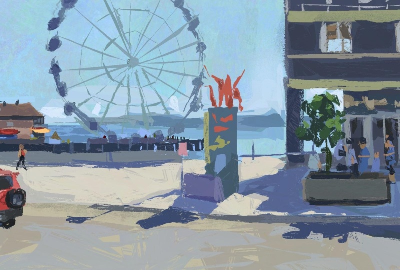
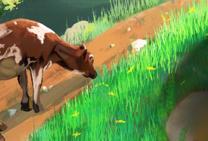
 Ayan Nag, Artist / Wanderer