Transcripts
1. Introduction: We all know about the
fundamentals of art. Beat lighting,
perspective, color TV. They're all talked about quite a lot in the
art community. What if I told you, there's a piece of this puzzle that's often overlooked
by most of us. Design principles are
the missing link which connects fundamentals to the
actual painting process. And we're going to learn
about it in this class. Hi there. I'm an artist from India. I've been working in the
entertainment industry for almost close
to a decade now. I create visuals for games
and animation as a living. And I like to wander
around changing places. Over the years of
studying art idealised just learning about fundamentals is not enough to improve my art. We need to be more structural and thoughtful
about the whole process. And I feel like design
principles gives us the tool to assist and apply fundamentals toward paintings
in a constructive manner. This class will be about
understanding design principles, how they work, and how they
are used in paintings. I go over each of
them one by one. Using master
paintings as example. I'll break them
down and show you how they were used to
create these masterpieces. If you're familiar with
just the basics of the fundamentals like
lighting, perspective, etc. You should be good enough to just start the
class right away. There's the first-class of the fundamental series
that I'm going to publish. There'll be two more
classes after this. We're starting with design
principles, this class. Next we move on to the
fundamentals of art. And after that, I'll
show you how to paint a landscape using all of
what we have learned so far. With all that said, I
hope you are as excited as I am to get
started. All right. In
2. Class Project: So the assignments for this
class will be very light in nature because most of it has to do with just
observation in general. What I'm doing is I
have a selection of master paintings that I really enjoy and I'll be
sharing that with you. So your assignment would
be to go through them. And wherever you find
certain aspects of the design principle more dominant in those
paintings are designs. Your job is to
find out why is it dominant and which principles
where used to bear. So it's basically after
you go through each and every principles that
I've showed you here, you will be just picking
up those images. And as I said, like wherever you find one
of the ring spins dominant, you will be just
taking that picture. Just mark over it how, how the principles are
used and where it was used to achieve certain
aspects of the painting. Let's say like there is
a character in certain, in a painting and
it really pops out. So your job is to
decipher why it was why it is that emphasize
that up in your face. And which means bills
were used and how. That's your homework. And when you do these, you are, you should be posting them
in the assignment section. And I'll have a look at them. And I'll tell you like if
you're going in the right way, if you're actually taking the thought process
to achieve these, are your just
mistaking somewhere, like making a wrong
turn somewhere else. I'll be there to guide you
in the right direction. So let's move on to the lesson.
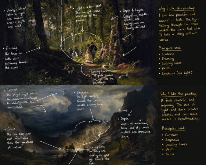
3. Principle I - Contrast: Have you ever painted
something that seem to you like it's a bit flat
or monitor illness. So in my experience, that is most likely an
issue with the contrast. So in this lesson, let's learn about
what contrast is and how we can use
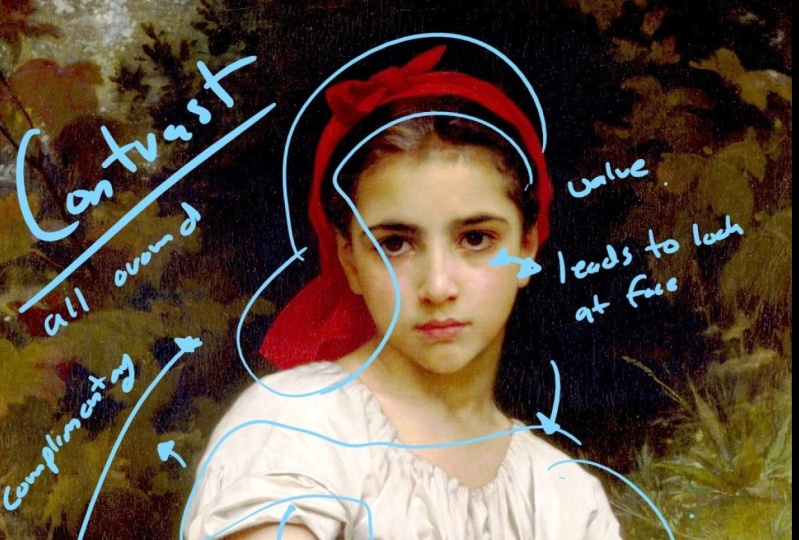
it to our benefit. Contrast is ideally
the difference we create between
elements, subjects, and everything basically like
here in the first image, you can see lot of
contrast in values, really bright values here. And here as well. Here we have a contrast in hue or color if you want
to say it that way. So in the first image, you have a lot of
dark values and lot of pride value
standing up against them. So that creates a sense
of contrast like this. Going dark to bright,
bright to dark. You're differentiating
the shapes and creating a sense of
contrast in the scene. And by doing that, you're basically leading the
viewer where you want to look dark to light
or light to dark. And emphasizing what do
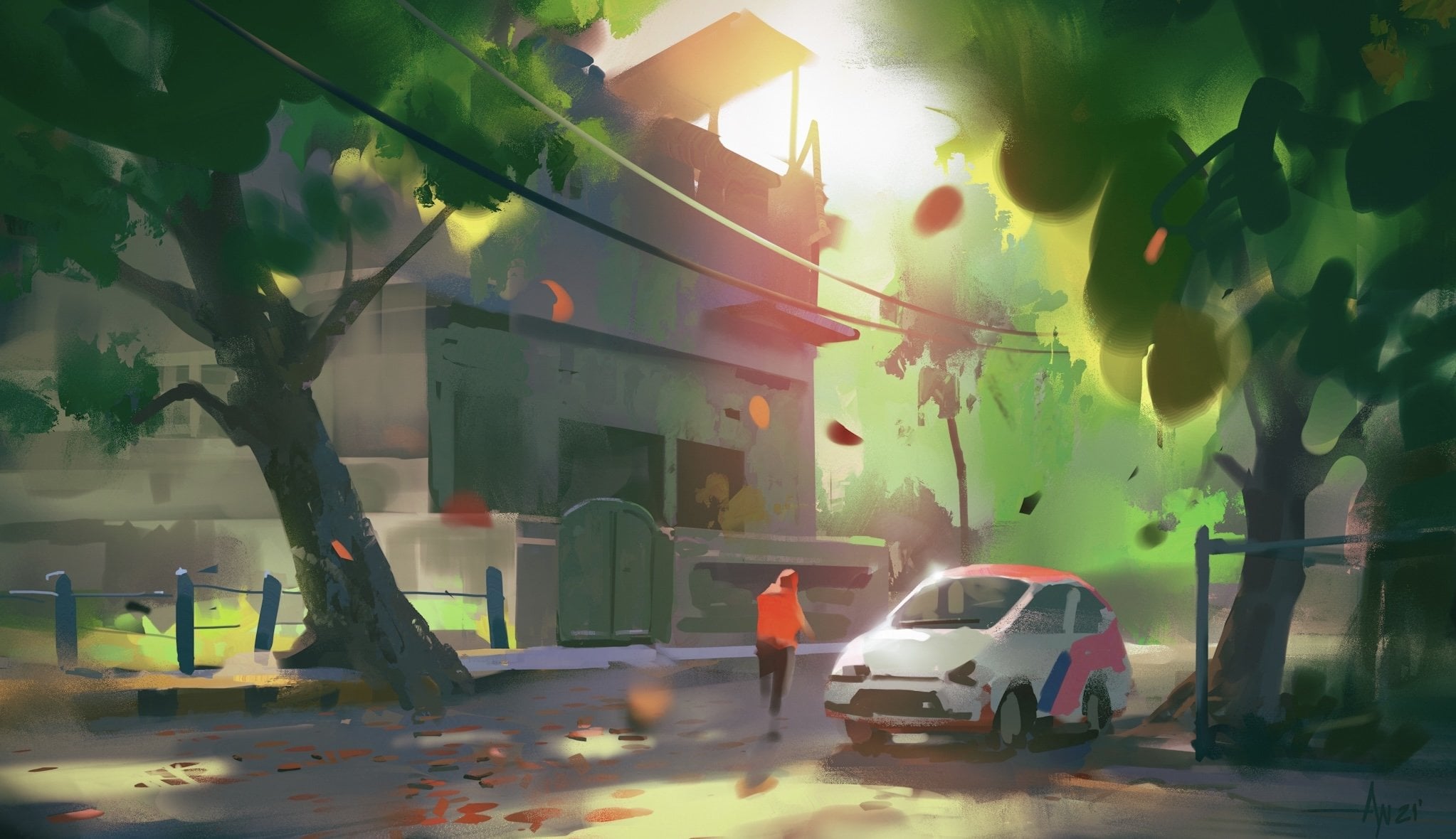
you want them to see? The second debates you will see obviously a lot of
value contrast, but also a lot of saturation
and color contrast as well. In the background, we
obviously have a darker value. But it's not, not just that because a lot of color
contrast and also creating a separate value
to show a leading line that leads the viewer
throughout the scene. So as a homework
for this lesson, you will be looking at
master paintings that I have put down on
the example box. And you will try to find out
where contrast was used, how it was used. However, I have
demoed in the video. So you can follow that route. It it's quite convenient for your own note-taking and
like all those stuff. So what you can do
is just take them, take the images, look at them, find out where contrast
has been used. And try to write them taking
mental notes or better yet, take a proper note on
the images itself. So it's easier for
your mind to register all these things like so next
time you look at something, let's say good painting
that you really like. And you will be immediately able to find out how contrast has been
used in that regard. So with this, let's move
on to the next lesson.
4. Principle II - Balance: So this is a very subtle
but very important part in design principles. Let's head over to the demo
and try to figure out like how balanced is at work
in most of the paintings, actually, all of the paintings. So you'll be able
to recognize how balances used in composition, and you will be able to use
them in your own paintings. So next, we have pallets. Generally the idea to distribute shapes and
volumes in scene. So we create a sense of balance. In this scene. We have basically do
bigger shapes here, one on the right and
one on the left. So he placed them as such to create a
balance in the scene, to create a sense of
stability in the scene. And moving on to the next image, we mostly have the subjects
on towards the left side, you can see the woman and
the tiger, Jaguar, whatever. You have to order
scientists in the lab, then you go to a satellite. There's a character there. Ideally he owned be lead as strongly as
he is in the scene. But just to balance
out the composition, he was literally with
a really strong light. And that is creating, that is actually
balancing out the, all the subjects we have on
the left with the right. So we have seen that
it's balanced and welcome post Onto the next image. Here we ideally have
for robot masses, I'm not counting in
the clouds because that's a different subject. Just look at the houses for now. So we have some medium to large shapes and some small
shapes within them as well. So I generally goes from left towards right because of that instrument of the
shape we have here. If you just remove the house on the far
right, the small house, we have, our iser, just go there and go
out of the competition. By putting a small shape to stop the viewer
from going out. We generally guide them back
in the composition class. Homework for this
lesson would be to just go over images
same as the last tone. Basically all these
homework would be same. But I want you to keep doing them and keep taking
notes separately, make a folder out of each design principles and keep them so it's categorized
inside your head. It's not just like
you do all of those in a single painting and everything is
jumbled up on your mind. So let's not do that. Let's try to find how
balance was used. How imbalance was
used in the picture making process to convey the
emotion of the story better. Alright, move on to
the next lesson.
5. Principle III - Emphasis: I'm sure you have
looked at all heard of The Last Supper by Leonardo da Vinci at least
once in your lifetime. So in that among all the
different characters, your eyes will generally
go directly to Jesus. That's emphasis, emphasizing and subject or an
object in your composition. So you guide your
viewers towards it. And that, in my opinion, is one of the most important
principles in design, like how to emphasize objects. Let's, let's dive into
the lesson and see how masters achieve it and how we can take note from that
and achieve it ourselves. So up next, we have emphasis. It's very similar to
contrast in nature. Because just see here, the character is obviously
standing out because how it's been placed against the backdrop, really
saturated backdrop. You can see really bitrates just in decreasing
the whole character. Again, contrasting values
or colors or lighting, or generally to a
lot of emphasis. So how you use them, it's up to you. Here as well. We can see the shortest,
really bright. And then we have a shadow
that leads to the face. Because the face has a really high contrast
highlights there. And that creates a sense
of contrast and emphasis. On the next image. We have an auto contrast in color and values in
the main character. Because it's been
emphasized in such a way. We are bound to look at
the character first, bound to look at
the current post. See how much saturation
in her dress. And a C sharp edges as well. That leads our eyes. Our eyes goes first to the dress itself because
of the high contrast. Then we have a value shift. And ideally it's leading
that shape is leading us to the secondary characters
and tertiary characters after looking at
the main subject. So how you emphasize your
subjects in a painting will determine how the viewer
looks at the image as well. As for the homework
for this lesson, I want you to find three master artworks that you really enjoy and that you feel, that you feel emphasis is
really a parent in those. And I want you to dive into
them and find out how and why it works and try to
take a note of those. And just so you can apply
them in your own paintings. Let's move on to
the next lesson.
6. Principle IV - Pattern: Pattern can be anything
from technical patterns, physical buttons or textures. So it's used all over the
places, let's say e.g. you use texture
for your clothes, you use texture for those rocks. So there's a certain
pattern to all of those. Some of them are very irregular, some of them are
very repetitive. So it can be textures, it can be how you
arrange your objects. Even those have
patterns in them. So let's dive deep into
them and see how they work. The next step is pattern. Pattern is basically unify
or fatty interpretation of any objects or shapes. So you can just repeat objects. That's also a pattern, and it can also be a
repetition as well. So repetition is also
a part of pattern. At least I would
like to think so. It can also lead characters,
repeat textures. So these are all
part of pattern. Here in this image you
can see lot of texture, a lot of patterns in the
image and the floor. That gives us a
sense of material, as well as a sense of scale. As it goes away, the pattern fades,
becomes smaller. And I want you to have
a look at the tables, the ellipsis we have. So that's also
creating a repetition. And it's giving us a sense
of scale as well as it goes farther from the
view, gets smaller. So that's perspective and
objects like combined. So we have a sense of
depths in the scene. We also have the
characters in there. And they're also
part of the pattern. I would like to sit because they generally gives us a
sense of scale as well. Here in this image you have a lot of repeated
objects like the chairs. And here, here as well. Lots of patterns like
through the object, we are creating a
motion and we're basically just guiding
the viewer around. So in this image, pattern might not
be as apparent. But it's mostly has
to do with textures. You can see the
lips at the bottom. It is a certain flow to them, but they also have
a pattern to them. They get texture. It's
flowing like that and it creates a sense of texture and detail over
the same over here. Flowing patterns,
flowing textures, and lots of
repetition of shapes. So that generally gives
us a sense of movement. So homework for the listener
be same as the last, as I told you previously. All of these are observation
based homeworks, so you just need to keep observing whatever you're
learning in this lesson. You'll have to just
figure those out in the example images and take
mental and physical nodes. So next time you see
something you can better accommodate yourself
to use these features, use these principles
to your advantage. With this, let's move on to
the next lesson as well.
7. Principle V - Proportion: You know, those paintings where we don't know if
something is wrong, everything is not matching up. The character looks a
bit too big or way too small relative to
the environment. So that's mostly the
issue with proportion. Proportion is very
important to kneel. If you want to make your images, your competition
more believable. Proportions can
play a huge role. You can use proportions to pretty much everywhere like there's
proportion in texture. This proportion in like, you can use the ocean
to show perspective. So let's dive deep
into the topic and see how the masters
have used it and how some of the common ways
we can use it to enhance our composition and make it more believable and more fantastical. Let's go. Proportion.
Our scale is the relationship
between the subjects or objects we put in the
scene or composition. It's basically differentiate or to identify the objects in the scene and give our viewers a sense of the
scale of the image. How big is the seed? How small is the scene? Here in this image you can
see we have a planet here. It looks like Saturn has rings. So we can instantly relate
to the object there, and we instinctively know
how big the object is. Compared to that. We have the spaceship
as well to the viewer. How big is the
spaceship in the scene? Because we have a giant planet. And we have the spaceship
and we have other elements that gives us the sense of
the vastness of the sea. So light there as well. Falsey is just too fast, just because we have introduced
the planet in the scene. Just instantly makes us late. And we can always tell how big other subjects
or objects are in the city compared
to what we recognize. As you can see here, that's repetition and shape
and generally showing the perspective there to give us a sense
of scale as well. Okay, look at the second image or the first two
heads right? Now. I want you to have a close
look at the textures. On the mountain pass we have. And then you can have a
look at the characters. Since we are familiar
with the character and we know how big humans and
horses generally are. So we can relate that to
the rest of the scene. And we can instantly gauge an
idea how big the scene is, how big those textures are, how big are those rocks, and so on and so forth. So that's one way
to achieve scale. You put in familiar objects
in the scene and help the viewer basically
recognize how big the CNAs. And we can generally
go from there. Like if I were to put a human, Let's add a human there. So once you put some
familiar objects in, you help the viewer realize
what you are trying to show how big the objects are compared to the familiar stuff. So we can take that away from the scene
and move on to the next.
8. Principle VI - Movement: So it'd be thinking
movement in a still image. How does that work? Well, let's dive into for listen and figure
out how it works. Movement or flow is a huge
deal in a composition. It's generally an idea to give an impression of action
or what is happening. Is the scene stable? Unstable, where you want the
viewer to look and all that? So we can achieve movement
in a lot of ways. Again, go through colors. We can introduce active shapes. But ideally in a composition, you want to have a
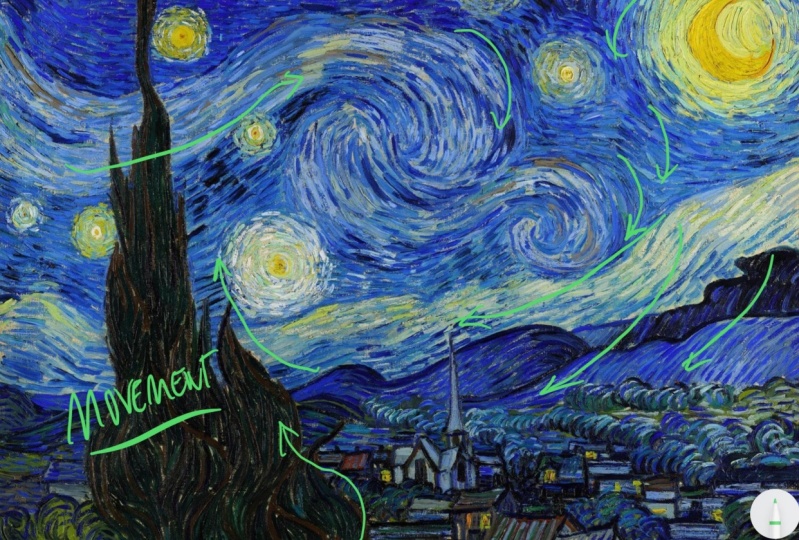
lot of leading lines. Leading lines are generated. Lines that goes like that. Points basically just points the pure towards an object or subject that we
want them to see. Here in this scene. We have a lot of leading lines in the foreground, like here. Here. And here. Everything leading
towards the subject. And the subject is
very centralized. And all the lines, all the shapes are basically
leading us to Him. And the beers. Even the mountains are basically ugliness telling us to look
this way, go this way. And we have a tilted surface. So that sort of gives us a
sense of imbalance as well. Here, the scene is balanced. And by denting the canvas are telling the surface
we can create a sense of imbalance in the scene and give it a sense of
movement or action. So lot of inward shapes
pointing towards the character, and lot of six eggs as well. You can always introduce some zigzag shapes
in the foreground. And to basically just
create a sense of movement. And kids, when they
can see the shapes are basically just leading
to the subject. And even their move
on to the next image. You can already see. The surface is slightly tilted, even though we have a sense
of balance in the horizon. We still have a tilted surface
that gives us a sense of imbalance and assistance of action or movement at the scene. You can obviously see the character and the
fishnets over here. They're ideally to
balance each other out. But you can see that the character is
off-balance slightly. So that creates a sense of struggle and gives us
a sense of action. You can also tell seal is not calm just
because of the ways that she said that inst and
with the surface is pointing. So that also gives us an idea of their
struggle in the scene. So I want you to consider
all this when planning is C, add a lot of movement
in the scene to top the shapes and see. You need to plan
out how you want the viewer to look
at, to see more. But it's a great way
to achieve that.
9. Principle VII - Variety: I'm sure you can guess
what variety and tails. It's pretty obvious
by the notion of it. But I'm here to show
you how you can incorporate in your artwork
design, and composition. I do think some of it
might even surprise you. So let's dive in. So next we'll move
on to variety. Variety can be different
instances of visual elements. Variety can be with colors, can be with values. Like here, you can see dark vans against bright,
really bright values. Same here. And same here. The shapes are
reading against each other, creating an emphasis
and contrast. And same here. You can see variety in subjects. Like you have a lot of
characters in here. You have grown-up characters, and then you also
have kids right here. Good. So that's also one way to bring in variety
into a scene as well. Here you have a lot of
variety in hues and values. So here you have a warmer
tone, their overall, then the background
has accorded to that plays against each other and
brains variety into the sea. You can also see
here the shadows are folder against
brighter services. Even in the basket, you can see variety
amongst subjects. All the apples are not the same. They have different textures. And that also brings in related. I want to have a look
at the books as well. They are not all the same. They have variety among them. Some of them have
different textures. Same everywhere. Even their alignments, like they're not
aligned the same way. You have separate texture
there, there as well. You can see the flow
of the arrangement. If you'd see a different
perspective, different angles. So those are going like that. These are also going like this. And even not all the books
are similarly aligned. So that also creates a variety. So in this image
you have a lot of warm bushes or for
lesions around. But to contrast that and
bring in some variety. You generally try to bring in
some colder tones in here. Like here, you can see darker and colder varieties of pushes to create a sense of
differentiation, if you will.
10. Principle VIII - Harmony: We learned about variety, but variety without harmony or unity is as meaningless
as anything else. So there are basically two
sides of the same coin. One without the
other cannot exist. So let's just go into this lesson and
figure out how we can combine these to understand
more about harmony and how we can combine this with variety to create
something more appealing. Harmony or unity is basically the polar
opposite of variety. It's the act of bringing together different
elements of art. Or it can be repetition
of objects as well. So harmony, it could be
achieved in many ways. Harmony, Lake, unifying
colors, shapes, patterns. And this image right here, we have a lot of
harmony and colors. Similar hues of colors, bringing together the
whole color composition of the image together,
like here, here. And here, the same
shade of orange or red. And then you have bolder colors. Also, we have lot of yellows, as well as the
backdrop is colder. That also acts as a
natural unifying elements. In most of the images. Here you have a
colder shade of blue. And here as well. So it's basically a backdrop
for the whole subjects. And in doing that, it's also unifying the
whole scene as well. So that's one way
to go about it. Here in this image, we have harmony in style or plus strokes or brush
efficiency, who will? That's generally what
you can see here. The rendition of the grasses are very similar here and here. So ideally, you want the image to have
a unifying factor in style. How you render elements, how you depict such things. So another way to
bring harmony into UC is using a set of
analogous colors. You can see here, these colors are all residing Vedic too closely to each other in
the color wheel. Here you can see hello and shades of green
and even the sky. I want you to pay specific
attention to the sky because the sky here is
also very desaturated. And this complementing
the colors we have used in the scene. And this scene. Harmony is achieved through
a repetition of subjects. Lot of characterise here, lot of person, a lot of people. So these subjects are
bringing everything together. But look at the top here and separate shade of blue
that was used here. So among all the cows that's
going on in the scene, like here, person here. You can tell like the differentiating factor and what's bringing them together, even the crosses here. They're also bringing
in harmony in the sea, similar shapes. And then there's
only one subject that's separate from the rest of the subject we have here. And also notice the
Arminian color here. Okay, We'll move on
to the next one. In this scene, we have
harmony and values. Overall, the CDS really exposed
to really high in values. And that is the target stock. And see, you can see how everything except
that, it's really bright. So using a set of values, change in your scene
and defining them. It's a high exposure,
low exposure, stuff like those can also
bring harmony to your scene.
11. Principle IX - Rythm: Rhythm is a pattern arranged in certain ways that creates
movement in the scene. So what do I actually
mean by this? So let's just look at the
examples and I'll try to break down how it works and how it
can be used in compilation. So let's get into it. Rhythm can be described as a combination of
movement and better. So you see datum is basically creating a flow within the image that's pleasing
to the eye like this. In this van Gogh, gametes
can see a lot of patterns, but they are following through, their following
through in emotion. You can feel the motion. So in this image as well, a lot of flowing shapes basically enact movement. Here. Here that's where you get the general idea
is ideally creating a non uniform variation of patterns that gives us a sense
of movement in the image. It's a bit hard subject
to define properly. But you know, like
once you see it here, you can see all the
shapes following through here as well. It's a reputation of
subjects like this, following perspective which
creates a sense of movement. It is also a form of rhythm. A non-uniform part
is very crucial. Because just like music cue, but in a non uniform
pattern in the image. Like this. To create
a sense of movement, flow within the composition. Can see here as well. Shapes flowing through that ultimately leads to fewer to the main subject we're
trying to emphasize. Here is a lot of
shifts going inwards. And here as well ending
up at the characters. So it's basically another way
to enact movement inosine. So this brings us to
the close of all, all of the design principles
that I have mentioned here. There are more, like two or three more
that you can find if you google about them. But fact of the matter is all the design principles
are correlated and they're either just variant
of each other or just the same thing like
in different packaging. So just understand this. They're all related. They all interact
with each other. And as you keep dive deeper, keep diving deeper
into these topics. You'll come to understand that one cannot really
exist without the other. So with this, let's, let's move on to the end of the lesson and I'll
see you there.
12. Conclusion: Alright, so this concludes
everything that you need to know about the
design principles. Try not to think about the principles as
something to raise it. Actually, it's
quite the contrary. The principles, in my opinion, is very flexible in nature. They are very interconnected
with each other. And a lot of the, lot of the principles
can and not can they influence each other in a way that's very
cohesive in nature. So like the more you
try to follow this, try to notice, try to observe
these kind of things. What n, what will end up happening is you'll
try to notice. It will try, you'll
start noticing much more nuances in their relationships that
that happens all the time. So the more you
notice these things, the more you will
be able to apply these in your painting. So my goal here is to just introduce you to the
concept of the principles. And by introducing these to you, you, hopefully you'd be able to think about
these actively. And while noticing something,
observing something, or just trying to come up
with a design solution, you will be actively
thinking about them. And that in turn, will actually help
you a lot with the decision-making process and making and coming up with
better designs all over. By using design principles, you would be able to analyze and take away a lot more from the paintings are designs
you actually enjoy and actively imply them. Implement them in
your own paintings. So with this, you are now ready to move on to the next class, which will be about
fundamentals. The reason I chose to introduce
the design principles before the fundamentals
is there is a reason. The main reason that I chose
to do this is basically the design principle
introduces you to a lot of new nuances that gets applied
into the fundamentals. So these are the parameters
that we're going to use to apply fundamentals
to our artworks. So that's why I figured it's
much better to know these, know about the principles beforehand before jumping
into the fundamentals. And in my Fundamentals class, which is coming up soon, you will be using a lot of these to analyze how
fundamentals work. Like how emphasis,
emphasis, contrast, etc, can be used in lighting, can be used alongside lighting. How lighting can be used to
emphasize certain things. How colors could be
used to emphasize certain things or something. Along the lines, like
all the fundamentals, actively use the design
principles in a way that's Vedic, cohesive and really
stitch together. Let's say. If you are unsure
about anything, just try to go through
the class once more. I know for some of
you like this would be completely new territory. And it will take
some time to absorb, it will take some time to just actively think
about these things. So just if you are
unsure about stuff, just go through the
class once more. And even then something
doesn't make sense. You are always welcome to
just drop me a line and I'll try the best of my abilities to just
answered them too. So with that, I'll
take my leaf and I'll see you very soon
in the next class. Happy painting. And I hope you take
good care of yourself.
 Ayan Nag, Artist / Wanderer