Transcripts
1. Introduction: Hi, I'm Celine. And digital fantasy
artists from Denmark drawing faces and thereby
skin can be daunting. So in this class, I'm going to teach you how
to paint skin in procreate, in a few simple steps that can be used with
any drawing style. We'll be using
different blend modes to use the digital medium to our advantage and try to make drawing skin a little
less intimidating. You'll be completing
a blending exercise, a feel for the
Blend Modes before moving to an actual face
for the main project. Both a template for
the exercise and a reference and face sketch
for the project will be in the resource
section along with my favorite blending brush
available for you to use. If you want classes
on sketching phases, painting portraits, or how to find the right
colors digitally. You can have a look
at all the classes I have on my profile. I'm working on building up a variety of subjects
for all levels. Without further ado, get out, iPad, fire up, Procreate,
and let's get started.
2. What are Blend Modes: If you're new to Procreate
or digital art in general, you may be thinking, what about our blend modes and what
can I use them for? As the name suggests, the blend most determined how layer's blend with the
layers beneath them. There are many to choose
from and play around with. But for today we'll
be focusing on multiply an overly assets. The ones I find the
most useful for beginners ever new layer is
set to normal by default, meaning they cover up what
is under them completely. If you lay down an
opaque layer of color. Multiply. On the other hand, we act with the layers, multiplying the color you're painting with two the
colors underneath. This means that you
can darken areas without loosens the definition you are already
done with shading. Works much in the same way, but depends on how light
or dark a color you use. If you use a dark color, it darkens and can
be used for shading, but with a light
color, it lightens. I find it useful for
brushing and adding life to skin without
losing definition. Now for the reason we're using thin Mozart painting
skin and thereby people or characters can be really complicated due to all the
complex shapes of anatomy. But the process
can be made a bit simpler and separated
into different steps, but working in multiple
layers and using blend modes. This way we can split
our attention between shading to get whatever
amount of realism you want. An adding variety to colors, always with the option of
undoing or we're changing our minds with everything
in separate layers. To show you what I mean, Let's get started
with an exercise.
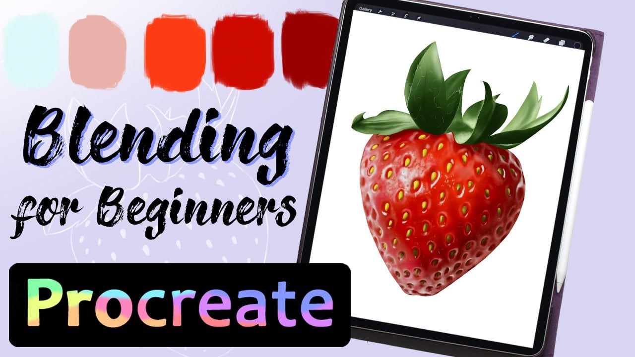
3. Exercise: Download the exercise
template from the resource section
and import it into an A4 canvas in Procreate. Here we have a sphere
to color along with spaces to swap the
colors we'll be using. Each sugar also
has a letter that shows what blend mode
each layer should be. Make a new layer. And
in the first circle, swatch your base skin color. Swatch, a warm brown
for the shading color, reddish brown for the brush, and a bluish purple
for the shadows, and light yellow
for the highlight. These are the colors
we'll be using to shade a whole face later on. Now make a new layer on
top of the template. Set it a clipping mask, so we won't draw
outside of the shape and keep the blend mode
on the default normal. Then fill in the circle
with the base color. Select the shading
color and make a new clipping mask
set to the Blend Mode, multiply the smear with this color, and use the smudge
tool to blend it out. The point of this
layer is to get the so-called shape and made
it look three-dimensional. In a new clipping mask set
to the blend mode, only. Use a blushing color to make variation to the color of
both the base and shading. Effective way to add
life and burying color without having to worry
about the initial blend. The next clipping mask we
set to multiply and use to purpose blue color to darken
the very deepest shadows. This goes at the very bottom of the sphere where there
would be no light. This adds another layer
of depth, the skin. In the final clipping mask, keep it set to normal and use the highlight color to
make the shape pop. This helps contrast to shading
and make this VL of 3D. Each layer adds a
bit more dimension and live to the skin while giving us the
option to return to each layer and change
things should we want to. This makes it a beginner
friendly technique with plenty of room for experimenting
with your personal art style. Knees bent most can be
used for all skin tones. So play around with that
to get a feel of how the different blend
modes affect the colors. The tricky thing about blend
modes is that the color will appear different in
the multiply overlay compared to the normal mode. But by playing around,
you'll get a hang of it. Now let's move on.
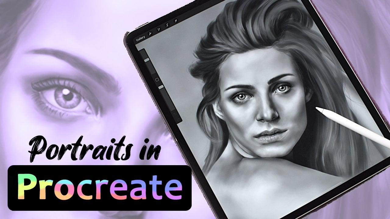
4. Reference and Sketch: The reference I'll be using
for this demonstration is the one that I used
from a previous how to draw hair class. Make the project a little
less intimidating. I'll be using the same sketch
I made for the class so you guys can get it to and not worrying about
starting from scratch. The fact that it already has hair will help make
the whole thing look a little more put together in the end and help us
adjust our values. You'll find both the
reference and sketch in the resource section ready
for you to download.
5. Step I and II: Base and Shading: Here we have the sketch. I went ahead and filled
in eyebrows, eyes, and lips to go with the hair so we only need to
focus on the skin. Below everything else. I make a layer called
base skin color, which is where we'll start pick the base skin color
of the palette on the top and fill
in the face and neck. This is easy since this is the bottom layer and thereby
can't overlap anything else. For lighter skin, look for
basis in the light pinks, orange or yellow on
the desaturated end. Now make a new layer
on top of the base, on image shading and make it a clipping mask
to the base layer. And keep the blend
mode set to multiply. Pick the brown shading color, and use this to shade according to your
personal art style. I went for a realistic look, using the reference as my guide, but it's also making
it out to you. If you need help with shading
realistic face anatomy, you can have a
look at microscale portrait class
that'll help you out. Good tip for knowing
where to shade is to make your reference grayscale
by removing saturation. This way, you only have
to focus on where to make things darker without
worrying about the color. This is one of the advantages, are working on the skin in different layers and
blend modes like this. I blend in a mixture of using the pen pressure of the brush
by using the smudge tool. How smooth or rough you blend, It's up to you and
your preferred style. I also had the eraser set
to the same brush since you can use it to carve out details that has been
**** and blending. Erasing in the shading layers does not affect the base color. So everything can
be if you mess up. You also don't have to
worry too much about the specific college choice
by painting skin this way. Since we can go into each separate layer and change or adjust
the colors at will. This takes out some of
the fear of messing up something that can feel
really complicated. This shading layer is what lays a foundation of shape and
the face of your character. And it doesn't matter how
realistic or cartoony draw shade to the point
where you are happy with the shape and
dimension of the face. And then we're ready to
move on to the next step.
6. Step III: Blushing: Make a new layer
called blushing, set to clipping mask on top of the shading and set the
blend mode to overlay. Pick the brushing color
of the palate and start working this in
wherever you want, some warmth and color
variation to the face. If you draw my style, this might only be the cheeks, but in my reference, this pink to various parts of the face like the
forehead, nose, and chin. I lay down the color roughly and then smooth it out.
It this much tool. The color might look
dark on the palette, but on the lighter
parts of the face becomes a crushed lighter
to set the blend mode. The same goes for this layer. You can erase if you need to, return to add or
take away later. If you regret the color choice. Along the way, you can go into adjustments and shift the
hue for this layer only, which can be very useful. In short, there's plenty of room for trial and
error with this method. If you're going
for realistic look and pay attention
to your reference to see small variation of color in the face and
where to place them. If you want more
interesting lighting scheme with colored lights,
for instance, you can add even more
layers like this with different colors set
to the overlay blend mode. But for today we'll be
sticking to the basics. Where the shading brought
shape to the face, the blushing drinks life, even if it's not the
most drastic difference. Now we can move on to
the deeper shadows.
7. Step IV: Deeper Shadows: To add even more dimension, make a new clipping mask
and set it to multiply. Pick the dark bluish purple from the palette and place it where
the shadows are harshest. This is usually on the opposite
side of the light source, like honor the hair,
and under the chin. This is again a
subtle difference that you will need
an all styles. But for realism,
it helps bring out darker values and
thereby dimensions. Since we already put down the basic shooting
in a previous layer, is little simpler to place
down this darker color, since the shading hint guide
us, we're going to put it in very bad pictures or
different art styles. You might not even need
this darker shadows. But the option is
there for the taking. Now we're ready to
move onto highlights.
8. Part V: Highlights and Adjustments: In a new clipping mask, you can set the blend
mode to screen, which will lighten
what he's beneath. But I prefer to
have set to normal. This way, I can choose to completely cover
spots in highlights, no matter the shading beneath. But ultimately the
church is up to you to find a highlight color
for regular warm light. They pick the base
skin color and choose a lighter color and shift
the hue towards the yellow. Placeless wherever the face
catches the light the most, like the forehead, tips of the nose and talk
with the cheekbone. I also use a small brush
to cover details around in the eyes and the
sudden skin folds there to help make
them stand out. Adding highlight is the
other side to the coin, like adding shading and
shadows as the lighter color make the features protrude and the darker corners retract. This all helps to
bring out damage. And in the end, I also like you to him
varying pen pressure to help us subtle highlights
along with the smudge tool. Even if the layers on
their own don't make a huge difference
together, that really do. At this point, we can go back
into the different layers with their appropriate colors to make some final adjustments. For instance, if an
area looks too rough, other back into
the shading layer and printed some more
with the smudge tool. As mentioned previously, we're going for
the basics today. But if you want a more
exciting lighting scheme or your reference shows different color
variations to the skin. You can make more overly layers and at different colors in. But for now, this
project is done.
9. Alternative Style Example: Anime: Here we have the same
approach to drawing skin bone in the character
in a simpler animal style. This style has less
shading over all, but the blend modes can be
used in exact same way. A lot of anime has
simple shell shading, but I prefer it to blend
things a little more. But these layers work
for shelter adding to. Even in more animated styles, having very issuing in the
shadows can make a difference. And I choose a slightly
lighter color for the shadows that would add some color without
being too harsh. You can choose to
paint scheme this way, no matter what odd style
resonate with you.
10. Final Thoughts and Class Project: Now we've been over
how to draw skin in procreate with a few
effective steps. Now it's your turn. The class project for
today is to compute the blending exercise and have a go at creating the
sketch I provided. But remember how
you shade is up to personal preference to use the blend modes to get the
result that looks best to you. The exercise template and
sketch is available for you in the resource section along with the blending brush or useful
entirety of this class. Thank you for taking this
class on my profile, I have other Procreate
classes that you might like, such as how to paint
portraits in grayscale, how to draw hair, and how
to pick and mixed colors. If we wanted to see
more of my personal ad, you can find me on Instagram
at a leader theater art, or have a look at my Etsy shop. Have fun creating
and bye for now.
 Celine D., Digital Fantasy Artist