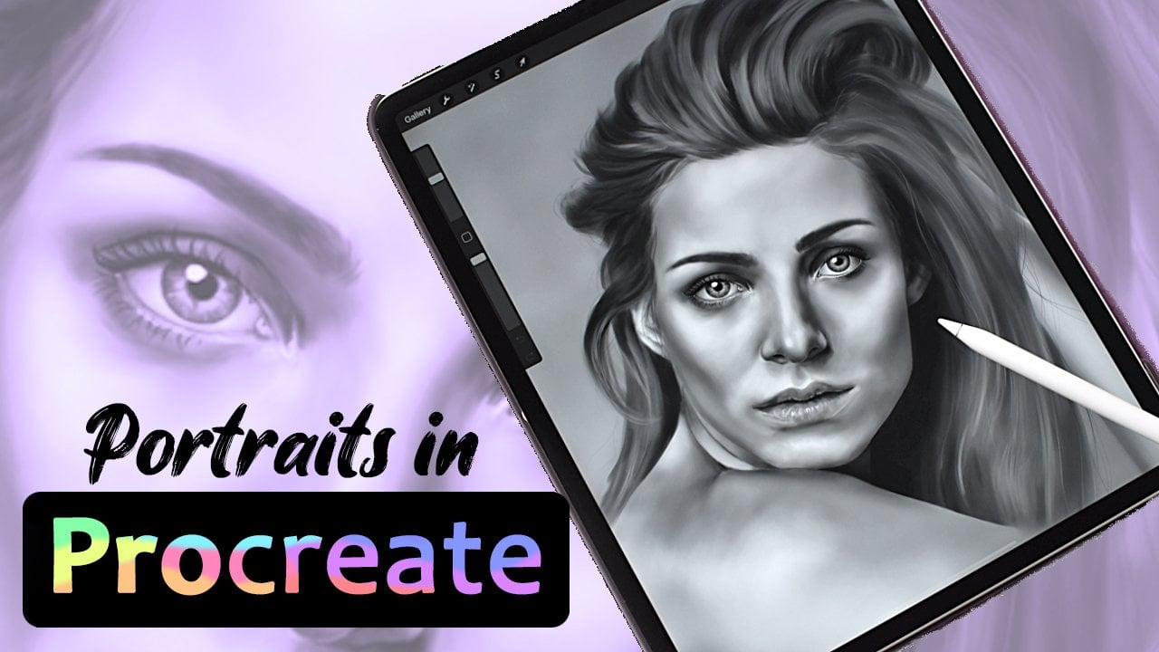
Blending in Procreate - How to Blend for Beginners
 Celine D., Digital Fantasy Artist
Watch this class and thousands more
Watch this class and thousands more
Lessons in This Class
-
-
1.
Introduction
0:35
-
2.
Exercise One: Traditional Blending
1:41
-
3.
Exercise Two: Smudging
1:41
-
4.
Exercise Three: Blurring
1:44
-
5.
Exercise Four: Pen Pressure and Brush Choice
2:13
-
6.
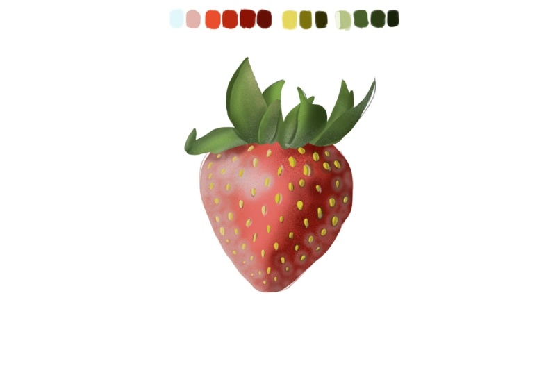
Demonstration: Strawberry
5:18
-
7.
Final Thoughts and Class Project
0:36
-
-
- --
- Beginner level
- Intermediate level
- Advanced level
- All levels
Community Generated
The level is determined by a majority opinion of students who have reviewed this class. The teacher's recommendation is shown until at least 5 student responses are collected.
562
Students
8
Projects
About This Class
If you’re new to Procreate and want to learn how to blend, this class is for you!
In this class you will learn:
- The most basic ways of blending
- How pen pressure and brushes works for blending
In this class you’ll get a demonstration of my blending process while illustrating a realistic strawberry in Procreate.
You’ll be completing 4 different blending exercises to figure out which approach works for you and your art process. You can also put them all to the test and create your own illustration - the reference photo, my sketch, palette, and blending brush is available to you.
Even if you are using a different drawing software or devise, you can learn from these blending methods, as they translate well to e.g. Photoshop and pc.
Although starting my digital art journey in Photoshop, once I got my first taste of Procreate I’ve never looked back. I use various ways of blending in my work, as I create fantasy portraits and magical settings.
Music by Lesfm from

Hands-on Class Project
Your class project is to complete the 4 different blending exercises to come closer to finding your preferred method.
Realistic illustrations can be a daunting task, but if you want to have a go at the strawberry I demonstrate, both the reference, sketch w. palette, and my own blending brush is available for you to practice with.
Sharing your work:
Share your finished exercises or finished illustration with the class by uploading to the “Your Project” section. If you have any questions, just let me know – I’m happy to help.


Class Ratings
Why Join Skillshare?
Take award-winning Skillshare Original Classes
Each class has short lessons, hands-on projects
Your membership supports Skillshare teachers
Learn From Anywhere
Take classes on the go with the Skillshare app. Stream or download to watch on the plane, the subway, or wherever you learn best.