Transcripts
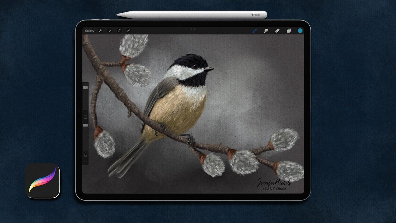
1. Introduction to Class: Hello, my name's
Jennifer Nichols. I'm an artist and teacher
into fabric designer. I have over 40 classes
on Skillshare and I absolutely love
teaching everything I know about Procreate. In this class, I'll be
teaching you how to draw birds with soft pastels. We're going to be drawing
a chickadee and you can apply these skills to
any bird you like. I've created numerous
free brushes to give you a
wonderful pastel look. And I'll also show
you how to create a textured Canvas
so that you can create your own Canvas
is on any size you want. I've included two pallets. When is it chickadee palate
and the other one is for background colors
for a pastel Matt. I've provided a whole
bunch of freeze photos and talk about the websites
where I find those photos. And then we're going to compose our own image with
two different photos. When branch and when
chickadee and I'll show you how to come up with a sketch based on those photos. And then we'll make
it look like pastels. It's a really fun class
with beautiful results. I can't wait to show you. Before you start class. Be sure to hop over to
my Skillshare profile. Follow me on Skillshare
so you can get notified when I publish classes. And you can also find my Facebook group,
Instagram and more. I can't wait to get started. See you in class.
2. Class Resources: Alright, so let's
go to the Projects and Resources tab of class. And this is also where you
can create a project to. I'll just show you
really quickly. This first button is for
just the cover image. And if you want to add more
images to your project, you add them with this
button right here. So that is something that
confuses a lot of people. And also this one will crop to a rectangle, the cover image, well, the resources are here. Sometimes the list is longer
and you need to tap this, See More tab and then you
can see the whole list. You need to be in a browser. In landscape mode, I use Safari and there are some browsers
that don't work so well. So check different browsers
if you're having a hard time. And I have a brush set so I
can tap that tap Download. You can see it right here. Downloading swatches,
download That's palettes, another swatches, and then
a zip file of images. So you get all of those and then you can get to
them right here. You can just tap one of them and it'll bring it over here to your downloads in
your files app, which looks like this. If you don't remember
the names of everything and you
can't find it. If you have a lot of stuff here, you can tap recent and they should be right
there at the top. So let's go ahead and unzip
that chickadee folder. Now, just tap on it to unzip it, but it's also going
to bring it back down to this Downloads section here. So it was called chickadees. So here it is, right here. I have mindset to do
alphabetical order. And then it and
zips to a folder. I think I've done it
a couple times here, so that's why you
see a second one. But you're gonna see a folder. And that is where you can access all the images
that I provided for you. So these are just
free use images from Unsplash.com
and pixabay.com. And those you can save
however you like. So you can go through and decide which ones
you want to keep. You can tap the little up
arrow and save your image to your camera roll or however
you want to organize that. So let's go back to recents. And you can see here we
have the swatches in the brush set for those I like to split my screen
with procreate. So you just carefully
slide EPA little bit from the bottom
and just do that. Now I can just tap. So I have my pastel
mapped Dots, Swatches, chickadee Dots Swatches, and
Jens PESTEL dot brush set. And those are just going
to import right in. Now if you just go into
any one of your Canvases, you can see the brush
set at the very top. And if you go over here to
this pallets option here, you'll have to scroll
all the way down to get to the palettes
that are right here. And then you can drag them around into whatever
order you want. Alright, next I will show
you a little bit about the swatches and the brushes and how to make a
textured Canvas.
3. Creating a Canvas Texture: All right, Let's go ahead
and start a Canvas. Tap the plus sign. And the plus sign again. Unless you have a
favorite sized canvas, go ahead and pick that. I'm gonna go with a size that I might want
to print some days. So I'm gonna go with inches. And for width, I'm
going to do 14. And for height, I'm
going to do 11, 300 dpi. And then I always stick with this first sRGB color profile, but I don't want to get
into all the details on color profiles and make sure
that you are at 300 DPI. Oops, May 14, went away there. And tap Create. If you don't have at
least maybe 10 layers, then create a
smaller canvas size, maybe eight by 10 or whatever is a typical print
size where you live. So in, if you go ahead and
go to Palettes and find the pastel colors and tap on it, then it'll be right here. So sorry, I think I
did that too quickly. If you just tap on one of the colors than the blue
checkmark shows up, and then you can go
over to the disk. This is how I like
to view my palettes. These are great colors
for background colors. So you can go ahead and tap
Background and pick a color. We're just going to
pick any color for now. So I'm going to add a
couple of layers here. And I'm gonna go
to a gray that is straight across but
a little bit darker. And now I'm gonna go down to the floor texture
brushes I provided. I'm going to choose pastel
board to start with. And we're not gonna be able
to see this very well. In fact, I may go even
darker with that. And pick a grain size that you want and whatever you choose. Just make sure you
cover the whole board, the whole canvas
with one stroke. Because otherwise it's
going to do that. Alright? And we're going to change
that blend mode to multiply. And we're going to
duplicate it and change that one
Mode to Color Burn. Now you can see that that created quite a
different look already. If you zoom in, you
can play around with the opacity,
the multiply layer. It's really just for
the light colors. So we'll look at that
in just a second. So I'm going to go ahead
and group these two layers together and rename
it pastel board. So that I know what a Canvas texture I
used on those layers. And I'm going to do another one. I'm going to go a little
lighter with my gray. And I'm gonna do craft paper. So you might need to use different shades of gray
for some of these brushes. And that's all going to be with experimenting that you
figure all of that out. Figure out what size you want. Cover the whole thing. In one stroke. Set one to multiply, duplicate it, set
one to color burn. Now I've played around with
the order of things and it doesn't really seem to make
that big of a difference. I'm going to turn the opacity
down on the multiply layer. I'm going to group those
two layers together and rename one craft paper. All right, so now I
want to go down to a blank layer and
just pick a brush. Let's do the soft chunky pastel
and get a white on there. And get a midtone on there
and get it dark there. Just to play around with
some colors and see how they're looking with your
textures that you've chosen. I always seem to be doing these days two different
types of texture. So for the pastels, I always do the pastel
and then another one. So play around and experiment and have lots of fun
figuring this out. So this is just my method
and I'm sure there's lots of ways I've played around doing
things with overlay to, I didn't have a lot
of success with that. The colors were
doing weird things. So but experiment. So now I'm going to
show you one thing. I'm going to turn the pastel
board off and I'm going to show you why we use
the multiply layer. If I turn the
multiply layer off, you can see that the texture isn't showing
up at all on the white. So that's the biggest
reason I have the multiply layer and I can
play around with the opacity while just looking at
that white layer until I have a good texture
on the white. So for Color Burn, I'm going to be looking at some different colors
like super bright colors, Color Burn might
not look so great at full strength with those. So I have I have my Color Burn opacity down just a
little bit, but you need to, depending on the exact
gray that you chose, you're going to need
to figure out what works best for your canvas. And also, you can
play around with not necessarily using gray
for your layers here too. So just have fun experimenting. I'm going to turn the PESTEL
board layer back on and do the same thing with my
multiply layer here. And my Color Burn layer. Here we go. So now just to get
them out of the way, I'm going to group my two groups together into one
group and collapse it. You can call that textures
or whatever you want. And now you're ready and that is really important to
do, to get started. And that will influence
all of your color choices. So this is kind of
just a little test. And now I can really decide what color do I
want my background to be? I might want to change
my mind depending on the bird picture that I
choose as a reference. So for now I'm just
going to leave it here until we know what bird
we're going to draw. You can go ahead and
clear that layer as well. Alright, so in the next
lesson, review the brushes.
4. Using the Brushes: All right, I'm going
to choose white for brushes and let's
talk about brushes. So the white pencil stroke is a really great brush that
I've given away quite a lot. And you might have this already if you've taken my classes, it works great in this class. So I did provide that again. And the rest of
them are brand new. So you can see that lovely
texture in that one. And this is hard edge, hard pastel edge detail. And that's kinda when
you take the edge of your PESTEL and you draw just to get some
details with it. So it's got some nice texture. The soft pastel is very smooth. And it's a pencil, soft
pastel pencil and you can use it on its side just
like a regular pencil. And then the pastel
pencil is just like it. But it's got more texture, so it's not as smooth. This streaky pastel brush is really great for
the bird feathers. I've been using it on a
fairly small size and doing a lot of this fund, the streaks with that. And then the soft
chunky past style is when that gets really big
and has a lot of texture. And the scientistic PESTEL is as if you were taking one and going like this, rubbing it. So it's kinda like
a Nikko rule here. I'll go a little smaller. I made it go big in case
you need it to be big. I've had a blast playing with color with this brush and then
smudging with it as well. And you can get lost. You can just totally
get lost in this. So do it, Have fun. Right then these three are just intended to
be used as majors, but you can use them to
draw with just like you can use any of these to
smudge with as well. But this one, the
steady blender is kind of simulating us go over to
the smudge brush with it, is kind of simulating
the color shaper is what they're called when you buy a physical stubby blender. And that's kinda when you're
blending with your finger, you have to use, you have
to blend a big area. And then this is a nice way
to get details blended. Without a blending the
whole surrounding area. The blend the fingers is
just what it sounds like. It's going to really smear your pastels around and
you barely have to touch. So when you're doing
multiple colors, it's going to be really nice
for getting those mixed up. If you don't want things
mixed up so quickly, this soft pastel
and the blender, so it can be used to as
a brush or a blender is a nice way to more subtly
blend your pastels. And there is a little bit
more streakiness to this one. So you'll be able to see
that when you experiment. So I, I definitely encourage
you to always actually to experiment with your brushes and really get to
know them and play around with them before
getting started. And then if you're worried
about doing that and you want to keep using that
same canvas for your art. But you don't want
that all to show up in your time-lapse video. You can go to the
wrench tool and go to video time-lapse recording, turn it off and purge, and then turn it back
on and it'll start recording right from there. And it won't have
all of that in. It will have all of that plane. It'll, if you've still got this showing on your screen,
it's going to show it, but it won't have all of
that experimenting and playing in the time-lapse. So that's kinda nice. Alright, and the rest are
just the texture brushes. So that's it for the brushes. And they're wonderful. I hope to, I hope that they worked really well for
you in this style. So there's one more thing
I want to show you, and that is a technique
that you can use when you don't want to blend out all of your texture like
I just did here. So let me show you
really quick with the chunky pastel here. Chunky, soft, chunky pastel. And I'm just going to
get some on the page. And then if I want to
add more color to this, but I don't want to
smear anything on it. What you can do is
alpha lock the layer. So two fingers
swipe to the right, or you can tap it and
choose Alpha Lock there. And then you can
draw right on it. So it's only going to show up where there's
already white pixel, these pixels, no matter
what color they are, wherever there's already
pixels on that layer. That's where this is
going to show up. I'm in a dark and that
background layer. So you can see that more easily. So you can see the dark
areas through there. And now I can blend. And you see all the dark, dark, dark areas through the
white and through the red. I can blend as much as I
want and those texture, textures are going to stay. So if you draw over here, might be a little
bit more obvious. No matter how much
blending that I do, those textures that
I laid down on that initial layer
are going to stay. Because the only blending
that's happening is all in the pixels that
were already on the layer. So you can take alpha lock off. And just to show you an
example of if you were trying to smear this pinkish red onto the white without
alpha lock on, you would smudge the, the texture right into. It would just disappear.
If this were on paper, you would be blended it
right into the paper, right? So you would lose the texture and it would just be smooth. So that's a look that you
will want to sometimes, and then that's a look that
you will want sometimes. So sometimes you
really do want and really just smear things around. Next step, we're gonna
do a little bit in sketch practice. And then we're going to
figure out our composition.
5. Your Class Project: For your class project, I'd like you to either
follow along the in-class with the sketch and the final project
that we make. Or find when completely
your own or both, you'll be creating your
own canvas texture, finding the perfect
background color, and then designing a sketch
and coloring it like pastels. I did not provide any sketch
for you in this class. But since all of
the photos that I provide are from free use sites, you'll be able to trace
those if you really need to. But I encourage you
to follow along and I'm just listened to
you my thought process for how I developed my sketches and give it a try
and be sure to post your class project in the class project section so we can all see each other's work.
6. Quick Sketch Practice: All right, We're going
to practice a little bit of shape language here. And this is just how I draw
using a reference photo. So instead of when I'm, when I'm gonna do
the real sketch, I'm going to show
you my process and I have split screen
when I do that. But before we do that, I wanted to show you where
I can draw directly on top. So I'm gonna go to
my soft pencil. You don't need to do anything except watch in this lesson. And I'm going to go to a bright red and I'm on a new layer, I see a little stroke on there. So I turned the opacity down on these just so
you can see them, my, my writing more easily. So I turn the opacity down
on the birds so you can see my red circles and
lines more easily. So when I'm looking
at a reference photo, especially with birds, I'm, I'm looking at the body shape first and let's just
go with this one. And so I would be looking for
circles and ovals, right? A little bit too big here. So for this one I
would be seeing that oval and then for the head, I would probably do
that right there. For this one, I would be
seen kind of a circle under here and the head
overlapping right here. For this one, I would
be seeing this kind of squashed circle here and the
head overlapping right here. And for this Len, little bit more obvious. And you can see the heads
are all overlapping. So that's what I see. And then after that, I do kind of think, Okay, what's the rest
of the shape doing? So let me turn the
opacity down on those and go to a new layer. So then for this one, I would be seen that
the back of the neck is nice and curved
like this, right? The back of the neck. It's nice and curved over here. Back of the neck over here. Oops, my Can't I draw
the back of the neck on this one is up there. Right. So I'm looking at where the
neck kind of meets the body. This one I've kind
of gotten much more smaller than the actual shape. And then the front of the
neck is usually curved in. So right here, it's a little
curved in, right here. You can't really see anything because the
beak is in the way. And the same with this. And this when I
have a curve out. So that's like a
profile shot there. And it just so
happens to curve out. And the next thing I
look at is the tail. So I went to look
at kind of just making sure I've got the
right angle on the tail. Right. Because if this
picture, for example, had a tail that
stick out like that, that would look nowhere near what the
reference looks like. So that's kind of
what my processes. And for beaks and eyes. And depending on the
direction they're looking, you can see, right
the eye to the beak. That bird is looking at. The beak is pointing
up and the eye is kind of at the top of the beak can set
in a little bit, this one too, that the
bird is looking up. So that line from the
eye to the beak is up. Beak. This one. It's kind of looking and down and you can almost see
the other eye right there. So one of the tricky parts with we're going
to run into with the claws and the beaks is when you look straight
on at a client, we know a collage is
shaped like this, but when you're looking
straight on at it, it's probably going
to look like that. And the same thing with beaks. So we have the beak that
looks like that at the side. And it might just
look like that. Probably a little wider
for the front view. So the trick here is to
draw what you are seen, not what you know, you know, the shape of the beak
is like this, right? But that's not what
you're seeing when you're looking
straight on at a bird. So we're going to practice
drawing what we see. All right, Next step we're
going to compose our sketch.
7. Sketch 1: Branch: So I like to split
screen with the photos. And now I think I was going to try to keep it
super, super simple. But I think I can do this in a slightly less simple way
and still keep it simple. But instead of just picking one photo and
sketching that photo, we're going to compile
a couple of photos. So the, the images
that I provided, some of them are the branches. So this one right here is the perfect picture to have
a bird sitting right there. Some of these are not so great. I used this one
in as a reference and I ended up leaving
off a couple of yhe, little perceive a low buttons. So that just allowed it
to be a little bit more simply simplified for me to get my bird sketched on there. And when I did that
I kinda went okay, so I have this branch
at this angle. Is there a photo where the
bird is also at that angle? 0 here? That one is right. So that one I could, I could sketch that bird. I could omit this branch and to use the other branch instead. And that's what I did for this. All right, so let's
think about this photo. I'm almost thinking I might
just draw this one branch and not these blurry
background branches. So let me think
about that and see if we have a photo that has a bird on a branch
that's either at that angle or the opposite because we can also
flip the photo. Yes, definitely. I think we can use this photo. And this branch. So do you see how this branch
is at this angle though? And in that photo the
branches at that angle. So now we need to decide, do I want my bird facing
this way or that way? I think I'm going
to flip the bird. That sounds terrible
if you know, if you're American and
you know what that means. But what you can do is if you have the photo
in your camera roll, you can tap Edit. And then you can tap
this crop option here. And you can flip it right there. While you're here. If you want to go
ahead and crop it to, you can do that and tap Done. So now I have a reference
photo of a bird on a branch at a similar angle to the
branch that I want to draw. And then you can decide
which comes first, the branch or the bird. I think I might just do a rough sketch of
the branch first. Really rough. I'm gonna go ahead and
stick with this dark color. I haven't done one on a super
dark background color yet, so I'm going to do that. And I'm gonna do my
wide pencil stroke and go to a pretty small size. I'm on a light color since I have the dark background color, choose any color you want. And I see my branches
coming up from up here. Oh, it just so happens that my reference photo is
this landscape image, just like the Canvas
site created. If you ended up
choosing an image that is more in portrait mode, then you can create a new canvas or you can
rotate just like this. But I think it does affect
your I'm time-lapse. So if that's important to you, then you may want to just start a brand new
canvas in portrait mode. All right, so I'm just
going to really roughly sketch the branch
pin of curving down. I already think I need it to
be lower than that actually. Maybe down here like that. It doesn't have to
look just like that. I might even leave
off one of these. Just have kind of a and
here and here and there. There's a little
Debbie branch there. So I'm just kind of looking
at you can see how very, very rough this is. I have a branch
coming off over here. And I really do
want it to be rough because I don't want a
really smooth pastel look. And I have another
branch coming off that comes up here with
another one here. I like that one up there. And then this one
goes up and out. And it looks like I have
another branch up here too, with a little double
placebo on the end. And then I can do
my bird right here. So I don't have really
the thickness of my branches and
sketched out yet. So I might want to come
back through and get a little bit more thickness and bulkiness on those branches. That'll work and you can
always rotate it and change it depending
on your bird photo. So let's go ahead and
you can pause and get your sketch ready before you
switch to the bird image. And then come back
and find this bird. And we'll get
started on this one.
8. Sketch 2: Bird: So I'm a my white sketch. I can't see very well here, so I'm going to alpha lock
that layer and that tells me I already have
something on that layer. I could label it too, but I'm really bad at labeling. So I don't do that. So I'm going to New
layer to sketch my bird and that so I
can move him around and get him into place once I sketch him
because I'm probably not gonna get it exactly how
I want it the first time. All right, so back to
our circles and ovals. So I had seen a big circle here and might be too
big at this point, that's probably a
little too big, but I'm going to stick
with it for now. And then the little bottom
part of the bird comes down. And I see it's kind
of at this angle, 45 degrees right here. So it's gonna come
down over here. Really, really rough sketch. It's coming down pass
to the branch, right, so you can see those
brown feathers down here. All right, and then
the squashed head, it's a nice squashed
circle up here. That's a little small, so I'm gonna go bigger. That might be a little too big. I think that looks okay. And now I'm looking at the
back of the neck and the wing. That for this one, this angle, the wind is
kind of nice and curved. Sometimes you, your angles
shows a nice flat back. But we have this
nice curve already. So that will work really
well for the wing. And it comes up just a little bit over here is
what I can see of the wing. And it's kind of
the back as well. And then the head kind of comes
around and straight down. So it comes around
and straight down. Where does it meet that wing? That's an important
one to think about. So it meets it
pretty high up here. So around and straight
down, right there. Now we have the nice
breast of the bird here. If it's easier to turn off
the branch at this point, that might be something
you wanna do. And then you can also erase some of these lines
that don't matter anymore. If it's easier for
you to kind of visualize things in your head. These things that
don't matter anymore, the tops of the circles, the bottom of the
circle, like that. Right? And let's look at
the eye and the beak. So we have, are, are kind of neck here. The black part is down here. So this back kind of
comes up and down. This curve right here. And then it goes down right
here. Maybe even lower. So that's this part right here. And you can't see it very well, but there's a kind
of straight up. And it curves in right
here and go straight up, curving in from the breast. So we have this coming
out that sticks out the most and that comes in
and intense straight up. And then relative to the head, we've got a nice
head shape here. We need to think about
where the beak is. So if you're looking at the
very bottom of the black, the very top of the black, that beak is definitely higher
than the middle, right? So if the bottom and the black
and the top of the black, the middle would be
about right here. Beak is higher than that. So it's kinda up here more. Make sure you're getting the
shape of the beak correct. Depending on the type
of burn your drawing, they're all going to be
a little bit different. And then the beak
goes further back. Not just to the edge
of the head here, goes back here, right? And then the, the
rest of the head just kind of is
along that circle. The eye, look where
the eye is lined up. The top of the beak, straight back, top of
the beak, straight back. And you can kind of visualize, it's not halfway
between these two, the back of the head and
the front of the head. It's definitely closer
to the front here. All right. And let's get the white
and black markings here. So those end at the beak. The white goes under the eye and then kinda
comes up and back down. So right here goes
under the eye. Backup. Doesn't
have to be perfect. And then down here it starts at that beacon kinda comes
down towards the wing. All right, and now let's
go ahead and do the tail. So make sure you have a
nice visualization of what angle that tail is compared
to the rest of the bird. So this one, I think my bird is angled a little
bit more upright. But if I'm looking at
drawing a line straight from the beak down, right here. Down. And how long is the tail? Well, this angle F, The bird is showing the tail shorter than gosh,
it's almost half. If you look at the whole
length of the bird from here to there, the tail is about half of that, maybe a little bit
longer than half. So if the, if you're looking
at a profile of a bird, you're gonna see
more of the tail. If the birds looking
right at you, you might not see
any of the tail suggests look at the
length and go from there. This is kinda of a lot
going on, on this tail. I might look at a different
photo at a similar angle. For a better tail option. Let's try to do
that really quick. All right, so that bird is
kind of looking towards me. So I don't want these side ones. This one's looking away from me. That one's looking
facing directly at me. I'm not sure we're going to
have a good reference photo. That one's a different angle. Now here's one. This is a similar
angle right here. So that I like the look of that, that looks away more simple. So it looks like we have so
the tail is going to come out from under the wing so
that can be dealt with later. The tail is going to
come out under the wing and down here. Right? And then we have yes, some, I'm going to erase
this solid line I have here to something
simple like that. All right, let's go back
to our original here. Yeah, I think that works. I don't want it to look a
fanned out because that's a different type of bird that would have a tail
that looks fanned out. So definitely keep it looking
like your particular bird. Whatever bird you're doing. All right. It's time for the feet. And for that we need our branch back on and we need to make sure we've placed our
bird appropriately. Right now my bird looks
like it's facing away. And I think that
that's because I had that kinda had it
looked like the tail. Yeah. I just I had
it looking weird. So I'm looking at this. I'm going to make
labored smaller. I see the brown feathers can at the very bottom of the body of the bird is on this
side of the branch. I am looking at that and went the branch to come
around this area. And now I think that's
a good placement. And what do I see? Four feet. I see the whole entire
leg coming out over here. Do I want to place made
bird up even higher? Oops. So the whole leg is kind
of coming out right from the body near the
branch, right here. Straight out and then curving straight down
towards the branch. So now I can focus on what that foot is
going to look like. I have kind of a big mound here. Right like that. I'm looking at this
shape right here. And part of that goes
back behind the branch. And then part of this comes
right in front of the branch. So just did a toe
here and a nail. We're really not going to
have to worry about details. This toe is kinda squished, this middle TO squished
between those two outer toes. So I do see a bigger part
of the toe right here, but then I don't see
very much up in here. I'll just put a little
kneel down there. We're not going to have a
lot of detail using pastels. They're chunky and big. So we don't need to
draw all the details. So that when they're, oh, and of course I know why this bird looks like
it's looking away from us is because we are not, we haven't erased the part that should be on the other
side of the branch yet. So that's another
thing we need to do. And then let's get this
on their first though. So this slide, That's
a tricky placement. If I look, it's kind of
directly down from where the wing meets the neck there on the back of
their neck right here. So let's do it right there. So if you had a Morse finished sketch of
your branch at this point, it would be easier to
draw the foot right now. So you can go back to
the branch layer and take alpha lock off and decide a little bit
more definitively where you want that branch
to be like that. And then go back to
the bird drawing. Let's go straight down from here and draw another foot on here. Oh, I can see it back clock
coming down from there too. So we have three collages. So we have kind of a mound
up and over and down. And then we have a bigger toe in the middle and couple
little or toes and claws. Again, we don't need
a lot of detail. And then we have a
token from right underneath all of that and it's just kinda hanging in
the air, it looks like. Alright, and we do need to
erase where this branches. So on the bird we're
going to erase the edges of the bird that overlap the branch
because the bird is on the other side of the
branch. That was a lot. So take some time to get this to a point where
you're somewhat happy. Don't worry about
a lot of details. And then come back
to the next lesson.
9. Finalize Your Sketch: So sometimes I'd like to make a finalized sketch and
sometimes I don't. So I think what I'm
gonna do is just fast forward a
little bit and get a little bit more
finalized on my twig here. I can go ahead and
merge my layers. All right, so there's
my final sketch, still quite a rough sketch. And they might
actually turn it to black so I can alpha lock it, go to black and tap on
it and tap fill layer. Sometimes I like working with black instead of white
because I can see it better when I'm drawing with
it as my sketch kept on. So that's just one
option that you can do. All right, let's get
started with color.
10. Add the Base Colors: All right, Let's
go ahead and get the base colors down
for everything. It is a really good idea to know the background color
approximately at this point. So I am, I've been enlightened
this up a little bit. Let's see. I think I'm on this one, so I'm going to go ahead
and go to this one. Yeah, I think that that
one's going to be good. I need to switch back
to my other palette. I am going to stick with
the streaky pastel for this, just base colors. So I'm going to be
doing a little bit of smoothing and
blending as well. And I'll go ahead and
bring up my photos. And I can already see here that this chickadee
picture is a little bit more yellow them the
swatches I have here, so I might just be adjusting some of these
colors a little bit. I think I'm going to go
ahead and just bring this. I tapped on this one. I'm going again to bring
the orange up towards yellow little bit and find a good color that might match that color a
little bit more closely. I think that's a good one. So I'm just going to go
through and do some, some of the darker tones. I like to have the first layer B on the darker side and then the layer lighter colors on top when we do the
finishing touches. So I am going to go to a darker version of that
for this area right here. And I'm just going to
start adding some color. I'm turning this sketch layer down will help you see your
edges a little bit better. And I'm gonna go pretend
like I am drawing on real paper and try
and to stay in the lines not getting this
color on the, to the branch. And if there's some
of that creamy color down here as well, then it go a little brighter. I'm going to up my
size and I'm going to brighten things up over
here a little bit more. And even more for this
section right here, a little bit more
towards grayish white. It's a little bit more
neutral up in here. Okay. Down here is much darker, so I'm going to go to
these darker colors here. And that's about the
wing color as well, at least the darker
areas on the wing. When they go back to this
darker color down here. For the wing, Amazon, this color, I'm going to go
up a little bit lighter. This might be pretty close
to my background color. Yeah, It sure is. That's okay. And now for the head, I'm going to pick
sort of this grayish, greenish white and just get a layer of fat down
for my white section. It's going to be covered up
lambdas given base colors. And then let's go really dark
for the dark black areas. A nice base coat. I keep repeating myself. Base coat, base code, base coat because this is not going to be what
it's going to look like. And then let's go
to soft pesto or pastel brush and get a little definition
on the beak here. I went to get some base
colors down on the branches. Well, if you need to switch to that reference photo and get similar colors to
that, you can do that. I'm just going to use these bronchi colors I have over here. I'm going to start
with the middle one. And I'm gonna go
ahead and go back to, I'm gonna do the white
pencil stroke actually. So I'm going to
fast-forward this part, but I'm basically just
going to roughly color in the whole branch,
this one color. And we're gonna do some
shadows and highlights later, but this is just the
base color and I'm really trying to be
really rough about it. This is a very rough branch. I'm going to go to a
pretty dark color as just my base coat on these
perceivable those as well. Just for the centers. This will be almost
completely covered up. And then you can see
these red areas. We want to do that as well. So let's go to this maze. Magenta. I don't
know what that is. Can have a brick red and go
a little bit more orange. Let's see if that's
a good color. That's a good color
to start out with. And they're basically just at the base of each one of these. So I'm just going to get
a little color there. So I don't forget later base
colors on everything here. And it's kinda
like a little cup. That's holding the placebo. And I think I'm
going to just leave the feet for now and
not do anything more. So for now, these
are my base colors. I'm going to switch back
to make bird reference here and kind of finish
up in here a little bit. So I have that yesterday color and then go back to the
streaky brush I was using. And then if you want to
go ahead and smudge, so you can smudge with the
soft pastel and blender. Spent the blender. I'm just going to smooth
out as if I was using my finger to just smudge in
my base colors everywhere. I think I'll leave the
possibilities alone. And I'm going to smudge
the branch a little bit. This is a really good time to do your background color if you are going to Take a challenge
and do your background, do the whole illustration
on when layer. This is a great time to do your background and to do that, you could go to the
stick pass style. You want it to look
like your easing the side of a pastel. Maybe let's go with some darker grays in some
areas That's pretty dark. I'm going to be removing
this in a second. I'm just showing you an example. I would go around
all of your things. I would keep doing that and
then I would be smudging. So that's this is why this is a good time to do
your background. Because you're going to
want that to be in place before you end up doing all the final details of
your illustration on top. So that's a chore that
you can do right now. If you do this, you can't really change your
background color later. So make sure you decide
on your background color, what it's certainly going
to be set at right now, I already feel like changing it. Before you do the background
coloring on the same layer. I'm going to undo all of that. And this is the one kind of cheat that we're going to do if you don't wanna do
it on the same layer, go ahead and go to
a different layer. And then you can appear
size and you can whoops, up your size of your, of your brush that you
are using just now. And you can go
through and you don't have to worry about
smudging your work. That's definitely an
easier way to do this. It is not actually
how you could do this with traditional pastels, of course, because you
are all on one layer. That is an option. And the great thing
about this option is if I decided to change
my background color, I just really want
to have flexibility with that layer
that I just added. And now I have that flexibility. I can change it entirely. I can clear it and turn it
off or I can darken it. If I want it even darker,
I can just go to hue, saturation, brightness
and darken it, right? So you could do
lots of things if that background is
on a separate layer. So you choose if you
want to do it more like traditional pastel or not. And then we'll go from there. So get all of your base colors down
and then come back for, we're going to break
this down into parts. We're gonna do separate
little videos on the head, the body, the tail in the wings, and then that branch.
11. Complete the Head : All right, let's work on
the details of the head. I'm going to turn
the sketch layer off so we can really
see what we're doing. And let's definitely do
some of the darkest first. Now, I'm seeing really, really true black in this. I hesitate to do true black. I am going to use
this freaky pastel. But you find what
you like the best. All right, so I'm on my bird
layer and I'm going to add all the little super dark areas around here and do super short
little strokes like this. And go in the direction
of the feathers. And I'm just looking
back and forth and now you can't
see my head but I'm looking back and forth
at the photo quite a lot. And I'm going to not
focus too much on this part down here because when I add these feathers down here, we can finish that part. And make sure
that's all tied in. Wow. And I'm going to
see this black part that comes over here. And the bottom of his beak
is quite dark as well. I'm going to switch to
the pastel pencils, so I have a little
bit more control. And I'm going to dark in that
bottom half of the beak. While I'm here on the beak, I'm gonna go ahead and do the lighter areas of
the beak as well. So you can kind of
pick your own colors, but I'm going to try to
stay in these colors here. Little bit more of a
brownish highlight here. And then I'm pretty
light streak right here. It's kinda wider over here and narrower as
you go towards the tip. Of course. I'm gonna go back
to this middle brown here, brownish gray,
French, French gray. And I'm going to go ahead and focus on the eye a little bit. We could switch to the
white area as well, but let's do the eye. So the eye is straight back from the top of the nose right here. And I'm just going
to use this brush to get a little bit of this skin that's around the
eye in that defines that I. So we know exactly where
our eye is going to be. So I just did the little
skin around like that. Now I went to get sort of this brownish,
reddish color here. So I'm gonna go to Brown. Really dark color. This might not be dark enough, and that's pretty good. And I'm just going to
get some hints of color. There's not a lot. I'm gonna go even darker. And I can only see
it on the really the bottom half there. I'm going to go down to this
pretty dark color here. And it's really dark between that skin color and the
iris that we just did, there is a dark ring. So make sure you have that. And then it's also
really dark on the whole top part
of the eye up here. And I'm going to go even darker. I'm going to go all
the way to black. And I'm gonna do a giant pupil, really dark in the center there. All right, that's
looking pretty good. And then we just need the little reflection
super important. So it's usually not
all the way white. I'm going to go to
this one right here. And I'm going to make it
sort of very light strokes to begin with on the
sort of a bigger area. And then do a super bright
spot in the center. All right, now let's focus
on the white feathers of the head and then we're
done with the head almost. We still have some
highlights to do in here. So for the whites, I'm going to go ahead and I'm gonna go ahead and
go to this white right here. I'm gonna go back to the streaky
brush on a smaller size. And I can see my widest area
is concentrated right here. It's also a pretty white here. So I went to come through and I'm going to look
at where the black and the white transition and
make sure that there's some nice feathery strokes
in the right direction. And that I'm getting my highlights in all
the right places. And if I need to switch
back to a darker color, I can do that as well. And remember, we're not
doing picture perfect. So we don't need to have this looking exactly like the photo. I can see the white gets pretty close to the bottom of the ice. I'm just coming up in
there a little bit closer. And I'm going to go
to the brightest white on a slightly bigger size. And Let's get one more
layer of color here. With the brightest,
brightest we can go for the super bright areas. And these little color changes
make a huge difference. And I don't know if you can
tell I'm leaving a lot of that dark base color exposed. And that offers as these, the shadows, the
looks of shadows. Alright, I'm really happy with that and I'm going to switch to getting a few of the
highlights on the black here. All right, so these three here, I'm going to choose this sort of bluish gray here
and just get some, just a few hints of a highlight here around
the back of the head. Just like that. I am going to do a couple of of I don't know, maybe this gray
right here does get a couple of highlights,
speckles in here. All right, In the next lesson, we'll do the body of the bird.
12. Complete the Body: All right, let's switch to the body and get
that finished up. And then we'll do the
wings and the tail. So you can see in the body there's a big shadow right here. And it's really bright here. And then there's some
shadows under the wings. And then there's
some more of the white of the chickadee
on the chest here. So those are the colors that
I'm going to get close to. It's okay if you don't get
exactly to those colors. So here's that sort of creamy color we
picked to begin with. And I'm going to switch
to streaky pastels now. To get a more feathered look, you're going to want to
start at the bottom and work your way up so that
the overlapping happens in a way where
you're having the feathers overlap as you go up instead of it
looking upside down. And we're actually going
to do the opposite on the pussy willows. So for now we're going to
mostly start down here. It's not a hard fast rule, it'll still be okay if you
end up not doing this, but just keep that in mind. And I'm going to
start pretty dark. So I picked that
cream bit of indigo, pretty dark with it. It's hard to judge what
color that is over there. You can bring the photo in to a layer and color pick
if you wanted to, just make sure you bring it to a layer above your
texture layers so that those aren't
being applied to the photo when you
choose your color. All right. Let's see. That doesn't quite look
dark enough actually. So I'm gonna go a little darker. So when we're layering, when we're adding
all of these colors where we're really
going from dark to light so that those
shadows are hidden underneath all of the
lighter, brighter feathers. So I'm currently just
going to focus on the dark area,
including down here. And I am working around
the branch a little bit. And I'm going in the direction
that the feathers go. And remember we're not
focusing on details. So we're really just getting some streakiness here,
some dark shadows. We're going to cover some
of these with other colors, so it's not going to look
like this in the end. We're just skin a layer down
here, some nice texture. And I don't wanna go too high
up with this dark color. Going up here a little bit, I see a little bit
of wing over there, but I think I'm going
to leave that off. And I have some
dark areas around the wings on this side
and go ahead and come in. And also down here, it looks even darker over there. So let's go ahead and
do that and go into a little bit more towards black. The decrease my size, it gets in a nice dark
areas down here. Right? And I see some dark
areas down in here too, since I'm on a darker color, I'm just going to come
down here and throw in some more dark areas. And the, it's also
much darker right around the the collage. So now we can start going up. So let's go back to
this original sort of orangey, creamy color here. And let's see what that
looks like on top of this. Well, that's a
nice bright color, that's probably too bright
for the shadowed area, but it might be good
for back over here. Kinda blends in over there. So we will go even brighter. I don't wanna go to
the saturated side, I just want to go towards white. I'm going to go up in size. And I see some
brightness down here, a little bit of
brightness down here. I'm on the other side
of the branch there. So I am going to get a few
bright feathers down there. And then this whole section is brighter. That's good. And go even lighter for
some lightness in here. And this, we have some
brain streaks over here. It's just going to add some
bright streaks over here. And then probably this part down here is the next
brightest color here. I'm gonna go really
white up in here. This is, although this is
kinda grayish white over here. So we'll do that. And I'm going to get a few of these lighter colored strokes to step down in here
for some variety. Alright? And it's really quite
bright up there. It's not white. Those I do want to go more towards the saturated
side and let's see. Oh yeah, that's a good one. And now let's go to
some of these whites. I think they are more of
these grayer bytes here. So I'm going to choose this one. And let's test that. Now that's quite blue, and we didn't use those
Abby here in this white. So I'm going to be a
little bit more consistent and use this set of grays
that are a little bit warmer. So I'm choosing this
middle when it's really hard for me to want to keep putting this
grayish blue on here, but it does look like that is
kind of what's over there. So I'm just going to
get a little bit down. And then I'm going to switch to this more green or blue
or green or white. Green or gray, I guess that would be a better
way to describe it. And then let's go
ahead and do this. Bright white here. It isn't solid, solid white. And let's just get some, the brighter areas are right
here in this middle section. It's definitely get
some brighter areas that will contrast with the
shadowed area over here. I tried to come down into this area with that
color a little bit, but that didn't look so good. We're going to come down this way a little bit more though. So I think we're going
to probably need to turn this sketch back on and just see where our
little claws are here. And make sure we have a nice
darkened area around those. So I'm gonna go back
to one of the darker. What color would this be? Creamy yellow. And just darken this area
down here a little bit. And that will make more
sense later when we come back to at the, the
talent's there. Now I can zoom out. Zoom out. I think I want to brighten
this area even more. But I am really worried
about making it too bright. So I might just add a few splashes of
brightness in there. And you don't have to make things accurately
colored either. It's really fun to
try alternate colors. So have fun with this. Alright, I think that's
good for the chest. And in the next lesson we'll do the wings and the tail and maybe have time
for the feet as well.
13. Complete the Tail & Wings: I forgot to focus on
this black area here. And we're gonna do
this really quickly before we move to
the wings and tail. I'm going to go back to maybe this dark, dark, almost black. And I am just going to just smudge tool if you don't
want to add more color, I just want to make
sure I have a bit of streakiness there and so
it's not just a line there. So that's good for that. And now we can move on
to the wings and tail. Let's start with the wings and the shadow here is
making it hard to see, but there's a separate
set of feathers up here and then there's
long feathers down here. So you can see that
in the sketch, I just very roughly added those. You can see if you
look at other photos, you'll see them
much more clearly. So we're just going to
get a hint of those as we add color to the wings, I'm going to turn
the opacity down on the sketch just so I can see where I've added those lines. But I'm on my main layer still. I see a lot of dark areas
darker than what I've got here. So let's go to a darker color. I believe that color was
probably this one right here. So I am just in
this day with that, but go a little darker. And do I want to stay
with this brush? I think I might switch to the pastel pencil on
a pretty big size and use it on the side a little
bit. Yeah, there we go. So I don't want
it to be too dark up in this area and went the darkness to be
down in the wing. And we're going to add
some highlights to so I'm just to incent dark streaks. Because remember, we are not trying to be
picture perfect. We're going to be between having some darker streaks and
some lighter streets. It's going to look great. Down here. We did look at a different
reference photo. I believe it was this one. So you can see there's
some light streaks down here at the
ends and up in here. And the rest is pretty dark. This dark color is pretty close
to that background color. I'm just going to darken the whole underside
a little bit here. I'm using the side of my pencil. And now I'm going to jump up to maybe this color right here. It might be too
light and decrease my pencil size and get
some streaks up, Perfect. So just get some nice thin do little curves at the bottom. It's okay if it's not exactly
what the photo shows. See how I just did
a little swoop. That's all you need. And we're gonna do this
same thing for the wings. Go ahead and go back to
the reference photo. Whoops, wrong photo. So for the wings, we've got maybe a smaller size as we have much thinner lines. We have some
indications of some of these longer flight
feathers with these lighter stripes on top of the darker ones
that we just did. I'm going to make
sure these line up and maybe add a
couple extras in. And then the feathers up here, we're going to kind
of do a similar thing that we did down there and get some lighter lines in there to show that we do notice those
feathers up in there. And I might go ahead and smudge
a little bit right here. Here we go. So now I
would call that done. I think you could probably
do when more darker shade with C down in here. If you're careful, you
can continue to do a little bit more
tones down here. So if we have like 33 tones, medium, dark and a light, though it looks nice. So just dark and did a
little bit down in there. Maybe put a couple
of dark areas. I've been here. And then I am going
to do a little bit more of this shadow
under the wing here. If you really pay attention to the shadows under the wings, it really does help define
the wing and show that it's resting on top of the bird. There. Here we go. So let's pay attention
to this area right here. I am on this soft pastel pencil still and I am just going to, I can see that the direction of the feathers goes this way. So I'm just going to put
a few little lines that curve that way and zoom out, turn the sketch off. Can you really see how that dark shadow really
makes that wings stand out? Looks great. Next up, we're gonna
do the branch.
14. Complete the Branch: All right, For the branch, I really want to
pay attention to where it's crossing
over the bird here. I have a lot of overlapping onto that branch section
and I want to cover it with that
branch coloring. So I believe I chose this
middle color right here. And I was using the
wide pencil stroke, but I'm going to switch
to this hard edge pastel. So lovely texture when it turn and I want it
to be a rough branch, but I do want to say I'm kind
of wiggling my my pencil, so it's not a straight line. I do want to get that nice and overlapped with
the bird area there. So that was where I
needed to really focus. And the rest since we did
just do a rough color, I think it looks okay. I know it's hard
to see up in here on camera these
colors are similar. But what I'm gonna do is
I'm going to go through with this darker color
and a lighter color. I think it's this color. I might bump up to a
lighter color over here. Then the shadows
for this branch, we're going to look
at this picture, not the placebo low picture. So the shadows are on the underside and
they're on the right. So on the right side of all of the branches
that kind of clean up or down on the underside of the
branches that are at angles. So I'm going to choose
this darker color here. And I'm going to roughly, one thing you can switch over
to the placebo low picture for is to look at how
rough this branch looks. So depending on what
you're drawing, your branch might be smooth. Let's see. I know we
have a picture of law. This is a good example
that's nice and smooth with a couple
of buds on it. There's when, that is this one where he's just on a super
smooth branch, right? So depending on what
you're looking at, you're going to want to kind of give a similar look without
being picture perfect. So for the shadowing, for me, I am just going to
go along the edge, but I'm also going to
be going like this. I'm going to be doing a
lot of coming up this way and in the kind of around
the branch kinda look. But I want to make
sure I get the whole bottom edge as well. So that's what I'm gonna do for all of it on the
bottom and the right. So I'm going to
fast-forward this part. And now I'm gonna do the
opposite for a highlight. Let's see if this brown works. That's a nice highlight. It's not really
in the same tones that this is going to bring it down to a redder
color. All right? And I'm gonna bring it over
a little bit more gray. So now I'm going to do a similar
thing on the right side, or sorry, the tops
in the left Smith. And this is kind
of the right side because it's this weird angle, but mostly it's just
the top of this branch. And I'm gonna do one more, quite gray and a
little bit brighter. I'm going to reduce my size. And this is going to
come through and add some random highlights
kind of to the top. Right. I think that's good
for the branch. And the next thing we'll
do, our yellow balloons.
15. Complete the Pussywillows: So for these, I'm
going to switch back to my streaky pass style. I have probably this
color right now on there. Nope, I have a darker
color on there. So it's darker than this one. And so we could probably choose this one as our next color. I'm going to show you one in detail and then I'm going
to fast forward the rest. So when I'm doing is the
opposite of the bird. I'm not going from the
doubt from the bottom up. I'm going from the tip no matter what direction
those are facing. I'm going from the
tip to the bottom. So that way they overlap in the way that they're supposed to in the photos. So some of these does
look like speckles, teeny, tiny super short lines
because they're facing us. And then some of them
look a little longer. So depending on if you're
in this middle section, you're not going to
want to do strokes. You're going to want to just
do a little almost taps. So you can see there's
dark in the center, which is what we have here. And then there's just gets brighter and brighter
as you go out to the edges. You know, I think
I will stick with this color right here. Just pick something a
little lighter than the dark color you
chose for this center. And for this one. Oops, I just forgot
to start at the top. For this, I'm going to go quite, quite a bit of coverage here, except for this center area. I want a lot of that
darkness showing. So you see how I just kinda, I made sure that edges
were nice and fluffy. And I went down to the base. What we're gonna do more on the little red section
there as well. If you have one that's looking
like it's behind a branch, just draw what your scene. Don't don't draw the part
that's behind the branch. And then we're going to
go up to another color. So let's go ahead
and try this color. I think it might be too blue. So that's up to you. I'm going to stick
with this color and I'm going to bump
it up brighter. So I'm still in this
kind of greenish gray. I like that. So for the next step up, you're going to mostly
focus on the outer. See how it's so much
brighter around the edges. And we're going to
remember that our light is coming from the top-left. So it's not going to be as
bright on the right-hand side, and it's going to be much
brighter on the left-hand side. And then go in the direction. So over here you're
going this way, and over here you're going
to sway in the middle. You're just kind of
dabbing, dabbing. And I wouldn't have
these gray tones be drastically different. Or it will look white. Contrasty, I guess would be
a good way to describe it. So once you have that, then we can focus
on this as well. So that color, you can, when you're doing a color
selection with texture layers, it's best to turn
the texture layers off and then select your color and then you
can turn them back on. Because you have an accurate
color selection that way. So for this you can see there's really dark areas
and light areas. So I'm just going
to play around, this is our middle tone, and I'm gonna go with
a darker color here. You can also switch to
maybe the pastel pencil. And my, my light is coming
from the top-left again. So I want this
side to be darker. So I'm just going
to maybe darken right around the base of this
little kind of cup shape. Go to a bigger size here. And I'm just kind of
adding some color. I'm not really making
it a certain shape. Besides the fact that it kind of extends out from the branch, like it's holding
onto that bloom. And then going back to
that original color in, go brighter to get some
highlights on there. And that's really all you need. So some of them,
there's a highlight right along the edge there, you can do that. I might even go darker for
that dark color over here. Right? So that's basically
what we're doing for the whole all of the blooms. So I'm going to play
with these two shades of gray and then a couple of
shades of that orangey red. And get all of the
rest of these done. Alright, when final
thing I want to do on this branch is add a little bit more contrast to
the shadowed, darker side. So I think I chose this
one for the shadowed side. And I'm just going to go towards black a little bit more and test that out.
Yeah, That's good. And I'm just on the
soft pastel brush. So I'm just going to come around and darken it and I think I need it
to be even darker. It's a little bit purple, so this is kind of purpley
also, so that's okay. And also around the year, you're going to want
to have a little bit of shadowing where there's a pussy willow
blocking a branch here, like right around here and here. That helps give it a
more realistic look. Just having a little bit there. I like that much better. We're almost done. So I know I have provided these blending brushes and
we haven't used them a ton. But if you want your pussy willows to
look even more fuzzy, you can come through and do
a little bit of blending. So that's a nice way to get them to look a little bit more fuzzy. Last, we're going
to do the feet.
16. Complete Feet: All right, I need
my sketch back on and I need my reference
photo pulled up, zoomed into those feet, zoom into these fee. All right. I need to
turn the opacity app. I can't see this very well. So I'm just going
to be looking over here for the most part and I'm going to start
with a dark color. So I'm on this pretty
dark color already. I think I might go head
and stay on this color. And actually, I'm going
to go ahead and go to the hard edge pastel
detail brush as well. I think I'm going to turn this background layer
off so I can see a little bit better this blurry background
layer that we did. And I'm just going to start penciling in really carefully. I can barely see it
has a hidden heat. The opacity turned up so high. So I'm looking over here and
I'm going to start getting the shape of my legs here. And the toes come
down like this. So I have a pretty
big toe right here. Another big toe
pinned at the tip of the toe without
the talons there. And another TO over here, kind of anomaly TO here. And this part is the part that goes back behind the branch. And I can't really do the
clause with this brush. So I'm not going to
do that part yet. This switch to this foot, I have a toe coming
out from under the branch and now
it's not black. And then I have a toe coming up, a whole pop cloud coming up over the branch here,
another TO here. So make sure you're coming
up over the branch, you not just at branch level. And another TO here. So I have three toes on
top and one underneath. This one goes I can see
the one that goes back, but then I can't see it anymore. And F3 toes on top. I'm going to switch
to the pastel pencil and do the pointy
little talents here. Niels. Again, not on a sharp enough. This one's kinda come
in straight down. This one's kinda come
in straight down. Trying to get the curve right. All right, I think
I need to turn the sketch off so I
can see things better. So I started with really dark. And that is because this lady
is a little long, isn't it? That's okay. That is because I like to have the dark underneath
and then go lighter. So now I'm going to
start going later. I'm gonna go back to
the hard edge detail and a pretty small size. So I can just start adding
some some areas of late here. So on this back toenail
here are the toe. Just going to add some dabs? I'm going to do
the the nails with a different brush. All right. And I'm up here. It's pretty light. Tone TO number one. To number 2 is barely visible
down there in the dark. Tone number 3. So when you zoom
out, you can see it starting to
actually look okay, even though it doesn't look like much when you're zoomed in. And then we have some
highlights at here. This is kind of too
bright of a color, so I'm trying to add
very little that TO, that goes back behind there. This TO rate here. This getting some
on the center like the center of the toe,
getting some highlights. Letting a lot of the black
continue to show through. And I need to erase a little
bit of this side over here. The first time we're
erasing up here. All right, let's switch to
a more manageable brush. And I'm gonna get some
highlights on those nails. Oops, I need a smaller size disk into doing like a light stripe down the top of the
nails a little bit. Some of them you can barely see. This one's really dark. These ones you can
see pretty well. You have some difference
in the leg color there. So I'm just going
to add a little bit of light right there. I'm just trying to
draw what I see. And as I'm looking at this
and realizing that this LED is really way sticking
out way too far. But I think what I did was, uh, maybe I didn't do
enough of the belly in here so I can
change that as well. And I want to shadow the branch
underneath feet as well. So I'm gonna go back to this really dark color
and go back really dark and shadow on the
right-hand side of these things. So I'm just darkening on
the branch a little bit. And that helps it feel
like there's an object on that branch rate and it's
causing a shadow to be cast in. That just makes it look
like it's more realistic. Bird feet are not easy. I would probably
blend a little bit. Maybe with, let's do pesto, Winder, stubby blender here. And maybe just kind of and
dab a little bit and get, get it to look a little
bit more smooth. And I'm gonna come
back to the bird. I'm going to, I'm going
to try to fix this. So I'm gonna go in with
one of these colors here and switch to
my streaky pastel. Turn my texture layer back on and bring this Delhi out a
little bit more right here. That looks so much better
already. All right. Now that leg doesn't
look so crazy long. Well, the feet are
going to take practice. You might like to start with light and then add dark on top. You find whatever
works best for you. And let's turn our
background layer back on. But I think this
looks really good. I like to zoom out. I actually really like
to look at things then next day before I really decide if I'm ready
to post something, but sometimes they don't
have the patience for that. All right, so there's your bird and I think that I
might actually play around with the background
color a little bit more and have them plain. And join me in the next lesson
for some final thoughts.
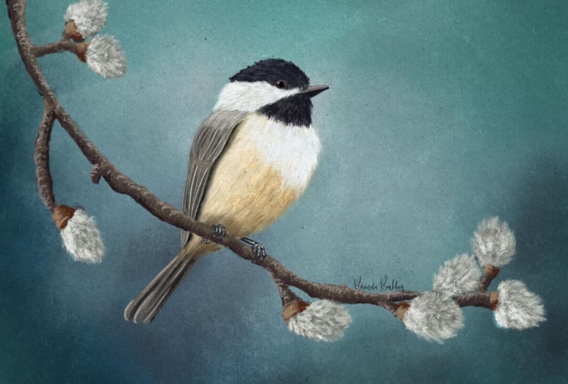
17. Final Thoughts: I think it turned
out quite well. What I like about
pastel simulation, I guess would be a good word, is it forces me to not
think about fine details. I did not think about
actual feathers and how they each have the line down the middle and the
strands on the sides. We didn't do anything like that. So for me, that's nice
because I tend to think about details
a little too much. So I tried not to go too
small on brush sizes. I tried not to zoom in really closely to try to
get every single detail. And I just love
how it turned out. Here's another one I did
with a nice teal background. This teal isn't in your palette. It's just when I experimented with and came up with on my own. So definitely play around with all the colored
are options out there. This one's my favorite
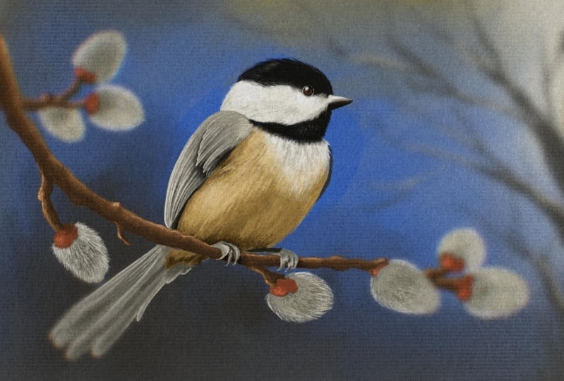
though, I think. And if we look at really
closely at the feet, I really just added a couple of highlights to
very roughed out feet. And I really like those a lot. This particular
pussy willow branch had much more pronounced these orangey red areas
so that those are really big part of
this illustration. Make sure you're
paying attention to the shadowing that the branches
are causing on the bird. And the bird and the feet
are causing on the branches. Also for this one, I darkened the branch
in the areas around the placebo Lowes
Because those of course are going to
cast a shadow as well. This branch is very
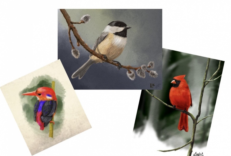
smooth and straight. Here's one that's very similar to what we just did where I did a very rough branch and
I just kind of faded it out on the ends because I didn't want it to
go all the way. I just wanted an illustration
that was in the center. This one I did do
all on one layer, so it was very tricky to get that coloring around everything, but it's a nice challenge. I recommend it. I didn't do any
smudging on the bird, so he's very, very rough. And this one I haven't posted
anywhere on the line yet, but this is another
one that I did and I'm still playing around with trying to give it a little bit, something
more interesting. It looks a little
boring to me right now. So maybe I'll put it on a really bold background
and see how that goes. I know a lot of times I get
a few people who wished they had more examples in class in that would
make the class much, much, much too long
if I kept drawing more sketch examples
and things like that. So this is with the things that you learned in this class, with the techniques. You can apply those same
things to any type of bird. It doesn't have to be chickadee. So definitely just think about your shapes and how they look like they're
overlapping a little bit. And the angle for the
head down to the tail, the angle you have for
the eye and the beak. What does the back of
the neck look like? Where it's connecting
from the head to the chest on the side. What does the front of
the neck look like? This one's concaved
in a little bit. And where are those feet placed? How do the markings go? Do they go above the eye? Below the eye, is
there a big black spot on the chest like a northern
flicker for example? All of the things that
we learned in this class can be applied to
all different birds. So I would start very simple. A chickadee and other
small songbirds would be nice and simple. Whereas, you know, a
peacock or something would be absolutely
not simple at all, or anything with
feathers that kind of go crazy all over the place. Those we didn't
really address here. Maybe you'll want to have the
feather look like a smudge, brush, harsh feather, not realistic feather
and things like that. So all sorts of options. You can smudge out
edges and get them all crazy looking and do
everything to your liking. I hope you had a lot
of fun in this class. Thank you for taking
this class and please find me over on my
Skillshare profile. Follow me for updates
whenever I post a class. And there's links on
there to find me online and very active in
my Facebook group. And it's a great place to
ask questions as well. I would love it if you
left a review of class, let me know what you thought. And of course, always
post AP class project. It's so fun for everybody to see what everybody
else is doing. Again, thank you so
much. See you next time.
 Jennifer Nichols, Artist & Teacher, Procreate