Transcripts
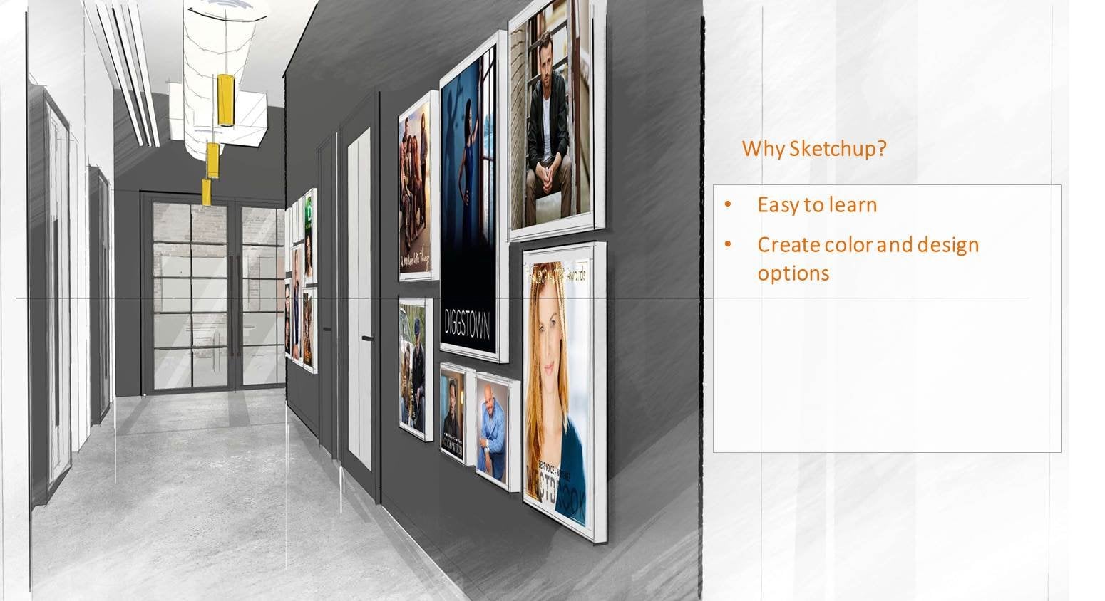
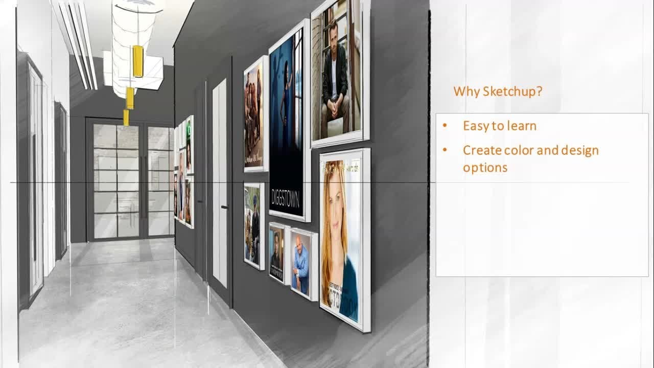
1. Introduction : Hi, my name is Oliver. I am an interior design professional who specializes in visual illustrations. In this course, I am going to show you how to take your sketches are tricky illustrations done in SketchUp and mentor them digitally using Photoshop. Nowadays it's quite common to see photorealistic renderings that is used by designers for marketing purposes or presenting design ideas clients. While this renderings are great, quite often in the take up a lot of time. It can cause a lab to produce them and they're more of a finished product. On the other hand, a drawing that looks like hand sketches are more loose. These drawings are great, especially during concept development. You can save a lot of time and create images for your presentation at work, at school, or for your own portfolio. In this course, we will cover some of the basic tools that you need to create digital renderings specifically tailored for interior spaces. We will learn how to apply layer masks. Create that by adding heat and shadows, emphasize materials and textures, maximizing the brush tool. And lastly, how to add lighting effects in your drawings. For the classic period, you will need a line drawing in a growing that contains materials and textures. I have added these files as part of your project so you can follow along in case you don't have one. We will convert destroying into something like this for our final rendering. With like infects. Shading, absent lines, shadows and textures, and maps all added into our drawing at the end of a class. And with constant practice, you will master fundamental tools in Photoshop. You will be able to transform your sketches into digital renderings. Thanks so much for watching. I appreciate your time and I'm looking forward to our first lessons together.
2. Getting started: Let's begin. Open both your line drawing and the shader drawing of your interior space. Minimize them in such a way that you can see both files in your interface. With the shader doing active. Click on the background layer and drag it to the line drawing to copy this layer over closer shaded clothing and maximize your line growing. Next, we want to make sure that both images are perfectly lined up. Go to view, and make sure that the rulers are open or check. Using the move to click hold and drag your mouse from the ruler until it snaps to the top of your image. This will create a blue guide that you can utilize this reference line. Do the same thing on the left side. Have to fake the move tool once again and move Layer one around to make sure that both the top and left side of the image snaps to these blue guidelines. This will give you a perfectly aligned image. Double-check by reducing the opacity level, the sheeted layer. Next, right-click on the background layer and select Duplicate Layer two. The same thing for layer one. Notice that there is a lot symbol on the background layer. Double-click on this layer to unlock it, and click OK. rearrange your layers so that you have the sheet that drawing on top of the line drawing. Click on the folder symbol here to create a new group correctly and rename it JPEG original. Now select the last two layers and drag them into this folder. It's always a good idea to keep a copy of your original drawing just in case. Now click on the i symbol beside the layer to turn off that group. Last thing we need to do is to select the sheeted drawing and then change the bending mode to multiply. This will change all the white areas on your image to a transparent one.
3. Layer mask: Let's look at the zoom commands. Click on the magnifying glass icon to activate the zoom to. Then look at the Options bar on top. If it's a plus symbol, it will let you zoom in. Clicking on the minus symbol, it will let you zoom out. You can also zoom in on a specific area by clicking and dragging your mouse into that area. The hand tool and Photoshop will allow you to pan your view. In addition, by double-clicking on the hand icon, this will fit your image theatre screen. Next, let's review the selection tools. If you click and hold and the symbol Photoshop will show you three nested variations of the lasso tool, the polygonal lesser. Let you draw freeform selection outline based on street polygons. By double-clicking, you can close your current selection. This is useful for tracing over objects. The magnetic to make selections by automatically clean to the edges of contrasting objects. You can click on specific points while the command is active. Better control of this election. Finally, the last tool that you make, free form selections. When selecting objects, you can press and hold shift with the command is active to add to your selections. Pressing and holding out, on the other hand, will let you subtract the occurrence election. The more T2 right above the Lasso Tool simply allows you to make rectangular selections. Now, let's look at layer masks. First. I'll open my layers here. Let me just strike this slightly to the left. Next, I'll select the legs and press delete a close this layer now and open another copy of this layer. Now I'll click on the Add Layer mass symbol under the layers here. Then I'll make the same selection. But this time, instead of deleting legs, a click on the brush tool, make sure you have a black color swatch in here. Also, make sure that you have the later mass thumbnail in here selected. Now changed the opacity at the Options bar to 100. And brush over the legs. You can change the size of your brush by tapping the left or right bracket on your keyboard. Alternatively, you can right-click and drag this slider. Now notice what happens when I change the sludge color to white. Also, pay attention to the blood spot on the layer thumbnail. And you pressure over this area can the legs will reappear. Layer Mask is irreversible way to hide part of your layer by applying black color too high or white-collar high. This gives you more flexibility than deleting parts of your layer. If I decided to move the position of the seated person, we get deleted layer. There would be no way for me to reverse this action. On the other hand, with layer mask, I can unhide legs. And then only the areas that will be affected by the position change. So let's apply this into our interior scene. At a mask to layer one. However, instead of just hiding parts of a layer with a brush tool, we are going to be using the gradient to first make sure you have the foreground. Stance was selected in the Options bar. Also makes sure that Layer Mask selected. Then click hold and drag your mouse from the floor up. Depending on how far you track your mouse, the gradient effect will defend. What I personally like to do is use a lower capacity number and slowly build up the gradient by applying it several times. Be doing this on all four sides of the image to create a reverse effect. Once you're done, you can select the brush tool to add to your effect. First, choose a soft brush. Similarly, I will use a lower capacity number, then gradually built up the mass by applying the brush several times.
4. Adding shades and shadows: Our touring currently looks a little bit flat. Maybe to add some shading onto the wall that give it more contrast. If you are just beginning to learn how to render your drawings, I encourage you to look at photographs of interior spaces and study them. In this image, ceiling and walls are in the same white color. At the ceiling appears darker. This is natural because of how the lights are mounted on the ceiling. Therefore, there is no direct light projecting onto it. The areas between the wall and ceiling appears darker. Similarly, because of the location of the light fixture that is mounted at a distance from the wall. The scholars of light are seen slightly lower from the ceiling, creating some dark spots above it. The areas between the wall and floor also appears darker. This is typical of any objects whenever a plane intersects with one another. Looking at this image, you will see that the joints around furniture starker. Thusly, let's look at the shadows. You will notice that the areas right beneath the chairs are darker than gradually appears the light enough that's applying what we have observed. First create a new layer and name it will shading. Now you see why creating two separate images can come in handy. I will turn off all the mayor except layer 0. Then instead of using the lasso tool, we will use the match one to make a selection. If I click right here in the middle of the drawing, the area around this outline is selected. The magic one is an easy way to select consistently colored area without having to trace its outline. So let's go ahead and pick this side of the wall. Or the command is active per shift at your selection. We don't want this area selected. So I will click the marty to press out to subtract this from our selection. Let's turn on our layers. Selectable sheeting layer, and activate the gradient to choose black or dark color tone with a low capacity number. Then click hold and drag your mouse to add cheating to this wall. Keep doing this until you have a bit of a contrast between the wall and its surrounding plains. Next, let's do the other wall. Select layer 0, activate the magic wand to select the wall. Notice how the ceiling is included in selection. If I zoom in, you will see that there is no line that divides the wall and ceiling. First pressured the finish of the selection of the walls. Then activate the lasso tool. Press out, and remove the ceiling from the current selection. We also need to remove this part of the table from the current selection. Now go to the wall shedding layer and stuck using the gradient tool once again, for this wall. Don't forget, you can also use the brush command with a soft brush for your shading. Now let's zoom in into this artwork to add some sheet and shadows around the frame. When rendering in Photoshop, one of the most fundamental things you need to learn is how to use the Brush tool properly. As an example, a render, despite using the brush tool. The idea is instead of using a fully opaque hard brush, typically, you want to render using a soft brush and with a lower capacity number. In addition, you don't just clear the whole thing with one stroke, but rather use multiple strokes. First, select a soft brush. Change to a lower capacity number. Then click on one N, press Shift and click on the other end to paint on a straight line. Reduce the size of your brush by pressing the left bracket on your keyboard. Then repeat the process. The idea is to start from a light tone, then gradually build it up by adding multiple brush strokes, dark in it. Other juice my brush size once again and do the same thing for the bottom part of the pipe and the top part as well. Lastly, I'll add a diagonal stroke for additive effect. Let's apply what we have just learned and had some shadows around this picture frame. Again, starting light and then having multiple strokes to build it up gradually. Your shadows should be noticeably darker around the edges of the frame. Then gradually to like an AP. Double-click on the hand tool to zoom to fit the entire image on your screen. This time, let's add some shading onto the ceiling and select the bottom part of the scene. We need to remove the wall from the selection once again. Next, add a new layer and limit ceiling sheet. Activate the gradient tool and use the same method that we did for the loss. Do this for all four levels of the ceiling. And don't be afraid to experiment in combining the brush tool with the gradient to see which one you will feel more comfortable with. Let's add a piece of shading to the ceiling here as well as some cheating the end of the wall. Finally, let's do the following. If I select layer 0 and click on the floor, only each of the floorboards are selected. So I will select layer one instead and click on the floor once again. If you are unable to select most of the floor, you may want to increase the tolerance number to about 30 at the Options bar. Oppress shift at these areas to my current selection. Then create a new layer and name it flourishing. Now in this case, because the floor has a distinct color, if we just use the brush for the shading, it won't look good. In order to resolve this, you will need to change the Blending Mode on your layer. Feel free to experiment. But most of the time, overlay will be your best option. So let me just delete this and start over again and select overlay for my blending mode. And then I'll add the brush strokes around the floor and intersections. You can increase the capacity for the areas below your furniture to make them look darker. To finish this, let's add some shading to the furnitures. Once again, I'll add a new layer. Choose overlay for blending mode. Then with the brush to fight the same shading method that we just did.
5. Emphasizing textures: The sharpened tool is a great tool to use if you want to emphasize materials with textures in your images. To use this, keep adding strokes Gradually. However, be careful not to overdo it. Assume materials could easily look to sharp. I'll undo everything and just add a few strokes. Similarly, since there is some textures on floor, I can use a Sharpie into in here as well. The Burn tool can be effective to darken areas of your image. You can determine the string by adjusting the Exposure slider in the option menu. On the other end is used to like an areas of your image. Let's apply this whose first select x, one. Then after feet, the sharpened tool. Just exposure strength and drag your mouse around the texture to sharpen it. Next, select layer 0. Using the magic one, selectively Click on the floorboards. This can be a very random selection. So I'm just going to click on the floorboards at random. Then go back layer one. Have to be the shopping tool. Adjust the exposure and drag your mouse around the texture to sharpen it. You may not notice any difference, but if I zoom in, you will see how the textures for some of the wood flooring is more pronounced. Select layer 0 once again and make random selection for the floorboards. This time around, we will use the burn tool. Make sure you are on layer one. Adjust the exposure, and start applying the Burn tool around the floor. Now sometimes you can also skip selection part and just simply apply it like the brush tool. Click on one and move your mouse to the other end. Pressures, and click your mouse once again. When you're doing this, feel free to play around with your brush size and don't worry about making it perfect. The idea is to make it look natural. This will create more variation on how you fluorine with your life. Typically, you want to make the areas along the edges to be darker. Shading principle, apply it on the edges to give it more contrast.
6. Inserting images: Let's add a company logo and an image for this accurate. Open both your images. Click, minimize button and drag the image onto your drawing. Depending on what immature trying to insert, there may be times the dragging the image won't work. To solve this, go to image mode and select RGB color. Let's try it again. Let's rename the layers to artwork and local, respectively. Right-click on your image and choose, select that layer, then go to Edit and transform. Here you have several options that you can use to modify the algorithm. However, the best way is with the image selected. Press Control T. Then use one of the nodes to scale it. You can press shift to scale it proportionally, or press control the skewed the image. Go ahead and drag the image. Do your artwork frame. Press Control T, and move each of the nodes to fit within the frame. Now, this part of the image to uncover the light with the outward selected click on layer mask, turn off the layer and Select Layer one. Using the magic one, click on the light fixture to select it. Now open the artwork layer once again. Activate the brush tool and click on the symbol here to make sure you have a black color swatch selected. Drag the opacity slider to 100%. And make sure you are on the Layer Mask, thumbnail. Then brush over the selection to hide this part of the court. After you have completed this, you can go to image adjustments and use any of these tools to treat your awkward. With the color balance. You can edit the colors of your image. Or you can use hue and saturation to do the same thing. Next, let's work on the local. Right-click on the image and select logo to activate this layer. Moves the logo to the middle of the brick wall, press Control T and scale up the local activate them are t2 and make a rectangular selection around the border of the local. If I click erase, this will delete the local. So what we want to do is make an Inverse selection. We pressing Shift Control I, we do the eraser, and this time the border is deleted. Another way to do the inverse election is by going to select then inverse. I'll just rescale the logo once more. In Photoshop, you can also add textures to images as an effect called the filter texture. And click on texture riser. Select the brick from the drop-down list, and then adjust the scale. Lastly, let's add a shadow for this logo. Right-click on the layer, then select Blending Options. Click shadow, and make adjustments to the settings. The angle, the distance, the spread, and the size to soften the shadows.
7. Creating outlines: Another way that you can make your drawing is Pub, is by adding outlines to differentiate tab of space. If we look at this current DLR, the front seats has an autosomal dark outline around it. They do this to emphasize step. Similarly, you see this outlines in the dashboard as well. Or create a new layer and name it outlines. Next, activate the brush to brush. I will reduce my brush size and lower my capacity. Draw an outline here. Photoshop comes in whichever preset brushes from hard brush, the soft brushes. If you click on the symbol over here, there is actually a lot more options that is available. Let's try the wet brushes. We will then see a dialog box asking if you want to replace the current brush or a pen, which is basically to add this brush that existing preset. Scroll all the way to find the web brush. I'll just increase my precise. Next. Let's write the dry media brush. I strongly encourage you to experiment with these precious, to familiarize yourself with them. Personally, I like to use the natural brush. Now, I'm going to add an outline on this wall here. And on this wall. I'll use the same method and keep adding outlines to areas where there shouldn't be a cue distinction that and even chateau had some outlines on the ceiling. On this edge. And this edge here on the output. Now, brush and add it to the edge of both our door openings. I'll also add some hotlines to some of the floorboards to accentuate them even more. And finally, let's add some outlines along the 4B sports as well.
8. Lighting effect: We will be adding some lighting effects for the light fixtures in our growing. By studying photos, you can have an idea of how lights on new drawings should be rendered. The downloads and the ceiling is not the Sibley brighter. The floor around the reception table is brighter because of the indirect light coming from the Millward. You will also notice a streak of light here, which comes from consider liking in the ceiling. Okay, first let's add a new layer and name is like a zooming and the logo and simulate a considered lighting in the ceiling. I'm going to select the tool and select a brick wall. Then I'll activate the gradient to choose a white color swatch. And then turn the opacity levels like the higher. Starting from the ceiling, click hold and drag your mouse downward to add a streak of light. Keep adding this until you have a strong bright white at the very top. Again, you can also use the brush tool to add to this. Just make sure to choose a soft brush with lower capacity. Then gradually build up the lighting effect. Assuming the ceiling and select layer 0. Let's select the down lights and using the paint bucket to apply white-collar through the slides. Let's do the same for the two dendrites. Now let's study this image into light fixtures. See how there is a clue coming from this slide here. Let's apply this into our growing. Select all three lightbulbs. Remember to press Shift to add to your current selection has just increased the tolerance level here. And then I will be using the lasso tool, the add this last piece. Similarly, I'll just use the lasso tool to select the last light bulb. Now quote, you like layer the paint bucket two and apply a white color to these bulbs. Click the marquee tool and select them. A zoom into this area here and using the brush tool, click on the box to create that glow. Once again, play around with the opacity and you brush size. Keep adding brush books gradually. I'll do the same thing for this bulb. And the last bulb here. Now let's look at the built-in lighting effect in Photoshop. Go to Filter, Render, and lighting effects. You may see a different dialogue box depending on the version that you're using. But basically in here, photoshop gives you the ability to simulate interior lighting into your images. You can choose a light from directional omni spotlight, as well as the number of likes. For this example, I'm going to choose spotlights and three down. Next, you will need to adjust the light and the nodes in this previous image to locate your lights in your drawing. You will need to do this for each of your lights. After you've paid your lights, you'd want to adjust the intensity and focus of your life. You will also want to adjust the ambiance and exposure levels. The ambiance is a great way that the light spreads out even the interior image. So if I drag this lighter, you can see how the entire image is similarly brighter. Readjust your liking intensity. Let me just adjust the exposure level of it. And click OK. And now I'm drawing the lighting effect to this walls here. Go to Filter, Render and lighting effects. Notice how the image looks wrong. Let's click cancel. He has to make sure that you are on layer one. Now let's do it again. Go ahead and start modifying the legs. I'll put one night on this wall here. I'll move on to this wall here. Adjust the intensity and focus. For the third light. I'll place it on the wall right above the light fish. Then click OK. We were able to achieve some nice lighting. But this area over here seems a little bit too dark. So I'll go back to the lighting effect and change the number of my legs. Five. Then I'll readjust the location of my lights and press OK. To finish this exercise, activate the brush to be adding some weight strokes that the done light in order to add that glow effect to them. Once again, with the size of your brush and the opacity level.
9. Accent lines: In this exercise, we will be adding the final details store interior space. We'll add some shadow lines to the wall fixtures to make them stand out from the wall will add color to this artwork frame. And like an applet or frame here to make it appear more transparent. And lastly, you will add some accident lines to some of the materials, specifically to the metals. So let's get started. Let's zoom into this wall m. I'll activate the eyedropper tool. This tool is used to sample or magical or from your image. If you click on a specific color on your image, you will see how the default colors for the foreground changes as well. I'll pick on the light fixture here. Then I'll Select Layer one. Have to fit the magic one and pick on the light fixture. Now, what I want to do is color the outside face of the fixture around the wall. In order to do that, I'll first go to select, modify, and click on border. From the name itself. This will create a border selection type in ten. I'll select my layer and then start adding brush strokes around the fixtures. By adding these brush strokes here, it will make you stand out from the wall. If you recall, we added agree that mask for this layer one, which looks lighter. Layer one, use the magic one. Click on the fixture. For the next step. Make sure you click on the Layer Mask thumbnail at the brush tool, and click on the switch icon here to make sure that you have a white foreground color. Adjust your capacity to 100%, then start adding the brush strokes to unhide light fixture. Okay, now let's add the shadows and shading around the fixtures similarly to what we did previously. Do the same thing for the last light fixture over here. Next, activate the magic 1-2 and select the picture frame. Let's add a new layer and name it. Frame. A click on the foreground color here and choose a bronze color. Then use a paint pocket tool and apply this color to the frame. Let me just stuck in this up a little bit. If we study the hand sketch rendering, the light part on this table is used to represent reflection coming from the window Due to the nature of the material being reflected. Same thing with accent light edges here. So let's add some accent in the frame and add some white diagonal brush groups. As change the opacity to 100%. And I will add some horizontal and vertical white absent edges somewhere in the frame. Using the same principle, apply y, x and edges to the light fixture. First, let's create a new layer and name it. Use the brush to apply edges and trace around disliked Fisher. Again, play around with your capacity level and brush size, then build up their affection gradually by doing multiple strokes. I usually like to start with the lighter tone. And then at the final stroke that is more opaque. And we'll add some absent in here to this will make the world a bit more rounded. Next, let's add some lines to the methyl transaction top. Feel free to experiment to find your own style. I personally, this White House and lines over all in the drawing, even if sometimes it may not be necessary. It tells, give my sketches and drawings a distinct style for touch. At this white troops to the table legs to make them look more shiny. Finally, for the glass door, go to layer one, select the glass material, then go to image adjustments and pig brightness and contrast. Adjust the slider to make the glass look brighter and more transparent.
10. Adjustment filter: It is now time for us to make subtle layer adjustments. Select Layer one and click on this symbol. Photoshop offers several modes that allows you to adjust your image. Let's try adding the exposure adjustment experiment and drag each of this litres. Exposure is a great tool to balance out your image from having areas that are too bright or over ex-post. When using layer adjustments, you need to pay attention to the order in the Layers palette. If I drag this layer above the artwork, notice how the acquired image now has a higher contrast than before. So basically the layer adjustment will have an effect on both the layers below it. And move it all the way above the ceiling sheet. Click on the symbol here. If you want to adjust or tweak the sliders after you have moved the layers. By turning off the Lear, you can compare it with either having the adjustment layer at it, without it. Another great thing about the layer adjustment is that it has the layer mask built into it. So if there are areas on your image that you don't want to be affected by this adjustment. You can simply apply the brush tool with the black foreground color to the Layer Mask thumbnail. Next, let's look at photo filter. This will let you add a thin or enhance the colors in the image. It comes with preset filters from warm to cool tones. You can also increase the density or decrease it. Just remember, other than adding this adjustment layer, you can also adjust the layers capacity if you think it is too strong. Let's add another one, select curve adjustment. This is one of the most flexible Image Adjustment layer that you can use. By clicking on the curve and dragging each of the nodes. It will give you the ability to manually manipulate both the tones and contrast in your image. Now let's say that I only wanted this to affect the brick wall. A go-to layer 0. Select the brick wall, and then Inverse selection. Press Shift Control. I. Now click on the Layer Mask, thumbnail under the curve adjustment, activate the paint method tool and apply a black color light the effect of the curve to this part of my image. I strongly encourage you to test each of these adjustments layer to familiarize yourself with them. To add our final touch, let's study this hand sketch showing Look at how parts of the drilling seems to be purposely deleted. And notice how this into like brush strokes. We can easily create a style like this, but activating brush and choosing one of the pre-set brushes. Select dry media brush and click Append. Then I'll choose the soft oil pastel brush. Increase my brush size, and create a new layer and name it brush. Just zoom out a bit and apply my brush strokes. I'll apply this around the corner of my growing. It doesn't need to be perfect. So you can do this randomly. You can also combine this with other brush presets to create your own style. You can also experiment with the opacity and the blending mode to get a different effect. This concludes my Photoshop rendering class. It will probably take you a few times before you can get comfortable with the tools and techniques that I have just shown in this class. But I can guarantee you that we practice. You will be able to render your sketches in Photoshop in no time. Remember, practice makes perfect.
 Oliver T.