Transcripts
1. Introduction + Class Outline: Hi, I'm Kelly and I'm going to strain surface Patton, designer and illustrator. I specialized in creating sophisticated intricate hand-drawn designs that the home decor mar market, particularly wall coverings and fabrics. Because my detailed hand-drawn designs, I primarily use Adobe Photoshop. And as I will discuss in the following lessons, it presents challenges that are different from designing in Adobe Illustrator. I am by no means an expert, but I wanted to create this class to help other designers are the tips and tricks that I've learned over the years in this particular area. And when it comes to large-scale designs in Photoshop, just so you can get the best possible results for your products as well. When I talk about large-scale designs, I'm referring to wallpapered wall murals and bidding. I've worked for a number of strain and international companies in these areas, and it's also fortunate. So we in the 2018 will Souls design a competition? So here are some examples of my work. In this class, I will cover best practices for creating and scanning original artwork in preparation for large-scale designs. A bit about Smart Objects, resolution fundamentals, resizing methods, designing for wall coverings, that is wallpaper and murals, designing for bedding, testing your designs, and then next steps and the class project. So welcome to class. Let's get started.
2. Original Artwork + Smart Objects: Okay, so this is just a quick overview of original artwork best practices. So firstly, I'd like to start by drawing my motifs at least A4 or closely equivalent letter size. The closer to the incise your original drawing is, the less manipulations you have to make in Photoshop, and the more likely you are to have better quality images. I always scan my artwork at around 600 ppi in RGB in tif format. Unless a client has requested something completely different or, you know, need to do something different based on the printer's requirements. If your design will be printed on a much larger scale, you may want to consider scanning at 1200 ppi, but be aware that this will make your final file size significantly larger and possibly unmanageable. So just a quick tip. In large-scale design, it is always a matter of balancing the resolution of your image with the file size. This is particularly the case in Photoshop. I've had a few murals that are quite large and they get to the point where Photoshop almost doesn't work anymore and sometimes they weren't even save. So there's always a tradeoff between one in the other. So if your artwork is larger than your scanner bed, most scanners are a four, some have a3, which is great. You'll need to scan in all the sections of your artwork into a single Photoshop file. Each scan will be a separate layer. Then you align the images so it looks like a full image merger layers together and then use the clone tool to eliminate any joins. And then you want to clean and enhance your image. This is particularly important to do with large-scale images because as you blow them up, every tiny little stray pixel or funny looking age, or just extra colors or something like that is going to be magnified. Like I said before, I always convert my images to smart objects once I've scanned them in and clean them up. So think of a smart object like a container that holds the image inside it. This is a really important non-disruptive way of altering your image without changing the image data as you're only changing the size of the container when you move the transform up or down, rather than changing the image inside it. Smart objects are also very useful for creating repeat tiles because it allows you to change one section within a smart object and it automatically updates the same section in other areas.
3. Resolution Fundamentals: No less than on creating large-scale designs in Adobe Photoshop is complete without discussing resolution. It's taken me a really long time to get my head fully around this concept. So I'm hoping that the following lessons will just help you grasp that concept a little quicker. So those of you familiar with Adobe Illustrator will know it's a vector-based graphics program, which essentially means that the image is made of points, curves, lines, and shapes that are then based on a mathematical formula or equation. So this means that you can infinitely scale your image without losing any image quality or data. So this is great for logos or really big scale projects. So, you know, then you go, okay, well, why would I use Adobe Photoshop then if illustrator basically does all this for me, for my wallpaper, Well, if that's your style, great. Adobe Illustrator works perfectly. But if you have a more detailed style or hand-drawn or painterly style like myself, then Adobe Photoshop maintains that image quality much better than Adobe Illustrator does. I'm obviously talking about using Adobe Photoshop to create your next masterpiece. And some key bits information need to know to make your large-scale designs really successful. So the difference is Adobe Photoshop is a raster based program, which means it's composed of colorized pixels. And if you don't know what a pixel is, a pixel being the smallest controllable element of a pitcher that's represented on a screen. So in other words, the tiny squares you can see when you zoom into an image on your computer or TV, there your pixels. So this is where resolution becomes a key point when you're working with Photoshop. And it is very important that you understand resolution when you're working with images in Photoshop, just so you can get the best results. So resolution then is how many pixels there are in an inch, also known as pixels per inch or PPI. The higher the number the pixels in an inch, the higher the resolution, and then the higher the quality of the image. He says, because there's more color information in a one inch square when there are more pixels. So standard resolutions for web images is 72 pixels per inch. And for print it's a lot higher at 300 pixels per inch. So it is best practice to create or scan your images sufficiently high resolution for your end product. Or if your end product is unknown, then create or scan your image at high resolution. You may have also heard of DPI or dots per inch. So this is essentially the same as PPI pixels per inch, except it's referring to the printer resolution. For example, the number of ink dots printed onto like fabric or paper, rather than screen resolution, which is the pixels. So just having this infographic we've got here vector images, a resolution independent. So they don't, they always kept saying quality basically no matter how big or how small U-curve. But raster images, such as those from Photoshop or resolution dependent. So you can see from the slide, I've just given an example of part of my logo. When you've increased logo by 600% on the left, you've got your vector. So that's just made up of points and lines and mathematical equations. And it can just increase and increase and you don't get any of that image loss. Whereas on the right, you've got your raster image and you can see it's starting to get fuzzy because you can start seeing the individual pixels. And then I've got another image here, which is just, it looks a bit scary. It's a, it's an I of my black cockatoo on my logo as well. But it's obviously zoomed in quite significantly. And basically, that is where you can see all the tiny little squares so that all the little colorized pixels that make up the image. There is also ways to convert Photoshop or raster files into vector images if you wish. It's a matter of trial and error of which method works the best. And you are essentially aiming to get your original image replicated in Adobe Illustrator with a vector file. And depending on your type of file, sometimes you can get quite good results. Other times, like I said, it can just look very flat. And another thing to consider too, is that when you've got all these points and lines in equations, the files can get really, really big, really quickly. So if you're trying to convert a really detailed file to a vector image and Adobe Illustrator, sometimes you file sizes it just unmanageable. So that's just a bit of an overview. There is a lot a lot of information, a resolution. If you want to look for it, I find that the best thing and the best information I've found is kind of from like Adobe help. They just put it in simpler terms and there's like a progression of information that just makes you understand it bit by bit. So if you really want to learn more, I'd highly recommend going into Adobe Help and having a look. But there's also a lot of tutorials, things on YouTube, things on skill share. You can go crazy road resolution and go really deep if you want to. But hopefully that just gives you a bit more of an overview of why it's important for Photoshop and particularly for our large-scale designs because we do make them so much bigger. And I'll go on next to talk about how we can make out photoshop images larger or smaller, and try not to have too many issues with image quality.
4. Free Transform: So what happens if you've got an original artwork and it's not quite the right size for the design you needed. This is particularly the case for a product if you don't already know what it's going to be in advance. So I like to think of there being three R's to being able to change the size of your design. So you can recreate the design. In other words, you can basically redo or your motifs, res, scan them, recolor them, reclaim them, and recreate your patent tiles, et cetera. And then, you know, you have the size you want, however you have spent an awful lot of time, so most people won't do this. The other two options are called resampling and resizing. And I'll go into more detail in the next lessons about the differences and the advantages and disadvantages of both. But for this lesson, I just wanted to quickly touch base on a process that you're probably already familiar with, the free transform option. And just to point out that it is a form of re-sampling. So I'm just gonna give you a quick demonstration of the free transform now. And then I will go into more detail of re-sampling In the next lesson. What I want to show you is increasing or decreasing the individual motifs within a Smart Object and seeing what happens. So to open up a smart object or the original files within the casein as we discussed before, I'm just going to double-click over here on the thumbnail. And it can be a little slow depending on how many you've got. I've got quite a few smart objects here. It keeps going. Not sure what I did with this one. Okay, so we're down to our individual leaves. So let's just say we wanted to increase the size of these. So let's just put a little background and so you can see a little better. Okay? So let's say we want to increase, well, all of them. The issue that we have with increasing the size of these motifs within a smart object is that you're changing the size of the individual motifs in the smart object. However, when you go back, I'll show in a minute when you go back to original file, the document size isn't changing. So then you get this kind of hot mess of overlapping motifs because you've changed one element, but not the actual file size overall. So let's just say we're going to increase this particular leaf. So Command Z or Control T for free transform. And we're just going to make it bigger. So the new versions of Photoshop now will increase the size proportionally. Without having to hold the Shift key down. So that's a nice little handy feature. If you wanted to make the motif a little bit, will not increase or decrease proportionally. You actually hold the Shift key down now. So I'm holding the shift key now. I'm bringing this scene and see how it gets more narrow. So I'm just going to be command said to go back to what I was because we wanted in proportion, just a little trick to live there. Okay, hit enter. Okay, so just keeping an eye on this particular motif so we've made it bigger. So I'm just gonna get rid of the background and then commence save for control, Save. And just keep going back and taking its time. Let's keep going back through the too many smart object lie is I seem to have in this particular file. Okay, it's close that one and the save. Go back to this one, save again. Okay. So now we can see, or we can't see where our big leaf has gone. So we'll see what the pattern looks like. Edit, define pattern. Let's just call it whatever. That's life in a new document. So we can see. I'm just going to do a standard pay for unlock the background layer Pattern Overlay. Okay? I'm going to pick that one. Okay? And we can see, I'll just click OK. Now we've got these red areas where the patent hasn't worked. And again, like I said, it's because the change Psych we changed the inside of the box but not the size of the outside of the box. So the box is cutting off part of that belief that we increase. It's just something to keep in mind. Let's just go back to our repeat tile. We might say that. The other thing to note as well is that anytime you do a Free Transform or the control or command t, that is the same as photoshops, interpolation method, or re-sampling. So again, anytime you do that, you're going to increase or decrease the number of pixels. Hopefully that's a trick that you can learn early on. Unlike me who learned to quite later on. And I would be resizing by motifs to fit in nicely to a pattern. Without realizing that every time I decreased and saved it, that I was deleting data from it. And then the image resolution was quite poor and then you can't get that back. So once again, I emphasize, please make sure you keep your original image file somewhere separate. And when you're trying to work out how to increase or decrease file sizes for different purposes, then make sure you do it from a copy and not the original.
5. Resampling: We've discussed the three ways that we can change the size of our patent tile or the individual motifs and wanted to show you re-sampling. So I've got this patent tile here, just have a simple leaf. And I wanted to make the leaf a little beaker for a lamp shade. Or client needed a much bigger lamp shade. And this side's just looked a bit too fussy with the smaller motif. So currently the size of this motif is about. I can get the layer I lost it because these are guides. It's about 8.7 to 12.7, so about four centimeters wide. And I wanted the width of this leaf to be about ten centimeters. So I found the best method for this was the resampling method. So I'm just going to show you what I did. So her to image image size. Okay. As you can see, resample is down here and it is ticked by default. So Photoshop or automatically re-sample unless you untick. So we're gonna keep it for this example. Now I would like to increase the size of the tile. So I am going to choose by cubic smoother enlargement. Basically, this list is all the different interpolation methods of Photoshop has. And I've found generally that bi cubic smoother enlargement is best for increasing the size of the tiles. And the via cubic sharper reduction is best for reducing the size of the files. So we wanna make it bigger for this example. So we're gonna go to my cubic smoother. Please also note there is an automatic where photoshopped chooses for you. Typically, Photoshop will choose by cubic smoother or by cubic sharp. I'm gonna go in and choose it myself. Ok, so as you can see up here, the dimensions of this tile, 2332 pixels by one hundred, ten hundred, eight hundred and forty pixels. So if we change anything in here, the number of pixels will change as well. Because as I said earlier, this method will change the image data. In other words, the number of pixels you have, whether you increase or decrease, it changes the number of pixels. So at this point, if you haven't already, I would make sure you've definitely saved your original somewhere else and that this is a copy. So you don't overwrite it just in case the results on what you want. Okay, so as we can see here, I've dimensions now, if I want to change these, let's say, to ten centimeters, maybe it's about a 160%. You notice up here that the number of pixels increased and it increase because photoshop added extra pixels in based on this algorithm, in this method of interpolation, the bi cubic smoother. So it has some funky algorithms that basically pull together information that's currently in the file. And it tries to guess what the next pixel should be in your file to give you more pixels so you can enlarge, and hopefully it looks good. These days these methods are pretty good. I think they weren't so great before. But again, we're going to give it a go and then just test it out. Because nothing is perfect in Photoshop. And there's always multiple ways to do things. So sometimes it's a bit of trial and error. Okay, so we changed a 160%. Note that the resolution stayed the same. And a lot of companies will want to keep a set resolutions. So it's important to have these or at least to know what your company your printer needs. But we did increase the number of pixels, which means there is some pixels in there that weren't in the original file that Photoshop has best guest to put in to make the image still look like the original file but larger. Okay, so we've got a bi cubic, smoother enlargements and re-sample selected and we just click OK. Ok. And there we have it. So we were looking at this individually for four. So I'm just going to grab my guides again. Okay. So 13.7 to about 20, so it's about seven centimeters now. So obviously, I can go back and make it bigger. But what I would suggest you do is if you really want it to be, say the ten centimetres and not just this slightly bigger, you are best to only do resampling ones every time you re-sample, you are adding or deleting the pixels, which makes it further and further away from the original. Because obviously Photoshop can only do a best guess. So in this particular situation, if I really wanted that to be bigger, I would obviously calculate the difference between four centimeters and ten centimeters and work out what that is in terms of a percentage increase and do that. But for now, for this example, I'm happy just to have it as around seven centimeters. So if we now zoom in just Command Plus or control class. So obviously as you get much, much larger, here we are down at 500%. You are starting to see individual pixels, but it's not too bad. It's not super blurry. From this edge of the motif, the leaf, to the background. So this will be more than sufficient to use for your, to give to your printer for the lamp shades, and it would still come out fairly clear. The other way to do it is just to print it out. I get a 100% on your printer and just look at it and go, okay, does this look good? Does it look still a bit too busy? Do the edge is blurred too much, they're too soft. And again, it's a bit of trial and error. So I'm just going to quickly show you also the bi cubic sharper, Which is the reduction of pixels. So I'm just gonna go back to the original file. We were worried about here. Ok, so we're back to our original motif being four centimeters. Now this time I want a motif to be maybe two centimeters. So I'm gonna make it really small maybe for a notebook. So again, we're gonna go to image, image size. So we want to reduce the size of this file. It's time by about 50%. So we can get our motif to be about two centimeters. So we're just going to change this to 50%. And notice how the dimensions decreased. So in this particular instance, Photoshop is now deleting pixels rather than using algorithm to add pixels, but it uses an algorithm to work out the best pixels to delete, so it keeps us true to the original image as possible. So again, number of pixels, decreased, resolution has stayed the same. We have the size. And this time we're just gonna make sure resamples is selected. And we pick the bi cubic shop or reduction in state ampersand K. Ok, so we just bring out little guide over again, say about 4.4 to about 6.4. So we're about two centimeters. So that's roughly the size we wanted. And then I'm just gonna do a command or control class on a PC just to zoom in a bit. Now you can see with the Smith where it's reduced it, that it's actually a bit more pixelated, then the increase was. So it seems like in this particular instance, Photoshop was better at interpolating and increase or adding pixels and it was decreasing or deleting the pixels. But again, not so bad at, this is at a 100%, I think it would be fine. So that's it for resampling. And next we'll talk about re-sizing.
6. Resizing: So now that we've looked at resampling, We're going to look at re-sizing. So the difference between resampling and resizing is that re-sizing does not change the image data. In other words, the number of pixels remains the same. So it's the same process. Go up to image, image size. And normally this is ticked. I've been fiddling with this, so we want to come in and on tick. So some things to note here are original dimensions. What we want to do, we said we were going to change it to maybe a 160%, just like we had before. But notice how the resolution has pretty much halved. So with resampling, our resolution stayed the same. We resizing and number of pixels or stay the same. So in order to use the same number of pixels in a bigger document, the program is essentially made those individual pixels larger. So this is where you get that. What you would think pixellated look, the more square look, because each individual pixel is now a lot larger than it was before. So this could work out well depending on what in production you have all your printer or client's requirements. But what you will notice is that a lot of clients will prefer that you keep your resolution at 300 PPI. So just bear that in mind. But for now let's have a look at the results. We've untyped resample, so it's going to re-size. Okay, so now that is about ten centimeters. So let's just zoom in and have a look with our command or control plus. And here we are at 700%. Yes, you've got some pixels but still not. So bam, again, it comes down to what kind of product that you are placing this image with and what kind of design you have in the first place, something like this, which is a fairly clean line in just two main colors, can be increased and decreased quite a bit without it being really obvious, something with a much more defined gradient between colors might become more obvious with these methods. So again, I can't emphasize enough a bit of trial and error to find the best result for you.
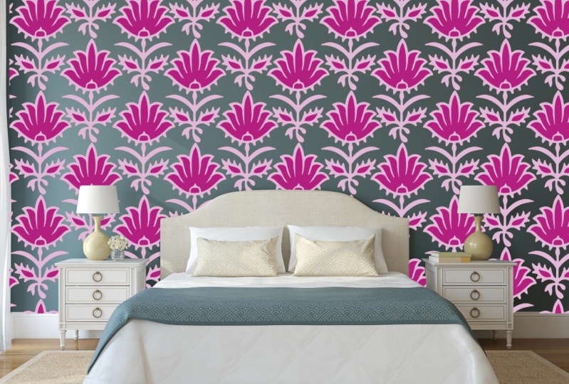
7. Wallcoverings : Okay, so the first large-scale product that comes to mind, a wall coverings. This includes wallpaper and warm murals or papers made up of multiple repeat towels or cross multiple wallpaper panels. Whereas a warm euro is one continuously large image across multiple panels. So wallpaper and wall murals are meant to be viewed from a distance so the resolution can be lower than other printed products where the standard resolution is a 300 API. So if you've got a bit of paper like a booklet, you're obviously looking at that quite closely. You want that to be high resolution at 300 DPI. We, the wallpaper, you typically stand away from it, look at it from a distance, you don't get up close to it. So it's like a balanced between. You obviously want high enough resolution because it's quite large scale. So you want your images to be clear. But at the same time, you can have a little bit of resolution degradation because there is that distance from what you, when you're viewing it. So I like to think of it like the coolest movie, quote, the Monet coat. Maybe this is showing my age, but I think it just sums it up perfectly. So basically, one of them says, Do you think she's pretty, cher says she's a full-on Monet. And then from far away it's okay, but up close it's a big old miss. So this is the same with wallpaper and more murals. So you get up close, you're likely to see the individual pixels. But from a distance that's where you typically viewing it, it'll look great. So this helps me remember. And it just made me feel better about the whole process of designing for large scale as well. Because I was always worried that my images whenever going to be big enough and that the quality would be poor if someone was putting it across a massive wall. But with this in mind, you can see how it can work quite well. So each printer and client will have their own methods for printing and installing wall coverings. And it's important to have this information before you convince your design. So in addition to knowing how they prune, you want to know whether they'd like files in RGB or CMYK mode. You want to know if they have a specific resolution that they want you to use. You want to know their panel size as in the individual wallpaper panels that they put up, and what format format they want for the final file, whether they want to Photoshop file with layers where they want to flatten 2V, whether they want a PDF. So panels will always be a set width. And this is usually based on the maximum width the printer can print. And they can either be installed side-by-side. And this is where Panel a would line up exactly next to Panel B. And then your other option is panels can overlap usually by a few centimeters. Panel B would overlap panel I. So no matter which method you use, you have to ensure that the panels flow seamlessly from left to right. And the motifs on the edge of Henle a match with the motifs on the left-hand side of panel B. And then the right-hand side of piano be aligned to the left side, a panel a, and so on. There's no limit to the length of the panel. And the top section does not need to say Missy match that bottom. It's also preferable to have a full job repeat for each panel. He says to minimize wastage as the wallpaper on stole, it doesn't have to cut up the panels to align them both horizontally and vertically on the wall. But you still want to obtain a toss repeat Luke, where you can't see where the patent, I guess starts and ends unless you're going for geometric design. So I then create a half dropped pattern with in each full drop panel, the size of the half chop repeat towel is usually advisable factor of the overall panel width to make it easier to incorporate it. So here I've got a black cockatoo design that I did for a company in Sydney. The panel is a 127 centimeters wide and it has a two centimeter panel overlap with the total of a 127 centimeters in width. Wall murals, resolution becomes much more important as individual motifs or enlarge mole to cover the entire space. Like old large-scale designs created in Photoshop. The higher resolution image to file, your image file is the better. While there is no general rule for resolution, I would aim to provide an image file for wall mural with a minimum of 10 thousand pixels wide at a 300 DPI resolution. He says about 80 centimeters. Why? I wouldn't recommend going below a 100 dpi. However, I have worked with a client that said they've used as low as 25 DAPI when printing an extra large mirror. So it can be done. Again, best to always just discuss this with the client or the printer you're using. So when designing a mirror or think about where the furniture might be placed for where they smear it was going to guard. If the mirror was for a living room, you might wanna consider placing the design higher, the wool. So he's an obscured by a sofa or some other piece of furniture. So here two murals I designed. Why have both a top-down and a bottom-up design? These designs are one continuous image, but will be printed across several overlapping panels. The size of the file, though, is really the hunt and is pushing Photoshop size limits. Wallpaper on the other hand, it's a bit easier to control the size of the file because you're only using a single patent tile that keeps repeating over and over. This means that your image doesn't have to be anywhere near as loud as a wall Miro image. And they fill the file size is much more manageable, but you keep the highest resolution. So what makes a good design for wallpaper and wall coverings for me? Like I said, that tossed repeat other things to consider. He's where's the design going to be placed and what is the overall mood of the space he would designing for, if not iron. So a colorful, bold design. My work really great in a small space such as a powder room, but are probably very overwhelming covering all the walls in your living room. The other thing to factoring is a design going to be for residential or commercial purposes. Obviously, something like a hotel and restaurant can be more bold and loud and out there compared to your own home. Always ensure that there's enough color, depth, and texture to create interest. And I like to design multiple colored suit, different clients tastes as well. So if you have a bright design, for example, he may wish to have a more tonal design as an alternate color. Wished to have the most sophisticated, muted look. I'd like to also provide mockups of my designs, have potential clients can see the scale and overall look of the work, if possible, also provide actual samples of redesign printed on wallpaper or February. There's nothing like seeing the real thing to help clients choose your work. Create additional designs to complement your primary design. So perhaps starting with a mini collection to present to clients is the best way to go. So you have you hear a piece and then you might have 102 other designs that complement that. So you want to vary the scale, how busy the designing is, the type of colors, et cetera, to really make the designs work cohesively. Imagine perhaps designing wallpaper for feasible in a living space and in providing a complementary design for the cushions on the sofa. You obviously don't want both to be competing with each other. You want them to, to complement. So perhaps the cushion, you could be a bit more out there cuz its smallest scale. And you can be more bright, but your wallpaper might be bit more muted and less busy. Most companies will want to work with you to put together an entire collection. But if you have a hero design and then say to compliment your designs, it shows a client you understand collections and how the different designs can be used on different products. Say you're adding value to the client. So I think that's a bit of a summary of kind of wall coverings for now. Hopefully that gives you a bit more of an idea of how to go about it and what's important and the differences between wall murals. And we'll paper. And let's get on to the next topic.
8. Bedding: So I just wanted to make a quick note about bedding. In addition to saying wall covering design, is that betting is typically unidirectional. So by that I mean, usually have to have a very clear top and bottom because obviously got the top of the bed and then the base of the bed. So you either have a design where it's kind of all topsy-turvy in it. All the motifs are all different angles and that's fine. Or if you've got something that's unidirectional, you just need to make sure you're thinking of it from the top to the bottom. And the area of the thing with varying too is that it is similar to wall coverings in that there is a distinct width that you have to fit within. But again, life is wall coverings. You need to have a chat to the printer or the company you're working with to find out the specific requirements. Unlike wallpapered wall murals you are viewing the bidding had a much closer angle. It's, it's kind of New York face, of course. So the requirement for the higher resolution, typically the 300 dpi will be necessary for bidding.
9. Testing Your Designs: Okay, so the final step, once you've changed your sizing and check to your image and Daniel 3p is to test your design. So you've incorporated all the tips and tricks of the previous lessons. I then always test my designs with a two-step process before sending any file to the client. So first of all, zooming everywhere, mistakes and messes and much more obvious analog, just scale. So I always seem into all areas of my design to clear, clean up any stray mock Sweet edges or any maybe repeat areas. So 1e to note is that the cleaning process is best done at the original scanning phase before you've even put the image into a repeat tile. That way it's ready to go from the beginning and you're not trying to fix it up in multiple areas. Then what I do after I've done all that and I've zoomed and I'm happy with it is I print the design out on paper. So this allows me to check the quality as well as the scale of my design. So I usually print out several sections of the design on a full paper. Or if you've got A3 paper in the printer, that's even better to be bigger. And then stick it on the wall and then take a few steps back to view the design. So this is B, perhaps where you would normally view some more paper, that kind of distance. So it gives you a real world setting of how your design looks both in scale. So ask questions like, does it look too busy for the space? Or is it too sparse and needs that are more detail, or maybe a bigger motif? And I also look at it from a quality point of view. So at the edges cleared, as you know, he can see the motif and what it's supposed to look like, or can you see individual pixels and it's starting to look distorted. So make adjustments as necessary and print out again until you're happy with everything. So here are a few examples of some like, I guess A4 samples that I've had printed out for some more paper I did for a Sydney company. And it just gives you an idea. I mean, obviously, printer paper is not exactly going to be the same as wallpaper and the print is going to be different, but it gives you an idea of the colour, the scale, and just the general quality. So I always recommend this step.
10. Pricing: So I just wanted to make a little note about pricing. I usually refer to the graphic artist skills handbook for pressing. While it's written for USA designers, it is still a good general guide for pricing for licensing. My royalty percentage for wall coverings has ranged from seven to 12% depending on how much the company plans to produce, who they sell to, as in whether they've got commercial or retail clients. A commercial client would typically by much more of your design because they're planning to cover an entire restaurant or hotel, et cetera. Versus a retail client might just be after feature will. And just don't worry how big the company is if they've got a good reputation, there's lots of factors. So say for a smaller company, I would prefer higher royalty. And for a large company who perhaps have a very good marketing campaign specific to my collection, I'd be willing to accept something lower because they are likely to see many more of my designs because they highlighted to existing clients, to some other tips generally try and limit the rights as much as possible so you get the best deal and can possibly use your designs across multiple products and possibly multiple clients. So for example, I would try to only license the design for wall coverings category. So then I can perhaps use the same design for fabric, for example. And typically like a one to two year period. And then specific to a territory. So if you have another company that covers say, the Americas, and then the first company only does Asia Pacific will then you can license that designed to people. So it just gives you more potential to end money. Flat fee pricing is usually much higher for larger scale designs. Just simply because of the complexity of the design. Usually anywhere from a $1000 to 1600 US dollar is reasonable. But having said that, Australia and many other countries generally pay less than the US. So it's up to you to decide what you think is reasonable to cover your time and expertise. So just to tip that I found with my experience And again, this is personal. I try and avoid print on demand only companies because you only get paid if they sell your design and they usually got thousands of other designs because there's no risk to them to add your design to their collection if there's no upfront money for them. So there's puts all the risk on you and none on them. And so there's no big incentive for them to particularly promote your design in the many thousands of designs they have. Now of course, there are exceptions to this. If you feel like your designs won't get lost in their database of designs. This is probably less likely for clients who provide services to commercial clients as they usually have a strong marketing campaign. But like anything with a creative business. So you need to make your personal choice and what you're willing to do based on each project and your needs and desires. So here obviously I've just covered the basic surprising and there are a lot of other websites, blogs, and classes that go into this in more detail. It's a very gray area. But let's hope we can all work together and increase the prices for all surface fat and designers. I do recommend the advice given in the advice for artists Facebook group. There's a lot of great pricing information there and a lot of people with a lot of experience that are happy to share insights and some of the pricing that they've worked with. So perhaps give that one a go.
11. Final Words + Project: Thank you so much for taking the class. I hope that those lessons helps you really understand the intricacies and little tips and tricks that you need to design large-scale designs in Photoshop, and that you feel a little more confident to go ahead and start your project and submit to companies. I can be contacted via my website, which I've put the details here as well as my Facebook or Instagram accounts. So thank you again for doing the class and good luck with everything. Okay, so now the time where we can do our project, hurry. Suffer your project. I'd love to see you create either a wall mirror or a wallpaper tile of your choice. From a can be either an existing artwork you've got or of course, you can create a new one. And Chinese all or some of the tips and tricks that I've shown you in this class. We would love to see your work, so please share in the class and can't wait to see what you come up with. So here's just a little bit about where you can find out more about me or get in touch and I'd love to hear from you. And I've also provided some links to my other skill share classes. If you're looking for a bit more on technical repeats or some more tips and tricks on photoshop when it comes to cleaning and scanning and all those fun little things to start with. So thanks again for during the class and can't wait to see your project.
 Kelly Kratzing, Surface Pattern Designer