Transcripts
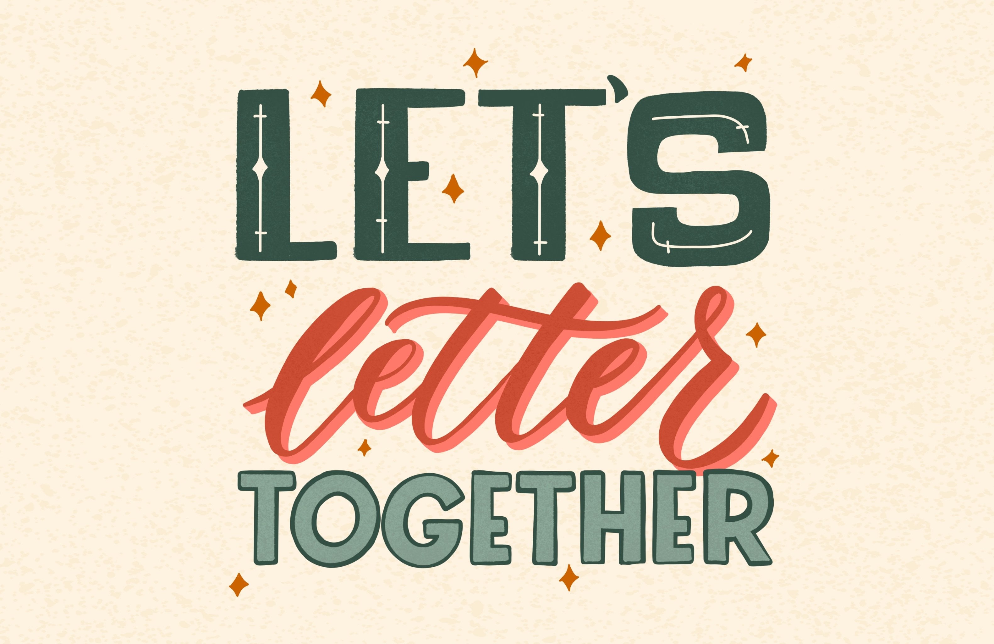
1. Introduction: Hi. I'm a lot of Griffo. I'm an artist and author, and I'm so excited that happened back in class today to talk about creating repeating patterns in a mobile street use patterns all the time for my work, like seeing on get bags or fabrics watchin or paper plates and gift wrapped. So I'm really excited to see what you have in mind for. The class will cover everything from compositions of color and testing it to make sure that you, Kate line. I'm really excited to see what you create.
2. Setting Up Your File: So what I've done today is I dropped these letters I wanted to do and in alphabet Repeat. And so I've already brought them into Illustrator and we're just going to sort of walk through my process step by step. So the first thing I did is I made a square, our board, and that's our borders. 2000 by 2000 pixels. I'd like to work in a square because it makes the math really simple. You can see I haven't finished placing them or cleaning them up or coloring them, because I just want to get the placement down first and make sure I like that so I can then change the color and move things around. So I'm just gonna go ahead and start by using this. Where is my template and moving things around and seeing how they interact together?
3. Getting Started: I'm just I'm grouping everything because I wanna be able to grab each letter and just really, I'm looking to use up the space. I'm not going to do any crazy half drop repeats. This is just gonna be a simple repeat patterns so that you guys just sort of get the idea of how the process works and how you can make your own and play around. So as you can see, a couple things are starting to come off the edge. That is no problem. We will address those once we have a better idea of where everything's gonna set just grouping some objects again, moving him around. And I'm not worrying about color. I just want them to be spread out evenly within my campus. And I didn't even clean up the lettering for this one. I am just using these rough lines, and I like how that looks for this because I want this to sort of be like a playful alphabet. And so when you some bright colors and see how it turns out, I also think the letters are gonna be pretty small, so it won't matter if there's some imperfectly lines. I think that will actually really add to it. There's no real Reimer reasons or where I'm putting things at the stage. I'm really just using the space and trying to fill up the whole area. As I made these. And as I sort of picked the colors, I thought about, where would I see this? Just like we talked about his past and I thought, We need betting or a little girl's pants. Or maybe a T shirt would be a scarves, but definitely a little more kid friendly or juvenile. E think alphabet Usually are the kid's rooms things like that. While decor a pillow would be really cute. I also want to make sure when I'm doing this that things don't were. Things don't read wrong. So I want to make sure each letter has enough space that it doesn't look like them intentionally putting two letters next to each other to spell some things like a secret hidden message. You really don't want anything to feel to planned. You want it to feel like there's a system, but that there's something like this you don't want to feel like, Oh, I see exactly where it's repeating just yet. You want to really flow and have some nice, different lines you could follow
4. Composition 101: And since he's director, obviously I can scale them up and Iran with the size and I can easily change the color as well. So I see a couple holes, so I'm just gonna keep moving things until I feel pretty good about it. So I chose to make everything a little bit bigger because I noticed there was some holes. So now I'm just gonna go back and rearrange. I don't want to change right campus size because there's a reason, and that is because 2000 pixels is a really nice square to work with. And so I'm going to keep that in mind, and we haven't gotten to these corners yet, But if you have something overlapping on two corners and create a little more work, so I'm actually just gonna bring this down and bring this up too. Simplify. It's not impossible. It just is a little more work for this introduction video. Okay, now that I'm getting closer, what I want to do is anywhere that it's overlapping the edge. I'm gonna go resolve those things first so I can tell there's gonna be a couple issues, so I'm gonna start with this A and All I need to do is copy and paste it in exactly the same space. So if you're on a Mac, that's command, See? And then command. So now it's an exact duplicate, right in the same exact spot. So then what I want to do is I want to transform that, and I want to bring it all the way to the bottom of my art word. So that way it repeats, so you can use the transform window right here on the right. And what you can do is on the X axis that is your horizontal access in your Y axis is up and down vertical. So if you want to move it on a cross, you want to use the X, And if you want to move it up and down, you want to use the why, So I want to move it down 2000 pixels. I want to move it down the entire our board. I'm actually just going Teoh, I'm gonna add 2000 pixels and now it exactly in the same spot, but at the bottom. So that way, when they meet together, they will be seamless. So now any two of these things around to make room. Make sure I like that new positioning, Harvey. Somebody changing color gives you the scale a little bit. Okay? The F is another one. This be seems silly to have that come off the edge slightly. So with these programs are so many ways to get to the same solution. Okay, so now I want to move the f So first will command C and command F to make a copy in exactly the same spot. And then the second way to do this is to instead of using transforming Charles to use the move tool. And that shortcut is shift command and M So I'm not moving in along the horizontal axis, so I'm just gonna keep that at zero. But I want to add 2000 pixels. I realize that sounds silly. Toe add 2000 when we're going down, but that is how it works. So I'm gonna add 2000 pixels. And now I have exactly at the bottom, so that looks good. And we still need room for the S. But I'm gonna make sure that the other once I already have fit before I move on. So we'll do the you this m is gonna be a problem. So I'm actually gonna move it over here because only to re arrange for that and I can tell the Z is gonna be a problem as well. So I'm gonna move it up a little bit and transform and see what happened. So if you wanted to move something that you've already mirrored, you could just grab both of them and move them together like that instead of, you know, gearing up for redoing the whole thing. As long as they are both grab, That should be a problem. So the end, I think I want to make the and a little bit bigger. And actually, we can just do these two together. Since they're both going down, I'm gonna copy them. So the important thing to know when you're using transform if you actually don't want to touch the other access, that's the position. And so you only want to add pixels. You only want to say OK, we'll just move it just many pixels and then move around. Whatever else you've got, going to see how the s looks in one of these and be stopped. I have, and you can see him going back and forth between which system I'm using. And really, either one works. Just remember, if you're in the move tool, you want to keep the position zero on the access, you're not moving. And if you're using transform, you want to just add to the one access There is a little empty space here, so I might actually just move this p in, which means I can actually move this one. So I'm sure we'll see some holes once we move around a little bit and test our pattern.
5. Going Off The Grid: So since everything's within the bounding box right now, I'm gonna just switch and show you how we sort of lose those river because we've just moved it over half a brick. And so these end they're not perfect because they're not integrating where they've been shifted. And so that's brick by Rober by column, The opposite direction. And this is a really cool way, and you can see here. If you have the background, it might create some confusion for you. You pay some overlap, and that's where you can do. He's moved a backing different things in the overlap section.
6. Making It Repeat: So now that I feel pretty good about the placement, I want to go ahead and mix up the color. And remember, if something is mirrored, then you want them to be the same. So this a and this, they need to be the same color. Unless I'm intentionally trying to create a line in the pattern. And I'm already out of these colors on my palette so I can just grab them and play around. I remember this side. This right hand side is gonna go right next to the side, so we don't want anything. We don't want this f and this P to be the same color, even though they seem far apart in this view. Once we get into testing, the pattern will see that there right next to each other. So they should be a separate color. Okay, So I really want to test the pattern now and see how it's looking. So are minute walk you through the steps of actually doing that. So first I'm gonna take this background. Since it's a perfect square and it's already clipped to the corners. I'm gonna coffee that and bring it to the front and then I'm gonna grab everything and create a clipping mask. And I just did that right. Doing command seven. If you don't know the short crack and then you go to object pattern make. Or you could also grab this square and drop it into your into your color palette. So then you can double click on that, and it brings up your patterns. Watch. And the first thing I do is I click sighs tile toe art. Since I've done a perfect square, I really want to just see this where? And we just want a grid, these air, some other options that we're not going to cover those in this class. This is just a basic introduction to it. So you can see already I forgot to do Exactly what I told you guys to do is to keep the intersection. So the things that are mirrored, I forgot to keep them the same color. So I need to go ahead and change that first and so at the bottom here, this end should be the green color, and you can see it automatically update and the f I also practically on the same. So that would be that big color. Okay, now I feel like there's too much paint, so I'm gonna go ahead and play around a little bit. No, no, I want it. Really Zoom out and look and see. Like, Are there any patterns that are alarming or does it look pretty good? Are there any holes that are not looking so concrete? Any rivers? I'm not loving how this end looks like there's a lot of empty space on both sides are going to grab the end. I'm actually gonna grab both of them and move them together. If you don't like working in that way, you can also just go back and making you are bored, and you can grab that's watch. And you can go ahead and edit your original design. So this is the spot. I had an issue it. So I'm gonna go ahead and skill it up and move it again. This is nice because you can preview and make sure you've got it right. And like I said, there wasn't enough orange. So I'm gonna make this orange on both the top and bottom, and there's actually only the p of the only one that it used this color with. So maybe I will just remove that color or at its mouth. And what the p I want to fill in this space as well as this place up here. So I'm just gonna play around with that first. So I still feel like they're sort of I'm missing letter, maybe over here. So I'm just gonna keep playing around and sort of moving things around until I feel comfortable. And I'm seeing here that the Z and the F are going to be next to each other. Same colors and meaner changed that as well. - Okay , at this point, I want to test the pattern again and see how it's looking. I want to make sure nothing feels too heavy, like this end has been sort of an issue. And it feels pretty loud from where I'm looking now. But I'm gonna try it again. So I'm gonna go ahead and create that clipping mask again. And the recently it could be masked instead of cutting off the edges is because I don't wanna work destructively. I really wanted maintain all the elements and so I can keep that and then we'll go ahead and create a new our board and I will fill it with that new pattern. And to get into that pattern editing tool, you will just double click on your swatch. But the other way to make that pattern is to want you have that clipping mask. It's good object pattern make, and that automatically brings you into that window. And so again, still, tell our and really zoom out and take a stuff set back and really look and see patterns. I mean, this is a repeat, so I'm going to see the G here, the G here, the g here. But when I look, it's too obvious. Or do I wanna make everything smaller? Is there enough space between things? Are there really clear lines that don't feel right? And so I am seeing a couple spots where I want to add something, and that might be a cool place for me to add polka dots or maybe some deft in the background. So I'm gonna take this pattern one step further with adding another pattern behind it. Um, and I just want to show you that if you do this change these. This is what we don't want to see in a repeat is that they don't line up. And so if you're gonna do a brick by row, you really need to plan for how you're gonna move things around. Run. Uh, after op would be win. One side draws halfway down, and so we're just going to stick to the grid for now. But a really fun way to work is to, you know, move things around within. Um, but since we've already done that that hard work, this is a nice three to test it out.
7. Another Approach: another thing I'll do is dressed without a background and maybe adding the referendum. Later, I will bring over some elements, show you this other ways to grab these three elements and drive them into a pattern. And you can go ahead. There's no background. So if I move this around, the airport is gonna move accordingly, and it's creating that repeat for me. And so this is a more passive way of doing that. Time is saying Okay, well, these air a pattern now make it work and playing around with in. But I like to sort of plan my layout and then go back into the panel and edit it. I want to show you how the other approach might. I'm just gonna snap all this to my corner, Okay, so I don't have the background. I can grab all of this and just say object pattern make. And if I go in, you can see that's why I didn't do it. This way is instead of having a seamless pattern, it's taking the whole entire thing. And so if I removed all the things that are mirrored, we're off the edge, grab them all objects pattern, make you can see now I could play around, and if I move them within, they will duplicate. I think since I've been planning at my patterns sort of manually, I just think the other way. And so I could just play around real quick and see, maybe we'll get a really different results. There's something wrong with his approach. It's a great tool. I find it's a little distracting toe work in this because of the grid and the art boards and things like that. But you need to make sure that size child art is not turned on because then it's not going to repeat within your bounding box. I prefer to work outside of it and bring up bringing the pattern kind of knowing what it's what it's gonna look like and the backgrounds overlapping a little bit. But that doesn't matter, since it's a seamless background behind everything. But if you are planning to do a more a pattern, that's maybe a drop creepy or a different shape. It's really fun to sort of work in this panel in this window, so that's really two approaches that you can use with an illustrator to make it better
8. Final Touches: So I mentioned that I want to add some sort of dimension, another layer to this pattern. And so what I'm gonna do is grab all the letters and put them on their own layer. And then in between those two layers of an ad, a stocks layer. So I'm gonna go and grab the same color is my background and then sort of adjusted to be they're a little bit lighter, are potentially a little bit darker. I want to be pretty faint and kid friendly. So actually like that almost right, really subtle. And I'm gonna go through and I'm gonna add some popa knots, which are really, really nice way to fill in sort of holes in your patterns. And this is really settles what might actually need little actual. But maybe I'll even just adjust the color. So with this one, it's always behind. Since it's in between, it's behind the lettering layer so I can put things right behind and not worry about them overlapping or getting in the way. I just want them behind to add some dimension and and actually gonna lock the fluttering there, and I'm gonna go ahead and start moving some things around. This really isn't that noticeable. But it does help break up that space when you see it all together and so another way you contest without bringing into your swatch. If you're not sure and you just want to do a quick test is you could we didn't create that clipping mask and then do the same thing transform up and then copy both and move them to the right. So let's see if we see any docks that have been cut off for any letters that hope in truncated That looks good. I think I could add a couple more. Would you like to that original? So now that I've got the final composition, I'm gonna go ahead and create a random size so I can go ahead and show you how you can scale it. And that way you can place in our mock ups or whatever else you need it for. So if you click on the scale tool or just press s, it'll bring it right up. You can do a uniform scale, but if you turn off, transform objects, then you can just transform the pattern. Make sure transfer pattern is selected and so you could say 50% and you can see how it looks if it's more condensed. But if you do 200% you can see how it's really big. So play roundly the scale that you want it in every purpose and then apply it to a mock up so you can show a client or a potential customer what it looked like. The other thing is that I've never my selected and then click on until the next to the number one and just move it around. You can drive which part of the pattern you want to see. So see this cell right here? I'm gonna move it because I want a particular part. I don't want to see twosies. I want to make sure they're really seeing the full pattern. So there you have it. Now you can go and download a mock up some creative market orographic burger, or you could make your own and apply your pattern so that buyers can see it in action.
9. Class Project: thanks so much for joining me in class. I hope you picked up some tips and tricks along the way for the class project. I want you to create your own repeating pattern using the grid format. Used bonus points if you upload your pattern is a mock up. What you can find creative market graphic burger or just getting a little. I think markets really helped the science of the potential of your pattern and how you imagine it to be. Thanks so much for joining me back, and I can't wait to see you create.
 Ilana Griffo, Artist & Author