Transcripts
1. Introduction: Are you a designer, a design
student or a homeowner looking to visualize
different paint options for your home or project? Perhaps you're a color consultant
or painting contractor, searching for a quick and
effective way to help clients visualize
how paint colors will look on their walls, cabinets, or exterior finishes. This course is designed to
give you the tools you need. Hi, welcome to my class. I'm Robert Frank
and I bring over 20 years of teaching experience
at the college level, where I specialize in digital presentation skills
for interior design students. In addition, I'm a practicing
architectural Illustrator and color consultant. I'll be sharing industry proven techniques
throughout this class. In this class, I will guide
you through the process of using Photoshop to
visualize paint colors. You'll learn how to import
and apply paint colors from your favorite paint
manufacturers directly onto images
of your projects. I will show you how to
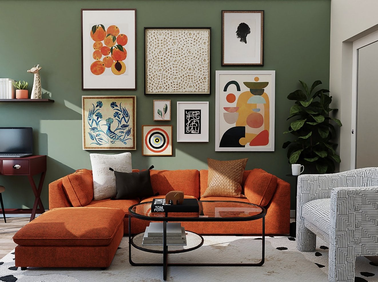
closely match paint colors to any inspiration image such
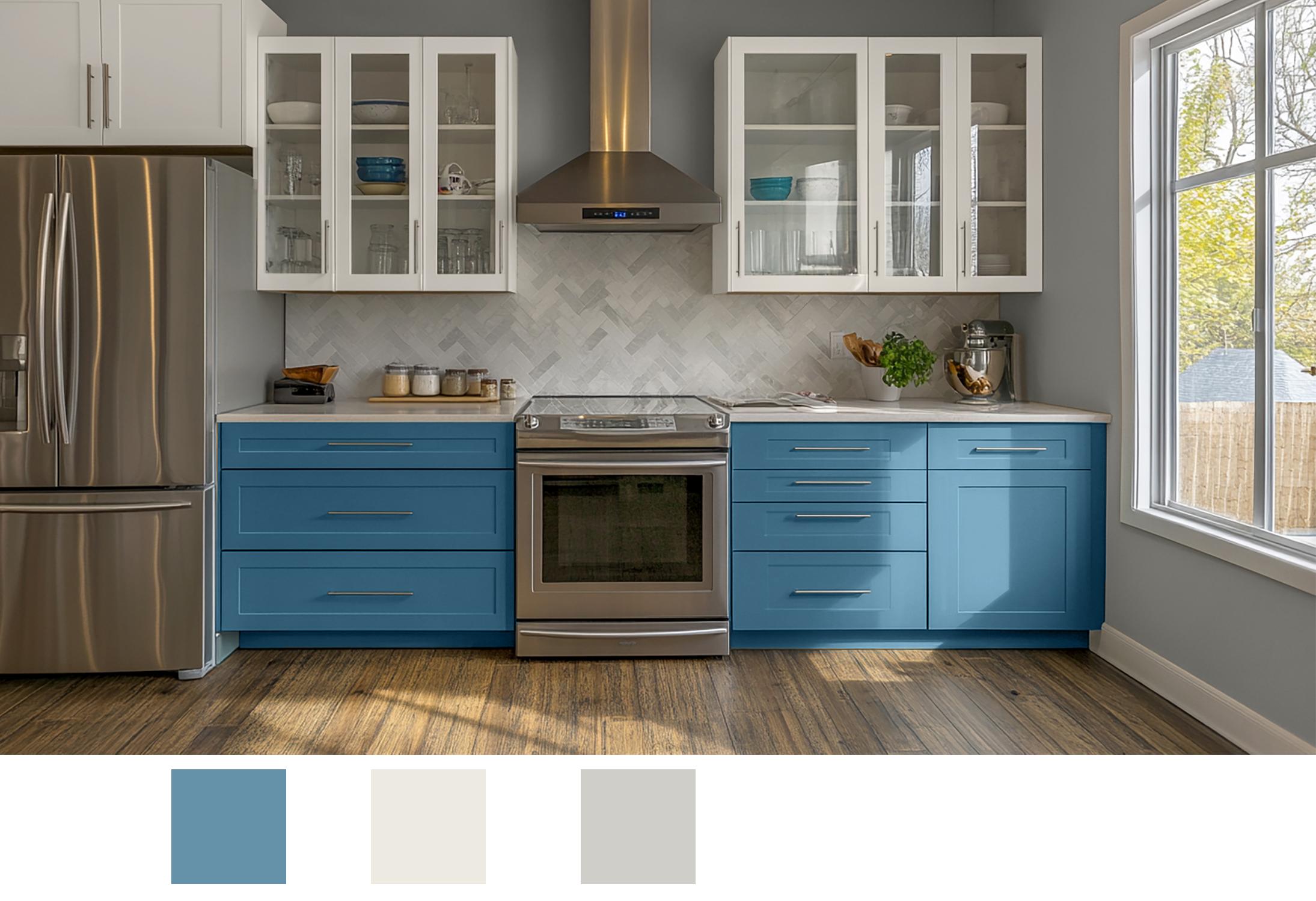
as photos and artwork. We'll use the kitchen cabinet
repaint as our project. But the techniques I'll
share can be applied to any interior or exterior design
project you have in mind. I've designed this course so
anyone will be able to use Photoshop to create paint
color visualizations. No experience necessary. These skills will
allow you to create professional color
paint visualizations for clients or for yourself, helping you make more
confident design decisions. I'm excited to have you
join me, let's get started.
2. Workspace: In this lesson, I'm
going to go over the workspace that we'll be using for the duration
of this course. I'm hoping it will simplify the overwhelming amount of
tools and panels and options that you have in
Photoshop and simplify it enough so that we can focus on creating the
color visualizations this course is
meant to show you. First of all, we want to do is click on Window and
the Window menu, and your overall view may
not look exactly like this, but you will have the
menus at the top. And then go to Workspace. Click on Essentials Default. I'll take you to the Workspace. Minus having any window. And on the top is your
typical menu bar. The difference between
the Windows PC, which this is and Mac are the location of
the preferences. So on a Windows PC, it's going to be under
Edit and on a Mac, it's going to be
under Photoshop, which will be to
the left of file. Below the menu, you'll have
your tool options bar, and on the left is your tools. One other thing about
the menu items, I won't be using the shortcuts,
but they're good to know. Since a live you, I assume you're going
to be on a Mac, and using the shortcuts may
get a little confusing. So I will definitely
make it easier for you but anytime even simple things
like copying and pasting, I will do that directly
from the menu. On the right hand
side, we're going to organize our panels. To be a little bit
more efficient. So for this course, we're just going
to be using layers and channels and swatches, colors and and properties. So we're going to organize and hide some of the ones that we're not using, which
will be gradient. So click on gradient. And click on Close and
the Hamburger icon. Pattern, click on the tab, click on the Hamburger
icon, click on Close. And then color,
I'm going to move over and put it in the
vertical column here. Properties are going
to move over as well. Put it into the blue column. If you missed it, it'll
just end up out here. It doesn't matter or
wherever it went. You can just move
it over, and once it's into a solid
blue like that, it'll be in the
vertical libraries. We can close that as well. Adjustments, I can
close that out. And then layers, I'm going to move that up into that group, channels up to that
group as well. So the three that
we're going to be using the most are going to
be all grouped together. I can click and drag them
any location I want, and pass I won't be using, so I can close that as well. Anytime you want to access a panel that you have
closed, just go to Window. This is on both Mac and Windows. And if there's a check mark
next to the name of a panel, that means it's active so and
then on the left hand side, are the tools we'll be using. Each time you click on a tool, the options will change
in the tool options bar. We're going to be concentrating
mainly on the tools along the upper
four or five tools. That will involve
the Marquee tools and some of the
selected Lasso tools. The tools that have
a little arrow, just about all of them do
on the bottom right corner, if you right click on
them, you'll see nested. So they'll be also, for example, liptical and so on. You can also click on the
little arrow on the bottom. But sometimes right clicking
works better. Then we have. We're going to be using
the eyedropper tool. Not a lot a ton. There's quite a few tools here, but we won't need all of them. Paint bucket tool, and then the swatches and
the color swatches, we have the foreground
color background color. Click on any one of
those, and that'll pull up the color picker. And, of course, again, I'm
going to be going into a lot more detail as we
work on our project. And then the last tool
you're going to be using is the edit in quick mask mode. So that's pretty much
it for the interface and the workspace
that we'll be using. So go ahead and, you
know, look around, become familiar with
the user interface, and then move on to
the next project.
3. Paint Swatches: Oh. Most of the major
paint manufacturers have color swatches
that can be downloaded and installed into your
swatches folder in Photoshop. In this lesson, I'm
going to show you how to install those files. I've already gone
ahead and downloaded them and placed them in the projects and
resources folder. I'm first going
to show you how I went about downloading
those files. I went to each manufacturer. This one is Sherwin Williams, and I went into their downloads color download
section of the website, and then just scroll
down or find where the photoshop links are for
downloading the swatches. So for Sherwin Williams, they have the designer color
collection and Color Snap. So these two palettes will encompass their entire
collection of colors. I've gone ahead and
downloaded them by number. You can do it by name as well. It doesn't really
matter because when we're working in Photoshop, we can search for them
by name or number. But again, I've downloaded
them by number, and they're available for you to using from the projects
and resources folder. And also just to let you know Ser Williams is the brand
that manufacturer that I'll be using for the
color visualizations for this course
just to make it a little easier and partly
because some of them have a lot of color
choices to choose from, such as Benjamin Moore. Of course, these
are also included. All the manufacturers
that I'm showing right now are in the resources folder, so you can download and
install them if you like. And then we're
also going to have bear Don Edwards and PPG. So once you have them
stored in your hard drive, either downloaded from
their manufactured websites or you have it from the
Projects and Resources folder, then go into Photoshop. Go to your Swatches panel. If it's not showing, say it's great out, just
click on that tab. If the tab is not
visible anywhere, go to Window and go
down to Swatches. Then go to the hamburger icon
and choose import swatches. And then go to
where your swatches are located on your hard drive. These are the dot ACO. On a Macintosh, you're
going to see all of them. On a Windows PC, you need to choose the extension
that you want visible. For the Sherwin Williams
colors that I want to install, those are going to
be the dot ASE, as well as Bear and
Benjamin Moore. And then click on the Sherwin
Williams Color Swatch and hold on the Shift key, click on the next version
of the next option. So we have the two different color palettes from
Showan Williams, and then click Load. And now you'll see that there's a folder now in your
swatches panel. You click on the Down arrow and you'll see all the colors, and they're listed
by number here. So these are the different
the designer collection as well as the color
Snap collection. And then you can search for
colors by name or by number. So I'm just going
to do this quickly. So I'll modarn white, and then you can
see it just popped up in the search under
Sherwin Williams. So go ahead and install the color palettes
that you would like to experiment with. As I mentioned, I'm
going to be using the Sherwin Williams
colors for this course.
4. Matching Paint Colors: For our project, we're going to find paint colors
that we want to look at for the lower
and upper cabinets as well as the walls. In order to do so, we can match two different
inspiration images. These are the
inspiration images. And in this lesson, I'm
going to show you how to match or closely match any one of these colors to one of the many manufacturer paint
colors that are available. First thing we want to do is create a new folder in
the Swatches panel. Click in the Hamburger icon
and choose New Swatch group, type in kitchen or whatever
name you would like. And this is where I'm going
to store all the colors that I'm going to experiment
with the kitchen project. And then click on
the Eyedropper tool. If it's not visible,
you're going to either hold down
your mouse over it, hold down the left
button or right click and click on
Eyedropper tool. Click on any color
you want to look at. You can see the color change in the color picker on the left, the foreground color picker. You can choose click and
just drag the mouse around and watch the colors change on the left hand side
in the color picker. I'm going to click
this blue color, and then I'm going to
click on the color picker, the foreground color,
and I'm going to control C or option
C on the Xcode. This is the HTML hex code. It's easier than trying to
remember and copy each one of these RGB values
separately and click Okay. And now we're going to go
to a website called EzrgB. And when you go to zygb.com, you'll have options for looking at finding colors either
similar colors from one manufacturer to the other or from an RGB or in our case, HTML hex code, which is
what we're going to use. So click on Try it now. And that's from a previous job, but you'll most likely
see it like this, and then you're going
to click on the down on the pull down menu and then
Control V or Option V, and then choose a manufacturer so you can choose
all collections, or you can choose specific. Here's the Barra collection, and so on, Don Edwards. We're going to use
Sherwin Williamson. That's what we already have
in our Swatches folder, and then click Match and you'll see you have some
pretty close matches. This is 1.7, which
is very close. I actually though like this color a little
bit better the 7606, showing Williams Blue Cruise. So memorize or write down 7606. For some reason, copying
and pasting it doesn't seem to work, and
I'm not sure why. But 7606, then go
back to Photoshop. And then in the search
underswatches, type in 7606. And there it is Blue Cruise. And I'm going to click on the
icon with my I drop a tool. Now it's here in the color
picker, as you can see. It's not going to
be any different. You won't notice the difference
because it was so subtle. Before I go into that, though, what I want to do is make a
copy of this name just to make it a little bit easier
to assign it to our folder. So I'm going to
Control C or Option C after double clicking on the name or highlighting it,
whichever works for you. And then let's delete
that so we can see all of our folders,
including the kitchen. Click on the kitchens Important and then you highlight
that kitchen, then go to color picker, and that's the color. And we're going to add
two swatches and then control V or Option V on a Mac and click keep that unchecked at
the current library. It's going to show up in your folder, and
you can click Okay. And now, you'll see that
we have our color also. It's in the Show Williams folder as well as in
the kitchen folder. And this is going to
make it easier to organize our colors as we build up a variety of options that we want to practice
with on our project.
5. Color Harmony using AI: For our kitchen project, we need to find a
couple more colors that are going to work
well with Show and Williams Blue crews
that we're playing to see how those look
on the lower cabinets. So we need two more colors, one for the upper cabinets
and one for the walls. In this lesson, I'm going to show you an
easy way of using Chat GPT to find colors that will work
well with Blue Cruise. The first thing you
want to do is go to Chat GPT in your browser,
type in a prompt. That asks it to find colors that work well
with Sean Williams, 7606, you don't have
to put the name in, or you could just put the
name and not the number. But as long as you
have Sean Williams in there, it usually works, and then press this
return Enter button, and you will now get
a series of options. As you can see, we have three upper cabinet colors
and three wall colors. I'm going to take a look at
seven alabaster and Big hill. I'm going to place those
into the kitchen folder. So you can copy a pass and take them into Photoshop
or just write them down. And for our cabinet,
color, 7008 is Alabaster. Click on the icon on
the color swatch, so it shows up in our
foreground color there. And then we're going
to double click on it or we're going to select
the name and copy it. And we're going to delete 7008, the number at the top so that
we can highlight kitchen. Then we need to click on the color picker and
add to swatches. And then paste it into the name. We have Alabaster.
We can cancel that. So that's going to be
our cabinet color. And then for the wall
potential color, we're going to use
7648, 7648, big chill. Click on the color icon see how the colors change
in the color picker. And then we're going to
copy the name, delete, the search and then
click on Kitchen name. Click on Color Picker,
add the swatches, paste in that color name we're going to use
or type it in, you have written down
or memorized it. Click Okay. And then cancel. So now we have our
first three colors that we can work with when creating our color
visualization of our kitchen.
6. Surface Selections: Before we can start
visualizing the colors on our lower upper
cabinets and the walls, we need to isolate those different surfaces
by creating selections. So the easiest selection tool usually is the Quick
Selection tool. Which is located right here
on the left hand side. Right click or
click on the icon. Most likely the magic wand
is the one that's showing. You can try any of the others, but the quick selection tool seems to work the best
for a lot of situations. So let's zoom in. Click on the Zoom tool and you can click the
left to zoom out. Click to move to the right,
not click, but move. And then let's just take a look at so I can move out a little
bit here, the whole thing. And click on the
quick selection tool and just kind of go
around the edges. And you'll see it's kind of miss a few spots or has more
than we want covered. Make sure the add selection is selected in the tool options
bar and just go around. So this came out pretty
good. This is pretty sharp. I don't need to do
any editing on that, except for the bottom here. So let's edit now. So we're going to use the polygonal lasso tool,
which is right here. And for this, we're
going to add we need to add to the selection. So click on the add
to selection button. And click and just
drag and go around. Once you get to the top,
you can just double click. You don't have to
be real neat there. And then on this
side, we want to subtract some of
the shape for that. We're going to use the
subtract from selection. So click on that in
the tool options bar. Click, click kind of follow
along that bluish color. And just click click click, click then double click. And that will subtract out the portion that we don't
want to add color to. And then we're going
to we also don't want to add color to the pols. So for that, the
easiest way of doing that is to use the quick mask. So click on the QuickkEdit in quick mask icon below
the by the tool, I'm sorry, by the color palette. And we're going to
use a brush tool, and automatically it's going
to go black and white. So black is going
to create a mask. White is going to remove a mask. And for this, we
want to use a brush about the thickness of the pull. And I'm going to zoom in
just a little bit here. And then I'm going to
use my brush tool. So four pixel seems
to be about right. Click once, go to the endpoint, then hold down the Shift
key and click again. You'll get a perfectly
straight line. Okay? Once again,
I'm going to click, move to the endpoint, hold down the Shift key, click. We'll do the same
here. Click, hold down the Shift key, click. And then Click. Hold down the shift key, click. Click, hold down the Shift key. And click. Click. Hold down the Shift key. Click, click, hold down the
Shift key. And one more time. Oops. If that happens, just do Control Z or
whatever it is on the Mac, do the Undo Edit Undo. Click, hold down the Shift key. Okay. Now we have all of
the portions where you're seeing right now
areas that we're not going to add any color to,
which is how we want it. So then click again on
the Quick Mask mode, and you'll see that we have nice clean selections
around everything. And now we need to
save that selection. Go to select. Go
to Save Selection. Type in the name, leave
everything as it is. Then just type in the name. So these are going to
be the lower cabinets. New channel, click Okay. And then we're going
to do the same now. We're going to create selections around the upper cabinets, as well as the walls. Once you've made your selections around the upper cabinets, using the same tools used for the lower cabinets
and the quick mask, as well as the
polygonal Lasso tool, you can now save that selection. Go to select Save Selection
and type in the name. That you're going to
want to use. Click Okay. And next, you can
select that now, and then we can
go ahead and make the selections same
way around the walls. For the walls, most likely, it's going to be just using the polygonal lasso tool is going to be the
easiest method. So now for our final selection, we have the walls completed. For the walls, they
use entirely using the polygonal Lasso tool
using add to selection, as well as subtract from selection if you went
over a spot or two. And then once you've made
your selection for the walls, go to select Save selection, and we'll name that one walls. Okay. And now we'll be ready to apply the paint colors that we've chosen onto our
different surfaces.
7. Swatches Layer: Before we start applying our colors to the
different surfaces, the cabinets and the wall, it'd be nice to be able to see these color swatches
a little bit larger and be able to compare them directly to the
different surfaces. So the easiest way to
do that is to create a swatches layer. So
I'm going to do that. And before I do it, though, I'm going to make the image the probate image
a little larger. So I'm going to show
you how to do all that in this lesson. So make sure you have
click on the crop tool. And make sure you
have background, default selected in
the tool options bar and just bring it down a
little bit, maybe about here. And you want to have it white. Make sure the background
color here is white. If it's not, single click on this default foreground
background colors icon and then just double click. Now we have an empty white
area down at the bottom, and I'm going to click on
the plus icon at the bottom. This is going to
create a new layer and I'm going to double click on that and call it swatches. Then I'm going to use the
rectangular marquee tool. And just make a square
or any shape you want. If you want perfect
square, just hold down the Shift key and
then go to Swatches. Click on the Blue cruise
with the eyedropper tool. Click on the paint
bucket tool and click and then you can just
go back to the layers. And if s is still selected, click on the Well, you can leave it actually
in any of these tools. And then copy of the
swatches we just made. You can just go to
edit, copy paste or on a Windows PC and I'm not sure how
to do it on a Mac, but Control and ls will
give you the double arrows, and then you can make a
copy and move it over. Let's go to the Swatches again. Click on alabaster or just
have the eyedropper over it. Now we have alabaster
and I'm going to again control alt and hold down the Shift key so
it keeps it straight. And then this will be
our big chill color. And, of course, you can go
ahead and label these if you like, with the type tool. Okay, so now we have
our three colors. And next we'll be able
to apply these colors to the surfaces and have a better idea how
closely they match.
8. Apply Paint Colors: Now that we have the colors
picked out and we have the selections made around
the different surfaces, we're going to look
at paint options. We can now apply those colors. And I'm going to show you how
to do that in this lesson. So the first thing
you want to do is we need to load the selection. So let's do the lower
cabinets first. So we're going to go to
select Load Selection. Pick up click on Lower
cabinets. Click on Okay. Then go to the adjustment layer down at the bottom
of the layers panel, click on solid color very top, and then move your eyedropper, which will automatically appear when you have the
color picker open, and just click on it,
and that's going to apply the color. Click Okay. Then go to color in the blending mode,
Layers blending mode. Click on that, and let's name
it before we go too far, so this is lower cab. And then we need to have levels, which is going to allow us to add a little bit
more fine tuning. So let's click on another
adjustment layer. Click on Levels. Then right click to the right of levels and choose
Create Clipping mask. Double click to the
right of the color of the lower cabinet and uncheck blend clipped
layers as group. Then click Okay. We'll come back and make some
fine adjustments after we've loaded
all the colors. Let's do the next color. Let's do the upper cabinets. Click on the background layer. Go to select Load Selection. Choose upper
cabinets. Click Okay. Go down to the adjustment layer. Just click on solid color. Click on the color
we want to look at for the upper cabinets,
which is alabaster. Click Okay. Under the blending mode layer
blending mode, go to color. And you can see right
off that needs them. It's going to need a little
bit more adjustment. And before we do that, though, let's go to the adjustment
layer again and choose levels. Right click on the levels and choose Create Clipping mask. Double click to the right of
what it's saying right now, color fill one, check Blend
clipped layers as group. Click Okay, and let's name that. Upper. Then lastly,
we have the walls. Click on the background layer, go to select Load Selection. Click on Walls. Click Okay. Now, see if the
walls are all selected. Another adjustment layer,
click on the bottom. Adjustment layer solid color, and we're going to use this color swatch
here. Click Okay. Set the blending mode to color and create another
adjustment layer for levels. Right click on Levels number
three, create Clippy mask. Double click to the
right color fill one, which is going to be our walls and unchecked blend
clip layers as group. And that will keep everything when we ever make
any adjustments, it's just going to affect
the color that's below it. It won't affect
any of the others. And then let's go ahead
and name that walls. So let's go back to the lower cabinet and
make some adjustments. So it looks like it might need
to be a little bit darker. So I'm going to click
on the levels above it. Double click, or actually, you can just single
click on that, and then you can move the
middle any of these sliders. I'm going to move the middle one just a
little bit to the right. Just make it a
little bit darker. And I think that's
fine. The one that looks a bit off is
the upper cabinet. That one I'm going to first
click on levels and then move move the slider just to the left a little bit,
make it a little brighter. You can also move these sliders to make some kind
of adjustments. So between the two of them, I think I'm getting the
value about right, but it's still a
little too cool. So let's double
click on the color, upper cabinet color, thumbnail. And then we need to make
it just a little warmer, so I'm going to bring
it down towards the red just a little bit. And just move it over to
the right, just to here. You can see very subtle
change right there, but just enough to
knock back some of that cool color temperature,
and then click Okay. And just looking at the walls, this looks
really good to me, so I'm not going to make any
adjustments to that now. So that's it for how we can
add colors to our project.
9. Alternate Schemes: Now that we have
the hard part done, I'm going to show
you how easy it is to change colors that
we've already applied. Let's create another group,
another alternative option. We'll use these same three
colors, but, of course, you can change any of
these colors using any of the manufacturers that we using the techniques
that were shown earlier. So, click on the first layer. Just one just below SWAT. Hold on the shift key,
click on the last. So we just want these
adjustment layers selected. Then click on the Create Group, icon, the bottom of
the layers panel. And we're going to
call this option one. Double click and just name
it as you would like. And then we'll make
a copy of that. Click and drag it down
to the plus sign, and we're going to
name that option two. And what we're going
to do with this, and we're going to
hide Option one, so click on the
eyeball there for option one. We just want. As you can see, turn off and on, the colors start to blend together, so
we don't want that. And then what we're
going to do, we're going to look at
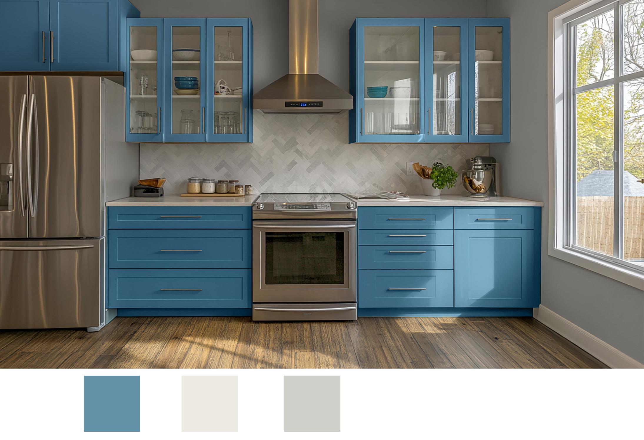
the upper cabinets. Let's see how this blue is going to look on
the upper cabinet. So we have the
upper cabinet here. Just double click
on the thumb nail. Click on blue on the blue color or
whatever color you want, and then click on Okay, and then click on
the levels and move that slider until you
get the right value. You might need to move
a couple of these. So just move until it
looks about right. I think that's pretty close. Okay. That looks good. And then I think the value and the saturation needs to be
adjusted just a little bit. So I'm going to
desaturate it slightly. Bringing that down, clicking on the S radio button,
bringing that down. So that looks like a
pretty good match. So this is option number two. This is showing all the
cabinets, this blue color. So now we can drag that
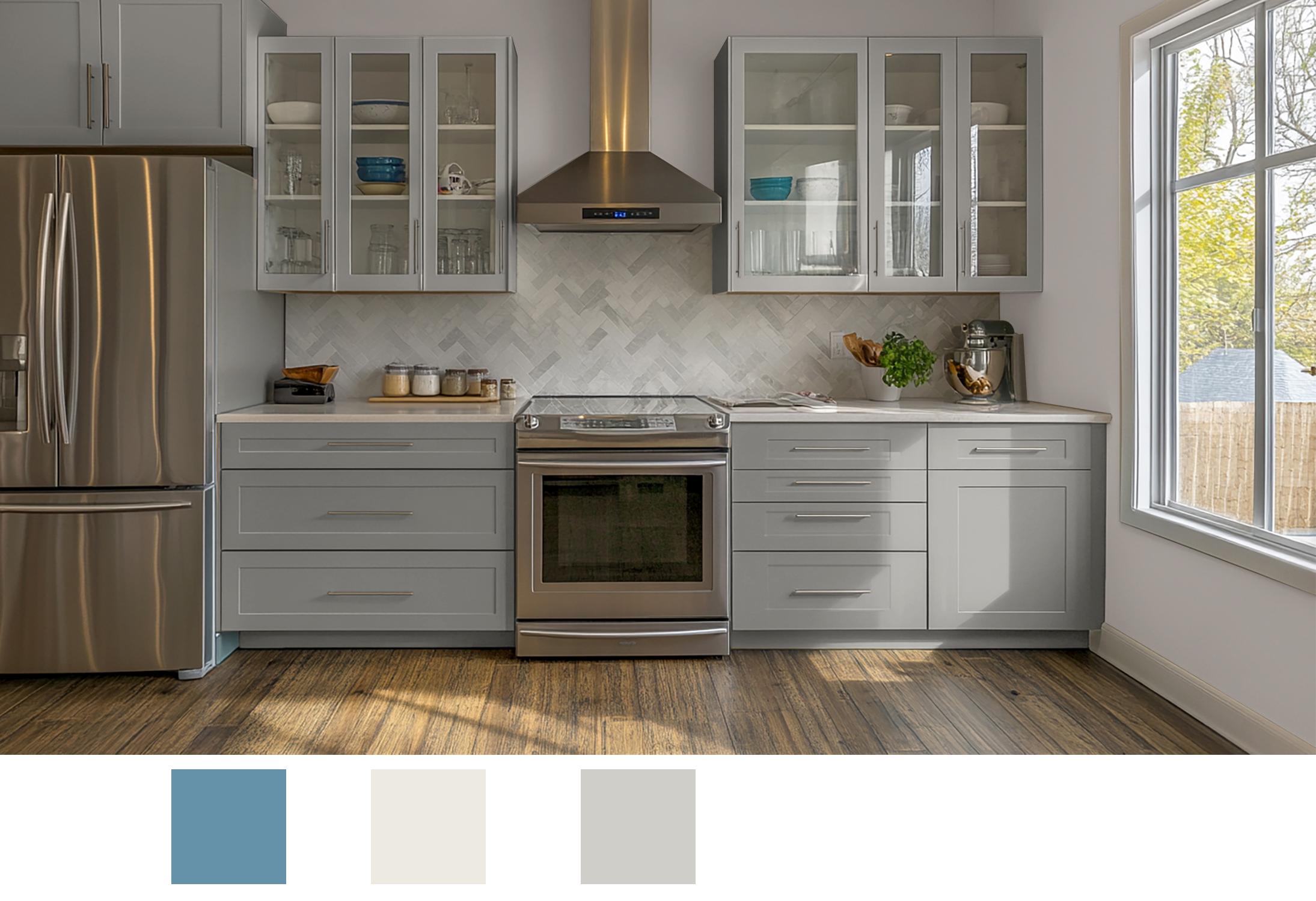
down to the plus sign and turn off option two and
then type in option three. And for this, let's make
both the upper and lowers. How about we make the uppers and lowers we're using
for the wall color, and then we'll use the
alabaster on the wall. So when we do that, click on the lower cabinet color and then click on this
grayish color. I Okay. Notice it's going to
need a bit of adjustment. So let's move everything
to the left a little bit. Actually, that's not
bad. I'm going to move this left
adjustment to the right. That looks about right. Now
click on the upper cabinet. And then once again,
you'll need to click on the color you
want to look at. And then I always start
with the levels first, and make those adjustments, and then before I go back
into make any color. Now, what's nice is that the cabinets were
already pretty light, so it's able to get that
to work out pretty good. So that's the option
for that color cabinet, and let's change the wall color. Double click, choose the
albaster, the middle color. Click Okay. And so
it's quite a bit lighter than what's existing or what the previous
version was. So again, we need
to click on levels, and that we can
lighten quite a bit. And it's also going
to need some warmth. So it is a lot of it's in shade, so it's not going
to be super bright. I'm going to put it
right about here. So if you compare
the values here, let's go into the double click on the wall color a little bit, and I'm going to go to Hue and then bring this
down just a little bit, just like I did
with earlier with the cabinet and then bring it over to the
right, just a tad. That looks much better. So it's a little trickier
with and we can go back and forth until we kind of get
the values looking right. So it's going to be a little bit brighter than what
was there before. So that's pretty close. That has some color
bounce. But you can go back and forth
all you want to get, you know, until it's matching. But there's another
color option. So we have quickly created
three different color options. We have option three.
We have option two. And we have option one. And then, of course, we
can turn all those off and see what the
original looks like.
10. Final Thoughts: H Congratulations on reaching
the end of the course. You've now developed
the skills to confidently visualize paint
colors using Photoshop. I hope you're feeling
empowered to apply these techniques to a
variety of design projects. Whether you're designing
for yourself or clients, this process allows you
to explore color options, compare finishes, and visualize your ideas with precision
and creativity. Throughout the course,
you've learned how to import paint colors
from manufacturers, apply them to project images, and match colors to
inspiration sources like artwork and photographs. You've seen how this
can transform something as simple as a kitchen
cabinet repaint. But the tools you now
have can be adapted to any exterior or interior
project you take on. These techniques are invaluable not only for experimenting
with your own ideas, but also for communicating them more effectively
to clients, collaborators, or even
your design team. I hope you continue to refine
and expand your skills by exploring new
projects and pushing the boundaries of your
color visualizations. The possibilities
are truly endless. When you know how to accurately
present your vision, thank you for taking this course and I'm excited to see where your newfound skills take
you in your design journey.
 Robert Frank, Color Consultant, Designer, Instructor