Transcripts
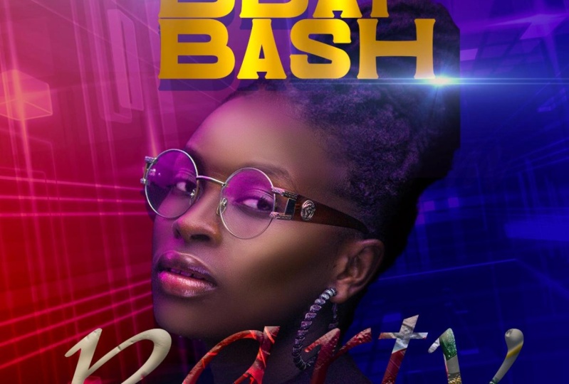
1. Birthday Bash Flyer Photoshop Intro: Hi students. I'm so glad to
have you on this course. My name is Tricia. You can call me
patricia as well. Now, I am an architect
by profession, but I like to play in Photoshop. And as a result of that, I have developed a
YouTube channel, West well as the Skillshare, where I have courses
that students can follow and learn and
grow, use in Photoshop. Now this is a
project-based class. No matter your level
of experience, whether you're a beginner or
an intermediate or advanced, you will have a steps to
step guide that up you. So by the time you finish, you will be a pro at re-creating
your own unique flyer. I also have an assignment that you will have to do so that I can see your progress in this class is head to
the resource library, download them and follow
along as we create this file. Once again, I want
to say thank you so much for choosing my class. There are so many other classes that you could have chosen, but you chose to stick with me and I wanted
to say thank you. So if you're ready, come with me and
let's get started. I will see you in class.
2. Step 1 How to Design Flyer Background : Welcome back. The first step to start off this flyer is to establish the size
of Canvas that you are going to use all
the size of your flyer. So you're gonna go to File and you are going to click
on new Photoshop, opens this window for you. Now, if you're going to use a
basic ten by ten font size, you have to click
on the costume. And it sets the resolution, the background, and even
the color mode for you. Now if you want to
change up the size, you can also do
that right there. But we are going to
keep to the ten by ten. Our background is set to white, so we are good to go. You just have to click
on Create and Photoshop basically sets the
Canvas for you. It opens it in a new page. I'm using a Mac book. So all the commands that I
am talking about is in Mac, but I will do well to
put the equivalent of the windows short keys in the tutorial for
you as we go along, the first thing we're
going to do is to set the background for our flyer. So what I'm going to
do is that you want to go under your adjustment. So go under your Layer Style, go to your adjustment and
you want to choose Gradient. Now, we want to set
a two tone gradient. So we are going to click
on our gradient fill. It will give us options
to choose from. We want something within
the purple and the blue. So we are going to start off choosing this purple blue color. And I'm going to go
into the color itself, click on the color stop, and we are going to set
this to a deeper blue. And I'm going to go
ahead and click Okay, now before we close
off our gradient, we want to change the
angle of our gradient. So you can go to your angle
and you can basically play around with the angle to get
it in the way that you want. We want to go ahead and throw in the background
that we want to add. I'm going to drag
and drop this image. And we are going to go
ahead to just scale it. Will scale it for it's
a fit the canvas. Now, if you don't have your transform activation
on, so students, if you'd notice, I'm using
Adobe Photoshop 2022, which is the most
recent version. Now, if you have an older
version of Photoshop, you might not be able to see your transform activation
once you drag in an image, what you have to do is click on your image and you
need to go under Edit, click on Transform,
and then choose scale to activate
the scale command. Now, if you own the new
one version of Photoshop, always make sure that once
you select your move, your auto select and
your short transform. Our check so that anytime
you bring in an image, you can scale in and out. Once we have this, we are going to go ahead
and take the opacity down. We get a little bit of
the effects that we want, but it's not too much. Click on the top of your layer, go and click on your adjustment, and we are going to
add a second gradient. Now, this second gradient is
just a one side gradient. So you notice that it's
from solid to opacity. So we are going to click
on the stop color and we are going to choose another
blue, a deeper blue. And I'm going to click on the white of the color and
set that to black. And we are going to click Okay, and Okay, now we are going
to change the angle. We want this on
the opposite side. So we get a little
bit more of the blue. Once we have the set, we are going to go ahead. Click Okay, guys, this basically sets the mood for
our background. Now before we move on, I'm going to click
on my gradient, and I'm going to go ahead
and change the blend mode of my gradient and we're going to choose Color Burn students. This basically completes
the background on which we are going to lay out in all the different elements
to finish off our flyer. So I'm going to move on to part two so we can begin
to add in the thing.
3. Step 2 Design Flyer Theme: Welcome back students. So for part two of the flyer, we are going to click
on our type tool and we are going to go ahead and
use the movement font. Now, I'll make sure that
I also put in the links, the font that I'm using so
you can have the same effect. So I'm going to click any
way in my Canvas and I'm going to just type in bird day and I'm going
to highlight this. And we are going to increase
the font like that. Double-click. If you want to change the fonts, all you have to do is
highlight the font and you can go ahead and
choose any font you want. We are going to change
this font to them. It no centric font. And we are going to go ahead
and scale it down a little, and we are going to
center it like that. Now, if you don't see your snap on or you need to do is
go under your windows. And you want to make sure that under your view you
want to make sure you have your Snap checked as
well as ten on your ruler. With this, if you
want to close up the gap of your font a little, all you have to do is go under your property and the a over a, you can go ahead and decrease it if you want to open up
your fonts spacing, you can also use
the VA to do that. But I'm going to
keep it close up. I'm going to open
this just a little. With this set, we are
going to move this and set that in the
middle for its snap. Now, I'm going to go ahead
and reduce it a little. Once we have this, what we want to do is
that we want to add glow effect as well as a
shadow effect to our font. We are going to
double-click on the font. It will bring up
the layer style. And the first thing
that we want to do is to add a drop shadow. Now when you add
the drop shadow, if I click on my drop shadow, you can see that I have
the mode set at normal, the blend mode, and I'm
using the cyan color. You can even see the
exact color below. And you notice that
my opacity is at 43, so that it's not too much in
terms of the shadow effect. Now my distance is around 25, spread at 40, and my size, I kept it to 0, so I don't want my shadow
to have a Blair effect. Now with this set, you notice my angle is that 90. I'm satisfied with my gradient. Now I want to add an outer glow. You want to click
on the Outer Glow? I'm going to click
on that now notice that with my outer glow, I do have a pink color, and you can see
that I'm basically played off the colors
in my background. I have this exact color. You can choose that to
add in your design. My spread is not 0, but I can even increase
my spread if I want. And you'll notice that
my size is at 5043. Now I can take it back so
that my glow effect does not take away from that shadow that I have beneath my font as well. So you just have
to play with it to see what works best for you. Now with this All set, notice my opacity is at 60. Now the next thing that I'm
going to do is that I want to infuse metallic
effect to my font. Now, you don't have to do with, but if you want a little
bit more interest, you can go ahead and do that. So I'm going to go back to
the resources that I'm using. And I'm going to go ahead to
drag in these two images. I'm going to
double-click to accept. So I'm going to set this on top. I'm going to turn
off this layer, and I'm just going
to increase this so that it fits on my font. And I'm going to
do the same width, the other one as well. And both of them fit
right over my my text. What I'm going to do
now is I want to infuse it onto my font. So I'm going to hold down
Option and I'm going to click. And notice that it gives
me the down arrow. So you are going to
click both of them on. Now, when you do it, it
looks a little bit too much. So we are going to
go ahead and take the opacity down so
that we get the effect. But it's not too much. I want to add a little bit of a blur effect to the top image. So go under your Blair, you'll filter choose
blank question Blair. Now we want to basically take this blade
effect, but a little. Now I'm gonna go
ahead and click Okay, now the next thing we
want to do is to add lens flare effect to our font. So guys, this sets the
theme of our flyer.
4. Step 3 How to add a lense flare effect: Welcome back guys.
In this section, we are going to learn
how we can bring in a lens flare effect and
take off the background. So going back to my resource, I'm going to drag
and drop this image. In. This image you can get
online just typing in Google Lens Flare effect. And you'll be able
to have all of these options pull up for you. Now we need to take
off the black. So all you need to do is change the blend mode of
that layer to screen. Now screen will basically
take off anything that is black and just leave
the light source. Now with this set, we noticed that it
has a little bit of a line on our phones
and we don't want that. So all you have to do is add
a layer mask to your layer. Pick up your brush tool with
your foreground as black. We know black hide, white reveals when
working with layer masks. Now we want to
increase our brush to do that use your left
and right bracket. And we are going to go
ahead to just paint gradually to hide the
edges of the image. Now, if you brush and
you have hard edges, make sure that you right-click, it will bring up
your brush options. Make sure your hardness is at 0, not 100, and you can get
the same effect like me. Now, we want to pick up our
move tool and we are going to make a copy of this lens flares. So all you have to
do is hold down Command J to make a copy. Now we are going to move that
and set that right there. So we have this cool
effect on our birthday. Now, I need to click
on that layer as well, pick up my brush tool, and I'm just going
to brush that end so that it does not show
that end as well. Two guys with this set, we want to go ahead and add
in the rest of the theme. On the lower section, I'm going to pick up my
type tool and I'm going to go ahead to type in
the width priority. So I'm going to go
ahead and highlight. And this time we want
to change the font and we are going to use the nice. And I will also make this font
available for you to use. So I'm going to move this and I'm going to go
ahead and scale it. And we are going to make
it big and double-click. Once you're satisfied
and set it in place, I'm going to
double-click on it and click on my foreground color. And I'm going to go ahead to
find the color that I want. I want something in the cyan. And I'm going to go ahead. So click Okay. With this set, we want to add a texture effect to our image. So we are going to go
back to our resource. And I'm going to
drag this image in. And I'm going to set that
right on top like that. Now students to make
sure that none of your layers keep moving
while you work in. If you want to go under your layers panel and you want to make sure you
lock all the layers that you have already set
in place so that they don't move while you are
working with this set, we want to go ahead and
infuse this to our font, hold down options and in-between the image
layer and the text layer, you can basically clip it. We wanted to change
the blend mode of our layer to pin light so we get our font
bleeding through, but at the same time we
have a very cool effect. Now notice that while I'm
trying to move the font, is moving the image
so you want to lock the image so that once
you click on your layer, you should be able to
move that by itself. The next thing we
want to do is to add a glow effect to the font. So to do that, we want to go ahead and basically click on
our font layer. We want to go ahead and click on the Outer Glow so it can
add some effect for us. Now, I'm going to click
on the outer glow, and I'm going to go ahead
to increase my size a little so that I get a little bit more
effect like that. Now I'm going to click on my color and I'm just
going to go ahead and increase it like
this so that I get a bit more deeper, pinkish color. And now I can go ahead
and increase my soul. Once you're satisfied, you
can go ahead and click okay. And we want to also go ahead
and type in the web Friday, so it's a bad day
bash Friday party. So I'm gonna click
on my type tool. And I'm going to type
in the wet Friday. I'm going to highlight and
we want to change the font. We want to use the
trolleys sub bass team. And I'm going to go
ahead and click on that double-click because we
want to set this to white. And I'm going to go
ahead to increase it. And then set that right
on top, like that. Double-click to accept
not we want to add the same glow effect
on the party to this. Click on your party
layer, right-click. And then you want to
go ahead and copy the Layer Style that you've
already applied to that one. Now go up to the
Friday texts layer, right-click and
then you want to go ahead and paste
that same effect. Now, if it's too much, you can basically
double-click on that layer, click on the blow, and you can basically reduce the glue effects if you satisfy, all you have to
do is click okay, and you are done.
5. Step 4 How to remove background in Photoshop: Welcome back. In this section we are going to bring
in our subject. So going back to our resource, I'm going to go ahead and
drag and drop this image in. But the first thing
we need to do is take off the background. So click on your image, go under your Quick
Selection Tool, click on Select Subject. Photoshop will do well to basically select your
subject for you. Now, once you have your
subjects selected, sometimes you need to
zoom in and you'll notice that they
are areas that you need to click on
your plus icon just to select these areas as well, so that you capture
everything of your subject. Sometimes you need to
zoom in to make sure that all the edges of your
subject have been selected. So once you have the selection, all you need to do
is add a layer max. So click, Make sure your
layer is still selected. Go under your layer style, and then you want to click
on the Layout max thumbnail. Now that will basically take
off the background for you. Now once that is taken off, you can go ahead and scale your subjects whichever
way you want. Now if you are using a
newer version of Photoshop, I did not show you, but another way to take
off the background is basically all you need to
do is click on your layout, go under your property. Now, you're looking
for the quick action. If you don't see
it quick actually means that you've
best of all need to convert your
image two layers. So click on Convert layers. You just have to say yes. Once that is done, if you go back to your property and you look under
your quick action, you will see Remove Background. So once you click on that, Photoshop will also take
off the background for you. So it's basically
the same thing. I'm going to delete this
one since I don't need it. Once we have our
subject in place, we want to make sure that we put a subject behind our font. So I'm going to
click on my layer. And I'm going to move
this layer and set that in-between the
party and my title. You'll notice that
my subject is in front of the top texts. By the lower texts my
subject is behind. So this is a good way
that you can layer in all of your
elements in Photoshop. With this set, we are
going to go ahead and add in the date
and time of event. I'm going to go ahead to
pick up my type tool. And I'm going to go ahead
to just type in seven. I'm going to go ahead
and highlight that. And I'm going to change this
font to the bee bus font. And I'm going to make that bold. Now, I'm going to go ahead
to make a copy command J. I'm going to make
a copy of that PM. And I'm going to zoom in so
you can see what I'm doing. Pick up your Move Tool
and you can go ahead and scale this to the
size that you need. And once you are satisfied, you need to do is that
you want to go ahead and group these two so that you
can move them together. I'm going to click on both
layers, hold down, Shift, select both, right-click, and then you want to go
ahead and link it. If you do that, you can basically move this whole thing and you can
set it wherever you want. We can set it on the
bottom like that. With this set, we want
to go ahead and type in the date of the event. I'm gonna pick up my
type tool and I'm going to go ahead to
type in November. I'm going to highlight, and I'm going to change this. We are going to use the Gothic, going to use the Century Gothic. Now, we can go into
our property and click on the Type option
and make this all cups. And I'm going to scale
this down a little, move that and said that
at the top like that. And we can double-click on it, hit return an ad in 25. Now we can highlight this, go into our property and we can increase the size
of our Twenty-five. Now you can go under
your a over a reduce the spacing so that both
tags within the same layer, they are all on one layer, but you can basically control
it from your property top. I'm going to go back
and pick my type tool. And we are going to go
ahead reduce our font size. And I'm going to set
this to regular, and I'm going to change
my font to about 30, and we are going
to type in music. I'm just making these
information up. You can change it to fit
whatever you are doing. Now with this set, we want to go ahead
and highlight. And I'm going to
change this to bold. Pick up my move tool and
I'm going to scale it down. And we are going to
sit that right there. I'm going to go
under my VA under my property and space
it out just a little. We have something
like this and you can choose not to
space it out as well. It's all prepped friend. With this set, we are
going to go ahead and add in the location
of the event. So to do that, we
are going to make a copy of this layer command J, make a copy, move that up. And we can basically type in
the location or the address. Once we have this, we
can highlight this and we can change the
style to regular. And I'm going to go ahead and
make it big and move that down so we can set it
right there like that. Now, once you have it in place, you can go ahead and double-click
to accept your changes, increase your spacing,
and we can reset this again so that we have
everything in the right place. Now, I can go ahead and reduce this a little and set
that right there. We're going to click
on the image layer. Then click, you'll notice
that is giving you this little like Stops, stops symbol. So you need to click
any way in your Canvas. It will say you need to turn this image into a Smart Object. Before. It says this smart
objects will have to be rasterized before proceeding, we want to say, Okay, now notice that I'm on the
thumbnail of the image, not on the layer max because in this case I don't want to erase
the bottom of my subject. I just want to make it black. So I'm going to go ahead
and paint like that, basically make that
portion black. Now the next thing that we want to do is that we want to go ahead and add some glow effect
to the rest of the font. I'm going to go ahead
and click on this image. I'm gonna click on this layer. And I'm going to go ahead
to right-click and I'm going to go ahead to make
a copy of my Layer Style. And I'm going to click on
this image, this layer, and I'm going to right-click, and I'm going to
paste layer style. Now notice that after pasting it still have the drop shadow, which I don't want now, you can basically turn that
off and that goes away. Now we want to add
the same glow effect to all the other fonts. So right-click and go ahead
and add the glow effect. It can tend off the
drop shadow since we don't need that
with this set, let's say that you want
your subject to glow a little and not just
look out of place. What we're going to
do is we're going to click on the subject layer. We are going to actually
right-click and apply layer max. Now, we notice that
in the Layer Style, we have only the subject
without a background. We are going to click on the party because we
liked that blue effect. Right-click and we
are going to go ahead to copy that glow effect. We are going to click
on our subject layer, right-click and paste it if you want to make it a
little bit more softer, all you need to do is
double-click on your layer, will bring up the Layer
Style click on your gloves setting and we can go ahead
and increase our size. Now we can reduce the opacity
so that it's not too much. You can sort of see that
effect, but it's minimal. Now we can even
change the color, so double-click on the color. You can set that to
white if you want. So you get a white glow
effect instead of the purple. And we can go ahead
and basically increase our side so we get that
glue effect on our subject. Now we can go ahead
and click Okay. With this all set, you can add in more of the lens flare on the bottom
for the party, we can click on one
command J to make a copy. And we can go ahead and set
that right there if we want. Now, we want to make sure
that we take that to the top. So click on that and move
that all the way to the top, so it sits right on top and
we have something like that. We are going to go ahead
and pick up our shape tool. And we are just
going to go ahead to draw a rectangle like
that at the top. And we are going to go
into our property and we are going to pick
up paint color. And we are going to make sure
that our stroke effect say it's empty so that we
don't have an outline. Now we can pick this shape
and set it in the middle. And I'm going to go ahead
to type in the information. So flip your foreground to white and you can
change your font. I'm going to choose
the Century Gothic. And I'm going to type in, I'm going to pick
up my move tool. And I'm going to go ahead
and scale it like that. We are going to move that
and set that in the middle. Now, we can leave it like that. All we can open it up. So all you need to do to open it up is go under your property, the VA and you can open it up and said
that in the middle. Now, if you want to reduce
the size of your shape, you can hold one end
and just do that. And you can recenter it
so it fits in perfectly. Once we have this, we
can click on our shape. Instead of keeping the solid, we can actually reduce
the opacity of that. So it's sort of blend in. Now let's say that we
want this to also glow. We can right-click on it
and apply the same effect. And once we do that, we can double-click on it, go into our glow and we can
reduce the glue effect. So it's not too much, but we still have
the effect showing. Now, I can go ahead
and click, Okay, guys, this brings
us to the end of this portion of the flyer.
6. Step 5 Camera Raw Effect: Welcome back. In
this last session, I want to show you
how to touch up your final flyer and even change up the color if you want. We are going to go
ahead to click on your adjustment
and you want to go ahead and choose a color lookup. Now in your property, you want to go ahead and
change this to the Fuji. Fuji in TBNA. Now, once you do that, you notice that it
really bumped up the colors on our flyer. And just with that, you are good to go. You don't have to
do anything else. Now, let us say
you want to change up background of your color. You can easily do that by clicking on your
background layer. You can go ahead, you adjustment, add a
hue and saturation. And you can basically
change that up as well. So notice that even though
we have set our colors, you still have the option of
Soul Plane with your hue and saturation to elute transform
your flyer a lot more. We are going to go ahead to
add a camera Raw effect. So go up to the
top of your layer, click on the Color Lookup and hold down Shift
Option Command E. It will make one file for you. Now you want to go under your filter and choose
Camera Raw Filter. Now with this setup, you can basically bump up the colors in your final
piece or you didn't take the temperature back to make your image more on
the wireless side. Now if you want it
to be more richer, you can keep the temperature
whichever way you want. Now notice that because there are a lot of blacks
already in this image, even if I move the
slider of my contrast, it doesn't have so
much of an effect. Now, you want to also
go under your vibrance. If you want your colors
to pop a lot more, you can play with
your saturation, as well as your vibrance. Now if you satisfy, all you have to do is click Ok. Now notice this
is the before and this is even before we
added the color lookup. It was a little bit
more washed out. Now with a color lookup, it pulled out all the
richness of the colors. And with the camera, raw effects give it a
little bit of a punch.
7. Step 6 Bonus Flyer Design: Hi students, welcome back. As promised, we
are going to have a bonus tutorial
which is extracted from this final flyer
that we have done. We are going to select
the bottom layer and we are going to
click on the top layer. You want to click on the folder, which is group, and it will
group your folder for you. So you have one file. Now if you want to make
a copy of your folder, you need to click
on your folder and drag it to the plus icon. Now, we are going to
name this flyer one, and we are going
to double-click to name the second one flier too. I'm going to go ahead to pick up my Type Tool ten
off this layout, which is for the fast flier. Now I'm going to
highlight this and I'm just going to type
in the wet birthday. Now, I'm going to go ahead to
highlight the whole thing. And we are going to change
this font to the bee bus. And I'm going to go ahead to
change the style to bold, clicking on the Font, we want to scale it, but notice and then just
go ahead and scale it. Without bad day typed out, we can move this lens flare
and set that right there. We have a whole
different effect. Now we have this right there. Let's say that we want
to go ahead and add an outline stroke effect
of the wet-bulb day. We're going to
click on our font. You'll notice that as
I'm trying to click on my font layer that has been
selected as the lens flare. So we need to first of all, locked these two layers. And I'm going to
delete the subject since we are not going
to use that anymore. Now, we want to go ahead
and click on our font. And I'm gonna make a
duplicate Command J, click on the bottom one and I'm going to go ahead
to move it out. I'm going to set
that right there. I want to get rid of the
Layer Style effects. So double-click on your layer, it will bring up
the layer style. We are basically
taking this off. Now. We want to go ahead and
right-click on the wet bath day. And we want to go ahead and
convert this into a shape. Now go ahead and pick up
your path select tool. Go up to the top
menu in your field. You want to click on empty. And then for your stroke, you want to go ahead and increase it to
whatever you want. Now we are going to change
the stroke color to white. And we are just going
to come out of this. Now, if this is too much, you can go back, click on your layer, and we can go ahead
and reduce the font. So we have something
a little bit smaller. We can even set
this to two pixel. And this is good enough. I'm going to click
on that layer, reduce the opacity a little so that we
still have the effect, but it's not too much. So I'm going to go
ahead and also make this image available
so you can use it. You can double-click
on the image. And if we wanted to take
off the background, we are just going to
click on our Layer, go up into our property, gold, look for quick action. Now, if you don't
see quick action, means that the image needs
to be converted into a layer before you can see the wet quick action
and remove background. Once you do that, you
notice that Photoshop cuts out the background for you. Now, you can go ahead and set your image wherever you want. I'm just going to
reduce it a little. And I'm going to go ahead
and leave it like this. Now, we want to
move this layer and bring it below Hardy layer. So we have something
more like this. I'm going to go ahead to
increase it a little. Or even if you want, you can set it like that. Pick up your brush tool with
your foreground as black, black height, white reveals. I'm going to pick
up my lasso tool. And I'm just going
to go ahead to zoom in with my foreground
set to white. I'm going to go
ahead to just draw just a little detail, like so. And I'm just going
to eyeball it. I'm just going to close
it off like that. Now I'm going to go ahead
to add a new layer, and I'm going to go ahead
to fill this in with white. I'm going to click on
Command D to de-select. You can go ahead and reduce
the opacity of this. Now we are going to make a
copy command J make a copy. And I'm just going
to move that down. Just like that. I'm going to select
both layers, command J, make one, copy, pull
that out just like that. I'm going to go ahead and
select all four Command J, make one more file, make one more copy. And I'm just going to
set that right there. Now, I'm going to select all, select the top one, hold down, Shift,
select the bottom. We are going to right-click
and match all the layers. Now, when we zoom out, we can move this whole thing
and said that some way here. And I'm gonna make
a copy command J, and I'm going to move that
and set that some way here. Now you can choose
to set this below your subject layer
so you can pull that down so it's behind
your subject. The next thing we're going
to do is that we want to go ahead and change the
background effect. So I'm going to click
on my background and notice that with this background I've matched all the
background layers that we did create. Go ahead and click on your adjustment and add
a hue and saturation. Now, you want to go up to
your top and go ahead and begin to change up your hue and saturation and see
what it gives you. Once we have this, let's say that we
want to go ahead and add another
level of gradient. So I'm going to click
on my bottom image, click on my adjustments
and add a gradient. Now I'm going to double-click on my gradient and we are going
to choose something else. You can basically keep
playing with this. If you satisfy, all
you have to do is go ahead and click
Okay, and Okay. You can move this and also
set that, maybe write that. The last thing I'm going
to do is that I want to turn off the wet party. The wet Friday we are
going to sit that we're going to change that
to say celebration. And I'm going to go, I hit increase it and do
something like this, like that. And we are going to move this, set that right there as PM. And I'm going to move this
and set that right there. And this is in a good spot. Now we can go ahead and
take off this background. We can do without that. And we can go into our
property and increase our VA. Make that a little bit
bigger, like that. Double-click on it, change
the style to regular. With our move tool. We can move that and set that
right at the top like that. Now I can go back and move this, or I can move this
back to where it was. You'll notice that with just a few iterations
to the fast flier, we have been able to create
an entirely different flyer. Now, I want to show you the two, so you can see now this is what we began with, the trends. I hope you enjoy
this bonus flyer.
8. Birthday Flyer Course Outro: Those students, thank
you so much for sticking with me
throughout this course. I want to say
congratulations because you made it to the very end. And I am so excited. I can't wait to see your re-creation of the flier
as well as your assignment. When you done, all you
have to do is post it on the discussion
board so that we can all appreciate your work and lead something
also from you. If you also want other
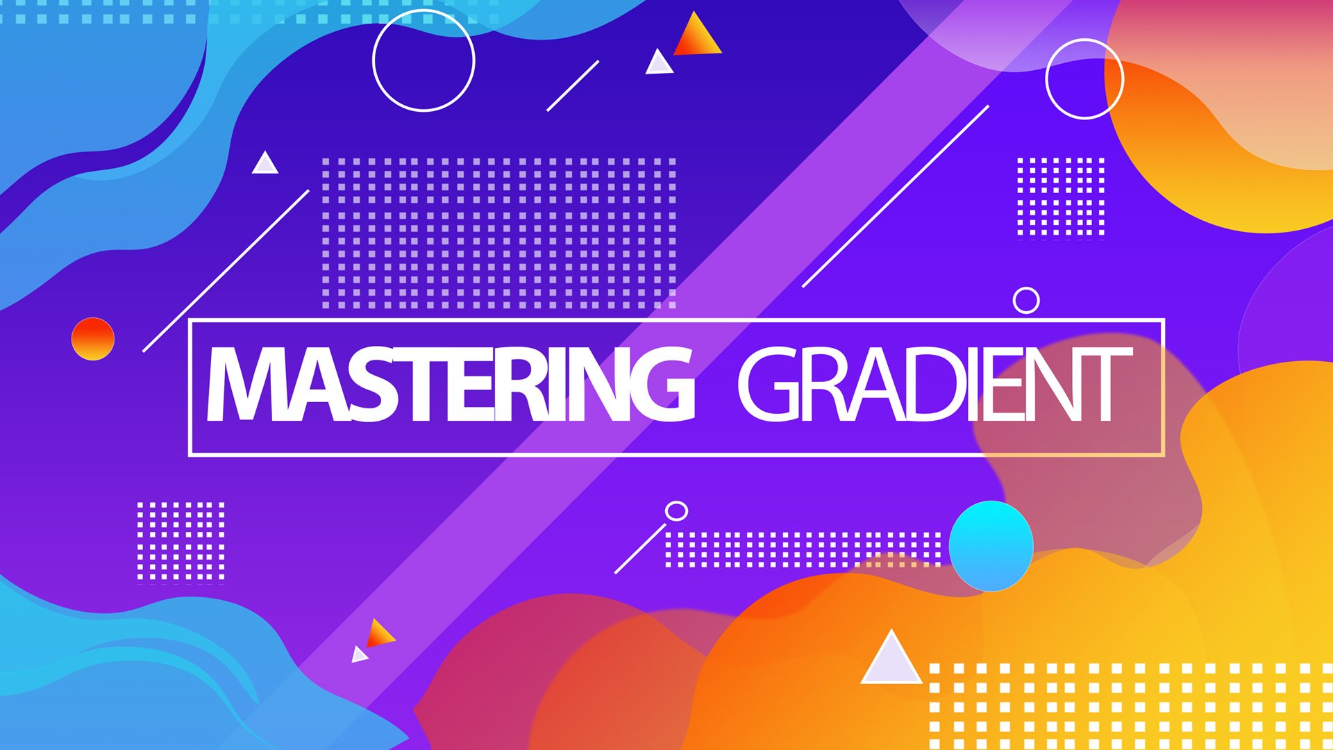
classes from me, I do have three other courses
that you can also follow. I have a gradient course. I also have another flyer that you can learn other
techniques from. And then I have a Photoshop
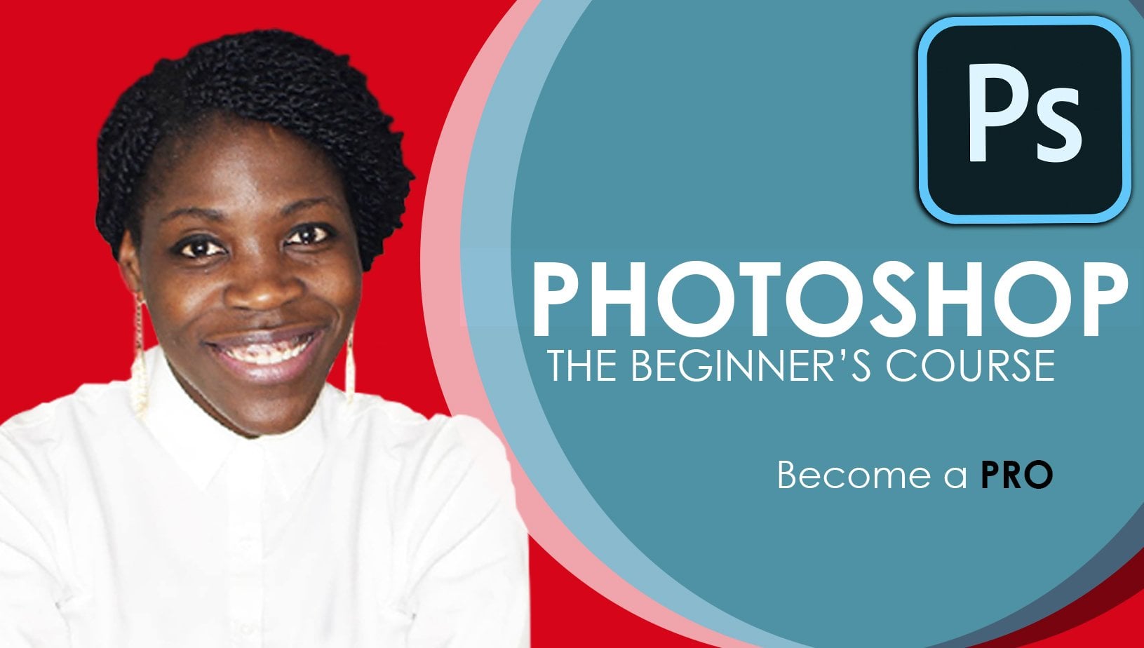
beginner course for all those who are just starting Photoshop and don't know a clue. I don't have a clue how
to use the program. Till I see you all next time, please take care
of yourself and I will see you back
with another course. To them.
 Patricia Quist-Therson, Quistt Photoshop