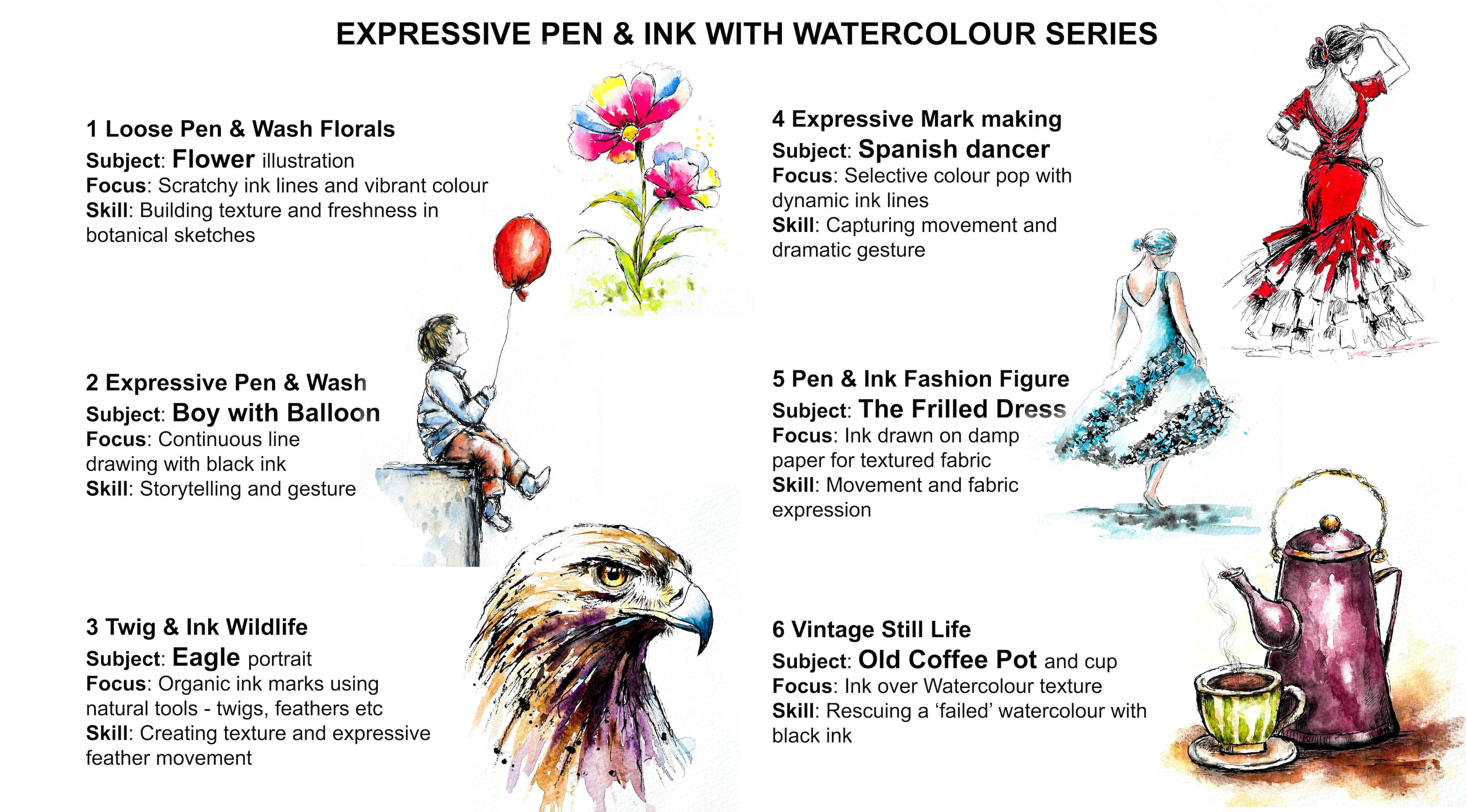
Pen & Watercolour Wash: Flowers: Scratchy Broken Line Style with Expressive Ink & Vibrant Colour
 Carrie McKenzie, creating painted visions
Watch this class and thousands more
Watch this class and thousands more
Lessons in This Class
-
-
1.
INTRODUCTION
2:19
-
2.
Loose Pencil Sketch. Focus on overall shapes and the natural flow of the stem & petals. Avoid detail
1:49
-
3.
Scratchy Broken Line Style. Use short, textured strokes; add broken lines and marks for character.
4:42
-
4.
Add bright, transparent colour to the petals and subtle splatter texture for energy.
8:41
-
5.
FINAL THOUGHTS
1:43
-
-
- --
- Beginner level
- Intermediate level
- Advanced level
- All levels
Community Generated
The level is determined by a majority opinion of students who have reviewed this class. The teacher's recommendation is shown until at least 5 student responses are collected.
15
Students
2
Projects
About This Class
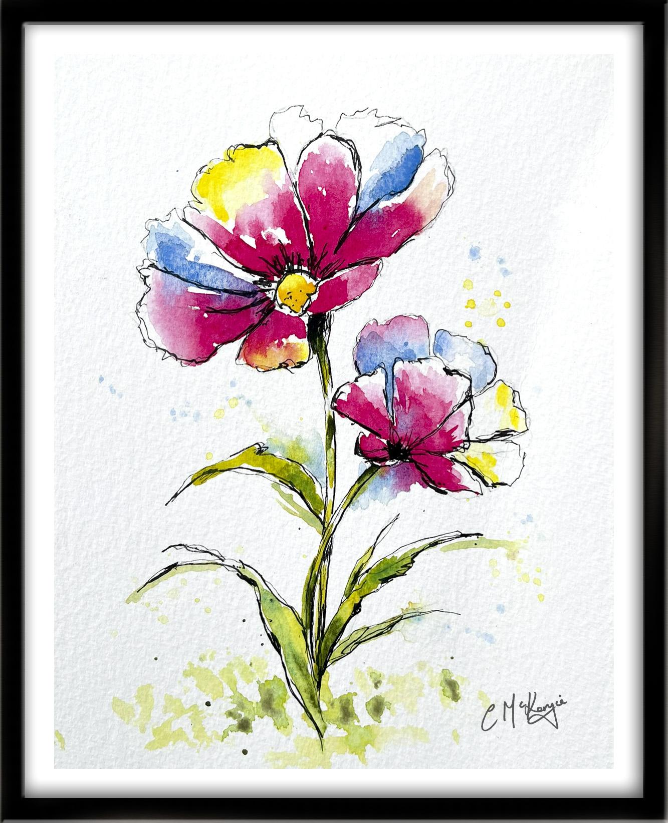
In this relaxed and expressive pen and wash/watercolour class, you’ll learn how to turn a simple pencil sketch into a lively floral illustration using scratchy ink lines and fresh, flowing watercolour. We’ll work in three natural stages:
- First, a loose pencil outline to establish shape and movement in the flowers.
- Then, expressive waterproof ink applied with confident, slightly imperfect strokes.
- Finally, vibrant, transparent watercolour washes that bring the flowers to life.
This class focuses on energy over perfection — allowing your lines to breathe and your paint to move naturally across the page.
You’ll learn how to:
- Sketch florals loosely without overworking them
- Use scratchy ink lines to create texture and character
- Add depth with minimal hatching and line variation
- Layer watercolour confidently over waterproof ink
- Keep your washes fresh, luminous, and slightly unpredictable
This class is perfect for:
- Beginners wanting to loosen up
- Sketchbook artists exploring pen and wash
- Watercolour painters who tend to overwork details
- Anyone who loves expressive botanical illustration
By the end of the class, you’ll have a vibrant floral painting that feels spontaneous, joyful, and full of movement — plus a repeatable process you can use for endless flower variations.
If you love the look of lively ink lines paired with bright, blooming colour, this class will help you create it with confidence.
What will we explore? This course is packed with:
* Start-to-finish demonstrations so you can see first-hand how to build up the painting every step of the way. I verbally explain the entire process in a friendly and easy-to-understand manner.
* I’m a big believer in ‘learning by 'doing' rather than by lecture, so you will paint right alongside me, up close and personal and learn the skills in a practical way.
This class is part of a Pen & Wash/Watercolour Series exploring expressive pen and ink illustration combined with loose watercolour techniques. Each lesson focuses on a different subject — from florals and figures to wildlife — while following a simple and enjoyable creative process. As the series progresses, you'll experiment with different tools, textures, and subjects while developing confidence in expressive drawing and painting. You can take the classes in any order, or just pick out the ones that appeal the most.
Meet Your Teacher

I am an artist and tutor who believes everyone can create meaningful art.
I design my Skillshare classes to be clear, approachable, and encouraging--so you feel supported every step of the way. I truly believe art grows best in a positive, welcoming environment, and I'm always inspired by my students' creativity and progress.
My goal is to help you build confidence, develop your own style, and fall in love with making art again. Join me in class, try the projects, and share your work - I can't wait to see what you create!
Alongside my online classes, I run regular workshops for all abilities, exhibit my work across Yorkshire, and give demonstrations for local art societies. Teaching and connecting through art brings me huge joy - especially seeing confidence... See full profile
Hands-on Class Project
Your Project: Create an Expressive Pen & Wash Flower
For your project, you’ll create your own loose floral illustration using the three-step process demonstrated in class.
Step 1: Loose Pencil Sketch
Start lightly. Focus on overall shapes and the natural flow of the stem and petals. Avoid detail — aim for gesture.
Step 2: Scratchy Waterproof Ink
Using a waterproof black pen, trace your sketch with short, textured strokes. Break lines intentionally. Add subtle hatching for depth and tiny marks around the flower center for character.
Let your hand move freely — imperfection adds life.
Once dry, gently erase the pencil.
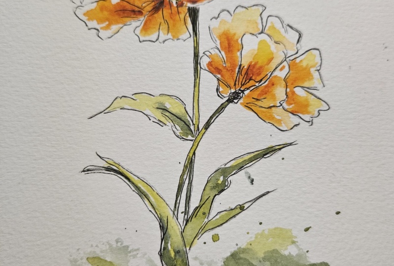
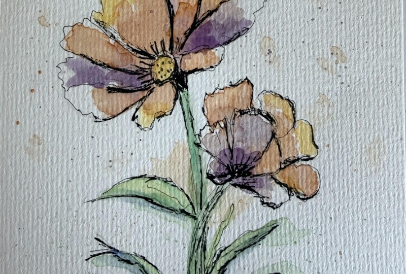
Step 3: Loose Watercolour Washes
Add bright, transparent colour to the petals. Allow colours to mingle softly on the paper. Leave highlights. Keep edges varied — some crisp, some soft.
Add fresh greens to the stem and leaves, and consider subtle splatter or light background texture for energy.
Personalise Your Flower
You’re encouraged to:
- Experiment with bold or unexpected colour palettes
- Paint multiple blossoms at different angles
- Try minimal colour for a softer look
- Add expressive splashes or abstract background touches
When you upload your project to the Project Gallery, feel free to share:
- Your pencil, ink, and final stages
- Your colour choices
- What felt freeing or challenging in the process
I love seeing how differently everyone interprets the same structure — your version will have its own personality. I will be sure to give you some personal feedback.
And if you've enjoyed this class, please take a moment to leave me a short Review so that others can find it too, thank you.
Class Ratings
Why Join Skillshare?
Take award-winning Skillshare Original Classes
Each class has short lessons, hands-on projects
Your membership supports Skillshare teachers
Learn From Anywhere
Take classes on the go with the Skillshare app. Stream or download to watch on the plane, the subway, or wherever you learn best.