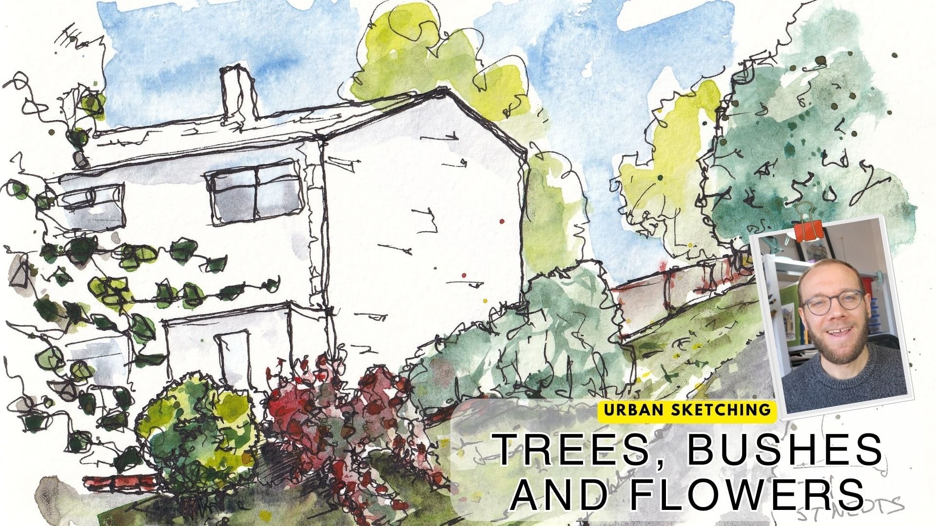
Transcripts
1. Introduction: First set out on our ink
sketching, or drawing journey. It can look like the
place to be amazing. Ink artists make it
look effortless, make it look simple, and yet their drawings, their sketches are
full of character. When we get started, there is this bewildering
array of supplies. And then with each supply, it feels like there are 20
new techniques to learn. With all of that,
it can be really hard to keep our motivation up. But I'm here today to tell you it doesn't have
to be like that. I'm going to show you
how to examine and test your supplies to understand
how they really work. I'm going to give you just
two really key things. That's all you need
to know to get started and master
ink sketching, and we're going to create an awesome project
together as well. My name is Toby, and I'm a loose ink and
watercolor sketcher. I love creating my
bold ink drawings and sometimes splashing
watercolors on top. But today we're going to
focus on that inside. And just because it's
only ink doesn't mean we can't add color and
can't add texture. Across this class,
I split it into three sections to make it
really easy to navigate, to understand the purpose
of each part of the class. In section one, we're going to unveil the various implements
that we might want to use, as well as have a
play with them and actually produce a mini project or two to get to know our
tools a little bit better. In section two, I'm going to
show you what I think are the only two things
you really need to understand to get to
grips with ink sketching. We often think about ink
sketching as line art, and I'm going to show you
that that is sort of true, but it's definitely
not the whole picture. We'll look at the
idea of line up and contours and how to make that
easy. That's concept one. Concept two is where we'll
unveil texture fun character. And I am sure that
by the end of that, again with a couple
of mini projects, you'll be feeling so confident to launch into the
final section. The final section is of course, the all important class project. You'll be getting things out of cupboards to have
a play with them. Pens you thought were pointless because
perhaps you just hadn't considered different
ways you could use them and the different things they
could bring to your art. And together we're
going to create a few studies to really pick apart what our pens can do and what we can
do with our pens. If you enjoy this class, then don't forget to pop up your project in the
project gallery. And of course, check out all the other amazing projects which will be up there already. You could also leave me a
review if you have the time. It's a huge compliment
and it means the world to all of us
teachers on skillshare. And finally, you can check out more of my
classes on my profile or on in Scram and Youtube where you'll find
me at Toby Sketch Loose. And with that,
let's get started.
2. SECTION 1 - SUPPLIES: This class is split
into sections. Section one is what I'm
introducing just now. In section one, we'll
find lots of discussions about different types of
different types of ink, how to fill fountain pens, Useful background information
which will hopefully give you ideas about how
to use the equipment, the tools, the things
you have at home. The key here is that I'm not trying to encourage
you to go out and buy loads of stuff
that you don't need because the art world
is an expensive world. This class could be completed
with a normal fountain pen, with a ballpoint
pen with a couple of permanent markers and just a few things that
you have lying at home. There are great fun ways of
drawing using India ink, which is rather
cheap just by simply sharpening a stick or
using a glass dipping pen, which could be bought
for a couple of pounds. Please don't take this class as needing to buy
1 million things. Take it as an
opportunity to open all your drawers and experiment with what
you've already got.
3. Supplies Overview: When we talk about
ink sketching, the supplies we could
use is incredibly broad. Everything from a
high end fountain pen through to a low
end ballpoint pen. Then there are
people who will use sharpened sticks or fashion their own dip pens
out of bamboo. Essentially, what I want
to show you in this is the range of things
that you might use. This is not an
exclusive list though, because really right now, the message today
is what you have is probably good enough and certainly good enough
to experiment with, create great art, and
have fun in this class. This class is all about
exploration about creating fun pages filled
with lovely ink sketches. In doing so, you'll need some ink mark making equipment
in sketching implements, essentially posh words for pens. Now normally I start
my class by saying, look, you only need this. These two or three
things is all you need to complete
your sketches Today, today is a bit different. What I'm saying is,
don't need all of this. These are just some examples of things that you could need. For example, I've got a range
of different fountain pens. These have all got different
inks in and different nibs. I've got some fine liners, all of different thicknesses. I've got some other more
fun or different pens. Ambo fue, a sailor
fude, and a brush pen. I've also got dip pens. I've got inks up here which
are soluble fountain pens. I've got inks up here which
can go in fountain pens, but a permanent got
other ways of filling our fountain pens and then
even more off to the side. I've got a whole case
of Dipper ball inks. Another dip pen, there are so
many things you could use. All I want you to do today is find a few things
that you might want to use. Maybe it's just one or two.
You have loads of things. Maybe you have things
stuffed in your drawers, which you haven't used for ages. And we're going to explore
what you can do with these. We're going to explore
the pros, the cons, and basically have a lot
of fun exploring ink, mark making, in sketching,
and creating art.
4. Paper Matters: Now I know this is an ink class, but I just want to
take a short lesson to outline the importance of the so often forgotten
but key supply that of course is paper. Whilst in matters,
sometimes it doesn't matter at all if we don't
have the right paper. With the wrong paper,
things are so much harder, it limits the
techniques we can use. Before we dive into exploring
all our different pens, I just wanted to explain
that also the paper we're using has a big impact on what we're able to do and how
we're able to create. It's not something you need to spend a huge amount of money on. But using good quality sketching paper, or
even better for me, I love watercolor paper, is, I think, a worthwhile
investment. Let me show you why. Today we have three
types of paper. On the left, we have some
natural paper from Japan. This is made through the processing of vegetable
fibers and plant fibers. Here we have some di paper. This paper is from India. It's handmade. It's
from recycled T shirts. It's 100% cotton. Here we also have some
100% cotton paper. This is an etch,
A five sketchbook got a slight texture to it. I'm just going to use a
fairly standard fountain pen. Now, my preference for sketching is in a watercolor
sketch book like this. If I just go to a random page, what you'll find is if you draw, you can get a really
nice variety of line. You also will find, if you can see that the line
breaks up a little bit. If I'm really gentle, the line actually becomes discontinuous. And that's because
of the texture. I like that texture. Many people don't
like that texture. But for me using a fountain
pen, I love this paper. I find the varied line quality
I can get is exceptional. Another key part of water
colored paper is it means well, we can use water using water. Creating wet textures
is something we'll be looking into in one of the
later lessons in this class. But for me, if we are ignoring water textures and ignoring the ability
to use that, then we are missing out on such a vast range of possibilities that
our inks can give us. Suddenly things
can come to life. You can create
immediate contrast. You can create such
just wonderful fun and interest on the
page so quickly. If we use a paper which allows us that
flexibility to use water, compare that to the Cardi paper. And what you might notice is
that line breaks up a lot. It can be very varied. It can be much bolder. And that's because this
paper is more absorbent, But because it's
also more textured, it can become actually
quite difficult to get a smooth line for me that's too textured and to absorbent over here on
this natural paper, what you'll find is it's
extremely absorbent. Look at that. If I leave
my pen just still, it will soak up and soak up. And if I move my
pen, you'll see I'm creating ink blobs without
doing anything at all. This paper is actually
very nice paper, but it's also a feature of cheaper papers that they're
extremely absorbent. When we have absorbent
paper like this, there's no chance of
drawing a subtle limit. Look, if I try and draw a face, the features are enormous
because just look at how big that line
becomes versus over here. I can be very subtle. I can build up shadow. I can hatch gently.
There's lots I can do. If we're using good
quality paper, explore the paper you're using before you start
exploring your pens. Because if you're using paper which isn't going
to take inkwell, then you're not going to be
able to explore your pens. You're not going
to be able to find out the pros, the cons, the fun, the stress that comes from
different types of pen.
5. Evaluating Your Pens: As we've said, the world of
pens can be bewildering. So how do you know if
you have a good pen? A bad pen, one which
you're going to love, or one which is going to make your life more challenging
than it needs to be. In this little lesson, I'm going to show you my demonstration of
what I first look for in a pen so you
can feel confident about selecting your own
sketching implements. We've chosen our paper, now for me, this is
my extra sketch book. It's got lightly cold
pressed watercolor paper, 100% cotton. Choose your paper. And now we can start thinking about our pens and our ink and what it that we're looking
for as we explore them, as we continue
through this class. This isn't a deep exploration
yet of the different pens. This is just how we start
building up our ideas. Building the uses we
might have for our pen. The things that I
initially look for, how does it feel holding it? It needs to be
comfortable for me, this twist bee has a
nice weight to it. It's got a nicely textured grip. Number one is literally
how does it hold? There are other factors
which come into this. I like sketching with
a really loose grip. If I sketch a loose
script, what happens? We get a nice mark brill, versus if I take a
fine liner and I sketch with that same loose
script, nothing happens. Now, I know if I'm
using my fine liner, I'm going to have to
hold it more upright. That's okay. If that's
what you prefer. It's just not what I prefer. We've got the comfort, we've got the grip,
how we holding it. The next thing we want to know is what is
the ink flow like? What we don't want is a pen, which we have to drag and
drag across the page. You can hear that scratch as we try and get
the ink to come out. What we want instead
is a pen that just effortlessly flows
across that page, but that doesn't leak in. We don't want one which produces that absorbent effect we
saw in the last class. We've got the grip, the comfort, we've got the
ink flow in, the feel. The next thing that I look for, because I think it's
key in sketching, is the flexibility of that pen when we're
creating a mark. Literally how flexible
old can the line go, how fine can the line go. Then simple things
like are we going to be able to use it
for in techniques? In techniques are
things like hatching, things like blacking in. Those are my initial
things to look for. There are of course, a few
other factors to think about. Those would become obvious through the course
of this class. But those things would include ecological factors.
How green is your pen? Is it a disposable pen, like a fine liner, or is it
one that you can refill? If you can refill it, that's great because perhaps you
can change the color. Perhaps you can change the ink
from permanent to soluble. You can even change the nib and enjoy a lot of
flexibility that way. Finally, of course, the price is a really important
consideration. What I'd say, and we'll look at this through the course as well, what I'd say is that
super expensive things aren't necessarily super
better for sketching, They can just be more expensive. Or they can have a different
level of craftsmanship around them rather than
actually being better to use. With all this in mind, what we're going to
do in the next class is have a look at how to create a little test page to work out the differences between
the pens you already have.
6. Lets Make a Test Page: This is the first mini project. Get us used to our pens and to hopefully inspire
you and show you that there might be
something sat in an old cupboard which actually
works amazingly well. Perhaps if you have a
little tub of India ink, you want to sharpen a stick and see how that works on
your little test page. I'm going to first
create my test page. And you can see me doing
that just very simply by adding a few titles at the
top of a sheet of paper. And then we are ready to go grab your pens and dive
in. And here we are. I've just prepared my
little page with pen bold, fine hatch block flow and flex. And these are the things
I'm going to be testing in just a handful of these pens. What I'd suggest is a first mini project is you
grab a few of your pens. You can even use pencils. You can compare your different
mark making implements and how they will function
on a little test page. My first is going to be, this
is one of my favorite pens. Tise, that's the first bit, the kind of pen.
Then what's the nib? It's an extra fine nib
because that's important, and we'll talk more about that when we look at Phantom pens. First, I want to know
how bold it can go. This means pressing
hard, as hard as we can, but as hard as we are
comfortable pressing and not thinking we're
going to damage our pen. Then we want to go fine
for fountain pens to get the finest line by actually
flipping it upside down. Now we're just scratching across the surface
really gently. Next, I want to
know, can it hatch? Doing the same thing,
if I go quickly, I'm getting nice
hatched textures. And I can also just try a
little bit of cross hatching. What you're looking for is, are you getting texture or are we moving more
towards the blot stage? Some pens won't hatch very
well, blot very easily. Some pens will hatch easily. And they won't block so easily like this
because it's so fine, it's hard to fill
that whole page. Now we want to flow test really
quick line into the flex. How flexible, how much can
we vary the flowing line? That's what we're
going to do, so I'm going to pick a
couple more pens, we'll compare one of
the most common things. First, this is a unpin, fine liner, uni pin. It's 0.5 millimeter. Let's see, bold. That's me pressing hard. Fine, being gentle,
then hatching. A little bit of cross hatching and then blotting
or blocking in. I think you can give yourself
a couple of goes over. But what we want to see is
not that you can block in, but how easy it is to
do then flow and flex. We can immediately
see some differences. This Uni pin, far less variable than the fountain pen
and that's to be expected. I'm just going to continue now and see what a few more
of my pens can do. This is a tombos
pens with a nib, if they're a fountain pen,
flexible nib like this, which allows us to
get a huge range of texture and line
weight immediately. This pentel brush pen takes
that to the next level. Look, it's got a
brush for a nib. It's harder to hatch with, but amazing for blacking in
and creating that ink blot. Going back to some
fountain pens, this is where we can think, oh, how does the ink change things? I'm using some
obergene sketching, It produces a very much
softer feeling line, easier to blot in interestingly, but just as much flexibility
than other fountain pens, dip nibs For another option, this is some Windsor
India ink with a unbranded dippy pen
with a medium nib. And you can see here,
it's a really bold line, but also really gentle fine line we can hatch very easily. It's harder to block because of the line quality
being so thick, but very easy to
create the deep, lustrous calligraphy
style lines. This is one of my favorites. This is a platinum 3776. Got an ultra extra fine nib that really does show in how fine a line this
fountain pen can produce. On the other hand, we can
move to a lammy medium, much cheaper pen, but because
it's got a medium nerve, it's bolder but also
a lot more flexible. Again, showing that
price isn't everything, but it does get you something. There's my little page. We've tested a fair
few pens out here. Perhaps I've surprised
myself in a few places, and I wonder for yourself,
what have you learned? It's really interesting just to complete little
exercises like this, to discover new things
about old pens, about new pens, about
different ways of creating. So join in, have Fannon do
your first mini project.
7. Fountain Pens - Introduction to Filling and Caring: In this lesson, we're
going to examine fountain pens a
little more closely. This is a bit of an
introduction to fountain pens and looking at different ways
we can fill fountain pens, which of course, is one
of the key advantages. And we'll look more specifically at why that's a key advantage, both in this lesson and
in the one coming up. Our next stop is fountain pens. And I am biased, but I think fountain pens are
absolutely wonderful. They are my favorite
every day sketching pen. But they do also have a couple
of extra considerations. One is a bit silly. It is literally how nice they are when you're getting
a fountain pen. It's something that you can
use for life potentially. But certainly for many years, getting a fountain
pen which you, which you like, the
look of you like the feel of is really important. They're not something you're
likely to throw away. Just put a little bit of
extra F into I want a lammy, which color to I want, then you can go really high end. But what I would say about
going really high end, and some of these pens
are quite expensive, is it does mean you need to learn a lot about maintenance. It does mean you'll
be worried about putting in certain types of ink, which is something we'll get to shortly actually
getting something nice, but something you're
not too scared to use. And that's why I think
pens like the lambs, Twi bees are really good. One of the key advantages
to fountain pens is that you can change
the ink inside your pen. Here, I have just
a few different inks and a few different pens, and actually these pens have
all got different inks in. I can produce a range
of different lines. If I was really out there, I could put in some bright
pink in yellow ink. You could produce any color. Key to that is
understanding that there is more than one way
to fill up pen. We all I'm sure know about ink cartridges in cotes
are great, they're easy. I have a couple of these
pens with ink cartridges. In the disadvantages, you are stuck with only
the brands which, number one, produce a cartridge which fits your specific pen. The lamy cartridge
only fits lamb pens. Number two, you're stuck
with a limited range of inks because there are far more inks which come in, in, in bottles. And these ink bottles are much
cheaper per volume of ink. If you're using a lot of ink, you'll get 50 mils
of ink instead of five mills for about
the same cost. But that brings
another obstacle. How do you fill
your pen? And there are two main ways to do it. If we look inside this pen, it looks like there's a funky
ink cartridge in there. That is essentially
what is in there. If I just pull this out, you can see this is the same
as this, but full of ink. What we do is we take an ink
converter as it's called, and it's got to be
an ink converter that fits your brand of pen. But it's a one off
purchase because this ink converter
will work forever. With that in converter, we open our ink,
whichever we like. We make sure that we twist it so the plunges
all the way down, pop it in the ink, lift it
up, and it will fill up. You can also fill many pens just by putting the ink
cartridge into the pen, already, dipping the
nib under the ink. And again, the same
process and it will actually fill up all
the way through the pen. It's a slightly neater
way of doing it, but it doesn't work for
a different cartridges and all different pens. The other way you
can actually do it is using something as
simple as a pipette or a blunted syringe
and injecting the ink into this
opening. That's one way. It's probably the
most common way. But increasingly pens like this, the twist bee pen, if we look here, well
there's no ink cartridge. In fact, if I twist
the pen itself, you will see this whole
plunger system inside moves. I can actually fill this
entire belly of ink up. That is the same in a couple of brands like there's
noodles pens, even this this is
quite high end pen by Numiki has a similar
system where if I unscrew it actually inside this you'll find
there's no ink cartridge. There's just a huge
belly full of ink. Then all I do is I use a
pipette in this one to fill up. Just imagine how much
ink is in there. The advantage to
these systems is you can fill it up once a month and you're
basically good to go. So there you go, a few ideas for different ways
of filling your pen, and that is something extra to look for in your
fountain pens there. Having looked at how to
fill our fountain pens, in the next lesson, we're
going to look at why, going to look at
how these little ink marks can become so much more by altering the ink and altering the
properties of the ink, which is something
we simply can't do with disposable pens.
8. Inks for Fountain Pens: In this video, we're
just going to do a slightly deeper look into a couple of inks
you might want to use. Understanding the properties
that you're looking for and therefore the uses that those different
inks might have for you. Now, we can't talk about filling your fountain pens
without talking about the different ink options. I've just got a few here, but there are hundreds
to choose from. I want to mention a couple
of really key properties. I'm not going to talk
about the obvious one. The obvious one is the color. We all know that we could
change the color of ink, But the less obvious
one actually, the one which is
really useful if we're wanting to use ink
and water colors, is that some of them are waterproof and some
of them aren't. If I wash over this, you can see all
that water pooling. Notice how none of these
lines are moving at all. There's no loss of ink
from the page whatsoever. The ink that I've used
to produce this effect, to produce a lovely
permanent line, are carbon in by
platinum and sketching. This is Lotti, which is
producing this nice black. And then also I've
got one called Jewel, which is, they actually
call it Oberg, but this nice warm red here. Now the advantage
of this is that we can produce ink and watercolor sketches or apply other
water soluble pigments and things on top of our ink, which is really great and is the primary use
for sketching. The disadvantage
of these inks is that they have micro
granules in them. If we let our pen dry out or we don't use
it in a week or two, they can block, all of these
inks can damage your pen. If you are leaving your pen
for any period of time, basically empty
all this ink out, fill it again with
water two or three times to flush out
all the ink residue. And then you should be
safe to leave your pen, but it is a consideration, these inks can damage your pen. The other Ks, however, are amazing for creating
instant texture. If we just wash down here, just look at how
they come to life. You can imagine just creating the most wonderful abstract, loose sketches,
using this effect. It is as simple as taking your pen drawing and then choosing where
to apply the water. Suddenly this little doodle
of an apple can come to life, can be provided so much shape. It's not that you need to throw out your water soluble links, it's that they have
different purposes. Now, having done a silly
little apple doodle, in the next lesson, I'm just going to do
a speed sketch of lots of different
random objects. And this might be another
mini project for you. If we just want to break out of all these theory lessons and start exploring
different kind of inks we have then doing little doodle sketches is a
great way to get started.
9. Doodling Mini Project: We're veering now off on a little tangent to
give ourselves a break. What you're about to
witness is about as far from fine art as I think
it's possible to go. I'm just going to doodle with different pens
and different inks, objects which are around
me in front of me. I invite you to do the same. We've talked through all
these different pens and all the different
possibilities. We've done a little test page even that might have
felt a bit rigid. Now break free and have fun. Just see how can I grip my
pen, How can I feel my pen? How do these inks combine? Can I use water with my inks in a risk free way
for the first time? Maybe just sketching
a little lake, which is something we'll
be doing in a moment. So have a bit of fun for
the next few minutes. Just create a little page
of doodles and see what happens with that. We are off. This is starting off with
me sketching my hair dryer. It's a hair dry I
use sometimes to dry my inks or my watercolors. And you can see using
this really fine pen, I can create little fine bits of hatching, little textures. Things will be
exploring very soon. We can also do this lovely
continuous line process, which is something I
really love creating all these objects out of
just a single line each. But what if we want some life? Well, maybe you get more life
from this lovely red ink. And maybe we could try even
sketching a whole candle. Just applying a little bit
of red ink to the page, and then pulling back our
water and seeing what happens. And like I said
at the beginning, this is as far as you
can get from fine art. But that's okay. We need to
give ourselves a break now. I'm sketching what
I'm talking into my little microphone again. Maybe we want to compare and contrast using a little
bit of soluble ink alongside the insoluble ink to create different textures and
have a little bit of fun. Now, we can even use
our inks wet on wet. Wet and wet is where we have
a wet page and a wet medium. In this case water
on the page and wet ink and look at the different kind of
doodles we can create. This isn't really an
everyday object that's more of a lake in a forest, but you get the idea now. I just thought I'd
try my Waterman Brown and compare that
with some dark ink. As I was doing that, I
thought maybe this red needs a bit of structure
with some other dark ink. And then let's just jump out and have some fun with something completely different. So this is a dip pen
just to show how similar actually the marks you can make are with a dip pen, but the ink isn't
quite as soluble. India ink, which is what
you use in most dip pens, will move a little bit, but
it dries up very quick. Nonetheless, we can use
these inks together, we can swap between pens, we can change all sorts
of different inks, we can have a huge
amount of fun dip. Pens are a very valuable tool, we'll be using more off
later in this class. I just wanted to show you the
range of possibilities of things that you might
just want to have a doodle to give
yourself a little break.
10. SECTION 2 - TECHNIQUES: Now section two is where
you have arrived at. We've done all our supplies, but now we want to
know how to use them. That is basically what
we're going to do. In the next few
lessons, we're going to look at what I call the two key concepts or
ideas in ink sketching. This is how I think
about my ink sketching, and it's what gets me through
my ink sketches and makes me feel good about them and
makes them come to life, at least in my eyes.
11. Ink Art as Line Art: For me, there are
two concepts in, in sketching which
we need to think about in this first lesson. And the one coming up after we are looking at the
first concept. That is the concept which
makes sketching easy. Now, it doesn't make it
interesting and fascinating, that's coming up in concept two. But in these next two lessons, you'll get a really good
understanding of how you can take any, any person, any animal, anything
else through simple observation
and the understanding of what we're trying to achieve. Without ink sketching,
you'll be able to sketch it in an easy,
in a simple way. There are two key
areas to focus on, to work on when it comes to
developing your ink car. The first one, the first
concept is what makes it easy? It's what the ink is all about. At least that's what we
think the ink is all about. Every pen will have a point. That point creates lines. That's how we write. We create specific letters by
using these specific lines. Another way of thinking
about inc is a contour. You can draw anything
in front of you. I've got on my pens out a pen is unmistakable as
a simple contour. And a contour is where we
just capture the outside, the outer limit of our object. Something else in front
of me is my microphone. Again, even that is going to be pretty instantly
recognizable. Just from capturing
that contour, we can focus the contour down. Actually, we can
find objects within object buttons on my microphone, I've got little sign. But all of these things,
all these things are just me picking out areas to contour.
This is different. When we paint, we tend to
focus on blocks of color. We focus on how to create the light and
the dark in, in cart. We tend to focus on
shapes, on lines. Instead of focusing on space, we focus on the borders
and the contours. The contour and the
line is the key bit. But how can we make this
easy in a complicated scene? How can we make lines easy? Well, that is where
shapes come in. Shapes is something I
call about all the time. It is what it sounds
like, shapes, the circles, triangles
and squares. But we can build up
all our objects. Anything out of these shapes, we don't have to name them. We can just think
in simple terms. Our pen could have been a
rectangle and a rectangle. Now we recognize as
we're drawing it, that the rectangles actually
got a slightly wobbly head. It's a rectangle
with a wobbly head. We recognize that this
rectangles got a wobbly bottom, but it's still a rectangle. Here we've got a circle. We recognize that
actually the circle has a bit of a edge to
it, fraying almost. But it's still a circle
even though it's flattened and it's got this
wobbly edge. It's a circle. We can just simply
build up our line, work through thinking
about shapes coming up. In the next lesson, we're
going to put this to the test. We're going to look at a scene. Something more complicated
than these simple objects. You'll hopefully believe me, that really it is that easy.
12. Shapes in Practice: So now we're going
to take a scene. We've got a little scene, and
I'm going to draw over it. I'm going to show
you what I mean when I say finding shapes. Then we're going to
take those shapes, pop them in our sketchbook, and suddenly we'll
have the scene. It will be that easy. Now if you don't believe me, let's have a look
at this example. What I'm going to do is use a
really nice and boiled pen, so I can draw on top. And show you that this scene is just shapes.
Now let's have a look. We've got here a triangle, then underneath it
we've got a square, although we've lost a corner. But that's fine. Here we've got another triangle
with wobbly edge, and then another triangle
with a wobbly edge. This is a rectangle. A triangle and a square with a rectangle on top or be
here with war key signs. Got a triangle here which
has lost its corner. I'm thinking all the time. I'm just thinking in shapes. I'm just thinking, how can I interpret this as a
series of simple shapes? In my head, I don't have
to name the exact shape. I just have to be thinking in a way that lets me simplify. When we simplify,
suddenly it becomes relatively easy to get
this scene on the page. If I now use these ideas, I can bring all
these shapes down. And this has a couple
of other advantages. When I've drawn a square, I can easily work
out the proportions. I can then go look,
there's a square in the back here, This one. It is half the height
of this first square. Then there's another
square on top which is half the
height of this square. Suddenly my proportions
become easy, because I'm not thinking
in complicated structures, I'm thinking in simple shapes. And simple shapes are very easy to compare
to one another. Equally, perspective
can become easy. Although perspective here,
we've got all sorts of lines of perspective going forward somewhere
vanishing off over here. This is a one point
perspective scene. Or we can just look and go
look at circles just getting bigger and bigger and bigger and bigger and
the same over here. Getting bigger and bigger
and bigger and bigger. By using shapes, we're not
only simplifying our scene, making it easy to capture, we're also simplifying
concepts like perspective, like proportion, like measuring,
like creating character. All these things are getting simplified just through
the addition of shapes. Now I know what
you're saying though. This, although simple,
isn't that interesting? And you're right, it's
not interesting because shapes is just half of
our little conundrum, half of the concepts we need to put together to make
things interesting. We're now going to focus in a
couple of lessons on how we make things interesting and how different implements
help us with that.
13. Creating Interest: It's time now to
lift those shapes. Take that simplicity and enhance this doesn't make it
actually not simple. It's just a way of thinking, a way of understanding
that beyond simple lines, beyond simple shapes, there are little touches and
little things we can do. Little things we can
think about which will lift our instantly. We have our shapes and we've decided our
shapes are great. They're simple, but
they're boring. How do we go from boring
and simple to simple, but fun, but fascinating,
but interesting? Well, this is texture. Texture has two facets. The first facet of texture is the texture of the object that
we are trying to capture. For example, if I'm
trying to draw a flower, it's got a smooth stem, but then the petals
might be crinkled. Within this sketch, we are
getting that crinkled feel by adding texture to our
lines Within the center, you might have just
repetitive little marks. It might feel like almost like a spiral going
into the middle. Again, we capture that by
imitating it with our pen. There is this texture
which is representative, but there is also artistic, or creative, or non
representative. I'm going to call it
artistic texture. This is where we are
exploring our medium, because the way we would draw this flower with this
pen is different. The way we would draw this pen is different to the way we
would paint it with oils. We've done it once
with that pen already, but with this pen. With an expressive pen
we might capture is much bigger, more brutalist marks. Still getting the idea, but focusing more on
the heavy contrast. We've now taken our same scene, but we've applied an
artistic touch to it, these artistic textures. I'm going to split even
more into two facets. The first is the dry textures. And the dry textures are
things like hatching. Hatching comes in many forms. It can also be creating
repetitive shapes. It can be how we
create our contour. It can also be how we create variation in
our line as well. Going from soft to
bold to discontinuous. All of these things
are dry textures. What's always amazing to
me is just incorporating these variations into
our simple shapes, our simple contours. Adding these simple
artistic textures in can bring life very
quickly to an image. Whether it's a
simple still life, this apple and a bottle of wine, or whether it's a more adventurous urban
seen or landscape. Then of course, the opposite of dry textures
are the wet textures. And this is where we can have
fun with our soluble inks. If I draw a little square
using soluble ink, we can soften that. Suddenly we've got some
completely different textures. I could just drop some water on the page to bring
my brush pen in, drawing a line across. I'm getting something
completely different as well. There are lots of ways to
create not just dry textures, but wet textures
depending on the ink, depending on the
pen we're using. Hopefully, that will
make sense So far, what we're going to
do is explore in the next couple of lessons how we consider these
different textures.
14. Contour Textures: Now we're into the nitty gritty. We've got a few individual
lessons where we're going to look at different
types of texture, different concepts of texture. Some of them will
overlap with one another and some of them
will be completely separate. The first one is basically how to bring
texture to your shapes, that is the idea
of cont, texture. In particular, we're going
to be focusing on how texture changes
depending on your tool. It's not all about
accurately looking out the window and seeing a bush and creating a perfect
version of that bush. The perfect version of that
bush is going to change depending on what you're
using to make it. The first part of texture that
I'd like you to consider, that I'm going to consider
is the contour texture. A great example for
this is something as simple as drawing a
wall, drawing a tree, drawing a flower, any
object in front of you, around you has a contour
which has texture. Now I'm going to take
something smooth, we just draw a smooth line. I can draw again my coffee cup, which is sat in front of me. That contour is smooth,
it lacks texture, but actually that is the
texture of my coffee mug. Look, it's smooth. It's accurate, that's a
representational texture. I look out the
window, I can see, for example, there's a bush
outside my neighbor's house. It's basically that shape, but that's no longer accurate. We can actually create a
representational texture, still thinking about that shape, but whilst applying
textures which are mimicking or trying to mimic
the shapes of those leaves, for example, in the
grass coming underneath. Simply, I'm just
going to look out my window again and I'm
going to say, look, I can see my neighbor's
fence as well and the fence basically shaped like that, but that
could be anything. However, if I start
applying texture, it's a wooden fence, it's
got these spikes at the top. All I'm doing is applying
some texture to my contour. In a few strokes, we've got something which is far more representative
of reality. This is contour texture,
It's the first step. It doesn't have to be
representative of reality. I could equally have drawn this bush using
a different pen. Using my Fed pen, I
might actually focus on how the pen can
create its own marks. It's semi representative. This is totally different to how I've represented it over here. I'm using different marks. I could take my phantom pen
and do the same thing again. This time I'm being more
loose and free because phantom pens have
that freedom to them. There we go. Again, similar but different, equally
valid representation. We talked about wet
and dry textures, and why not use some water again to enhance or
alter that texture? The same could be
said over here, we've got a fence. Well, I could have
done it differently. I could have used my brush
pen and created bigger marks. And this time the texture is
actually going to be from almost imitating each of
those wooden boards going up. The contour is formed now, not by an actual contour, but by those marks
I've made throughout. Again, because I love
my fountain pen. Let's have it go
with a fountain pen and see what I
will do with that. This, it might be about
going up and down again, keeping it a continuous
line, that fluidity. Now we've got another
different feel. We're still focusing on the
same idea of the contour, but we can either try and be
realistic and represent it. Or we can match that alongside the natural qualities of our pen to make things
more interesting.
15. Dry Textures 1: The outside of our
texture is done. If we're following the
logical progression, that must mean we're looking
at the inner textures. Now I'm going to split this
up again so we can think about different ways to create texture with
different implements. This first lesson is
all about dry textures. Next we have all
those dry textures that you can form
and dry textures, textures of the ink alone, fine liners are a lovely place to start exploring this idea. You can form all
different textures from simple hatching
to cross hatching. For example, if we take my mug again and
when I pop it down, I get a shadow down here. That shadow has no texture, But we can celebrate
our ink pen by using an ink texture to also
imitate that shadow. Now I can create texture and shadow and a bit of
life in the scam, we can change that to
double down on it, to enhance the shadow by doing some cross
hatching just like that. We are again creating
something which is not real, but it is a texture that
enhances our art nonetheless. And imitates something real, imitates the shadow
on our scene. We could take another example if we look in here at our fence. Our fence currently just
has a contour texture, but with some simple marks within we're going to
create some texture. Now this is a little
bit like hatching. What I'm actually is imitate the shapes that are
within the fence. I can see just over there, just outside my window. Similarly, let's say
that this wasn't a fence tool. This
is a brick wall. We can use repetitive shapes of the bricks to fill
that wall with texture. The way that you
shape your bricks, the way you apply your
texture, could be realistic. If I do the top half
in my fine liner, you probably consider
this a realistic, obviously simplified, but semi realistic version of that wall. Or we come back with
something different. We come back with our
fed pen and suddenly we can create
different loose marks, again suggesting that texture, but making it more
about the pen, more about the process, whilst also trying to
display something about. This lovely example would be
in our bush, for example. Within here we could painstakingly draw
lots of leaf shapes, or we can just do these scribbles that we've
already done for the contour. These dry textures
will build up shadow, they'll build up an idea of your scene wherever you
are, Just building up, showing the process, showing
how you created that sketch, whilst also showing
something about the scene, but allowing expression,
allowing more than just a photo realistic representation
to come through. But instead allowing
your scene to have an artistic or
creative quality.
16. Dry Textures 2: Time. Now for a bit of a
deeper dive into try textures. I'm going to show
you two things here. And I invite you to treat
this again as a mini project. And the first part to be creating a little
grid of textures. These are the kind of
textures you can explore depending on what implements you have and what
you enjoy doing. In the second part,
I'm going to show you how artistic textures can apply in different ways using different implements
to different scenes. Again, I invite you at this stage of your journey just to pick some familiar scenes, pick some familiar
people or animals, sketch them really quickly, and see how different textures emerge from different
implements, and give your sketch
different character. Firstly, you could
start by creating a little grid like this page and trying out different things. This first is simple
linear hatching, which you can upgrade to. Cross hatching using a
really fine fountain pen or a fine liner is a great way to achieve this
control technique. Not all pens are made of a
control though Fude pens and flexible nib pens create
amazing scribbles which can equally build up to create that
appearance of shadow. More intermediate
techniques, to be honest, suitable for almost any pen, is the idea of using
repeating shapes. Here, the idea of bricks
builds up into a wall. The idea of gravel perhaps
builds up into a gravel road. Just the simple
repeating shapes, using your pen to its
personal capabilities can create amazing textures which are either representative
or realistic. Stippling is the last
one I'm going to show you in the dry
technique section. The classic idea, the pointer is making lots and lots of dots. Again, this could be realistic
or it could be artistic. But how do we put
that into practice? How do we actually add?
You can see here is a dog which has been constructed
from simple shapes. But if I come back in
with my Tombow pen, I can create a lot of fun, a lot of drama, a
lot of texture, which gives this dog
a lot more life. Simple hatching again, but this time done in a loose fashion. Using the fude pen
to its strengths creates a lot more of
a fur like texture. Perhaps we could do more simply constructing it
without those initial lines. Just using tiny dots
and a little bit of raft drawn texture to
create a similar feel, a similar feel alive
but simple dog coming over to the other side. If we use our brush pen
creating another dog, this is actually a
portrait of my dog asleep. We can use the fude pen to
create those big bold lines, create that immediate
contrast and a real feeling the
image straight away, those rough textures suggesting something in the background. Rather than just focusing all our texture on
the subject itself. The same subject drawn
in different ways can have dramatically
different feelings. This is a completely
different example. Now we're using a fountain pen and we are focusing
on some cliffs. The cliffs can be divided into shapes which you might notice
have a contour texture. That contour texture
can be enhanced. We could find shadow by applying different degrees of
hatching and cross hatching. That hatching is not a
texture which is real at all. The shadow, it's
interpreting Israel, but the actual texture of the cliff is not
that of the ink. What we're doing is
we're creating an image which represents what we see, but shows the process. It shows that ink
sketching process. We could go even more loose and abstract by applying
hatching to the sky, which obviously isn't there. But it applies. An artistic or a stylistic note. A very obvious stylistic note, which some of you may love
and some of you may not. But these are the things I'd really encourage you
to experiment with, explore, see what different
pens are capable of. For example, this sketch, very easy to do in a fountain
pen or a fine liner. Very challenging to do with
a brush pen, a fud pen, with the hatching
being uncontrollable. Now, last but not least, we can apply the same ideas using different color
inks to provide texture, which is the same look, the same stylized
hatching in the sky, but actually gives us
a very different feel. Something more unique. Perhaps it makes the buildings pop out in a different way. You don't have to apply hatching across the whole image either. I did the whole sky before
and now I just do half, because that hatching
gives contrast. Now we've got this
marked contrast of sky against building, which really pushes things forward a little bit
of different color, doing some ink blotting
instead of just hatching. Well, look, we have
a really fun scene emerging just through the
addition of temple textures.
17. Wet Textures 1: Having done our dry textures, we're now onto our wet textures. Wet textures of course
require soluble link, things like fine liners and
the fed pen I've been using, this doesn't apply to,
but there are many, many pens which you can use to create amazing
wet textures. Now, wet textures
are where, for me, things can come to life
can be amazing, super fun. It does, however, depend
on the pen you're using, which is what this entire
class is all about. If I take my fine liner here and I put loads
of ink on the page, even within a few seconds, what we'll find is
that it basically won't move if I bring
some water over that, there's very little
movement of that ink. Within a couple of minutes, it will be totally bone
dry and permanent. What you'll find is
almost all fine liners, they say on them, waterproof water and fade
proof or pigment ink. Pigment ink is ink like this, like carbon in carbon Inc. Is a permanent ink which you can
put in your fountain pens. Sketch ink is another
permanent ink that you can put in
your fountain pens. That doesn't mean you can't use carbon ink for wet textures, but you can only
use it if you add water First, having added water, I can take a pen which
I have carbon ink in, and I will be able to
create some wet textures. But it's going to be
difficult to control. We need to think about
the pen we're using. Fountain pens are my go to
for creating wet textures. I've been using this
one a few times, and inside it's got
some normal Mike ink. If I draw myself a square, if I draw myself a line, if I draw myself some graphs, then I just bring a
really simple water brush or any brush at all. You'll find we can create texture by moving things around. One way to create
wet textures is to do your line work and then
wash those textures around. We need to have a think
as well when we're doing those textures a bow color because we can have a lot of fun by incorporating multiple
colors into our sketch. If we're going to be doing
any form of ink sketching, you can always
change your colors. But it works especially well if we're doing
these wet textures. The other thing we
can think about is when are we applying it here? Yeah, we did water first, we can try that with some of
these water soluble inks. We'll find that because
they're water soluble actually tend to run
a lot more easily. Then we can create marks
inside, we can splash. If you're lucky, it's not easy to do with all fountain pens, you get a few splashes in there. We can also even use our
fountain pens to paint from. There's loads of ways
that we can start thinking about wet textures
and creating wet textures. Last thing to note is
when I've done this, I can use that ink elsewhere, I can move it around the image. It can be totally separate. Totally separate
from the pen itself. Finally, is using different
names like brush pens. Brush pens are made for
these amazing textures. Just look what happens as
I come near the water. This in actually will be fairly permanent
when it's dried, But before it's dried, because it's laying
down a lot more ink, it takes a longer time to dry. So before it's dried
we can move it around, we can create just the
most fantastic textures. These things can be
representative here. It's representing
reeds or grass, or it can be totally abstract, like dropping in little
bits of black in here and letting
them bloom out and just celebrating the
kind ink techniques medium that you're
actually using.
18. Wet Textures 2: Like with our dry textures, it's time now to
have a little fun. And let's see how
these wet textures might work in practice. Firstly, we can finish off
that grid of textures. And secondly, we can jump in and do a couple
of speed sketches, which I invite you to do to
complete your mini project. Finishing off this
section of the class, let's start with that little
grid of textures now. I call this in loading, where we draw a line and
that amount of line work, the number of lines, the
density of that line gives us more or less
ink to play with. And you can see that as
we do on line two lines, three lines, four lines. Suddenly we get darker and darker and more
obvious ink textures forming just by the
simple addition of water. We'll see how that
can impact us later. The next thing we can
do is actually use our pen as a little reservoir, almost like we're using
watercolors or indeed, like we are painting from
ink out of the bottle. With this, if you let it dry, you can create other
textures through layering. Notice how these
ink lines on top of the previous ink are creating
other layered ink textures. Now, the other thing that we can do with ink is wet on wet, which we've alluded
to previously in one of the lessons here. I've got my pen, or brush pen. I've loaded each of these
squares with water. And notice how by running
our pen through it, on it, in it, around it, we can create different effects. We also could do that
with our fountain pens, as I showed you in
the previous lesson. Now lastly, these
aren't wet textures, but I thought it
was worth showing one more little goer
textures with a bold pen. Notice I can hatch,
I can stipple, I can use reoccurring shapes, I can cross hatch, and I can also do other things. It's just less subtle and
therefore very different. Now let's explore how this might work in a scene,
these wet textures. The first thing to
note is I'm using here my normal lamy Safari pen. There's nothing special
about the pen I'm using. In fact, it's one of
the most common pens and I'm using lami black ink. The ink which literally
comes with this pen, this ink is also soluble, but that doesn't actually affect our drawing process in any way. I'm focusing on shapes. I'm focusing initially on some dry textures of the contour that I'm
finding of my sine. Contrasting the manmade
contours of our lighthouse against the not manmade contours of the bushes and
things on front. What you'll notice when we are thinking about
our wet textures, that so much of our
time is spent here on shapes and on dry textures. Already we have a
pretty good scene emerging in front of us. What we can then do, however, when we've applied
our dry textures, is very quickly create drama. It's a little bowl of
ink and a simple brush and we can just move
some of that ink around. Yes, we're impacting
our dry textures and you might want
to come back and add a bit more line work on top to reinvigorate some of those
lines, or you might not. You might want to leave this
as a really expressive, punchy, heavy
contrast bit of art. You can see in no time
we've transformed our image just for the
application of wet textures. Next, we can have a look at something a
little more complex, but again, an example of how to use our ink to its maximum. Here I'm doing a
continuous line, an amazing technique
to get to crypts with particularly with those
lovely flowing fountain pens. This again is the same
lami, Sari with black ink. You know what's happening next. Can it introduce just
a touch of water and am just life and contrast
oozing off the page, but don't have to stick there. Now I get out another lami with blue ink and we can
add these blue tones. I can get another lami
out with brown ink. I can hatch with that
brown in that brown ink is also water soluble so I
can create wet textures, So we can use our inks together, we can multiply and
make amazing art just by layering
things together.
19. Dip Pens and India Ink: With a class with so many
different bits going on, I feel it's important to have a couple of
creative breaks. Here is another creative break, or you can treat it as a
mini project if you like. We have touched on
all sorts of things, but I'm very aware
that one thing we haven't done a lot of detail on is dips are wonderful, they are cheap,
they are cheerful, they are flexible, have
a lot of fun with them. I'm going to show you right
now some fun we can have with dip pens with India ink
with a brush and some water. If you want to complete
this and the references in the class resources
to download, this is chroma lighthouse that
we are sketching together. You don't have to use dip pen, just use the things we've been playing with so far
with whatever tool you like, it will warm you up really
nicely for our project. With that, there is no
time at the present to jump in a dip pen. Typically, we use with Ind. The reason we use it with D
is because drink is fixed. If you put India ink
in your fountain pen, you will damage
your fountain pen. Don't do it. Get
fountain pen safe inks. But if you put fountain
pen ink on a dip pen, it probably won't stick
around long enough to create really lovely lines. The other fun thing about Indi Inc is you can use
all sorts of colors, which I've just outlined above. You can use all
sorts of implements. I've mentioned a few times. You can use a sharpened stick
here using a glass pen. I pick this up from Amazon for, I think, about three pounds. Yeah. Look, it really works. And you'll also notice that
it holds a lot of ink. Although I've picked up
in a couple of times, I've actually done
this entire sketch so far from one dip notice as well. It's great for creating
specific lines. Here we are focusing on shape. We're also focusing on
the texture because the texture of the
walls is smooth, really, they're quite modern
feeling walls underneath, we get a bit more of
that contour texture, trying to pick out the
idea of the bushes, trees underneath and
around our lighthouse. This pen is really great fun for creating these lovely
illustrative images. You can get dip pens with
all sorts of different nibs. This is why they
are so flexible, because you can have spoon nibs, flat nibs, bold nibs, italic. All endless nibs dips themselves cost very little money
because all you have to do is put them into
your normal handle. Unlike a fountain pen Db, which comes with all apparatus, I love using dip pens for
simple scenes like this, for creating simple
ink technique, simple ink hatching,
for example, here I'm pulling apart
different planes of the image to create
different shadows. Using simple linear hatching, we can then apply
nice bold lines to enhance the silhouette of
the image before starting to play around with
how texture and color can interplay to pull
apart two different planes. Now the front, I'm
using nut brown. In the actual lighthouse, I've used black everywhere. Now the amazing thing about India ink is you
needn't be stuck, just your dipping pens
and dipping implements. You can use brushes, in fact, across the Orient
and across Asia. The ink art that you see there is often
created with a brush pen, much like the pental brush pen I've been using a lot
in these classes. Here you can see with
a tiny little brush just to drop the ink
in, with a water brush, to move some of that ink around, just to soften it around, we can create the
most dramatic sky. Similar but different to what we might be able to
create with watercolors. You'll also notice that as
I'm moving the water around, indic is relatively water
fast, but not totally. I'm able to add a little bit
of movement once it's tribe, but not a huge amount there also another great
bit of indic fun is the idea that I can come
around and I can put things like gold and silver
ink and white ink. I just added a few fun gold
highlights to my lighthouse. Finally, coming
back, just showing the diversity of
different nibs here. Back to my medium nib
on my normal dippy pen. And you can see this
creates a lovely, far more flexible
than that glass nib. And we're able to just put a silly frame around our
art, it fits for me, that illustrative Feel
some bolder lines, regain a bit of structure
where that gold has gone on and perhaps
covered up some lines. There you go. This is how
I love using dippy pens to create fun illustrative artwork.
20. SECTION 3 - PROJECT: The final section of this
class is the project. Let me tell you a little bit
more about what we're doing. The project today is to experiment even more
with our different pens. I'm using four different
pens for my project. You might use 238910. You don't have to use
the same pens as me. In fact, I would love you
to use different pens. The idea here is we
take the same scene. I've got a reference
of Lismore Lighthouse, really fun reference with some nice shapes and a few different textures
that we can play with. We repeat that scene
quickly, 234 times. How many times do you want
by using different media, by using different markers, by using different pens, different implements,
you'll find something different about
the scene every time. I know that maybe some of you thinking repeating the
same thing over and over, that is boring, but
it's really not. I have the shortest
attention spun in the world, but I find this
exercise really fun. We're creating art
over and over, re, exploring the scene. We're creating quick
sketches that keeps us engaged and it keeps us learning and it
keeps us entertained. Now my sketches are going
to be around six in size. I'm doing them in my five
wood color sketchbook, but I'm going to
shrink them down to make them achievable quickly. That's a key tip here, because when we are
doing these things, we want to do them
quickly lively. We don't want perfect sketches. We want things where
we made decisions, left it imperfect,
and just had fun. When you're done, then take
a quick photo and upload your finished project into the resources and
project gallery. You can do that by clicking
on the same name tab, the class Resources and Project, and then pressing Create
Project on the far right. When you've done that,
I can come back and I'll probably learn a huge
amount from you guys, but I can also give
a bit of feedback and encouragement on
every single project.
21. Project - Fine Liners: It's time now for
project part one. And I'm going to be using
a couple of fine liners. Fine liners are amazing for those controlled specific marks, using a couple of them. Let's us vary our line and vary our texture just
a little bit more. Push yourself as well. This is about exploring the
scene. Exploring our marks. Trying to do this sketch
in 5.10 minutes maybe, and leaving it unfinished. Leaving it imperfect is
what this is all about. Because by doing these things, we open ourselves up to new
horizons, to new textures. And we really explore all of our ink mark making
opportunities. Now, having explored our different pens
in different ways, and about how different pens and different things have
different strengths, we're going to jump in and
do a direct comparison. So I've got a scene here. This is Lismore
Lighthouse near Ober. We're just going to sketch it in a few different ways
using our different pens, and then trying to do different things along
the way as we use them. I'm going to start with
our precision instrument, our fine liners. I'm going to start,
as I said before, fine liners are brilliant
for finding shapes, being neat for
those dry textures. Let's start. I'm going to create a little
thumbnail sketch here. The idea of behind these thumbnail sketches isn't
to create perfect sketch, but to explore the differences, the similarities, and
have fun with the scene. I'm going to start in my little thumbnail
here and just go for it and see what happens
with fine liners. For me, it's all about
finding those shapes. I'm never neat, but somewhere toward, somewhere
towards specific. We're trying to find nice shapes because our line is
so specific and fine, we can actually narrow
down those shapes. We can find quite
specific, neat shapes. We can still be quick and
efficient with our marks, but we can be finding those specific shapes
at the same time. Going to come
around, find some of these small windows and
work my way around. We've got this lovely chimney
coming up the back there. We've got a couple
more shapes to find that is basically
a lighthouse. We've also got shapes
in the background. Then coming up here
some more shapes. One more shape to find
which is the background. But what are we
missing at the moment? What are we missing? Well, fine liners are a
precision instrument. They have a precise line. We're missing a bit
of line variation. The scene feels flat, it lacks any depth. We can easily fix that
with a fine liner. Instead of using the same
pen and pressing harder, we use a different pen and
we press the same amount, and we get a harder line
that is a 0.3 and this is a 0.7 What's going to happen now when I go round
and I find the key, the shapes at the
front of the scene. Well, hopefully you'll agree, Look, suddenly
things jump forward. This is a really
great test or use case for fine, specific shapes, specific details, then
being able to control that line in a really
neat and easy way to bring things forward. To make it jump off the page, a couple more lines, we
can really bring forward everything that is at the
front. And there we go. So now we have depth in our scene. But what
are we lacking? We're lacking texture
now with fine liners. Again, we have so much
space for texture. I'm going to start off
with something very fine, a 0.3 mill look, totally, totally different to
what we've just been using. This is going to let me come
around and do some hatching. Hatching is a quintessential
ink skill and ink technique with a very
fine hatch like this. Something you can't achieve with other markers on the pen. You can actually create a
real subtle and lovely, both texture and sense of
shadows. That's what I'm doing. I'm going around, I'm finding in the image, where are my shadows? Where I find those shadows? I'm doing some gentle hatching. We might want to add
some other textures. Maybe we want to
suggest them bricks. We can do that nice and
gently coming down. Maybe we want to add
a bit of structure to these rocks and
things to this cliff. And again, we can do that
really simply, really easily. We can do that
with some slightly looser marks to show that we've got man made and then in the front
we've got natural. We can add a bit of
texture, something else. Haven't used the 0.5 yet, that's going to
sit in the middle. Maybe with that we
can add just a few, again, suggestions
of that structure. Look, we can suggest where
the rocks are coming in. We can maybe find a couple
more windows that we hadn't fully elucidated before. We can embolden a couple
of lines, that bold line. You see how that provides a
little suggestion of shadow. Maybe just we can bring in
some lines into that sea. And I'm just going to double
down on our frame because a lovely frame around an image like this does
give it something extra. Last thing that I
quite enjoy doing, this might be something you
do love or do not like, is really simple
hatching in the sky. What I find is this
celebrates what we're doing. It celebrates our ink pen,
celebrates our liner. It shows us the
processes we're using. It's not realistic, is it? But it's celebrating the
fact of what we're doing. It's going, This
is an ink drawing. This is an ink drawing
using a specific pen. It flattens out the back. How we go, see if this is
something which you enjoy. It's a great way to simplify
an image and to fill negative space If there's just too much on the
page. There we are. That is funnel one done an exploration of specific
techniques using a fine liner. We can jump now to
repeat the process, but this time using
something more fluid and expressive with
a fountain pen.
22. Project - Fountain Pens: Time for me to move to my loose, my lively, my expressive
fountain pens. Let's see what we can
make of these now. Remember, this is
about exploring each of our own implements. I'm using what I've got. If you don't have a fountain
pen, use something else. In fact, I would love for people to totally
different things to me because we can all learn
from one another that way. So we've had a look
at fountain pens, we've seen some of the
advantages of fountain pens. That is, their fluidity, the way that they just flow, the nibs, bend and flex. One thing I really love
taking advantage of with a fountain pen is how that
fluidity can turn into, for example, an
expressive drawing. An expressive drawing just
means a drawing where you are putting some of
yourself on the page. It can be looser, it
can be more abstract. For me, a great way of accentuating that is something like a continuous line drawing. I can repeat my scene for me. I know this could feel boring, but for me this isn't boring. This is really fun
experimental exploratory stuff where every time we
repeat our scene, we find different things. We find different ways,
different things to express, different aspects to find
different mistakes to make, and different amazing
things to add. For me, look, this continuous
line drawing is finding different textures in
different parts of the image to include
and exclude. We can be more varied
with our line. We don't have to wait
for that second pen, we can just be more gentle. We can flip our pen over and draw with the back
to make it really fine. We can press hard, maybe to
create that bold outline of our lightho and then we can come back to be soft again to
get more of the background. We can use some hatching, but we could be much
looser about it if we want. We don't have to be. Fountain pens can also be precision instruments,
but for me, the magic of a fountain pen
is the fact that it is fluid, it's loose, and we can just create these amazing
expressive drawings. Remember, there are wet and dry textures out
there in the world. These are all dry textures. Now was fountain pens, we talked about proof in water soluble links
in this fountain pen, I've got a water soluble link, that means immediate contrast. Immediate, I want
to say happiness, but what I mean is this
immediate character. And I say happiness because it is something that
makes me happy. Having this sudden feeling,
jumping on the page. Look at just how
it comes to life. This fluid, expressive process
is much easier to create, I think with a fountain pen. Now, don't forget, as
part of wet textures, you can do other things. It doesn't have to be just that one way that
we tried there, where we draw lines
and then ink 0 them. We could also add our water on the page and create
some textures like that. Maybe then move around our ink a little bit and we can use
different colored inks. We could pop in. I've been using this is
name Black ink and now I've moved over to some ink by diamine and this is
called Little Chris. It's just a lovely, slightly iridescent blue as you can see. Really creates a huge contrast compared to that ink
we're using before. The name black can do some splashes and you see how we're now
getting these textures, these movements which
may be suggest that cloud in the sky having
messed around with that, we can pop it back on. Maybe we come back with
our black ink again. We can just embolden a couple of places and refine some
structure if you want. All of these things. Of
course, a very option. That's just little ideas
that you can play with. We don't want to lose
that loose feel at all. I'm going to be
gentle as I do this. Just do a few extra lines and then sign it.
And there you go. A very different version. But yeah, still the same scene, just using different tools
to explore the same medium.
23. Project - Brush Pens: Last but not least
is a double bumper. I'm going to be
using my few days, my brush pens to produce two
very quick and fun sketches. I call these pens anything I can do quicker pens
because they're not subtle. But boy, do they get an interesting line loads of contrast on the page
really quickly. Having done these too, we can flip our page over and have a look
out in front of us. Haven't we used yet?
What? Haven't we used? What? We haven't used? The pen and the brush pen. These pens are
anything you can do. I can do faster pens, as I'd like to think of them, with a fude pen. This is Ambo fude pen
with a flexible soft nib. What we get is this
ability to create immediate contrast with
much more simple line work. We should be able to create
the same joy and expression. They're not going
to be as subtle, and they might be
more stylistic. But we can just create these
big, bold flowing lines, just have immediate
fun on the page, and be much more loose and yet still get across the
impression of our scene. You see how these immediate
dark areas develop just a few marks and we can
create a real sense of drama. I think that's really what
I love about these pens, the drama that they can create. We might miss a few
bits out because the marks are bigger,
the marks are bolder. It's harder to get
those details in, but whilst it's harder
to get those details in, it's easier to get that contrast and easier to get textures. So if we come down to
these rocks look big, bold marks and we've
really got that idea of this bold textured
area going on again, Maybe because my
mark is too big, I'm going to lose
a little bit of the proportion of my
lighthouse on the right, here on the left,
but that's okay. This is what the nails are for. We're exploring getting things wrong and getting things right. Having the right, of course, being the expressivity,
fun, the joy. We can still hatch, notice. But the hatching
is very different. It's not subtle, it's old, It's really definitely there. Compare that to the fine line
of hatching we were doing. If you remember, it's
quite a marked difference. I think it's much more
of a nod to texture, but it's like, yes, look
I've arrived, I'm here. And that's what
these are all about. This really quick,
really lovely texture, which is, I think, really fun thing to explore now. They're so quick that
we can easily, I think, achieve a second one in this same class because that one's only taking
me a couple of minutes. Let's do something different
with our brush pen. This ink is basically
water fast when it's down, but only when it's dried. That means if we
are nice and quick, we can create really
wonderful effects. So we can pop our line down. I've still got some blue ink
on there, but that's okay. We can pop a line down
and we can actually use that unexpected blue ink to create part of the
texture we can come up, and then we probably
want more dry ink. When we get to the shapes
of the lighthouse, this is going to be even
less detailed because the marks are even more
difficult to control, especially when we're going
really fast like this. But again, we can now just flip between water and then
ink and then water. Just find the big shapes, find those big shadows. We might even want
to just go up where the lighthouse is,
drag that ink up, that's got the
shadow lighthouse, then we can come down
with our pen and then up our lighthouse will
just emerge there. As simple as that, in
the background perhaps, this is another place
where we go water first to drop a nice chunk
of water on the page, then just drop in some mink. We've got that tone already
there from the water. We can just move that
water around now. Bring it around, bring it down, and bring the background down to the lighthouse instead
of the other way around. Instead of a logical
progression, we're just able to have fun, move things around and create another lovely but
dramatically different image. And there you go. These are what I've called,
anything you can do. I can do faster and
amazing ways to create interest on the page
in a matter of seconds.
24. Next Steps, More Ink Ideas: So amazing guys. You got here all the way
through to the end. And that was a bit
of a bumper class. I hope you've enjoyed each
of those three sections. Going from supplies
through to technique. Actually, getting to
create a series of really fun miniature
pieces of art. If you've learned something,
you've enjoyed it. If you've got questions, then a class project, ask me a question in
the discussion section. I love interacting. I think the most important part of teaching and of learning is to interact and have those questions and
those concerns answered. If you've enjoyed it as well, I'd absolutely love you
to leave me a review. It's the biggest complement.
It means the world. It only takes a
couple of minutes. Don't forget as well. You
can find me elsewhere. If you search for Toby sketch, you can find me on
Instagram, on Youtube. I have some courses on my
website, Sketch, Lose.com UK. Whilst you're here, I
have a huge library. Well over 20 different courses that you might want to
take on skillshare, including others which are
quite relevant to this one, such as classes on loose and
expressible in sketching, classes on the beginning, basics of ink and
line work as well, and a few others besides. You can find them all in my
profile following this class. Most importantly though, take
what you've enjoyed here. Take what you've learned here, keep creating, keep having fun, and just enjoy your own personal style
of creative expression.
 Toby Haseler, Urban Sketcher, Continuous Lines