Transcripts
1. Intro: I'm really excited
about this class because I love pattern.
I always have. In fact, my first
Instagram handle, if you've been following me
while might remember was pattern obsession before I changed it to Suzanne
Allard Design. So this one feels
especially fun for me. In this class, we're going to
paint a pattern still life, but not in a decorative
or realistic way. Pattern here isn't about filling
space or copying motifs. It's a design tool that we use to create
rhythm, movement, visual interest while keeping the painting loose and
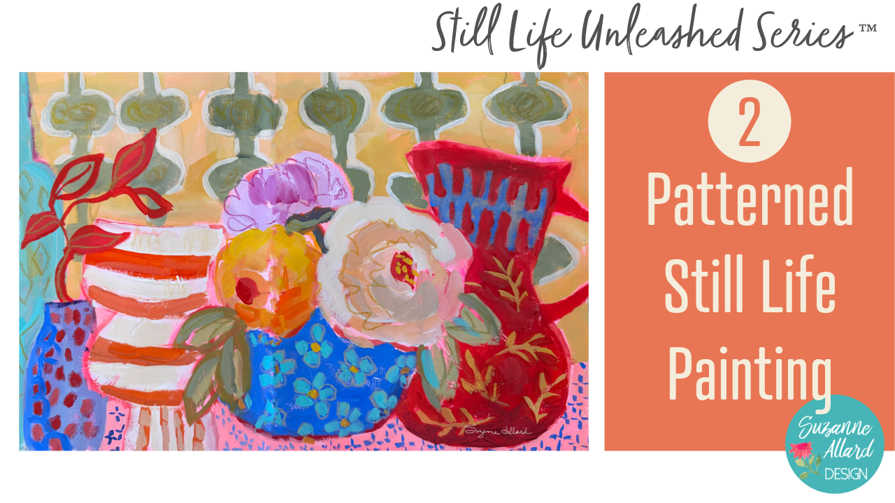
flat and expressive. Our project for this class
is a pattern forward still light painting
where objects are simplified in the bold shapes. At least one, well, many surfaces will have
intentional pattern, and flatness is going to be prioritized over
depth or realism. But you'll be making decisions by responding visually as you paint rather than following a strict plan, which
is how I love to work. Pattern shows up throughout the still life unleash series, this is the only class where
pattern is the main focus. We're going to look at how
repetition activates space, how busy areas interact
with quiet ones, how pattern can bring life to a painting without
overwhelming it. This class is playful but
also very intentional. Pattern becomes another
shape decision. You know, it can be imperfect, expressive, and even
a little messy. We're not copying motifs. We'll use restrain so that the painting feels
lively and not busy if you love pattern, but aren't always sure
how much is too much or how to balance it with Cal
Marius this class will help. I'll talk through
all those decisions in real time as I paint, when to repeat, when to
interrupt, when to stop. The goal here is not a
polished or perfect painting. Success here is
learning how to use pattern with
confidence and loosely as both in a delightful way
and as a design concept and understanding how rhythm and restraint and choice
all work together. Before you jump into this class, I do recommend taking my class module,
designing still life, freedom, confidence, and
choice because it walks you through the design mindset
behind this entire series. And I think you'll get much more out of this class
if you start there. If you're new here,
I'm Suzanne Allard, and I didn't start painting
until my early 50s. And I really learned pretty much everything from
online classes like this. Today, I licensed my art. I sell originals and prints, and I love teaching because
we all have a creative part of us that just sometimes needs the right
approach to get out. Um, be sure to download
the class resources. You'll find reference photos, a cheat sheet of tips just
on this type of painting, and a supply list, and those will help you get the
most out of the class. So I'm ready to get
started. How about you?
2. Supplies: Okay, let's talk
about supplies for this Still Life Unleashed
series of classes. I in general, when it
comes to supplies, I definitely have a problem. I am addicted to art supplies. So bear that in mind. You know, you do not need
all of these supplies. I just am an art supply junkie, and I love experimenting
with things. But I did try to keep it
under control, 'cause, you know, limits are good. So let's start with here, let me flip us down
to this camera, and let's start with what
I painted on in the class. I used these three sketchbooks
and a canvas board. But, of course, you
can also use paper. So I'll just quickly
go through them. And by the way, I
painted this cover, so it doesn't come like this. This is the Stillman and Burn. And I have all of this
in the supplies list. I work really hard on
my supplies list to make sure they have
everything I reference. So you can let me know
if I leave anything out. But I have links to everything, and I just really love
the paper in this, and I like an off white paper. Just a personal preference. And then this is the Moleskin
Art Journal the Large. It's probably two thirds full. This is, let's see, one of the paintings that we're
going to do in the class. Yeah, that's one. That's
one I did outside of class. This is one of the
class paintings. I love this sketchbook,
as well, moleskin. And then the third one
we use is the fabriano. This is called I think
that's in the back of Ansia. Yeah, Vensia. And it's
just a little bit larger. The paper is also
a nice thickness, and it is, like, a more white color, but it, you know, takes pretty much
everything I do to it. So I give you a sneak peek ala
This was a class painting. That was a warm up
to a class painting. Well, really the I can't
remember which one. I love doing those fruit ones. Okay. So those are the
sketchbooks I used, and I would say they are
three of my favorite brands. Down because they're so heavy. I also use the canvas panel
in one of the classes, and I love these as well. I provided a link for them. They frame up just like
paper wood, you know, in a frame, but they're
already treated and they have, you know, some
substance to them. And they're more expensive than paper, of course, but not. Ridiculous. And
they're just easier to handle for me than a big canvas. If I'm on the easel,
then I use a canvas, usually, or one of those panels. For paper, I would say a
watercolor or mixed media paper, definitely something
heavier, 140 pound or more. And the Europe, you
guys call that 300 GSM. I would prime the paper, and I also prime my
sketchbook pages, and I'll show you how I do that, or I'll show you what I
use because the reason and I do have a YouTube on why I do this kind of in more depth, but the bottom line is
that paper like this is, you know, especially
watercolor paper is meant to absorb
the paint, right? Makes sense. And
if you're going to use watercolors on
it, that's great. You get that bleed
effect and so forth. Or even if you're going to use Acrylic with a watery wash, then you're going to
get that bleed effect. So it really depends
on what you want. If you're using a more
watery consistency in this class and you
want to have um, that washy look, then don't
prime the watercolor paper. But if you're going to work
the way I did in the class, which is Acrylic and
kind of juicy paint, you want it to sit on top, not get absorbed in.
Does that make sense? So we prime the surface
with something, and you can use I use
them interchangeably, depending on what I want. I use a fluid map medium if I just want to kind of
have a more slick surface, and if I want that kind
of crunchy, toothy feel, I use gesso, and you just
brush it on and let it dry. And that's enough. That way, when you paint, your paint won't get sucked
up by the paper. Before I learned
to do this, I was trying to paint with Acrylic,
and, you know, you'd paint, and the kind of paint
would disappear and then paint another
layer and disappear. And you waste a
lot of paint that. Again, if you're
gonna do the wash heathing where you want
the bleed and so forth, then you would not
prime the paper. And the same thing applies
to the sketchbooks. So I usually prime them with the MT medium or the gesso
for the same reasons. Okay, so that's surfaces. For palette, I either use, you know, a piece of plexi. I think I have an old
piece of Plexiglass here. I usually use palette paper. I just like to be able to
use it easily quickly. And then sometimes you get some nice pieces to use for collage, or some people use them as inspiration for
abstract paintings. But that's disposable palette. Basically, you tear off the
sheet and throw it out. For brushes in this
series of classes, I used my Suzanne Allard design
juicy brushstroke series, and they are they just came out. Um and I think I only used I might have used
one more smaller brush. So but any flat, if you wanted to get
the same effects, a flat number six, and maybe for the occasional
detail of flat number four, and maybe sometimes a Filbert, and that's what
this shape is here, and it's kind of
rounded at the top. But I would say any
good quality brush, what I would be
careful of is just don't get anything
that's too smushy, like, super, super soft. You're not going to have maybe the effect and control
that you want. And on the other hand, don't
get anything too stiff. Like for this. Anyway, or just understand that brushes will
change the effect. So there's no wrong brush. But if you're trying to get certain effects, learning
what they do, like, these Princeton catalysts
are really, really stiff. And so you're gonna get
a different effect. You're gonna more,
like, push the paint, and it's kind of
better for oils. So just understand
if you're getting if you're not getting
the result you want, might be the brushes. Of course, it might
be the paint, too. Speaking of paint, I use in this Still Life
Unleashed series, basically two types of paint. I use the Acro gouache and my favorite brands
are the Hbain. That's what these two
are and the Turner. And I put them both in a palette the same way I do the acrylics, which
I'll show you in a second. And then the acrylics I'm
using are the Nova Color. These are the paints that are available only via
their website. They don't sell in
stores and they're artist quality paints for
a student grade price, but they really only a good
deal in the US because the shipping is too much to make it worth getting out of the country is what
people tell me. Anyway, I have a Suzanne Allard
design bundle with them. You do not need to
buy Nova Colors. You do not need to buy
the Turner or the Hbin. You can use what
you have. Just try to buy the best quality
that you can afford. I would rather have you have fewer colors and
a better quality. So if you'll see I use a limited
palette of the acrylics, which is what's often called
the split primary palette, which is really
just two yellows, two reds and two blues. But within each of
those, you have a warm yellow and a cool yellow, a warm red and a cool red, and a warm blue and a cool blue. So really that and maybe
a few really fun colors like fluorescent magenda,
which I'm obsessed with. And maybe, you know, you can make almost every color from that split primary palette. So I would rather see you get
a good brand and just get those six colors plus white and then get some cheap brand
and get a bunch of colors. You'll learn so much more
about color and you'll like the result
of your paintings better because the
cheaper paints don't have much pigment in them. They have a lot of
fillers, so you just you're not getting that, you know, kind of rich look that you probably want.
Alright, so that's paint. For sketching, I
sketch my compositions in usually three or
so different ways, always very casually. And in the designing
Still Life class, I talk about how you can use really anything.
You can use a pencil. You can use a colored pencil. You can use sometimes
I like to use this fun fluorescent pink
solid marker by sakura. Or one of these pencils by Well, this I would use for
actually something that's going to show
because they're pricey, these luminant
carinash luminants. And I've got all that
in the supply list. But I often will just take
a little bit of paint, water down on my brush
and sketch with that. So I also love sketching
with neoclor crayons. And, you know, these
are the neocolor twos, so that means that they
are water soluble. So if I sketch
with one of these, I can it'll dissolve with
the paint that goes on it. It doesn't really show, and I kind of like when
some of it does show. So that's those are the different sketching
tools that I use. All right. And let me
show you the paint, and then I'll show you a couple of sort of paint related,
I guess, things. So quickly, I put my for me, success in painting means I can just get my stuff
out and start painting. I don't have to squeeze
a lot and work a lot. It just helps me to
be more on the go. So for the acrolGuah
and you could actually use these containers
for either Acrylic, there's no rhyme
or reason to why I just I'm using them this way. But I put the acro gouache
in these containers and then I can kind of see the split
primary there a little bit. The warm yellow, cool
yellow, warm red, cool red. And some blues. There's a couple of other
things like an opera pink, which is another color that I buy because
you can't make it. So these guys, I keep
them with wrapped in a wet paper towel like you just saw me take off in the fridge, and they have lasted months, months, months,
months. It's amazing. Sometimes the silicone
rubbery cover is a little tricky
to get back on, especially 'cause I
probably have some paint in there, but that's it. That's how easy it
is to get them out, start painting and
put them back. And then I if I find that
they're drying too fast, I will add sometimes a slow
dry medium by liquitex. And so they're just it's so convenient.
They're ready to go. And same with my novas. I have a small one and
a big one of these. Is my wet paper towel. And, um, it took a while to find the right container
to do what I wanted, but I did. And, yeah. So again, you know, now, if I notice,
like, that one looks a little dry when I'm painting, I will use my I think
it was originally a makeup like a face
hydrating spray. But I use it this way. You know, I don't like them too, you know, over the watery, but if they need a spray, then I'll do that. But again, I bet you I've had this in the fridge for six
months. And that incredible. So it's a great way to save save paint and make
them convenient. And it's fun because you can
mix some of the colors that you really like right in
the little wells. Okay. Last thing I want to show
you, I think some people ask, let me get my sketchbook. You know, how do you
keep the pages from sticking if sometimes
like this one, we paint in the class. I
love how this turned out. But, well, the
acrylics not too bad, but sometimes they will stick. Let me see if I can
get one to stick. Oh, you hear that? That
was a sticky sound. And so I will use
this fixative Um, if I want to use something
non toxic in the house, like in the winter, this
is the Dega spectra fix. It's completely natural.
I can do it right now. No issues. If I want
to use something, this one's a little pricey. So if I want to just do it outside in the garage, I use my Okay, I think we're
okay. If I okay, using, you know, going
out in the garage, I can use the crylon
workable fixative, which does not smell good,
but in the garage, it's fine. But I don't and it doesn't linger too much on
the sketchbook pages, 'cause I don't want my
sketchbooks to smell. Well, I don't mind if they smell good. But I don't want
them to smell bad. Alright, I think I've
covered everything, and we are gonna have so
much fun in this class. I can't wait to get
started with you.
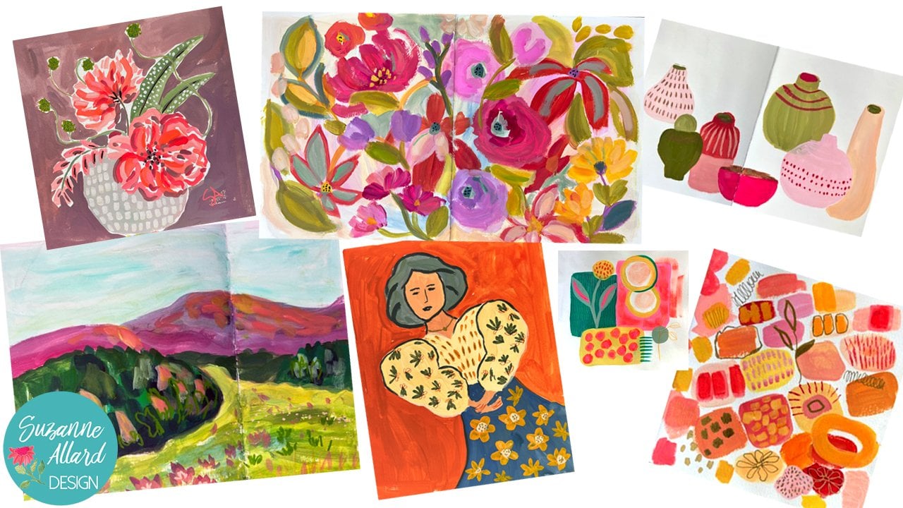
3. Gathering Inspiration: Okay, let's get inspired. I love pattern. I'm obsessed with it. In fact, my first handle on Instagram was pattern obsession. I just I don't know
what it does for me. Maybe it's from growing
up in South America with the beautiful
patterns and fabrics. I'm not sure, but I am obsessed. If anything, I have to
work on not overdoing it. So we'll work on that together. So I wanted to just start with a few that I have in
my sketchbooks. That we can look at. And this little I just I don't
even know if you can see the texture that I
achieved on this blue with I think it was just a little bit
of lighter crayon, but I had painted. That's another reason I
like to pre paint my pages something with something
that gives you texture on them is some
of that shows through. And so I have pattern
in the wall here. And then I remember I did
this and it was too much. So I painted over it and it left a really nice subtle
painting or print there. And it's just so fun to do
pattern because there's so many inspiring
places to find it. And, you know, pattern
is part of the design. It's it's in our
design decision. So we now we have to make sure the painting works
before we put pattern in. It won't carry up painting, but here are a couple
other examples. I did put these in
another one Yeah, I have another one that I put in class documents for inspiration and then I've got the
inspiration photos in there too. You see how we don't
use it everywhere, and it can create rhythm, which is what moves
your eye around a painting it's great
for helping with rhythm. Anything that you move
around, color, um, shape, texture pattern that
helps move the person around. In this case, this was a spread. But that's what we're going for. Using pattern is a design
element and not overdoing it, building our shapes first. Let's look at the
pictures I've selected for the class download. Here's a bouquet that I made. I really love the stripe
and the vase and I love this sort of fat chunky, you know, you can, so maybe
we'll put that in there. This is a picture from
everywhere I travel. I take pictures of
vessels and just pattern, anything that I think, you know, I might
want to use someday. This was in Portugal in a store and I just
like these shapes. This was Pixa Bay. I love primitive patterns. Then one of the masters of pattern when I was in
Paris at the anger Museum, I got to see two
original Mattis. He's probably well, one
of my favorite artists. And look at all the
pattern in this, here, here, here, here, and really even those stripes
are a pattern. So he's just kind of inspires me in general
for color and pattern. This was in Paris in
a little coffee shop. And this vase
caught my eye, and, you know, there's
a pattern on it, but the shape also and
this little guy as well. This was another shop in Paris. So I just take
pictures all the time. People people are probably like, why is she taking pictures
of all of our items? Why don't she just
buy something? And then I put this
together just playing with some pattern things that I had painted as a background, a few kind of still
life elements. And then this is the painting. This is another painting
I did with pattern. That's the one that's
here. Then this is a Pintres photo
because look at it. I mean, my gosh, it's got great vessels with
different patterns on them. I mean, you can do a
lot with this photo. And then I threw this in there because I just love this fabric, mole fabric from South America. And I don't know if
we use it or not, but it just, you
know, you never know. That's what I do is kind
of collect some things, think about it, and then just start painting and
we'll see where it goes.
4. Background Sketch: Okay. So the first decision I usually make is unless
I've already pre painted, is what color is my underpainting going to be
or am I going to have one? In this one it was this
turquoise. You can see behind. And in these, I
did a lot of pink. I think I made the
shapes in pink, it looks like, and then different
shades of pink and then kind of sketched it in
hot pink and went over that. So I think it'd be kind of fun to
incorporate some of this. So let's do kind of a
mixed pink background and the challenges
that you have to do. Well, you have to watch if
you use a lot of fluorescent, it is too hard to look at. It hurts the eyes
until you cover it up. So that's challenging.
I'll tone it down and then we'll see
what comes forward and I'm using my little aqrlGuah
palette for this painting. So I'm going to mix
some. I've got that. There's different names for it. They have opera rose.
I mean, opera red. Well, there's an opera rose. This is a luminous rose. Some of them are
less than others, but I can just tone it down. So first, I'm going to go
through and do that without making too much of a fuss and kind of mixing
it right here on the page. So I'm going to get
a larger brush. Any brush will do. You could even use a like a craft brush for this kind of thing 'cause we're
just getting it on there. See what I mean by ouch. So sometimes I'll
just tone it down immediately with
some of this beige. We use a little water and throw
in a little bit of gesso. Gesso acts as a white. So we're actually even
in the underpainting, starting with a little bit of
rhythm because I'm going to make sure that the same bits, some of the same
bits are over on this side in different places. So I'm just dipping
into my beige, my pink need a
little more gesso. This is my Skillman Stillman
and burn sketchbook. I really love these sketchbooks. It's the Gama series, which they kind of
name them Gamma, Beta, something like that for different colors and
textures of paper. And even though here I am
painting over the whole thing, I like an off white paper. So see how I'm just making sure there's a little bit of balance and
rhythm even in this. Even though most of it
will get covered up. This also is a nice warm up. It just sort of allows
you to play loosely, I mean, because it
does not matter. You can literally can't
make a mistake on this. I mean, I guess you could have really intense color on one side and really pale
color on the other, but that wouldn't be a mistake. That would just be
something that, you know, influenced
your painting or you could end
up covering it up. And it doesn't have
to be ha covered. Sometimes some textures nice. I'm using a little water. The more water you use, the
longer it'll take to dry, so just keep that in mind. Here, I'll use other side of
my brush to hold it down. I've just got cardboard, like, stock or card stock in here to, um, protect the other
pages in my sketchbook. Okay. Here's something
fun you can do. Scratch into it a little bit. Never know. So we might leave some of
that showing through. Okay, we're gonna let that dry. And for brushes, I'm
using my brush set. The juicy strokes brush set. And once this is dry, we will get our main shapes in. These are so fun. All right. So the way I did this spread, it's like two separate
but magi paintings, color and rhythm wise. But I'm thinking here, maybe I'll just make
one whole composition, and I really love this. So I think I want to
sketch that in first. I will make it off
center on purpose. Then we'll just pick
out some shapes in here and add to that and get the structure of this yeah. And pattern comes after that. So um, since I've got a
underpainting in pink, I don't want to sketch in pink. Let's see. You can do red, real work. I'll water it down. You can water it down a lot. You can use a crayon,
what else could you use? A marker. I sketch on
all kinds of things. I love how fat those little
vases something like that. Then these um you don't realize when you
do a bouquet how big, look at that size
of that flower. It's almost the size
of this bouquet, which would mean I've already
made the bouquet too big. I can't make it because I don't want to make
the flower this big, but I continue to be amazed by that when I
really just look at that. We'll make it big because
I love a big bloom. It's just giving me an
idea and smaller one here. Got some leaves
going different ways here. Another one there. Maybe I don't want to poke this little guy
to dominate too much. Just putting that Yeah, I probably did make
the vase too big. But we will let
me show you how I can's take some of that out. Make it smaller,
just so I remember. We'll see if I remember.
Hm. Alright, let's find another shape.
This is pretty cool. This could be like
I love that, too. Hmm. I think that might have to go here,
at least part of it. When I do, 'cause we might do some sort of tablecloth pattern, so I'm just gonna make a
couple of marks there. Alright. Let's see. Oh. Remember
that. That's fun. I'm trying to decide
what size to make it and whether to put it here. Let's make it like this tall. It's kind of more like this. It can be anything
we want it to be, but I'm I like the shape of it, so I'm trying to keep with it. Okay. This. Okay,
let's see here. Looking for another vessel. Yeah, I could use my paintings as inspiration,
but I don't know. Sometimes I do. Let's
go back to this. Oh, I know. Wait. Do I
have my blue bottle? No, but I love putting this in, so I'll find it and add it
into the class documents. So it's just a tall, you know, water bottle,
wine bottle type thing. And I'm intentionally
having these be behind each other, in front of each other,
that sort of thing. Alright, so that's four vessels, I don't want an even number. So let's put a
little one in front. That shape is fun. But I think I want more
of a Oh, where was that? I have one more picture
I haven't looked at yet. Yeah. Let's see. Maybe just that shape there. M kind of put it small here. I want it behind
that one, I think. Better color that in or I'm gonna forget what I've got here. Behind this one, but
in front of that one. So this is like a visual note. I'm giving myself. Okay. All right, so we have a sketch and
we'll be able to do pattern on these some
of these vessels and also on our wall and
maybe in some tablecloth. I think I want to them shorten this vase here and make it
smaller, so I see that better. That we have some tablecloth
down here. Alright. All our sketch is
done, it's almost dry. We'll just give it
another minute, and we'll start painting.
5. Painting Main Shapes: So I just wanted to show that we are when
I did the design, I have everything at a different level and different size. So, I don't have it
going straight across. I have this tall one,
this little one. This one's about that high, high that high, none of them are at the
same exact height. And, you know, we may I
may put a floral going up. Who knows? Or some leaves. But just from a
design point of view, it's more interesting,
right to have variety. All right. Color wise, I really like this
color palette here. So I think I'm going to start with this being that
kind of deep red. And I don't use colors straight out of
the tube because I always mix them with something. So I'm just mixing this red with a few other things
until I like it. I put in some kind
of a cory color. I still kind of dull looking. I will say painting against this pink background does tend
to make things look dull. So I know that and I just
kind of bear that in mind. Here's our scratches
showing through. And you don't have to start
with any particular shape. I just felt like
starting with this one. But I think I'll go in and
do this one next because I do love cutting in
around objects, and that's easier done. Well, that means that you paint the things forward first,
and this one is behind. Okay. This, I think, should be
a nice ultramarine blue. I love ultramarine blue
with a little bit of white, and we'll probably do some stripes in it,
like in the picture. It's a little toning it down with a tab with a
little bit of yellow ochre. I'm holding my brush loosely. And I'm actually standing. You could sit for this
painting. It's not that big. But I'm kind of into standing these days. Alright,
let's leave that. I kind of like some
of that. Do you see how I left bits
of the background? It's kind of fun. I
think for the flowers, um, I grab a Philbert
and maybe take some white with the beige and sometimes I
play with letting, you know, this background
color be part of the flower. So let's just see
where that goes. I always have to try to not
make the flowers too round, too perfectly round
and overworked. That's always a challenge. I'm going to put the
center more up there, pointing kind of this way. And maybe orange here. A nice warm orange. This center can be there. It helps to kind of
ground the flour if I grab the center, and then we can take
some of this red. It's for rhythm, right,
and make centers. There's some nice bits of the
pink showing through there. So this is our first pass. I'm not gonna do too much until we kind
of see where we are. What color should
I make this one? Maybe maybe a lavender. I've still got
yellow on my brush, so it's a warm lavender. And heading a little white here just so we have a sense
of structure to the flower. Maybe a little magenta
in the center. This is a sideways view. Now I'm going to make some green I still have the lavender. Basically, I don't
wash my brush a lot if I start feeling
like a color is not going the way I want it to or mixing
compliments too much. They can tone down
things nicely, but they can also
flatten and kill colors. All right. I'm getting
some leaves in there, but like the bits of pink
showing through there. Let's keep that simple for now. Let's see there. I grabbed orange too much
orange by accident. I wanted that a bit darker. Alright, so that's there. Let's color let's I was
going to say color in, but we're Color
it in with paint. I want to make this a almost white color
then we'll come back and put stripes in
it or something. I put a tiny bit of my off white. For some variety. Well, those marks are cool. Makes it look like
pottery, doesn't it? That's why I love using a
big brush and not painting. In fact, I want to
be careful here. I want to keep some
of that pink there. Varying my color a little bit, throwing a little
green in there, gives it that sort
of and my brush is a little dry and
sort of scumbling here, which is giving me that nice
pottery look and I don't want to go in and mess that up. Well, I have this nice color. I'll see if we can put
a little bit there. Okay. I end up making
this fatter than I want. So I think I'm
gonna bring it down more like I'm just kind of making a
sketch more like that. And there will be
some space there. So I just have to
decide the color. What color? What color? Who? Dark glass. Is that too light?
That's too bright. Okay, so we'll knock it
back a little bit with some green and throw a
little orange in there, just maybe it'll
look like glass. You really letting the brush and the paint do the
work for this stage, and then we'll let the
pattern do some work. Okay. I had to make my um, top of the bottle center. It's going off the
page. It's fine. I don't need to make it. Have it make perfect sense, right? I'm cutting out the shape
of this one in front of it. There we go. Yeah,
okay, that's good. Maybe a little more
like this. It's pretty. Where else am I gonna
put a little turquoise? We can always put it in
the pattern, and we will. That'll be fun. Okay, now I can take this little guy here, which he's kind of
a lavender blue and make him a little fatter 'cause he's not running
into that bottle anymore. Does that make sense? I didn't want this ending with that, but it's not anymore 'cause
I made that bottle smaller. So now I'm gonna take
that more like this. I took it. Putting a
little background back in. I didn't want to be that wide. That way, I know where
I am when I paint. Okay. That shape is good. This is good. Yeah. Okay. So background
color. Maybe a yellow. Yeah, I think that'd be pretty. Let's get the background in and then we'll
let things dry. Kind of a warm sort
of softer yellow too too bright. No. Your background doesn't have to all be the exact same color. In fact, it's kind of
nice to mix it up. You'll see a lot of
artists do that. Yeah, especially
where you can help it contrast with things like
this is a light colored vase, so I could make the
background a little darker there to help
it show up better. I'm not covering all of it
because I like our pink. I just realized, you know, you do this underpainting stuff, and then if you cover
up too much of it, you kind of lose
some of the magic. So that's taken me, you know, that's been a process. And not just the background,
but some of your shapes. So be thoughtful, not anal, but thoughtful about what you want to cover up and
what you want to leave out. Like, as I'm painting
around this, you know, maybe I leave a bit
of the pink there and I can use this negative space to paint
maybe leave that there. That little triangle. Who knows? It might be something
distracting, but I can always
cover it up later. Oh, I forgot what tablecloths
gonna start there. Oh, that colors so pretty. This is reminding me, like
a little French cafe scene. Now we have our tablecloth, which could just be pink. Yeah, why not? So I'm just gonna put it in
a little more intentionally. Maybe it's a pinky yellow. Kind of like what we
had in the background. We'll see how that looks.
And yeah, then I can fix. Oh, I've got some vase
there that I can play with. See how things started to shape. And here's a little background. I'm gonna cut that
shape a little bit. Things started to get
shape when I start putting that tablecloth
in kind of fun. Yeah, this is looking good. I'm debating, so, you
know, I was like, Oh, I need to go back and put
some red there for that vase, but there's something
kind of fun about that the way that looks there. So I don't know. Might leave it. The other thing I'm
thinking about is see my tablecloth
ends right here. And do I want that or do I
want a little bit more here? Let me just try to
visualize that. I don't know. Well,
we can this is dry. We can put it in. Let's try putting it in after this
stress so it doesn't smudge. And also walking away, 'cause I might decide,
No, don't do that. I mean, I can always just
paint turquoise back over, but I feel like we need to set the bottle
back a little bit, which would mean a
little tablecloth. Then these two are forward. These two are back a little, and we have kind
of a nice balance of that here, but we'll
let it dry first.
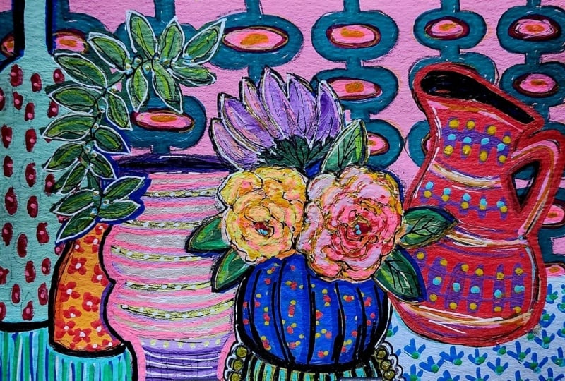
6. Designing Pattern: Okay. So, you know, this is a pretty
little spread painting, but it will come to life
when we use pattern. And it's just so much fun. And I really love this kind of wall pattern
that I made there. So I think I want to
do the same thing. Yep. I'm going to sketch it out with one of my
No color crayons. And So let's just do it. There's no rhyme or reason to starting Well, it
might be too big. Yeah, there's no rhyme
or reason to starting with the um the wall behind it. You know, I think I just start where I'm
most excited about. So, me, that's drying now. So let's see here. I'm not trying to
make this exact. You have to be
careful with pattern if you can get
perfectionistic or, you know, anything like that
because you can get drawn in by trying to create the
perfect symmetrical pattern. And I mean, unless you
really enjoy doing that, this kind of painting is not
about the perfect pattern. It's just about creating that liveliness and
sort of element of excitement that
Pattern provides. Whoops, it's way over. And actually, it can be
more wonky. Alright. I just wanted to
kind of see what that looks like. I like that. And I actually really like these little white flowers
in here instead of a stripe. So maybe I'll do that. It's I like kind of coloring
them in sometimes with a crayon just to get an idea
of the whole composition. And sometimes I've left them. I'm just like, Oh, that
worked with the crayon. I don't need to go over it with paint or marker or
whatever you've got. Color pencil works, too. Just a suggestion
of it over there. And it is a suggestion. You know, there's you don't have to spell everything
out in a painting. We can have um The
idea of something. So people know that
it's a pattern. Let me do some stripes here. This is an orange crayon. It gives me an idea
that I can see, do I like that orange there, and maybe it goes
this way down here. I can come in there with paint. Already, it's getting
a little more alive. Let's look for some
pattern inspiration on our pictures. Maybe
for this one. Well, that's a pretty wall
pattern that Mattis did. Ooh. I like that
from the Paris pick. So and I think it'd be
pretty in the blue, too. So, let's see. We'll do
a loose version of that. Basically, it goes like this. And then comes around and
goes like that again. Ooh, isn't that fun? Do I want to do more of it? I'm just sitting there
going, Do I want to cover it or just do that one bit? I don't know yet, so
I'm gonna leave it. Pattern doesn't need
to be on everything, course and shouldn't maybe we won't even do
anything on this one, but this I want to
do something on. And I want variety. So maybe this one would be
something really small. Like, maybe even just
some spots like that. And red would be a good color because it would
give us rhythm here. So this will just I can either just do them
in crayon like this. Or I can come back and do
some and paint or not. That crayon, I need a
better point on it. There we go. You get this nice texture
effect with the crayon. Which you know you
may or may not like, but it's an option. Okay. So now I'm looking
over the whole thing. Tablecloth. What, if
anything, do we do there? So here I did these little,
let's look at the painting. So I like this would be good because we don't
have anything tiny. So we could do the tiny here. And we can still find
some places to do tiny. We could actually
do this kind of thing up this part of the vase. That would be pretty and do these tiny little Flo
del looking things here. Well, I think
that's a good plan. So just as a note, and I think blue would be nice. So we're just gonna make little couple little Florida les. This is, like, a visual note that that's what
we're doing here. Okay, so that's that. We've got this. Alright, let's
do some of this and paint. We planned the shapes first, and now we're planning the
patterns to paint some of these small flatworks like, the size four or around. Depends on kind of
the look you want.
7. Painting Pattern: I really like these flowers. I might not want
to paint them in. Hmm. Kind of like how they look. Alright, well, since I'm
not sure what's laid on them and come in here and do
the orange stripe on this. I kind of an orangy red, just so we can bring
in some of that red. Maybe a little. We'll vary the orange,
maybe lighten it at some. A little right there. I like having the crayon marks show through, too sometimes. Um, let's just make these. I like the mark sometimes the flat brush makes
when you go this way, like I just did
sideways like this. You would think you
could just go like that, which is a different mark, but there's something cool
that happens there. Well I have the orange on my
brush when I add a little yellow and just give another
highlight to this flower. This little second coat bit. Maybe it's the sun
hitting it a little bit. And I was thinking do I
want orange anywhere else? Well, in case we decide
to leave these flowers, I could see what
happens if we just put some little
centers in there. I'm using the
corner of the flat. I don't need to make
them all uniform. Um, Hmm, that's kind of fun. Might have to leave those
cream flowers. Let's see. I don't I think green picking
up the green in the leaves, how long this pattern would
make for a nice rhythm there. So let's take out
some of my orange, but not all of it
and make a green. So let me get my little. Sometimes it's hard
to see a color, and that's too dark
on the palette, so I mix it and put it on the it's just what
I'm looking for. I'm kind of looking I kind of like this shade that came here, so I'm going in for
something like that. It is it is a background, so I don't want it to be too, you know, in your face. And Yeah, that's cooler, and cool colors recede, so we'll push it back
with a little cool color. I'm not gonna paint
it really precisely. I kind of like those
crayon marks showing. And this, also, if I adjust the color as I
go, it doesn't matter. And I don't even need to
cover the whole background. So there's little
bits of that showing We're suggesting the
pattern, you know? This one is pretty clear, but we don't have to
paint it precisely. Um, some places I'm
letting my brush dry. So it's kind of scumbly. I like that scumble effect,
especially on the background. HarcoGuah can dry
out pretty fast, so in a way, it makes you work quickly. It's drying out on me, and
I wanted that dry effect, so I didn't want to
put too much water in, but gonna have to. Add some a different effect. Okay, we would have another
one starting there. Okay. I'll bring a little
bit of that colour just for balance here. This is fun. I'm looking it over. I think I do want these um, little red things to
be more tying that in. It's just a little, I
don't know, preference. So that they pop a little more, at least some of them
and tie in with that. It's fun. I varied the color a little bit.
You like doing that? Okay, so let's do our
blue thingamajigi here. Well, I think that's
better done with a flat. Going back to the ultramarine blue with a little bit of white. You see the texture,
remember when we use the back of the
brush into the background. There's a little bit
of line here and a little bit of
that here and here, it's really I'll show
you a close set, but I don't know if you
can see it. I like it.
8. Painting More Pattern: Two I'm not gonna cover some of that
scratchy stuff I like. Okay. Yeah, I don't think we need any more of that there.
It's really bright. So now I'm feeling like I need some I know we have some blue that's gonna go
in the tablecloth, so that might be enough. Alright, well, we
have it. I'm just feeling like this is too bright, but we'll let it dry and see. Can always tone it
down a little bit. I'm gonna get the round brush to do the little Florida Lee, and it's very very, um, casual mark, very, uh, painterly and not
trying to be precise here. We're just suggesting this. I'm not lining them up
or anything like that. It's really fun, isn't it? To just make these marks
and see it come to life. When I hear it's lighter,
I add more white. Just because no reason. Variety. It's drying
out a little bit. This we can add water. I
don't need to scumble this. Alright, I still feel
like I need a little of that blue on this end. So I'm just gonna
come over here and do a little sort of
out maybe an edge. That's fine. Okay. Now, we talked about
doing something here. But let's look and see if we are going to have
too much if we do that. Well, it is a pattern class,
so I think I want to. Maybe come up here with this yellowy orange
color and make a like a leafy thing,
sort of like this one. I could either just do the
leaves or I could do these. Mm. I'm kind of thinking just little small leaf things
so we don't overdo it. The great thing is like I
showed you in that one example, if a patterns too much,
you just paint over it. And then you have
in this example, and then you have
that happy accident of it's still there, but it's just tone down a lot. Okay, so I think
I just want to do some smallish branchy things
and turn them around. I need a little more pain. I just want them going
in different directions. They don't need to be
precise or matchy. Maybe one's coming out of there. And this way. Hmm. Alright, so I think I'm gonna stand up and
get a better view. I think I feel like
they're too big, but I can fix that
with some cutting in, which I love to do with the red. And also, I'm gonna
cut in on that when it's dry and just
settle it down. Because it's blue on the
red is really jumping out. So I want to tone it down. And what else am I thinking
as I look at this? But like there's a lot of excitement here
and it's a little imbalanced and quieter here. That really happened
when I did that. If I tone this down,
that might help. Let's just wait and do that
and then see what we think. The other thing is, I keep
looking at this going, this will be a fun place
for a viny type of plant. Maybe I should just
go ahead and do that. Why not? What color would
I want it to be? Well, if I did it in red, that helps the
excitement factor. I like it. I'm thinking about, do I want it to flow over more? And I'm also thinking about not to try not to make it too, um, tight or fuzzy. Hmm. Well, you know, since
I have the red out, I can come in here and make the stuff a little go ahead
and cut in on some of this. I don't want to cover up
some of the juicy bits in the background of this vase 'cause there's some
nice scratchy marks. But I just want to make this smaller and more
less of a thing. Yeah, remember we
were talking about this pink section. Well,
now might as well. Come in and it was kind
of cool the way it was, but here we are. And Okay. Well, um, gosh, cut in on this. Make this a lot smaller.
It's mostly dry. Let's see. It's gonna need two
coats probably. I actually love the process
of um modifying, you know, so as you go along in the
painting and you make changes, I think that's that old saying, or I don't know
how old it is, but that artists create
problems and solve them. Okay. I think that I might
make that leaf solid, some of these bits. Me that one solid
and maybe one more. Alright, now we're
gonna live it, right?
9. Final Details: Alright, so I want to play
some more with some ideas. Um, let's get this
small flat brush. I want to I want to bring
some things together. I want to do some details. So I'm gonna take some of this turquoise
that we made here, and I am gonna do those flowers. And You can see how imprecise I'm making them. I'm gonna bury the
color a little bit. My brushes was wet
from cleaning it, so the paint is a bit watery. So I may have to do two
coats. Let me dry it out. That will give some nice
variety, just adding some water. Okay. So the other thing
I was thinking about is some kind of, like, see how here, what I did was I came and
painted the background, and it was like a
happy accident. I left some of the
white behind it of the paper, and I like that. So now I'm wondering, I want to do something
like that here, but I could either just paint a little
bit of white around, which is kind of what
I'm leaning toward, or I could paint white and
leave the yellow bits. So neither one is
right or wrong. It's just kind of what I'm
feeling like I want to do. And when I say them both. I kind of like them both. So let's do the white around
the shape a little bit. I don't want it to
be super opaque, so I'm gonna add water. I use a side of my flat brush,
and we'll see it, I think. I could also use a marker. I could use a white No
Color cram as well. This kind of gives the
effect of cutting in, too. It's one of the few times
where I use my brush hold my brush like this rather
than like a magic wand. When I'm painting most of this, I do this, which allows
you to be a little looser. I remember, like,
on some of these, I'll redo something
three or four times before I'm happy with it. Just adding a little more mp. Just wondering if I want
to do something like that. Yeah, I like that. Um, Alright. And I was thinking
about something here. I couldn't help myself. I mean, we're basically Devon, but, you know, how I like to play. And I play until I'm like, Okay, that was the bit
of magic I wanted. That helped. I like that
brighter yellow there. And I am feeling like this
blue is still too loud. So let's see if we take some off light teeny bit of orange because orange
is a complement of blue, so it'll knock it back. But I really want basically,
I'm making a glaze. So I'm trying to
Really water it down. Yeah. Then I can go back
over with the red. Alright. Let's see. Maybe some little we don't
have a lot of tiny things, so let's put a little bit of some tiny bits in here. And I think it would be fun to come in
with a white cram on these. Let me get my, um, white
cream or a very light one. Let's see what we've got here.
Yeah, let's try this one. Maybe not on all the petals, but just some of them. Waiting for that to dry. And I'm gonna tone down
this white a little bit. It's in some places a
little too white for me. Jumps out too much. So bring it down on a hoch or
two with the off white. Take another sweep
of that there. Okay, that's dry. Um, well, I'll let it dry a little more. And then I think I'm gonna do, like, some texture in
these with the crayon. It's probably Yeah, it's
not visible enough. I mean, I can kind of see it
'cause I'm moving sideways, and I can see, like, a glimmer. But let's see. We could do something a little less subtle. What's great about the
neo coolor crayons is if you use the
number two ones, they are water soluble. So if you don't like
what you just did, you just take a wet paper towel. Okay, let's do a little pattern here and if we don't like
it, we'll make it subtle. If we don't like
it, we can always, you know, take the
wet paper towel, get rid of it if we
think it's too much. Or if we think it doesn't add, sometimes you do
something and it doesn't add, and it detracts. And then you can get rid of it. I like the texture
in this bottle, so I don't want to put anything
too, you know, strong. Maybe take another crayon
and do some patterning here. I'm just wanting a little more
texture. I'm just playing. Alright, let's do this. And then I think we are going
to be done with this one. It's fun when you
watch someone paint because all you see is
the finished product, and you don't know the
different adjustments they went through
and the different, you know, how many
times they repainted the background or
changed something. I always enjoy that. And when if you call
something a mistake, it's just I don't know, for me, it's like an opportunity
for more texture or to grow, learn something different. I mean, you can
definitely overwork, and this is looking
like it could be. But I think the cutting
in helps keep it fresh, 'cause now I've got these
interesting shapes coming, and now we've got this
kind of wash on there. So it's just making for
some interesting bits. I'll put some of this darker
paint here and there. Particularly down at the bottom, even though we're not
really concentrating on form in this class. These are flat shapes. But sometimes it's nice to
put a little suggestion of something down
there for a shadow. You can mix it up. Okay, I think this one is
ready to sign, but where? I generally like to
sign with something I've been using in the painting like a crayon
or a color of paint. I think I'll just wait till let's try and
do a little there. See if there are any other
areas I want to play with. I was fun. I think we're done. I hope you enjoyed that.
It was fun to, you know, put our shapes together and then build up
pattern from there, push things back,
bring them forward, look for balance and rhythm. And I'm pretty happy with it.
10. Wrap Up: Hope you really enjoyed painting this pattern
still life and exploring how pattern can bring energy and personality
into your work. In this class, we focused on using pattern as a design tool, using repetition to
create movement, balancing busy areas
with quiet ones, and letting patterns support the painting instead
of overwhelming it. It's kind of a challenge, right? What I love about this approach is how
it helps you to see pattern as a choice,
another design choice. This carries into
everything you paint, whether you're working
from a reference, imagination or a mix of both. So be sure to come back to the cheat sheet as you
continue exploring this idea. And I also have some
additional resources for you. I have a Facebook
only student group, and the link to join that should be in
your welcome email. If you don't have
it, you can always email me at heart
at suzanne.com, and I'm happy to send it to you. You can also find me on YouTube, Instagram and Facebook for
more earning and inspiration. I do send out a monthly, bi monthly email newsletter called Your Creative Adventure, where I share creative insights, inspirations, studio happenings. But most of all, I'm just glad
you painted along with me. I really love working this way, letting Pattern be expressive and imperfect and full of life. And I hope you did, too. I will see you in the next class.
 Suzanne Allard, Landscape, Floral, Abstract Painting Teacher