Transcripts
1. INTRO TO PATTERN PORTFOLIO: So what do you need for this class? Well, the first thing you'll need is a journal or notebook, and a pen or pencil, or potentially an iPad, if you would rather do your note-taking digitally. That's cool too. And you'll also need your portfolio pieces in this class, I'm not teaching you how to create eight the pieces for your portfolio. Instead, I'm teaching you how to put your portfolio together and everything that you need to have a successful portfolio. So let's move on to the class agenda. So the first thing will be the introduction which you're in right now. And then we'll move on to the next lesson, which is all about creating collections for your portfolio. From there, I'll teach you how to make mockups and where are the best places to find mock-ups are. And then we'll touch on who you, who needs a physical portfolio and why, and who needs a website portfolio, and how to create that. From there, we'll dive into your assignment and I'll give you all the references at the very end. So be sure to stick around for that.
2. CREATING COLLECTIONS: Welcome to lesson number one where we're going to discuss creating collections for your portfolio. So number one, why are collections important? Why do we need to design and collections? Well, they create a story among your designs, like a little family of designs that go together. And they show a fully thought out concept. They bring an entire vision to life and really lived together in such a way where all of the designs could be used on a collection of products that really compliment each other. So first let's talk about a hero prints. Now this is talked about a lot in fabric design. So what exactly is a hero print? A hero print is kind of like the main character of your design collection. It's the star of the show. It's usually multicolored and has usually has more complexity tails than the rest of the patterns and tends to be a little bit larger scale. Now here is one example where you, you will see on the left-hand side, everything I just described is so the 12 inch repeat design is the hero print and you can see it is multicolored, it has more detail, and it's pretty much at a larger scale. The large flowers are at a larger scale than the other designs as shown in the collection. So number three, what are coordinates? Coordinates are like supporting characters for the hero print. They're kinda like the sidekicks you would see in a movie. And a lot of times they are two to three colors now they can be multicolored as well. But it's always good to include some simplified coordinates that really let your hero print shine and be the star of the show. And so coordinates sometimes are a little bit more subdued with being only two or three colors. And they generally have more simple details. And sometimes there also a smaller scale. So coming back to this artist's collection, you'll see over on the right-hand side how these colors, the OG, as well as the smaller flowers, are all two-color designs and they, the ones on the bottom have different color waves and they all coordinate back to the hero print and really let the hero print be kinda the star of the show in the main design. Okay, so let's review some other types of collections. So here's another one that I did called bleed. This one's called gleam annual C Again, the hero print over on the left, while the coordinates that really go back and supported this design, you'll also see that I like to include the Pantone colors here so that an art director can see. All of these colors are using the same color pallets. So for example, the orange within all of these designs is one orange, the pink is one pink, the teal is one Peel teal and so on. Here we have Daro where you see a, another hero print, but these same coordinates can apply to a multiple hero prints because this is all part of a larger seventies collection. Here is older, which has a different set of color ways are a different color waves set that you can see over on the right with all the different Pantone colors. And you can see that for the coordinates, some of these are a little, have a few more colors than just the two color. We do have one to color design here, but some of the others do include more colors than that. But you can see that the background color in a lot of the coordinates is different than the background color of the hero print. And so that way they complement each other pretty well. And a lot of the motifs that you'll see in the coordinates are also pulled from the original hero print and just made into a different design that's either smaller scale or maybe a little less complex. Here is a Lisa, another collection where you'll see again some three color designs or with the green and yellow background, but you'll also see a multicolor in this six-inch repeat design, which is basically using a lot of the same motifs that the hero print is using, except it leaves out the larger floor roles. Here is arbor, which is a more neutral color palette. And then I also wanted to show you guys some different collections of different pattern designs that I found across the internet. So these are not my designs, but I wanted to show you kind of how some other artists approached designing a collection. So you'll see these with the black and white sort of theme with different check patterns. Over on the right is a little bit more geometric, whereas the left side is a little bit more nature-inspired. Here we have a fruit pack where you'll see a lot of the same watermelon colors being repeated over and over again. The same greens, the same yellows. Here again, you'll see this same color pallet and a lot of the same themes and everything is drawn sort of in the same style where whether it's the Hawaii or the hello summer. Here you'll see a collection of horoscope cards and again, the same blue as being repeated throughout the cards. The same ivory, the same paint, the same red, orange. And of course, the way that the characters are drawn, they had this same line quality and all of that. The wrapping paper is also a super cute and all of this goes together nicely in a collection as well. Here is someone at a trade show booth and this is another great way to kind of see if your collection actually goes together, if it would show well in an exhibit. Here are three other little collections. First we have this set of candles where they color block to the candles and the same purple is being used, the same mint green color, the same kinda of salmon pinks. And so I love seeing this candle collection. Also in the middle here you have this abstract collection where the same types of motifs are being shown and they compliment each other really, really well, as well as the toothpaste over on the right. Here is a group of coastal pillows and this makes a really nice collection as well. You can see sort of the overall coral design as well as other pillows that have a more centralized motif like the seahorse. Here's another little collection for a different napkins and fabrics. Here's another paper collections. So hopefully this will inspire you depending on what type of industry you are wanting to work in. Here are some kinda younger collections for maybe back to school with a book bag, with calendar, the stickers, more geared towards kids. Here are some little groups of different chin Waze recollections. I love seeing kind of this bamboo lattice lining up with a different Chinese motifs and vases. And just, I love the way these fabrics come and pillows as well come together to make a really nice collection. So I loved also seeing this interior design. So interior design is another way to think about designing your collections. So for example, if you are designing a wider range of products and you wanted to design pillows, but also wall art or maybe a cluster of wall art like we see a lot of people using today. So yeah, so your wall art could even be a type of collection if you're more of a painter. Here we have some really cute baby collections. Over on the left we see this baby Safari and you can see these little polka dots in the middle there that make great coordinates for the animals. And then over on the right side we have these cute little bunnies. And of course you're not gonna see bunnies and every single pattern, we see stars, we see dots, we see easter eggs, and then we see these sort of geometric triangular patterns as well. So those are really awesome coordinates of four the bunny prints. Here we have some more kind of abstract designs. This makes a cute collection as well for someone who's exhibiting at a trade show. Again, you want everything to look cohesive the way she's displayed it here, to really make a statement with your collections. Help this looked nice as a collection as well, even if it's just using the same colors throughout products again and again. And here we have a really beautiful wrapping paper collection. As you can see, the ribbons kind of relate back to the wrapping paper and we have a lot of the same color as being applied throughout this collection. Here we have a cute collection of pillows. These are very neutral but with gold or yellow being sort of the accent color. And you'll see on the left, it's only pretty much one gold color being used throughout these pillows of different designs. It's really the color palette is super tight and that just allows the pillows to go together so nicely as a collection, even if the pattern is different. And then over on the right you'll see a little bit more blacks and more ivory and solid yellow pillows. The mustard yellow color is a little bit bolder. And on the left it's a little bit more muted, but these make really nice collections as well. For textiles. This was a beautiful collection as well, and you can see that it's just very soft. Again, we're going back to the colors and the applications and the trim. Everything just goes together so nicely. And a lot of it is the color. But again, you'll see kind of over on the left here we have a two color, blue and ivory. We have, on the bottom we have another blue and ivory pattern as well as sort of a neutral kind of, I don't know if it's animal print or kind of just some geometric lines that are very organic. But it's again, another two color design that's going back to kinda complement the floral, which I would consider the hero print here. Banjo also is really great about creating collections. And so they have a lot of really fun stuff that I just wanted to show you this. And another fabric collection that is really just great for interiors and textiles. And you can see the solid top color fabric as well as the other two color designs are excellent coordinates for this main, a floral print which has, which would be used as a hero print and interior design. So here we have a couple more examples. I love this batik on the left side to its very kinda beau WHO? But again here, most of the designs are kinda two color because that is more of the theme and trend there. But over on the right side we see the pineapple pillow, which would probably be more of a main print, being sort of supported by some of these more solid colors. Love these collections as well that you can see in stores. So it's always good to kind of pay attention to that when your backend stores. Again, some more interior design just to kinda give you an idea of how things go together when you are designing prints, it's good to always think about how they will be used and how they will live together, either in a store or in someone's home. And here's a cute collection of animal prints.
3. MAKING MOCK UPS: Welcome to the next lesson, making mock-ups. In this lesson, we will discuss why it's important to create mock-ups, and I'll also show you how to do it in Photoshop, so be sure to stick around. So number one is, why are mockups important? Well, it helps show your work on products. It helps you fully understand if the designs work together as a collection. And it removed the guesswork for our directors when they see your work on products that they are trying to sell. So what is a mockup? A mock-up is a digital rendering of your design work on a physical product or in a relevant seen it show, it shows the end-use very clearly. So where can you find a mock-up templates? My favorite place to look for templates is on Creative Market. You have the high res files, the high res photography, and it's pretty much just a blank canvas for you to manipulate and upload your work. If you need a cheaper option, you can go to sites like Society six, art of wear or contralto and make and upload your work to the site and then take a screenshot. Print Full is another one. Alright, so here is an example. So this is a template that I downloaded from Creative Market and you just want to open it in Photoshop and the layers are already set there. You can see how some of these layers, you can click off and on and decide if you want to keep some of these natural light shadows are seeing shadows, but that the fabric roles are all kinda of in this one group. So all you have to do is double-click on the mask and go. Click on FX in your Layers panel and click on Pattern Overlay. And all of the patterns that you've already previously saved should show up. All you have to do is go to File Save and then close this file and it will show up on the mock-up. So there you see it. It's rendered on the mockup with all of the shadows in place. However, I think I'm gonna go back in and actually lock these first layers that are on top. So that way when I click on a product, it will take me directly to that layer. And I can go ahead and do the pattern lay overlay that I want to do. But I think I'm gonna go ahead and try out these Jacobian fluorophores because they work together really nicely in a collection. And so this is a great way to test out your collection and see if it's really working when you can see it. On physical products. Now eventually you'll develop an eye for this anyway, but especially if you're just starting out, this is just a really great way for you to see if it's working together and also see if the scales work together as well. So I'm gonna go ahead and change this one because this one is not belonging in the Jacobian for older collections. So I'm just gonna go ahead and change it out to this coordinate here. And I'm gonna go ahead and leave it at a pretty large scale so we can see how that looks. And one of the things I encourage you to do when you are creating mock-ups is to play with the scale. So you can see that these scales are pretty different. And the larger scales and smaller scales in medium scales kinda go together nicely and it's good to have a range within your collection. So let's try out this guy and I'm going to shrink the scale just a little bit more on. It's a nice multicolor and kinda goes with all of the other fabric designs. So there you can see this one is a smaller scales, a little bit busier. And we'll just try out the next one here. And if you don't have your patterns saved in the pattern overlay, you can also drag and drop your patterns into this section. Just remember to save your file and then close it for it to show up on the mockup file. So this is the same one as the orange one, but I'm going to shrink this scale so that it has a different look within that collection. And you'll see that here. So it's quite a bit smaller than the orange flower, so that gives some variety to your customer and to the overall way the patterns and designs are living together. K, So let's choose another one, and this is another coordinate. And I'm just going to increase the scale here a bit and then save and close. And you can see this is working pretty nicely. It's a good contrast to the bigger floral and also to the more two-color, three color fluorophores that are in sort of the reverse. So the green and the orange are sort of reversed where the background is a color. And some of these others had this ivory background where the multi-color sits really nicely on top. So I also encourage you to try to do that. Have some two to three colors, simple coordinates in your collection as well as some more detailed multicolored patterns within your collection that serve kinda more as a hero print. So for this one, I'm just going to adjust the scale to be quite a bit different than the other. And I don't necessarily know that we need both of these in the mockup. However, there are seven fabric roles here, so I didn't have five different designs. But again, you can repeat some of the same designs at a different scale or use a different color way like I'm doing with the more simple floral. And I'm going to choose another one of these simple fluorophores in a different color waves. So this pink one is pretty nice in a minute. Also adjust, adjust the scale here so that it's looking different from the orange and green. And as you can see, it fits quite nicely. It's more of a medium scale. So the customer has all of these different options on these fabric roles. And an art director can see how you can envision the end product with your designs on products. And so you can come back and then readjust some of the shadows and see what you are liking the best. If you want to add more shadows or kind of click off this scene shadows or just kinda see what the brightness and contrast is doing. If you want to add texture or this mock-up has so many cool things in it. So all you really have to do is click on and off these layers to get all of your customizations. So that's one thing that I really, really, really love about some of the mock-ups that are found on Creative Market. And so if you, if you're curious to know where I got this mock-up on Creative Market. Be sure to stay tuned till the very last lesson where you get your assignment and I will share all of those goods with you.
4. PHYSICAL PORTFOLIO: Welcome to the next lesson where we will discuss the Who needs a physical portfolio and all the different options for a physical portfolio, including my favorite option. Now, uh, for a lot of artists, you'll see them use a blurb of books. And so a blurb book can look super professional. It's really pretty and it just, the end product really looks gorgeous. So it's tempting to use a blurb book. They just, they look professional, they're beautiful and clean. But the one thing that I might hesitate on getting a blurb book four is that there's no flexibility once you're buckets printed. That's it. So if you have new designs that you want to add or maybe some old designs that are now looking dated and tired that you wanna take away. You're not really able to do that with a blurb book. You'd have to reformat the entire thing and then get a new one printed. So let's talk about a portfolio or a kind of an original portfolio that you can find at any art store. So I'll show you the one that I have in just a second. But first, let's talk about how the layout might be a little weird. And sometimes the dimensions of an art folio like this are just a little bit strange and you have to pace your work to the pages. Now it's nice that they have a kind of a glossy covering, but yeah, you paste your work to the pages as so the flexibility is better than a blurb book, but it is still limited as the pages are permanently in the same order. So you can't just easily reorder things. You can't take things off the pages and replaced them, but then you kind of run the risk of ripping the paper. So you have to be super careful with that. So that way it is hard to rearrange the designs. So here you can see the pad folio that I haven't looked super professional. There is a pocket here in the front where you can keep your resumes and business cards. And you can slide out the paper in-between these plastic sleeves. So you can kind of rearrange them that way. But it is really hard to slide these in an hour just to let you know. Now, this might seem like a little bit of a surprise, but I want to go into the benefits of using just a normal everyday a three-ring binder, because it has loads of flexibility. You can add or subtract pages quickly and easily. So I tend to love this option. And in, so in the very last textile design job that I had, I actually used a three ring binder for my interview. Art directors really care more about what's inside the portfolio, then the portfolio itself. Obviously you want it to look, put together and professional. But a three-ring binder really is, in my opinion, totally fine. So as you can see here, this is my three ring binder and you can put your resume in that front sleeve along with any other kind of cards or anything in this sleeve on the Left side and I like to start out by just making a little collage of inspiration because this is something that art directors are always going to ask you is where do you get your inspiration? Then you can see I have some professional photos along with a trend board to kind of show the whole concept of this Scandinavian themed project. So you can see all of the inspiration and then the designs and color ways that I did for a rugs and pillows here. So this really helps show an art director how you think from concept to finish product. And you can even see the products in this scene here. And I even have a few little fabric samples. These are from the pillows so you can see how the actual colors turned out in real life. And you can, of course, uh, take these pages out and rearrange them super easily. So if you were going to a different company who might not be interested in one of these concepts. You could easily take it out or add in products or mock-ups that were more irrelevant to them. So this one is retro Modern. Again, I had the inspiration board at the front and then all of the products that I designed come after as, as well as some kinda lifestyle shots here on the right and the color palette that I used. So an art director can see exactly what my colors were that I chose and how they turned out in the actual pillow fabrics there. So step number four show your process. So art directors want to see how you think, especially if you're going in for an interview as an in-house designer, for at least one design, you wanna show sketches, a thumbnails, concepts, initial designs, and show how you went from a concept to a final design. Now again, a physical portfolio is going to be more relevant if you are going in house for an interview. Now your freelancing or art licensing, you're probably not going to be meeting with people in person unless you're at a trade show or something like that. So I don't think it's necessary to actually have a physical portfolio unless you're going in house for an interview or exhibiting at a trade show. So step number five is to show your color palette. This helps the art director understand how you think about color as a designer and how you're going to apply it to your designs. And it shows that you can work with a limited color palette. So if the art director is giving you a project and they say, hey, this is our color palette. They know that you're going to be able to see the end division for that and use that color palette effectively. Step number six is to research the company. Now if you're going in for an in-house interview, you typically want to research the company before you go into the interview. So as always, do your research and adjust your portfolio to best match the company's products and aesthetic. This is why I love the three-ring binder option because you can adjust it, it's flexible. You can add pages. With mockups of this company's product. You can maybe take out some pages that wouldn't be relevant to this company's aesthetic. Step number seven is to add mockups and photos. So I, you know, you don't have to include mockups for every single design by any means. But I believe that it's better to not make the art director imagine your work on products. Yes, they should be able to do that, but you don't want to leave that up to chance. Show them, show them in your portfolio how your work actually looks on products. It will not only help the art director envision your work, but it will also kind of as a precursor, helps show, help you see your work on products and see if maybe you need to tweak your work and improve it to be a little bit better. You can create mock-ups for a 1-2-3 examples or use professional photos of samples if you've worked in a previous job that had a photographer and there are already photos in the marketplace, then you can use those photos to put in your portfolio. And step number eight is to show commercial work. So if your goal is to sell your artwork, then it needs to be viable in the marketplace. When you show your work to art directors, their primary question is, will this cell? So you want to follow mass market things, themes such as bestsellers on the company's website. So that's one way to research, you know, good motifs and themes for some of your designs. And oftentimes our directors will play it safe and continue to buy what's already selling. But more trendy companies, however, will want to jump on the upcoming trends. So in places where I've worked with, they've tended to go by the 80-20 rule. And a trend can be like super trendy or could lean more towards mass market. So when I say trends here, I'm talking about more like the high level, like super, super trendy stuff. But you definitely want to mix in trend based artwork to show that you can do your own trend research and that you know what's up and coming, as well as what's kinda stable in the marketplace. In that you can appeal to new exciting trends, but also you can design very safe and very commercially. So I just would advise you to have both in your portfolio, aka commercial work.
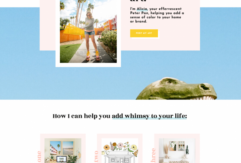
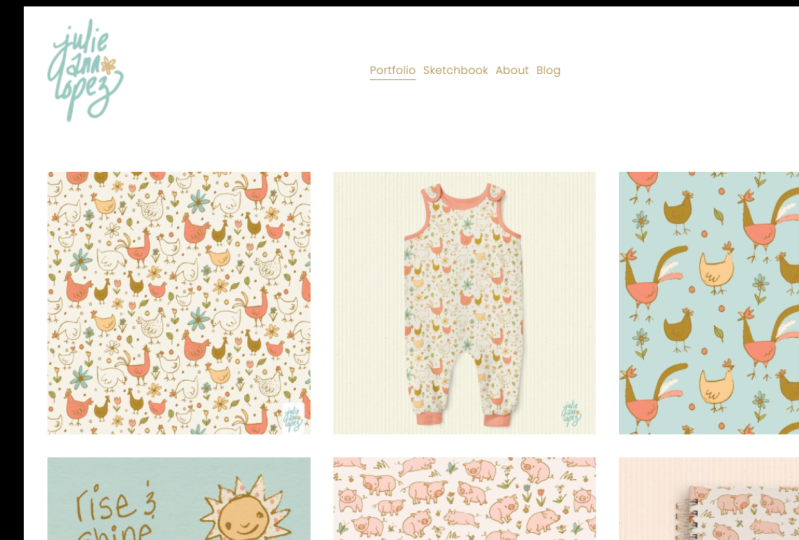
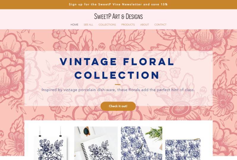
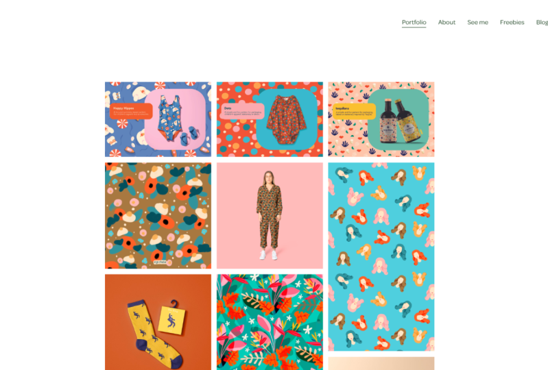
5. WEBSITE PORTFOLIO: Welcome to the next lesson where we will discuss why you need a website portfolio. So why do you need a website in the first place, especially if you're going in house and already taking a physical portfolio book. Well, a website really does help you look professional, especially in this day and age. It's really become expected of any artist, whether you are working in house or if you are a freelancer, or if you are trying to go the art licensing route. It's really just a homebase to house all of your designs. And it kind of just gives people a better understanding of your style and who you are as an artist. It makes you look like a more serious designer. And the best thing I think about having a website is that there are no distractions. So if you want someone to your Instagram, they could easily get suggested by Instagram to go look at another artist or they may be distracted by their news feed or they're stories like there's tons and tons of distractions on social media. But if you give someone your website, then they are not going to get distracted by anything else that you're going to be a 100% focused on you in your art. So some other websites I recommend are Squarespace number one, that's the, uh, website platform that I use. And some other ones that other designers like our include Wix, Weebly, and a WordPress. And now I'm going to show you a few examples of some really excellent website portfolios that I happen to really, really love and admire guy. So real quickly I wanted to show you some portfolio examples online as a website so that you can just kinda see how some people have done it extremely well. This is Elizabeth Olin and she is an amazing surface pattern designer and she works more in the licensing realm. However, if she was willing to work for a textiles company, I'm sure every company would jump at that opportunity. And as you can see, she's kind of mixed in some products shots with the flat patterns. So that is a really great way to kinda showcase or her designs on the home page. And then you can see here how she has all of her different little things. If you want to see about her, like if for you for getting a job, maybe you want to have your resume or your experience or anything like that. Some maybe reviews of people who have worked with you and that can kinda vouch for you. That would also be great. Here is another one by Shannon McNabb. She also kinda works in licensing more so, but as you can see here, it's very easy to kind of browse her website. You can click on patterns, illustration or hand lettering. So that is extremely clear and concise and everything is just really clean. You can also click on her portfolio here and you can get more specific down here if you want to only look at patterns, for example. Here is another example of I've broken Glaser and this is more of an illustrator. However, you can see these buttons here where she has divided out her different styles and categories. So you can just see how nicely this looks as well. There's good spacing between each thing. She had those cute little background going on. But these kinda overlap each other, sort of like the half draft layout that we mentioned in then, you know, for you, if you wanted to put a little blurb like this at the bottom, you could say get in touch or view resume or something like that. Okay, next, let's discuss social media and what role it plays with your portfolio website and just your online presence overall. So art directors also do look at Instagram and Pinterest. I've had several people contact me from Instagram and have actually gotten some licensing deals that way. So it's not something to totally ignore, although I don't believe personally that social media should ever, ever, ever replace your website. However, it is a great way to kind of point people to your website. So social media can really help you get found in it's a great way to also reach out to other designers and other art directors. I've met a lot of people online just based on social media interactions. If you have a decent or big following, this can also help art directors kinda see you as a really popular designer and it kind of gives that validity to your artwork, especially if you are going to art licensing route. Especially also if you have a lot of engagement on your social media. And you can point to that. Again, it's just sort of that social proof that gives our directors a lot of confidence to work with you. So let's discuss being an in-house designer. So if you're going to be an in-house designer than social media is not as important. It can always help, but art directors don't expect you to be some kind of famous artists on Instagram or something like that in order for you to be a good, decent designer and work in house. So if you're an in-house designer or you're applying for jobs as an in-house designer, you don't need a private gallery on your website. But you should add your CV or resume. Maybe leave off your phone number if you don't want to put your phone number out there, but have a way for our directors to be able to contact you if they are interested in hiring you time. It just kinda gives all the information in one place so that if they find you through your website first, they will be more likely to reach out and contact you for an interview. A website portfolio helps show your process. Even if you are looking to be an in-house designer, again, you don't need to do this for every design, but I do think it's a great idea if you're applying to be an in-house designer, to have a little blurb on your website. Just one little section where you can show your process from start to finish, how you kind of come up with your ideas and concepts and how you go through that process creatively to arrive at a creative solution. This is a great place to also add color palettes and show art directors how you think about color. Now again, I mentioned that it's a great thing to do to SHE also show this in your physical portfolio. But if they haven't invited you in for an interview yet, then this is another great place to kind of wow and art director. And, you know, you might get a higher chance of being invited in for an interview if they see this stuff up front when they're browsing your website. You can also add mockups or some product photos on your website. Again, this just takes away the guesswork for art directors. You know, you don't want to leave anything out to the imagination. They should be able to imagine your artwork on their products, but this is just going to help you in the long run. And my last tip for having a website portfolio is to include at least one video. Now video is becoming more and more popular online and people don't necessarily expect to see it from a, an artist portfolio at this point in time. However, that just gives you an extra boost. If you include like a hyper lapsed video of you, you actually painting or drawing or doing something on your iPad or whatever your process is. Showing it in video is just going to impress any art director. And they're gonna be like, Oh wow, I can really see how this designer works and how they, how they draw their drawing skills, how they apply color, just your entire process. They can literally see with their own eyes and a video. Okay, so number four, if you are going to freelance or licensing route, we have a few different suggestions for your website portfolio. So if you're going freelance or licensing, it might be a good idea to add a private gallery. Now I would say this is especially more important if you are going to be our licensing route. But depending on what type of freelance work you do, you may want to also consider this, which just means that your page on your website is password protected. And they will have to kinda sign up and ask you for that password in order to see the bulk of your portfolio. Now you probably do want to put a few examples on your main page so that they can get an idea of your style. But you know, you can kind of tease them or hint that, hey, I have way more than this. But, you know, to make sure that you're not someone's sketchy. If I have a private gallery and will provide a password for you. So you can invite buyers and art directors to also join your Art newsletter. Now again, if you're applying in house, this might not be really relevant to art directors because if they don't want to interview you than they probably have no interest in seeing your portfolio again. But if your freelancing or licensing, especially if you're doing licensing, then inviting buyers and our directors to your newsletter is a great way just to get new art in front of them as you continue to work. And I recommend sending out new collections, either quarterly or monthly depending on your industry. So you should also show collections of work if you are freelancing or licensing. This is also a great thing to do if you're applying and house, but it's not as important if you're applying in-house. Add mockups or product photos again to your website just to show art directors and buyers what they're what your artwork would actually look like on their products. Again, just remove that guesswork. Don't make them have to imagine it. Just show up. And if you have any showcase brand or if you have any brand collaborations or Awesome PR, This is a great place to also showcase that on your website. Again, it just kinda provides that social proof that other brands have worked with you and have been really happy and successful working with you. So that just really again gives confidence to the art directors and buyers.
6. ASSIGNMENT: As promised, here is a little section on where you can find the exact mockup that I used. You want to get this same Mockup, then I'll show you where you can find it on my website. If you go over to Resources and click on software, it will jump you down to all of the software that I use. And this fabric mock-ups is the one that I used in this demonstration if you'd like to buy the same one. And here are some other mock-ups that I really love. So be sure to check out those as well. And just to let you know, I do get an affiliate commission on any of these products that you buy from a my links on my website. So I really, really appreciate it if you buy through my links on it doesn't cost you anything extra and it helped support my small businesses. So thank you guys so much for watching. Alright, let's dive into your assignment for this class. So the first thing is to create a website portfolio. Decide if you want to use Squarespace, Wix, Weebly or WordPress or something else. And go ahead and create your website portfolio by uploading your portfolio pieces. From there, take screenshots of your website and add your website link into the project section of this class. And also create a physical portfolio if you plan on interviewing and house. Now it's not necessary if you're not interviewing in house and you decide to go more freelance or our licensing. However you're, if you're interviewing and house, then definitely create your physical portfolio as part of your assignment and take photos of it when you're done and upload those photos to the project section of this class. From there, be sure to share your work with us. I would so love for you to share your work in the design tribe of Facebook group. Be sure to apply to join and answer all three questions to get admitted. I do. Facebook lives within this design tribes, so we would love to have you as part of our private community. And be sure to leave a comment in the Facebook group or leave a review on this class and let me know what you thought of it. If there's anything that I left out, please let me know in the in your review and I'll definitely consider adding another lesson if do you feel like anything from this class is missing? Thank you so much. Be sure to follow me on Instagram at Lauren Leslie studio, and I will see you over on Instagram and in the Facebook group. Bye guys.
 Lauren Lesley, Textile Designer + Portrait Illustrator