Transcripts
1. Welcome to class: Hey everybody, My name
is Veronica Sala. I'm an illustrator, pattern designer and teacher
based in Berlin. And in this course, I wanted
to show you nine ways to create better patterns and to work on your pattern
design portfolio. We have all been
beginners creating the same very basic patterns and not knowing how to
monetize our portfolio. So chances are that you either want to improve
your passive income, for example, the income from your POD shops or any digital products
that you might have. Or you want to elevate your
patterns portfolio so that you can present
yourself better to potential clients and
companies and get those jobs. I'm here to show you my
favorite easy ways to refine your techniques and to build a strong foundation
for your career. This course is structured in such a way that some
of the tips and recommendations
that I'm giving are a little bit more
technical in nature. So they revolve, for example, around such topics
as composition and color choices and the
flow of your patterns. Whereas the rest of the recommendations and tips
have a little bit more to do with your mindset and your motivation and the purpose of you creating those patterns. This course is for pattern
designers of all levels. It doesn't matter if
you're a beginner or a more experienced
designer and you can take it regardless of the
software that you're using. Maybe you're creating an
affinity or procreate or Adobe, or maybe you're a
traditional artist. This course is suitable
for everybody. All I recommend is to have you a notebook and something
to write so that you can take notes and
you can write down some actionable goals
that you will be able to implement right away
after taking this course. Get a coffee or Tea. Get your notebook and
something to write, and let's get started.
2. Getting Started: Hey everybody. Welcome
to the course. I'm here to share
with you my tips and my recommendations on how
to improve your patterns, but also how to improve your
pattern design portfolio. So that you can
present yourself in the best possible way
to potential clients. And you can get new
collaborations and new projects. Because I think apart from
the joy of creating patterns, this is the goal, right? There are so many
ways in which you can take your pattern
design to the next level. And I'm really excited to share all my
recommendations with you here in this course so that you can implement
them right away. This course is not
just for beginners, it's actually for
people of all levels. It doesn't matter if you're just starting in pattern design or if you have some
prior experience. You don't really
need any extra tools or resources to take this class. It doesn't really matter
if you're designing in procreate or affinity designer or in Illustrator or Photoshop. In discourse, I'm
sharing with you my tips in four categories. The first one is composition, then we move on to color and color palettes.
Next is interest. And finally, the juicy
one is the portfolio. This is how I
structured the course. My piece of advice here would be to grab a sheet of paper. Maybe you have a notebook, Maybe you have a
digital notebook. I recommend for all
those four sections to take from each of those. Something like a
nugget of wisdom or a tip that you
liked next time you create a pattern To try to
implement this piece of advice right away in case you are completely
new to pattern design, I recommend my other
pattern design courses. I have a few classes
that are dedicated to those people who design in a software called
affinity designer or for those of you who are interested in transitioning from other software to
affinity designer. In each of those courses, I will be also giving some
tips on composition and colors and how to manage your pattern design
workflow in general. Your task will be to create a new pattern after
taking my course. So it's a very easy project
then I would like to ask you to create a class
project here on skill share. It would also be great
if you could tell us in the project section what you liked the most
from the course, which tips or which
recommendations were the most useful ones. Then there's also a bonus for those of you who are taking
this course in 2024. All of the projects that you
will upload till December 1, 2024 will participate in a
big Skillshare giveaway. Each of the projects
will have a chance to win one year of Skillshare
premium membership. Even if you already have an
annual membership running. This extra one year
will be counted to it, so to say, so that it will
get extended for free. All you got to do is
publish your project, namely create a pattern. It's very easy. Then
I would like to ask you to leave a review
here on Skillshare, to participate also
in this giveaway, and outside of the giveaway, so that I am able
to rank better in the search results on
the Skillshare website. Then the winner for
this year's giveaway will be announced on December 6, 2024 on St. Nicholas Day. If you're using affinity
designer in your pattern design, you could also share
your work with our Facebook affinity
support group. It's a safe space
where you can ask questions and you can also
share with us your patterns. And you can ask for a critique
after taking this course, because I will be
giving some advice on portfolio and what
to pay attention to. If you feel like you would
like to further work on your pattern design portfolio so that you can show it
to potential clients. You could consider joining our
portfolio club on Patrion, which I started at the
beginning of 2024. Okay. But now let's
get started with the first segment of our
course, the composition.
3. Composition: Repeat Type: Choosing the right repeat
type is quite essential, and it will really decide on
the final pattern outcome, whether it will
look good or not. This is usually the very
first thing that we decide on before we even
move to the color palette. You want your pattern to flow harmoniously, most of the time. You want to hide your
repeat if that is the case, and you would like to hide
the repeat very well. You will most frequently go
for the half drop repeat, or the brick repeat or
the diamond repeat. I know that many beginner
pattern designers, they feel a little
bit intimidated by those different repeat types. They always start with
the standard repeat or with the full drop repeat, but then they have the tendency to stick to it a
little bit too long. Now, the standard repeat type can look a little bit too basic. The repeat may be more
difficult to hide. However, it can really shine in those designs where it is
intended to show beautiful, repetitive geometry or
small ditsy blenders. Or when you want to go
for checkerboard designs. But I think if you have a more detailed pattern
or a hero pattern, I would rather
recommend that you go either for the half repeat or the brick repeat or
the diamond repeat. I think the diamond repeat and the diamond automated
template for affinity designer
is the one that I use the most like
90% of the cases. My personal all time favorite, like I said, is the
diamond repeat. I use it 90% of the time. This has been my
most requested and my most popular online course, Automated Diamond repeat
and affinity designer. To sum up, you really
want to be quite strategic about choosing
your repeat type. I admit choosing
which repeat type is right for this
particular project. For this particular pattern comes with a little
bit of experience. The more you draw, the more
of a feeling you have. Which repeat should fit
what you have in mind? Then on the other hand, you want to avoid using just the standard repeat type or the full drop repeat
type for too long. I think it's great for
complete beginners to learn the software to
warm up a little bit, but with time I would
rather recommend that you get more
proficient in using, I think the diamond repeat
is of course my favorite. But also I think most
of the designers opt in for the have
repeat most of the time. Okay, now we are
ready to move to the next block about the
composition balance.
4. Composition: Balance: My next step for composition and balance is to have a
good variety of shapes, forms, and sizes because
this will help you to achieve greater balance
in your pattern design. I also taught some tips and tricks on composition
and those types of advice about forms and
shapes in my previous courses, even the ones that do not even refer back to
pattern design. For example, there's quite a lot of tips that I'm giving in my botanical illustration in procrete course and in
magical Ts also in procreate. In this lesson, I
will try to summarize all my recommendations for you also from those
previous courses. For starters, make sure
that you're including a variety of sizes when building the
elements of your pattern. Let's take a look at
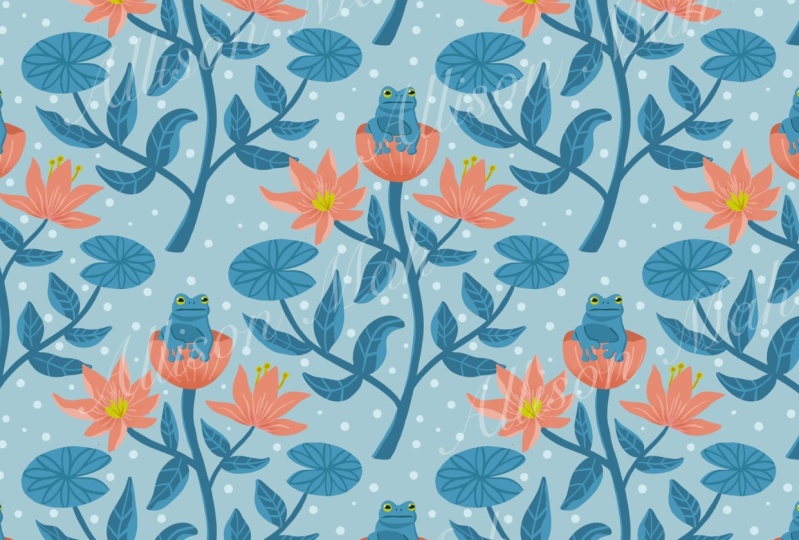
this more intricate and detailed floral Dits pattern from my most recent class about automated dis patterns for
a much better balance, I recommend that you draw some of the elements bigger
and some more detailed. And also some other elements
should be smaller so that they can act as nice fillers
for your pattern as well. The bigger and the more
detailed motives should be spread evenly across
your entire pattern. And they should also offer
some variety for the eye, so those will be usually
your hero motives. We will talk about
the hierarchy of your motives and one of
the next lessons to come, what I would
recommend here is to copy one of your heromotives, one of your bigger motives. And then as you make your copy, you can scale it down,
Maybe you can rotate it, change its direction, and
then you can use it as your big versus medium
sized element here. For example, I started with
the plant on the left, the one with yellow
and light peach, and then I made a copy of it. I think I changed the
light peach to orange. I made it smaller, I
changed the scale, and then I rotated
it so that I had a mirror reflection
of my hero plant. The same in this
pattern. This pattern is actually quite simple. That was the goal, so that
it's quite minimalistic. I took the very same flower you see on the right,
in the right circle, The one also with the,
I think it's one of my more favorite colors like rosy light, peachy orange tone. Then I made a copy out of it. And like I flipped the colors, the inside is white, the outside is orange. It's basically the same color, but it's just copied rotated. I changed the angle
a little bit and I used it also
throughout my pattern. The same in this pattern, this little tulip shape. I copied it. I made it smaller, I flipped it, rotated it. I think I played
a little bit with the nodes because
it's a vector tool, it has a little bit
more flexibility to play around with the shapes. Then I also included
it somewhere as a filler within this pattern. Next, I would recommend
that you include a variety of shapes you
can think Geometry, circles, ovals, triangles,
and also pointy shapes. Just as an example, have a look here on
those slides how those simple
geometric shapes can translate into interesting
botanical assets. Now let's take again one of
my patterns as an example. In this pattern, you
can observe that I included more round flowers, more oval, and a little
bit flatter flowers. I also included some
shapes that are more pointy and
triangular in form. As my filler, I had some horizontal lines
and some vertical lines. Also some smaller dots
and lines as my fillers. I think that this advice is especially more suitable
for hero patterns. Because naturally
if you're designing blender patterns or even less detailed
secondary patterns, I don't think they have
to have so much variety. I think they
actually, on purpose, limit the amount of motive. So you cannot probably possibly have all this variety of
shapes and sizes and forms. But this is really good
advice that served me very well when designing
my hero patterns. Maybe this will be the tip
that you will take out of this first section of the course to include a variety of shapes, forms, and sizes in
your next pattern. If you're going to do
that, you are good to go and your portfolio
will be also great.
5. Composition: Flow: In this lesson, we will
be talking about one of my most favorite aspects of pattern design,
namely the flow. This technique,
this little trick, was actually something
that really saved my portfolio because
there was a time that I caught myself producing
over and over and again the same patterns,
with the same shapes. It was usually for
D. And then when I was preparing my
online portfolio to send it off to clients, I looked at it and I was like, this all looks the same to me, there's very little variety. I started to think more
about how my pattern flows. I'll show you a few
examples in a minute. Now, if you have taken my other classes on pattern design, you know that I like to start creating my patterns
with a good sketch. But in this technique, I encourage you to start your sketch with a general
flow of your composition. Namely, by using arrows, like in this example here. Those arrows will just indicate
the initial direction of my motives and they will help me to spread them on
my pattern tile. The example that you
see on the slide, this is my automated
diamond repeat. You see in this green
color the diamond shape. Within that diamond, I
positioned a few arrows. It's going to be a
botanical pattern. With those arrows, I indicated more or less the
direction in which those flowers or stems and
leaves will be flowing. I make sure that at this stage, the entire canvas is very well filled with those
shapes and arrows, and that there are not too many empty spaces in between them. Then I sketch out
my main shapes. Here, again, I'm using
simplified shapes. I'm sure that you have seen
it in my other courses too. I'm using circles,
triangles, basic shapes. I like to spread them
out evenly again. And then to consider a
variety of forms and shapes. Just like we
discussed this aspect in the previous lesson, I also want to make
sure that they're not in the same line that you are forming those
very straight lines. Horizontal and vertical lines. You basically have to
make sure that you're not creating any strange grids. You might have already
noticed that this is the affinity designer interface I am working on my sketch
in the pixel persona, you can see in the upper left corner the
symbol or the icon for pixels. That's the pixel
persona where I can use raster based
brushes for my sketch. Then I decided, first of all, to change a little bit the
color of my background. Then I slowly start to fill in those basic shapes
that I started with. The circles, the triangles
with my flowers, with my clusters of flowers, my leaves and my stems. Of course, the sketch with those very basic
geometric colors was on a separate layer. I am of course, able to switch it off. Here you can see my rough sketch before I start
vectorizing my pattern. Okay, this is what the
final pattern looks like. The diamond repeat shape
is somehow visible, but not entirely
a diamond repeat. Again, referring to
the first lesson about choosing a repeat type. I think it's also beautiful
and very versatile repeat to choose if you're just too bored of half drop
repeat all the time. I've been using this
technique over and over again even before I dived deeper into pattern design before creating patterns and before
switching to affinity. I was a very passionate
user of procreate and I created two courses about botanical illustrations
in procreate. Both of those courses, botanical compositions and
Procreate and Magical mutts, They actually do
present this technique. It's so versatile
that you can also use it outside of pattern design. Next, I also have quite a
detailed article on my blog, on my website, about
using this approach for botanical
compositions in general. I also have dedicated Youtube playlists with
some free tutorials where I am showing you step by step how I draw a botanical composition
and procreate also using this technique where I
started out with planning out the flow of my composition and then working on
simplified shapes, that will turn into a more detailed illustration
in the end. But now let me show you a few more hands
on examples on how I map out flow of my patterns with those arrows
and simplified shapes. Here is one flow example that you can also find
in my Dits workbook. It's like an upward flow. We have the same flower type flowing together in
the upwards direction. Even though we don't
have a big variety of scale in here, for example. And it's still the same flower, it is drawn differently. I think it's the same
flower type that I've drawn three times. Sometimes it's also rotated. It's flipped so that I
have a mirror reflection, but all of them flow in
the upward direction. This pattern, for example, we have a central
round flower that is repeated in the way
throughout the pattern. Then we have some leaves that branch out of it in
the outward direction. In this way, they serve as a wonderful filler type
for our background. Now this pattern here
is quite interesting. I'm not sure if you are able to see exactly the flow
of this composition. I'm showing it to you
here on this next slide. It's a diagonal flow, you don't really
see it that often. It can really stand
out in your portfolio. In this case, all
the botanical forms flow into the upper
right corner. In this last example, I think this pattern has an even more interesting flow
shape, very unique. It's also moving upwards, just like in the first one, but it's a merger between this upward flow
and a diagonal in a way, it's flowing up and then gently towards left
and then up again. It's an upward
movement with a twist. If you're looking
for more inspiration on different types of
flow for your pattern, then I will include
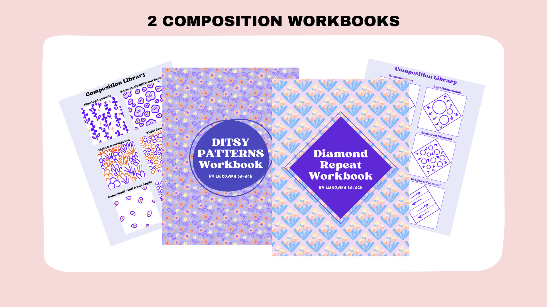
also in the resources, the previous workbooks from my automated Patterns classes. And then make sure
to download them and have a look at the
composition library. Maybe next time you can step out of your comfort
zone and you can consider a completely new flow
type for your new pattern. This lesson was
the last lesson in the first category that was about general composition
for your patterns. I'm really curious about which of the lessons
you like the most and which of the pieces of advice will you implement
in your next pattern. Now we are moving
to the next block, which is about color and color palettes
for your patterns.
6. Color: Your Palette: Now, choosing the right colors, the right color palette for your pattern can sometimes
really give you a headache. But usually it's one of the most important
things to decide on. It's very essential, well
considered color palette can certainly
elevate your design, but it can also destroy it. It can set the mood
of your pattern. It can make it more playful. It can make it more calm. It can also make it more
suitable for some markets. We will see a few examples
on the next slide. Let's start with tip number one. Reduce your colors to
maximum six colors whenever you produce or
create your pattern. What I keep seeing, especially
with beginner artists, is that they get lost
in too many colors on the color spectrum and
they feel a little bit chaotic and all over the place. Really, the tip
number one that I can give you
starting from today, I told you at the beginning in the getting started lesson, that you can take from each section one piece of
advice and you can choose, actually I should say that
this one is non negotiable, that this is something
that you should try out because it will really be
good for your portfolio, I believe, at least
to test it out, to create a next pattern with
a minimal color palette, it could be maximum six colors, but it could be even fewer. Reducing the number
of your colors will usually result in a
much cleaner outcome. It will make your pattern easy to understand
if it makes sense. Which will work really
well for pattern design, for branding and
packaging for example. Then working with fewer colors will encourage you
to shift your focus more to composition and the arrangement of
your pattern motives. Using fewer colors is
also what your potential client or might want because it could be
more cost effective, especially in print production. Working with limited colors is a good habit to develop
from the very beginning. Patterns with fewer
colors are often easier to reproduce
accurately in print, making sure that
the final product matches the original design
as close as possible. Tip number two,
often overlooked, identify the mood of
your color palette. Let me give you a few examples. Your colors could be
playful and vibrant. Such combinations are really excellent for the kids market or for a playful clothes
line for teenagers. Your colors could
also be vintage. They could evoke a
feeling of nostalgia. Think about, for instance, the colors of the
'60s or the '70s. They could be really
fantastic for home decor and for bold fabric. Your color palette could
also be mysterious and dark, with darker and
more moody tones, grays, purples and browns. It could be more fitting for some esoteric products
or for cosmetics, maybe for some products for men. Your color palette
could also be romantic. It can include a lot of pastel
colors with pinks, creams, and big super fitting
for obviously more romantic or let's say feminine products for
some romantic occasions. For packaging, wrapping paper, wallpaper, there's actually
so many applications that you can think of. You could also choose very
fresh colors with mint green, turquoise, vibrant
yellows and blues. Such fresh colors,
they give you a kick. I think they would
go very well with sports apparel and
some fitness products. Or again, considering
the mood of your colors, you may want to design something much softer and delicate
with pastel tones. This soft pastel
color palette is really great for baby
products and for the nursery. Now, when choosing
your color palette, there are also some resources outside of the digital
realm that can help you. For example, books. Maybe you have some
books that don't even have to do anything
with illustration. I remember back in the days, I had a lot of albums that were about bouquets and
flower arrangements. And you could just snap a photo from this
very artistic album, and then you could import it
to procreate or affinity, and use that as
your color palette. I wanted to show you one of my most favorite books for
research in color palettes. It's called Palette
Perfect by Loin. I hope I pronounce your
name correctly, Wager. I will include this title of this book in my references
in the class description. This book, I found it
on the German Amazon is Religious. A treasure
of color palettes. It's structured in a funny way, because it is actually
structured by the mood. This is what we were
discussing previously. In the table of contents, you will see that this book has some examples of
natural color palettes. Color palettes connected to some curiosity, dreamy, magical. There's also fresh fresh colors. Solitude. That's a nice mood. Solitude, romantic, mysterious, retro tranquility,
playful, delicate. It's much more than I
included on my slides. Trendy, nostalgia and lush. There's a whole bunch of even emotions that
colors can evoke. Some of them can be more
elegant and more sophisticated. When you get a project,
you will most probably get a creative brief
from your client. And they will describe and tell you the purpose
of the design, why they need a pattern
or a pattern collection. And they might
include some keywords that refer to the
mood of your colors. Such resources are
really super helpful. The last step that I wanted
to give you for this lesson is to look out for
signature color palettes. For example, I had a phase when my color palette was a little
bit more rustic and earthy. There was a lot
of dull pinks and purples and some pastel greens. It was a little bit Beijing
then my daughter was born. So it was a completely different
mood in my life, right? I rediscovered the
power of happy colors. It was quite a natural
process for me that my art started to be
more bold and vibrant. Gave me a lot of joy because
that was also the time of my life where I felt a lot of joy because I had my first baby. Even currently, when
you just have a look at my website portfolio
or on my Instagram, I have a few
favorite colors that I tend to use over
and over again. Like there's a special type of blue or teal or peachy orange that I like to use over
and over again in my art. Not just in pattern design, but also in my picture
book illustrations. To finish off this lesson, I wanted to show you
how other artists are using colors
in their patterns. I reached out to some of my favorite pattern
designers on Instagram. With their permission,
I wanted to show you their patterns, their art, and what they have
to say about using color and color
palettes in their work. Our first artist is Elena. I really love her color palette. In me personally, I instantly think about
the mood it evokes those feelings of calm
and warm, and very cozy. I think her patterns
look especially good on products for
children or for babies, and they would be super
fitting also in the nursery. I am sure that her patterns
can be really popular with those people
who like to saw themselves and they look really, really great on bald
fabric as well. This is what Elena says about
using color in her work. Finding your signature colors
can be a bit stressful. Just give yourself
time to experiment. My color choices
vary with seasons, and that's okay if
it's intentional. Typically, my patterns
include bright spot colors, warm neutrals, and
something cute. Here, you already
noticed that she herself is aware that she does have some colors that she
really likes coming back to, maybe they became her
signature colors. Even then, she continues to say, it's helpful to begin by noting the colors
you don't like. For me, I avoid greens, yellows, violets, and pinks. Here's advice from my
color theory teacher. Check your outfit to discover
your color preference. I have lots of blues
and warm neutrals, which I often use
in my illustrations and patterns after some
color experiments. I have also summarized the tips that Elena
wants to give us. First of all, give yourself
time to experiment. Like I said, sometimes you really just have to
produce one pattern after another to gain more experience then intentionally choose colors depending on the seasons. I also noticed that whenever
there's the fall season, I adapt to what I see
on Instagram as well. And I start to reach out for more seasonal color palettes with browns and with oranges. Here one of my favorite tips, check your outfits to discover
your color preferences. Another great
artist is Mary Lou, and I also wanted to
present her in this lesson. I really adore her designs. They're super sweet
and cute and I need to find out where I can buy
them for my own daughter. She was also very kind to gift
me some time and to share. Some of her tips on
using color in her work. This is what she's saying. Working with color is a
big part of my practice. I spend a lot of time building
up good color harmonies. I like to work with
as large a palette as possible while maintaining a balance and
comforting composition. Here you'll notice that
she's also saying, again, I spend a lot of time. This is something that you cannot probably
develop overnight. It just comes with time. And with your
experience drawing and making one pattern
after another, I often work on the
palettes first, then adjust the colors according to the
shapes in each image. I have many favorite
colors such as yellow, green, blue, and pink. Again, she's very aware of which of the colors
are her favorites. And I bet she has some ready made color palettes saved up and ready to go every time she designed
something new. Here's a summary of her tips. Start your project with a color palette
that inspires you. Then take some time to build your palettes.
And do not rush it. Identify your recurring
favorite colors, which as we know,
might with time, become your signature colors. Next we have Carly, who is again featured
in my chorus. Because I can't stop
looking at her designs. They're so beautiful
and full of joy. You see, automatically, I didn't even plan it. It's not scripted. I said that her patterns, they evoke in me a sense of joy because they're so
bold and happy. I instantly think
about the mood. This is what she shared
with me when I asked her about using color
and color palettes in her work. I love color. Yeah, for me it's the most
important part of my work. I have been collecting
color palettes or even just images with pleasant color
combinations over on pin trust for many years now. I have a big library to
draw inspiration from. I like to use dreamy
palettes of pinks, blues and purples in
lots of vibrant hues. And I will stick to the same
palette for quite some time so that my work has
a cohesive look. Recently, I have
been inspired by the palettes of Georgia O'keefe. Her colors are so magical. Now here is the summary of tips and recommendations
from Carly. Collect color palettes
and store them, for example, on Pinterest. I'm also a fan of
Pinterest, by the way, and I have so many
art boards by now, and then I use it quite
actively whenever working on a new pattern
or a new illustration. Stick to one color palette
for a period of time so that you create a body of
work that looks cohesive. Finally, seek
inspiration looking at famous artists
from art history. I really love this
last piece of advice. Next we have Meghan
who has drawn my attention to her artwork
through her use of color. Precisely. I found her on Instagram and she
is, in my opinion, extremely good at
showcasing her artwork, And I really love her
color combinations. So I asked her to
participate and to share her pieces of advice on using color and color
palettes in her work. So this is what she's saying. The first thing I
do when starting a new pattern or illustration is choose the color palette. I love to use limited palettes. Usually three to six colors
plus black and white. That pushes me to find creative
ways to use the colors, while also giving me a
guideline from the start, I end up working faster. And the end result
is more interesting. Here's a summary of her recommendations
for the use of color. Her first piece of advice is, start by choosing your colors at the beginning
of your project. I really have to
agree with that, that sometimes I am inspired
to create a pattern when I first see a very beautiful color palette,
not the other way round. Then very importantly, use a limited color palette of
max three to six colors. I really couldn't agree more. Thank you so much to all those talented
pattern designers for participating and for sharing your experience. And your tips. Here are their Instagram
handles so that you can visit their accounts and
give them a follow or just admire their
beautiful artworks. How does that look in practice? And how did it look
for me when I was choosing my signature
color palettes? You will start to
notice as you create one pattern after another that you keep coming back
to some colors. You can also take notes. Maybe you have some
artistic journal where you take notes
about your inspirations. Maybe you have a
sketch book where you can draw with paints or
with colored pencils, but you can also cut out some beautiful color
combinations from magazines and keep them in this notebook for safe keeping. So to say, you start
to identify at least this one and then second color that you keep using
over and over again, they just become part of your repertoire
on a daily basis. Next you go further. You include those
colors not only in your creative process but also
in your branding process. Maybe you include those
colors in brand logo. Perhaps you also take them into consideration when building
your portfolio website. I always have my brand colors saved up in the software
that I'm using. I have them both in
procreate for sketching, and also an affinity designer. I have this one color palette that I just called branding. It actually did change
like I used to have a more bluish brand identity last year and now it's getting
a little bit more peachy. Again, when you develop your signature brand
color palette, it doesn't mean that
it's set in stone. It can actually also evolve
with you as an artist. And you can, of course,
keep changing it. Think about one of
the other aspects that I mentioned when
talking about color. Think about the mood.
My signature colors are very happy and very vibrant. It might have something
to do with my origin. I originally come from Poland, where the reality is
a little bit gray. It's not Spain, it's not Mexico, it's not sunny all the time I lived in those
post communist blocks, it was a lot of gray
and a lot of brown. I think naturally now I want a little bit
more color like, even if the environment is
gray and a little bit black, I want more color in life. And this is also part of my artist statement that I can also include
on my website that I want to bring more
color and happiness onto the client's products to spread a little
bit more happiness and a bit more optimism. Your signature colors,
your favorite colors, they can become your
signature colors. They can evoke a certain mood that is also part of who you are as an artist and it's
part of your brand identity. What about you take a
sheet of paper or take your journal and write a few thoughts after
watching this lesson, do you know what you like? Do you know the mood of your patterns or your
illustrations in general? Take a few notes.
Just write them on a sheet of paper to gain a
little bit more clarity. I hope that this
lesson was helpful.
7. Color: Contrast: Color contrast is important, not only for pattern designers, it's important for illustrators, for designers, it goes
beyond pattern design. But I needed to include a lesson about it because I
have a few tricks that I wanted to show you. It's really essential to have good contrast also
in pattern design, because it makes your
pattern more readable, it can grab the
viewer's attention, it's more visually appealing. In the end, let's have a look
at the following example. The circle on the left does
stand out much better, whereas the circle on the
right really does hurt our eyes in a way and
it gets a bit lost. That's because the first
circle has a better contrast with the background color
and the other one doesn't. While the software
color might look better for more secondary
details on your patterns, such as more gentle fillers
on the background layer, maybe it won't be the best
color for our hero motives. Color contrast helps
pattern designers establish focal points
within their compositions. By using colors with
differing intensities, you can guide the viewer's gaze. You can create an emphasis on specific motives or details. For example, in this pattern, I wanted both the
background as well as the leaves and stems of the flowers to be
really secondary. You can see it very well on
the leaves and the stems that they share the color
with the background. I basically took the color of the background and
I made it brighter. And that was the
color that I chose for the stems and
for the leaves. Then I used the same technique
on the second pattern, where I chose this peachy orange so that the hero flowers stand out more compared with
the other elements. My advice would be for
you to play around with patterns that have more
contrasting colors. You can have a look at the
color wheel and experiment. I think for starters, with
complimentary colors, for example, red versus green, or yellow versus blue, or one of my most
favorite color contrasts, purple and orange. When I say contrast, I just don't mean
specific color choices. I also mean that my artwork
is really readable. If we were to turn
it into gray scale, just grace blacks and whites. Let's have a look
at one affinity designer example and later on at procreate in case you're
using affinity designer. This is super,
super easy because you don't need to create
any dedicated layer. The program, the software
gives you that option to check your designs in gray scale within I
think two clicks. All you got to do is you have to go to the Navigator menu, which you can find in
the lower right corner. Then next to the sub menu that says Main View Mode vector, there is a small icon as if with three circles together
for color modes. And when you click on it, your design will change
automatically to gray scale. In this smaller navigator window in the upper right corner, you will still see the preview of your real colors
of the design. You can toggle this gray
scale effect on and off as you go simultaneously
to the color studio. And then you can simultaneously
change colors there. And observe in real
time how this color adapts in terms of contrast
for procreate users. This step will involve
an extra layer, which you have to be mindful
of if you run out of layers. But you can always export
your pattern and test this out in the new
document where you have more layers
at your disposal. So you need to add
in an extra layer by hitting the plus symbol. And then you have to fill this
layer with a midtone gray. I like to find this midtone
gray from the color menu, from the classic view. This is where I
position my selection. It's more or less in
the middle left corner. And then I drop this gray
onto the entire canvas. And then I go to the
bland mold options. And I scroll down through the drop down menu
and I find color, and this is what I select. You will see that
in pattern design, color contrast is essential in creating the
illusion of depth. This depth in turn, can help your pattern look more. Dynamic contrast between colors enhances the readability and
clarity of your pattern. At the very least, after
watching this lesson, I highly recommend that you start doing the
gray scale test. For me personally, this has
been the most useful tool, especially since I started using affinity and I discovered
this little option. I think it came
actually with one of the more recent updates of 2023. I was really delighted. I swear I use it
100% of the time, both for my parents
as well as for my picture book illustration. It has really helped
me tremendously. Now with this last useful tip from the color section
of the course, we are moving in the next
lesson to the interest section.
8. Interest: Motifs & Themes: Beginner Pattern designers often stick to the same themes
or the same motives. For example, they
have a tendency to draw pretty much the same
thing over and over again. Of course, it's also
important to know who you are if you specialize,
if you have a specialty. If you specialize, and
that's how you show yourself as a botanical
pattern designer, then of course, it's
part of your brand, it's part of your strategy. But chances are that you
want to be more versatile, you don't have such a
closed specialization. Chances are that you really want to expand and get as many, for example, licensing
deals as possible, or as many sales
in your POD shops. Especially for the latter ones, it's quite important to
branch out and to start creating patterns with a
variety of motives and themes. Let's talk about the
themes of your patterns. It's very natural, like I said, to start out with
floral motives. But then the next natural step would be to try to branch out to more specific categories, even within the same category. For example, you start
by drawing flowers, then you branch out it
a little bit and you explore fruit and
vegetables, for example. Then once you have a few fruits or veggies in your portfolio, you might draw some
food patterns that would be great for the
kitchen or kitchen products. In this way, you are
expanding your reach. So to say, you will be able to apply to a bigger number
of potential clients. Next, you can, for example,
explore drawing animals, birds, mythical creatures, and then perhaps some
whimsical scenes. Of course, let's
not forget about a few festive patterns for the holidays like
Christmas or Easter, and patterns for
special occasions, which are really important
in pattern licensing. You would like to expand
beyond just keywords such as flower bloom,
floral, and botanical. You want a wider variety of keywords that then you
would be able to put into your pattern descriptions
in your POD shops that will help you to
increase your reach and your visibility in
their search engines. Here I have a few examples. Those are by my research, some of the best in demand
themes in pattern design, we have the beach
and nautical themes. Fish, think about crabs and whatever might fit onto
swimwear or beach wear. Next is birds and fish. Then you can explore the
wide realm of hobbies. Next, very important
occasions and holidays. Think Christmas, Easter,
Valentine's Day, and so on. Now, especially for spoonflower, a lot of makers, a lot of creators buy
their fabrics because they want to make something
for their kids or for a newborn baby. You might want to think about motives for baby boy
versus baby girl. Then another very
trendy category are patterns for pets
like dogs and cats, something the last
point that I wanted to included on that
list that was super, super trendy a few years ago, but I see it's still very popular out there are the
motives of the forest. This is also, it could
be a botanical theme. You can tackle some botanical
elements from the forest, but also forest animals. Okay, I hope that this
list will at least get you started and inspired to create patterns from
different themes. Now let's talk about
the hierarchy of your pattern motives In general, it is helpful to
differentiate between hero, secondary and filler
motives for your patterns. I talk about it even
more in depth in my automated half
drop pattern scores where we are drawing together
quite a detailed floral, ditsy pattern which
is constructed from those three
motive categories, hero elements, secondary
elements, and filler elements. This is the pattern that we have drawn in this class from A to Z. That's how I would
deconstruct it now so that you can see
those motive types better. Your hero motives are the
star of your pattern. They are usually the biggest and the most detailed elements. Here, I tried to circle a few of my hero flowers
in this pattern. Those have a little bit
more detail on them. I also scaled them in such
a way so that they are my biggest elements from the
pattern on this next slide. You see my secondary motives, you can probably notice that
my circles got smaller. I changed the scale of
those secondary elements. They are there to
support my theme. In this case, it's
a botanical ditz, of course, they need to
complement this theme further. They add more interest
into the pattern, but they don't overshadow
my hero motives. At the same time,
they already act as my middle sized fillers to fill up this
pattern with motives. Finally, the small fillers, in my case, these are the
tiny grasses and berries, some stars, or some
abstract shapes like wonky lines and oval shapes that could also imitate
stones on the ground. As a filler, you
could also be using some interesting texture in the background or some shadows. Speaking of the
trendy forest theme, here we have another example, a pattern of mine with a
few deer in the forest. On the next slide,
you will see that the deer are my hero motives, the trees and the bushes. I consider them here
secondary even though those smaller flowers and the mushrooms could also
be considered secondary. Then I have a whole
bunch of fillers. That would be my third category. I have here some tiny flowers and some abstract
shapes and lines. I think a pattern looks
much better if we do not leave out too
many empty spaces. If you don't have
an idea what to do, what to draw and how
to fill up this space, then just go wild with
abstract shapes and draw some circles or some lines or any other abstract
wonky shapes, and I think it will
do the job very well. Now going back to this pattern, again, this is my hero pattern. Therefore, I have the whole
hierarchy of motives present. Like I said, there's
the hero motive, secondary motives, and
there are my fillers. But you got to bear in mind that your secondary patterns
or your blender patterns, they don't necessarily need
all of those dimensions. On the contrary, you can take your secondary or
filler elements from your hero pattern and
you can turn them into a blender or a secondary pattern that will be part
of your collection. This is pretty much a
quick and dirty method of expanding the number of
patterns in your collection. On the next slide, you
will see that I used those tiny little
flowers that were acting as a filler
from my hero pattern. And I turned them into a
completely new pattern, which is more of a blender
or a secondary pattern. Since there are no
other motives present, this filler motive became the hero element
for this pattern. Actually, my final advice for this lesson is to get out
of your comfort zone. If you are guilty of creating
only floral motives, then I really warmly encourage you to branch out a little bit. You can go to such POD shops as Red Bubble or Spoonflower or even Society six and
you can check what's trendy right now and you can try to tackle those
different motives. Another piece of advice
that I can give you is not to go overboard
with your hero motives. I usually have maybe one or two, but not more, maybe three. Like if it's a botanical pattern like the one that you
saw at the beginning, then I think I had three
bigger hero flowers. But I rather do not go beyond because then you start adding
secondary motives and your fillers in your pattern
can get a little bit too busy and then you're
entering danger zone, then it might look a little bit messy even though as always it's a matter of your style and taste is sometimes
very subjective. If you feel that you created something that would work
for a given end product, then of course, by
all means you can also include it in
your portfolio. Now we finish this lesson. In the next video,
I will talk briefly about using assets
in pattern design.
9. Interest: Assets: I dedicate this lesson to all affinity designer
users because we will be discussing vector assets and your assets library
along this feature, being able to save your design elements as
assets was enough to convince me to switch my workflow from procreate all the way
to affinity designer. I have a whole class about
creating vector assets. And affinity designer, you may want to check
it out if you would like a deeper practice
on your assets library. For those of you who
have never heard of assets before, what are assets? Assets are design elements
which you can save to your device and then open and
use them in any document, you can reuse your assets. You can save both vector and raster elements as your assets.
It doesn't really matter. You can even save up
textures as your assets. For example, paper textures. You can import and
export assets, and that means you can even sell them later on as
digital products. Let's have a look at an example. This pattern is
created by reusing some of my old vector
assets entirely. The funny thing is I created those baked goods
assets for some of my children's picture
book illustrations and I decided to recycle them later
on quite spontaneously. On this slide, we can see the affinity designer interface, I'm using the ipad version. To the right side, you see
parts of my assets library. I have a whole category called Kitchen Cafe and I saved a lot
of items in this category. And among other things, all those baked goods, all the rolls and breads
and pretzels and baguettes. Once saved, you can just
drag them and drop them onto your document and they
are ready to be reused. You can rescale them or you can recolor them,
whatever you need. So that was the first
illustration where I used some of those
baguettes and breads. It was a simple flat
lay illustration with some Polish ceramics. You can see here a little bit
more of my assets Library. I also have like a category for treats with some
sandwiches and jams, and pies and doughnuts, cookies, and even ice cream. And here's one of my more recent illustrations
of a bakery shop where I could just
go wild and use all the breads and
all the baked goods that I previously created. You just inserted
them again into your document and you place it as you like
and you're ready to go. A few more examples
from my ipad interface. My secret garden collection. I think I created at least
six different patterns using just a variety, a mix of those assets. Here's another example, the same secret garden
collection of assets. The secondary
flowers that you see in the middle of
my assets library, where the hero
flowers that I used for this playful
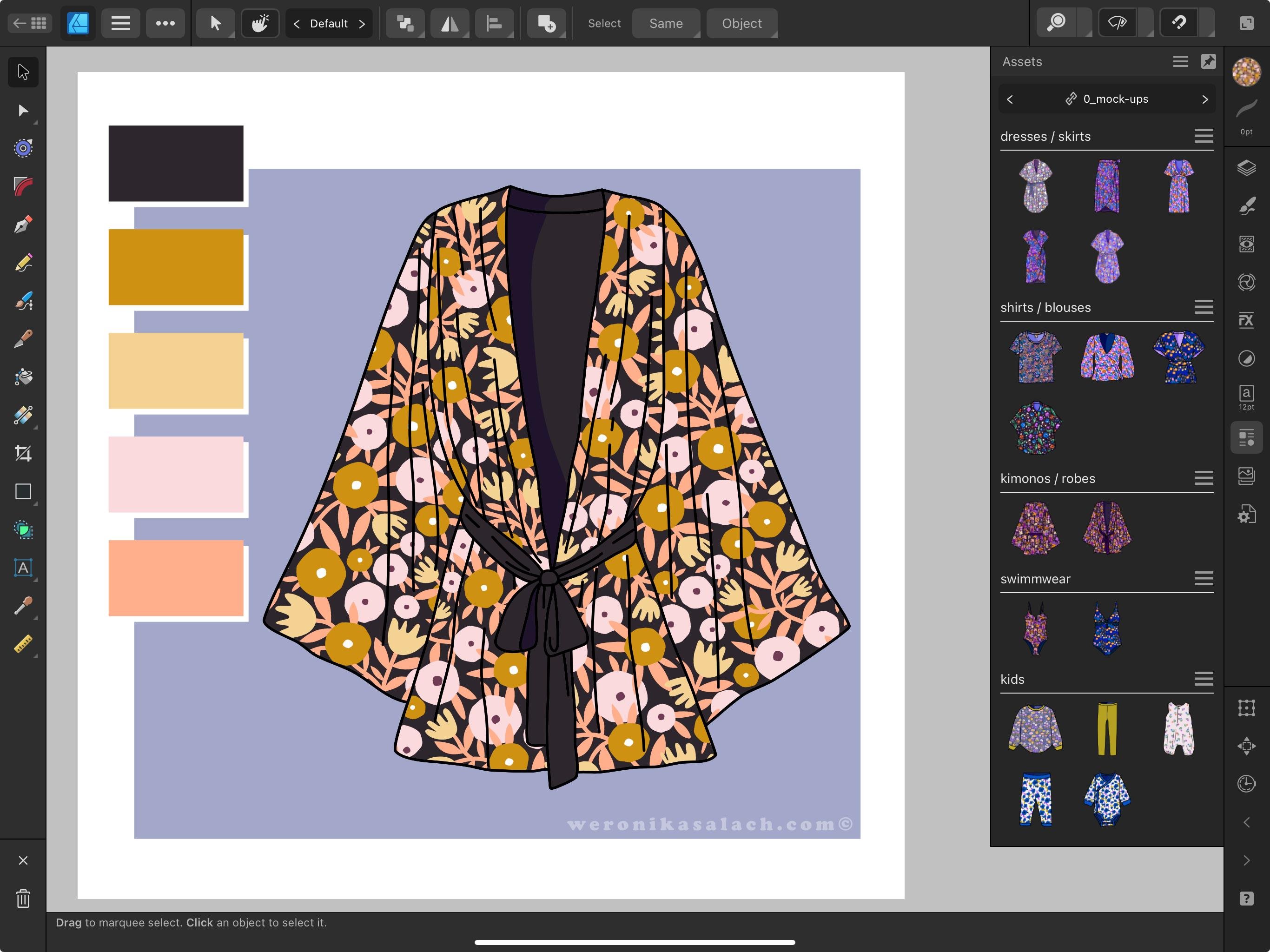
pattern for kids. I also like drawing my own hand drawn mock
ups clothes for women, for the types of clothes that I would
like to wear myself. And also for kids clothes. Then I can save them
up as assets as well. And then I just drag them, insert them into the document. I change the pattern that I
want to show on the mock up, and it takes me literally, probably 2 minutes or less. Having mock up saved
up in this way gives me a very quick opportunity to test out my patterns
after I created them. Here's another example
of a pretty blouse. And by the way, those
color swatches that you see to the left of my mock up, I also have them saved up, like I have a whole color
palettes category in my assets library that I also use for saving up color
palettes like that, I often mix up assets from
different categories. Like those houses are from
my older city category. And the parts of the
background you see here, the clouds and the birds are from my
environment category. I try to keep my categories
relatively tighty and I sort my assets by a topic or a theme because they can
really grow big over time. Keeping a rich library of assets can really give
you an advantage. I've noticed, for example, that compared with my colleagues
who draw and procreate, I tend to work a little
bit faster because I can reuse some of my
elements much, much faster. And also having a rich library, When you scroll
through your library looking for inspiration, it can actually spark
your creativity and get you creating right away and start working
on a new pattern. The process, in the end, for you is much
faster than before. I often have days where I don't have any
particular pattern idea, but I know that I would my portfolio would profit
from a given theme. Then I only sketch
elements of that theme. I bring it to affinity and I
only build my assets first. It doesn't have to be
the other way round. It doesn't have to be
like that, that you have a pattern in
your mind and you start drawing a pattern
right away in your template. Sometimes I just
draw assets even all day long because I
know I'm going to need it. Then the pattern
design process comes in a few days or
in a few months. If you would like
to start building your library of assets, I recommend that you start
with filler elements. Because usually hero motives, you should probably
draw them from scratch because you don't
want all of your patterns, of course, to look the same. It's not a quick
and dirty option to cheat your way to
make things faster. It's to make some
of the steps of your creative process just a little bit easier
and more efficient. And I found that the
best thing is to start with creating a lot of
nice filler elements. Because this is usually where
you get a little bit stuck. Like what to put into
your pattern and how to fill in the gaps that
you have in your pattern. You can have, for example, a
category for I like adding stars and little tiny
stars into my patterns. You can spend some time
building your lunar category. Some abstract fillers
like wonky shapes, circles, and wobbly
lines, for example. Or small floral
botanical elements that could be great
fillers for your patterns. I hope that this lesson
inspired you to look into this topic of developing an assets library in case you're an affinity
designer user. Now in the next lesson, we move on to the portfolio section of our course and we will
talk about your style.
10. Portfolio: Your Style: Now we are moving to the
last section of our course about tips and recommendations around your patent
design portfolio. And how to present yourself in the best possible way
to potential clients. My next tip for
you is to stick to one style for a longer time. Oftentimes, beginner
pattern designers try out new things and experiment
with new techniques, which is completely
normal at the beginning. I do recommend
sticking to one style, at least for a while
and exploring it fully. This will give you a
more consistent look and it will help you
build your brand. People may actually start to recognize your
style and this is, I think, a desirable thing. It might happen
that next time you post your new work to Instagram, and people see that even before seeing your name
written your account, they will know that it's you. And I believe that it's
actually a good thing. I also believe that
potential clients who have a look at your
website portfolio, they do look for
a certain unity. It will help you to build
higher quality patterns when working using a
familiar technique for a longer period of time. But also for your
website portfolio, you will be able to present yourself in a more cohesive way. Everything will be
tied more together. In this way, you will give
your potential clients a better idea of what you like creating and what they can expect to get from you
when they hire you. Sticking to only one style does not mean that you shouldn't be experimenting on the
side quite on the contrary, you should still explore
and you should have fun. At the same time
for your portfolio. When you start presenting yourself and you
only start pitching to potential clients and
sending out your work, I recommend that you build a more cohesive way
of presenting yourself. And you do that by showing a body of work that feels
that it belongs together. Think about it in this way. If you see ten thumbnails
with patterns on a website, in a website portfolio, you want to ask
yourself the question. Was this created by one person? Or is it like a medley of patterns created by
different people? You want to give this
impression that this is yours. You can actually even
make a test, take a test. Once your portfolio, your
website portfolio is done, you can ask someone who
has never seen it before, maybe from your
family or a friend, if they think that it's just one person that
created those patterns. I think that's a nice test. One more recommendation
that I could give you for structuring
your portfolio with regard to your style is that you might categorize
it on your website. For example, if this is you, that you're an artist who creates flatter vector patterns, but you also love
experimenting and creating with watercolor
brushes and procreate. Then you could consider
for your website to have those two
categories separately, something like flat
style patterns or vector patterns on a
dedicated landing page. And then separately
watercolor patterns, which also could have
like a different audience and might be more appropriate
for different end products. Now we move on to my favorite
lesson from this section. We will be talking about the
essence of your portfolio.
11. Portfolio: The Essence: In this lesson, we will
talk about the essence of your pattern work
I truly believe, and this is probably
the number one advice that I would give to
pattern designers. I believe that those
pattern designers that are most successful
ones are the ones that are designing with
the end product in mind. They just don't draw for
the sake of drawing, they are able to imagine what this pattern will look
like on product A, B, or C or X. The easiest way to check
whether your pattern has sense, meaning whether it
will be applicable, is to test it out on a mock up. For instance, for me personally, my dream target market is
bold fabric and apparel, in particular, clothes
for women and for kids. Once I started testing out my pattern immediately
right after creating it, it was a really big
game changer for me, especially for clothes mock ups. It was sometimes very funny because I created a pattern
that I really liked. And then I placed it to test
it out on a blouse mock up. And then I was completely
put off and blind. I thought, okay,
this is not working. I have to do something with
the colors or with the scale. I have to make it
work for the product. It doesn't really
matter that you create the most beautiful
pattern design that stays somewhere on your
laptop or on your ipad. You should design for
the real world and for the real products
that are waiting out there to have your
patterns on them. Oftentimes, my pattern just
needs a very small change. For example, I saw on my mock up that the
pattern would look more flattering with
a darker background. And that was the only change that it took to make
it look better. But again, I always have
my target market in mind. I have my end product in mind. I designed my pattern, and then I always test
it out on a mock up. Now, a few words
of encouragement. I know that it seems that the pattern design market
is very saturated. But the key to be successful
in this industry is to keep creating and
to keep it fresh, To keep your
portfolio up to date, and to produce a lot of patterns so that you can
show them to your clients. If you apply my advice
and my tips from the previous lessons about
colors and contrast, trying out different
motives every now and then, like drawing bikes instead of flowers today or cars for
a baby boy bolt fabric. You will do just that. You will always have your end
product in mind. You will be more focused
and more successful in the end because you will design with a purpose
in your mind. Check out those popular
markets for patent design. We have, of course, Bolt
fabric and apparel. We have home decor textiles, wallpaper designs,
stationery and paper goods, phone cases and
tech accessories, gift wrap and packaging, kids apparel and products, swimwear and beach wear designs. Pet accessories, very fun
kitchenware and tableware. Packaging for food products, we have greeting cards that can also have patterns on them. Interior design and
upholstery and baby products. Select a few focus markets
for yourself for this year. For each of those focus points, find at least five
potential companies where you could
pitch your designs. Let's say you're interested
in pet accessories. Find at least five
companies that you like. Maybe you'll find
them on social media. Maybe you do a quick
Google search. Start the database or write
them down in your notebook. And set up goals for yourself. For example, set up a goal that all those five companies
that you researched, you will find your
contact persons for those companies and you
will write them in e mail. You were pitched to
them. This last advice about having a sense of
purpose when you're designing, thinking about your market, having your favorite companies
that you have researched, and having this end
product in mind. I left it as the last, most important lesson from all the sections that you
could watch in this course. Because for me, it's
like this cherry, cherry on the cake,
on top of the cake. For me, this is
really the essence. This is the most important
advice that I can give you. You can even extend
it to your learning. Because right now what
you're doing when you're watching this course is
you're learning something. Every time you finish a course on skillshare,
gumroad, Tame. Think about, okay, so what, but how can I apply it to my
portfolio and to my career? How will this help me to
develop my portfolio? What I have to show and to
offer to potential clients? And always take some
actionable steps. Either something
for your POD shops if it's more of a passive
income that you're trying to build or actively search for the companies that
you could apply to. Do not let your
patterns to just stay on your ipad or somewhere
on your storage. I don't want that for you. I
don't want that for myself. I want you to create a sense that you can make
a career out of it and you can start creating
income out of it as well. Create with a sense of purpose.
12. Final Thoughts +2024 Giveaway: Thank you so much for watching
this course till the end. I hope that by the
end of this class, you have taken a lot of notes. And you have also written
down some action points for each of the sections that I presented in this course.
Remember what we had. We had some tips
about composition, about color, interest, and then about your
portfolio. My favorite one. Ideally, for each
of those sections, you have at least
one actionable step that you can
implement right away. I would like to warmly
invite you again to join our patron portfolio
club where I can support you further in developing
your digital portfolio. The project for
discourse is very easy, just create a pattern or
even a pattern collection, Take a screenshot and then publish it as a project.
Here on skill share. Of course, within the project
I would be very happy to read your sites what you liked about the course
and which of the tips and recommendations you think were the most important
ones for you. All the projects from this
course will participate in a Skillshare giveaway
where you can win one year of Skillshare
premium for free. The deadline for uploading your project is
December 1, 2024. You have plenty of time, but don't forget about it. Thank you again for
taking my course and I'll see you next
time. Happy creating.
 Weronika Salach, Art with MAGIC