Transcripts
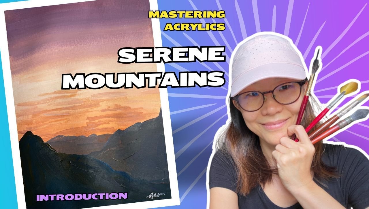
1. Introduction: Always wish to capture breathtaking beauty of
natures on your canvas. But if feel really overwhelmed by the
thought of starting, Are you a beginner artist
struggling to start? Not knowing where to
begin and how do you get all those beautiful landscapes
with acrylic paints. Are you a beginner artist
who sick or painting? No squares of color
teaching you shades. If so, then this course is for you, introducing
pastor paradise. Hi I'm Teacher Io. Bestor Paradise is a collection of seven paintings designed to empower artists like you to confidently embark on the
acc painting journey. This course is specially crafted for beginners who
want to explore the world of acylate painting with guaranteed results. Yes. I understand the
feeling of being a beginner and seeing all
those beautiful paintings. And I'm like, Wow, I
want to do that, too. But when I paint it, it
doesn't look like it. And when I Google
beginner paintings, what comes out may
just looks too simple, or not very pretty. So I know what
you're looking for. I understand your challenge. So as a beginner artist, I can understand we
face overwhelmed. Like, there's so many things, so many pretty pictures
that we want to paint, but we don't know
where to start. There's also a incredible
feeling of fear of failure. Like, what if it
doesn't turn out nice? At some painting, I'm
also feeling really, really nervous, that
this painting will fail. At some point, this painting
doesn't look right, and that really makes it very difficult for me
to continue painting. Also, as a beginner painter, we generally lack confidence. We doubt, you know, our own artistic ability, whether we can achieve what we see as our reference picture. So I know all your challenges, and this painting
series is for you. I picked these
paintings that are really easily digestible and achievable even for a beginners. I've broken down the steps
and painted it step by step so that you can
follow easily and achieve immediate results
with your paintings. Over the course of
these seven paintings, you will master
essential techniques, including brush
rokes, color bending, and color layering to achieve what is what we
commonly need in our paintings. You will also be using
a pastel color palette. I know some of us are
in love with pastels. I am two. You will discover how versatile and beautiful
pastel color palettes are. And you'll learn how to use them effectively in
your landscapes. Most importantly, you will
also gain confidence in your own artistic skills through practicing these
seven landscapes. Watch yourself progress
through the course and create beautiful landscapes. Join me on this exciting
artistic landscape adventure and unlock your
creative potential.
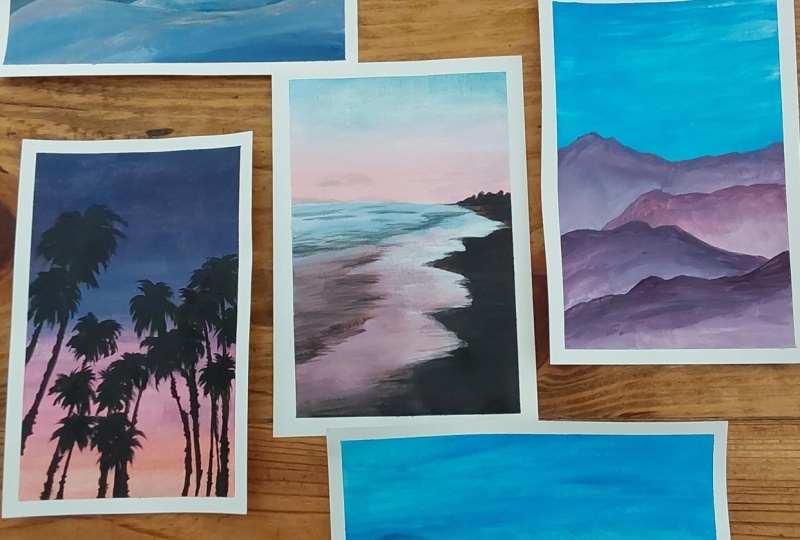
2. Painting Walkthrough: Hello, hello. So
let's take a look at the seven paintings that you'll
be doing this time round. They are all pastry landscapes and they are of
defying difficulty. So maybe let's take a
look at the first one. This is actually
pink sky is above. And it is a really
beautiful painting simply because it's got like
a pastory rainbow, right? We all love pestels. And yeah, anytime you
place a sky like this, if I see in real person, I think I'll be like in all. So why not paint it ourselves? Create the ideal
landscape on our own. So this piece is actually
fairly straightforward. We're going to
learn how to blend colors effortlessly and
you'll be doing that a lot. You notice that
planning is really an essential skills
and knowing how to do that helps you create a lot of landscapes and a
lot of paintings. Okay. So this is actually
for the background, and then we'll also learn
how to paint palms. You get to practice
your palm trees. I'll give you some tips, as well as how do we create the illusion of lights
in the palm tree. So you can see the palm tree
looks like it's back lit. So this look like me lying down. On a beach in, you know, seeing the sunsetting or something like that
it's really pretty. So I've included two palm sins, one from the bottom up and
one slightly in the horizon, and you can see the
color slight y slightly. So this one starts with a purple where syst starts with a blue. So you can, you know, choose to get creative with
the blends that you choose. You don't have to
follow mind exactly. The moment you add
white into your blands, I think it's going
to be beautiful. So over here, we're
also going to practice our paintbrush confidence
in painting inner lines, the palm stems as well, as well as the shape. Okay? So these two the first two that I'm
going to introduce. The next two is actually
mountain skips. Okay. So I have here
mystic mountains. And lunar pigs. Okay? You can see
that although this is also pastel
landscapes, right? They're pastel colors,
they are propol, but they're very
different purple. So what kind of purple
you're going to mix depend on what kind of colors you actually have
in your repertoire. So for me, my personal
preference is for something that is not so stark. So this one, I like the color. I like the propo for the
fact that it's a lot, okay? I'm not a fan of this
purple, to be honest, but some people, some of
you may really like this. If you belong to that camp, good for you, okay? This purple can only be mixed if you have the
right paints with you. So when it comes
to mixing color, it really depends on the kind of pigment and the
paints that we have. So it's a good idea for
you to really get to know your paints
that you have, okay? So each time you can buy
different kinds of red, like I have let's see, these two rates are different. You see? These two
d. This is zarine, and this is cadmium. And lizarin looks more like
a pink, purplish tone. Cadmium looks more
like a orange. And when you mix them with blue, With cadmium,
you're going to get something that is a
little bit more brownish. With Alizarin, you're
going to get something that's a bit cooler,
more populish. So although they both belong
to the group of rats, you're not going to
get the same results. Okay. So bear in mind, if you happen to be mixing, sometimes you may get
different results from me, and that's only because your
pigments are different. If you happen to have a
ready made tube of propo, then you probably won't
get all these variants. So It's a good exercise to find out what you like
and what your paints can do. Okay. So these are
all landscapes again, blended background,
and then small blends, learning how to
blend how to layer. One of the wonderful magic about equate paint
is the can layer. So how do you create
that with just layers? So this is another one. And then the next one is actually horizons.
I have these two. I'm in love with both
of them, to be honest. Although I said I didn't
like stark paints, but this is one of
the rare exception. I really love the the rawness of the sun blue and the pink. Okay? This is processed magenta. So these are colors that
you cannot mix on your own. You really, really,
really just have to get the right paint color
to get this result. So if your blue is different, your pink is different, that's
likely because, you know, your pin tube is
made differently. It's no one's fault. You just have to find out which paint tube will give
you the colors that you want. Right. So I love this. I
also love this. This is not so
straightforward. Okay. The colors are a little bit
more miuted and more gentle. I like this as well. Very quiet quiet scene. So these are the two
that you can do and the last one is actually
called whisper of the show. So for this piece of work, I particularly like it
for how quiet it is. I can really imagine
myself walking along the beach in this quiet
quiet morning, okay. And seeing the
reflections on the water the gentle wave washing
against the shaw. It's just so peaceful. So with this. So with this piece of artwork, you'll find that this is the more challenging pieces out of the seven that you'll be attempting because
of the layering that's needed to be done on the waters and the
rendering of the waves. Okay. So I will show
you how we get there. And color wise, it
is a lot more muted. If you want to try something
like that, you could too. There's no hard and fast rule. You don't have to use
exactly what I use, but I really like it because it's really muted and
soft in this case. Okay. So yeah, we
have quiet scenes. We have very quiet
contemplative scenes. We also have hopeful scenes and scenes that are
starting to brighten up. So this is the whole collection that you'll be creating with me. I hope you like it.
3. Materials: Hello. Welcome to the
materials module. Very quickly, I'm going to just go through what I use for mine. So in the demos, I actually painted on paper
for this pastel landscape. I've not used any canvas
board or stretch canvas. If there is something that
you like, you can, okay? If you want to use paper, The main criteria is
that it is thick enough. So this is one of the
brand that I'm using. Honestly, the brand
doesn't really matter. It doesn't even need
to say acrylic pad. It's just that with
a acrylic pad, you get the texture
of the canvas paper. I mean, the stretch
canvas, you know, the canvas cloth, but that's
really not necessary. Over here, in my demos, I actually use two
kinds of paper. The smaller pieces like this, they have the texture. So you can see this is the
texture of the canvas paper. But at the same time, I also use normal paper. You
see this is smooth. So if I were to compare
this is the smooth type, and this is the rough type
with the canvas texture. Both are pretty thick. So it's like at least 300 GS M. Unlike normal paper, let's say I have a
normal piece of paper, you can hear the sound, right? So this is very flimsy. It's not suitable
for acrylic paints. For acylate paints,
you definitely need tick pieces of paper. And I use A four size
or slightly smaller. The size is entirely up to you. Okay? So that's paper. For acd paints, I generally
use student grades. So these are the student grade And I also have some
like artist quality, which is much thicker, a lot more pigmented,
usually says heavy duty. So I mix them around because since I have
them my repertoire. But you can achieve
everything that I do using just the student grade, and some of the paintings are done just using
student grades, okay? So don't worry
about the brand or the type of accurate
paints that you get over time as you start
painting more and more, you will be able to make more informed decisions
about what you want to buy. Okay. So these are what I have. And this is like 75 ML. This is like 500, I think. I think it is close to 500
L. So this is really huge. I use them for group classes. That's why I buy big
ones, but for you guys, you'll probably be using
something like this in tubes. Then the next thing you need is actually a
water container. I have these three
compartment ones. I like them because
it allows me to wash my day brush in one and then wash it again just to
make sure it's very clean, and if I need new water, I
have the third compartment. If you don't have
something like that, you need at least
two compartment. That will be more ideal. Next, I have brushes. Okay. You need brushes. So brushes, I recommend
synthetic ones like this. I usually just get three
sizes for my students. I ask them to get who
this is sticking out. Okay. You don't want your
brush to be sticking out. I might pluck it out later. Make sure you keep your
brushes properly and don't let them get out of shape. Okay. So I usually get like
a big medium and small. So over here, you can
see I've got, like, a two sizes, one big
and one small. Okay. If you can afford it, you might want something
even bigger. I do have one
that's even bigger, but because I'm painting
in a pretty small size, so sometimes I just get
the smaller brushes out. Okay. So same thing. This is called rounds.
This is called flat. So for the rounds, I also
have one size bigger. So roughly this are what I have. Sometimes I also
use this. No often. These are usually
used for texture. These are the rougher brushes. Then next is the palette. So this is actually a
disposable palette. Once I finish using them, I actually tear them off. The texture. The
texture of this is really like wax paper
like our baking paper. So technically, if
you don't have this, you can also do it on a
piece of baking paper. As long as the surface doesn't absorb the water,
you can use it. The only thing is,
this is you know, like, commercially made, they actually glued up the
side, so it doesn't move. It's very solid. If you just use a piece of packing paper, it may fly, okay? So that you might
want to tape it down. Or you can just use disposable
plate or ceramic plate. Anything that's non porous
will work well, okay? So yeah. That's pretty much it. And one last thing that I use is actually this masking tape. I use it to take
down my my artwork. That's why it has
a frame around it. This is also to
ensure it doesn't move because when
it takes up water, sometimes the paper tend
to bulge a little bit. So I don't want that. What I do is I tape it
down to my table surface. Yep. Last thing. C, you need a cloth to dry your brushes
when you wash them. What I do is I also place
a piece of, you know, tissue on top, so I
dry it on the tissue, and then I replace it. Yeah. That way, I can use
my cloth for a longer time, but it's entirely up to you, just something to dry
your brush with. Yep. And that's it for materials.
4. Lunar Peaks: First, let's get the blended
background on the back, and you can see this is a really beautiful
color beautiful pink. But it's not exactly
a very clean pink. So what I've done here is I've gotten a complimentary
color of red, which is green, and I'm just going to get a tiny bit of it. Yeah. I want to
desaturate my pink. So that's why I'm adding a little bit of the
green into the pink. Fairly light, Soitinguishable. Quite a beautiful color, and I'm just going
to make a guess where the wtains are
going to be later, maybe somewhere around here
and start up a little bit lower than the mountains. The mountains will
go over later. Then I'm going to then I'm going to slowly
pump up the color. By too fast. Oops. Pump it up a bit more up here. So you can see the green
makes the red a little bit g So there's a intersection
here, that's not working out. And makes a little bit
of the lighter tone. Bring it to blend it out. So you can see that when we are mixing three colors together, it can be a bit challenging
to get the exact ratio. Great. Once I'm done with that, I'm going to wash my brush, and I'll go ahead
to dry the artwork. So I'm going to go
ahead to I'll put in the moon with the moon in place, then I can go on
with the mountains because the moon is
actually behind. All the mountains,
right. So we'll go too much water in my brush. If you need, you can use
a cap or something to, you know, sketch out the
moon first to get it round. I get the a bit and I'm going to go
ahead and dry it. So you can see that there are still some streaks and I
can see what's behind. In terms of the
strokes of the brush, so I'm just going to
go over a second time. I can remove some of the brush
strokes that I'm seeing. All right. Now let's
get to the mountains, and you can see
that the mountain is actually not a single tone. The top of the
mountain is usually a little bit, and then it. Okay. So yeah, going to do different tones again. So I'll just do a. Maybe too, we can
probably go a b. Maybe even lighter. Because we are contrasting
with the color behind, which is this area of the sky. So it doesn't have to be so. And a little bit of white, go a little bit of
white. To soften it. Okay. Let's go on
with the ones behind. The mountain here. This one literally merges and, you know, disappear into
the background. Grey light. And then we have another
mountain going up. Another going up as well. Okay. So it's about playing with the intensity of the color. Okay. If you find your
colors or paint to be blending, between the layers. Slowly getting lighter up here. This is a much
lighter hold up here. I's going to go with it. This mountain over here, because I made the
moon quite thick. So it's kind of s the moon is showing so so
I'm want to go over w. Too much. Oh All right. Now I'm going to go
with the darker tone and I'm going to change
to a bigger brush. Is going to be much darker. I want to make sure
that in my mix I have more red than green. I still a tiny bit of white. That's more green. Yeah. Hey, this could be interesting. Notice that the red becomes a
lot richer and you actually get a lot more colors variety and choice when you just
mix in the complimentary. Then there's another of
a small mountain here. Maybe another small one
up there. Got that. Now I'm going to move on
to the darker mountain. So at some point, you'll notice that just the red
and the dark green, there's a limit to
how dark you can get. That's when you need, you know, other colors to
really bring it der. So that's when I'm
adding the black. A little bit of the
Black and green. Remember to always add
your black very slowly. Next layer, maybe more black. Okay, here, the distinction
is a bit hard to see, so I'm going to do is,
I'm going to dry it. If not, if I cannot see it, what I'm going to
do, I'm just going to lighten this area. Yeah. Okay. So you can see
once I lighten it, it's easier for the
foreground to appear. Now let's get the foreground. Yeah. I think this is good. Signature. Try the work. So you can see
that with this landscape, it's about getting off red color so that
it's a lot richer. And basically, when we
want to separate things, it's always about which one
is lighter, which one is. Let's review the artwork. And we're done.
5. Pink Skies Ahead: Welcome to today's class. Today, we're going
to be using white, a little bit of orange and pink. Depending on what kind
of pink you have. If you don't have pink, you can use red. That's completely fine. We can mix our own pinks
as long as we have white, so you can use red
as well. Light blue. I'm using cobalt blue here, any kind of blue will do. If you have light blue, you can go ahead and use light blue. If not, again, we can
mix our own light blue, and then we're
going to use black. I'm going to start off
with the background. So I'm going to start with
the lighter color which is getting some of the
lighter orange here. So before I start, I mix the paint that
I want. On the side. I'm going to get a
smoother gradient than what is within the
reference picture and using the reference picture for inspiration of the colors
that I want on my artwork. Now I'm going to
mix my light pink, so a little red and
some light pink. The first thing I do is I get the big area of colors. So I mix my light pink. Get the big area color. Lay these two color
block side by side. Once I get the color
block side by side, I'm going to get usually the
lighter color in this case, a light orange, and
I'm going to go in the middle up and down. Now I'm doing this
fairly fast so that the color blends really easily. Next, I'm going to get the blue. Now, my bush still
has some pink, and I'm not going to be very particular because it's
not a lot of paint. So I can can start
to mix from here. But if you find that your
brush has too much color, you may have to wash out
the paint. Big strokes. I'm adding a bit of water when I find the paint a little dry, my blue is a little dry. Up and down, big strokes, lay the two blocks of
color side by side. And I'm going to pick
up the lighter color, which is the pink and
go in the middle. Quick sides. Getting
a little bit dry. So I'm wetting my pain brush, get the pink again,
slide back and forth. In the middle where the
colors be. There you go. Maybe I'm going to
get a little bit more pink, and slide
back and forth. Notice when I side, I side
all the way to the end. Great. Now I'm going to
have some blue here. Meaning less white, more blue. Again, big brush up and down. And I'm going to
get a light blue to strike in the
middle. Maybe to light. Strike in the middle where
the two colors up and down. And I've got my background. Wash my brush and I'm going to d. Now I'm going to put in the palm trees
with my black paint. So pick up a little
bit of black, and what I'm going to do is
I'm going to plot out where all the t trunks are for now. So with this step, you want to make sure that
you get the paints at the right consistency
because if it's too wet, to be transparent,
too dry, too pasty, you might not be able to
pull the brush very much. Here here Be one over here. I would be one here. I'm going to be in
the three trunks. Next, I'm going to
kind of sketch out whether these are going
to come out from. For this step, you
might find it more comfortable to change
to a t inner brush. I kind of just marking out
where it's flowing to. S three Palm leaves
coming up here as well. I can start. Pulling
out Palm T leaves. So you'll notice on one side, the leaf is a bit shorter. Pay close attention to where the leaves are actually
pointing towards. Is the action of pulling out? Okay, sometimes the palm
leaves are overlapping each other and you'll find
that certain areas are dense. That's really normal. Next,
let's go to the next one. As you pull out, you will lessen your pressure on your brush so that it ends up
being a sharp edge. Sometimes you can
press a bit harder. Sometimes you can
press a bit harder, you get a thicker stroke. As it moves out,
of the leaves get, you need to lighten
your strokes as well. Closer to the center, you can actually use
thicker strokes like this. So can just keep repeating and create more
and more palm leaves. It's a It's a overhead. It's like you're
lying on a beach and seeing all the
palm trees above you. E. It's a big one first. You can see some
of the palm trees I really made them quite thick. You can see that over here, the brush strokes has
quite a fair bit of holes. That means my paint is actually a little
bit on the dry side. So be careful not to have too many holes
in your palm tree. I think to a bit awkward. If that happens, just add a bit more water
to your brushes. You have one here. We are looking for
a certain lightness when we create the pump leaves. So observing helps us
get close to nature. Maybe we are not able
to paint exactly 100%, but we don't have to because you're looking for a lightness. No machine, a photocopy machine. If you want 100%, You know, you could
joy will take a photo. Okay. Over here, we
are really exercising our ability to see our ability to capture
things that matters to us, things that are
beautiful for us. And in this case, I really
like the color of the sky. I really like the feeling that I am beneath the palm trees. That's why I'm
capturing this scene. Okay. Once I'm done with this, I'm going to get a little bit of a lighter grayish bluish tone. And just on the side. A bit of a gray tone. Where the blues are
put in the ladder. This will give a little bit of of the light that's coming. Give it a bit of layer. Especially along the edges. That means the tip. The
ending of the palm trees. Depending what is the
color in the background, I will use a color that is closer to what's
in the background. Over here, maybe it's got
a little bit of purple, so I'm going to a bit
of light purpsh gray. I add in some of the rei the pink in my brush and I'm
just going to go on top. Some of my leaves. This will give it a bit
more sense of layering, so that it doesn't feel so flat. So nice. Nice, little
purple here so I can d it feels like some of the leaves are catching the light
in the background. It doesn't have to be accurate, remembering we're
capturing a feeling. And I might put in a little
bit of a high light. Along the edges of the tree
truck, just a little bit. Oh, wait. I want to add
something here as well. Next I want to add for this, and this is definitely
a more orange. White. Bit more orange to brighten up. Color that's coming through light that's coming
through the saves. Maybe at a bit of red as well. Okay. I quite like it. I think I might want to darken this area
a little bit more, make it a bit darker with the leaf closer
together just to tighten up some of the edges and bring our audience eyes
closer into the middle. As well, there's too much holes there. Tighten some of this. Because if there's holes, there's a little bit
activity going on, then our eyes tends to
go out of the artwork. I want to bring our
audience in to the artwork. Can sometimes what I do is
I stand up and take a look. I don't just check
the reference. I stand up and take a look at my final work because that's what I'm going to be
seeing anyway, right. Yeah. I think I quite like this. And I'm going to dry it. And now I'm going to do a
tiny signature somewhere. Inside the lease. I'm going to review the book. There you go, to
finish out work. Very simple piece of
artwork, hope you enjoy.
6. Mystic Mountains : Hello. Welcome back. And today, we're going to be painting a very serene serene landscape that's made up of
pastory colors. And the colors we're going
to use is white, some pink. Okay. And if you
don't have pink, you can just use red,
some light blue. Over here, I've got a
little bit of black. If you don't want
something so harsh, you could also choose like a complimentary
color of the red, which would be green. That could work fine as
well and it's not as harsh. Over here, because I did a previous painting
and I've got some black, so I'm going to use A right. Let's get started. So
first things first, I'm going to be painting the sky and just
going to get a bit of a watery paint to kind of figure out where I
want my mountains to be. So it's really watery because I don't want to
leave too much of a marking. And I can't decide, so you know what I'm going to do a sketch from the bottom up. So something like that. Probably. I just want to have an idea how much of
the sky to paint. Let's get started. Going to mix my sky color and you can see that the blue that I have is not the same as the
reference picture. That's fine. We
don't have to use the exact color as what we
have in the reference picture. Because it's just a
reference picture. Is to inspire us on the kind of landscapes
that we can create. See here my blue is
a little bit dry, this paint because I had this
paint for the longest time, and I didn't use it. That's the problem when we buy too much material and
paint very little. But that's going to
change now, isn't it? We're going to paint
a lot more together. This time round, I'm doing
the darker color first. Then after that, I'm going to start shifting to
the lighter color. And the shift is
going to happen. Pretty fast, meaning I want it to go
really light, really fast. Lots of white and a very
slight tint of pink here. Be sure to paint all
the way to the edges, a lot more white, a
little bit of pink. Lots of white. If I paint onto the
mountains, doesn't matter. I just want to make sure I
know where to cover up to. I want to go beyond the
mountains because the mountains, I want to paint on top of it. Data. C. Now I have my sky. What I want to do now is I want to bring in a little
bit of the clouds. So I'm going to get my white, very little pain, and I'm just going to brush
it horizontally. Now, my paint underneath
is still wet. You can see as some brushing, the colors are
actually blending. So I can just pick up
the white blend it. Into the background. So it's kind of a horizontal,
very risky clouds. It's a good idea
to always look at your reference to get an
idea where the clouds are so that we don't make
things too similar or too repetitive because things are too repetitive in nature, it's not going to
look realistic. I can see the
bigger clouds here. Disappears into This guy. That looks pretty good.
Now I'm going to go on and get my mountain. So you can see that
the pink I have looks nothing like the
reference picture. So I can change my pink
color to match that, but I'm not going to instead, I'm going to work with the
colors that I have and create the painting based on this color
scheme that I have. All right. So I'm going to
mix a bit of a darker pink, and if I find it a
little bit too harsh, what I can do is I can put in a bit of blue
into my clouds. And then I starts using the reference picture, I kind of get inspired by what kind of mountain
shapes I can create. Hi be careful not to make all these
peaks exactly similar. Once I've gotten the nice
edge over here, land it out. I pick up a little bit
of the white paint and lend it to a lighter
color at the bottom. If the purple over here
or the pink is still, I will be able to
create a blend. One of great lighter
tones below. You can see all
these harsh edges, brush a few more rounds,
and you will disappear. You want to make
sure that you're painting a lot more than what is required because the next mountain is
going to go on top. You don't want to
run the situation where the mountain
has no place to go, but really really up close. So you want to have
high and low mountains. Create the base first. Like I said, while
it's still wet, you can always a
bit of blending. Good. Now that we've
gotten the first layer, we're going to go
on to the next one. Again, I'm going to pick up pink and maybe now lesser blue. O So at this point, I want to make sure
that the mountain really stands out from the back. So you can see if the color at the background
is not light enough, the tip of my mountain
cannot be seen. Right. So it's actually
fairly important for us to be able to
get our blending right. So you can see over here, it's actually most
the same color. So this really doesn't work, meaning the background
needs to be lighter. I'm going to do is I'm
going to go to the back. I just repaint that layer. I have a lot of much
lighter paint again. So I'm kind of moving whatever I painted in
front, that's fine. Let me just get
it, much lighter. Is way too you can see that now there's
a hard edge here because the propo
basically is dry, so I need to put back
and mix my propo again. The darker pp. And now it's a little bit
of a challenge to get back the same tone, right? There you go. Okay. So I got the propo in. Now I got to do the blending. Too much pain on my brush. I'm just going bh
got lighter pain. Remember lighter pain. And do the blending. Much better. Much. To make it even easier,
I'm going to dry it. First, if I go on
with the next layer. Next layer. Let's go. Not so, this looks nice. O. So you've got the edge. And now I'm going to
blend it out again. So lots of light paint
and then blend it out. It only happens if
it's wet enough. I have a lighter
pain Underneath. Good. Dry it again. So drying it allows me to
paint on top of it without worrying that the bottom layer will mix with the paint on top. Let's get the next layer on top. Okay. If I want it a bit darker, I can tap in a
little bit of black. I don't know what it
will do to the pink. It's a mystery for me. And I finding out. Here's
the color I'm getting. So as it comes to the front, gets more and more
pigmented with the color. You can play around.
With the color you like. Still a bit of white in there. Good. I've got my next layer. To get lots of light paints
and get it very light. You notice, I just picked
up the white paint and went straight ahead because
my brush has the prople pain. So B of the prople paint mixing and blending
as I'm painting. The key is not to get
any hard edges here, if there are hard edges. Deal with that okay. One to too much of the
hard edge. Pick up a bit. Nice. Drop it again. It's coming to the front. I use a lot more pink, a little bit of the black. It's coming more vibrant
as it comes to the front. Shifting the color. And since
I have a mountain tip here, I'm not going to have
a mountain tip here. I'm going to shift. I
have a mountain tip here. I'm not going to have one here. We want to alternate where the mountain
tips are coming in. Okay. Let me see I'm
playing around with that pine as I'm moving along. Let see what kind of
color I like to create. I'm just painting and
creating the edge first. Oops. Okay. Here, looks like. Looks like I need to go up
a little bit. Like that. Okay. Now, let's get the white. Lots of white paint. The land out. Great. Dry it. Last layer, I'm going to get the model for t more pink and head
mouth of the black. And it's going to
come off of the side. Right? I that. And
I been the whites. The bland You can see that over here, the pain is pretty much dry. That's why we have
a very hard edge. Pick up a bit more of that. Pain that we originally
have and tap it in just to keep
some of the edges. If not for this
reference picture, I would never have tried
this black and pink kind of combo, but you know what? I'm excited to see what
comes out from this, whether this color
scheme works for me. That is how we discover and learn about colors
by trying things out. By referencing nature
and trying things out. Great. So Great, Let me get signature. P one. Maybe I want it on the mountain edge. Maybe with this. I'm going to
get it on the mountain edge with dark red. Or maybe a white. I keep changing my
mind as I'm painting. I'm deciding, looking
at the colors. Alright. And I think that's
it for this one. Let's review the upwork. There you go.
7. Tropical Palms: Today, we're going
to be painting the sunset scene with lots of, palm and palm trees
in silhouette. Raising white orange, red, purple, and I prepared a
little bit of black as well. Let's start off by creating
the whole background. You can see it's
mostly pastory color. So I'm going to
mix pastor orange, get some white into my orange
and lay on the bottom. Straightaway. It's a beautiful, beautiful color
that you see here. Next, I'm going to very
quickly Mx a pink. So as you can see, I'm
actually mixing the paint as I go along and I'm painting
and mixing fairly quickly. Because in blending, I want
the paints to still be wet. Now, in the event that the
paint dries, it's okay. I can still go and rewet
it and achieve a plan. Okay. But as you paint more, you'll find that it is fairly easy to be able to do all
the mixing on the go. So right now, I have
them almost side by side with a bit of
a space in between. Usually, I don't
leave the space, but I know that I'm
working really fast, so I know my pain is still wet. You see with a two strokes. In fact, just one, two, I'm able to blend the colors
in between already. Now what I'm going to do
is I'm going to prepare a a light propo.
As a transition. Now, if I like, I can also
bring a little bit of red into my purple so that the propo stays a bit warm, a bit warmer. I've got my color
now very quickly. Lay my color on my
canvas on my paper. You can see sometimes
a little bit of orange picks through
my paint brush. That's because I didn't
really wash my paint brush. Okay? I didn't clean
out the first color, so some of it is getting stuck closer and closer to the feral. I'm not too bothered by it, but if you want a
really clean color, then in between every color, you've got a wash your brush and there's a chance that
the paint will dry. So you will have to go in
and do the blends again. Get the color accurate before
you blend in the middle. So you can see this time round of slowing down,
but the same thing, I'm painting all
the way to the edge before I do the bland. It's a pretty warm day today. Okay. So my paints are really
drying out pretty fast. Okay. I'm trying to get the nice pastry color
a little bit higher. You can see a area
of each color. There's a hash transition. Now I'm going to get light
pink to do the blending. I usually pick the lighter
color for the blending. So the lighter pink
going to go in. I got too much propo
on my brush man. Get some more light pink. I see. I've got red there. So my brush is currently way too loaded with paints to do a good job
with the blending. So what I'm going to do is I'm going to clean out my brush. Then I'm going to start
with a fresh pink. So I know when I start with a fresh pink, and
start somewhere here. See I'm getting the same color. I move it up to light purple. Nice, smooth bland. And I always paint side to side. Now that I've got
the light purple, I'm going to move into a darker purple or a purple
without any red mandy. So I'm just going to get
the white and the propo. So this give me a version of
the propo without any red. I still a bit of white in it. I'm going to pick
up a version of the light purple with a bit of a pink left and right. O. Inside that? Awesome. Now I'm going
with just pure purple. Mets in the middle. My
get some light purple. Go in the middle, back
and forth. Beautiful. And the bland is done. So now I'm going to dry the w. Once the artwork is dry, I'm going to put
in the palm trees. And since I don't like
black on its own, what I can do is I can mix in the bit of the
other colors I have. It's already on my
palette so that my black has other
colors in them. To draw this
straight long lines, what I do is I usually put my finger on the to
guide where I'm going. So I'm going to draw out
the three trunks first. Okay. And it's just a thin line. Doesn't matter if
the line breaks. Just kind of marking
out where things are. Okay? Okay. If you notice that your brush
is crushing too hard and, you know, creating a line that's too thick, then
change your brush. O. Okay. Once I've gotten this, then I'm going to move in, to start doing more
of the details. The shapes that I see. So you can see that it's quite impossible to
do every single lit. But we can see the big shape. Paint out the big shapes first. It's okay if it's a
little bit transparent, you can always go back
in to touch it up again. At this point, it's important
to capture big shapes. So I can see that they are big areas in the way the
palm trees are growing out. Once I get the big shapes, then I go in with
the smaller strokes to create those palm leaves. I want somethin out of
the palm tree leaves. That's why I'm using
a smaller brush. Usually, the side that is further away from where the sun is
setting will be darker. So I'm picking up more black and laying it
on the left side. Sun will be setting
some here. Okay. And in the process, I'm adding
some of the sections on the put t. It's not
a straight texture. At the bottom, you can see that it's definitely
a bit fatter. I think these are
where all the young young parts of the
coconut es grew and then, you know, they got chopped
off or they fell off. So I notice when I'm not
using my small brush, I like to clean it and,
you know, leave it there. I don't keep my paints on the brush because it
dries out on the brush, and then I wouldn't have
a nice brush to use. Then I wouldn't have a nice
small brush to use anymore. So this one looks like
it's sit at the bottom, something in the middle. Like, at the top,
something side. That see the generic
shape I'm looking at. Then there's another
one over here. Look. There's a
group at the top, then a shape at the bottom. Oh. Now, don't be afraid if
there's spaces in between your at the moment because later you're going to add in the small palm trees, the leas, and you will be able
to join up your palm tree. So remember, big ships. Look at how the ships are
being grouped together. Capture that first. Now that I've gotten
the big general shapes, I'm going to go in
with a smaller brush to bring up the um. Okay. When you're
doing the palm leas, I encourage you to
really look at where the direction of the palm
leaves are going, Okay? Sometimes you may
need to extend it and add on certain direction, okay? Oh, Oh. Sometimes it may be a good idea to hold your
brush a little bit further away to create this texture. Make sure you don't treat
your palm trees like a star and just go drawing the palm trees sticking
out all the way. No. Sometimes the palms are
actually flowing down, is it? Okay. Like there's
gravity, there's weight. The the leaves, it's heavy. So it can't be sticking
out all the time, yeah. So please use the
reference picture to inform how you
draw your shapes, what kind of marks to make
to suggest the te of a pump. Even for the t trunk,
not entirely straight. There's some texture rings
around the t trunks. Ohh Te I quite like how this one is looking. I might just go through and take a look if there are
some things that I can highlight a little bit more. Okay. Because sometimes I
tend to maybe also, you know, create similar shapes when I'm not looking
at the reference. So looking at the reference
really help bring back some of the details that
I think might be helpful. Okay. Pretty good. I like how
this one is looking. Let's take it out and
review the artwork. And the out work is done.
8. Cotton Candy Sky: Alright, let's get started. This is a simple bland,
very beautiful colors. Well, the blue is
actually really special, but we may not be able to
get the exact same blue. So if we can't, we
just substitute with whatever blue you
have, okay? At home. Simple colors,
white, a bit of red, to get the pink and
some light blue, blue, basically, and then a bit of
black. Let's get started. Go to get a bit of
a horizon line. Okay. I'm going to start
with the pink at the bottom. Actually, this pink in the picture is a
little bit warmer, but I'm not going to
make it so complex, so I'm just going to keep
it as a simple pink. Like a pure pink. Get a nice base, that pink. Getting lighter. Hey, I can see that there
are some streaks of, you know, more pinkish area. So while it's still wet, I'm going to put it in. And I can actually see a
little bit of gray as well. So I'm just going to fly quickly grab a
little bit of blue into my mix and make it really light and drop in some of the looks a little
bit g kind of. Just a bit of blue in. Oh. To the sky. Just adding a bit of
blue will give it a hint of a grayish kind of feel. Great. Then I'm going to
move on to the light blue. Actually lots of white. Okay Let's get some of the pink. A little bit of blending here. So you can see my strokes
are really broad. I want it smooth across. Then I'm going to get the blue. Because I'm using
a smaller brush, I actually have to move faster. Oops. I'm picking up more water because my paints are
drying out fairly fast. Great. Nice plan. And I'm going to pick
up some of the whites. As in drop in some of
the whites that I see, and the white has a little
bit of the pinkish tone. So something like
that really light. And I'm dropping it
while it's still wet. Depending on the background, you may need it to be
a little bit lighter. Okay. Now I'm going to pick
up the blue and really in. Still too dark, so going to add in some
white for the sky. Yeah. This is a light sky. Oh Okay. Great. Now what I'm going to
do is I'm going to pick up a little bit of the dark color for the mountains. Dark color. Let me try and mix
some dark color here. See if this is dark enough. Fairly using the blue and the red. I'm just
going to use it. Here. Quite like the colors here. Okay. Next, what I'm
going to do is I'm going to in some
of the der clos up there and be very light
handed with this, meaning go in a little bit and test things out
before you commit. Very gentle with your brush. Your brush must have
very little pain. Scoop off all your paint
already, let it be dry. In fact, if you want,
you can even get a tissue we off the excess pain. You want to really fairly
dry brush going on. Cheers a little bit. Maybe a little. If you need more, just
scrub in a bit more. Very gentle, very light handed. Use your brush very gently. T Pick up the paint where it is very dry
and just minimal, okay? Go good. And I'm going to put in the darker tones
for the trees below And I think I'm
pretty much done. Okay, let's try at the artwork. Oh Here, right then.
9. Silent Snow: Today before we
start the project. I want to talk about the colors
that I'm selecting today. And this is in
response to a work that I've done before this. So I have been I have
been using this color called process magenta for my previous work
with Cobalt blue. And I noticed that
the results that I'm getting is actually
kind of purph. So this is done in another demonstration
within this class project. And you know, is fine. Like I've got this artwork. I'm not a fan of this color. So this new reference picture that I'm seeing here is warmer, like it fits more
orange, kind of color. So equipped with this knowledge, What I can do is now I can actively choose to
adjust my color. You can see it doesn't matter what color I have
at the beginning, because when I understand how my color works through
experimentation and play, moving forward in my
next piece of artwork, I can improve, I can
tweak the colors, I can try new things. I'm not attached that whole. This piece of artwork
is not really my 100%. I'm not attached to
this piece of artwork, I don't really
like it that much. Because of the colors, I really am not a fan
of this purple. But it's a personal taste and some of you may love
this color so much. For me, I don't like it. Now I have to learn, if I don't want this color,
what do I do with it? Or if I'm looking
for this color, I know this is the pink
that I can go with. This is why painting
consistently and often and
frequently, is really, really a key skill set of an artist because
without painting, you cannot understand
your color. You cannot just look
at this and know whether this is the right color without ever using it before. Experience is our best teacher. So. With this lesson, now I'm going to try to add
a little bit of orange into my paints and see what I get
for this piece of artwork. All right, let's get started. I'm going to just
do a tiny marku. You know, I like doing that. Little bit of watery paint. Let to kind of mark out where
things are on the horizon. Maybe this is one
landscape, two landscape. O Y. Something like that. So I'm going to start
with the sky first. The horizon. I'm
going to get a bit of orange and a tat of red. Se. Yeah. I actually like this
so much better. Okay. And I'm not sure. Let me try a little
bit of blue in there to see what it
does to the paint. A Okay. I actually dig this
color so much. Loving this color. So this is this is quite a tricky mix because there's so many colors involved. Okay. Make sure
you mix it well on your palette before you
even start your painting. I'm going to go quite close
to the lines that I drew because I don't want my snow to grow any
higher than that. Let's start off here.
Slightly darker pins. Desaturated because I've
got in some blues there to really cool down the
sky near the snow. Slowly, I'm going to move
it up. Bit more orange. Let's see, not light enough. Let's get some little
bit more pink. Let's go. So side by side, two blands and I pick the lighter
color, go in the middle. Fairly quickly, Mx it. Blend it. Se effortlessly, left
to right, very quickly. Now let's get more white, and it looks like there's
orange and a lot more blue now. So it's going to
tweak the color. Yeah, this looks good. So I'm going to again
slight the band of color across this B more blue here. So this pastry landscape. Bands of colors. Got it. Then left to right, blend it it quickly. Great. Now moving up, even more blues. P good for me. I'm loving this color scheme. Now I know how I
can use the pink. My brush is getting
a little bit dry, so I'm adding some
water just to wet it a bit only to the
tip of my brush. I'm done with the sky.
Instead of drying the sky, what I'm going to do
is, I'm going to move down to my snow instead. So with the snow, it's an interesting play of
the blue and orange. There's a lot more blue there, just going to go with that. I can see this. But in the blue, I still want a tint of the
orange and the pink. So that's going to make
it a little bit popish. That's fine. I'm fine with that. Because the colors are quite harmonized when I
bring in those colors. I'm just going to
use a pure blue. I feel it's a little
bit to contrasty. Go slow when you're at
the edges at the bottom, if you paint over these
lines, it doesn't matter. I'm getting some of the
darker paints there. Okay. P some darker colors here. Pre go some darker colors here. So you see, I'm jumping
from area to area. Well, honestly, I paint a little bit faster
than you guys. So it's easier for me to
jump and come back to it. If you are not comfortable
with that and you find the paint drying out really
fast and you can't manage it, then I would suggest you
finish one area at a time. Okay. So I've got
these two area. Next, I know I'm going to get it lighter and probably some
of the warmer tones, lots more white, a
little bit of orange, and I'm just going to put in. So I will also
check if, you know, it is sticking or blending with the sky,
whether it works well. You can see pain is
a little bit dry, so the blending takes
out a bit more space. I think that's
looking quite good. I want another
lighter tone here. Notice I actually added more white on a slightly
different area. Now I'm going to go.
Edge. As I walk the edge, I'm actually a lot more careful. I can increase the
height as well. Now I'm going in. And doing the blending. You see my white almost
eight up everything here. Depending on you, if I want to go similar to the reference, then I will need to
go back and adjust. So maybe pick up some of the
blues again or the purples, more accurately the purpose. I'll go in and bland. I noticed there's a slight
depression in there, maybe what I can do is go in with a little
bit of the darker. Purple and create a little bit of a indent here. I've got the darker color. And I want to do some
blending on top. So I pick up the lighter
tones and go in again. So you can see, I I can quite effortlessly switch
between my lights and dark without even
washing my brush. Sometimes I'm just
using the tip of my brush to do the blending. And I'm quite hay with this. The next area let's see. I want to make sure that
this color does not blend in or stick to this
piece of land. On the top, usually it's
going to be a little bit lighter because the
light catches you know, on the surface, getting a bit, a bit of water, a bit. Some darker blue. You can see over here,
this is way more blue than the rest
of the artwork. Okay. So I'm going to get the lighter tones and go
right up to the edge. And Okay That's a nice one. Let's get some more.
Let's go here. This land closer to me is
actually a bit warmer. If I don't like it, I can
put it in a little bit more. Notice the difference, cooler. I can tap a bit more. If I want a bit of warm. Let's go So over here is actually
a soft gradation in the reference picture. It means it's not
four pieces of land, and I kind of like that. So I'm going to try and
bland that as well. So I'm just going
to go into this. You can see because it's, so it doesn't quite
blend as smoothly. So now I'm going
to pick up some of the slightly darker toes again, pick up my lighter
tones, do a blend. Again, here it doesn't
blend well, why, dry. Dry already. So let me pick
up the dark tones again, wet it, and go ahead, like the tones. Now it blends. You can see the key is simply to ensure that your paints are
wet enough to do blending. You can control that. You can create a lot of smooth blending. You can create
blending on demand. All right. I really like this. And the sky is actually dry now. So I'm going to go in
and tap in my moon. I'm just going to
draw a rough circle. And the first layer
that I paint is actually a little bit, um, thin. So I'm allowing some of the
orange to show through. Because the moon has a
texture on its surface. So a lot of times when the
light shines on the surface, you'll see lights and darks. It is not always like
just a white ball. So what I can do is I can
I find so if I find that, you know, it's too white, what I can do is I can
t and dry my brush and just gently tap away some of the colors inside to reveal a little
bit of the orange. Lastly, I'm going to
get thicker pines, can I just get the edges clear? You need a thin brush
for this please to. So we get some more
definition around the edge. Yeah. And I think this is it. I've got my very quiet and
chilly kind of landscape. Let's sign our name. Awesome and review the w. A very quiet piece of
art. Hope you enjoy.
10. Whispers on the Shore: Welcome to today's class. Today. We're going to paint this beautiful pastry
seaside scene. As you can see, for
this reference picture, colors are not so
straightforward. It is not exactly an orange, it is not exactly pink. But if you were to answer
this question honestly, like, what colors do you see? I'm pretty sure, you are still able to pinpoint
some colors you see. Like, Oh, I see a
little bit of pinkish, I see a little bit of orange. I see a little bit of brown. So my invitation for you is when we see a complex picture with colors that we're not sure, lean into your intuition. And then over time as
you're painting with me, you'll understand how I work
out some of the colors. It has to do a lot
with the color wheel. And you'll see
what I mean later. So over here, I've
prepared white, because obviously it's
a pastory landscape, we need a lot of white. And then I've gotten a very reddish kind of
orange over here, I use cadmium red. Okay. So use
whatever orangy tone with a slight tint of
red that you have. Okay? The other color that I
have is actually this pink, but I find it really
too pinkish for me. I feel that in the
reference picture, it's really a lot warmer, so I chose something, you know, leaning towards more
reddish and more orange. So that's how I
select my colors. On the color wheel, the
complimentary color of an orange would be a blue. That is why I would always add in the
complimentary color. Okay. So in this case, I added in yellow blue, which is the darklest
blue that I have. So whatever blue you have, you can you can put it in here as long as it's the
darker version of it. And the next color that I have here is actually
burnt umber, which is a darker
version of the brown. I also have a lighter
version here, but I'm thinking I could work
with the darker version. Since the sin does look
like the sand is pretty, you know, leaning against
the darker side. Okay. So this the colors that
I choose to work with. And ready, let's get
started. Wet brush. You know me. I
like to start with slightly watery paint to figure out where my horizon line is. Not in the middles. Usually it's slightly higher or
slightly lower. Do I want more sky?
Do I want more? So maybe just a little bit
higher this time round. Okay. So once I've gotten that, I'm going to work
with the sky first. And what going to do here
is going to mix Canada. The pink orange tones
near the horizon. If you notice nearer
to the water, we can see some grays. So we can also add that in. And what I'm going to do
is, I'm going to just touch a little bit of the blue
here and mix it in. Just a tint. You see too much, is going to turn all blue. I don't want it all blue. Okay. So notice how with the lights red as
the background. It looks kind of
purplish, brownish. That's the kind of
effect I actually want. Beautiful, beautiful color. So by painting colors
that are not so obvious, we learn how to blend and
play with the colors. Can you see over here, I
actually added more blue, so it has a bit of
more blue tone. So even when I mix the color, it doesn't give me
a perfect purple, like in our minds, we think, Oh, red plus blue gives me purple. But in actual fact, because of how our pigments are, sometimes there
are other pigments in the paint that we have. Okay. So I've gotten this. Now I'm going to move up here, which is definitely
a lot lighter, so a lot more white. And you see, I'm
actually mixed in. I mixed in a lot more of the kind of the
color in between. So I get kind of, you know, a little bit
of purplish, very, very light, very, very smooth and comforting
kind of tone. And this pain is
actually still wet, so it blends effortlessly. So as I move up, I may want
to blend into the gray. So with the gray, going to
put in a more of the blue. Okay? So if it's too bluish, I'm going to still tap in a bit of this orange
reddish color. Cap in red I'm using. Kind of like that. So
I'm going to go ahead. Start off with
this right corner. Let it meet in the middle. It is still like
our usual blending. Let both colors meet. Then let's pick up
the lighter tones. Go in the middle and
see how it blends. Oh. Beautiful sky. Beautiful color,
right? Yeah. So now we're going to move
on to the bottom and didn't actually draw a rough line where
things are going to be. So maybe you know what? Going to just use the existing pain that I
have on my brush to do that. So it ends somewhere
around this edge, and then there's a kind
of a water mark left by the seawater washing
onto the shore. Okay. So I've got two lines. Maybe this is a
little bit too much, so I'm going to adjust it. It. Okay. Basically,
we want to make sure that we don't have
things right in the middle, cutting the paper into
half or like equal shapes. Okay. So this is a bigger piece of area
right in the middle. I'll let this be
the smallest piece. So I like to have big
medium and small size, so I have two big and one small. I'm going to start with the
lighter color of the water. And I can see it looks
a little bit pinkish, and very light, like,
reflecting the sky. So go ahead and lay the base of the water with a layer
of the light colors. Over here, I can see that
it's actually got more blue. And then as it
moves to the front, it seems to have
more orange tone. So as I'm mixing, I pick up a bit more orange and shift the
color just a bit. So you can see this
is just laying the base layer of your painting. Very, very light, lots of white. When I pick up colors, I'm really stingy with it. Okay. Oops, this
is way too much. So we'll just swipe it out. Okay. So I've kind
of gotten a base. I know this is messy for
now. Okay. Don't worry. With accurate paint, we
can always paint over. What I want to do
is I actually want to establish the ground, the sand on the other side. So go to mix in. Let see if I can get
the color that I want. Okay. So you can see that this brown is actually
not really dark. Okay. One. My brush is
filled with some white. Okay. The other is
it could be that the brown doesn't
reach that dark color. So I'm going to try adding
in a little bit of blue. It shift the color a bit.
You can see that, right. Okay. But it still has some
sort of a milky tint. Um, I'm okay with it. Having a
milky tin at the bottom, so this is what I'm going
to do at the bottom. Just block in the
brown at the bottom. Then I'm going to wash
my brush and try and get something a little
bit darker up there. So let's try again. Now I can see it's
really vibrant. Okay, the brown is vibrant
and not that dark. So I'm going to add in a
bit of blue and see what. That does to it.
Yep, much darker. Maybe I'll add in a little
bit of orange, too. A little bit of orange. *** red. I like this better. So I'm just going to work
out the shape. Okay. For those of you watching, you might notice
that when I paint, my sketch is quite minimal. Okay. In this case,
as I'm painting, I'm kind of working out
where my shoreline is. I'm I'm quite comfortable
with that because I have confidence in
my drawing skills. So for those of you
who find it really, really challenging to
get things accurate, you need a lot of assurance
at the beginning. That happens because you haven't gotten down
your drawing scale. So it can be a little bit more
challenging for you guys. And you're welcome to, you know, really mark out the lines to be closer to what you think you're going
to be painting on. Okay? Because the key thing about acrylic paint is
it can be painted over, so no worries about that. You can always paint over. And I'm banking on
that because see, I've missed out a little
bit of the ocean here, and I'm not at all worried. Okay. So Yeah. I think I've gotten mostly
the land portion pretty much. Yep. So maybe I want to smooth
out the sand portion or, you know, work out the
colors a little bit more. So I'm going to get some more of the browns and a little
bit of the orange. Just to clean up the
sand a little bit. This brown paint is a little
bit on the drier side because I'm using a
artist's great paint, and I had this paint
for the longest time, so it is a little bit dry. But artists quality paint is a lot more pigmented and
thicker inconsistency. So you will see me adding a
lot more water to this paint. I'm adding a little
bit of white just to soften the sand towards us. I don't want it too
light as well, but yeah. So it's also blending,
but, you know, slow blending. With big areas. You don't need it really smooth, and then it blends into this
pinkish water zone here. So that's what we're
going to tackle next. So you can see the first
layer that I have. It is actually kind of watery. So I want to change
that right now. I'm going to start working
on it, the second layer. So the colors I want, It's going to be
a lot more sure. So in the distance, it looks a little bit gray, bluish kind of tones. So I'm going to get the
and go over it again. Okay. Making sure
it's not too watery. Okay. I know we see all
those waves, right? The shadow of the waves underneath the wave.
Don't worry about that. We'll deal with the waves later. Look at the lighter colors, see if you can, lay in the lighter color first. I'm going to touch up
the pinkish color here. And you can see I can
paint over the sand, right, exactly what I was
talking about just now. We can still nudge the sand the edges between the
sand and the water. Okay. And you can see over here, it turns a little bit browny, so I'm going to pick
up a little bit of brown um, light cadmium red. And I'm going to shift. A lot more brown below. And this is where the
blending happens. So I'm going to bring
my brown all the way to the edge of my darker brown and pick up my darker brown
and create the blend. So there's still an edge
here. What do I do? Because my brown is actually
pretty dry on the inside. So I'm going to wet it first. And get the same tone. Right? So once it's
mixed already, now I'll pick up maybe up the lighter toe
and brush it across. If you find that it's
way too light here. Sure. Let's shift shift it back. So you can see if acylic
paint is really a lot of fun because we can play
with it literally. Paint on top of it again, and again, Oh, my
God, I don't know. As I'm talking, I don't
know what color I'm mixing. Why is it turning all blue? I'll try that again. So we're going to
brush into the waters. Let's get some waters. To brush into the sand. S. See the beautiful blend. Okay. And then go
about this area. I think it's got pink
pink and orange tone. So go back in with the
pink and orange tone. A bit of the blue
tone. All right. So this is really
the first layer. Now, I'm going to change
to the smaller brush. And I'm going to get
the slightly darker shades to work on the shadow
underneath the waves. So a lot more blue,
and then some brown. Okay. I'm going to work
on the distant ones. So going to test
it out a little. So you noticed that over
here, it looks really light, but on the paper,
it looks very dark because the paper already
has a very light blue. Okay. So at the beginning, you may not need something
as duck to create the ion of a shadow.
Can you see what I did? I actually mixed white. It looks so light, but even as I placed it on, you can actually notice that it's gotten a bit of a
shadow tone already. Can you see that? And I'm using my
brush horizontally just to create that
illusion of the waves. Okay. Here I can see there's some
massive shadow going on. So horizontal movements. Horizontal movements. Yeah. All right. And what I'm going to
do is I'm going to pick up something even darker. Let's take a look. And apply only at the bottom of the wave. Only at the bottom.
You see that? Only at the bottom. Thing darker. Okay. Even for waves, it's all
about light and shadow. Underneath the wave,
the sun can't reach it. That's why you get
really dark shadows. So it's always
underneath the wave. All right. So you got this. I'm going for the next layer of the wave that's
coming up to the shore. And this layer looks like
it's got a lot more brown. It's a lot warmer, so
I'm going to pick up more brown and more
red brown and re. Okay. So I'm just going to gently still doing
horizontal marks. A bit of lighter tones. Start with the lighter
ones before you commit to a really dark line. Okay? Something like that. And I can see that is got
some shadow here, right? So a bit of the pink, made a bit of the pin
red and the brown. I keep calling it pink. Okay. So on the edge of that wave, it does look it's
getting darker. Slowly blend it out. It's like the wave. I'm getting lots of
blue in my pink brush. Because I have a habit
of not washing my brush. Fine with it, but
if it bothers you, then please do wash a brush. Okay. I'm done with the
second second layer of waves. Now, I'm going to
mix the darker pink. Okay the brown and the red. And this time round, I
need a little bit of blue to bring it darker. Okay. Again, I apply
it underneath. Underneath the wave. Might want more blue in there. Oops too much. So you can see, I'm literally
just playing with the ratio of blue orange and admin red. So notice how much we
can do with sole colors. Beau. Just a little bit era. Oh. Okay. You can blend
it out. Okay. I kind of like that. Here, I find that it's a
little bit too watery, so I'm going to switch to a bigger brush and
go over it again. Going to get some red brown, get a light tone, and then I'm going to
brush over it again. I just want to smoothen
things out a little. And I gently brush
it into the sand. Okay. Over here as well. Brush a tint of a
white and cadmium. Just brush it on
top of that water. I want something lighter here
as well. On top as well. I want to create some
lightness, basically. So a little bit of the
lighter tone in on top. I also want to soften this age, so I'm going to do
is I'm going to drag my mixed paints slightly into the sand. A lights. Now what I'm
going to do is I'm going to work on the far landscape. And let me use a small brush. Let me see if my existing paints are dark enough to
create the fi landscape. Okay. I brush away any excess paints to get a
shot point before I start. Distance land. Looks like it works. Okay. And last s, what
I'm going to do is, I'm going to screen my eyes and look at the reference
picture to see if there's any place that
I want even darker, or any places that I may want to highlight
a little bit more. When we screen, the
details disappear, and we only see
big relationships like big areas of duck,
big areas of light. So what you want to
make sure is that the lights and ducks
are all in place. I think I'm good with
that. So there we go. We're going to sign our name, You can either ah or if you have a Posca marker,
you can use that as well. Okay. So today I'm going
to use a Posca marker. Sign my name and let's review the outwork to see the results. Hello.
11. Debrief: Congratulations. Welcome to
the end of this journey, and I acknowledge you for taking a big step out towards your
own creative development. So I hope by doing
all seven exercises or attempting some
of those paintings, you have gained something
new for yourself, increased confidence, increased creative
use of pestel colors. I bet you mixed some
colors that you never thought you would
have made before. But this is not the end
of your creative journey. This is just the beginning. There are more classes that I have on skill share
that you can attempt. I have the orange theme, and I plan to have many more different color
themes landscapes coming up. Feel free to join me
on this journey and discover the paints in
your own repertoire. Find new ways of using it and create beautiful,
beautiful landscapes. If you have managed to finish all your artworks,
I would really, really appreciate
it if you upload your work onto the
class project folders. Doing so will help me understand where you
guys are doing well, what you guys are excelling in, what kind of content, and what kind of help you
would like what kind of, you know, classes would you
like to see moving forward. I would also like to see some of the creative colors that
you guys have come up with. M as well as just get to know
you guys a little bit more. And what would be really
helpful is if you leave a testimony and a
review for the class, because this way, I would
get to know you guys better, and the platform would see it as a signal that this
class is working, so they would keep the class on the platform for you guys. I would also love it if you
guys tag me on social media, um, on Instagram, you
can take skill share, or you can just communicate
with me through your class discussion boards
or through your reviews, you can submit more
than one class project because there are seven in here. You can submit multiple times. I promise I will look through your work and give you
constructive feedback. If you like. If you don't
want me to say anything, you can say, Okay, I
don't need any feedback. That's fine too. Okay.
Yeah, I hope to see you in future classes or on
social media. Enjoy.
 Ee Sock Ang, Artist. Teacher. Traveller.