Transcripts
1. Class Introduction: Hello. Welcome.
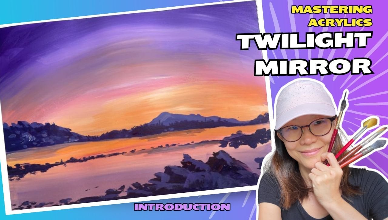
Hi, I'm Puta Isok. And I'm going to bring to you this special Acrylic challenge. And in this Acrylic challenge, you're going to be
painting Not one, Not two, Not three, seven. Seven acylate landscape. Yes. And we're going to be exploring this
unique color orange. We're going to be
incorporating orange into all our seven landscapes, and you will see
how this beautiful, beautiful color plays out in different kinds of landscape
and how we can use this color to create and dynamic compositions
in landscapes. There are a few things you
will learn in this class. First of all, definitely
you going to learn essential acclic
painting techniques. This class and this
workshop is designed for learners of all levels, and we are going to be learning essential
techniques like blending, layering, and how to achieve the perfect gradient to bring all your
landscapes to life. You'll be surprised
how much we can achieve with just the
blending technique. You also explore the
use of color mixing. You're going to use very
small color palettes to create beautiful landscapes. With very limited colors, how do you find interesting
new ways to create color compositions to
create landscapes. This class is actually designed for learners young and old, suitable for anyone who wants to start painting in acrylic. The second thing that's
very important is to achieve some kind of consistency in our
painting practice. Very often, when
we take a class, we paint one painting and
then full stop, that's it. But it's not enough for us to internalize
what we learned. In this class, I created
seven landscapes for you to practice over and
over and over again. If you can't, you could
complete one landscape a day. It's going to only take
you less than 30 minutes. It is doable. It's possible. If you commit to it. If you take time to show up for your own
creative practice, just 30 minutes away. But if life gets in the way
and it does happen to a lot of people, Do not stress. This is an online class, so you can take it
at your own pace. What I would recommend is to
cove fifte minutes a day, just to do a little bit of
this creative practice. It will give you
immense results. By committing to practicing
the same skills daily, you will be able to
build your skills and witness remarkable progress. At the end of this class, you can expect to
have a collection of seven breathtaking acrylic
painting landscape. That reflects not just
the beauty of nature, but also of your commitment and your dedication to
your own art practice. I hope that at the end of
your seven landscapes, you will find new found
confidence in painting.
2. Materials: Okay. Welcome to the
material section. All right. For this artwork, see, I have some of
this artwork here. I have done my artwork on paper. So you can choose to do
it on paper just like me. Or you can choose
to do it on canvas, stretch canvas, canvas
spots. That's fine too. But, You know, if you're just doing it for
practice, paper is fine. The only thing you
need to pay attention to is the gramage of the paper. You want something that
is thick enough to hold the paints the
acrylic paints, basically. So you can buy this kind
of acrylic pads, okay. And as you can see, this is about 300 GSM. That's the gramage. That
means how thick the paper is. So it's pretty thick. And you could also
use something that's this is only 163 GSM. So it's a little bit thinner. It's actually a sketch book, and you can see. Let's see. Yep. I've also done some
paintings here as well. So something between one
above 150 GSM is good enough. 300 is luxurious. I love it. So that's for paper. And if you're using paper, it might be moving on your
table or in your sketch book. If you want this white frame, what you can do is you
can get a masking tape to tape around the sides. So This is a masking tape. Make sure it's a masking
tape and not a scotch tape. That's very important. If it's a scotch tape, you're
going to tear your paper. And then for this
particular class, we're going to use
the color orange. So I highly recommend
that you actually get a tube orange so that you don't have to
mix it every time. And then there are
some other colors. Um, that we're going to use. It will differ from
cluster class. I use blue a lot with my orange, so you might want to
get a blue as well. Definitely we need white, we need blacks, and sometimes I have
other colors as well. If you don't have orange, but you have red and yellow, you can do your own mixing, but that will make
your process a little bit more complicated
because you got to mix the color
before you actually apply it onto the painting. But it still works.
And as you can see, I have three different kinds of you know, paint
packaging here. They are pretty similar
except this one. This is artist quality, so it's a little bit thicker. But I painted my painting using mostly student
grade like this. Okay. They work just as well, and I recommend that
you use whatever you can find where you live, just to start off first. Okay. And then of course,
you need your brushes. I recommend having
three different sizes of the flats and the
rounds. All right. So the flat actually
the square ones, and then the rounds are
the sharp pointy ones. These are for detail. So you may need some that
are really thin. So synthetic brush like
this and M that one part. So if we look at the brushes, these are the brushes
that I recommend, which is the synthetic ones, but I also recommend that you
get a natural bristle brush that like that it's usually made of like
really rough hair. And these are really,
really cheap, like less than $1 each and usually they come in
really long handles. I managed to find this sweet little one that's really short. These are really useful
when we do some of the detailing like trees
and the leaves texture. This is really useful. We don't need expensive brush
for the te leave texture. So, get cheap rough brushes. You wouldn't use
this for your face. You know, this is synthetic and it's really kind of smooth. Yeah. So these are
kind of gentle. These are the rough one. So
get some rough brushes, okay? Like this. You
will need a cloth, you need water containers, let's say, water
containers here. A. As long as you have at least two compartment,
that's good enough. And then last, I'm going
to touch on the palette. You can have like a
commercial palette like that, this palette has all these
different compartments and if you if you haven't finished painting and the paint, you want to leave it inside. If you haven't finished
painting and you want to leave your paint
inside, you kept it, you can probably still keep the paints wet for
a couple of days. But if you don't have something like that, you don't need to, you just need to get
something that is not porous, meaning it does not adopt water. So you can use a plate,
a porcelain plate, or a paper plate, wax paper, those
can work as well. This is pretty much all you
need for this art project.
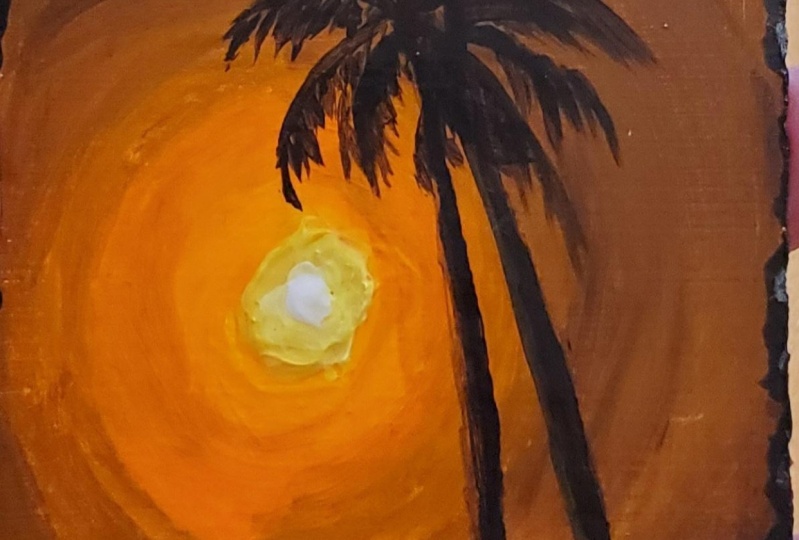
3. Project 1: Sunset: Today we're going to use white, yellow, orange, a dark blue. I'm using Psion here, and then a little bit of black. Let's get started.
First things first. Mark quite a low horizon. That's going to be
where the water is, something like that. What we're going to do is we're going to do a radio pattern of the sun radiating out. Let's go ahead. I change
the smaller brush instead. To move around with
a smaller brush. Get some orange. When you do blends
needs to be wet. The yellow in the
middle is still wet. Once I got it, side by side, use a yellow, pick up the
yellow, blend one round. You see how fast it is. Then very quickly, I'm
going to move out. Create the next ring. As that you are going to use. Be yellow and do a bland. Round. Next, I'm going to
pick up a little bit of blue. Be very stingy with the blue because you can see at too much, the color is going to go
really dark, very fast. Slowly and in the blue. Be now the ring is
getting bigger, you'll notice I
keep going back to the palette to mix the paint. That's just how it is. So now that I've
gotten the ring. I pick up the orange. So I always use the
lighter color to do the bland in the middle
of the two rings. I'm going to get the top
of a little bit der. Great. Once I'm done, I'm going to paint the ocean
and the ocean is going to be a lot darker than
what we have here. Get the edges. Curves. Horizon that's actually horizontal, you
don't want to curve. So be very careful that
and then brush cross. Next, I'm going to
work with even darker. I'm to try and get
even darker home. So the darker land in front. I'm just going to use more blue. And I'm just going to suggest
kind of land in front. Quickly watch my brush, and I'm going to pick up a little bit of
white into this mix. So a bit of white, more orange and I
suggest the ocean. It's okay if you go over
the doesn't matter. This to lighten the waters
that are closer to us. I didn't put any on the horizon. They are usually
on the lower side. Now, what I'm going to
do is the sun is here, is going to cause a
reflection of water. So I'm picking up
yellow and orange and doing that
reflection of the sun. You might also want to ad
in a bit of to your yellow. This can help give
it a little bit of strength in terms of the capacity because yellow
is a bit translucent, or at least the ones that I have, they're bit translucent. So on its own, it's actually not very bright. I'm going to try a mo brush to see if
it helps. You can see. I'm actually a
very lazy painter. I don't like using
a lot of brushes. I would be able
to fish my brush. Tin bruh. Yeah,
definitely easier. Should have done it
a long time ago. Next, I'm going to
pick up some orange. Texture here. Now, the orange will be a little bit darker, not that bright because it's not direct reflection, right. I sing small brushes, make sure you really
clean it out. Because if you don't, they will really
spoil very fast. Now, what I'm going to do is I'm going to add a little bit of a even brighter
sun in the middle. So yellow ph to do to bring out the
center of the sun. Next, I'm going to go
with the land in front. Okay. So a lot of blue. Right. If you think
it's not dark enough, you can add in some black
just to help you out a bit. And to use my small brush
to do some kind of fence. Suggest that some fences. So this will give you
a bit of a foreground. And a very light fine. Do all the different fences. Great. Next I'm going to add in a palm tree or
a coconut tree. Now, if you are not
confident with this step, what you can do is
you can definitely use the super tin
brush, kind of do a. And when I do this, I
like to put my fingers down if the pain
paint is still wet, so that it guides me
where I want to go. Okay? So with that guideline, it's easier for me to work it out because now I need to
taken it as it goes down. Next, for the left texture. What you can do
is you can again, use a tin brush to really mark out fireworks. Then with that as a foundation, then you add in the
texture of the lit. Now, you notice that
something about this is that we are only painting the three leaves that
are going sideways. But the truth is the reality is there are also leaves that
are pointing towards us. So I'm going to paint in front. Imagine they coming towards us. So you'll notice
that the center gets messed up like covered. And that's the reality because the coconut leaves or
the palm tree leaves, they are actually shooting
out in all direction, 360. But when repaint, we often
just make it grow out like, like a single plane because
our painting is flat. But the reality
is it's not flat. This is a step that I do to help make it look a
bit more realistic. So that's something
you can do. I notice this portion is
getting a little bit transparent with the t trunk. So I'm going over again, if it's transparent, it's not going to look
very realistic. And I think I'll
add a little bit of a Light the tone
here and there, just to give it a bit of debt. And over here, I don't know. It looks weird for me. So maybe I'm going to suggest
that there's a root here. Grassy texture here. Maybe something like that we
will do and there you go. As the finished. Sign our
name and then do a review. Is it?
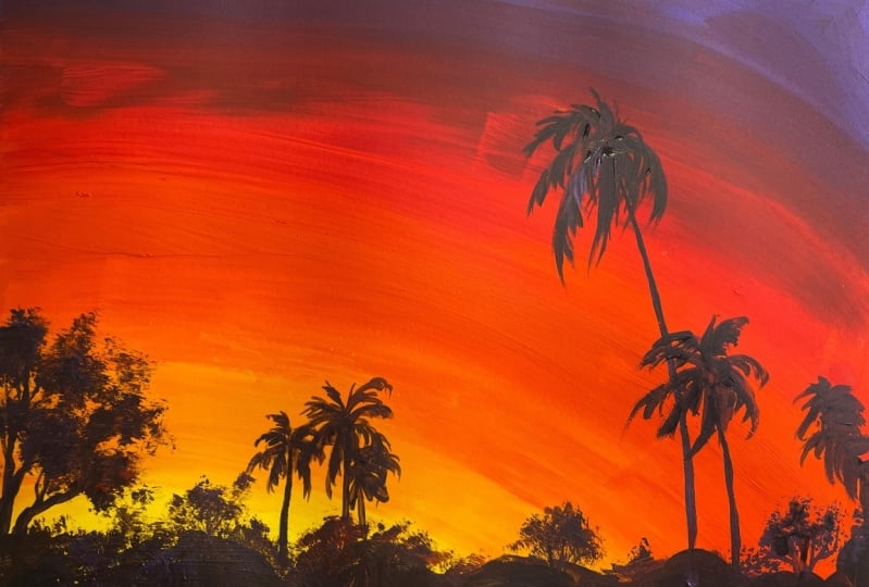
4. Project 2: Amber Palmscape: Today, we're going
to be using yellow, orange, red, purple, and black. Let's get started.
First, I wet my brush. Then what I'm going to do is I'm going to start creating
the background. I'm going to start
with a nice yellow. I yellow sun picking off
the left of my paper. Next I'm going to mix
a yellowish orange. The lighter orange. Very quickly, I bring it around the yellow
that edges painted. I use bit of the yellow gold in the
middle of the transition, pull it back and forth. Right. And then I'm
going to go into orange. Again, I painted
it quite close to the edge of the light orange
that I have just now. And I picked out some of
the lighter orange tone, and I go back and forth. That I have the orange in. I'm going to put in a
little bit of a red here. Orange us a little bit of red. Over here and I'm going
to transition to the red. A little bit of orange because there's some separation here, used the orange to create a bland in the middle
of the two colors. Now that's done, I'm going
to pick up a little bit of a prop. With the red. I want to create an
intermediate color because this change from
red to purple is quite strong and sudden. So I want it to be a bit softer. So I'm going to re see
in a little bit of the propo to create a
intermediate transition. Because it's still were, I can actually move into my red. I can give my red to. I
just do a blending here. Then I'll move into my propo. Pick up the purple, lay it all the way until
it touches the red. Pick up the red, and I'm
going to go in the middle. In between the two colors
to create a transition. And I've created the nice bland. Wah my brush and dry my work. Next, what I'm going to
do is I'm going to create the silhouette of the
trees in the foreground. So I have black over here. And what I want to do
is I'm going to mark out the palm tree or coconut tree up the fingers
press down. Quickly. Cute. Marks. Shorter one here. Another one here. Here. I'm kind of just making a mark so that
know where things are. That's a little bit. This one's a bit thick. Okay. In any case, I'm ready to go
ahead and continue. So I don't like my
black ones own, so I'm actually mixing
a little bit of the other colors and kind of marking out roughly
where I want my scape to be. The foliage up here. Talking a little bit of the warm duck toes
push it into the font. I'm also bringing in a little
bit of my dry brush to tap in some of the
texture to suggest le So you can see the airy texture that really works very
well for the leaves, and then I can add in some of the tree trunks or branches. I use a dinner brush for this. Okay. And then I actually have
a tree over here as well. Let me get that. We
to take my brushwk, so we'll change to
a smaller brush. Os So you can see this dry brush. Technique is really very handy when it comes to
creating tree texture. So I keep one of
these rough brushes in repertoire in my
brush repertoire. I just re really useful. There's some this here, but I think I'm going
to leave it out. Yeah. Now I'm going to work
on comple trees or punch. So I'm marking out the stems. And then roughly
when the left is going before I add in
the details of the lift. Now, I'm adding the
details of the lift. O this one. There's another three here. Let's go for the big one. Thicken up the t t a little. The bigger t. Then
I can press a bit harder to add more
thickness to it. Fm up the tiny one.
Then let's go ah. So you can see when I'm
actually doing the palm trees, I kind of mark out where
the main shapes are. Before I attempt to use
a smaller brush to go in and add in the leaves. Always pay attention to
where the leaves are going. Even though the leaves are on
the right side of the tree, it is swinging to the left, you can see, leaning
towards the left. So it doesn't just
open up like a sr. Les look when you
are doing details. Like the palm. Is it swing downward, does it swing left, swing right? Those are important if you want your palm
tree to look natural. Okay. I think that's it. Yeah. A
simple piece of artwork. Let's review and take a
look at how it looks. I understand.
5. Project 3: Amber Hues on Ocean Edge: A. This blended sunset landscape that
we're going to do today. Only uses four colors, white, orange, blue, get a
dark blue, if you can. And then some black. Let's get started. The first thing I'm
going to do is again to mark out my horizon,
and this is the middle. Remember, I always like to
start below the middle, right? I'm going to leave a bit
more space this time round. Okay, I have the band here. And then I'm going to have some I's going to kind of
lightly sketch out ws. It's going to happen later. So some kind of bend here, and then I'm going
to have another then coming here front. If you'll cut through
and then have some background, middle ground. And probably ammonia. Let's get started. I'm going to use a
mid sized flat brush. My brush is very clean, clean out a bit more. Pick up the orange.
And for my orange, I'm going to start
at the horizon even though I sketch it up. I do not want the sky do to
match the mountains later. I'm just going to go ahead
and start with the horizon, paint the background, and I'll paint the mountain on top
of the background later. I paint it well. Okay. Nice, bright orange sky, and then I'm going to
lighten it up into the blue. Okay. So I pick up
the white and I quickly rushed over to create
the bland, can you see? Then I pick up more white. And I create the bland across. Pick up more white,
create the bland across. And I'm going to pick up a
little bit of blue the orange. You see the color
turns really fast. It turns a little bit
gray really quickly. Because they are
complimentary colors, orange and brown are opposite
side of the color wheel. When you mix them, they will turn into a neutral,
which is a gray. But why do I do the mixing? Because I want the color
to have a transition. I do not want it to turn
into blue suddenly. So I want it to
have a transition. Instead of placing
blue directly, I always get a mix on
the palette first. This is how I always brush
my colors left and right. Good with the sky now. I'm going to work
with the water, and the water is going
to be a bit of gray. I go to get a gray. So it's just blue and orange, and I'm gonna sweep it across. Now, it looks pretty gray now. If you don't like it so grey, then put in more
of the blue, see? I'm just going to make
sure that I cover over the kind of the
bushes at the bottom, right the fort grow. And you notice that I usually
paint left and right, I don't go down because the water direction is
left and right, and I want a smooth plan. That means I need to
go left and right. Okay. So once I created a base, Now is the interesting part. I'm going to pick up some
white and I'm going to start doing kind of horizontal
movement with just the white. Okay. This is going to help suggest the texture
of the water. Notice that I did
it while it's wet. So the white is actually lending with
the pains at the back. Now, keep it
completely horizontal because we want the water
to be kind of peaceful. The drier, the pain underneath, the harsher, the white would be. So I did it really quick
while the pain would still. We don't want to her. Now we have kind of a base. And what I'm going to
do is I'm going to be putting in a moon
later over here, and the moon is going to
cast like a reflection here. I'll pick up more white and
do a reflection in the water. Just horizontal lines. And you can see that the
lines are pretty harsh. So I don't want it so harsh. What I'm going to
do, I dry my brush, and then I just slide
the pain crust. My brush is wet. So that
will lighten the strokes. If you think you want some more too little,
add it in again. Too much. Then you just use a wet brush to move it around. Great. At this point, we're going to dry the artwork. Great now that we
have the background. I'm going to put
in the mountains and the mountain
is going to be a. Again, it's orange and
blue, but less white. It's just a matter of how much orange and how much
blue you're adding in. I'm going to do something. Looks too for me. I'm going to add in more blue. Oh. You can see that adjusting colors to
make sure that my ocean and the ground the ocean
and the mountain behind are a different
tone or a different shape. The mountain is a bit darker. Good. And I want it to be a little bit more
bluish than orange. Co. Once that is done, I'm going to go ahead and move to the front and this time, it's going to be so less white. And going to go ahead. It's overlapping in front. And I'm not sure if I want to place a small
one in front here. I'm going to leave it and
I'll do the darkest one. Okay. If I can avoid just
using black, I will. I'm just checking out. What's the texture to you, sir. So because it's
closer to the front, I don't mind having
more orange in it. Warmer colors, when it's
closer to last it's fine. Now that I've done this.
Again, I'm just going to have a bit of a
light orange tone. Just to add a bit of texture in the front because I don't
like it when you know, it's a full ducks to the wet
So I'm just going to add in. So I use a bit of orange, a bit of white, pet it a bit. Yeah. Let's click. Lastly, I'm going to thee in. Okay. Now, I could put it here, but I'm concerned that
not sure if I can see it. Let me try it out. If your paint is fully dry and you kind of painted over
and you don't like it, you can always wash it away. It's going to add in the moon. It's going to be a half moon. So the one is a bit
stressful, right? You want it to be around, so go a bit slower. If you really need help, you can use a pencil to dry it out first or
put a coin there. It can be useful. And
then what I'm going to do is going to use my
brush to pet out the site. To let it disappear. I put lots of pains here. One option that you
can use is to use a little bit of a
tissue to soften it. You can put in lots of pain. I mess a tissue or a
cotton but just to bet. But out the edge to lessen
the pain on the other side. All right. And there you go? We have the moon
reflecting in the water. Just make sure
it's aligned here. Let's review and take a look. Not forgetting our nature. Okay. You landscape is done.
6. Project 4: Temple Gate: For this tutorial, we're
going to use white, orange, dark blue and black. Let's get started. Things first. I'm
going to mark out MI. Horizon is be somewhere here. It's going to go from orange, the sunsetting all the
way to a blue sky. Nice orange bland. Is quickly turning light. We need to really go very light. And a tint of blue
at already, es? T a tint. So it's a very slight
landing that's happening. Slowly, let's get a
little bit more blue, but I also want to
give it a bit of a gray tone first before
I move fully into blue. This will harmonize the color. Meaning that the color
doesn't change to sudden. B one is a warm color. The other is a cool color. You can see the difference
without orange, is really quite blue, so I'm just going to bring
in a tenth of orange there. See a difference? Great. Gotten the sky. Now I'm
going to go for cover. Waters. It's going to be a gray, something like that,
bluish gray for the water. Maybe even lighter. Ops. It's way too fast, but it's okay 'cause there's
gonna be some land up there. Pat some land on
the horizon later. So I've got the waters. And I'm just going to mi even lighter and just fush it across. Somewhere close to the surface. While the pain is wet. I'm going to already bring in this lighter
suggestion of waves. I'm just going to put a
little bit more on the right. Just to create different
areas in the waters. That's not a single tone. You remember keep it
horizontal, yeah. Once this is done, let's
give it a blow dry. Now what I'm going to do
is I'm going to create a landscape at the back and it's definitely
going to be much darker. Let's just get a duck. Gray tone in and suggest
a distant mountain. Requires some kind of control over how you are
mixing your paint. The ratio of the red to the blue allows you to control
the temperature. Then the ratio of white
that you add in allows you to control the
shades and tins. You controlling a
bit of things here. Remember to take care
of the bottom ge, still keeping it is on. Got it. All right. Now, we are going to
put in some rocks. Much darker rocks in front. Put the shinto temper kind of gate right in
front. Let's see. I I can't get it enough, I might have to resort
to using some flats. Rocks here. Yeah. This
looks pretty good. I want to add in a little bit of a darker shadow
underneath the water. Lines, then then what I'm doing. I can use another
brush to kind of just brush it up the dry brush. Shadow there. Now, let's
go onto the rocks. It's going to go all
the way up to here pro paint the base. Now, they're add in
the shindo temple. Now that I've created
the sto temper, I'm going to create a little
bit of shadow in the water. Let's get some der toes. So I'm going to add some
reflections in there. Some kind of waves. Same thing. You can use a dry brush to kind of brush it across
so that it lightens up. It softens lighten up. So that it softens the strokes. So horizontal and then just
a dry brush, brush it over. So like a six movement. But make sure it's random. A little bit of lighter. Great. I'm just going to add a bit of a little
bit of highlight. Give it a bit of ent and
maybe texture on the rocks. Next, I'm going to
add some clouds in the sky and I'm going
to use a dry brush. I'm going to use a dry
brush to pick up the gray. And just gently brush it across. I'll lighten it. Keep it as as you can. And br use a wet
brush to soften out. And go back in and
brush at the wet area. What's going to happen is
pick up the darker tone, and lay the darker
tone at the bottom. You want to keep the
lighter tone at the top, the darker tone at the bottom. You can pick up a
little bit of a lighter and brush it at the top. Or you can brush
it brush a bit of the darker tone at the
bottom. I'm doing here. Bit of a darker tone. Cheers at the bottom. Cheers at the bottom. What is done? Let's review it, and then is done.
7. Project 5: Crimson Mirage: Okay. So to start off, notice that I have
gotten white, yellow, orange and orange that is on the redish side if
you have kept me red, you may want to use that, but I wouldn't fuss over the colors. Just get the colors
that you have, work with whatever you have. Okay? Then I'm going to
get some kind of blue, the darkest blue that I have, I'm using tian blue
and the black. So let's get started. Today, we're going to
work with a bland that uses that uses a
interesting mix, which is orange and blue. You might find that when you initially mix that
color, be very alarming. Don't worry. You'll be
fine. Let's go ahead. I'm just going to
pick up a little bit of orange and lockout. I'm kind of a lower than
half kind of horizon line. And what I'm going to
do is I'm going to work from the horizon all
the way up to the sky. And what I have here is I'm
going to get the right red. To get kind of a sunset look. Go ahead. Got the brightest red. And then I'm going to
move into the orange. And I'm going to quickly
move into the yellow. The mixing happens when
the pain is still wet. So very quickly, I'm
going to move into the white. So from the yellow. Very quickly. Move into a white. And that's when the blue
is going to come in. And that's going to be
the tricky portion. Add in your blue very slowly and pick in a little bit
of the bed or the orange. I want to give you
a tint of green. You notice that when you add colors on the opposite
side of the spectrum, you do end up with
a bit of grey. So, let me see how the
color is shifting. I'm picking out a bit of
white just to see the middle. And I'm not moving down
anymore, moving upwards. In the sky and get
a bit more gray. So a bit more blue and
a bit more orange. So you can see that the gray
is not a very dark gray, just like a very
neutral kind of gray. We have the sky. Next,
what we're going to do is we're going to lay the
base for the reflection. And we're going to
do the same thing except before we start. We're going to do a lighter. It's a very light. The surface of the water. Before we move into
the range. White. So again, that's
sth into the range. So very quickly, the
shifting the color. Very quickly, we're
shifting the color. Next thing in your
yellows and your white. And then of the blue
and the orange to get. Maybe I want a little bit I'm going to get the
boxer much darker. You get a dry. You can spread the
brush a little. So always paint side to
side in quick strokes. So you kind of got the base in a single
layer fly quickly. Now what I'm going to
do is I'm going to dry it A Now that the clam is dry. I'm just going to
put in a little bit of some clouds in
the background. Signify the sky. I'm picking out a
bit of the blue and the orange and white? Because it's going
to be fairly light. I' going to paint it
on the background. Se around how dark you want
it. Tightly up to you. You can adjust. If you want it cooler, just add more glue to it. Because of the red, it's going to appear
more grayish. So blue. Now, just going to go ahead, pick up some blacks. And I'm going to paint on
the far islands behind. Now, I can also make it a little bit lighter if I
want two separate layers, so I can do is a
little bit of white. Make the layer the back slightly
gray rather than black. Okay. So just think
like painting bushes. Okay. So kind of a dot texture. We don't want it to be
just really smooth. We want to suggest the
kind of landscape is. So if it's buildings,
you can trate, you know, blocks coming out, if it's more nature,
suggestion of bushes. Don't worry too much
about getting it perfect. This is a fun playing with
a simple landscape. Ops. I see, I got a bit at the
bottom, but never mind, don't worry about that we are going to put in another
land right in front. So the other land is going to
be slightly in the middle. Do it right across. Okay. So
it's just slightly in front. And again, just
the bushy texture. Some high, some low. And next, we're gonna pick
the texture of the trees. Ah. Right? And then you can go
ahead and grow them out. So for this, if your
pain is too thick, you'll need to dilute
it. It'll be watery. If your brush is thick, you also need to change
the smaller brush. Let's see what's the thinness
line can be in this. Yeah. You have to be
really light handed. So you find that you have
difficulty with that, then just switch go ahead and
switch to a smaller brush. So I enjoying it to
the three trunk. Kind of like a circle shape, but everything is kind of going
back into the main trunk. Can you see that? I on going back to the main
trunk that you established. So of it you suggest slightly different kind of
trees like the texture. Okay. I want the center tree to be much taller, so I'm. Oh. Great. And now I'm
going to create the illusion of a bit of
a shadow in the water. This one. I'm going to do
is a little bit lighter. And I'm going to just brush it. Now, use a dry brush. So can you see that
when I brush down, it's just barely
scraping the surface. So the bottom is
actually very dry. Brushing it down into the water. I actually want it softer,
so I'm going to do this. I'm going to pick up a
little bit of orange. I'm going to sy it across. L et's swipe it across. Let's see, when I
swipe it across, it covers the black. It's just a bit of
orange, not watery. Dry. So you got to dry your
brush. Swipe it across. Now, it's not going to
cover it completely because our paint is already dry because when we
scrape down the black, the black is is fairly dry. Okay. What I'm also going to
do is I suggest a little bit of shadow over
here for the land. So again, I use a
fairly dry gray and brush it across bush cross. Push it underneath,
and I'm just going to pick up a orange,
brush it across. So it's kind of
covering the gray. And perhaps I'll add in a
little bit of lighter on to suggest some lanes
texture light that is, you know, fully black. Oh. So this is another blended
landscape that you can create, to help to take and take a look. Another thing that's
sign your artist's name. Great. I hope you
enjoyed this one.
8. Project 6: Golden Hour: For this piece of artwork, we're going to use
mostly orange and blue. We're going to work with orange,
brownish, grayish color. And I put in a little bit of yellow just in
case I need it. So white because I'm definitely going to
tone down the gray that I'm getting from the orange and blue and a little
bit of black here. Be. Started. Let first, I'm going to mark out the hot s which is maybe square here. This is about one
quarter of it. Okay. Going to go ahead
to create the sky, which is going to be orangey, but I don't want it
to be so bright. I kind of want to be able
to tone it down a little. So this is what I'm doing. I add a little bit of blue. I don't want it to be
completely orange. Sometimes I'll bring
in a little bit more of the darker blue. Bring in a little bit of the
blue and a little bit of the white to create a
orange g for the sky. Maybe I want it lighter. So just to create some
visual interest in the sky. I would like to have it
darker on this side. Because I'm going to put in the sun that's
setting down later. I kind of want the center of the focus to be in the middle. And one good way to do it
is to darken the corners. This way, our eyes
travel to the center. Notice how our eyes travel
to the center already. Now what I'm going to do
is I'm going to create a base layer for
the waters here. Again, it's going to be
kind of a gray tone. So orange with
something like that. Maybe a bit more bluish. Tn it down. Quite a
fair bit of that. Okay. You know this is a
lot more gray than the sky. And I'm going quite
close to the horizon. In fact, I'm touching it. It's fine. I'm going to be heating some mountains
there later for sure. I'll do a quick left right
kind of strokes for this It's a very and y kind
of a sunset scene. Same thing because the focus is going up as I'm moving down. I will want the water
eventually to become darker. Okay. The water will carry some kind of
reflection from the sky. So that's why I actually started by cooking it with a base
layer of this orange. You try to keep your strokes left and right as
much as possible. Because the water is very calm. You want to keep the strokes
of the ocean left and right. I'm done with the bottom
and what I'm going to do. So you want to use a white? Create the sun first. You can see the orange
coming up a little because it's not fully
dry at the back. I'm not fussy about it because I intend to do
more than one layer. Yeah. That's fine. Anyway, I'm going to go ahead and create the
mountain at the back, which is again a gray It's up to you, you want a
warmer kind of mountain? If you want a warmer mountain, you can have more orange in it. You want a cooler mountain, then you add more
blue in your mix. Good. Now I'm done and what I'm going to do is I'm
going to create the waters. So the movement of
the in the water. And I'm going to again, g. So you're only playing with a few colors
here in this work. It's a matter of how much
ratio you're working with. Just know that,
the further it is the lighter is going to be. I will not have the texture be too
strong at the beginning. To dark. I want it to be
very gentle and very light. As it move closer, then I'll start will
increase the sheet, okay? I'll start to make
it a lot darker. My small strokes. As they come closer, they become thicker
and further apart. Make sure you do not
want them to repeat. What do I mean by
repeat, meaning two lines that are
exactly the same. So do not want pins
that are too bright. You really want to mi
the gray before you go onto your that book. Once you're closer, now my strokes going to be
kind of like a zig ac. As they come closer, I'm going to change
the way I paint. Now it was more like
going horizontal. Now the waves are getting
clearer and clearer and closer. We're doing a zig ac. So at different points, you can press harder
to create ck waves. Epcily closer to us. The exact texture. I'm going to put a little
bit of the dus on top. Here I to pull a few for sicker. Don't worry, if you find
that it gets too dark, you can always adjust it. I'm trying to
darken this area so that the eye travels to the top. Remember how you are always trying to bring the
audience eyes in to the. Good. Now, I'm going to bring in the bright colors
from the sun. So I really want it bright. Okay. So that's in the yellow. Can lay it on in a ter fashion. And as we come closer to us, the reflections are going to get further and
further parts. I added some white really
brighten up this area. I find that yellows can be a little bit
transparent at times, so adding white will help
make it a more opaque. Going to put in some of
this highlight on the. And it will be always
on top of a shadow. You see this darker area? The on top. Shadow the wave. Be careful not to
make them the same thickness and
repeating too much. I might have to remove some
of it because I find that this area seems to be
repeating quite a bit. Break this up a bit because
it's getting too consistent. Better. Other than that, you're also going to
add in a little bit of a range reflection
on the side. This is to reflect
the at the sky. Sometimes I don't
want it so bright, then I'm just w it down a
little bit with the legs. There something
like this going up. Little bit of And then the sun, I actually don't want it so
white paint over it again. And now because of
the white base, it's definitely a lot
easier to paint on it. I don't see the background
anymore because the white has created a base. Now what I'm going to do
is I'm going to get black, and I want to paint
a silt right there. Maybe I'll pick up some of the colors that I have on the
palette because the black is really standing out very
much and I don't like it. I want it to have a bit of the colors that what
this painting has. Sail pots usually
has strings around. It looks way too thick. So what I'm going to do is
I'm going to remove it. My brush is way too thick.
I don't like the s. Yeah. Okay. So, you
have the sunset scene. Let's sign your name. Try our work. Let's take a look. There you go.
9. Project 7: Solitude Amongst the Grass: L et's get started. We're going to do
an easy one today. We are going to white, yellow, orange, a dark blue, I'm using Crucian blue
here and a black. Let's get started. I'm going to do a slunt. Pt landscape with a tree. So I kind of want
a landscape here. I'm going to have a sun
and going to plot in the sun middle and then I'm
going to shake out the sides. And I'm going to have a orange yellow yellowish
orange around it. I'm trying to create a
illusion of a kind of a clouds kind of
texture rather than the usual radio kind
of design that I typically create
radio meaning round. I I don't want that
for this piece, so I'm going to
try something more of a horizontal stroke. So you can see this is actually
very atmospheric as well. Then we're going to
slowly move in to a slightly darker orange
especially below. Note how I pick up the
blue is really very slow. Because I don't want
the colors to change too dramatically
all of a sudden. I have complete
control over here, because I just use
a pure orange. If anything dries up, I can always go
back in and adjust. And by adjust what I'm saying is that I
can always go back in to wet and recreate that
color fairly easily. I can see even a little bit of a blue really changes the color. Anyway. So I'm just going to wash up my brush
because I actually want the top part of the sky to carry a little
bit more yellow. So I'm going to put up
yellow and I'm going to pick up a little bit of blue, yellow. I want the color to shift,
but this time around, I want it to have a little
bit more yellowish tint, especially in the top area. Yellow, some orange,
and some blue. Can you see how the
color is shifting? To much yellow,
you're going to get green because yellow and blue was going to
give you green. We have to be very mindful of the color shift
that we're creating. But we're playing
with the color. L get used to experimenting
with a limited palette. Look at what kind of
colors you can create. We don't need a lot of
colors to create magic. Can create a fantastic painting
with just what we have. So you see? A little
bit more orange. A little bit more yellowish
at the top already. So I pin. And then here it's going
to become much darker. Same thing for the
sky. Also a bit. Daka. So under normal
circumstances, you might think that this is such a ugly color
like a ugly brown. And what this exercise can provide us is the inside
that there's no ugly color. It's all about application. And in this case, on its own, just looking at the color, it's not the most beautiful color. But because of the context
we're using it in and the fact that we're going to
build it up with layers of other details
that's going in. This color, this muddy color
suddenly becomes beautiful. My paint on the paper is
actually getting drier. So I'm finding it more
difficult to create a smooth bland instead is
giving me a lot of striks. That's mainly because
it's drying out mooly. So when it's dried up, I can still go over again. I want it to be a smoother land. And you note that
I'm actually just going over with a orange, even though this is
supposed to be orange and a little bit of
the blue, right? It's fine because it's actually harder to cover
up darker colors. So when you apply a
lighter color on top, it usually just
cleans it up green. That illusion of the cloud
movement in the sky. If you find that it's
really moving too much, the pains the colors are
shifting too much then, dry it. It's usually a lot
easier to control a completely new layer
on top of a dry layer. For me, I like the spontaneality of working
straight on the work. So usually I don't like drying and I go back
drying and then go back. For me, it's a little bit slow. Then while it's
still kind of wet, I'm going to start pushing in a little bit of the white
to suggest some clouds. So I picked up some
white and some of the dirty color because if
it's pure white going in, it's going to look
really harsh and really weird, and I don't want that. So I want a color that's kind
of close to what's there. I just pick up a dirty color and a little bit of white
to lighten it a bit. Sometimes a good
practice is stand up. Move away from your painting, take a look at it to decide if it's the right kind of lightness or darkness
for your outwork. Because sometimes
when you're painting, when the acrylic paint is wet, it can look lighter than
it actually is when it's. So it does dry to be
a little bit darker. In some clouds. Be careful not to make
the shape two similar. Meaning you don't want three triangular next to each other. And typically, the lighter part of the clouds is on the top. Ben. Ben. B. B. It's way too light. See what I mean. I kind of like that. And
I'm going to pick up a little bit of a color and paint in the sun. I added white because
yellow can be translucent, so might be a bit
difficult to put it in. So I need the help
of my opaque white. So the sun in the middle. Then I'm going to block out the dark colors at the bottom, and I like to create my dark colors without
black if possible. So you can see it's really dark. It's just, you know, a blue and orange. It's getting way
too similar here. So I'm going to put
in more orange. Sorry, more blue. If I think that I
still want it darker, I can always add black later. Now, I'm going to
create the Cris He and I'm going to create a bit more of a contour because this is like a grassland
kind of landscape. So I definitely does not want it to be a slanted
straight line. I need to have more character. And great. At this point, I will need to dry the painting
because I want to insert a tree on top of the sun and
the sun is completely re. Okay. Same thing. I'm going to use
my own duck mix. And create the sun I mean
and create the tree. Now, when you're
creating the tree, as you move out into the branch, you need to ensure that it's, and then the main tree
trunk can be thick. This is very important. It's just It's just
nature, right. Okay. And I find that a lot
of times beginners don't pay enough attention to this
structure and their tree will look really awkward or fake. So when I'm doing a tree, I like to, you know, paint according to a reference. That way, I don't have
to imagine or guess or try and invent a lot of
things while I'm trying to control my brut strokes, and, you know, there's a
lot of decision making. When I'm painting and I just don't want
to make my job that much harder by adding in a
design work at the same time. So as you go out, your
strokes has to be even thinner for the smaller. Tree branches. Now, what I'm going to do is
I'm going to add in some distant details there. So it can be a
suggestion of bushes. It can be suggestion of trees. I notice it's a little
bit transparent here, so I want to use
a ticker brush to really solidify the branches. Once I'm done with this step, I'm going to add in the
leaves and to do that. I will pre mix the pain
because I don't want my brush to be full of
pain because that way, I won't be able to
create every texture. So you see I change
to a hair brush, which is a very rough brush. Notice the kind of texture
that I'm creating. So I use it to create
this kind of texture. So these rough hair
brushes, usually, you can get them for a really
cheap amount of money. Yeah, but they're
fantastic for textures. Just make sure you rotate
your brush around. Really awesome. You
can also create some texture the Yeah. I think that's good. Now, what I'm going to do is I'm going to pick
up a little bit of orange and I'm going to put some
spots the tree. And then I'm just going to use my dry brush to spread
it around a little. Creating a little bit of
the lighter orange texture, especially closer to
where the sun is. Yeah. That's great. I'm going to add in a
little bit of our orange on the tree trunk near
where the sun is. Lastly, thinking I'll
add in a little bit of a texture in front. Because the foreground
is pretty dark and flat. So I usually prefer to have
a bit of leisure interests, like, you know, things
that people can look at. So, again, dry brush is Other away. Create some thoughts instead. Yeah. I the signature. Try it. No.
10. Debrief: Welcome to the end
of your class. Congratulations. I hope you
finish all seven landscapes, and you have a collection
of seven at naps. That is reflecting not
just the beauty of nature, the beauty of the color
orange in nature, but also a reflection of your dedication and commitment
to your own practice. Thank you for showing
up for yourself, showing up for your
own creative practice, and taking just one step every day to learning
something new. As a bonus, I would
encourage you to share all your creations in our
class project folder. As well as on Instagram, you can tag me at ESO. As a special incentive for this first ever seven day
challenge that I'm launching, I'm going to be selecting one special student for completing this
whole art challenge. The criteria of the
art giveaway challenge will be in the
class description. Take a look and show up I hope to see you
on the other side, and I look forward to
seeing all the beautiful, beautiful landscapes in
the class project folded. Thank you, and I'll see
you in the next class.
 Ee Sock Ang, Artist. Teacher. Traveller.