Transcripts
1. Introduction Video: Hi, hello. My name is so, and for the past nine years, I have been running an art studio and really
working with a lot of children. But outside of that, I also
paint. I'm multipassionate. I love working in many
different mediums, like guash, watercolor,
as well as acylics. I want to share art
with a lot more people and share my expertise with
more people hopefully. Art can bring to you what
it gives me as well. I absolutely find it super
meditative when I paint, also very accomplished and successful when I
execute an artwork, and I hope to share
that feeling with you. I came up with this idea of
recording acrylic classes. This series called Mastering
Acrylic is all about practicing simple techniques in acrylic to help you
achieve wonderful and amazing artworks. I'm going to take you through
exercises that really focus on one technique
for an entire series. We are going to be looking at
the technique of blending, how we can create frameworthy jaw dropping kind of landscape using very
simple techniques. I hope that what
I share with you will be of value and that it can help you ignite your
love or the acrylic medium, as well as take you
further in your journey if you already know how to
use some kind of acrylic. I hope to see your artworks, please share them with me. I would love to support
you in your art journey.
2. Materials: I'm going to talk
about a material. Now, my style is if
you're a beginner, you're just starting, go ahead and start with whatever
materials you have. You don't have to buy the things that I show in the video. You don't have to
get the same brand because a lot of
times artists make choices about their
art material based on a lot of factors and you wouldn't know all
of the factors. Start where you are, make
it as easy as possible for you to start big bottles because when I work
with a lot of students, then I need big bottle. Are there other brands
available? Yes, they are. Do I try them? Yes, I do. These are smaller bottles. These are craft paints. I don't buy this very often because the only thing is take not because of the kind
of packaging it has, it's a air can go into this
packaging very easily, which means that you
will dry up fairly fast. There are also cube ones, the plastic tubes
and metal tubes. How do you tell if a tube is student quality or
artist quality? Usually it's stated that, if you look at this,
this is artist quality. So artist quality heavy body. Heavy body simply means the consistency is like
toothpaste when you use it. This is more watery. Then what you will need is
the palette. So pin palette. Now, if you don't
have a pin palette, or you are unable to buy one, then just use paper plate. Just start with what you have. Okay, invest later brushes, any kind of synthetic brushes. Now, of course, not all synthetic brushes
are made the same. Some are really soft and flimsy. Some chip ones are really bad. A good synthetic brush to start with is something
that is not too soft. The paints are a
little bit thick. Let's say, I'm using,
like, a watercolor brush. Can you see how soft this is? It's almost like a makeup brush. Imagine having toothpaste on this brush and trying
to move it along. You will not be able to do it. I would say you want your brush to have some kind of bounce, then we have the paint pads. So these are meat fat
and I can tear it off. So what is the criteria? I would say as long as it's stick enough to hold the paint. Let's see, this one
is about 250 GSM. You cannot use
normal printer paper that you use for school work, we can even paint on
cardboard, honestly. So what I do is I tear
out the paper and I usually tape it to the
board, something like that. I tape it to a box so that it doesn't move,
it doesn't walk. Because with paper, it can walk. With canvas, it wouldn't walk, but canvas would cost much
more per piece, right? So it's entirely up to you. If you think you want to use Canvas board or
stretch canvas, you
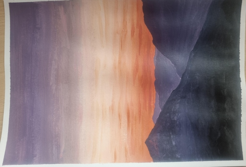
3. Serene Mountains Part 1 Sky : Today, the colors we're
going to be using is white, orange, a little bit
of purple and blue. I might add in a little
bit of black at the end. I'm not sure. I don't have
it in my palette yet, but I'll see how it goes. I'm painting this
reference picture. So you can see that I chose a little bit of purple
because I see that there's some grayish purplish
kind of sky and I wanted to keep
that purplish tone so I chose to have
purple in palette. Let's start with my brush. Okay. So I'm going to
start at the horizon. And typically, what
I'd like to do is get a bit of a watery
mix to mark out my horizon. And I like my horizon to be
away from the middle line. So probably going to
have it somewhere here. Just to mark out so
that I know where I will start to paint
and I'm going to start mixing the light
orange that I can see here. We got the pain. I
always mix the pain away from the two pink colors. I'm going to make it
a bit more orangey. The bottom up. Pick up more white, just to start lightening the
colors as I go up. More white again.
So in the middle. It's really lightening. A lot to white. So I just pick up
the white paint it in and then blend it. And it's starting to turn into a little bit
of popliis tone. I really pick very
little of the propo. Okay. Very little. Just to shift the
color. Can you see? With that amount of paint, I'm already shifting the
color of the orange. More purple, can you see? Yeah. So go ahead and I think it needs to shift a bit faster
mix in a bit more pot. I'm working fairly fast, so my whole surface is
actually still wet, which makes it so easy to blend. Now, if I want it a
little bit more grayish, what I do is I'm going to
add in a bit more orange. See how dark become Shift
if I want it that dark. As you can see here,
the color that I have is not the exact same color as
the reference picture, which I'm totally fine with it. I just use the reference
picture as a reference. So chase the blending and
the atmosphere of it. Nice land across. So I've got the nice sky.
4. Serene Mountains Part 2 Clouds: Now, what I'm going to do is I am going to add in a little
bit of those orange clouds. I'm just going to pick up
a little bit of orange and them and brush it
across P I have here. So it's a little bit
orange with some F both. Especially at the bottom. Towards the top. If the pop a goes a bit lighter. So going to add in
a bit of white. If you add more purple, it's going to
become really grey. If you add more orange,
it will be warmer. So closer to the top, you're going to
have to have more orange and white instead of Oh. Try not to use pure white. I always have a bit of the orange tone or the
proposed to in there.
5. Serene Mountains Part 3 Mountains: Okay. Once I'm done, I want to put in the mountains,
and for the mountains, I'm going to have the
furthest mountain to be actually much lighter. I want to mix a light gray and use a bigger brush for this. So let's get the gray. The first thing I'm going
to do is try mixing it with just purple and orange and see what
kind of colors it gets. So I can see that the mountains in front actually
looks a lot and a lot. So I'm going to do is I'm
going to put in some blue. Adding in the blue will give
it make it a lot grayish, and I'm going to lighten it for the mountains that
are further away. Okay paint the mountains. I'm going to bring in the
darker mountains in front. Before that, let me just
paint in a bit more. Okay. So I'm going to
create three layers. This is the furthest layer, then a second layer in front, and then a third layer
really, right in front of me. As I move to the front, I'm going to add less and less of the white and more
and more of the blue. So it's becoming and. Get that. H. Last layer, the ones right in front going to use a
whole lot of the blue. No white at all. Because I want the paint to be really
saturated with color. You can put in all the
colors that you have. Let's try and really pop
up the mountain in front. So you can see that because
of the way I'm painting, I'm actually having a lot of very saturated color
right at the front, and I like this more
than using black because this give the colors in front a lot more
visual interest. I think we're done with
this. Go to try it. Okay. And then I'm going to
sign my name at the corner. Okay. I can choose to go
and sign your name as well. Let's review the painting. Okay. And it's done. A
simple landscape.
6. Outro: Congratulations on
finishing your artwork. I don't know how many of the tutorials you
have attempted, but I acknowledge you
for showing up for your own creative mental health and really nourishing
yourself creatively. I hope you enjoyed
some of the tutorials, and I know that sometimes you may not be able to achieve
the exact same effect. So what I would encourage
you to do is to upload your finished artwork onto the classroom so
that I can share, take a look, guide you along,
celebrate your success. I think art is a journey.
It is not an end point. It's not about getting that
perfect one piece of artwork. Really about going
through the process, understanding the
medium because as you guys may be using
different kinds of brands, different paper for me. Sometimes you find how come my pain is behaving
this way or that. Different brands of pain
may react differently. Give yourself that
compassion and kindness, speak kindly to yourself,
like, it's okay. I don't have to get it
right the first time. I'm going to share quite
a few projects that are all focused on the
blending technique. Keep working on them.
 Ee Sock Ang, Artist. Teacher. Traveller.