Transcripts
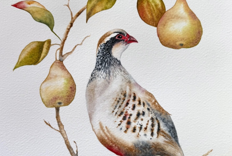
1. Introduction: Hello, and welcome to this
intermediate watercolor class. Today, we're going
to be painting a partridge in a pear tree. And yes, I'm trying my
best not to sing it. This is a nice one to get us into the festive
spirit and paint it in one layer with a few extra techniques
thrown in for the mix. I'm Jane Davis. I live, paint, teach, and walk my lovely spaniels in the beautiful South Downs
National Park in England. Over the last 20 years, I've taught myself the free flow technique that
you see today. Not having been to art school, finding my own way has been
fun and sometimes daunting, but has allowed me to
develop my own style. This has led me to teach others either on a
one to one basis or as part of a group in a wonderful studio in the
heart of the South Downs. I also run a successful
art business where two days are never the same from the thrill
of exhibiting to painting pet and
wildlife commissions in my own home studio. In all my classes, you will follow
along in real time, where I can guide you
to keeping your work loose and fresh
without overfussing. If you're just starting out, my three beginner
classes will guide you. With your first masterpiece
painted in only 15 minutes. You'll find dozens
of my master classes available covering a wide
range of beautiful subjects. In each one, I share the techniques I use in
my own professional work. We'll have a lot
of fun together, and you'll gain the
understanding and confidence to
incorporate everything you learn into your own work. You'll be amazed at how
easy watercolor can be. I provided you with
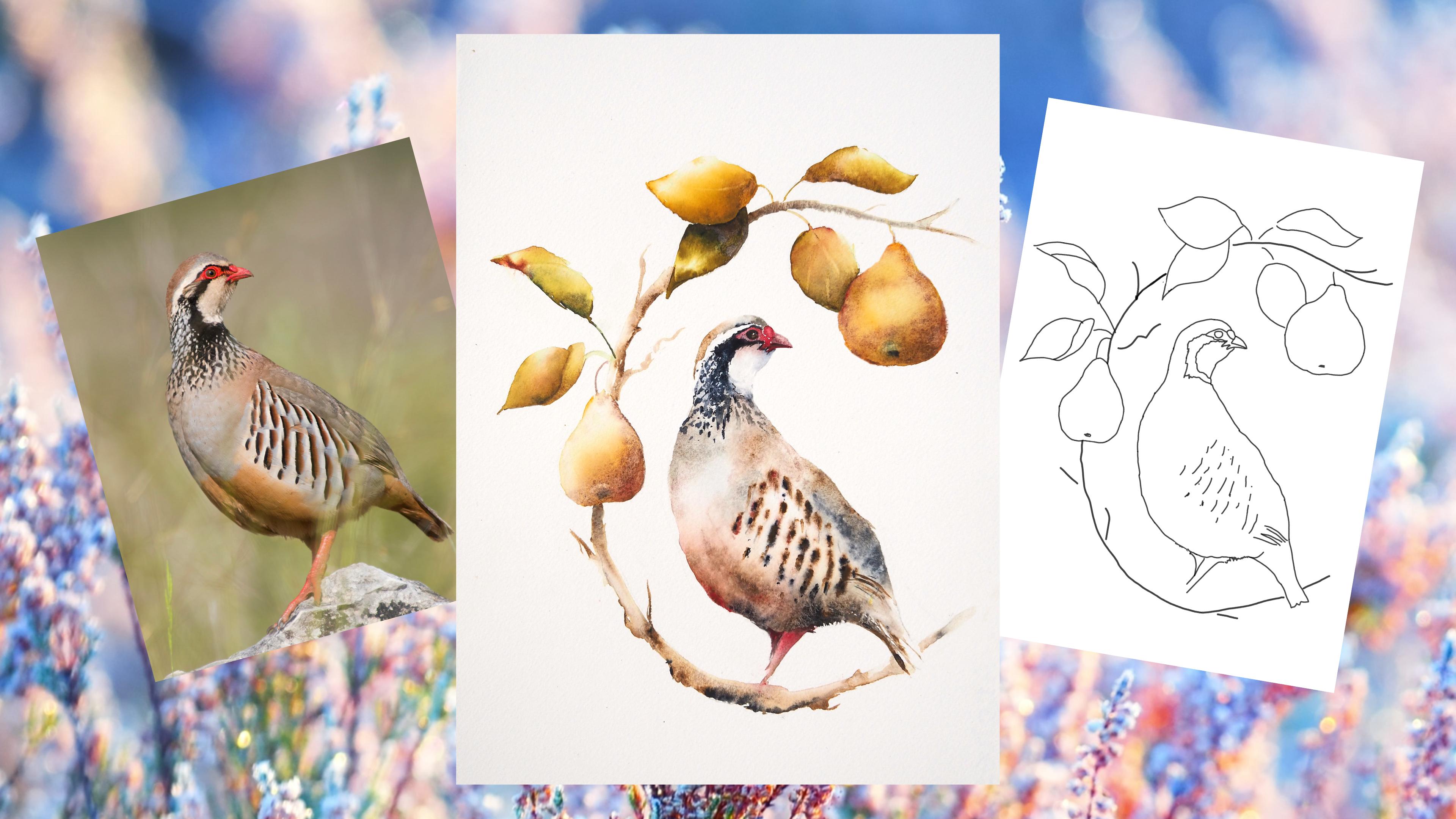
a wonderful photo of the partridge and a downloadable template
of the whole piece. The template will give you a stress free drawing so you
can just enjoy the painting. We'll be painting the
partridge in one simple wet on wet layer where I can
demonstrate the magic of timing. I'll be showing you how to
create that pear tree bow with the lightest of touches
while working wet on wet. And unusually, for me, there'll be some wet
on dry painting. This will give us some lovely
crisp, clean detailing. And, of course, I'll
be showing you how to adjust and dare I say it, fiddle at the end to bring
your painting to life. If you'd like to learn
more about me or my work, then please pop
over to my website at Jane Davis watercolors.co.uk. This can be found
on my profile page, along with links to my
Instagram and Facebook pages. Well, I love to share
my art and adventures, especially on stories
with many ideas, works in progress, and
tales of studio life. I really hope you will share all your paintings on the
projects and resources pages. I love seeing your masterpieces. And don't forget
I'm here to help if you get stuck or
have any questions. I want you to experience
that buzz of painting in this liberating wet on wet loose style. So
come and join me.
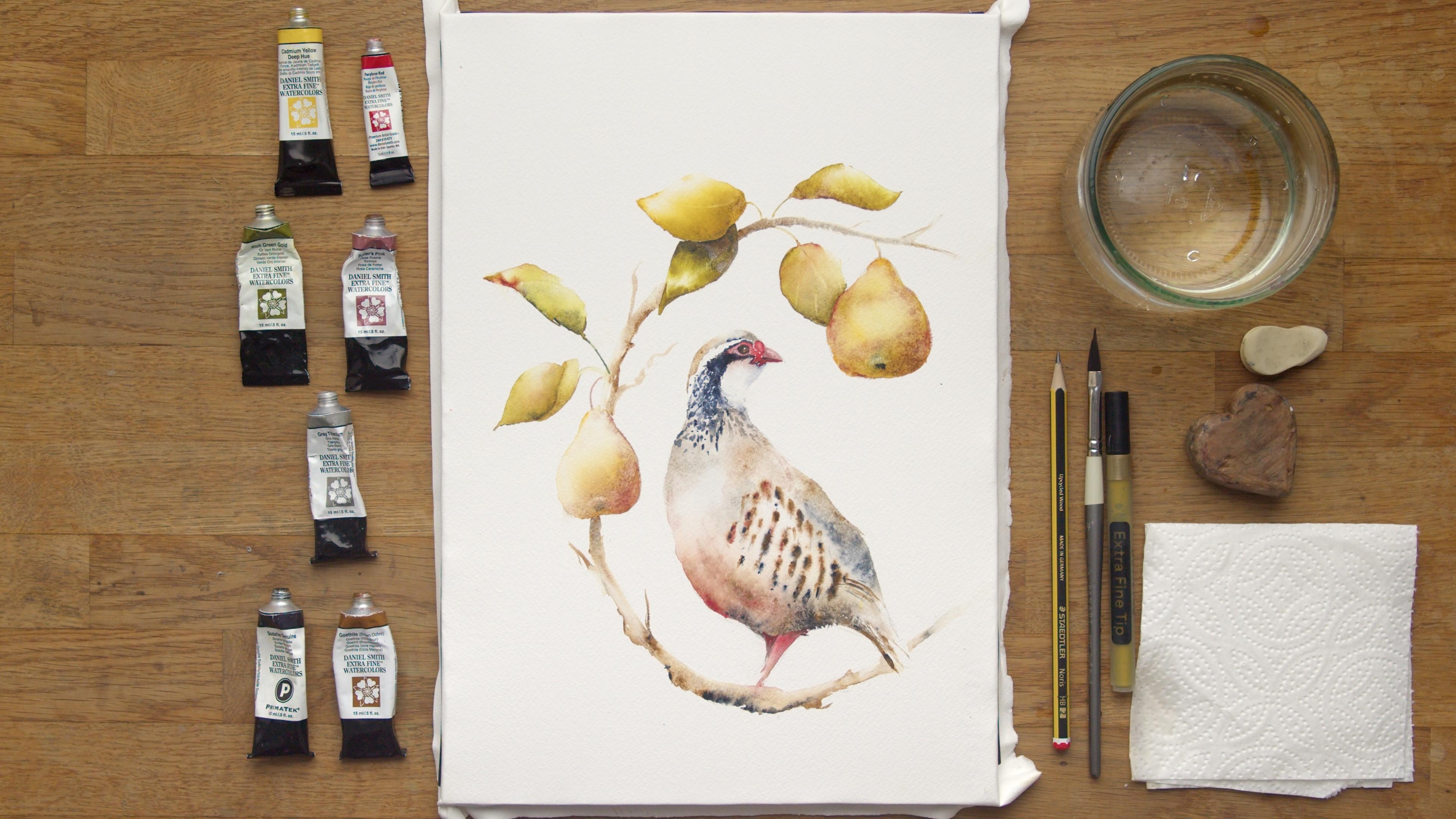
2. Materials: So let me run through
all the materials you're going to need to paint this partridge in a pear tree. I'm going to start with
my collection of paints, all Daniel Smith as normal. So we have the cadmin
yellow deep hue, the praline red,
rich gold green, potters pink, great
titanium, absolute favorite. Well, two of my
absolute favorites, so light genuine and the
gothite brown ochre. All these can be found in the projects and
resources pages. So all list of these materials are there for you
to refer back to. If you don't have
exactly the same colour as me, please don't panic. This can easily be done with
whatever you have in stock. These parches, I've
painted quite a few times, and you went through
quite an array of different colors from pinks to darker blues. I even had an indigo
at one point. I settled on these
for various reasons. One, I like a little
bit of potter's pink because it gave me a
bit of granulation, especially in the fruit. I liked the pin of the cadmin. It's a little tricky
bird in some ways because you've obviously got the warm colors at the bottom, the cooler colors at the top, so I was trying to
balance those out. But really, it's more about the technique
and just enjoying it. So please don't get too
hung up on the colors. My paint is arches, and it's been stretched on
a perfect paper stretcher. Again, I'll pop
all those links on the projects and
resources pages. I have my pot of water,
a little rubber. This is just an inch height. So if you follow me a few times, you know, you probably
recognize the heart. It's just an inch high. It
allows me to tilt my board. I don't do it a huge amount
just in a couple of places. I've got a kitchen
roll or paper towel. I have a gold pen
which I don't use, but as I explained through
the class, this bow, which could be
turned into a C can be added into gold or
a very bright yellow, but I explain that
as I go through. So unless you're doing something
particularly Christmassy, the gold pen is not necessary. I have just one brush today, and that is a dagger brush, and I am really into this
brush at the moment. I must admit, it's got a
nice good point to it. It's got a nice edge to it, which has been really handy for doing these and, you know, tiny little points for the widdly little
bits like the bowels. A useful brush.
And really if you haven't got one of
these, probably a side, say, eight, and maybe a very small one or naught
would be useful. It's just doing
the small details because this painting isn't big. A standard pencil
honestly doesn't matter as long as
it's not too heavy or too sort of you don't want your pencil
marks to be showing, so a nice light pencil. Then lastly, I do
have a hair dryer, which just helps sort
of the drawing process, so you're not hanging
around as lot as much in between sort of layers, but it's by no means essential. There is a nice reference
photo of the partridge again, in the projects and
resources pages. Now, the bow for better or
worse, is my own design. So the only thing you
can refer back to is this painting of
the finished piece. But I will also put some reference photos
of pear bows in there, so you can just have
a look at the leaves. If you don't want to do
exactly the same design, it's useful to look at how a
leaf hangs on a pear tree, so I will pop those
in there for you. Other than that, I think we should go and sketch
them out and get going.
3. Sketching Out: Now, the sketching out part is quite an important part
of this painting as ever it's worth getting
this right to start with before you commit
your paint to paper. I know it's always a fun bit, and I often want to sort
of skip this stage, but it is important
to get right. Let me give you a little help with the part you
should start with. There's a lovely photo in the projects and resources
pages. So get that up. And however you find
this best to get this correct image
down on the paper, then do so there's
a template there, as well, which you
might find helpful. But once you've lifted it up, just check everything
is in the right place, and you're happy
before you start. These barred markings, I found really helpful to get
the right direction because they're subtly different in their angles and
suggest the body shape. Make sure the legs kind of pointing in the right
direction and the tail. But say, if you've
managed to get this down from that reference photo, using sort of
templates or tracing, then you should have it right. The lovely hopefully
it's lovely. This is for better or worse,
this is my own design. So this pear bough is
roughly in a s. Now, I'm doing this at Christmastime, so obviously it's a
partridge in a pear tree. And at one point,
I'll show you this, excuse the partridge
he's not the finest. But I did the see in quite a bold yellow to
suggest S for Christmas. Obviously, you may
not want to do that. And actually, in this class, I'm going to go more natural
and do it as more of a bow. But equally, you could
do it in a gold pen, so you could pop that in if you're feeling really festive. These there isn't obviously a reference photo for the bow, but obviously there
will be the photo of the finish painting. So if you want to go a
little off piece and make your own design up,
that's absolutely fine. The leaves and the pears will be done in a particular style, so you could probably
just do that and freestyle your own design. Um, yes, I don't think
there's much else to say. Again, just really take your time to get
this sketch right. I always if I'm doing a commission or anything
important, I will sketch it out, step away, even if it's
just for half an hour, come back and reassess to
see if I've got that right. And I'm happy to
sort of proceed. Oh, one other thing, keep your pencil
marks nice and light. I know these are quite
heavy here, but obviously, I want you to be able to
see what I'm painting, and we'll rub some of these
out a little before I start. Particularly any light areas, because what you don't want is to finish the painting and then not be able to get those pencil
marks out. So go gentle. Right. So once you there's there's always
a dog hair somewhere. Once you're happy
with this sketch, you are really confident you've got things
in the right place, then I'll see you
in the next lesson.
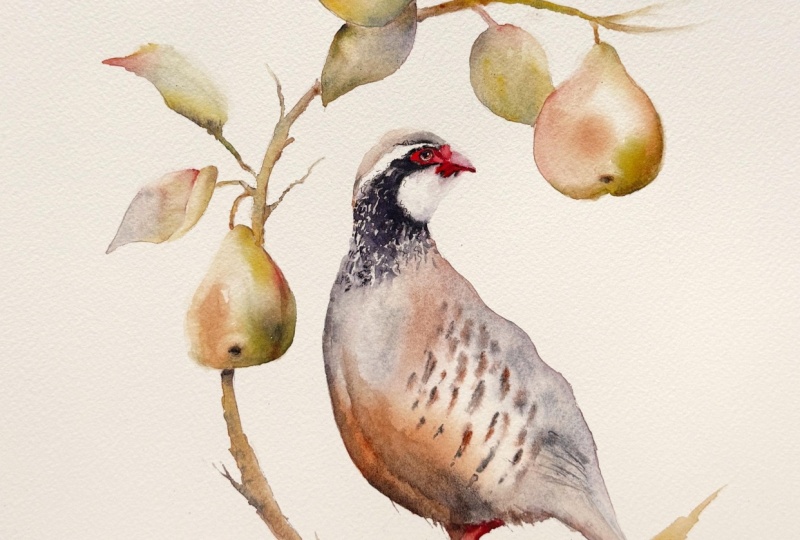
4. Partridge Main Layer: Right, so it's onto the fun bit. Let's get some paint
on this paper. And I'm going to be starting
with the partridge first. So pick up your brush, and we're going to start
wetting the bird down. I'm gonna start from the
top, and I'm going to include the dark marking and it kind of come down
at a sort of an angle. So I'm leaving this white
strip that's above the eye. You can see on that
reference photos. Don't paint that in wet
that down, should I say? All the same with the lovely white cheek kind of
cut underneath there. And then we're going
to wet very carefully. The body down, stay
within those nice lines. You've probably taken, as
I've knacked you before, stay within your
lines. Come down. We're going to miss the feet. We're going to go over
the white wing area with those nice markings. And we're going to
come down to the body. The tail we're
doing a little bit, we'll draw some of that
paint down into the tail. But for now we're
gonna miss it out. Just take your time
and make sure there's no little dry patches, 'cause that paint
will always round it, and we'll be left with a funny little often little
squares, aren't they? Well, I always end
up with squares. So yes, make sure it's
all nice and wet. And again, the little trick is, I'm sure you're aware of
this if you've followed me on a few classes, just just bubbly, bubble it, bubble your head up and down. And you'll see if
there's any toy patches. Now, this layer is we're
just doing the one layer, and we have to work quite boldly and quickly
and confidently. Um, plenty of time, but if it does start to dry a little bit and
you're working maybe in a warmer climate or
you're a nice hot studio, you can always it's feeling like it's
starting to dry out, you can always just add
a little bit more water. As long as the rest
of the area you've wet down is damp, then
that's absolutely fine. It shouldn't leave any marks. Now the trick is
not to get it chew puddly it's all going
to be about timing. We're going to put
gonna start at the top here and we're going to
work our way around, and we're going to try
to reserve this white or the wing with those
really obvious bars. So it's about getting,
say, the timing we, popping that paint down so it doesn't creep into
here too much. So goes the theory, as I say. Right. I'm going to
start from the top, and I'm gonna pick up
my gray and my pink, and I'm gonna pick
up this sewed light genuine before before we start. The blue on the bird
is very subtle, but I didn't want to bombard
you with too many colors. I could have added another blue, but we're going to use
the so light genuine has that very pale
blue on the plumage, and we're also going to use
it for that dark marking. So it's doing sort of two jobs. So go lightly, if you're
wanting to add the blue. Let me just tap a
little bit of that in because it can be ever
such a soft color. Obviously, it can be a
very hard color as well. So just gently,
that's the softness. You can just see it's
little touch of blue there. If you're wanting
to add more col, you've got colors like lavender and stuff,
you could use this. But I say, I do want to give you too many colors to
have to cope with. Right, let's go
from the top here. Let's It doesn't matter
if it goes over this, um, you know, this will
be that dark collar. I think that's probably
the best way to call it. With it's the correct
terminology, I don't know. But let's tap that down there. We're using the gray
as well on top. So I'm doing the two
colors at the top and just allowing that to
blend and bleed. Pick up that phyte, as well, that's a really
lovely color with it. I say, I'm just
tapping. Very gently. Keep everything
wonderfully soft, all your wrists, nice and
soft. Nice deep breath. It's very easy,
isn't it when you first start this where
everything clamps up, and you're like,
Oh, my goodness. Here we go. Oh, my just
talking about myself. Okay, a little bit of gray, a little bit of the so
light genuine tiny, tiny, little bit of
so light genuine. Just taping there.
Take your brush away, see how that's going. Say it don't want to
work down here too much. I start adding color there
kind of push in too quickly, but it here keep your eye on it. If it looks like it's drying, then you can always
whiz down there. This is the beauty of having your paper stretched as well. It's nice and flat. You're not going to have any
buckling. You know. This area should be drying at the same rate as the top area. All right. Again, just
tapping those colors in, just looking at a
reference photo, using the paints in my hand. Keeping in mind is
sort of a light coming down from
obviously the top, so it's a little hopefully a little bit try to keep in mind. It's a little bit
warmer on the top. We're going to try and get a
little cooler on the bottom. And there's that
nice blue once we put all these little markings, freckles, I suppose,
but the freckles actually there's blue
underneath those freckles, so let's get a little
bit of blue there. Very gently, say, the so light genuine could
be such I just love it. You follow me a little bit, you know how much I use it. It's just such a lovely colour. But it can be very soft as well. Okay, that's looking
quite pretty. I just gonna have a squint. See, there's a
little bit of pink that runs sort of up here. A little bit of a bar there, isn't it if you squin your eye, you can just see it
underneath that marking. There's a nice weather breast bone that is
there with breast. It's a nice lighter light there, so I'm not going to try and
put any color in there, and that should just
leave it nice and light. Right, I'm gonna come down here and see how that's feeling. Let's get rid of that
pink for a minute. I want to pick up the red. The red I use very sparingly. It's quite a vivid, bright red, so I'm going to try and not use
that too much, but I'm going to start at the
top on the top of the bird, shall I say, so that's the
gray and so genuine together. And I'm going to see
how that's moving. That's pretty good, actually. I can see that's gonna move, but not gonna hopefully
creep in there too much. So let stat, add a little
bit of warth if we go up. Use gray titanium is lovely. It's quite a pushy color, so it will move more than
the other other two. So if you're using that, just be aware that's
a it's character. It will shift quite a lot. So this is where
you sort of get to get used to the colours and
you get to know your colours. And I do often pick colours because I know what
they're going to do and what? Obviously, I will pick
them for their color sake, but also I pick them for their colour ability and how they react. Oh, I'm
looking for the pink. Let's have the pink, as well. Actually, somebody
asked me, when did you start using your
paint out the tubes? And I think, honestly, I can't really remember, but I think I was being stingy
not wanting to waste it. So I started just
dipping my brush in probably when I didn't want to squeeze some
more out onto the plate, and it kind of went from
there, if I'm honest. So yeah, in answer to
that, if you're listening, I think I reply back
to you, but yeah, it's interesting how
these things evolve, isn't it without you
necessarily planning it. Okay, I just tapping
that color in. Take my brush away. That's
looking quite nice, right? Let's get down to this
underneath the bird. So that's there with the sorry, go thigh. Tapping, allowing. Pop a tiny little
bit of red up here. Just to say, it's
quite a bold color, so it doesn't you
don't need a lot. I just want to get
that a nice bit of punch of color, a
bit of warmth up there. Also, I want to get a little
bit of depth and darkness, so I just add a little bit
so light genuine down there, as well. Fairly soon. We don't want this
completely dry 'cause we're gonna do that hail, so there's a little bit
of multitasking and a little bit of
keeping your eye on your on your painting. A little bit more red, a
little bit more go site. Just tapped in on the they're on my brush
at the same time, so it's got two colors sitting there on my brush,
and I'm just tapping. I'm not going to worry too much. It's a very obvious,
um, line, isn't it? I'm not going to overly
worry about that. You just can't reference photo
should just be your guide. You don't want to be too
slavish to it. It just stops. So if something
happens that you like, but it's not on the
reference photo, I think you tend to go,
Well, that's not there. I'm going to rub
that out and move on and do something,
try to get that right. But, in fact, it's
probably better just if you've got
something that's sort of working for you to work with
that rather than trying to be a slave to the
reference photo. It's just there to a guide, giving you idea of the colors. So it's a little bit more
so like genuine there. I also want to do
these flicks, okay? They're always best done
when that paper's damp. So let's I normally start a
little way in and then come out and be random, go
different actions. They're only slight, so you
don't want to go too mad, maybe just a couple here. It's just a hint. Excuse me a little bit of
goth right there. Right. Let's do this tail before that completely
dries. I'm quite. I think I'm happy with
that breast, actually. I knew I'd say that.
I'm happy with it. No, I'm going to do
a bit more fiddling. So I've just used
a little bit of the gray titanium because I know that's a
nice, pushy color. It's a little bit
cooler and just gonna I just wanted to push
out a little bit more, actually, into this area. Again, lift and brush weights, tiniest little bit of red. Trust you gut instinct. If somebody's telling
you to add something somewhere, just do it. It's it might not work out, but you just have to
try these things, and it's all a learning curve. We're all on a journey. We're all sort of
finding our way and seeing what works and
how our style evolves. Right. A little bit,
so like genuine, little bit of the
great titanium. Let's see if we can just pull that tail out so I'm using
my brush a little bit damp. Just don't want to get too exact on this tail or give
it too much um, emphasis in some ways. It's just just trying to
keep these pieces loose. We can always if we wanted to, and the tail doesn't
look quite right when we were doing the
finishing off bits, we can always sort
of section it off and add more if we
feel we need it, but it's very hard to, to take away, and we'll lose
that sort of freshness. I think that's right there. There's a nice sort
of sort of marking, you can see on that
reference photo, so we'll put those in later, and I think that we'll
just give enough. Right, I'm going to leave
that there because I quite like how that's forming. Okay, that's crept in
perfectly, actually. Don't think. Just a little
bit more strength there. I don't really want to
section the wing area off, but also just a tiny
little bit of definition. Okay. I think I'm going
to leave that there. Now, the trick is to get your paper at exactly the
right stage of dryness. So when you put these
barred markings down, we're just literally gonna
pop the paint on the brush and at a nice angle, I'm just gonna dip them in. But if it's too wet, they're
obviously going to spread. So it is really getting
that timing right. So have a look at
your piece now. If you feel it's excuse me. M. If you feel it's ready, let's give it a lott test
so I can help you. If I put a nice and
you want it a really sticky consistency
to clean a brush, excess water off, so I'm not adding more water at this stage. It's quite I'm always
putting this on neat. Actually, you know what?
That's almost there, actually. You can see that's
not moving very much. So that's number one. Put another one there. I'm gonna try and keep the
little bit cooler at the bottom and maybe add just a tiny touch of
the red as we go up. But let's put another
one in there. Say, follow those pencil marks, but don't be a slave if they're if something's working out a little bit
differently for you, but you like it,
then go with that. Don't Sorry, that's my dog
trying to make a nest. Sorry, that scraping noise. Um, yeah, let's have a little bit of
I see the pink was wrong, that's a little bit
too spready, isn't it? B? It just gives
me another slide, different sort of
shape, different color. It can be Okay, take your brush away,
have a little look. We'll put those little darker markings on in a little bit. Start adding a tiny
little bit of red there. Just a tiny bit, as I say, that's a very punchy red. And if you want to
get these, say, at a slightly different angle, given that sort of feeling of
that body contouring round. Another one up here.
Again, take the bush away. If you think you need something somewhere else, then go for it. I'm quite happy with that. I'm gonna put the
tiniest little bit of red on that one there. I wanted those to be a
little bit more warmer. Right. Clean your brush again. Make sure you're not
carrying too much water, and we're gonna dip your brush
into that so like genuine. And let's start here, and see how that's looking. Again, I don't want
to be slavish and put dark on every single
one of those bars. It's just having a look. One down here, there's a
few little random ones further down almost don't
join into the those striped, isn't kind of hold 5 minutes. That so like genuine spreads
a little bit quicker. And it's obviously
harder color anyway. So that's spreading just a tiny bit too much at
the moment for me. So I'm just a bit more gothpe down there on top of that one, just to make sure I
don't get that too blue. All these things it can be
just like 32nd difference. Cleaning my brush
and make sure I haven't got too much
moisture on there. Let's have another
another go up here. Yeah, well, I think
that's enough. Again, in the sort of finishing off bits when
we're sort of tinkering, we can always add a little
bit more or add more. But this stage, again,
it's just too easy. I'll do this without
fail, don't I? It's too easy to add and
keep wanting to fiddle. It never, sadly,
never works out, but you just can't help
it, can you sometimes? Right. Open advice, Jane. Let's put these down a minute. Now, we're going to pick
up the so light genuine. Hopefully, it might be just
a little bit soft steel, of sil soft, a little
bit wet steel. Now, we haven't need
to put that red in, so we're just going
to go around. This is actually doing
a bit of painting. My goodness, dry white on dry. So you can see where the
dark goes round the red. We're just doing I'm going to pull out
my old excuse here. I'm always painted a
little way away from my subject just so you don't
see my head appearing. So it makes it a
bit trickier doing these little intricate bits, but take your time. Let me say, if you
like, I always stand. I'm standing now, but
if you are standing, it's a nice time to sit down. If you take the weight
off your feet, relax. You've probably done
the stress a bit now. Okay, we're going to come round. Yeah, just a little bit damp. We're going to make it try
and keep it stronger at the at the back on this side, so on the left hand side. And then a little bit
just a bit paler. So you haven't got as
much paint on your brush. It's not so strong,
so you've got a little bit of hopefully, it gives you an idea of light hitting the
front of this bird, so it's a little bit lighter. I think that looks
right. Clean your bush, and we're just going to go up to the top of there
and do this cap. So wipe that down. And then we're going to
have a little bit of the gothte Just gonna
tap pain at the back. And then we're going to
pick up a little bit of the gray titanium and
pop that in the front. And again, if you can just
allow that to sort of bleed up and blend
into one another. That would be perfect. I just goes under
here and almost pick up actually a tiny bit
of soda like genuine. Tiny tiny. And if it's left with a little
clear light patch on the top, that's lovely. That's not looking too bad. Um, right at this stage, it really does need to dry fully because we
need to put that red in a little bit
of shadow in here and these flicks
flicks and markings, but they're actually
done, surprisingly for me on dry paper. So allow this to dry. Try your best not to
fiddle I for some reason, you're looking at going, Oh, I wish I'd put a little
bit more strength there. This is starting to go off now. It's all starting
to settle down. So if you were to go in
and put more color in, you'll find it won't
work well for you. So you can always
do another layout. I'm trying to keep this
a little bit simple. Obviously, if we're this
is a kind of Christmassy, predominantly a
Christmasy class, and people are kind of how much time have we got
around Christmas? There's a little bit of a hurry. So what I'm basically
saying is, yes, I'm trying to keep this nice and simple. Allow that to dry. If you wanted to make it
stronger, let that layer dry. You can just add another layer and strengthen
where you need it. But for the rest of
us, just leave it.
5. Beak and Speckles: Okey dokey. So once
that's nice and dry, let's be methodical,
and we'll start at the top and add
that nice red in. So, I mean, if you haven't got one
of these dagger brushes, the little tiny fine brush
will be brilliant now. So it's just something
nice and fine. Take your time, sit down, get nice and close, whichever
however you find it. Most come to sit down and
sort of get this right. So the beak will really define this partridge
and what it is. Beaks are very, really
do indicate the sorry, I tried to concentrate
on the painting not not go outside my lines from this
distance I'm working. Yes, they're very
individual and really will indicate the
species of bird. So just gently, curfly work your way around around the eye. So just touching that
little dark so it just blends a tiny bit. It shouldn't do too much. It should be nice and dry, but it just helps sort
of soften any lines. Now, I've left the top one. I actually going
to do that pink. It just helps break that up. And keep a nice sort of
pale top to the beak. That looks pretty good. Now, because this
is quite small, we can't really do
much more detail. If for some reason
you're doing this big, then you can really get in, do those tiny little marking, take little bits of color out. You can really get a little
bit of nice detail in here, but we are working quite
small, and from a distance, you're not going to appreciate that for the amount of
squinting you'll do, and the risk of it going
a little bit wrong. So you'll leave it there for a minute I want that to
dry before I add the pink. So let again, and the eye that needs to dry
before the eye can be added. Oh, I know what I haven't
put some clean kitchen roll. Let me go. Right. It's onto these little speckly markings. Got my so light genuine? Clean my brush just
to make sure it's not contaminated
we didn't think. And we're going to work
towards the back first. I want that to be sort of
stronger and we're going to go softer at the front, probably pick up a little
bit of the gray titanium. Let me have that in my hand
now before I get carried away and add it all
in in the blue. Now, if there's anything that puts me out my comfort zone, it's painting onto dry paper. So we all have to push
ourselves that we sometimes. So just keep your plenty color. Try to make them as
random as you can. Twist your paint brush round, take it on different sides. Little different pressure will give you different markings. It's almost a fact you're almost going
to close your eyes, so you stop being too anor
trying to exact, isn't it? I'm not sure if that would go terribly well closing your eyes, but I think you
know what I mean. It's probably a little bit of
graditaum on my brush now. Start working. And that
sort of paler front. That's what's nice
about this dagabsh I can kind of get right on the on the on its
edge, but pointy edge. There's actually quite a
few here, isn't there? They sort of middle parts a
little bit dense in there. Again, lift your brush away. If you're happy with what
you've got, then leave it. If you want to do a
little bit more fors, you can, but don't overrus. So, it's just an impression. It doesn't have
to be exactly the same as that reference photo. Right, I am going
to leave it there because this isn't my say, my area of confidence, and I'm likely to Back it up. Right. I'm happy with
that, so that's right. Let's pop that down. I'm gon keep holding it so like genuine. And I go, I'm gonna pop a little hair drive just to make sure that ready is
actually really dry.
6. Throat and Eye: Alright. I know that's
confident that nice and dry. I just want to get a
little bit of blue here. You can see where
that darker marking goes round the beak. I've got a little bit
of damp paint now. I'm just gonna pull
that out very jelly, we create a little bit of
shadow underneath the chin. So it's not enough. It's
a little bit more paint. Take your brush away. That's
probably enough, actually. And I'm gonna put that down a
little bit of potters pink. Gonna pop that underneath
there underneath the sort of eye area. And again, us it's just a
tint tints a tint, actually. A touch a tint That's enough. What's lovely to keep
this nice and fresh. A lot of this really
nice and white. While I got hold of
this bottles pink. Let's fill in the
top of the beak. I'm not wetting
anything down. I am literally just just painting. Can you just keep
lifting that brush away, having a little look,
getting that shape bright. It's surprising,
like I said earlier, the beak is such
a defining aspect of each individual
species of bird. You can quickly turn it into a completely different a
completely different bird. Okay, I'm happy.
Let's put that down. And we're going to
do the little eye. I say, it's tiny, so we'll Ooh. There's no clever
shading, really. It's just I'm gonna use a gothteRound and round
round, little bit of brown. And actually, if you can leave a tiny little white line,
sometimes that's quite fun, so let's leave
that for a minute, and then we can always close
it in if that looks wrong. A little bit of
so light genuine. I suppose I'm going to try
and get a little bit so light at the top and maybe leave a little bit brown
at the bottom. Again, don't worry too
much because it is a very tiny tiny subject
or tiny bird say. I think come about
there, actually. It's always nice to do these, and if they're not, you know, you could always in the sort
of finishing off parts, there's nothing to stop us
adding a little bit more, changing the shape a little bit. But yeah, I think I
think I've got that she says squinting from my far off distance and realizing I
probably need to start, I need to invest in
some glasses, as well. Okay, there's also
that little white line little dark line that separates the top part of the beak
to the bottom part. Lovely. Right. We will do
the little catch light, but that really needs to be
done once that paint dries. And we're almost there
for that partridge. So I'm going to
leave this to dry. I'm gonna pop that
little catch light on. I'm gonna take in these
little pencil marks out, so we're almost
done the partridge. I know we haven't done the leg, but as we do this branch, I'm going to incorporate the leg just so that
blends into the branch. But yes, let's allow
that to completely dry, and then we can just do the last little bit so
the partridge is done. Y.
7. Partridge Finishing Off: Right. Once they're fully dry, I'm gonna rub some
petel marks out. It's always nice to
get rid of them. Lo around, Jenny, but yes, 100% make sure that
is really dry. I'm gonna keep the legs I don't want to lose
where that is. But that's probably
pretty much it. Little bit in there, isn't it? We're just then go to just do the finishing
off a little bit, so we have him complete. We've got little bars of little feather markings down here with that wing
sort of folded in. A little catch light, and just some general
little thinkers. So let's do the catch light 'cause that's always
fun to put in. I'm actually going
to slightly cheat. I've got a white gel pen here. Just go to make sure
this is running. And I'm just gonna pop that in. Birds normally have them. If you look at most reference photos, they often refer
them to at the back. I still like putting
them at the front. It just looks a little odd like they're looking behind to me, but if you want to obviously
do them somewhere different. That's just a little
little dot there. Now, you could, if you're feeling like this has
gone a little bit, solid, you could always add a little bit of
white pen there, squig it with a finger. I'm quite happy with what
I've got there if I'm honest, so I probably won't do too much. So you can probably
put that safely away. I'd like to take a little bit of color out just in
a couple of places. So let's do that. I'm trying to work
from top to bottom. I like how this chin
a little shadow under chin a little
blush of pink. That's really pretty.
I'm not going to touch this white here. It just works. It
looks nice and fresh. I like a little bit of light, but if you've lost some
of the light there, that easily with damp brush, very gently brush and take
dab with a kitchen roll, that's exactly what
we're going to do. A little bit further down. I just want a tiny bit here. Of breaks up the bird, gives a little bit
of sense of light. You can sometimes do it
with your finger and sometimes enough just to
lift. So try that first. If it doesn't lift, then you can always carry on with a
bit of kitchen roll, but that's probably
enough, actually. Again, I'll just keep
looking away from it. This is dark enough.
I don't This point, sorry, I probably
should have mentioned. If you wanted to
do another layer, it would have been best
to do the layer before you put those freckles
on other way, it's going to get a
little bit messy. But if you still want
to strengthen that, there's no reason why you
can't wet that little area down and then just gently add
that bit of strength there. But so hopefully you've
got enough strength. That's dark enough for me. I just want this
to be nice to say Symporte it doesn't want
to be too complicated. Happy with that. I don't really want to make more of that tail if I'm honest, but we will do those
nice little marks here. So I've got a little gotht
little bit more brush, and we're just doing
a little sweeps. We'd add a little bit, so like genuine
in there as well, just to give us a little
bit more strength. Again, keep lifting away.
That's probably enough. This is already quite
sort of bitty and liny, so I don't want
her to get it too liny That's lovely. Just enough. Now, if those bars of marking
aren't strong enough, like I said, we can always add a little bit more strength. So let's let me I'm quite
happy what I've got here, but I want to I want to sort of demonstrate this if you want to add a little bit more strength. So again, put a little bit
of paint on your brush, and you can just,
obviously, do a few more. If you want to what's
one down there? The reason for doing
this on damp pay but I just love that softness. This could be the bars could be done similar to how those
freckles were done, but they look a bit stark to me. So that's how I again it's
just how I like to see things. It's not Yes, we all have our own way of creating what we want
to see, don't we? Some people want to see
something a little harder. I'd you put a couple down there? Trying to keep it
blue underneath, so just give again a sense that it's the
darkness under there. I like that. I think
that's enough. I can carry on fiddling and I won't improve
it, I don't think. So I will call my
partridge done. Oh. It's quite nice, actually, to take a little bit of light out this sddle and I should have looked up the
name, actually. That little almost
like a scent gland. It's probably not
right on top of the big gives kids a
little bit of light. And if your pink has
got a little bit solid, you could always, again, just take a little
bit of light out. All these little things
make a difference. And maybe one day, I'll do one a partridge a lot bigger 'cause it would give
us a lot more scope. We could play around
with salt and yeah, give us a little more room for that lovely paint
to sort of flow. Smashing. Right. I'm
going to leave it there. Yes. As long as you're
happy with that.
8. Pear Tree Leaves: Let's paint ourselves
some leaves. These are wonderfully
satisfying to paint. So clean, sorry, clean
pot of water first, and I've got a clean bit
of kitchen roll, as well. Let's start a nice and fresh. So we are simply going
to wet down each leaf, and I'm probably going
to do the leaves first, and then we'll do the pears. So, I mean, strictly
at Christmastime, probably the pears wouldn't be fruiting and leaves on
the trees at the same time. So, yeah, let's not
get too pedantic about the about the timing
of all these things. I might right. So I'm going to try
and very vaguely, keep warm at the top and a little bit cooler
at the bottom. So I've got my gothite,
camine yellow. Be careful the camine yellow, it's quite fierce, so you
only want a little bit. We need a little bit
more than that, though. So I'm just going to
tap gonna try and tap at the bottom and allow it
to sort of bleed to the top. Honestly, almost
whatever you get given, work with because like I said, leaves can be all sorts
of colors, tones. They can have marks
at this time, you know, at that time of year. I'm thinking kind of autumn, even perhaps heading
into winter. Who knows? A little bit of pink. Let's put a little
bit of pink in there. Let your Let your
imagination be free. Don't worry too much. I say, I'm probably going to
leave that there, really. I'm not going to
do too much more. It's just a little bit
so we can the eye has something that the leaf
goes along the top. I might leave a nice
little bit of light. And then we'll just gently
very slender. The pear. Stems are very, very fine, so there's not a lot to them. And we'll just move
on to the next one. Your partridge should
be nice and dry, but just be just double check, 'cause it will be
quite upsetting to put your fist it in a damp partridge
and then smudge it. But we did hair dry it
down, so it should be dry. Okay, nice and wet. All nice and wet.
And again, actually, if you did leave the
little dry patches, it really wouldn't matter
because it would whiz around and leave a little mark. I don't think that
would be a bad thing. So I'm just gonna go at the bottom and allow that
to blend at the top. Just be really mindful you're creating that
pear shape there, so get that line in right, if that makes sense, so you can see there's a nice round pear. We don't want to be going over
that and correcting that. So I chin chinks have a little bit more green
green at the flip side. That's put. Let's go
for a four hander. Tiny, tiny little bit of red there. Bit of red in the middle. So this is where you can
be a little bit more pot just a little bit
more constrained and getting things
in the right place. But I think the
leaves are lovely and can be lovely and loose. I haven't got any salt, today, but you could put salt
in some of these leaves. So like I say, it's a nice, free sort of element
to this painting. A very fine leaf. So,
a little fine stalk. And then moving on to the next
one, we will have to leave this one top one to dry
before we do the bottom, I don't really want the
bleeding into one another. Nice and wet again. Start off with the green and brown, so it's two colors on my
brush at the same time. Just sort of tap. You can tilt. I have got my
lovely trusty heart to give us a little
tilt somewhere, but I don't think I
need it at this point. That's a little bit of cadmin see how that whizzes, can't you? Cut that? Fab color. Very strong and potent, but it's a good one for
shifting things around. I'm gonna keep that nice
and light at the top. So we'll gently move, I'm sure. Bit of a blob there. See
our sticky sticky mass. Always take your brush away. It's such a useful
thing just to check. Things are looking how you
want them to look, really. Let's do another di stem. It's useful to do the stem while it's still nice and
wet cause you will get a little bit of sort of
softness where that joins. So you're not sort sticking
a stem on on a dry leaf. It's very subtle, but all adds to the overall
effect, I think. I'm just going to put a
little bit of gophte there. It's got that yellow
is so strong, punchy. Yeah, that's better. So I'm going to leave that one to dry. By,
let's tackle that. So we've got this lobby
leaf and actually, it's got a crease. But what let's do one half. Let's do this front
portion first. So I'm waving these
in the air, aren't I? Let's put some of
these down. I'm gonna hold on to my gothit
and the green. At a little bit so genuine. Can't help myself. So tiny
bit so light genuine. Just the bottom there.
See how that looks. See how much cooler that makes it put a little
bit green on top. A bit reluctant to do
much, isn't it one? Drop a little bit of water. Probably blend nicely, I think. Trying to get the angle
right and not get my big old face in the camera. Yeah, and I'm gonna
just do that stem. 'cause I allow that just
to dry a little bit, and I'm gonna move down to
this chap a bit further down. Let's do for this one, let's do the back side of it. Honestly, no rnal
reason, really. Let's have a bit of yellow, a little bit of the go the. Do you want to incorporate a
little bit of red just so we pick up the color
of the partridge, and we will be using
the pink in the pears, but I don't want to sort of put the pink into the
leaves as well. It's all going to merge. I like the pears to, you know, look a little bit
different than the leaves. So let's put it a little bit
more. Let's pick up that. I just down. I do love the
spontaneity of holding, again, sort of, going back to
why do I paint out a tube? It's just so nice. The
paint is just there. You know, you're tapping. So I think that's partly
why I love it, as well. Though mixing, you don't have to worry about that
sort of side of it. Perhaps a little pink, isn't it? Let's pick up a bit of green. Are you saying I don't
want to add pink. I've managed to mix
myself a pink there. Because the paints,
you know, will, in some regard, sort of mix as you put them on
top of one another. It doesn't replace
complete mixing. It's something I'm that
familiar with or use. Say, we all have our own style, don't mean how we
like to see things. I took a tiny little bit
of so light genuine, and I think that's where my love for starting to paint out the tubes came from was just I just needed a little bit
more extra colour somewhere. I was like, Oh, I could
just dip my brush in. Right, I was just
going to go back to this one a little bit
higher up and try not to smudge it.'s gonna wet? That down. I'm going to start I'm going to wet it
down at the top. So then, in theory, it has already has
some water here. So when I touch the leaf top, it won't wheeze quite
so much because the water is almost creating
a bit of a barrier. Well, I do want it to not
take too many hard edges. Let's have a little
bit of the green. I'm gonna pop that right at the very tip and some little
bit of that red, as well. That's nice together, isn't it? Just let that merge in. I
need a little bit there. Got a tiny bit of gotht on top. I don't want it to be too red. Yeah, I think that looks alright. Let's put
that one down. I got the flip side
of that to do, but I'm gonna leak
that to dry a bit. That probably still wet. Yes. So I think I'm going to leave
just to dry for a minute, cause I really want to finish these leaves off before
we do the pears. So I'm just gonna allow these little this top leaf to dry so we can
do the bottom one, and so I can allow that to dry so I can do
the flip side of that. So yes, obviously, by all means, if you want to carry
on with the pears, you can do, but I'm just gonna
allow that to dry first.
9. Lower Leaves and Pears: Right. That's nice and
dry that leaf there, so I'm going to work
underneath this one. I'm gonna touch the edges. So if it does gently bleed,
that's absolutely fine. And let's go. Let's have a tiny
little bit sol genuine. Let's have the gothite
little bit of cooler underneath it be sitting
in theory underneath. It gives a nice contrast to that top leaf
as well, doesn't? Little bit of goth over top. Let's have a little
bit of green in there, as well, just for good measure. Just it pops out here. The leaves at the moment, there are actually
Novembers on filming this. They have been
extraordinary this year, and the colors are just quite breathtaking when you look
at them all so individual. Beautiful. Okay, I'm gonna leave it there. I like how that little
white area is forming. And we've just got this little flip side here of this leaf. So again, gonna give that a little bit more
of a rustle just to make sure that bleeds in there and it actually
tucks round. So actually you get that
nice, gentle curve there. You know what, almost, isn't it? Could do a touch more color. So I'm going to go a
little bit of green, a tiny little bit of gothi
gonna pop it underneath, actually, see how that looks. Yeah, that's
actually quite nice, isn't it nice little
light up the middle. Saw it up the middle
up top there. Okay, I think they I
think they look alright. So we can do. It's the dried, some little veins in
there just to make sure the eye really
does see their leaves. This one could do
with a little bit of help in explaining
what it is. Just gently, you can either
add them in with paint or you can actually just take some of the vein out with a brush again, nice thing about these
little dagger brush, so I can take the
light out, as well. Nice sharp line. Again, just using my finger. Yeah, it just helps to sort of guide people to knowing that's a leaf
rather than a pear. Taking a little bit of
light out at the top there. I lost it a little bit there. So again, fingers are
really useful for that. And again, this one could
almost be a lemon, couldn't it? Let's dam up a little
vein in there. That's almost enough, actually. I think the risk is with
doing things like detailing, you can lose that
nice sense of like looseness if you try
to get too exact. I'm just going to
wet. This portion of this leaf down and
just the mere fact of hopefully just
wetting that down, I will get a water line that will give me that
nice edge I'm after. So let's see how that ties. Tell you what I didn't do
on this one. Little stuck. Fabulous. Right, I'm going to move down to this pair here. No, no, I'm not gonna do
that one. Let's do that. I'm thinking that's wet,
but it's not, is it? Okay. Nice and wet, and we're just touch
the edge of that. G nice and wet. Keep bidding those
nice lines that you've painstakingly did
when you sketched it out. I'm going to try and
sort of stay here. Most majority of
my color here on the right hand corner and
a little bit under here, just a game against that leaf. So I want to make this
a little bit pinky and a little bit more rougi just so they sort of stick
out a little bit. Let me I'm not gonna bring
this banks excuse partridge. As you can see, the leaves
a little bit greener, but I want to keep that sort of pink ready blush to those hairs. So let's we will use
a tiny bit of this. Like I say, it's quite
fierce. Bit of potters pink. Also have a little bit
of the green to see how those colors all
interact together. So bit of green to start with. A little bit of
the potters pink. A bit more potters pink. Potter's pink's a
very soft color, so it needs a little
bit more help. You need a bit more strength. Let's put a tiny, little
bit of red in there. Use a tiny tight, again, tiny bit of the cabmin 'cause
I know that will helpfully shift some of that paint around. Let's go up the top. So a
little bit of the admin. A bit of potters pink. Let's put that cabin down to cab miini. Potter's pink's lovely 'cause it does give a really
nice granulation, which I think really
helps these pears, so let's be a bit bolder
with the potters pink. And we also need to
add it there, as well. It's lovely if you
can get that sort of sense of light in the middle. So don't try to try not to do the whole painting
or the whole pair. Try if you squint your eyes and look
for the darker areas, as I say, the light should take care of itself as long as you don't
fiddle too much. There's always a nice way to paint a little bit more
potters pink around that edge. A tiny little bit
of cabmin there. I say, your pair will probably be looking
different than my pair. So the minute you
have a nice pair, as it were, leave it. Don't try not to over fiddle it. 'cause they all blend together. I mean, the paints,
you know, continue moving and blending together, so I'm pretty pleased to that. Let's put a little stalk up there as well
before we forget that. The little PIP, the
little PIP area. I'm just gonna
allow that paint to dry a little bit
before I add that. I's gonna spread too much. I'm gonna try and keep
an eye on it while I do the second one. Let's
put those down. A minute. Getting nice and wet. And I'm going to work onto this right hand corner again and try to allow all that paint
to move up on its own. So let's have got
the potters pink, the cabmin and the gothite. So let's drop the gothite
and the potters pink. Just keep happy. A
little bit more water and encourage it to
move a bit more. So a tiny little bit of
cadmin in that corner there. A nice sense of
light on the top. That one's almost
there. That's come together a lot
quicker, hasn't it? The pate moved freer
on this piece. On this pair. Gonna
do that little stalk? Yeah, I'm gonna
leave that 'cause I think the time everything's
all bled and bleeded, then that should create a
nice light filled pair. That all sounds a bit wrong, but right, let's have
a little look at this, and um, probably
should be about ready, so that's so like
genuine and just a tap. If it looks like it's
moving too much, just hold form. Let's
see how that goes. Yeah, that's not
too bad, actually. Probably all I need. And we'll take a little bit of
light out around there, which really makes
that sort of ping. I have a go here, as well. So I think I might be ready. Perfect. I think that
the two pairs done. So we've just got this bow. It's now, at this point, if you're going for the
nice gold metallic, obviously, allow
everything to dry if I were you and then do
your gold metallic. If you're going for
the yellow bow, then ideally allow things to dry because it
doesn't there's no advantage to having the pears wet and letting anything bleed. So at this stage, we will allow those pears to
dry and then add that bow. If, like me, you're
gonna, again, do the bow in a
more natural color, we still need to
allow it to dry. Um, So, yes, we need
to allow that to dry. And then we can pop that bow in.
10. Bough and Finishing Off: Lovely. So once those
pears are nice and dry, let's just finish
those little bits off before before we
forget to do those. So a little bit of
light around the core with a little pips really
nice to bring out. Again, just squig it
with your finger. It won't take as much light out. Otherwise, you can end
up lifting it all out, and it looks a bit too much. Again, the same
with the other one. Just maybe just do
the top little part a little bit further
down, isn't it? Down the bow, sir. We
won't catch as much light. Okay, so once they're
nice and dry, we will do this bow. As I said, we could be
all at different stages. If you're going to do the cabmin yellow,
it's quite simple. You literally just paint it in, I think the idea is to keep
it really nice and bold and obviously sort of yellow to
bring out the see of the bow. So that's a very easy Easy do, really, literally
just paint it in. And again, if you're using
the gold pen, again, you can pop that in you'll have as much expertise
in doing that as I will, so I'll let you do that. And if you're going to
do a more natural bow, then we should do that together. Again, the stars at the
very top, clean my brush. I've got a clean piece
of kitchen roll, and we're just going to wet
the top section of the bow down to that top
to this pair here. I'm going to pick up a
little bit of gothte. I got just blank. You might even put a tiny little bit of so
like genuine in. Just give us a little bit of um and you can see that it's
just moving along the bow. Clean your brush. Then
we'll touch the very tip, where we wet it up to,
and then just pull out. You can give it. So this
is my little heart down. You can give it a little tilt. You can see that will
allow that to run. And actually, by allowing
it to run and tilting it, it will give a little
bit more granulation because it's being forced to run so there's grain in that paint will
be more exaggerated. Add a little bit
more there just to give it a little bit
more definition. Honestly, the best thing to
do honestly is to leave it. Don't try to fiddle it. The beauty is in putting
it down and allowing it. And that would give say that nice exaggerated
granulation. Let's go a little
bit further down. While that's on a slight tilt, it's going to help with this
sort of curve around here. So, what I'm going to do, and this is going to be
the partridge leg. Going to wet that
at the very top, pop a little bit of the red
in there. Add that there. Tiny little bit of so like genuine just so it's
a little bit darker. Pull it down. Just so
it's touching that bow. And we're going to work
sort of from there, touch the leg, so
that color will run. And then the tail it was nice that the tail was
in front of the bowel, so keep that in mind. Um, yes, and try to keep your bowel sort of thickish at the bottom,
because in theory, it has to take the
weight of a partridge, even though strictly partridges actually don't sit on trees, but we won't brush
over that slight. Um, fact. So, again, I'm just
tapping and allowing. You can put a little
bit of so light genuine 'cause it's a lovely
granulating color as well. Just a little bit lower down. Don't have to go all
day long. That's nice. And we'll just join it up here. Although we're on a funny tilt, I think it would still work. So I've just wet up to the pair, touched that little part there. And then we tap Again, take your brush away,
have a little look. It's a little bit up to you how details you want this
to be and how exact, the impression of something
you want to give, so it's let this be your, your own sort of design. So this is Unfortunately, I haven't got a reference photo for this other than
what I'm painting, so You can do whatever you like. Just a little bit more
so like genuine there. I'm going to leave that I
love, though, that sitting. The legs just sort of
merged in to the bow. I'm not the best with doing
feet if I'm totally honest, so I will sort of fudge
that in there and let that just blend and not worry
too much beyond there. Again, we've got this
little section here to do. So I'm just gonna wet that down. To the pair and see you. Obviously, it's got a
tilt at the moment, but if we add what goes down, they're all getting a bit
disrayed, aren't they? Let's stick with the goth and let's just put
it on this side of the bow because
we've got a tilt here, if I add it onto the right
hand underneath, I suppose, that shouldn't travel up as much because it's obviously
going against gravity. But actually may be enough. I'll tell you what I have done. A little bit of an error there. This leaf here, I might
extend that I've just now just incorporated that
line into the leaf line, so it's making it a little odd. So I will have a
little tinker with that leaf and just bring
it out a little bit. Although, it looks a
little strange to me. Again, take your brush away, have a ponder. Is that enough? I personally think
that's enough. I quite like to just do
that little bow there. I need to stop
saying that's enough I inevitably then carry
on doing something else. Do I need any more? Maybe? Oh, I don't know. I think something just here. If I do very light, I have the magic sponge, which I could arraye if
it gets a little bit too too many little sticky
bowels and gets a bit tweak, but I quite like I think
I like that. Right. I'm going to allow that to dry because I don't want
to fiddle anymore. That's that bow is
lovely and loose. It's got a little bit
of granulation in it. It's very fresh. If I continue
fiddling, I will ruin it. Right. Once that bow
is lovely and dry, I'm going to just take my heart there away
and have a look. How does yours look? Are
you pleased? I like it. I must admit, I probably
prefer the natural bow. But I did quite like my
yellow ones as well, though. Anyway, what I would
like to do now is to rub any pencil marks
out around the bow, just to allow any kind of constrains it if
you've got lines. So it encourages those
lovely lost and found edges that we all love in watercolor. Fabulous. And now it's to assess, really. Is there anything you want
to play with ord, fiddle. Fiddle is there's nothing
wrong with fiddling. I think it's these kind of bandied word that we should
never fiddle with watercolor. It's the worst thing
you could possibly do. But I think there's a
time and place for it, and this is probably the time. It's just getting that lovely
crisp detail at the end. If there's something
that isn't right, say, say for for instance, the eye is a little misshaped. There's nothing wrong
with going in and just tiding the edges up
and neatening things. So it's not at this stage,
I like the freshness. I don't want to do
any more layers, but you could go on
and do more layers. If you wanted your pear to
be richer and stronger, you could wet the whole
thing down again, just add a little
bit more to it. So this is the sort of fiddling. I think it's, um,
the thing is not to overwork while you're
working on a piece. If you're working, say, on the pear, just drop
the color, allow. Try not to fiddle at that stage, but there's nothing
once it's dried, it's to assess and fiddle. And I'm going to do the
same with this leaf because I've made this
little error here of incorporating the stem up to the edge to the point of the
leaf, if that makes sense. I'm not going to
take an awful lot, I think, to correct it. I just want to get
the point of the leaf out into the into the
open again, really. Such as that. So that's
what I would call fiddling. And I don't think personally, there's anything wrong with it. It's just correcting and
making your painting right. Fiddling is often done better when you've
stepped away for a little bit and
come back to it, you will often go, Oh, I'm not sure if I actually
do need to fiddle with that. So that's always a good tip for fiddling. So try not to fiddle. Towards the end,
when you get tired, I think we're all desperate
just to want to have it finished and
looking really nice, but it's such a useful thing to step away and look at it
again when you come back, you may have a completely
different view on that. So with that in mind, I am really happy with how
this piece is looking. I'm going to step away
if for any reason, there's tinkers I want to do, then I will re film the
tinkers, if that makes sense. But I'm pretty pleased with it. Oh, I tell you what we haven't
actually done, she says, is the little backfoot before before I wave
my goodbyes to you. So there's a little just
a tiny little triangle of the other foot coming in it. I think it just makes a little more sense
to the painting. We've done some flicks here, we've got this little
triangle with nothing in it. So let's that's a
little bit of red. I'm just gonna tiny
little bit so like genuine to give it a little bit more depth in
the back there. A very, very simple
little Tinker. But yeah, that
would be something I would probably have picked out when I came back
and looked at it again. I'd be like, Oh, that backfoot just take a little bit
of colour out there. I just don't want to make
too much of this lake. I always gets a little bit
much. Yes, that looks better. As I was saying, yes,
if there's a lot that I think needs altering or
improving on this painting, I will film a little bit more, but I wouldn't imagine there is. So I'm I really hope you enjoyed this class a little bit different than my
normal subjects, especially doing sort of bows and pears and leaves and things. So it's it's being fun. It's been challenging
at times, but fabulous. So Thank you very much. And please, I say,
please, please, please share these on the
projects and resources pages. I adoring your work. And if you're honestly,
any questions, then pop that in the discussion
section on each class, and just ask me anything. I'm more than happy to help
if I can possibly can. So thank you very much before
I say anything more silly. And yes, if it's Christmas time, happy Christmas to you.
11. Final Thoughts: So I hope you enjoyed painting the partridge in a pear tree, and it got you into
the festive spirit. How did painting the partridge
go in just that one layer? It's liberating and fun, but you have to work swiftly
to get the timing right. Did you actually
enjoy some painting? It's a nice contrast to that wet and wet style and a good way to keep some lovely, fresh crisp detailing on a
relatively small subject. How did your pear
tree bow work out? Remember to keep that paper nice and wet and just
tap those colors in. As I always say, it's
worth stepping away and coming back and looking at your painting with a
fresh pair of eyes. It really does highlight the
bits that need adjusting. So we look forward to seeing
you in the next class.
 Jane Davies, Professional Artist and Teacher