Transcripts
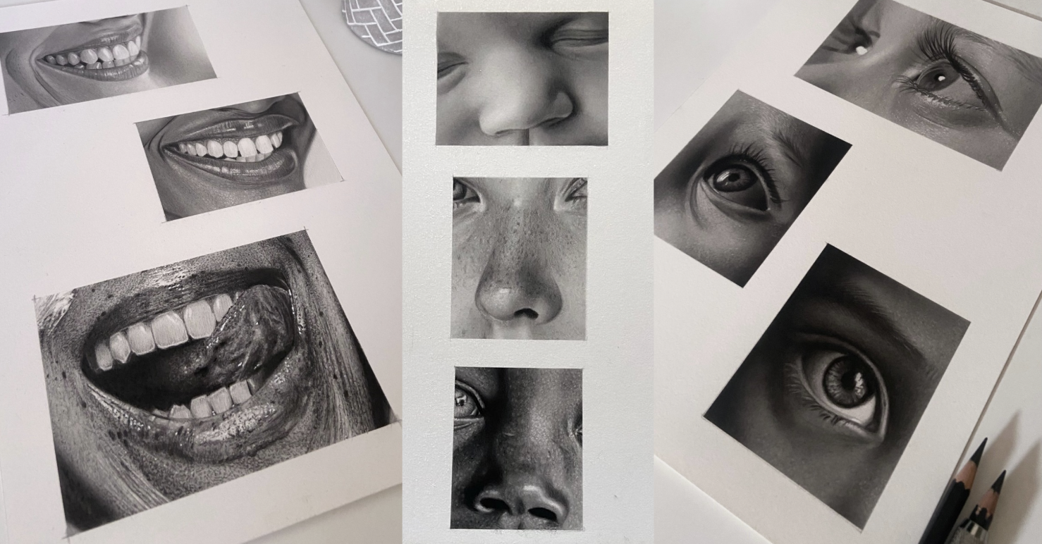
1. Introduction: Nose: Hi. My name is Shane, a professional portrait
artist based in the UK. I run my own commission
based art business where I'll help clients recreate heartwarming moments by drawing photo realistic portraiture
of their loved ones. Welcome to the second episode of daily exercises to
improve your portraits. This particular episode
will focus on the nose. Where you'll get a chance to create super smooth
skin texture, light tonal blinds,
dark tonal blinds, and blinds combined in both. Also, there's a relatively easy freckle detail
and skin texture. You're interested in photo
realism or hyper realism. Knowing how to utilize
a full range of values is foundational
to achieving both. It's impossible to achieve this using graphite pencils alone, so we need to incorporate
different types of pencils to give us a
full spectrum of value. It can be quite a daunting
prospect when starting now. Even if you have a
little more experience and just want to up your game, try to figure out which
techniques to use or which materials to buy can
be a frustrating process. So I wanted to
develop a series of classes whereby at
completion of that series, students will have nurtured
the skills necessary to produce stunning photo
realistic portraits. I'll guide you through 26 small fun and manageable
drawing studies that will take you from novice to
advanced in one series. You'll learn a specific
learning process that uses graphite, carbon, and charcoal pencils together to showcase a full range
of beautifully rich, saturated tones with
exceptional results. I've separated this class into a series of eight mini episodes, each focusing on different
elements within a portrait. Please feel free to visit my
home page where you'll find all episodes within the series to be added over
the coming months. Students will learn how
to observe and recreate details that help achieve
realism and authenticity, a skill set that actually translates beyond
portraiture and pencil drawing and is relevant practice for lots of visuals. I it to advanced
students are welcomed. I want to wish you all
the very best of luck, so grab those pencils
and let's get corrected.
2. Class Orientation: Nose: Hey, guys, and welcome back for the second installment of daily exercises to improve
your portraits. It's lovely to see you here. This is the first installment
you've come across, I encourage you to visit
my home page where you all locate all
class episodes. I intended for the series
to be work through from the beginning as each
individual lesson builds on the last and
has been organized in such a way so as to further
your skill set as you go, either by introducing
new tools or techniques, increasing time and
improving patients or practicing newly
learned skills. This particular
episode is a second in a series consisting of
eight class episodes. Here, we'll focus on the nose. You'll get a chance to work
with brushes and see just how effective they can be for creating super
soft skin texture. You'll complete a study
focusing mostly on a lighter graphite
only tonal range and a study focusing on
dark tonal blends, where you'll get to use
the graphite carbon mixed sdular pencils and
tieb charcoal pencil. To detail realistic freckles and also how to create
realistic skin texture. Complete small studies will only help keep your
attention focused, but will also help
prevent you from feeling overwhelmed,
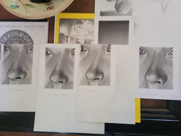
tired, and frustrated. I've uploaded gridded
printable sheets and resources below this video, along with reference photos, materials, list, and schedule. You can mark out the
border shapes and use a grid method for outlining
or free hand if you prefer. To get the most out of
this realism class, I recommend that you one, mentally prepare yourself
to slow down before each lesson and take your
time with every project. Two. Take a photo of each finished
study, as you progress, place it alongside the reference
photo using an app like layout or on your desktop and make any necessary
adjustments. This is such an
important part of the process when learning
and will give you a greater understanding of any difficulties
you may be facing. And three, try to
increase the time spent adjusting and
perfecting your work at the end of each study. Using a full set of values is key to creating photo realism. But if you place a
deep black charcoal directly on top of graphite, the contrast will
look too stark. So I'll show you how to layer different pencil compositions to maintain a consistency
in tone and keep all values in
harmony with one another. Basic materials to get
started will be arches paper, Stadler graphite pencil set, Sedl graphite and carbon
mixed pencil set, one tier pari charcoal pencil, a few cheap brushes,
and some erasers. You can find a whole lesson
on materials in episode one. Before we move on, I'd like to give you a bit
of encouragement. There are four years between
these two portraits. My journey was self taught so I took me a very long time
to figure everything out. Completing all lessons
within this series will speed up your learning
process immensely. And if you create a
daily drawing habit, you'll be killing it
in no time at all. So have fun, and I'll see
you in the upcoming lesson. Oh.
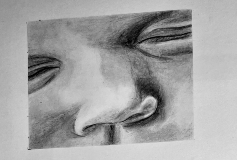
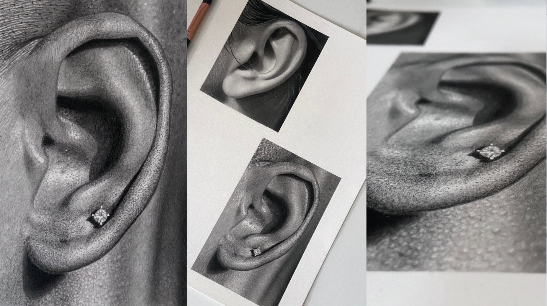
3. Nose Study: Super Smooth Baby Skin: Yes. Hey, guys,
and welcome back. In today's lesson,
we're going to be creating unbelievably
soft baby skin. I love making smooth
skin blends like this, we'll be putting our
brushes to good use. We want to spend extra time varying our pencil pressure to create value transitions that are as smooth as
we can get them, then use our soft brushes to blend and smooth
out even further. I've included printable
sheets with grids for all the studies
within this class in the resources tab
below this video. You can use a grid,
trace or free hand method to transfer your
outline, whichever you prefer. I should mention that
if you weren't able to purchase arches
paper, By the way, I very much doubt that's the correct
pronunciation as it's a French company, but
I'm sticking with it. Please do not feel
frustrated if you aren't able to get the
smoothness you want. Paper is such an important part of the puzzle in regard to art. And watercolor paper like arches comes pre size with latine, which means it blends a little differently to normal
drawing paper. I find it slightly
easier to blend with. If using normal drawing paper, you can get the same result, but you may need to take
a little more time making sure each layer is
even and smooth. Lastly, what will really help
you improve faster and get a better read for
value is if you take a photo of every single
completed study, place it side by side with your reference photo
either on your desktop or using an app similar to the layout app and make
any adjustments needed. It can feel a little frustrating
doing this at first, but if you allow time for it, your understanding of value
will improve so much faster. Once again, I begin marking all the important lines
using the HB black, so I don't lose
them when blending, always making sure
that I don't go over any lines that aren't
as dark as a HB black. Then I begin building the contours of the
face using the F blue followed by the HB and two
B from the blue range. Notice how I create different
tones around the eye just by changing the pencil pressure
slightly of the F grade. Try all of your blending tools. I use a combination of the
stiff day round brush, the tissue, and cotton bud. Lifting any imperfections
using the nedable eraser, and then re establishing the dark lines of the
eye using the HB black. Using a cotton bud here to
blend quite a small area. I lay down my first coat of
five B blue for the dark area by the side of the nose here and smooth with
the cotton bud. Back to the F blue, to begin this side and
blend with a tissue. I begin building the contours of the lip using the B blue. I use the two B black to make the line of the ice
slightly darker. And now some light blending
with the ke show brush. I'm always interchanging
my blending tools to get the best result and re establishing a
sharp nostril line using the perfection eraser. I deepen the value of the
shadow underneath the nose with the two B black pencil and soften using the e
show makeup brush. A second coat with
the B blue pencil. Then smooth off using
the ke show and create a darker tone with two B black for the
upper lip area. I'm using quite a
lot of pressure here to smooth the edge of the B blue value using
a stiff Georgian brush. Now using the five B blue to begin the dark areas
around the other eye. Then onto the four B black for the darker lines of
the eyes and smooth out. I also used the four B
black to begin building value for the darkest part
of the inner eye here. And the F blue to begin
the lighter tones. Smoothing out with the
che show brush once more. I use the two b blue and then the four B black to
build the rest of the eye. Be mindful that smoothing
out a layer will sometimes diminish the tone a little so it can be
necessary to reapply. Now back to the F blue to begin the lightest shades
for the rest of the face. Our lightest tone here is running down the left
side of the nose, so I'm not covering this just yet and smooth out
with a tissue, and now the two B blue and four B black to build
under the eye here. And begin to build
the contours of the nose and cheek
using the two B blue. The bottom of the cheek here just to the right
of the nostril, has a lighter value than
the top of the cheek, so we need to adjust
pencil pressure to fade the darker tone into the
lighter one underneath. And now I grab the
five B blue to strengthen the contours of
the nose and lower eye. I used the two B black
here for the nostril area, and it went to dark
after smoothing, so I lightened the tone by
dabbing the perfection eraser. So now we have all
the changes in value in place to the
right side of the face. I use the four B
and six b pencils from the black range to start laying down our
darkest tones around the bottom of the nose
and inside the eye. Be mindful to keep the outer
line of the nosts sharp. But to light adjustments with
the two B and four B blue, along with some soft
make up brushwork, and we can move across
to the other side. Using a soft makeup
brush to smooth out the last layers will help
create a soft finish. You may not be able to see a few subtle dark spots on film, but I'm just lifting them now as I go with the
need of a eraser. Okay, so going to
the other side, I add a second
layer of F blue and gradually deepen the tone of the cheek with
the four B blue, then blend with a
brush and tissue. A quick reminder
that if you can't get the smoothness you
like from a brush, try using the tissue
for a smoother finish. I begin a third coat of F blue with slightly
increased pressure. It's still quite light, though, and then smooth off
using the stiff brush. As I near the required
finished tones, I switched to the softer
brushes to help create a smooth finish for the
soft skin texture we need. I'm gently adjusting
the transition here to make it look
smoother at the edge, using the four B blue. You'll notice in a moment
that the brushwork will leave a heavier
line than anticipated. I'll then adjust the
transition again using a needable eraser
to lift some graphite, thus making the
transition perfect. Okay, so there's
quite a heavy line around the dark six B tone here, so I'm going to use
the two B black to make a smooth transition, using circular motions with
unbelievably light pressure. I use a medium stiff master touch brush for a
smoother finish. And still working a way at softening this transition
around the inner eye. Once again, taking away
some value as I gone too dark by dabbing the
perfection eraser to make a smoother transition. This brush here is the
master touch brush. It's a mid stiff brush
with finer bristles. Combining this with
the small makeup brush will give you a
really smooth finish. I'm using it to push
some graphite already on the paper across
the light part of the nose to give it
its first layer. Okay, so we've covered
all the techniques and tools needed to
finish the piece. There'll be lots of
small changes coming up, so I'll let you follow
along for a while without any interruption from me while I add all the
finishing touches. But making sure all
skin tones are smooth, all transition
blends are smooth, and all values are in harmony with one another
throughout the whole piece. It's by taking time
in doing this, going backwards and forwards, blending and lifting
again and again, and again, that will really
help improve your drawings. Before we finish, I should point out that my overhead
light always makes high lights seem
brighter than they actually are in the demo videos. Therefore, some of the
smoothness gets lost. You'll be able to get a better idea of what the
finished drawing looks like in the ph at the
beginning of each lesson. Oh. Oh. And lastly, some minor adjustments
to the transitions. So before you begin, the
main things to remember in order to achieve that
extra smooth skin effect is to use the pencils and spend
as much time as is needed on making sure every transition is as smooth as you can make it. Then you finish off for
the soft brushwork. I hope you have fun and
achieve super smooth results. I'll be waiting for you
in the next lesson. Yeah.
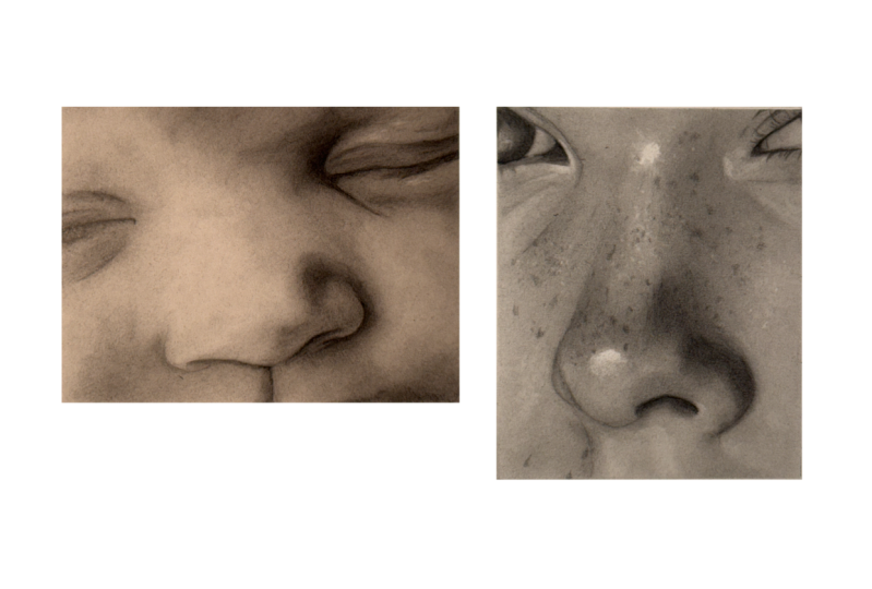
4. Nose Study: Light to MId Tones & Freckle Detailing: Hey, guys, I welcome back. In today's lesson,
you get a chance to repeat and improve the skills
learned in the last lesson. But in addition to this, we
have some relatively easy but impressive detailing to
achieve by way of records. This will really help
make your drawing pop. We'll be focusing mainly on light skin tones
for this study, and we'll mostly be using pencils from the Blue
graph only range. There aren't any really
dark areas in this study, so we'll start with
the lighter grades of pencil and slowly add darker grades until the
right mid tones are reached. Okay. Let's get into it. Okay, so first of all, I go over all the
important lines using the HB black pencil so I don't
lose them during blending, and then lay down
my first layer, that being the F blue. I covered a whole
area of dis pencil. Then blend together using the tissue in circular
motions where possible. Notice that I've
left space for where the high lights are at the
top and bottom of the nose. Then I begin creating
the contours of the face using the B blue. Unbelievably light
pressure as always. Don't forget to
vary your pressure to fade a transition
wherever needed. And smooth out using a
cotton bud or tissue. And more of the B blue pencil and then smooth out
using a tissue. And then the F blue pencil, trying not to draw over
the highlighted bit, that's followed by the four
B black for the nostril. Then smooth. The fines of a small makeup brush will leave a really smooth finish on
this watercolor paper. I start the iris of the
eye with a five B blue, then smooth out with a
small make up brush. Then I add the seven B black and an eight B
black layer on top. There isn't much detail here, so I use the brush and dab the perfection eraser
until it looks just right. Now, I begin to darken the value at the bottom
of the nose using a five B blue pencil and then smooth out with
the soft make up brush. I grab a lighter pencil to
build the body of the nose, the two B blue, leaving space for the high
light at the top. I re establish the highlights with the battery
eraser turned on, then add another layer of
two B blue and smooth out. I apply a tiny bit more
pressure with this layer so we can distinguish the bridge
of the nose a bit better. And then another
layout of five B blue for the dark areas
and blend out. I'm constantly making tiny adjustments to
the values as and when needed by gently dabbing either the needable
or perfection ***. Double checking values against my value chart to
make sure I'm on the right track and more work with the two B
blue until I'm hay. Darken a nostril using
an eight B black. Being mindful to leave a sharp line around
the nostril edge. Add some six black
to the right eye, some more smoothing out
with the makeup brush, and a few highlights
around the eyes and nose using the battery eraser. I'm not turning the
power on just yet. Oh. I'll make some final
adjustments by dabbing the perfection eraser and then adding some two B black to
the bottom of the nose, and then we're ready for
some freckle detailing. We need a few elements to draw realistic looking freckles. We need different
tones, different sizes. So freckles will have
hard and sharp edges, and some soften blurry edges. We use different
pencil grades with varying pressure to
achieve different tones, like I'm doing here with
the HB black pencil. Along with blending stumps and brushes to create
soft blurry freckles, like I'm doing here
with a blending stump. We can use blending stumps to either soften freckles
made by pencil or we can make graphite powder
and dab the stump in the powder and gently
add directly to paper. Da the perfection eraser
in between the freckles, we will add some
lighter skin pores. We can also use the
perfection battery and nedable erases to make subtle highlights in
between all the freckles, like I'm doing here
with a battery eraser. You can also notice
that I'm using several different pencil
grades like F blue, B blue, HB black, and two B black for the darker values at
the base of the nose. Now, the HP black for
some subtle eyelashes. I hope you enjoyed the demo. So to recap, we want
to make sure that all our values are smooth and correct before
we begin detailing. To create realistic
looking freckles, we use a combination of
different pencil grades, varying pencil pressure,
different sizes, and blending stumps to make
hard and soft freckles. Okay, so have fun, and I'll catch you in the
next lesson. Yeah.
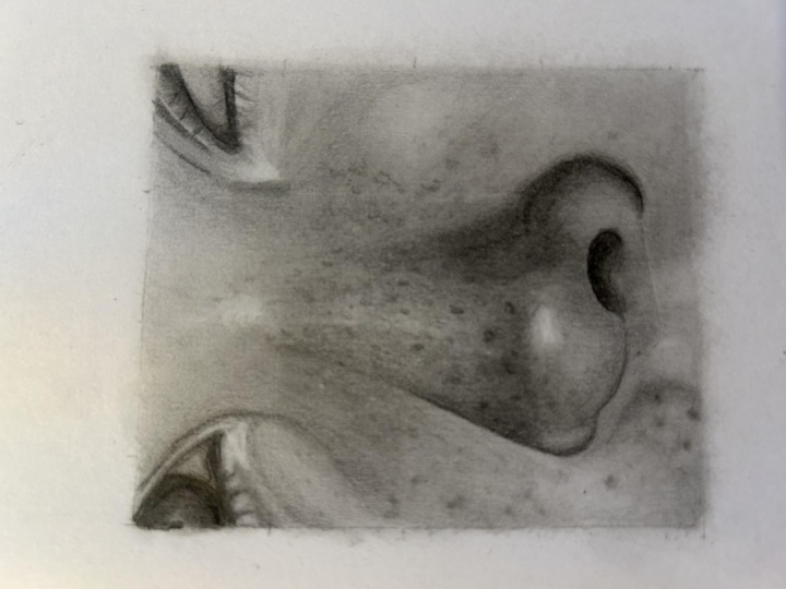
5. Nose Study: Dark Tones & Skin Texture: Hey, guys, and welcome back. In today's lesson, we
have another nose study, but in this drawing, we'll be concentrating on
mid to dark tones. As mentioned previously,
when I'm working on a piece which incorporates a good amount of
my darkest value, the quanti three
B charcoal pencil or eight B stead of black. I try to build that value on
the page as soon as I can. By doing this, it really
helps me determine all intermediate values
as I build a portrait. By contrast, if I were
working on a piece which only incorporated
light to mid tones, I would start with the lightest graphite grader pencil and build darker value until the required mid
tones are reached. We also have some more skin detailing to attend
with. So let's crack on. So I begin with marking out the important lines of
the HB black and then lay down the first five B
blue undercoat layer for the areas with
the darkest value. Sometimes, if I can't get the smoothness I want using a brush, I'll switch to a stiffer
brush or one with shorter bristles as this will help blend the
graphite better. Then add two layers of eight B black using small
circular motions to create an even cover and smooth out each layer using
the small makeup brush. Now that we have some of our
darkest value on the paper, we can start working the
values on either side. Starting with the five B
blue for our first layer. I used a small makeup
brush here first of all, but didn't get the smoothness
I wanted on the dark value. So I'll switch to the
show brush because the short worn bristles
are better to push the graphite around the paper so blending slightly better. I use two coats of five B blue, smoothing out each layer. A field and nostrils using the eight B black then
add more five B blue around the nose with
varying pencil pressure to keep the subtle
changes in value. Now I grab the B blue to start a lighter tone at the base
of the nose and upper lip, being mindful not to cover the
high light on the nostril. The two be black for
the right of nostril using the perfection eraser to make some tiny adjustments, and darkening the
lines of the left eye, using a two B black. You want to be careful adding dark lines to the eyes as it's easy to go too dark compared to the other
values in your portrait. If you do this, the eyes will be too prominent and stand
out way too much. Start with lighter
values and deepen the value as you build
the surrounding tones. And the two B blue, and the eight B black
for the eyelids, be mindful of line weight between upper and lower eyelids. Lower lids are generally
not as dark or thick. Okay. So we have a good render for the values to the
left side of face. Let's begin the lighter
right side using the F blue and use the tissue and make
up brush to smooth. Using a two B black to very lightly make
some skin texture. These small areas of dark value aren't a smooth even cover, so I'm using small
circular motions with quick varying pressure to create small spots
of light and dark. Or you can create an even tone and use the
eraser to make some texture. There's always more than one way to get the result
you're looking for. I'm using the same technique here again with the two B black, tiny circles or very quick
back and forth action, keeping the fore
arm quite rigid. I use very quick changes of
pressure when doing this to create tiny changes in
value for skin texture. If I were working on
a bigger drawing, I would need to change
the technique and focus more on every single skin. And once again,
you can do this or build a solid tone and use
the erasers to make texture. By gently dabbing and lifting
up small spots of graphite. Adding darker value as I build the contours
to the top right, using the B blue pencil
and smooth out the tissue, gently dabbing the
perfection eraser to adjust the tone just around
the highlight on the nose, and a second coat of blue. Okay, let's begin
the ris of the eye. I grab the five B blue and start making patterns
in the iris. The lines in the ris
always travel from the outer ring towards
a pupil in the middle. Once we have the lines in place, we can smooth out using
either a brush or stump, which will cover the
whole area with graphite, and then we're able to use our erasers to pick up
some highlighted lines. I keep doing this until I
get the desired result. I use the IC show
brush here with mid to heavy pressure to
smooth out this area and push the darker tone
that's already on the paper onto the lighter
tone to make it a shade. And then smooth out all the
other values and transitions. Right. Now for our
darkest value, the conti free Be
charcoal pencil, starting with the nostrils, then onto the body of the nose. When smoothing out the
nostrils with a brush, be careful not to push any of the powder left body
conte onto the nose. We want a nice
sharp nostril line. Notice that there
are only a couple of solid black tones
along the nose, one around the left nostril, and two next to the eye. Outside of these areas, I dab the conti to
create a stipple effect. And use a brush to dab the
charcoal and soften the dots. I then finish the area off with a light going over with
the Ike show brush to blend everything together and soften the edges of the
shadow part of the nose. Okay, let's begin some detail. I should point out that
my overhead light always makes a high light seems so
much brighter when filming, whereas in reality, they
are much more subtle. I begin by gently dabbing the battery eraser
to make skin paws, I vary the pressure when dabbing
to make different tones. I'm not turning the eraser on as that will pick up
too much graphite. I use the HB black to lightly
make some cast shadows. I smooth over with
a brush and then re dab several of the same dots. This creates a mixture of mid
tone paws and lighter paws. If I wanted to make
a few small bumps on the skin, for example, spots, I would use a light
grade pencil to make cast shadows on
several of the dots. The light is coming from
the right hand side, so the cast shadow would need to be on the left
hand side of the dot. Making a semicircle shape
to the left side of the dot will fool the eye into believing they are small spots. If I wanted to create indentations on the
skin like skin paws, then that pencil mark
would need to be on the inside of the dot
to the right hand side. The light in this photo
is coming from the top, so the shadow marks I'm
making here are at the top. Using unbelievably
light pressure with a HB black pencil to make
semicircular marks and then using the battery
eraser to gently dab and make highlights in the middle of those semicircular shapes. You can use the sharpened perfection eraser to
get the same effect. Even using the needable
erasable makes subtle marks, use a combination of all
of your tools to help add as many different types
of detail as possible. I just keep going backwards
and forwards using all the techniques just shown until I'm happy with the detail. I'll let you follow along with the time laps until we reach
the end of the project. Making some light adjustments to the tone here with the Na Bersa. O. So a few things to remember
before you start A, to lay some of
your darkest value on the page sooner rather than later as that will
help you work out all other values
during the process. And use a combination of all the erasers to make
different types of skin pores. For example, different sizes, tones, hard and soft edges, small bumps, and indentations. So good luck with this
drawing, have fun, and I'll be waiting for you
in the upcoming lesson. Yeah.
6. Conclusion: Hey, guys, you made it. I just wanted to
give you a huge pat on the back for completing
the second episode. Congratulations. There are lots of things to take on board
within this episode, but I think the most exciting
aspects were learning how to use brush work to create super smooth
skin texture, realistic freckle detail, and
also realistic skin detail. Knowing how to create
wonderfully smooth values and transitions is such an
important skill to acquire, one that should
provide immediate improvements in your portraits. It's a foundation on which to create detailed
portrait drawings. Couple of things I'd
like you to take away from this
particular episode. Firstly, is to make sure all of your values are correct before
you start any detailing. Do you remember what I said earlier about taking a photo of your work and placing it side by side with a reference photo? You won't need to do this too often as you become
more experienced. And secondly, in order to create an unbelievably
soft effect, use softer brushes as you finish your work toward
the end of your drawing. Before I wrap everything up, I just wanted to remind
you that you can upload all completed studies
to your class project page. Each student gets one project
page per class episode, but on that page,
they're able to upload all the projects from the
episode along with text. There's even space for thumbnail
photo at the very top of the page where you can add a drawing from the class
that you're most proud of. The thumbnail picture
is what will appear on the main class page for
everyone else to see. Students can press on
the thumbnail picture, which will open your
projects page for them to see all the wonderful drawings that you made
throughout the class. If you'd like to leave a review, you can hit the Reviews tab
and then press Lev a review. All reviews are warmly welcomed, and I always love to hear
your thoughts on the class. If you have any questions
regarding the class, you can hit the Discussions
tab where you'll find a discussion that I started
regarding contact me. You can hit Reply or one of these tabs and
post your question, and I'll reply as soon as I can. I've also started another
conversation thread on my main profile page. Just find my page, scroll
down to the bottom, press the questions
and discussions, thumbnail and leave
your message. With that being said, I cannot wait to see you in
the next episode. We have more fantastic
studies to get through. So take care for now, and
I'll catch you there. To
 Shayne Wise, Professional Portrait Artist