Transcripts
1. Introduction: Hi, my name is Shane, a professional portrait
artist based in the UK. I run my own Commission
based art business where I help clients recreate heartwarming moments by drawing photo realistic portraiture
of their loved ones. Whether you're interested in photo realism or hyper realism, knowing how to utilize
a full range of values is foundational
to achieving both. It's impossible to achieve this by using graphite pencils alone, so we need to incorporate
different types of pencils to give us a
full spectrum of value. This style of drawing,
and I've spent many years honing my craft, dedicating almost every day
to researching, learning, and practicing the
skills necessary to produce such quality
in my drawings. It can be quite a daunting
prospect when starting out, even if you have a
little more experience and just want to up your game, try to figure out which
techniques to use or which materials to buy can be
a frustrating process. I wanted to develop a series of classes whereby at
completion of that series, students will have nurtured
the skills necessary to produce stunning photo
realistic portraiture. I'll guide you through
26 small, manageable, fun drawing studies
that will take you from novice to advanced
in one series. You'll learn a specific
learning process that uses graphite, carbon, and charcoal pencils together to showcase a full range
of beautifully rich, saturated tones with
exceptional results. Separated dis class into a
series of eight mini episodes, each focusing on different
elements within a portrait. This particular
episode will focus on some basic techniques
required for realism. We'll be making our very
own value scale chart, creating solid tones and
super smooth gradations, learning how to fix mistakes and keep layers smooth
and so much more. Please feel free to visit my
home page where you'll find all eight episodes within the series to be added
over the coming months. Students will learn how
to observe and recreate details that help achieve
realism and authenticity, a skill set that actually
translates beyond portrait and pencil drawing as its
relevant practice for lots of visual arts. Beginner to advanced
students welcomed. I want to assure the
very best of luck, so grab those pencils
and let's get corrected.
2. Class Orientation: Hey, guys, thank you so much
for rolling in the class. It's lovely to see you here. This series as a whole, comprises many small
drawing studies. I recommend working through
the series from Episode one, as each individual drawing study builds on the last and has been organized in such a way so as to further your skill
set as you progress, either by introducing
new tools or techniques, increasing time and so improving patients or honing
newly learned skills. Completing small
studies will not only help keep your
attention focused, but will also help
prevent you from feeling overwhelmed,
tired, and frustrated. Some studies will focus mainly
on lighter graphite tones, some from the
darker tonal range. You'll get a chance to produce
super smooth skin tones, different vocal effects, some relatively easy
skin and hair detail, and so much more. So this particular
episode is the first in a series consisting of
eight class episodes. Here, you'll learn about
materials and how to use them, and I'll show you how to make
your own value scale chart. You'll learn how to create
solid single value tones, along with super
smooth gradated tones. These are important for things like backgrounds
and skin blends. I'll show you how to fix
mistakes and keep layers smooth, and you'll get an opportunity to practice pencil We'll then get a chance to use all your
newly learned skills to draw hyper
realistic water drops. Using a full set of values is key to creating photo realism. But if you place a
deep black charcoal directly on top of graphite, the contrast will
look too stark. So I'll show you how to lay a different pencil
compositions to maintain a consistency
in tone and keep all values in
harmony with one another. I've uploaded grided
printable sheets in resources below this video, along with reference photos, materials list, and schedule. You can mark out the
border shapes and use a grid method for outlining
or free hand if you prefer. Get the most out of
this realism class, I recommend that you one, mentally prepare yourself
to slow down before each lesson and take your
time with every project. Two, take a photo of each
finished study as you progress, place it alongside the reference
photo using an app like a layout or on your desktop and make any
necessary adjustments. This is such an
important part of the process when
learning and will give you a greater understanding of any difficulties
you may be facing. And three, Try to
increase the time spent adjusting and
perfecting your work at the end of each study. Our first project
will be to make a very own value scale chart. I always advise taking
the time to make your own using the medium
you're working with. It will be an invaluable piece of kit to have by your side, especially while
building familiarity with using a full value range. The basic materials
you'll need to get started will be arches paper, Stadler graphite
only pencil set, Stadler graphite carbon
mixed pencil set, one contiapary charcoal pencil, a few cheap brushes,
and some erasers. We'll cover more about materials
in the upcoming lesson. Before we move on
to the next lesson, I'd like to give you a
bit of encouragement. There are four years between
these two portraits. My journey was self taught, so it took me a very long time
to figure everything out. Completing all the
lessons within this class will speed up your learning
process immensely. And if you create a
daily drawing habit, you'll be killing it
in no time at all. So have fun, and I'll see
you in the upcoming lesson.
3. Materials: So for this lesson,
I want to show you all the different
materials that I use to create photo
realistic portraiture. I'll also be providing a
few tips and demonstrations along the way on how I use certain tools to get
the most out of them. We'll be covering
things like which papers, best for realism. Why we need different
pencil compositions to create a four
range of values, blending tools, different
types of brushes, different types of erasers, and. By the end of this lesson, you'll have a better
understanding of what is needed and why. Okay. Let's get into it. I think the most important
consideration when choosing paper for realism is the
texture or lack of it. I always look for
super smooth paper. This really helps with all
those tiny little details like the corners of
the eyes, et cetera. Generally, I use two
papers when I draw. They're both fairly similar
in weight and smoothness and are both fantastic
papers to use. The first paper is the
Strathmore Bristol Smooth, a 300 series paper. At 100 pound weight is
a good weight paper for professional use and has a
wonderfully smooth surface. Be careful not to purchase
a vellum surface, as they look identical, vellum has a medium texture. Second, and the one
that I'll be using for this class is that arches
hot press watercolor paper. Hot Press by the way is a term used for smooth surface
in the watercolor world. It blends graphite
unbelievably easy, which does help with the
smoothness of value transitions. It's a little more hard wearing than the Strathmore, therefore, a little more forgiving, and handles brushwork
extremely well. Beginner artists will find the workability of this
paper a great advantage. One thing to mention,
be sure to use low tech tape if making a border around your portrait
before drawing begins. Otherwise, it can rip your
paper or leave residue, which is the bugger to remove. Okay, so to pencils, I use three types of pencils
when I draw with graphite. They all perform slightly
differently on paper, and are essential for me to achieve a full range of values. They are the Stadler
Ms lumograph, blue graphite only pencil range. I use four H to five
B from this set. I bought the two H to eight B set with an additional
four H add on. Then there's a umgraph
black graphite and carbon mixed pencil range. I use a four range of six
pencils from this set, HB to eight B. You can't really lay down
dark charcoal next to graphites as the contrast
will look too stark. So this set of pencils are
ideal to bridge that gap. And the contia peri peri
three B charcoal pencil. It's quite difficult to find a charcoal pencil that you
can use on top of graphite, but the conti works
wonderfully well. Something to note
about the Stadlers, the black range of graphite
carbon mixed pencils behave slightly differently on paper than the
graphite only ones. They do not blend and smooth out as easily as
the graphite only, so we need to make sure that we use unbelievably light pressure, especially with the darker
values from this set. Sometimes it feels like it's just the weight of a pencil
alone touching the paper. Also not forgiven asigrap our own pencils and
do not lift as well, so we need to bear
this in mind with regard to pressure
in case of mistakes. Onto pencil sharpeners, I use two types of
pencil sharpeners, the JackR brass double whole wedge shape sharpener
for the stdlars, and the contia peri wooden
sharpener for the conti. The conti charcoal pencil is slightly thicker than others, so this sharpener is ideal. I always have three sets of
brushes on hand when drawing. A soft bristle, medium
bristle, and a stiff bristle. I prefer getting them in sets as all the different
sizes do come in handy for different
parts of the portrait. I have a soft makeup
brush set by a Bestop. They're just a generic brand
bought cheaply from Amazon. I have the master touch
reflex filbert brush set. They're a medium
stiffness brush, and the drogan short
filbert brush set, which is a stiff brush set. I also use the following as I find it really
good for blending. I use this brush extensively. It's a generic brand
called Ig Show. If you can't find this
one, then a similar, soft, short shaded iron
makeup brush will do. None of these brushes
are expensive, and they don't really
need to be brand names. The main thing is that
you have varying degrees of stiffness as they
all play their part. We have some additional
blending equipment here. You can grab a box of
soft tissue or lou roll. I normally fold this to a point and use circular
motions when blending. If you go back and forth
in a straight line, you'll probably end up making darker patches at every
change of direction. Cotton pads do a great job. Try to also use in circular
motion whenever you can. We have two types of cotton buds here, rounded and pointed. Pointed ones can be good
to have laying around for detailing and
blending tiny areas. And finally, dirent
blending stumps are great to use as they are a
little softer than most. Some of the generic
stumps can be too hard, and I find that they do
not blend quite as well. Whatever you decide to
get at the very least, we'll be needing soft tissue, rounded cotton buds,
and the durance stumps. Okay, so let's take a look at some erasers and how
best to use them. I use several different
erasers when drawing. All have a part to play and are needed for different
jobs during the process. The needable putty
eraser by Faber Castle. You may not realize it yet, but this simple thing will
become your best friend. I'm constantly
using this to help create those super
smooth skin blends. Sometimes you get
unintentional dark marks caused by graphite build up, I'll use this eraser
to make a point and gently dab the area to
lift up the graphite, and then re blend to
create a smooth finish. It can even be used to
create different effects or textures like a mottled
background, for example. Mono zero eraser
is a pencil eraser with replaceable two
millimeter rubber leads. This tool is so important for creating things like
fine strands of hair, the patterns of the ris, and even skin paws. You can use a craft
of if or scissors and make a diagonal cut to
get a really sharp edge. But for speed, I just run it along the sandpaper
block at an angle. The T battery powered eraser is another great
tool for detailing. I use the sandpaper block once again to bring the
tip to a fine point. This is great for
paws of the skin and those tiny highlights around the eyes and the
lips, et cetera. It's also the best tool to
erase errors, if needed. And finally, we have the curry naw and faber
castle pencil erasers. They're fairly similar, albeit the curry naw has a
slightly softer rubber. Both are great for
detailing and to lightly bring up a layer
or two of graphite. It's good to have both on hand, as they behave
slightly differently. The curry naw with
the softer lead, will erase more graphite, whereby the faber castle
perfection eraser is fantastic for perfecting
small subtle blends, for example, creating
water effects. I have an artist's sandpaper
block sitting by my easel. This comes in handy for things like sharpening the
monozero eraser, sharpening the Thu
battery power erase, cleaning your blending stumps, and you can even
make some powder from your pencils to use for detailing with your cotton
buds or stumps, et cetera. I always give my finished
portraits a couple of coats of Windsor and Newton fixative
spray for protection. I find using a male stick a really convenient way of eradicating finger and
palm smudges on your work. It just hooked over the top of your easel, if you're using one. I made this very easily
using a strip of wood, a couple of screws,
and a bracket, which I bent, or you can
just use a sheet of paper. And a few extra items
that may come in handy, but not absolutely
necessary for this class. So I hope you now have a
much better understanding of all the different
types of materials needed to create
realistic portraiture. Out of all the products
we've covered, I'd say smooth paper, the correct blending tools, and the three different
pencil compositions are the most important
for achieving realism. So as you close at this lesson, have a think about your space
and all your equipment and try to get everything ready to go for the upcoming lessons. I'll see you there. Yeah. A
4. Making a Value Scale Chart: Hey, guys, welcome back. We have a fantastic
lesson for you today. You'll be using your pencils and blending tools to make your
very own value scale chart. Although a relatively simple
exercise to complete, this chart will become
an essential part of your everyday work as a portrait artist and speed up your proficiency in
determining value immensely. In time, you'll have a much quicker understanding of what value is needed
at any given point. This particular lesson is
important for two reasons. Firstly, will be using the same pencils as we
used throughout the class, so you'll have your first taste of how they behave on paper. And secondly, you'll have a value chart with an identical value reference
to your medium. You can buy a cheap one online, but it'll be much more
beneficial to you if you make your own using the
medium you're working with. Your eyes can
sometimes play tricks on you when trying to
ascertain a value, so I find it helpful
to have a value scale which represents
a true reflection of the medium I'm using. If you pause on the following
image for a little while, you'll see exactly what I mean. Okay, so let's get cracking
with a first project. I've included the
image on screen now in the resources
tableau video, so you can easily refer to it when completing
the project. In it includes all
the information you'll need to
complete the charts. For example, all measurements
and pencil grades along with the pencil
grade layers in sequence. We'll be using pencils four H to five B from the blue
graphite only Stadler range and HB to eight B from the black carbon graphite
mixed Stadler range. We'll also be needing our
conti three B charcoal pencil, cotton bud, and a brush. I use the Georgian short Filbert number six
brush by Daler Run. So the idea with this project is to use very soft pencil strokes, then blend to a smooth, saturated finish using
a blending tools. It's okay to use different
directional strokes. The important things to
remember are to always apply very light pressure and to get an even cover with each
layer before blending. We'll be adding
three to four layers of value to each box, blending each layer as we go. This will saturate the paper
and create a solid tone. Okay, so I'm just marking out the lines for
the chart here. Each rectangular box is 1.9
centimeters across and 3.5 centimeters down with an
additional 1 centimeter at the bottom for space to
write the pencil grades in. We'll be starting light to dark. As if we go dark to light, we run the risk of darker values seeping into the lighter
value during blending. As I mentioned earlier, we want to use really
soft pressure here to create an even layer of
graphite before smoothing out. It's okay to use different
directional strokes as they will all blend together nicely when using the bud. Using different
directional strokes will help hit your
graphite layer even. You can use slightly
more pressure on the second and third layers, but it's still very, very light. We use several layers of light pressure instead
of one layer of hard pressure
because we're trying to stimulate the effect
we get when drawing, this will give us the best
value match for a scale. Okay, I'm happy with this layer. It's the same value all over
with no uneven dark patches, so I think it's
time to blend out. I'm using a tissue here, but you'll notice
in a minute that I swapped back to the
cotton bud as I didn't want to run the risk of smudging darker value onto the value
in the lighter boxes. Don't forget to add
several layers in each box whilst we build to
our desired value, smoothing out with each layer. This will help you achieve
that saturated tone, which is ultimately
what we're looking for, a nice, solid,
saturated skin tone. Try to make sure
that each new box is just ever so slightly darker
than the previous box. You'll get a chance at the
end to go back across them all to make sure you have
all the boxes even gradated. You'll know when it's time
to move on to the next box, because after a few layers, you'll start needing to apply heavier pressure, which
we don't want to do. So when you can't see
it getting any darker, after about three layers, and it's a solid tone, then you can move
on to the next box. So remember, under all the
Stadler black pencils, we lay down the five B from
the Stadler blue range first. This acts as a sort of
an undercoat to help keep the tonality between
the two pencil sets. Otherwise, I find applying the black range straight to
the paper without the five B blue underneath can look too stark compared to the
graphite tonly pencils. Also, remember, use the
lightest of pressure with a black set and try not to leave any visible lines
before smoothing out. You'll see me smoothing out
the Stadler blacks soon, using the Da ale
Georgian filbert brush. It's a stiff brush, which
is good for this pencil set as it gets right in amongst the black leg to
blend it altogether. Tissue doesn't really
do the trick as they don't blend as well as the
graphite only blue pencils. You can use medium to
hard pressure for this. During the process, we
wouldn't always go from the five B to eight B
black pencil in one go. In cases, we'll have
a few more grades in between to help with
smoothness and transitions. Last two boxes consist
of first layer, the five B blue pencil
range, second layer, the eight B from the
black pencil set, and the last box,
an additional layer of conti three B
charcoal pencil. So I'm now going back over
to make sure that I have even gradations between the
lightest and darkest values. You'll notice that there's
quite a big jump in value from two b to four B blue. So I want to make that as
evenly gradated as the rest. Be careful not to
blend light value using the brush that
you've just used, and it's still got
darker value on it. Wipe it off onto a
tissue before blending. So, now at Sh turn. Create a value reference chart
to use for this project. Once completed, use it to
try and determine what sort of value you
think is needed for different areas of
the reference photo. For example, the forehead may have several
different values. You may need a four H
for the lighter side, and F or HB grade in the middle, and the shadier side may
need your darkest value, the cont charcoal pencil. As I mentioned previously, the name of the game here is to make the value blocks
in your chart as smooth as possible and to have even gradations between
white and black. For our next lesson,
we'll be learning how to transfer our outline to
paper. I'll catch you there.
5. Transferring Outline to Paper: Hey, guys, welcome back.
During this lesson, I'm going to show you
a couple of easy ways to transfer your reference
photo outline to paper. If you would like to
free hand your outline, please go right ahead. Free hand practice is beyond the scope of this
particular class, but I always encourage
daily free hand drawing as it's a
fantastic skill to master. You'll be amazed by how
much you improve with a daily practice in just I'm
not free hand in my outline, for example, working
on a larger piece, I'll use a grid method. This is an easy way to keep
proportions intact and is a fantastic method to use
for extremely large pieces. I recommend downloading
the drawing grid app. It's free and
really easy to use. Upload your image to the app
and configure a squares. You can change the color
of your lines so as to make them easy to see
in any reference photo. Use the amount of
columns you want. I've used ten columns going left to right
throughout this class. The shortest side of an
A four sheet measures 210 millimeters. So dividing 210 by ten means we get ten square columns each
measuring 21 millimeters. You can also change the
width of your lines. I always go for the thinnest, which is one pixel. Make sure the squares
button is on, so you get 21 millimeters squared boxes and
not rectangles. You can even add
numbers, if you like, along with diagonal lines, but I never use these. Export the gridded image, safety gallery, and
voila. Job done. Measure out the same number of 20 1 millimeter squares on your paper as you
have in the App. Use the squares as a guide to outline the boxes for
each drawing study, and then you're ready to
outline your references. Some of the study boxes
in this class do not fit perfectly along the 20
1 millimeter grid lines. So be sure to
include any part of the reference photo that sits just outside of any grid lines. Some may only be a
few millimeters over. I've included the
outline I make for every study within this
series in resources, which you can find
below this video. It is possible to
trace your outline. However, I don't
recommend this way, as it's extremely easy to make indentations to your paper. Indentations will
leave white lines when covered with graphite,
which you do not want. However, if you would like to trace and have
access to a printer, this will be the quickest
way to transfer an outline. Normal printer paper is best. The thinner, the
better. First of all, we want to print out
a reference photo. Make sure you set
your printer to use the entire A four piece
of paper with no border. A good tip to remember
is that if you ever feel your image
printout is too dark, and maybe you having trouble
seeing important lines, then try lifting the brightness a bit on your phone
before printing. Grab your five B
Stadler blue pencil and completely cover the back side of the printed photo
with graphite. Make sure not to leave any gaps. Then securely, attach your printout
over your drawing paper. A clamp of some sort is
best, like I'm using here, but if you don't have clamps, then low tech tape will do. Just be mindful that some
tapes leave residue, so use a low tech tape or try to cover as little of
your paper as possible. Then outline as follows. Make sure your pencil is sharp. A four H is good to use, and be very careful
not to press too hard and leave an indentation
in the paper below. Practice pencil pressure before attempting to trace the studies, so you get a feel for
how much pressure to use without
leaving indentations. Also, it's a good idea to lift your printout periodically to check you not pressing too hard. Keeping a pencil at an
angle will help with this. So to recap, if using
the grid method, use a light grade pencil
like a four H blue, and with light pressure, mark out the 20 1
millimeter squares on your A four sheet of paper, draw the study boxes, then outline your study. If tracing, remember, to set your printer to use a whole
A four paper with no border, thin photocopy paper is best. Using a four H pencil at a low angle will help
alleviate indentations. Definitely practice
your tracing pressure to make sure you're
not pressing too hard. Bonus of using the
grid method is that you're not restricted to
an A four size printout. So in the future, if you work at new measurements, you can use this method to fit
any size paper you choose. For now, have a think
about which method you'd like to use to transfer
your outline to paper, grid, free hand or trace for when we get to
the drawing studies. We have some really exciting lessons coming up beforehand, lessons that are important
not to skip if you want to get the best results from the studies in this series. If you take extra time, getting these fundamental
practice lessons right, they'll transform
your portrait game. I look forward to
seeing you there.
6. Pencil Pressure Practice: Single Tones & Transitions: So we have a very important
lisson for today, practicing how to create solid value using
pencil pressure alone, so without blending
tools or erasers. The drawing practices
within this lesson will only improve your
technical ability, but also your patients. Mastering how to
create different values using pencil pressure alone will help you to slow your work down and
take time with your. Is such an important
skill to acquire that our highly
recommended students take as much time as is needed until the required
results are accomplished. Our blending tools are used to finalize
great pencil work. Mark out the lines
from the study sheets that are outloaded in resources as many times as you need
until you achieve even tones, wonderfully smooth
transitions, and a good feel for all your pencils and
how they interact on paper. The longer you spend
perfecting this practice, the better your drawings will
be throughout this class. Because this practice session is focused solely on
pencil pressure, I'm not free handing or
gridding the outline. But instead, using
a sharp tool to pin all the important points so I can outline with speed in mind. It's a great way to
outline if you wanted to try this practice
multiple times. However, I definitely would not recommend using
this approach for any part of the upcoming
drawing studies, as it will ruin your paper. Small scissors, a bradle, pin, or compass would
also be good to use. If you don't have any small
sharp instruments to hand, please feel free to free
hand or use a grid. I've placed gridded
sheets in resources. I pinpoint the 20 dots only along the outside
edge of the box of nine rectangles and use a ruler to connect the
lines across the page. Okay, so I'll be starting with the four H from
the blue set of graphite only pencils and work my way through to
the five B blue. The idea of this
practice is to use unbelievably light
pressure whilst creating an even solid tone. To start off, the
pressure feels like it's just the way to the pencil
alone touching the paper. Keep your pencil at a
low angle and sharp. You'll see artists twist their pencil a quarter
turn quite regularly. This is so they can prolong the sharpness before they
need to sharpen again. Our goal by way of
layers is to alleviate any dark lines or spots
caused by graphite build up, overlapping pencil strokes, or slight changes of pressure
with your pencil strokes. Try to keep your pressure
consistent throughout each layer and use strokes going in all
different directions. For example, one
layer horizontally, one vertically, and
one diagonally. Also, small circular motions
are good to use if needed. Using this technique throughout multiple layers will eventually
create an even tone. After several layers
have been applied, we can very gently
increase our pressure to match any lighter
areas to darker areas. However, be mindful
that the change of pressure is
unbelievably light. Speed is your enemy here, so try to focus on taking
your time and going over and over with layers until you get
the result you want. Now for the two H blue, this is the second
darkest grade I use. I use nine grades from
the blue set from light to dark going
four H, two H, H, F, HB, b2b, four B, and five B. The five B blue has
a similar value to the HB from the black
range of pencils, so it's a great value
to swap pencil sets. Because the black set has graphite and carbon mixed leads, it's a perfect set
to take you up to the pitch black mat
charcoal pencil. Use the same technique
used with the four HH blue with all other
grades of pencil. The graphite spots
and lines will be more apparent when
using the darker grades. One other important
aspect to consider this practice is to
try and aim to make each consecutive box
slightly darker than the one before as you use darker
grades of pencil. Like in the photo of my practice at the beginning of this lesson, you can perfect this by slightly increasing
the pressure for the last few layers in each box until you reach
the required tone. Oh. You should begin to notice dark graphite spots appearing when using the darker grades. Keep working around them with small circular motions
until the whole. O M Okay, so as we're nearing the end of the
single tone boxes, it's time to outline
another rectangle page as regard to be
practicing transitions. Creating smooth transitions is an unbelievably important
skill to master. Outline the rectangles on
another sheet of paper and use the same pencils we
just used to five B blue, one box for each grad pencil. Lighten the pressure as
you go down the page until you fade out to the
natural paper underneath. Just like last time, try to
make each consecutive box slightly darker than the as you use darker
grades of pencils. It's quite difficult to fade to nothing with the
darker grades and will require the lightest of
touches. See how you get on. Now that we've
completed solid tones and smooth transitions, practice creating
more transitions, but this time over the solid
tones on our first sheet. Using the five B blue box, layer a few grades of pencils
from the black set on top. You want to lighten your
pressure evenly from top to bottom to create
a smooth transition. Try whichever grades you like, but make sure the last
one is the eight B black. Then you can try making transitions for the
rest of the boxes. Choose two or three
darker grades of pencil for each box and
do your best. Okay. Hey, guys, I hope you
enjoyed that lesson. So to recap, the object
of this lesson is to use super light pressure to create even tones
and transitions, which means we need to focus
on eradicating any lines, graphite spots, or uneven value. If you're not 100% happy
with your first try, I encourage you to outline
another sheet and try again. Trust me, if you take time
perfecting this skill now, rather than doing the studies, your drawings will
turn out so better. So have fun playing around with different
pencil grades while creating even tones and
super smooth transitions. I'll catch you in the
next lesson. Yeah.
7. Pencil Pressure Practice: Cube - Straight Plane: Yeah. Welcome back people. For this lesson,
we'll be needing a new pencil pressure
skills to render beautiful soft transitions along flat planes and give
form to a cube. Remember, to start
with extremely light pressure and apply pencil strokes going in many different directions to
create a solid even tone. As mentioned previously, our blending tools are used
to enhance great pencil work. I've uploaded a quick
reference value, guide sheet in resources, which you can print out for easy reference whilst working. This will show the final
grade of pencils that I used for different
areas within this study. Although you had the
guide, this is a good time to start using your value
scale chart to help determine the correct value from reference photo to paper.
Let's get into it. Okay, so just like
in the last lesson, because this is a
practice lesson, I'm using the same
technique to mark the important points so I can outline with the speed in mind. I wanted to show you a quick method as you may want to try this practice several times before moving on to
the next lesson. I definitely would not recommend
using this approach for any part of the upcoming studies as it will ruin your paper. Once you've marked
all your points, draw the boxes, and
reference outline, place your low tac tape
around the edges of the box if you have
any and begin shading. Okay, so using the same
techniques as in the last lesson, I begin this piece by adding three layers of two HH
blue to the background. Remember, to make
strokes going in different directions
to help saturate the paper and create
an even tone. Don't forget to use your value
scale to make sure you're on the right track when adding your first tones to the paper. Creating the correct
first values will really help you gauge
all other values. I also use the two HH blue to begin the lightest part of
the shadow on the ground. Using exactly the
same technique. You can see that the top side of the cube is slightly
darkened in the background, so I'm going to use the H blue. Try to keep your corner lines as straight and as
sharp as possible. We have a nice transition to replicate on the
front plane of the c. I want to cover the whole side with
the lightest value, which is at the bottom, so I can men a darker value on top and vary my pencil pressure to fade into the lighter
tone underneath. Starting to build darker
value with the H blue, keeping the edges sharp
and being mindful to convey all reflections
along this plane. I start to define the
darker portion of the reflected shadow
using the H blue. It's only a subtle
change in value, but it still needs to be added. Use a tiny bit more pressure with another pass of HB blue, and you should
really start to see the reflected
highlights stand out. Make sure your seven B black is super sharp for the
edges of this plane. So this is the darkest
plane of the cube, so I'm creating an even base
layer with the HB blue tone. O Now we have the base layer down. We can begin building
the transitions. Keep your pencils sharp, especially with the black set. I use a B blue for the
lower transition and both the seven b
and eight b black for the top transition. If at any time,
your layers are not looking as solid as
you'd like, for example, there seems to be either lots of dark graphite spots or
lighter grainy spots. Try sharpening your pencil, lifting the angle of
your pencil so it's more vertical and delicately
use small circular motions to either fill in around
the darker spots or add value to the lighter spots
to make the layer more even. I'm using the F blue here, just to strengthen, the
mid tones on this plane. And using the two B
blue to help saturate the transition and strengthen
the subtle reflections. I'm using the floor to help gauge the largest
part of this plane, which is at the bottom, so using the two blue to add a
bit more darker value. Oh And now to add some finishing touches. I'll make a couple of
thin lines for the shadow between the floor and cube
using a four B black, and then a thin line separating the floor and wall
using a B blue. I'll sharpen the cube
edges with the B blue, and then some soft tweaking for the reflections on the floor and cube using four H
and B blue respectively. It's important to study all the subtle changes in value for the reflections on
the floor and try to include them as
best you can. Oh. Hey, guys, I hope you enjoyed that lesson and feel
inspired to get going. To recap, when starting a
different sides of your cube. Try to figure out what
the lightest value is and create a base
layer of that value. Then you can use very
pencil pressure to fade out the darker values to your
base layer as you add them. Also, pay close attention to all the subtle differences in the reflections on
the floor as this will really help
your cube to pop. As always, don't forget to use unbelievably light
pressure to start. You can gently increase
the pressure if you need to after a few
layers have been added. So have fun, and I'll catch
you in the upcoming lesson. Yeah.
8. Pencil pressure Practice: Sphere - Curved Plane: Yeah. Hey, guys, welcome back. In this lesson, we'll
once again be practicing our pencil pressure skills
to give form to a sphere. It's slightly more difficult creating transitions
on a curved plane, but I'm sure you'll
be able to handle it with the help of
a terminator line. Once again, remember to start with delicate
pressure and apply pencil strokes going in many different
directions to help create a solid even tone. This is a good time
to start using your value scale chart to help determine the
correct value. I find it helps me immensely
if I can build an area that includes a little of my darkest value
as soon as I can, that being the Seed eight b black or the Quanti
three B pencil. Once I have my darkest value
and lightest value present, that being a natural
paper itself, it's easier and quicker to determine all other
intermediate values. Even if a project doesn't
incorporate my darkest value, taking extra time
with the value scale to make sure I hit the
correct value when I start always speeds
up the process of determining other values
throughout the project. Okay? So let's get cracking. Okay, so I'm going to start
the background with this study as a value and transition will be
relatively easy to gauge. Because of this, before I apply the finishing
layers to the sphere, I'll complete the
background first. We're using a B blue
for the first layer. Remember, using strokes going
in different directions, along with small
circular motions, will help create an
even solid tone. Now I want to start creating a smooth transition going
from right to left, starting with a four B black. I want to lighten my
pressure with every grade of pencil I use as I head
towards the left side. I switched to the two B
black to stop transition using extremely light pressure because 'cause it's a
black set of pencils. Now, deepening the value, some more using
the seven B black. Again, using the two B black to strengthen the transition. Then I double check
the value using my value scale and need to deepen the base
background tone a little. So I use the two B blue
to add an even cover. Okay, so I'm happy
with the background so far as I have most of
the value on the page. I may need to touch up the
values a little once I have the darkest value in
the sphere on the page. Adding the darkest value
to the sphere will possibly make the
background look a little lighter
than it does now, but we'll see how we get on. Need to apply a base
layer to the sphere. You can just about see the
highlight on the sphere in the reference photo and
on the ground underneath. So I know the lightest
part of the sphere is just a shade darker
than the highlights, so we'll use a light
layer of four H blue. I can see the lightest tone
in the table is ever so slightly darker than the lightest left side
of the sphere. So I'm starting the table with a base layer of two H blue, not forgetting to
leave space for the highlighted reflection
just underneath the sphere. The small area will be
left natural paper. I add two passes of two H, mixing up my pencil strokes to create an even cover
with both layers. I'm also using soft changes
in pressure as there is a very subtle transition from dark to light going
right to left. I begin the sphere by lightly marking out the terminator
line through the middle. This is the line that divides
form light and form shadow. The line in our study is quite a bit softer than this sharp line, but marking it out
will help you maintain the curved plane when
creating your transitions. Then I use the two
B blue to start the darker areas of the sphere and the cast
shadow on the table. Make sure you study all the
subtle value transitions as you darken the cart shadow. Even though I'm
using strokes going in different directions
to create an even tone, I'm making sure the
majority of them are traveling around the
curvature of the sphere, also lightening the
pressure at the edges of the dark block value where the transition
begins to lighten. I would normally use erasor to pick out the
highlights at the end, but because this is a
pencil ony practice, don't forget to shade around a small highlight on the
sphere as we deepen the value. Now that I have
the darkest value on the page, the eight B black, I can begin to soften
the transitions using a lighter grade
pencil, the five B blue. Going from dark to light, I also realize that the
background needs to go a bit darker for which I also
use a five B blue. I'm now using a lighter HB blue to strengthen the midtones
within the transition. Same with the HB black. Okay, so from here and in, I'm mainly
strengthening value and perfecting all transitions to make them as smooth as I can. If you want a great finish, you really have to dig in and take the time
to perfect them. This is where careful use of pencil pressure
really matters. You'll notice how
smooth the transitions become just by using
a delicate touch. Oh, As I lay down the final cate
for the table, I vary my pencil
pressure as there's a slight change in tone from
the right side to the left, the lift is a little lighter. Now to create the per number, which is a name given to the softness around the
edge of the cast shadow. Using very light tiny
circular motions to soften the edge a table as it's slightly out of
focus in the reference. Sometimes, if I want to
saturate the paper a, but not make an area, I'll use a lighter grader pencil
with ale more pressure. I've sharpened the blue here, also the seven B black and two B blue in a moment and
raised the angle of my pencil so I can use tiny
circular motions to apply value to the lighter areas as it's not as smooth
as I'd like, J. So now it's your turn. To recap, mark out your terminator line
as this will really help you to keep the curved plane
when rendering transitions. Study the reference photo
and pay close attention to all the subtle
changes in value as this will be what makes your
drawing look realistic. Differentiate your values
using lighter grader pencils, then gradually deepen the tones with darker value as you build. Part of the drawing doesn't
look as smooth as you'd hope, you can sharpen your pencil, raise the angle of your pencil, and use tiny circular motions to softly fill the lighter
spots with graphite. So good luck, I'll be seeing you in the upcoming
lessons where we'll be learning how to blend your awesome pencil
skills into silky, smooth, saturated tones.
I'll catch you there. Yeah.
9. Keeping Layers Smooth & Fixing Mistakes: Hey, guys, and welcome back. In today's lesson, we'll be
covering some techniques that I use to help maintain
smooth and even tones. The goal within this
lesson is to create some imperfections
using pencils, and or graphite powder, and use the techniques
shown to bring it back to a smooth, solid, even tone. Okay, so let's get into it. Okay, to start, I'm
adding a couple of layers of F
grade blue pencil, blending each layer as I go. I use different
directional strokes to help create an even cover. To smooth out, I fold
a tissue to a point and use circular motions
to blender lines together. Using circular motions helps alleviate dark graphite patches. Sometimes, if you
smooth out grand backwards and falls
in a straight line, it can create dark
graphite spots at every change of direction. And same process again
for the second layer. And now two more layers, but using the B
grade blue pencil. Quite a lot of time
is spent creating and trying to keep
transitions looking smooth. I'll use a combination of
tools including a needable as, perfection eraser, and
even a tissue will pick up a layer or two
of very dark value. Depending on the size of
the area to be lifted, I'll either mold
this eraser into a sharp point for smaller
areas or round it off to pick up a larger
surface area and gently dab the area to
lift up any dark patches. Oh. The perfection eraser is
another great tool to use. You can either sharpen
a point and use a stippling action or create a flatter surface
by running the lead along a sandpaper
block and very gently, using small circular motions to lift up a very subtle layer. We'll be using this
technique while creating the water
drops in a moment. Whichever tool I use, I always re smooth after and use a pencil to lightly fill
in any lighter patches. I always use a
lighter grade pencil than the tone I'm working
on when doing this. Just flattening the
surface a little, using the sandpaper block. So using these techniques
is basically how I keep all tones looking smooth and even throughout the
whole drawing process. Even a strong pencil line
can most often be removed. For example, you could use a sandpaper block
to make a point on the battery eraser
and very gently dab the offending line
until it's been lifted. If you do make a big mistake, I would highly recommend that you don't throw your
artwork in the bin. Instead, use it as
a learning curve and try different techniques
to rectify your mistake. It's the best way you'll learn. Okay, we've come to the end of the demonstration
for this lesson. So now, it's your turn to put everything you've
learned into practice. Make a ten by ten
centimeter square, build a solid tone
using multiple layers. Create a mess using a
pencil or graphite powder, and then use the erasers to help bring back to
an even solid tone. So have fun putting your
new skills to the test, I'll be waiting for you
in the next lesson. I'll catch you there. Yeah.
10. Smooth Single Tone Study: Backgrounds & Skin Blends: Hey, guys, I welcome back. So for this study,
we're going to be creating a solid
single tone block, ten by 10 centimeters. There'll be lots of blending
practice in this lesson, which is an important skill
to master for things like backgrounds and those
beautiful, smooth skin blends. So your task here is
to mentally prepare yourself to slow down so you don't rush through any layers. More layers are
better than less and blend every single
layer as you go. Try to give each layer and
even cover before blending, leaving no lighter
dark patchy areas. Lift any dark patches or
spots gently as you go, using the needle eraser and fill in any lighter patches
with another layer pencil. Okay, so let's get into it. So I'm just measuring,
marking out and taping the squares
here, ready for drawing. If you measure two large squares on your arches paper,
you'll be good to go. My ones here are ten
centimeter square. I'll be starting
with the two blue laying down several layers, smoothing each layer as I go. You'll notice the
first layer will always look a bit
patchy after smoothing, but this will decrease
with subsequent layers. This is why we use
multiple layers to help saturate the paper and
make the value look solid. Remember to use light pressure, and notice that I'm changing the directions of strokes here. I don't really use circular
motions with a graphite only pencils as the stroke lines blend together quite easily. I'm using a cottonwoo
ball here to smooth out, but tissue will create
the same result. Just fold the tissue to a point and start blending
in circular motions. If you use straight lines, you may get a dark patch at
every change of direction. Repeating the same process for layer number two
with a two H pencil. I don't know whether you
can see the patches at the top and bottom to the
right hand side here, but these are what I try to
eradicate as I'm working, either filling the lighter
areas with another coat or use the nedable eraser to gently dab the
darker patches up. Sometimes I'll mold the eraser
into a point or sometimes I'll round it off to lift
up a wider surface area. And now for the third layer, you can already notice how much more solid the tone looks. One more layer, and we can
move on to the HB blue pencil. Now using a rounded, nedable eraser just to bring everything together
and finish it off. If you notice some lighter patchy spots after
several layers, you can just give
those lighter patches one more light layer and blend. And now, the exact same procedure with the
HB and five B blue, but I only used two layers
for each of these pencils. This is because we have a
good tonal base already. So now it's your turn. T recap, use as many
layers as it takes with each grade of pencil until you achieve a solid, even tone. No light of dark patches. And remember, to use your
needable b eraser gently to lift any dark spots or patches that appear
after blending. Right then, grab your pencils, have fun, and I'll be waiting for you in the upcoming lesson. Yeah.
11. Smooth Gradated Tone Study: Backgrounds & Skin Blends: Hey, guys, on welcome back. So for this lesson,
we're going to be creating a gradated tone block, ten by 10 centimeters. There'll be plenty of blending
practice in this lesson, which is an important skill
to master for things like backgrounds and beautiful,
smooth skin blends. So your task here is to give each layer and even
cover before blending, leaving no light of
dark patchy areas, and gently merge
a new dark layer into the lighter layer below. Lift any dark patches or spots gently as you go using
the Neder eraser, like in the last lesson, and pay extra attention to
pencil pressure throughout. Keeping your pressure
unbelievably light, especially with the black range
of pencils as they do not blend as well as blue
graphite only pencils. Because of this, we
want to be mindful of not leaving any visible
lines before blending. We can achieve this by using
a combination of small, straight strokes going in all different directions
and small circular strokes. This will help create
an even cover. Sometimes, with the
black range of pencils, it feels like it's
just to wait at a pencil alone touching a paper. Okay, so now let's complete
the gradated square. I'll start with a four
H blue pencil here, and just like in
the first square, lay down two to three passes, smoothing out each
pass and making them as even as possible. Okay, now for a couple
of passes of HB blue. For this layer, we
want to lighten the pressure around
three quarters of the way down the square. This will lighten the tone, so it blends nicely with
the four H tone below. And now a couple
coats of four B blue, lightening the
pressure at around halfway down this time so as to blend nicely into
the HB layer below. I should point out that
if I was working on a larger piece of paper
like an A three size, I would use more pencil
grades between the four H and four B to help keep the transition from light
to dark looking smooth. Over a larger surface area. Now we're ready to add the
black range of pencils. Starting with a two B black. We need to be more careful
with these pencils. Remember, pressure is
always super light. Literally, just a
weighted a pencil. I use smaller lines going in
all different directions, even circular motions with the black pencils in
order to alleviate a noticeable strokes
because strokes from the black set will stay
noticeable after blending. One or two passes
with the two B, or until you happy
with the evenness. Don't forget to pick
up any tiny spots with the needable eraser, no matter how small. Take note of where
I'm lightening the pressure to blend
into the layer below. Using a stiff brush to blend the black range works
wonderfully well. If you use a tissue,
you may find that it lifts a layer instead
of smoothing it out, especially true with
the darker grades in this pencil set or
the charcoal pencil. This is the Georgian
short filbert brush by Dalla Raley, number six size. Using quite heavy pressure, I use the brush in
a downward motion here going towards
the lighter value, as this will help blend the darker value to
the lighter one. I use this technique extensively when making smooth
skin transitions. Light pressure here,
just to finish off by pushing the graphite around to make it as
smooth as possible. If at any time, I think it could be a little bit smoother, I'll lightly go over with
a tissue or cotton ball. Exactly the same again for the six B black and
the eight B black. Notice how ex light
pencil pressure is. It's literally just to
weight of a pencil. So remember, with the
black range of pencils, I use quite a lot of brushwork
to make the transitions as smooth as possible and to blend them into the
graphite only values. I use tissue for graphite, but the brushes work wonderfully
well with the Black set. This is a really
good technique for achieving great skin blends. Once I'm happy with my values, I'll begin to use
quite heavy pressure with the brush to push a darker value in
the direction of the lighter value to make
a really smooth blend. Now for the conti three
B charcoal pencil. I wanted to leave a heavy line with this pencil
to show you how we can soften it with a brush just by pushing the charcoal
down the page. As you can see, we softened the transition quite a
bit, but it's not perfect, so I'm going to grab a lighter value that eight to be black, to soften the blend more and
make the transition perfect. Keeping the pressure light, even more so as you
work our way down the page to fade into the
lighter toned layer below. Hey, guys, and now
it's your turn. To recap, remember to lighten the pressure as
you work your way down the page until you fade the new layer into the
lighter toned layer below. And use your brush to make the transition as
smooth as possible. If any dark patches
or spots appear, you know how to remove them. Right, then, grab your pencils, have fun, and I'll see
you in the next class. Yeah.
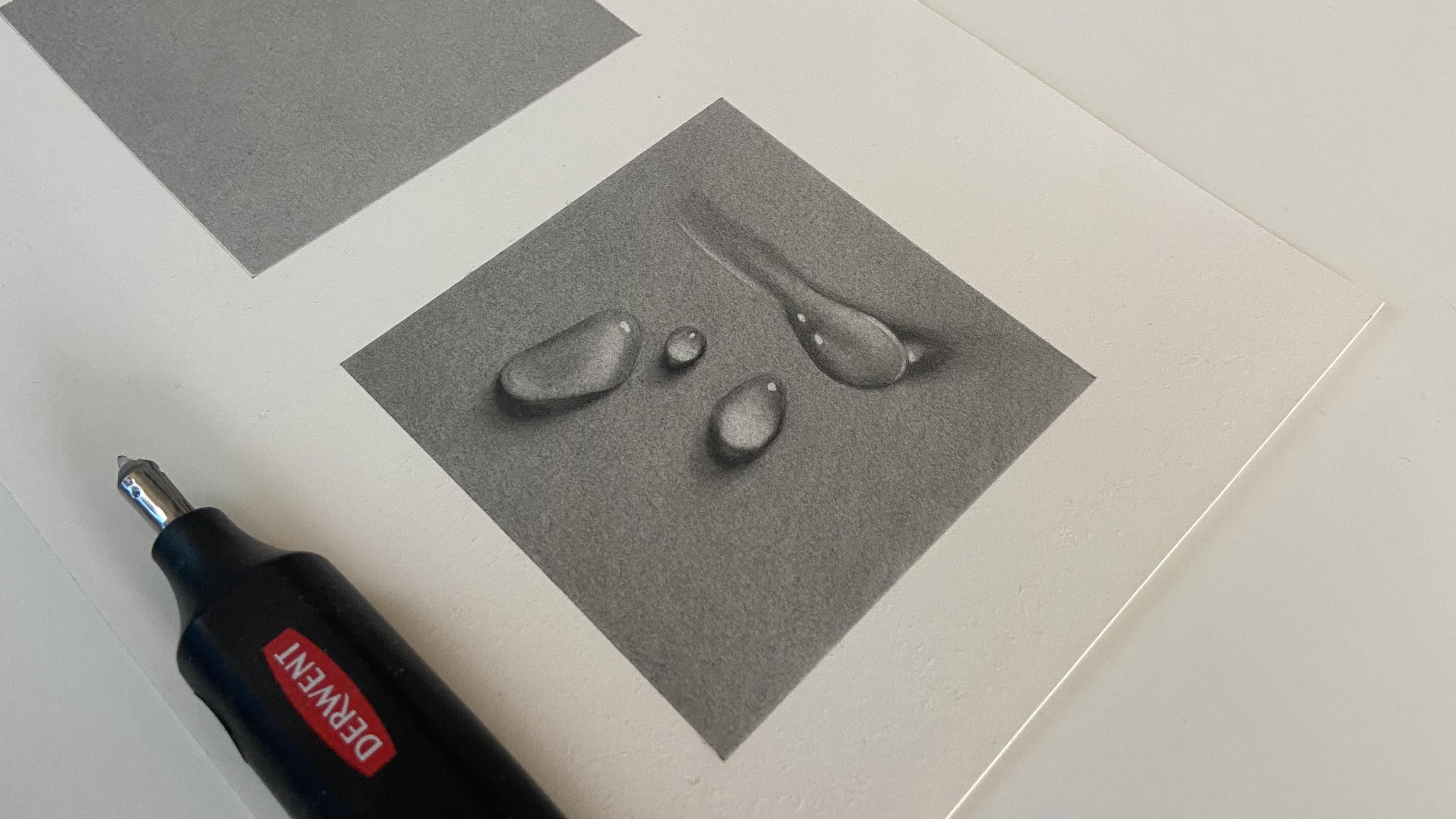
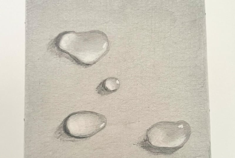
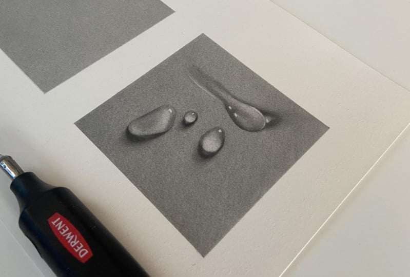
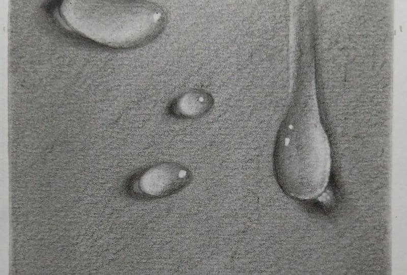
12. Water Drop Study: Introducing Perfection Eraser: Yeah. Hi, guys and welcome back. We have a fun little drawing for you to complete in
today's lesson. We're going to be
drawing some relatively easy realistic water drops. You'll get a chance
to see just how good the perfection eraser can be
during the drawing process. The trick with using this eraser is to use the
lightest of pressure. The lighter your pressure, the less graphite it'll pick up. This can be useful
for when you have to lift very subtle tones. I'll be showing you how to
draw the first three drops. Then, I'd like for you to free
hand the last one and use your new skills to render a
false realistic water drop. I place the photo and resources
for you to copy from. Then I'd love for you to upload the drawer into
your projects folder. Okay, so we want to create
a base for the water drops. I'm making two passes here
with a five B blue pencil, and just like before, we want
to smooth out each layer. You can try using
any of your brushes, if you like to get
a feel for them, but Atisha will work
perfectly well. Making an outline for the
drops using the HB blue, the light sources
coming from top right. Then create some shadows
using the B blue pencil. Light source for this drawing is coming from the top right, so it's casting a shadow on
the drops on the bottom left side and then strengthening the cast shadow with
a five B blue pencil. Now using a flattened
perfection eraser to very gently lift up graphite in circular motions to show the reflected
light areas in the drop. Although the pressure is always unbelievably light when
using this eraser, I reduce it even
more at the edge of the highlight to try and make a smooth transition
into the five B tone. Have a practice
with this technique and see how light you can go with pressure to try and
lift the lightest of tones. Now using a B blue pencil to
deepen the mid tone values. Using a soft make up brush will smooth out the
transition perfectly. Now using the two B
from the black range of pencils to deepen a
cast shadow even more. The makeup brush has
left a tone here, which is slightly darker
than I had expected, so I'm gently lightening it using the techniques
previously explained. The perfection eraser
is better at creating smooth blends because
it has a harder lid. The softer lids that come with the Tu battery eraser and
the currynaw pencil eraser. We'll pick up more graphite and therefore create a
brighter highlight. I'm not actually turning
the Thu eraser on here, just using the
softer lid to make the highlights just a
little bit brighter. Keeping your edges
nice and sharp will help the drops
pop off the page. O. I'm now turning on the battery eraser to make a few bright highlights
in the drops. I should point out
that, although you can see I'm using a
drin eraser here, I replaced the lead holder
with the Tu eraser holder. As a dirn only holds
five millimeter lids, whereas the Tu holds a five millimeter and
two millimeter lis. The diran is also slightly more powerful than the T.
Having said that, Durant now do a
rechargeable battery eraser with two different sized lids. Now to spend a few minutes
using the same techniques just learned to tidy everything up and
finish the drawing off. And lastly, just adding a few reflective
highlights that are coming through the drops
onto the cast shadow. So when using the
perfection eraser, see how light you can keep
the pressure and try to lift the lightest of tones until
you hit the right tone. Remember, that sharp edges
will make your drops pop and a soft make up brush will finish the transition
blends off perfectly. If you accidentally go over
any lines with graphite, gently dab the eraser to remove. When you finish the three drops, see if you can free
handle last drop and use the techniques covered to get it looking as
realistic as you can. So as we proceed
along the class, I'll be adding the time
it took me to complete each study at the
end of every lesson, as some students may find this helpful for
their progression. Probably take you longer to complete as you're
learning new techniques. So please try not
to focus on time, rather, focus on making
each layer as best you can. Have fun, and I'll see you
in the upcoming class. Yeah.
13. Understanding Value & Contrast: Hi there. I welcome back. During this lesson,
I'd like to talk a little bit about the
importance of value and contrast and how
clever manipulation of both can have subtle, but striking effects
on your portrait. Okay, so what exactly is
value in relation to art? Well, value is an element of art associated with a relationship
between light and dark. Essentially, how light or dark something is on a scale
of white to black. Good drawing or mendering
skills will use differences in value to help
create an illusion of depth. Artists are able to
create the illusion of light using different
tonal values. Clever gradations of tone also referred to as value
are used to create light and dark areas to give a three dimensional illusion of form to the subject
matter being drawn. The bigger the range of values, the deeper and more realistic
the drawing will look. As you can see here. So
amongst other techniques, value can be
carefully manipulated and used to create a focal
point within a drawing, which leads us to contrast. The more tonal
variance in an image, the lower the contrast, whereby higher
contrast images have fewer tonal values in between strong values
like black and white. That's why reference photos with dramatic lighting can
look unbelievably good as drawings as the
lightest areas sit side by side
the darkest areas. Contrast is achieved when opposing visual elements
are arranged in juxtaposition to create meaning and intensify the
characteristics of the work. There are quite a few
techniques of contrast that can be applied to art to
make something stand out. For example, you have
dark and light elements, warm and cool colors, colors that are opposite
each other on a color wheel. Textures, hard and soft shapes, for example, focus and
unfocused areas and detail. Even opposing subject
matter can create emotion, as you can see here
in this banks e me. Like value, contrast can
add depth and dimension to a work of art and enhance certain areas to direct
the viewer's eye. So one can use high contrast in values to emphasize parts
of the drawing that you'll want to draw the eye
two and low contrast in values to add dimension,
foreground, and background. It doesn't matter the type
of art you're creating. As long as they are dark values in harmony with light values, your portrait will most likely look
aesthetically pleasing. Okay, so now you
know how important a role value and contrast
can play in art. And we've seen how both of these elements can be
used and manipulated within a piece of art
to make certain areas stand out or to direct
the audience's eye. Armed with your new knowledge, try finding some
art that inspires you and see whether
your eyes are drawn to a particular place
within that piece and see if you can figure
out why that is. Yeah.
14. Conclusion: Hey, guys, you maybe it. I just wanted to give you
a huge pattern of back for making it to the end
of the first episode. Congratulations.
Learning something new is always most difficult
at the beginning. I hope you're looking forward to taking your new knowledge into the upcoming episodes and building on what
you've learned so far. There are lots of things to take on board within
this episode, but I think the most
important aspects were learning how to
keep airs smooth, how to create solid tones, and also learning how to create
super smooth transition. I hope you enjoy drawing hyper
realistic water drops at the end and experience just how good the perfection
eraser can be. If there is one
thing that I would like for you to take
away from this episode, it would be that it
takes multiple layers to create solid tones. This,
of course, takes time. It's why learning patience
in regard to realism is just as important a skill as the technique and equipment. Please feel free to
try any study as many times as you like until
you're happy with results. So before I wrap everything up, want to remind you
that you can upload all completed studies to
your class project page. Each student gets one project
page per class episode, but on that page,
they're able to upload all the projects from the
episode along with text. There's even space for a thumbnail photo
at the very top of the page where you can add a drawing from the class
that you're most proud of. The thumbnail picture
is what will appear on the main class page for
everyone else to see. Students can press on
a thumbnail picture, which will open your
projects page for them to see all the wonderful drawings that you made
throughout the class. If you'd like to leave a review, you can hit the Reviews tab
and then press Lev a Review. Reviews are warmly welcomed and I always love to hear your
thoughts on the class. If you have any questions
regarding the class, you can hit the Discussions
tab where you'll find a discussion that I started
regarding contact me. You can hit Reply or one of these tabs and
post your question, and I'll reply as soon as I can. I've also started another
conversation thread on my main profile page. Just find my page, scroll
down to the bottom, press your questions
and discussions, thumbnail and leave
your message. With that being said, I
cannot wait to see you. In the next episode, we have some fantastic
studies coming up. So take careful now, and I'll see you a bit later.
 Shayne Wise, Professional Portrait Artist