Transcripts
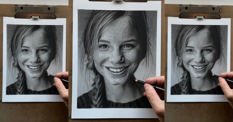
1. Introduction: A wanted to make your portrait
drawings look exactly like photos to showcase a full
range of beautifully rich, saturated tones and soupy
smooth skin blends drawings that just radiate
depth and personality. Hi, my name is Shane, a professional portrait
artist based in the UK. I run my own commission based art business
where I help clients recreate heartwarming moments by drawing photo realistic
portraiture of their loved ones. Yeah, I love this style of drawing and for the
last several years, I've been honing my craft, dedicating almost every day
to researching, learning, and practicing the skills necessary to produce such
quality in my drawings. Over the years, I've developed a specific layering process
that uses graphite carbon and charcoal pencils together
to showcase a full range of beautifully rich values
with exceptional results, which if you're familiar
with using graphite pencils, we'll know is impossible to do. So within this class, I want to teach you all the
skills, knowledge, tips, and techniques
that I use to create photorealistic drawings
for your portraits. It's my intention to help you understand the process
of layering, blending, and smoothing out all the
different pencil compositions whilst maintaining a
consistency in tone. Along with this,
I hope to convey how important patience is when
trying to achieve realism. We'll be covering
things like what makes a great reference
photo and how to transfer to paper how to achieve a full range of values
using only pencils. When exactly to transition through different
pencil compositions, prepare to share your final
portrait and so much more. There's even several
small but fun tasks to help you build
confidence before we begin, not only will this class
teach students how to create stunning
photorealistic portraiture, but it will also provide
students with the knowledge and confidence to use
a full range of values in any form
of pencil art. You will learn how to
observe and recreate details that help achieve
realism and authenticity. A skill set that actually translates beyond the
portrait and pencil drawing, but is relevant practice
for lots of visual arts. I've done my best to make this class as
comprehensive as possible, so it's suitable for
not only beginner to intermediate students, but also experienced artists looking to add to the skill set. So without further ado, I want to wish you all
the very best of luck. Grab your pencils and
let's get cracking.
2. Class Orientation: Yes. Hey, guys. Thank you so much
for enrolling in the class. It's lovely to see here. Whether you're a beginner or have a little more experience, there'll be bundles for
you to learn, I'm sure. If you're a complete beginner, please try not to
feel overwhelmed. I've kept you in mind throughout the whole process
and have included little projects along
the way to help you gain confidence before the
main project itself. Furthermore, the main class
project is split into many small segments so you can enjoy the process without
becoming overwhelmed. So, the main class
project is to draw a photo realistic portrait using the reference photo provided
in class resources. So you may choose an
image of your own and apply the same techniques
taught within this class. I chose this particular image as it has a few
elements that will really help your
drawings stand out whilst not being
overly complicated. We have a four ng of values, soft and hard elements, for example, in
and out of focus, and some relatively
easy detailing. Before we commence, we'll need to get ourselves
some equipment. The following class will go into this in much more detail. I've added PDFs in
the resources have below this video to print
tail for easy reference. I've listed all the items
that I use in the PDF. You're welcome to
take this class without investing in them all. However, some are essential if you want to get the most
out of this realism class. I've separated the
materials in order of priority as unmindful that some students may not have the budget to purchase
everything straightaway. A few things to aim
for as you go through the class would be
solid even tones, smooth skin transitions between light and dark value and keeping certain areas appearing in and out of focus as per
the reference photo. And the most important
of all is keeping all values in harmony with one another throughout
the whole portrait. It's possible to take a photo
of each project and upload them to your class project
page for feedback answer. Each student gets one
project page per class, but on that page, they
are able to upload all the projects within
the class along with text. There's even space
for a thumbnail photo at the very top of the page where you can add a drawing from the class
that you're most proud of. The thumbnail picture
is what will appear on the main class page for
everyone else to see. Students can press on
a thumbnail picture, which will open your
projects page to show all the wonderful drawings you made throughout the class. So before we move on
to the next lesson, some encouragement for you. Now are 2.5 years between
these two drawings. My journey was self taught, so it took me a very long time
to figure everything out. Completing this project
along with me will speed up your learning
process immensely. Even more so if you create
a daily drawing habit. Drawing daily will be so
beneficial for your journey, and over a relatively
short period of time, this practice will
become a habit. You'll notice a shift in
your attitude towards drawing after a few weeks and actually start to miss
a day without it. I hope you're as excited
as I am to get started. I have bundles to show you. The next class will
cover materials and equipment and will take you
through my whole setup. So have a think
about your space and your setup and try to
imagine all of your tools displayed in such a way
that everything is easy to find so everything will flow
during the process. Yeah.
3. Workspace & Materials: So during this lesson,
we're going to run through my complete
workstation setup. We'll cover all the materials and learning what goes where, there'll be tips
and demonstrations, all sorts of goodies. Things like what kind of
paper do we use for realism? What pencils do we use to get
those stunning deep blacks, blending tools,
types of brushes, all the different erasers,
and much, much more. Okay, so let's
have a little look at this setup and
see what's going on. I have all my pencils
stored away in the drawers, charcoal pencils to the right, and graphite sets to the left. The easel is smack bang
in the center with a mole stick and clamps to hold the paper for if I use
a different easel. The mole stick I made myself, which you'll get a
closer look at in a bit. And I don't trust
sticky tape anymore, is it can rip your paper
and leave residue, which is a bugger to get
rid of and which you only know about when you go to cover it with
graphite at the end. Have the pencil sharpeners,
blending tools, and enable erasers at
the front of desk and all working pencils and
brushes standing upright, spaced out and in order in
a clear plastic holder. Also, some other
bits and pieces like mechanical pencils,
more brushes, more erasers, and
battery erasers in the pot back right behind
that beautiful plastic plant. My ipad sits on the screen at the back as does
some kitchen roll. But you can secure your phone to the easel with one of the
clamps if you don't have an iPad or do yourself a
reference photo printout. I keep my ruler and homemade value scale chart
on the right hand side, and above that is
the bubble wrap to cover my portrait
when I'm not working, so I don't accidentally spit
coffee all over it again, my camera rig and ring
light for overhead demos. And I always keep some kitchen roll and paper close to hand, kitchen roll to wipe away
excess dark value from a brush and paper to try out drawing techniques if I'm not quite
sure how they'll look. And voila, that's
pretty much it. Oh, the plastic plants
are just for you. Mm. I think the most important
consideration when choosing paper for realism is the
texture or lack of it. I always look for
super smooth paper. This really helps with all
those tiny little details like the corners of
the eyes, et cetera. Generally, I use two
papers when I draw. They're both fairly
similar in weight and smoothness and are both
fantastic papers to use. The first paper, and the
one that I'll be using for this class is the
Strathmore Bristol Smooth, a 300 series paper. At 100 pound weight, it's a good weight paper for professional use and has a
wonderfully smooth surface. I'll be using a nine by 12 inch. The second the arches hot
press watercolor paper. Hot press, by the way, is a term used for smooth surface
in the watercolor world. It blends graphite
unbelievably easy, which does help with the
smoothness of value transitions. However, the Strathmo
bristle smooth is so smooth that you get
a fantastic finish with no visible texture. Therefore, no grainy finish. Be careful not to purchase
a vellum surface, so as they look identical, vellum has a medium texture. Although I love
blending with arches, I think the Strathmo
probably just tipped as my favorite because of the
smooth finish it provides. Okay, so on to pencils, I use three types of pencils
when I draw with graphite. They all perform slightly
differently on paper and are essential for me to achieve
a full range of values. They are the Sedler Mars lumograph blue graphite
only pencil range. I use four H through to
five B from this set. I bought the two H to eight B set with an additional
four H add on. Then there's a Stedlar
Mars lumographblack, graphite and carbon
mixed pencil range. I use a four range of six
pencils from this set, HB through to eight B. And the conti Paris pier noir, three B charcoal pencil, it's quite difficult to find a charcoal pencil that you
can use on top of graphite, but the conti works
wonderfully well. Something to note
about the Stetlers, the black range of graphite
carbon mixed pencils behave slightly differently on paper than the
graphite only ones. They do not blend and smooth out as easily
as the graphite only, so we need to make sure that we use unbelievably light pressure, especially with the darker
values from this set. Sometimes it feels like it's just a weighted pencil
alone touching the paper. They're also not as forgiving as the graphite only pencils
and do not lift as well, so we need to bear
this in mind with regard to pressure
in case of mistakes. On to pencil sharpeners. I use two types of
pencil sharpeners, the Jacar brass double hull
wedge shaped sharpener for the stdlers and the conti pari wooden
sharpener for the conti. The conti Charcoal pencil is slightly thicker
than the others, so this sharpener is ideal. I always have three sets of
brushes on hand when drawing, a soft bristle, medium
bristle, and a stiff bristle. I prefer getting them in sets as all the different
sizes do come in handy for different
parts of the portrait. I have a soft makeup
brush set by Bestop. They're just a generic brand
bought cheaply from Amazon. I have the master touch
reflex Filbert brush set. They're a medium
stiffness brush, and the Dala Rowney Georgian
short filbert brush set, which is a stiff brush set. Also use a following as I find it really
good for blending. I use this brush extensively. It's a generic brand
called eig show. If you can't find this
one, then a similar soft, short shaded iron
makeup brush will do. None of these brushes
are expensive and they don't really need
to be brand names. The main thing is that
you have varying degrees of stiffness as they
all play their part. We have some additional
blending equipment here. You can grab a box of
soft tissue or lou role. I normally fold this to a point and use circular
motions when blending. If you go back and forth
in a straight line, you'll probably end up making darker patches at every
change of direction. Cotton pads do a great job. Try to also use in circular motion whenever
you can whilst using these. We have two types of cotton buds here, rounded and pointed. The pointed ones can
be good to have laying around for detailing and
blending tiny areas. And finally, dent
blending stumps are great to use as they are a
little softer than most. Some of the generic
stumps can be too hard, and I find that they do
not blend quite as well. Whatever you decide to
get, at the very least, we'll be needing soft tissue, rounded cotton buds,
and the dent stumps. Oh Okay, so let's take a look
at some erasers and how best to use them. I use several different
erasers when drawing? All have a part to play and are needed for different
jobs during the process. The kable putty eraser
by Faber Castle, you may not realize it yet, but this simple thing will
become your best friend. I'm constantly
using this to help create those super
smooth skin blends. Sometimes you get
unintentional dark marks caused by graphite buildup. I'll use this eraser to make a point and gently
dab the area to lift up the graphite and then re blend to create
a smooth finish. It can even be used to
create different effects or textures like a mottled
background, for example. Mono zero eraser
is a pencil eraser with replaceable two
millimeter rubber leads. This tool is so important for creating things like
fine strands of hair, the patterns of the iris,
and even skin paws. You can use a craft
knife or scissors and make a diagonal cut to
get a really sharp edge. But for speed, I just run it along the sandpaper
block at an angle. The T u battery powered eraser is another great
tool for detailing. I use the sandpaper block once again to bring the
tip to a fine point. This is great for
pores of the skin and those tiny highlights around the eyes and the
lips, et cetera. It's also the best tool to
erase errors if needed. And finally, we have the curry naw and Faber castle
pencil erasers. They're fairly similar,
albeit the curry now has a slightly
softer rubber. Both are great for
detailing and to lightly bring up a layout
or two of graphite. It's good to have both at hand, but if you only want to get one, then I'd recommend the Curnw. I have an artist's sandpaper
block sitting by my easel. This comes in handy for things like sharpening the
mono zero eraser, sharpening the Tehu
battery powder eraser, cleaning your blending stumps. And you can even
make some powder from your pencils to use for detailing with your cotton
buds or stumps, et cetera. I always give my finished
portraits a couple of coats of Windsor and Newton fixative
spray for protection. I find using a male stick a really convenient way of eradicating finger and
palm smudges on your work. It just hooks over the top of your easel if you're using one. I made it very easily
using a strip of wood, a couple of screws,
and a bracket, which I bent, or you can
just use a sheet of paper. And a few extra items
that may come in handy, but not absolutely
necessary for this class. So we've covered all the
materials that we'll need during this lesson,
but smooth paper, the correct blending tools and the different pencil
compositions needed to achieve a full range of values are the three main ingredients
needed for creating realism. So as we close out this lesson, it's time for you to
gather all your materials, set up your space, and get everything ready for
when we start drawing. I look forward to seeing you in the next lesson where we'll
learn all about value and contrast and how important they are to your drawings.
I'll see you there.
4. Understanding Value & Contrast: Hi, there. I'm welcome back. During this lesson,
I'd like to talk a little bit about the
importance of value and contrast and how
clever manipulation of both can have subtle but striking effects
on your portrait. Okay, so, what exactly is
value in relation to art? Well, value is an element of art associated with the relationship
between light and dark. Essentially, how light or dark something is on a scale
of white to black. Good drawing and
rendering skills will use differences in value to help
create an illusion of depth. Artists are able to
create the illusion of light using
different tonal values. Clever gradations of tone also referred to as
value are used to create light and dark areas to give a three dimensional illusion of form to the subject
matter being drawn. The bigger the range of values, the deeper and more realistic the drawing will look,
as you can see here? So, amongst other techniques, value can be
carefully manipulated and used to create a focal
point within a drawing, which leads us to contrast, the more tonal
variance in an image, the lower the contrast, whereby higher
contrast images have fewer tonal values in between strong values
like black and white. That's why reference photos with dramatic lighting can
look unbelievably good as drawings as the
lightest areas sit side by side
the darkest areas. Contrast is achieved, posing visual elements
are arranged in juxtaposition to create meaning and intensify the
characteristics of the work. There are quite a few
techniques of contrast that can be applied to art to
make something stand out. For example, you have
dark and light elements, warm and cool colors, colors that are
opposite each other on a color wheel, textures, hard and soft
shapes, for example, focus and unfocused
areas and detail. Even opposing subject
matter can create emotion, as we can see here
in this banksy mule. Like value, contrast can
add depth and dimension to a work of art and enhance certain areas to direct
the viewer's eye. If you take a look at
the following image, you'll be able to notice
how the artist has used a varying tonal range to separate the foreground
from the background, thus given the
illusion of depth. They've used high contrast
in values, for example, a strong white next to a deep
black to emphasize and draw your eyes to the books
in the foreground and a lower contrast
in tonal range, white next to gray
for background books. Subjects stand out when contrasting with
the surroundings. So one can use high contrast in values to emphasize
parts of the drawing. That you'll want to draw
the two and low contrast in values to a dimension,
foreground and background. It doesn't matter the type
of art you're creating. As long as they are dark values in harmony with light values, your portrait will most likely look
aesthetically pleasing. Okay, so now you
know how important a role value and contrast
can play in art. And we've seen how both of these elements can be used
and manipulated within a piece of art to
make certain areas stand out or to direct
the audience's eye. Armed with your new knowledge, try finding some art that
inspires you and see whether your eyes are drawn to a particular place
within that piece, or if anything seems to pop off the page and see if you can
figure out why that is. And next lesson
is all about what makes a fantastic reference
photo to draw from. Once you learn this
little bit of knowledge, you'll already be
halfway to creating beautiful portraiture.
I'll catch you there.
5. Choosing a Reference Image: Welcome back people.
During this lesson, I'd like to talk about some of the elements that
I look for when trying to find a reference photo to draw or try to incorporate. If drawing a commission, there can be quite a few things to consider that will really help give your portrait
that extra pop. I think it will be good
for you to understand them if you want to take your
drawings to the next level. Things like how important the full range of values
are in relation to realism. How light value next
to dark value can really make your drawing
dramatic lighting, shallow depth of field
effect reflections, and reflective
materials and shadows. Okay, in the previous lesson, we already covered how important the full range of values
are in relation to realism. And how light values next to dark values can help
make our drawing pop. And how this translates to reference photos with
dramatic lighting. So there's no need to explain
in detail again here. But some of the things that
I look out for when choosing an image to draw are the
shallow depth of field effect, which means some of
the image will be out focused and blurred
and some sharp. This would allow us to see firsthand how this simple
technique will really help create depth between
the foreground and background and draw the
viewer's eye to the face. It will also help
us think in layers, enable us to see the effect of different background
and foreground layer can have briefly explained. This pertains to how
much of an area is in focus within a field of view
in front of the camera. Lens depth of field
is the area of acceptable sharpness
in front of and behind the subject matter to
which the lens is focused. Let's imagine that you were
looking through a camera at your subject and there was
a wall behind your subject. The broadest depth
of field would be the distance from the
camera lens to the wall. Your subject will be positioned
somewhere in between. And everything in view through the camera
will be in focus. If you only wanted to keep
your subject in focus and anything in front of or
behind your subject blurry, you would change the aperture
setting on your camera to close the amount of
field that's in focus, Making it shallower
and shallower until only your
subject was in focus. If we were to use this
technique on a smaller scale, like a head, you would change the aperture so that only
the face was in focus. So anything in front
of or behind the face, like hair or shoulders, for example, would be blurry. This subtle change in technique within a drawing
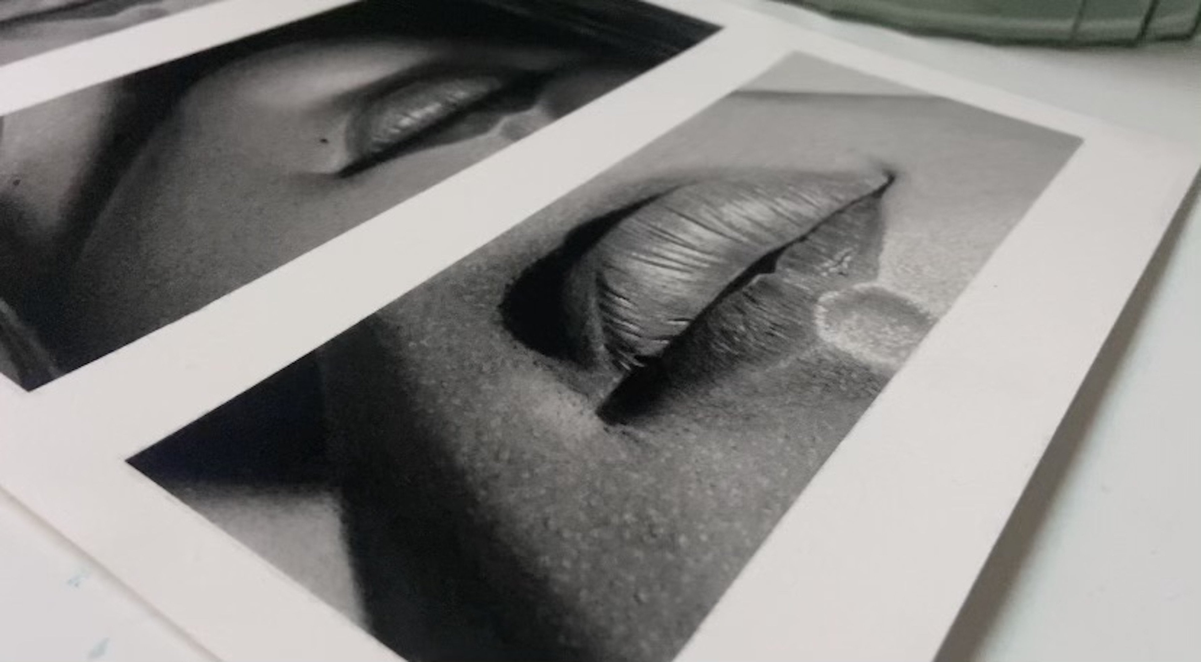
can look stunning. Reflections or reflective
material can also add a really interesting element to a drawing and trick the eye to thinking a
drawing as a real photo. Reflections on glasses
are great for this, as is a reflective
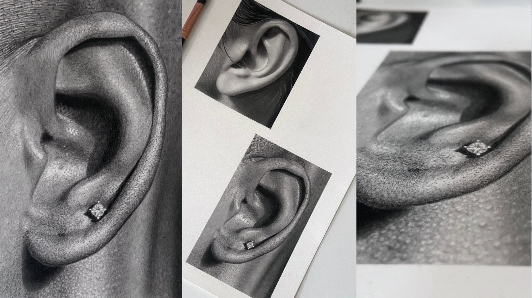
material on this coat. Jewelry is another
interesting facet to look out for for
the same reason. Shadows are another great
way to add depth to your drawing and can really catapult your image
off the page. They can be on a wall
behind the subject, as you can see here in this stunning drawing
by Kelvin Oquefor. They can be over the face
or even under the chin, for example, which
will help frame the face. Something
to be aware of. When choosing an image
to draw, however, is under or over exposure,
you do not want this. If you take a look at
the following images, you'll notice that there aren't a huge R values in
either of them. This will translate to
your drawing and it will just end up looking
flat and lifeless. Okay, so we now have a
greater understanding of what elements help make
a great reference photo. They may seem small
things in essence, but can have dramatic
effects when drawn and really help give
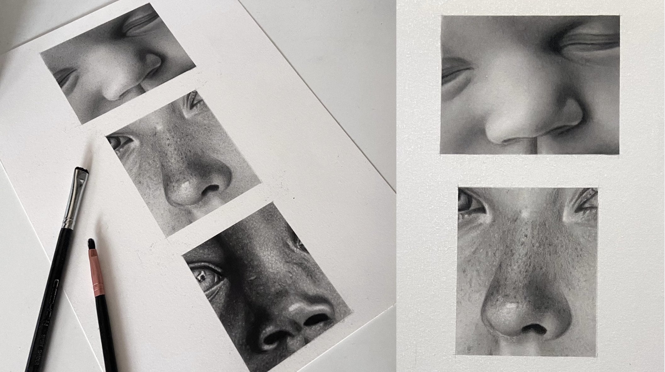
your portrait the well factor. For our main class project, we'll be drawing the
provided reference image that's in resources. But I'd like you to
practice finding good reference images
to use in the future. And the more you do
this, the greater your understanding of what makes
good portraiture will be. So go ahead and find as
many reference images as you like and save them to
use for your next portrait, where you can apply
everything you've learned in this class to your
own unique image. Feel free to share your
reference images with me in the discussion
on this class page, as I'm sure all of
your fellow students will be really
interested to see what you can find and I can give you some feedback on your
options if you like. In the following
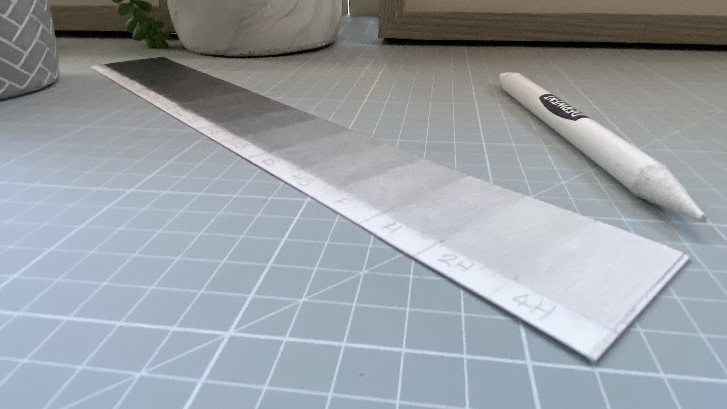
lesson, we'll be making our very own value scale chart. Learning how important
this piece of kit is and why it's important
for us to make our own. I can't wait to see you there.
6. Making a Value Scale Chart: Hey guys, welcome back. We have a fantastic
lesson for you Today, you'll be using your pencils and blending tools to make your
very own value scale chart. Although a relatively
simple exercise to complete this chart will
become an essential part of your everyday work as a
portrait artist and speed up your proficiency in
determining value immensely. In time, you'll have a much quicker understanding of what value is needed
at any given point. This particular lesson is
important for two reasons. Firstly, we'll be using the same pencils as we
used throughout the class, so you'll have your first taste of how they behave on paper. And secondly, you'll
have a value chart with an authentical value
reference to your medium. You can buy a cheap one online, but it'll be much
more beneficial to you if you make your own. Using the medium
you're working with, Your eyes can
sometimes play tricks on you when trying to
ascertain a value. So I find it helpful
to have a value scale which represents
a true reflection of the medium I'm using. If you pause on the following
image for a little while, you'll see exactly what I mean. Okay, so let's get cracking
with the first project. I've included the
image on screen now in the Resources
tab below video, so you can easily refer to it when completing
the project. In it includes all
the information you'll need to
complete the charts. For example, all measurements
and pencil grades along with the pencil
grade layers in sequence. We'll be using pencils four H to five B from the blue graphite
only, Std, lar range, and H B to eight B from the black carbon graphite
mixed stedlarrange. We'll also be needing our
conte three charcoal pencil, cotton bud and a brush. I use the Georgian Short Filbert number six brush by day roundy. So the idea with this project is to use very soft pencil strokes, then blend to a smooth
saturated finish. Using the blending tools, it's okay to use different
directional strokes. The important things to
remember are to always apply very light pressure and to get an even cover with each layer. Before blending, we'll be adding three to four layers
of value to each box. Blending each layer as we go. This will saturate the paper
and create a solid tone. Okay, so I'm just marking out the lines for
the chart here. Each rectangular box is 1.9
centimeters across and 3.5 centimeters down with an
additional 1 centimeter at the bottom for space to
write the pencil grades in. We'll be starting light to dark. As if we go dark to light, we run the risk of darker values seeping into the lighter
value during blending. As I mentioned earlier, we want to use really
soft pressure here to create an even layer of
graphite before smoothing out. It's okay to use different
directional strokes as they will all blend together nicely when using
the cotton bud. Using different
directional strokes will help keep your
graphite layer even. You can use slightly
more pressure on the second and third layers, but it's still very, very light. We use several layers
of light pressure instead of one layer of
hard pressure because we're trying to simulate the
effect we get when drawing as this will give us the best
value match for a scale. Okay, I'm happy with this layer. It's the same value all over
with no uneven dark patches. So I think it's
time to blend out. I'm using a tissue here, but you'll notice
in a minute that I swapped back to the
cotton bud as I didn't want to run the risk of smudging darker value onto the value
in the lighter boxes. Don't forget to add
several layers in each box whilst we build to
our desired value. Smoothing out with each layer, this will help you achieve
that saturated tone, which is ultimately
what we're looking for, a nice, solid,
saturated skin tone. Try to make sure
that each new box is just ever so slightly darker
than the previous box. You'll get a chance at the
end to go back across them all to make sure you have all
the boxes even liquidated. You'll know when it's time
to move on to the next box. Because after a few layers, you'll start needing to
apply heavier pressure, which we don't want to do when you can't see it
getting any darker. After about three layers
and it's a solid tone, then you can move
on to the next box. So remember under all the
Stadler black pencils, we lay down the five B from
the Stadler blue range first. This acts as a sort of
an undercoat to help keep the tonality between
the two pencil sets. Otherwise, I find applying the black range straight
to the paper without the five B blue underneath can look too stark compared
to the graphite. Only pencils also remember, use the lightest of pressure
with a black set and try not to leave any visible
lines before smoothing out. You'll see me smoothing
out the Stadler blacks soon using the Daly aly,
Georgian Filbert brush. It's a stiff brush which is
good for this pencil set as it gets right in amongst the black lead to
blend it altogether. Tissue doesn't really
do the trick as they don't blend as
well as the graphite. Only blue pencils,
you can use medium to hard pressure for this
during the process. We wouldn't always go from the five to eight B
black pencil in one go. In most cases we'll
have a few more grades in between to help with
smoothness and transition. Last two boxes consists
of first layer, the five blue pencil range, second layer the eight
from the black pencil set, and the last box,
an additional layer of Conte three B
charcoal pencil. I'm now going back over
to make sure that I have even gradations between the
lightest and darkest values. You'll notice that there's
quite a big jump in value 2-4 B blue. I want to make that as
evenly gradated as the rest. Be careful not to blend
light value using the brush that you've just used and it's still got
darker value on it, wipe it off onto a
tissue before blending. Now it's your turn, create a value reference chart
to use for this project. Once completed, use it
to try to determine what sort of value you think is needed for different areas
of the reference photo. For example, the forehead may have several
different values. You may need a full H for the lighter side or HB
grade in the middle, and the shady side may
need your darkest value. The quanti charcoal pencil. As I mentioned previously, the name of the game here is to make the value blocks
in your chart as smooth as possible and to have even gradations between
white and black. For our next lesson,
we'll be learning how to transfer our outline
to paper. I'll catch you.
7. Transferring Outline: Hey guys, welcome back. During this lesson, I'm going
to show you a couple of easy ways to transfer your reference image
outline to paper. If you'd like to
freehand your outline, then please go right ahead. Freehand practice is beyond the scope of this
particular class, but I always encourage daily
freehand drawing as it's a fantastic skill to acquire and one that will get better and better than what you practice. You'll be amazed at how
much you improve with a daily practice in
just one month, okay? So let's start with
a trace method. If you have access to printer, then this will be
the easiest way for you to transfer your
outline to paper. Just normal printer,
paper is best, the thinner, the better. If you don't have
access to a printer, then the grid method
that's coming up in a moment will be
perfect for you. I think it'll be a good idea if we outlined the
blending page first. If this is your first time
transferring an outline, then it'll be good
practice for when we get to the main portrait itself. It's pretty easy
to do and we'll be needing it for the upcoming
blending lesson anyway. First of all, we want to
print out our subject. Make sure you set
your printer to use the entire four sheet
with no border. A good tip to remember is that if you ever feel
your image print out was too dark
and maybe you're having trouble seeing
important lines, then try lifting
the brightness a bit on your phone
before printing. Then grab your five B
Steadler blue pencil and completely cover the back side of the printout with graphite. Make sure not to leave any gaps. We will then want
to securely attach our printout over our
Strathmore paper. A clamp of some sort is best, but if you don't
have any clamps, then low tach tape will do. Just be mindful that some
tapes leave residue. So, try to cover as little of your Strathmore
paper as possible. We'll be okay with this image
as it's not 100% four size. We have space to secure
at the top and bottom, then outline as follows. So when it's time to
outline a class portrait, just follow the same
procedure and you'll be fine. Although I should point out, pay extra attention
to important areas like the corners of the
eyes and lips, et cetera. We want to be mindful
that we're not overloading those areas
with too many lines. As it can become confusing. There's a time lapse of
me making my outline. Next I'll talk you through
which lines are make y here I'm making
any pattern lines. I can see on the jumper, I'm not marking every bit of detail. I'll see just the main lines that will help me
keep track with regards to value changes and detail during the
rendering process, marking out block value
changes on the neck area. Here, try to look at areas in a portrait as a whole
to see if you can spot values in
blocks rather than independent lines in here. Try to mark out the hair strands at a point where value changes. Don't worry too much about the loose strands of hair
as you can add these during the drawing process
if I'm drawing busy here. Like curls, I'll make a
point of shading in some of the dark patches as it helps
separate all the lines. I block out the
brows and then add a few brow directional lines. I'll add a few light lines at the top of the hair to
remind me where the light changes with the eyes. Make sure you trace
the corners perfectly. Try not to overload
these areas with too many lines as it can
be confusing when drawing. Now blocking out the shaded
right side of the face, you can see the shade
line running from the parting in the hair
at the top down to the chin onto the lips. Like the eyes. Pay
attention and mark exactly where the corners
of the lips are and make sure the
teeth are perfect. The eyes and smile are the most important
areas of any portrait. Now adding some lashes, pupil and highlights
of the iris. If you're struggling
with the nose, try to focus on just
putting the line of the nostrils in and then
this avocado shape here. If you can find and
mark out that shape, it'll really help
with all the value changes around this
area when rendering. Okay, So now I want to transfer all those lines to my paper. You notice that the
four H pencil is sharp, but I'm using it at an angle so not to make any indentations
on the paper below. I'm constantly lifting
the paper to double check the pressure and also that my lines are
being transferred. If you're using the grid method, I recommend downloading
the drawing grid app. It's free and
really easy to use. Just upload your image, change the amount of
squares you'd like to use, change the line
width to one pixel. You can change the color
of your lines and even add numbers if it
helps measure out the lines on your
Strathmore paper so they correspond to the ones
in the drawing Grid app. And you're good to
go one more thing. When you're ready to outline
the reference photo, you should be thinking
about finding lines that separate
changes in value, Direction of hair, direction of thread patterns
closes, et cetera. Also looking at the
portrait as a whole and trying to find value
changes in blocks. We can focus on
the detail within those blocks later
whilst drawing. For example, look at the
face first for block lines, then the hair, then the
portrait as a whole. Try to determine at which points the light source changes to shadow across
the whole portrait. So to recap, we've
learned to try and view values in blocks as opposed
to independent lines. We've also learned how
to trace our image. Just remember to set your printer to use a
whole four paper with no border and to use thin photocopy paper and a hard four H pencil
to draw the outline. I've shown you which lines to make and explain why we need to pay extra attention to the
corners of the eyes and lips. Also the best way
to attack the nose. We covered the best way
to use a grid method. The bonus of using this
method is that you're not restricted to an
A four size printout. So in the future, if you work out
new measurements, you can use this method to fit the width of any size
paper you choose. If adding the numbers
on your grid, you only need to
add the top line and one line at whichever
side suits you, and not for every
box inside the grid. Now I'd like for you to
decide which method you'll use and outline
the blending page that I uploaded in resources. Ready for the exciting lesson
we have coming up next, which is blending practice. We're going to be
drawing a few shapes and creating some super
smooth value transitions. This practice will really
come in handy for when we get to those beautiful ski
blends in our portrait. I can't wait to see you there.
8. Rectangular Blending Practice: Hey guys, welcome back. We have some fantastic
exercises to get through. Over the next four lessons, I've put together
several small projects for you to complete that
will really help you when it comes time to achieve those super smooth skin blends in the main class portrait. First for this lesson, we'll be outlining a couple
of rectangles and using our tools to create
a smooth even blend. In one box we'll use the graphite only blue
pencils for a lighter blend. And for the second box, we'll get to grips with
the Stadler blacks. The name of the game for all
forthcoming blending studies is to make your value transitions
as smooth as possible. Firstly, we make a
smooth transition by varying our pencil pressure. Then we blend and smooth out using our blending
tools and using our razors to lift up any graphite irregularities that interfere with our
smooth blends. As always, we'll be starting
with our lighter values and build up layers until we
reach our darkest value. By doing this, we'll saturate
the paper with graphite, which will really help create that super smooth finish
that we're after. Remember, I want you to use very light pressure
throughout all exercises. With this particular exercise, I'd like for you to lighten
the pressure even more as you get to the end of each
layer within the rectangle. So it blends nicely with
the lighter value below. When I'm drawing the
lightest part of each layer, it feels like it's
just the way it a pencil alone touching a paper. I've uploaded the
blending page in resources for you to
print out if needed, which includes three of
the blending studies. You can outline them all at
the same time if you like, as they'll come in handy for
the preceding two lessons. To outline your blending page, I recommend using
a technique that you intend to use to
outline your portrait. For example, trace method, grid method, or
free hand method. If it's the first
time outlining, it'll be good practice for when we get to the main
class project. If you're using
the trace method, please do not press too hard. This will leave indented
lines in your paper, which will be very
noticeable when rendering your work and quite difficult
to cover with graphite. Before we begin our blend, I'm dabbing my outline here with the needable eraser
to make it lighter. We're going to stick
with just the graphite, only blue pencils for this box. I'm starting with the
lightest grade pencil, the four H. Remember, super light pressure and we want an even layer before smoothing
out with the tissue. I lay down a couple of
passes before moving onto the pencil and try not to
go outside of the box. As we come to the end, lighten the pressure
about 1 " from the end as we want to fade out
to just the paper. Also, remember to use circular motions whenever
you can because we don't want to leave dark
patches if we blend out going backwards and
forwards in a straight line, using the moldable
eraser again to make sure the graphite fades
to the white as a paper. Now onto the HB pencils, I'll be using six pencil
grades for this blend. The four H B 24.5 Just
remember that with each pencil grade change
to cover a little less of the box and to fade out sooner
using lighter pressure, this will ensure
that you achieve an evenly gradated scale
from light to dark. Now a couple of layers of two B, then onto the four B blending
out in between each layer. Lastly, a couple
of coates of five. If you see any dark
graphite spots appear like I've noticed here, just mold your needable
eraser into a point and very lightly dab the spots
to lift that dark spot. If you leave a white spot, then you're probably dabbing too hard or your point
needs to be finer. The same goes for any lines that interfere with your
smooth gradation. You can use this
technique and then re blend to make
it smooth again. Or using the stiff brush to
push the graphite around can sometimes blend
away unwanted lines. A quick eating up
around the edges using a pencil eraser and we're
finished with this box. Now on to the Stadler Blacks. Remember in our previous lesson I explained that
I always lay down a five blue under all the black pencils to help
with consistency of tone. My first layer in
this box is to cover the entire box with
a five blue pencil. I'm using the show
short shader brush to blend a five B. I'm
not overly concerned with this layer being
perfectly smooth as I'll be covering it with all
the black pencils later. First up is the HB pencil. Remember what we discussed
in the previous lesson? You need to use even
lighter pressure with this set of pencils, as they do not blend
as well as a blue set. We do not want any visible
lines before blending. Use loads of
different directional pencil strokes to
alleviate this. Or small circular strokes, a combination of both is good. I use a stiff, bristled daily roundy Georgian
short Filbert brush to blend these pencils. It leaves a beautiful finish
especially for skin blends. Please have a try with all of
your blending tools to see how each performs and see
which one you prefer. You can use medium
to hard pressure using this brush on the blacks. In a moment you'll see me using really hard pressure to
push the graphite around. As I blend the HB black
into the five B blue. The transition is a bit too heavy for my liking
at the moment. Now, onto the two pencil, I still think the
transition between HB black and five B
blue is too heavy. It happens too quick. So I'm gently using a pointed needable eraser to lift some of
the darker layer, which will help
lengthen the blend, so making it smoother. Now onto the four
then 6.8 pencils. And to finish off this box, we'll use the three
Conti charcoal pencil. For the deepest black value, I use the pro art mid stiff
master touch reflex brush to blend the Conti as this pencil has a
beautiful soft lead. Okay, so now let's see what you can come up with.
Take your time. Pay attention to
your pressure and shorten each new layer
bit by bit as you go. Make sure you have an even cover with each layer like we
talked about before. And use your erasers to lift any irregularities like value
lines or graphite spots. Before you smooth each layer, I can't wait to see
what you create. I'll be getting ready
for the next lesson, where you'll be using
your new blending skills, but with curves.
9. Sphere Study: I hope you enjoyed your
first blending lesson. I also hope you
begin to feel more confident in your tools
and your abilities. So we're now going to move on to something slightly
more difficult for this lesson and add curves
to your blending practice. We'll be drawing a sphere shape, which will be good
practice for when shading curved elements within
a portrait like bones, chins, or shoulders, et cetera. Again, the name in the game for this lesson is to
make your value transitions as smooth as possible by varying
your pencil pressure. But this time when you lighten the pressure as you go
from dark to light, I want you to concentrate
on maintaining the spherical shape to reflect
the curvature of a ball. Remember, when drawing the
lightest part of each layer, it feels like it's
just the weight of the pencil alone
touching the paper. Okay, we start off using the four H pencil from the blue range to
make an even cover, then smooth out
using our tissue, I use the H B blue
for my second layer. With this layer,
I start to create the lightest spherical
highlight area. You'll also notice that I'm not covering the reflected
highlight line, bottom right of the ball,
decreasing the pressure. The closer I get to the
main highlight area. Once again, try your
blending tools. This is the cotton bud here, but I still think you can't beat soft tissue when you
come to blend graphite. Now we're getting to
the darker values. You'll really start to notice
your highlighted areas pop. Now using the two from the blue range and
onto the five B. The cast shadow is quite dark, so I'm starting with
the five B, blue. Do you remember my advice on not pressing too hard when
tracing your outline? If you look closely, you can see the indented outline I made
whilst lining my shapes. This is very hard to
cover with graphites. Take a little time
in figuring out your outlining pressure
if tracing your images. This is something that you
really want to try and avoid. From my next layer, I went straight in with
the six black here, which I think was
a bit too dark. Try to four black
and see how you gets on the cotton bud is great to smooth
out in smaller areas, as is the blending stump. Having laid down the
mid tones on the ball, we now focus on the core shadow using the two B black with
super light pressure. You can notice here
that I've switched to the stiff Georgian de la uni brush to blend
out the blacks. Now a tone darker with the four black softening the
edge of the cast shadow. Using the cotton bud. I'm about to net it up
the edge of the sphere. So I'm just sharpening the mono zero eraser
using the sounding block. And we'll erase auto graphite that has been smudged
over the line. It's really important to
remember that whenever you use an eraser to make
sure that it's clean, otherwise you'll leave
a smudge on the paper. Rather than using another pencil to draw over the
highlighted area. I'm just using what's on the
brush at the moment just to really bring that
blend together nicely. I think the outside edge of the cast shadow needs to
be a tiny bit brighter. So I'm just stabbing with a
mono zero eraser to pick up a little bit of graphite and then blend with
a lighter pencil. Now it's your turn. This lesson is a little trickier
than the last lesson. So I want you to pay
extra attention to your pressure as you
go around the sphere. Try to maintain a curved
value change as you go. Make sure the outline of
your ball is sharp and be mindful not to use a grade
of pencil that's too dark. Drawing an outline
always comes out darker than when shading with
the same grade of pencil. So try a few grades lighter
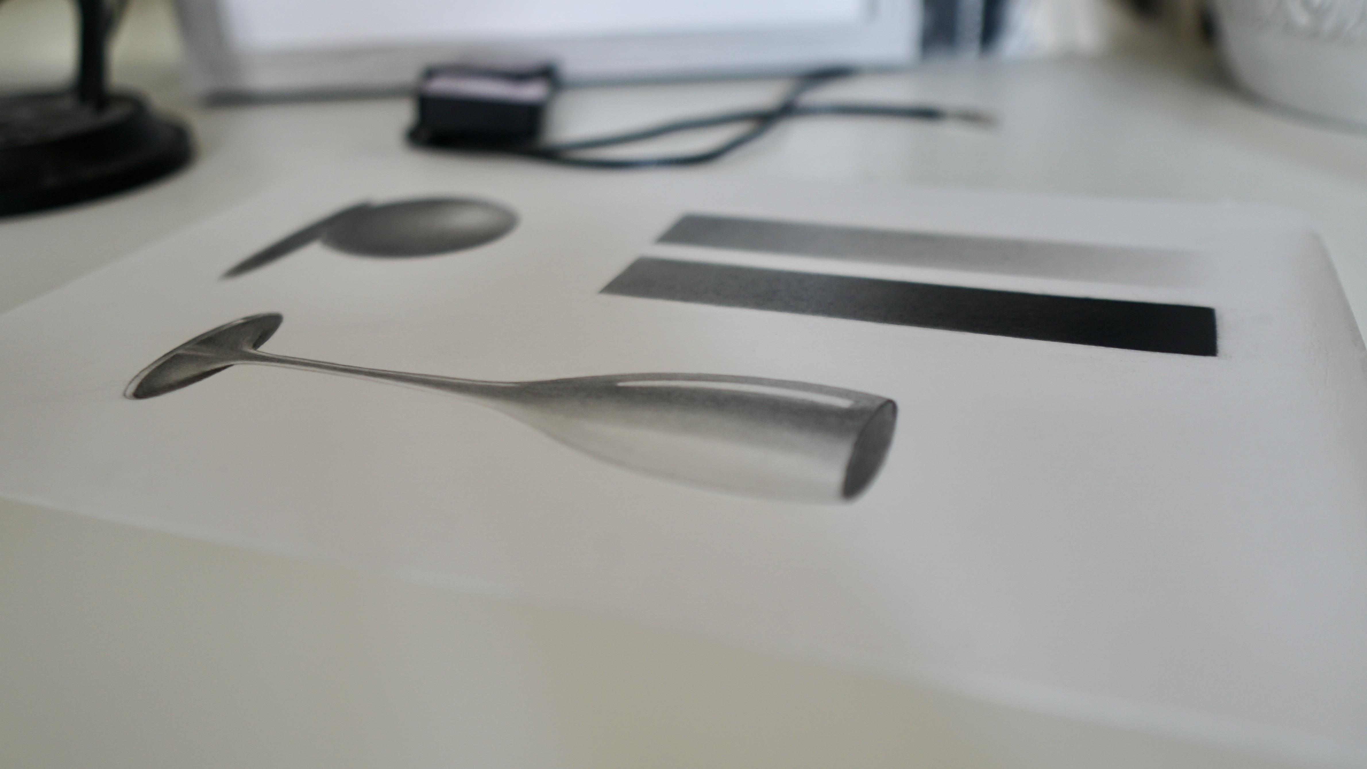
when neatening an edge. We have a champagne flute
study coming up next, where you'll get a chance to put all the techniques
you've learned so far into one drawing. It's gonna look awesome.
I'll see you there.
10. Champagne Flute Study: Hello people, Welcome back. So I hope you're feeling proud of what you've created so far. I also hope that you're
beginning to feel inspired. And your motivation is building along with
each completed study. For this lesson, we're going to be drawing a champagne flute. It's a little more challenging than the previous two lessons, but you'll still be
able to nail it. I'm sure you'll get a chance to utilize all that you've learned in the last two exercises. Lots of subtle pencil
pressure changes, lots of value changes, and blending small areas. But this time, before we start, I want you to pay
some attention to all the different value changes within the reference photo. Again, it'll be good practice for when we start
the main portrait. Okay, so you'll notice that our darkest shadow value is
at the top inside the flute. The next darkest value is
on the base of the flue. At the back front of the base is a shade lighter,
running down the stem. And the center of the body
is a shade or two lighter. The mid tone is far left and
middle right of the body. And the light tones are
running down the right side of the cup with some strong reflective high lights
to the left side. I'm now going to use my value
scale to give me an idea of which grade pencil matches
which value on the reference. The darkest area inside the
flu is maybe a seven black, the base looks like it
could be a two black at the front and maybe a four
or six black at the back. The darkest value running up the stem and body could
be the five blue. Either side of the five
blue could be a two blue. And the lighter right side could be any of the four
H F grade blues. Depending on the pressure used. I actually intended to start
with a four H blue pencil, but accidentally picked up
the F grade pencil and didn't realize until I shaded nearly all of the
right side of the cup. But by using unbelievably
light pressure, I was still able to keep a very light tone in accordance
with the reference photo. What this tells us is
try not to get overly fixated on using exactly
the right grade pencil as you can get many
different values from one pencil just by slightly
changing the pressure. Okay. Starting with
the grade pencil, I lightly lay down the lightest value to the
right side body of the flute. I then increase the pressure
ever so slightly to lay down a slightly darker
tone for the middle and left side of the
body stem and base. I'm changing the pressure
as when needed to replicate the change in value as per the reference as I go. Then smooth out with the tissue. Now the B grade pencil
for the mid tones, the soft wins blending stump works
fantastically well here, as the areas we need to
blend are quite small. Circular motions work
wonderfully well. Pay really close attention to all the subtle changes in value, no matter how small. I'm using small circular
motions to make the B to F grade pencil transition smoother here by pushing
the graphite around, that's already on the page. Back to the B grade
pencil here as we build the darker layers
and then sharpening the outline using the
mono zero eraser. Now onto the five blue for the darkest value running
down the center of the glass, straight in with the five blue to create the rim
of the glass here, as it's quite a dark value. Then the blue, five blue, then 2.4 black as we fill
the inside of the glass. Now the 6.7 black to finish
off the inside of the flute. Back to the two B from
the black range here. This is the four B
from the black range. If you look closely at
the reference photo, you'll notice that
there's a little bit more lighter value to the right side of the base. Nearly all of our
values are down now, so I'm just going to spend the remainder of
the time neatening everything out and making sure everything is smooth and good. Just neatening off the edge
with the grade pencil. Make sure that all of
your edges are sharp. Don't use a pencil
that's too dark. But when your edges are sharp, it really helps your drawing
to pop off the page. This tiny angled makeup brush from the makeup brush set
really comes in handy for those tight areas to complete this drawing. I'm just finishing up, making sure that all
lines are sharp, all values are correct
alongside each other, and all blends are smooth
with no imperfections. So this lesson has provided you with lots of
practicing pencil pressure blending in tight spaces using the stumps and lots
of value changes. It's also taught you to start
paying close attention to the subtle changes
in value within a reference and how to
relay them to your project. Now I want you to use this new information and
create your own champagne, and I'd love to see you
upload it to the class. We have a fun little exercise. Next we're gonna be drawing some water droplets which will literally
jump off the page. It's a simple project, but one that I
think you're going to love. I'll see you there.
11. Water Drop Study: Hello guys. So we have a quick and fun
lesson for you today, we're going to complete
a small drawing of some water droplets. It's a relatively easy
and quick project to do, but you'll be amazed by
how much they just jump off the page with just a few
subtle changes in value. You'll be familiar with all the blending and
lifting techniques by now, so I just want you to focus on values and keeping
your outline sharp. A crisp, sharp line
will really help differentiate the droplets from the background and
make them pop. Keep your pencil sharp for
the final outline pass. But remember to use
a pencil that's lighter than what you use for
the body of the water drop. And do not press too hard. Okay, let's make a base
using the five B, blue. I'll make about eight
passes with a five B. Then use the H B to make three circles for
the water droplets. Also adding lines for the cast shadow using
very light pressure. Once again, I use the four B black to start building the contours
of the water. Decrease your
pressure to lighten the four value as you move
away from the upper outline. And then fill in
your cast shadows. Making sure all lines are
sharp, neat, and tidy. Using a pointed
needable eraser to very gently dab the reflected
highlighted areas, the battery powered hoot eraser, to bring up the highlights. Watch as the water drops. Pop even more as I'll
add a very light layer of seven black to
the base layer. Now strengthening the dark
value with a six black, the posca paint pen really
brings out the highlight, just tidying up the outline, using the soft rubber
in the thou eraser. I'm not actually
turning it on though. The devil is in the detail
as the saying goes. And it makes a huge
difference with the finished piece
when you spend time on all the
little imperfections. Okay, so I realized
that I've taken up a little too much value from the reflected highlight
within the droplet here. So I need to reapply using the HB just to give
the effect that there's a little bit of
the background showing through the highlighted
area of the water drop. I hope you had fun
drawing notes. It was just a quick little
exercise to give you a chance to use all of your new skills to
create something cool. It doesn't take long to make a two D drawing bounce off the page, or
once you know how. Our next lesson we'll focus on studying our reference image
before we begin to draw. If you do this before
you begin any portray, it will give you a
clear understanding of the project you're
about to begin and provide you with a kind of mental roadmap for your
upcoming endeavor. I do this before every
portrait I draw.
12. Studying the Reference Photo: Hello people. Welcome back. We're nearly ready to start
our main portrait drawing, so I wanted to give
you a quick preview of the mental notes that I make before commencing any portrait. I'll find this procedure
really helpful as it provides a mental
roadmap for me to take. During the process, I
look out for things like where's the best place to
start any block values. I use my value chart
to gain an idea of what grade pencils I'll
need For light, mid, and dark areas, I determine the darkest areas which will
need the three B pencil. I look to see if there are
any blurry or sharp elements. I then decide how
I'm going to process the layers to create the
different contrasting effects. Which areas of the
portrait, if any, are lighter than the
background scanning, which areas are
darker or lighter compared to other
areas in the portrait. Also having a closer look at any super detailed areas like skin pores et
cetera, for example. Can I notice any patterns
in the way the pores flow? Using these techniques, Let's apply them to a main project now so we can break it down and have a better understanding
of how to approach it. First of all, I try to decide
where I'd like to start. Personally, I find it
really helpful to start in an area which incorporates a good amount of
mid to dark value, where I'm able to
lay down a little of my darkest value not
long after I've started. Because I already
know my value range, I find it far
easier to determine all other values once the darkest value is on the
paper in this portrait, the background has a good mid to dark value with the darkest value on the
right side of the hair. I'll be starting this portrait by completing the
background first, then the right side of the hair, then the forehead, and
work our way down. These areas are a great
place to start as they aren't overly
complicated or detailed. So they will get you
warmed up for when you get to the more important
areas like the face. We discussed this in
the previous lesson. But I also look out
for any block values that will help me break
down proportions. I use my value chart
extensively during this stage to gain a much
better understanding of which values are
needed and where I determine the darkest areas which will need the
Conti Freebie pencil, I make a note of which
areas of the portrait, if any, are lighter or
darker than the background. In fact, whilst drawing, it's good practice to keep
checking how light or dark certain areas are in relation to other
areas in the portrait. This will help keep
harmony between values. We have hard and soft
elements in this portrait. The neck line, jumper, and most of the hair are
out of focus and blurry, while the whole face
is in focus and sharp. If you take a close look at
the left side of the hair, we can see that the back of the hair is blurry and that it gets more in focus the
closer it gets to the face. We want to try and replicate
this when drawing. There isn't enough
detail captured in this reference photo to be able to see the
pores of the skin. The fact that we're
only drawing on four size means that
there wouldn't really be enough space for us to dial in on this element
of a portrait. But if I'm drawing an three
or two size portrait, and I'll have a high
definition photo that captures all the
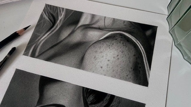
details in the skin. Then I'll check for skin pores. Skin pores sometimes flow
in certain directions and this can be really helpful when trying to navigate
all the tiny details. And the wave like patterns
can look amazing when drawn. Just something for you to
look out for in the future. Now that we have a better
understanding of how to mentally process an
image before drawing it, and we know how to
figure out and maintain correct values whilst keeping
harmony between them. I'd like for you to find
a different portrait and use your new
knowledge to scan every part of that portrait
to try and figure out how you will go about drawing
it from start to finish. For example, where's a
good place to start? Which values are
needed and where? Which are the lightest
and darkest areas and how do they relate to other
areas in the portrait? Are there any areas which need
to be kept soft or sharp? Have fun looking at your images from a
different perspective. And whilst you're doing
that, I'll be getting things ready for the next
lesson and I'll see you there.
13. Patience and Progression: Hi, I'm welcome back. I remember how
daunting it was when I first decided to embark
on my artistic journey. So I'd like to give you a couple of pieces of advice on how to get over hurdles you may face as you progress along
your own journey. I didn't have the funds
at the time to buy finite courses or
to attend college, so I was never really sure if what I was doing was correct, which led to me double getting
myself quite frequently. I realize now that
a huge part of creating fine art comes
down to patients, which can be even
more difficult to master than learning how
to use your materials. Once you have a
good understanding of how to work your medium, you can then find a way
to work on your patients. For example, I see many hyperrealistic
artists working grids, completing many small segments separately until they reach
the end of their project. This way of working
helps the artists stay laser focused on one
small section at a time, allowing them to capture all the tiny details
like skin pores, without becoming lost
and overwhelmed, especially on bigger pieces. Looking at larger
projects as a whole can make it seem a near
impossible task to complete and
difficult to maintain focus on the thousands of
tiny details within it. If you're struggling or you lean more towards hyperrealism, using this technique may
be of interest to you. It all comes down to
finding a strategy that will help you achieve your goals with a method that suits you. I could always spend a
day drawing a portrait, but as soon as I packed away
my pencils for that day, I had no desire to pick them
up again the following day. But over the years, as you begin to learn more
about value and layers, you begin to realize
that achieving the results that inspire you
takes time and patience. So you push yourself that little hard with every portrait. I've now progressed to spending four or five days on a piece, or even a week on a large piece. The 12 or 300 projects
still elude me, but they're in my sights, I'm sure you'll find, as did I, that every time you push
yourself to complete a better portrait over a
longer period of time, you will immediately
raise a bar. And that new bar will become the norm for all of
your future projects. That's why it's so important
to remember to trust the process when in the
midst of a long project, when you've been drawing
for quite some time, you'll undoubtedly have days
where your enthusiasm wanes and you struggle to draw or
to even start a new project. I find that on those occasions, if I just sit at my workstation and study the reference
photo for a while, like what we did in
the previous lesson, imagining how I'm going to
approach drawing a portrait. After a few minutes,
I'll start to feel inspired and naturally want to make a start on the project. Also, what never seems to foul is breaking the
task into small steps. I'll tell myself
that I'll just do the outline today or I'll
start with something easy, like the background of the neck, somewhere with not
too much detail. Picking up your pencils to start a small task or something
relatively easy, we'll tap into your
creativity urges every time. If you ever find
yourself feeling overwhelmed with the
task, start small. Either break the
task into small, easy chunks, like an
outline or background, or pick a small area
with lots of value and complete that area in
full before moving on. Once you complete a
small area fully, you'll be dying to complete
the rest of the portrait. I really hope that by now you've gained confidence
in your new tools and your new abilities and
are really starting to feel excited to get stuck
into our main class projects, which will be making a
start in our next lesson. So put your game face on
and let's get corrected.
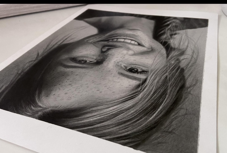
14. Background: Before we start, I just
wanted to give you a huge pat on the
back for getting this far and to say, well done. We've covered quite a few
topics and I really hope you've enjoyed following along with me and excited for what's to come. So starting with the background, I want you to focus on making the whole area as smooth
and as even as possible. If you use your value
chart as I'm doing here, you'll get an idea of which
pencil grade to aim for. I'm not sure if you're able to see in this
video exactly what I see in the flesh as there's some light reflecting
off the graphite. But my chart is telling me that the bottom of
the background is somewhere in the region of
HB or B grade blue pencil, and the top is similar
to maybe five B blue. This means that we're going
to have to make a smooth, even transition from five
B to B, or thereabouts. Similar to what we did in the rectangular blending
session earlier. Remember what we discussed
in previous lessons? To achieve a solid,
saturated tone, we're going to need layers. And we always build
from light to dark. So I'll start by applying two or three layers
of two H blue. Then the same again
with the F grade. Then a couple coats of
HB, or blue gray pencil. This will give us
our base layer, that being the lightest
value in the background. Once the base layer is down, we can then begin moving
up the page using our darker grades as we go until we hit
our darkest value, the five B blue or thereabouts. You'll notice that
when you smooth out the first layer of
each grade of pencil, it may look a bit patchy. This will lessen with
each additional layer. However, if you notice any patches that are
particularly dark, use your needable
eraser to gently lift the patch before moving
on to the next layer. You can blend using
tissue or cotton pad. Try using both of you, have them to see if you prefer
one over the other. Okay, so we begin laying
down the two H blue, notice that I'm
holding my pencil at quite an acute angle. This grip helps with control by using your whole
arm from the elbow. But before we do this here, I'm making the outline darker, so I don't lose it
whilst smoothing out. Be mindful not to outline any areas that aren't
as dark as a HB black though the HB is good to use for this as it doesn't
smudge During blending, Smoothing out between every
layer using circular motions. You can notice that I have a dark patch bottom
right of background, which you'll see me
lift in a moment using a pointed edible eraser, two coats of two H, and now the same for
the F grade blue. Also same again for
the B grade blue. And repeat the process
for the other side. Now we have the base
value laid down. We can begin the
darker values to create a smooth transition using the two B here and
lightening the pressure to fade out at around
halfway down the page. Using two to three layers of each grade pencil will help that value look
saturated and solid. Same again for the five B blue, but this time we fade out at around a quarter of the page. I've noticed some dark
marks here and from, I think, a blemish on the paper. So I'm just going to
spend a bit of time with the eraser here trying to lift them
up and making it blend more with the
background layer. Then just keep
playing around with a two B and a five until you achieve that real
smooth transition from dark to light. Lifting up any
tiny imperfections as you go with the
top few layers. It's possible to use a little more pressure to
get a slightly darker tone, but it's still quite light. Well done, guys, for
completing the background, I hope you're 100% happy
with your transition. During this lesson,
we've learned how to create a solid, saturated tone. One that incorporates a
super smooth transition from dark to light
with no imperfections. Don't worry if at this stage you feel like your background
should be a bit darker. We'll get a chance to welcome
it again a bit later. We'll be moving on
to the Here next, which will allow us
to lay down some of our darkest value
to anti free B. Once we have a little
of that on the page, we'll find it much
easier to gauge all other values from here
and in. I'll see you there.
15. Hair: Hi, welcome back. Today we're going to be drawing the hair I chose to draw here next as it incorporates a good amount
of our darkest value, the Conti Freebie pencil,
as mentioned previously, land down some of
our darkest values sooner rather than later will really help you determine all other values within the
portrait as you proceed. We'll also break the hair down
into sections as this will help you keep track of value changes throughout
the procedure. The goal of this
lesson is to create an outer focus effect for the hair at the back of
the head and the plat. And to gradually
bring the hair into focus as we move nearer
to the face line. Also, I would like
for you to apply your pencil strokes in the
same direction as a hair, as this will really
help with authenticity once we start to hone in on
the single hair strands. Firstly, before I proceed, I break the hair down into these four sections and make a mental note of all the lines. This helps me to keep track of all the subtle changes in tone whilst building this
side of the hair. I use the same technique
to make sense of all types of hair,
especially curly. So the first thing I do is lay down an undercoat
layer of five B, blue to all the darker
areas of the hair. This will separate the
light and dark areas and will provide a much
clearer view of hair flow. I pay close attention to all the mid and
dark tonal variants within this layer and will change the pressure
slightly to replicate this. As I go, pay close attention to which direction
the hair flows and try to replicate this
in your pencil strokes. You see me using the
show short shade of brush here to smooth
out the five B pencil. Once all the five
B blue is down, I then apply a coat of two B black followed
by eight black. Use the Igshow brush once again
to smooth out each layer. My main concern here is to keep an unbelievably light pressure and to get an even
tone before blending. When you reach the
parting of the hair, work your pencil strokes going towards a
highlighted area, lightening the
pressure to taper off. This is the two black. Now for the eight black, now the conte three B pencil. I find the master
touch Filbert brush, a great brush to
smooth out a Conti. This pencil lead is really soft. This mid stiff brush
is great for spreading all the loose bits
of charcoal around a page to leave a
really smooth blend, I build this little section
using the two black, then the eight black, and then the conte to finish off building the darker strands of hair here using
the six black pencil. And then picking out a
few highlights using a sharpened mono zero eraser. I always use the
brush here just to blend the ends of the
highlights that I'm making. This tiny section here is a bit lighter than
the rest of the hair. On the right side, I'm using
a six to build this here. I'm using the 46.8 B
blacks to build value. On the left side,
pay close attention to the directional flow of hair and all the subtle
changes in value. Remember to use the eg, show brush to soften every
pencil stroke that you make. This stiff Georgian
short filbert brush has almost worn
down to the metal. But it's still a pretty good brush to work
the medium into the paper or soften
hair strokes and to keep the outside edge of
the hair looking blurry. Bear in mind that you can
achieve a variety of values using just one pencil by changing your pressure,
as I'm doing here. All of the highlighted
strands of hair in this section are mid tones, which is why I'm not concerned with covering the whole
area with a brush. If there were any pure
white reflections, I would make a point
of drawing around them and not covering them
at all with graphite. Now, sharpening the
mono zero eraser just to pick out
a few highlights for the lighter
portion of the hair. Here I'm using the five
blue and two black. Don't too much. If
you go too dark, you can always use
your needle eraser to lift up a layer
or two of graphite. So as the set of
time lapse runs out, you'll see me switching between all the tools and
techniques just used. Gradually adding
and lifting value until I'm happy with the
likeness to reference photo. The stiff or short
number two brush to blending stumps are great tools to keep the
outline looking soft, blurry, and out of focus. We will cover more in
this in a later lesson. Things may change as we progress
throughout the portrait. And we may need to make minor adjustments
towards the end. But for now, I'm happy enough to move on to the
next part of the portrait. Remember, brushes and blending
stumps will help soften the value changes
and keep parts of the hair looking blurry
and out of focus. As you move forward towards the face line on
the left side of the hair, gradually start to make
the value changes thinner, so they begin to look more
like strands of hair. Then as you need a face line, combine using the
pencil and mono zero eraser to create
sharp strands of hair. Coming up next, we
get a chance to dial in on those super
smooth skin blends. I'll catch you there.
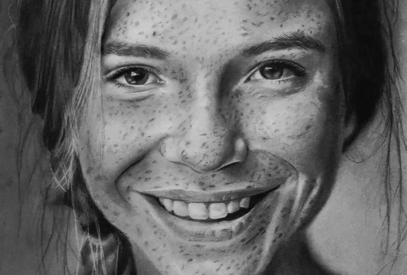
16. Forehead: Hi guys, Welcome back. Now we've completed
the hair and have a good amount of our
darkest value on the paper. Let's move on to the forehead. This part of the face is a relatively easy part to
start with as it provides quite a large area
for you to practice blending before we get to the more difficult
areas of the face. Another area that's
normally good for the same reason is the neck. We'll try our best to
complete the forehead in, but I always find that as progress throughout the different
stages in the portrait. I constantly need to come back and touch up
previously worked on areas in order to bring harmony to the values in
the portrait as a whole. The main focus of this
lesson is to keep the subtle changes in
tones as you build layers. And to make the transitions as smooth and as
saturated as possible. Okay, before we start, if you studied the forehead
closely for a moment, you'll notice that we have several value changes within the forehead as
I'm showing here. I want you to keep this in mind as you're
building your tones. Okay, so the first thing
that I do is to darken the outline of the eyebrows
so I don't rub them away. When I smooth out the forehead. Always be mindful of your outlines as you
build darker value. As you don't want to lose any, pay close attention to the directional flow
of the hairlines. I'm using my ipad to view
the reference photo. As I find it shows a sharper
image than a printout. However, the ipad is back lit, so it shows the lightest part of the forehead which is just above the left eye as we
view it being a four H blue. I'm going to start
with the four H blue, but may possibly go
darker as we progress switching to the grade blue here as we want to keep
the change in value. Now the blue for the darker areas now using a folded tissue to smooth out small circular motions
wherever possible. This is a second coat of four H, and now beginning to go a
bit darker using the B blue. And now for the five blue, for the darker areas, remember to adjust your
pressure where needed to fade into the
lighter value below. And smooth out every
single layer that you apply using a two B blue here, just to make the transition between values a bit smoother. Notice with the blue that I'm shading around the lightest
part of the forehead. Now using the five blue and then the six black for
the right eyebrow, I use the eye show
brush to smooth out as the bristles on my brush are really short due
to it being old. A blending stump or the small angled brush
will do the same thing. I begin marking the hairlines of the left eyebrow
using the five blue. Mindful that the left brow
is lighter than the right. I'm also mindful that
the tone in between the eyebrows is ever so slightly darker than
the forehead above. So as you can see, I'm just switching back and forth
between my pencil grades, starting with light
grades and gradually getting darker and darker until the correct
value is achieved. The stiff bristled
Georgian short field, but number two size brush is a great brush to work the
medium into the paper. This one is completely worn, so it works a bit different to one with full length bristles. Try using a small
angled make up brush, or stumps to blend press
slightly with the stump, so small circular motions will soften the edge. As you switch to using the black set of carbon
pencils on the skin, use the lightest possible
pressure you can. You do not want to be seeing
any visible lines at all. You can use straight lines
in all directions or small circular motions
to get coverage. But remember, they
do not smooth out. As well as the
graphite only set, you can start to apply a
tiny bit more pressure in the real dark areas. Try all of your brushes to get a feel of how each of them feel. Blending the black pencils, you will understand
that you need to be more careful and
spend a bit more time using your pencils to create the transitions with this
set before blending. Using the two black to
soften a transition here. Sometimes if I don't
want to go any darker but feel an area needs
a bit more saturation, I'll use a lighter pencil grade and blend them altogether. As we apply the darker
tones of the forehead, we can see that the
right side of the face isn't quite as dark as the
right side of the hair. We need to make sure that
we don't go quite as dark. You may not be able
to see in the video, but I'm using the needle
eraser here to again, soften a couple
of small areas to make for a smoother transition. Using the pencil eraser
to lightly bring up a layer and then blending
out with these stumps, making the hair lines
here in the left eyebrow, using the two black as you finish the forehead area. Take quite a bit of
time making all of your transitions as
smooth as possible. Use your needable eraser to
lift any hard transitions, or a lighter pencil
to smooth them out, along with the
filbert brushes to smooth them out afterwards.
They're great for this. I normally spend
quite a bit of time just using the filberts to
push the graphite around. It's already on the
paper until I'm happy. The Conte three B
charcoal pencil here has a really soft lead which
leaves some residue, so provides an ultra
smooth transition when blended with the brush. To summarize covered how to separate all the values
in the forehead and how to build layers whilst maintaining all the subtle
variations in tone. Throughout the process,
you've learned which blending tools
to use to create super smooth transitions
and have seen how to blend the carbon mixed pencil set into the graphite
only pencil set. So have fun drawing
your forehead. I'll be getting ready
for the next lesson. That being the eyes and
nose. We'll see you there.
17. Eyes & Nose: Hey guys are welcome back. So for today's lesson, we're going to be concentrating
on the eyes and nose. I think the most
important things to bear in mind when working on these areas are line
weight around the eyes, the shape and thickness
of the lashes, and keeping the shape
around the nose. You'll notice in
our reference that the bottom line of the eye is quite a lot lighter
than the top line. This is something we definitely want to keep an
eye on as we build a line that's too
heavy at the bottom will throw the whole
eye out of balance. The same applies with
the bottom lashes. They are thinner, lighter, and smaller than the top lashes. We also need to be mindful
that the whites of the eyes aren't exactly
white with the nose. I really want you to focus on the block shape that
we made in outlining. This will really help break down the changes in value for you. If we look at the shadow
side of the nose, we can see that the middle
part of the shadow is a slightly lighter tone than
the top and the bottom. We can also see that those top and bottom areas aren't quite as dark as
the iris on the eyes. Just like the whole
right side of the face is a little lighter than the right side of the hair. We need to be mindful of all these subtle changes in
value throughout the process. Okay, so as we begin the facial features
wherever possible, I lightly outline any
parts of the brows, eyes and mouth
using the HB black. This is a great pencil to use for deepening the outline as the graphite carbon combo
in the HB is quite stable, won't smudge when blending
the skin around these areas. Something to bear
in mind though, the darker grades of the black
range smudge quite a bit. You have to be a bit more
careful if blending near them. Also, be careful not
to outline parts of the eye that aren't
as dark as a HB. Sometimes the bottom eye
line might not be as dark. For example, here I'm starting to define
the dark shades with the first layer
of five B blue. Using a blending stump to
lightly smooth out the iris, et cetera, is perfect as it has a soft point to get into
all the tight spaces. Also laying down
the first layer of blue for the surrounding skin. Using a cotton bud to smooth out this area is great as it's small enough to get
into the corners. This is the two blue here just to help smooth
out the transition. Now using the six black to start laying down the
dark lines of the eye. Not for the lower
eye line though. Don't forget to leave out the
lighter parts of the iris. Okay, you should
have a good idea by now how to build value. Gradually I'll let you follow along without too much
interruption from me. However, I'll flash up the
pencil grade changes as we go. Now the eight black for the
darkest areas of the eye, then very lightly add the upper lashes
using the two black. Be mindful not to go
too dark with these. Okay, we begin building the darker contours of the
eye using the two black. As mentioned in the
previous lesson, the whole right side
shadowed area of the face is slightly
lighter tone than the right side of the hair. So, be mindful of
this as you proceed. I'm starting off
with the HB blue for the corners of the
whites of the eye here. I'm using the HB blue here to mark out the rest of the
darker tones around the nose. Be mindful of the
thin light line that separates the right nostril from the shadow below the nose. Now the five B blue to darken. Starting with the four H blue for the lighter
side of the nose. A sharpened mono zero eraser is great for adjusting any lines
of the eye you need to make using the stiff La Ali
Georgian felt number two, brush here again, okay? So to summarize, the
key takeaways of this lesson are to focus on the natural
directional lines of the lashes to keep an
eye on a difference in line weight between the
upper and lower eyelids, that the whites of the eyes
are adequately recreated. Also, to concentrate on the block shape of
the nose that we made an outlining to help us
keep track of value changes. The next lesson
focuses on cheekbones. I'll be getting set up for that whilst you finish
the eyes and nose. Take your time and I'll
see you when you're ready.
18. Cheekbone & Nose: Hello again. For this lesson, we'll be moving slightly further down the face
to the cheekbones. Whilst touching up the nose, every now and again as we go, you'll probably feel some areas already previously laid
down, like the nose, for example, may begin to look lighter as we build
value around it. Can you remember the image I
showed in an earlier lesson? The one that tricked
the IR guiding tone? It's a similar effect. That's why I'm constantly going back and forth
between areas of a portrait as I build to keep harmony between all the values in the
portrait as a whole. Building the cheek
bones is similar to the sphere study that
we completed earlier. Both the cheek bones have their lighter areas in
the middle of them, so we want to lighten
our pressure with every layer as we get closer to the center
of each cheekbone. Also, just like in the
last couple of lessons, we need to keep the
shadowed right side of the face slightly lighter
than the hair on the right. I'm just touching
up the lower parts of the eye here and then we'll lightly mark out the
smile lines with the HB black. And then add two passes of two H blue for
the first layer. Following this, I
use the five B blue to mark out the shaded part
of the face to the right, smooth out with the cotton bud. Now using the H blue to cover the whole of
the right cheek bone, as this side is a bit
darker than the left. But then I use a H blue to start building the contours
of the left cheek. I use the H, B blue to start the contours of the right cheek, followed by the five B blue to add a bit more detail
around this area. Straight in with the seven black for the darkest
side of the face. Don't forget to use
really light pressure and smoothing out with the eye. Show short shader brush, just creating detail
to the right side of the eye here using
the five B blue. There are some smile
lines to this area. So we want to lightly add those, making the nose area smoother. Using the Eg Show brush. Pay very close attention to
the darker value lines around the mouth area as these are unbelievably important when
trying to recreate a smile. And don't forget to use your needed ble eraser to
lift any value needed. I'll probably be adding
some darker tone to the upper half of the background sometime before we
finish the portrait, But I'm happy with
the lower half of the background compared
to the reference image. I'll be using that part
of the background to help gauge the lighter
left side of the face. I know this side of the face is a little lighter
than the background. You can see a very
slight change of value running along this
smile line in the chin. So we want to add that also, If you look closely now, you can see that my
pencil stroke has smudged some of the black
value onto the cheek. I'll need to use
the inedible eraser to gently dab this up. Don't forget the outside
edge of the cheekbone here. It's only a subtle
change in value, but an important one. Nonetheless, I
constantly line parts of the portray up with
other parts of the portray to help
with accuracy. For example, how far over the corners of the eye
does the eyebrow fall? Does the highlighted area on the nose end at the
upper eyelid or eyebrow? Gently dabbing the
hu battery eraser or the curry gnaw
pencil eraser can be great for adding
small bits of detail. Using the six feet
black to very gently create some very small lashes
to the bottom eye line. These are a lot more sparse than the lashes on the upper line of the eyelid When
adding the lashes to the eyelid to try to keep the curve of each lash going in the right direction As the direction changes as
you go around the eyelid. There isn't that much room on an A four piece of paper
to really focus on lashes. But we still need to
get the direction right now for the eight black, for the darkest
parts of the eye, be very careful not to go overboard here
with the eight B, I'm softening the edge of the dark value here
using a six black just to help smooth
the transition using unbelievably
light pressure. And then smoothing it out with the Georgian Filbert
brush number six. So to recap, you want to be thinking about the
sphere study we did earlier in the class
and try to use a similar technique to
recreate the cheekbones. Also when you're happy
with the cheekbones, re evaluate the nose and see if you need to make any changes of value anywhere we have the mouth and
chin coming up next. So have fun and I'll be
waiting for you there.
19. Mouth & Chin: Hey guys, welcome back. For this lesson, we're going to be tackling the mouth area. We have a beautiful
smile to draw, and the things we need
to focus our attention on here are the smile
lines and teeth. A lot of people have difficulty
with replicating teeth, mainly to do with achieving
the correct shape and tone. Regarding tone, we
can see a couple of tiny highlights in the
corners of the front teeth. So that will give us
an idea of how much darker we need to go for
the body of the teeth. We want to keep these lines
in mind as we build the area. All the main value changes
happen around these lines. The first thing I do when
starting the mouth is to use the HB black to darken
the appropriate lines. Then the five B blue for the lines that are
slightly lighter. Now applying a five
base layer for the darkest parts of the
inside corners of the mouth. Pay extra attention to the
width and shape of each tooth. Now a couple of coats of four
H blue to the upper lip. Now start building all
the smile lines and begin separating the
values using the HB blue, followed by the five blue
for the darker parts, and now is six black. Making sure that I outlined
the bottom row of teeth, two B, then four blue for the
left side of the upper lip. Then starting off the bottom
lip with the two H blue, Pay extra attention to all smile lines as these are some of the
most important lines to make line these areas
up with other parts of the face to make sure they begin and end where they should. For example, does this
highlighted area here line up with the bottom
of the nose or just above the
corners of the mouth. This area of the
chin here is a tone lighter than the shadowed
right side of the face, using the five blue to begin adding some detail
to the bottom lip. Once again, you should
have a good idea by now of the tools and techniques
used to build value. So let you follow along
for the next few minutes without much
interruption from me. Now I'm going to add
a little darker value to the top half of
the background. And gradually lighten the blend into the tone that's
already on the page. I use a two first lightening the pressure to fade out
around the eye line. Then the HB black
at the bottom of the blend just to make
the fade a bit smoother. And then a touch up at
the bottom of the two blue and the second coat
of the two be black. For the top couple of inches, I'll make a start on a neck, but I'll talk about that
in the next lesson. As we begin the teeth, I lay down the first layer
using the four H blue. I use the blue for the
subtle variations in value, then the blending
stump to smooth out. Once I'm happy with the
shape of all the teeth, I use the HB black to eaten all the edges and the four B
black for the darker areas. So that brings us to a
close for this lesson. To summarize, we want to pay special attention to
all the small lines. Making sure if need be, to use other parts of
the face whilst adding value to help determine the correct shape
and proportions. Try to make sure your teeth are the correct shape
and also smooth, and when you're happy with them, take care to give
them a sharp outline along the bottom edge, as this will really
help them to stand out. Have fun whilst you
complete this area. We have the neck coming up
next. I'll catch you there.
20. Neck: Hello people and welcome back. We're going to be
drawing the neck today. I'm once again using
the reference photo to evaluate value compared to
other parts of the portrait. For example, I can see
that the lighter tones on the left side of the
neck look pretty similar to the lower
portion of the background, but a little darker than the highlighted side of
the face to the left. The shadowed part of
the neck looks a little lighter than the darkest hair
value to the right side, but about the same tone as the
shadowed part of the face. The neck in our
reference is similar to the forehead in regards
to building value, but in addition to this, we want to make sure we keep our neck line blurry where it meets the
background and jumper, but keep the chin
line sharp also, as always, make sure our
skin blends are smooth. I also have a
little trick that I want to show you at the end
of this lesson that will give you something to
experiment with in future portraits to make them
even smoother like before. To begin, I want to make my
outline a bit more stable. Using the HB black, I use the blue to begin the
lighter tones of the neck. Slightly adjusting
the pressure to differentiate and maintain
the changes in tone. Now going slightly
darker with the HB blue, I begin marking out the
darker tones using the blue, the straight onto the five blue, onto the 6.8 B blacks to lay down those
really dark tones, smoothing out with the
E. Show brush as I go. Now you see me using a few of the midtone pencils from the blue range to begin
deepening the values. Notice how the five B blue helps smooth out the transition. Here, lots of brushwork. Using the show,
you can use light, mid, or heavy pressure
with the brushwork. Heavy pressure will help push the graphite around and
smooth out transitions. There's some very subtle detail running down the
center of the neck, which I'm picking out here
with the needable eraser. Okay, so I'm happy
with the next. So far I'm going back
to work on the face for a little while
just to strengthen and smooth out
some of the tones. I'll flesh up the
pencil changes as I go. And we'll see you in
a couple of minutes. Were I'll show you a nice little trick for you to practice in the future if you want to make
your values even smoother. Okay, so here I'm using my
pencil and sandpaper to make a little powder where I'll use a relatively soft
brush to smooth out. I wanted to show you guys
this technique to give you something to practice
on future portraits. The only thing I will say is
that I used a B blue to make the powder for the right
side and blue for the left. I think they were ever so
slightly darker than expected. Maybe try the H grades first and see how you go
or failing that, you could try with Jakars, a sorted gray set of
compressed charcoal. I don't use this
technique too often, which is why I didn't include equipment in class resources. But this set is fantastic. However, I will only use powder for the very
last finishing layer, as I find interchanging
graphite with charcoal whilst building
layers doesn't mix at will. And turns out,
looking a bit messy. I also wouldn't necessarily use this on lighter skin tones, just on darker values, as the graphite blends
really well on its own. I'll use the craft knife to make powder and then
I'm good to go. Lastly, the B grade blue pencil at the bottom just to help
smooth the transition. As you can see, I've already
completed the jumper and come back to the outline
to make it look blurry. To do this, I'm using
the five B blue to make small circular motions
just over the outline. Then I'll use either a brush
or blending stump to blend. Okay, so as we close out
this lesson to summarize, when drawing a neck, it's
fairly similar to the forehead, so I want you to
focus on keeping all the different
changes in value as you build them throughout
the whole procedure. Make sure they look
saturated and solid, and to make sure all
the appropriate lines look blurry and out of focus. Where needed, we get to
grips with a jumper. Next, I'll be waiting for you.
21. Jumper: Welcome back people.
So the least lesson we'll be completing the jumper. I want you to focus on the
pattern of the jumper here. It's very subtle, but you
can just about make out a couple of knitted ribbed lines to the left shoulder and body. We'll want to mark out our
pattern lines before we start and keep our changes in value throughout
the whole process. Everything in the
jumper is blurry. So there'll be lots of brushwork and some light pencil
razor strokes. Okay. So the first
thing I do is to again use the HB black to
mark all the important lines. Then I use a five
B blue to lay down a base layer for all
the darkest spots. A slight change of pressure
for the lighter areas. Then blending the whole area with the Eg show makeup brush. Here I'm using the seven B
back to make the lines of the jumper a bit darker so I don't lose him when blending. You'll notice that already I'm starting to replicate the
pattern of the knitted jumper now for the Conte Freebie
charcoal pencil for the darkest right hand
corner of the shoulder. Smoothing out with the mid stiff master touch reflex brush, starting to make the patterns of the ribbed part of the jumper
using the seven black. These patterns don't
have to be exact, so long as they give the
impression of thread direction. Now for the eight black
to really strengthen those dark values and still using the show brush to
blend with every layer, I use the Conti free
charcoal pencil to just lightly dab some of the darkest areas
in the corners. You don't want to overdo it, so use it sparsely. Using the stiff Georgian brush here just to soften
some of the edges. You can use the a pencil eraser to pick out some highlights in the thread or the soft in the hu battery eraser
is great for this. I don't turn it on, no, as it will give you a line
that's too harsh. I then go over with the show brush so they
aren't too bright. Using the two B blue just to touch up the lower
portion of the background, I want the transition looking
just a tiny bit smoother. I begin the left side shoulder
using the seven B black, changing the pressure to mark the patterns of
the jumper as I go. Now that the jumper's finished, I readjust some of the
values in the plate. So now it's your turn. Remember to make your pattern
outlines darker before you begin and then mark all the differences in value
using the five B blue. You can then start to
build darker tones while keeping the patterned value
changes intact as you go. Have fun drawing a jumper. I'll be waiting to see you for the final adjustments and
detailing in the next lesson.
22. Final Adjustments & Detailing: Welcome back guys.
For this lesson, we'll be spending
our last few hours making sure that
we're happy with all our values and then adding the final details
like flyer wear, hair strands, and freckles. I always spend quite a bit of time finishing my portraits, depending on how detailed
the reference photo is. If I'm drawing a commission for someone before I add details, I'll probably take a photo
of the drawing and try to make the image as close to
the reference photo as I can. Then I'll place them side by side to see if anyone
needs adjusting. But more about that
in the next lesson. For this lesson, I want
you to focus on creating depth between the hair strands and realistic looking freckles. We create depth by making some strands of hair
blurry and out of focus, and some sharp and in focus. When you place the focus strands on top of the blurry strands, the blurry strands will
look like they are behind the focused ones and more towards the
back of the head. We make our freckles look realistic by adding
size differences, tonal differences, and
keeping some soft and sharp. Okay, so let's get into it. So I'm just spending
the next 40 seconds or so making small
adjustments to the portrait. Then we'll get onto
the good stuff, That being the loose hair
strands and freckles. I hope that by now,
by watching me continuously go back and
forth, strengthening values, you're beginning to understand
just how important this is in helping to create a
solid, lifelike drawing. And now for the good stuff, I'm going to use a
five blue to create some soft outer
focus hair strands smoothing out using
the blending stump. Pay extra attention
to the strands of hair that cross
one another as this may create a
slightly darker tone in those areas as they cross, we want to replicate
these small changes in value as it'll add more
interest for the viewer. Also, there will be changes in the thickness of the
out to focus strands. We want to try and
recreate this. I use the HB black to lay down some strands
that are in focus. Pay close attention
to the direction of these strands and make
sure to recreate them. Also, some strands
will look like they start and end in mid air, taping off at each end and be ever so slightly
thicker in the middle. The HB black here. Once again, I'm making
some in focus strands. Once again to go over
the outer focus ones. This will give the
impression that the outer focus strands
are further back. Be mindful not to overdo
it and draw too many. Now the two B black. For any dark areas within
the flyaway strands, I use a sharp angled
mono zero eraser to pick up the lighter
strands of hair. If you look closely, these
strands are not bright white. So I use a brush
to go over the top and dull the brightness
down if needed. Using my Georgian stiff number
two short Filbert brush to help make these strands
look out of focus. As mentioned before,
the bristles on my brush are completely worn down to the metal, so
it's good for this. If yours are still quite long, then you can use
the blending stump, strengthening the deep blacks in the mouth with the B black. Starting with the freckles. Now for the first layer on
the lighter skin tones, I'll be using the blue. I'll be changing the
pressure a little to create lighter and darker
freckles and making sure they are different
shapes and sizes. Then I'll add several darker
freckles using the HB blue. I only make a few just to
add a little more detail. You don't want to overdo it
here if you look closely. Some freckles have soft edges and some are a
little more sharp. I use a blending stump to soften some of them,
not all of them though. On the darker skin tones, I use the same technique, albeit with darker
pencil grades. I'll start this side
using the two blue. The idea is to create three to five different
freckle tones throughout the whole face, making sure they are all
different sizes and softness. Just remember, be careful of the amount of darker
freckles you make. You don't need to add as
many as the lighter ones. I'll let you follow along
as I finish the freckles. I think the eyebrow
overruns a tad here, so I'm using the T o eraser to lightly lift a
couple of millimeters. I'm not turning it on,
just gently dabbing. I feel the hair at the bottom
here is a little dark, so I'm using the needle
ble eraser to lighten, gently dabbing The tho eraser is a great way to make
a few highlights. It's not turned on as I'm not looking for bright
white highlights. The mono zero eraser will do the same if you
don't have the tho, if you need to soften
highlights a bit, you can lightly go
over with a soft brush using the H blue to strengthen the subtle
details on the neck. You'll notice I use the
TTu eraser just to make some subtle highlights along the detailed lines
of the upper lip. If you've used tape to
secure your drawing, remove very slowly and at an angle perpendicular to
the line it's secured. Otherwise, it can damage your paper like here and
you do not want this, especially if it's a commission. Lastly, a couple of coats of fixative spray to help secure the graphite
and you're done. Leave to draw between coats. To recap, we've learned
how to create depth with the flyway strands of hair using soft and
sharp elements. We learned how to lay out the freckles using
different grades of pencil, creating several
changes of tone, size, shape, and appearance. So enjoy finishing
off your portrait. I'll be showing
you how to capture the best photo to use
your socials next.
23. Image Edit for Final Photo: I always spend quite a bit of time taking the final photo as I want an image that represents my work as I see it in hand. For this lesson, I
wanted to give you a few tips on capturing
a beautiful photo. So you can either upload it to your socials or
send it to clients. If you're taking commissions. The incoming daylight has the ability to change
it dramatically. Even if I place a drawing under an overhead lighting rick, it can end up being too bright and highlight
the grain in the paper, making the whole portrait
look gray and nothing like the smooth blended portrait I've just spent days
trying to achieve. Even natural daylight
can sometimes give a strong blue or orange
tint to the whole photo. Depending on whether the day is overcast or bright
morning or evening, Sometimes I find I get a really good result which
needs no editing at all. If I take the photo just a
couple of hours before sunset. More often than not, I
find I need to first find a location in the studio which provides adequate
lighting, take a photo, then make a few
minor adjustments with the editing tools on my phone to get that image looking as close to what
it looks like in hand. I actually go through
this process before final adjustments and
detailing as well, because I want to be sure that my values are spot
on before detailing, especially if someone has
commissioned a portrait. Once I've captured
the right photo and made a few minor edits, I'll place a reference photo alongside the photo of
my drawing either on my desktop or an app like layout and study the images for any discrepancies
between the two. And then adjust where needed. In my studio set up, I find I get the best results. If I place a drawing a couple of metres
away from the window and turn it slightly away so it's not facing
direct sunlight. Unfortunately, the only way
you're going to find out what works best in your own space
is by trial and error. Everyone's working
environment is different. So once I've captured an image
with the right lighting, I always first
reduce the warmth by about 35 to 40 and then
increase the tint by the same. I don't like changing the
image to just black and white. As to me, it seems a bit too harsh and doesn't give a
true reflection of the work. If the high lights aren't as bright as they are
in the drawing, then I'll increase the high light or the brilliant a little. For the dark values, I'll
increase the shadows, or the black point by
only around five to ten. Be careful not to change
the darks too much as the image can begin to
look a bit pixelated. Same goes if
changing a contrast. The contrast can either
make an image more vivid or can mute the tones
for a more subdued feel. To recap, we now know
that direct light or bright daylight is maybe not the best condition
to take a photo. When you're ready to take
a photo of your portrait, first find a position around the workspace that doesn't
provide too much bright light. If it's an overcast day, that may well be directly
in front of the window. But if it's a bright day, you may need to find an area slightly away from the window. Once you capture a good picture, first talk of the warmth
and tint on your phone. And then adjust to highlight some blacks until you're happy. Have a play round with your photo and see what
appeals to you. I'll be waiting for you in the next video where
we'll conclude the class and remind you of just how far you've come
throughout this process. You should be super stoked at your achievement, seeing a bit.
24. Conclusion: Hey guys, welcome back. Once again, as we
conclude this class, I just wanted to give you
a huge pat on the back and congratulate you on making it through
the whole class. It was a massive undertaking
and I hope you found a process as rewarding and enjoyable as I
have teaching it. We've covered so many
topics that I hope will help set you on your path to becoming a great artist. You've learned how
important patience is in regards to realism
and how to use and layer different pencil
compositions to showcase a full range of values
and consistency in tone. The latter is not only important for commission based
portrait work, but is a great skill set to have for all
kinds of pencil art. You now know how to achieve super smooth skin blinds
and authentic looking here. And you have a greater
understanding of what makes a good reference
photo and how to study that reference
photo before drawing. You also know how
to make and use a value scale chart and how to evaluate values
throughout the process. But out of all the
topics we covered, I think the key takeaway
that I'd like for you to focus on going
forward is patients. If you master
patients, there'll be no limits to the realism
in your creations. So please don't forget to upload your drawings
to the class. I'll be so excited to see them as will your
fellow students. So can't get some love. Also, if you'd like
to come introduce yourself on Instagram
or Facebook, hit me up. I'd love to hear
from you. I'd also love to follow your journey. And if you send me a photo
of a portrait you completed before you took the class
alongside this class project, maybe I can post them
together on my socials. I'll be uploading more
classes over the coming year, like how to draw curly hair, how to draw pets, and possibly even hyperrealism. If any of those interest
you then do feel free to give me a follow
so I can keep you updated. But in the meantime, have fun putting your new skills
to work and take care.
 Shayne Wise, Professional Portrait Artist