Palette Hunting: Finding and Crafting Impactful Colour Palettes
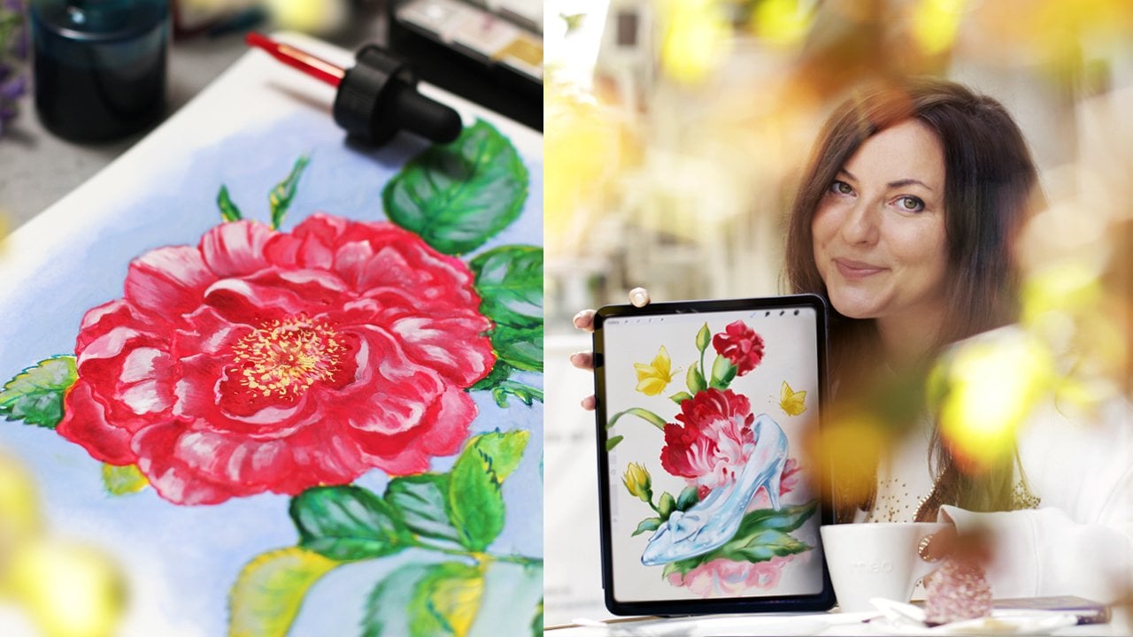
 Sha'an D'Anthes, artist, illustrator and author
Watch this class and thousands more
Watch this class and thousands more
Lessons in This Class
-
-
1.
Welcome!
0:39
-
2.
Let's Prep For Class :-)
0:59
-
3.
Exercise 1: Monochromatic Palette & Mixing Colour
2:07
-
4.
Exercise 2: Harmonious Palettes
2:14
-
5.
Exercise 3: Complementary Palettes & Culling
1:58
-
6.
Exercise 4: Colour Inspiration in Classical Art
1:26
-
7.
Exercise 5: Palette Hunt
0:55
-
8.
Wrapping Up, Sharing Your Projects & Other Resources
1:12
-
-
- --
- Beginner level
- Intermediate level
- Advanced level
- All levels
Community Generated
The level is determined by a majority opinion of students who have reviewed this class. The teacher's recommendation is shown until at least 5 student responses are collected.
1,674
Students
26
Projects
About This Class
Crafting great colour palettes is a crucial part of the creative process because a great colour palette can elevate your work, guide a viewer around a piece, reinforce themes and evoke emotions. In this class students learn about:
- Various colour palette types
- Using The Palette Finder Tool as a starting point
- Experimenting with personal colour preferences
- Where they can find colour inspiration
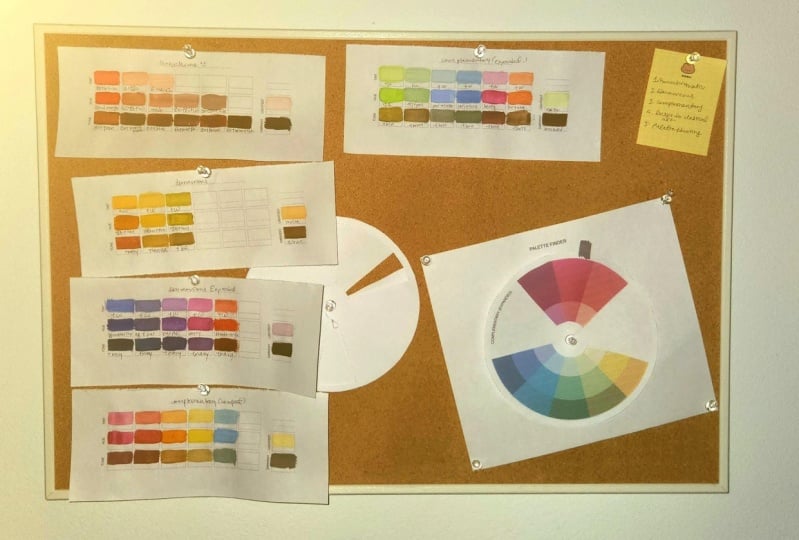
Students will leave this class with 8-9 unique colour palettes that they can bring into their future projects.
Who is this class for?
Colour is such an important part of visual communication and so this class is suitable for creatives of all visual disciplines. This class may be useful for creatives at any stage of their career - but beginners should bring mediums they are familiar with.
What should you bring to class?
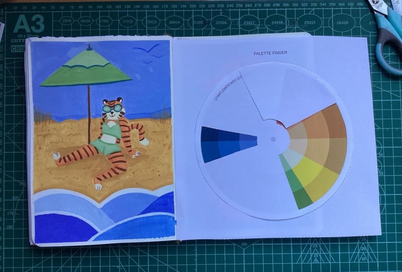
Students can choose how they want to approach this class, starting with bringing the supplies they would usually use to add colour to their work - the palette finder tool and swatch files for this class can be found in the class resources
Students working with the printed palette finder will need to print out all of the files in the 'TO PRINT.zip', a pen, pin, scissors/a blade, and something to pin the palette finder into (cardboard will do). We will go through how to set this up during the class.
Students working with the digital palette finder will need to download 'DIGITAL.zip' and import all images to different layers in the app of their choice.
Meet Your Teacher

Hi, I'm Sha'an :-)
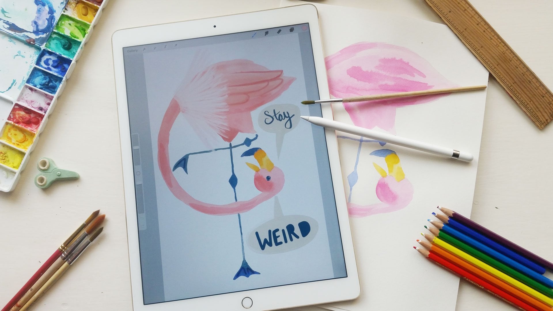
I am an illustrator, visual artist and published children's author who has a passion for creating vibrant and joyful pieces that embrace a childlike way of looking at the world.
I love working with both traditional and digital media, and over the years I've had the pleasure of working with a number of global companies (including Adobe, Samsung, Squarespace, Coca-Cola, Depop, Skillshare, The Sims, Levi's, Prime Video and Audible) on an illustration, creative direction and content creation basis.
In 2013 I graduated with a Bachelor of Visual Art and Design, and in 2016 my childhood dream of "writing and drawing my own books" came true with ZOOM (Hachette) followed by Bandits (Hachette) in 2020.
Some of you may know me as 'furrylittlep... See full profile
Hands-on Class Project
The project for this class is the creation of a suite of colour palettes that students can use for future reference. The class is made up of 5 short exercises:
Exercise 1 — Monochromatic Palette & Mixing Colours
In this exercise we explore Monochromatic palettes using the Palette Finder tool. Students are asked to:
1. Replicate the hue, tint and tone they see using the Palette Finder Tool and their swatch card.
2. Expand the monochromatic palette by mixing new tints and tones and adding them to their swatch card.
Exercise 2 — Harmonious Palette
In this exercise we explore Harmonious palettes using the Palette Finder Tool and students begin to think about curating their palettes. Students are asked to:
1. Replicate the hues, tints and tones they see using the Compact Harmonious Stencil, Palette Finder Tool and their swatch card.
2. Repeat the exercise using the Expanded Harmonious Stencil and choose some colours to omit from your swatch card.
The project for this class is to come up with a suite of colour palettes you can reference moving forward in your projects. There are 5 exercises in this class that will make up this project that will introduce students to the basics of colour, mixing colours, curating palettes and finding colour inspiration.
Exercise 1 — Monochromatic Palette & Mixing Colours
In this exercise we explore Monochromatic palettes using the Palette Finder tool. Students are asked to:
1. Replicate the hue, tint and tone they see using the Palette Finder Tool and their swatch card.
2. Expand the monochromatic palette by mixing new tints and tones and adding them to their swatch card.
Exercise 3 — Complementary Palette & Palette Curation
In this exercise we explore complementary palettes using the Palette Finder Tool and students are asked to omit colours according to their taste. Students are asked to:
1. Replicate the hues, tints and tones they see using the Compact Complementary Stencil, Palette Finder Tool and their swatch card.
2. Repeat the exercise using the Expanded Complementary Stencil and choose 2 hues to omit entirely.
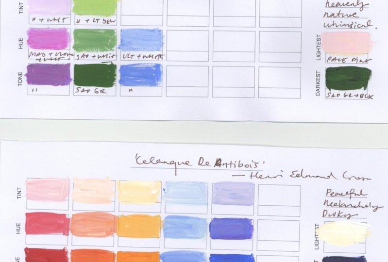
Exercise 4 — Finding Colour Inspiration in Classical Art
In this exercise we explore how classical art can be a great reference for colour studies. Student's are asked to:
1. Choose a centuries old artwork to analyse from the perspective of colour.
2. Fill out a swatch card inspired by this artwork.
Exercise 5 — Palette Hunting (Finding Colour Inspiration Outside)
In this exercise we explore how the real world can be a never ending source of inspiration for colour. Students are asked to:
1. Go on a walk and take photos of things that include the three palette types discussed in this class.
2. Fill out a swatch card inspired by one of these photos
Sharing your projects!
I would love to see the projects inspired by the colour palettes you dreamt up in this class. Feel free to upload scans, screengrabs or photographs of your palettes and/or projects inspired by themin the class project gallery.
Class Ratings
Why Join Skillshare?
Take award-winning Skillshare Original Classes
Each class has short lessons, hands-on projects
Your membership supports Skillshare teachers
Learn From Anywhere
Take classes on the go with the Skillshare app. Stream or download to watch on the plane, the subway, or wherever you learn best.