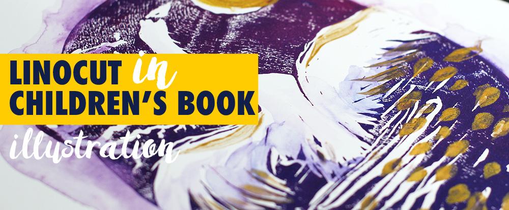
Transcripts
1. Intro: Have you ever felt a
sudden spark of joy while flipping through a
beautifully illustrated book? That's the magic of
book illustration, and that's what we're
going to learn today. I'm a multi award
winning artist, illustrator, and author
based in Berlin. I had a lot of dream projects, but book Illustration
is my true passion and has made my professional
career possible. Let me tell you a
quick story of how I landed my first
book commission. A local publisher was
hosting a contest for a new children's book
with a tight deadline. I took all the freelance work I could back then,
so I participated. There were five contestants. Two didn't meet the deadline. One's work wasn't really nice. Another artists, just
copy someone else's work, and that left just me. I couldn't draw very
well back then, but I had a strong
sense of composition, which was crucial regardless of your style or skill level. In this class, we'll explore five key elements of
composition and apply them to the classic fairy
tale illustrations like Beauty and the
Beast and Cinderella. We'll also discuss
how to approach publishers and editors how to work with manuscripts and scan your artwork
in high quality. First, we'll use ink
and watercolors. Then we'll work digitally on
iPad using Procreate app. I'll show you how to apply
gradients and textures, and I prepared some
helpful downloads for you. Feel free to use any
art supplies you have. The skills will
learn I universal. By the end of this class, you'll be able to apply them in various creative fields from design and fashion to
personal projects. Let's get started and
create some magic together. The adventure begins now.
2. Inspiration Fairy Tale Books: Welcome to the very
special part of the class Book Inspiration. We'll dive into the world of
illustrated favorittales. In my home library, I have a lot of
enchanting editions. And to be honest, I can get a
few copies of the same book because the edition is so
beautiful or I love the artist, or it's an anniversary edition. I'm sure you know what I mean. I want to show you a few
artists whose work I admire. Their illustrations for
favorittales are so balanced and unique and they capture the magical essence
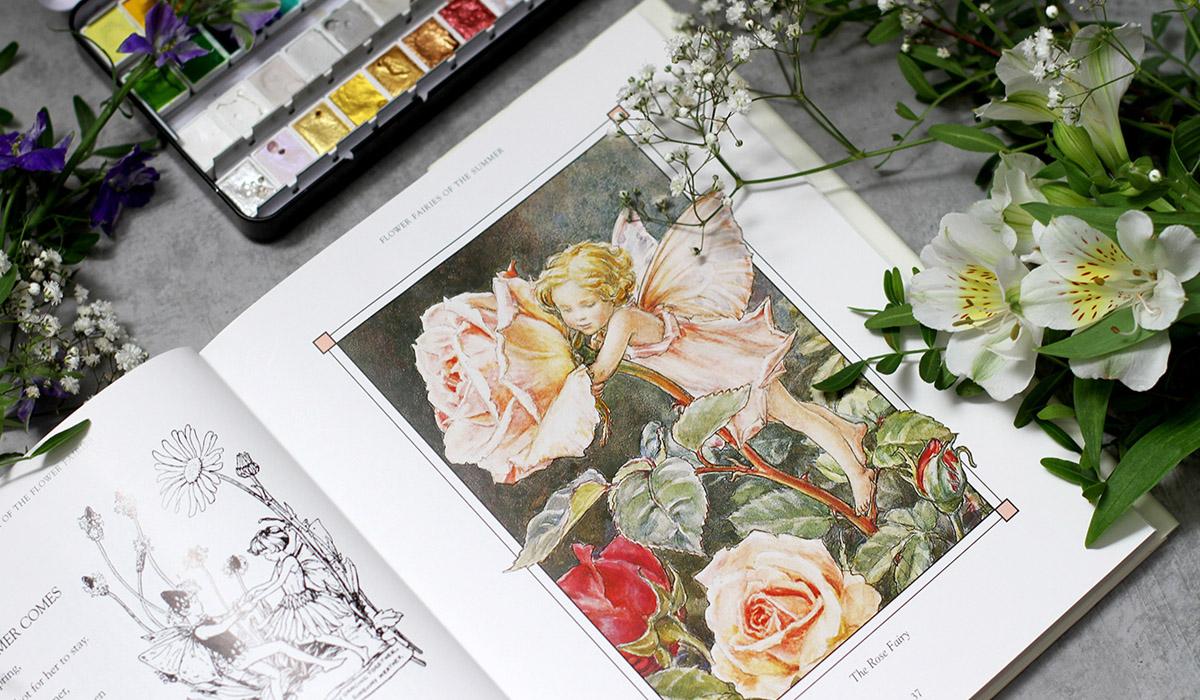
of the stories. Let's take a closer look. So the first treasure
is the complete book of the flower fairies by
Cicely Mary Barker. It's a wonderful collection of seasons and fairies and poems. We can discover the
beautiful watercolors, ink and wonderful composition
in every artwork. We can see the magic
of fairy world, the wonders of the
flowers portraits and seasons collected
together in one book. I love the colors and the charm of this
book, Illustrations. I think autumn is my
favorite season here, but honestly, I love
everything in this book. There are various editions, and I just wanted to have
all fairies in one book. I even have a small one just
for autumn, to be honest. We can discover a
lot of details, and I love the technique. So obviously, watercolor works
great with inks. Soccer. The next one is very, very famous GrimsFairy tales. I have this lovely
illustrated edition by legendary Arthur echam. It's a collection of some
best loved tales with spot illustrations and
full page artworks. There are not so many artworks, but still more than in
usual Grimes edition. I love the technique, and I'm sure you've seen the
artworks before. Reckon was one of
the leading figures of the Golden Age of
book Illustration. Pen and ink, dramatic
feel and the lines, everything is so inspiring. His work is noted
for the pen and drawings which he combined
with watercolors, just like in previous book, but it's completely
different style. And that's what we're
going to do today. We will also work with ink and then add watercolor on top. You can browse the tales. This artist is a huge influence. So magical book indeed. The next artist I find super
inspiring is Walter Crane. So I wanted to show you these two editions I have
with his illustrations, the Brother Grims tales and the collection of Fairy Tales. So I really love the
format of this book. I think it's use
Walter Craig's style. There's a variety of tales, and the overall design of the
edition supports the style. He was a part of the arts
and crafts movement, so his style is very detailed
and it has a narrative. Of course, it's a
book illustration, but, you know, foods and boots. This book is in Russian.
It's my native language. So no surprises here. Cinderella. I love
the graphic style and the bold contrast
of the shapes. It's simple but very, very inspiring and striking. Beautiful details,
limited color palette, a lot of patterns. I love the background
on this one. He always includes
some additional story telling on the background. There are a lot of editions, and I'm sure you can
find different books illustrated by Walter
Crane, like this one. It's a Grim'sFavorite
tales illustrated by different artists,
illustrators. And I really love the style. This one is beautiful. As you can guess, it's
Cinderella illustration. So the one that we're
going to do today. And I think Frog prints is illustrated by
Walter Crane here. Yes, the details, very
recognizable style. Frog prints. Exactly. The different tales have
different translations, so you might find it
with other titles. Beautiful artworks.
Wonderful books. And now I want to show you
some modern treasures. I would love to show you some contemporary
illustrated books for all ages, which is my favorite genre. Let's begin with a short
winter fairy tale. The Wood at midwinter
by Susannah Clark. It's a fully
illustrated edition, and I love everything that
Susannah Clark creates. She's a brilliant author, and I'm looking forward
to reading her new books. All of her books. It's a special
edition. Very beautiful. And this is a wild swan
and other tales by Michael Cunningham,
illustrated by Yukoshimsa. If you love inks, you
heard about her and she also has some classes
on Skillshare. Beautiful ink, black and
white illustrations. These fairy tales, as you
can guess, are a bit dark. So black and white
style sets perfectly, and just keep in
mind that, indeed, it's a very gothic
style of some sort. And here comes the
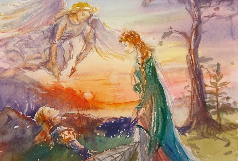
Beauty and the Beast, illustrated by Benjamin Lacombe. Here we can see the iconic rose, which we also paint today. This one. It's a very
beautiful edition. I love everything, the style, the depth of the artwork, the colors, of course,
the atmosphere. Full pages of artworks
and spot illustrations. Some of them are created in ink. Some of them, I think, are charcoal with watercolor on top. Very beautiful contemporary
interpretation of the classic fairy tale, which we are going to do today. So I hope you enjoyed the
enchanting book inspiration. It's always the favorite
part from the whole class, and I'll see you
in the next video. So let's move on, and I'll see you there.
3. Inspiration Around You: Welcome back. I hope you enjoyed the book inspiration and maybe even think about
visiting a local bookstore. Speaking of going
out for a walk, the world around us is
the best inspiration. You live in a unique place. Just visiting your garden or strolling the streets
can give so many ideas, sunset fields of natural parks or antique bookstores, anything. Even the facades of the building sometimes tell
fairy tale stories. For example, here's the
house on the way to my favorite coffee
shop. That's right. The scenes are straight from
the classic fairy tales. Try to find some hidden
gems where you live, and I would love to read about your discoveries in
your class project.
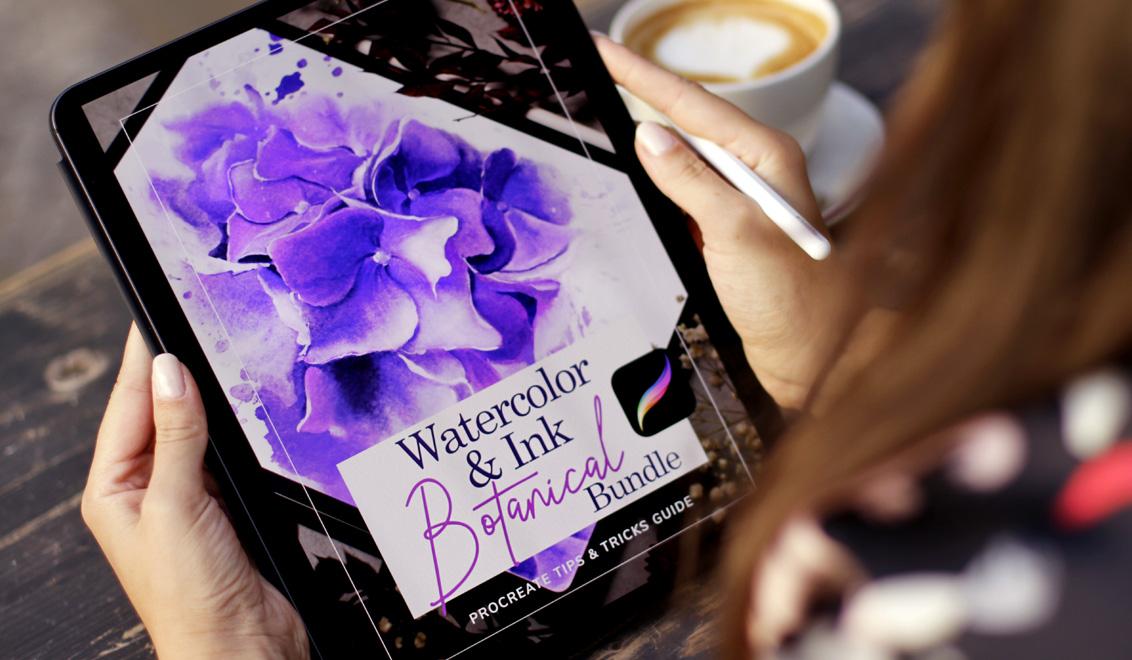
4. Materials: Welcome back. For our
exciting journey, we will need some art supplies. Actually, any art
supplies you have. Since we'll be focusing
on composition, you can use materials that you love and feel comfortable with. I'll use my favorite
combination of inks and watercolors for the Beauty
and the Beast illustration, to create Cinderella artwork, I'll work on iPad using the Procreate app
with Apple pencil. Let's take a closer look
at what I'll be using. So here are the materials. You don't have to
have everything. I'll just show you what I use, and maybe you'll
find it inspiring. So for the worksheets, I'll use inks and markers. It's an ink brush pen. What's important it's
water resistant, so you can paint over
it when it's dry. I'll love to use this
brush pen 'cause it's small enough
and waterproof. It's just the usual
mechanical pen, so very thin. The one I always use
for any artworks. Then I use dual
brush pen markers. I'll use three colors
for light, middle, and dark tones. Now inks. I'll use Bingment
based colored ink, so they will not fade over time. I'll use red for the petals
and tell for the leaves. We'll talk about it
in the next videos, and I will use this
color palette. It's very comfortable
to use the small one. Now the brushes. This I will use for inks. I like to keep separate
brushes for ink. These are synthetic
brushes size, too. So this way I always have
separate brushes and I don't have to worry about
keeping everything clean. Now, other brushes. These are also
synthetic round brushes with variety of sizes, usually sizes two,
three, six, and ten. That's what I use for
most of my artwork. And now the mop brushes
or French brushes. They hold a lot of water, so it's great for washes. I also use them all the time. Next, let's talk about paint. Here I have white gouache and my beautiful watercolor set. There are even
shimmering colors, but I'll just use a
few colors like pink, yellow, blue, I'll show
you in the next videos. And, of course, the paper. I will work in
Cotton sketchbook. It's large enough
for any artworks and I love the quality of
the paper, it's 100% cotton. And the worksheets
I've printed on the layout paper is super
thin and super smooth. It feels like a usual
printer's paper. And I've also prepared the appropriate version of
the worksheets just in case. So don't forget to
download it if you want. Okay, so I think we are ready, and I'll meet you in the
next video. Let's move on.
5. What is Book Illustration: Now let's talk about
book illustration. Of all the artistic genres, this one is my favorite. You don't have to
even ask me why. I will tell you anyway. Book illustration is such a
unique blend of visual arts, storytelling and your
own private experience. When you look at these
images and texts together, you have a perception of the
story that is unique to you. The history of this
art ana dates back to the 15th century early
European woodblock printing, and it's been
evolving ever since. Illustrators not only create a visual interpretation
of the text, they bring the story to life. Literature in general
and, of course, imaginative fiction
like fairy tales is an incredible source of
your artistic inspiration. There are endless ways
in which illustrators can communicate with the
author and the reader. We as artists can actually
control which part of the illustration is more important and set the
mood for the scene. By the way we use
composition, arrange objects, and use light and dark areas, we direct the viewer's eye and create even more
interest and meaning. And that's what we're going
to do on our journey. But before diving into
creative exercises, let's talk about some
helpful practices. In the next video,
we'll talk about working with a
publisher and editor, which is super helpful
if you want to get published or realize
your own projects.
6. Working with a Publisher: Welcome back. Now that we've explored the magic of
book illustration, let's talk about
practical parts. Book Illustration process
is a collaboration. Working with a publisher
can bring your artwork to the wider audience and to
a completely new level. In today's market, there are many ways to realize
your project. You can approach a publisher or self publish your book
and promote it yourself. The key is to find
the perfect match for you and your
potential audience. That's the most difficult part. But how to find a publisher. The best first step is to go to the bookstore and find
the books you love. And then find out
who published them. You probably already have a sense of the segment
that suits you. You should have a
solid portfolio with a defined style and vision which you can submit
to the publisher by email. When working on a book project, your closest contact
will be the editor. Communication is the key
to successful project. Be open to feedback. And understand that
the editor may have another perspective
on the future of the book. So it's not just
about your artwork. Partnering with publisher
and editor can bring so much to your creative career
and artistic growth. Make sure you clearly
understand the contract. You can always ask for changes if something
doesn't look right. While large publishing houses have pretty strict contracts. They still can make changes. Professional advice and pricing, I recommend the graphic
artist guilt handbook. Everything is very individual, but this book has been an
indispensable resource for me. In the next video, we'll discuss working with manuscripts.
I'll see you there.
7. Working with a Manuscript: Now we'll talk about one of my favorite parts
of the process. Reading. When working on
the book illustration, you have the perfect
excuse to read some fascinating texts and
dive into fantastic worlds. A manuscript is a written
text that the illustrator uses as a reference to create
a visual representation. It can even be a draft
or an edited copy. Depending on the book's
length and deadline, you might read the
manuscript a few times and take
some mental notes. It's essential to understand the main idea and the
mood of the narrative. I usually think of the
pacing of the book and mentally divided
into segments. Even if I'm excited to
illustrate certain scenes, they might be too close to
each other in the narration. So I need to have
this layout ahead. I ask myself what technique
would suit this book best? Then I create some
nail sketches, the small basic ideas of
composition and style, and then choose the final ones to show as draft to the editor. Using this strategy
leaves enough room for creativity while ensuring I'm moving in the right direction. Finally, in the next video, we'll talk about composition and how to apply to your work.
8. What is Composition?: So what is composition? Composition is the art
of arranging forms and other elements
within a picture to effectively express
artists ideas. Regardless of skill level, well composed
illustration creates a satisfying feeling
of balance and beauty. We can control what part of the artwork is most important. We can make it bigger or put it in the
middle of the image. We can guide the viewer's
eye to the main point of interest by making it
darker or lighter. There are so many
elements of composition. In this class, we will
focus on five basic ones. Line, depth, value, and rhythm. In the next videos, we'll
practice creative exercises to explore these essential
techniques. Let's move on.
9. Composition Warm up Techniques: As we discussed, let's try
some creative exercises to explore the basic
elements of composition. You can load the
warm up sheets from class resources or
simply use blank paper. I prefer to practice these
warm ups in circles, so you can make a few
templates for yourself. Of course, you can
use any shapes, any art supplies you like. It's a personal preference. Let's get started.
We'll begin with space.
10. Composition Element: Space: Let's get started. I've
printed out the worksheets on this paper as we
discussed, layout paper. And I also prepared
apcriate version. Just in case if you
want to draw digitally, you just pick any brush and
draw inside the circles. I created two layers, and it's very easy to practice a little bit
without any thinking. Well, with a little
bit of thinking. Okay, so we begin with a space. It's also called picture area. It's the area of the artwork
within your borders. Square circle or any
shape you choose. I just prefer to work in
circles for these exercises. You decide what size are the elements and
where you put them. So for the first image, I will draw this
little tiny boat as a small part of
the picture area. I use the black ink brush pen to speed up the process a bit. So my idea is to draw a small object right
here and the shadow. That's it. So the area around the object is super
important to show space. It's simple way to create dramatic effect and
impactful composition. Now we can add shadows. Oops, bit smudging. I had to wait a bit. Now, here on the water
something like this. Now, we can control what part of the artwork
is most important. We can make it bigger or put it in the middle
of the image. And we can also use
the rule of thirds, where you put your
central object near one third of the frame
to create the balance. Let's draw a tree. And plan it to be near one
third of the frame. You will see the
balance right away. Many artists work
intuitively and they just create balanced artworks. But it's good to practice and to know what you are
doing sometimes. Now, the artwork can also fill the whole
frame of the image. Let's draw a huge flower. This way, the effect will be very different from
two previous examples. Of course, you can
draw anything. It's just the examples I decided
to show you. The petals. It's like a close up
photograph on your phone, but illustration is
not a photograph, luckily, and it's very
important to keep it this way. And Beto leaves here of maybe ten Petals
lives over here, and I planted so
I use this set of markers and the black ink
to simplify the process, but at the same time, I like to have painterly feel
even with markers. That's why I use three shades, the light tone, the middle tone, and the darkest dark.
So the ink is dry. And as I told you, just a
little bit of smudging, if I wait a bit, there would be no smudging, but we have a lot
of things to do. It's a darker gray. Let's put some contrast
on the leaves. And here and in the middle, just sketching with
markers is very relaxing. At least at this stage, we can think about the general impression of
the sketch and nothing more. Let's add a background. So we will have a
beautiful worksheet. That's it. Maybe a bit
of lighter gray on top. I love the sketchy feel
of these exercises. So now we have three ways
to use a picture area. They're very different, but
they have the same idea. And in the next video, we will work on the line. Okay, so let's move on.
11. Composition Element: Line: Here comes the line. Is my favorite element. Even the simple line
can be so powerful. Even the single
line like this one, but we will add some more. The line is not just an
outline surrounding the shape. Line can lead the viewer's
eye to the point of interest. It creates mood,
direction, and rhythm. And what I love is that it works perfectly even for
a single object. So try to draw different
lines and see how it feels. It's a very simple exercise. Just the shape
created by the line. And now, I'll paint or draw a small scene and
begin with a village road. This road will lead the viewer's eye right to
the house. You will see. I draw a road with a soft
border made of grass. And right away, you look at the end of the road,
and you're curious. Well, maybe you're curious
to see what will be there. But I already told you
it will be a house. So let's paint it. With our inky brush, the roof. Nothing too detailed. But still, we need to show the whole house. Otherwise, it won't
look so nice. So a door shape of the roof, more details. The idea is very clear, but still I would love to have
three complete worksheets. That's why I'm adding all
these tiny details all around. And here and bit more here. Super. Now we have the
illustration with a direction. And now I'll try to draw flowers in a bit of
graphic design fiel. If you, for example, are a surface pattern designer, you know this feeling. I simplify the flower, and I try to use bold strokes
just to show the direction. Like sew and sew with a beautiful graphic feel
and simplified sujet. Here, the same line I've been
using in the first example. Very powerful tool. Like sell and a few elements. So as I told you, it's
like in the first example. I use the same lines,
the same principle. I just combine them differently. So here we have a contrast
of the larger shape of the flower and the thin
line with a direction. Beautiful. Now let's add some shadows for the interest just to keep the scene alive. When sketching, I don't
like to use a lot of colors just to get the idea, and it's a very nice feeling to draw on the paper
with a few shades. Let's add even more shadows to the scene and to the
flowers, of course. Something was missing,
and now I love the design that we created. So now we have three examples, and next, we will explore depth.
12. Composition Element: Depth: Welcome back, and we
begin to draw right away. Depth creates an illusion
of three dimensional space. So I love these exercises
where the lines are interwind
behind one another. So I just draw some lines and hide them behind
the first one. This exercise is very simple, but still requires
a lot of attention. I don't want to use any color to distract me at this point. It's the basic idea of depth. But still, we have a very
graphic approach to it. So no shadows, nothing
more than shapes. As you can see, the
lines are everywhere, and we use them in all the most important
elements of composition. It's a very relaxing exercise. And now I want to add
the biggest element. It looks like a ribbon. Now, the bottom line and
the middle line then I'll just draw a few spots of black to show a
better contrast. Right away, we have
this illusion of three dimensional space
like this and like this behind these lines
and here and here, a sketchy feel, but the
idea is very clear. Let's sketch more over here
like so and vinyl element. And here. Mm hmm. And we are ready. So to create a convincing
sense of real depth, we use foreground, middle
ground, and background. So I will draw a tree. And this will be the foreground. Then I will draw
something behind it, and our eyes will follow the composition
in an interesting way. Just a le tree right in front of us with flowers just
for the interest, and then behind
that famous house. Well, maybe another one with some plants or trees,
something small. Closer to the edge of our shape. Now I think we need to
connect it somehow, and we already have
this idea in mind. Let's use the magic road that leads us somewhere
somewhere nice, hopefully. Now a bit of details to
keep the scene alive. Mm hm. So as you already know, we make shapes smaller when
they get further away. That's why the house is small and the tree is much bigger. So a small scene where we can travel and have the
path for the eye. So one of the best ways to show depth is to
use overlapping. As we see in our life, part of the objects
are partly hidden. Things that are closer cover
things that are behind them. So we can use it to make
a beautiful arrangement. For example, I will draw this object right
in front of us, and I will draw
something behind, which is partly hidden. And that will create
interest right away. It looks almost like
a still life element. The shadows, highlights
everything with an ink pen. Just a hint. And now behind, I will
draw a book, of course, open book with pages and lines and some secret script. Okay, so we have two objects in a very
interesting arrangement. Now let's add some shadows.
Just a little bit. So we'll have all of our
studies in similar style. Why? Just because we
can and it looks nice and it's a pleasant feeling
to sketch with a few colors. And we have the
white of the paper. So I really love the result. So as before, we have three
examples of the depth, and now we can move
on to the value. Let's move on.
13. Composition Element: Value: Here we go. Ally shows how light or dark are the
elements of our picture. So here, I'll take the light
marker and draw a tree. Just with this
light brush marker, the lightness of the color will set up the whole
mood of the scene. Value creates the overall
mood of the whole image. Is it dark, dramatic or
is it light and subtle? You can choose, and value also creates atmosphere
that should be consistent. So it's a good idea
to plan things ahead or use just one marker, like I'm doing right now. So the scene is subtle. No drama is involved,
no contrast. Just a very, very subtle feel
of the neutral gray color. Like this, maybe I should just add a bit of grass
or something over here. Just a hint on the
surface, like so. And that's it. The
atmosphere is very clear. I will add another color which
is also very light on top. So the scene will look organic. No black elements,
no darker tones. Okay. So now I will
draw some flowers, and I will try to add
contrast right away. Leaves with darker color. And another one. So I will use here
a key principle. The strongest contrast
between light and dark should be on the point of
interest of your image. In my case, this will be
the middle of the flower. Less important parts
should have less contrast. This key principle works for all the artworks for
surface pattern design, for book illustration, even for just graphic
design elements. Okay, so I have the flowers, and now I want to
add the contrast. So naturally, I will use
the darkest dark I have. Look, a few strokes and
the image comes alive. We have interest right away. The graphic feel. This can be a spot illustration
right away. Right on top of light gray, I have the elements. And like this, like this, I will adline for the interest. Super. That's correct
a few elements a bit. And dots also for the interest. So the line looks almost the
same in the whole sketch, and it gives the harmony. Okay, so let's make
a dramatic scene. I will paint some trees
in the dark night, and I will use the white
of the paper for the snow. It will be the dark,
dark, dramatic value. The trees are also dark, but the background
will be even darker. So let's add another
color for the ground just in case and then
I will use very, very dramatic color
for the background. I just leave the place
for the snow untouched. It's a very loose sketch. So I don't think
about details a lot. I just want to show
you the general idea. So I leave the white
of the page as a snow. And I just wanted to show
you the contrast that you can achieve with just
three colors right away and, of course, the
white of the paper. Something like this. You can see the difference between
these three scenes. They are all very different
in value and in impact. So details with a darker
color like we have here. Okay, let's move on
to the rhythm part.
14. Composition Element: Rhythm: You're doing great. I'm sure you've already had
some ideas that appeared while working on these exercises. It
happens like this. Now, let's explore the final and my favorite element
of composition. Rhythm. Here we go. This element of composition
is very powerful. Rhythm uses repetition
in any form to create flow and
guide the viewer's eye. Here's a simple example. You can draw drops and see
the pattern right away. Just a simple small drawing shows you the idea
or the rhythm. Study the direction
of the lines in your rough sketch and repeat some parts of the elements
to create the flow. You can use just small shapes, brush strokes or even patterns. So here we can add
just tiny strokes, and already we have
interesting pattern with a variety of shapes
and marks like this. Now let's try another thing. I will draw a huge flower
with repetitive elements. I'm using the repetition of the lines and also the
repetition of the shapes. They are almost the same but
face different direction. And here I will draw the leaves, and they're also the same. The shape is very close. And we have this repetition
here, here and here. Now, let's add some shading. You can change the
size of your elements. They don't have to
be exactly the same. But they should be recognizable enough to create this
organic pattern. I think I will add a few more
strokes here, here, here. So these elements look similar. And of course, as we
did in previous videos, some contrast as a
center of attention, and again, brush strokes. The same for the whole image. So we can recognize the
repetition and feel the rhythm, even in this small sketch. Something like this. Now,
let's add even more value. And next, I will use repetition. I will use repetition
of the lines to draw a tree and
add some shading. That's our line friend that we already know
from previous videos. And I use the same lines, change the direction
to draw a tree. And the branches will
look very, very similar. Something like this and
this and this and this. So we follow the
direction on the lines, and we recognize the
repetition in their shapes. Okay. Now let's add shading. Like so and like so, and maybe something
in the middle, just to keep things alive. Okay. And I think we are ready. That's it. We've learned so much and meet me
in the next video.
15. Applying the Principles : Welcome back. Now
that we've explored the five basic principles
of composition, let's apply them to our
fairy tale illustrations. Before moving forward,
I wanted to share how I use these principles
in my own artworks, for example, in my own book, Brilliant Inks and
in other artworks, like the Book Cover for
the Secret Garden Novel, or the painting inspired by the novel The Life and
Epinions of the Tom Cat More. Let's take a closer look. Here's my book, and
let's open some spread. I'll pick the one I
like most. This one. Here you can see a
clearer used rhythm to lead the viewer's eye. It consists of small
brush strokes, but the direction is very clear. Now, let's try something else. Every spread uses the
principles that we discussed. Pomegranate. Here, the main
character of pomegranate is surrounded by the frame of leaves creating a focal
point of interest. What do I have? Here. A lot of interesting things. And in this illustration, the line is obviously
playing the biggest part. Almost every artwork. More or less uses
this principle. Okay. Now let me show
you another painting. This painting is created for the book cover of the
Secret Garden novel. I've set up a slightly
darker value and depth, so we're drawn to the
center of the image. The main character is
surrounded by flowers. And let me show you the
thumbnail sketches I did. I only had a dining sheet of sketchbook paper
with me in cafe, but it's more than enough
to try out some ideas. So I tried three or five
different sketches, and I began with
direction of the line. I had three lines over here. And another sketches
are based on letters. You can learn more about
it in my other classes. For example, on
book Illustration, using Linocut technique. It's a wonderful class. So I had these ideas, and I also made
some color studies. Actually, we'll do the
same in the next videos, three colors, but they are very similar to
the final result. The character, the background, and the position of the flowers. So this small set was
enough to move forward. And now I will show you the painting in
my signature style. It's a Tomcat Moore
for the gallery show, and you can see the
variety in value. There are a lot of shadows all
around the main character, and the butterflies are super bright on the darker background. There is also a contrast on the edges all around the image, and, of course, the line
is super important. As I told you, it's one of my favorite elements
of composition. So I use it all the time on the leaves and on the
character everywhere. Here, I used all the elements of composition to create a
balanced and dramatic artwork. So you can use
everything in one piece. Okay, let's move on and
practice our skills.
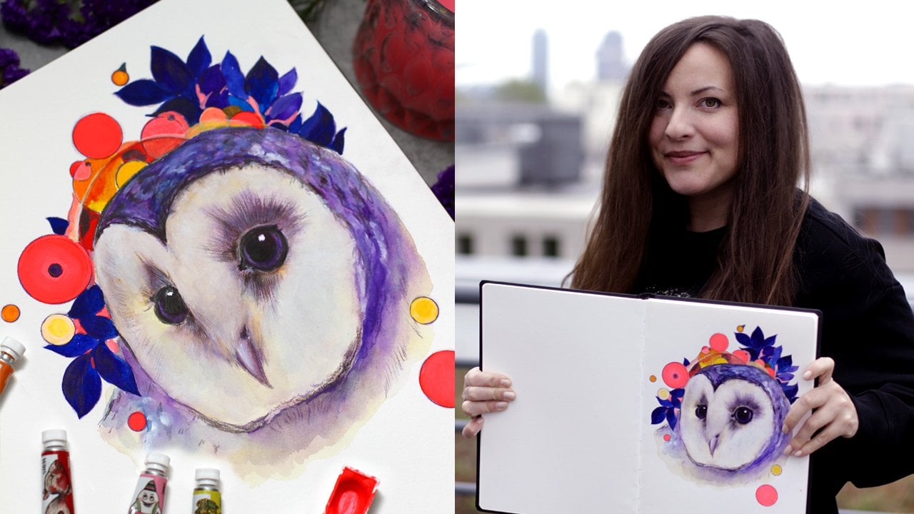
16. Demo: Beauty and The Beast Illustration: Welcome back. I'm super
inspired about this part. We're going to apply what
we've learned and create a book illustration inspired
by the classic fairy tale, Beauty and the Beast. We'll begin with
some nail sketches.
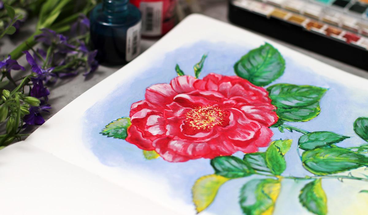
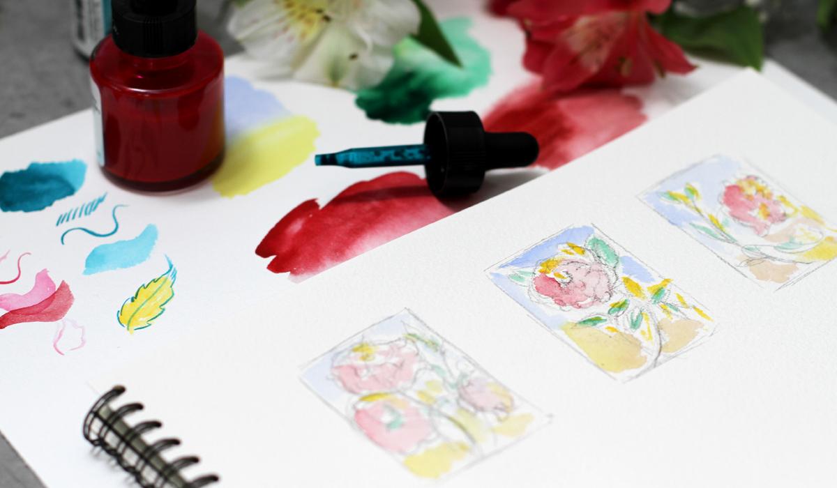
17. Demo Rose: Thumbnail Sketches: So here we go. I begin with some nail sketches to explore
the ideas and composition. For our spot illustration
of the rose, I plan to explore three operans. I will make some pencil sketches and then prepare
the color palette. So I begin with a
line as always. And I plan, for example, one flower here and another one maybe
another element or even another
flower over here. I'm just exploring ideas. Doesn't have to be
standalone rows, and you can add
anything you want. That's your interpretation. I'm working with a
very loose strokes, so nothing distracts me much. Okay. I think this
idea is clear. Let's try another one. This one will be in the center, and the line will lead
the viewer's eye like so. Now we need to
cross the interest. So leaves should be
somewhere on the other side. We overlap, and
we use read them. Mm hmm. Very loose sketch, not to spend a lot of time. Sometimes I get too
many details. Okay. The next one will be just a flower looking closer
to the edge to the right, and then additional
elements like this. I think I love the middle
one, this one the most. So now I need to plan
a color palette. Here I have all the watches from my watercolor set
that I'll be using. It's much easier to look at the real watches of
the real colors, and I can plan the color
palette right away. So I take the pigment
paste ink for the petals. Let's check the color
on watercolor paper. Ink and watercolor both, they change the
color when they dry. So it's always a great idea. To test everything first. So this one is for the
petals and the green one, the till one is for
the background. So I plan to paint the
outline with inks first. These inks work a bit like watercolors so I can
draw very fine line, and at the same time, I can work like
with watercolors. The ink is waterproof, so my plan is to paint over it with
watercolors afterwards. If you've seen my other classes, you know the technique already. Now, the teal ink for the
leaves. Let's try it out. Tiny wash, and I need to
check the fine line super. A simple synthetic round
brush is great for the test and more
diluted version. Okay. It looks really nice. And I plan to make the outline of the
leaves using this teal ink. It will not fade over time. And this color is
for the battles. Shape is very questionable, but still you get the idea. Okay, now I need to
plan the watercolors. I need to prepare the palette, so I spray it with water so everything
is ready right away. And I'm going to pick a
background color now. I want to make a
beautiful gradient. So I think the cobalt
and yellow should work. I take cobalt blue. And titanium yellow. Let's see how it blends
together. Beautiful. Coupled blue and yellow. And this is coupled yellow. I plan to paint over
the leaves with coupled yellow first and only then we'll
cover it with green. I will usehalogreen, this one. So this layering technique, let me check how
they blend together. Beautiful combination.
So this technique will allow me to create rich and deep effect with
a minimum of layers. This one is for the petals. It's quinacridon pink. And for the shadows, I will use rubby red. Quinocrdon pink is
a beautiful color. It can be super, super bright and
at the same time, you can soften the edges. So I will work with it
over the pigmented ink, as you can already guess. That's my technique. And this is ruby red. I will use it for the
shadows on the petals. It has a bit of different
hue than quinacridon pink, but close enough to
make a soft transition. I will use white gouache, of course, on the top layer, and I will use the color
palette for the inks, not to spend too much space. Now, let's test our color
palette right on the studies. I really love the feel of
working on the small elements. I'm using the larger
synthetic brush. I think it's number six. And I will try to add a bit of every color that we picked just to have the
general impression. The studies really help to focus and to keep in mind the general
picture of the artwork. Even if you change everything, you will have the anchor
of what you're doing. It really helps me to work
intuitively afterwards. Thumbnail sketches
are almost ready. We have the general impression. Let's add brighter yellow on top to add the beautiful
layering of watercolor. When the paint is dry, it will look a bit lighter, so keep that in mind. I love this version best, and we can move on.
18. Demo Rose: Inking the Outline: So here we go. I have my sketch ready. You can download it
in class resources. And the first step is
always to lighten it up. I'm using the razor, and it's best for the
watercolor paper. Now I'll prepare the ink. I have this beautiful
porcelain palette, and I will put a few drops of
the red ink for the petals. So I'll be using
synthetic brush size too as we discussed. So everything goes
according to plan, and I will paint the petals. My sketch is very detailed. So I paint over the
pencil outline carefully, paying special attention to the shape of the
petal and the line. Inks will stay even after I'll paint with
watercolors on top. So the line should be beautiful enough and support the whole
impression of the artwork. I love to use detailed sketches. So this way, I have the
plan of work way ahead. Now, another petal
and I draw every, every line using the ink. Of course, you can use water, and you can colour
the petals with inks. These are water resistant. So when you paint over
it, nothing happens. It's a beautiful
effect, but still, I think I will work with
watercolors most of the time. But of course, you
can experiment, you can paint with inks. I talk a lot about it in
my book on colored inks, and I use a lot of
brush strokes to show the direction of the petal and to support
the shape of the petal. And of course, every tiny
detail is very important here. In book illustration, it's almost like painting
with words for me. And I want to add a
lot of information. It's the way I
love to work, and, of course, you can experiment and you have your own style. Just wanted to
share how I prefer to work on such projects. So my plan is to work
in the same manner all over the surface of the flower using the
red pigmented ink. And then I will continue
working on other parts. But for now, I will draw every petal using a
lot of fresh strokes. So our petals are ready, and we can work on the leaves. So my plan is to use
steel, pigmented ink, as we discussed, and I will prepare it in my color palette. I don't dilute the
inks with water. I just use the ink straight
from the bottle, like so. So I will paint in the same
way like I did with petals. I put a sheet of watercolor
paper underneath my hand, not to smudge everything. This inks are super, super fast to dry and still it's a good habit to put something under
your drawing arm. So I draw the outline of the leaves and even
inside the leaves. This way, we will have
a variety of color, a variety of lines, and it will add a
lot of interest even after we will paint
with watercolors on top. So I already have
everything in pencil and I just draw on top
of it with inks. I have a lot of shapes here, so my plan is to carefully, carefully paint all the details. I'm working from the top, so it will be easier for my hand to follow
this direction. But again, it's a
personal preference. I know the artist who use another techniques. The edges of the leaves. This one is very close to
the edge of the sketchbook, but it doesn't matter much. I plan to scan this
artwork afterwards. Now details inside and it will stay in place and
in other leaves. Okay, so I will continue in the same manner and draw all the leaves in our
spot illustration. We have a beautiful outline. It's almost ready. This outline will shine
through just a little bit, and it will bring depth
to our illustration, and it's much easier
to work over it with paint to keep the book
illustration alive. Inks dries super fast, and next we're going to
paint the background.
19. Demo Rose: Painting the Background: Our inks are completely dry, so we can erase
the pencil marks. I erase everything
with kinda eraser. It works best for the
watercolor paper. I think for any paper, and now we're going to
paint a background. We already pick the colors, so we know what to do. We pick the colors cobbled
blue and titanium yellow. Now I will put some clear
water around our rose. Inks are water resistant, so we don't have to
worry about smudging. At first, it feels a
bit scary when you put a clear water right on
top of your outlines, but inks dries super fast, and you won't be able
to smudge anything. So I put some water
around the leaves, around the petals,
around the flower. I want to keep the
expressive shape of the background and not
color the wrong page. So I think I will use
the larger brush. Synthetic brush size six and
cobbled blue right on top. What a beautiful
contrast right away. I enjoy the first brush strokes of the background every time. I push the paint around. The water is still
wet, as you can see. So I have the soft
transition with soft edges. So in some places, the water is almost dry, so I will need to add
a bit of water again. I carefully work around the edges because I want
to keep the details. And I also carefully, carefully add more and
more blue on the side. I want to keep the expressive
shape of the background. So it's not a perfect
square or anything. I don't use Muskin
tape to control it. Just a free hand painting
with a very pointy brush. You can always
increase the color. The cobalt blue from my
set is pretty intense. It feels almost like, gosh. And I know that when it's dry, it's going to be lighter and
have this made filter it. Okay, a bit of blue
inside this shape. It's important to have the
whole background around the petals colored with blue. This way will have a
beautiful contrast. Behind the leaves, Let's intensify parts
the background. Later, I would add yellow closer to the bottom of the page and create a beautiful gradient. That's my goal, that's my plan. We planned everything together. So now I'm just filling
the background Okay, now let's soften the edges. Let's soften the edges a bit. I'm using mop brush or a
French brush and clear water. Paper towel is a great
tool if you need to make your brush, not so wet now on top, more pigment on this side. And then I think I will need to soften
the ends like this. I try to think about the shape of the background as
a separate shape. So it should be expressive, but still support the
overall composition of our spot illustration. Now, the yellow. I want to add yellow to the bottom
of the background, and it will create a
beautiful gradient. It's important to test
the colors first, especially blue and yellow. Sometimes they create a green that is not the best
choice for the background, so that's why I tested
everything before. Working on the final artwork. And now I want to blend
everything and have this soft, beautiful transition
between colors. Then I will put more blue on top to intensify the
impression, of course. Our background is almost ready. As you can see, we
have the outline. Our background is almost ready, and all we need to do is add color with
watercolors on top. We already have the beautiful
transitions right here. Let's add a bit of water and
yellow on top of the blue. It's a beautiful combination. No unusual green,
a bit of green, but I will soften the
edges and the transition. So everything will
look balanced. So I soften the edges. And here I have
some strange dot. Let's cover it with plume. And what I'm going to
do next is to intensify the blue color especially closer to the main focal point
of our spot illustration. We want to have a
beautiful contrast but still very organic feel. Nothing too bright
or too predictable. On top. You can add even more layers
or just use one layer. It's also a personal preference. More blue on the background and behind the leaves to
support the shape. I can almost imagine how
I see this in black and white or without
any color at all. So I soften the edges using
my fringe brush or mop brush, and it's a long process. So speed up process
is a good idea, and our background is
almost almost ready. When it's ready, I will
wait till it's dry. I don't like to
use hair dryer in sketchbook because it
makes the pages sarp. So I will just
leave it as it is. The paint and ink
dry super fast. So we can move on to
our painting part. It's very exciting.
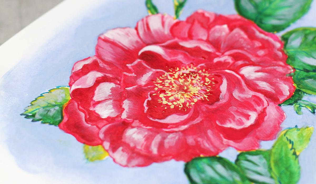
20. Demo Rose: Painting Petals and Leaves: Welcome back. Our painting
is completely dry, so we can move on and
paint the petals. I'll be using Quinacridon pink, and I'm going to paint, as we discussed over the ink
with watercolor, like so. I'll use synthetic brush size
six for the intense color, and then I will blend
it with French brushes. This way we'll have a beautiful
transition of the color, almost like a gradient. I need more water. Like so. Sometimes I use just
two French brushes at the same time to
speed up the process. As you know, they hold a lot
of water and a lot of paint. So I can cover the larger
areas at one take, I move from the top. This way, I won't
smudge anything. Sometimes I forget to put a sheet of paper underneath
my working hand. So intense color
closer to the edges, and then I blend it
closer to the top. I already know where the shadows are because we have
this ink strokes. And then I blend it, like, so We should have a beautiful variety of
value on the same petal. This way, we'll achieve this rich and interesting
feel and depth. I think I will use French
brush, as I told you. To French brushes probably
will work better. Let me add some water. So I'll paint with a smaller French brush
closer to the edges with more intense color and then blend with pure water, like so. This way, we can quickly
achieve the beautiful effect, and we don't have to
worry about inks. Everything is super dry. Everything is waterproof. So my technique is very
convenient in that sense. I'm working around the
center of the flower. The first layer is
very important. You can plan the
future layers at this stage while you're
working on this one. So I know here we'll have darker shadows,
more intense colors. I look at the brush strokes, and I will continue
in the same way. Now it's time for the leaves. I will use cobelt yellow
as a first layer. As we discussed, we had a plan and we
will follow the plan. So cobalt yellow is warm color and will have
a beautiful contrast. Over the tell of
the ink right away. So I just cover the
whole leaf with yellow. I'm using large synthetic
brush size six. Well, for me, it's
a large brush, but I know artists who enjoy
working with 12 or ten. So it's a personal preference. Let's add some brightness.
The beautiful contrast. I really love the color. It's so sunny and cheerful. And we have this
tell ink underneath. So we already have a beautiful
contrast and painterly feel even with the second layer
with just one more layer. So my plan is to paint
all over the leaves. And then in the next step, I will add green on top. But first, I need to make all the leaves yellow and I will continue
in the same way. It's very mesmerizing process. Now, we're almost ready. I'll add a few strokes to
cover the white space, and the first layer will be
ready for the next step. I have a few spots left
during the process, so I will cover them up and we can move on
to the next stage. And this one. Okay.
21. Demo Rose: Adding a Second Layer: Welcome back, and we continue. I will add color
sand to the middle. We have some paint left, and it's a good idea
to do it right now. It will mix a bit with our quinacridon pink and
create a beautiful transition. Okay. So it looks
wonderful already. And now I want to add shadows to our petals
using Ruby red. We have first layer of the
quinacridon pink ready, and at first, I want to increase the intensity at this stage. So let's try this ruby
red as we discussed. Like I did just now, it would be much harder
with pink to add shadows. So I picked another very, very close color, but still with a different hue. Like this. It's pretty much intense. So I will need to
blend it a bit more. Like, so, since we already have a plan with
inks with the first layer, it's much, much more easier
to follow the route. French brush works better
for me at this point. I use two French brushes
as we did before. So I blend it with water. The color is very intense, but it can be
different depending on the brand you're using. I'm using very, very
highly pigmented colors. These are professional
watercolors, and some of them
are very intense or they look almost
like guash a bit. So it's always a great idea
to test everything first. Blend it with water. And here underneath
the curl on the petal. It feels like sculpting a bit. Everyone has different manner
of painting or drawing, so you can do whatever
you like to change the order of the things
that you plan to do. For example, you can begin with watercolors and then
draw with inks on top. It's a different imagination
in works. Darker tone. So I use darker tones
closer to the edges to keep the value and to have this
three dimensional effect, the illusion that we
can increase later. So I begin with shadows. And when the whole area is covered with shadows
and entails color, I will then work with
white gouache on top and will make the
highlights even brighter. And for now, I will
continue painting in the same manner and will paint all the shadows and petals on our beautiful rose.
That's my plan. Here we have wonderful depth. And now the next step
is to paint the leaves. Once we have the petals ready, we can move on to the next step. I'm happy with the result, and I love the way the
petals look and the shapes. Everything is blended and
beautiful depth is everywhere. So the leaves, as we discussed, I've tested the colors
for the leaves, and I will use ptalogreen
on top of the yellow. It will create a rich
gradient right away. I plan to take a lot of paint and then blend it
with water using, yes, you guessed
right, mop brush. So the process is almost
the same every time, but with different colors, different mediums, and
different thoughts. So I put a lot of
color right on top. I avoid ink brush strokes, but just in case, so I could see them as a guide. And then I will blend
everything with water. Our first layer is dry. So when I put some water on it, it blends a bit,
but not too much, you can control the amount
of water you're using. What effect. I work with very light,
subtle brush strokes. Beautiful. You can see the
effect we're aiming for. Subtle transition of the color. We still have the
lines of the inks. And this way, we don't
have to be super precise. We will have the
beautiful technique and the effect working for us. Now the water, try to use
different amounts of water, and you will see how it works, especially with your paint. Every watercolor paint behaves differently and has
its own character. So it's better to know
how things are working. And I also love to
plan things ahead. Now I will try another leaf. I think I need more paint. Everything depends
on the surface, on the brush, paper, paint, so many unexpected
situations and blending. Me water and subtle
subtle blending for the beautiful effect. And I will continue working in the same manner on all the leaves on our
beautiful illustration. We have a beautiful rose, and let's add even more depth. So next, I think I need to add the second
layer of the green, closer to the edges, the shadows to
intensify the color and the overall value of this part
of our book illustration. So closer to the edges, I put a lot of green but not so close to the top of the leaf to have this
beautiful contrast. We already have a mix of yellow and green and
everything together. So we'll have this unexpected
blending happening. The beauty of
traditional artwork. Always something
new and surprising. Now, here I think I
need some support. Okay, super dark green,
very intense color. It works as a shadow if
painted close to the red. So we have a beautiful
contrast right away. With the mop brush,
I blend the shadow, so it will look smooth and will keep the organic and painterly feel
of the whole artwork. A few strokes here,
a few strokes here, just a little bit,
small touches. When the whole painting
is almost ready, you can feel what you need to add to keep the balance to
unify the whole artwork. And it looks wonderful already. You can see how just a
couple of layers you create this deep rich effect.
Just a few layers. It's not that much for painting, and we have the real depth and interest and
everything on one page. So let's move on
to the final part.
22. Demo Rose: Adding Highlights and Details: Welcome back. And we begin to add magic with white gouache. I will mix a bit of
white with pink, so we will have the
subtle rose color. You can change the
amount of white, the amount of pink to
get your perfect hue. And I love to do it
during the process, so I just put them
next to each other and mix everything
in a very free way. Something like this,
beautiful pastel color, and I will use it
for the highlights. As usually, I will use
the intense color first, and then I will
blend it with water. With gouache, things
are a bit different. The paint is more opaque
and it's quite intense. So I think I will need
another brush like this. Gouache turns more
mat when it's dry, so you should keep that in mind. And of course, it will mix
with our initial layers, creating a beautiful transition. But sometimes the effect
will disappear a bit. That's why you can add
a few layers if you feel that just one
layer is not enough. So this white on top. I color not the whole petal, but some parts of it
to keep the interest. I'm supporting the shape
of the petal and blend it closer to the edges
of other petals. So bright ascent on top. And I think here, we already have the
dark shadow underneath. So white on top will create a beautiful and striking
contrast right away, like so. So we're painting
the shape on top. Beautiful beautiful effect,
but I need to blend it more. It's super intense. It won't be so bright
when it's dry, and since I know it, I can just leave it
alone for a while. But of course, I'll be
thinking about it because I always think about
everything too much. Okay, so more blending closer
to the bottom of the petal. And near the edges
of other petals. These transitions are
very important because they keep the general impression
of the artwork alive. Okay, I planned the whole
area we've just painted, and that's the principle I'll be using for the
rest of the flower. So I will be using the
mix of white and pink in different proportions to build the highlights of
our beautiful rose. And keep everything in balance like these more brushes
are great for blending. You don't have to use too
much water with them. Something like this. Okay, I continue working
in the same way. Okay. We have beautiful result. And now our rose has a subtle shining and
at the same time, depth and artistic feel to it. So next, what we're going to do? I want to add some
stamin in the middle. I will take titanium yellow. You remember it
from our background and very subtle strokes, dots over here,
right in the middle. I'm using the small
brush size too. It's around synthetic
brush and just scatter some dots around
the middle of the flour. This yellow feels
almost like white. So you can just mix
any yellow with white and get this intense,
intense color. I just have titanium yellow
in my watercolor set. But you can mix your
own, of course. Some scattered dots.
Beautiful effect. Okay, now the secret sauce, I will use the cobbled
bloom. You already saw it. And I want to add
extra depth and aesthetic with
subtle huge on top. So I will take a bit
of cobbled bloom and add it over
the illustration. I can mix it with white
for a more subtle feel. So it will cover the
thick green on top. Like so. Just a few strokes. This will make a
huge difference. The tiny details always
play a big part. So I mix it with
white a little bit to get more intense consistency. The texture is more opaque. Like, so right on the leaves. We have a beautiful contrast
next to the flower, and we have a blue background. This way we unify the artwork. For example, if you
work digitally, you can just put the
texture layer on top, like we will also practice in the second part of the class. But here, it's more complicated. So we need to be inventive
and super brave. Okay, a few strokes over
here and here and here. So every piece of artwork had a small
amount of cobalt on it. Super. I really love how it looks, but I need to blend it a bit. We don't need anything
too sharp at this stage, because the center
of the artwork is still the flower itself. And when you're working with
book illustration in mind, you're thinking about print and you don't want
too many details. So we have the main
focus, the main part, and the leaves are just
supporting the composition and the overall impression
on the flower. So I blend everything
with mop brush. We already have a few layers, so everything blends together, and we can add another layer. On top of the blending, it's always a nice touch. Not everywhere, but on some
places that will feel right. Like here, here. And maybe here. Mm hmm. It's a very nice process. Everything's almost ready, and you're just
polishing things. I love this part of the process. Not too much pressure
to create anything, just to keep the balance and to build the atmosphere even more. A few more strokes. At this stage, I'm
just looking at the illustration in general
and think what I can add. So I think the second layer of the copper blue
is a great idea. So what I'm going to do is add a bit more of
the blue on top. And then, of course,
I will blend it. Otherwise, it would
be too graphic and to balanced to the
whole style of the artwork. So I blend the edge carefully. Now it looks very wet. But when the color is dry, it will look more
mat. Now, here. So basically, I work around
the edges of the petals. They are fully painted now
and adding a layer on top. Supports the shape and
the color even more. Like this, we're creating the background on top
of our first layer. And here, you can
always smudge it, blend it, or lift the paint if you feel
that it's too much. I work on the edge. It's a large mop brush, and this edge is also important. Some paint over here. It's a pure cobalt blue
without any white. But as I said, my paints
are very, very intense. So yours might be not
that thick opaque. Now, here I think a little bit, and then we need to
transition to the bottom. So leaning begins right away. We almost finished our
painting, some final touches. And we have enchanting
rose illustration, brush strokes, layers,
everything unified in harmony. So I'm going to scan it
in high resolution so I can print it in any size
or send to the publisher. And in the next video, I'll show you how
I scan my artwork. And now we have our beautiful enchanting
rose Illustration ready right in our sketchbook. Let's move on to the next part.
23. How to Scan Your Artwork: Here we are. I highly recommend scanning the artwork and
not photographing it. This way, you'll keep
all the nuances and brush strokes of the beauty we've created in our sketchbook. So I make sure that the
artwork is completely dry. We don't need any
rush at this stage. It's better to wait and to
double check. Before scanning. And next, I'm going to
place it in the scanner. Like so. Make sure your artwork is flat
and aligned with edges. This way, you won't
lose important details. So I carefully put
it in the scanner. Then I open preview window. For scanning, I usually
start with overview scan. Here, I can crop and adjust to make sure only the
artwork is selected. It looks great, and I
choose the color mode and resolution in these fields. Usually, I'll scan at 600 DPI, but the common
practice is 300 DPI, which works fine for
both print and digital. But if your computer
can handle it, 1,200 DPI can give you
even more detailed result. So I will scan my artwork. It takes a few moments, and our beautiful
artwork is ready. We see all the richness. We see all the details,
the brush strokes. We can crop it. And I will save it for future
post production. And that's it.
24. Digital Book Illustration: Welcome to the second
part of the class. We will use the magic of digital tools to bring
our illustration to life. I've noticed that
I take bed with me more often than
Ral sketchbook. Well, which is perfectly fine. Traditional art is
inavailable to me, and I believe we can
combine the best from both worlds and grow as artists. You can even experiment and
combine both techniques. For example, by making
digital sketches to test the ideas and make changes quickly and then complete the final
artwork traditionally, or use the approach that
works best for you. We'll explore digital techniques in Procreate like
blending modes, gradients and textures to add traditional touch and charm
to your digital artwork. You can download some
custom materials I've prepared for you
in class resources. If you want some
additional materials, I have some really
awesome sets available. Just check my Skillshare page. In the next short video, I'll show some of the
procreate settings. So if you're using
other software, no worries, you
can just skip it.
25. Procreate Settings: Here we are. Let me show you some of the
settings I love to use. I will go to settings, apps, find Procreate, and I will make sure that simplified
Andus is off. This way, I have a better
control over the process steps. Then I go to Apple Pencil, and I turn off the double tap. I don't use it, it's just
a personal preference. Instead, I use a squeeze option that is supported by my pencil, and I use it to
show color palette, but there are other options. You can try to find out
what you like best. Then we go to Procreate. We create a new canvas by pressing this little
folder with a plus. The canvas size. I
prefer this one. And if you plan to
print your artwork, make sure to set a
DPI resolution to 300 or high like 600. It can even be 72 DPI if it's only for web, but
I don't recommend it. So then I go to range icon, which is actions, preferences. Here they are, and I
go to two controls. Here are all the options. I turn off the assisted drawing. I like to keep my
original brush strokes. That's also my
personal preference. There is one more thing,
pencil pressure curve. In Procreate, you can change
the pressure of the pen. We go to wrench icon and
tap pressure and smoothing. You can change the pressure of the pen and pull the arc up. This is my usual setting, but you can always reset it. So try to find out what
suits your style best. You can reset to
the usual setting, and I work with this one. It can also be done
for separate brushes. There's another
thing I wanted to show you a reference mode. We go to range Canvas and
reference on a small window, you can see a canvas
here or some reference, which is super helpful. You can recise it or even
make swatches. Let me show. I guess watch the color of this beautiful
watercolor texture, which you can find in class
resources, by the way. Like so. You'll see
in the next video, we'll talk about how
to apply textures.
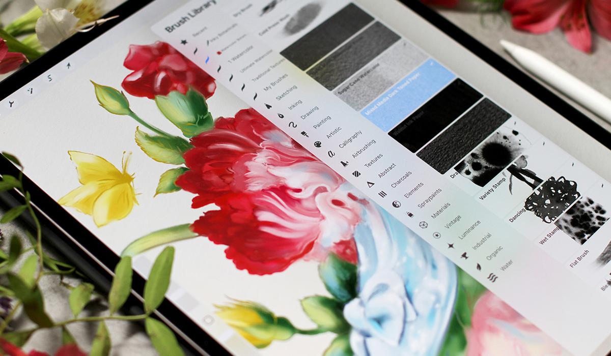
26. How to Apply Textures: Welcome back to a
depth to our work. We will apply textures. If you never use textures
before, no worries. Let me show you
some quick ideas. This approach is universal. You can use the same logic in Photoshop or other software. You can find my
custom textures in class resources. Here we go. I love adding real textures
to my digital artworks. So I created some
watercolor experiments and scanned them professionally. You can see it's very
thick, watercolor paper. You'll find these textures
in the class resources, and I hope they will
inspire you too. I use professional art supplies and high quality
watercolor paper. They are very detailed. You will see. So basically, there are two main ways you can add textures in Procreate. First, by using the
scan texture images directly or by using
them as custom brushes. Let's start with the first one. I open my illustration and
go to ED, insert a photo. The texture appears
as a top layer. You can change the
size, and of course, you can move it above
or below the artwork, and you can also change the
opacity and blending mode. I usually use multiply
or overlay here. You can see the
effect right away. I love the way it adds subtlety and grain in unexpected way. The texture is hand painted, so you always have
this organic feel. You can change different
preferences and experiment whoops to check how it would look
on your artworks. So you can see the difference. The second way to use texture
is to use it as a brush. Let's check it out. It gives you more flexibility
because you can apply the texture exactly
where you want it. So you just pick any brush with texture and apply
it to the area. Add the texture, and you can also change the blending
mode afterwards, like so. We can make the full texture like I have on the
photo or you can just paint over a small
element of your artwork. Here, I can add texture
to the hair and flowers, some grainy feel and change the blending mode to find
the effect that I like, and I can change the opacity. So if I want just a little
bit of texture, I can do. Let's make the full texture. It's my custom brush, mixed media paper brush. You can also download it as
a bonus in class resources, so we can try another
texture and just experiment. So we get the idea. Both methods work great. It's just a personal preference, almost like everything in art. But if you want detail, it's better to use brushes, and if you want the
overall textured feel, it's better to use
scanned texture instead. There are a lot of
brushes and textures. You can compare the results
and see what happens. And in the next video, we'll learn how to
apply gradients. I will show you my
favorite way to do it. So here at the blending
mode, and let's move on.
27. How to Apply Gradients: Welcome back. There are a couple of ways to create
gradients in Procreate, and I'll show you my favorite. I'll show you how to use
Gaussian blur and Smudge tool. This is the principle
that I'll be using in my cinderella
illustration. So I want to be prepared and to show you the way
I usually paint. So I will paint some flour or, I would say bud and then
with this simple form, I will show you the technique. So a few small leaves
here and maybe here. So the color is
just neural green. I will fill it with color, and then I will add a second
layer of the color on top, or you can do it right
next to the first color. Let's choose the
basic color yes, it should be underneath
the outline. So I'll just quickly color this small
illustration with green. Then I will pick another color, lighter one right on top. Or you can put it next
to the first color. It doesn't matter much. You will see the principal
right away, like so. Then I will paint even more. I think, like this. Yes. Then I will click Alpha Log so everything
stays in one layer. And then I go to
adjustments Gaussian blur, and I slide my pencil across the screen to
control the blur. Like so. The more I slide, the softer the gradient. If you use Photoshop before, you already know this principle. So it's really quick
and awesome way to get the smooth blending. That's the first option. And let me show you
another option that is closer to my style SmudgTol. It feels more painterly more like working
with real brushes. So basically, I just smush
the colors together. If you watch my other
classes on Procreate, you already know
this principle, too, because I use it in my
artwork all the time. It feels like working with
gouache or watercolor. Like so. I love
the organic feel. The brush strokes, great. So something like this. I also like to merge
the layers and then use Much tool to blend
the edges even more. Usually, it's the final step
in my illustration process. When I work digitally, let me show you how it works. Oops. I merge the layers, and then I use
Much tool and just blend the edges even more. So when everything
is almost ready, I usually merge all the layers and correct some small parts and blend everything together. Super. Now you know the
techniques we'll be using, and in the next videos, we will work on our beautiful
fairy tale illustration like this and this. Okay, let's move on.
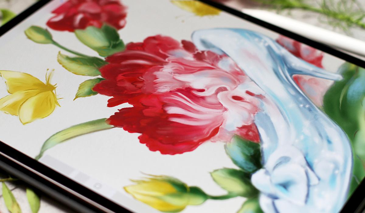
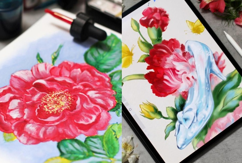
28. Demo: Cinderella Slipper Illustration: Let's get started.
We will create an illustration inspired by the legendary favorite
tale Cinderella. There are many
versals of this tale. We're going to depict
the iconic symbol, the glass slipper. It's curious that in the
German version of the story, the slipper is golden. We'll begin with striking
composition at ink in details and use gradients and textures to bring our
illustration to life. And then add a touch
of magic to it.
29. Demo Cinderella: Inking the Outline: Welcome back. I already have my sketch of the Cinderella
glass slipper with flowers. And here's a color palette. You can find everything
in class resources. I love to find
inspiration everywhere. So I just saw these
beautiful shoes in souvenir Museum calendar, and I was just amazed
by the details. So I took a few elements as an inspiration and,
of course, the flowers. Of course, you can
use this sketch, but if you want to add
your personal strokes, you can use any ink brrush on top layer and draw your
outline like this. Let me show you you change
the opacity of the layer. Create a new one and
using any ink brush, just work with your hoops. We need a new layer, as I told. And with your brush strokes, you create a sketch like so. You will find all the
download in class resources. So we have a sketch. We have color palette, and we are ready to go. What we need is texture. So what I'm going to do is I'm going to add a
texture right away at this first step so the sketch
will be the top layer, and I will put the texture
underneath like we did before. I prepared a vintage
paper texture, so we will have this
beautiful filling right away, like this. I love the color combination and the texture is very subtle. So I think it's a great match for the
atmosphere of the artwork. So I duplicate the sketch, and it's my habit from
Photoshop just in case when something happens, I always have the
initial drawing, and then I'm going to make a clipping mask
on the new layer. This way, I will be able
to color the lines, and it won't affect
any other area. This is the way I
usually work digitally. So I pick the color. I choose any brush that
works well in this size, and I color the lines
depending on the artwork. So I paint the flowers. Just like in
traditional painting, I would paint with red and then paint a few colors on top. The clipping mask
allows us to work on specific area without
ruining anything else. Everything stays
inside the lines, so I can change the color. I plan to paint
butterflies with yellow, so we will have this
beautiful accents. Let me show you a bit of
playing here, here and here. We'll have this triangle
of yellow color, which will bring a lot of
interest to the illustration. Okay, at the moment, my next color is green, so I color the lines of the leaves and everything
around the red flower. Like so you can change
the opacity of the color. You can change the
pressure, everything. And I prefer to use a
lot of colors at first, and it brings a lot of
interest afterwards. So the shoe is made of glass. So obviously, we will
need blue collar and butterflies are Yellow. Like this, like this. And we're almost ready for the step. I think we have
yellow, red, blue, and subtle pink closer to the slippers the center of
our illustration anyway, so we need to have
some free space, so to speak around it. I want to make the petals darker for the future
digital watercolors, and the slipper should
be a bit lighter, of course. It's
transparent glass. Okay, it looks great, and we're ready
for the next step.
30. Demo Cinderella: Petals and Leaves: Welcome back, and it's time to apply the techniques
we've learned. Let's use a reference mode. We already know how to do it. And what I'm going to do. So here I can see
the whole sketch. I will use Selection tool, and then I will work with
every element separately. Let's create a new layer. Then I go to selection, and I begin with petals. You will see the process. I think I will work
underneath the sketch. I select the element
is a free hand, so I can draw any shape I want
using this selection tool. And then I will
fill it with color. Anything from color
palette or you can just pick anything from
your reference like so. And then I will tap Alpha ok so everything
stays inside this layer, and I will add another contrast. Color, in this case, closer to the bottom
of the flower. And some darker color on top. It doesn't matter much which color I'm
using at the moment. The most important is this subtle transition I
will create afterwards. So I paint the shape
of the petal like so, and then you know what
I'm going to do next. Cosan blur and I slide the
pencil across the screen. Very, very subtle blur. Now the next layer and I will do the same with
another parts of the flour. You can select as large or
as small areas as you like, depending on your style. The principle will
stay the same. I love a lot of details, so I just work on
this part separately. At the end of the process, I will merge everything
together because I love to work in
traditional way. So I would treat this illustration as the one
painted on watercolor paper. Then I add more colors, and I can just
swatch the color of the outline Apalok and Gosenbler so. And next. So I will select a few more elements and
continue working in the same manner all over the petals on top of the glass
slipper and on the side. So don't forget to tap Alpha Lock at this
stage, of course. Later, we won't need it anymore. Time for the green elements. I plan to use not
so many details, and it's difficult
because I love details. So I just color them
in plain green color. And then I will add shadows
and highlights on top. So now I just makes a general impression
of the background. And then I will use shadows as darker green behind
the petals and, of course, behind
the glass slipper. So let's make sure
everything works. And I begin to add darker green on the same
layer that we have. Like so. Just a
hint of the form. Dark elements on the side
and behind the petals. I use subtle brush strokes and a few strokes here and
there, and, of course, the shadow behind the slipper
and bet on a flower and, of course, the main shadow to create a three dimensional feel. Then I'm going to add highlights
with a lighter green. And I will even
add yellow on top. But for now, I need highlights
like this, like this. And since we already
know about butterflies, I can use yellow
for the interest. Let's pick the color and add some glowing elements with
yellow here and here. Super. We have magical scenes, so we can use anything we want. Now, let's check Alpha lock and use Gas and blue
as we did before. I slide the pencil, blend the colors, and
merge everything together. Now, the butterflies and
other yellow elements. So I will group
everything together. Again, I try not to be caught
up with too many details. That's why selecting
a few elements can be a great option. And then I will use yellow and a bit of
shadows just a little bit. To have this glowing
yellow warm impression on the edges like
so. Looks beautiful. And I will add a few
shadows just a little bit, like I did before,
slightly darker. Yellow. You can use any brushes. General impression of the shape. Nothing too detailed. Outline is detailed enough. A few strokes over here and on the wings
and on the flower. I can't wait to paint our magical sleeper
in the next video. So I quickly finish these parts. Let's see what we can add darker over here and
darker areas over here. Closer to the leaves. Let's see how it looks. Goes and blur a little bit. Super and we merge everything. Okay, we're almost done, and in the next video, we'll continue with our magical
glass flipper. This one.
31. Demo Cinderella: Rendering the Glass Slipper: Welcome back. We have
everything in place, and now it's time to bring
our glass slipper to life. I will begin by selecting
the whole slipper shape, and then I will fill it
with a soft base color. Don't forget Alpha
Lock, you know, so we can stay in lines using free hand selection I draw around the
slipper, the heel here. So I will have the whole shape. It doesn't have to be perfect. In my painterly style, it's not that important. Now, let's pick the color. I would say this soft blue
works great, like this. So we have Alpha log selected, and it means that we will
have the edges clean. And now I'm going to add
highlights and shadows. I will add lighter tones
to suggest reflections. You can begin with shadows or highlights. It
doesn't matter much. But for glass, I think working
with highlights is easier. So I plan the white almost
almost pure white parts. And then I will add
darker shadows with darker blues and smudge everything together
like we did before. So white reflections,
transparent reflections. I will blend everything with Gaussian blur
as we did before. So I don't worry about
being super precise. The shadow beneath the
bow closer to the edges. I still have the outline, so it may look a bit um, To painterly at the moment, but it will look
beautiful at the end. Let's add a few strokes here. Darker domes, here and here. These are a bit random shapes. Oops. We don't need it here. TotapT undo, then this
part closer to the edge. And closer to the petals. Of course, the he should
be more pronounced. And again, so now I think I
can add even brighter color, maybe even brighter blue. So we will have the whole
artwork in harmony. I love the way the bright blue
works close to the petals. So as you can guess, our goal is creating the delicate transition
as we see in glass. So I will use Gaussian
blur as we did before to blur these
colors that I used. I add some brush strokes
around the slipper. Okay. I think even more
highlights would work great. And next, I'm going to blur
it using gas and blur, like so, okay,
just a little bit, and you can see the blur. It's very, very subtle. And, of course, I will need to correct the shapes afterwards. I will do it using Smudge tool. I will merge
everything together. And before I work
on the slipper, I want to add a few brush
strokes on the petals. Right now, I can see that
there are some gaps in color. And now that we have
the full composition, almost ready, I can feel what I need to add to have the harmony. It's the most important
part in any artwork. So the things work in balance. The shape of this petal is very important because it's
very close to the slipper. And I will pay special
attention to this part, especially when I will merge
the outline afterwards. Here, let's add some contrast
to the bloom. That's great. We added a brighter blue. The red almost pink
is quite vibrant, so we will have a
beautiful impression. Now, what we're
going to do next, I always duplicate
the layer just in case it's my habit
from Photoshop, as I told you, and now I merge everything
together, like so. So the whole artwork
is one layer. It means that we are ready for the magical part themuch too. But before that, I want to
work on the petals a bit more. I always try to think
about what I can do to make the artwork even more beautiful at this stage before
the final touches. So I plan to improve the
edges of the petals. Here we have beautiful shape, and I want to make
it more pronounced. So now that I have
everything in one layer, I can smudge using pintage paper brush or
any other soft brush. The subtle edges right here. The smudge tool pushes the paint around and makes this beautiful
painterly transition. The Smudge tool works for
every part of the artwork. I love to use it for
final refinements. It feels very painterly almost like working with
traditional brushes. So I enjoy this part a lot. I smudge with
vintage paper brush and push the colors around. So I add depth and I
form some highlights. I try to think about
the general feel of the artwork and not about
every little detail, and I love details. So from time to time, I need to remind myself that the general impression
is very important. So I much the paint
closer to the edges, and I also push the paint
around here and there, the outline gets this blur of traditional brushwork closer
to the edge of the slipper. We create a beautiful
transition of color. So I add depth, and then I need to add
even more highlights, I think to increase
the contrast. So I just paint over
the shapes a bit. Of course, closer
to the slipper, I need to be more careful. The highlights are
brighter in the middle. And then the battles get darker. Here, I need to add
a bit more color. Imucht again. Here and here, I change the
size of the brush or I can change the brush to
another one just to get the structure
and the texture right. Let's pick the lighter color. Like so, I think I
should work better. Doesn't matter much
the brush you're using the more important are the choices that
you make along the way. So here I want to have a detailed line to
lead the viewer's eye like we had in our worksheets
and a few strokes. Here, now it looks
almost finished. I enjoy this part of
the process a lot, so it's very difficult to stop. Let's see what else we can do. These parts of the artwork
are not so important, so I try not to pay
a lot of attention. So as you can see, I smug everything with
broad brush strokes. And I don't care much about being super precise or
staying inside the lines. I just want to keep the
general impression of the magical floral sliver. This part should also be very, very blurry, but the petals
should be, of course, seen. So I work of the petals
on the top flower, and I add shadows underneath. And a few more fresh strokes. So I swatch the color
right from the petals, and I add it here and there to keep the beautiful
impression. And, of course, I pay special
attention to the edges. It's very important part of
any any book illustration. Butterfly and then the leaves I skip some parts of the lines
to have this organic feel. And I even make some parts
more precise at this stage. For example, here, I
think the contrast behind the slipper is very,
very important. It makes the slippers
stand out, and the darker, darker green works as a great contrast to the
color of the petals. So smudging here behind
the slieper even more, of course, subtle background, almost no details here. And maybe I want to add a
bit more shadows over here. So I add and I smudge, and I push the paint around. We're almost ready at
this stage. The petals. So by combining
blur and smudging the slipper gets this
magical shimmering look. It looks very
painterly and organic. And in the next part, we'll add some sparkling, final touches to it. And you will see the
beautiful result.
32. Demo Cinderella: Final Highlights and Details: Welcome back. In
this final part, I'll focus on
refining the details. I can see that I need to refine shadows and highlights
on the slipper. You can choose any brush. It can be sharp or very soft. It doesn't matter much. So my plan is to
make the shadows deeper and try to make
highlights sharper. I work on the parts that
need to be more precise. We already have a lot of
highlights and shadows, so this will add another layer of depth
to our illustration. Let's pick the right color. And, of course, I will
smudge it afterwards. So this way, I will create a beautiful transition
sharper shadows closer to the tip
of the slipper. I imagine there are a
lot of reflections. So I put some random
strokes on the surface. The bow the edge should be very accurate
as we already discussed. And then I just add more
highlights and shadows. I think about the shape, I think about the material, the texture of the glass. Even thinking about it makes
my hand draw differently. So I can add random brush
strokes for the highlights. And then, of course,
I will need to add a few color essences. For example, a bit of
red on the slipper. It's a transparent
slipper, a magical one. So it should reflect
everything around it. Now the shape looks better. Like this, like this. And I continue in
the same manner. And now I want to add
some reflections. I want to add some
blue on the leaves. It will support the illusion of our magical glass slipper. I will paint reflections
and sparkles all around. These blue brush strokes will
unify the whole artwork. And I really love the
contrast all the colors. So subtle strokes, if you color scents here and on the leaves, I think it's a good idea. So everything around the
slipper and even on the petals, but not too much, we still
want to have the organic feel. It should be not too much. Near the sleeper behind the
sleeper on the background. You can change the transparency
of the brush if you feel that it's too bright, something like this,
and then yellow. We have this yellow
contrast all around. So let's increase it a bit. So I put some brush
strokes on the leaves, but not too much again. We don't need too many colors. I'm working on the edges,
the important part. And then I'm going to add a bit of red right on the slipper. Inside the glass, of course. Like so. A bit of red inside the glass will make the transparent and shimmering
effect even brighter. Like this. Just a little
bit here and here. And then, of course,
I need to smudge it. So everything looks in balance. Like so. If I see the outline
is too sharp, I will smash it again and again, and I can always add some
highlights or shadows on top to make things sharper
and then smash them again. So if you use a lot
of layers and I mean, not technical layers,
but layers of paint, it always shines through. It's a great
technique to achieve the painterly feel
of traditional art. So now I want to make the
slipper even brighter. What I'm going to do is
I'm going to use curves. But before I want to select the whole
shape of the slipper. So I will work
only on this part. I want to make it brighter, but only a slipper. I will make the selection first. And then I will go to curves, and I will carefully
adjust the tones. Just a little bit like this. I will make it a bit
brighter, like so. This way will have a
brighter, polished look. Super. The shimmering
and magical effect looks even more
beautiful right now. So now I can see that I need
to increase the shadows, make them more dramatic. After any filter or adjustment, I always return to
the general image and check if I need
to add something, change something so we
can keep the balance. A lot of tiny decisions closer to the edge of the bow. Like this is small, small adjustments, which
are very important. Next, I will add
a texture on top. We're almost done. All I have to do is add a
texture and a few sparkles. So the shapes are ready, and I'm going to duplicate our texture that
we already have, put it on top as a top layer, and change the blending mode. And opacity. Overlay is a great choice, but you can try other modes. You can see the difference. I love the effect, how it looks, and I will continue to
refine the elements and increase the shadows and make the
highlights brighter. We're almost done, and
it's time to add magic. I will add sparkles
with a brush. So I select the slipper, so I will have the full shape, and it will be much easier to work with
special effect brush. I will add a few highlights that suggest glittering glass. It's a standard flare brush. So you will have it in a
standard procreate choice. And there are different types
of special effect brushes. You can try what you like best. So I add a few highlights
on the slipper. The light feels like
a real fairy tale. If you change the
size of the brush, you will have different effect. All these finishing touches, they bring everything together. The artwork shines,
but still has this organic feel
and painterly feel, which is super important. So I add a few highlights. I group them together, not to have a very
computer graphic pattern. So if you here and here, I change the size of the brush, and then I will
smush them a bit. This way, it will feel
more like traditional art. So I will add them all around. And then I will use a smudge tool to work
on some of them. But not every sparkle
will be smudged. Then I try to think where
to put it too much. It's a very difficult balance
not to overwork everything, especially with these
enchanting sparkles. I just want to put
them everywhere, but I know that I should be very mindful about where to use
the small elements of magic. So I smoth them a bit
to have this beautiful, shimmering reflection
on our glass slipper. Everything shines. Here. I think I need to add another edge. So I correct the small
details at this stage. The textures are here,
everything is ready. The sparkle and the shining of our illustration
looks wonderful. So we don't need
sharp edges here. So we've created a magical, shimmering, beautiful
illustration. And I'm going to save it. Of course, you can
do it in this menu. That's it. And I'll see
you in the next video.
33. Your Assignment: I'm so happy to see
you've made it this far. Looks like you admire books
and stories as much as I do. And I'm so curious to see
what projects you create. Your assignment for
this class is to create your own book illustration and plan any technique
we've learned. It can be a tiny black and
white illustration or anything else that tells a story and captures the
viewers attention. Feel free to follow
along with one of my demos for Beauty and
the Beast or Cinderella. I've uploaded a helpful
outline to save you some time. Then I encourage you to share your artwork in the
project gallery. It can be just an idea, a reference to the Fairytale
text or anything else. It can be traditional
or digital or both. You can also share
it on Instagram. I'll be waiting and we'll
meet again in the next video.
34. Final Thoughts: Well, here we are, thanks
so much for joining me on this magical journey of book Illustration
and composition. As artists, we have an
incredible power to express our ideas in a
unique and meaningful way. And I hope you gained
valuable insights to use in your own
creative practice. If you're looking for
more inspiration, check out my other
classes and resources. I also have a very special
book on color Things called Brilliant Things
that you might find Health. Follow me here on Skillshare
to stay updated on news, new classes, and giveaways. The button is somewhere above. You can also find me on Instagram and even
join my mailing list. But most importantly, you should keep practicing your art, and maybe visit the local
bookstore for inspiration or treat yourself with a
new gift edition of a classic fairy
tale. Just a note. I'll be waiting
for your artworks. This class is an
anniversary edition. Thanks for your trust support and for sharing your
creative journey with me. I'll see you next time, and let's believe in little Magic.
 Anna Sokolova, Berlin-based Artist