Transcripts
1. Intro: If you love cats and are looking for inspiration for
a next collection, client project or personal
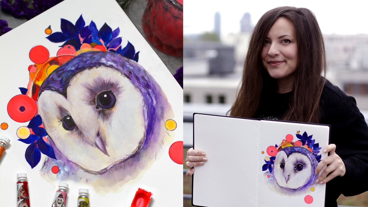
artistic journey, this class is for you. My name is Anna, and I'm award winning artist
living in Berlin. My passion for painting
cats and flowers has led to international gallery shows and collaborations with
luxury brands. I'm also the author
of the book on colored inks, gold
Brilliant Inks. Today, I'll show you my
unique way of painting cats and flowers in
watercolor and procreate. Combining these two
popular subjects can create artwork that is both personally fulfilling and
commercially successful. We'll explore diss inspiration from artists like Stein
Len and Louis Wain, along with textures of floral art and the
art deco movement. We'll focus on
textures and learn techniques that will help bring your artwork to the next level. If you work traditionally, you will need some
watercolors or gouache. We'll even experiment
with pressed flowers. If you prefer digital painting, we'll use iPad and
the Procreate app. Of course, you can use
any other software. We'll learn how to
apply textures and digital paper to bring your
artistic vision to life. I've also prepared some custom brushes and
materials for you. As a result, you'll have a unique sketchbook
page filled with vibrant textured
illustration that can lead you to the
next dream project. Okay, our fluffy
companions are waiting, so grab your brushes, and let's dive into the
world of cats and flowers. A perfect world for an artist.
2. Inspiration Cats: Welcome to the inspiration
part of the class. There are millions of
ways to paint a cat. And when you're looking
for inspiration online, sometimes it's just
impossible to stop scrolling. You browse all those stunning
cat photos on Pinterest, and the time is up. So I love to have some printed
inspiration in my studio, a book, or even a
magazine or ad. Today, I want to show you some incredible
artists I really love who captured the charm of
cats in their own unique way. The first treasure
is Theophil Steinan. He was a French painter
and printmaker. Even if you never
heard the name, you've seen his iconic
black cat, for sure. You've seen it many, many times. Let me show you. You'll
recognize it right away. That's right. So called hanoi. The artist lived on Montmartre, and it was his favorite
subject over the years. He also painted cats in a very
special way like this one. And just look at this painting, a global gathering
of cats in Monater. This composition is very popular in children's
book Illustration. And this one, the next one, you've seen on postcards
for sure. I also haven't. And he also painted his
wife and daughter a lot. Exactly. We can see right away that he was happy
to paint his subjects. So this book is really
nice exhibition catalogue. The next one is Louis Wain. I have this vintage poster book, which is quite amusing. I just have to have some
printed materials in my studio. Louis Wayne was an
English artist, famous for drawing of cats
in anthropomorphic manner. I really love how he
illustrated different emotions. He created a lot of
various artworks. I think we've seen some
of them in the movies, and you're going to explore both emotions and
fashion and everything. It's really, really
nice for inspiration. Just a small book. The next one is
something different. Yes, it's the whole book
about cats in various styles. I have a copy and
translated to Russian, but you can find it in
English, of course. So there are
different artists and styles all very, very unique. So it's full of inspiration. I wanted to show you the
work of TokujaroFujita. He was a Japanese
French painter with a very unusual and
distinctive style. It's a bit of a combination of both Japanese and European
artistic traditions. You can see the type of lines and subtle washes in his work. They look a bit like
woodblock prints, I think, used Ink, I love the
expression of the eyes, and there are a lot
of tiny details. So a lot of storytelling, I would say, in very
special perspective also. And here is something
even more expressive. Cats by Franz Mark. Let me show you three examples. He was a German painter
and printmaker, and as you can guess, he was a main figure of
the German expressionism. He painted a lot of animals, and he used bright
colors like this one. He also was a founding member
of the Blue Rider Journal. So here we can see
a few examples of different but very,
very unique cats. I love the way he
used the color. And now you can see some of my artworks clearly inspired
by the cat artists. This one is called
The White Cat, and it's inspired by the literary favorite
tale of the same name. In my professional work, I
love to use a lot of details. Well, you can already see that. I think literature is a great inspiration
for cat artworks. And another one is
inspired by the novel, The Life and Opinions
of the Tomcat More. You can also see
a lot of details. Okay, I will see you
in the next part.
3. Inspiration Flowers: Now that we've
explored the world of cats can't be too many of them. Let's dive into the
world of flowers. In my work, I love to combine the modern
approach of painting a cat and contrast it
with some flowers. So I love the books
on botanicals. For example, floorlgu
is a collection of botanical illustrations
with wonderful textures and outlines and everything. And also some art
and design history like the Artico movement. Is rich with geometric shapes, bold colors, and
stylized flowers. Let's explore some examples of flo Elgumillustrations and
article flower designs. This one is the star
of my collection, the garden at Eichstat
Amazing book perfectly printed with original
illustrations and lettering. This edition is
very close copy of the original Botanical
Illustration collection of the plates. This book of plants
depicts the beauty of the garden at
Eichstat in Germany. Let me show you a few examples. The original was published in 17th century with
elaborate descriptions, and I can almost imagine that. The flower, the beauty, the details, and the lettering, the calligraphy,
everything makes it look like a treasure. These details, the
quality of artwork. It's fantastic
though we know that main goal of such
edition was scientific. It's absolutely stunning, and I need to explore
it even more. For now, I just browse the pages and enjoy the
pleasant surprises. Here are some descriptions
of the plants and flowers. Of course, I can't read it, but that's not a
problem for sure. The book is a part
of the collection of three books that I have. I love that you can see
the smallest details and also the general impression of the size of the traditional botanical
illustration plates. They used to be very important scientifically and a
little bit artistically. Now, comes the next inspiration, but this time, it's different. It's a collection of
Benedictus art deco designs. I found this book online
in a very good condition. So it's a German edition, but it's also a translation. Eduard Benedictus was a painter famous for his floral
art deco designs. I love the almost
abstract shapes of the colorful flowers. These designs were
used in fabrics. So if you also make
surface pattern design, it's a great inspiration. He used pure colors. This is a very bright
and high contrast. But of course, the
quality of the print of this relatively old
book is not super bright, but I like it so. So here you can see the various combinations of the abstract forms and shapes. Mostly pure color
and abstract motifs. It's great for patterns, for fabrics, almost anything. And I love the way
you can create a variety of impressions with just simple geometric
shapes in one piece. I think we export
a lot of beauty, and we are ready to move on. I'll see you in the next video.
4. Materials: Welcome back. For this class, you will need
watercolors or gouache. It's a personal preference. I'll work in a
cotton sketchbook. You can use loose paper. I'll talk a bit more about
it in the next video. I also use some extra
slack pressed flowers. I got mine in a hobby store. Well, ideally, you can
make some of your own. That's definitely a next step. And in the second
part of the class, I'll work on iPad in
the Procreate app. Don't forget to
do on the brushes and especially the
textures I'll be using. Of course, you can
use any software. You can use any brushes, and the textures
will work anywhere. Now, let's take a closer
look at the materials. Here are the materials. You don't have to
have everything. I'll just show you what I use, and maybe you'll want
to try some of them. So first, I will use
watercolors, different kinds. This one is basic set of
watercolors in full pens. I use them all the time, and these are so called
liquid watercolors. I won't use them in main demo the class, just for the warm up. I really love the effect, but the quality is
very different. So just try it out. Use the paper you're
going to paint on. It's very important
to test the paper first with the
liquid watercolors. Then I'll have some
watercolors in tubes. I love the combine
various brands to have a nice
contrast of texture. The size is relatively small, but it's enough for
high pigmented paint. So I have few colors. And these are super
granulated watercolors. Nowadays, many brands
manufacture them. It's just my favorites, especially this one,
it's called Lunar black. So obviously, this paint is the combination
of three pigments. Usually, you can find the name of the
pigment or the number. It should be a letter and a number on the
back of the tube. So it's a combination of
three different pigments, and you can always
find what's inside. It's just super convenient
to have it all in one place. And these are other
colors that I love, and I'll show them
in the warmup. Then I will use white gouache. As usually just very
important part. Then we'll have a pencil, just a normal pencil, and, of course, a kneaded
eraser it's great because it doesn't damage
the watercolor paper. I use it all the
time to lighten up the sketch. Now, brushes. I prefer working mostly
with round brushes, but it's a personal preference. I usually use sizes
two, three, and six. So this one is for larger areas. And I also have a really, really nice mop brush or
a French brush size 12. It's synthetic and it
holds a lot of water, and it can be a substitute
for natural hair. So if you want to change the classical mop brush or French brush like this one, this one is for fine details. A nice substitute to it would
be a synthetic mop brush. And here's the set for our
breast flowers and ventures. We'll talk more about it in
a special part of the class. So basically, you
can apply flowers. I have the set here, got it. Especially for this demo. Really nice color.
Basically, you can apply flowers using acrylic
medium like a clear gesso. It has no color and it's simply invisible or
just use the normal gloom. I love the design of this
bottle and the smell, so I just got it
because of the design. And of course, the tweezers. It's also part of the
process to keep things neat. Then I'll use paper
towel and masking tape. Also very cheerful. Oh, and of course, the paper. Mostly I will use cotton
sketchbooks. It's super nice. I have the bigger like one. It's like a sheet of paper, and I have a small travel
cotton sketchbook. You will see it in
warm up exercises. I will see in the next video, we'll also talk
about sketchbooks.
5. Notes on Sketchbooks: So we've discussed
the materials. I also want to say how
important it is to choose the sketchbook or paper
that works for you. Every artist has unique
personal preferences. For my final artwork, I prefer high quality loose
sheets of watercolor paper. It just brings me more
freedom and flexibility, and I have a lot of sketchbooks, and they all are for
different purposes. And yes, I always have
reason to buy a new one. Most of them are like
diaries to keep recording all the experiments and remember what worked and what didn't. So when creating something new, I can always find unique
color combinations or the sequence of steps I
recorded in the sketchbooks. Some sketchbooks are more like a plan for larger projects. I love to have a roadmap. Surprisingly, it works best
for my focus and creativity. This way, even if
I don't have time, I can open up a sketchbook and there are some prepared
outlines or some task, and I can just
enjoy the process. And I know we are all very busy with many responsibilities. So a little planning
makes so much sense. If you want to learn more about sketchbook types and layouts, you can check out my class
on sketching with markers. And now let's move on to the next video and
talk about texture.
6. What is Texture?: Welcome back. If you
look around you, you'll notice the amazing
variety of textures, the cotton fabric
of your clothes, if you prefer cotton like I do, the wooden handle of your brush, the velvety feel of paper, even the shiny surface
of the monitor or tablet you're
washing this cloth on. All these textures bring
interest to our eyes, and we can add so much to our artwork by using
these details too. Texture is both a visual look and tactile feeling
of the surface. In watercolor painting, we can create this
illusion by adding textures with a variety of brush strokes,
layering and washes. We can even expand it and add almost three dimensional
objects like pressed flowers. In this class, we will
focus on textures created on top of the first layer
of watercolor on paper. On top of the first wash layer. This will help bring
depth and interest to your work and even
create some mood. The key to creating unique
textures is free experiment. Try to play around with
materials you already use. Watercolor brushes, pencils and paper and see what
textures they create. Paint some dots, opaque and
transparent brush strokes, combine them together,
and just play. In the next video,
we'll talk about basic texture
techniques that we'll discover in this class.
I'll see you there.
7. Basic Texture Techniques: Now that we know
what texture is, let's discover some
basic techniques that help bring your artwork
to the next level. There are so many techniques. If you're interested in
some special effects, I have the whole class on
watercolor special effects, so you can check it out.
It's super inspiring. Here are the basic
texture techniques. The first one is wet on dry, the super basic one. For this technique, add some marks or paint
on the dry paper. The texture is created with a variety of brush
strokes or pressure. It's great for fine
details or for outlines. The next one is wet on wet. For this technique, you apply
wet paint on wet paper, creating smooth dreamy textures. For example, it works great
with liquid watercolors. The next one is dry brush. For this technique, use a
dry brush with paint and almost no water to make some rough marks
on the dry paper. The brush strokes are visible. As a part of it, I also love
to use flat angle technique. Well, that's how I call it. You hold a brush at a very
flat angle to the paper, creating a lovely pattern. In the next videos, we will
practice these techniques. We'll make some
warm up exercises and see what textures
they create. I will also show
you how I applied them in my real illustrations.
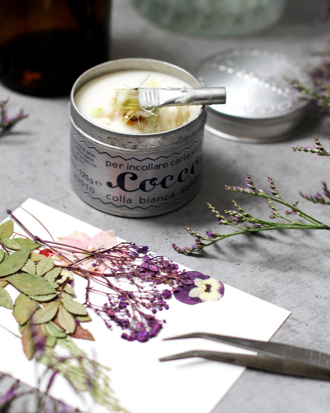
8. Pressed Flowers: Okay, here's one more video
before we dive into Praxis. I just couldn't resist including this new obsession of mine. I add pressed flowers to my watercolor and
mixed media paintings. They bring unique charm and
texture to the artwork. I got mine in a hobby store, but you can easily
make your own. I think I need to
make a flower press. In the next demos, we'll
experiment with using pressed flowers on our
watercolor paintings. Let me show you
what I'll be using. And then we'll move forward to our warm up exercises.
Here we go. I got myself a few packages. They can be arranged by color. Here's my sketchbook page where I applied pressed flowers. So basically, there are
two ways I use them. This one is created
with a normal glue. You've seen this one before. So I use it in the
main demo the class. I just apply the glue right on paper and then put
the flour on top. I love the way the
flowers look so subtle and natural this way. It makes sense to
protect the page. So every time you turn
the page, it can damage. So I put a piece of transparent
paper on top like this. The colors are super
subtle and nice, and I love the feeling
of lightness it brings when you use
something not ceiling. And this way, I wanted to keep the texture
in a very interesting way, the combination of the paint and the texture of the flour. So I used a sheet of
transparent paper. I just used a tape or
glue to put it on top. The second way is to
use an acrylic medium. I prefer clear gesso. When it dries, it looks
almost invisible on the page. Let me show you the example. But it seals the artwork. Here, I put the flour
on the page and then brush it with a
clear gesa on top. It acts like a glue little bit, but when it's dry, it
seals the artwork. Of course, the parts that
were covered with it. In our case, the flowers. You can touch them,
nothing happens. It's super protected. You can turn the page and
do whatever you want. The flowers are not
so subtle anymore. So these are the ways I use breast flowers or
even some herbs. And, of course, you can
try some other ways, too. I think we're ready for the warm up exercises.
Let's move on.
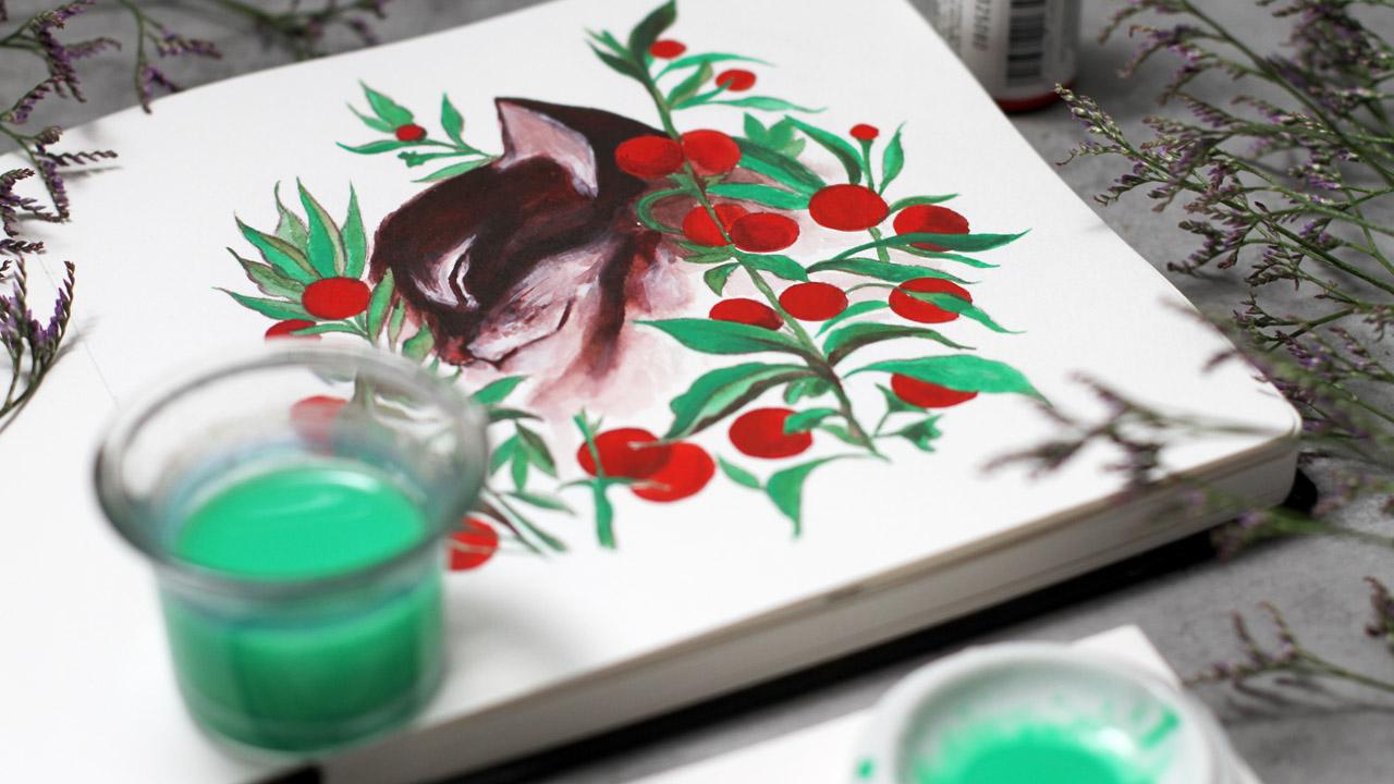
9. Warm Up: Contrast: Welcome back. I'll use two complimentary
colors, red and green. You can see how I
use this effect in sketchbook illustration. Just by using these
two contrast colors, we can immediately add interest and impact to our artwork. Just a few elements are enough
to create these effects. I use a cotton sketchbook here, and I always try
to make notes with color swatches and even
the number of steps. I used to create the artwork. Now, I'm going to
protect the edges with a masking tape of another
cotton sketchbook. I got myself a really
nice one with cats. So it will suit the class. And then using the mop brush, I'll add a lot of water and apply thick layer
of green paint. This way will have a nice
wash ready for the texture. Well the colors in
tubes work best for this practice because it's
easier to apply this way. Let me show you. I
have some tiny tubes, but it's more than enough. The paint is thick enough. Then I will use a contrast
of the liquid watercolors to create a beautiful
and unexpected texture. But first, I need to
create a first layer. The surface should be very wet, so I think I need
even more pigment. This process is
super satisfying. So if you feel that you need
additional inspiration, you can just make
swashes this way. Now, the surface is super wet. And I'll add the drops of red straight from the bottle
in the random manner. Like so. Let's see how it works. And drop Super. It looks like magic, and we can't control
the pattern. Beautiful texture appears
without our efforts. I love this effect
so much. Great. I will use a hair dryer to
let it dry it takes time. Liquid watercolors
are very unique. So they behave differently. And here it is. I will remove a masking tape. It's always a favorite
part. You know what I mean? And our first warm up
exercise is ready. We can move to the next warm up.
10. Warm Up: Flower: Welcome back. You remember
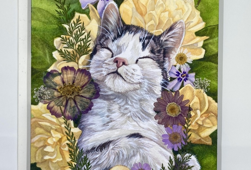
this fluffy fellow. These pink flowers,
let me show you, um. They were created after the warmup that I'll
show you right now. We will use different color, but the principle is the same. I will work with large
mob brush and paint a huge circle of petals
using carmine watercolor. I will use a smaller
brush first. I think it will work better. So I'm using the color, which is called
permanent carmine. It's a brand name, so you can
use any color or just red. So with a lot of
water and a very, very low angle, I
paint the petals. Like so I almost roll the
brush on paper. The angle is super, super low. I keep the brush
at the same angle so you can even roll
it in your hands. So I paint this huge,
huge circle first. After that, I will
paint a second circle, a bit smaller inside. So we'll have a beautiful flower that can be used
in pattern design, and it's a great warm up. Then I'm going to paint a
second circle in the same way. The bigger brush works better because it holds
more water, I think. It should be a bit darker, so I take less water.
And keep going. I can rotate the canvas. It's not a canvas, but it's
just a watercolor paper. So the circle is
almost complete. And now I want to add
some texture to it. So what should I do? I want to intensify
some strokes, like so. So I do the same
with another brush, just add more paint closer
to the edge of the flower. This will create a bit of
depth very, very nice effect. Just want to intensify it. And now I'm going to lift up, lift out some pigment, L. So with water and paper
towel and super wet brush, I just lift some paint and support this three
dimensional filling of the flour, super simple one. You can do everything
with just one brush. The flour can be super small. So I lift the paint all over
the place. Now, let's try. And now with a lighter color, I will fill the gaps
between our circles. It should be lighter. This way will have a
beautiful contrast. Also, I use the same
color every time. This effect can work great for pattern design for surface
pattern design elements or for some dresses, fashion, you can use just elements or
parts of this flour. It's really nice warm up. Now, the last part inside, we will move to the
middle with a lighter. But first, let me
intensify this layer. The rest of the flour is dry, so when I add pigment here, I don't disturb all
the other layers. You can experiment and
add another color, but I just wanted to show
you this effect because it's pretty easy and
very impressive. Now the middle with a
light light light color. I keep the brush low like so Sugar. Now I'm going to add
a striking contrast with some blue to this
very, very middle. Right here. Super, you can create a flower
with many, many circles. I cob with blue, and I will add this striking little dot that will immediately
add interest. Let me show you right
here, right here. It looks lovely, and it can be applied
to so many designs. I think we created
a lovely sketch, and we can move to
the next warm up.
11. Warm Up: Supergranulation: Welcome back. I hope you
enjoyed the practice. Now I wanted to tell
you about one of my favorite and easy watercolor
effects granulation. So what is it exactly? It's a special property
of the pigments to cluster on a paper
creating a unique texture. This can result in a
variety of textures from subtle speckles to amazing
abstract patterns. Some pigments
granulate naturally, like Indian red or ultramarine. Or the entire series of paints manufacturers
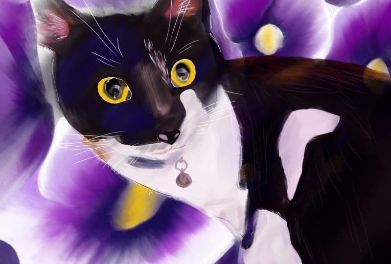
with a specific effect. My favorite paint is Luna black. I use it to paint black cats. Let's explore some
examples together. Here is my fluffy and
very serious dark friend. You'll meet him again in the
digital part of the class. And here are the pigments
that I used to paint him. So I love to combine
a few colors in one layer for this
deep, deep effect. Here are some swatches of the supragnulation
colors that I have, and I use them on this cat. Let me show you the watches. So you can see that they
are darker on one side, and then the texture
becomes much more visible. So for the black color, I love to combine
three different shades of this super granulated paint, and you will see
it in our warm up. I will just create a
background with them, but I use them to
paint the black cat. And now we can get started. So I will prepare the paint, the lunar black, then
violet, and then pink. You should test the colors first because the texture is
very, very different. Now I put a lot of water
on my cotton sketchbook. A lot, a lot of water. The paint, yeah, I can
check that's well enough. Super granulated paint is a bit different than
normal watercolors, especially in tubes. So it's a good idea
to test them first. Now, starting with
the top left corner, I begin adding the pigment. The black, the luna black. At first, it will look like
a normal black watercolor. But then you will see the small particles
granulate beautifully. Then I will use violet
on another corner. And then I will add
pink at the bottom. It's important that we leave some white space
between the colors. This is where it will
granulate most beautifully, like on my Black
Cat illustration. Here comes pink. You can see the texture
is a bit different. So every color is
a bit different. Beautiful granulation over here. And I will add some water here to move the pigment a bit for
the beautiful Contrast. Like so. Then I will use a
hair dryer to speed things up. I will roll the brush a bit, just experiment and see what works best for you and
what colors will you use. No rules here, for sure. At least somewhere we
can do whatever we want. Now, I will use a hair dryer, and here it is, magic. So we have a beautiful effect, and I think that I will scan it and use
it somewhere for sure. Beautiful, beautiful
design, and background. So it looks a bit
like my black cat. I think we're ready to move on. Right.
12. Warm Up: Restricted Spread: Welcome back. Here's
our big cat once again. You can see the beautiful
pattern dexture on its fur. It's created with just one layer using the restrictive
spread technique. Here I made the watches. The properties of pigments
react in particular way. Basically, one pigment restricts
the spread of another. And this is what we're going to practice in this small video. Now, I'll show you the example. First, I'll take naples yellow, and then I will mix it
with cadmium orange. Please note that the choice of the pigments is not random, so I will mix these two colors.
It will take some time. The orange, cadmium orange should be brighter.
Yes, this one. So I will mix these two colors. And we have this beautiful
beautiful orange light orange, yellow, light orange color. And then I will add Siper brown. Sometimes it's also
called Van dike brown. So I think it will work. Let me try. I take some Siper brown and using the round
brush, synthetic. It should be not super soft. I add the stripe, like so. You can see the
effect right away. Beautiful texture
without any efforts. You can see how it
reacts on our mix. We can even try some marks. You can try different
pigments on top like Venetian red to add interest
or something like sepia. We can add wonderful touch just by layering these
heavy pigments on top. Beautiful beautiful effect,
and it's not complicated. I really love the way
that you can't control much and have this
beautiful variation. Now, let's try less
yellow and more orange. Let's see how it looks. You can experiment with
variety of recipes. Now, let's see how it
works. It should also work. Like so. Yeah, the
effect is different, but it's still here. It's great for
painting cats, lines, all the beak cats, all our fluffy friends, and we're ready to move on.
13. Warm Up: Layering: Here we are. One more
warm up to choose from. For this cute fellow,
I used a layer of orange as a top layer
over the whole painting, even with a bit of red, but that's not necessary. Let me show you how it works. So I made some notes
over here not to forget. I will sketch three clouds you can sketch any shape.
It doesn't matter much. And I will color them in, let's say, cobbled blue, violet, and cadmium red. And then I will use
a top layer with transparent orange to
see how it reacts. Let's begin with
cobalt, just a cloud. I don't know why a cloud, but I think it looks very beautiful regardless
of the drawing skills. You can just paint any shape. When it's done, I will use a hair dryer to speed
things up a bit. It's a good warm up to cover the whole
shape with a color. You're going to
have to think about any composition or
anything at all. The second cloud will be violet. I think this color is called Kinecridon let every
brand is very different. But the number and the letter on the pigment will
always be the same. So if you're looking
for specific paint, you can try different brands
and find out what you love. Now the next one will
be red, cadmium red. That's one of my
favorite colors. Let's put it in this corner. So I will use a hair dryer and we'll show you the
layering technique. Vinyl touches. Here we go. Our clouds are dry, and let's try a
transparent layer on top. I love to use a color
called chromium orange, but any orange or yellow that is transparent
enough will work. So you can just try what you
have in your color palette. Let's apply it to
the first cloud. The effect will be immediate. It creates mood right away. You don't have to use
even brush strokes, just some broad impression. I love this vintage feel. It creates mood immediately. Some yellow can turn to green. It depends on the pigments
and on the brands. It's a wonderful texture
if you want to add painterly feel or a vintage
look to your artwork. Even this tiny cloud without any composition is
really nice right away. Then we will add
added to the red. The red gets even
brighter right away. It's perfect for
painting flowers. Very, very nice effect. I would say even
striking at some point. Now let's try the third. This should just add another
color transition here. Beautiful color. Very,
very different one. It's a lovely effect
to add interest and depth to any artwork. We explore a lot of effects, and I'll meet you in the next
video. I'll see you there.
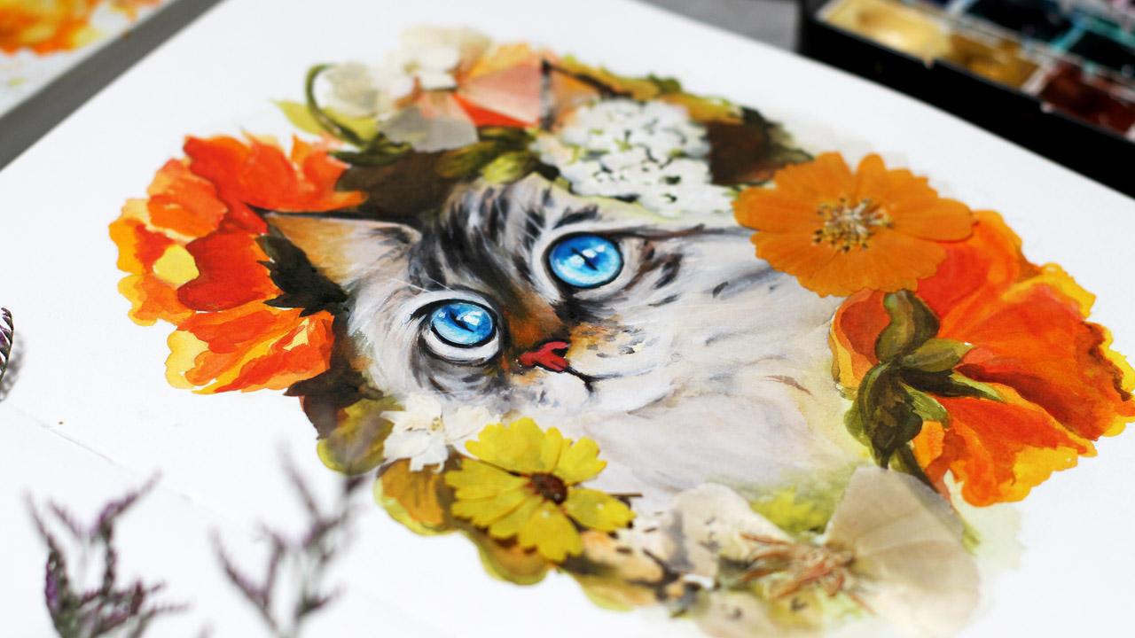
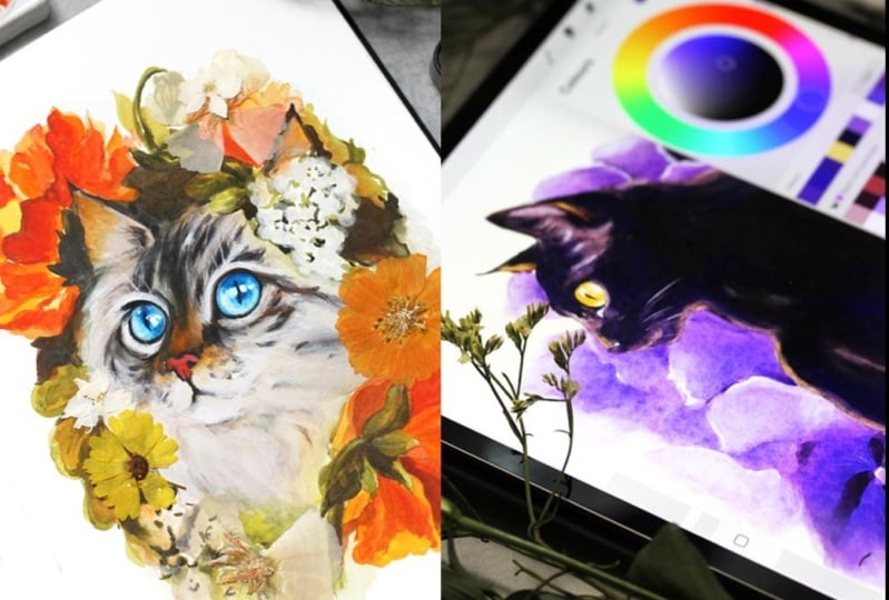
14. Demo: Cat Sketch & Colors: Come back. I'm happy to
see you still with me. Now we will create a
beautiful painting of a cat with flowers. You can paint with me or get inspired to create
your own artwork. If you want to follow
along my example, I've prepared a pencil outline, so you can use it and save some time so you can get
straight to creating. Let me show you the colors
I'll be using and we can get started. Here is the sketch. I love to make pretty
detailed pencil outlines. Then I lighten it up
using needed eraser. That's my usual process. So I use just a normal
pencil to make very, very detailed drawing, and then I just use
only parts of it. During the process, I
decide what works best. Now, I will use a kneaded
eraser to lighten it up. The quality of cotton
paper is super nice, so I don't have to
worry about ruining it. That's why I use kneaded eraser. I use it all the
time on any paper. So I lighten the sketch, and then I'll show you the color palette
that I'll be using. The first color is
cadmium yellow. These first colors
off of the flowers. So I will take cadmium red, and then I will take orange. These two work great together. I love this orange
from the tube. Here, it's called
permanent yellow orange, but of course, you
can use any brand. This one super nice, and I love the texture. So we'll have this bright
mix for the colors. It looks like fire a little bit. Then what next? We will need something
for the leaves. At this moment, you already know how the artwork looks like. So you have the idea. I will use olive green for the leaves. We have this beautiful mix, and I try to mix everything together to see how
the combination works. Just in case you never
know what happens. Sometimes some surprises
are not super nice. So I test everything on the same paper or on
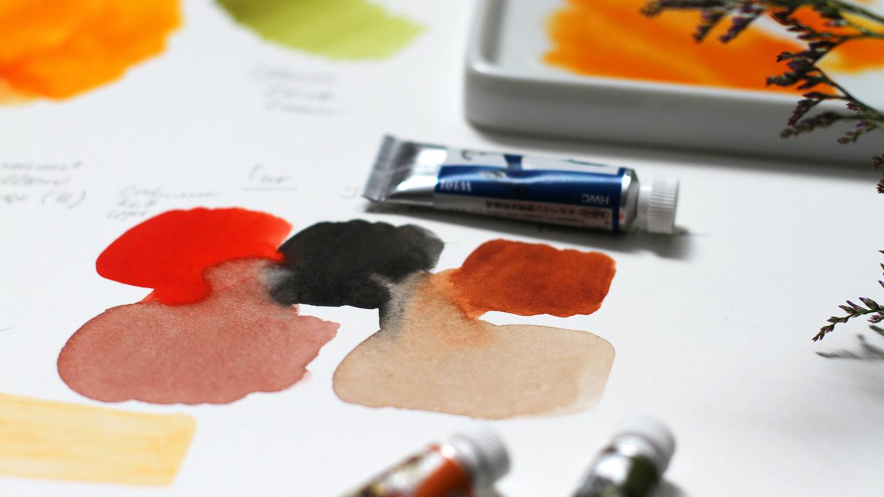
the cotton paper. Now, this is red, and this is the mix for the fur. I want to use not just a brown, but a mix of cadmium
red and ivory black. And I can also add burnt sienna. So you can see the
beautiful rich brown color when we mix red
with ivory black. So it's just a black and red.
You can use what you have. I love this rich, brown or red black color. And I will use burnt
sienna also for the mix. Here we have more neutral brown, and then I will add
another layer on top, like we did in
warm up exercises. It's a hromium orange. At least it's called
like this in my set, and this one is for the eyes. Mine is called Peacock
blue, but of course, you can use copleblue or
Turkeys blue, something bright. I'll write down all the names I'm using in class
materials for you, so you will have a better
impression of what I'm using.
15. Demo: Cat Flowers & Leaves: Let's begin. The first step
is not necessary at all, but I love to adapt with it. So I decided to show
you my process anyway. So as a first layer, I add a subtle subtle layer of subtle subtle yellow like
naples yellow or any other, and a bit of cobbled blue. I've learned this technique
while painting landscapes, and I find that it works great for portraits and
painting animals, too. I add a bit of
cobalt on the side, and smooth touches will make it even more transparent, like so. I soften the edges, and we have a beautiful
gradient as a first layer. And then I will let it dry. I will use a hair dryer
to save some time. So it's dry the magic of video, and now I begin to
paint the flowers. I will use the same mix that we discovered in
the previous video. I will start painting our beautiful orange flowers using the color mixes
that we already know. I begin with the top left corner because I'm right handed, obviously, and you can
change the starting point. It doesn't matter much. So I put a sheet of paper
underneath my painting hand, not to smudge everything. And I mix the color
right on paper. I use the synthetic
brush size six. And I paint the
outlines of the petals. Mike the pigments
right on paper. Like so beautiful transition. These colors are so cheerful, so I really enjoy the process. I use more of orange here and more red closer to
the middle of the flower. You can notice that
I leave a lot of white space between
some of the petals. I will paint them later with a lighter color just
for the interest. Like this. We have a very detailed sketch. So it's not like a
coloring book, but still, I don't think about
composition at this moment or any other thing
than paint itself. Now, what I'm going to
do is I'm going to take this small mop brush and
soften the edge just a bit. Like this. I feel that it works best. It holds a lot of water, so I can easily make these gradients right on
the flour, right on paper. We have a very beautiful
color combination, so you can't do anything
wrong at this point. You just paint as you feel, and it will look
beautiful, for sure. Super cheerful
color combination. So this is the way that
I'm going to paint all the flowers surrounding
our main cat character. Mixing the pigment right on
paper and leaving some of the white space just for
the beautiful effect. So I will continue
in the same manner. So here comes the third flower. We already have the
two of them painted, and I do the same. As you can see,
our initial layer already brings
beautiful color play. So I want to support this composition by
adding third flower. So we have this three
beautiful color splashes. The details are
not so important. It's a sketchbook, and though I do love very
detailed artwork. Here I'm a bit more relaxed
about the number of details. So the petals and now
the brighter red. If you add the second layer while the first
one is still wet, you'll get these
beautiful gradients and color transitions. Like so. I will work with
any colors. Doesn't matter. Especially if they are in
harmony like this one. And I just paint the
shape of this flower, like, so the next step B leaves. But before that,
we need to paint this beautiful flower
with a variety of colors. I'm using yellow closer to the
edge and paint the petals. Remember the direction
of the brush stroke. Now, let's intensify
some of the petals here. When I see three flowers
at the same time, I can better plan
the impression. Red and orange are very heavy, so they will cover transparency. We don't need too much of them. They are a bit like a
gouache, sometimes. Let's add some texture
here and here, keep in mind the direction of the brush so like
we did in warm up, where we painted a flower. No. This one, this one, I think our flowers are ready
and we can paint leaves. We will need another color. Like we discussed
in previous video, I will use olive green. You can try different greens. I'm using the one from the
tube. It's really nice. I've tested it on this paper, so I'm not afraid I
will paint leaves over here and here and here. So all over our
fluffy character. Let's begin. I'm using this beautiful
olive green and begin on the left side using the round
synthetic brush size six. Basically, you can
use just one brush for almost all the artwork. I leave some white
for the wines and add a bit of color over here. You can even add some yellow
or orange right away. It's a very beautiful
color combination, so it will unify our artwork. That's why it's a great idea to plan a color palette upfront. When I was starting
out, I never did it, and it was such a surprise
for me to find out how to do it because I always worked with
intuition mostly. And now I love to plan everything ahead a bit, of course,
not everything. Now, let's add a
few leaves here. It's still a sketch, so I
don't paint too many details. Again, like I would
in my other artworks. You can dilute the pigment
with water to get subtle color and use just a little bit
of water if you want to get intense lines like this. So these are like shadows. You can paint the edges,
it's still a sketch, so you don't have to worry about some parts looking to lose. Now, the stem. We
just need to support the shape of this flower.
I leave some white. Like so. And then we will
need a few greens over here. I will make it brighter
a bit later, for sure. One layer won't be enough. At the end, I'm going to add a transparent layer
of orange on top of these greens and I will work in the same manner for the rest of the leaves
on the right side. So our flowers and
leaves are almost ready, and we will work
on our character. I will just add a
few small touches. Okay, let's move on.
16. Demo: Cat Fur: Welcome back. So let's
prepare the mix for the fur. As we already tried it, we will use burned sin
and a bit of ivory black. Of course, you can use just the brown color that you love. For example, van **** brown. But when you mix watercolors, you always get a
unique combination that changes on the paper, and it makes your artwork
much more beautiful. So I begin by adding
the mix to the ear. I'm using a mop brush
with a lot of water, and I paint the whole
area of the cat, avoiding the ice and
the areas around ice. We will use white gouache later. So it's not scary if
you color the ice also. But still, they will be blue, and we don't need
too many layers. So I just prepare the
first layer for the fur. And as much everything
with water, it should be very subtle. And as any water color, this mix will be
lighter when it's dry. So we will use a lot
of layers for the fur. I think it's the most
challenging part in the whole cat painting
in any cat painting, is to get the face right, to get these stripes and
the expression of the face. The eye smoothen it up, smudge the edges a
bit, soften them. And now the first stripes. Don't be scared. I know
it's super challenging, but it's just the first layer. We will repeat this
step many, many times. I mix the color right on paper here should be darker. These are the main stripes. Like tiger stripes. So we need to support
the illusion of depth, the three dimensional
feel of the face. So these stripes help us
to achieve this goal. They support the
shape of the face. Here we'll have
small, small mouth. And when it's dry, it's going to look
very beautiful. At this stage, it's
difficult to believe it. So cheeks, here we have
a lot of fur and here. I want to make soft edges. So I need more water. So if you made a mistake or there are no
mistakes, of course, but you can always
add a lot of water, and it will just be the first shadow layer
or something like this. At this stage, everything
will look very, very nice if you
soften it, like so. Like, so now, the
tip of the ear. So it's important
that we paint very, very particular parts
of the cat like eyes, or the stripes. This way, we can recognize
the shape of the cat, and it will look nice regardless of the rest of the
painting or the sketch. So let's add even more stripes. Here and the nose. The nose should be
very, very dark, and we will add some red, even magenta on top of the nose. For the contrast with flowers, with greens, some
fur, here and here. And then I will paint eyes with small round
synthetic brush. But for now, I just paint the impression of the face to have everything in right place. Mm hmm. So it looks
really nice, I think, and I will take a small
small brush and I will paint the ice carefully
with the same colors, I paint the outline
of the eyes like so. I usually use the brush
size two or three for that. I don't use any expensive
brushes for this size, I just found some very, very affordable ones in
the local art store. For example, mop brushes
should be really really great, it makes sense to invest
when you buy a mop brush, lasts long and the
difference is huge. And for the small
synthetic brushes, it doesn't matter so much. Beautiful outline. We already have the impression
of the cat over here. When we will add color to the eyes and the layer
of white gouache on top, you will see the
transformation right away. Now let's add a bit
of darker color. I think we should
add I think we will add red right away on
the tip of the nose. Even magenta. Like so. Super. Yeah, it's
a great contrast with green of the leaves. This color sand will be a great idea for the
focal point of the face. So I add a bit of
orange on the nose. We will soften it up later. We will smug
everything with water. No worries. If it's too bright,
it doesn't matter much. You can always add some brown on top to saturate it a bit. But for now, we will
add the bright ascent. This orange will also be a
great contrast with ice. So we will have a striking
and bright impression. Now, let's add some to the ears. Like, so And so. And the next step will be super challenging
and very magical. I'm using white gauche and
our mix for the firm to soften everything up and to add the depth to
the fur, like so. I just paint with a mix on top of the fur and
around the eyes. I'm using a synthetic brush, which is hard enough to
handle white gauche. It's not as soft as watercolor. So I add the white, and you can see the
transformation right away. The beauty shines through the layer and the color mixes unexpectedly
right on paper. So that was our plan all
along around the eyes. Still, it's the first layer, and I will repeat the same
step over and over again. Not too many times because
it's still a sketch, but if it would be an artwork for a gallery
show or book illustration, I would make several
layers of the white. So it will look even more realistic in some way,
of course, in some way. It is still stylized. Portrait. Now, let's add white here and continue working in the same
way all over the cat's face. And of course, then I will use a smaller brush and the
darkest darkest color to paint the outlines of the
eyes again and to paint the stripes again
on the same places. If you feel use too much water, you can always use a napkin to parts and continue
in the same way. So I keep repeating the
steps many, many times. I add white to the flowers. I will add white to
the green a bit later. Now I just want to unify
the artwork by adding white elements on top of almost every part of the
painting, but very lightly. Now we need to add a few
strokes on the stem. And then we can move forward to the most interesting
and inspiring part painting blue eyes. Yeah, I think it
will work like this. Let's move on.
17. Demo: Cat Eyes: Welcome back, and
we are ready to paint this beautiful blue eyes. I use a pico blue color, which is quite similar
to coupled blue, I think, or turkeys blue. So using a lot of water and
just a plain blue color. I add the blue paint
right on the eye, avoiding the highlight area, like so mop brush works
perfectly for that. I have a really, really
small mop brush, so keep that in mind. Just a few few,
few brush strokes. Now the second dye. And while the first
layer is still wet, I will add more intense color. I leave the white of the
paper for the highlights. But of course, I will add
white gouache on top. So if you forgot to do
it, it's not scary. I love the contrast
right away. We have. So I add the contrast near the highlights here and here. The character shines through and soften it a bit
soften it a bit like so. I will lift some paint around
the edges just with water. Like so. I lift out some pigment, so we will have this
deep impression. And then I will add darker layer around the
edges for the shadow. So here we have beautiful
edges right now. Very, very soft
color transition. Even the highlights
are slightly visible. We will use white quar so we don't have to
worry about it much. So what's next? Darker color around the
edges like shadows. Like so. I'm using more brush, and it creates soft
edges by default. Now, let's smoothen things up. Anyway, smudge everything a bit. Like, so we beat the same
step all over again. The left eye, the same step. And we should keep in mind
the shadow and light areas. So everything will look natural. I lift up some pigment with a smaller brush because
the eye is not so big. So I keep refining everything
till it feels right. And what I'm going
to do next is I want to add shadows with
greenery around our cat. And for that, I will use
our mix with olive green together and add it around
our cat character, like so. It's just the impression
of the leaves, not detailed, the impression. We have a beautiful effect, and now I'm going to add a
darker stroke on the pupil. Like so. Now that we have this
dark background, we can better arrange
everything in front. So what comes next? We need to add highlights with gouache as we discussed before. Let's add a few, few dots. Here and here. And of course here also. Let's move on to the next part.
18. Demo: Cat Layering: Welcome back. In this part, we will work with
white gouache again and paint another layer of fur. We'll soften the edges and support the three
dimensional feel. Now that we have the ice,
everything looks clear. I will use both synthetic
brush and mob brush. This way, I can paint faster combining the fine
lines and soft edges. This is how I usually work. So I add a brush stroke with synthetic brush and then
soften it with a mop brush. You can do it with just one
brush, but it's just faster. And this way, you can cover the large areas in
a very comfortable way. So I paint the
shape of the face, and now everything looks
so beautiful already. We have a few layers done, and each layer brings
interest to our work. The areas around yes
is super important. Here we paint very accurately. We have white areas above
and the bottom of the eye, and some fur here. Keep in mind the direction of the fur. It's very important. Some strokes over here. I will add some depth
to the flowers. So the area around the eyes
is the most important. So I work on the second
eye, the white gouache. Is a bit tricky
because when it's dry, it becomes lighter, and you have to use a lot of
layers if you want to have this deep,
deep, deep effect. It's better to use
few layers than just one thick brush stroke. Now, the chin and, of course, we need to
soften everything, to smudge everything right away. So these areas are
not that important, so I just use one brush. And I continue this way
over and over again. An Now, let's add some depth
to the flowers. I carefully add details with red carmine on top of our
beautiful orange flower. Maybe I should use a
mop brush instead. So we'll have unified
look like so, right? Otherwise, it's too sharp. So I add a top layer. This will help to convey the three dimensional effect behind the middle of the flower. So petals are visible, and then we'll have the
second flower here. The contrast with
ice is amazing, and I will add a bit of red
even on the green leaves. On the darkest parts here. Like we did in the warm up, we're unifying the
whole artwork. It's one of the ways to do it. It's one of the simple
ways to do it to use the color palette and to add a bit of every
color in every area. Even here, just a little bit. We tested everything
first, so no surprises. Okay, now let's brighten it up. So and let's add some dimension. We need shadows for the value. We need to show the petals, the hint of the petals
just a little bit. And then I will continue with fur and white gouache again. But till then I want to
add darkening a bit. This leaves should be
slightly, slightly visible. So I think it's enough, and now I will continue with another layer of fur
and white gouache and So I will take the
darkest color and add shadows and tiny details that I feel are missing.
We're almost done. I just add things that change during
the painting process, so I want to fix them
a bit right now. For example, this should be a bit brighter and
I add more white. Some areas should be
darker and I add more Brown. Right now, I can
see everything better. The flowers are so bright, so I want to correct
this part a bit. It's very challenging part. Now, I will add more highlights
and whiskers over here on top and here and here, very light brush stroke with a small small brush like
this, an impression. Great. I think it looks really
nice. We're almost done. We're just adding final touches before we move to
the pressed flowers. So here some whiskers. In a very expressive manner. So what's next? I think we should
increase the highlights. Make them brighter. You can do it so many times. And this eye so the closer to
the finish of the artwork, the smaller brush I'm using. Highlights as super important. The eyes are the
center of our artwork, so we should be
very, very careful. We're almost almost done. I'm just adding
fine fine details. You've seen it when we
talked about technique, textures, and the
different texture types. Now let's move to the final
part, pressed flowers.
19. Demo: Cat Pressed Flowers: Okay, one more thing. Let's add even more
shine to the eyes by using flat angle
technique once again. The one that we discussed in the video on basic techniques. I decided I will need
to add another layer. So I use a brush at a very
low angle and little water to add texture on the
edges. Like so. You can add it a few times and then soften it up
a bit and then add again. This will create beautiful
beautiful depth. That's it. And now I want to add a subtle orange on top
of the entire painting. Not the whole painting, but just parts of it, of
course, around the cat. We also practice it in
the warmup. Like so. I'm using a mop
brush and a very, very diluted orange paint. This will unify the artwork. I think we did the same
in the warm number five. We want to unify our painting, so it will be entirely ready
for the pressed flowers. The contrast is lovely. The blue eyes, the
orange around the cat. Everything looks
lovely right now. The red of the nose, super. I think it's almost done. It's difficult to
stop, of course, but I think the
main idea is clear. I add just a hint of orange
to the face near the nose. So we'll have this beautiful,
smooth transition. Super. So finally, I think we can finally
add pressed flowers. Here's our magical
set, and here we go. As we talked about earlier, the flowers, and I will
just use normal glue. Our artwork is entirely dry, so I will just put a glue on the area that
I think will work best. With this strange brush. I just love the
design of this glue. Of course, you can use
just a normal one. So I put some glue and
using these tweezers, I will transport
our subtle friend like so straight to the
sketchbook page carefully, like a little something super soft and super
gentle, like this. Okay. Now, let's think about
another place maybe here. Let's pick another flower. We want to have striking color scene with
pressed flowers. Careful hops, the petal, but it's not that important. These pressed flowers
super beautiful accent. These pressed flowers will
look lovely everywhere. But when you think about
painting and composition and you just use them as
elements of the composition, it makes everything
look even more amazing. Now we will need to
put something on top. If you use clear so
it's a bit easier. But I didn't want to use any acrylic thing
on top of this cat. So let's add something on top. Let's pick the flour. I feel myself like a scientist
with these tweezers. I also had to Google
the translation of this word in English because
I don't know this name. Okay, now, something on top. Like so. Super. Okay.
That's a wonderful effect. I think we're almost done, and I will add something on the left right near
the green leaves. We have this yellow one. Most of the pressed
flower sets are already prepared with colors and shapes, so you can just why
one and use it. Like, so we're almost done. And now that I have all
these breast flowers ready, I will add the last one. It's also difficult to stop because it feels like you
can add more and more. So now we have everything ready, and I want to add some small details just
to unify the artwork. Here, I want to add soft edge. We're just adding unity to the whole artwork now
that we have flowers, everything is bright enough just to get the general
impression of the artwork. So I feel I should
soften the edges a bit and even add some orange here for the composition to support the focal
point of the painting. I think we've created
a beautiful cat with flowers with focused
textures and depth. I hope with a cup of
coffee or a green tea, you will join me in the
second part of the class. We will discover even
more beauty together. So I'm very happy
with the result. And I'll meet you in the next
video. I'll see you there.
20. Thoughts on Digital Painting: Thanks for joining me in the
second part of the class. I'm sure you've
created something beautiful or you
have plans to do so. Now we will work digitally. I worked professionally as digital illustrator
for many years, but nothing moved me forward as an artist as much
as traditional art. In digital art, you can undo
mistakes, make changes, experiment without fear
of ruining your work, it's great for client projects. But it's super important
for your growth as an artist to embrace the
challenges of traditional art. I deeply believe that these
both techniques can fuel each other and help
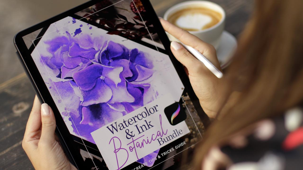
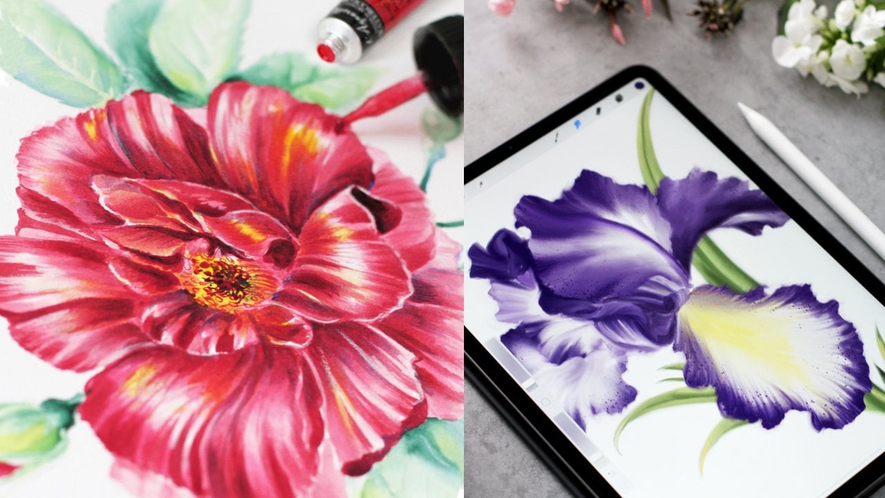
us grow as artists. I'll be using iPad
and Procreate app, but of course, you can
use any other software. If you use Procreate, don't forget to download the digital assets in the
project section of the class. I've prepared some brushes
and textures for you. This will help add charm of the traditional art to
a digital painting. In the next two videos, we'll talk about
Procreate savings, so you can skip it if
you use other software, and we will move on to the demo.
21. Procreate Settings: Welcome back. Before we begin, let me show you some of the
settings I love to use. I go to settings, Procreate and make sure
simplified us is off. This way, I have better
control over the steps. Then we go to Apple Pencil, and I turn off the double tap. I don't use it, but there are different actions you
can assign to it. Instead, I use squeeze option that is supported by my pencil, and I use it to
show color palette. You can use it with
a double tap, too. Then I will go to Procreate
and make some settings there. Let's go to Procrit. We will make a new canvas by pressing this
folder with plus. I usually use this size. If you plan to
print your artwork, make sure to set
a DPI resolution to 300 or higher like 600. Here's the number of
layers that you have. For my style, I don't
use many layers, so it's not that important. Some creatives use the
screen resolution of 72 DPI if it's only for web, but you never know, so I
advise to use 300 or even 600. Then we will tap create. Here's the size, here's the resolution and number
of layers all set, and we tap create now let's go to the range
icon, which is action. Then we go to
preferences to controls, and here are all the options. Make sure the assistant
drawing is off. This way, we keep our
natural way of drawing. Here's what I also
use. Let me show you. I use full screen
for finger tap. Let me show you how it looks. Let's open some
artwork, for example, this one, now for fingertap. Yep, the full screen. Now let's get back
to our preferences. And then another setting. So we're back to the
gesture controls. And here I use clearly a
tap and the scrap is on. Let me show you how it works. It's really nice
new gesture for me. I make a few steps on
a layer like this, and then just rub it like so, and the layer is clear. So these are my
personal preferences. Of course, you will
have your own, and I'll meet you in the
next video with another tip.
22. Pencil Pressure Curve: One more thing. If
you draw a lot, it's important to take
care of your hand. I've drawn professionally
for many years and prefer art supplies with
a very light touch. I don't use colored pencils
much and prefer brushes. Here's my personal
preference for working with Apple
pencil in Procreate, which you might find
helpful. Here we are. We go to the wrench icon and
tap pressure and smoothing. You can change the pressure of the pen and pull the arc up. This is my usual setting, but you can always
reset it, like so. I use it as a
general preference, but it can be done for
separate brushes as well. Something like this. Let's move on to the
next video where we'll talk about how to
apply textures. Super interesting.
Let's move on.
23. How to Apply Textures: Welcome back. I have a lot
of textures on my iPad. I love to use real
art supplies in digital work because they add charm and uniqueness
to the artwork. You can find this
whole collection in my botanical bundle. So there are two ways
to apply texture. You can use digital pieces of texture or use texture brushes. They will apply as you draw. We will explore
the first option. And then I will show
you another one, too. The same works for using paper. So we go to actions. Add insert a photo. You can use it as a top
player or anywhere else. Let's choose some texture, cover the entire image, like so, and then change the blend mode to multiply or something else. You can experiment and
try different modes. So I love to use
overlay or multiply. Then we play with opacity, and you can also change the saturation of the
texture like this. This is how I usually work. So you will have this
beautiful grainy effect. I usually use it on my
artworks as a top player. Then another option
is to use brushes. They behave like usual brushes, but instead, they paint
with texture, like so. So you create this
screen effect using a brush on top or
on any other layer. You can even change the
default size of the brush. Of course, you can
change the plant mode like we did before. And let me show you how to change the default
size of the brush. You go to brush properties
and change the minimum size. This way you can work
with more details. That's right. Meet me
in the next video, and we'll talk about
using paper and stems. Let's move on.
24. How to Apply Paper and Stamps: Welcome back. Before
we move forward, I wanted to show you how to use paper textures and stamps. That will immediately add depth, interest and unique feel
to your digital art. I've prepared some
custom textures for you. Don't forget to download
them in class resources. Now, let's explore how to
apply paper textures and stamps in Procreate. Here we go. As we discussed in
previous videos, there are two ways
to apply paper as a digital texture
or as a brush. My favorite way is to use a high resolution digital
image as a separate file. I create a new layer, go to actions, add
insert a photo. I pick an album with
watercolor papers. I have some special
effects here, and the paper should
cover the entire canvas. When I use it as a bottom layer, I don't change the
blending mode, just opacity a bit. But sometimes it
makes sense to change the blend mode for the
top layer to multiply. You can also try
different blending modes. With paper, it's always
a bit of experiment. Now, let me show
you how it works. With one of my favorite brushes, I use it to paint
petals details. So the mode is multiply, and I've also included it as
a bonus download for you. So you'll find it
in class resources. This is the brush, very
soft and painterly petals. So if you paint on top of
the paper on the top layer, multiply mode works best. You can see it right here. You change the
pressure of the brush, but the effect stays the same. Of course, you can
also use paper as brushes like we did before. They will behave
like usual brushes. Now, let's explore stamps. They also behave
as usual brushes. In standard Procreate set, there are some
stamps in water tap, and I'll be using
my splatter stamp. You can use any stamps
or download this one. So I change the size of the stamp and just
use it as a brush. You can also add some color. You click the alpha log here, so everything you do stays
inside the shape of the stamp. So you can easily
change a lot of things. Let's pick a color, something something bright like yellow, then we'll need to
choose some other brush, of course, any brush. We know this one. And you can color the stemp
or the part of the stemp with this color. So it can be anything you
can color just parts of it, and it can be
really nice effect. We will use it in our work. You can also change
the shape and the size of the stamp
like usual object. And I think we're finally ready to move to our
digital painting demo of a black cat. Let's move on.
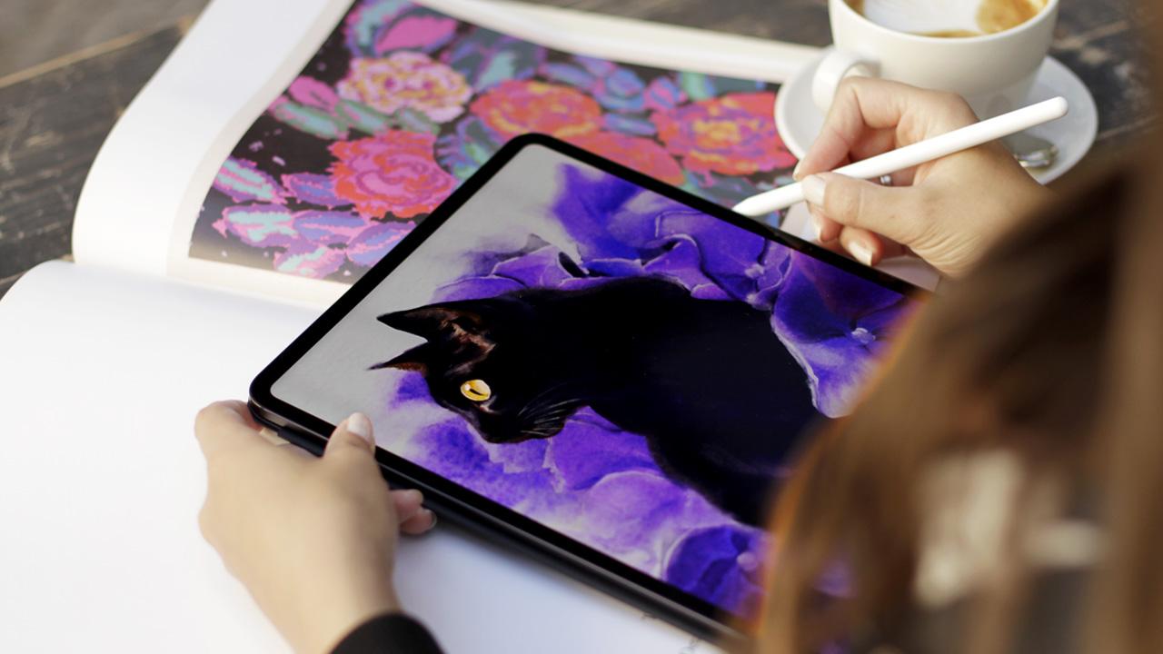
25. Demo: Black Cat Hydrangea: So we begin by
creating a canvas. You already know what
we're doing here. We create a new canvas, and I already have
my sketch ready, and I just add it. I usually lock the layer
and change the opacity. Let me show you. So
I lock the layer, so nothing happens, and I
usually make it a bit lighter. So it doesn't bother me much. Here we have a color palette. And if you want to use
your own personal strokes, you can use any ink Brush on top layer and draw your
outline like this. Or, of course, you can use this sketch for the
purposes of the class. Please feel free to use
the sketch that I provide. And also, please keep
in mind that I have a reference photo open
on my other old iPad. So it's not that
I'm drawing from my head and imagine
everything as I go. Of course, I don't follow
the photo straight, but I still have the idea of the black
cat that I'm painting. So I will work with my sketch. So I don't need this top layer, and I will make it
a bit brighter. And I'm going to apply
the first layer of paint on top layer and create
a new one in multiply mode. We explore this a lot, and this is how I usually work. So I pick a brush, and make this first layer of subtle yellow like I would do
with the real watercolors. So I use a dry sponge
texture brush and light yellow color and
cover all the outline. Then I add Von so I change
the size of the brush, and this one is a bit sketchy, so I don't need sketches has
another meaning, I think. So this is a bit sketch mode, I would say, and
you don't have to think about shapes or
anything else at this moment. So I cover the ear, the head, almost
everything here. Later, I will erase
some of the edges. So no worries about
it right now. I can add a few more colors
just for the interest. It's like painting with
oils, using glazing. It creates beauty just by
using the variety of hues. Then I'll show you the principle
of how I paint hydrana, the flowers, petals and
basically everything else. I use the vintage paper brush and add some areas of paint. Change the size a bit of bacity. I use dark violet closer to
the middle of the flower and lighter color
closer to the edges. And then I will smudge everything
using dry sponge brush. And so I use the lighter
color closer to the edges, the lightest violet on top. Later, I will even
use white color. You can change the
brush, anything. I will smash it, and then I will repeat this step
over and over again. That's why I can use very, very broad stroke at
this very moment. That's a cool tip to use with
color palette, by the way. Now the brighter, even
super bright color on top. This one should work. Hydrnga can be so bright
and it can be red. It can be so beautiful
with different hues. I saw this one in our holiday, so even blue will work. Then I want to try and add a bit of color on top. So what I'm going to do now is I'm going to
smudge everything using dry sponge brush as
we discussed, like this. The effect is immediate. So you can see right away, it looks like a painting. You can change the
opacity of the brush. This will change the
effect it makes. So you can find the
perfect balance, at least somewhere you can find it in your artwork for sure. And now you just
smudge everything and make the smooth transition like you would do with a brush. So I will repeat this
step a few times. I can try different colors, make it darker, and
then smudge it again. So it works like with traditional painting when
you blend a few layers, and it makes a beautiful
deep effect right on paper. So now I'm going to use a
few brush strokes on top, and I will work in
the same manner on all other flowers and also
our beautiful black cat. You will see the same
principle all over again. I will color all the
flowers, all the petals, and then our black
cat. Let's move on.
26. Demo: Black Cat Hydrangea Petals: Welcome back. And we continue painting the
hydrangea flowers. I use the same brushes
as in previous video. I use darker color under
the petal edge and the brighter violet closer
to the top of the flower. You can almost randomly combine the colors
from the color wheel. Don't forget to download
the color palette. So I use the darker color here. This way we create the
illusion of depth. And a bit of three
dimensional feel, which is quite nice for
the hydrangea flowers. This one is most detailed. I keep in mind the direction
of the brush stroke. It's not that important, but I still love to have
this visual dynamic. Now, the blue you can use as many colors as you like at this point, of course, from the color palette of
the violets and blues, when you smudge everything, you'll have a beautiful gradient
like this, a bit darker. Here, and next, I'm going to use a writ pen and paint the
darkest dark inside the flower. You can use any brush
from the drawing tab. Actually, it doesn't
matter much, but it should be a bit
like inks or pencil brush, so it should be not
so transparent. So I paint the darkest darks. This way, we have a
beautiful illusion of depth and almost three
dimensional feeling. I have a really strong
wind behind my window. Now, it's two big. And then I will much
everything like we did before. So it doesn't matter if
the color is too dark or if the stroke is not so
perfect, which is absurd. Now, let's see
what we have here. And next, I'm going to
paint the highlights with white right closer
to the top edges. This way, we will have a beautiful contrast and
three dimensional feeling. I use a bit of white,
but not that much. I will repeat the same
step all over again. But now you can already see that I'm basically
sculpting the petals. You can work with more details
on the front flower and leave something to imagination
for the background. I really love this one, and I want to add a lot
of highlights here. So I add a lot. I keep in mind the direction of the brushstroke
as we did before. And then I'm going to smudge
everything and you will see the bold and dramatic
effect it will have right away. So I'm going to use the same brush and I smudge everything with
a very light touch. You can change the
opacity of the brush, and this will also change the strength of the
smudging here and here, we have beautiful effect. Now, some shadows
will soften this one. You can see the three
dimensional feeling. I usually hide the sketch
layer from time to time just to check
how everything looks. It looks really nice. So I'm going to
repeat the same steps on all the other
flowers and petals. I will add lighter violet
as a basic color and add shadows with darker one or
blue underneath the edges. So now I'm going to
move to the left side, and I will do the same, but it won't be so detailed. Since we here we
have a cat's face, and I don't want to be
too much distracted. I begin with the
same steps and I can skip a few I can
skip a few layers. Let's see how it looks. I use some broad strokes, and it will be modern enough
for a beautiful effect, especially near the cat's
face around the cat's face. I will use the same color, and I will also keep in mind the
general composition and the feeling of the painting. As you've noticed, I use
large broad brush strokes. I swatch the color from
the right side to save some time. Maybe here. Just the impression
of the battle. I leave the space of the cat
untouched for the moment. This part looks like
a sketch a bit. But then I will
smudge everything again and it will be quite fine. Let's see how it looks. The edges will be raised later, so I don't have to worry
about it right now, and I think we're ready to move forward to paint our black cat, the most challenging part. I'll see in the next video.
27. Demo: Black Cat Fur & Eye: Welcome back. We are
ready for the challenge, and we're going to
paint our black cat. I'll be using the same
brushes and same principle. So I will begin with
a dry sponge brush, and I will use some dark color to put the first layer
of paint for the fur. Something like this.
Very, very broad strokes. I use the blending
mode of multiply, like we did before, like I
showed you in some videos. So I cover the whole fluffy
body of our companion. And here I will be more careful. I try to keep in mind
the shape of the face and draw the brush
strokes around the eyes, I will add a bit of bloom. Like I would do with
traditional paint. You've seen this cat in
watercolor in my sketchbook. We explored it in super
granulation part of the class, and I was so inspired that I
thought that this would be a beautiful demo in case you
want to try a few tricks. So I just mix the
colors right on the digital paper like I would
do in traditional artwork. I color the whole body. And then I will add a bit
of color on the ears. It's still a bit of a sketchy. Again, not sketchy, but
sketch, sketchbook style. So it's not super precise
or super detailed. Then I'm going to add a
bit of red to the ear. It's not the red red, but it's a mix of
violet, I think. So I will add it here, I think it's too bright. So I just mix everything like I would do with gouache
or watercolor. This way, we have a beautiful, unique texture on the cat, and it won't look super digital
in a sense of this word. Now, let's add some strokes of lighter color to
support the outline of our fluffy companion and
this should be enough. Just a few strokes for outline. Then I'm going to add a few
color cents with ink brush. But before that, I need
to color the whole body. Black and blue work
great together. For example, if you're painting a raven or a cat or a black
cat that looks like a raven, you can add a few
lines over here. These brushes are a bit transparent and this way you
have a beautiful layering. Here some shadows. And I will add the light layer of blue
all over the cat's fur. So now I'm going to add a few colour scents
using ink brush. You've seen this brush before? It's a red band brush. I add some details here. And next, I'm going to check how everything looks
without outline, like we did with flowers. So I use a lighter
color to paint. So did a few lines here. And on the face. This illustration
is not super detailed. You know, I love
extra detailed work. This one is more
of the impression. It has a painterly feel to it. Then I will support the
outline with the same color. No too bright, but
maybe a bit here, just paint how it feels. And in general, smudging
everything again works great. So I will smudge. The face. Everything looks smooth.
That's our goal. And now I'm going to see how everything looks
without outline. Well, it looks really beautiful. And without outline, it
will look even better. Three dimensional feel and
the depth of the artwork. And now we're going
to paint an eye. It's the brightest part
of our illustration, and we're going to use the ink brush and
the yellow color. It's quite easy. We just
color it with yellow, paint a few shadows and
white highlight on top. We have a limited color palette. So this bright bright
yellow shines right away. Let's put a highlight
here and here and here. You can even smudge it a bit to make a beautiful
smooth color transition. When you have highlights and
everything put together. Then I'm going to
paint whiskers. I still have the outline, so it's a good idea
to do it right now. Then I will hide this layer
till the end till the end, till the final step. Now I'm going to add just a few strokes with inky
brush and paint highlights. I create a new layer on top
and just draw this here. And here. This should be enough. Of course, I will smudge
it afterwards also, but not that much, because usually we see the
whiskers of the cat. And then I'm going to add highlights on the
entire artwork. So I hide the layer and work on the highlights with
just lighter color and our usual brush. I add highlights
on the whole cat. Now the next step. I will duplicate
the outline layer. So I already love how
things look without it. I will make a copy
of this layer and look at just in case
something happens. That's a habit from Photoshop, and I will also duplicate
the cat layer just in case. It's always a good idea. Let me show the whiskers. Then I'm going to smudge it. Let's smudge everything. I need my hand, uh huh. And now I'm going to
duplicate this layer also. So now we have the file that is modern enough to make
mistakes if we want to. So what I'm going
to do is paint over the outline and then smudge everything
like we did before. This way, we will have this painterly effect
of the painting. I use the word paint too much, but still you
understand what I mean. And I use the light
color right on top the very edge and
right on top the outline. I use different colors, and then I smudge it like so. This will bring realistic
feel right away. There are no lines, but still, I love to keep a few of them, and that's the mix of my style. So I keep the smudging to the very light
light light touch. You can smudge the outline using subtle brushstroke, like so. So I basically soften the
outlines with a smudge dog. I'll see you in the next part.
28. Demo: Black Cat Petals Details: Welcome back. And now we're
going to work on the edges. Remember, we have
this outline layer. I made a copy just in case. So now I'm going to use eraser
and wintere paper brush, and I'm going to lighten up all the edges in our
illustration, like so. This subtle work we bring
unity to our illustration, and I just love to use
this way of working. So I work all over the painting, and I lightly
delete the outline, like so, especially
right on the edges. Here and here, we already
have the shadows. And then after I'm
done with the outline, the cat's face, of course, I will repeat the same steps with highlights
and shadows again. Here, we don't need
any outlines here, especially near the lightest
parts where they are clearly seen closer to the cat. Here and here, we should have the unity of the
whole illustration. And now I'm going to draw
the darkest shadows. Once again, areas
that look too smooth. I need to support the shadows to make the shapes more visible. And then I will match them
again like we did before. So now I just smudge two, and I will just smudge the edges softly with the color
of the background. Like so. This will
create different shape. So you can use your intuition
a bit, what feels right, what shape you like, best.
It's a difficult part. We don't have to smug too much, just to give the impression
with a very light background. And then I'm going to
work on the eye again. So now I'm painting the eye, using the rib and I
paint a highlight again, and then I'm going
to smudge everything and then paint again
and smudge again. This should be darker. Absolutely. The outline around the eye should be more visible, and then I'll try
to smudge it a bit. But still, I want
to keep the outline sharp enough to draw
the viewer's eye. But of course, it's also
a personal preference. Sometimes soft eyes
look very beautiful. I smudge the face, soften the features, whiskers. Super important part of
the cat and the nose here. A few details here. In part, it's simple,
but it's super, super important for the whole impression
from the artwork. And I'm going to
repeat the same steps with flowers and petals again. We painted our black cat, and now we need to unify
the whole artwork. I can work on details forever, but it's time to move on. We need to add balance. Our artwork is almost ready. Let's move to the
next part where we'll add final details and texture. We will add depth, interest, and unique feeling to
this illustration just by applying texture from the
traditional art technique. I will add a few lines closer
to our main character. The petals are more visible
and then smudge it again. This process can be endless, but we need to move on. I'll see in the next video, we will add details and export our beautiful
illustration. Let's move on.
29. Demo: Black Cat Textures & Stamps: Welcome back. Here's our
beautiful illustration, and we are ready to add
final touches and a paper. But before that, I need to
smudge these wins a bit. Like so. So they
won't be so detailed. So I will create a new layer for the paper and put it
underneath the cat. This one will be
for the paper here. Then I go to add and
pick the paper texture. For example, let's
choose this one. And I cover the entire canvas. Then I'm going to change
the opacity a bit, so the paper will look lighter. And I think I want it
to look less saturated, so we can easily do that. This way, we have a balanced artwork and I create a new layer using a
multiplayer mode. And here I will add a texture. Repeat the same steps. We add special texture. You've already seen this one. I cover the entire canvas again. This texture is on top. So here are different
blending modes and some effects are
really beautiful. I love this one. It
looks super nice, but the opacity should be less. Usually, I change the saturation
of the texture on top. This way, I can use almost any texture with a
beautiful grainy effect, right on top of any painting. So the saturation is done. We can change the opacity, and it looks amazing right away. The depth, everything has
a perfect balance now, and the paper should be
adjusted a little bit. And now I want to
add some stems. I will create a new layer. On top of the cat. Change the blending mode, and I will pick the splatter, like I showed you in the videos before and put a
few splashes just like so. We can easily transform
it, rotate it, change the scale,
follow your intuition to find the balance of the
shape, how it feels right. So dynamic, something like this, or maybe I should
rotate it a bit. Then change the opacity a bit, and I think we can lighten
it up with a razor. It will look more
natural this way. Like when you use
some splashes from inks and we can now
rotate it again. Yes, it looks better now. I will add another one
on a separate layer, so it'll be easier to
transform a new layer, change the blending mode. And the same brush,
something like this. We can rotate it to
keep the balance, so they won't be symmetrical, just to add interest
like it would look with the usual splashes or
random brush strokes, and I lighten it
up with an eraser. Something like
this, maybe change the opacity to keep the balance. I will look like we have
a beautiful background. Painterly feel with
a combination of some expressive
strokes and splashes. I think we created a
beautiful artwork. I love the play of textures, and actually, you never
know how they would work. So it's always a good idea
to experiment and to try the plant mode for every
layer to see how it works. That's the beauty of using the traditional textures in
your digital illustration. I think it's always a pleasant experiment,
a very joyful one. Now, let's export our cat. We go to Actions,
Share, pick a format. Usually, it's speck and
then we save the image. Super. I'll see you
in the next video.
30. Your Assignment : Super, I'm happy to see
you've made it this far. You watched the entire class
or some parts of the class. And now you are ready to work
on your own illustration, featuring our fluffy
companions and flowers. Your assignment for
this class is to create a cat and
flower illustration using any techniques
we've learned in this class and upload it
to the project gallery. You can follow along
one of my demos or experiment and
discover what you love. You can share just a sketch. It's always so inspiring
to see what you create. I'm always very surprised. Feel free to use the materials I've uploaded in
class resources. There are brushes if
you work digitally, a color palette and an outline. This will help you
save some time. If you want to add
something more, I have a whole procreate bundle
available on skill share. It's a unique pack of
watercolor and ink brushes with custom paper textures
and more. Just check it out. And of course, you
can always get inspired by my book
Brilliant Inks. You can also share your
project on Instagram. I love to report artworks. Don't forget to tag me right
on image, so I can find it. Okay, we have one
more video to go.
31. Final Thoughts: Congratulations on
completing the class. If you're like me, you'll
probably watch it again. I hope you enjoyed exploring the perfect world of
cats and flowers, and next time you'll scroll
through the cat images. You'll think about textures. Today, we've learned how we
can enrich our artworks. Don't limit yourself
to realistic textures. The key to creating unique
textures is free experiment. So observe the world around
you, the fabrics, metal, the plants, and imagine what brush strokes you
would use to depict them. Try to play around with
materials you already use. Sketchbook works
great for recording your experiments or
collecting small studies. It's your feeling
for the subject that makes your art unique. And our fluffy friends and
flowers are your joy to study. Digital painting offers
so many benefits. You can undo mistakes and have no fear of
ruining your work, but it's super important
for your growth to embrace the challenges
of traditional art. I think these both
techniques can fuel each other and help you
grow as an artist. So if you enjoyed
watching this class, please leave a review.
It means a lot. Just a few words would be great. And you are very welcome
to check my other classes. I'm sure you'll find
a lot of inspiration. You can also press the
following button above somewhere to get notified
about some news, giveaways, new classes, and
projects I'm working on. And you can also follow me
on Instagram. That's it. I'll be waiting for
your artworks and get back to my imaginary
cats. See you next time.
 Anna Sokolova, Berlin-based Artist