Transcripts
1. Intro: If you love Os and want to
level up your art practice, this class is for you. My name is Anna and I'm a multi award winning artist and illustrator based in Berlin. I believe that painting
what you love while experimenting is the best
way to grow as an artist. As a mysterious, timeless and an incredible subject
for your portfolio. Publishing and
licensing. In fact, while working on this class, I'm licensed two all artworks and landed
a new collaboration. Over seven days, we'll create
focused sketchbook studies, inspired by Alberg Dürer and Natural History
Illustration books. We'll explore inks, Watercolor,
Sgraffito technique, and Procreate, all
on projects you can finish in one sitting
or over a weekend. Start with your most
comfortable medium. Then I'll encourage you to
try the one that scares you. Well, sometimes all of
them try new things, brings you technical
and creative freedom. You'll be able to express
yourself the way you imagine. Everyone is welcome, regardless of your level and art style. Now, let's get started and
meet our nocturnal uses.
2. What You’ll Create in 7 Days: Welcome to the class. I'm so happy to see
you joining me in this magical All Adventure. So how to approach this class? You know, alls are
not what they seem, and so is this class. We'll experiment a lot. When I think about drawing all, I remember the classic
card books joke, draw some circles and then
draw the rest of the all. It's funny because it skips the most important
part, practice. And we won't skip any steps. To get the most out
of what I share, your project should include at least one technique
we'll explore together. There's absolutely no pressure. You can create just one,
but very special all, and that's enough, or you
can complete the whole week. You can repeat a
day or skip ahead, follow your own rhythm. We'll begin with inks, combine it with Watercolor, and then experiment
with wax pastels, and finally create a magical, modern mixed media all artwork. In the second part of the class, we'll work in Procreate and
paint a textured all feather. I'll share some
special technique and show you how I approach
this kind of project. You can use any
software or replace the digital part with
traditional media. If you want. I've also created some class
resources for you outline so you can
save time and get straight into painting
and materials list, Procreate color
palette and brushes. They're all available as downloads in class
resources section. Now, let's move to
materials list.
3. Materials: Welcome back. Let's
explore some materials. I'll show you what I
use, but of course, feel free to use what you have. We'll start with
essential materials like inks and watercolors. And then I'll show you
some optional ones. You can replace them. Think of a substitute. Well, you know how the
creative mind works. For the digital part, I'll be working on iPad in Procreate, but you can use any software or skip the digital part
entirely if you want. In the class resources, you'll find a PDF with
the full materials list. Now, let's take a close look. So here are the treasures. You don't have to
use everything. I'll just show you what I use, and we will begin with
essentials, watercolors. I use the ones in tubes. They're bit different.
Some are opaque, some are more transparent. You can use any watercolors. These are just the ones
I use in this class. Then, of course, white
Gouache, super essential. And I'll use colored ink. These are my favorite
vintage colors and super basic Indian
ink or Chinese ink. It's permanent and
water resistant. I will also use fluorescent
Watercolor for the contrast, this one I have set in the
special palette over here. And for the ink, I will
use these secret weapons, ink bipeds or ink droppers. They are great for
splatters and ink drops. Then the brushes. I use round synthetic brushes,
sizes two, three, and six, and the brushes that hold more water like mop
brush and the larger one. So these are my tools that I usually use in
most of my artwork. Then I'll use Wax Pastel. Very special art supply. I love using highly pigmented
permanent wax Pastel. We'll have a wonderful
demo with it, and you will also need a knife. Actually, it's an erasing
and sharpening tool, but it'll work great
for our project. As alternative, you can use
the top of some brushes. They have a sharp tip, so you can use it as a knife for our technique that I will show you later in this class. And the next one is circle
stencil or circle template. I just love to use those it makes you look
professional in some way. I don't know why, but
it's super awesome. Then colored pencils. These are a few
colors I'll be using for outlines and details. Of course, you can use any
colors or any pencils. And if you want
more flexibility, these are awesome
erasable colored pencils. They're sold as kids art
supplies, which is even better. It's a really nice option. And if you want to
be more precise, there is another option. I have another pencil
that's also erasable. This one. It's super thin. Like mechanical
pencil, and you can also erase the sketch afterwards if you want and
leave some parts untouched. Okay, and of course, the paper. I will work in
Gardens sketchbook. It's my sketchbook for
mixed media experiments. You saw it on
Instagram, probably, and it holds a lot of layers, so I don't have to think about our supplies when
I'm working in it. And I experiment a lot, so I will use it
for our artworks. Okay, you've seen everything, and in the next video
will get inspired, I will see you there.
4. Inspiration: Welcome to the inspiration
part of the class. I recently visited
the painting studio of my favorite artist
Albrecht Dürer. You've seen his work many times. He's an icon of the
German Renaissance. When I visited Durr's house in the city of Normerg
for the first time, I was completely amazed
by the atmosphere. Do you know, it's the only
Renaissance artists house in Northern Europe that still stands in mostly original form. You can even find the painting and printing workshop there. Not surprisingly, even
being surrounded by Durs art supplies and feathers made me
want to paint them. And I hope you'll join me. Durr combined inks, Watercolor, and mixed media in his work and constantly experimented with
new pigments while painting. What an inspiration. And I also want to show you two
books from my home library. Natural History Illustration
is a wonderful source of inspiration and super helpful
if you love to paint birds, owls, eagles, and animals. Let's take a closer look. Here's the first book
I want to show you. It's the collection of vintage engravings with
a lot of references. It's a beautifully
cuated collection, and there are so many details. You can see a lot of
animals here, very, very different interpretations, and we'll get straight tools. Let's find them. Somewhere
here, and here they are. It's a perfect collection
of tiny studies, and you can use it for
your creative projects. These are engravings
and you can use them as ink illustrations as inspiration for your ink artworks,
for Watercolor artworks. There are a lot of details
to study, to practice. If you love natural history, illustration is a great source. Now cats. I just want
you to look at cats. It's always a great idea. Now, the next book is
very elegant inspiration. It's a collection of Edward
Lear's parrot illustrations. It combines vintage
feel and modern design. I really love how this
book is manufactured, and here we can find our friend beautifully illustrated
on Vintage background. And then we'll find different
illustrations of parrots, especially love
the combination of subtle lines and bold colors. The focus on the bird and a few details
on the background. It works great for watercolors. If you use colored pencils
for any technique. The principle will
work everywhere. Beautiful illustration. Now I wanted to show you my recent artworks I did for various brand
collaborations. This one is pencil sketch. I used a full tonal range of pencils to create a focal point. And here I used various
pastels as pencils. It's so curious that
every time you draw all, it looks so different. And now let's move on.
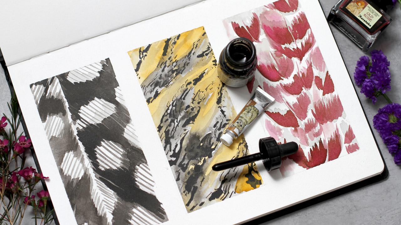
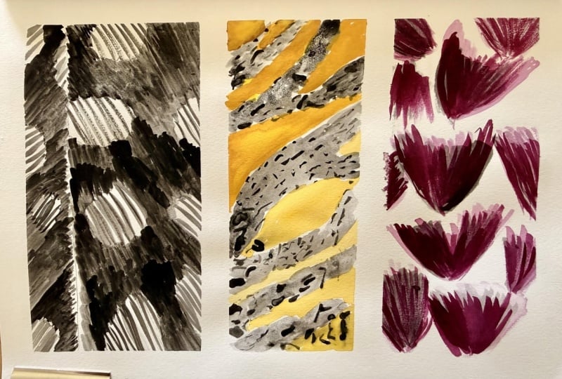
5. Day 1: Feather Textures: Welcome to day one.
We'll begin with simple but very beautiful
feather textures. I'll use ink first and then add color ascent
with Watercolor. Let's get started.
Here is my sketchbook. I've secured the edges with skin tape and divided
it into three parts. I'll use Indian ink and a bit of yellow ochre and colored inks. This vintage color
is super beautiful. Today, we'll create three
beautiful feather textures. So I will begin by
preparing ink first, and then I will use the synthetic round brush
to ink the feathers. I already have the
pencil sketch. So you will also have
it in class resources, and I followed on the sketch. And just draw some inky lines and inky areas around
the white of the paper. The quality of the inks and of the paper
is very important. You'll get different effect every time you use
different art supplies. So it's a sketchbook and we're not very
precious about it. So you don't have to worry much about it
and just experiment. I keep the angle of the brush stroke pretty much the same. So we'll have this
beautiful dynamic. Now the second part, you can add a bit of water
to get the light to wash. So my plan is to paint the first layer and then
wait till it dries. I will work on other textures. Of course, you can
use head dryer, but I prefer not to use it
very often in sketchbook, so the pages won't buckle. Now, using the ink dropper, I will work on the second part. It creates very special texture. Look, I just make some marks. I draw some dots, and already it creates
the feather texture. I ink over the sketch
like I did before. A few dots here and here. I'm following the pencil sketch, and I'm forming the groups
of marks like this. Of course, you can use
any pipet instead. I just have the Indian
ink with this one. So the first part
is getting dry, and I'm working on the
second texture like this is very, very
satisfying part. I just draw the group of marks, keeping the direction of the
dots and lines and marks and smudgy parts to create a random but
still organized system. I already love the look of this. So we have a few groups, and then I will
wait till it's dry. Usually, if I don't
have a ink dropper, I use another type of
pipette, for example, this one or another one. I'll show you in
some other parts. And now let's work
on the third part. This one is getting
dry so I can save some time and start to
ink the third texture. So I'm using diluted black ink, and I paint the feathers. I'm following my sketch, and I form the small elements of feathers and building
the larger shapes. I'm using the same
synthetic brush. It's universal and works, I think, for all the techniques. So I'm painting the feathers and I leave some
space in the middle. So the shapes will
look beautiful. The wash is pretty much diluted. You can see the light
gray of the ink, and I'm following the sketch. Even with the diluted ink, you have the variety of color, which is very beautiful. So I'm adding a few more strokes over here to fill the space, but still leave some
areas untouched. So we'll have room to breathe. And now we can add the second
layer to our first texture. I use a bit of diluted ink. And add the stroke on top. I have two types of ink
in my color palette, diluted one, and straight
from the bottle. So I think the straight from
the bottle will work better. So I'm using both and using these brush
strokes and synthetic brush, I create the texture on
top of our first layer. Keep in mind the direction
of the brush stroke. Like this, I leave the white
of the paper untouched. It's all intentional
because later, we will add some texture on top. Okay. Our second texture is dry, so we will add shadows with diluted black ink and careful
brush strokes like so. I'm not sure if I should
take a larger brush. Let's see. I think
it will work better. Yeah, I will use the
brush number six to add the second layer of
shadows to this texture. Like this, I use a lot of water to create
beautiful gradients, and my plan at the end is
to add Watercolor on top. But for now, I'm preparing
this second layer. And then I will use
a hair dryer to let it dry as an exception. For the demo because later, I will add watercolors
and I don't want it to smudge a lot, and ink is permanent, so you don't have to worry about mixing the layers
only if you want to. And for the feather texture, it can be a great idea. I'm adding some random strokes, not some random, if you think
about it, and let it dry. So now I can add details
to our first texture. With a small synthetic brush, I add stripes on the
white of the paper. That was our plan. Like so. Keep in mind the
direction of the stroke. We'll have a texture
ready in a few moments. Beautiful result right away, another angle of the strokes, and then I will
soften the edges. Inky lines can be
a bit sharp and feathers have this beautiful
transition of the color. So I will use a
bit of diluted ink and water and soften
the edges like so. A bit here and here and here. Just a little bit is enough. Super. And now we can move
to the third texture. I'll use the beautiful
vintage color. It's called vintage rose or so. And I will add the feathers right on
top of our first layer. The first layer is
completely dry. So there is no mix, only the optical mix. I use very careful brush strokes to keep the shapes of the
feathers recognizable. And the first layer is dry, so I can use the ink
straight from the bottle. And I don't have to worry about mixing the ink with black ink. Otherwise, it will ruin the bottle of this
beautiful vintage ink. Of course, not ruin.
I would use anyway, but will have a different color. So I work on all the feathers, and I continue in
the same manner. And now we'll add a
bit of Watercolor. I'll use yellow ochre
to add color sense to our texture.
It comes to life. Wonderful effect
Watercolor on top of Indian ink, and it's permanent. So everything works nicely. No smudging, of course, if the first layer is super dry. And I love the effect. We have this natural feel of the texture of
the feathers like. So just a few strokes would be enough for a beautiful effect. And we're almost done. I will just add a few
touches here and there. Maybe on the third texture, we have beautiful layering
of the vintage ink, and I can add a bit of diluted
water with ink on top. It's not dry, so I will
smudge the top in clay a bit. Beautiful. Now I'm going
to leave the masking tape, and the day one is complete. We have a beautiful sketchbook
page with textures, and we're ready to move
on to the day two.
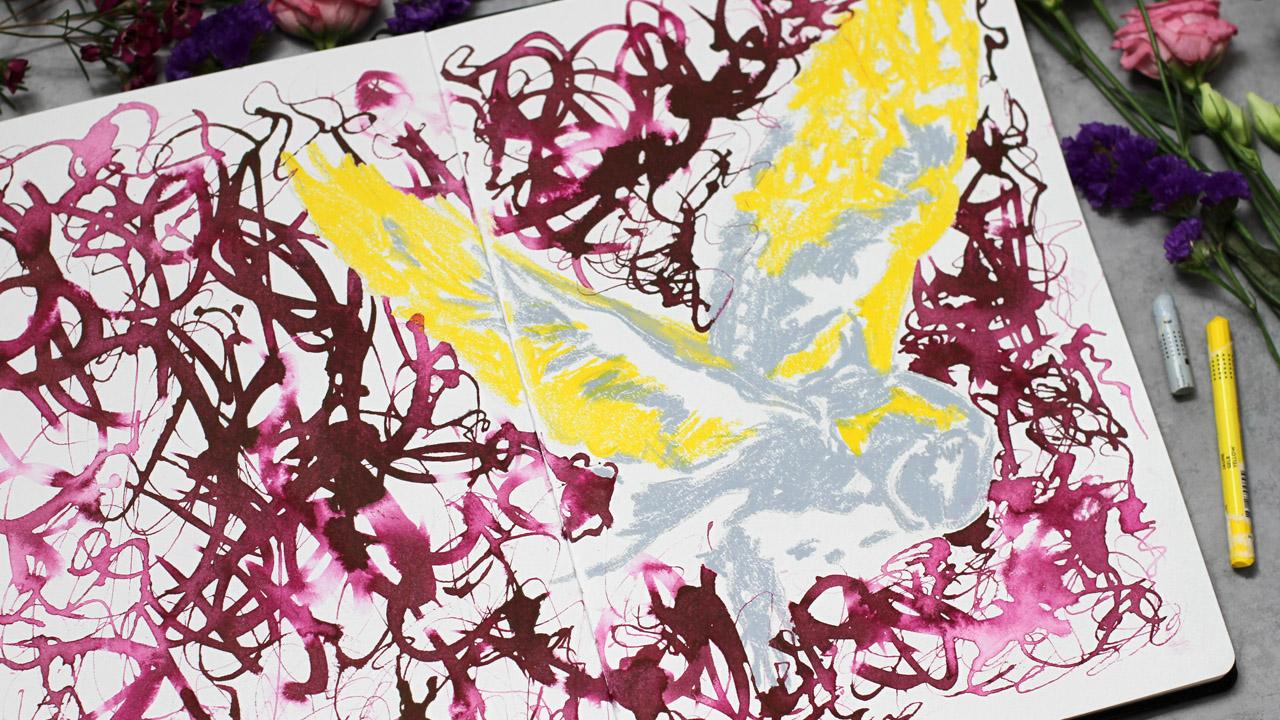
6. Day 2: Silhouette & Form: Welcome today, too. This part is super experimental, and I'm super excited to
show you this technique. I'll be using colored
pigment based ink and this unusual ink dropper. You can use another dropper
or any pipette, of course. And here I have
permanent wax pastel, and I'll use just two colors. I will use yellow and gray. Let me show you this
yellow is super nice, works over everything, and
subtle pink would work great, too, but I think we
will keep it simple. But it's a beautiful
combination just in case. I'll begin with
yellow color and draw the silhouette of the
all over my sketch, and you will find it
in class resources. I will also use this large
brush to add water afterwards. You will see. So I
begin with yellow. I have a pretty detailed sketch. You'll find it
ready in downloads, and I will draw the
wings of the ow, leaving a lot of white
space untouched. So my plan is to combine
just two colors this time. And you can test any colors,
any pastel you have. I use Wax Pastel. If you have oil pastel,
it's even better, but it's super smudgy
and it's also permanent, so you have to be mindful
about your workspace. I tried oil pastels a few times. The colors super
intense and beautiful. But my working desk was completely covered
with colored dust. So I'm drawing the wings. I leave a lot of white space, like sew and like sew. And then I will use gray
color to draw the head. So now let's take the gray and define the
head of our owl. So it works like a
silhouette a bit. It's not very difficult, but also not so easy. I color some parts
very intentionally. So I don't want to have too many parts
covered with pastel. My plan is to create a
beautiful silhouette. And then we will make
a magical background. I will show you a wonderful and super easy and very
effective technique. Now, this part of the body of the O Let's add a few strokes over
here and over here. And I will continue
in the same manner. Our pastel all is ready, and here comes the magical part. So what I'll do, I'll
put some water on the paper using
circular random marks, and then I will add colored
ink with an ink dropper. And the wax pastel
will work as a mask. So it will repel
the water and we will have absolutely
wonderful effect. So I'm putting some water using this dancing brush method. If you read my book or if you watch some of my other
classes, I hope you did. You already know about
this dancing brush method. Now comes the magical part. The effect is fantastic Walla. Here it comes. Super. Very
beautiful random texture. Fantastic, dynamic and
subtle at the same time. We have a wonderful
contrast with the old texture and the
expressive background. You can try different effects. For example, if you have an
interesting ink dropper, you can do like so it's
almost impossible to stop, and the ink is still wet, so you have very unexpected
and interesting lines like calligraphy a bit. And as you know, the wax of
the pastel repels the water. So even if you make
some marks on the all, it won't work, which
is super nice. I still have some
space over here, and I have the arch to
fill the whole page. Now, let's add a bit of marks. Here, you can combine the light wash with
ink from the bottle, and you'll get
unexpected results. Our day too is almost complete. I can ink this
background for hours. I think it's very meditative, and the result is
always beautiful. Now, I will think about
composition a bit. So we have a lot of random
experimental expressive lines. But I want to add a bit contrast near the
head of our over here. So I will add if you diluted ink lines here. And here, the hand is dnsing on the page and
it's impossible to resist. So some space is left, and I need brighter
contrast near the head. I think it will look better. So we will have the
focal point even in this experimental style. Let me fill some
space first and then add ink around the
heat to support the silhouette and
form like so and so. And I'll meet you
in the next video.
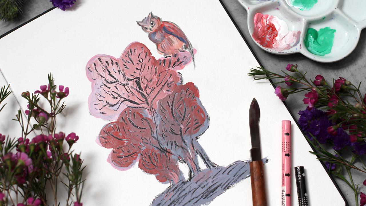
7. Day 3: Sgraffito Technique: Welcome back. I hope you
enjoyed the previous taste. Maybe you already
created a few artworks. Now, I'm super inspired to show you this
experimental technique. It's called Sgraffito. Sgraffito is an artistic and decorative
technique where you scratch the surface to reveal parts of the
underlying layer. This technique has been used in Europe since classical times, and we'll try a simpler
modern approach. You might want to come
back to this part later. It definitely counts as the
medium that scares you. You don't need to
do it right now. You can just watch and
return when you are ready. But we are brave. So
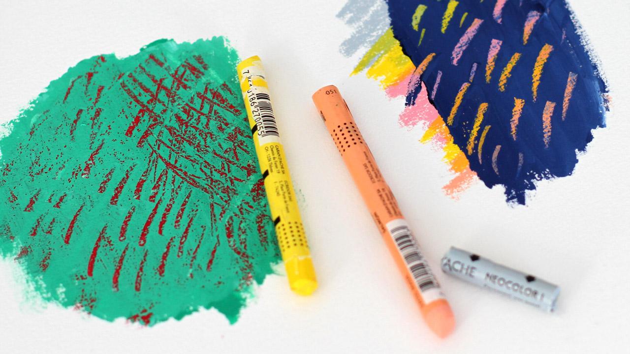
let's get started. Here are my materials. Wax pastel. You already know it. And then I have the knife, erasing and sharpening tool, and as alternative to the knife, you can use the tip of the brush handle to scratch the surface. Now, let me show
you the principle. We have Watercolor paper, then I make some marks with wax pastels to seal the
first layer of the paper. Let me show you another
way to seal the paper. You can use the variety
of box pastels. You can create a gradient. You can smash them. You can also work
with oil pastels, but it's a bit messy. I love the yellow color
on top of everything. It works great. So now,
what I'm going to do, I'm going to add a layer of
Watercolor on top, like so. In my case, it's emerald green, and my watercolors
are a bit opaque. So if you use
transparent Watercolor, you can add a bit of white
gouache to any color, and it will work better
on top of box pastel. I cover the whole surface. You can add white, like so, and you see right away that the paint gets this
creamy texture, which works much better
on top of any surface. I cover the whole range of red. I'll put just a few layers so you'll see the result
and the effect better. Now, the dark blue
over our gradient, I think I should add white, as I told you, like so, and it becomes much easier, but the color changed. You can experiment with the
color of your top layer, with the color of
your first layer, and you will get
different effects. Now, how it works. Using tip of the knife, I scratch the wet surface of the paint to reveal
the underneath layer. Like so. And as a result, we get a unique texture and
unexpected accidents. You can make a variety of strokes experience
with mark making. Scratch like you're painting. The texture you get
is completely unique. Now here, our next example, beautiful gradient becomes
visible right away. Super. So this is how it works, and we're ready to add depth to our new O. Let's get started. Here I have the sketch. You will find it in
glass resources, and I will use a black pencil, just the usual black
colored pencil to draw the outline of the owl
sitting on the tree. It's a very stylized
illustration, and I think it works great
with graffito technique. It has a bit of book
illustration feel. So I will draw the outline, and then I will add the layer of black box pastel on top the
entire sketch of the tree. So the all is ready, and I will add the layer of box to cover the whole
area of the tree. You will see why
I do these hoops. It happens with Pastel a lot. There are special
holders for Pastel, but I don't use them.
I don't know why. I just enjoy to use the
stick the way it is. So I'm covering the sketch over the pencil lines beautiful
texture right away, but we have a different plan. So I'm covering the thick layer of work on top of
every sketch part. Now using white
and a bit of pink, I begin to put a top layer
of paint like we practiced before and cover
the whole area of the sketch of the tree. Now, I plan to change the
intensity of the color a bit, so we'll have an interesting
effect, and as a result, we'll have beautiful
illustration, which is not just a sketch, but a full artwork. I'm really enjoying this part, so you don't have to think a lot and still get beautiful results. I will add gray for interest, a bit of gradient. When you add white
to Watercolor, it feels like guash a bit, and everything depends on
the brand you're using. So I will add more gray, and then I plan to add a bit
of red for the color sense. Let's add some red with white. Also red will mix
with gray that I have and everything
will be unified. This brings the artwork
together a bit, the color and the
mix of everything. Now, let's draw
some more on top. And over here. We're almost done
with this layer, and the important part
is to keep it wet. Magic. It should
work right away. Super. Now using the knife. I'm drawing the branches. Like this, it feels
like engraving, you know, the vintage
illustrations. The effect is wonderful. The top layer is very thick. So I have plenty of space to
experiment with the lines. The direction of the lines and thin strokes
or thick strokes. Super. It feels like drawing on some special surface
over here and here. So I'm following my sketch. Of course, I don't see
the sketch anymore, but still I remember the idea, and I want to keep the
rhythm of the branches. And I clean the knife, using a paper towel. The layer of the
paint is very thick, so I have some paint
left on the plate. A few strokes here. And then I will just paint with Watercolor over
the ol sketch on top. And this is it. So some
mark making on the ground. We have the dynamic effect. And here, here the
lines long strokes. So the texture will
change while you work. The pat is getting dry, so you have to work
quickly like this on top. You will have a different
results, I'm sure. It will look beautiful. And now I will add some
color on our night friend. I use the same mix
of watercolors and water just to put
everything together. We don't need many details. I have the outline, so just shadows using this
subtle pink and gray on top, a bit of shadows closer
to the edges to bring some character our
faithful companion is super important part
of this illustration. Let's add shadows, highlights
in a very simple manner. The outline works for us. The blue to the eyes
and to the wing. Super. Now, let's add
a bit of details. So our night friend
has a character. The day three is completed, and we can move forward to the hero artwork of this class. Let's move on.
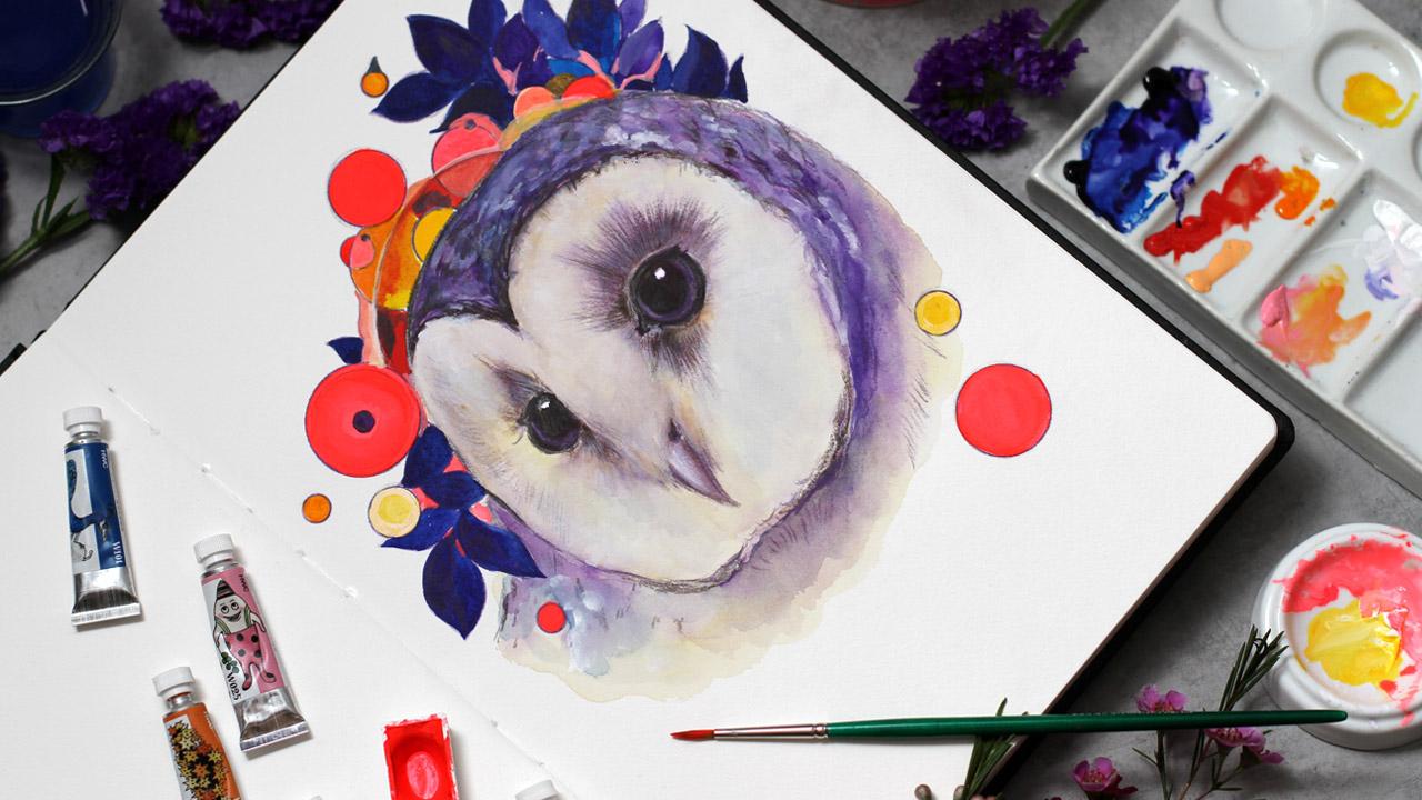
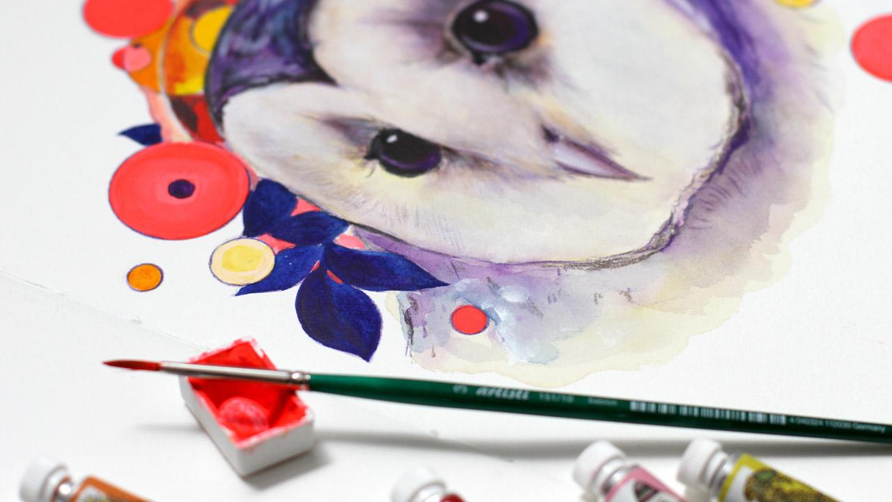
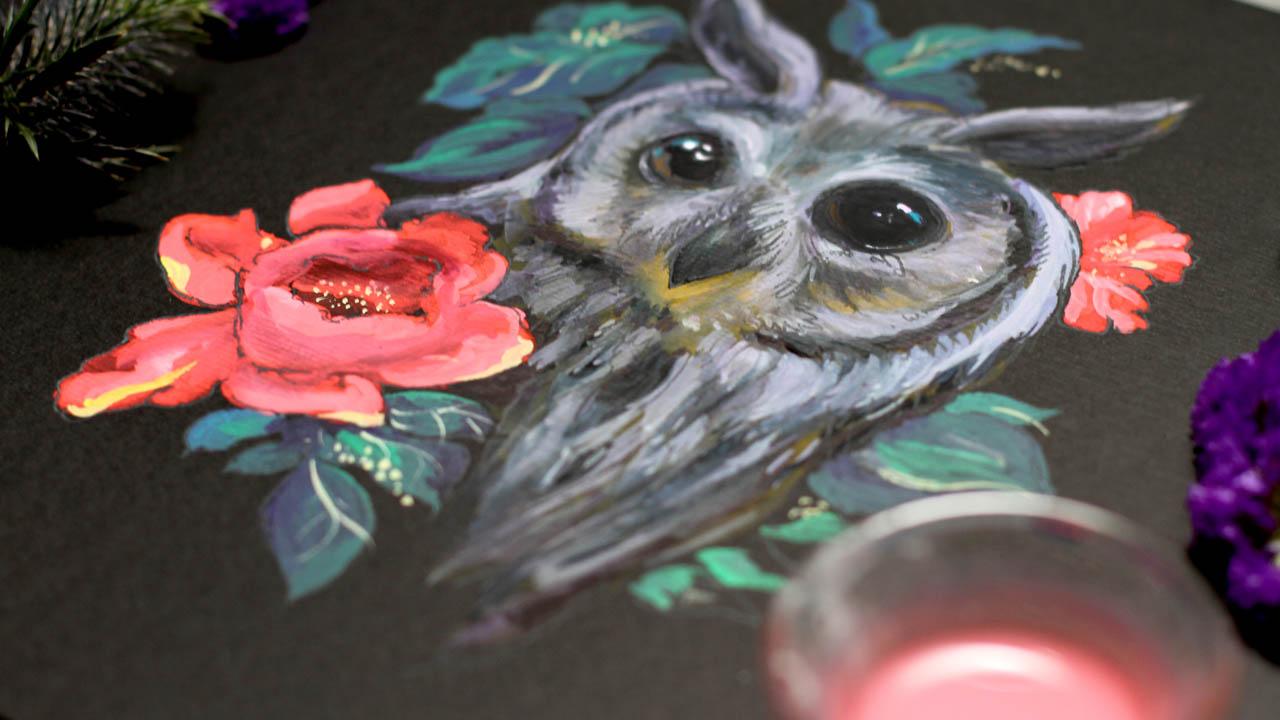
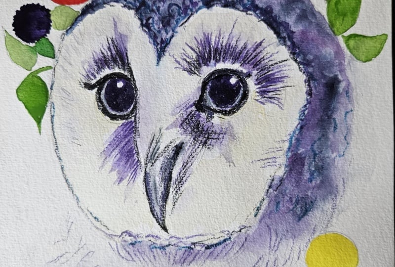
8. Day 4: Hero Owl Drawing: Welcome to Day four. During the next two days, we'll paint the magical all. I have all my materials ready. What a color sketch and, of course, the circle template. I will use a colored
pencil for the outline. I painted this all
in one setting, but of course, you can paint
according to your plan. So I always begin with yes. I use the sketch as a base and draw the outlines again
using the colored pencil. This is just the usual pencil. It's not water soluble. It's very important.
Otherwise, if you use Watercolor pencils, you will then lose the lines
if you use watercolors. Now my favorite part stencils. I already have some
circles on the skege and now I'm trying to match the
template with what I have. So here I have various sizes, and I try to match the exact size of the
sketch that I have. You can experiment and just use other tools or
draw free hand. It's your choice, absolutely. And I prefer changing
the size here and there, and I combine larger circles
with smaller versions. This way, we have the
variety of competition, dynamic, and overall interest. So I scatter the
circles around the ow. Like this. And then
some smaller ones. Then I continue to
draw the outline and the background using
the same violet pencil. I find this color to be universal for the color
palette that I love to use. So I just draw the outline
and it will stay visible. That's why I love
this technique, so I don't lose the entire
sketch when drawing. Later, I will add another color. I will add brown or sepia color using also colored pencil
and then a bit of black. So this way, I will intensify the first
layer of our magical. I work over the sketch and continue drawing the
outlines in the same way. Now I'm going to use went brown pencil to
add another layer of depth around the eyes and then to some other
parts of the head. So we're drawing the
marks around the eyes. That's super important. Keep in mind the direction of the lines. We use minimum shading to
get the maximum effect. So I always think about the direction of the
lines around the eyes, and I leave a lot of white
closer to the eye outline. Now the second one if you marks, create depth right away. Now over here just a little bit to define the
shape of the head. And then the second
layer on top. So when we use Watercolor, we'll already have
the first layer with intense and rich color. A few strokes over
here, over here. So we don't have to
draw everything, but the general
sketch is guiding us. Then I will use a black pencil to intensify
the color even more. Like so. Of course, closer to the eyes
is the most important part. It's a focal point of our
magical owl portrait. So I need to make
this part darker. The principle is the same. What I'm doing is just drawing over the lines
again and again. And our outline is almost ready. So it's time for the first
Watercolor gradient. I use two colors subtle
mix of violet and yellow. Let's prepare the colors
and make a subtle mix. I add a lot of water
for the first layer. So we will have some room left
if we want a brighter hue. The first gradient
right on top of our sketch and more violet on top of the feathers like so. I really love this
color combination. You can adjust it along the way, and the gradient is very
beautiful when it dries. All watercolors
dry a bit lighter. And if you use a bit of gouache, it will have this
mad feel to it. Now, I'm using the
mop brush that holds a lot of water
so I can freely work with my first layer to
create this expressive feel. I use a lot of yellow on the face and a lot of
violet on the feathers. They serve as a shadow also. Now I will continue with
shadows around the eyes. There's a lot of let and water. And then I will
soften the edges. The paint is still wet, so I will have a soft
transition right away. So my plan is to continue
in the same manner. Add color and then
soften the edges. And it's time to paint the ice. The most important part
of every animal artwork. I use amber and the small round synthetic
brush. To paint the eye. Usually, I use size
two or even size one for this kind of painting. So I work over the outline, and I use amber, but you can mix it with violet
a bit to get a deeper hue. I have some violet left
from our previous layer. So I tap the brush into the mix and have this
beautiful amber brown violet. Rich Huh. I leave the
highlights untouched. But even if I accidentally
colored them, you can always use
white gosh on top. Then I will add
more details near the feathers over here and here. Again, I'm working
over the lines that I already have with pencils. So I don't have to think a lot. I just want to emphasize some parts and add brighter
ascents at this stage. Now let's add more
depth around the eyes. Keep in mind, I
keep the white line right behind the outline
of the eye untouched. So I just add marks here and
there, soften the edges. It's always a good idea
to soften the edges. So I have this smooth gradient. Now, let's add some
shadows here and here. Also, we need shadows. Let's soften the parts. More brush works perfectly. And then you can use a hair dryer or just wait
till this layer dries. Then I'm going to use
a colored pencil again and sharpen the lines around the eyes instead black pencil. I think it works better
if it's super sharp. So I try to sharpen
them very often. Now, let's add a bit
of brown over here. This part is very intuitive.
You just add what you need. Now, the next layer, I will use two colors yellow
ochre and royal blue. It's just the names of
the brand I'm using. You can use any yellow ochre and any kind of blue, I think. So just mix and experiment. I'm adding brighter
sense with yellow. Here on the edge, you can see the
wonderful contrast of yellow and violet super. That was our goal. And it works great with the layers
that we already painted. So I soften the edges
like we did before, and I plan to build
the layers using this ochre color and use
blue for the feathers. I don't mix those two colors, and I use them separately. But you can always
experiment and mix the colors you're
using with Watercolor. You never know what happens. Now, let's add a bit
of blue as a shadow. Here and soften the
edge using a mop brush. So I will work in the
same way ing blue at the shadow around the
eyes here and there. And the next layer
will be white gouache. Another layer of
depth and interest. Subtle layer of blue on top
of our first Watercolor hue. Then I add violet blue.
You can mix them. Just paint how you feel. But careful around the eyes. Let's add a bit of depth. Like so. So basically, you can mix everything you
have in your color palette, and it will have a unified feel. Now, the white gouache. It's a magical paint for sure. And I'm going to add a
thick layer right on top. And, of course, dilute it with water and soften the edges. My gouache is super opaque, and it means when you work
straight from the bottle, it will cover the
layer entirely. We don't want that. So I
lift the paint carefully. I add the white and
soften the edges, working carefully around
the e. At this stage, we're building the shape a bit. Even with minimal composition, we still want to have
this focal point and the beautiful contrast
of the elements. So keep in mind the direction
of the brushstroke. I try to imagine small
tiny feathers on the face. So I kind of imitate
them with my brush stroke like so over here, feathers, mark making on top. I'm using synthetic
brush size six. And I soften the edges
everywhere around the face. And I continue in the same way. It's time to add white
highlights on the es, small details, but
very important ones. I use the most brush. Let's support the
shape of the eye. And then soften this line a bit. We don't want it
to be too sharp. Like so. Looks really great. We're now adding final touches, and we will continue
in the next video. We will paint the background
using bold colors. And now I'm adding a few
strokes here and there just to bring the artwork
together more white. Around the edges of the e
and highlight, of course. Now we're ready to move
to the next video.
9. Day 5: Bringing the Owl to Life: Welcome to Day five, and let's continue painting our
magical friend right away. The face is almost ready, and I'm going to
paint the background. I'll use two different
blue colors and a hint of violet to create
depth and dimension. And then I will add bright
vivid colors for our circles. So now I begin with foliage. I use blue very neutral color. You will have the list of the pigments I'm
using, but, of course, you can use any colors or any combinations
that you prefer. So I have this bright blue and a mix of this another
kind of blue. It's more like turkeys, blue. And then I will add a bit of
violet between these leaves. This way, we create the rich
variety of colors using just one few then. Let's add darker leaf over here. So I try to create
contrast using the darker color closer to the edge of the
white of the owl. Now, let's add some
blue over here. And over here, of course, you can use green for the
foliage or anything you want. I just love to experiment
with variety of blue, if you know my artworks. And I don't have to think a lot. I just change the blue and the depth appears
almost immediately. You can add another
layer on top. Now, I'm going to use
pink for the circles. This pink Watercolor feels almost like gouache
when working with it. So everything depends on
the brand you're using. If you add white Gouache to
any Watercolor that you have, you will get this
creamy texture. Now, I will add red. Let's be careful over here. It's very close to the edge. So careful, careful. I have this design
of circles on top, so I want to keep the edges clean and
combine different colors. I think I will use yellow. But for now, I'm painting
the circles that I have. So next, I'm going to
add yellow or orange. I will think I'm adding a
shadow with blue a little bit. Now, let's see what I have. Yellow over here. It feels a bit like wash, but you can still see
the lines of the sketch. So it's not 100% opaq. Now I have orange on top. I think it's a good idea. Orange and yellow is
always a good idea, very cheerful combination and a great contrast with the blue. Then I have this
smaller circles. I will add color. Then what I'm going
to do is I'm going to make these circles brighter, small bright elements,
the pink again. And red on top. And for the larger circles, I have a big plan. You will see it in a minute. Then let's color this one. Okay. I think we can mix the yellow with white
to make it even brighter. It's a white gouaches usually, and this will create even brighter yellow,
a bit different. And near the blue, it
shines even brighter, so super feels like some little sun
over here and here. And next, I'm going to
add super special effect. You will see it in a minute. Okay, I think we're
ready for the next step. If you want your
tails, like this. It's almost like
building a design. So you always want to add more tiny dots, some
triangle, anything. I want to keep this part
of the circle visible, so let's add a shadow with red. Like so. So we have this part of the circle on top
and a bit of blue. Now, here comes another magical part
fluorescent watercolors. I really love the quality
of this vivid red. It's made by really awesome
paint manufacturer. It's not so thick as acrylic, and you can create
subs yet vivid layers. Just take a look at this color. It shines so bright and still, it's a bit transparent, so you can create a few layers. It's not like working with
paint markers or paint pens. So I left the larger circles untouched for this master plan. Superbight, vivid red. If you color ascends will work nicely for
our composition. You can also mix this
color with white, and you will have this
fluorescent pastel pink or so. I carefully color the circles. And add some layers on
top of the other circles, like so, and I continue
in the same way. I will add darker details in the middle of the
circle and around the whole composition
just to have these little points of interest for the
contrast and everything. I used white for the edges of some circles and
experimented along the way. So now I want to
add even more on top another layer
of watercolors. We will increase the
effect over here. So the initial layer is dry. I just create more
intensity over here, and I think blue can
be a bit deeper. The first layers are also dry, so I'm adding darker
color on top. You can just combine
anything from your mix. It will look beautiful
and unified. It's not like a digital
painting where you can pick any color We have
color palette ready, and you can use everything from it that we're already using
and add the tails with white. It's always a good idea. And you can use white pencil for this purpose to increase
the highlights, to add white strokes
around the eyes. I'm using the brush. It's
easier for me somehow, but white pencil works great if the first layer
is dry, of course. And the second layer and
all the layers. Of course. Now, let's increase
the highlights and add another layer of tiny
feathers around the eyes, so they will shine
and sparkle a bit. L so small brush
strokes very subtle. Now a bit here and here. Adding final dashes
can last for hours. I'm sure you know the
filling is really difficult to decide when
the artwork is finished. So I'm just adding
a bit of white, some feathers, and
it's almost done. Our magical all becomes
alive in our sketchbook, and I'm so curious to
see what you create. You'll have unique
artwork for sure. And I will meet you in the next video.
I'll see you there.
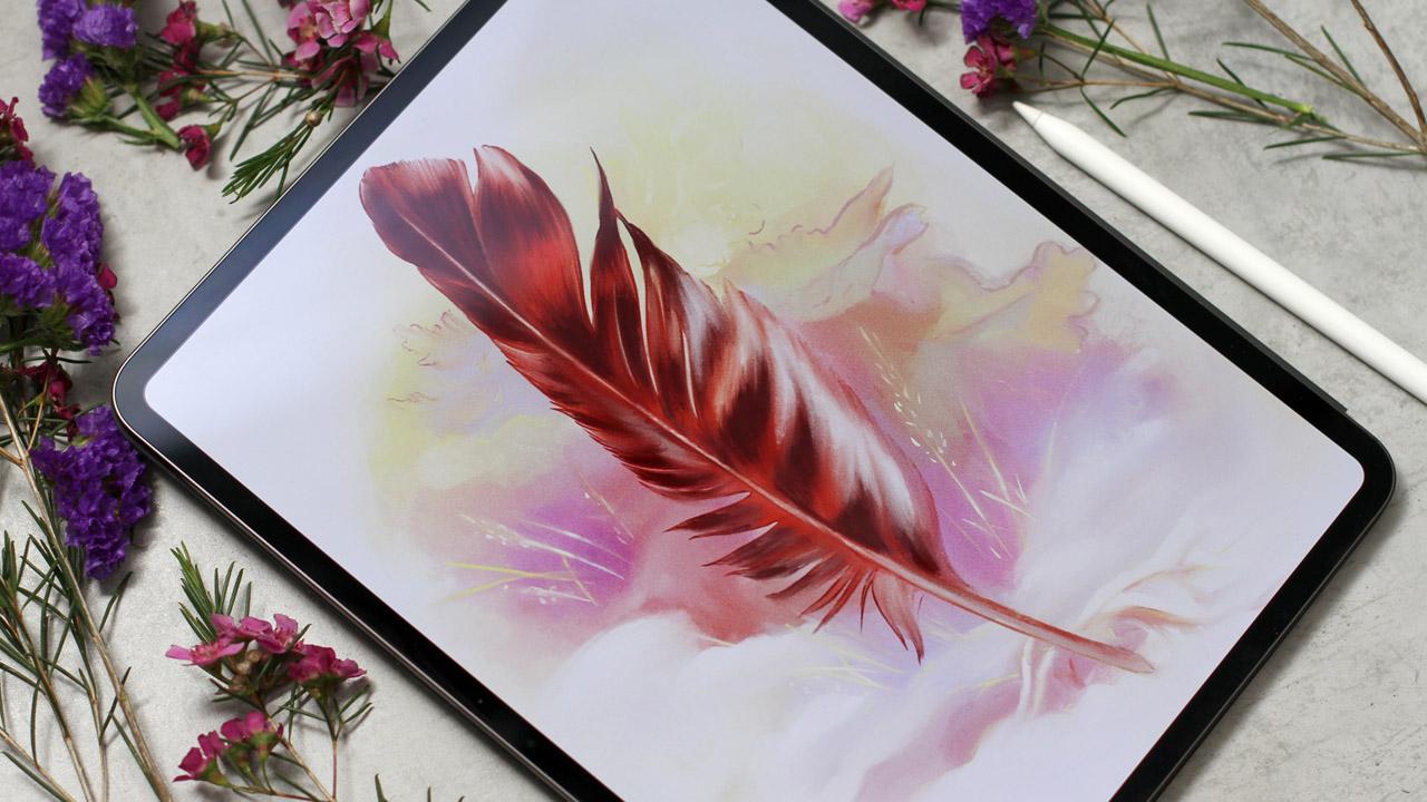
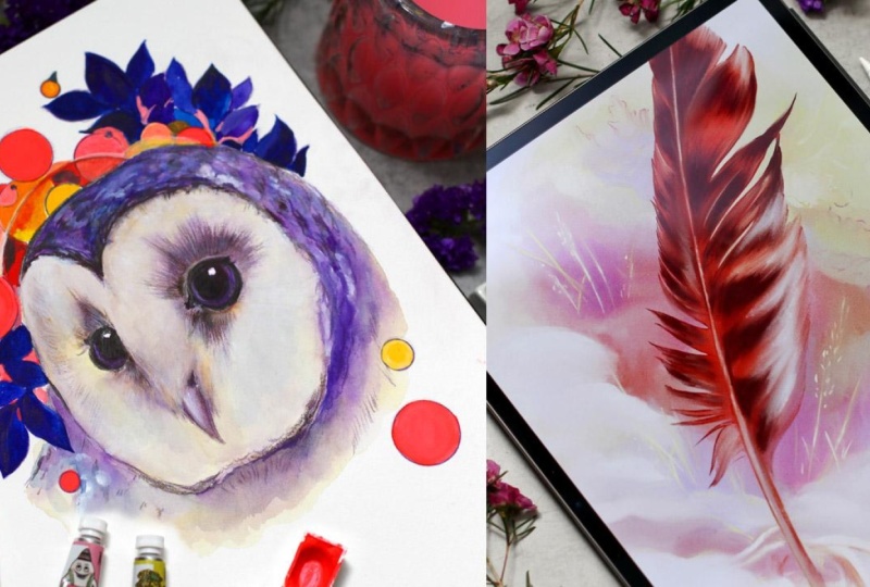
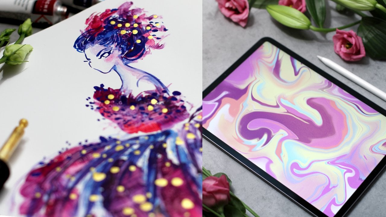
10. Digital Weekend: Welcome to the digital
part of the class. As we discussed, you
can replace it with traditional media or any
software if you like. If you work in Procreate and want to learn more
about its settings, I have other classes for you. Check out Magical
Book Illustration or Katz and Flowers sketchbook. I share some of my favorite
technical tips there. Now, we're going to paint
a wonderful owl feather. I'll show you my
technique of combining just a few layers to get a rich, painterly feel.
Let's get started.
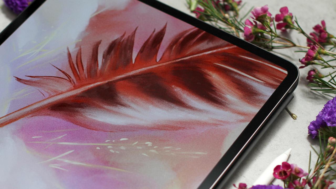
11. Day 6: Owl Feather in Procreate: Here we go. I have my
digital sketch ready. It's inspired by Dürer feathers, and you'll find the file
in class resources. So here is my Canvas info. It's my canvas size, and I usually use the
Resolution 300 DPI, so I can print the
artwork afterwards. Here I have two separate layers with feather and
with a background. This is how I usually work. You will see it in the process. Then I have my color
palette ready. I will show you it in a minute. So the layers, you'll
find in glass resources. Here's my color palette
with beautiful colors. Everything is ready,
then brushes. I have my personal set of
brushes I love to use. But for this old challenge, I've created a two brushes
you'll also find in class resources. You
can download them. Of course, you can
use any brushes. It doesn't matter. You can use
my sketch or ink your own. Let me show you how to do it. Let's pick some brush. For example, this one. I prefer to ink from
the pen brushes. Then let's change the
opacity of the layer. You can do it like this
or you can tap the layer, like so, and then slide the bar on top and
the opacity will change. I prefer to use the
old school method, but I just wanted to show
you how it can be done. We have the opacity, and I created a new layer, and I will ink this
feather on top. Like so. So you can work over my sketch or over your own
sketch or over a photo. This way, you will have your own unique outline you
can work with. I usually work with this
sunderling pan Brush. It's very comfortable and
works for almost any style. Okay, so now you have the idea, and let's begin to
create our illustration. So what I'm going to do is I'm going to
create a new layer. It should be
underneath our sketch. And then I will pick
the brush from my set. Any brush will work. Just pick any brush,
pick a color. Let's say this one. And I'm going to color the feather the whole
surface of the feather. This brush feels like
Watercolor a bit, and it has a subtle line, which is super nice for feather. So I'm going to color the
whole surface of the feather, and it will be the base for
the rest of our process. I color the whole surface, and I don't have to think a lot about being super precise. You know, that's the bonus
of digital painting. You don't have to
worry about spoiling the paper and everything. So I just paint and color and don't think
about the process much. Now, I will add the
darker hue on top. I will add darker
parts of the feather, and I will use feather
brush for that. I think it will work better. Let's check the texture. Right. I think it works best. So the texture is better. Now I'm going to add darker
colors here and there. And at this point,
I think I will erase the color
that I don't need anymore using sunderling
brush, super precise. So I'm going to erase the
parts that I don't need and add a darker tone on top, like I did before, and I will continue in
the same manner. And now I add lighter
color closer to the edges. My layer is alpha locked, so I can paint
only in this area. I add white closer to the
edges of the feather. Later, we will work on the outline and we will have
this smooth transition. Let's add a bit of
saturation over here. So it will be a bit brighter. I think it will work better. Now, what we're going to do next is work on the background. Let's create a new layer. It should be
underneath our sketch, and I will pick the
color for the brush. And the brush, which
works for background, I think the best one
is philosopher falls. So like in traditional artwork, I will just throw color
randomly on the background. Oops. Of course, the lay should
be underneath everything. We don't want to paint
over the feather. This is very neutral base color. That looks beautiful
on the background, and you can add
any other colors. I will add violet a bit
later as a contrast to it. But for now, I just define
the frame around the pet. Darker elements. I'm building the color
composition as I go. Let's add subtle violet. It looks almost
like combination of the old portrait we just
painted with watercolors. The idea is to bring
the artwork together, both background and the feather, but in a very subtle manner. So we can keep the depth and painter the feel of the
traditional artwork. Now let's add contrast. God. Even more, we have soft
edges around the colors, and I think we can add a bit of details using another
type of texture. Let's define the leaves
behind the feather a bit with a color,
with the shadow. And over here over here, it should be lighter a bit. Yellow works great in
contrast with violet, and still, the feather is the brightest part
of our artwork. This one is almost blue. Beautiful contrast with violet. Now let's add something
more using feather. Let's add snow hint
of snow over here. This light color works great. We don't have to use
a lot of details, but then the shape will
work for us and create the frame for the main
hero of the painting. So I'm painting
behind the feather. So dry branch lies
on the ground. Mm hmm. Lighter color, her parts here and here. In the second part of this demo, we will smudge everything. I did this artwork in one
sitting, but, of course, you can work according
to your plan, according to your master plan, and every artist
is so different. Someone works super fast, and another artist can spend hours just
planning everything and picking colors is absolutely unique
process for everyone. Now, let's add cold around
the frame of our background. So we'll have this
beautiful transition, and the focal point
will work better if we will make the
background more subtle. Like so. I will continue to add tiny brush strokes here
and there in the same way. It's almost done, and
now we can move to the next part where
we will bring the artwork together.
Let's move on.
12. Day 7: Owl Feather Final Touches: Welcome back. Let's
continue with our painting. We will color the outline. Let's turn on alpha ok. So we will work only inside
the area of the outline. Now, I'm going to use the
brush that we did before, like feather or any other brush, I will pick the color that
is close to the color of the feather and
color the outline. We already have the shape
of the feather painted. So this step is just another step to bring
everything together. So I'm painting over the
whole feather artwork. And then I will
smash everything. The same works for
the background. I turned on the Alvelo, and I will use the lighter color to color the outlines
of the background. We also worked a lot. To create a beautiful
composition for the background. Now I'm just using
different colors. The outline won't look so sharp and we will have
the painterly feel. I'm changing the
colors, the brushes, designing what feels right at the moment. There are no rules. You can work with anything. So the lighter outline
where there are snow areas and the yellow on top of violet
looks super bright. Like so. The contrast
works right away. I change some parts, and then I feel that I need
to change other parts. Okay, I think it's ready, and now I'm going to
work on the feather. I will add to our feather layer
some highlights using the old feather brush. The lighter color
will work best. I think this one Mm hmm. And then I will smudg everything like in
traditional painting. Lighter color on top. Now, the middle of the feather, I'm not very precise
either at this moment. So I will smudge everything and it will
look smooth and beautiful. And I know my plan. So now I'm just adding some brighter color
that I want to see at the final stage a bit of
white closer to the edge. And here and here. So we'll build the
subtle texture of the feather right away. Now I will merge
the layers like so, you see that we have one
layer for the feather now. Alpha o is on. It means that what we do stays
inside the feather, and I'm using the standard
brush for the smudge tool. You can use anything. I just
find this one very useful, and I'm smudging Everything
inside the feather like so. This is my favorite part. It's super satisfying. I change the opacity and
the size of the brush, so it feels perfect for
what I'm going to do. The feather becomes smooth and soft like it should be. Super. So I will work over the whole surface of the artwork,
smudging everything. And if you need to raise
something at this stage, it's a perfect moment
because you're building everything
almost to the final look. So I keep in mind the shape
of the feather, the texture. I'm thinking about birds, even very subtle edges. Especially closer to
the top of the feather. Everything should be very soft. And now, what I'm going to do, I'm going to change
the situation again. I want to make the
feather brighter, and I will use curves.
Here's what I do. I change the curve a bit, so the feather becomes
even more bright. Now, what I want to do is add a bit of
highlights, I think, with initial color on top, tiny adjustments that appear
always during the process. The darker darks
over here and here, then I think I will
smash them, of course. Darker darks closer to the
edges near the outlines. I'm increasing the shadows and the texture of the feather. So when you use a lot of layers, even on one layer, I mean a lot of layers of paint. You will have the depth of traditional art in
your digital painting. White. I think I need very, very subtle, very
thin line like this. I'm changing the brushes, I'm changing the colors, I'm building the shape of the feather according
to my vision. Super. And then I'll smudge everything
like we did before. And the same way will
work for the background. For the background, I use the same principle as
we did for the feather, and now I want to add more
details for the grass, just a little bit of highlights
will work beautifully. I use small brush and add
details using the lighter color white or light yellow will work beautifully on
the violet background. Some marks to define the soft grass on the
background, yellow over here. And I keep in mind the
direction of this lines, not to be close to the feather, but still to support
the composition. And we have lighter color
on the darker background, and you can smudge it a bit, so it won't be too bright. We have feather
as the main hero, and we don't want
the background to be too bright or too detailed. Now, let's add some final
touches on the background. Now that we have almost
everything ready, we can add Color and bring
the artwork together. We need to unify the
background and the feather. Let's add more highlights in the middle and
closer to the edges. How many times we
already did it. Okay, let's do it again. Super. And on top and here now as much everything
as I did before. Now it looks even better. When you use a lot of layers, it always looks better. Now, the background,
the snow part, I think we should add
even more white or here, like small elements of white, and of course, I
will smudge it then. Grass, much everything,
much everything. I wish it would be so easy for traditional art
much everything. Now let's add tiny shadows. These are just
small parts that we add according to the
feel of the artwork, it's almost ready, and I will
add another effect on top. Let's add a new layer,
adjustments add noise. And here you can slide. To choose the intensity
of the noise. This effect will unify
the artwork even more, and then we go to mode
and choose overlay. You can experiment and
try different modes, but I prefer overlay. Now I have a crispy texture
on top of the whole artwork, and this effect works great. Now I want to make
everything a bit brighter. I use curves as we did
before, like this. Even brighter. Not too much. Okay, I think this will work. So we have beautiful
contrast and subtle colors, but everything is super bright. Okay, I think it will work. And I'm really happy
with the result. I think I will still need
to add final touches, maybe the highlights on the
feather somewhere here, and, of course,
smudge it afterwards. Like so. We're keeping the
direction of the lines. Super. I think I need to
make it a bit brighter. Let's try. Let's go to curves and make it even
brighter. All bit. The whole artwork shines super. I think we're almost done. I just want to add a few more brush strokes
on the background. It's almost
impossible to resist. There are always things
you want to add. We have a beautiful artwork, and I'm really happy
with the result. So I want to save it. I will go to Actions, Share, choose the format,
and save the image. Super. Wonderful. We've completed the challenge, and I'll see you
in the next video.
13. Your Assignment: Wonderful. I'm happy to
see you're still here. Maybe you've been carefully
watching the class and planning your
artworks ahead. Or maybe you're already sitting in the company of
our birds of the night. Your assignment
for this class is to create at least
one old artwork, applying any technique
that we practice. And, of course, upload it
to the project gallery. Feel free to share
it on social media, and don't forget to tag me
so I can actually find it. Sharing your art online is super challenging but also
very rewarding, especially when you know you're supporting our
creative community. You can follow along
with my examples or experiment and
create something new. Maybe just a few sketches. Feel free to use the materials I've uploaded in
class resources. They will help you
save some time. I'm also sharing a PDF with some helpful tips that I use
myself almost every time. You'll also find it
in class resources. Now, let's move on to
the final thoughts.
14. Final Thoughts: Congratulations on
completing the class. Even if you just watch
it and plan to come back later with incredible ideas
and new art supplies, maybe it's even time to use that precious new sketchbook or use the usual paper that
doesn't seem precious at all. We've learned a lot about
experimenting and using mixed media to achieve
unexpected results. Train new mediums brings you
more freedom of expression, and with it, you'll
be able to take your art to the next
level. So maybe next time when you'll be
working on your new project, you'll suddenly
add inky marks or Sgraffito technique or your own unique
combination of both. If you enjoyed the class,
please leave a review. Just a few words mean a lot. You're very welcome to check my other classes
on Skillshare too, and I'll be waiting for your artworks in the
project gallery. Please do share your art. Press the follow button above
to get notified about news, giveaways and new classes. If you'd like to go deeper
into mixed media texture, S graffita and more experimental approaches like working
on black paper, I've created a studio edition of this class with additional
demos and experiments. You can find it on my website. The greatest value
of your illustration is your unique
individual expression. It makes your work original, and that's the most
precious thing about art. Thanks for creating with me. I can hear all s calling,
so see you next time.
 Anna Sokolova, Berlin-based Artist