Transcripts
1. Intro: Hi. My name is Anna Sokolova and I'm a Berlin based artist and illustrator with more than 10 years of experience in the industry. I'm also teaching classes here on Skillshare, and I'm so thankful for your fantastic support. A while ago, I visited a German city of Nuremberg. It's the hometown of Albrecht Düre, a painter, world famous for his woodblock prints. When I saw his Ottilia and amazing artworks I became passionate about printing techniques and book illustration. Printed techniques like linocut, which is our topic for today and take a look at this museum building behind me. It's created specially for the art group called The Bridge artists who invented the linocut as we know it today. Linocut is amazing medium to work in. It's easy to create an inexpensive to print at home or in your studio. It's often used by children's book illustrator, fine artists, and designers. In this class, we'll get inspired by classics and create children's book illustration. We'll illustrate Hans Christian Andersen's tale, The Ugly Duckling, which I find really inspiring. I'll show you tips and tricks on how to create an expressive composition for special tussle, and then we'll continue with internal illustration. I'll guide you through the whole process of image transferring and experimenting with different papers and materials. I'm really happy to see you join me in this class. That's why there is a giveaway too, just follow me here on Skillshare by pressing the button above and on Instagram. Post your project in the project gallery before August 25th for a chance to win a secret box of art supplies I love and use myself. Well, I can't wait to begin. Let's start creating.
2. Materials: Welcome to the studio. We'll use basic linocut materials for this class. I've also listed all these materials in the helpful PDF you can find in the class project section. So, this time I'll use very inexpensive chisel with a couple of blades. This was about $2. You can buy the whole set. Rubber ink roller and the piece of glass to prepare the paint. You may remember this piece of glass from my class on Monotype. I took it from the $1 for the frame. Printing inks. Well, I am a paint maniac. So, these are a bit pricey, but I really love the quality. You might also use oil paints, but they dry so long. You may use acrylic paints. They dry so fast, but they create a special texture you may not like. A tablespoon or something that looks like this to wrap the back of the paper of the lino. Now, the lino. These are some options you can use. A classical linoleum. It's pretty hard. It's solid, but it's really classy and I like to work with this material. There are other options like soft card and easy card. Today, we'll work with this material. It's easier to cut and I use it for small details. So, of course, we'll need paper. I've prepared everything that I had in my studio. So, this is craft paper, sketch paper, and Bristol paper. You may use anything. I also like to experiment with you. That's why I prepared some colored stationery paper. Oh, and you may find helpful a permanent marker. So, now when we're all set, join me in the next video to get some inspiration.
3. Inspiration: Inspiration. That's my favorite part. I wanted to share with you a couple of books from my library, which I used to get inspired for this class. The first one is Albrecht Dürer. Well, it's really hard for me to pronounce these two r's, because I've got a mix of German and Russian in my head. Well, let's start. The first one is the famous portrait of the painter. On the next page, even more famous painting of the hare or the rabbit. I don't know if you know who he is, just tell me. So, let's move forward and this painting is wonderful. It's watercolor on peregrine paper and the transitions of the colors are so tender and it's simply beautiful. The next one is, I wanted to show you, it's my favorite spread. It's a graphic spread and this work is called melancholia. I can watch it for hours. It's full of symbolism. You can explore this tiny details. Very beautiful. The last one I wanted to show you is, where it is? Here. The praying hands. I'm sure you've seen a thousand times but just take a look at this lines. Fine lines deployed on the toned background. Beautiful. So, the second book is a beautifully published fairy tale books by Taschen. It's the inspiration for our today's work. This book is a collection of fairy tales illustrated by different artists in mixed media techniques. So, wind touch paper, cuttings, everything. Let's check some beautiful illustration. Mixed media, very unusual authentic artworks. The graphic, by the way, if you're interested in inks and silhouette illustrations, just check my class on inks. So, let's move forward. Very, very unusual illustrations. The contemporary artists have been touched, everything. I think it's a paper cut. So silhouettes, really, really unusual ones. Now, let's see the ugly duckling, our topic for today. Actually these illustrations inspired me. Of course, we'll create something completely different, but it's always great to have that anchor. It's a mixed media. Well, I think you got the idea. Beautiful book as an object. The third book I wanted to share with you is the Japanese Woodblocks prints. These prints influenced western art so much, especially artists like Van Gogh. Let's take a look at some illustrations. These characters and compositions are so beautiful. So I wanted to show you some sceneries, the focus on small details. I love everything about Woodblocks. So, it's the animal section. Let see. Yeah, the botanicals, the ducks, special ducks, Japanese ducks probably, fruits. These tiny little birds, you can see in botanical gardens everywhere. The lines, everything, is very, very inspiring. This one, I love the composition how it leads the eye of the viewer, and yeah, I wanted to show you this hawk and very, very unusual combination of printing techniques. So, now I think we're ready and let's move to the next video and finally start creating.
4. A Letter — Composition and Transferring: Welcome back. Before you prepare the sketch, you should remember how lino cut got works. Essentially, you cut away the parts of linoleum where you want to leave the white of the page and keep the parts you want to be inked like here. So Iinoleum is an int with a ruler to create the print. The image is mirrored, remember about that. So, keeping that in mind, I was choosing between these three variations. This is leather composition for a special title of our ugly duckling. The chapter begins with a T so I decided to use this letter. The first composition is symmetrical. So, we can draw imaginal line right here and it's splits the illustration into two similar parts. Another composition is O based. It's based on the shape of the letter O obviously and has this small little focal point right here. It's a swan. But I've chosen this one. It's eye pathway composition. It uses the natural way of the viewer's eye and leads it to the top of the illustration. I find this form the most effective. So, I've chosen my illustration and that's where I'm going to do next. We don't need this anymore. The image should be mirrored. So, I use the computer to create the mirrored illustration. I'm putting this away and I've got my plate prepared right here. The size is similar and I've created of course two copies. So, to match the size of my plate. I know many artists who draw freehand right on the plate, but I'm showing you my process. I'm not such a person because I want to keep control at least on something during the creative process. So, what I'm going to do is I'm going to use a pencil or a pencil is this form to cover the back of the illustration and then transfer that image on the surface. So, I'm covering. I shake everything is shaking. I want to show you the process in details. So, even if you're experienced printer, you can always find some interesting tips and tricks like I love to watch educational videos. Well, I watch them a lot honestly. So I'm covering. If you want to use the pencil for this purpose, make sure it's bold enough. So I think it's enough. Then, I'll need some tape. I'll keep this here as a reference. So, I'm going to stick to my plate and start transferring. But I want to make sure that everything is okay and I don't want to stick very hard. So I could check if everything is working. Let's start with the bubble. Yeah. We say the bubble. It works. So, I can begin transferring. It may take some time. Now our pencil sketch is done and here is our permanent marker. It comes into play to make it easier for us to cut later. So, my plan is to ink with a lino the parts which I want to be actually inked. So, I don't need it anymore and I will just work on my illustration and I'm looking at a printed copy so it's easier for me when I have a reference on the original artwork. We're almost done. Remember, the black parts we want to be inked. So, the more black areas we've got, the less we have to cut and that's my secret plan. So, our goal is to create effective graphic composition. It's always about simplification of the shapes. Well, the letter will be also black. So, I will just create several strokes here and there to show it. Free painting, I'll love it. So, just to show that I don't need to cut it. Yeah. I think we're done and we can move to the scary part, cutting. Let's move forward.
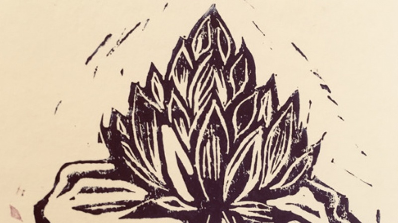
5. Cutting: Welcome back. Now, the most interesting and scary part. We will cut our liner. In this case, soft cut or easy cut. So, here's my chisel, I got a couple of more blades and the cutting knife just in case. So, I'm starting to cut away the areas which are not painted with black. Once you get comfortable with a blade, you'll find the process really relaxing. I really can understand the artists who choose printmaking as their main medium. We're getting rid of the first layer, so and then to change the blades for the bigger ones for the bigger areas. It's easier to do. You may have additional handle, additional tool to do that. By the way, recently I've had a really awesome band called tool, and so you see the surface is bigger, so it's easier to cut wider areas. Now, I'm going to work through the whole illustration and create a printing form. The most important thing, is you should cut away from your body. I know it's tempting to sometimes to do like this, but it's too dangerous. So, my plan is to work toward the lines and get rid of the whole white areas. Well. It'll be very boring to watch the whole process, so I think I'll make the video go a bit faster. Oh, by the way I wanted to share with you a little secret that I didn't want to show you at first, but when I prepared the class, as first I started working with the liner, and actually it was so hard to cut, and I decided to continue with easy cut. So, just to show you the difference, the liner, I forgot to mirror the image by the way, too soon and with my mistakes and you can see the difference right here. So, it's really hard to cut, but the crafty feel you get working with liner is awesome. So, we don't need it. Let's continue working on our chosen medium. Now, we're almost done. I want to add some small details with the finest blade of gold, and we can move forward to the fun part, experimental painting. So, the birds need special attention I think. I think we're done. It doesn't have to be the exact copy of your sketch, but I feel that this will be the beautiful special title illustration. Let's move forward and paint our beautiful liner cut.
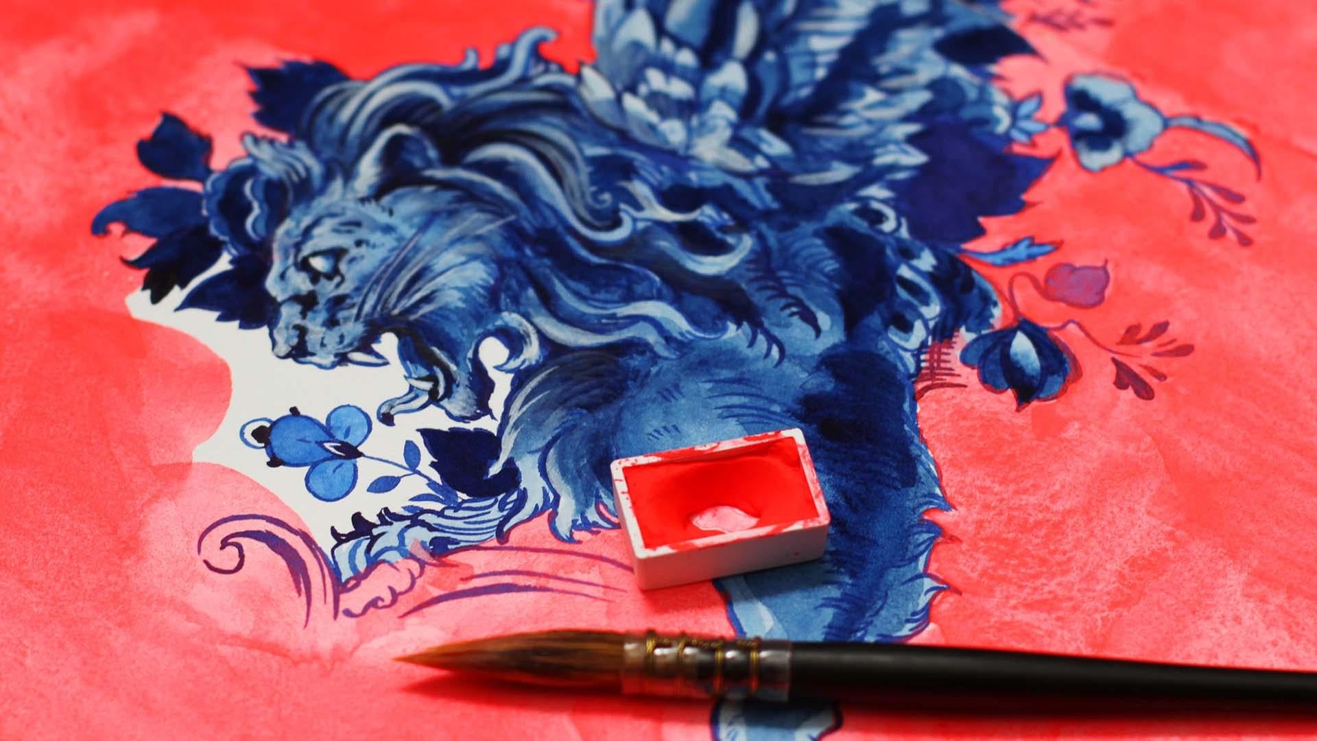
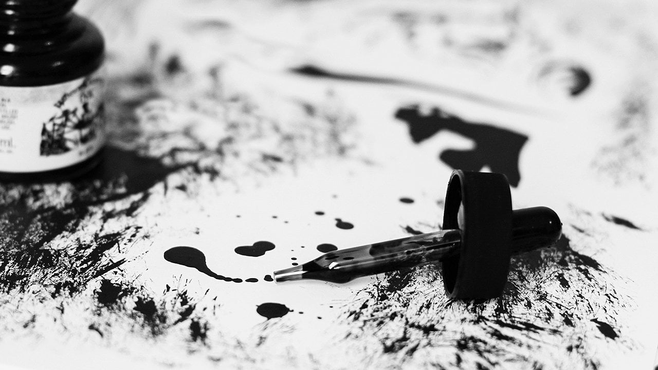
6. Printing: Welcome back. Happy to see you again. So, our plate is prepared and we are ready to create our exciting first print. I start with the paint. We need to spread it. Do you like the color? Yeah, we need to spread it on the glass. Using these movements, like this and like this. So, we're spreading the paint, so we'll have a fine thin texture and we will start applying it right here. You can add some pressure. You notice that I'm using a wallpaper here, not wallpaper, newspaper so we won't get messy. As you can see the black parts are covered and I think we need more paint, and the whites are the same. If we were printing on the printing press, we could use less paint but as we're using our hands, we need to be prepared. Okay, I think it's enough. You can even hit a little bit. It's one of the techniques. So, our magenta special title is almost ready, and I put it right here and the paper is here. It got darker and I have this tool and I'm pressing the piece of paper. You can use your hands or you can use a tablespoon to add some pressure. It doesn't matter whether you put the piece of paper on the top or the linoleum. It's just the personal preferences. We're almost done. Almost. I'm usually so nervous before I see the first print, because they can be some pieces of linoleum left and it's imperfect, but it's perfectly imperfect. Let's see our result of craftsmanship. Now, carefully holding this, great, awesome I knew it. So, this is our first print. Let's sign it like a real artists do. There are some rules you can use. It's going to be a lot of numbers. That's why it's an author's print and we are writing the author's prints sign here. If it were circular or some several exemplars, you can just use the number. For example, it would be the first of 10. So, the second one is the title. Let's just say it's T. The next one is the signature. So, it's my signature and the last one is the month and the year, month is not necessary but I would write it anyway. So now, you can frame it and it's officially a piece of artwork. I think, we are ready to experiment a little bit. We are brave enough and what I would do is add another color. Let's print. Let's add some more ink here, at the top, our bird needs inking, and the lower part of the letter. I want to mix with the darker blue. So, I m preparing the color here and I've got this additional color. This is my favorite part, I could just do it without any purpose. I'm going to mix it carefully. I'm controlling the pressure so, it's textured in a funny way. I can mix it here a little bit, and why not try some contrast stationery paper. I have no idea if it's going to be good, but we'll see it together. I think we're ready. So, the paper is pretty tender and I'm using only my hands this time, maybe just a little bit of pressure. You can scan this illustration afterwards. Actually, that's the plan if your work in children's book illustrations. You prepare everything by hand, or in mixed media techniques and then it with a high resolution. Okay, I'm a bit afraid. Let's hope. Let's hope. Hold in the angle. Super. Do you know that the contrast of the yellow of the paper, and it creates this special three color composition? That's just beautiful and it's so different from our first print. It's like completely two different artworks but it's created with the same plate. I even got the shaking hands because I'm very excited about the results. I hope you are too. I want to try one more print with the craft paper this time, and after that we can move forward to the inside illustration. Yeah, I want to use German words, Russian words, but the most important you see the process. Doesn't matter what I'm talking about, right? Right. So, I like this double color effect so much and I'm going to use it once again. A blue color, I think you'll notice the quality of the paint. It's really pleasant to work with. Maybe a bit more, some little pressure here. I like violet. So, I gathering the paint to get some texture. I'm almost hitting the plate, especially when you have tinny tiny elements, it's helpful. I'm going to try this craft paper and check the results with you. This paper is tough so, I'm going to use a spoon. Well, I think it's enough. Well, I hope it's enough. Anyway, we'll get a grandeur feeling I'm sure. Carefully, super, grandeur feel, with some texture elements. So, I'm really happy with the results and join me in the next video where we'll start work on the inside illustration of the ugly duckling.
7. A Swan — Planning and Transferring: Awesome. You've made it this far. So, here is my sketch for internal illustration. I got inspired by classic artworks. I showed you this book in the inspiration part, and my Japanese woodblock prints. Usually, internal illustrations in the children's books stories show some parts of the story or the impression of the main character, and this is the part where our ugly duckling is actually a fabulous one. Well, he has always been so, but he just had a bad company, actually a wrong company. So, my composition is pretty simple. Liner cut simplifies your natural style and creates very strong graphic composition. It leads the viewer's eye right here. Well, honestly, my plan is to create this moon with another color, I took the moon here and maybe add some fallen leaves. But, we'll be back to that in the next video. Right now, I'll work with this whole composition, and, of course, I've created the mirrored image. After creating a mirrored image, I created a sketch on the plate. So, my next step, is to use a permanent marker and to ink this plate, so it'll be easier to cut away the parts I don't need and this is my plan. Afterwards, I'll cut away the parts that I want to be left white. So, we're continuing to cutting away the parts we don't need. So, now we're almost down. Join me in the next video, where we'll experiment with printing and some other exciting stuff.
8. Printing: Now, it's time to print. Let's begin. I'll use the same colors as the first time, so we'll keep the style the same. I'm spreading the paint, spreading the paint. I think I need a little bit of more and maybe we should work with two colors. Now, when very familiar with the technique, we can work faster. Oh, it's scary but looks nice. I already see how it will look on the paper. Looks nice. I'm covering the whole illustrations. A bit of pressure. Strange sound. I mix. This little roller is really cute. So, this is the bottom part of the illustration. I've got some nice plans for this moon but this will be in the next video. Right now, we're creating the first print. I think we are ready. Let's do the first part. Paper. Now, a bit of pressure. I want to create a couple of prints so we can experiment a little bit in the next video. I think it's enough. Here's our swan. Wow! It looks beautiful. We'll let it dry out here and add some more paint. I think I will cross this border, I don't want that contrast to be so obvious. Some textures. Let's do the yellow paper. I really love how we have this tiny pieces of feathers and the small details. Of course, you can work for hours with your plate and create so beautiful, detailed, and fine illustration. Now. Very beautiful. Okay, some pieces right here but this is really beautiful. The contrast, it plays a great part. So, let's continue. I think we can take away and put away the print, and change. We should work really carefully. That's why I left some pieces here and there so we can hold it and not spoil everything. So, let's go again. How about printing just where the texture, it's strange, on the merge in the paper. Well, we'll see. We're putting the paper here, some pressure, and let's take a look. Oh, that's a beautiful effect, do you see? It's very unusual and there is a small texture over here like in monotype technique. The lines, they are so fine. I really love this effect. You never know which print will look better. So, my plan for now is to print one more white illustration because I want to try some experiments in the next video, and I need additional print just in case. Because you never know with this art stuff, what will happen. So, my plan is to have some spare print to work with. So, it's violet I think. Yeah. So, violet, okay, who cares. So, put the white paper. I'm not sure about the background so I'm going to try and quickly change it. I should have left more space for this action. I'll do it right here. Well, it's my table, who cares. Let's add some pressure. Some pressure here. I think it's enough. Maybe a bit in the middle. Let's check the result. Great. The violet one. We'll work with it in the next video. So, we've got some paint left and I suggest that we just create a print to use this paint. I think it's enough. Well, I've got a really strange color over here. Well, let's see. Oh, it looks like a Rose Oak Grove. Also nice. Okay, I think we've got enough prints to experiment. Join me in the next video, and we'll continue with the golden flowing leaves, and the yellow moon.
9. Adding Golden Elements: Welcome to experimenting part. My plan is to have the moon here color with yellow, and add the fallen leaves with a golden elements. So, to do so, I've cut out the shape of the moon, which I think will pass perfectly here. And I sketched some fallen leaves right here. As you can see, this shape is similar to this one. So after that, I've got them all out of the Lyonel, so, to spare some time, I'm sure you've seen enough of the cutting process. Now let's try to do the print. So, my plan is to print like this. I think you've guessed. So I've got some gold. I'm happy to use it. You can't use gold every day. So, I'm happy to have this chance. It's so gold and so precious. We're spreading the paint. I got the golden roller. Let's cover some, hope you see it. Looks really good, maybe like here. Be very careful, I left the parts I want to leave untouched. So, let's try and add some pressure. I'm even afraid to use anything to add the pressure except for the fingers. Well, gold can't spoil the illustration, so, anyway I think we'll have a final result. I really can't wait to see your art works, I'm sure you can do better than me combining different styles and unexpected shapes for a line cut. Wow, golden golden leaves. It really worked. Okay, and now let's at the moon. I've got a bright yellow. Maybe I should do the yellow leaves, but I like the gold actually. So, let's prepare the paint, and add them onto a small. I think it's good enough. I left the special piece to handle it correctly, and done. So, a bit pressure maybe like this. I'm imitating a printing press. Okay. Super. I love this accent. So now this illustration is finished. I will sign it right away. So it's Arthur's print also, and we'll call it the swan, no fantasy here, the signature, and the month, and the date, and we're done. That's beautiful. Okay. Let's try and experiment on this one. I think we can add the yellow piece, right here. Okay. Some pressure. I'm not sure maybe we should to the leaves in yellow. We can try that. Let's see how yellow behaves here. Well that's interesting. Let's do the leaves in yellow. We need some more paint. I love the texture, but if you don't like it to be textured, you can spread the paint evenly, and you'll get even coloring as a result. Now, let's focus on the bottom and add some pressure here and there. I want to show you one more thing but on another print. That's enough. Surprise or not? Wow, that's a bit psychedelic, but I like it anyway. I will sign it also. Well, maybe I can get some copies of it, so, I will put the first one out of 10. This one, the Swan lake. Okay. The sign and the month and the date. Well, that's beautiful. Another thing I wanted to show you. So we've got a print left, and I think we will add some maybe gold. Maybe golden sun, just change the game. This colors are water based, which means you can actually use them if you printed them on watercolor paper and so on. So you can really experiment a lot with this materials. You can combine them. Okay, this may spoil, I'll print a little bit, but it's worth showing you. These are water-based colors. So, do you see what I mean? You can work in the really unexpected ways. So you can create unique prints for your artsy stores or whatever. You can as shadows to the swan. Even when the paint is dry, you can create unique illustrations. So you can create several prints. But each one will be unique. I think it's great for the platforms, for creators. It increases the price and the piece is more unique. So you can't obviously, you can't repeat even the same print, they can look pretty similar, but when the handwork is seen, it's really hard to repeat it. So this is what I wanted to show you. Just a couple details and you've got that illustration in mixed media technique. Why not? You can even add some gold, as actually, also water based medium. So that's why I have to use good quality inks. So, this print is unique, and I think we did a great job together. I'm really happy you joined me in this class, and I hope it helps you to get something interesting in your artistic practice. Yes. And we are done.
10. Your Task: So, now we've created together a beautiful children book illustration in the linocut technique. Your task is to create your artwork using any tips from the class and show the process along the way. You can choose any story, any character, any letter that inspires you. I'd love to see your projects posted in the project gallery. If you'd like to be featured on one of my social media channels, just tag me on your images, so I could find your work. Join me in the next video for the final thoughts of this class.
11. Final Thoughts: Thanks so much for joining me. I hope you got inspired to create more beautiful artworks. The amazing process of cutting and printing liner, simplifies your natural style, and it leads to creation of a very very powerful graphic artwork. The excitement of expectation when you lift up your first print is just fantastic. Thanks again. If you like the class, please leave a review here in the right corner. It's very important for a class to trend very well. Follow me here on Skillshare, so you will be the first to know about future classes context and exciting use. You can always drop me a line on Instagram or via email. I'm always happy to hear from you. Don't forget about giveaway, and see you next time.
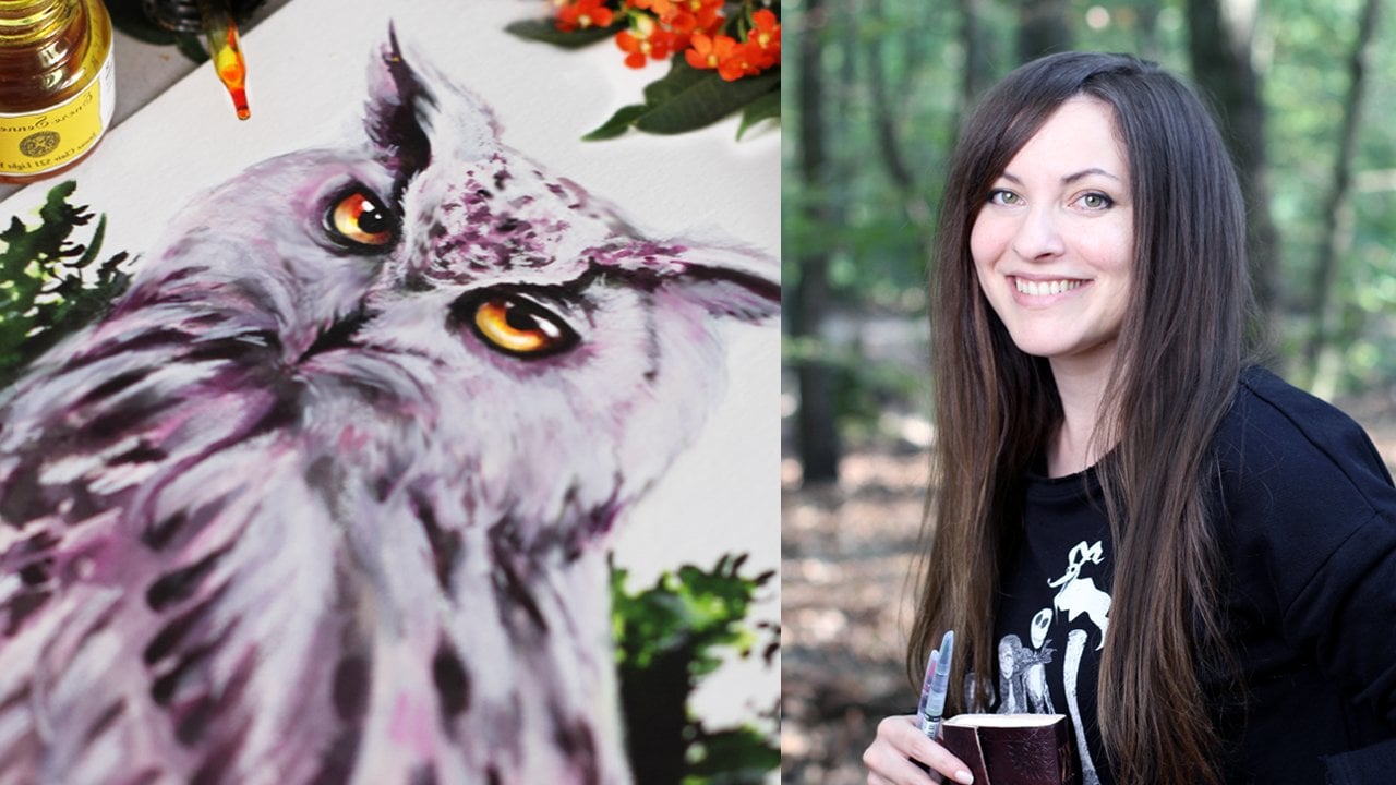
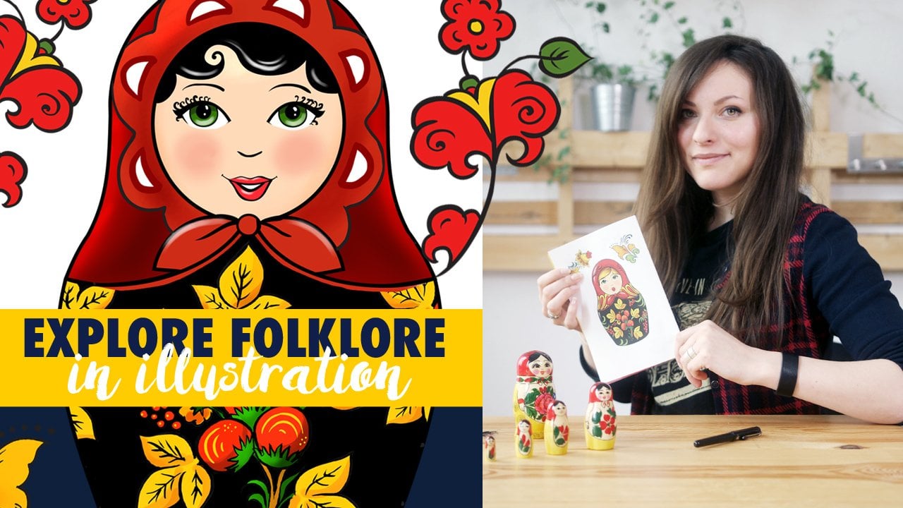
 Anna Sokolova, Berlin-based Artist