Transcripts
1. Introduction: [MUSIC] The most important thing that I love about art
is how it unites us. We might not have the
same language region, but we can all understand
the language of art. [MUSIC] Hi. I'm Alika, a self-taught artist
and a YouTuber. I paint abstract
realistic portraits, which is a marriage between
abstract and realism. I don't obsess towards creating a
realistic-looking artwork. I do like to combine my
own abstract ideas and other components
into the painting and create a different
looking artwork. I'm here to share with
you how to create your own original abstract
realistic portrait and all the important techniques and tips with amazing artworks. We'll start by finding inspiration and
creating a prototype, choosing the color palette
and mixing colors, creating the outline, and finally getting
into the fun part that is painting the portrait. By the end of this class, you'll be able to find your
own style as an artist and also understand what is
your own original niche. Art gives you immense
amount of freedom and an opportunity to explore
your own hidden goodness. All you need are some
basic art supplies, some love for art and
you're good to go. I am so excited to
start this class. Let's get started. [MUSIC]
2. Finding Your Inspiration: [MUSIC] Since childhood, all I could do was
painting and I had to do something related to art and I joined this
designing institute, where I learned a
lot about poses, illustrations, and that I incorporated in
my artwork today. YouTube was never
in the plan though. I had a back injury and because of that I
could not bend and that brought me to a
realization that I need to share this
word to the world, that please explore
your hidden goodness before it's too late. Within a month's time, we had so many people, we built a beautiful
art community. Finding your own inner style as an artist is the most
important thing, I believe. You want to create your own unique identity
in this art world. Using similar elements
in your painting makes your work way easily
identifiable. For example, Carla Grace, she creates realistic
looking wildlife animals, which makes her work
very prominent. Also I like David Bromley. He has his own unique style of creating nude style of arts. The moment you come across these artists and
their artworks, you can easily identify
that this belongs to them. It takes a lot of practice and experimentation to read
your own inner style. If you're an abstract
floral artist and you're bored of making 10
such paintings, then that's not your style. Basically if you're
going back to a specific element
again and again, that might be part of
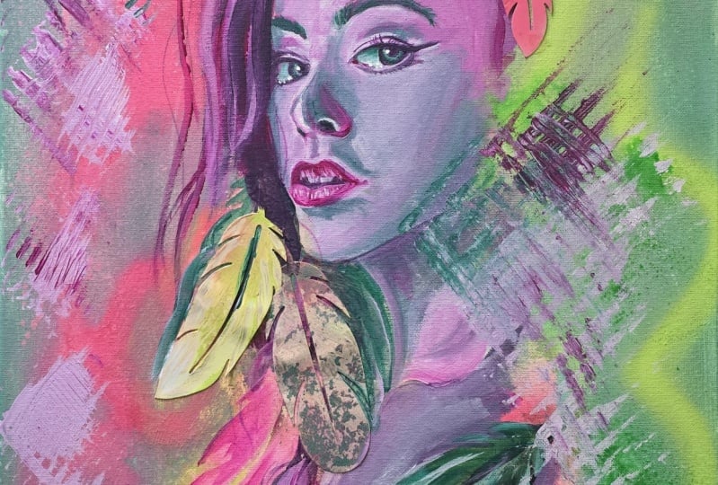
your signature style. I definitely enjoy combining the realism aspect and give a more abstract
look to my painting, because I think that's
my ways as an artist. The elements that I use in my paintings usually
have a theme. The birds represent freedom, lights representing power and my portraits represent fears,
self-love and embrace. Start noticing nature
and you'll find thousands and millions of
inspirations out there. Photography is going to just expand the horizon of
how you look at things because it also gives you a clear vision where the
reflection of light is falling, where the depth is. For my mediums, I love
to use mixed media. I loved combining different
elements like in acrylics, water-soluble oil
colors, crayons. As an artist, you should experiment on different
other mediums. Just try out what works best for you and then home on to
the one that you love. The idea of being a forever
student will help you a lot to explore your own style and
know exactly what you want. Creating thousands and
thousands of bad paintings will one day lead you into a good portrait that
you'll be happy about. Even if you think that you've found out your own inner style, you should constantly challenge yourself to create
different unique artworks, to constantly keep evolving. [MUSIC]
3. Preparing Your Canvas: [MUSIC] Welcome to my workspace. Before we start, I'm
going to be giving you an overview of my process. I start with prepping
and priming the Canvas. Next, we're going to
be doing the prototype where we are going
to be designing the painting digitally. Then comes the outline where we're going to be
using the grid method, and then we'll transfer
the image on the Canvas. Then we start making
the background , painting the portrait, adding detailings on it, and then the final touch with texture and the last one niche. All right, now let me
quickly take you through the art supplies that
we require today. First off, we need
the stretched Canvas. This is 18 by 24 inches
fine green Canvas. Then mini gestural, acrylic colors, termite
resistant one niche, brushes of different sizes, two beakers filled with water, one for picking up clear water, and one for washing and
clearing the brush. For wiping the brush, we
need some tissue paper, some extra fabric, and today we're also going to be using some makeup brushes. Then of course we
need a color palette, where we're going to be
blending and mixing the colors. For adding the texture,
we need crayons, some markers, sprimase
portal and inks. We also are going
to be needing hoax and cotton thread to
hang the painting. At the end for the
final finishing, we're going to be adding
one niche on the top. For that, we need a very inexpensive flat
brush or a sponge. Before we get started for prepping and priming the canvas, I want to share with you all
and important audit wise. You should always use
a fine green Canvas, so the brush also
moves very smoothly, the blending process
becomes much more easy and of course you'll
have better results. Let's first get started
by adding GSE 100 or acrylic gloss varnish on
the backside of the fabric. This acrylic gloss
varnish is actually a cheaper version of GSE 100. You can just choose
what you like and just start applying it on black
of the canvas like this. For that application, I
like to use a wedge tool. You can also use a
scale or a ruler. Because here if I
was using a brush, it would have taken
me a lot of time. So I'm just going to spread
it on the backside of the Canvas like this,
and you're good to go. Now we'll let this
dry completely. The way you're prepping
and priming the Canvas, everything talks
about the brand and the quality of
artwork that you're going to be selling in future. So it's very important
to look into each and every detail and also
fix this wood pad, because this might
come in contact with termites or
wash it in future. So you really need to seal that and give a good
protecting layer to it. For this, I'm going to be using a termite resistance varnish. Of course you can
go ahead and use any simple one is that
you already have. Always use your extra brush or an inexpensive brush
for applying the varnish. Because with time
all these products and all these spoil the
quality of the bristles. So you definitely don't want to lose on your favorite brush. This quarter one is
dried completely. Now we also want to
secure our Canvas. You can see that it has
some space around here, so there might be some chance that insects might
start living over here. So we want to seal
these corners as well. This person is based
in [inaudible] any masking tape and just apply
it on the corner of area. One more reason why they need to apply this masking tape is, if you just look into
these staple lock pins, so you know with time,
they also get rust. So it's going to just keep
it safe from everything. This is how your corners
are all tagged and sealed. Now we're going to be fixing hooks on the backside
of the Canvas. This is what we need and I'm just going to be first
measuring it up by using a scale because
you want to fix them on both the sides equally. I'll just take my ruler and mark four-four inches
on both the sides. The reason why I suggest
you always to fix these hooks on the first
stage of the painting is, you really don't want to damage
your painting at the end. [NOISE] Here I'm fixing
both the hooks like this. Then we need this thread. We're going to be putting
it on both the corners. You can use a cotton thread
or a steel wire as well. This thread will help you hang
this painting on the wall. Just tie it like this,
and you're done. Now moving onto
the front part of the Canvas where we are
going to be priming it, for that I'm going to be
applying a layer of gesso. In case you're using
a good-quality gesso, then you can just do
one or two layers. If in case you're using
an inexpensive gesso, then you do need to apply
three to four layers. Remember just moved
progressively, apply thin coats of gesso. For that, you just
need this wedge stool. This procedure takes less amount of time and gives
you a better finish. Once it is done, you can
always clean out the edges. For cleaning the corner end, I like to use my paddle brush and of course you can
use any flat brush. Sometimes you have some
pigment present on the Canvas. You can always blend in
mode by using the brush. Once this is done, we need to let this
dry completely only then we'll add
the second code. Just go ahead and apply it
evenly on the top like this. All right, our canvas is
completely prepped and primed. Next up, we are
going to be creating a prototype and coming
up with a concept. Your student exercise
for this lesson is, to gather your tools
and prep your Canvas. [MUSIC]
4. Drafting Your Concept: [MUSIC] Before I get started, I like to create a rough
draft of my painting. You can do this digitally
or even do it manually. Just take a sketchbook and draw anything that
comes to your mind. Today, I'm going to
be using Procreate to create a rough composition. Before starting any new
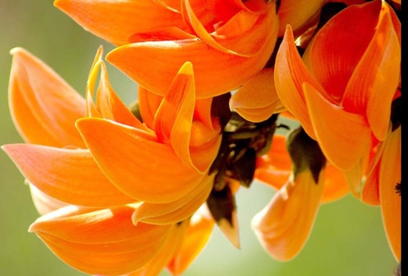
painting or concept, I love thinking about a theme. For example, today I wanted to work on a sunflower painting. They are bright,
they are beautiful. Here as you can see
in this folder, I have already collected all my inspirational images
related to sunflower. These can be collected
very easily from all the royalty free websites
like Pexels, Pixabay. This one here is a self image
which is my own portrait. The reason why I'm using
this image today is because I couldn't find this
pose anywhere else. At the same time, it
also shows me clearly, the light's falling,
the shadows. If in case you're
also looking out for a specific pose or style, then you can always get
into your own photography. This also helps you to get
away from all the copyrights, and of course, you'll be
the owner of the painting. Once we are in this app, now we are going to be deciding
the size of the canvas, and of course, it has to be the same that we prepped and primed, that was 18 by 24 inches. We'll just add that, that is 18 inches will be the width and 24
inches is the height. We have our canvas ready. Now we are just going to be inserting the images
that we have selected. It's very simple,
you insert a photo, I'll just select this one. I really want that the
outline should not be there because we want to
add other elements there. Once we have our image, now we just want to crop
it from the corner. Then you click on this tab and then you have
this Remove option. Once you click that, you
can just move around the image and decide on
what part you want to keep, what you don't want, and just cut it out. Once you select it, then you
choose on the Eraser option. From here, you can increase
or decrease the size, and then we're just going
to be erasing it like this. [NOISE] Now we can just click on this image and decide where we want
it to be placed, on the top, on the bottom area. Now we're just going to be
adding other elements there, for example, we
want that flower. Same thing we are
going to be doing for this flower as well, we just want the corner
side to be cropped. We'll choose the Remove
option and cut that. You can increase the size, you can rotate it, just decide on how exactly you want the composition
to look like. Then we'll keep adding different images and see
what works best for us, so maybe this image can work. We'll do the same for
this one as well, we'll just crop it and
remove the extra part. Here, you also get a chance
to do all the mistakes, play around with it, just see where you think
it will look good. For example, I think for me, the head area would
look really nice with this beautiful pattern
that honeycomb creates. So I'm just going to
be placing it there. You can just play around with multiple compositions here and then hold on to the
best one that you like. Here you have the freedom to do what you like and make
this painting your own. You'll have a specific style or some element that
you really love using, or there might be a color
scheme that you always follow, now you can incorporate
that to your painting. See how easy it was to just club everything together and see how the end result
would look like. Now we also want to know what color combinations will look great on the background. For that, I'm just
going to be playing around with colors and let's see what the background
would exactly look like at the end piece. You can always choose
the brush that you like, I'm just going to
be picking up that. Maybe in the background, I like this color today. Let's see what it looks like. I'm just creating a very diluted
effect on the background like you've added a lot of
water to your color mix. Then maybe on the
second color shade, I want this color. You can choose any brush and create the texture
that you want. When you choose a brush,
you can also just see what it's going
to look like, what effects it's
going to create. Now let's just merge
all of this together. You have so many other different color combinations there, just choose whatever you think that would
suit really well. You can choose it from
this color wheel as well, and create the pattern or
the tone that you want. You just keep doing what you think will work best for you. I'm also planning
to add some drips. This is a basic drip
brush and this is the effect that it's going to
give so I think that's it. This is what I'm assuming that my painting should look like. From here, we can exactly take the shades and we would know what all colors we
need to mix and just get the palette ready
for the final painting. The main important reason why I always suggest plan
your painting first, because once you
are done with this, you'll walk to the canvas
with lots of confidence. Because you would know what
the end result would be, what colors you need to use, and even you might just
decide on the brush as well. While working in the
entire painting, it might happen that you
might think a specific theme, and then at the end, you
might just not paint it. It is no rule that whatever you've created can only
come on the canvas. It is just an outlook of how the end result
is going to look like just to avoid mistakes
on the main canvas. You may even end up with something better than
what you plan for. Your student exercise
for this lesson is to think about the concept and the mood that
you want to work on. [MUSIC]
5. Making Your Outline: [MUSIC] Once my
prototype is ready, now we need to transfer
this image on the Canvas. For that I like to
use the grid method. Grid method will
help you define and get the exact proportion
for your face. You go to the Canvas option, and then from there you
choose the drawing guide, and then you get so
many options here. You can always make them in larger numbers so that you
get the exact proportion. This way you can see more precision and you'll
be able to draw better. Then you can increase
your opacity and then just make the
lines more thick. Once you've created this, you can easily see what
comes in each block. Once we have a grid
made on the prototype, you're going to be
making the grid on this Gateway paper, which is going to be exactly
of the same dimension, that is 18 inches and 24 inches. You can always fix
the sheet by using a masking tape so
that it does not move around while
you're working on it. We can easily count the
square boxes on the top, that is 1, 2, 3, 4, 5, 6 and the total
distance was 18 inches. When we divide 18 by
6 we get 3 inches. Likewise on the height we have 24 inches and the blocks
that we have are 1, 2, 3, 4, 5, 6, 7, 8. When we divide 24 by 8, we get again 3 inches. We're going to be marking
three inch point in all the sides and then joining
the lines to get the grid. Now we have identical
squares in both the grids, on our prototype
and on the sheet. Now we just have to notice each and every block
there and just see what comes where and draw it directly on the box
that we see here. For example, if you calculate 1, 2, 3, 4, 5, 6, on the sixth block, you get the eye area, which is here 1, 2, 3, 4, 5, 6. Now I made the eyes, the nose, and I'm going to be quickly
going over and making the remaining features as well. Here I've almost created
the final outline. In case you think that
something comes to your mind, you can always add
on that as well. For example here, if you notice the reference
image that I've used, my hands are very
short and tiny. So I'm going to be
extending the nail area so that it looks little
sharp, more presentable. You can make these
basic changes as well. It doesn't have to be exactly
what you see in the image. Our outline is almost done. Now, we're just going
to be transferring it to the main Canvas. There will be a time where you'll be so
skilled that you'll be able to create direct
portraits on the Canvas. If in case you're not feeling
confident, work on grids, create outlines, trace them on the main Canvas and
then enjoy painting. The aim here is to
simplify your artwork, just make this journey super
easy and fun for yourself, work progressively and you'll definitely find great results. While our outline
was getting ready, our Canvas has also dried completely and now
we're going to be using carbon paper and then we'll transfer the image on
the Canvas like this. Always try to use a good
quality carbon paper because otherwise the traces of those poor quality carbon paper
might come on the Canvas. I fixed them altogether. This was just an A4 sheet so that they're all at one place, and they're all combined. Always try to fix the corners by using a masking tape
because you don't want the sheets to keep moving and to get the wrong
tracings there. Then we have our outline. We're just going to be
fixing it on the top. Try to fix all the corners
by using a masking tape. [MUSIC] Once you get that fixed, just use a basic pencil and
move on top of this line. It's very simple and easy
and you'll be able to get the tracings
right on the Canvas. [MUSIC] There we go. Just open one corner
of it so that you can see whether the
print is even there or not. If you see that it's not
very dark or it's too light, so you can go again on top
and trace it back again. But here as you can see, I have all my tracings ready and we are all set to
start painting on this. Now we're going to be locking this outline by
using acrylic color, define the corner lines and
make it more prominent. For that we're going
to move to our easel. Now I have set up my
Canvas on my easel, let's go ahead and
start adding outline. We are going to be first
creating a color mix, adding some water with
black acrylic color. The reason why I add water
to my color mix is because I really want the consistency
of color to be very flowy. We really want the
brush to move very smoothly while creating
those fine outlines. Here I'm also picking
up this dropper because it really helps me pick
up the color very easily. One drop, two drop. We can actually calculate
them and add it to your need. I'm going to be using
this fine liner pointed brush because I want
those fine detailings. I really don't want
that thick line. We already have the
tracing on the Canvas, so now it becomes
super easy just to go on the top and
create the outlines. [MUSIC] Once the background
comes on the top, the lines of the
tracings that we have got might just not be visible. It's really great to just add that dark line here
so that you can always see where exactly your portrait is and how
it exactly looks like. One thing that you can
keep in mind is to create fine lines here, because these lines are going
to be visible till the end. While creating the outline, you can have the freedom to add any element
that you want. It does not have to be exactly what you
have already drawn. You might get really
different and nice ideas throughout the process. Never feel restricted. Just keep on enhancing
the painting, keep on adding the elements, anything that you think would
look nice on the painting. [MUSIC] Whenever you think that your brush is not
moving very smoothly, just add a few drops of
water to your color mix. Just add drop by drop so
that you don't add a lot. In case you add a lot of
water to your color mix, the bristles will
split and you won't get that pointed end for
creating the outlines. [MUSIC] Once the outline is done, I always like to add some depth and add
those darker areas. [MUSIC] That's it. We are ready with our outline. Your student exercise
for this lesson is to create the
outline and lock it in. [MUSIC]
6. Painting Your Background: [MUSIC] I'm so excited to get started with coloring and first you're going to be
painting the background. To begin with, I'm going
to be choosing my colors. Now here's where a
prototype comes in use. As you've already decided the color combinations for our background in the prototype, you just look into it and just choose the
colors accordingly. Here I'm just going to
be using this rose pink. You can always mix some white
color to your pink shape, and you can create
any light shade of pink from the background. I would always suggest you to keep your color palette ready, do a good color mixing
before you start painting because you really don't want your colors to dry. Because I want a very watercolor effect
in the background, it's just very important
that I first make it moist. Please use a hair spray. What it does is, it
does not create, drips. It evenly spreads out on the canvas and the colors
when they come on the canvas, they just start mixing and merging and create a
beautiful background. I'm just going to stay
a little away from the canvas and then start
spraying it like this. Once it is done, I'm using my flat brush and I have
added a lot of water to it. Now let's go ahead and
add the background. You apply the color
and then you take your spray bottle and just
spray some water there. All of us might have
the same technique, but the backgrounds for all of us are going to be
different and beautiful. I'll quickly wash my brush and then maybe I'll pick
up the other shape. Let me just pick up blue now. If you think that the
water that you have applied is already dried, then you can always
add more water there. [MUSIC] In order to make your main
subjects stand out, it's always nice to use those complementing
colors around them. That's why I'm adding those certain colors in
the background. It all depends on your
painting process, what color you like, what you think would
go well there. Once the first letter of
background is dry completely, I'm going to be picking up my
flat brush and doing a wet on dry technique for which I'm going to be using
these three colors, that is white, magenta,
and lemon yellow. This will also helped me to add the texture on my painting
that I'm looking forward. I'm just going to be using
these colors directly. I'm not adding any water to it because I want that dry
brush effect there. Once you're happy
with the color mix, you can just go ahead and use this dry brush to create that texture in some
parts of the painting. Some more paint, I really need to blend
and mix more color because I want to add it
in other areas as well. Then I'll also spray
some water here. I'm also trying to use
both the effects here, the dry brush effect. At the same time I'm also
adding this water there to get a beautiful watercolor
effect on the end corner. [MUSIC] While making
the entire painting, whenever you think you
have done anything was wrong or you're not happy with some part of the painting, don't worry at all. Just pick up any brush, load it with water and
then a tissue paper, just go there and start scrubbing
it around by the brush. You can always rectify
your mistakes and keep on changing whatever you think is not making that gray, the background would always keep developing in each
and every phase. Don't worry about it. If in case you are happy
at this stage, you will get many chances
in the later part of the painting to just
keep on improving. [MUSIC] We're done and we let this dry completely and then we'll move on to the face. Your student exercise for
this lesson is to create this background and keep experimenting till
you're happy with it. [MUSIC]
7. Painting Your Portrait: [MUSIC] As an abstract
realistic painter, there is no boundation. Just play around with
patterns, textures, lines, and keep adding different
other elements, whatever makes you happy. Now we're all set to paint the face and while my
background was drying, I'll lay down all my colors
on my color palette. Always use good-quality acrylic. It's going to really help you in slowing down the drying process. If you're someone
who's going to be painting for about few days, you can always use
a wet palette. This is what a wet
palette looks like. It just has this hydration
form which is filled with chilled water and this
hydration film on the top. You just add the
color on the top and then it remains
moist for about weeks, and if in case you don't
have a wet palette, you can always make
it at home yourself. Just use any box like this. Keep a foam on top, add some water and on
the topmost layer add any sheet that does not allow
water to just get absorbed. A pass band sheet
can also do the job. Another trick would be to keep
making your canvas moist. Whenever you make it moist
the blending process becomes very easy and in case you want
to keep your colors moist, you can also spray
some water on the top. Colors do dry very quickly on a hot summer day as compared
to winter or monsoons. You also have to keep the
weather conditions in mind. Never paint directly under the fan or in front
of the window. Now we are going to
be painting the face. I'm going to be using
a filbert brush because this has a curve tip. This really helps me in
creating those soft blends. At the same time, the pointed end of this brush is going to help me to
create those fine lanes. I have my inspiration image
right in front of me. I can clearly see the
lighter parts on the face. For example, the
tip of the cheek, the nose, and of course, on top of the eye area. This will really help me to make a very realistic
looking portraits. I'm going to be
spraying some water on my colors so that they dry
really slowly and of course, on my canvas so that I can
have good blending there. Keep a tissue paper always ready with you because whenever
you dip the brush in water, you should remove
excess water from the brush because you don't want that watery effect there. You just want your brush
to be a little moist. At this stage, as
you can clearly see, our face has no 3D
or realistic look. It has no shape, no form. In order to give it
a realistic look, it's very important for
us to first know about mid tones, highlights,
and shadows. Now what are these? Let me just explain this to you by giving you a simple example. Can you observe the lightest
part in this shading, which is of course
on the right side because the light is
coming from there. As you can see that entire
part is very bright and has a reflection of
light falling over there. If you just observe the
left side of the cherry, there is no light source there, hence it is darker
and has shadows. But where is the mid tone? The area which is between the highlighted area
and the area of shadow. That is the place which
is called the mid tone, which is right here
on the center. This cherry is also casting some shadow on the
bottom surface, which is known as
the cast shadow. It's very important to have this basic information
about highlights, mid tones and shadows because
that's actually going to give any object a
realistic look. To begin with, I always like to start by adding the mid tones, then progressively add the depth and highlights at the end. I'm just going to be
using my filbert brush and at this stage
I'm also adding little water because the brush and the colors have
gone a little dry. The most beautiful feature on the face on any
painting is the eye. If you've made those eyes right, you get that life
into the painting. In stage 1, we're
just going to be learning the first
base layer and then progressively keep
adding different layers to add the depth on the face. It's always great
to switch over to a smaller brush if in
case you want to add those colors on the
corner areas are on those smaller buds and
for adding more depth, I'm going to be using any
darker shade that I had. For example, I'm using
this burnt sienna. In case you want you can always
mix this acrylic medium. This is going to slow down
the drying process as well, and in case you
think that you have loaded a lot of
color to your brush, just remove the excess
by using a tissue paper. Always keep looking into
your reference image, that's going to give you
a beautiful direction of how exactly the
painting should be. Around the eye
area on this spot, I think there's lot of darkness, I'm just going to be increasing the color there and
make it a little dark. Because that area
is really small, I'm switching over to a
smaller filbert brush or any flat brush that you have. Here I'm also following
very loose strokes. They don't have to be perfect. They don't have to be precise. You just have to
create these layers of color by using
different shades here. On the way here, I want to add little depth. In case if I start
adding it now, the base is not moist, the base color will
start falling apart. It will just spread and the layer would not
come on the top. It's very important to let the first layer dry completely, only then we can progressively increase the layer and
the intensity of color. I always believe that having
limited art supplies, but having great command
over them and doing a lot of practice with
them really helps. Sometimes you can use a
single flat brush to create the entire painting because you exactly know how it works. This is the cheapest
brush that I have in my collection and this
does wonders for me. If you just notice
here around the eye, if you can see, I've
added a lot of depth. This is helping us to get
that protruding effect. This is important that you add the shadows around it and make the center part light because maximum light is falling
on that surface. Once the first layer
dry completely, then I'm just adding another
layer of the depth again. You can just do some dry
blending there by using the same flat brush and to add some lighter areas on the face, right on the center
of the eye here, I'm just going to be increasing the intensity of white color. Once the base for
the eye is done, I'm going to be adding
those lines there just to define eye more and to
add those eyelashes. I'm going to be using
the tip of my brush. You can always use
round brush number 0 or even a fine liner brush
to get those fine lines. Here I just took some
black color on top of my brush and let's
just notice the image. It really gives you
the uneven texture and really enhances the corner ends and gives
them more abstract look. I've just gone ahead and
added some color on the face. This is just for the
base color actually. I'm also finishing
up my eyelash by adding some more
detailing there. Here the style and the
technique that we're using is very loose strokes. They don't have to
be that perfect, that ending doesn't
have to be that smooth. That's the beauty about creating an abstract realistic
portrait that you can just use the stroke that you want
and make it look beautiful. On the top, again, I'm adding some white color just to make it a little oval. We'll follow the same step
and paint the second eye, and this time I'm going to
be using a purple shade. There's no rule that
you always have to paint the face with
the same skin tone. You of course, can use the same technique because you want the face to look realistic, but you can definitely
choose any color of your choice as well [MUSIC]. Whenever you think
you're not able to blend the color properly, you can always use a moist brush and you'll be able to blend
the color very easily. For adding the final detailing I'll let this dry completely. Meanwhile, let's go and
finish the nose area. Starting off from the nostrils just to remember
where the depth is. On top of the nose, as you can see, a lot
of light is falling. I added this white
shade and this will dry and then we'll
add that blending part on this side
so that it looks really dark in that area and
the shadows can be seen. I'm just going to be adding some more skin tone
only on this side. You can always use a moist
flat brush and blend. [MUSIC] Next we're going to be doing the lips and
for that I'm going to be using this magenta shade because I thought that
it will add a pop of color and compliment the yellow color that's there
because of the sunflowers. If in case you want to use red or any light shade of pink, please go ahead and do that. Beneath this area I've just
added a little bit of shadow. For that, I use
this burnt sienna. You can always do that when the first layer
is going to dry completely and also just
under the nose area, I've just added some shadows. I've gone ahead and done
a bunch of detailing. At this stage when the lip
color is dried completely, we can add a little shine and then reflection that falls
on the top of the lip area. For that I'm going to be
picking up the same brush and I'm going to be using
this white acrylic color. Just going to change
the look of the lip. It's going to make it
much more plumper. Remember, don't use a lot
of pigment on your brush. Don't go overboard with it. I'm just trying to
blend this color with this fluffy flat brush in
case if you don't have it, you can always have makeup
brushes like these. This is a basic
eye shadow brush, but I like to use
it sometimes to create beautiful
blends and merges. The cool thing about them is they're relatively
inexpensive and you can buy so many of them in place of a
professional brush, and at the same time they
give you great results. [MUSIC] Now we're going to
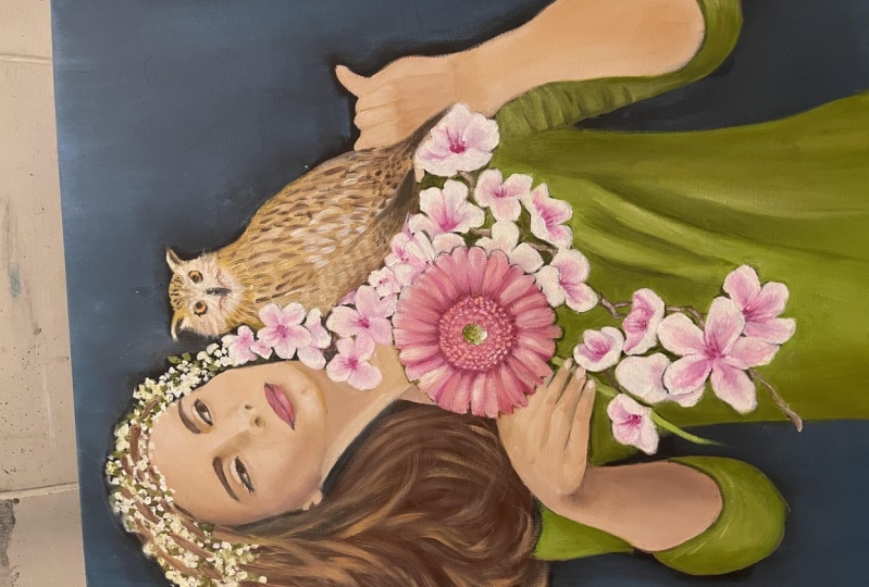
be painting the sunflower, which is the most important
element of this painting. [MUSIC]
8. Painting Other Elements: Here are a bunch
of sunflowers with me and the reason why
I'm carrying them with me is because I really
want to understand where the shadows of these flowers
would fall on the body. You can always use
the real objects for your inspiration and
just club them there. This also gives you a great idea of what the color
mixing should be like, how it looks in real. I'm just going to be keeping
it right in front of me. While I'm painting, I
also keep noticing it and try to create sunflowers the way they should look like. I've already got all
my colors ready. We're going to be using lemon yellow, cadmium yellow, white, and orange color, and for adding the depth we are going to be using
burnt sienna shade. Let's quickly go ahead and
start adding the petals. I'm just taking this
lemon-yellow color, which is mixed with
little white color, and adding it on
the base like this. Once this is going to dry, then I'm going to be
adding the shadows. As you can clearly notice here, while I'm applying this color, the background can
be clearly seen. I really want to create
that opaque look where only the petals are
visible and not the background. Adding this white color really helps because it creates a
thick layer of color there. [MUSIC] Whenever you and
I pick up a new concept, I start from zero. There are always new
challenges with new concepts. Don't judge yourself, just learn basic techniques and
improve your skills. Meanwhile, this is drying. Let's go ahead in
center [inaudible], add some darker shade there. I'm just picking up
this burnt sienna and adding it only
on the center. This will also require minimum one or two
layers of color. [MUSIC] Once the base of
the sunflower is ready, now I'm going to be picking up some lemon yellow color
and also using some white. What I do is I just stroke
on each petal like this. You also get that
natural petal effect. I'm going to be
following the same steps for the remaining
petals as well. [MUSIC] While you're painting, you definitely need a lot of patients because layer
by layer the painting will come alive [MUSIC]. Something that I
like to do while I'm painting is I keep
clicking images. See what you did wrong, what you can add to the painting to make it look much
more appealing. So this way you study your own painting and
rectify your own mistakes. Once I've added that
thick layer of color, I'll also increase the intensity of lemon yellow color with some cadmium yellow to add those fine lines
only on the center. As the base color is
completely moist, it will beautifully blend
and create those fine lines. If you notice, I'm using
the tip of my same brush to create those extra fine lines and detailing on the center. [MUSIC] If you notice the
sunflower between each petal, you'll always find some shadow. Just notice these natural
twists and turns. Adding them to your
painting gives a very beautiful natural
and realistic look. Now, let's take this
observation to our canvas. Sometimes I also like to use my fingers for blending
those tiny areas. [MUSIC] I'm just going to go over all these
parts and blend it out. While that is drying, I'm just going to be adding
some depth on this area. This is done with
a very loose brush with very loose strokes, you don't have to be very
particular about it. We can just apply it very
randomly by using a flat brush. For the neck, I'm
going to be mixing some rose pink and also adding
some orange shade to it. I'm just adding some more
darker area right here, which is between the
face and the neck. We're just trying to
create more depth here. Then just to blend it
out with the base, I'm also going to be
adding some water. Meanwhile, this is drying, let's go back to the sunflower. [MUSIC] Coming back to the neck, I'm going to be picking
up a darker shade to give an illusion of shadows
falling over this surface. Now, I'm going to be adding
some leaves here by using sap green color or any darker green color
that you already have. As you can clearly see, the leaves don't have
a specific shape. I'm just creating very
loose random strokes and then adding the
leaf pattern there. Now I've finished up all my sunflowers and it took a lot of layering and that's the reason why now they look
little protruding. I'm going to be using
my palette knife. By using this sap green color, I'll be just creating
leaves like this. If in case you want to
add some more depth, you can add some darker
color in-between two flowers to show more
shadows falling in the center. Palette knives give
a beautiful texture to the painting unlike a brush, that's the reason I love
using them and it creates such nice abstract
backgrounds and textures. We're going to be adding
the final elements that should be a
honeycomb on the top. We are going to be
just first applying a base color of
cadmium yellow shade. I just added a darker shade, which was burnt amber. Now in the center,
randomly pick up some black color and tap it like this for giving that cute
hair effect on the center. Now we're creating the
honeycomb on the top, I'm going to be using
similar shades. This burnt sienna, which
is going to be mixed with some white and lemon
yellow shade [MUSIC]. Then I like to use a separate
fluffy flat brush just to blend both of them on the center and just
make them very uniform. I'm also going to be adding different shades
here, but for that, I need to wait because this
layer has to dry first. At this stage, I'm using
this hard bristle brush. This also allows me to give a beautiful texture at the same time blend
the color like this. I keep switching between
different brushes because each and every brush has
a different task to do. For example, here, I wanted
a very smooth blend. That's the reason I picked
up on this flat brush. If I want those lines and those dry brush effect then I'm going to be using a
hard bristle brush. I'm not going to be following
a simple color scheme. The colors that I think
would go really nice. I'm just trying to blend
and make them hue. By now as you have worked
really hard for the painting, you don't want to ruin that. In this stage, what
you are going to do is just click an image and then transfer that image
to any art app and there you can digitally design and see what would
look really nice. [MUSIC] I'm randomly picking up some
color and here I'm using a flat brush because I want to create those smooth blends. [MUSIC] I'm using a
pointed liner brush and creating these
basic hexagonal shapes. Here on the honeycomb, I just added some light
area on the center. This is just to show
some light passing in. This is also going to act as highlight on some parts
of the honeycombs. I'm just adding this pop up bright color only on the center. Again on the top, I'll keep
adding the texture by using a random flat brush
and just blend out all the components together so that they
look beautifully moist. We'll let this dry
completely and then add the final
layer on the top later. The base part of the honeybee
is dry so I'm picking up this flat brush and I've used lemon yellow color and
I'm just tapping it on the top gently to create
those hair texture. You can also mix some cadmium
yellow color in stage 1, If you just want that bright yellow shade
to be on the top. Just dabbing the
brush by using way little color will give
you beautiful effects. By using a fine liner brush, I'm going to be adding remaining
parts of the honeybee. [MUSIC] I'm really excited how this painting is
coming out and I'm looking forward for
the final end result. We'll be adding all the final
details in the next lesson. The student exercise
for this lesson is to add all different
elements to your painting. [MUSIC]
9. Finishing Touches: [MUSIC] Here again, I'm just using a very
dry brush technique. Just pick up little colonial
brush and just try to move outwards in this
uneven direction. By using the same brush, I'm also just trying to
create this texture there. Blend it out by using a small brush and coming
back to the honeycomb again, we'll just add some more
depth in few areas. Just to add more
detailings there. I just wanted to create a slight glaze of these
sunflowers falling on the face. I'm mixing a little
white and yellow shade. It's so fascinating
that just a tint of color can add to
the painting so much. On this cheek, I just
want to add this bright white light falling. That's a reflection
and of course, on top of the nose. Just in case you think that some part has a
little empty space, you can always create some
textual patterns, lines. Like I mentioned initially
that the background is a continuous
evolving process. It just keeps on
changing in each step. Now, for finishing
the hand area, we're just going to be
adding little shadow. For that, I have also mix some burnt umber and
white color together. You can also add
black and white, just have a very
light shade of gray. Because a lot of texture and some different strokes and patterns are going
to come on the top. That's the reason I
have just kept them very simple because there's drips and some dry brush strokes which are going to
come on top of it. [MUSIC] Here I loaded my brush
with a lot of water. On the same texture I'm just going to be adding few drips. For creating a beautiful
scumble design, I'm going to be using
my makeup brush. You can of course use
a mop brush instead. Just creates a very
blurred effect and this dreamy background does add to the abstract
theme of the painting. Now I'm going to be
adding the final highlights to our sunflowers. [MUSIC] If in case you came and you
committed any mistake, then you can always use any moist flat brush and just
pick that out like this. Now let's quickly add some final highlights
on the finger part. [MUSIC] Now I'm going to be adding the last
part to this painting, which is the drips, but that I'd like
to mix my color in this color palette where I
can actually add some water. You want the color to
be really diluted. I also wanted to add some white. Once you have these light
water drips falling down, the colors tend to
lose their saturation. Just look into the painting and think where you
exactly want it to be. If in case you think that you don't want
them in few areas, then you can always pick that
up by using a tissue paper. You can always sprinkle some water and then
add the texture. For example, here I
want to add some green. I'll just add this green color and then I'll just
sprinkle some water. [MUSIC] At this final stage, I like to play around with different other
mediums like here, I'm using this crayon to add the depth and to just
give a final outline, like here in-between
two flowers. The use of different textures really helps your
painting to stand out. I'm going to use acrylic
markers to create some fine lines around this body and that's
completely optional. On the top, just adding little more of white color by
using white crayons. This is how I like club, different other medians and
try to create some highlight. You can go ahead and find
out different other objects, maybe a sponge or some net
or any wrapping material, just dab it and create
different textures. Any texture that you add here at this stage can make your
painting uniquely yours. I could keep adding
to this forever, but for now I think I'm done. I really like how it
turned out to be. The final step to end
a painting is going to be applying a layer of
varnish on the top, which is going to give a
beautiful gloss effect at the same time, protect the painting
from any dust or dirt. Let's get started.
Now we've waited for the painting
to dry completely, and once it is done, I'm going to be
applying varnish. You can use any brand. Just go ahead and
apply it on the top. One small tip that
I would like to share while you
apply varnish is, check whether you are applying
it in the right direction. You can always bend down
and see whether there is any patch and keep on
checking and then apply it. Never leave your canvas
right beneath the sun to dry because that will
definitely fade out the colors and harm
your painting. [MUSIC] This will take another 10-20 minutes to dry and our painting
is all ready. Your student exercise for
this lesson is to add your final detailings and
finish up your painting. [MUSIC]
10. Final Thoughts: Congratulations on
finishing your class. I'm super proud of you already and I wish to
see your artworks. Don't forget to share with me in the project gallery below. In case you want to check
out some of my work, then you can find me on my YouTube channel and
Instagram on, Goodness In You. I hope this class
really helped you to explore your
goodness and you would find these techniques
and tips very useful for creating
your artwork. Thank you so much for joining me and I'll see you very soon.
 Alika Bhatt, Artist, Teacher & Youtuber