Transcripts
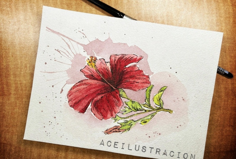
1. Welcome: Welcome to my class - painting tropical flowers in watercolor. In this particular class, we are going to paint a hibiscus. I chose this flower for this class because it's the national flower of my country. Hi, I'm Soo Ling from Malaysia. And I'm a self-taught watercolor artist. In this class, I'm going to lead you through the process of painting a hibiscus, starting from the base layer to adding shades and tones, and finally adding some finishing touches to create a red, bold hibiscus. So I hope you'll join me in this class and have fun learning painting hibiscus. See you.
2. Your Project: Your project for this class is to paint a watercolor hibiscus. The reference photo, drawing, as well as a quick guide on supply list and tips, are all available in the resource section for you to download. And after you have completed your project, I would like to encourage you to upload a photo of your watercolor hibiscus to the project area. If you have any questions for me, feel free to drop them in the discussion section. Without further ado. Let's get started.
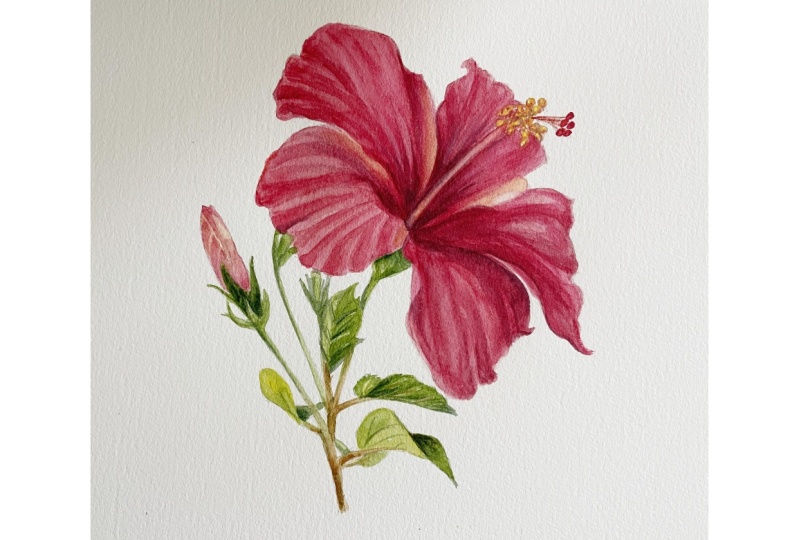
3. Supplies: Let's go through the basic supplies that I'll be using for this class. First, watercolor paper. I'm using Canson XL Aquarelle, which is 300 GSM in paper weight, and it's the cold-pressed type. You can use watercolor paper of any brand with the characteristics I mentioned. This is the reference photo you can download from the resource section. And this is the outline for you to trace. We will use this photo as a general guide for colors so that we can identify, for example, the darker areas and the highlights. The transition of brown to green on the stem. To trace the flower drawing. You can use normal tracing paper or a light pad. This one is meant for A4 size paper. But in this class, I'm going to show you later a simple way to trace or transfer the drawing without using tracing paper or light pad. And of course you need pencils and kneaded eraser. A jar of clean water, paper towels and watercolor brushes. I have here four round brushes from Princeton Heritage in four sizes. So brush size 6, 4, 2, and the smallest one I have here is one. Next, watercolor mixing palette. For colors, I'll be using Winsor and Newton's tube watercolor in this class. This is alizarin crimson, cadmium red deep hue, permanent rose, lemon yellow hue, sap green, vandyke brown, and indigo. We will check out the color palette in the next video.
4. Color Palette: Now I'm going to do a quick swatch of the colors. So if you don't have the exact colors shown here, at least you know how they look like and you can use similar ones. This is alizarin crimson and cadmium red deep hue. So this would be the two main reds for the flower. I will also mix them as I paint. For the stamens It will be lemon yellow hue mixed with some red to get a warmer and deeper yellow. For the really dark shades, say down the center of the flower I'm going to mix alizarin crimson with some indigo to get a deep purple-ish red. Lastly, I'm going to use a very light wash of permanent rose to give the flower a pinkish glaze at the end. Moving on to the color palette for the leaves. This is sap green. When mixed with indigo, you can get darker greens. And when mixed with lemon yellow hue, you can get a bright yellowish-green like this. Lastly, for the stem, I will use Vandyke brown. I'll mix with some sap green to get some variations. To get a dark brown, I will mix Vandyke brown with indigo. So these are the main range of colors that you can apply to this watercolor hibiscus.
5. Tracing: So now I'm going to show you how to trace or transfer the flower drawing onto your watercolor paper, when you don't have either tracing paper or light pad. Basically you only need a pencil. First, I'm going to flip over this drawing and I'm using a 4B pencil. Then just start applying a layer of graphite. You can also use 2B Pencil, but you may need to apply more layers. Then later you will flip the paper over and trace the drawing. As you apply the graphite, make sure you cover the entire drawing. This is ready for tracing. Place your watercolor paper below the drawing. I'm going to trim off the top and bottom part of the paper and I'll come back in a minute. Before I start to trace, I want to use paper clips to clip them together so that I won't accidentally move either of them out of place and mess up the tracing. You can use any pencil to do the tracing, just make sure it's sharp. I'm just using an old mechanical pencil. Here, you can see that lines are transferred onto the watercolor paper. So I'm going to finish this off and see you later. Ok, I'm done with the tracing. This is the transferred drawing. What you can do now is to check the traced drawing, If there's any gaps or lines that are not clear. then you can just use a pencil to fill it in. And where lines appear a bit dark, use a kneaded eraser to lighten the marks. So we will start painting in the next video.
6. Base Layer - Flower & Bud: So we're going to start painting our base layer. You can refer to the printed photo while you paint. I like to look at the photo on my iPad as the colors are brighter, and the shades and tones are easier to identify. For the base layer, or sometimes what we called the under wash. We will use the wet on wet technique to quickly fill up the petals with color. So let me prepare the paint first. Wet on wet technique is basically applying wet paint onto a wet surface on the watercolor paper. So you carefully wet the paper with water using your brush, keeping it within the line. I'm using brush no.6. You want the surface to be evenly wet but not having puddles of water. Sometimes you need to tilt the paper to be able to see if you have covered the whole area. So now I'm picking up some Alizarin crimson and drop the paint onto the wet surface, which helps the color, to spread more easily and evenly. Carefully filling up small gaps near the edge. To create highlights on the petal, rinse your brush and remove excess water by dabbing it on the paper towel and sweep it over the area to lift up the pigment. So repeat this a few times until you have lifted up enough pigment. I want to add some lemon yellow hue here, where the highlight is. Just to remind myself not to darken this area later. I'm going to add it here as well. You see this? I've accidentally created this bloom effect here, but it's okay. I can cover it later as I add on layers. Watercolor bloom happens when there is difference in paper wetness, just now I introduced a relatively wet lemon yellow onto the surface that is drying up. So the water kind of push the pigment away and created the bloom effect. So to prevent or minimize unwanted watercolor bloom, Try to make sure your brush is less wet than the surface area that you are applying watercolor. I'm going to continue filling up the base layer for other petals using the same wet on wet technique. So I shall speed up the video. Here, I'm using a smaller brush to mix lemon yellow hue, with a bit of red, and apply it to the stamens.
7. Base Layer - Stems & Leaves: I will now work on the base layers for the stems and leaves. For the leaves I will start with sap green with a tiny bit of Vandyke brown. If you prefer to have leaves with fresh green color, feel free to keep brown out of the mix. Because the area that we are painting is small, We can apply the paint directly onto the paper. For small areas like this, it's very important that you control the amount of water or wet paint on your brush. At anytime if you feel that the brush is too wet, dab it on the paper towel to get rid of excess water. If you need a brighter green, you can mix a bit of lemon yellow to the sap green. So if you want a darker green, mixed with indigo. Just by mixing these few colors in different amounts or ratios, you can get a wide range of green hues. For the lower part of the stem. Use Vandyke brown as the main color. Carefully filling in the narrow spaces of the stems. So I'm done with the first layer. We will now move on to adding shades and tones in the next video.
8. Shades & Tones - Flower (Pt 1): Before I start working on the petals, I'll just quickly paint this pistil. I'm going to use a very light orangy red here painting some short strokes for the stamens. Continuing to the stigmas, with a more concentrated red. For the second layer, we're going to mainly add more pigments, add some midtones, and create some texture on the petals. A reminder for you. Before you start working on the second layer, always make sure that the first layer is already dry. So you can see that I'm applying relatively concentrated paint here. I'm not going to paint the entire petal with this, but just applying onto areas that are supposedly to be darker, or where the petal appears to have folds or veins. And then using a damp brush, I can pull out some of the pigment to blend it into other areas. I'm using brush number 4 here. You can keep using brush number 6 for this, just choose the one that you feel comfortable using. Applying more pigment and repeat the process on another section of the petal. For areas that need to be darker, you can add more pigment. And if it needs to be lighter, you can lift away the pigment with a clean, damp brush. Don't be afraid to always go back and add more pigment If necessary. Moving on, I will work on this petal instead of the one right next to the first one, because it's still wet. Basically it will be the same process as in the first petal. So I will speed up the video. Here's something I would like to show you. I have used the lifting technique to create a few veins here. So this is how you can do it. Use a clean, damp brush, size number 1. You do this sweeping movement to lift up pigment from the surface. Normally this is best done while the paper is still slightly damp before the surface dries up. But I find it rather easy to do this on Canson Aquarelle paper, even after the surface has dried.
9. Shades & Tones - Flower (Pt 2): I will now continue to add layers to enhance the red tones as well as applying darker shades, at this lower part of the petal. I'm going to mix a deep red, almost purple color, using brush no.2 and apply it here. So I try not to disturb or paint on the veins. Let me zoom in for you to see clearer. If you see areas that need a bit more contrast, you can still add on layers. And at this stage, you can also paint some lines to indicate some finer or subtle veins, this will give the petal dimension and texture. In the next video, we will work on the pistil.
10. Shades & Tones - Pistil: For the pistil, we are going to keep it relatively simple. So let's start with stamens here. So I'm mixing a orangy, warm yellow and then just loosely paint the outer area of the stamens. Make sure your brush is not loaded with too much wet paint. You just need a little amount of paint for this very small area. Now painting this part of the pistil. Which is specifically known as 'style'. The stigmas. We just need them to be clear against the background. No details to worry about. We will move on to the stems and leaves in the next video.
11. Shades & Tones - Stems & Leaves: Now I'm going to work on the shades and tones of the remaining parts, starting with the leaves. So I'm just mixing up some colors first. I want to mention that off the screen just now, I had added another layer of deep red or purple around the center section of the flower to create a greater contrast. So you can do that too. So what I'm doing now is something called negative painting. Instead of painting the veins on the leaf, I'm painting its surrounding area with a darker tone, so the lighter parts left will appear as veins. If you are unsure where to add darker tones, always refer back to the reference photo. But you have the liberty to mix up the shades of green that you like. If needed. You can use a darker green, or brownish green to draw out the veins. Whichever areas that you think need more contrast, don't be afraid to go back and add more pigment. Note that I don't use watery paint at this point, all I need is a little bit of paint on the brush. So remember to pay attention to this while you are painting the leaves and stems. Lastly, moving on to the flower bud. Referring to the photo, I know that I want to keep the right side of the bud brighter and have more red on the left. We want to create something like a crumpled effect to resemble the overlapping bud petals. In the next video, I will apply some finishing touches to complete this hibiscus painting.
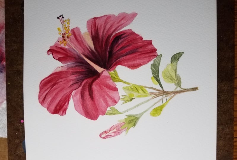
12. Finishing Touches: This is the final stage, where I'll be adding some final touches to the flower to complete this painting. So at this stage, you will practice to look for areas that needs a bit more contrast or darker colors, shadows, or just any improvements as you see fit. And then work on it. For example, you can tidy up the edge of the petal with a fine outline. So now I'm going to apply a light wash or glaze over the petals using permanent rose. Just to give it a pinkish tone. You only do this step when the surface is truly dry. So just brush lightly over the surface, but don't go back and forth to avoid lifting up the existing colors. By doing this step, it also helps to slightly soften the hard edges between two different shades or tones. Now touching up the pistil. I'm doing this to make sure the pistil stands out from the petal behind. A tiny accident happened earlier and messed up this area, so I'm correcting it now. This is our completed watercolor hibiscus painting.
13. Thank You: Congratulations, you've made it to the end of the class. Thank you so much for joining me. I hope you have now learned to paint a beautiful watercolor hibiscus. Please don't forget to share a photo of your final artwork in the project area. If you have any questions or feedback, feel free to leave it in the discussion section. And don't forget to follow me on Skillshare so that you'll be the first to know when my new classes are available. See you again soon.
 Soo Ling Loo, Watercolorist | My Little Oasis Studio