Transcripts
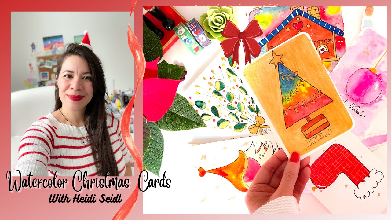
1. Welcome: Hi, I'm Soo Ling from Malaysia and I'm a self-taught watercolor artist. Welcome to my class... Painting Christmas plant elements in watercolor. In this class, we're going to paint three types of elements - poinsettia, holly berries, and spruce cones. We will be using a very simple watercolor technique for our class projects. So it's totally beginner friendly. So join me in this class and together we'll create some beautiful and magical art together. See you.
2. Your Project: Your assignment is to draw and paint one or more of the Christmas plant elements using the techniques demonstrated. After completing your paintings, do share them in the project area so that we get to see the magical art you created. Finally, don't forget to wish me Merry Christmas. Okay, that's optional. But I do want to wish all of you a fun and happy Christmas. So let's get started.
3. Supplies: Here are the basic supplies you need for this class. First, watercolor paper. I'm using Canson XL aquarelle but you can use watercolor paper of any brand, as long as the paper weight is 300 gsm and it's cold-pressed paper. I've cut the paper into a 5x5 inches of card, so that it will be easier for me to move them around and more convenient for me as I paint. Do have some strips of paper handy to test your watercolor. And also some normal printer paper to practice drawing your elements before transferring them to the watercolor paper. Watercolor mixing palette, it's best to use a palette with many mixing wells because we are going to prepare some watery watercolor mix each time before we start painting. And as for water containers, we will need one for preparing our watercolor mix and one to clean and dip our brushes. In this class, we actually use more water to prepare the watercolor mix, but we don't really need a lot for cleaning the brush. And I will place this smaller container close to my palette as I will be dipping the brush very frequently. And this is the dropper to drop water into the palette for color mixing. I'm using Winsor and Newton watercolor in tubes, but you can use any watercolor paint of your choice. As for brushes, you'll be mainly using small sized brushes. I have a bunch here ready for me to use, but you don't need so many, mainly you'll just need 3. First brush no.2, any no.2 brushes will do. Then you can choose to have either no. 1 or 0. The third one you need is a 2/0. Or if you have a 3/0, that's fine too. Paper towel, very essential, because we need this to help remove excess water from the brushes. Because water control is important in the technique we're using. Drawing stationery. Erasers. Kneaded eraser is the best. And pencils, you don't need so many pencils. Just use any one that you feel comfortable using to sketch. But at least have these two types. A lighter one, like HB for sketching and drawing, and then a darker one, like 4B, to use when transferring the sketch. So that's basically all you need.
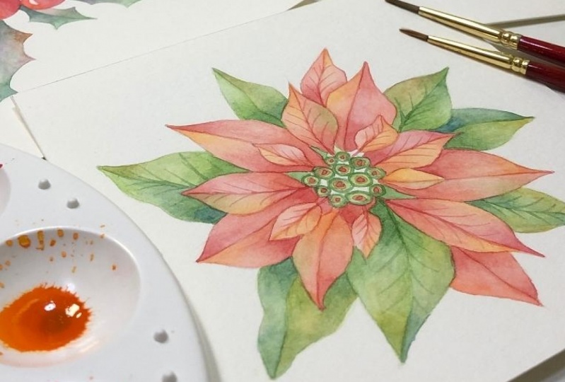
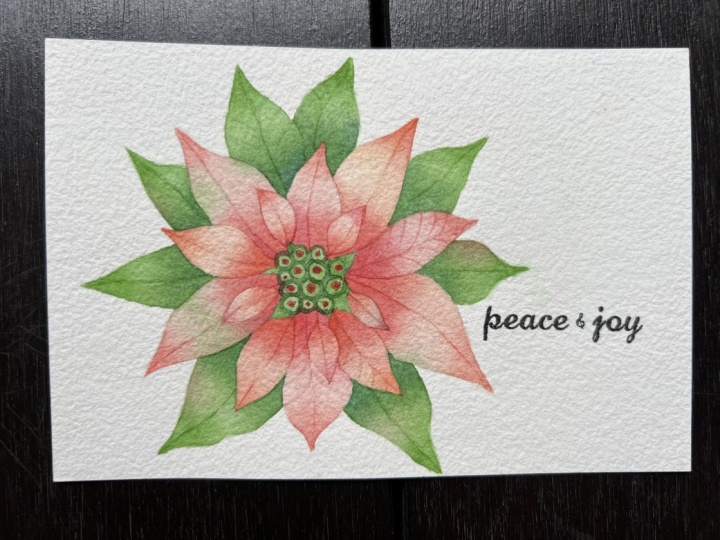
4. Draw: Poinsettia: Poinsettia is relatively easy to draw. So I'll draw straight onto the watercolor paper. Here are the flower buds, in the center. The red leaves around them. So I'll start by drawing the center part. First I draw a circle, then the smaller circles inside as the flower buds. And we'll start drawing the smaller leaves. So we will draw a few around at different corners. Next, draw slightly larger leaves. So we are trying to fill up the gaps between the smaller ones. So you just continue to add layers of larger leaves below and try to fill up the gaps in an irregular fashion. They don't have to be symmetrical. So this is done. Next, we'll draw some holly berries.
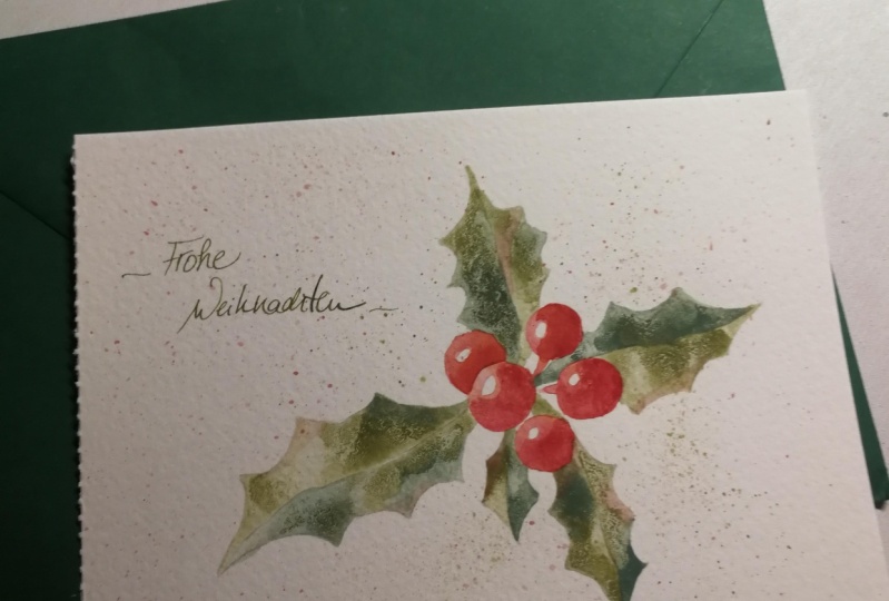
5. Draw: Holly Berries: Holly berries are easy to draw as well, mainly there are berries at the center and the leaves extending in different directions. So you can choose to draw three berries, five berries or even seven. I'm going to draw five. So let's draw. I'll start by drawing one at the center. And then a second one here. One behind this. Another one here. If you don't like the arrangement, just erase and redraw. These will be the shiny highlights. I'm not sure what this is called. Is it called stalk? Okay, moving on to draw the leaves with spiny edges. Try to draw the leaves in different sizes for variation. To add interest, you can have the tip of the leaf extended and curved as well. And this one, this is a tiny leaf. Just like the berries, I'm going to draw five leaves as well. Going with odd numbers is nicer. So, we're done with the berries.
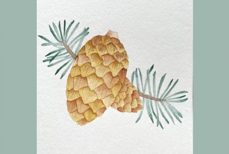
6. Draw: Spruce Cones: Now moving on to the spruce cones, this one is a bit tricky. You can draw directly onto the watercolor paper if you're confident. But I will sketch on a piece of paper first. So I'll draw on this paper and make sure I like it before I transfer it to the watercolor paper. But first I will make an outline of the watercolor paper To ensure I draw my spruce cones within the square area. So there will be one spruce cone here and just a small one behind plus a twig. So I'll start here. First, draw an outline of the shape. We are not going for accuracy here, We're here to draw and paint fun Christmas illustrations. For the scales on the cones, we will draw lines to form some diamond shapes first. Then use the diamond shapes as a guide to draw the scales. Next we're going to draw the twig with leaves or known as needles. So draw this branch thing first. And then add the narrow needles. I need to change to another pencil with a sharper tip. So in actual, there should be many, many needles here. But I'm simplifying a bit here, doing a minimized illustrative style. I'm going to lay down a layer of pencil here to make my own carbon paper to transfer the sketch. So I put a piece of paper below to avoid dirtying my desk, When you do this, make sure the entire area behind your drawing is covered. Now put your watercolor paper below your drawing. Make sure your drawing is placed at the right spot of the paper. You can use masking tape, or washi tape to help tape the papers together so that they won't move about, but I will just use my hand and make sure neither of them move out of place. So I'll start tracing now. Okay, the drawing is now transferred to the watercolor paper.
7. Color Palette: For the color palette, It's meant to be a reference. You don't have to follow exactly. You are free to use your own favorite colors. So first, for the poinsettia. For the red leaves here. I'll be using these two red colors, cadmium red hue and cadmium red deep hue. You can use any other red combinations that you like. To add some interest to the leaves or to brighten up the red a little. I'm going to add some orange tones. I have here cadmium orange hue and Winsor orange red shade. You can use any orange that you have, or even a warm yellow. As for the green leaves, I will be using sap green as the main color, and I'll add cobalt blue to it to make darker and cooler greens and as much as I need to. For the holly berries, I'm going to use a combination of quinacridone red, and alizarin crimson. If you don't have these two colors, you can use the cadmium reds that I mentioned earlier, or other types of red that you have. And I'll see how the colors turn out and add other red tones if necessary. Similarly, I will use sap green and cobalt blue to mix the green colors that I need for the leaves, since they are already in the mixing palette. Alternatively, you can use Hooker's green dark if you don't want to do any mixing. And dioxazine purple to add interest to the leaves. For the spruce cones the two main colors will be yellow ochre and raw umber to paint the cone scales and the branch. I'll throw in VanDyke brown as well for some color variation. As for the needles, again, I will be using sap green and cobalt blue to mix the green color that I need. And lastly, dioxazine purple to add some interest.
8. Prepare Your Watercolor: So now I'm going to show you how we need to prepare our watercolor before we start painting. As I mentioned before, it's best to use a mixing palette with wells because we need the paint to be in the water form throughout the process. If you're using watercolor from a tube, you can squeeze out some of it on the side of the well. Then use your dropper to drop some water in. Then mix in your watercolor. You can then test it on a strip of watercolor paper. If it's too light you can add more paint. If it's too saturated, add water. But do keep in mind that we want to maintain the lightness and transparent characteristics of the watercolor. So if you are using a watercolor pan set like this one, this is how you will prepare. I will use cadmium red hue to demonstrate. This is actually from the tube. Oops, I've rinsed my brush in this water. Actually, I need this to prepare the watercolor mix. But it's okay for now, as the water is still pretty clear at the moment. But do remember to prepare your watercolor using clean water. So one tip for you is that you can fill all the wells with watercolor first before you start mixing any colors. And you don't have to worry about making the mistake like I did just now. Test the color. It's a bit light, so I'm going to add some more paint. Ok, looks better now. Okay, so I will continue to prepare the colors that I need. But first, I will go through with you the basic watercolor technique in the next video.
9. Painting Technique: Now I'm going to show you the technique that we'll be using to paint our projects. Basically, it's a very simple technique, it's very much like doing a graded wash. Just that we are doing it in smaller spaces, in shapes like these, and using shorter brush strokes. So let's practice, starting with this leafy shape. So I'm using brush number 2. Load the brush with the watery paint and drop it at one end of this leaf shape. So you want to make a small pool or puddle of paint here. Rinse the brush, slide it against the rim of the container to remove excess water. But you still want the brush to be wet. Then pull the paint outward and blend into the dry area. Pick up some water again, and continue from here. So you are now slowly creating a gradient effect. Because the wash has become very light. I'm going to add more paint and repeat the process from the other end. So it depends on the size of the shape and amount of paint you drop in earlier. If the shape is small, you probably just need to apply the paint once. To create a smoother gradient effect, you want to make sure your brush is wet but not overloaded with water. Always dab lightly on the paper towel to control the amount of water on your brush. Now to the smaller leafy shape while waiting for the first one to dry. So you repeat the same process. Since this leaf is small, I'm going to drop in just a little bit of paint. And when the shape is smaller, the more careful you need to be with water control. Currently the color is very light and you don't see much gradient difference here. But it's okay. We will add more layers of colors later on. So we'll just let this to dry first. Moving on to the circle, or round shape. So we'll start from the side that is supposed to be darker. So I'll come back to this circle later. Now we carry on to the next one. You will see, later, that basically these are the shapes, the basic shapes that form our Christmas plant elements. That's why I would like you to practice with these. So now I'm going to apply the second layer of color. Say, if you think the first layer of color is too light for you. You can now enhance it using the same color. Basically just repeat the same process. But this time, you may not need to go over the entire shape. The color here now looks slightly more saturated than before. Now for the other side, I'm going to use a different color. Because when using different colors, not only you will be creating a gradient effect with multiple colors, the colors also have more interesting tones. So now on to this very pale leafy shape. I'm going to change into my brush number 1. So while the surface is still damp, you can use a wet-on-wet to enhance the color of the tip. But if it's already dry, then you have to blend it. On to the round shape. So as you can see, this technique here is very simple, but does require some patience. The gradient here doesn't look right. So I'm going to add a bit of paint to make it look more like a spherical shape. For this one, I'm going to add at the corners. I know this purple is not so purple after all because I mixed it with the cadmium red and cobalt blue here. I wouldn't be using this in the projects. So this is a way to add interest to your watercolor elements later. Adding colors at the corners, or along the edges, or at some random spots to make them more interesting. The last technique I want to show you is glazing. If you feel that the color of the entire leaf needs to go a bit deeper, then this is how you can do it. Stir your paint well, and load your brush. Make sure the surface is already dry. Then you apply it. Use gentle sweeping movement and try to apply it once, just once over the area if you can, because you don't want to disturb the existing layer too much. You can still see that the tips are darker and the gradient effect remains. So this is the transparency characteristic of watercolor. So now we are all ready to start painting our Christmas plant elements.
10. Paint: Poinsettia Pt.1: So this is the poinsettia that I'm going to paint. And here's the watercolor paint that I prepared. Cadmium red hue. Cadmium red deep hue. Cadmium orange hue. Winsor orange, which looks more red-ish than cadmium orange. I may or may not use it. We'll see how it goes. Sap green. This darker green is a mix of sap green and cobalt blue. I have the blue here so that I can adjust the green when I need to. So let's paint. Brush number 1, to paint the smaller leaves near the center. Always give the paint a little stir from time to time, to make sure the pigment and water mix evenly. Then start to paint using the technique shown in the previous video. Make sure to get rid of excess water. Instead of painting the whole leaf at once. You can also paint half the side first. You will see why later. I'm changing to the 2/0 brush because brush number 1 is still picking up too much water for even such a small area. Now painting the other side of the leaf. See this line here. When you paint one side after another, the overlapping in the middle creates a line that looks like the midrib of the leaf, so that you don't need to actually draw out that line. I will leave this to dry now, and we'll add a different color later. So we can now move on to the larger leaves. So I will paint most of the leaves in red and paint the outer ones with sap green. But it's up to you if you want to paint the entire plant in red, or even green. I will go ahead and finish the first layer and see you when it's done. So now we have got our first layer painted. The colors now look very light and pale but it's okay because we are going to add another layer of colors. You can use cadmium red hue for the red leaves again, and sap green for the green ones. For me, I will also incorporate cadmium red deep hue for the red leaves and the darker green for the green ones. So it's just repeating the process all over again. So you can start from the base of the leaf. Then from the tip of the leaf. Change the brush if you need to. I've also started to add cadmium red deep hue. Continuing with the green leaves. So, you can continue to use sap green. And start adding the darker green anytime you like. There's no fixed rule in where to add the lighter or darker green. Our main objective here is to make it look nice, beautiful and interesting.
11. Paint: Poinsettia Pt.2: Now I'm going to paint the flower buds while waiting for the second layer of the leaves to settle and dry. I'm going to make this simple. by first filling the circles with sap green. I'm going to let this dry first. And meanwhile, I'm going back to the leaves for another layer of color. Now, I'm going to bring in the orange tones with cadmium orange hue. You don't have to do this for every leaf, just add randomly here and. there. Of course, you can do this for all of the leaves if you want to. For this one, I'm doing a glazing. Now I want to try Winsor orange red shade and see how it looks. For areas that you think needs to be a bit darker, you can go back to add another layer of cadmium red deep hue. Just make sure the previous layer is already dry. You can add a tint of green as well. So do the same for the green leaves. Adding extra layers where you think is necessary. Since I have cobalt blue here I will also add it to some of the leaves. Back to the flower buds. I'm going to just add some red circles. So while waiting for the flower buds to dry, I'm adding some orange tones to the leaves. Add some red tones as well. Returning to the flower buds. I'm just drawing circles around each of them. using the darker green. One more layer of red circles. Now I'm using the darker red to draw some veins on the leaves. I'm not going to draw for all the leaves. I will just leave some of them without the veins. So this is up to you. It's your creative decision. Outine on the flower buds once more. And this is our completed poinsettia.
12. Paint: Holly Berries: So now we are going to paint our holly berries. Here are the colors I prepared. Quinacridone red, alizarin crimson. These are the colors for the berries. Dioxazine purple to add color interest to the leaves. This is the darker green I used for the poinsettia earlier. So I'm going to start with Alizarin crimson. So apply it on the darker side of the berry and then blend it out. But remember to leave the small area untouched. That's the area for the highlights on the berry. So basically you just do the same for all the berries. Make sure the berry next to it is already dry before you paint this one. I'm adding another layer as the color is too light, mainly because I have not used sufficient paint when preparing the watercolor. But then it's better to start lighter and go darker gradually. If you started with a dark layer, then it's difficult or even not able to turn it around. Now, I'm adding quinacridone red, starting from the other side of the berry. Quinacridone red is brighter compared to alizarin crimson. It looks like a deep salmon pink to me. But I can't really see the difference in the tones between the two reds at this moment. I'll continue and then make necessary adjustment later. So let's paint the leaves now. Adding second layer to the leaves. Adding a bit of cobalt blue to the green. Because I want the green to be slightly cooler. I will just add cobalt blue directly to the leaves. So the fun thing about this project is that you can play around with colors, make adjustment as you go, and explore different color combinations to make your painting look interesting. You can also add some dimension to the leaves, by adding shades this way. Besides applying the paint at the base or the tip of the leaf, you can also apply it along the edges. So now I've done with the second layer, I went to make adjustment to the colors and tones of the berries. First I'll try again with another layer of Alizarin crimson. It doesn't look like there's much difference here. So I'm going to use one of the cadmium reds. So, I will go with the cadmium red deep hue. This is looking much better. So I'll do the same for the other berries. Next, I'm going to add some orange tone using Winsor orange. I'm now adding purple tone to the leaves using dioxazine purple. How about adding some red tones as well? And some orange too. So I'm going a bit crazy with the colors here. You should do that too. Lastly, for the little stalks of the berries. I'm going to try to mix some kind of brown color. using what I have on the palette. I just need a tiny amount. I just want to make the base of the leaf darker. So this is our completed holly berries.
13. Paint: Spruce Cones: So now we are going to paint our last Christmas plant element, the spruce cones. So here are the colors. Yellow ochre, raw umber, Vandyke brown is here. A dark green, mixed using sap green and cobalt blue. And dioxazine purple for adding interest of the leaves. So let's start. Starting with yellow ochre. We will be painting the scales one by one. If there's too much paint, you can lift it off with your brush. I've changed the brush to the smallest one. You may have to change the brush a few times due to the different sizes of the scales. Try not to immediately paint the scale right below the one you have just painted to avoid bleeding. Choose one that is further away. I'm going to paint some of the scales with raw umber. No fixed rule here, just choose randomly, or in some kind of pattern or sequence that you like. So I'll go ahead to finish the first layer of the scales and see you when it's done. So now the first layer is done. I'm going to do the second round to intensify the colors using both the yellow ochre and raw umber. You can use a different color, such as adding raw umber to a yellow ocher layer. Or you can use the same color to intensify the existing layer. You can also add it on the tip of the scale. So I will continue to work on the second layer and see you after I complete this. After the second layer is done, it's time to add some details. I will use Vandyke brown for this. Give it a stir. And place some paint along the border here. And then you draw some fine lines using quick and short strokes. So we are going to do this for every scale, one by one. I'm done with the details and also painted the stalk using one of the browns. Next, I'm going to work on the twig behind the cones. I'm using the darker green mix. I'm trying to find the best angle to start. Drop in a bit of paint. And blend to fill the entire needle. Remember to use your smallest brush for this. To add some interest to the needles. I'm going to add dioxazine purple now. So go ahead to work on this and I will see you when the needles are all filled up. So next, we will paint the branch. Using raw umber and very carefully filling up the space. Continue to do the same for the other side. And now to the fun part, adding green tones to the scales. You just choose a few to paint by random. You don't have to paint all of them. So this is our completed spruce cones.
14. You've Done It!: Congratulations for completing your three watercolor Christmas plants elements. Thank you for joining me in this class, and I hope you have had a good time painting. I would love to see your beautiful work in the project area. So please, please, please share them. Till I see you again in my next class, Merry Christmas and Happy New Year.
 Soo Ling Loo, Watercolorist | My Little Oasis Studio