Transcripts
1. Introduction: Hi, thanks for joining me for another class painting
successful landscapes. It's all about value. Accurate value is
the key to making a painting feel
believable and life-like. As a beginner, it can be
tricky to see values, let alone mix them accurately. This class is designed to
help simplify the process and get you feeling confident
with value in no time. First, I'm going to give you
some examples so you can see y-value is such an
important part of painting. Then you'll create
your own value scale, a useful tool to help
you recognize and mix accurate values more easily. And for your class project, you'll put your new knowledge
of values into practice by painting a beautiful mountain
landscape along with me. This is a great way to practice using value to create depths. By the end of the class, you will know how
to use value to create more successful
landscape paintings. And feel confident to apply your new knowledge to all
of your future creations. Have fun.
2. Understanding Values: Value is basically how
light or dark something is. I actually think that value is more important than
color in a painting. Accurate value is
the key to making a painting feel
believable and life-like. First, I'm going to
give you some examples. So you can see y-value is such an important
part of painting. Here's a painting by
photo-based artist Andre during the colors
aren't at all lifelike. And yet we're still
able to make sense of the image because the
values are correct. The lights and darks are still
in all the right places, despite the unrealistic colors. When we make this
image black and white, you can see the values
clearly and it suddenly feels like a more realistic
representation of the scene. The same is true
of his portraits. The colors here are exaggerated and not
at all true to life. There are no skin tones, but yellows, green for the
shadows, and bright pinks. However, when we make this
painting black and white, you can see how accurate
the values are. You can see the highlights and shadows that make up
the shape of the face. And because those
values are correct, we're able to make
sense of the image regardless of what colors
are actually used. Value is what brings
your subjects to life, giving them form, depth,
and believability. It's important to be able to
see and recognize values in your subjects and
then accurately convey those values
in your paintings. This example by Manet, the strong contrast between lighter values in the
background and darker, stronger values
in the foreground really creates depths
in the painting. Getting accurate values
in your landscapes is what will give them a
real sense of distance. It can be difficult to
recognize values sometimes, especially when
color is involved. One tip is to squint your eyes. Squinting at the subject
will help to mute the colors you're seeing so you can
better see the values. It gets rid of the
details and merges colors of similar value
into bigger shapes. Try squinting at this image
and you should see that it clearly divides the
areas of light and dark. Now of course, you wouldn't
squint your whole painting, but it can be helpful to help pinpoint your values
before you begin.
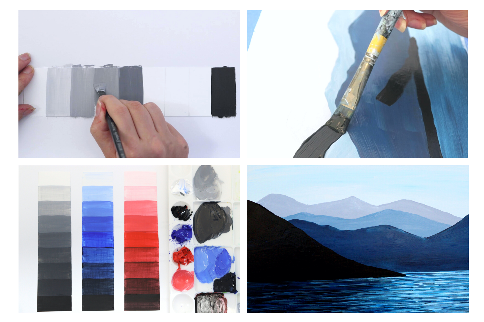
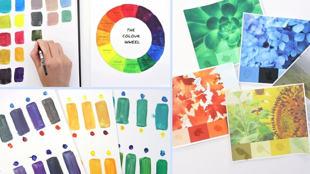
3. Introducing The Value Scale: Recognizing and depicting values is something that you'll
develop with practice. The more you start to look
out for these things, the easier it will
become to see them. But for now we're going
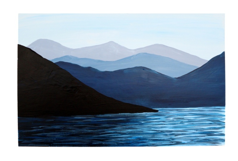
to start by creating a value scale like this. You'll need your paint
in black and white for one scale that I'd also recommend trying it with
some other colors to choose two other colors you'd like to make a
scale with as well. I chose red and blue. You'll need a medium flat brush, your water palette,
and some tissues. Before you start, you'll
need to prepare a strip like this one here for
each of your value scales. I've just cut mine from
some acrylic paper and then used a ruler to divide
them into nine sections. When you're all set up, head to the next video, we will practice
mixing those values.
4. Make Your Own Value Scale: A value scale is a useful tool to help artists identify light, mid tones and darks more easily. We're going to just
use black and white to create a scale from
light to dark here. Let's fill in the first box
in the scale with pure white. Then the last box on your
scale with pure black. Then we want to mix
up the other values. Black and white are both
quite powerful pigments and we want a nice even transition
between the values. So we'll start by making a midtone by mixing
equal amounts of black and white and
then adding this to the middle box in our scale. With these three
values in place, we have a good structure to help us fill in the rest
of the squares. For the lighter values
start with a base of white and then add a
touch of your main gray. This will give you
a really pale gray, which will sit next to
the white on your scale. The aim is to get a
nice gradient which transitions from light to dark. For your next block, you'll want to mix in more of your mid tone into the
gray to darken it. Keep adjusting the
mix bit by bit until it feels like
it's a shade darker. Next, what aiming for
a value which sits in-between all paler
gray and our mid-tone. So again, just keep
adding a mixing in the mid tone gray until you
get the right kind of shade. That's the first part
of our scale finished. Now we'll start working
on the darker values. This time you'll want to begin with a base
of the mid gray. If you don't have
enough of this, mix up some extra Before
we start adding the darks. Add a touch of extra
black to create that next shade up on the scale. Keep going, adding
more black each time to build those
darker values. That's our scale in
black and white. This is the one you'd
usually keep for reference, but colors will
also have a value. This exercise really helps
with your mixing technique. I want you to practice
this twice more in color. Start with your base
color as your mid tone. Then you'll be
lightening and darkening your color to create
its different values. I'll start by mixing the palest
version of my blue here. Then I'll gradually
mixing more of the blue as we
continue up the scale. We're aiming for a nice even transition
between the values. So you can adjust
these if you need to. For the darker end of the scale, use your pure color as the base. And then gradually mixing black to create
your value shades. Keep building the darker values step-by-step until you reach
the end of your scale. I'm going to repeat
this process one more time with my
second color of red. You can choose whatever
color you like. Repeating the process
with different colors is a really good practice
for color mixing. And it will help you become
more accurate when you come to painting highlights
and shadows in your artworks.
5. Seeing Values In The Real World: Now you have your value scale. Give your eyes a bit of practice with recognizing
different values. Take your black and white scale around your house and hold it up to different objects to see what values
you're seeing around. You. See if you can see where on
the value scale that object would fit can make it
harder to recognize values. If you aren't sure, try to squinting
trick and see if that helps you pinpoint
in the object's value. You might feel a little silly, but it's all good training. Keep your value scale
somewhere safe as it's a handy tool you may want
to refer to later on. If you have any
questions about value, just drop them in the comments. And in your next class we'll be painting a mountain scene. To really put those
skills into practice. I'll see you then.
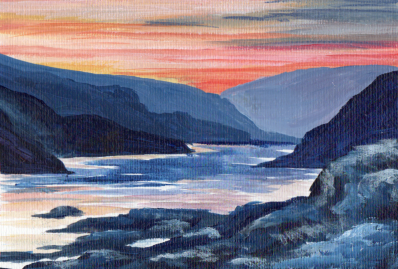
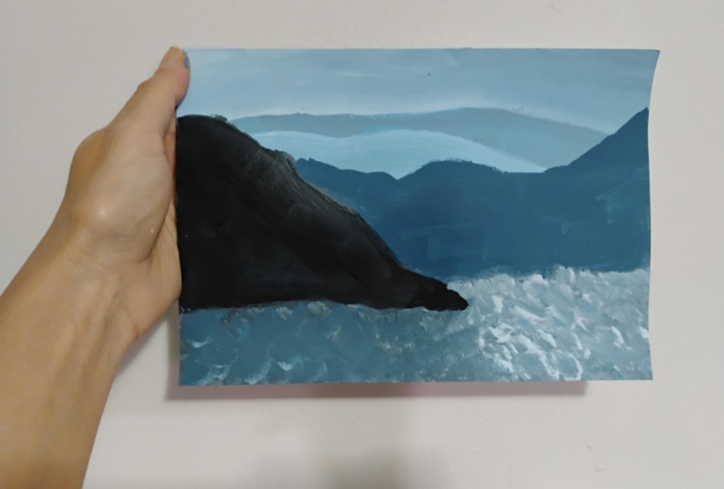
6. Class Project Introduction: Hello, It's time to paint another full painting
along with me. This time we'll be putting
your new skills for painting values into
practice with a mountain IC. This is a great way to practice using value to create depths. Notice how we have lighter, less intense values
towards the background, and more intense dark about
using the foreground. This is very common in landscape
paintings as colors tend to lighten and get more muted as they fade
into the distance. Believe it or not, I only used one brush for
this painting, my half inch flat brush
and just four colors, blue, red, black, and white. So get yourself setup with your usual supplies
and when you're ready, head to the next
video and I'll show you how to paint the
scene step-by-step. Have fun.
7. Mountain Landscape - Part 1: To begin, mix up a pale blue. You're aiming for a very
light sky blue color. So just a small amount of blue mixed into your
white will be enough. You'll be using this blue to cover the whole of
your background. Just fill your
whole surface with this color and we'll get rid
of that scary white page. You don't need to be
super neat about this, but do try to keep your brushstrokes or going
in the same direction, moving horizontally
across the page. Even though this is
just a flat color, keeping your brushstrokes
consistent will make your painting feel
calmer and more unified. If you have lots of brushstrokes all going
in different directions, it will look a bit messier
and more energetic. Sometimes you want
that kind of energy. But here we're painting a
nice calm landscape scene. So we want our brushstrokes
to be nice and calm too. Next, we're going to
mix the color for our most distant
row of mountains. Will keep the pale
blue as the base, but we'll add to it to
create a pale gray. Now this is going to be the lightest value
for our mountains. It's important not
to go too dark. I'm adding a touch of red just
to give it a warmer tint. Then I'll also add the
tiniest touch of black. If you do go too dark, just keep adjusting
your mix until you've got about the
same shade as mine. This color is going to form our most distant
row of mountains. You'll want these to sit
near the top of your scene. I believe, about a third
of space for the sky. And then paint in some
loose mountain shapes. You can use your imaginations for the mountains themselves. Just imagine there are some
distant peaks on the horizon. And paint in those shapes. Once you're happy
with the shapes of your mountains on the horizon, you can continue that
pale gray down the page. You don't need to go
all the way down, perhaps just about halfway. When you finished your
first row of mountains, you'll be adding another row and these will be slightly
closer to you. This means that value
will need to be slightly darker as they were coming
forward from the horizon. Will use the same
base color but mix in more of our other colors
to strengthen the value. Think back to creating your value scales and imagine you're mixing
the next step along. You want to color
that is a shade stronger and more
intense than your first. Then you'll be painting
another row of mountains slightly further forward
than your first set. Again, you can use your imagination for
the actual shapes. Just paint in this
next row of mountains, exactly like you did before. Beneath the mountains you're
going to have some water. And this water will reflect
the colors of the mountains. Before we add our next row, I'd like you to use this same color too quickly
block in some of the water. I'm thinning down my paint to make it flow better
than I'm just brushing this watered-down color over the bottom section
of the painting. You can be really
loose with this because we'll work
on top of it later. But it's just a good idea
to get this base color down while we still
have some of it mixed. This has helped to fill in
that space at the bottom. And because we've
watered the paint down, we have a nice
transparency which will help give the illusion
of water later on. When you felt this
section with color, we'll paint in the
next row of mountains. Our third set of mountains
will be further forward again. And this means that they
need to be darker in value to create depth
in our painting. I've started with a darker
colors of blue and black here. Then I'll add a touch of
white just to soften it as I don't want it to be too big
a jump between the values. We're aiming for. A nice deep blue. As before, this set of mountains is going to be
further forwards again, it will overlap the others. I'm going to start this
set a little higher up just to add some variation. Then I'm going to
paint in the peak shapes just as before. If your other layers
aren't quite dry yet, you might get some of the
lighter color sneaking through. I don't mind not
too much actually. It looks almost like snow and it gives
some extra texture. But it's up to you. You can dry the layers off or let them blend into
each other a little. As our mountains are now
getting closer to the water, you'll want to start
knitting up the bottom edge. This time we'll create
a straighter line along the bottom of our mountains
as they meet the water. Just keep working and adjusting your own mountains until you're happy with
the way they look. You can see how
we've now built up these three values as the mountains fade out
into the distance. This is starting to give our landscape a nice sense of depth. To finish this stage
of the painting, we'll just add some darker
reflections to the water. Thin down some of the same
color so it's nice and watery. Then just brush in
some darker areas. I'm keeping this to the
left-hand side of the painting just underneath where our
final mountain will sit. You can see I'm getting these nice marks from the
bristles of the brush. As the brush dries out at
the end of the stroke. I'm going to leave those
edges like that because it already gives a sense
of ripples on water. At this stage, the painting's still looks a
little bit strange. There's always this or quit halfway point in any painting. But stick with me and your
piece will start coming together as you add
detail in the next stage.
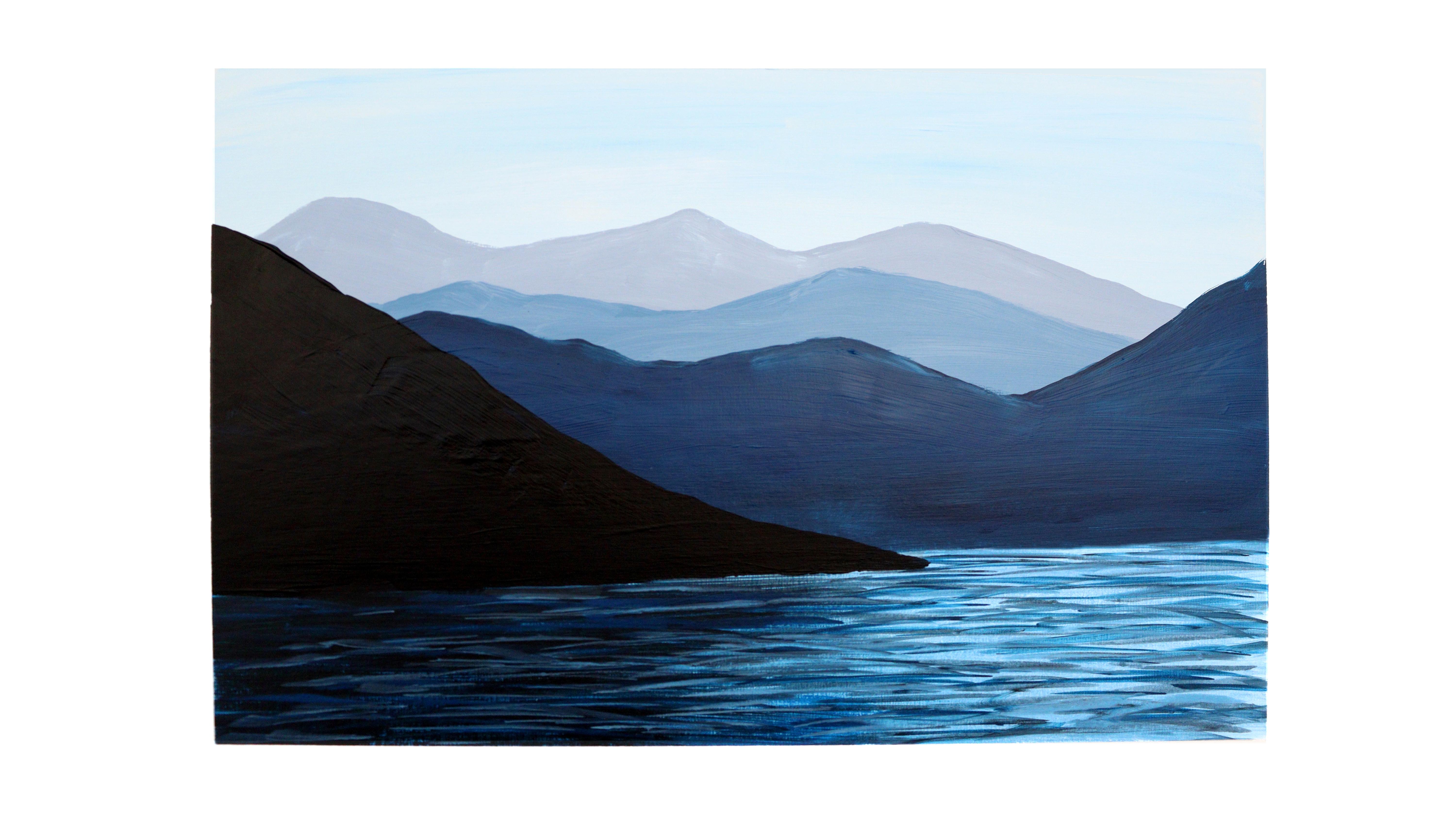
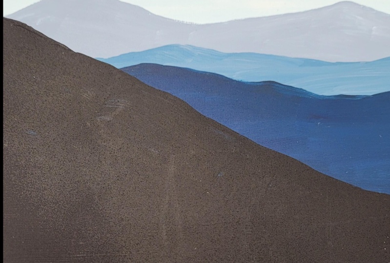
8. Mountain Landscape - Part 2: Now it's time to paint
our final mountain. This one is going to be
the furthest forward, coming right up to the water. This means we want it to
be the darkest value. And to create real
distance in this piece, we're going to go all out and just paint
this one in black. So it's like a
silhouette against the paler background layers. This is just one mountain
and it's going to be coming out from the left-hand side
down towards the water. I'm going to start by brushing in the base
for the mountain. And I want it to
come out to about just over halfway
across the piece. I'm still using my
flat brush here. But if you find yourself
struggling to get a neat edge, you can switch to a pointed brush to give
you a little more control. Notice how the base of my mountain comes out
slightly into the water. This will help give
the illusion of depth because some
of the water will be sitting and going around the edge of this
foreground mountain. I'm going to bring the side of the mountain down
from about here, imagining that we
are quite close to this one and it's coming out
of the edge of our frame. Then I'll just fill in
the rest of this shape. To neaten up at the edge at
the base of the mountain, you can use some more
water on your brush so that you'll get a
smoother flow of paint. Now, we're going to add a reflection in the water
beneath the mountain. Water down your black paint exactly like we did
with the colors before. Then lightly brush this across the water beneath that,
the dark mountain. You might need to add
some more water as you go because black is
such a strong pigment. Then you'll have the
base of your water. All it needs is a few extra
ripples to bring it to life. We'll start with the shadows. You can keep using your
watered down black paint. Make sure it's
watered down enough that it really flows
from your brush. You don't want any resistance. The flat brush is surprisingly
good for painting ripples. Make sure you're using just
the tip of the brush and palate horizontally across the
page to create thin lines. You will not try to get a nice variation in the
width of the stroke, which works really well
for painting water. Your brush should really
just skate across the page. If you find it too dry or
you're getting blobs of paint, keep adding more water to
your mix until it flows. We're going to repeat
this same process, this time using our
deep blue water, the paint down until
it's nice and thin. Then add another layer of
ripples in the same way. As you paint your report, you want to get a mix of
short and longer strokes. Try to mix it up so it
doesn't become too uniform. We're going to brush
these all over in both the darker and lighter
areas of your water. Finally, we're going to
add some highlights. So I'll use white to mix a pale blue and then water it down until it's
nice and thin. Then simply repeat the
same process as before. Brushing in those highlights. You don't want too
many highlights in the dark area of the water. Here. I'd keep them more
spread out and just add a few of them to give
a hint of the ripples. Just keep working
back and forth, building those ripples
up until you're happy. We have our finished mountain
landscape where you've used different values to create that sense of depth
and distance.
9. Well Done!: So big, well done. I hope you enjoyed painting that mountain scene
along with me. How did you get on with painting
those different values? Do share a photograph of your
painting in the comments, and I'll take a look and I can always give
you some pointers. Just click the Create
Project button to share your painting. If you enjoyed this class, I'd love for you
to leave a review to help other students find it. If you'd like to keep
building your skills. To take a look at my other
classes here on Skillshare. Take care and I'll see you soon.
 Kate Broadhurst, Artist / Painter / Educator