Transcripts
1. Class Intro: [MUSIC] Have you ever been baffled
about how to create stunning digital portrait
paintings in Procreate, that too in a structured way, with right color choices and
with incredible details? If yes, then this class is going to solve the
problem of yours. Hi. This is Ritika. I'm a freelance portrait artist, illustrator, and a top
teacher here on Skillshare. I work both on traditional
and digital medium. I enjoy creating
caricature portrait albums minimum illustration, sometimes I sit and paint my
heart out on my sketchbook. Be it pencil drawing
or iPad illustration, I work on portraits with incredible details because
in my point of view, the beauty of art lies in
those small and fine details. But of course, abstract art
also has its own charm. In this class, I'm going
to teach you how to paint such amazing
portraits on your iPad. This class is going to
be filled with lots of tricks and techniques
about portrait painting. The journey of mine
includes hundreds of client portrait works and
also personal sketches, and watching a number
of portrait tutorials searching on YouTube for the
portrait tips, and so on. That is why I want to simplify the process for you and teach
you in a structured way, so you can save lots of time. The core value of this
class is going to be bringing knowledge
about skin tones, blending, and
detailing portraits. This skill is absolutely
going to help you to create stunning masterpieces
without messing too much of blending, which makes the art look flat without creating
muddy or dull colors. I would say this class
is for intermediate in regards to portraits
and Procreate, because this class is not
going to cover the basics of Procreate tools and the process of
sketching a portrait. We will be starting off with painting a portrait directly. In this class, we're
going to cover about choosing the right colors, splitting up the painting
process in steps, working with shadows
and highlights, tones like saturation and hues, and detailing the
facial features, painting the hair, adding some special effects or the blending modes to
make your portrait pop. Then lastly, creating
a background with textures and patterns that
compliments the portrait. One more thing,
I'm also going to show you how you can
export the artwork as a time-lapse video
and share the process of the portraits in
three ways as reels, which you can use it as
a social media content. I'm so excited to share my techniques and tips on
digital portrait painting. Just to inspire you a little, I'm going to show you
my oldest sketches and my latest ones. [MUSIC] Don't you want to level up your skills and
portraits, just like I did? Don't wait further, join me in the next lesson and
we shall get started.
2. Getting started: [MUSIC] Thanks for
joining the class, and since you have decided to stay with me for the next art, let's not wait further, and let me explain to you
what this class is about, the class project, and lastly, the supplies and the tools
required for the class. The class project for
today's class is, of course, creating a
portrait along with me. But in case, if you're not able to paint a full
portrait with me, but want to learn
the techniques, I have something handy
in for you as well. These are going to be quick
and small exercises to warm you up with the tips from
each lesson of the class. Or if you're really interested you can finish
both the projects. It's never too much to practice. Portraits are not done
just in a few seconds like in reels or short videos by
just pushing the pencil. But of course, it's a treat
for the viewers to look at the reference image and the
painted portraits in seconds. But, you have to know that to create a few seconds
of magic in the reels, every artist might have spent a lot of time building
up their portrait. To get the entire portrait
done there are many steps. In portrait painting, the first step is to get the outline sketch of
the portrait and then, to start with the painting. In this class, I'm going
to start from painting the portrait that you
already have a sketch of. This class is not going
to be from blank canvas. In case, if you don't know
how to sketch a portrait, then I've got you covered. I'll be providing you
with the sketches of few portraits that
I've created for you. Or if you want to
learn the concept of sketching a
portrait in freehand, you can check out my class
on three-step recipe to illustrate stunning digital
portraits in Procreate. You can always
find my classes on freehand portraits sketching on both iPad and pencil drawing. Portraits with grid method, realistic shading, mixed
media techniques, and so on. If you were someone who
knows to sketch a portrait, then you can start off
with your own sketch. Coming on to the tools needed, you will be needing an
iPad with the Procreate in it and the style is
like an Apple pencil. Another requirement for this
class is I said earlier, some basic knowledge about
Procreate is preferable. Next, you will need
a reference image. You can find a few in
the resource section, that is why I have included all the outlines of
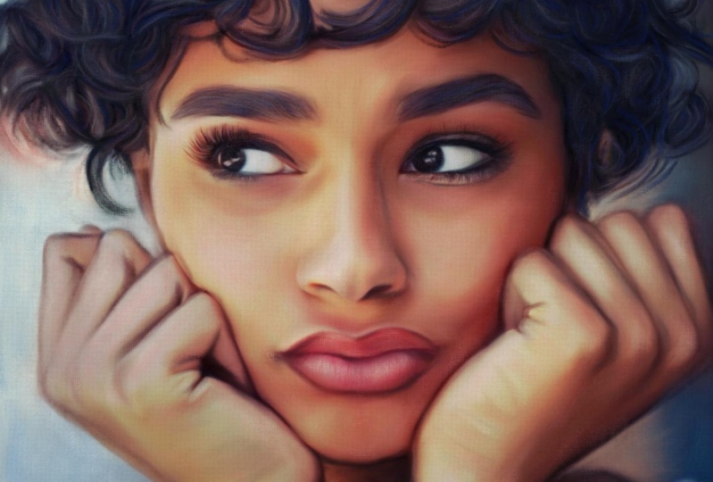
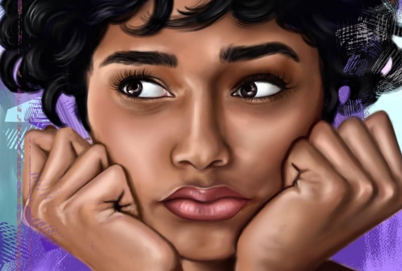
the portraits as well. This is the portrait that I'm
going to paint for today. You can also choose the same
or use a different one. Before you start coloring
and painting the portrait, make sure you go
to the settings, go to video, and ensure if the time-lapse
recording is on. In the next lesson, let me show you how to pick the basic colors,
shadows, and highlights.
3. It's all about the Base: How do you bake a cake? First, you prepare
the cake base with the flavors and then
you prep the icing. Just like that the
first step for us is to shade the portrait
with the basic colors. To do that let me first explain how to choose the basic
colors in a portrait. For that, you should know
the term color tones. That is how I'm going to refer
the colors in the class. If you take any portrait there
will be many color tones and different values
in each color. Let me simplify this further, what are colors or tones? For your better understanding, I'll show you some
tones and the values. For that, I'm going
to pick a few colors and show the tonal
variations of each tone. I'm picking this color and
I'm using an eye brush, so this is the tone
that I've picked. I'll show the tonal variations
in this particular color. For that I'll move to the value or I'll go for this
classic palette, and now the lighter we go we'll have the lighter
shade of that tone. This will be the lighter
shade of this particular tone and then if you move towards
the left or the right, you will have light to dark. I'm going for the midsection and here you have the mid-tone
of this particular tone. I'm moving towards
the darker side and you have the darker shades. What I'm going to tell is, I'm going to mention
this as the mid tone, and this has the darker and the lighter shade of
this particular color. Considering our portrait, first I'll pick the
color tone of this. I have the mid-tone
of this portrait. Don't consider the dark
or the lighter shade, just take the mid-tone
of this skin tone. Open a new layer and I'll
have my reference image here. You see here, this is the
darker tone of the skin and this is the lighter tone. I'll pick the mid tone now. I've showed you
what are the dark, mid, and light tones
of a particular tone. I'll explain it in
reference with a portrait. Here you see the
tone is very dark, and here you can see
it is very light. These are shadows and
these are highlights. We are going to leave
off both the shadows and the highlights and I'm
going to pick the mid-tone which is this tone which is neither too
dark or very light. First, choose that
particular color. Here I have the shadow,
here I have the highlight, so I'm going to pick
the middle tone of it which is going to
be our mid-tone. This is the mid-tone or the basic tone of a portrait, I'm going to color it below
this sketching layer. Using the airbrush, let's first shade entire
phase with the mid-tone. You can simply
fill in the color. Always when you color
or add a new color, open in a new layer and add it. I'll erase the extra tone. Same way I'm going to pick for
the lips, eyes, and hands. We are having a great one. What I'm going to do is move
towards the right a bit and I'm going to
pick this color. Then for the lip,
again you can see. This is the darker shade
that is the shadow, and these are the highlights. I'm going to pick the mid-tone. Here it is very dark and I'm
going to pick this tone. I'm going to open a new layer
and I'll paint the lip. We have the basic
colors painted here. I'm going to leave
the half portion. I'm going to show that
in the later lessons because the process
of coloring the hair is going to be a
little different when compared to the skin tone. Next what we're going to do is paint the shadows
and the highlights. Shadows are nothing but the darker areas
in the skin tones that are cast by other objects
or other facial features. You can easily
identify the shadows, usually they are the tones that are darker
than the mid-tones. Let me pick the shadows of
this portrait and paint it. Here you can see
there's a dark shadow, and here are all shadows. I'm picking this tone. Whenever you pick
the colors from the reference it'll be
a little desaturated, so you cannot
completely rely on it. You have to pick
the tone and move it until you see the tone is
perfect for the portrait. I've picked the darker tone, I'm going to paint wherever
you can see these shadows. Starting from here. Here you have the shadow,
so I'll paint it. Again, open a new
layer and do it. I'm using only the eye brush. There is a lot of shadows, so I'm going to use
a bigger size brush and I'm going to fill it. I'm painting the darker tone wherever is this needed and remove wherever
it is not needed. We're going to finish it
with the highlights now. Moving on to highlights. Highlights are the lightest
element in an image or a reflection of light. The highlights are nothing
but the whiter portions. This is the highlight
in this area. We're picking that
particular tone, and again open up new layer. I'll paint the
highlights like this. There where you see
the lighter shade just paint it with
the highlights. You see they'll also be white portions that is
the brightest spot, so I'll be painting white with it at the later
stage of the portrait. In these areas, it is completely dark, so I'll leave those portion. I've painted the
highlights as well. In our portrait, these are
the areas of highlights. To pick that color mostly
use the lighter tone of the basic color or a shade almost close to
white or pure white. Just a reminder,
shadows throughout the face doesn't necessarily
be of the same color. It usually varies with
each part of the face and also based on the lighting. To avoid muddy colors
in the shadows, avoid picking tones
just straightly from the reference image and never go too dark
with the shadows. A portrait then will be filled
with too much of black. The same goes with the
highlights as well. I will show you how to add different things in
the next lesson. So far in this lesson, we have seen how to paint
the basic tone evenly then going for shadows usually the dark tones and
the highlights. What I want you to do after
this lesson is identify the shadows and highlights of three different portraits
and share it with me. You can also paint
the basic colors, shadows, and highlights
in the portrait.
4. More tones to the skin: [MUSIC] There is the reason
that we don't see the world in
black and white. That is why it is important to use the right
colors for realism. Choosing the right colors for our art work and
painting them is a huge process and we have already done the
first step in it, that is applying
the basic color. In this lesson, I'm going to add saturated and tinted
tones in our portrait. Adding enough amount of saturation actually
gives life to a drawing. First, identify the areas
that lack saturation. Then I'm going to add
the tones to the face. Now we have the dark, mid and the light
tone in our portrait. That is the shadows, mid
tones and the highlights. But what is missing is
desaturation underpins. That is what I'm going
to do in this lesson. At last I'm going to
blend everything. I'm opening a new
layer that is going to be my saturated tones. That is nothing but the mid tone with a little
amount of yellow in it. That is the saturated
tone in a portrait. As you see, this is very
dark with only brown shade. But if you move a little
towards right side here, you can find the saturated tone. I'm going to pick this
particular tone and I'm going to paint it there
where you see that. See here you have a saturated
tone and here, and here. These are the saturated tones. [MUSIC] Now, we have painted this
saturated tone as well. Next is tint. What I mean by tint is the
pink shades in a portrait. You can see here you
have a pink tone in the nose and here on
the cheek as well. I'm going to pick and
paint that color. Then I pick the colors
from the reference, you can see it is
very desaturated. Instead, I'm going to pick the tone from
the color wheel. I'm going to move
towards the pink shade, and I pick a lighter
tone, or the mid tone. I'll paint wherever
it is needed. Again, I'm opening a new
layer and painting it. [MUSIC] We have the dense as red. Coming on to the blending. There are two ways that I
use to blend the colors. The first one is using the smudging tool to blend
each part of the face. If any part get decolorized, add the same tone that
is present in that part. The second process is, if there is a problem
with the process 1, that is the color
gets desaturated. Go for this process. This process is going to be using the eraser as
a blending tool. I'll be showing you the demo
for both in this lesson. I'm going to use the process 1. Using this smudging tool, I'm going to blend each part. I'm picking this
margin brush and I'm again using the same
soft round brush. Now, what you can do is, duplicate all these
layers that we painted. Now, I'm going to
combine entity. [MUSIC] Now, I'll merge
all these layers. Again, duplicate it. Now let me show you
how to blend it. Use the soft round brush and blend wherever you have the
skin tones just like this. Too much of blending will
always flatten the colors. [MUSIC] There is another type of blending that is, if there's a problem
with the process 1 or this color goes to desaturated, or if you lose the pixels, you can go for this method. That is, without using
this smudging tool, you can use the erasing tool
and minimize the opacity. You can erase the
tones a little. This can be done only when the shadows and the mid tone
are in a separate layer. Since we have the
duplicate of it already, I'm using that and I'm going
to show the demo of it. Now I have the shadows and highlights and mid
tones in different layers. I'll show the demo of it now. I'm going to open the shadow layer and I'll show you how to
blend with the eraser. When you erase the
tones a little, it automatically lensen. [MUSIC] This is another type of
blending that you can do. But I mostly prefer
the first method. I'm going to use the
smudge tool and go to blend the entire portrait. [MUSIC]. Just a reminder, too much of blending can lose
pixels and decolorizes to a wide that big colors wherever needed and add the mid
tones as a blending color. Now I'm going to explain you what too much of
blending can do. It actually lose pixels
and decolorizes like this. You can see the color is very desaturated and it looks very light because
the pixels are lost. To avoid that, I'm going to pick the same color and color it above this and then
blend it again. I'll show you how
that is done now. If I'm going to
blend this portion, I'm going to pick this color and I'm going
to color on top of it. Again, it will be desaturated. More little towards the right. Now, color it on top of it. Next, for this tone as well, I'm going to pick this color and move it towards the right. That gives this saturated tone. Now, I'm going to
color on top of it. Let me blend it. While blending the margin
or the line that separates the two tones has to
be hidden like this. With the same
process, I'm going to repeat it for the
entire portrait, and I'm going to
blend it even more. [MUSIC] Now, I'm picking this
tone. I'm coloring it. Mostly use the mid tone of the color so that the portrait doesn't go
very light or very dark. Later whenever needed, we
can add the dark tone. You can also use that mid tone itself
and blend it like this, without using the smudge tool. Since it is an average, that it blends the colors well. Now I'm going towards white,
recolor this portion. Now let me blend this. Here again I'm recoloring it and I'm going to blend it. [MUSIC]
5. Building up layers: [MUSIC] In the same way now I'm going to color and blend the nose. [MUSIC] I'm also blending
the highlights. [MUSIC] Now again, I'm using the mid tone
to divide our areas, and I'll blend it later. [MUSIC] You see, this portion is a
bit dark compared to this. I'll pick the same exact tone. Now there is a lot
of black lines in our portrait that
is from our sketch. I'll minimize the opacity
of our sketch layer, so you can see the
colors better. If you see this portion is a bit dark when compared to this. I'm going to lighten it by
adding the saturated tone. Here as well I think
it is very dark, so I'll add this
tone and blended it. [MUSIC] Here and there
when you color it, minimize and see if you're getting the color
tones exact correctly. Sometimes when you're zoomed in, you will not see the
overall picture. [MUSIC] Until you get a smoother grid, keep blending and keep adding
the colors again and again. [MUSIC] Next, I'll blend the
forehead portion. [MUSIC] Wherever the tones
are flattened, I'm adding the colors again. Now, I'll blend it. [MUSIC] Then I pick the colors from the
reference, it is very dark. We're not going to use
the same exact color, but we're going to go a
little further up like this and use that
shade for this part. If you pick and use the same exact color
our portrait will become more of black shade
and we don't want that. This is enough. [MUSIC] You can also open
your Canvas here and see the entire portrait. [MUSIC] Here again I've added
the saturated tone, minding here for
the nose as well. [MUSIC] Now, I'll correct the hands
and the shoulder parts. [inaudible] I've
lost the colors, I'm going to recolor
it and blend it again. [MUSIC] This blending is enough for the basic shading. Later we'll add in the details. We can pick the exact colors and duplicate it
in our portrait. Now, I'll also blend this hand. [MUSIC] Now, I'm almost done with the skin tones. I'm going to pick the shadows and the
highlights for the lips, and I'm going to blend it now. I'll open the reference. Let me pick the
shadow for her lip. Again, as I earlier told you, pick a saturated
tone rather than picking the exact same
color from the reference. Here again, the tones are dark. I'm going to use this color. For the very darker
shadows, like here, I pick this tone
and [inaudible], and also towards her
right right that you will have a saturated tone. [MUSIC] I've added the shadows now. I'll blend it with
the smudge tool. [MUSIC] Now I'll add in the highlights. I'm moving towards
a dark like this. This is going to
be my highlight. [MUSIC] This again is going to be the basic
shading for our lip. We are going to detail it
further in the later lessons. [MUSIC] The basic shading for
the lip is also done. In the next lesson, let me
show you how to detail eyes, nose, and lips one-by-one. The recap of the lesson. First, we added the
saturated tones to our portrait and then we saw two types of blending and
then the blending process. Now it's time for you to
put this process in action. Go ahead and blend a
portrait from scratch. Or if you haven't finished
the earlier steps, you can go ahead and
download the portraits with colors in it and you can
try blending them up. I have included two to three half blended portraits
in the resource section. If you have any doubts, you can always clarify it with me in the discussion section.
6. Details to the Eyes : Detailing actually it's
the same process as of the end of your portrait
like we did till now. What is the first
process that we did once we got the
outline sketch done? Basic colors. So the basic colors
has to be added like the white and the
black in the eyes. Always remember white as the
eyes of never pure white. Now we'll go ahead and paint
the eyes in our portrait. I will show the process
of painting one eyes. Let me detail the eyes now. I'm going to open a new layer and let it be below
the sketch itself. First, open your reference. First I'm going to
color the white area. For that, it's a bit gray
here in our reference. What I'm going to do is color again on top of it with gray. When it comes to detailing, I'll be doing it below the
sketch layer a little. Later I'm going to
switch it on top of the sketching layer
because we are going to hide the
outlines as well. Here usually there will be a pink tone so
I picked the pink tone. I've added at the end of pink, gray, and white. Now what I'm going to do is open a layer on top of
the sketch layer. Again, I'm going to use this white and I'll be covering
all the outlines. Here there's a dark brown shade. Use that same tone
and have the outline. We're going to move further up and use this color for here. In the references, if you can see there is a very desaturated and a
grayish tone here. I'll try to replicate that. Here there is a blue
tint, the eyes. I'll pick the color and I'll
shade it next to the iris. I'm using this brown shade first and I'm adding it
wherever it is needed. Especially at the
tip of the eyes, like here and here. A little here as well. Then the lighter shade
of it like this tone. Now I'll smooch the tones
with the blending tool. I'm going to add a little
more of blue tone here. More towards a blue and
pick a lighter shade. Here you can see there's a lot
of white and here as well. I'll use it lighter
here and here. In the blending process, makes sure that the line that differentiate both
the tones disappear, but also you should be able
to see the color variation. Now I'm going to shade this part. I'm adding a bit of
the pink shade here, and also a darker gray tone. I'm only blending it a little because I want
all the tones like the white, pink, brown, and
everything has to be seen. Don't blend it completely
until the color disappears. Color the shape here a little. For that, I'm going to pick the skin tone that
is below the eye. I'm going to color it like this. Now I'll shade the iris. Until I'm satisfied
with the shading I've done the white part. Here it seems a little unblended so I'll blend
it a little here. Now for the iris, I'll pick a brown shade. You can't see clearly in
the reference so I'll pick a random brown shade from the color wheel and I'll
color it in the portrait. On top of it, I'll color
it with a black tone. Then here it is more of a
darker shade like black. I'll use black and
color these areas. I need the brown shade
only to be seen very little so the rest of the
portions, I'll cover it. Now for the highlight, I'll pick this tone, that is the white
or mild gray tone, and I'll color it here. Wherever you see reflection just color it with
the white tone. Now I'll blend it
little on the edges. Now the iris is almost done. Next, I'll move on to the
eyelids and the lashes. For that now I'll
outline the eye first. I'm going to use
this darker tone of brown for the bottom of the eyes and also here. Then for the lashes, before shading the lashes, I'm going to color the eyelid. For that, I'll
pick the tone here and I'm going to use this color. While doing this if you see any change in the outline shape of the eyes just correct it. You can see here the
shape is going a little wrong so I'll use the gray
tone and I'll correct it. The same color I'm going to
use for the bottom eyelids. I'm picking the saturated tone. Now, I'll blend
all these colors. I'll actually hide the
lashes on the outline, later I'll detail it in the upper layer. I've almost blended these tones, now I'm going to add the lashes. Before that, I'll add the
outline of the eye, for that, I'll use the black tone, and I'll use a scripting
brush from the calligraphy. I'll minimize the brush size and outline like this. Here I'm going to
use brown tone. Here is where I'm going
to draw the lashes. Before that, I'll blend these
colors a little like this because the outline should not be seen, it has to be blended
in with the portrait, so blend it a little like this with the rest of the tones. I'll pick this tone
and color it here, I'll go back to my add brush. Here as I'll smudge the black until the top of the
eyelid like this. Let me draw the lashes. Before that, here, the color seems to be unblended, so I'll go back to that
layer and blend it. Now I'm going to draw the
lashes and show to you, for that I'm going to use this sketching brush and I'm going to pick
the black tone. First, I'll start
at the edges and minimize the brush size and
sketch it just like this. Keep it little thin, and as you move
towards the right, change the angle of the lashes. You can see the lashes
starts from here, bends like this and more
towards the upper direction. I'm going to repeat the same, so I'll move this layer towards
the top and as you see, the lashes start
from here and come towards this side
and then go upwards. For that, I'm going to draw
a few lashes like this. Only the curves, and then I'm going to continue the rest of the lash like this. This is just to show the
curvature of each lash. Here I want a sharp lash, so I am darkening it a little, wherever needed, darken
the lashes here and there. In the same way, I'm going to draw the bottom lashes here. Usually, the bottom
lashes will be shorter than the top one, and the angle also changes like this. The lashes is almost done, I will outline this area with a little bit
of dark black tone. I'll also use the brown shade. After that, I think I have to correct the shape
of the iris a little. What I'm going to do is use the same sketching
brush and outline it. Now, I'm going to
smudge this part, the line of the iris
and the white portion. We're going to smudge this
very little just like this. I'm adding a bit of
highlights here and there and our eye
is almost done. The last thing that
I'm going to do now is add the highlights
here and here. I'm picking this saturated tone, and I'm going back to
my soft round brush and shade this in
the bottom layer, here I'm adding a bit
of this light tone. Now, let me blend it. This eye is almost done, I've repeated the same process
for the other eye as well. If you want to take the
process of the other eye, you can go ahead and watch the time-lapse video
in this bonus lesson.
7. Details to the Nose: [MUSIC] Next, detailing the nose. Now, let's start with the nose, starting with the basic tones. Now, let me show you
how to shade the nose. Exactly it's going to be the same process like
of that of the eyes. First, I'm going to correct
the desaturated tones. Since there's a lot of
shadows in the nose, I'm picking that color and I'm going to shade with
the darker tone of the brown. [MUSIC] Since we are working on the top
layer of the sketch, I'll try to hide the
outline sketches as well. [MUSIC] Now I'll blend these tones. [MUSIC] I'm going to lighten
this area a little, or else, it will look
very dark or blackish. [MUSIC] After the basic
colors are added, add the shadows and
the highlights. Of course, we already added the shadows
and the highlights, but such detail parts
of the face will have lots of detailing and
the tones will vary. That is what we're going
to add in this lesson. [MUSIC] If you see the reference, this side of the nose
is a little dark, so I'm using darker
tones for this side. [MUSIC] Here as well, it has to
reduce the tones from black. I'm using black here. The tones should actually
reduce from the black, so I'm using black and then
I'm going to use brown. [MUSIC] Now to bring the
outline of the nose, I'm going to use
the darker brown and I'm going to
minimize the brush size. First, I'll outline this area. [MUSIC] Then this side is lighter, so I'm going to use the lighter
tone or the light brown. [MUSIC] The outline shouldn't
be evidenced, I'm going to blend it now
with the rest of the tones. Like this, just blend it
smoothly and very little. If you see, the
outline tone has to blend with the rest of the
skin, like the cheeks. I'm going to use the same color and just color it like this. Same thing, I'm going
to blend this area. [MUSIC] Now to correct this part, I'm using this tone and
I'll start from here. [MUSIC] I'm combining this eyes and the nose layer so that I'll be able
to blend it together. I'll shade this side
of the nostrils. It's not very dark or black, so I'm using a
darker brown shade. [MUSIC] On here, there's a
bit of pink shade. So I'll pick that tone
and color it here. This is very saturated so I'm picking this tone, the brown on top of it. [MUSIC] Now I'll blend this, blended along with
the outline and shouldn't be seen as an outline but it should blend with
the skin. Like this. [MUSIC] I think this part is
a little bit bulged, so what I'm going to
do is select this area and I'm going to move
it a little closer. Now blend it. [MUSIC] I'm going to correct
this part as well. Just off the nostril should be merged well with
the black tone. For that, I'm using
the darker brown. [MUSIC] It's almost done, but when I compare it with
the reference, you can see there's a lot of
highlight here and here. That is missing in our portrait, so I'm going to add that. I'll add this inner new layer. Here there's a lot of
highlight and here as well. [MUSIC] Now let me blend it. If the white part that you have painted seems
to be very dark, you can also do one more thing. You can reduce the opacity
of the layer that you created and then blend it. [MUSIC] I'm going to blend
only on the edges. If you've painted the
white portion like this, just blend at the edges alone. I'm going to repaint this part. [MUSIC] I'm going to add
a highlight here. [MUSIC] Now the nose is done. [MUSIC] You can find the
painting of eyes and nose as a separate file
for your reference. Again, you can find it in
the reference section. In the next lesson,
let me show you how to detail the other
features, like the lips.
8. Details to the Lips: In this lesson, let me show you how to take the
portrait that they have done to the next step
by detailing the lips. First, to detail
and paint the lips. I'm going to cover all
the outlines. For that. I'll go to the top layer
above this sketch. I'm going to use the same color that we used in the bass tone. Next, here I'm going to
use darker shade of brown. Here I'm going to use the
skin tone and blend it. Now the outline
is almost hidden. First I changed the upper left. For that, here I'm going to
use little bit dark brown. You can say that is a little
bit of a reddish brown. Then I'll smudge it. Now I'm going to pick
the base color of the lip layer and
bring it to the top. I will merge with this. So now you can match the dark layer with
the basic colors. It'll be blended together. Next, I'll use black
or dark brown. I'll create a new layer. Then also the separation of
the upper and lower lip. At the ends I'll use
little bit of black. Now again, it shouldn't be
seen evident like an outline so I'll blend it with
the rest of the tones. The lip is almost done, but here I think the colors are not very dark
like in the portrait. I'll pick the tone and then
move towards the saturation. Then I'll shade it like this. Now I'll combine
these two layers so it'll be easier
when you blend it. Now for the finishing, I'm going to add
highlights alone. So I'll move towards the top
and pink this pink paint on for the highlight. Do this in a new layer. I'll reduce the opacity
of this paint a little, and then I'll blend it with
the rest of the colors. I'm going to blend it
only on the edges. On top of this pink. I'm going to add white
highlights as well. So again, I'll blend only
on the edges like this. So now we have shaded the lips. Now go ahead and paint the lips. If you have any doubt, you can always throw a question in the discussion section. You can find the painting of the lips as a separate
file with each step as a time that's medial
in the bonus lesson.
9. Finishing the Face details : [MUSIC] We have painted each
facial feature, but still, there are other
parts of the face left out like the cheeks, forehead, and the jaw. Let's see how to detail
them in this lesson. Before we finish the
hands and the hair, I want to show you how
to detail the face. That is the forehead, cheeks, the jaw portion, and
all those things. For that, just like we did
with the eyes and the nose, we are going to pick each color from the
reference and we're going to detail it with
all the tones in it. First, I'll start here, there's a very dark
shadow here because the hair actually lies
very close to this. I'm going to pick
the darker brown and I'm going to
add it a new layer. Again, like we did for
the eyes and nose, we're going to cover the
outlines as well [MUSIC] and then the lighter
shade of it. I'll leave off this hair portion because we'll be
coloring it later, so you will need
the outline of it. [MUSIC] Here again, there's a very dark
shadow in this portion. I'll use the darker brown. [MUSIC] Now I picked a saturated and tinted brown, that is it has a lot of
low and tint tone in it. That is what I'm using it here. Here as well, it looks
a little bright, so I'll use that too. At last, I'll be
adding the highlights. [NOISE] I'll move towards white a little to get
the lighter shade of it. [MUSIC] Now, I'll go and blend
all these tones. This has to be very
light blending because each color variation
should be seen there. [MUSIC] Now this portion
is already done, so I'll use this brown. [MUSIC] Now I've shaded the forehead. Let me continue it with
this side of the cheek. [NOISE] So again here as well, the shades are very
dark because of the shadow formed by
the hair and the hands. I'm going to use the
same dark tone here. [NOISE] I'll just pick a
little saturated tone. I'm moving towards the right
[NOISE] and I'm coloring it. [MUSIC] Here again, it is shadow formed
by the nose and the hand. Again, I'm using
the darker brown. [MUSIC] Now I'll
blend these shades. [MUSIC] Here you can see this part is really dark, so I'm going to use the
black tone. [MUSIC] Now, moving on to
a lighter tone. I am picking a saturated
shade like this, similar to orange and brown. Now, I'm going to color
the cheek with it. [MUSIC] Now I'll add highlights here. For that, I'll pick this color and move towards the white. I'm going to do this
in the new layer. [MUSIC] Now I will blend this with
the rest of the shades. Since it isn't a new layer, you can also minimize the
opacity and then blend it. [MUSIC] Now let me shade the jawline. We have a shadow here. For that, first I'll use the dark tone and here as well. I'll also cover the outline. [MUSIC] Since I'm on the top layer, I will avoid the lips area
because it will cover it then. I'll leave off that
area unshaded. Now let me blend this. [MUSIC] Then lastly the highlights. [MUSIC] Now I'll shade this
side of the face. Again, it's going to
be the same process. I'm going to pick
the colors from the reference and add it. It's not very dark
compared to this side. It's going to be lighter
compared to this. I'll pick a value from here
and move towards white, and then use that tone. [MUSIC] Since it's the same process, now I'll speed up
the process and show you as a time-lapse. [MUSIC] This line looks very wide, so I'm going to add
a skin tone to it. I'll use a lighter
tone of the skin like this and I'll color this area. [MUSIC] I'll add this dark shadow
here and also here. [MUSIC] We have painted the
entire face so far. In the next lesson, I will show you how to paint the hands.
10. Painting the Hands: Painting hands will seem
a little challenging, but I'm not going to detail
it like the hyperrealism. I'm going to keep
it little subtle so that the main
focus is in the face. First, I'm going to paint
and show this hand, just like we did the
other parts of the face, like the eyes and the nose. I'm going to pick the tones from each of the fingers,
like the shadows, highlights, and the saturation, and I'm going to
paint and blend it. Let me show you
how that is done. First, I'll pick the shadows. Here here have a
very dark shadow, so I'll use black and color it. Next, I'll go for
the brown tones whereby I have the brown, I'll pick that
tone and color it. Then I'll outline each finger, which I'll be blending it
with the skin tones later, I'll move this layer to the top. Next I'll go and pick the
lighter brown in shade kit. This hand is not very dark because the light is
coming from this direction so it'll be lighter compared
to the rest of the portions. Here I have the shadows
or the hand lies very close to the face and
it is forming a shadow. I'll draw the dark
brown shade here. Here the skin actually
looks very pale so I'm going to pick this tone and move towards white
and paint this shape. Now I have added all the tones, let me go and blend it further. Make sure all the
outlines are hidden. I'm seeing an outline here so I'm going to paint
it on top of it. Now the basic shading
of the hand is done. I'll go ahead and further add in all the details in the fingers. I'll create a new layer, and here there's a
lot of highlight in this finger so first
I pick that tone. Now the shading of the
hand is almost done, I'm going to add a little
more details in it, and then I'm also going
to add the shadow that is formed in between the
hand and the cheeks. I'll pick the darker
brown or the black tone and I'll add in the
new layer and paint. I'll smudge this with the face so that the shadow
falls on the face. Next, I'll add in the
minute details in the hand. There are a lot of
highlights here and here so I'll pick the lighter tone
and I'll add the highlights. Since the light is falling from this direction
in the image, we have the highlights here. I'll blend it smoothly
with the skin tone. I've blended it too much so now I'll make it very smooth. Little blending is
enough for this portion because we have to
see the highlights. I don't want these outlines
to be visible like this so I'll paint over
it again like this, and hide the outlines. Now similarly, I'm going to paint the
other hand as well. You can watch it in the
bonus video as a time-lapse. I've already finished it. Now let me show you that, this hand is almost done. In the final detailing I'll
be showing you all the minute and the small things
that you have to add in your portrait to
make it even more special. Now we have painted one hand fully and the
process of painting the other hand is also
available for you as a time-lapse video
in the bonus lesson. You can always go through
it for your reference.
11. Painting the Hair : Painting hair will seem
like a difficult job for many people until you
know how to paint it. I can feel you in this
because I've been there. So let me show you how to paint the hair easily
in this portrait. Just like we painted the other features of
the face and the skin, we will have to
start with the head. Just a small tip;
painting hair shouldn't be done like sketching
each stroke, rather paint as a
whole like we did the other features and
then the highlights. The first step is
the basic color. While painting the skin, I told to start
with the mid tone. But in this, it's going
to change a little. What we're going to do is start off the darker tone of the hair. First, we should know how to identify different
strands of the hair. I will do that now. This is one strand
and this is another. See wherever you can
group this strands. The first step is to color the
hair with the basic color. While painting the skin, I told you to start with the mid color. But in this it's
going to change. What we're going to do is start with a darker
tone of the hair, that is the black. I'll first use a black
shade and I'll paint the entire hair just below the sketching layer
so that I'll be able to identify each strand. I use the soft round brush again and I'll color
the entire hair. [MUSIC] Now, to identify each strand, I'll reduce the opacity of
this layer a little like this and I'll paint
on top of it. Now if you see here is one strand and here
is another one. I'll show you how to paint
two to three strands. First, to shade one strand, I'm going to pick little darker gray like
this and not black. Then I'm going to use the hairbrush and minimize
the size of it a little. Then I'm going to
paint it like this. Since I will reduce
the opacity of black, it will be of the same color. Now you can see the difference. Now it's time for highlights. Choose a lighter shade of this
hair color and apply it in a new layer for
each of the strand and then blend it with
the erasing technique. After that, I'm going to use the erasing tool and
erase the ends like this. Then I'm going to
open a new layer and pick an even
more lighter gray. Now I'll reduce the size
of the brush even more and then I'll draw
strands like this. Since we have the
outline on top of it, you cannot completely
paint it all. So I'll open a layer on top of the outline layer and
then paint this strand. After that I'm going to
erase it just a little. [MUSIC] Again, I'll erase the edges. Similarly, I'm going to paint
the rest of the strands. You can see the
skin color in this. So I'll go ahead and
erase that part. Next, I'm going to
paint this portion. For that I'll pick the darker gray and I'll make the
brush size a little more bigger because this strand
has a lot of textures. First, I'll paint all these hair
strokes like this. Then here this strand
goes just like this. After that, I'll
erase the edges. Now I'll use a lighter gray and minimize the brush size
and draw these strands on another layer just like this. I'll use the erasing tool
and erase off the edges. Now in the same process, I'm going to paint
the rest of the hair. I pick a darker gray first, and I'll open a new layer
and paint all these strands. Since it is a curly hair, the hair seems to be very curl. After shedding a few strands, use the erasing tool
and erase at the edges. [MUSIC] While erasing the edges
like this means only then it will be seen like the hair is coming out from the
bunch like this. Only if the edges
are dark it will be seen like there is a
highlight created the hair. That is why we are
erasing the edges. I'll erase like this. Then I'll pick a lighter gray, reduce the brush size, and paint on top of it. This randomly paint all over, especially wherever you
see a bright highlight. Then you'll see the erasing
tool and erase off the edges. Now I'll continue the same
process here as well, darker gray and add a new
layer and I'll paint it here. You can also paint
like each curls overlap with each
other like this. [MUSIC] Now I'll pick the lighter
gray and new layer and I'll also minimize
the brush size. Then I'll go in for
the details like this. Using the same process
and the same techniques, I've also painted this
side of the head. But as you see in the reference, this side is very dark
compared to this. So there is very
little highlights. I've given it very minimally. Now I've shaded the hair. Let me show you how to shade the eyebrows now with
a similar technique. Use the hard brush again. Minimize the size of the brush. It's enough if you
use black shade. Here and there you can use light skin and white
tones for the eyebrows. This layer is actually
about the sketching layer. I'm not completely
filling it with dark, but since it is a hair brush, it's enough if you
draw such strokes. See the direction of the eyebrow hair and just
draw the strokes like this. At the start the hair
will be very little. What I'm going to do is
shade it with black and then erase it or paint it
all over the skin tone. Here and there I'll erase
a little like this. Also the edge like this. I'll use the skin tone
and blend it with the eyebrow so that it
looks natural like this. Here and there, draw
eyebrow strands like this. [MUSIC] Pick the gray paint and
paint on a new layer on the eyebrows like this. Just draw very thin strands so that it's not
completely black. Because we can always see
highlights however dark the eyebrow is. That's it. I'll go ahead and proceed with the same process for
this eyebrow as well. Now, again, I've done the same process for
this eyebrow as well. Wherever you can
see the highlights, you can go ahead and add gray, white, or the skin
tone for the eyebrows. Now I've showed you how
the paint the hair. You can find that the more of another hair drawing process in the bonus lesson in case if you're
still confused about it or if you need more guidance. Now go ahead and paint
it in your portrait.
12. Enhancing Your Portrait : What is an ice cream
without dressing? Just like that,
without the final step or the special effects that I'm going to show you
in this lesson, our portrait will be ordinary, just like an ice cream. It's time to polish up your
art with the final touches. Here is where you find and take our work so
far to the next step. There are a few blending
modes in Procreate, that is what we are
going to use now for making a portrait extra special. The few blending
modes that we'll be using in this class
are color dodge, lighten, screen,
multiply, and overlay. I'm just going to explain the
ones that we will be using. First, the multiple
blending mode. We will use this wherever we
want to darker the tones. Next, the overlay. I'll be using this to
enhance the saturated tones in a portrait and thus
enhancing the skin tone. In this lesson, I'm
going to show you how to polish your artworks and
enhance it even more. First, I'm going to open
the reference image and I'm going to compare
each facial features, and see what can I add
even more to enhance it. First, I'll start with this. I see there are a
lot of wrinkles and lines here below the eyes, so I want to add that
and color it even mode. All this has to be
done in a new layer. Now, I've added the lines, now I'll go and
minimize the opacity. I'll reduce the opacity a
little and erase the edges, just like we did in the hair, so that you can only see
thin and fine lines. It has to be done very lightly because we don't want it
to dominate the portrait. Then there is a highlight
here in this area, so I'm going to add that. There is a highlight just above the eyebrow
and also below it. Here I already have, I'm going to add
the highlight here. Now, smudge it very
mildly, just like this. Before proceeding
with the next step, what I'm going to do is
it is all the extra lines and extra layers
that we don't want, just like this; all these
lines are not needed, so I'm going to erase
all those things. It does this in the
sketching layer, so I'll go ahead and erase that. Now, I'll see where I can
enhance the forehead. Here there is a highlight which actually shows the
expression in her face, so I'm going to work on it. I will pick the lighter tone and I'll take this
layer to the top. Now, I'll smudge these areas. Next, I will enhance the
shadow here a little, so I'm going to use a dark
brown and here as well. Then now, I'm going to add
the highlight that is here. I will blend this a little here, and I'm going to add a little more tint
here, in this part. Also, shadows. Then I'll use the eraser tool and erase the edges off of it. Now, for the nose, I'm going to add a
sharp highlight. All these fine
lines will enhance and enrich your art a lot. I'm only smudging it a little because I want the
highlight to be seen well. Next, using the same process, I'm going to compare each and every part with the reference, and I'm going to enhance
the artwork a little more. There are a few blending
modes in Procreate, that is what we are
going to use now for making a portrait extra special. I'll tell you what are those. There is color dodge, lighten, screen,
multiply, and overlay. I'll show you a demo of what the each blending mode does and how I'm going to use
that in our portrait. First, I'll be
using color dodge. I'll go to talks
to all the layers and I'll pick a rich skin tone, and then I'll paint
all over the portrait. I leave off the hair part. After that now I'm going to just scroll all the blending modes
and see what each does. It's changing the tones
of the entire portrait. What I'm going to use
is I'm going to use the screen and
minimize the opacity. Next, I'll check
with the overlay. This is making a
portrait a lot more saturated and the tints
are even more higher, so I'm going to minimize
this opacity a little more, until the colors are rich
and not very flattened. Now I'll remove this layer and see it's making it
more saturated. This is what I'm going to use for the rest of
the portions as well. The skin tone is looking
even more richer. now. Next I'm going
to show you how to enrich the hair
a little more. For that, I'm going
to use the overlay. What this will do is I'm
going to pick black color, and I'm going to paint
on top of the head. Not entirely, but wherever
I have black color. I'm going to paint
it just like this. Or you can paint it entirely
and minimize the opacity. This will again enrich the
black color a little more. Now I'll minimize
the opacity fit. Now you can see the difference blacks are becoming
even more darker. Now again, I'm going to
use the overlay layer, and this time I'm going
to use the white tone. Now, this is going to be used
to enrich the highlights. I'm going to use only little wherever I have to
enhance the highlights. You can see it's brightening
those parts here there are very few I'll
highlight in this portion. I'm going to use it very less. I'll erase the edges. Now you can see the
difference that this blending mode is making. It is enhancing the whites, and it is also
enhancing the blacks and making it look
even more richer. Now, before finishing
the portrait, I'm going to do one last step. That is, all the edges of the
hair seems very unfinished. I'm going to finish it
up with the hair brush. I'm going to minimize
the brush size and add in a new layer and add a few strokes
of hair on the edges. I'll pick another hair
brush and add this. This hair brush is like this, so it will be easy to add in the last edges and
the fine points. Also on the face I will
add this a little, so that the edges will be neat. I'll use a thick brush
wherever needed. To paint the individual strands, I'm going to use this brush and I'll blend the edges. Now I'm going to
pick white color and I'm going to use this brush. Here and there you
will see a lot of highlights that
is very evident, like the ones here and here. For that, I'm going
to share it now. I'm going to use this brush and make the brush size large. I'm going to draw this, and I'll erase the edges. Now you will get the highlights. Same way I'll do it
wherever it is needed. I'm going to create a new
layer and repeat this process. You can also use different
color if it is a brown hair, you can use brown sand
halo or any other color. Now since this portrait
has only black hair, I'm using white as highlights. You can also use gray, or lighter blue shade. Likewise, I'm going to add
a bit of highlights here as well I'll reduce the brush size, and erase the edges.
13. Painting the Background: [MUSIC] Painting the
background is optional, but I prefer painting it
because it complements a subject and that to when
it blends with a portrait, it gives a whole
lot of a new field. I'll explain what I
mean by blending with the portrait in the later
stages where we do it. To start with the background, I will first explain two types of backgrounds that you can use. The first one is painting
the background from the reference and the next one is abstract colors and patterns. Choosing this is your choice. But I will explain with two scenarios where
you can use this. When you need the exact same
background as a reference, you can go for this. If you see, when this
will be required means usually when
you do a commission. Here, your client asked to
recreate the special occasion or when they need a beautiful dream destination in
their background. Next is the abstract
colors and patterns. The reason you need to
go for this is simple. When you don't need the exact
same background and when you need to bring an artistic
feel in your artwork, you can go for this option. Also, when you need to add some bright colors
to your portrait. When you need an abstract field, you can choose the style. I'm going to choose the second
option for our portrait. Now I'll start with
the background. I'll choose the color that I
think will be dark enough, or that is contrast
enough for this object. To identify that color, I'm going to use the color
wheel and go to harmony. Now, here is the
skin tone that we used for the entire portrait. I'll pick this color first or you can also
go for this color. I'll pick the darker skin tone, and then I'll go for this color. I'm going to color the
background with this tone. After that, I'll add shades that are light and dark enough
of that particular tone. I'll also add here and there
a little bit of green. Next, I'll try and see what
the various blending wants. I'm going to use
the hard light now. After this, I'm going to use different textures and patterns and enter enhance
the background. Once you add the basic
colors in the background, next is the patterns
and textures. With no particular
order or choice, I'm going to pick a
few pattern brushes and apply a few strokes
in the background. For that, I'll use
the texture brush. I'll attach all these brushes
in the resource section. I have a lot of textures here. I'll pick one and now, I'm going to pick
this particular tone. I'm going to add a new layer and paint the darker
tone of this color. I can always minimize
or reduce the opacity. You can use any textures
or pattern brush. Then I'll find another
texture brush like this one and I'll pick this color and I'll
choose a darker shade. [MUSIC] I'm randomly picking
the dark and the light tones of that color, and then I'm smudging it. [MUSIC] Now again, I'm picking another brush. For this, I'm going
to pick a tone that lies in between
this and this. [MUSIC] Likewise, I'm going to add a
few strokes with different brushes in
this side as well. I'm going to use
this pattern brush. I'm going to use another
layer and I will go for a lighter tone and I'll create patterns like this. Next, I'm going to minimize the size of the brush
and I'm going to pick a different color and
repeat the same thing. You can also vary and see the opacity or variance
in the blending mode, and see what different tones or different shades
that you're getting. Next, I'm going to
use another brush to blend the subject and
the background edited. Not very evidently,
but very little, so that I will use this brush and maximize the size a little
use a new layer. Now this time, I'm
going to take this to the top so that it colors
about the portrait as well. I changed the color selector
and create patterns. Next, what I'll do is reduce
the opacity like this. I'll also erase
here and there so that the texture is not
seen very evidently. [MUSIC] I need it to be
very minimal like this. I'll pick different color
tones for the same process. [MUSIC] Likewise, a
light here as well, just a little. Lastly, I'm going to add a thin stripe on a new layer on this end. [MUSIC] I'll know to
minimize the opacity there. These are all your wish. How much ever you want, you
can go around and play with the patterns or if you'd
like it to be very minimal, you can just stop here. [MUSIC]
14. 3 Reels ideas to share your Artwork: In this lesson let me
show you three types of how can show their
work on social media. First, let's see how to export the time-lapse video
of our portrait. Once your work is done go to settings video and time-lapse and click "Export
time-lapse video". The time-lapse video will
be saved in your gallery, so you can go ahead and
share it as a reels. Coming on to the reels
ideas, the first is, while you export your video you can offer a 30-second video, and this video will be
saved in your gallery. You can use that. The next type of
reel that you can create is a working process. This can be done in two ways while working and
after you work. First, I'll explain how to
film him while working. You can pause and film a short 3-4 second
video of each step. I will list down the stages
in which you can film. First, the sketching stage, and then pause and film the basic colors
likewise film each step, and also record while you
paint the background. Lastly, don't forget to film the final reveal
of your portrait. This process will only
suit for few people because for a few others it might be difficult
to switch to the filming set up
whilst you are working. Because I'm someone who
likes to work in a couch or in my bed sometimes. If you are someone who
doesn't like to take a break while you work and film, then you can film the above
process at the end like this. Hide all the layers, if you simply long
press on a layer, so I'll go for the
initial sketching layer and I'll select it. If you simply long press on it, only this layer
will be selected. Now what I'm going to do, is I'm going to duplicate this
and I'm going to hide it. Now, you can erase some
parts of the sketching and pretend like you're
going to sketch just now. You can use a sketching
brush and print it, just like you're
outlining it now. First, you can take
the outline sketch like this, and after that, you can go ahead and
select the base layer, base coloring layer, and
also the initial sketch. Now, you can pretend like you're going to shade these
shadows and the highlights. Now, using the airbrush, I'll add the shadows. You can film this process
here and there and later, you can show the final result. I'll show you an
example of a reel that I created with this method. The third type of reel. Revealing reference versus art. This is an old style
that many had already done but again it is obviously
satisfying to see this. Take your final art in one layer and then the reference
on top of it. Grab a brush with extras, but not too much of it, and just swish around the
reference like erasing and that's your third reel.
15. Final Thoughts: [MUSIC] If you have finished
at least one exercise or if you have done the entire portrait with a complete shading
process, cheers to you. I'm so proud of you. I hope that you have
discovered something new and exciting
through this class. You can even practice
other subjects and different portraits
every week and you can see how you
are progressing. With practices like these, you will master the realistic portrait painting techniques. I am beyond excited
to see what you'll create with this technique
from this lesson. You can even share
other subjects that you sketched with the
tips from this class. You have now mastered the portrait painting
on iPad like a pro. Do connect with me on
Instagram at ritika_sridhar. Tag me in your post and when
you share your projects, I will be thrilled to re-share your works on my stories
and to connect with you. I share my portrait commissions and my other works on Instagram, so you can just follow
me if you would like to tag along with
me in my journey. So just a reminder, you can draw anything with these techniques,
not just portraits. Also, you know that
each face is unique, so this technique will help
you to draw any face easily. Practice until you feel
confident about faces and get to know different face
positions and expressions. You should definitely share your works and assignments and also the portrait that you
chose in the project section. Thank you for joining me
on such a lovely day, I'll meet you in
another amazing lesson.
 Ritika Sridhar, Artist, Illustrator